JF Ptak Science Books LLC Post 820 Blog Bookstore
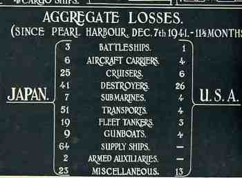
I’m always ready to see different and interesting methods of displaying quantitative data, and this work–published in LIFE magazine in 1942–certainly fits that category. That the ship losses are printed in reverse–white on black–is unusual in itself, but the design is just particularly good, fitting a lot of data on a single sheet of paper. The image dramatically displays some very good (and very welcomed) news for the American public as the campaign for the Pacific dug in. This was a major Allied victory in November 1942, and one of the pieces of the end for a campaign that stretched itself out over three years.
–Solomon Island WWII battle chronology found HERE.
–General history of the Solomons campaigns HERE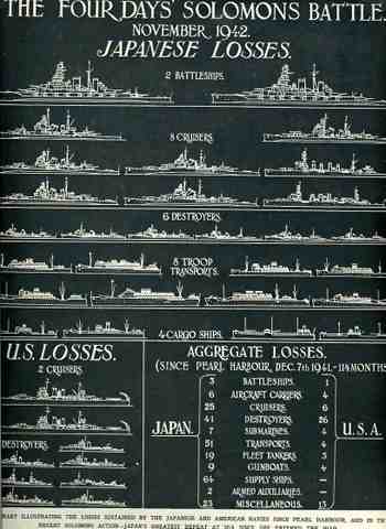 .
.
Detail of the above: