JF Ptak Science Books Post 934
This confusing title is accurate without very much grant in license and tells a short and true story of three fitful maps, two of which are beautiful and one just so-so.
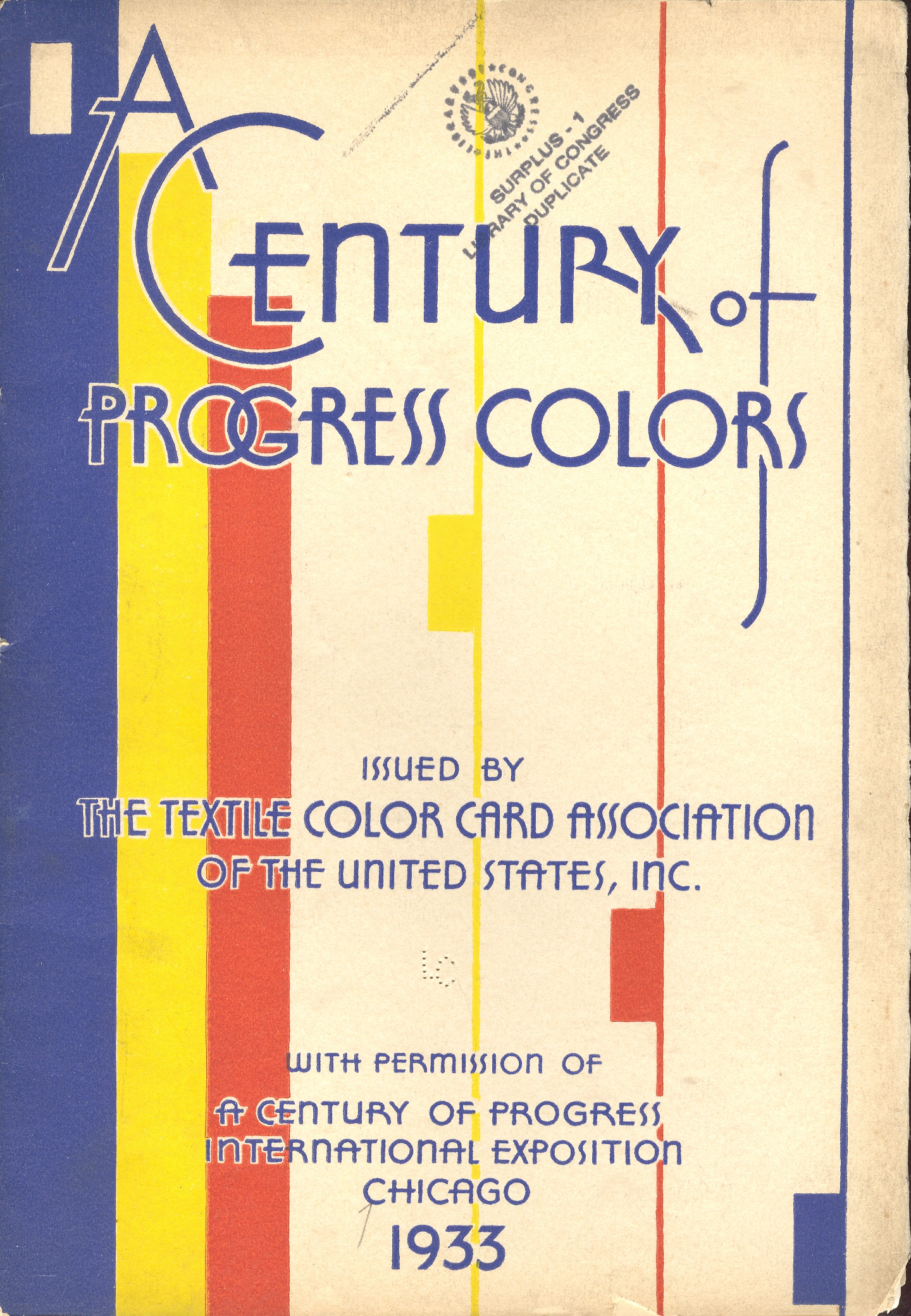
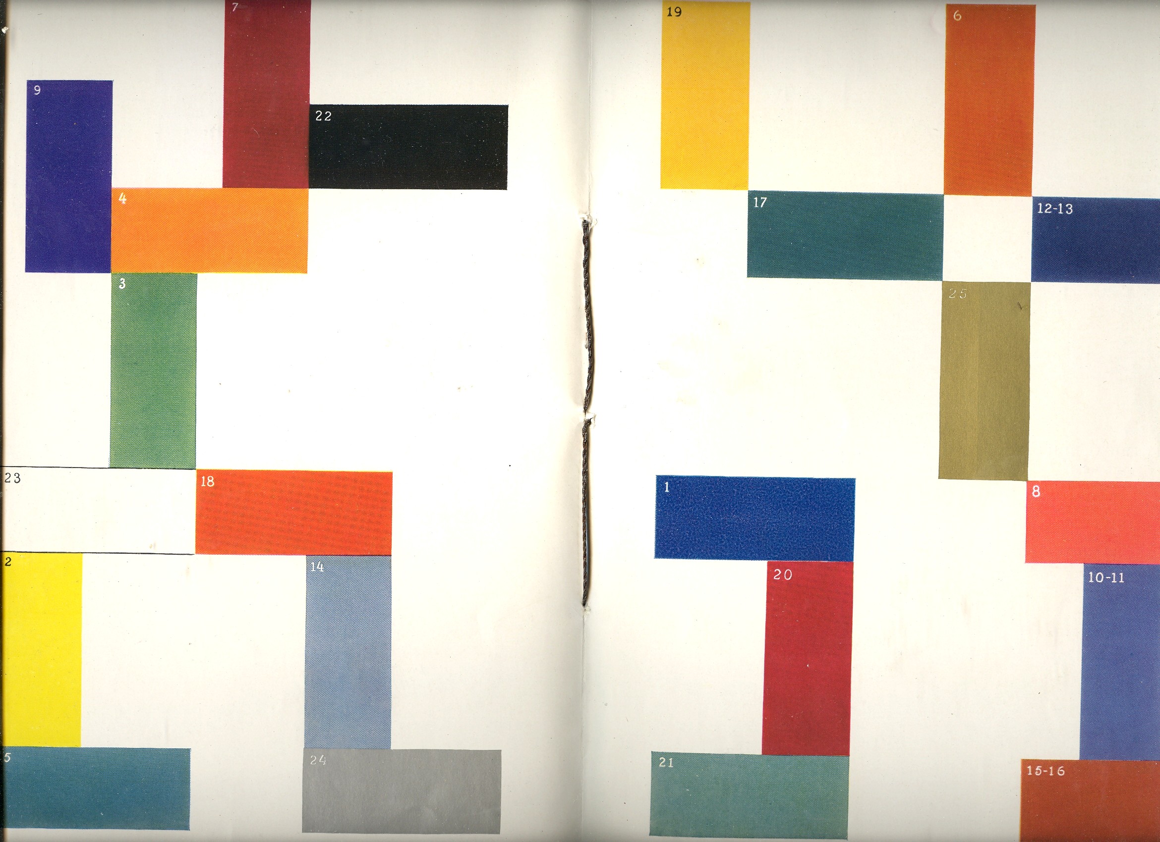
The first map fit is featured in a beautiful pamphlet called A Century of Progress Colors and was issued by the Textile Color Card Association of the USA.(The title being a small play on the 1933 world’s fair in Chicago called “A Century of Progress”. The Textile Color Card Association was created to standardize color nomenclature and composition in industrial colors (and is still in existence.) The map distributed the major pavilions at the fair by their dominating colors, naming those colors in the unusually-sequenced double-page key on the following pages (below1). I can certainly appreciate the effort and the beautiful design it produced, but as a map of the fair it leaves much (if not everything) to be desired.
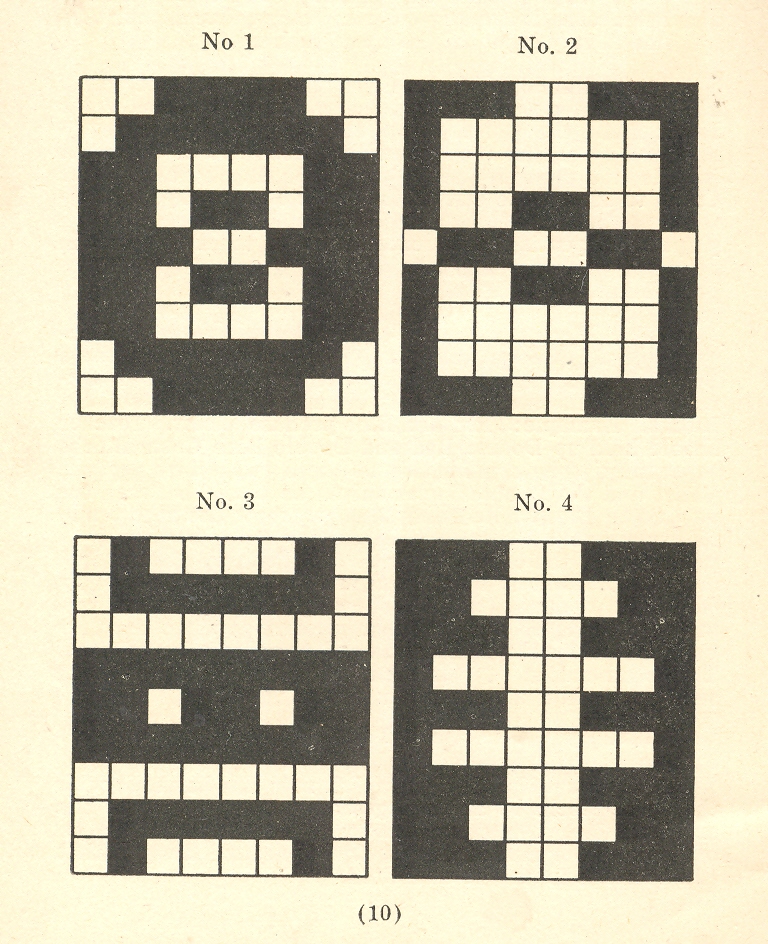
The second map fit belongs to a small pamphlet published by Albert Coble called Games of Colors, Kindergarten and Primary Exercises. Its actually an enterprising little book about reaching into the minds of little ones and explaining how colors are put together and how they relate to one another. It is unfortunate that the drawings used to illustrate the color map part of the pamphlet were done in black and white. Which is a little on the self-defeating side.
But the finest fit of the three fits is fit number three, which is the map of the Bellman’s tale, starting the second fit of Lewis Carroll’s The Hunting of the Snark, an Agony in Eight Fits.
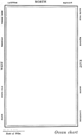
But the map that I think I love the most illustrates Lewis Carroll’s The Hunting of the Snark, an Agony in Eight Fits, and occurs in the Bellman’s tale, starting the second fit1. It is simply magnificent.
Then, of course, there is this:
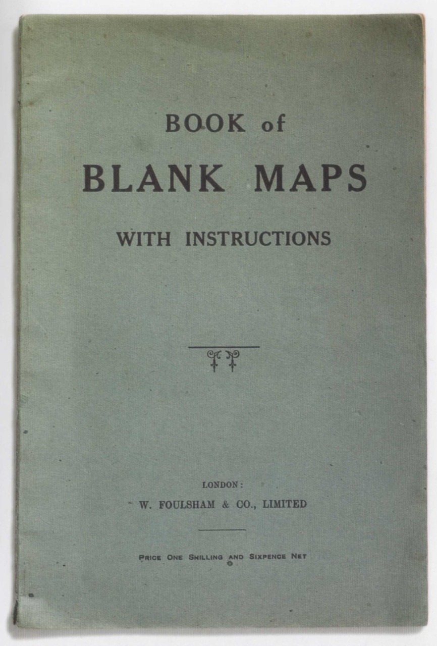
Notes:
1. The key:
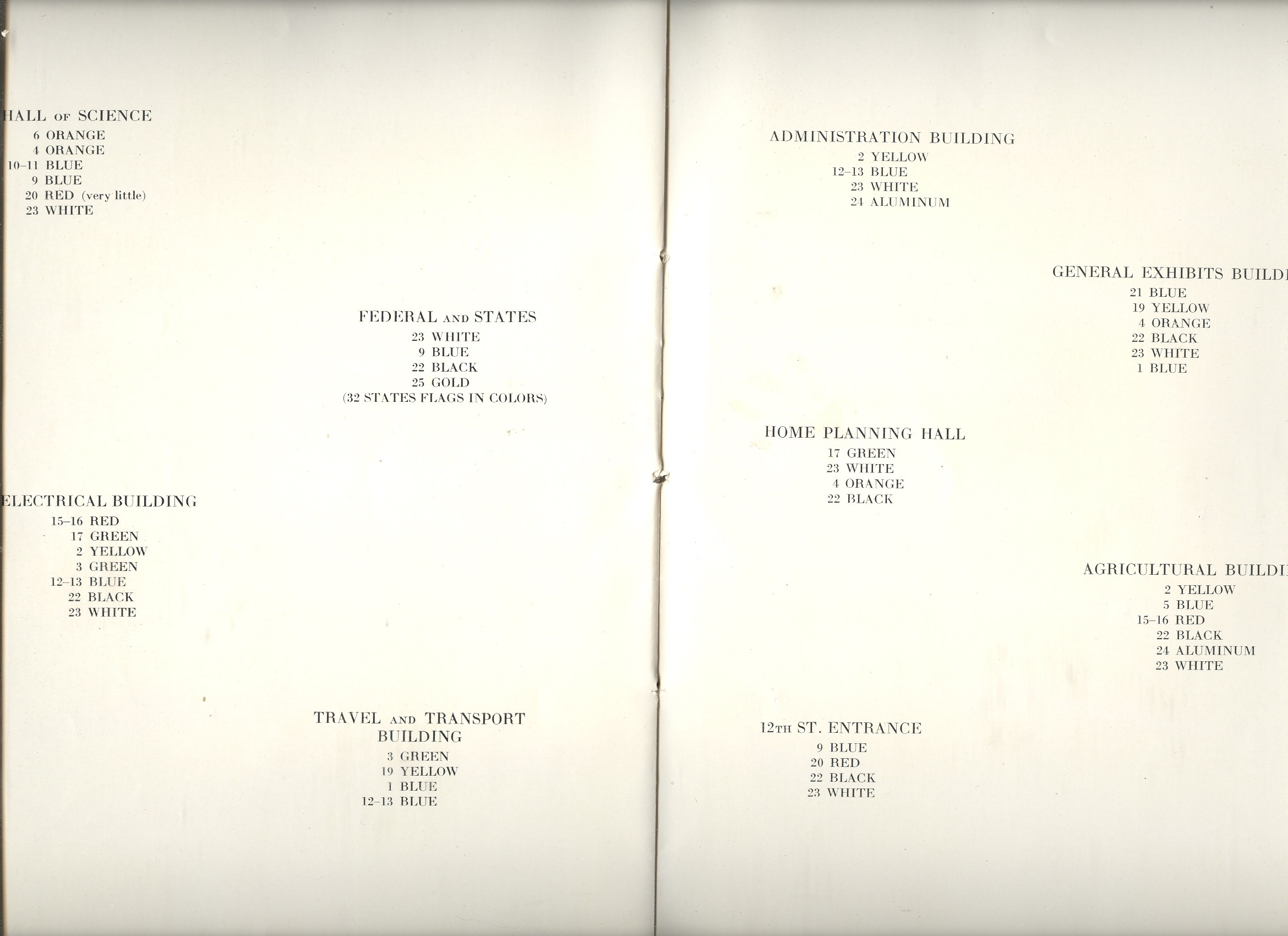
2. The fit begins so:
The Bellman himself they all praised to the skies-
Such a carriage, such ease and such grace!
Such solemnity too! One could see he was wise,
The moment one look in his face!
He had bought a large map representing the sea,
Without the least vestige of land:
And the crew were much pleased when the found it to be
A map they could all understand.
“What’s the good of Mercator’s North Poles and Equators,
Tropics, Zones, and Meridian Lines?”
So the Bellman would cry: and the crew would reply,
“They are merely conventional signs!
“Other maps are such shapes, with their islands and capes!
But we’ve got our brave Captain to thank”
(So the crew would protest) “that he’s bought us the best-
A perfect and absolute blank!”