JF Ptak Science Books Post 1099
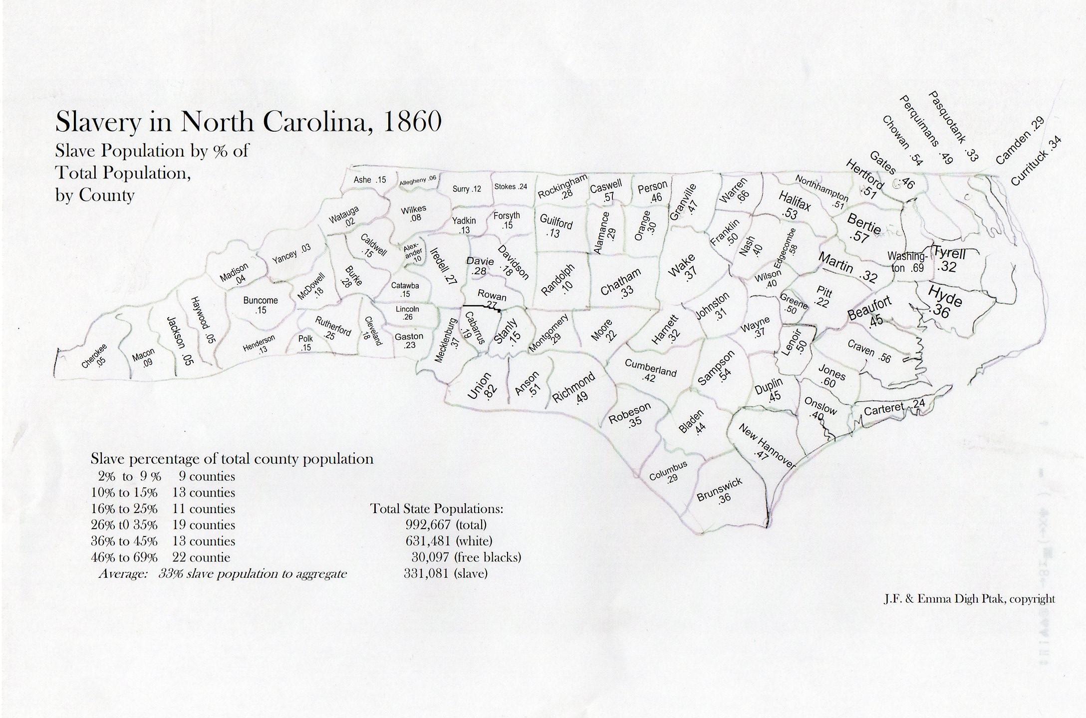
My daughter Emma and I put this map together a few years ago for a project that just didn’t come about. I found it this morning and thought to just post the thing and its tables. It could certainly be dressed up some–or at all. Color would be nice. So would a clickable interactive bit. Caveats firmly in place, here it is–so far as I could tell there wasn’t such a descriptive tool like this available to quickly show the distribution of slave ownership (by county) in North Carolina. (Map is expandable.)
.
Data below in expanded reading section, slavery distribution arranged by heaviest concentrations to least.
Once you get into the mountain region of the state (the last third or so) where there are lots of hardscrabble/subsistence/poor farmers, slave ownership drops quickly. (I’m not sure how the Cherokee slave ownership factors into this.) It would be nice to know how NC compares to the rest of the slave holding states, and I might do that yet–but for now I just wanted to share this relatively raw map before I lose it for good.