JF Ptak Science Books Post 1991 
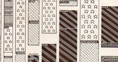
This dense, complicated table showing the distribution of
strategic raw materials (published in The Illustrated London News 3 August
1940) I is a decent example of how not to display data.
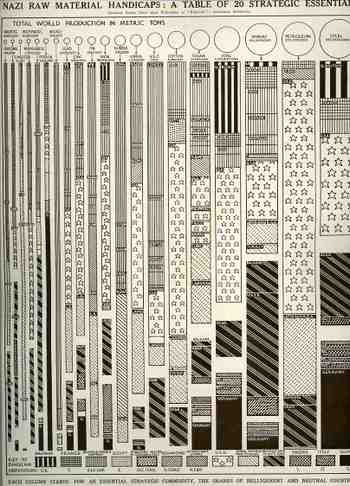
Perhaps there’s just too many variables to
try to control here in one visual display: it tracks twenty raw materials by percentage of access for thirteen
different countries, with the entire graph being displayed in a sort-of
progression according to metric tons of material. Maybe it’s the varying widths of the bars
representing the material, maybe it’s the complex designs distinguishing the
countries, and maybe its just too many lines. The only time this really works for relatively-offhand use is when you’re
looking for one country in particular, and then the eye allows it self to just
concentrate on the solid black (Germany) or the stars in a bar (U.S.) When the
graph is used in this manner it displays rather quickly that Nazi Germany doesn’t
control a whole lot of the combined tonnage of the twenty strategic materials, which
was a particularly good thing for the general reading population in the Allied
world to see, because the war was not going so well at this early stage. (At this
point in the war—less than a year old now in Europe—the Battle of Britain had begun
though it was still weeks away from when the massive Blitz begins, and Hitler had
just toured Paris…it was not a good time for Britain, and a worse time for France.
The
Soviet Union is listed still with the Axis as it was
still 10 months away from being attacked, Hitler turning on his allies in Operation
Barbarosa in June 1941.)
A little further
effort would show that the Allied countries are mainly lighter, with the “belligerent”
or neutral countries are darker, showing the lighter is on top with darker
beneath, and that in general the Allies control more of these materials than
the Axis. It is also interesting to not
ethe relative smallness of control by Great
Britain, though when you throw in the rest
of the British and then the French empires the possession summary changes
dramatically.
So the data is there, and there’s allot of it, and its
fairly nimble—its just that the visual display is not pretty or easy to use .