JF Ptak Science Books Quick Post
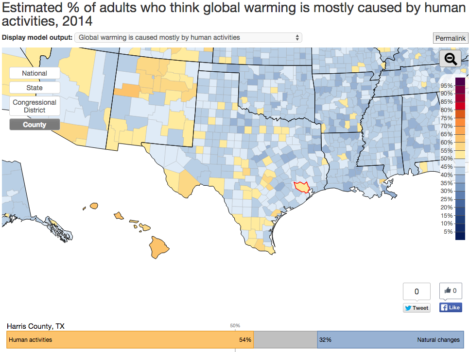
Interactive Map on Global Warming Opinions
Click a state and more detailed parts of the questionnaire are revealed, including whether the climate change is largely a result of human action and thirteen other questions arranged in the three areas of policy support, risk perception, and beliefs.
One odd thing is the percentage of people opposed to renewable energy R+D–I’m not sure why 21% would say so, why someone would be against becoming more-or-less self-sufficient. Another 25% are opposed to regulating CO2 emisisons, which combined with the renewable opposition is frustrating to comprehend.
SOURCE: http://environment.yale.edu/poe/v2014
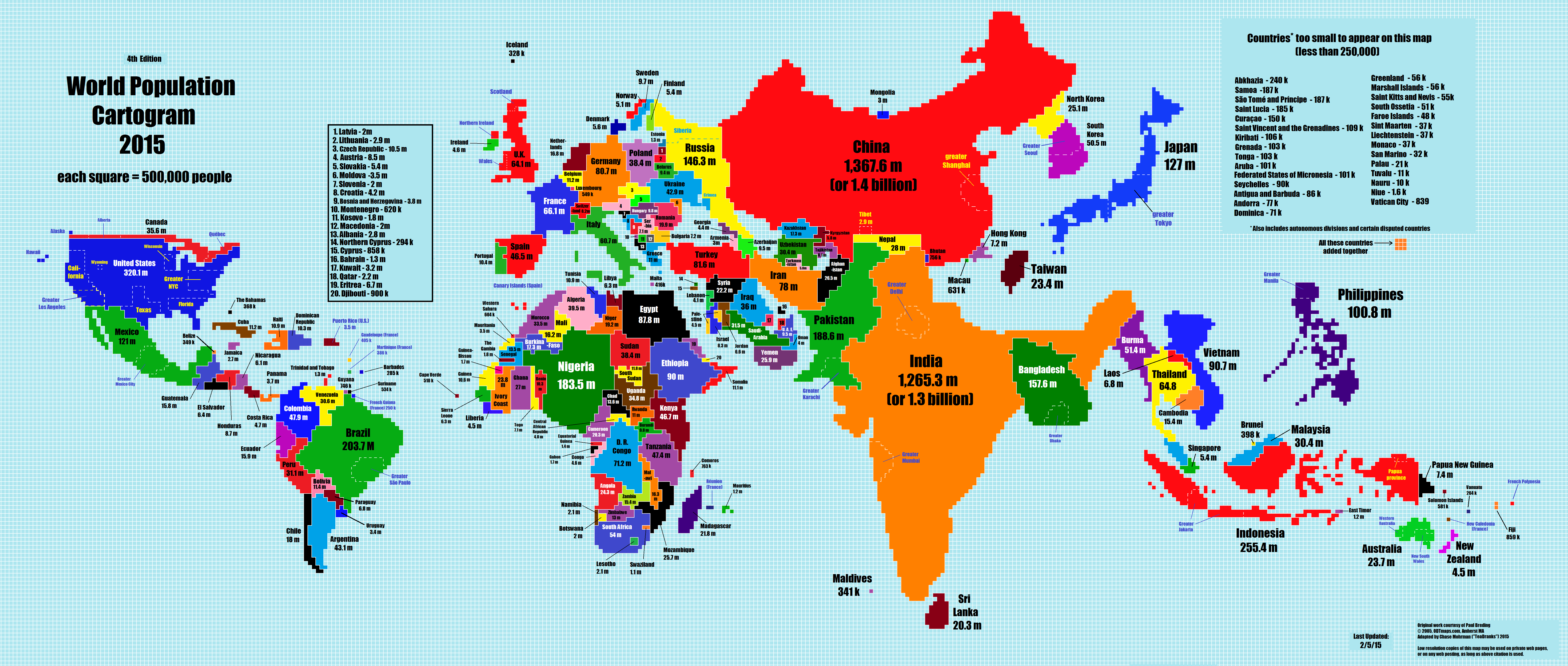
Population
The 2015 World Population Cartogram, showing country population in discrete blocks equal to one million people each. Not a projection but looks like one, and interesting:
SOURCE: NPR blog, here http://i.imgur.com/I81xSNt.png
Drought Map, 2011-2015.
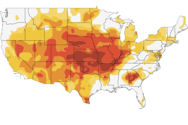 There’s a fine and scary interactive map if you follow the link to the NPR site showing the development of the drought situation in 1200 counties in the U.S.
SOURCE: http://www.npr.org/2012/07/18/156989764/interactive-mapping-the-u-s-drought