JF Ptak Science Books Quick Post
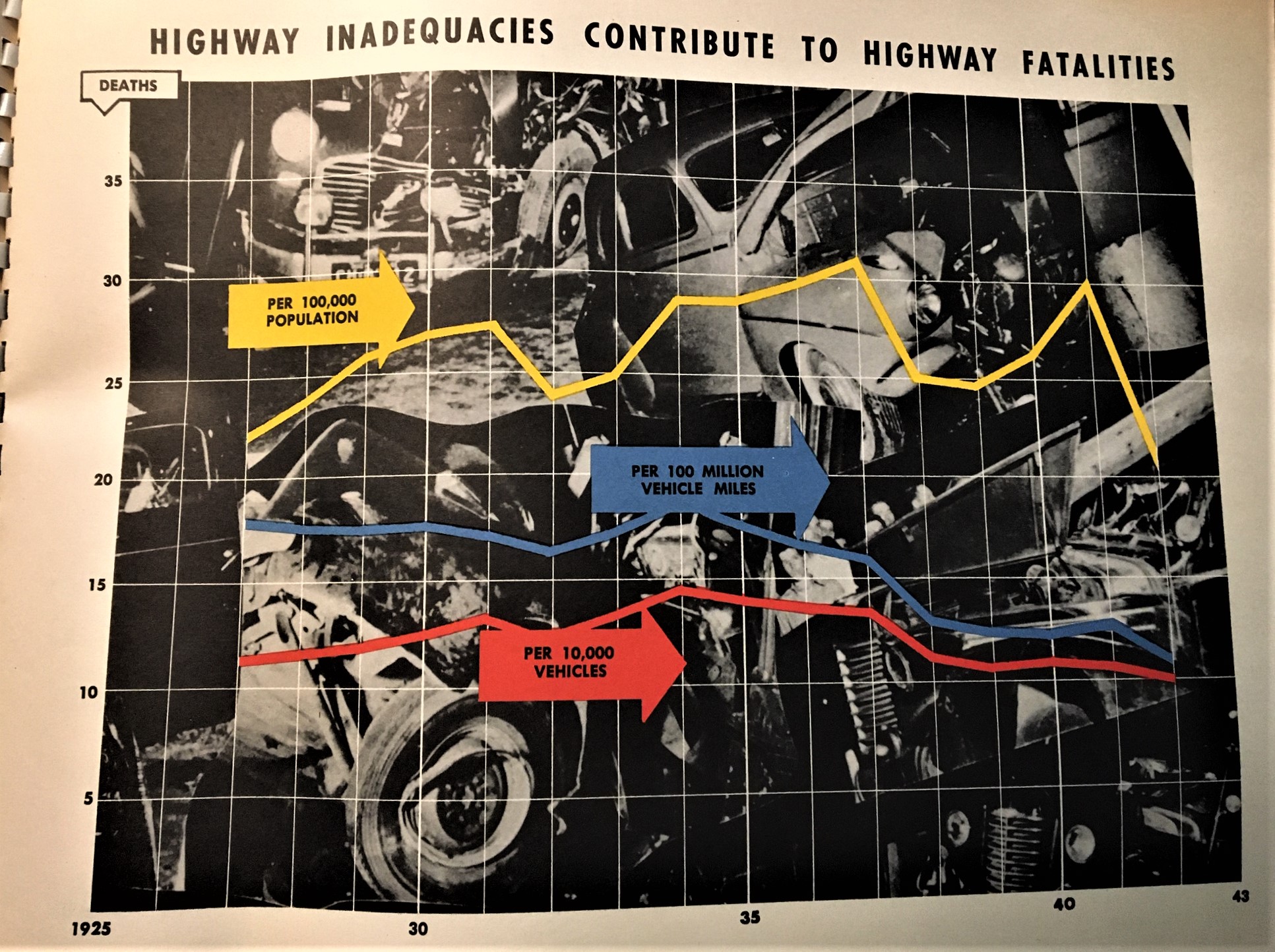
I’ve made a number of posts to this blog on color and the lack of it (for example, see the series on “Color and its Advanced Abuses”) mostly concentrating on MONUMENTAL color or the lack of it when it could have been there (this, for example, exemplified in a beginner book on color theory with illustrations in glorious black and white). Today’s example comes from a oversize pamphlet called The Story of Highways, which I think was a vehicle used to deliver highway stats to crowds of congressional interest. The 16″-wide pamphlet contains 26 graphs/charts that reproduce 30″x 40″ posters used in a presentation somewhere to justify federal money spent on highways during WWII. Some of them are unexpectedly colorful, very flat, and as I said in the title of this post, somewhat Brutalist in design. It isn’t quite Soviet Style or Brut Soviet, but there are those elements that I think are pretty noticeable. And if not, they’re interesting to see.