A Daily History of Holes, Dots, Lines, Science, History, Math, Physics, Art, the Unintentional Absurd, Architecture, Maps, Data Visualization, Blank and Missing Things, and so on. |1.6 million words, 7500 images, 4.9 million hits| Press & appearances in The Times, Le Figaro, Mensa, The Economist, The Guardian, Discovery News, Slate, Le Monde, Sci American Blogs, Le Pont, and many other places… 5000+ total posts since 2008.

Category: Prints–looking HARD/deeply at

  • Display of Quantitative Data: What was Left of the Japanese Navy, 1945 [Short Post]

    JF Ptak Science Books    Post 1220

    Japanese sinking detail

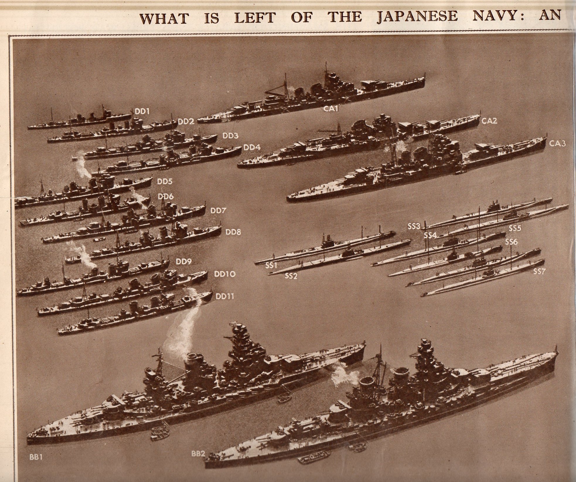
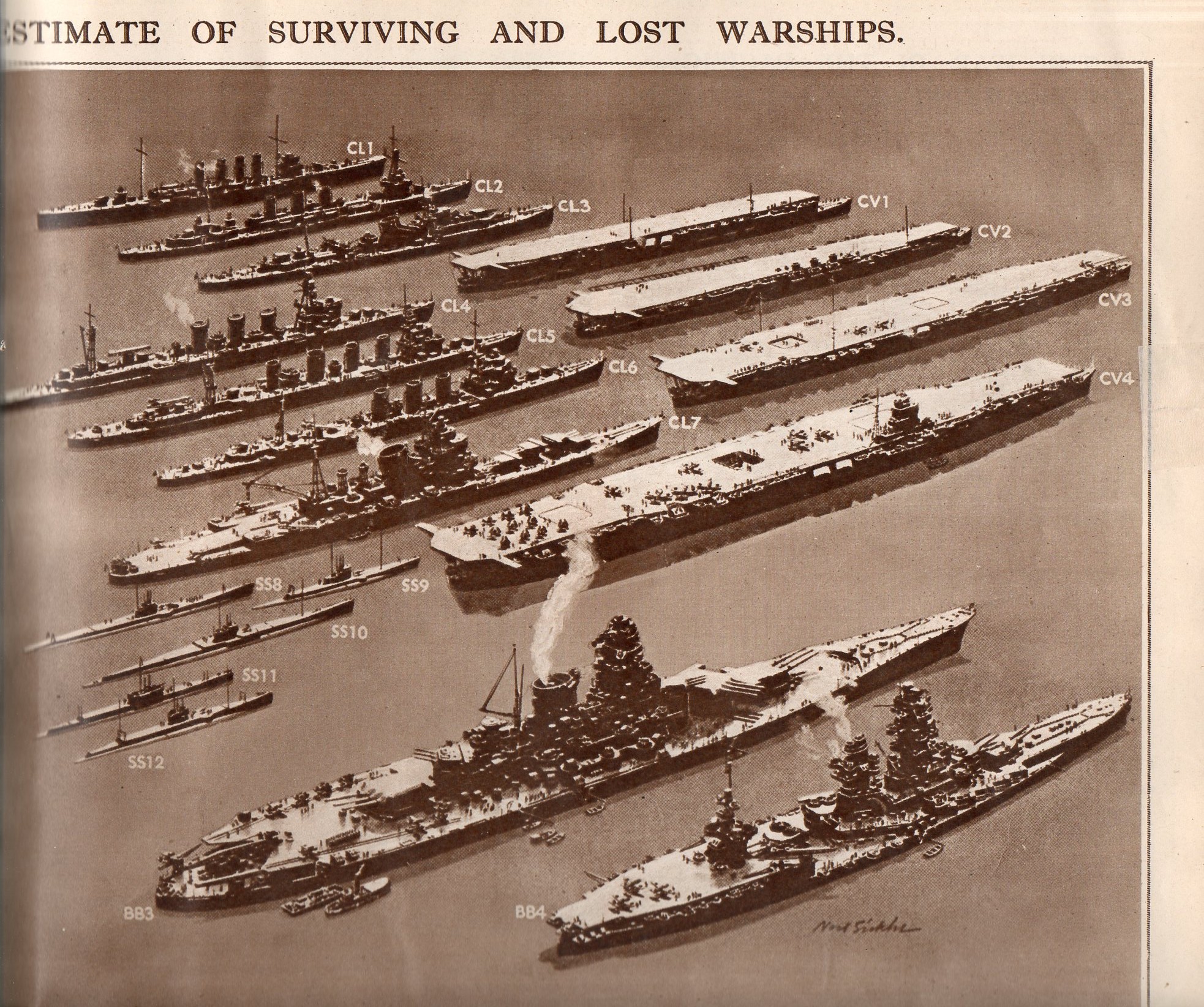
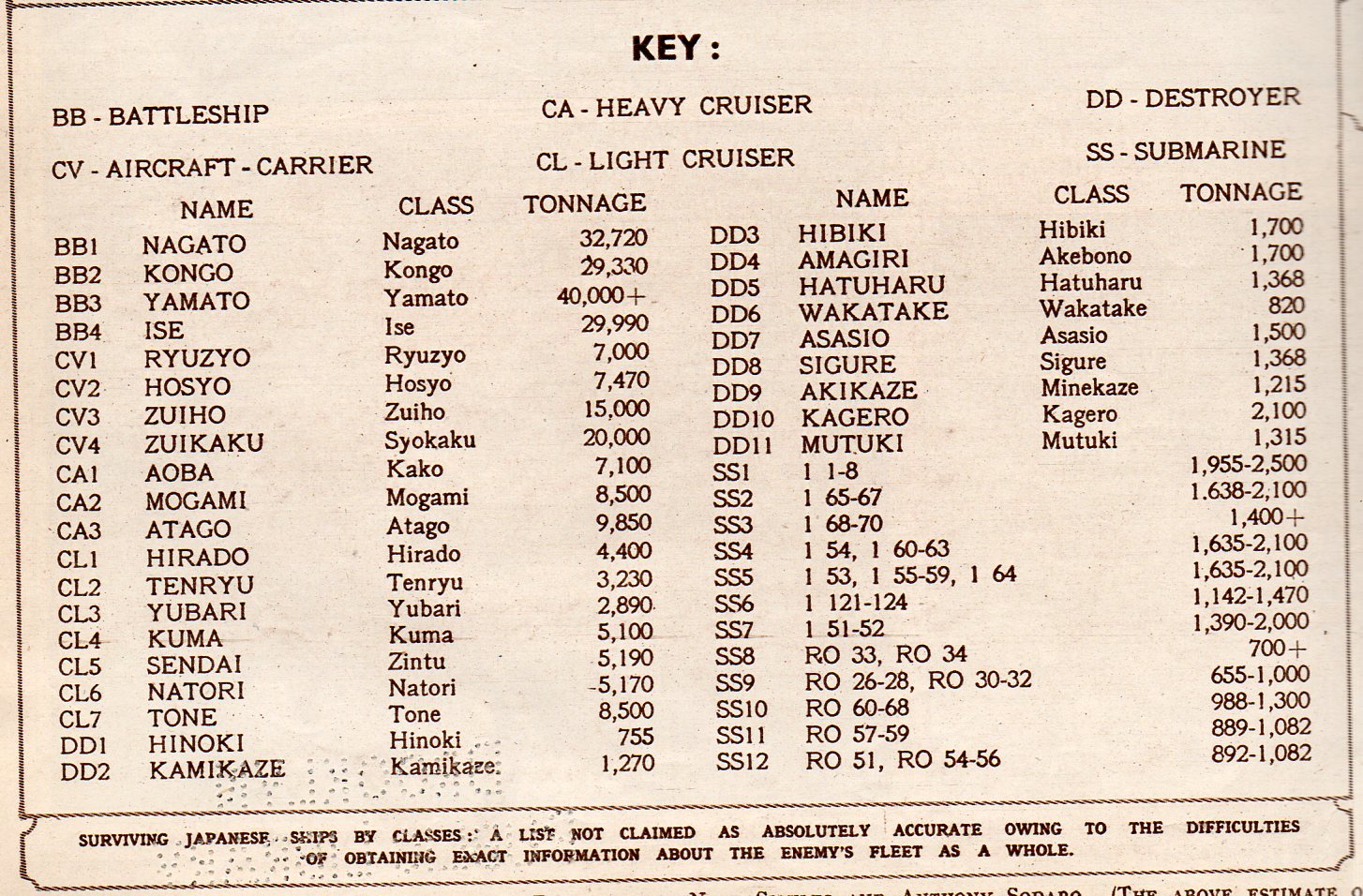
    This double-page spread in the Illustrated London News for 28 July 1945 displays what was left of the Japanese Navy.  Originally appearing in LIFE magazine a few weeks earlier, the image represents classes of Japanese naval ship, multiplied by the estimated number of ships in that class.  Even after all of the great  losses of 1942/3, the Japanese Navy was still the third largest afloat. 

    The navy consisted of an estimated 10 battleships, 6 carriers, 15-30 cruisers, 60-80 destroyers,and an not-estimated number of subs–or at least that is what was being published as the case in LIFE/ILN.

    This is an excellent display of a significant amount of historical data, made quickly understandable to even a quick reader, or even to a non-reader.  Two weeks from this date would find this information about the remaining Japanese Navy to be beside the point.

     Japanese Navy 1205 

    Japanese Navy 2206

    Japanese Navy 3207

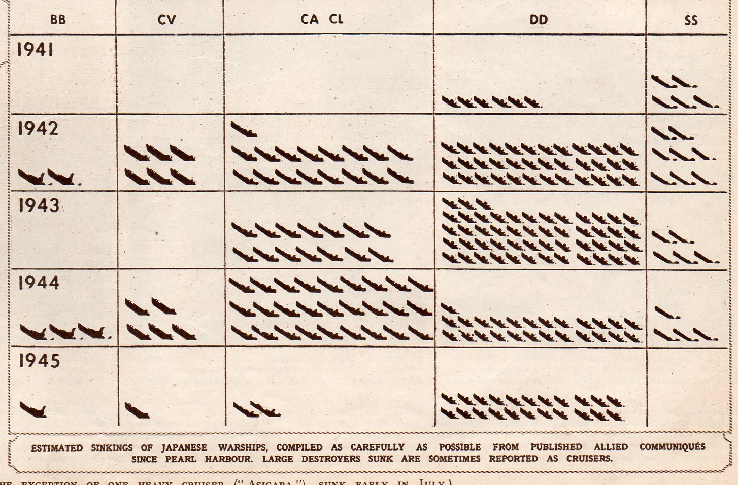
    This chart shows the numbers of each class of vessel sunk by year:

    Japanese Navy 4208


  • Defeated but Alive–German POWs, 1945. A Remarkable Photograph.

    JF Ptak Science Books   Post 1212

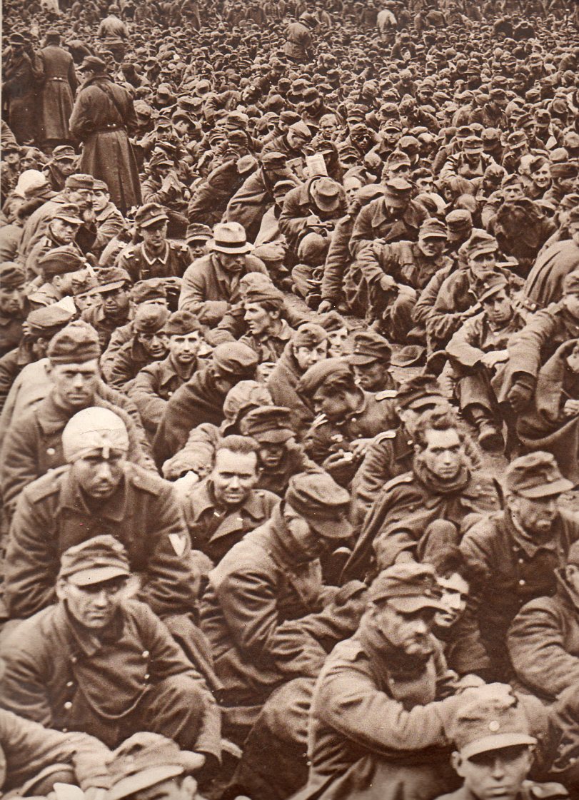
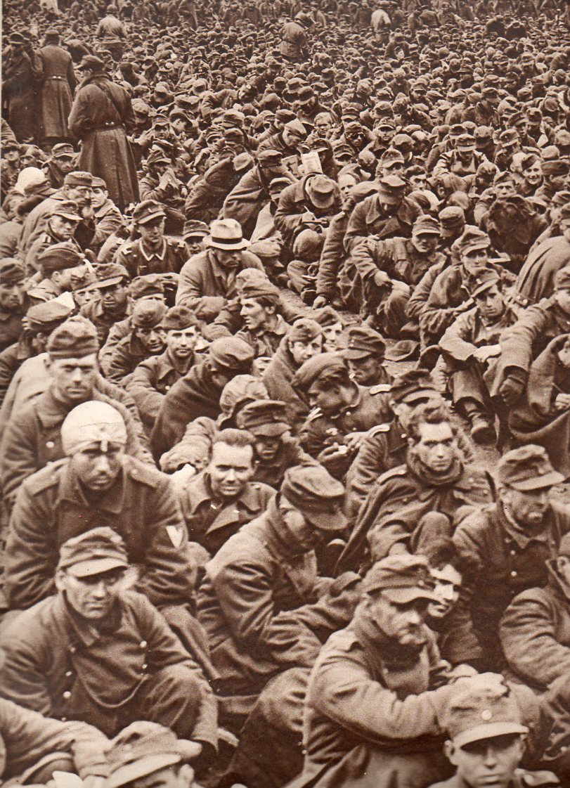
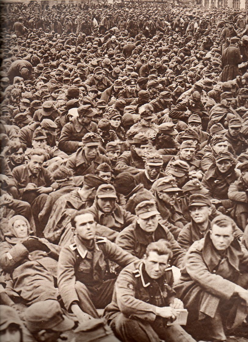
    Crowds--German prisoners-right-804 Crowds--German prisoners-left800

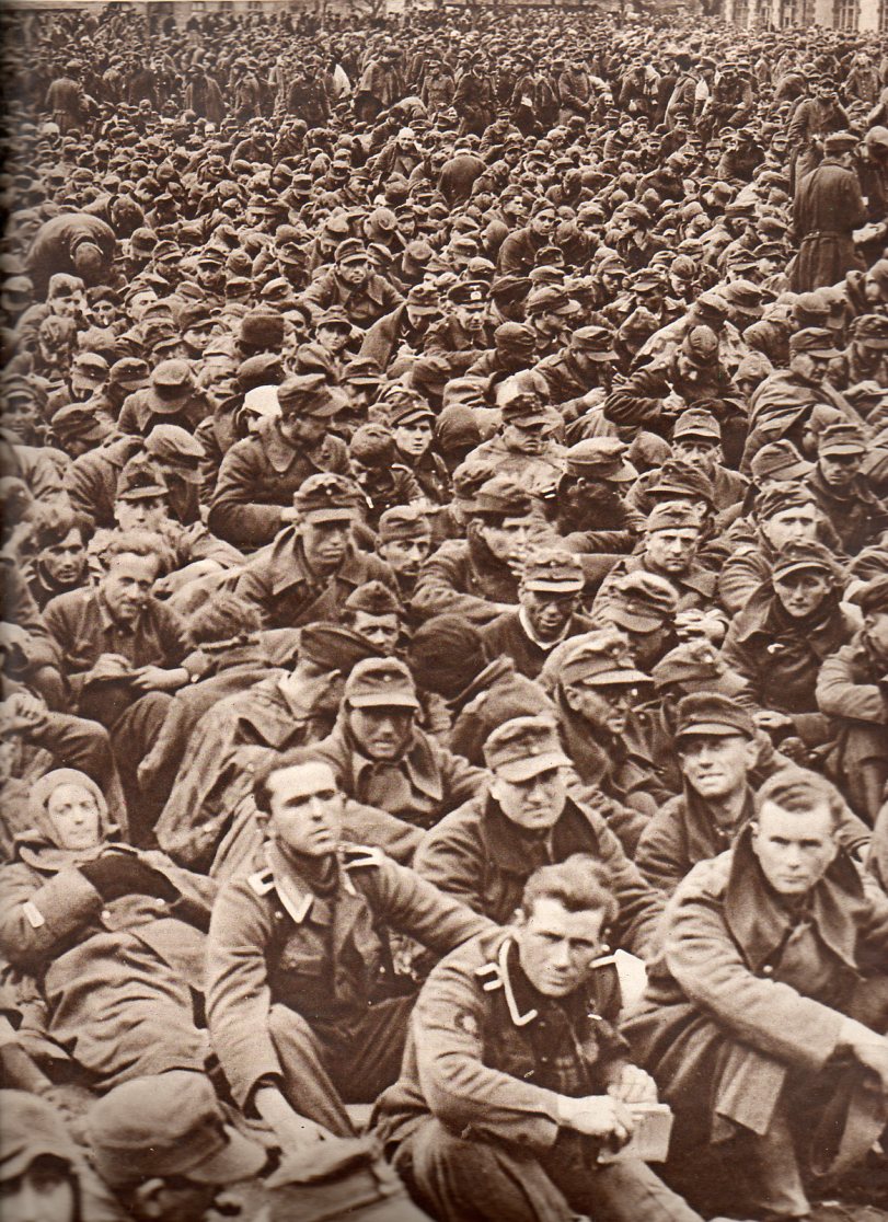
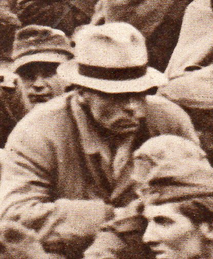
    By April 21, 1945–the date that this photograph was published–I should think that those left fighting in the Wehrmacht would have thought that it was time now to be taken prisoner by the British or the Americans, and to not be taken by the Soviet Army.  Thousands of German soldiers made their way west at the tail end of the war, trying to evade capture by the Russians, to find some sort of respite from the fear of being taken away by the Red Army to work and disappear somewhere inside the heart of Mother Russia.  There was a heavy dose of vengeance being unleashed on the captured German forces in the east in partial payback for the devastating assault on the Soviet Union (Operation Barbarossa) by the Nazis beginning on 22 June 1941, and which caused millions of citizens and soldiers their lives.  (Barbarossa was to have been a multi-month long campaign to secure the minerals and farm lands and forests of the Urals and Siberia and the Ukraine, but it lasted for more than three years along an 1800-mile front.  The initial operation was very successful for Germany, but the Blitzkrieg ended quickly, and a long slogging campaign began, one which would be decided not only by weather, but by massive production of Soviet materiel and overwhelming army strength.)

    Crowds--German prisoners-left800

    The caption of this Illustrated London News photograph states that this is but a small fraction of the 2,000,000 prisoners then held by the Allied Forces.  Shortly before this it was estimated that the Nazis held some 1.7 million Allied prisoners, which meant that in early 1945 more than 4 million soldiers were held as POWs in Europe.  This enormous figure is exclusive of Japanese prisoners (estimated at about 150,000 in early 1945, with this number being exclusive of any Chinese prisoners), and the number of prisoners held by the Soviet Union. 

    Crowds--German prisoners-right-804

    Crowds--German prisoners-right-det802
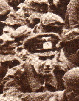
    Te return rate of German prisoners from Allied camps was very high; that same rate for Germans in possession of the Soviets was very low, something along the lines of 20%.  The Nazi campaign through the Soviet Union showed small mercy and great cruelty; the Soviets reciprocated with the German soldiers they captured.

    Crowds--German prisoners-left-detaul801
    Overall, this is a tough photograph.  The soldiers were evidently awaiting delousing before being sent onto trains to deliver them to more formal detention facilities. At least when these soldiers got on those trains with what sound like hgih-tin whistles, they mainly survived their ordeal, and the showers that they were going to receive were using water, and not zyklon-B.


  • Gas Masks and Poison Gas, World War I, 1915

    JF Ptak Science Books   Post 1191

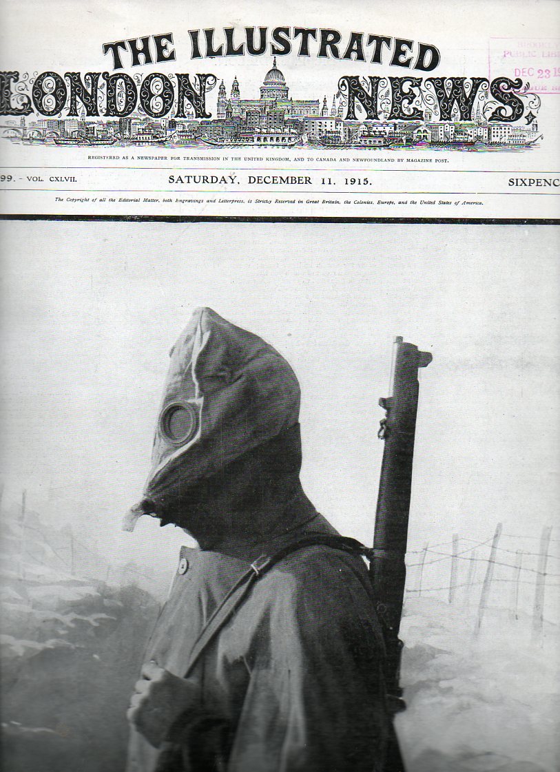
    In the long line of potent and horrible weapons, few are as so superbly bad as chemical and poison gas.

    WWI--gas mask full pg696

    [This image is available for purchase at our blog bookstore, here.]

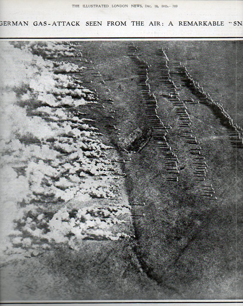
    The heading of this full-page photo from The Illustrated London News for 18 December 1915 really is quite understated—“remarkable” really doesn’t quite cover it.  First of all, photographs from moving airplanes were not common; secondly, this is one of the earliest images ever made of a poison gas attack in progress, just eight months after the initial use of German poison gas at Ypres (a first-hand account of which can be seen here http://www.firstworldwar.com/diaries/firstgasattack.htm  The experience of poison gas in warfare was still “new”–newer still for the Russians, who were at the receiving end of this unnamed  Eastern Front attack.

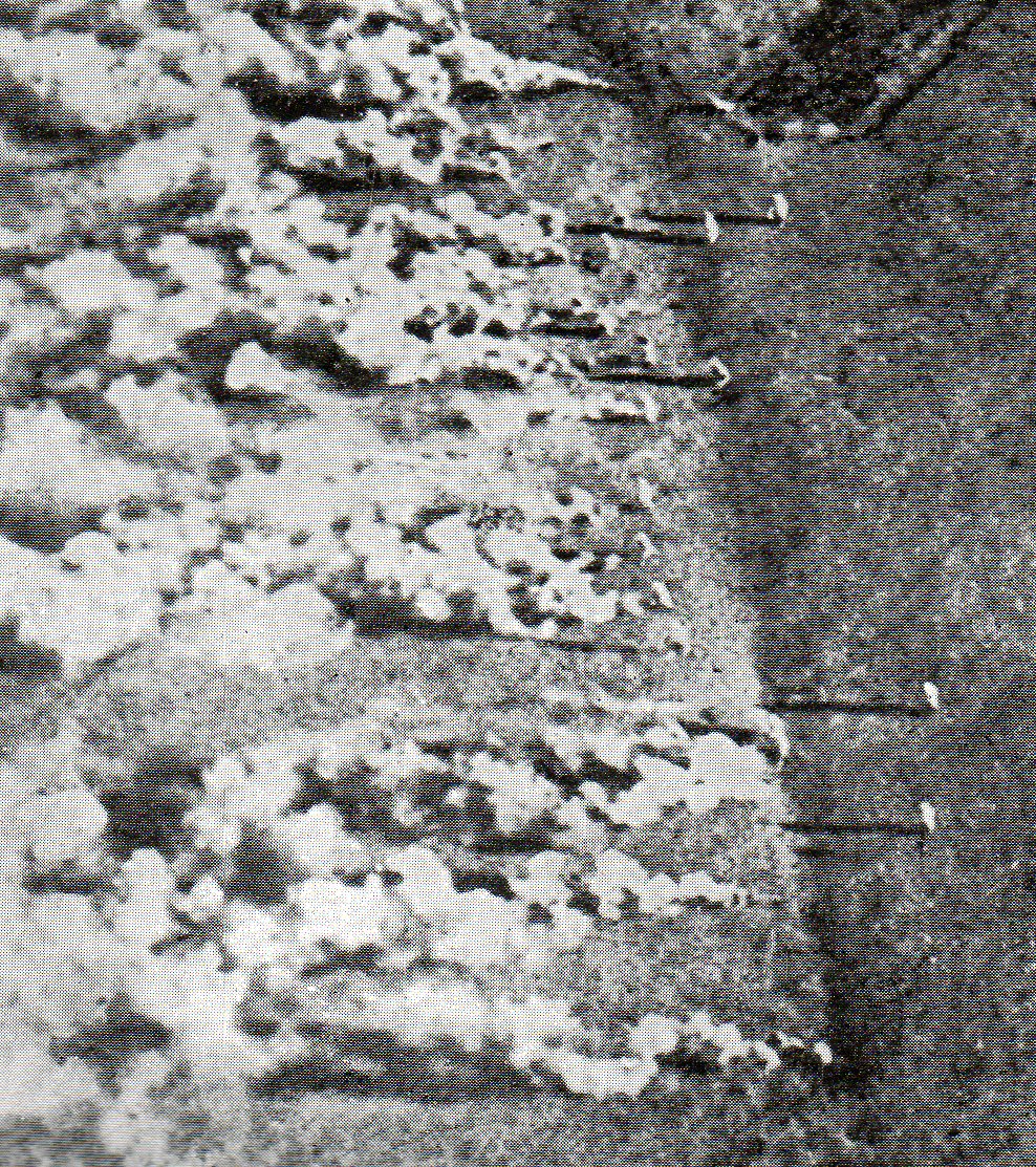
    The story on this goes as follows: during the night the German enemy forces crawled with metal and glass canisters of the poison gas to the very front of the Russian lines, or at least to the outer edges of the barbed wire perimeter.  The crawler would retreat, and then the whole of the attacking force would wait until daylight and a favorable wind condition at which time rifelmen would discharge at the canister, a direct hit mixing the contents fo the vials, producing the desired gas.  The wind would then pick up the gas and disperse it, the Germans waiting for the first leg of their attack to take effect on the poor soldiers in the trenches, and then attack once the gas had mostly cleared.

    WWI--gas attack697

    And the associated

    WWI--gas attack det b699

    And this solitary figure:

    WWI--gas attack detc700

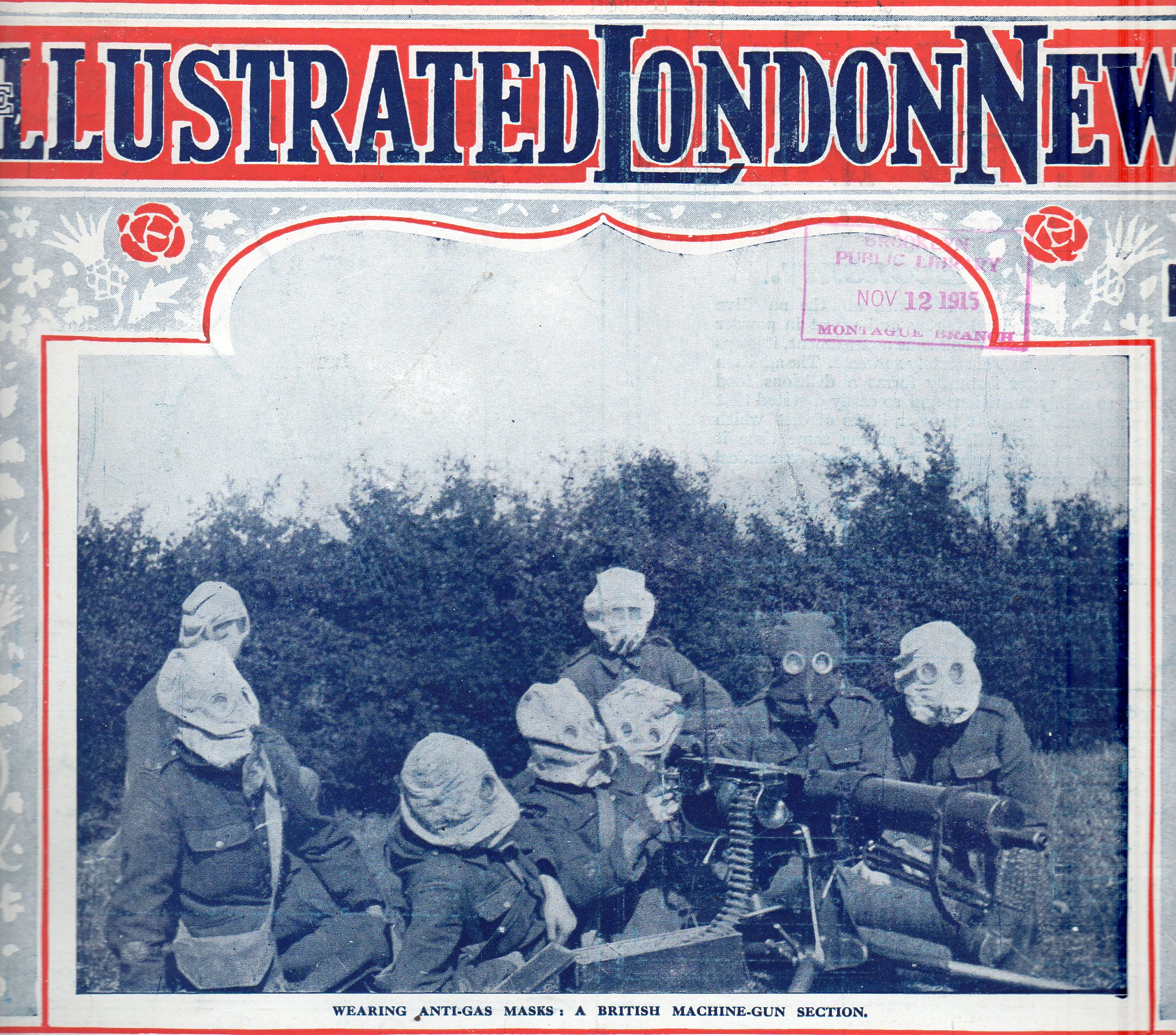
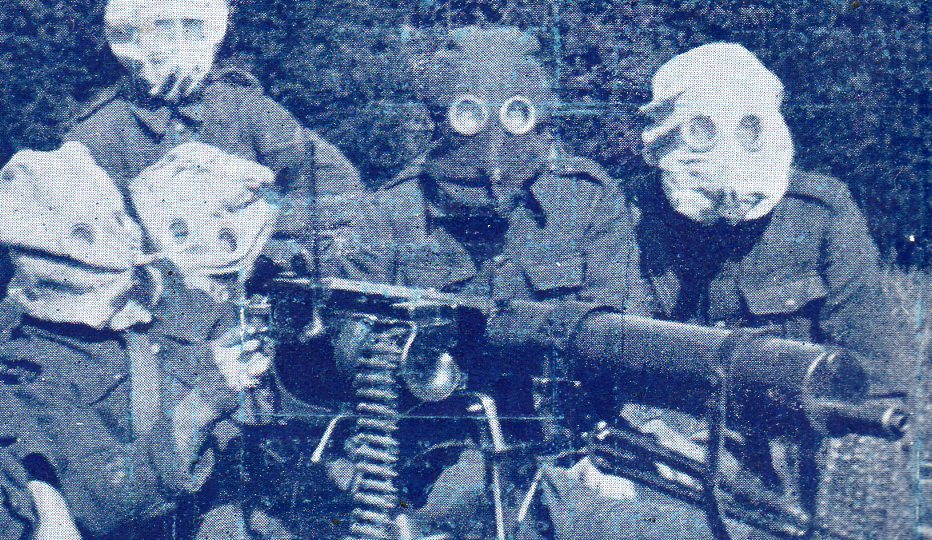
    The masks devised to deal with the attacks were soemtimes effective, sometimes not–actually, they were occasionally enhancers.  The earliest masks were creepy, unworldly, Coraline-like burlap-and-button-faced affairs–I’d hardly wnt to imagine seeing thousnads of these guys come running up to me with rifles and grenades in their hands attacking my position. 

    WWI--gas machine gun711
    WWI--gas machine gunb712


  • Women in World War I–Rare Photographs, 1918

    JF Ptak Science Books  Post 1190

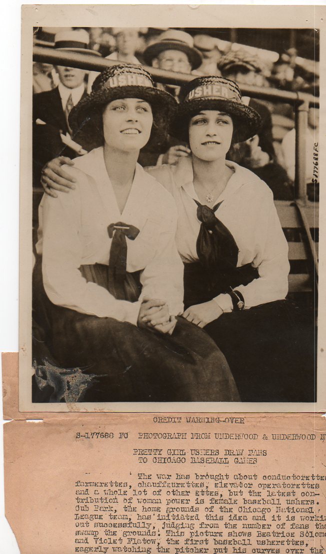
    WWI--e--women ushers684

    [All of the images below are available for purchase; see our blog bookstore for details.]

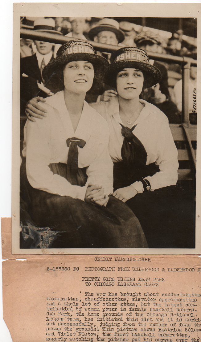
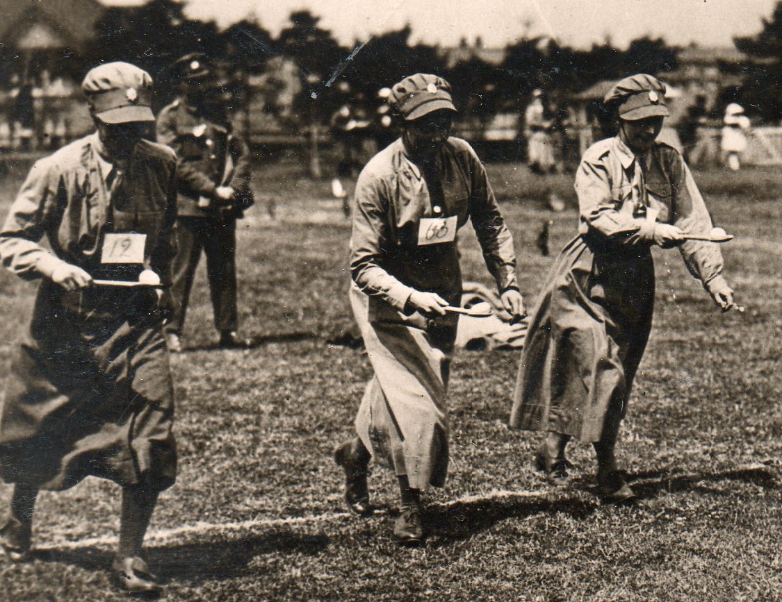
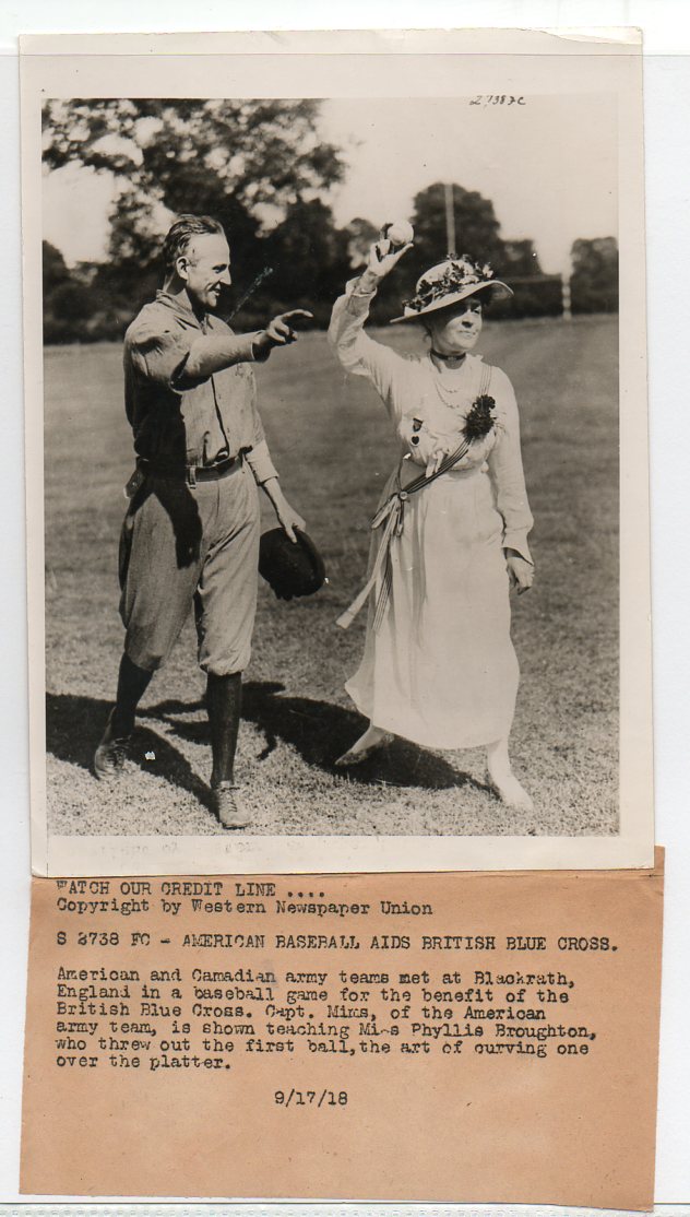
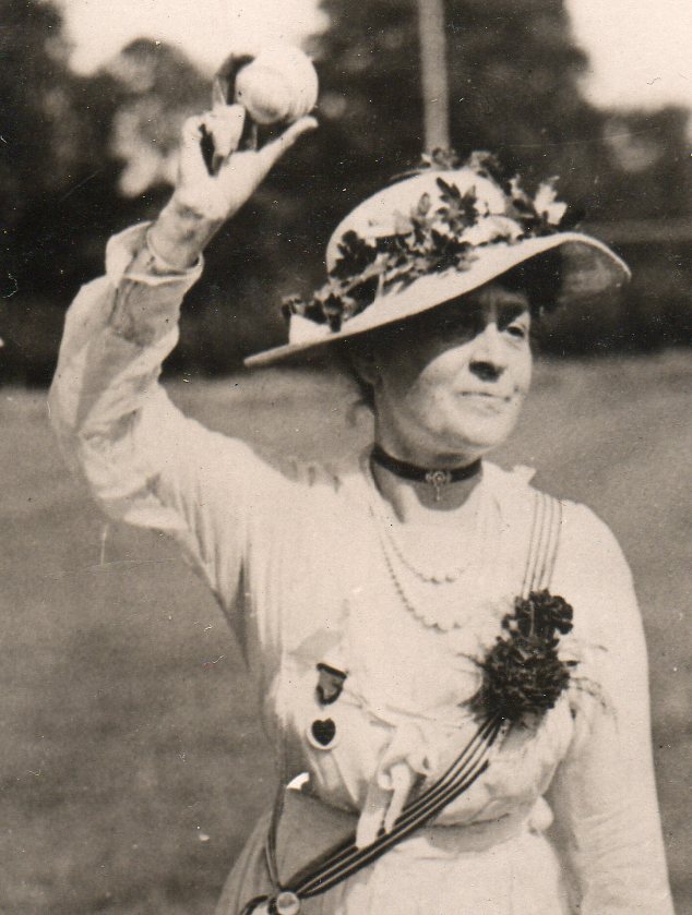
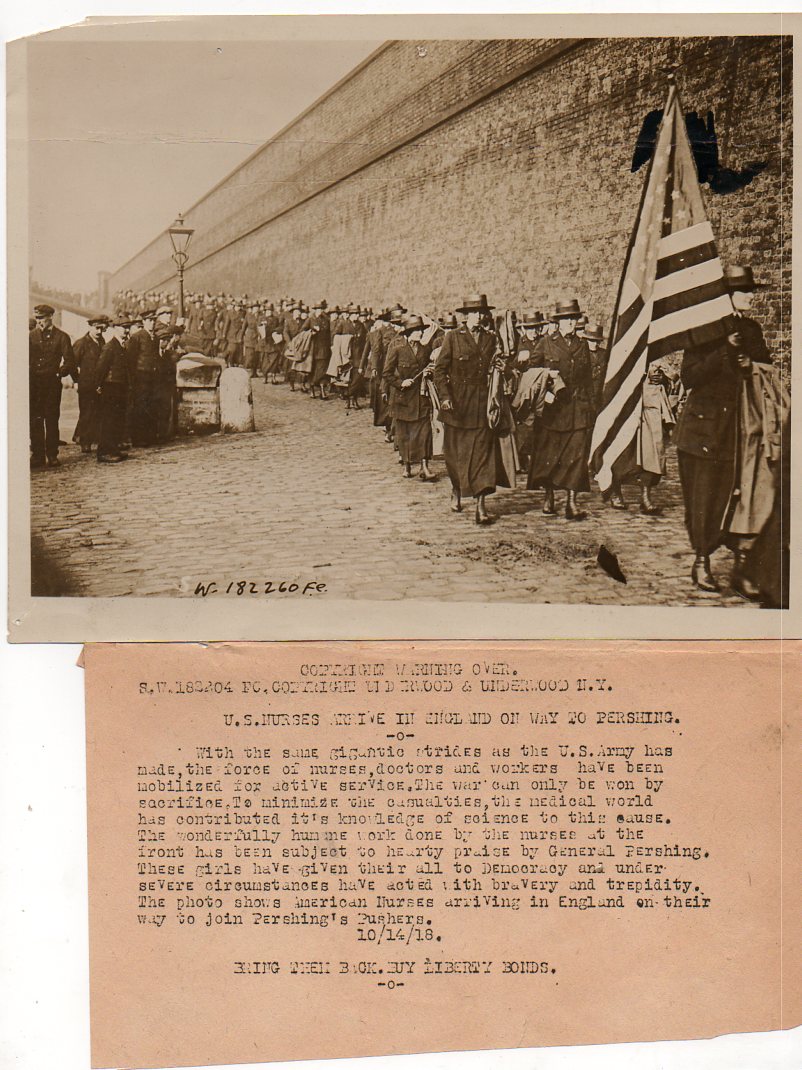
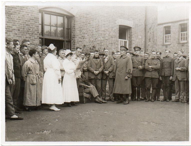
    This is another in a series of posts on images from my News Service Photographs of WWI collection.  All thousand or so of them were made in the last half of 1918 (save for a very few made in 1919) , in the last months of the grueling conflict, and were intended to be used by newspaper and magazines to illustrate stories about the war. An editor would send off a request to one of these agencies for, say, a photograph of marching American nurses, and the agency would send one back (for a fee) along with a caption.   There’s really no way for me to determine if these photos were ever published, and there is never an attribution for the photographer. 

    Most of the images have an accompanying descriptive text–this was to be used by whomever published the photograph, along with the attribution for the source of the photo. 

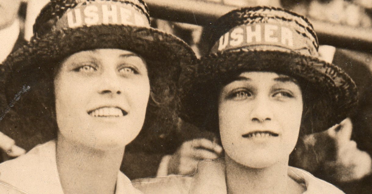
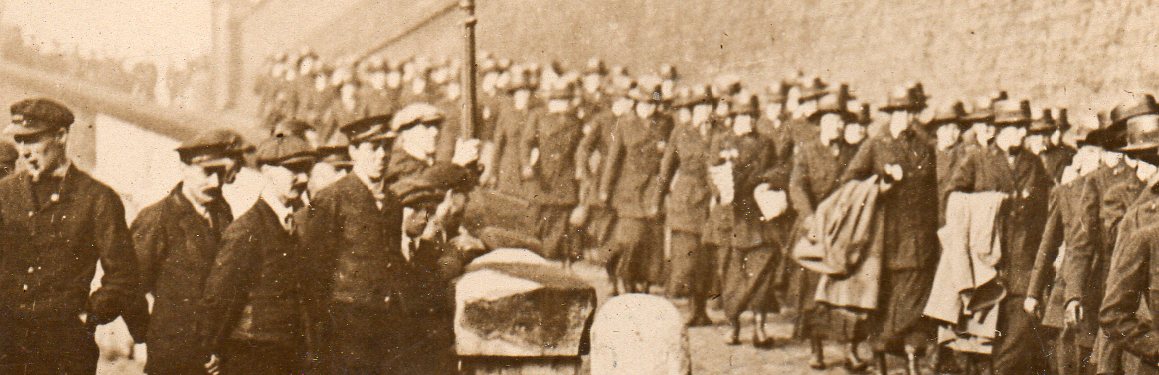
    In almost every case I supplied a detail of the image, hopefully of something that you’d want to see a detail of. 

    WWI--e--women ushers684
    WWI--e--women usher dets685

    ORIGINAL Photograph, 1918.  8×6 inches.  Very good condition.  $150

    WWI--e--women--egg race det664
      WWI--e--women-baseball672

      WWI--e--women-baseball det673

    WWI--e--women--nurse pershing653

    WWI--e--women--nurse pershing det654

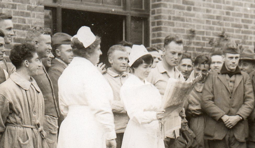
    WWI--e--women--nurse reading paper659

      WWI--e--women--nurse reading paper det660


  • What is It? Stinky Pete, the 8086 Processor, Vernacular Construction and Mies van der Rohe

    JF Ptak Science Books Post 1186

    Stinky pete Years ago I played a little game with our older daughter, Emma, with a Toy Story character called “Stinky Pete”.  Stinky was almost round, with little legs about 1/10 the size of his plush spherical body, so it was almost impossible to tell (when handled the right way) if Stinky Pete was standing or sitting, ’cause you really couldn’t see any perceptible change.  There was very little difference, and most of that was imagined.  We called the game “Sitting or Standing?” and it used to make Emma laugh and laugh.

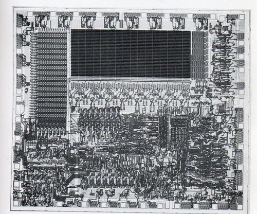
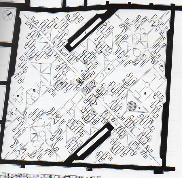
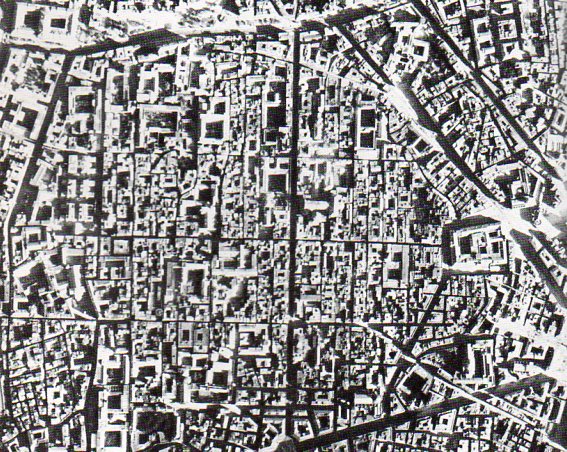
    And in that same veinish vein I wonder how easy or difficult it is to tell what the follwoing figures are, whether they’re city plans or biological units or integrated circuits or microelectric machines or skin. Sometimes its a close call.  And what that means I’m really at a loss of what to say on whether there is some deep underlying trap of relational woowoo.

    And so, what is it?  (Admittedly these could be made more difficult by using confusing details of a segment of each image, but this is good enough.) Answers at end.

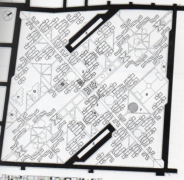
    1.  City plan or integrated circuit?
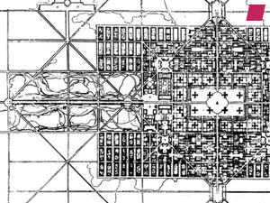
    'Ville Contemporaine' by Le Corbusier - 1922, from 'Urban Utopias in the Twentieth Century: Ebenezer Howard, Frank Lloyd Wright, and Le Corbusier' by Robert Fishman - 1977


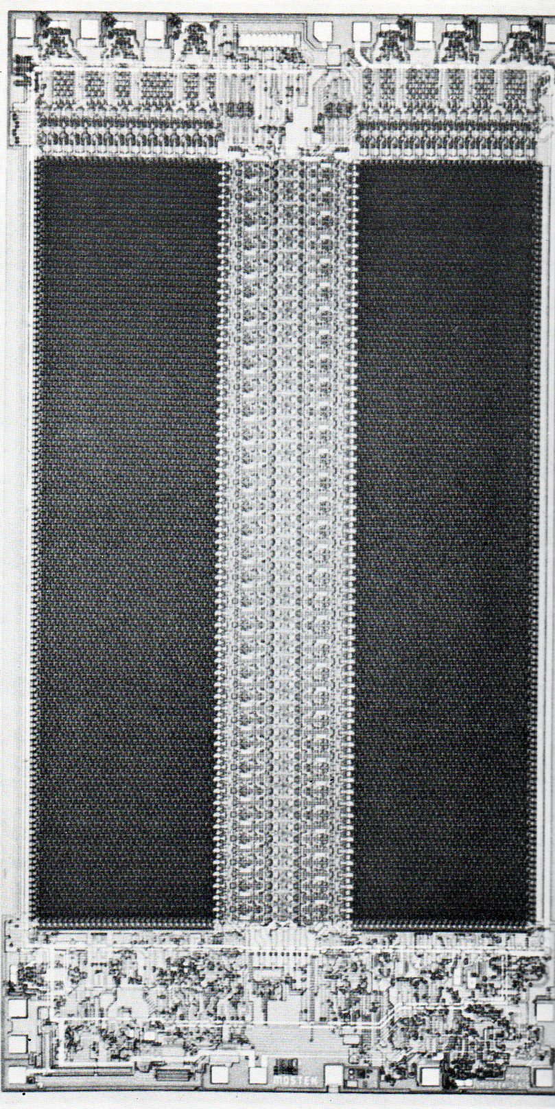
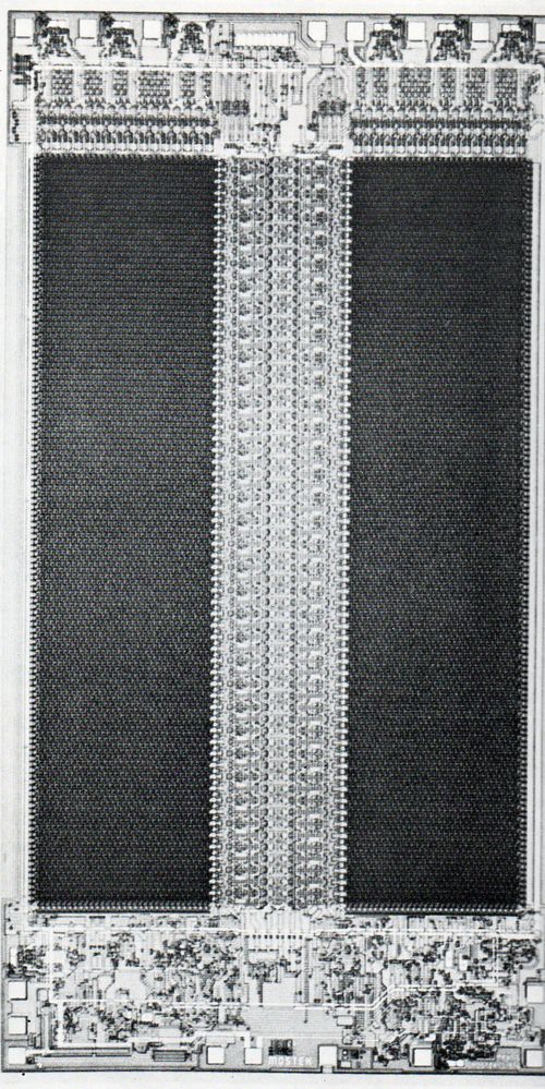
    2.  Integrated circuit or palace plan?
    Fontana microprocessor 2210

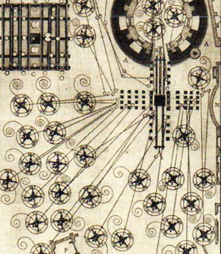
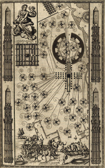
     3. Clockwork interior or renaissance engineering diagram?
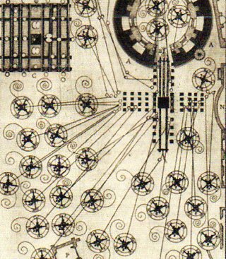
     
    City plan-fontana635

    4.  Plan for a Lunar city or micro mirror?
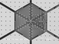
    MEMS Mirror


    https://historyofideasblog.com/a/6a00d83542d51e69e20133f2411ef6970b-500wi

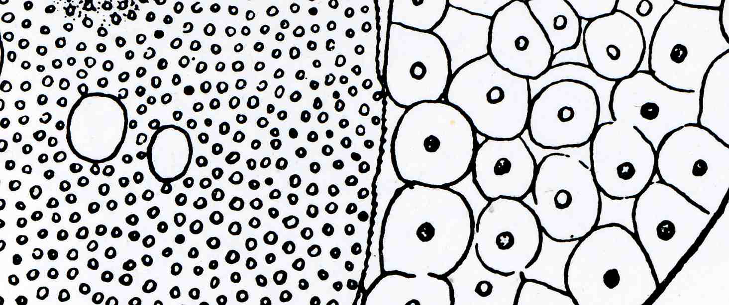
    6.  Drawing of aboriginal village or human blood cells?
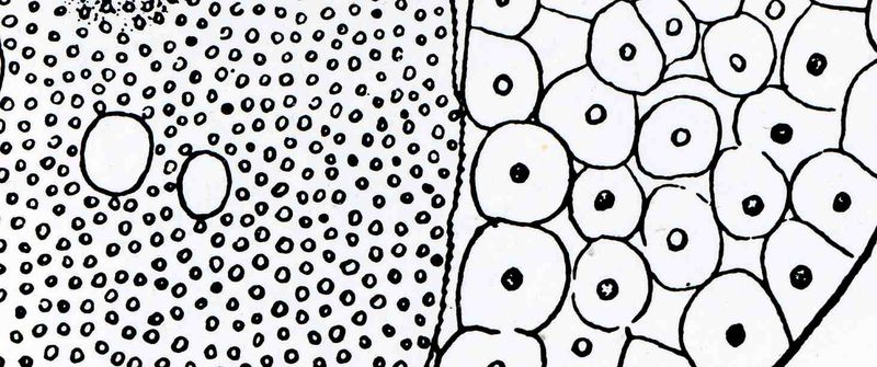
    0 blog feb 3 dots518

    7.  Integrated chip or city plan?

    City plan--roca632

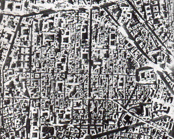
    8. Integrated chip or city plan?

    City plan--naples633

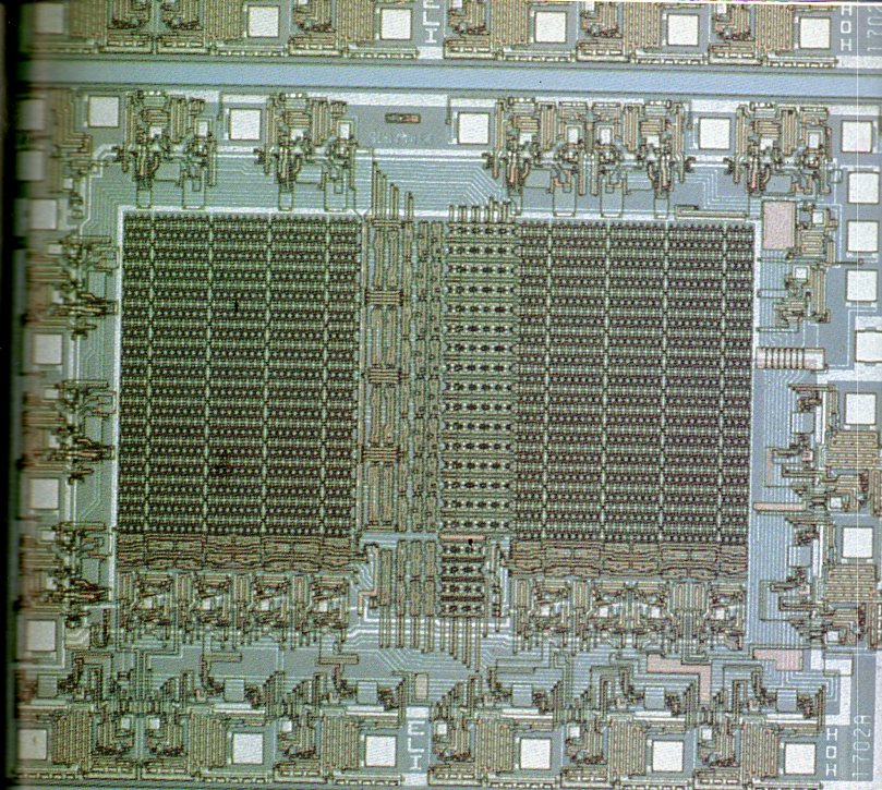
    9. Integrated chip or satellite parking plan for football stadium?
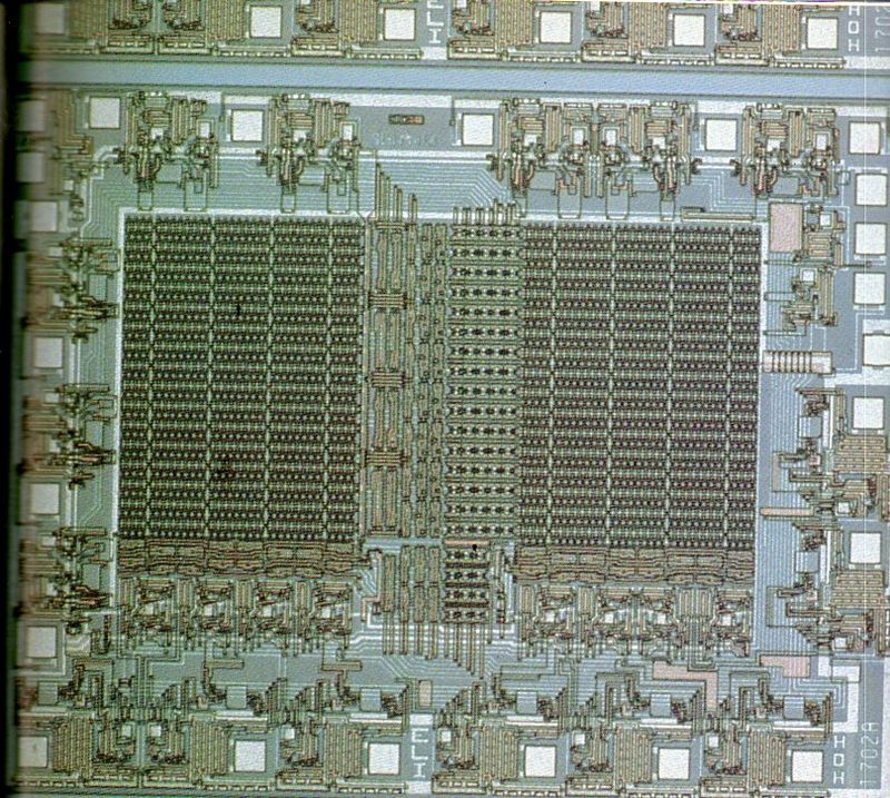
    City plan--IC 1701634

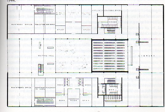
    10. Early integrated chip or floor plan?
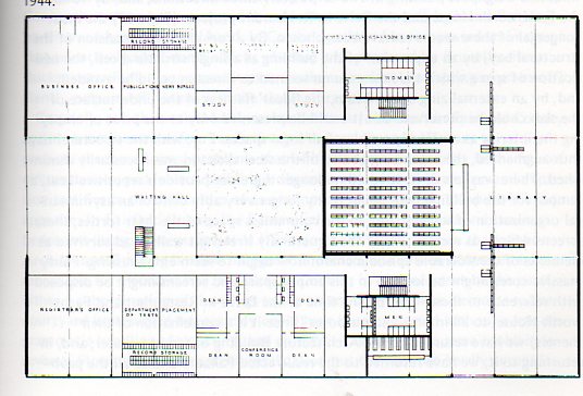
    City plan--library plan630

    11. Integrated chip or sci fi space colony bubble?
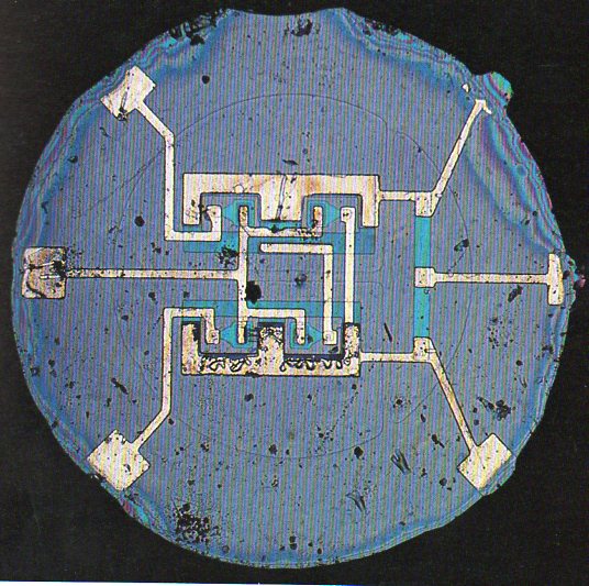
    City plan-planar IC636

    12.  Microphotograph of 1959 integrated chip or village plan?
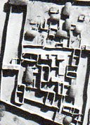
    City plan--arch wo architects631

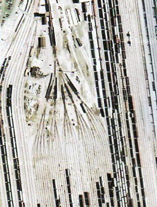
    13.  Railway switching yard or cross section of human skin showing hair roots?
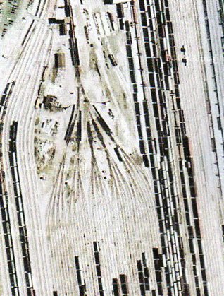
    City plan-rr yard637

    14.  Buckeyballs or skin?

    Buckyballs could keep water systems clear

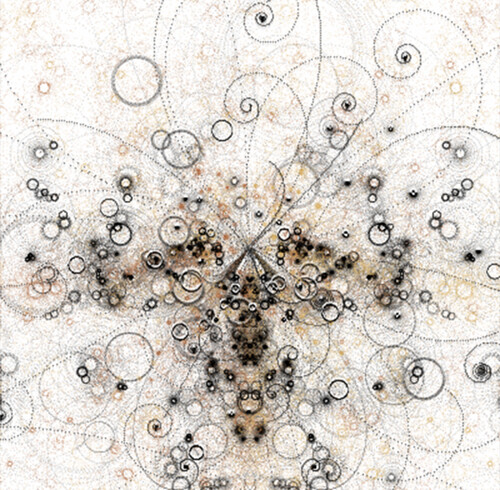
    15. Microphotograph of carbon or particle collisions?

    photo

    16. Farmlands or nanotubes?

     
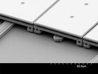
    17.  Model for Chicago bridgeworks or micro mirrors?

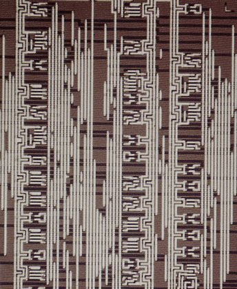
    18. Elevator plans for the Dubai Tower or integraetd chip?
    City plan-rr yard IC638


    Answers: 

    1.  Le Corbusier’s plan for his “Ville Contemporaine”, 1922.

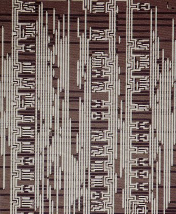
    2. Photograph of the 1971 16k bit random access memory chip (via Mostek Corporation).  On the other hand  I can see a vast palace at the top of the picture, with a long, columned entrance with manicured gardens on either side.  The image offers an elevation and a plan–that is, the top and bottom images of the buildings are seen in a deeply oblique view, while the central part of the image is a straight-out plan.  At least that’s what I see, its imaginative possibilities more appealing than the physical realities (though that’s where the extraordinary value is/was).

    3.  The engraving appearedinDomenico Fontana’s  masterpiece Della trasporatione dell’obelisco Vaticano…(published in Rome by Bassa in 1590) and illustrated  one of the greatest engineering feats of the Renaissance. The full image:

    Blogfontana_moving


    4.   Springs for a mechanical electrical machine positionable mirror, a few microns across.

     6. Human blood cells, described by me in an earlier post in this blog: “In 1837 the hemispheric frontal lens for the compound achromatic microscope developed by Giovan Battista Amici (1786-1863) vastly improved magnifying power to open an entirely new submicrospic world–this somewhat on the order of the introduction of Robert Hooke’s (1635–1703), investigation in Micrographia (1655).  G.C. Ehrenberg (Die Infusiontheirschen als volkommene Organismen, Leipzig 1838) was among the first to use this new development, showing almost immediately that infusoria was not what was seen to be as Buffon’s “organic molecules” (or unified wholes) but something far more complex…”

    7  Architect Migeuel Angel Roca, San Pedro Housing Project, January, 1974.  Source: Miguel Angel Roca, Academy Editions, London, 1981.

    8.  Perpendicular view of Naples, ca. 1938.

    9. Intel 1702 integrated circuit, the first erasable, programmable, read-on memory (EPROM), 1971.   Actrual size:  0.147x 0.161 inches.

    10. Plan for a library and office space at the Illinois Institute of Technology, Chicago, by Mies van der Rohe, 1944. (Source:  Colin Rowe, The Mathematics of the Ideal Villa and other Essays, MIT, 1985.

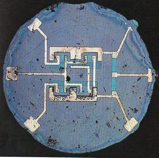
    11. As much as I like the idea of an energy ball existing in negative space (or some such thing), this image shows the Fairchild (first time ever) planar integrated circuit, from the ripe year of 1961.

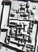
    12.  Village of Logone-Birni, Cameroon.  Source: Bernard Rudolfsky, Architecture without Architects, Doubleday, 1964.

    13.  Railway switching yard, Chicago area, 1940.

    14. Buckyball-treated membrane.

    15.  Simulation of particle collisions. “A single super-massive collision produces a discrete universe of four particle types. Particles draw their positions over time resulting in the construction of oddly familiar patterns.”

    16. Microtubes. “Microtubules can be seen in a bundle in this negatively stained preparation.  Recall that negative staining starts by immobilizing the preparation on plastic on an electron microscopic grid. Then heavy metal stain is deposited around the structures, delineating their structure. This preparation may allow you to see the tubulin molecules in the protofilaments.” (Taken from Bloom and Fawcett; Textbook of Histology)

    17.  Scanning electron microscope photograph of a MEMS mirror array.  “The device has a closely packed, one dimensional array of mirrors. These are piston mirrors, capable of vertical displacement only. This piston motion can be used to adjust the phase of optical signals, allowing correction of chromatic dispersion. The mirrors are made of polycrystalline silicon, and are coated with a thin layer of gold to improve reflectivity…”

    18. Fairchild’s first IC made with computer aided design, 1967, which was about .15 inches square.

    IC image sources are all from Stu Augarten’s  State of the Art, a Photographic History of the Integrated Circuit, Ticknor & Fields, 1983.


  • Mr. Mole, the Stationary Busby Berkeley of Mass Crowd Installation Photographs, 1918
    JF Ptak Science Books Post 1185

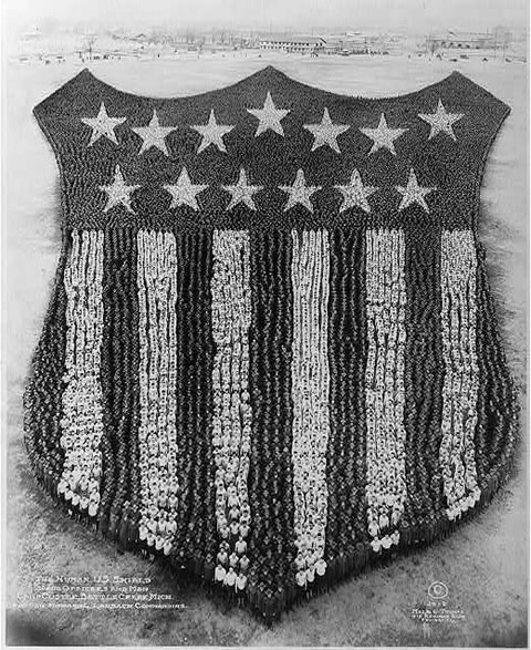
    I’ve long enjoyed these massively organized, captured moments of time and effort–large caliber photos of concentrated efforts of tens of thousands of people, all of their motion and utility directed to produce this one moment in time.  Perhaps the greatest practioner of this artform was Arthur S. Mole (1889-1983), the stationary Busby Berkeley of Big Organized Crowd Efforts (BOCE).  (He led an interesting life, coming from Scotland with his family to be part of a Utopian community led by John Alexander Dowie–a faith healing visionary, self-reported precursor to the second coming of Christ, and leader of the Christian Catholic Apostolic Church–at City Zion, Illinois. Dowie was a problematic man not without good and interesting qualities, though his to-the-death prayer duel with a rival visionary is an interesting story to be left for another time.)

    I’ve always enjoyed this photograph  in particular–it was made from a 70′-tall platform with a 11×14″ view camera using a wide angle and a deep oblique angle, along with 30,000 soldiers from Camp Custer, Michigan.   It was made in 1918 by Mole, along with the evident and very capable choreography of John D. Thomas, who was the Doctor of Persepctive and Motion for the pictures.

    [Note: most of the images below are extremely clickable/zoomable.]

    Arthur-mole-human-us-shield

    Most of the soldiers are used to make the field at the top of the stripes–so near as I can tell (from the resolution image that I had to work with), there are about 300 men in each stripe (except for the outer two), meaning that there between 3,000 to 5,000 in the collected stripes, which puts something like 25,000 troops in the stars and their field. The middle stripe I reckon to be 150′ long; my guesstimate for the star field is 600′ deep and 1250′ wide, making a triangular collection of men 750’x1250′. That takes a little bit of planning to accomplish to ensure that everything is kept in perspective, and which also means that a lot more folks are needed at the top of the constructed image than at the bottom.

    Another excellent example is this photo made of the U.S. Marine Corps emblem using 6,000 marines at Paris Island in 1920.

    http://redtreetimes.files.wordpress.com/2010/05/arthur-mole.jpg


  • A Domesday Book for Missing and Blank People

    JF Ptak Science Books   Post 1122

    I’ve long been interested in the added, extra stuff found in the foregrounds and empty places of artwork, the eclectic extraiana, the not-necessary pieces, the microworlds of antiquarian visual anthropology. (See here for example, an earlier post in this blog, “Hidden Children, Found Art and Social Vignettes Inside Art”.)  In towns views and architectural studies, where the primary interest is geography and, well, architecture, people are sometimes added to literally flesh out the bank spots, and to add a point of reference and perspective for the viewer.   In many circumstances these added bits turn out to be extremely interesting insights into everyday street life for the period of the artwork, also including societal exuda and discarded people, the social “rejects”, the underclass, the classless, the workers, the laborers, people.  That would be most fo the population of a place. 

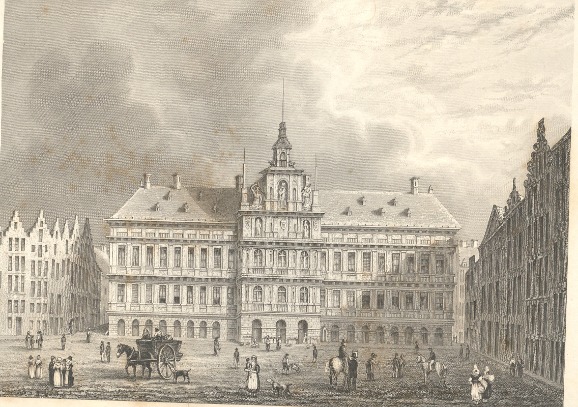
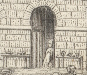
    For example in this application of the imaginary forensic arts microscope, we see this series of pictures of a standard view of the town hall of Antwerp; but what we see advancing under magnification is a very interesting set of occupations displayed in absolutely minute detail (seen in more detail in this earlier post, from which I quote below).

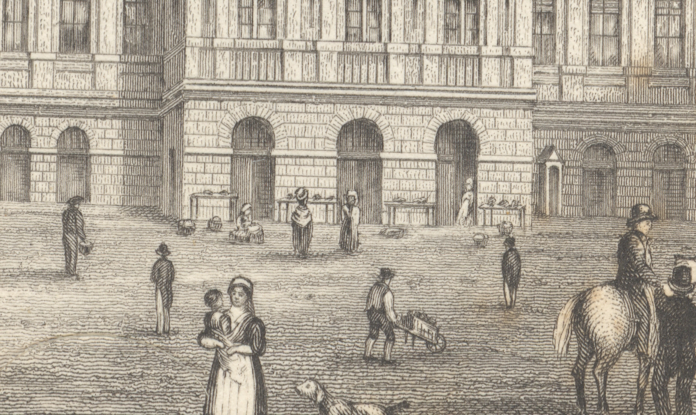
    First, the majority of the engraved image, followed by a close-up of the center of the building (the three doorways), and then by a closer view still of doorway three:

    +++looking closely

    +++looking closely detail

    The
    truly interesting bit here is barely observable in the original; but,
    under magnification, we see a very rich and minuscule “engraved
    photograph” of a slice of daily commerce and street life in Antwerp.  If
    you look at the central entrance to the town hall you can see three
    main (and large) doorways, and if you look clos+++looking closely detail2er still, you’ll see something leaning against the portal at right.

    Extraordinarily, what the artist snuck into the original is a tiny
    (2mm) figure watching over several tables of her (fruits?/vegetables?)
    ware, waiting for a customer. There doesn’t seem to be much interest in
    her stuff, currently, and she has allowed herself a little relaxation,
    leaning against the doorway.  I’ve found this sort of extremely minor
    subject matter and its ephemeral connection to the larger work at hand
    to be just fascinating.  I wonder why such detail would be added–why
    would the artist, or engraver, take such care and interest in such minor
    visions.  Perhaps this is just what was at hand on the days the artist
    fleshed out his work; perhaps it was the work of the engraver, alone,
    incising yet another semi-boring architectural image; desperate for a
    little artistic activity, adding some interesting, almost-invisible
    touches, here and there.  Perhaps no one would ever really notice them,
    but whoever was responsible for adding such incredible,
    extra-dimensional details would certainly enjoy knowing they were there,
    recognized or not.

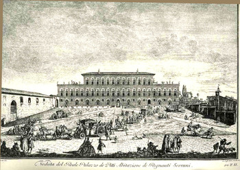
    Here’s another example (seen in an earlier post here) from Giuseppe Zocchi (1711-1767) who was commissioned by he Marchise
    Andre Gerini at mid century to record the greatest of Florentine
    landmarks.  The plaza scene offers a great view for all sorts of people, and the artist/engraver take great advantage of the possibilities:

    Bloglooking_closely_b124

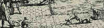
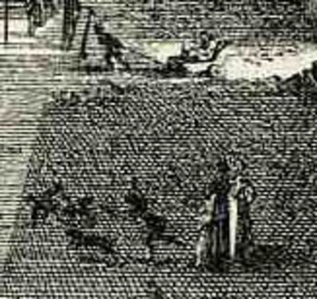
    Among the many people populating the image we find folks interested in a dogfight:

    Bloglooking_closely_b_dog_fight


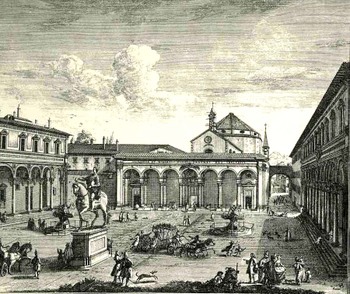
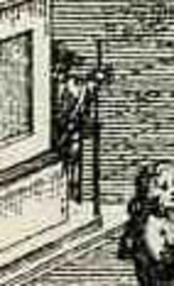
    Another image by Zocchi, Veduta della Piazza della SS Nunziata Statua Equeftre di Ferdinando Primo, Fonti, e Loggie Lateral, shows more good work with the possibilities of ephemeral populations, where among the many details we see an invalid being pulled in a small cart, and a half-obscured  man with a staff leaning against the back of the monument.  And of course there’s much more–you just need a little magnification to see the human element of the artwork. 
    Bloglooking_closely_1_96123

    Bloglooking_closely_1__carriage_2


    Bloglooking_closely_1__man_cane

    There was a class of illustrator that drew on their surroundings, or
    what they saw on their walks, or from their window–the incidental
    people in their artwork were people that they saw, who meant something
    or other to them, who formed an impression in their brains.  There were
    other artists who were perhaps not quite so fortunate in their daily
    lives to come into contact with a variety of people like this–perhaps
    they were sheltered, perhaps they were privileged and of a class that
    would not put them into contact with ordinary people. 

    Perhaps it was this class of artist who need William Pyne’s great-ish
    1845 work, Picturesque groups for the
    embellishment of landscape…1
      It was a work of clip art for its day, really, showing,
    detailing, the attitudes and occupations of working people.  It was a
    book filled with the people who might ordinarily have gone missing from
    the work of the artists needing their images displayed in their brains
    by someone else’s labor; a book filled with figures to plug-up the blank
    spaces, round out that unkind bits that called out for a human touch.

    Interestingly, it shows people at their professions but more often than
    not , it doesn’t actually show people working–its more like people
    readying themselves for work, getting materials ready, sharpening
    things, ordering.   It is impressive nonetheless for its found,
    pre-photography snapshots of working life in England in the 1830’s.  It
    shows potters, leather dressers, gravel diggers, itinerant mowers,
    hay-makers, gleaners, paviers, shepherds, fishermen, knife grinders,
    quarrymen, foresters, woodmen,  basket-makers, coopers, horse rollers,
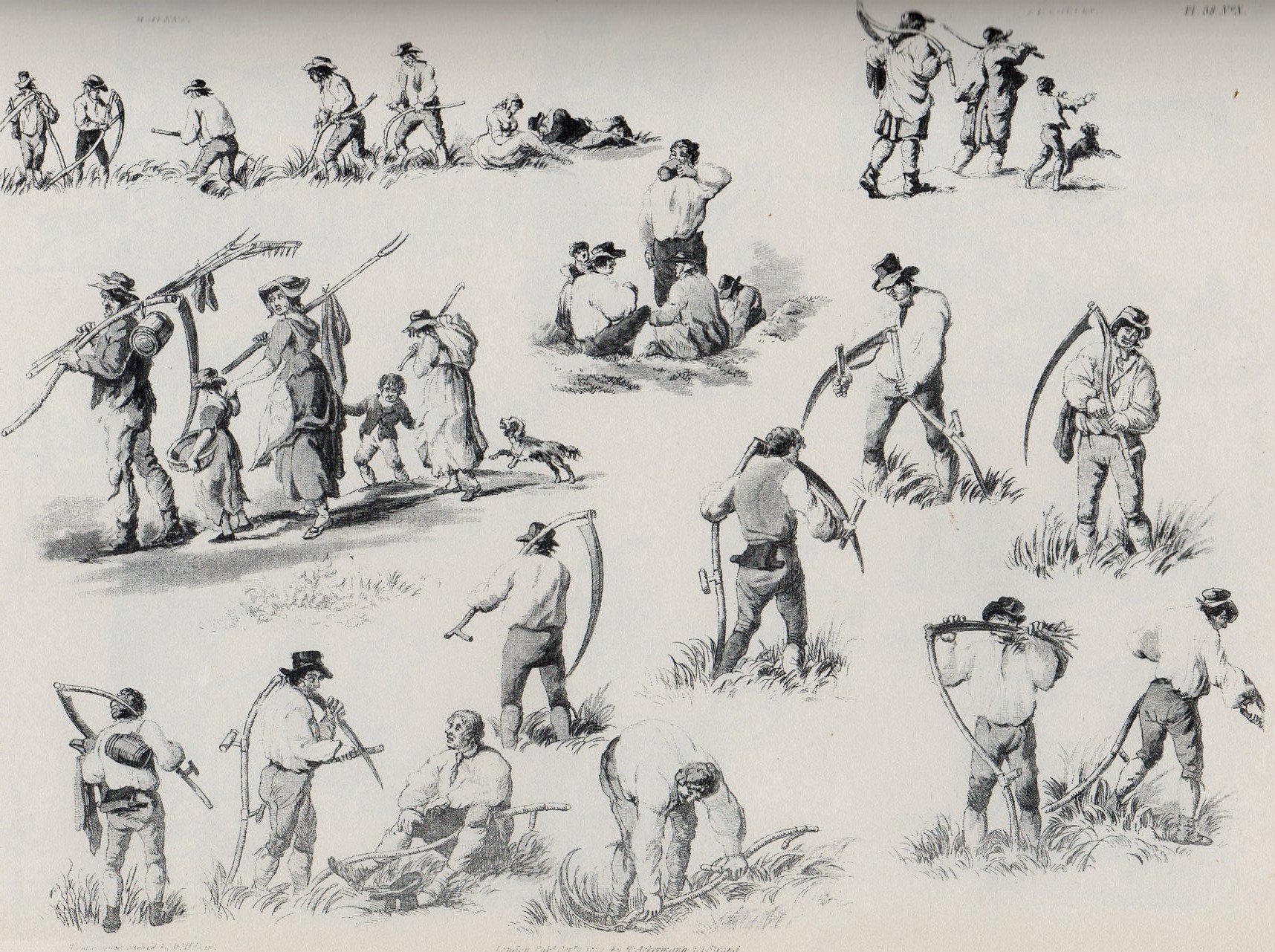
    cider-makers;  and images of boats, barrels, gypsies, games, county fairs, and on and on. For example, here’s the multi-image engraving for “itinerant mowers”:

    Mowers340
    Perhaps it was only a practice-book of images for people who wanted to
    practice–if so, it wasn’t a book for just anyone, as (so far as I can
    determine) it would’ve cost a working person week’s worth of labor to
    purchase it.    And there are certainly pictures of people doing unusual
    and rare things even for 1843–like sailors washing sails,
    maybe–actions that were not commonly seen.  And it also placed people
    in attitudes of unusual poses, so some people may have looked at the
    book with an eye for artistic anatomy.  But by and large, to me, it
    looks like a missing persons book.  

    Notes:

    1. William Henry Pane (1769-1843), Picturesque groups for the
    embellishment of landscape : in a series of above one thousand subjects :
    comprising the most interesting accessories to rural and domestic
    scenery, shipping and craft, rural sports, pastimes and occupations,
    naval, military and civil employments, implements of trade, commerce and
    agriculture, etc. , the whole forming an encyclopaedia of illustration
    of the arts, agriculture, manufactures, &c. of Great Britain 
    Publisher: London (Bedford Street, Covent Garden) : M.A. Nattali, 1845.


  • The Message is the Medium–Children and Bombs, London, 1943

    JF Ptak Science Books  Post 1035

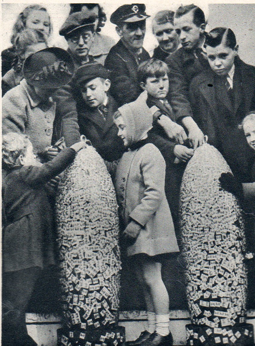
    I have no doubt that the history of decorating “bombs” reaches far back into dim history–decorating launched explosives I guess must be as old as the medium itself, though I’ve gotta say that the earliest photographs of decorated bombs goes back only to WWI.  In “reading” the Illustrated London News for the WWII years I found this image of children in Trafalgar Square fixing savings stamps to 500-pound bomb shells, part of a significant mile-long parade and will-to-win display–the “Wings for Victory” campaign– illustrating the Empire’s aeronautical might hat took place in London on 8 March 1943 and published a week later in the ILN.

    Children bomb003
    The “Wings for Victory” campaign targeted raising 150 million pounds; by this point more than 50 millions had been raised via monies being placed in War Bonds, Savings Bonds, Saving Certificates and Defense Bonds. My guess is that you’d get a sticker saying that you had invested x-pounds–these were the stickers placed on the bombs by the kids, I think. 

    It was pointed out in the accompanying text that the bombs would “at the end of the week…be dropped on Germany”.


  • Seeing Vision: Examples of Light and Sight, Personified

    JF Ptak Science Books LLC  Post 976


    (On seeing the morning’s rising sun): “Looks like light to
    me.” SpongeBob SquarePants


    “All the fifty years of conscious brooding have brought me
    no closer to answer the question, ‘What are light quanta?’ Of course today
    every rascal thinks he knows the answer, but he is deluding himself.”  A. Einstein

    “Are not gross bodies and light convertible into one
    another, and may not bodies receive much of their activity from the particles
    of light which enter into their composition?” I. Newton, Opticks,
    1704, Query 30.

    Mar 12 #51

    Depicting the capacity of sight and nature of light has been
    both an easy and a knotty problem in the history of science. Over the
    successive theories on the basis of light the artistic presentation of the
    phenomenon has been generalized (generally) in a very simple way:  by straight lines.  There’s certainly nothing wrong with that,
    the lines are just parenthetic place-holders suggesting direction, not actual
    descriptors of what light “looks” like.

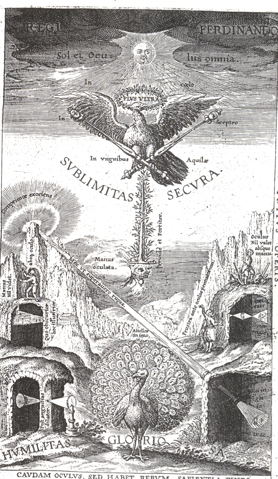
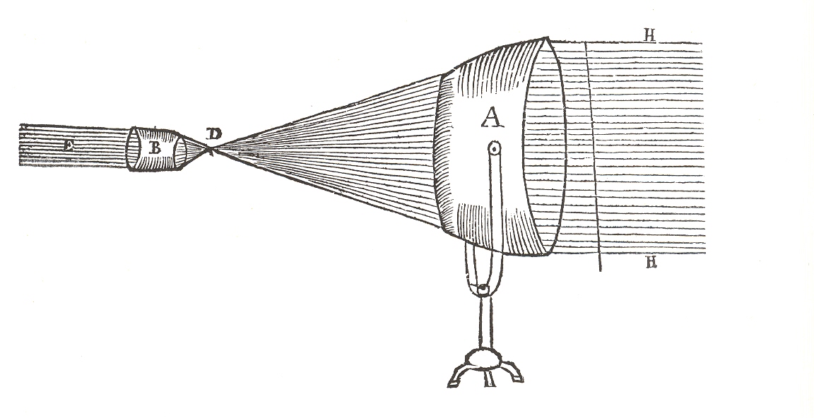
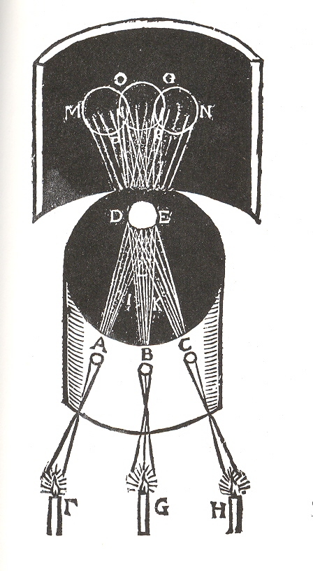
    There are literally hundreds if not thousands of images printed 1550-1850 to call upon to make this point, and I’ve selected but a few.  The first belongs to Jesuit astronomer Christoph Scheiner and which appeared in his  Oculusm hoc est: fundamentum opticum...,printed in Innsbruck in 1619. His work is an out-and-out landmark in the history of optics,  physiological optics and ophthahlmometry, and provided a springboard for two generations following him, not the least of whom was Rene Descartes. The illustration above is the book’s frontispiece, and features four camera obscuras demonstrating four principles of the eye, the middle ground of which is a beam of light 

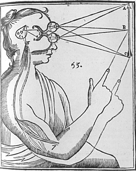
    Rene Descartes depicted the interpretation (in his  Principles of Philosophy of 1644) of light and its physiological reaction in the brain as follows:

    Cartesian_Vision

    the lines of sight depicting binocular vision, observed (and compressed) by the eye’s “particles” and processed by the pineal gland which in turn manipulate the “fluids” in the control of nerves and muscles. 

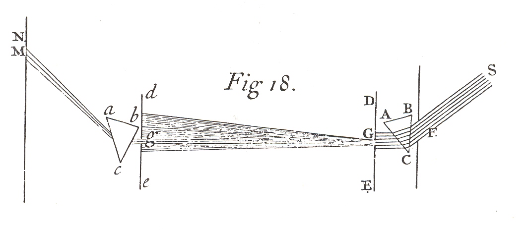
    Another example of even greater fame than the iconic image by Descartes is that of the diagram showing the connection between color and its reflective index by Isaac Newton, appearing in his Opticae of 1706.

    Mar 12 newton 

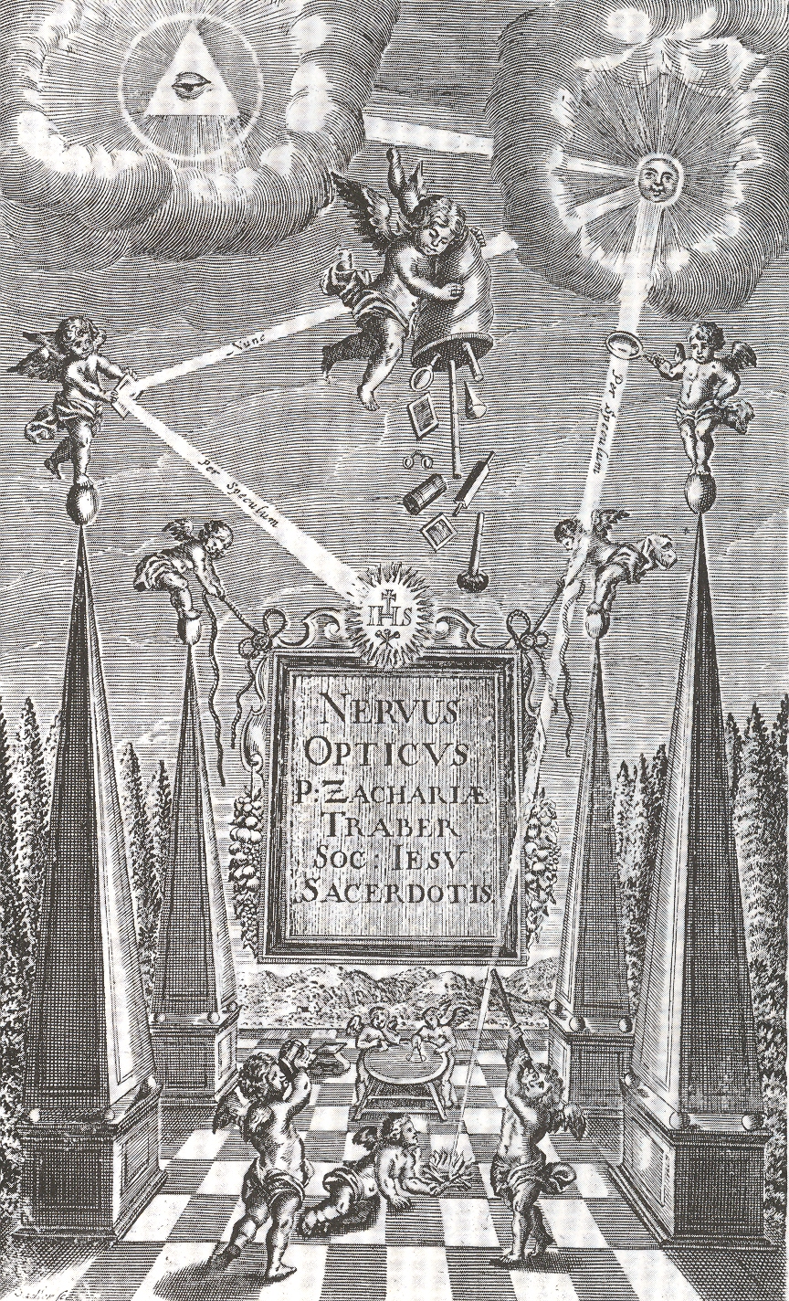
    Another fine example comes from Zacharias Traber’s (1611-1679) beautifully illustrated classic of optics (and physiological optics) , Nervus Opticus sive Tractatus Theoricus..., published in Vienna in 1690.  Traber is a great collector and synthesizer of the work done during and before his time, using the work of Descartes, Kepler, Schott, Kircher, Scheiner and Aguilon (for example), and then further implementing their ideas especially in the areas of color theory  and light refraction.  The image certainly reflects Jesuit Traber’s religious training, depicting the holy source of light (originating with the almighty force) which directs it to the sun; the light then is left to the inquisitive and playful hands of cherubs who reflect and magnify it, as well as use it to start a fire (from the condensing lens) and observe it through a telescope. The main cherub empties a sack containing a number of different optical tools, no doubt for the playful brethern beneath. 

    Mar 12 trauber 

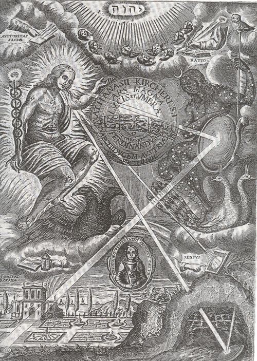
    And then of course there is the great, unstoppable, polymathic and sometimes incorrect Jesuit Athanasius Kircher.  This image appears in his masterwork Ars Magna lucis et umbrae, printed in Amsterdam in 1671, which deals with light and shadow, optical illusions, color, refraction, projection and distortion, sundials, mirrors, as well as astronomical subjects. Most of these subjects are clearly seen in the engraved frontispiece to the work (below), the source of all of the “rays” of light coming from the godhead, relayed through a telescope, reflected from a mirror, and gathered in a camera obscura. 

    Mar 12 kirch 

    Other interesting images from the Kircher include this spotlight.

    Mar 12 krirch detail long

    Mar 12 krirch black detail


  • States of Perfection: Refrigerated Food & the Archaeology of Meat, 1954

    JF Ptak Science Books LLC  Post 965Icebox250–extended

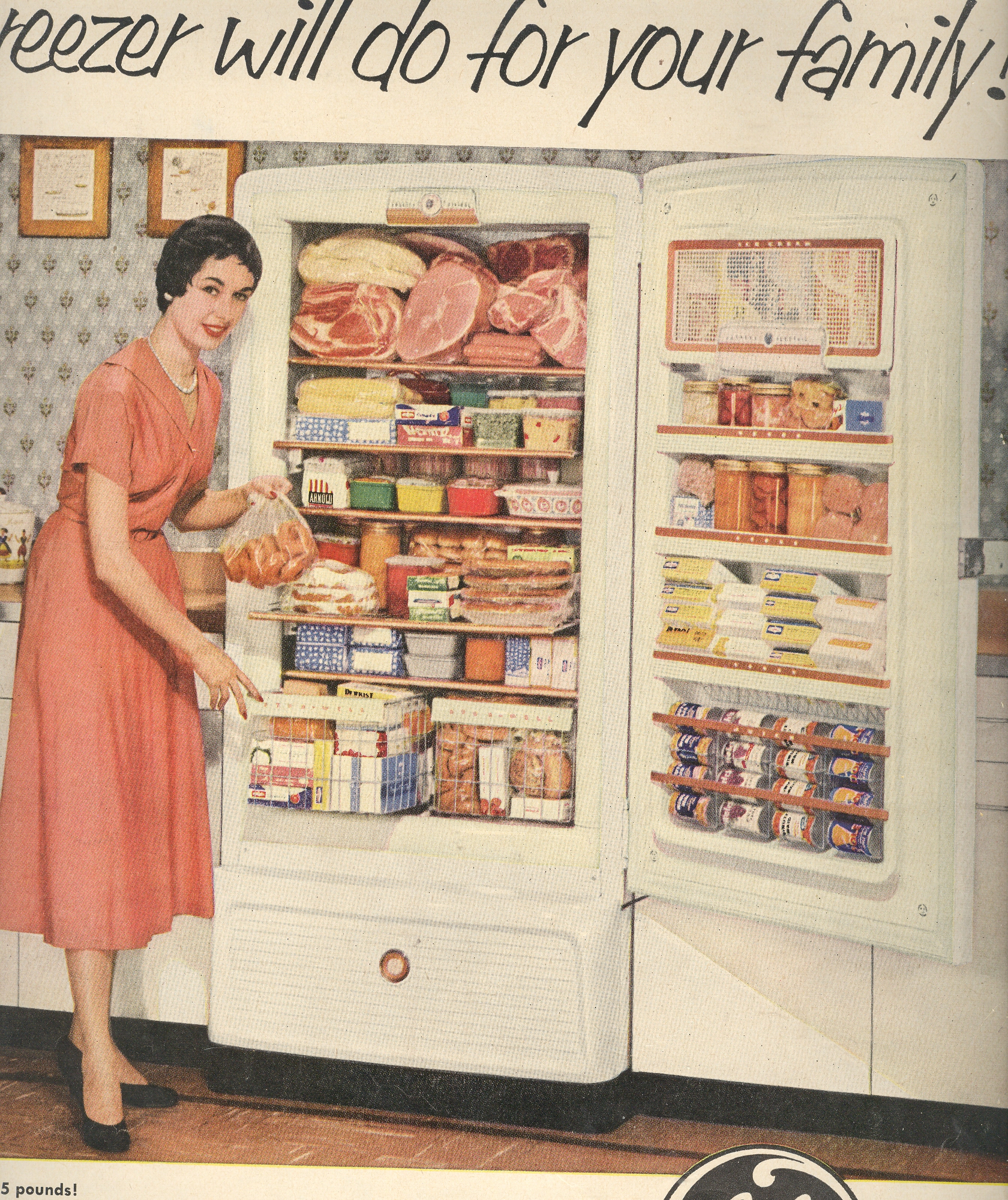
    Like Greek statues, orders of architecture, the golden ratio and Vitruvian man, these ads from LIFE Magazine in 1954 measure a sort of highest-attainable-state, though directed at middle class America.  The ads are for refrigerators, but the interest really is in what is displayed inside of them: they offer an insight into what was seen to be the greatest level of sophistication, the highest stage of want for the most important/essential daily need, and then turned into luxurious accommodation.  Far beyond rice and beans and eggs and ham, far beyond the tiny, perpetually empty icebox of the Kramdens (“The Honeymooners”, ca. 1952).

    [This continues another post, States of Perfection:Images of TV within TV Ads, 1950.]

    You will come to notice (if you look closely enough) that there are a lot of gelatin-thing plates, often located next to a meat plate, or plates.  Funny thing, that.  

    March 6 refer meat

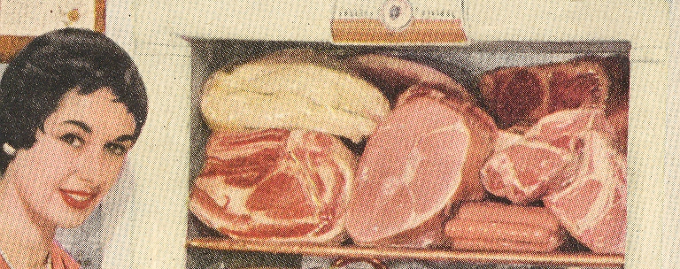
    The top shelf is of great interest, a virtual archaeology of meat:

    March 6 refer meat det