A Daily History of Holes, Dots, Lines, Science, History, Math, Physics, Art, the Unintentional Absurd, Architecture, Maps, Data Visualization, Blank and Missing Things, and so on. |1.6 million words, 7500 images, 4.9 million hits| Press & appearances in The Times, Le Figaro, Mensa, The Economist, The Guardian, Discovery News, Slate, Le Monde, Sci American Blogs, Le Pont, and many other places… 5000+ total posts since 2008.

Category: Prints–looking HARD/deeply at

  • History of Dots in the First Pictorial Image Printed in America, 1670

    JF Ptak Science Books     Post 1463

    Ots mather414
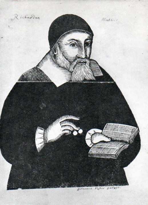
    This installment to the thread on the History of Dots takes us to the very first print made in America–John Foster’s portrait of Richard Mather. Mather was ordained in England in 1620 but his Puritanism came to be a point of departure for him, and he sailed to America for his taste of religious freedom, arriving in 1635.  He was a pastor in Dorchester, Massachusetts, for the next 34 years until his death in 1669 at the age of 73. 

    As it turns out this portrait was made of him by John Foster just prior to his death and was not published until 1670, when Mather–who as it turns out who be the founding member of what would become a long-established and important family of clerics, including Cotton Mather–was already dead for a year. 

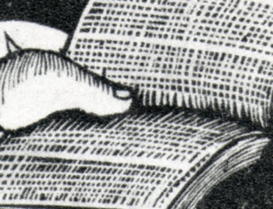
    He is shown holding a book, which—since this is the first print made in America–is also the first image of a book.  The book is held open by Mather’s enormous thumb–and what do we see in this book for words but dots.  Perhaps there are some dots, and perhaps there are some dashes, but its close enough for me.

    Ots mather414

    I do wonder about that horizontal line running across the image, appearing just under Mather’s whiskers. It seems like the woodblock was broken and pieced back together.  Perhaps it was just an accident.  Perhaps it was broken on purpose so that Foster could use an interchangeable body and replace the head, so that the next series of portraits would be easier for the artist, which he may not have been. He did take the care to render Mather’s spectacles, even if they are but little mites of specs. 

    In any event, Foster did a great job with very limited ability, and I think that the great blackness of Mather’s  body, which formulates the print’s large power, may have been done by mistake.  It really doesn’t matter, as the overall effect works beautifully well.

    Ots mather413


  • Microworlds in Prints: sub-millimeter Action Figures, ca. 1660

    JF Ptak Science Books   Post 1435

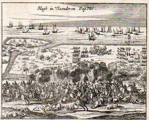
    This small engraving, Slagh in Vlaenderen (Battle in Flanders or thereabouts), is about 3×4 inches, a tiny engraving (on copper, I believe) depicting a large action between what I would guess to be the Dutch, or the army at Flanders, and the Spanish, sometime in the late 15th century to the early/mid 17th century.  There were a number of different years in which this action could have taken place, so I’m not sure what this image actually depicts.  The print was made sometime in the mid 17th century, possibly earlier.  (The original is available for purchase at our blog bookstore.) 

    What attracted me to this print was the minuteness of the figures in the background–the horse depicted here is not a millimeter long in the original, but we can see that the artist took enough care and had the imagination to make the horse run. (There is a long thread on this blog, “Prints–Looking Hard/Deeeply at” that takes a micro cruise along teh surface of large and complex prints into their perhaps seldom-scene embedded small worlds.)

    Flanders battle373
    Ditto for the soldier just to the left of the horse and out of formation–even when you hold the print close, you really can’t see that there’s a figure there unless you use a magnifying glass.  This sample was scanned at 1000 dpi and represents a section of the print that is maybe 8 mm across. 

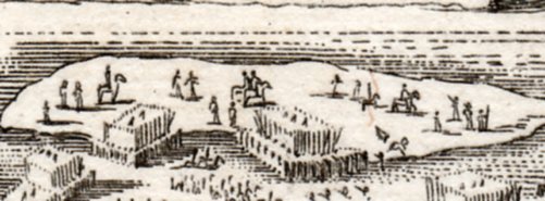
    The next sample shows an island that in the original is about an inch across, and as you can well see the sub-detail from the image above is just a fragment of this detail.

    Flanders battle372

    And the print in all of its glory, appearing on your monitor at about full scale. 

    Flanders battle371

    I am constantly amazed at the precision and care and artistry of these early engravers, and how much they cared to include interesting details that were all but invisible to the majority of its viewers.  But that’s not the point. 


  • Maps of Things Not There: Eden.

    JF Ptak Science Books  Post 1431

    The tale of the Garden of Eden is told in the Old Testament, and although it described, its location is left to mystery1, even though its legend is ground zero for the Fall of Man, the eternal disgrace for which humanity still pays. I suppose it would be nice to have a tombstone for the grave. Over time—and particularly in the Middle Ages and then in the Renaissance—the location was fixed in the eastern reaches of the known Euro-world, and then in and about Mesopotamia.

    Eden 2359

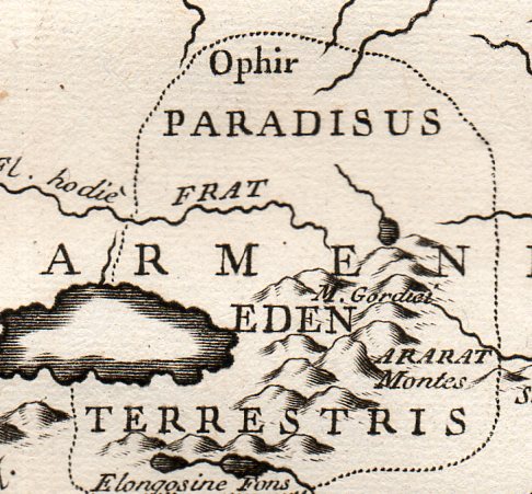
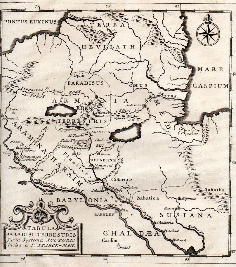
     The map Tabula Paradisi Terrestris justa Systema Auctoris incisa a P. Stark-Man was printed late in the 18th century, probably around 1775, and locates the GOE far in the north country, near the Dead Sea, deep in old Armenia, near Mount Ararat (where Noe and his family were supposed to have landed after the creator flooded the world killing everything, where everything else, young and old, infant younger, men women children, beasts and ants, were killed by a wrathful OT maker.).  

    Eden 2358

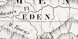
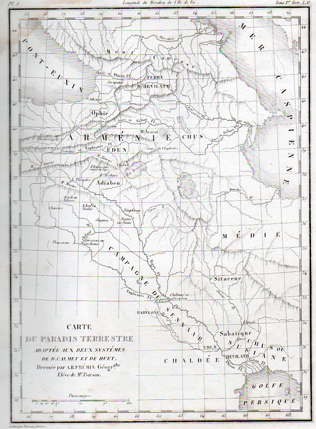
    The very finely engraved map by A.R. Fremin, Carte du Paradis Terrestre, printed 1839 (in Paris, by Félix Locquin et Cie, for  l’Atlas de la Sainte Bible)., again locates the Garden much further north than the great majority of other maps that I have seen, coming  (as with the map above) nearly to the Dead Sea.

    Linoleum italian274

    This image is a detail from:

    Linoleum italian273


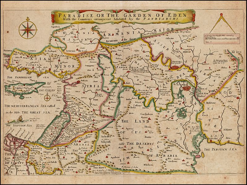
    Joseph Moxon’s Paradise of the Garden of Eden with the Countries circumjacent inhabited by the Patriarchs, printed in 1690,  shows the GOE as just to the east of Babel and not far due north from the Persian Gulf, just on the Euphrates in the Land of Nod, which is quite different from our two samples above. 

    Garden of eden Moxon

    [Source–https://commons.wikimedia.org/wiki/File:Paradise_or_the_Garden_of_Eden_With_the_Countries_circumjacent_Inhabited_by_the_Patriarchs,_Joseph_Moxon_1660.jpg]
     
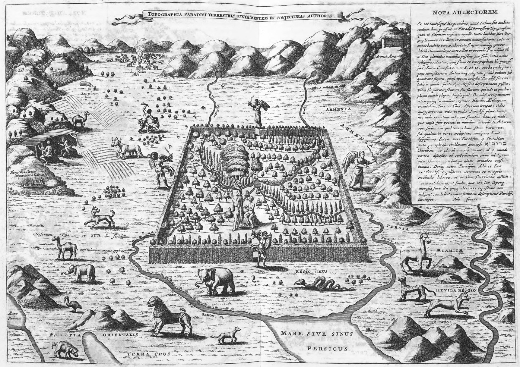
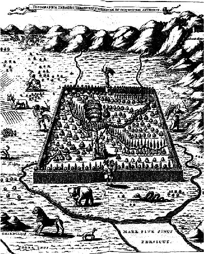
    The polymathic and semi-problematical Jesuit genius Athanasius Kircher suspected the location of Eden to be along the Tigris and Euphrates Rivers, in southern Iraq, and published his idea in this map Topographia Paradisi Terrestris in his book Arca Noe in 1665. It is of course a highly idealized map, Eden taking up a disproportionate amount of land, larger than life, bigger than legend almost, a monstrous overstatement of the lost land. Eden is shown here with four gates guarded by angels, but it does its occupants little good, as we can see that Adam and Eve are already stepping up to Satan in the tree of knowledge, and that outside Cain is killing Abel, all harm already being done.

    Garden of Eden Kircher

    [Source: the website The City as a Project, here: http://thecityasaproject.org/2011/07/paradise/]


    There continue to be differences of opinion on this matter of location, particularly in the modern age, when there are many laying claim to the position of Eden, including a number of half-hearted attempts to locate the place or its idea/ideal in the United States.  There are at least 14 Edens in the U.S.– Eden  City/Isle/Town/Valley/Prairie/Village/–in twelve different states (Idaho, Louisiana, Maryland, Minnesota, Mississippi, New York, North Carolina, South Dakota, Texas, Wisconsin, Wyoming and thankfully Hawaii),but for some reason they are fairly sparely populated, eight of them having populations of under 1000 people.  I don’t know what that means.

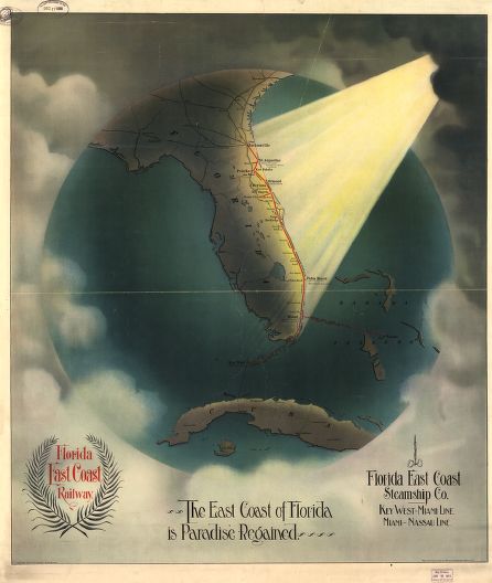
    Then there is this terrific example, coming from Florida (which does not seem to actually have anyplace in the state named Eden), in 1898, being a transorbital bird’s-eye view of the east coast of Florida receiving  pure holy light, announcing yet another newish Eden.

    Paradise florida

    [Image source: Library of Congress, Geography and Map Division.]

    Notes

    1. “And a river went out of Eden to water the garden; and from thence it was parted, and became into four heads. The name of the first is Pison: that is it which compasseth the whole land of Havilah, where there is gold; And the gold of that land is good: there is bdellium and the onyx stone. And the name of the second river is Gihon: the same is it that compasseth the whole land of Ethiopia. And the name of the third river is Hiddekel: that is it which goeth toward the east of Assyria. And the fourth river is Euphrates.” (Genesis 2:10-14 KJV)


  • Little Pieces and Superb Design: Rockets, Canons, and other Boom Boom

    JF Ptak Science Books  Post 1420

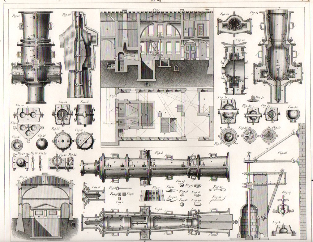
    Artillery285

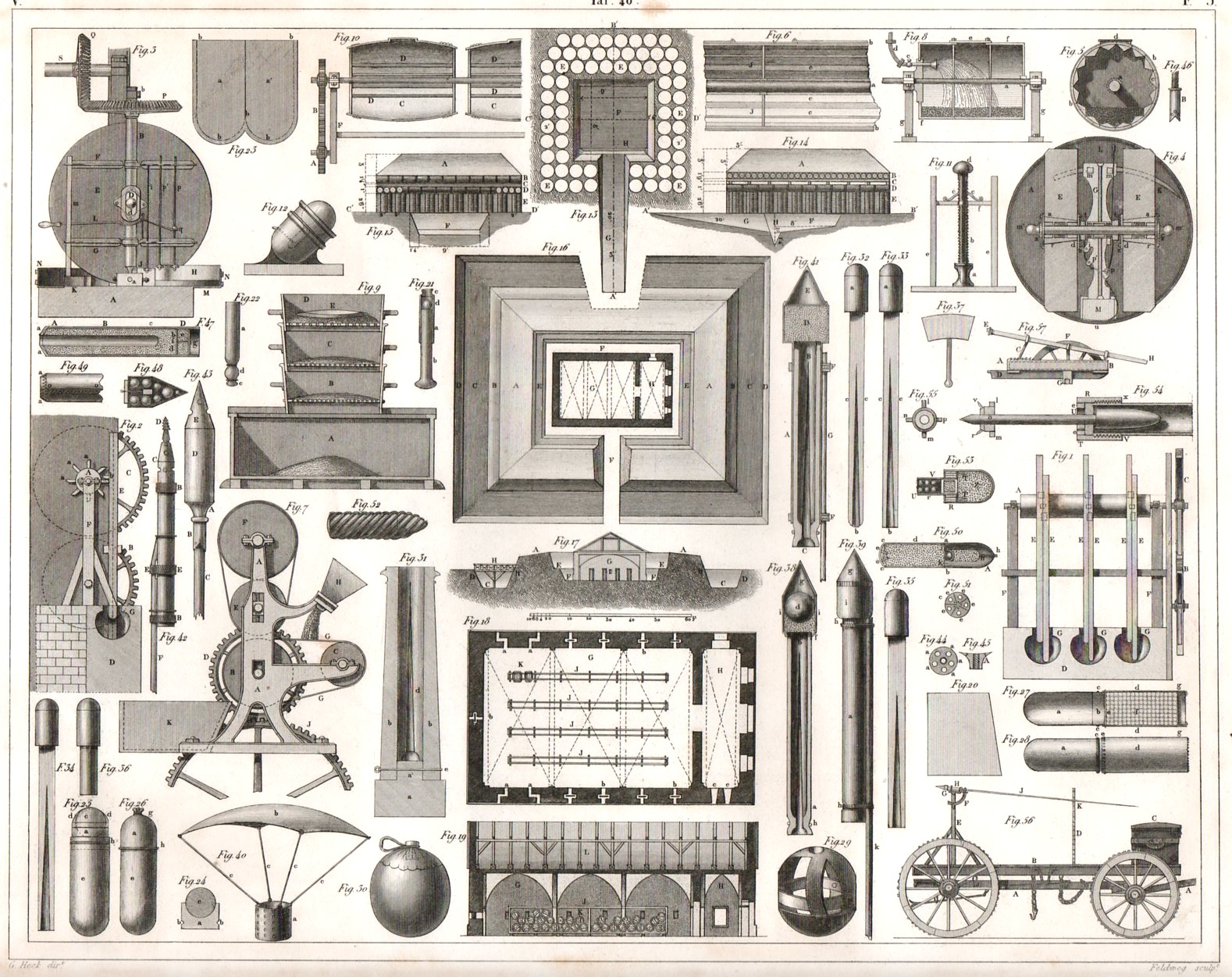
    The Iconographic Encyclopedia of Johan Georg Heck (printed 1851)  turns out to be perhaps one of the best designed books of its type in the nineteenth century.  Seemingly no  matter how much diverse information is hosted per page, whether the items number in the dozens or over a hundred,  the artist managed to distribute them with such grace and apparent ease that it is an absolute pleasure to see it all arranged before you. 

    Take for example the following two engravings of artillery fabrication of the early/mid 19th century.  There are 49 complex images on this first  piece of 11×8-inch paper (above), and yet there seems to be also a lot of white space.  It is a full but not crowded display of superb craftsmanship–it is also all very interesting. (Both are available for purchase from our blog bookstore.)

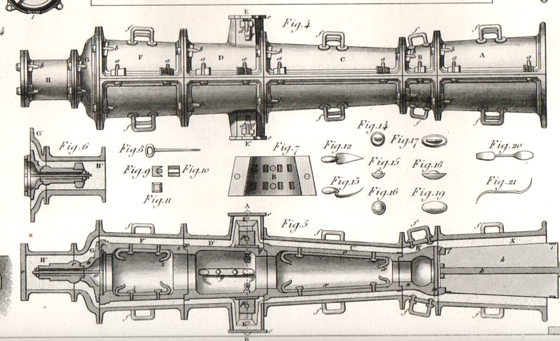
    To start, the main figures at top-center shop the plan and elevation of a workshop for casting canons, and we can clearly see the main furnace (“A”) for the big guns, surrounded by smaller auxiliary furnaces for smaller pieces.  Off to the side we see “K”, which is the drawing room and also the place where the director of the plant would live. Underneath it all in section we see various pipes and drains used to take away water and ash.  The structure on the lower right is for forming the business end and the purpose of the canon or mortar–namely, the ammo, and in particular, the pattern mold of a 50-lb mortar.  The long vertical pole at left used to place he liquid metal under pressure in the hearth, the ball being at the very bottom center.

    I’ve enlarged figures 4 and 5 to show the particulars of a canon (dry sand) mold, #4 being the exterior of the mold and #5 showing a cutaway so that one could see the six-ponder canon that was being formed inside.

    Artillery286

    There is just so much in this image that a more knowledgeable person could easily go on for pages describing each and every bit. 

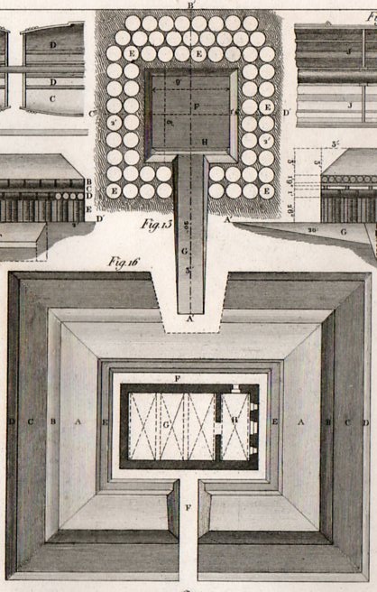
    The second image displays cartridges and (in general) fireworks–military pyrotechny.  What strikes me right away in this image are the five architecturals in the running vertically down the middle of the sheet.  They show what to do with gunpowder once it has been manufactured, which is an important consideration on handling and safety prior to it being used in battle–the first plan shows a field magazine, while the other four show the disposition of the construction of a permanent magazine, which show plenty of ventilation as well as massive walls which are in turn sunk into the earth and surrounded by ramparts.  It also seems that the roofing is huge, built no doubt to accommodate an earth filler.  Each of the barrels carried a hundred pounds of powder, so there was considerable interest not to allow the magazine to blow up, and if it did, to have the blast go mainly skyward. 

    Artillery287

    Some other items of interest in the second engraving include the incendiary devices (at bottom, #s 29+30),  signal rockets (#s 32,33,34,35), and the Congreve rocket, (#40 and #52,  which is much bigger and meant to be fired on the enemy, it being an incendiary); #53 is another Congreve, but this one scatters grenades as it is in flight. 

    Artillery288

    There’s a lot that can be described here but it goes a little beyond what I wanted to do with this post–it is also a lot beyond what I know about the subject.


  • Ephemeral Uniqueness in Large Crowds, 1917

    JF Ptak Science Books  Post 1390

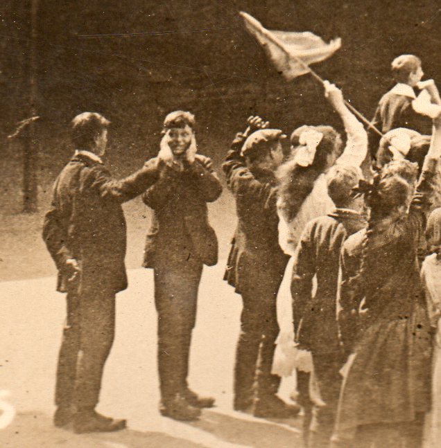
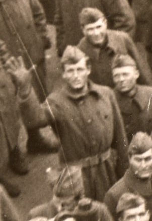
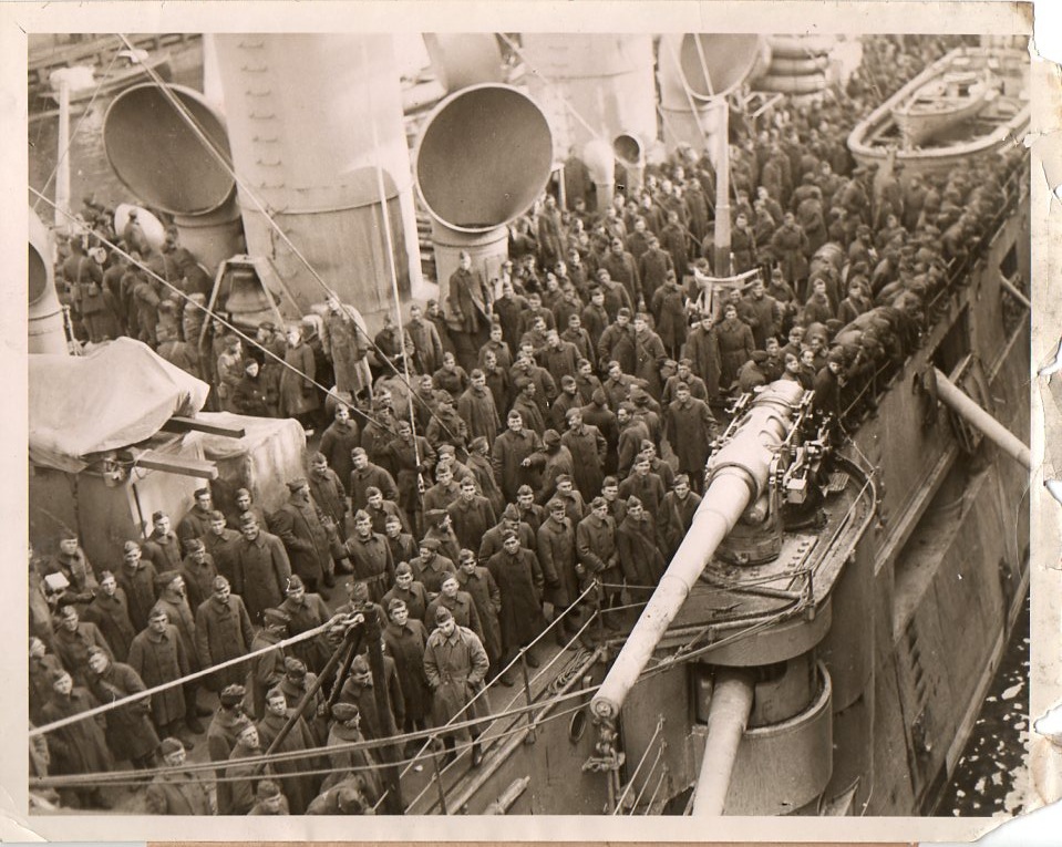
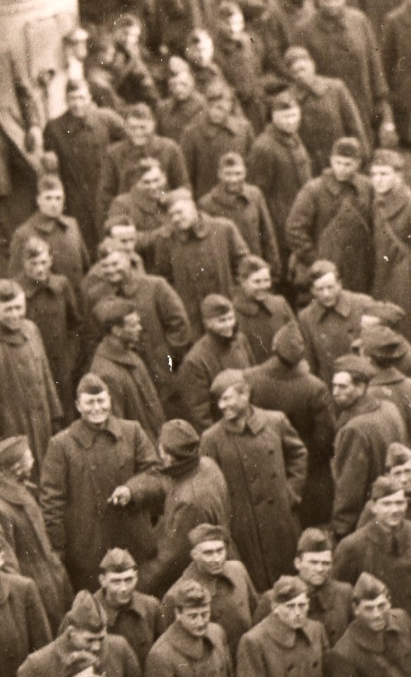
    There are 1500 or so of these news service war photographs here, and one of the remarkable things that I’ve discovered about them–trivial things to be sure compared with their overall message, ephemeral bits of semi-nothing–is that in many of the very-large-group images that there is sometimes just a single person who is doing something that no one else is doing, and it has been captured almost forever in the photo.  There are photos of thousands of troops, all facing east, with on solitary soldier facing west; there’s the solitary waver; there’s the one bare-headed man in  a sea of a thousand men with hats; there’s the one person raising his hat to the photographer in a sea of people looking at the camera but not raising their arms.  Then of course there’s the group photo of a mass of German WWI POWs, with only one soldier without a hat or helmet, and he looks just like me. 

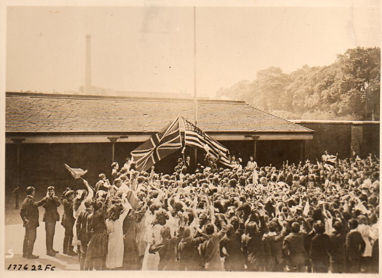
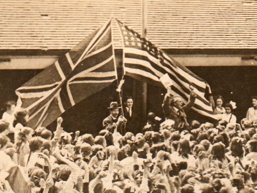
    Here are two other examples–the first is a detail from a photo showing British children cheering their American allies in 1917, showing one man clearly reacting to the hundreds of screams by covering his ears.  And is the only one doing so.  The second detail shows a large contingent of American soldiers leaving for Europe on a steamer–there is only one man  who turns to the camera and waves.

    Both original photographs are available from our blog bookstore, here.

    WWI troops ship171

    The second detail:

    WWI troops ship167
    The entire first image, showing the children cheering the raising of the two flags:

    WWI troops ship169

    And this:

    WWI troops ship170

    And the second, showing a group of hundreds of soldiers waiting to leave Hoboken, New Jersey, for the fight in Europe, 1917.  Most are pulling themselves inside their coats as much as possible; I suspect being right there on the harbor–and seeing the floating bits of ice in the water–that it was wet and very cold.  Our one adventurous Doughboy gives the camera a spread-fingered wave….he also seems to be quite tall.  He is the lone waver.  There also seem to be a lot of smiles in the crowd. 

      WWI troops ship166

    WWI troops ship168


  • Engineering Art: Cross Sections of the HMS Olympic (1909) and Mauretania (1906)

    JF Ptak Science Books  Post 1382

    “...And a Gymnasium.”

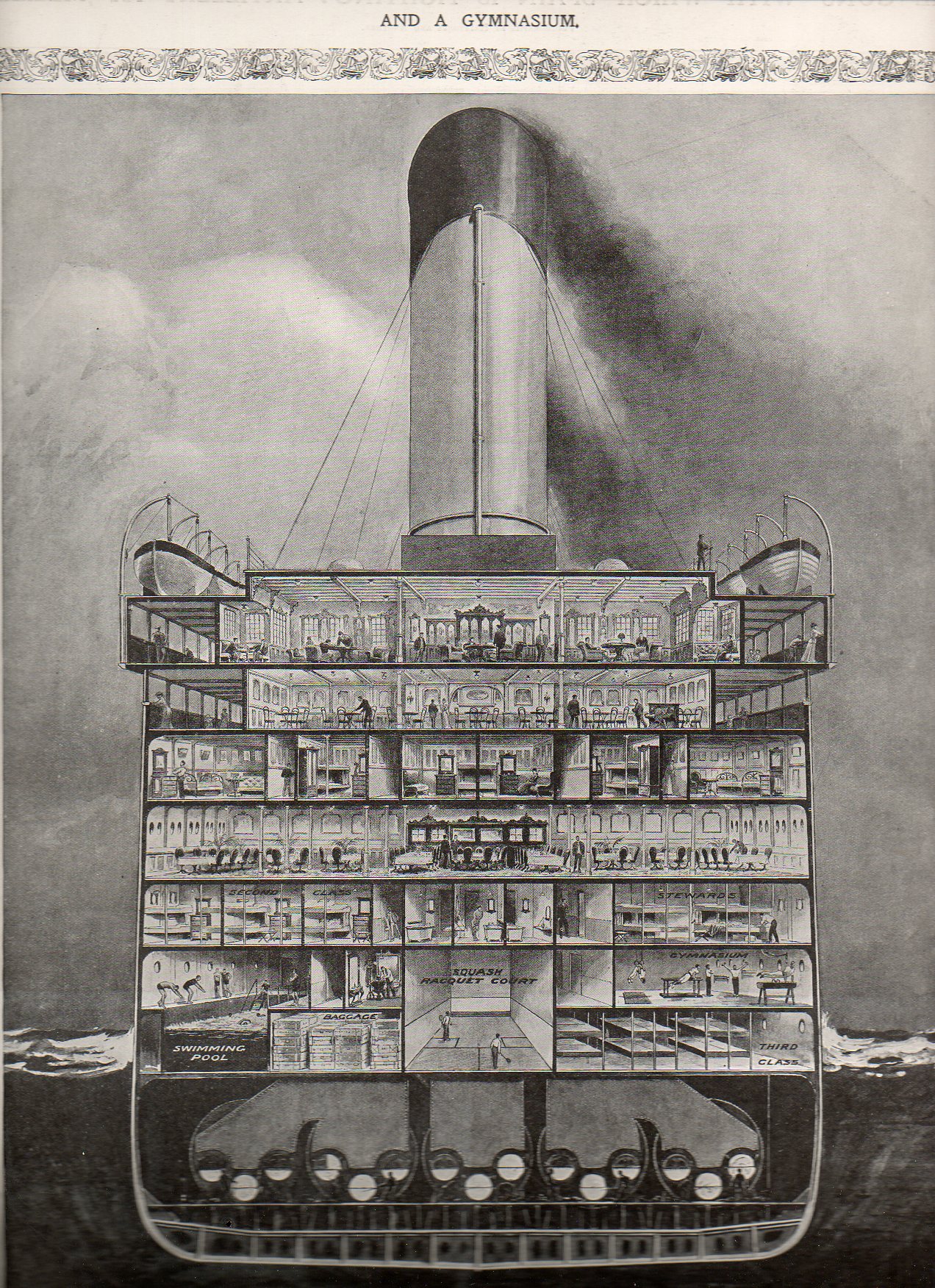
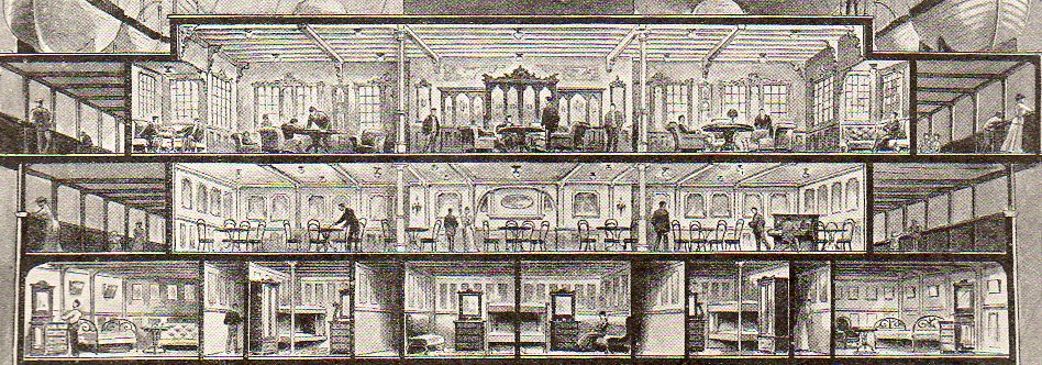
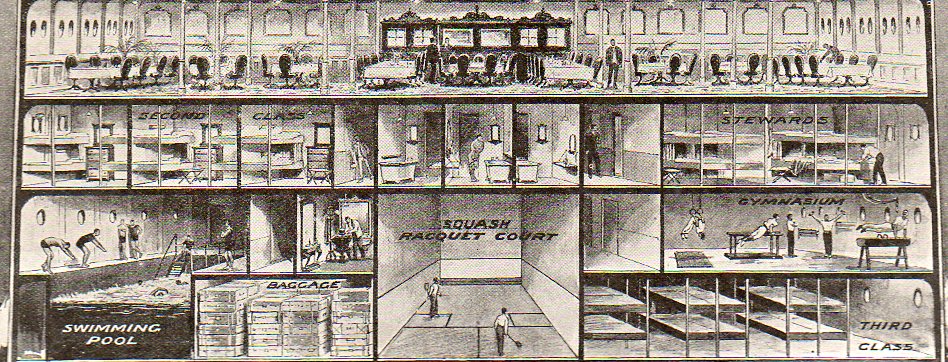
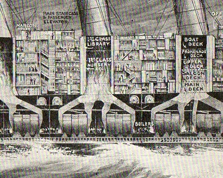
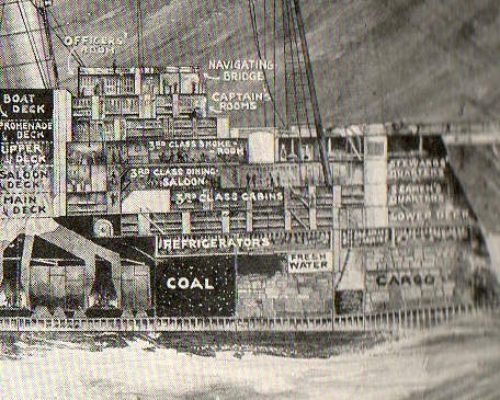
    Resting comfortably in-between this blog’s Cross Sections and Looking-At-Things-Straight-On series is this straight-on cross section of the midship section of the HMS Olympic.

    Cross-sectionship131
    This cross section appeared in the 14 August 1909 issue of The Illustrated London News, just six months or so after she was laid down. The Olympic was finished in 1911 and sailed through until 1935, a considerably much-longer career than her two sister ships, the Titanic and the Britannic.  The Titanic of course was launched in 1911 and went down on 12 April 1912; the Britannic lasted a little longer, though this ship never really had much of a career, launched just before the beginning of WWI and then used immediately as a hospital ship, striking and being sunk by a mine in 1916.  The three ships were beasts, about 882 feet long and about 53,000 tons displacement. The viewer certainly gets a good idea of the scope of the ship from this image.   [The original image of the Olympic and also of the Mauretania are available for purchase from our blog bookstore.]

    Cross-sectionship132
    Cross-sectionship133

    Third class looks pretty rustic, a no-bones approach to ocean travel, stuffed into the space next to the squash courts and under the gym. 

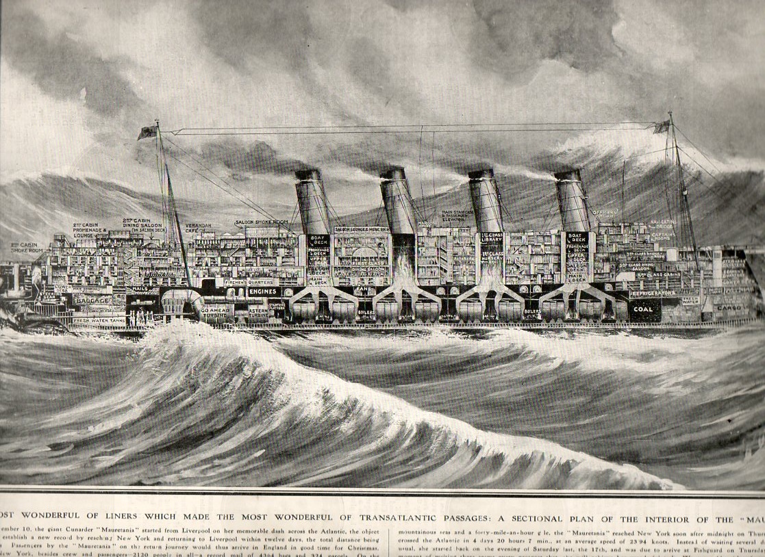
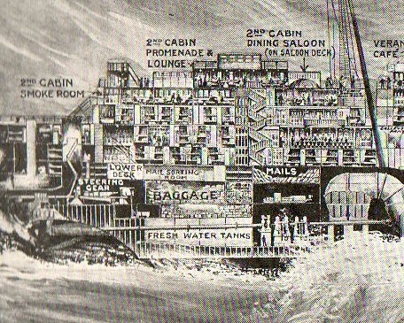
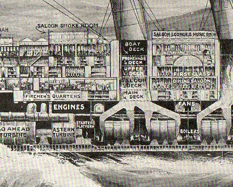
    Next comes the HMS Mauretania, again form The Illustrated London News right at the time of its record-setting speed attempt to cross the Atlantic in November 1907.  The ship was long (almost 800 feet) and about the fastest ocean-going ship in the world,. crossing and re-crossing the Atlantic in 12 days.

    Cross section mauretannia137

    Cross section mauretannia138
      Cross section mauretannia139
    Cross section mauretannia140

    Cross section mauretannia141


  • Why I Like Pictures

    JF Ptak Science Books  Post 1369
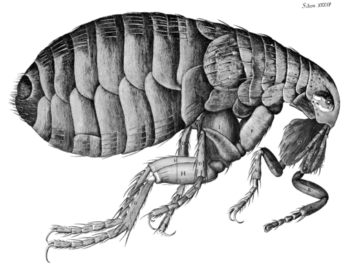
    Hooke--flea


    Printed images are interesting in that they exist at all, at least in pre-modern (ca.1900) times. When you think of the total amount of time that humans have been thinking–like the possibilities of all total ideas for all people for the past, say, 10,000 years—and think about the 10×10^9 neurons firing for everyone all the time, and the numbers of books and pamphlets and journals and such printed before 1900, the access to the archive of the human condition looks a little paltry compared incomprehensible amount of good thinking that has gotten away. (Humans haven’t helped themselves all that much in this regard, given the deep, long, wide history of the planned destruction of libraries throughout time.) 

    There are more stars than books. Lots more—10^22 stars versus 1.3×10^8 books (or the stuff that an odd Google study classified as “books” for their scanning and advertising appetites). There’s also bacteria and other microorganisms alive in/on the human flora than books (and blood cells too for that matter). Until the 18th century (and really into the 19th) the practical means of producing a book were set to restrictive, upper-class access. For most of human history the ability to even record a thought on transportable material was a deep issue; getting it reproduced somehow was extraordinarily difficult, especially if you belong to the not-yet-existent working class. Even if we just consider works that are 1455-1800 era the illustration was not a common thing, which is odd to me since it seems the image could show in less space what was being described in the text (and for argument’s sake here we’ll just say that production facility for the illustration and a page of text were equal). I have a funny feeling that if you weighed all of the pages of text against all pages of illustration in all books published from1455-1800, illustration would be enormously, fabulously outweighed.

    Which is why in my mind “pictures” are so interesting—they are rare, and so that when they were published they were deeply considered objects.

    All this changes though in the nineteenth century when production facilities increase, costs go down, the finished product is available more cheaply to a growing class of people who work for a living and have a disposable income. Newspapers and magazines begin for real in this century, paper costs go down, ability to print at high speeds goes up, and suddenly there exists an addition to the concept of “disposables” —information commodities. For the first time a mass of material is produced to be replaced in the next day or week, disposable reading material. There are more images reproduced and distributed in this century than in the entire history of man on earth. Of course all of this look like nothing, today, now that almost everyone in the U.S. (at least) can be their own publisher/producer of original or found work, which means of course that people in 2086 will look back oat our abilities as we do on the 19th century. And so it goes.

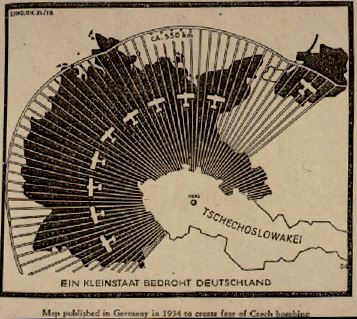
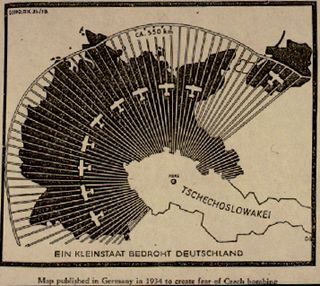
    This is why I like pictures—they’re comparatively rare, and the tell as much of a story as you will allow. I enjoy scientific and technical images as much as anything, for their dreamy amount of detail and revolving possibilities of 3-D display and such; maps too, for pretty much the same reasons (and that one usually doesn’t memorize them, at least not the detailed ones). Of particular interest on this blog has been maps-with-a-purpose, particularly  cartographic propaganda, like this 1937 Nazi-published map showing the “danger” posed by the Czechoslovakian air force to Germany.  Blog jan 3 czech airIt is a graphic representation of the Big Lie, an element of design intended to transmit an idea to a reader who really doesn’t need to do so, being able to get the idea of the the data being presented in the map in one quick visual.
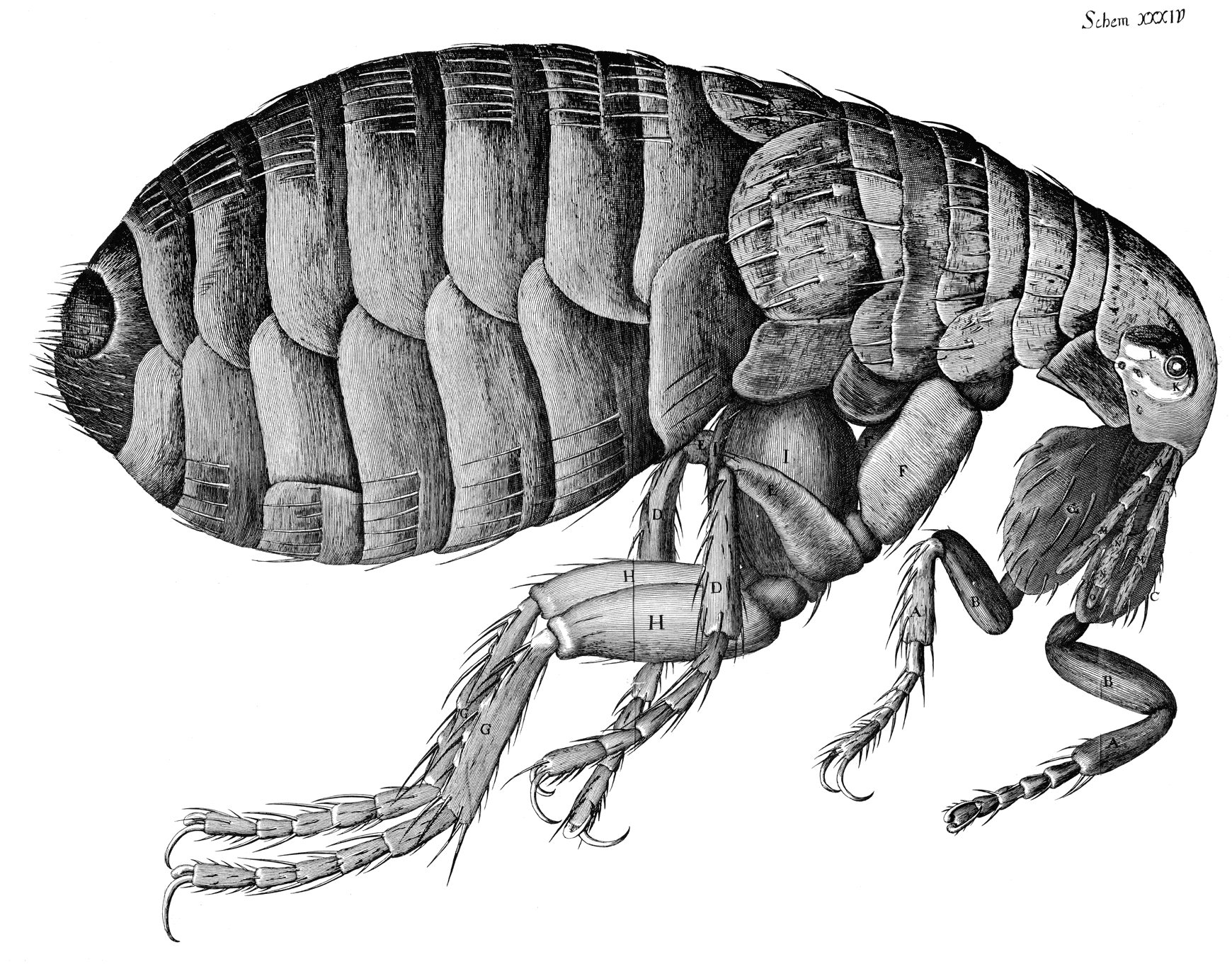
    The scientific images demand that you see the difference with what came before to truly appreciate them—one of my favorite examples of this is Robert Hooke’s engraving of a magnified flea. The microscope was brand new, and this image, which appeared in Hooke’s magisterial,epochal work Micrographia1, presented as much of a new world to people in 1665 as Galileo’s reporting in Siderus on the massive number of new stars that he had seen with the telescope he used to look up rather than just across. People would have had no idea that such a magnificently detailed creature such as this flea existed, as they simply couldn’t see it. Same too for the stars, which (with the exception of Brahe’s Nova and such) had been seen to be “perfect”, an harmonious fixed number, though a relatively simple innovation using materials that had been around for centuries brought a new world to bear. (One is tempted to say that in his new, massive book that Hooke included “only” 38 images; but one has to remember that Hooke did all of the drawings by himself, and actually rushed the book into print as he sensed a market for it which combined nicely for his need for money..Hooke was correct about the market for the book.)

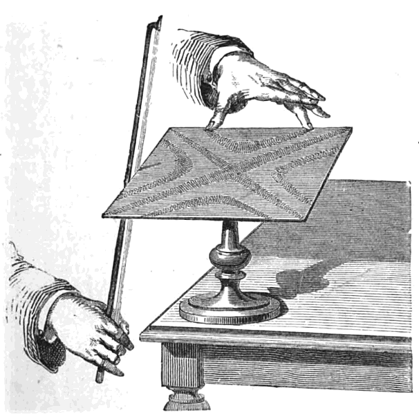
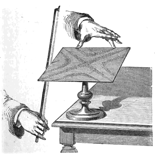
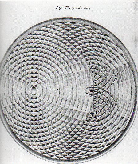
    The purpose of some scientific images are difficult to identify when faced with them for the first time and out of context, but once rectified they can be beautiful renderings of complex relationships, like Ernst Chladni’s patterns of vibration revealed to us via sand on metal plates (in his Discovery of the Theory of Pitch, 1787), and the Weber brothers’ exacting drawings of wave forms  (from 1825) (and shown below, respectively).
    Bowing_chladni_plate

     
    Adding mercury to mercury: the sensational drawings by the Weber brothers as they observed the changing wave fronts made by a drop of mercury into a pool of mercury:
     
    Weber acoustics461

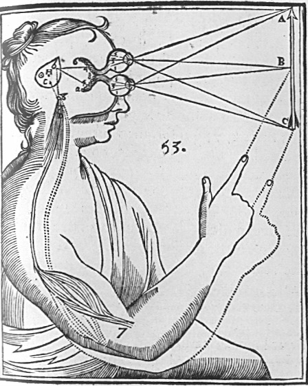
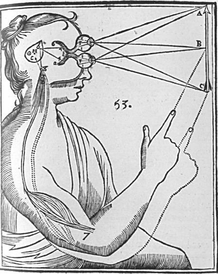
    Rene Descartes depicted the interpretation (in his  Principles of Philosophy of 1644) of light and its physiological reaction in the brain in this iconic image, as follows:
    Cartesian_Vision

    the lines of sight depicting binocular vision, observed (and compressed) by the eye’s “particles” and processed by the pineal gland which in turn manipulate the “fluids” in the control of nerves and muscles. 

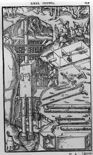
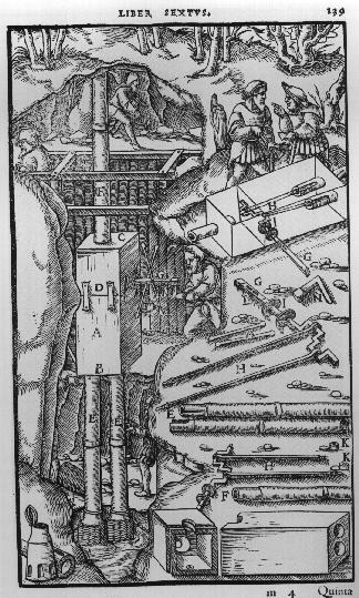
    Agricola’s De Re Metallica (from the first Latin edition f 1556) displays many interesting cross sections of Renaissance mines:
    Agricola

    There is so much more, and it may be possible that there were millions of pages of illustrations during our time period.  Harvey’s demonstration of the flow of blood in the human body pictured by fingers and a forearm (in his On the Motion of the Heart and Blood, 1628), Descartes’ analysis of how the human eye “sees” (An Analysis of the Eye, 1637), Agricola’s cross sections showing how to construct mines (1556), Scheiner’s illustration of the apparatus he built to observe sunspots (1611),  Borelli’s study of the mechanics of the human body (1680), Rosalind Franklin’s x-ray photograph of DNA (used by Watson and Crick to depict the structure of DNA), Thomas Young’s illustration of light-wave interference (1803)

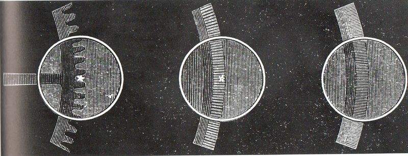
    Then there are the pictures of the interior of the Fizeau apparatus as it captured the velocity of light so:
    Aaa-light fiz gears158


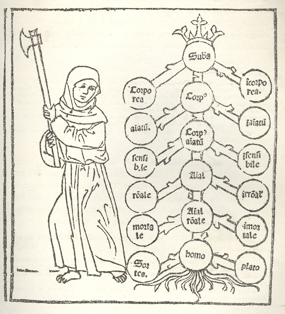
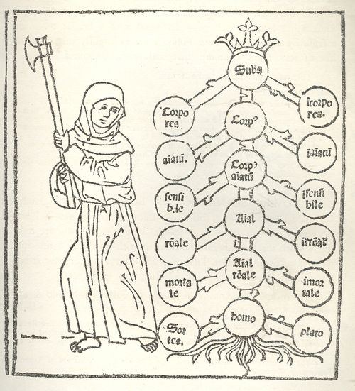
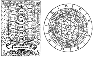
    Classifying images, like this of Porphyry’s (logic) Tree and Raymond Lull’s diagrams of life and decision, are in constant appearance for centuries, excellent ways to provide method and organization to large quantities of information and for problem solving. While not exactly a generator in the sense of Jorge Borges’ Library of Babel or Jonathan Swift’s take on Lull’s writing machine, the antiquarians did produce very interesting, elegant, beautiful ways of story information and ordering information.  The Tree of Porphyry is far more concise–an abbreviation–compared to the infinitely expanding hexagonal rooms filed with books and attendant librarians in  Borges’ universe. 
    1--logic tree

    The Ars Magna/Thinking Machine of the 13th century Lull (also known as Ramon, Raimundo and Raymond, Raimundus and Raymundus Lull, Lully and Lullus and Lulio), was the ultimate organizer of how sentences can be made and knowledge produced/uncovered (particularly if you want to please the logic of the church and the Creator), and which was also written about, described and worried-over by Borges.  There are many other early figures in this category to be sure (Lewis Carroll, William Jevons, and even in a way Mr. Venn, not to mention Leibniz and his calculator,  and all of the changes in scientific method and (English/Dutch) mathematical concentration on applied mathematics of the 17th century that made thinking about the industrial revolution possible.
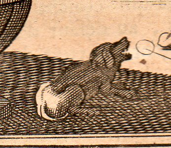
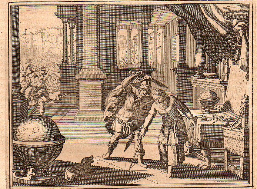
    Images of ebb and tide, of cause and effect, of bones inscribed in clouds and solids manufactured of gas, of the steps of discovery, of the integral drawing of the integral pieces, of cross sections detailed enough so that you too could build your own locomotive, or guide yourself through a paper transverse dissection of the human brain–this is the great essence of images. It is interesting to look at these things forensically, to identify all of their components and articulate the symbolism, to look at the image cautiously, judiciously–sometimes this just results in insights into the artist who may have been tired and was working through just another piece of drudgery and tried to make their work a little more entertaining.  This doesn’t add much to the understanding of the event, but it does give the scene a fullness,  like, for example in this image of the killing of Archimedes from  Histoire Universelle published by the ubiquitous Peter van der Aa in Amsterdam at the turn of the 18th century–it falls in line with many of its comrades of this event  in that it depicts the tragedy in the second before it occurred.  One thing it has that other scenes do not–a barking dog.  Maybe it belonged to Archimedes, maybe not.  But there was a dog depicted here, and it was barking at the scene, probably barking at the man about to stab the mathematician, which means it would’ve been the mathematician’s dog.  But Archimedes certainly didn’t hear the dog if he couldn’t be interrupted by the battle outside his door or the Roman who yelled at him to turn.
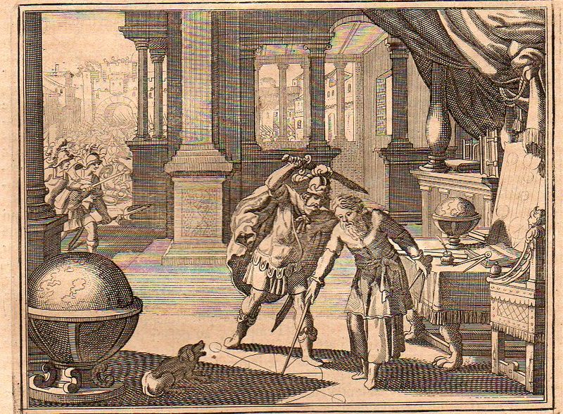
    Archimedes 1705348 

    Archimedes dog 1705349


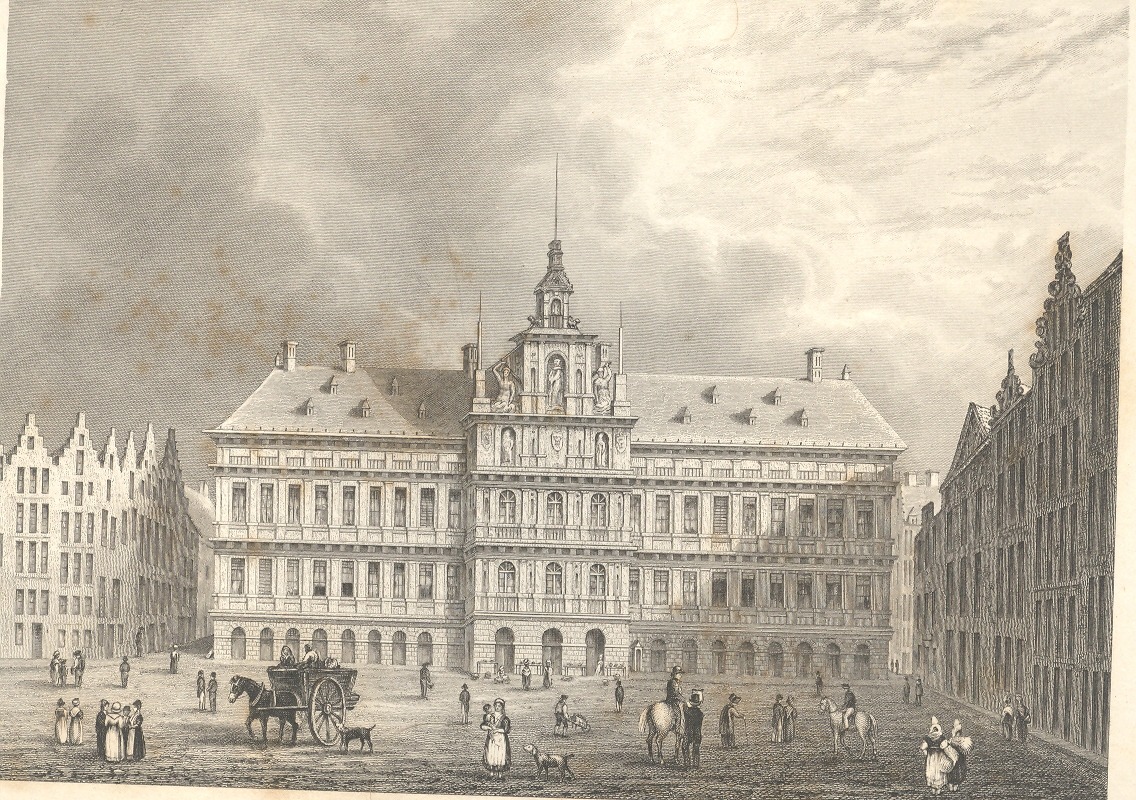
    This blog is written and illustrated around the very loose idea of “the history of ideas”, and is quite image-driven–there are probably about 5,000 pictures reproduced here now, a wide selection of illustrated thinking in the sciences and many other fields.  This includes one classifications of an image series that really don’t exist—I mean they were images intended for one purpose but for the passage of time (and sometimes removing them from context) they become something completely different, entirely new, providing unintentional insights into their artists and times.  I find exploring in images this way to be fascinating, noticing the semi-hidden and/or unnecessary, extravagant, extra-necessary bits that were intentionally placed by the artist, as in this example of Archimedes’ dog, or with the characters that are sometimes found as “filler” and which are basically wholly unrelated to the intention of the illustration.  For example in this application of the imaginary forensic arts microscope, we see this series of pictures of a standard view of the town hall of Antwerp; but what we see advancing under magnification is a very interesting set of occupations displayed in absolutely minute detail.

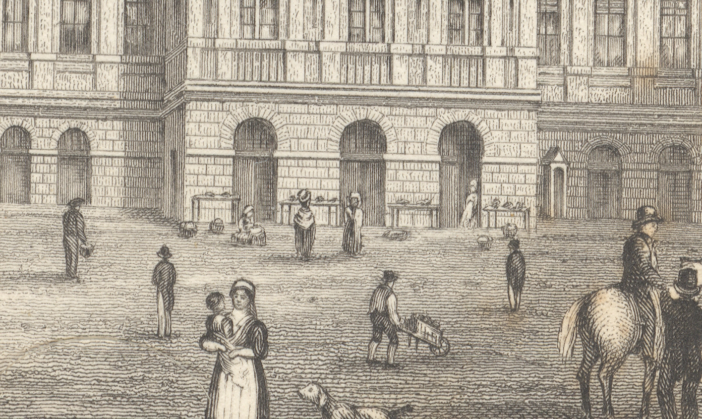
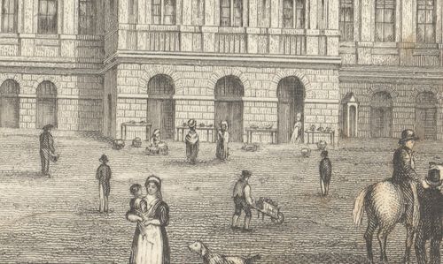
    First, the majority of the engraved image, followed by a close-up of the center of the building (the three doorways), and then by a closer view still of doorway three:
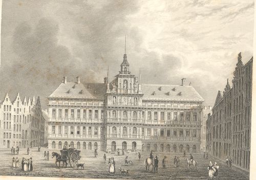
    +++looking closely

    +++looking closely detail

    The truly interesting bit here is barely observable in the original; but, under magnification, we see a very rich and minuscule “engraved photograph” of a slice of daily commerce and street life in Antwerp.  If you look at the central entrance to the town hall you can see three main (and large) doorways, and if you look clos+++looking closely detail2er still, you’ll see something leaning against the portal at right.
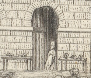
    Extraordinarily, what the artist snuck into the original is a tiny (2mm) figure watching over several tables of her (fruits?/vegetables?) ware, waiting for a customer. There doesn’t seem to be much interest in her stuff, currently, and she has allowed herself a little relaxation, leaning against the doorway.  I’ve found this sort of extremely minor subject matter and its ephemeral connection to the larger work at hand to be just fascinating.  I wonder why such detail would be added–why would the artist, or engraver, take such care and interest in such minor visions.  Perhaps this is just what was at hand on the days the artist fleshed out his work; perhaps it was the work of the engraver, alone, incising yet another semi-boring architectural image; desperate for a little artistic activity, adding some interesting, almost-invisible touches, here and there.  Perhaps no one would ever really notice them, but whoever was responsible for adding such incredible, extra-dimensional details would certainly enjoy knowing they were there, recognized or not.

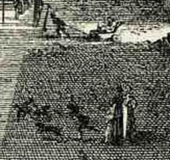
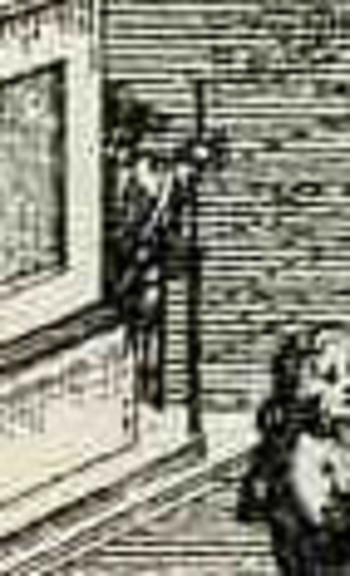
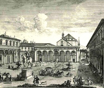
    Another good example is found in Guiseppe  Zocchi,Veduta della Piazza della SS Nunziata Statua Equeftre di Ferdinando Primo, Fonti, e Loggie Lateral,shows more good work with the possibilities of ephemeral populations, where among the many details we see an invalid being pulled in a small cart, and a half-obscured  man with a staff leaning against the back of the monument.  And of course there’s much more–you just need a little magnification to see the human element of the artwork. 
    Bloglooking_closely_1_96123

    Bloglooking_closely_1__carriage_2

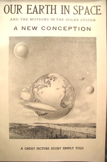
    Bloglooking_closely_1__man_caneAt the end of the day one of the most enjoyable of all image classifications for me  are the classifications of image series that really don’t exist—I mean they were images intended for one purpose but for the passage of time (and sometimes removing them from context) they become something completely different, entirely new, providing unintentional insights into their artists and times. They are also on the outer-edge of being pre-Outsdider Outsider art.  One of my favorite examples in this genre is this 1941 pamphlet which isn’t so much “interesting” as it is interestingly illustrated, where all of the semi-coherent  interest resides, the text having left coherence far behind, somewhere, in it own intergalactic dust. When I first encountered it this was the only instance that I had ever seen of New York City floating in space with the Earth floating happily in the background–now I’ve collected at least three other extra-New-York-City’s-in-space in the last few years. 
     

    Dsc04543


    This is also a nice example of extra-NYCs, where there are several other instances, balancing out the larger collection of the opposing missing-NYCs, like this 1902 example showing the city sunken and out-of-sight, disappeared under its own weight:
    3--nyc gone

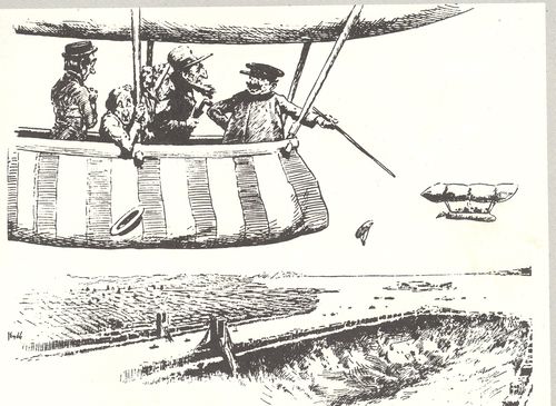
    There’s also the sub- or  supra-category of extra-Earths department, where I have at least five other examples, including this remarkable effort by Victor Segno of Los Angeles, who in 1929 published this fantastic image depicting extra-human empty alien souls being dropped on the earth to repopulate the place after it had been cleared out by “brain waves”.

    And so I guess that would be the perfect place to exit this short appreciation of pictures. 

    ____

    Notes.

    1.  As Hooke states at the end of the 28-page introduction  to the work: …”it is my hope, as well as belief, that these my Labours will be no more comparable to the Productions of many other Natural Philosophers, who are now every where busie about greater things; then my little Objects are to be compar’d to the greater and more beautiful Works of Nature, A Flea, a Mite, a Gnat, to an Horse, an Elephant, or a Lyon.”.
  • Technical Drawing: an Early, Convict-Powered, Revolving Turret Ship

    JF Ptak Science Books   Post 1364

    Technical drwg--revovl turret circular540

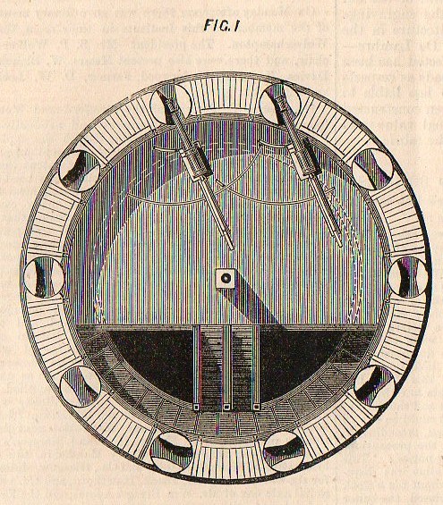
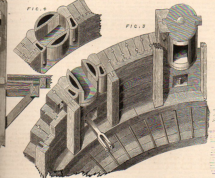
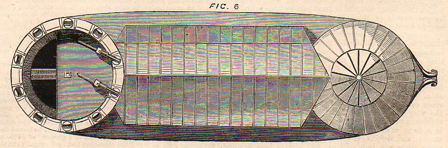
    This image (from the The Engineer for 30 October 1874) shows a plan of the top floor of a revolving battery designed by M. Baltard in 1831 (and which is available at our blog bookstore).  This idea is probably ancient, though it really only had major technological legs by the 19th century. Even though Baltard is given some fair credit for the modern rediscovery of the revolving turret–and in this short article he is given premier status–there were earlier engineers at work before him.  For example, in the earliest part of the 19th century Col. John Stevens designed a saucer-shaped floating battery that was supposed to be able to fire in any direction; T.R. Timbly–slightly after Baltard–applied in the U.S. Patent Office in June 1843 for a device he called a “metallic revolving fort”.  Then came the great John Ericsson–very long on accomplishments but very short now in modern memory, he is also one of those memorialized men in marble in DC for whom people have almost no modern recognition–who in 1854 produced an “impregnable battery revolving cupola”, which led to his great innovation on the Monitor.  And as we recall, the Monitor’s defeat of the Merrimack in Hampton Roads in 1861spelled the coming end of the wooden ship of the line–metal ships with mounted revolving turrets fore and aft would prove entirely too far superior to the 19th century wooden ship.
    Technical drwg--revovl turret537

    What we are seeing in the first engraving is the top floor of a two-story fortification–roof removed–showing the floor plan of the battery.  The walls and roof were stationary; the floor was not.  The two cannons were located on a revolving floor and were moved by turning the floor (basically) to one of the open firing windows (embrasures) a detail of which is above. When the barrel of the canon was pulled out of this opening, it was turned closed to prevent any fire coming into the fort.

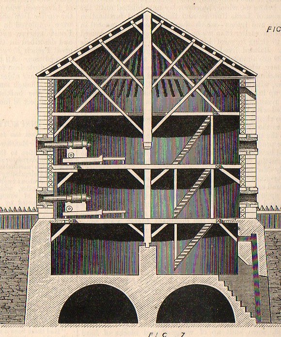
    The engraving below shows a cross-section of the two-turret land structure.

      Technical drwg--revovl turret535

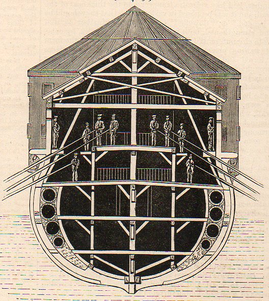
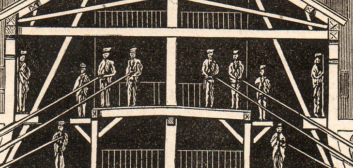
    The engraving below shows the idea of the land fortification shipboard, one revolving turret fore and aft. It turns out that the engine for the vessel was human, the engineer calling for “either” convicts (forcats) or soldiers to row to move and position the boat

      Technical drwg--revovl turret536

    And a detail we can clearly see the long sweep oars:

    Technical drwg--revovl turret big detail538

    And the turrets on the ship, the pre-Monitor-style ship:

    Technical drwg--revovl turret big detail539

    I assume that the boat was being used for coastal or harbor defense, or at least something very close to land, and was really more a floating, positioning battery than a boat.  Seems to me though that after everything was said and done, after all the work was accomplished and the boat built, that making the whole thing dependent on sticks of wood was a fatal flaw. 


  • Technical Drawing–Superb Shadowing, Shipboard Cannons, 1887

    JF Ptak Science Books   Quick Post

      Shadow ship 515

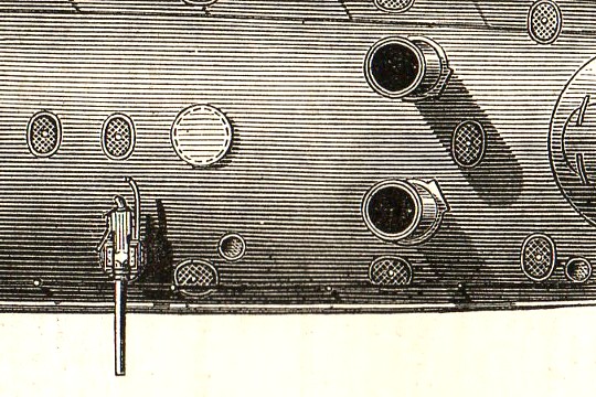
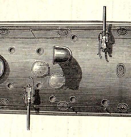
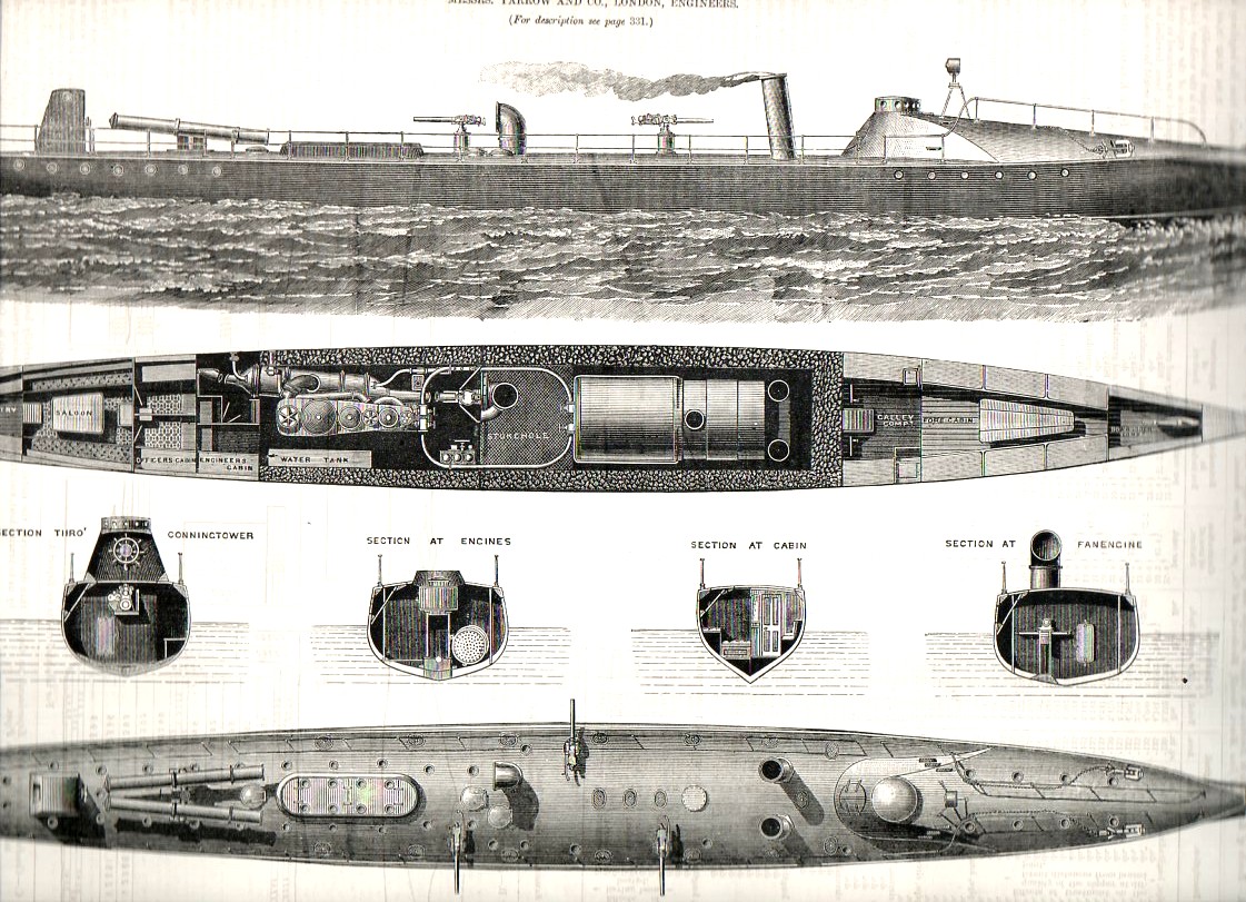
    Horace may have said “Pulvis et umbra sumus” (“We are but dust and shadow”)- and meant it, but the artist working here on this ship would definitely have replaced “dust” with “metal and wood”.  The details above and below are two very small bits (each about a half-inch long or so)  from a 15-inch long engraving of a Spanish torpedo boat, and published in The Engineer on 21 October 1887.  The workmanship is superb and the sense of design to me is absolutely glorious–the entire image of the plan of the ship is below. [The original is available from our blog bookstore.]

    And another detail:

    Shadow ship 516


    Shadow ship 513


  • Baroque Weeping Baby Skeletons, the Creation of Man, Genesis and a Tiny Bit of All That.

    JF Ptak Science Books  Post 1357

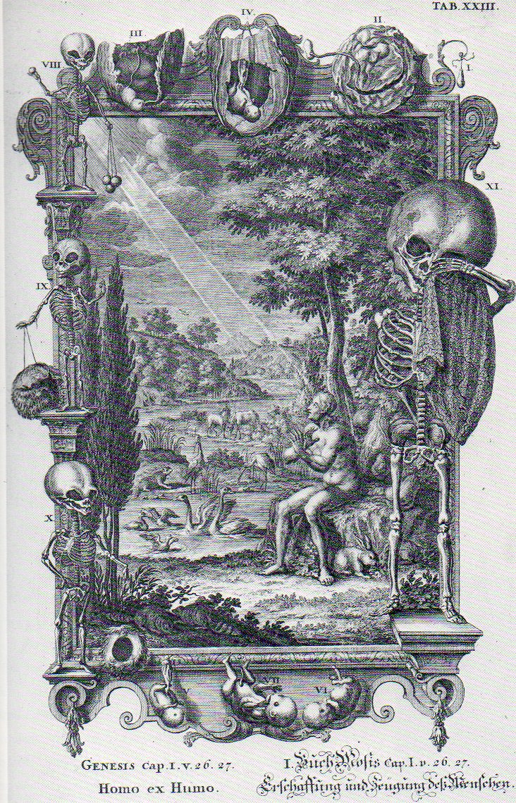
    Jean-Jacques Scheuchzer’s Physique Sacree (published 1732-1737) is an enormous, plumply illustrated thing, an extraordinarily diverse work on the Old Testament and the antique sacred and its relationship to the panoply of natural philosophy.  Its  759 illustrations are usually given overly-encrusted decorated borders by a diverse and at times bizarre selection of themes from biology, geology, astronomy, physics, chemistry, and whatever else seemed to work. It is a production of the High Baroque and high imagination, working within the very definite confines of ecclesiastical squareness and scientific roundness–and somehow the pegs all seem to fit, for Scheuchzer.

    The image that I latched onto [and which is available at 200% if you click through it]  illustrates Genesis I 26, 27:

      Baroque480

    “26: And God said, Let us make man in our image, after our likeness: and let them have dominion over the fish of the sea, and over the fowl of the air, and over the cattle, and over all the earth, and over every creeping thing that creepeth upon the earth.
    27: So God created man in his own image, in the image of God created he him; male and female created he them.”

    Indeed.  We can see the pure holly light (appreciably wide as it gets to its subject than when it started, where it is also degraded)  extending diagonally across the image to a surprised/fearful Adam, who is popped into a landscape of the newly-created.  But it is the border illustration that is most extraordinary to me–it is an 11-segment depiction of the birth process, told almost exclusively in baby skeletons.  The story begins at top-right corner, with perhaps a hint of conception, and then through  developmental stages II (embryonic) and then III/IV (taking us through the third month) and then V through VII (showing perhaps through the seventh month or so), displayed in a top- and bottom-middle display, and not in order.  I really don’t know enough of developmental anatomy to say what is depicted in images VIII through XI, except to note that–of course–they are all skeletons, and the last is weeping. 

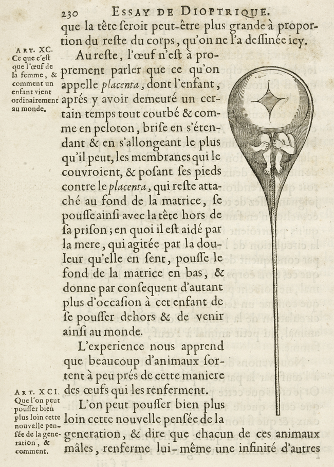
    Spermatozoa seem to be missing in images I and II, or at least Scheuchzer didn’t make an attempt to show them at work, even though he must’ve been aware of their existence, discovered  fifty years earlier (in 1677) by Leeuwenhoeck.  But this discovery certainly didn’t get in the way of maintaining the theory and belief in the homonuclus–the tiny, preformed person carried completely within the sperm and implanted in the woman who served basically as an oven, a receptacle.  Scheuzcher believed on the other hand that the homonuclus was located in the ovaries–still part of the preformationist camp, but getting closer to elevating the importance of woman in embryological development.

     [All that said I don’t know the reason for the weeping skeleton; or, for that matter, what the things are that the two skeletons at upper left are holding.]

    The homunuclus, famously illustrated in Nicolas Hartsoeker’s Essay de Dioptrique in 1694: 

    Ovary Hartsoeker