A Daily History of Holes, Dots, Lines, Science, History, Math, Physics, Art, the Unintentional Absurd, Architecture, Maps, Data Visualization, Blank and Missing Things, and so on. |1.6 million words, 7500 images, 4.9 million hits| Press & appearances in The Times, Le Figaro, Mensa, The Economist, The Guardian, Discovery News, Slate, Le Monde, Sci American Blogs, Le Pont, and many other places… 5000+ total posts since 2008.

Category: Prints–looking HARD/deeply at

  • Reading Symbolism in Raymond Lull’s Portrait

    JF Ptak Science Books  Post 1333

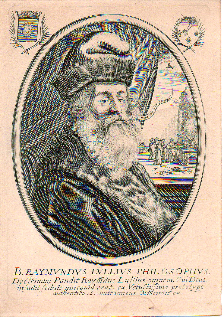
    Raymon Lull is perhaps the most famous Catalan given to the world–he is also one of the most famous people in history with the most names. (He was also known as Ramon, Raimundo and Raymond, Raimundus and Raymundus Lull, Lully, Llull, and Lullus and Lulio, among others.) Seriously though, he was a very interesting thinker who went far beyond the norm, and then some, his creativity overmatching the possibilities of the parenthetical sciences of his time, and stretching timeless logic as well as he went along.  But so it goes, as they say; he did do aggressive work and at the very least it was for the most part quite pretty-sounding.  And as he pushed up and against existing thinking it was up to that confronted thinking to push back–which sometimes happened and sometimes didn’t. He studied the law, alchemy, botany, religions, and may well have written the first novel ever to appear in Europe (at least it was the first in Catalan)–I think that you could say, overall, that he was a rationalist. 

    • The original engraving is available at the blog’s bookstore, here. 

    This engraving is one version of many that I’ve seen online, and may be the original–this is a pure guess on my part, my reasoning is so mainly because there is so much more added detail than in any other versions of the engraving.  the added bits in the corners, and of course the scene revealed by the pulled-back curtain.  The engraved lines are also very sharp, very pronounced, not like some of the other version which look a little less defined…this one is razor sharp. (The image is available for purchase from our blog bookstore.)
    Lull087

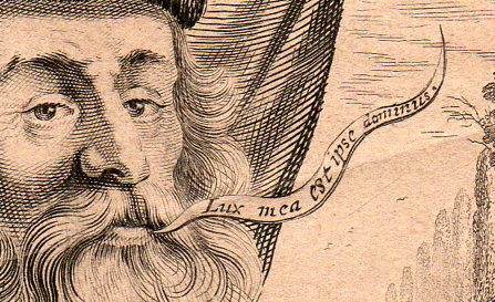
    The word balloon (and by the way I wrote a post here two years ago on the history of word balloons) coming from Lull’s mouth is Lux mea est ipse dominius “My light is that of the Lord”, a claim for divine inspiration, guidance, fortitude.  Beyond all else Lull was a Christian, and a Christian to some severe fault–he was very involved in the conversion of Muslims, and was also an (utter) expulsioist in regards to the Jews.  The Christian philosophies of Lull are clearly shown in this 17th century portrait of the man. 
    Lull371

    And in the scene that is not seen in the other reproductions of this portrait online we see a small host of interesting sci-philosophical instruments cluttered around what seems to be a giant working with an astrolabe.  (This fellow is a head taller than the other people gathered around him, and he is most definitely sitting down on a high stool, making him taller still.)  We see dividers and various measuring devices, plotting instruments, and even a pair of specs, which would’ve been very uncommon in in the 13th century.  I’m happy to see a dog sleeping through the ruckus.

    In the sky in place of the sun is a triangular collection of burning candles, or they seem like candles, which continues a very old tradition of symbolizing unity, and in this case, in  a Christian theme, a god surrounded by the holy trinity… related symbols appear frequently in images depicting the Old Testament creation cycle. 
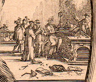
      Lull373

    Continuing this theme, if you look in the right upper corner of the engraving there is another interesting symbol–a hand issuing from a cloud with a book, sourounded by three fleur de lis.  This is in obvious reference to the balloon statement, the hand of god issuing a book, or knowledge, to the recipient (which would be the reader or Lull); the fleur de lis, a French lily, was often used in Renaissance and Baroque imaging as a representation of the holy trinity, and of purity and chastity, spirituality.  Or  perhaps it was just a flower. 

     My own interest in Lull–aside from the  great beauty in which his ideas were encapsulated and presented–is in his idea generator, and the possible influence it had on later thinkers like Leibniz who may have built on his interesting breakthrough to produce one of the earliest arithmetical calculators.  Lull’s own calculator (which I wrote a little about here) is simple and elegant, and may actually be powerful for some–it was a series of discs that when turned would relate ideas and letters and numbers which were by serendipity intended to generate unexpected ideas to think about.  For the 13th century this was a major idea, and I like it even today. 


  • The Guts of Mathematics, Archimedes’ Dog, and the Greaseless Anatomy of Machines

     JF Ptak Science Books  Post 1326

    “…with his blood he confused the lines of his art”—On the death of Archimedes, in Valerius Maximus

    “….Bark, bark bark!”–Archimedes’ dog

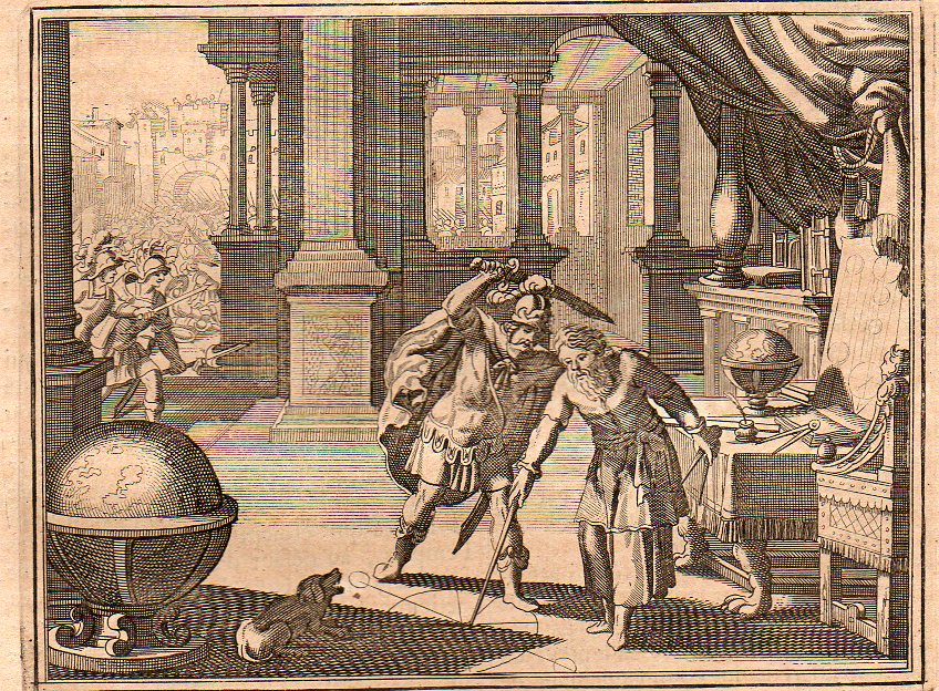
    I came across this unusual and not-web-reproduced image of an infamous scene in the history of mathematics, the murder of Archimedes.(The original is available for purchase from our blog bookstore.)  There have been a number of depictions of the event, a few dozen artists it seems–including Daumier and Delacroix and others whose name do not begin with “d”–who have chosen to try and capture the moment.  (The website at  NYU reproduces some of them;  Drexel also has a very good space devoted to Archimedes and is a great source for quotes dealing with the event.) This one comes from (I think) Histoire Universelle published by the ubiquitous Peter van der Aa in Amsterdam at the turn of the 18th century, and falls in line with many of its comrades in that it depicts the tragedy in the second before it occurred.  One thing it has that other scenes do not–a barking dog.  Maybe it belonged to Archimedes, maybe not.  But there was a dog depicted here, and it was barking at the scene, probably barking at the man about to stab the mathematician, which means it would’ve been the mathematician’s dog.  But Archimedes certainly didn’t hear the dog if he couldn’t be interrupted by the battle outside his door or the Roman who yelled at him to turn.  (I believe Roger Clemens when he says that he didn’t realize he was throwing that bat fragment at someone, saying he was in the zone.  It happens.)

    Archimedes 1705348
     Archimedes dog 1705349

    And a detail of the dog: shows him barking from a reclined position.  Jarred awake by the intruder, he sees the  action just before the critical motion–not quite awake, no time to stand, the dog (snarling with teeth barred) tries its best. (I am romanticizng the dog part of course. My own dog, Bluey, now 14 or so, simply stared at the people who walked into my house last night with their luggage, thinking that mine was the bed and breakfast where they had their reservations.  He sat and stared, and they stared at him.  Missing their destination by one house, how disappointed they must’ve been to think that their retreat was filled with an old dog, kid toys, a dead Christmas tree, and the rest of the jumble.)

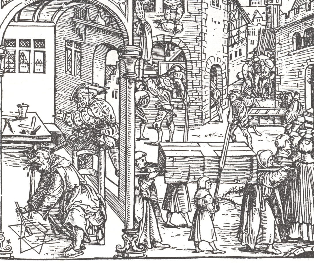
    I’m not aware of any artist who steals the moment quite so graphically at Jost Ammon (below) does, though. He also makes no effort to remove the millenium-old event from his own Renaissance environment.

    ==blog==july 8==arch 2

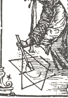
       Seldom do we see a maxim so vividly depicted as with these lines from Valerius Maximus:  Archimedes trying to hold a thought in his head while a Roman soldier comes tugging at him, Archimedes pushing the soldier away to protect the geometrical work that he was scribbling in the sand, and then having his head full of thoughts spilled onto the drawing he was trying to protect.  What we see in the detail is almost exactly (or on the verge of being exactly) from the Valerius quote fragment  “…with his blood he confused the lines of his art”:  Archimedes has spoiled his geometry in the moment before his cleaved head releases the control of his muscles.  It is a nasty image, the pissed-off Roman soldier—who theoretically was just looking for spoils in the looted city of Syracuse—having had enough of the three-second hesitation by the old man and reacts badly, beheading him the hard way. (I’ve written about this pirnt earlier in this blog, here.)

     ==blog==july 8==arch This is definitely the great CSI moment in the history of mathematics, so far as Mr. Ammon is concerned.  There is no chance not to see that there is no heraldry to the moment, no faint-away moment, just blood in the sand. 
    And for some reason–except for the dog part–all I can really think about here is the anatomy of the machines that were shown by the great Precisionists of early 20th century art, the artists who depicted the modern industrial landscape and its tools with fantastic precision and modern-Gothic-y grace. 
    The artists who found modernity–a modernity found mostly in America–in massive factories, and shining metal, and spokes and gears and all of the other components of factories. There was of course the Marinetti manifesto preceding all of this, and the 1913 69th St Armory Show,  and the coming of the French (Duchamp and Picabia  & Co.) in 1915 and the Tzara/Huelsenbeck/Ball Dadaist 1916 movements and the rest….but what I’m reaching for is the slightly later work, the early ‘twenties, with Hartley and Stella and Sheeler And Demuth and Schamberg (and even the early O’Keefe).  This is where I think we see machine art, an oddly realistic semi-cubist something, depicting the power and form and grace of the machine itself rather than the expression of its dynamism. 
    But what happens (for me, anyway) is this–that when the guts of the machines are revealed, that when we see inside to the components, the very anatomy of modernity, we see a clean, rustless, oil-less, greaseless, world.  Big and heavy, massive things of terrific density, and they smell like nothing except their own immobility, which so far as I know smells like nothing.  As much as I find these artworks beautiful, I miss that their core wasn’t represented–I’d would’ve liked a little more mess.  This is antithetical I’m sure to the message, but it is the essence of the machine. 

    Zoom Image
    [Charles Sheeler, Stacks in Celebration, 1954.] And humans didn’t often make it into these images–as much as I like the artwork of Louis Lozowick, I like it more when he peoples-up his ultra-tech/urban images.  That’s another story. 

  • The Beauty of Ball Bearings

    JF Ptak Science Books  Post 1268

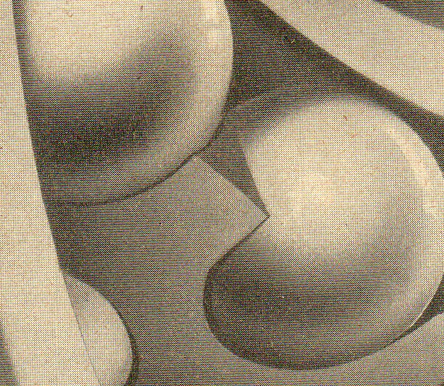
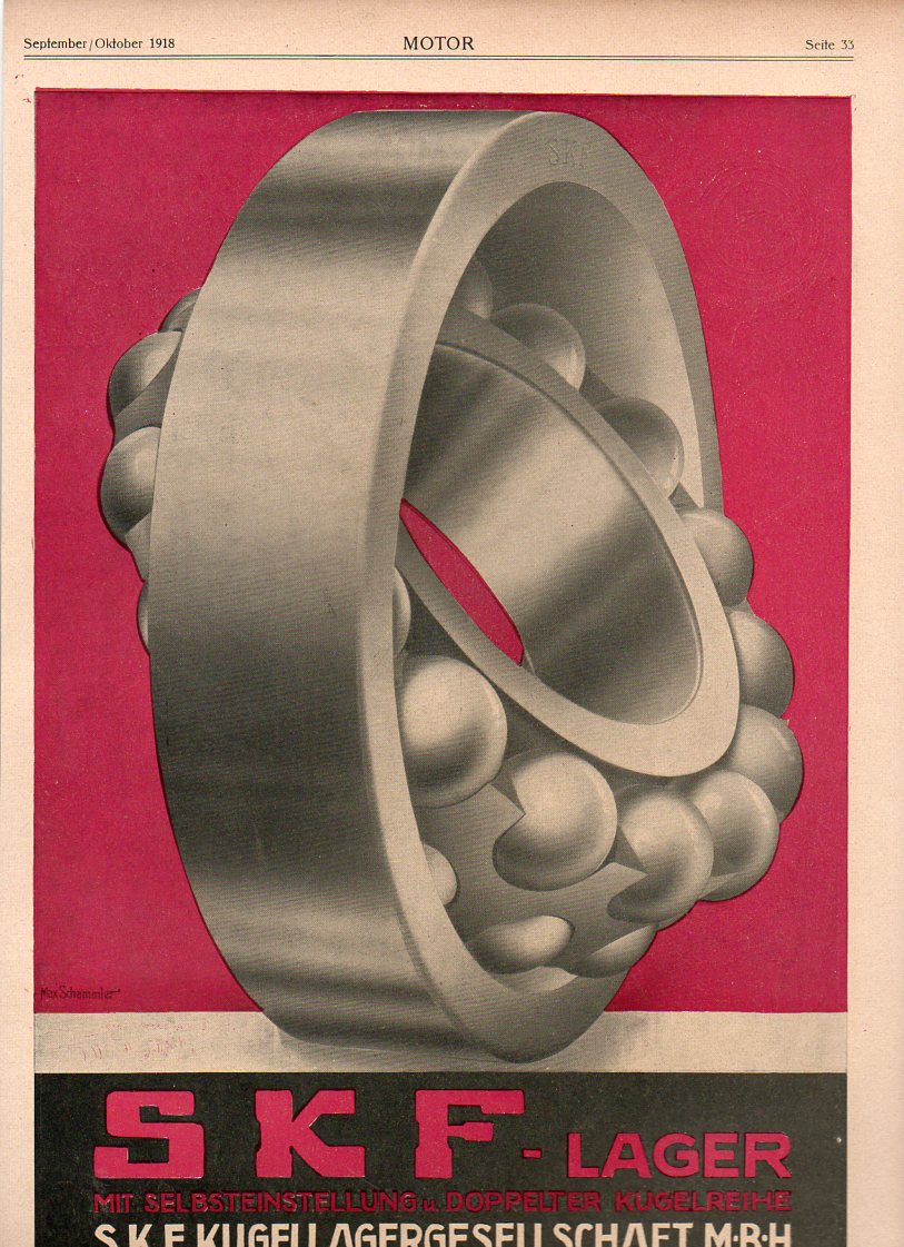
    When I look at something like this–an advertisement for a company that produced precision instruments–I think instantly of industry, automation, Dada and Duchamp, who along with Cubists and Precisionist and Futurists whobrought out the extreme beauty of industrial, technical, instrumental form.  At the same time its probably possible to unthink Engels and Marx who thought that the new coming art form of Communism would be purely functional, to be used in design and implementation only.  And I’m not talking about the way that the Victorians added their Victorian crowns and laces and altars in the design of machines and machine parts, worshiping as they did at the shrine of tech science.  Marx and Engels had something different in mind, a non-art of simple, employable, straightforward applied design.

    This ad is just beautiful.

    Ball bearingsb076

    Which is a detail from this image (available from our blog bookstore, here):

    Ball bearings075

    Ball bearings are exceptionally important and have a long history, I mean, long stretching back more than 2000 years (in its most primitive form), finding formative articulation in the Renaissance, and then their first patent in 1869–long and off the point for right now, just long and a little complicated.  I just want to say–I find this image to be quite lovely.


  • WWI Photographs–the Trenches, 1916-1918

    JF Ptak Science Books  Post 1265

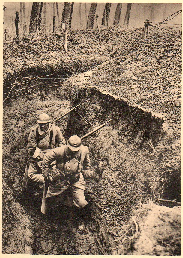
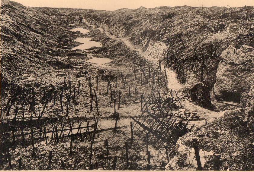
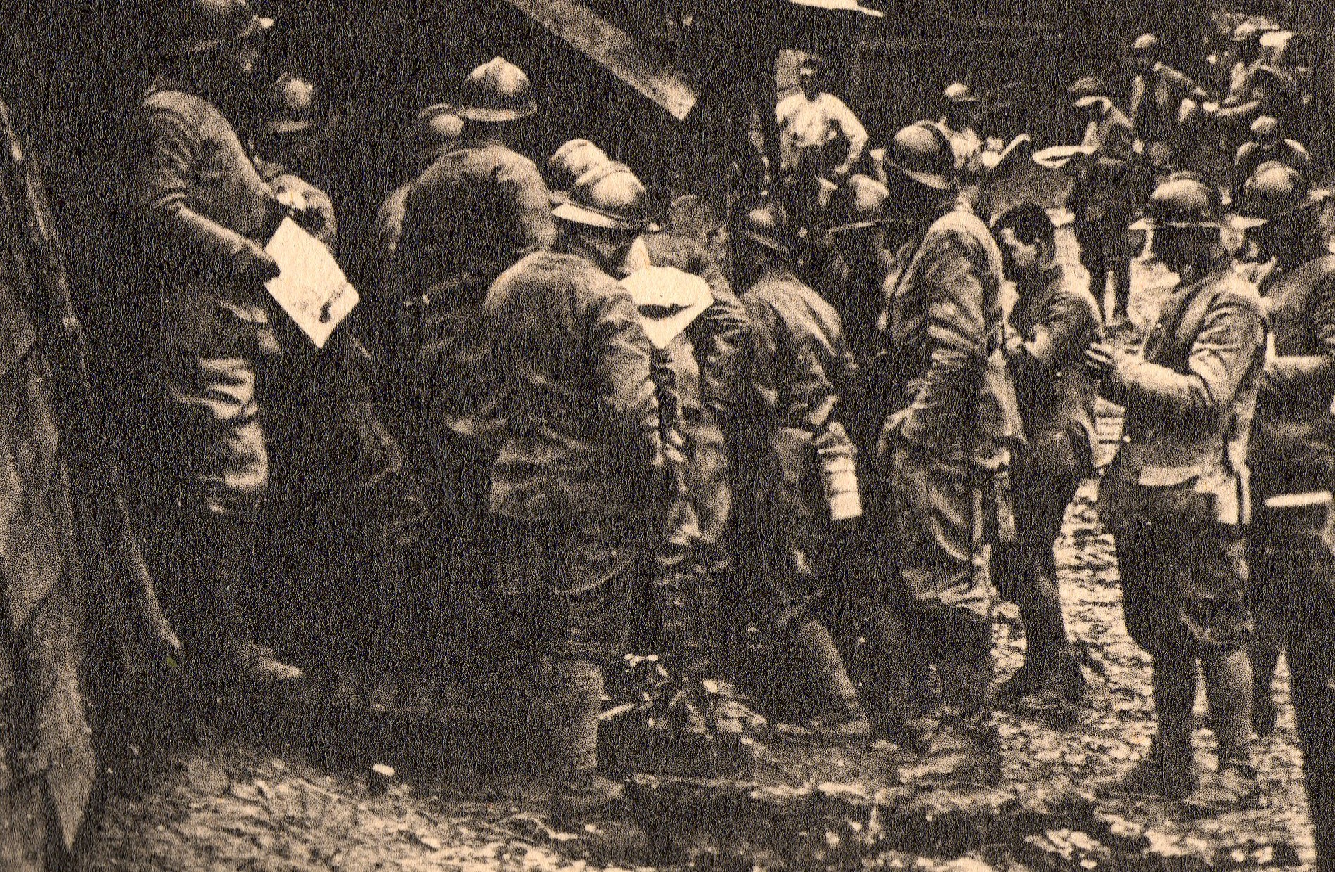
    Perhaps one of the worst inventions in the history of warfare was The Trench. Millions of men were wounded or met their ends while defending one, or attacking one, or being in-between two of them.  Hundreds of thousands of troops spent months charging back and forth between opposing lines, the ground over which they fought made uninhabitable for almost any form of life. 

    Earlier in this blog I wrote about sub-trench warfare--the story of the sappers who would mine underground, underneath the opposing force’s lines,  digging a horizontal hole the end of which would be filled with explosives and detonated, exploding up, destroying the enemy’s trenches. Bad business.  The trenches were bad enough without having to be vigilant against someone tunneling beneath, trying to make you into little pieces. Trenches were mostly cold, dark, miserable, wet, potential disease carriers, poison gas accumulators–and that’s of course before the shooting began.  There were thousands of men–tens of thousands of men, hundreds of thousands–waiting in their trenches, waiting for the other side to try and advance, attack over the well-named no-man’s land, running across open ground in a hail of millions of bullets.

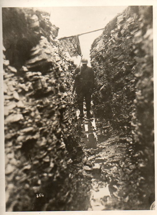
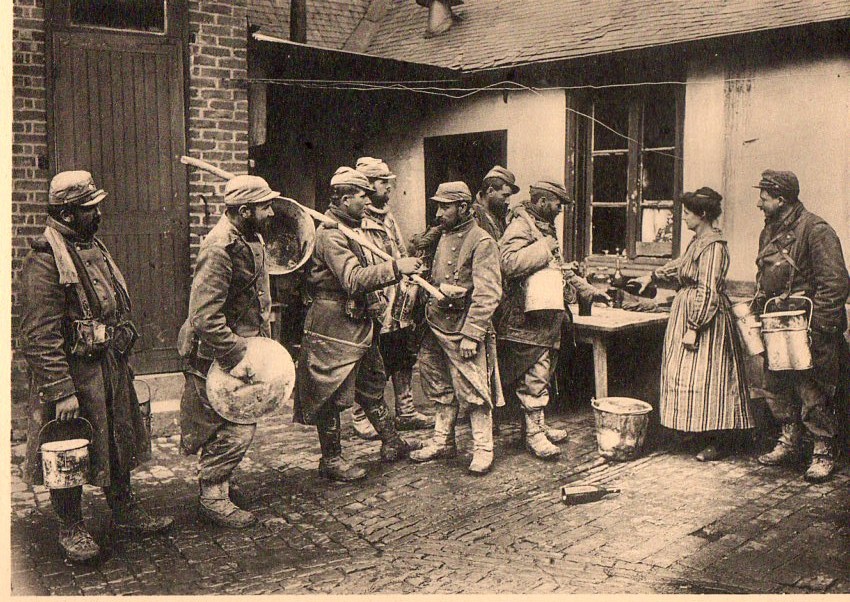
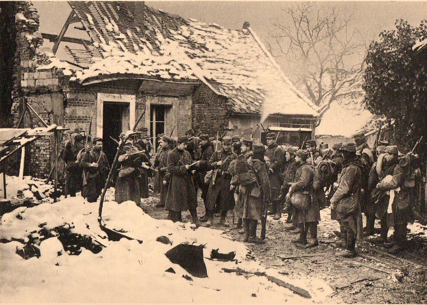
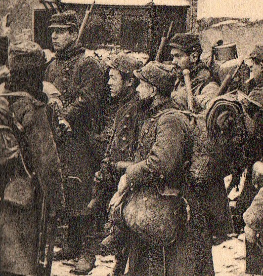
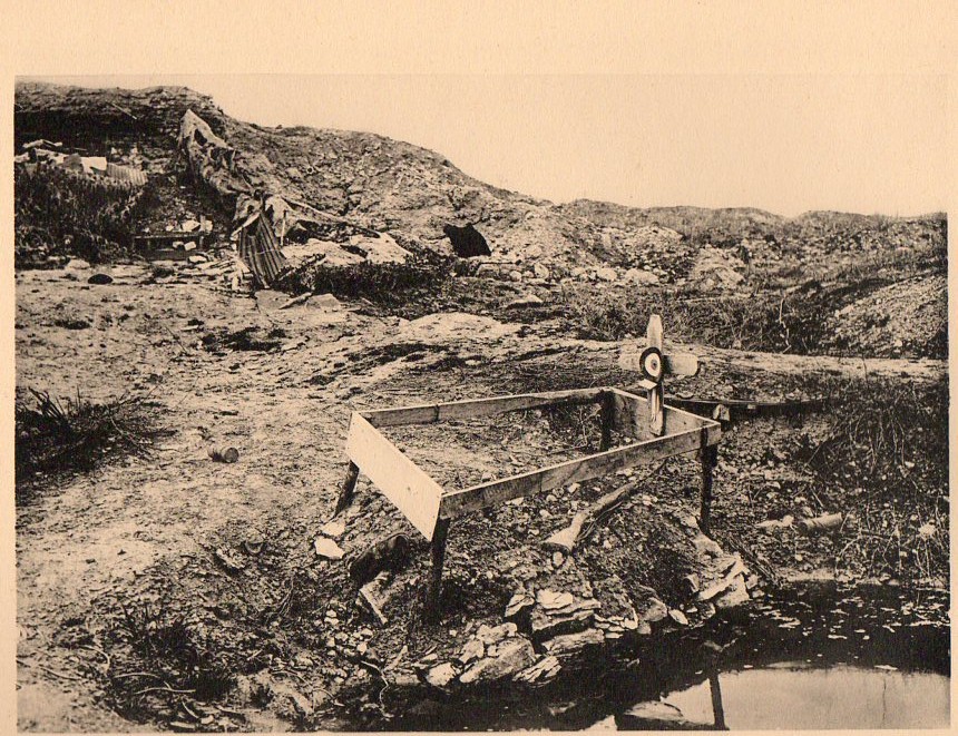
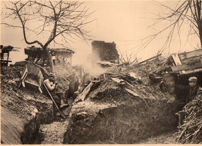
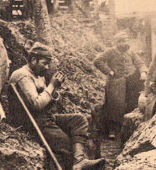
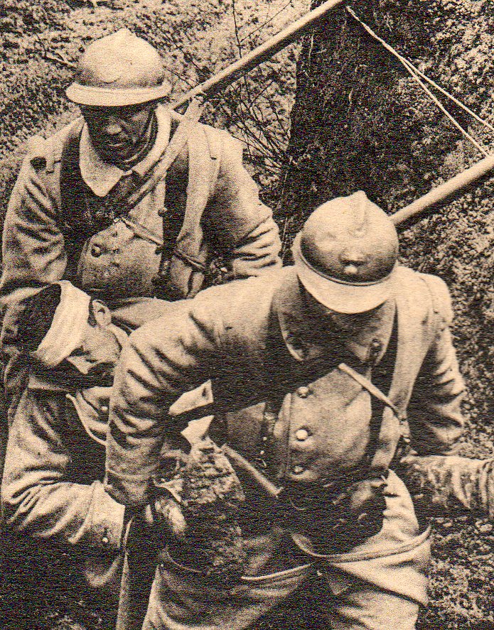
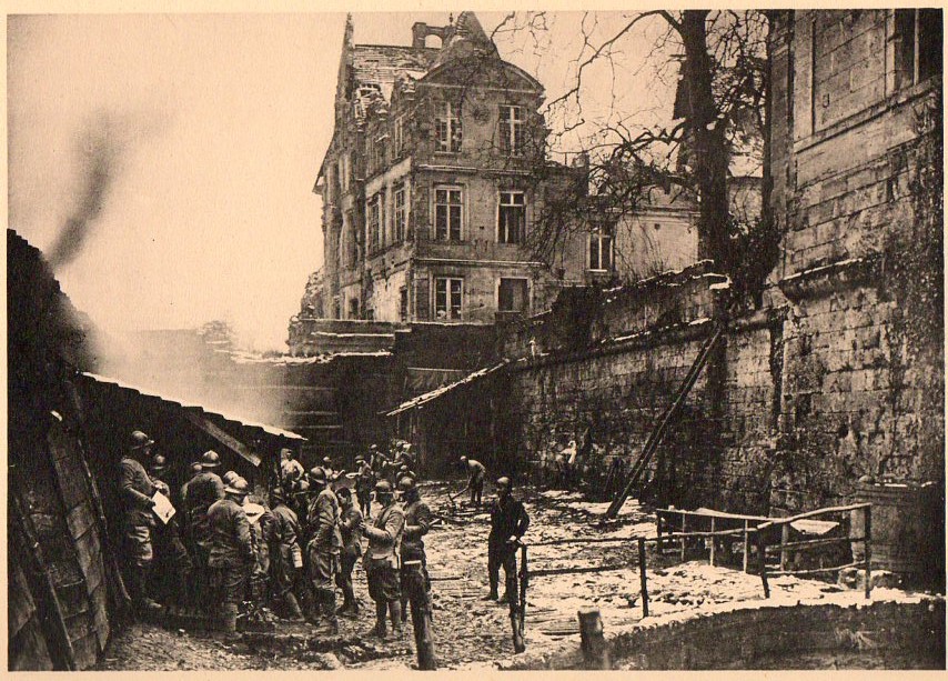
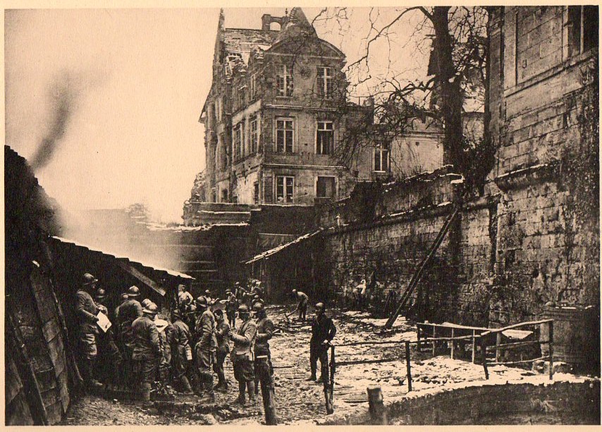
    I’ve collected a few images that are here (and available at our blog bookstore) that give a little flavor of the trenches, and the men in the trenches–though without the scent of the stale water, or the bite of the chill, or the perpetually wet feet, or the cold, or the dysentery, or death’s constant pull and struggle.

    WWI photo--trench045
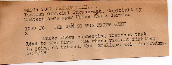
    This is an original photograph made by the Western Newspaper Union Photo Service, as a “British Official Photograph”  (with the “British” part penciled out and replaced by an unknown hand, “Italian”),  The photo agency supplied a caption for the image (that was supposed to have been used by the newspaper or magazine that published the picuture) as follows:

    WWI photo--trench note046

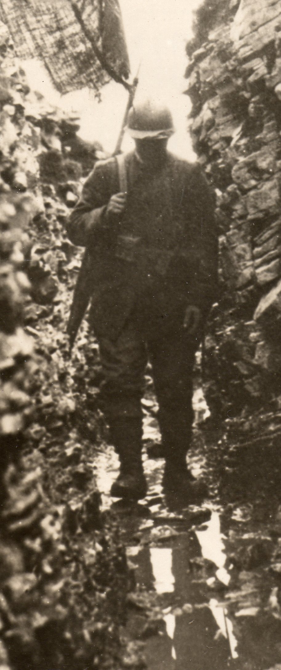
    And the detail:

    WWI photo--trench note detail047

    I’ve also put together a few examples from a collection of exceptional photogravures printed in 1919:

    WWI photogravure--group gettg drnk055

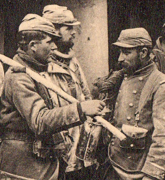
    And the detail:

    WWI photogravure--group gettg drnk det056

    WWI photogravure--soldiers waiting059

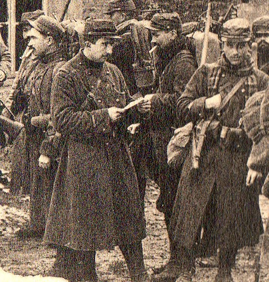
    And a detail:

    WWI photogravure--soldiers waiting det060

    And another detail:

    WWI photogravure--soldiers waiting det061

    WWI photogravure--grave054

    WWI photogravure--trench life 058

    And a detail:

    WWI photogravure--trench life det057

    WWI photogravure--trench wounded050

    WWI photogravure--trench wounded det051

      WWI photogravure--trench empty062

      WWI photogravure--bunched group street048

    And the detail:

      WWI photogravure--bunched group street det049


  • Blank, Missing & Empty Things: German Soldiers, November 1918

    JF Ptak Science Books   Post 1305

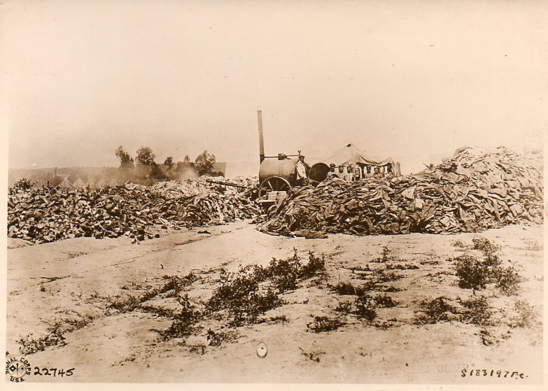
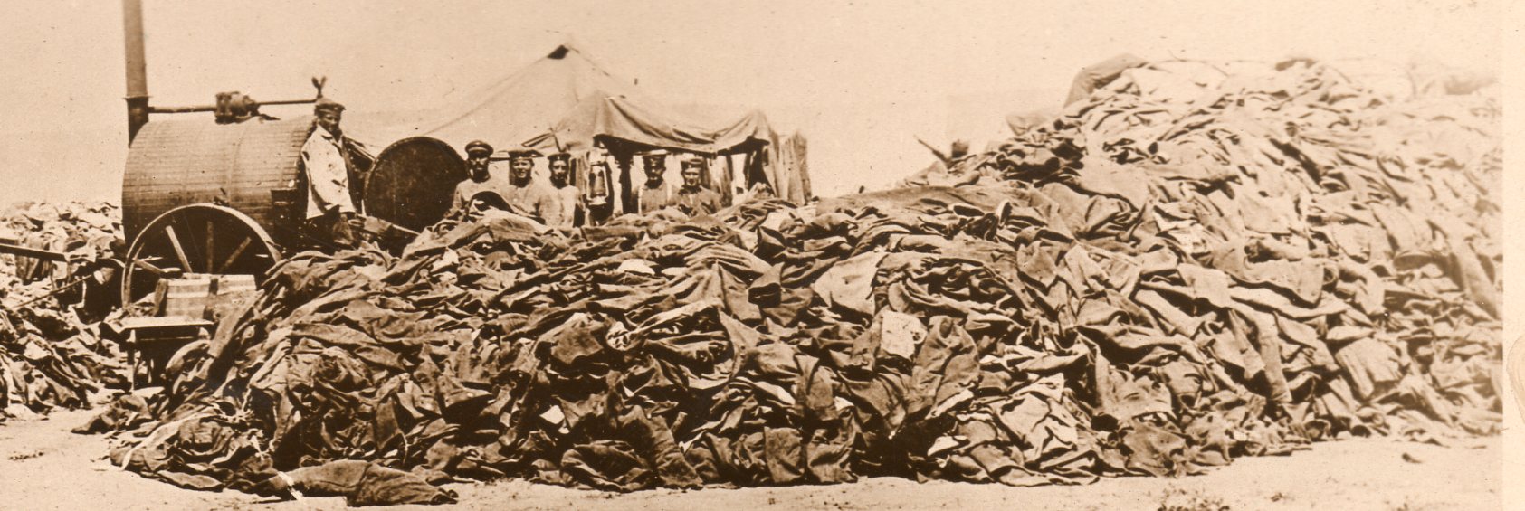
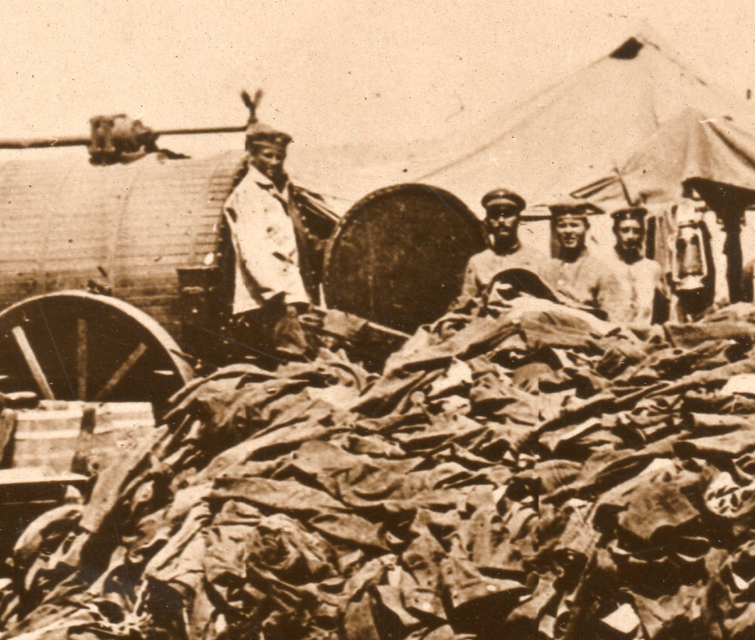
    This remarkable photograph is part of an archive of World War I Underwood & Underwood News Photo Service photographs I purchased many years ago.  It shows a pile of German soldiers’ uniforms–thousands of them–taken from German prisoners, the clothing headed for “cleaning and repair”. 

    World War I photos--empty uniforms287

    [This photo, along with mnay others, is available for purchase from our blog bookstore.]

    I didn’t know before this that the uniforms were repaired–I can imagine the cleaning part, since the prisoners must wear something, and deep into the fifth year of the war it seems hardly the case that they would be given anything at all to wear except for what they were captured in. the cleaning part sounds logical too, especially as the cleaning was being done by the prisoners themselves (pictured here).  Clean clothing makes for more sanitary conditions in mass compounds for thousands of prisoners, and lowers cost for the health maintenance for the prisoners in the short and long run.  And so far as repairing goes:  attached buttons make for closed coats; closed coats allow prisoners to have a better chance at staying healthy in the coming cold months. Just ask Napoleon about the cost of thread on the buttons of his army’s overcoats in the march towards Moscow.  (The thread that wasn’t used cost very little; the cheaper thread that was used cost everything.)

    And the detail:

    World War I photos--empty uniforms det288
    And closer still:

    World War I photos--empty uniforms detb290
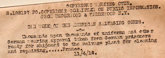
    And the text that was provided by the photo service company to be used along with the photo wen (or if) it was published. 

    World War I photos--empty uniforms txt289

    The cleaning and repairing went on, the prisoners kept coming in–even for those involved, the scent of the end of the war was in the air, though I doubt that the majority felt that it was only a week away. 


  • An Unexpected “Discovery” in Correspondence to Santa, 1871

    JF Ptak Science Books

    Blogsanta121 I do love Santa. 

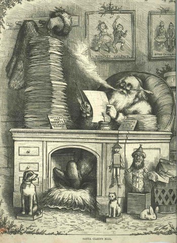
    And I know a little about him; but when I looked closely at this wood engraving of the man hard at work something struck me as very unusual to my Santa experience.

    The image is from 31 December 1871–coming after Christmas for some reason–and it is one of the very earliest depictions of the most universally recognized form of Santa. It was created (his image that is,  of course) by the incredibly prolific and almost-entirely socially responsible (except for Catholics and the Irish) Thomas Nast.  Nast created this standard, iconic image of Santa–plus the Republican elephant, the Democratic donkey, the Tammany tiger, and many more iconic public images. 

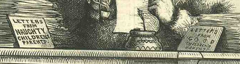
    In fairly famous and often used images I had never noticed that the letters that Santa is reading are being taken from the piles on his desk–but the letters are not written by children, but rather were sent by the parents.

    Is this end-of-the-year grading? Were the “naughty” children being ratted out by their parents?  Does Santa really need to be told all of this?  And who on earth really is deserving of a lump of coal, anyway?  I’m guessing though that this was simply a warning cartoon to children, saying to them that they’d better well be good or a letter will be going out from Mom and Dad to Santa in the afternoon mail

    This might make more make more sense if the cartoon wasn’t published five days after Christmas but appeared before the holiday. Perhaps it is perfectly placed–tis would’ve been the first issue of the weekly magazine after the holiday, so reminding children to be good after a Christmas in which they might not have received what they wanted may have been caused by their behavior.  And since part of Nast’s social power came from depicting events that were of interest to the working class and the poor and making them intelligible to the illiterate, where the cartoon/caricature could speak without words and make themselves understood, it might’ve been the case where parents would show the image of Santa to the kids and then tell them about the letter part to try and codify a different behavior in the new-coming-Christmas season. 

    Blogsanta121detail

    These questions aside, the lesson yet again for me is to look very closely when looking at complex images like this—especially when you think that you already know what you’re looking at…


  • Terrific Understatement Department; the Kaiser and the T.V.

    JF Ptak Science Books   Post 1273

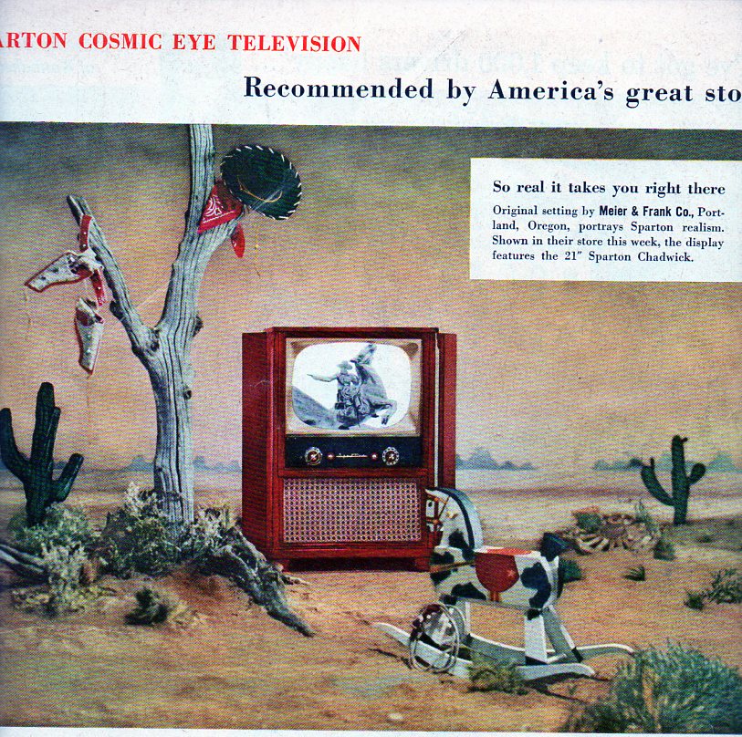
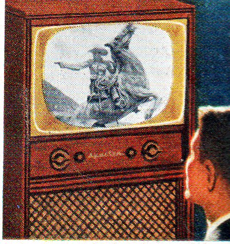
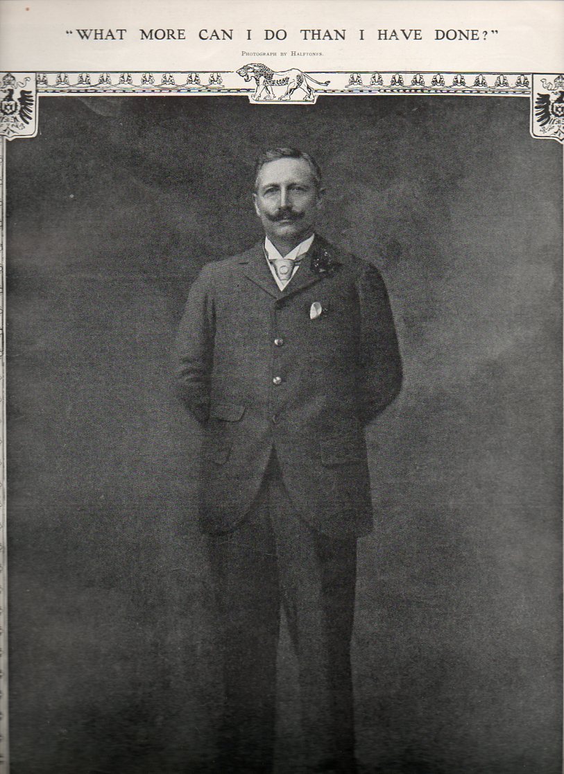
    There are some combined image/narrative displays that are quietly spectacular, soaringly spectacular in very not-provocative, subtle ways. Here are two that popped up last night. 

    Out-of-place Department tv118
    Out-of-place Department tv b119 The Sparton TV ad (from LIFE 1954) dares us to believe that it will get us to the thing that we are watching–a tremendously invasive lie, a Big Lie, buffeted by placing the TV in the middle of a desert from the scene it was/is projecting, along with the toys of a child.  And in glorious black and white.  We can obviously see that the television can’t get us there, not really, not at all, not better than a book (an enormous creative implement compared to the television), by the tv-set’s absurd appearance in the desert.  Plus, well, the TV isn’t getting “you” to the place, it is getting itself there.
                           
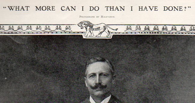
    Now,  Kaiser Wilhelm II–looking like quite the entry into the Anglosphere in this photo, which came easily for him since he was the grandson of Queen Victoria–was depicted in this image (appearing in the Illustrated London News for 7 November 1908 as a great peacemaker.  Or at least a man who had extended himself to find solidarity with Great Britain–so much of himself in fact that he could extend no further, that he could do no more, hence the question “what more can I do than I have not done?”
    Out-of-place Department Kaiser116
    IT has the quality of a post office “wanted” poster, which may actually be sort of true, what with what would happen in the next six years and all.

    By 1918 the Kaiser was hiding in the neutral Netherlands, caught unawares out-of-town in Belgium when things went to hell in Berlin for him.  And after the war with the signing of the Treaty of Versailles, Wilhelm II found himself in early 1919 facing Article 227 of that treaty, “for a supreme offence against international morality and the sanctity of treaties”.   But he wasn’t extradited by a friendly Queen Wilhelmina (hint) in spite of the international call to do so.  Well,  “International” except for the United States, where President Wilson sought to infringe on Lincoln’s post-bellum treatment of the Confederacy by letting Wilhelm go, not prosecuted for the larger hope of keeping alive a chance for peace.  Wilson should’ve looked a little harder for peace than in the Kaiser’s direction, as the Treaty really didn’t end the war as much as it started the next one. 

    The Kaiser last until 1951.

      Out-of-place Department Kaiserb117


  • Bombing Britain, 1940–a View from the German Side

    Dsc04742_2 JF Ptak Science Books  Post 1241

    It is essential to look at objects from alternative angles, especially in science, in order to determine the correctness, or fitness, of a finding, or opinion.  Even when consolidating data or evidence regarding the confirmation of an established bit,  you may very well find other strands of loose data that could help illuminate even a well established or iconic societal “given”.

    That the war was not going well for the Allies in September 1940 is an understatement—and the chief allies at this point excluded the United States, happily now recovering from the Depression, and still a full 14 months away from entering the war. 

    Dsc04739 What is very weird to me is that after having looked at every issue of LIFE magazine at least three times  from the start to the end of World War II, that there are more advertisements using war images than there are images of the war itself.  This actually continues into the spring of 1942, when LIFE got really busy, the war got really messy, and people started really dying.  And frankly even the coverage of Pearl Harbor in no way lived up to what I thought the coverage of a photo-magazine like LIFE would be. This is not a scientific study.  It just strikes me as odd, or propagandizing, that there should be such relatively scant, or undervalued, coverage of the fighting when sanitized images of that same fighting were being used to sell socks and shaving cream and cigarettes and such.  I understand the power of hearts-and-minds campaigns, but this seemed so amateurish, boorish even, that it just didn’t approach the level of a psychological ploy to pacify an American public that had virtually no interest in attending the European Theatre. 
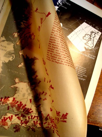
    This was not the case with the British equivalent of LIFE—the Illustrated London News.  Actually, I should say that LIFE is a dumbed-down version of the ILN, which was the world’s first illustrated magazine, and which began almost 100 years before LIFE was born.  The ILN covered the war like it was a war being fought in their front yards—and it was.  Dsc04741

    This was also not true of one of the principle German equivalents of these two weekly photo-imags, the Illustriete Zeitung (Leipzig).  There was a  lot of war coverage, though much more sanitized than even the very sanitary (pre-1943) versions of reality issued by LIFE and the ILN.  The Germans by and large did not use war or military images to sell common-sue, every-day consumables; it rather concentrated on the glories of battle, real and imagined, as well as using a very grandly flatulent palette to paint the image of Adolf Hitler.

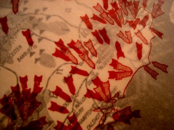
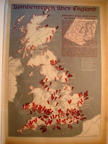
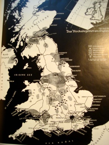
    What caught my eye was a map in the 5 September 1940 issue of the Zeitung.  (The cover woodcut illustration, by the way, is a sharpened point of the Roman standard bearer being used by the Fascist Mussolini government about to impale a running cat-thing that represented Somalia.  The Italians attrociously bombed innocent civilians in Somalia and Ethiopia with abandon and disdain.) On page 165 is a two part map, the upper part being a velum-like overlay, showing the German bombardment of England.  (“Bombenregen ueber England.  England muss jetzt allein um seine insel Kaempfen…” )  The template map is in stark black and white, showing locations of “war” industries, chemical plants, rubber works, textile plants, metal industries and gas works . The overlay shows the outline of the island with 150 or so bombs, imprinted with a color code to show what sort of industry it was intended for.  As you can see there was quite a cluster around London—I looked closely, and no one bomb was actually placed directly upon the outlined city of London. Suffice to say that no fool editor at the Zeitung was going to show their readers that German bombs were falling on a city. 

    Dsc04740 What this map shows me, outside of the propaganda aspect for its intended readers, is that the basic bits of the bombing campaign was actually true—that there was a whole crap-load of bombing going on, and going on quite well country-wide.  Certainly people in England knew this but knew it in chunks.  The Battle of England was being fought at this point, and the outcome was still undetermined—even though the Brits had the “ultra” and basically knew when the attacks were coming, and where.  But looking at this image of the bombing from a completely different, contemporary, and ENEMYsource hammered home the fact that England was being bombed, and bombed heavily, and that its future was in real doubt. 
    [This issue of the Illustriete Zeitung is is available for purchase from our blog bookstore.]


  • Finding Unseen Things In and From the Air

    JF Ptak Science Books  Post 1131

    Seeing more deeply--air weather det853

    Finding the hard-to-find, the invisible, the “hidden”, is an essential aspect of, well, mostly everything.  Whether it is Newton separating light with a prism to find its constituents, or Hooke investigating the formerly quasi-real microscopical world to reveal worlds within worlds, or Galileo using his telescope to quash the ideas of the unaided-eye-visible night sky as an unaltering perfection of creation, or Roentgen seeing through his wife’s skin, or Fraunhoefer finding the complex spectrum, or Henry Draper determining a chemical constituent of the sun, or the invention of the zero or negative numbers or subtraction, of finding Black Holes or other planets or the remnants of the Big Bang, or (Kandinsky) finding the nonrepresentational aspect of art, or Duchamp finding in an upturned urinal that art had no boundaries…the list goes on and on.

    One aspect of this “finding something in nothing” business that is interesting to look at because it is so local and discernible–and recent–is in air navigation and detection.  And I’ll do this using a series of excellent illustrations from The Illustrated London News, all of which are from the 1927-1938 period. 

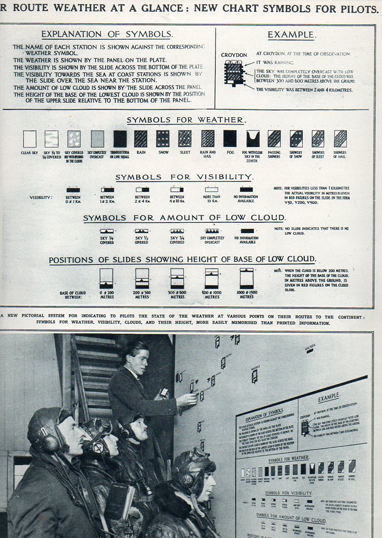
    The first is relatively simple, at least simple from here in the year 2014, which shows four pilots being briefed on weather conditions with a aerial chart for conditions along intercontinental routes.  The placement of these symbols represented a vast improvement over the earlier systems of readying pilots for what weather lay ahead, if indeed there were any communications at all.  This represents an early look at a codification of conditions and expectations for air travelers–a display of new and important data in 1927. 

    Seeing more deeply--air weather852
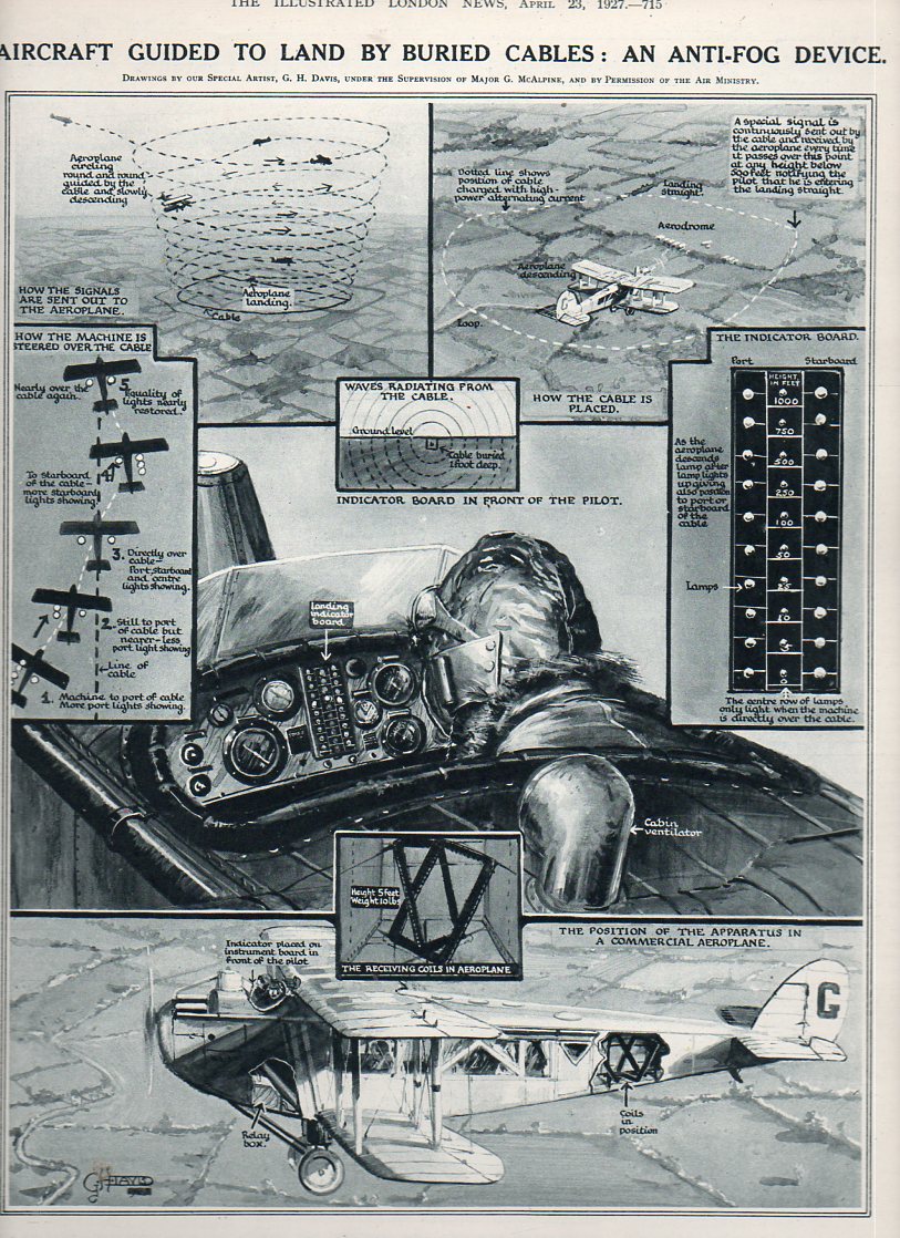
    Next is a brilliant device for assisting pilots to land in foggy and dark conditions–actually on how to find the ground safely.  In 1927 (again) a RADAR-like system was put into place on aircraft that involved receiving the signals of an ac-pulsed buried electrical cable that surrounded an airport.  The receiver (seen here on the flight panel of the pilot in an open-air cockpit) would be read to reveal proximity of the airport, the pilot making wider and then closer spirals in descent until his was basically within the buried airport cables and thus able to land.

    Seeing more deeply-anti-fog855
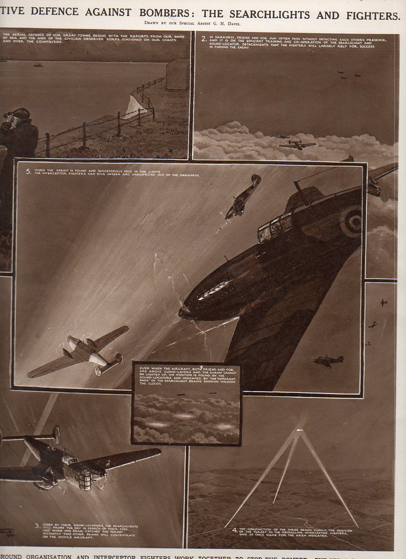
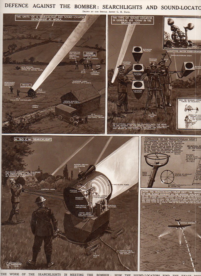
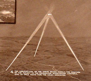
    Prior to WWII RADAR1 was somewhat functional but still in development, and as we see in this set of 16 July 1938 illustrations, the key methods for finding enemy aircraft at night (in order to shoot it down of course) was an audio-visual method, using “sound-locators” to find the approaching bombers and then spotlights to illuminate and track them to their destruction.  

    Seeing more deeply-searchlight856

    Seeing more deeply-defence against bomber854

    These images represent some idea of the state of the art of being able to find things–like the ground at night or approaching enemy aircraft–in the 1927-1938 period, all of which would be drastically changed in just the next two years.

    Seeing more deeply-searchligh detail857

    NOTES

    1. RADAR was coming very close to being developed in the early 1930’s–and in 1935 the process of experimentation and implementation was at a peak.  The development of this new technology was an international property, though perhaps no one owned it more in this period than the British, with Watson Watt giving his experimental ideas on RADAR to the Air Ministry on 12 February 1935 in a secret report titled “The Detection of Aircraft by Radio Methods”. Int his years alone there was feverish work being done by  Rudolf Kühnhold (Scientific Director at the ‘Kriegsmarine  Nachrichtenmittel-Versuchsanstalt) who in 1933-1935 established a RADAR-hunting company called Gesellschaft für Elektroakustische und Mechanische Apparate, or “GEMA”; there was also elements of the Royal Navy, Telefunken, Standard Elektrik Lorenz, Philips Company’s  (of Eindhoven, Netherlands) Natuurkundig Laboratorium, the Research Office of Nippon Electric Company, and even in the Soviet Union (until the key figures involved were murdered in Stalin’s purges–this one distinguished from others and referred to now as The Great Purge– of 1937), the French Compagnie Générale de Télégraphie Sans Fil (CSF), and  the Italian Regio Instituto Electrotecnico e delle Comunicazioni (RIEC, Royal Institute for Electro-technics and Communications) to name a few.  The United States of course had been long working on the project, at least since 1922 at the NRL, with considerable private (and federally funded) work done by RCA

    .
    Whipping ahead into WWII a very significant “battle of the beams” began between the U.K. and Germany, especially during the Battle of Britain, involving countermeasures, espionage, propaganda and false-positives in regards to the use and development of radio-based tracking and detection–the U.K. particularly making use of this technology in a wide-spread air defense system.  But it was in the United States in 1940 (and really by the U.S. Navy) that RADAR got its name (for RAdio Detection And Ranging) as well as its great impetus for development and deployment.


  • A Paper Mirror and the History of Blank Things–Illusory (Sea) Power

    JF Ptak Science Books  Post 1228

    [This is a part of our History of Blank, Empty and Missing Things series.]

    Mirrors don’t necessarily have to reflect something to show  reflection–they merely need to offer you a picture of something that can show the difference of something real versus a false image of that same thing.  “Through a glass darkly” (1 Corinthians 13:12) isn’t necessarily a reflecting surface though it is a reflective one; neither is the painting in The Picture of Dorian Gray.  Harry Potter’s Erised mirror does act like a mirrorish mirror, and Narcissus does come to a bad and wasted end in front of his pondside reflection (the “perilous mirror”of the Romance of the Rose).  The queen’s mirror in the tale of Sleeping Beauty doesn’t reflect but does give advice, and Alice’s Adventures…  in 1871 begin with wondering what was on the other side of a mirror (“looking-glass”) above her mantel–in a similar vein Kurt Vonnegut introduces a mirror as a “leak” into another dimension rather than a reflection.   Sometimes you get a hand-held thing with glass, and sometimes you just get a piece of paper.

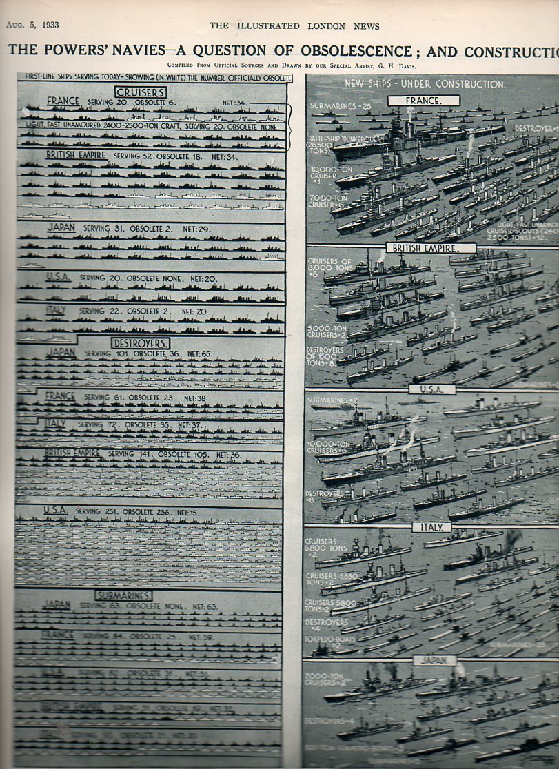
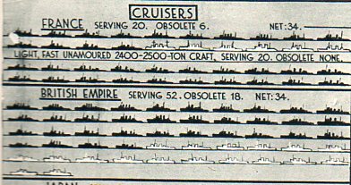
    Navy obsol818 This graphic from The Illustrated London News (5 August 1933, and available for purchase here) is an interesting case in point for a paper mirror.  It is interesting in how it presents a reported state of affairs and its actual condition.  In this case, the artwork shows the supposed/reported strength of the navies of the five major seafaring powers (France, British Empire, Japan, United States and Italy) and what those navies wpuld look like if the outmoded and obsollete ships were removed.  The modern and servicable ships are shown in black silhouette; the numbers of obsolete vessels were shown in white.  The dipiction of blank or empty of missing ships was a very convincing tool depicting the actual state of the major powers’ navies compared to a more romantic means of reporting naval strength. It must have been an excellent wake-up  to thopse with the capacity to see the truth, presented on one piece of paper, a mirror by any other name.

    Navy obsol cruisers819