A Daily History of Holes, Dots, Lines, Science, History, Math, Physics, Art, the Unintentional Absurd, Architecture, Maps, Data Visualization, Blank and Missing Things, and so on. |1.6 million words, 7500 images, 4.9 million hits| Press & appearances in The Times, Le Figaro, Mensa, The Economist, The Guardian, Discovery News, Slate, Le Monde, Sci American Blogs, Le Pont, and many other places… 5000+ total posts since 2008.

Category: Prints–looking HARD/deeply at

  • Beautiful Technical Illustration: Heck’s “Iconographic Encyclopedia”, 1851

    JF Ptak Science Books   Post 151

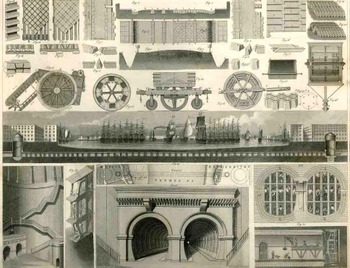
    J.G. Heck wrote and compiled a fascinating and complex work entitled The Iconographic Encyclopedia of Science, Literature and Art, and was published in America for the first time in 1851 following Spencer Baird’s translation from its original German.
    Blogtunnel_full239

    The key to his work is the amount of data displayed on each of the 500 engraved plates illustrating this work and the way in which it is arranged.  The design and layout of the 30,000 items on these 500 plates was a work of genius, and for my money it is easily the best-presented complex means of the display of data and objects that was published in the 19th century.   

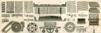
    Take for example this illustration in the technology section (a subdivision of the applied arts which is a sub division of the plastic arts) and, continuing in this complicated scheme, was Plate 1 from Section X Number A1 with a description found in the text on a dozen pages in Section 2 of Volume 2 on section pages 134-150 and overall page numbers 835-851 (!).  The plate contains 35 figures, very finely executed and rendered (many of the other of the 500 plates have 100 or more figures), and is in general related to the construction of roads and tunnels (and further, part of the “communications” section).

    This of course would be a perfect Hypertext candidate.
    Blogtunnel_top240

    The illustration itself contains an enormous amount of information.  The row along the top third or so is dedicated to street construction and paving stone, showing stones in plan and profile, as well as a cross section and ground plan of a “typical” street (including sidewalks).  It is interesting to note the detail of the cross section and the stonework that is placed beneath the horse and wagon section of the street.  There are some other beauties here as well–details of wooden paving blocks, the plan for a Laves of Hanover road, different ways of cutting stone blocks—but we won’t deal with those right now, except to point out that there are several renderings of street cleaners and road rollers (of Shettenmann and another of Schaefer) used to border the street section from the tunnel section. 

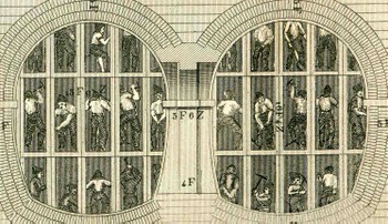
    Blogtunnel_middle241 The middle section of the engraving is of course a cross section of the Thames tunnel of the beautifully-named Isambard Kingdom Brunel (begun in 1825 and completed 1843, the tunnel 35 feet wide (11 m), 20 feet (6 m) high and 1,300 feet (396 m) long, running between Wapping and Rotherhithe at a depth of 75 feet (23 m)).  The representation here is only one inch high and ten inches long but is loaded with just fabulous detail, no the least of which are the (less than) 1mm tall workmen that can still be seen in the tunnel.
    Blogtunnelbig_detailig247
     
    The enlarged detail shows a section of the tunnel being built according to Brunel’s new specifications:  a larger, shielded tunnel being constructed around the interior construction of 12 individual tunnels (each about tall enough to allow a (short) man to stand erect. 

    In short, the engraving is a superb example of *correct* design of great artistic  ability, all accomplished while displayed heaps and gobs of interconnected, complex information. 
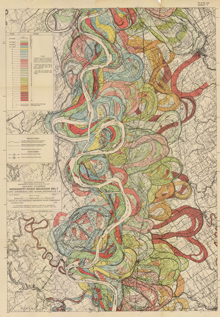


  • Ghost Trails of the Mississippi River: Harold Fisk’s Geological Map of 1944

    JF Ptak Science Books   Post 144

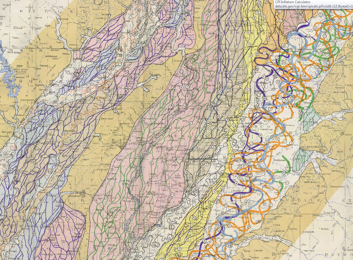
    Fisk map plate 22

    Understanding the Mississippi River was the skeleton key to understanding pre-Civil War America.  There was really nothing else quite like it—the Ohio River and the attention paid it by Collot and others  was of great importance to understanding the early far Western (east of the Mississippi River) adventures of Colonial and Post-Revolutionary America, as was the Missouri to early 19th century American exploration and settlement, but the Mississippi loomed over all.  Like saying that Babe Ruth was a fabulous baseball player or that Richard Feynman was a brilliant physicist is a bland statement of the obvious—the understatement hollowing and becoming more brittle the more deeply their “records” are studied showing how truly incomparable they were—the Mississippi, “The Father of Waters”, is really the Big Deal in the history of the U.S. 

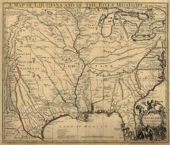
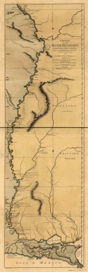
    And in spite of the fantastic maps made of river through the 18th and 19th centuries (like these gorgeous and iconic examples by John Senex in 1721 (A map of Louisiana and of the river Mississipi [i.e. Mississippi] : this map of the Mississipi [i.e. Mississippi] is most humbly inscribed to William Law of Lanreston, esq.)  or Robert Sayer  (Course of the river Mississippi, from the Balise to Fort Chartres; taken on an expedition to the Illinois, in the latter end of the year 1765. By Lieut. Ross of the 34th regiment: Improved from the surveys of that river made by the French. in 1772, or even Coloney & Fairchild’s Ribbon Map of the Father of Waters (below, a whopper, measuring in at 337 cm (and which was issued on a wooden spool for the use of travelers on board steamships moving along  the river), there were very few that gave you an idea of the *history* of the river.

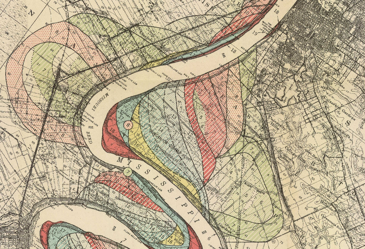
    That was achieved in spectacular flourish by  Harold Fisk (in the map above) in 1944 in his Geological Investigation of the Alluvial Valley of the Lower Mississippi River (U.S. Department of the Army, Mississippi River Commission, 78p) The map showed the very ghost trails of the river over time, and trying to show where it wasn’t was the great question.  He tried to reveal the history of the valley by mapping  and dating all physiological features of the river and tried to reconstruct the channel changes with what were to become speculative appreciation.  Nevertheless, he did make a tremendous attempt at explaining the courses of the Mississippi over time by utilizing his own excellent maps and a little generative thought.  This might not be the most accurate map of the courses of the Mississippi over time, but in 1944 it was really a spectacular achievement in cartography and general thought.  And the thing was just drop-dead beautiful.

    Here’s another sample from the suite of maps:

    Fisk Map

    [Source: http://biotech.law.lsu.edu/climate/mississippi/fisk/plate_15-1.pdf]

    And another detail, from map 15, in the vicinity of Baton Rouge:

    Fisk map baton rouge

    • The full text is available here from the LSU library: http://biotech.law.lsu.edu/climate/mississippi/fisk/fisk.htm
    • For a very quick, elegant overview see Radical Cartography which has all 15 of the maps displayed at once, along with a key chart :  http://www.radicalcartography.net/index.html?fisk
    • Also go to the U.S. Army Corps of Engineers site and click on the “Fisk oversize” link in the left-hand “documents” column:  http://lmvmapping.erdc.usace.army.mil/index.htm


    Mississippisenex

    Mississippi_1765

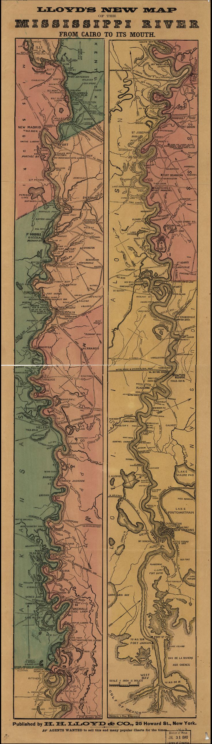
    Lloyd’s new map of the Mississippi River from Cairo to its mouth:

    Mississippi Lloyd map[Source: Library of Congress, http://www.loc.gov/item/99447107/]


    And the great “Ribbon map of the [Fa]ther of Waters.Created / PublishedSt. Louis, Mo. : Coloney & Fairchild, 1866”: 

    (Very zoomable version here:  http://www.loc.gov/resource/g4042m.ct000797/  The initial image comes up about 4mm wide (1)–don;t be discouraged, just start clicking away at the magnifier and it will zoom right in…)

    Mega-long scroll follows:


  • Visionary Architecture and a Falling Man Prank–E. Hebrard’s Tower of Progress, 1913.

    JF Ptak Science Books   Post 118 (expanded)

    Dsc00013

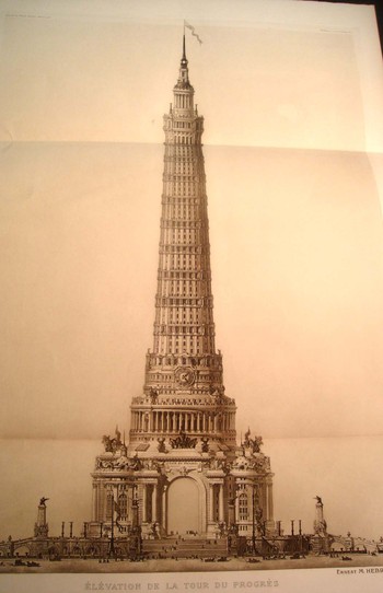
    This image has two things going for it, one obvious, the other not (and just about hidden, until you see it, then you can’t help not seeing it all of the time).  It comes from an unusual, somewhat pretty/bizarre visionary work privately printed in Paris in 1913.  The lead author, Hendrik Christian Andersen, along with Ernest M. Hebrard (and his brother, Jean Hebrard, who we saw in an earlier post), collaborated on a project (ungainly) called Creation of a World Centre of Communication1, a deeply complex, very detailed, and just plain weird offering for building a sprawling extraterritorial city dedicated to “oneness”.  The drawings and plans were lush and lovely, with a lot of thought in their execution but actually very little into how everything might actually be pulled together into some sort of working whole. 

    Dsc00012

    And so it goes.  I imagine that if the beautiful Etienne Boullee thought in terms of cities rather than in single structures, he might’ve produced just the same sort of gorgeous, unconnected thing.  After all, just because you draw a plan with a lot of buildings almost touching each other doesn’t necessarily mean you’ve drawn a visionary city. 

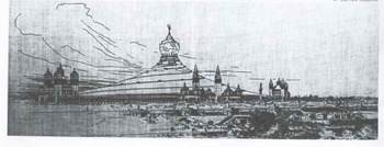
    This is one of 22 large images (in real life this print, a heliogravure, measures about 28 inches tall) showing different structures from an art center to a fountain of life.  This is the “Tower of Progress”—I don’t know what sort of progress as there’s really nothing to go by, except for the big 100’-tall clock, so at the very least it is a celebration of the progression of time, which needs no monument outside of the trillions and trillions of trillions (or centillions, or 10303?) of bones it has distributed around the planet over the millennia. But for Hebrard it formed the locus of the  “a fountain of overflowing knowledge to be fed by the whole world of human endeavour in art, science, religion, commerce, industry, and law; and in turn to diffuse throughout the whole of humanity as though it were one grand, divine body conceived by God, the vital requirements which would renew its strength, protect its rights, and enable it to attain greater heights through a concentration of world effort.” Whew.

    I figure that the tower was to be about 1,500 feet tall (scaling it by the 2mm tall figures scampering around in the image)—a giant tower perched on top of a rotunda placed on top of a table-like something, looking terrifically fake, but lustrous.

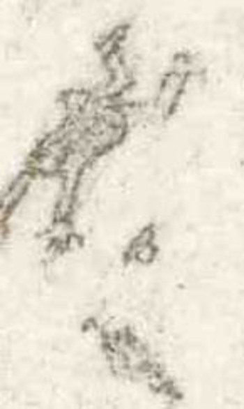
    The prize though in this portrayal of the “Tower of Progress” is a little smudge-like thing to the middle-left of the tower.  Under magnification, we see that it is a man, with a bowler and an umbrella, hurtling down, falling from somewhere way on high in the tower.  It is of course a very unexpected feature of this visionary architectural rendering, a hidden joke (perhaps?).  These sorts of additions—the work of a disgruntled/drunk/humorous engraver—pop up from time to time in the history of printing.  Perhaps the most famous intentional example of this graffiti is found in the earliest copies of the first edition of Twain’s Adventures of Tom Sawyer, where a male character is featured with

    a very large, very lumpy, very noticeable, erection; a proof reader spotted the embarrassment, and the plate was reworked to rid the character of the Natural Function.  I’d guess offhand that this was the case with the Hebrard heliogravure, even though there is a second figure in the tower pointing at the figure hurtling past, implying a little more thought in making this a more cohesive joke.   

    Notes:  An interesting review of this work appeared in Town Planning Review for 1914, here. 

    Falling_man_super_detail


  • Gigantic and Unbuildable Buildings: Leroy Buffington, 1889

    JF Ptak Science Books LLC   Post #106

    This is the first in a series taking a little look at some big buildings—very big buildings, that is, monstrously putting the “b” in “big”, altogether too-big, impossibly-big, buildings.)   There have been grotesquely, morph-aided, Babel-like buildings proposed that are bigger than the ones I’ve got in mind, but those tended to live in the science fiction world, or even more removed, in the self-published beyond-the-pale world—but what these later buildings have in common is that no one intended to actually build them, while the ones we’ll take a look at were serious proposals looking for real world serious money. 
    Big_arch136_2

    (For example of the former category, I own a 1935 pamphlet in which the self-published author proposed a 60-mile (?!) tall building with a bell on the top to summon all world peoples to celebration of unitary religion and other, odder, needs.) 

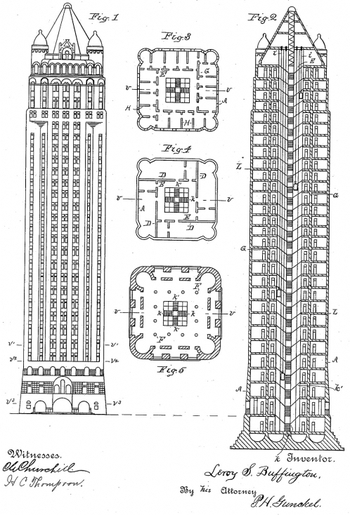
    The first of these intentional  buildings was a proposal of a busy, respected and advanced architect named Leroy Buffington, of Minneapolis.  His put forward this plan in 1889 to be considered for an exhibition building in the Chicago Columbian Exposition of 1893.  It was rejected out of hand because of the obvious expense, but when you take a closer look at the thing it just seems to have been an impossible structure to build given the contemporary technology.

    The building was meant to be a “steel tent”, with a corkscrew-like electric railway winding its way around the building to a globe with a cross on the apex at the top of the structure.   (The detail  below is from about the exact middle of the building and shows the railway cars.)
    Big_arch136detail_2

    By my reckoning, the structure in this image is 150mm long; each of the railway cars on it seem to be about 3mm; if each railway car/pair  was a relatively modest 30-feet long in real life, this would make the building about 1500 feet long, with a height of about 400 (measuring to the base of the globe).  Since we know the structure was to be elliptical, this would give it a circumference of nearly a mile and an area of about 2 million square feet. Given that the skyscraper was basically invented at about this time, and that the idea of the steel skeleton was also practically brand new, and given the structure’s very odd shape and dimensions, and given the weight of the roof, well, thus building was just not getting done.

    As a matter of fact Buffington himself tried to patent the idea of a steel skeleton building (U.S. Patent No. 383,170, presented May 1888)—a claim which has been refuted and dismissed by modern scholars (such as Adam Lathrop, formerly of the University of Minnesota, who said that Buffington drew direct inspiration from LeBaron Jersey) with documentary evidence—Buffington should’ve known better.  Perhaps his proposal in 1889 was just a platform for publicity for his patent; perhaps not.  But it just seems that the state of the art for the big structure, as we see in the patent drawings for this imaginary 28-story building, was just nowhere near the realistic edge of being able to support a steel roof that was something like 1/12th of a square mile.
    Blogarchbuffington

    Even though the building was enormous, and impossible to build, it was also very not pretty.

    And for some reason Buffington just couldn’t get enough of his idea-that-wouldn’t die, as he presented it, again, for consideration for a pavilion for the 1933 Chicago World’s Fair.  It was rejected then, too. 


  • Emblems of Featureless Faces–Philibert de l’Orme’s Architecture, 1568

    Web_blogbad_builder028
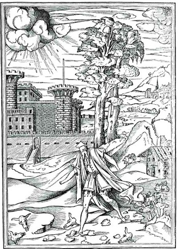
    Philibert de l’Orme’s book, Le Premier Tome de l’Architecture,
    printed in Paris in 1568, contains a singular illustration. L’Orme (who lived ca. 1515-1570), was perhaps one of the first modern
    architects, not only because of his superior engineering skills, but also because
    he was a superb organizer—a superior architectural tactician.

     He worked for Henry II and Charles IX, supervising the construction
    of Fontainebleau, Saint-Germain-en-Laye—where he built the
    Château Neuf, and the other royal buildings. As well as the Tuileries,
    in collaboration with Jean Bullant.

    The text explaining the illustration reads something like “to
    guard against persons who can do nothing right, cannot see what is to be done
    well, cannot hear what should be understood…” Perhaps l’Orme was talking about people in general; or, perhaps, as I
    suspect, he was referring to someone in his own profession, a builder, an
    engineer, an architect? In any event,
    this singular image is one of the few that I can recall in which a person is
    allegorically represented without  hands,
    eyes, ears or, perhaps a nose.

    There’s quite a bit of imagery showing unusually-featured faces–and I’m talking about emblemata rather than monsters or mythological/hypothetical beings meant to go creaking into the night. I’m also excluding medical images Blogorme
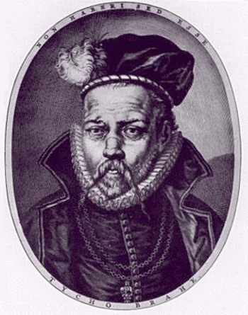
    (like this for an early form of rhinoplasty) and people who have suffered injury or are differentially abled (as in this image of the great Tyhco Brahe and his silver nose).  I’m Tycho_brahe
    hard put to think of other examples of representational humans with such features existing in the technical or scientific world, though–I think that l’Orme’s designer/engineer here is a very scarce creation. 


  • Beautiful Title Pages 1—Oswald Croll’s Chemistry, 1611

    Web_blogcroll3_2027_2

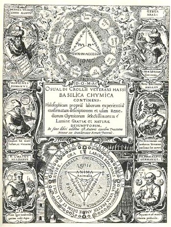
    Oswald Croll is a big name in the history of chemistry.  At a time where so many other Big Names were writing books about chemistry as a science, Croll wrote a scientific book of chemistry.  Paracellus, one of the greatest of these big names, wrote rather vaguely and in a sense secretively about his preparations and compositions, as well as their use and applications; Croll on the other hand writes in great and exhaustive detail about just such things that Paracelsus leaves out. 

    The title page to his Croll, Oswald. BASILICA CHYMICA. Continens Philosophicam propriam laborum experientiam confirmatam descriptionem et usum Remediorum Chymicorum Selectissimorum e Lumine Gratiae et Naturae desumptorum. In fine libri additus est Auctoris ejusdem Tractatus Novus De Signaturis Rerum Internis, was printed in 1611—probably two years after Croll’s death—and is a gorgeous display of allegorical and historical images. The allegorical parts are a bit out of my range, but the historical figures are easy enough (being identified!), and include Hermes Trismegistrus, Geber, Morienes, (the great) Roger Bacon, (the magnificent) Ramon Lull and Paracelsus.

    I like the Croll as the beginning of a series of images of beautiful title pages in the history of science.


  • Graphical Representation of Data: Slavery in the U.S. 1854

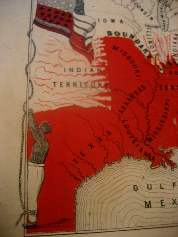
    Blogslavery_detailThis incredible, indelible image is another from our collection of graphical representations of data and ideas.  This map, is entitled Moral Map of North America, 1854; the Slave States are coloued Red, the blighted influence of Slavery is also deeply felt in those parts more slightly streaked with Red€.  I can find no record of this map, printed obviously by our Bretheren across the ocean–€”that and the fact that it was printed in 1854 is all the publishing data that I can find. 
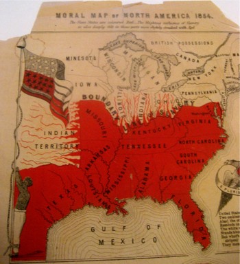
    The poem at bottom reads:
    United States! Your banner wears
    Two Emblem €”one of Fame;
    Alas! The other it bars
    Reminds us of your shame.
    The white man’s liberty in types
    Stands blazoned by your stars;
    But what’s the meaning of your stripes;
    They mean your Negro-scars.

    Blogslavery

    Reciting this poem by Thomas Campbell before an abolitionist convention in 6 March 1851, William Wells Brown continued (as was reported in the National Anti-Slavery Standard) “The name of the United States is becoming a hissing and bye-word in the mouths of the inhabitants of every clime. My country is indeed the land of oppression. There is not a rood of territory over which the Stars and Stripes€ fly, on which William and Ellen Craft or myself could be protected by law. Wherever the American flag is seen flying on the continent of the New World it points us out as slaves; and we enjoy to-night a degree of freedom in your town that we could not if we were in the land of our birth. I often speak of America as my country, but in point of fact I have no country. In the language of one of the noblest of the Negro’s champions in the United States.  €œMy country is the wide, wide world; My countrymen are all mankind.”€

    Brown should know:  his mother was a slave and his father the plantation owner who later granted him his freedom.  Brown then worked the underground railroad and much, much more, working with William Lloyd Garrison and Wendell Phillips.  Among his published works included the incredible  Clotel, (1853), which was one of the first novels published by an African-American in the U.S.,  and which discusses in great detail the relationship between Thomas Jefferson and his slave/lover/mistress Sally Hemings.

    The map is definitely a tale of morality, showing a definite margin of slavery but also depicting slavery leeching its way through the border states. It is interesting to note that Washington D.C. is represented in red as it was indeed a slave-holding district, with a slave pen right on the Mall in the 1830’s. 

    The most striking feature to me of course is the slave who is lashed hand-and-foot to the flagpole on which the American flag is flying—this is the only time that I have seen the slave and the flag portrayed as a unit, together, the slave being tortured by the standard of our country. 


  • Underground Horses, 1875

    JF Ptak Science Books   Post 22

    Unusual cross sections have always fascinated me–they are an X-ray of the techy-inards of the physical world , showing you a slice (literally) of the Unseen and Unapproachable. 

    Mine_height_2

    The first engraving here is of an (unidentified) Western-U.S. mine, printed 1869, and shows the comparative depth of an un-effacing mining operation in terms of height, nestling it in against Trinity Church (NYC).  The “21 stories” depth  of this mine would have been astonishing to the 1869 mind thinking of it in terms of height. Few office buildings in NYC for example exceeded 5 or 6 stories at that time. [It was in 1872 that the tall buildings’ fortune turned, as C.W. Baldwin (working for the Otis Company) invented the geared hydraulic elevator, meaning that buildings could now be taller than the strength and endurance of its occupants’ legs.  (Actually, to my mind it is the invention of the elevator safety brake that clinched the deal, making it safe to enter an elevator and expect to survive the experience.  There’s a lot of other stuff that comes into play, not the least of which is steel framing, lightening the buildings weight and displacing the weight from its’ normal receptacle of the foundation, but I digress.) ] So trying to imagine something that was 15 time the height of the spire of Trinity Church was doing some pretty large-scale imagining. 

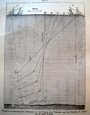
    A corollary the the height of the mine is, perhaps, a cross section of the depths of waters. Here we see an 1877 illustration from an article on new methods of determining the depths of ocean waters, giving a very clear indication of the enormous “height” of the ocean even in its most measurable (and not-so-deep) section.

    Depth_sounding 

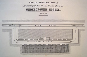
    I simply could not resist this 1875 engineer’s drawing (“Plan of Ten-Stall Stable….for W.D. Wight’s Paper on Underground Horses”)–and yes indeed these were horses kept underground, used for hauling the heavier wagons (on tracks) of whatever, brought out to these larger chambers by men doing the same work with lighter loads in smaller areas.  (For perhaps the best description ever of men at work in a coal mine, see the gorgeous George Orwell’s Down and Out in Paris and London)Underground_horses

    This is one of those images I think that will elicit a pretty light-hearted reaction until your brain catches up to the reality of what the print is really depicting.

    Coal_mine_black_3


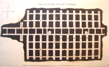
    This  image is actually much rarer than a mining cross section–it is a plan (looking from the top and down) of a mine showing the mode and direction of ventilating the whole bit, printed in 1818.  (As it turns out it is rarer still to see a plan depicting a mine’s numerous layers–I’ve honestly not seen another one of these done before 1900.)  What an incredible image this must have been to the early 18th-century eye, seeing such a novel, and rare, depiction of (important!) data.

    Mine_cross_mosaic

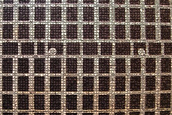
    In the Victorian panoply, the technological temple ma have had an entryway mosaic constructed from the idea of the mine cross section or plan–it is a structural, semi-architectural bit after all, made to withstand advanced weight and pressure.  Or how about a mine cross section template for a stained glass window?  I can imagine the Temple of Technology boasting a design schema of nothing but elements like these–those people trusted, perhaps even worshiped, the small and great mechanical machines and contrivances of their era.  All you have to do is look at the housings for even some of the simplest objects and you’ll find a metallic skin of awe and beauty, a symbol of admiration and respect for analog creativity.


    Mine_stained_glass


  • An Analog(ous) Victorian youtube: the Eccentric vs. the Insane in Victorian England

    Insane_darwin_electricalJF Ptak Science Books LLC  Post 21

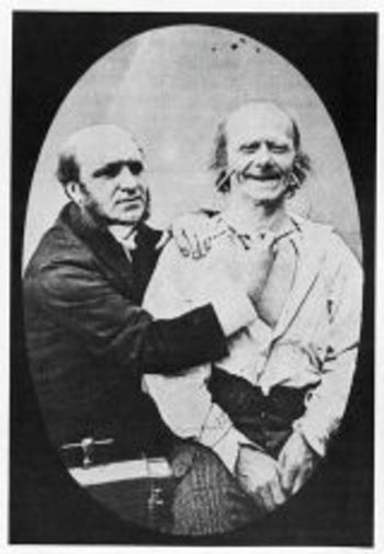
    The “eccentric” versus the “insane” in Victorian England may well have been identified by the amount of available disposable income–if you could afford your whimsy and misery, then you were “eccentric”; if not, then you  were “insane”, which also meant that you were culpable of being scooped up by The Authorities and interned if you turned out to be a larger/smellier/more obnoxious nuisance than a simple dot of the street.   That or you may have wound up as an electrically-prodded subject in an experiment by Charles Darwin (Expression of Emotions….).   In this way the past telescopes nicely into the present, less the electrical stimulation bit. 

    The image shown here is that of Mr. James Lucas, “the Hermit of Red-Coat’s Green, (near Hitchens)”, living his life inDsc04646_3
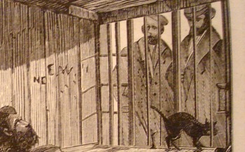
    a most uncommon hermit-like fashion, even for a hermit.  Seems to me that a hermit would be removed from society and be away from people; Mr. Lucas may be of a singular caste of that genre, living his life alone in the very midst of society–he lived in the kitchen of his townhouse, in a single room with a window to the street.  There he lived out his life in full and constant view of the passersby on the busy sidewalk.  Crowds would come by and stare, and Mr. Lucas would stare back–he would rarely, if ever, communicate, though he would (“he was not miserly”) give out “farthings and gin” to “swarms of tramps”, no to mention sweetmeats to children.   He’d watch people watching him.

    He also didn’t write (except we are told “upon a check”), and made no physical effort to retain anything that he thought about; nor was the reason for his uncommon lifestyle made known.

    He was one son of “an opulent London merchant”, and in time proved to be an incorrigible and strong-willed non-conformist (with the funds to do so in some comfort).  He evidently went completely over the edge when his mother died, and after a year of keeping her body in the house removed to the kitchen, where he spent the rest of his days (living there from 1850 to 1874).

    Detail
    After he died and his room cleaned out for the sale of the family’s property, it was discovered that the floor was covered in two feet of ashes and soot from the kitchen fireplace.  Without the family money Mr. Lucas surely would’ve wound up on a cadaver table long before his seventieth year, suffering real social Dickensian travail rather than that which existed just in his mind.