A Daily History of Holes, Dots, Lines, Science, History, Math, Physics, Art, the Unintentional Absurd, Architecture, Maps, Data Visualization, Blank and Missing Things, and so on. |1.6 million words, 7500 images, 4.9 million hits| Press & appearances in The Times, Le Figaro, Mensa, The Economist, The Guardian, Discovery News, Slate, Le Monde, Sci American Blogs, Le Pont, and many other places… 5000+ total posts since 2008.

Category: Prints–looking HARD/deeply at

  • Mondo Bizarro: Image of the Earth with a Background Earth Floating in Space

    JF Ptak Science Books LLC Post 253

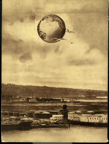
    Well, one doesn’t get the chance to write a title like that every day, or, for that matter, write about dual/multiple earths, with the earth both in the foreground *and* floating in outer space in the background.  I wrote about a spectacular pamphlet in February in Post 11 that did exhibit just such a thing– I thought that it was a pretty singular event, writing:

    “This is the only known example of the depiction of an extra-terrestrial New York City pictured with the earth in the background.  Huh?  Yes, this is the Big Apple in space—not its OWN space but THE space,  outer space—somehow, impossibly, removed to some something-or-other (actually in this case, a “bubble”) that, while not being the Moon, was something like it, though not actually a solid and without gravity, floating on a base of floating effluvia…”

    Blog1sept_10_floating_earthclean

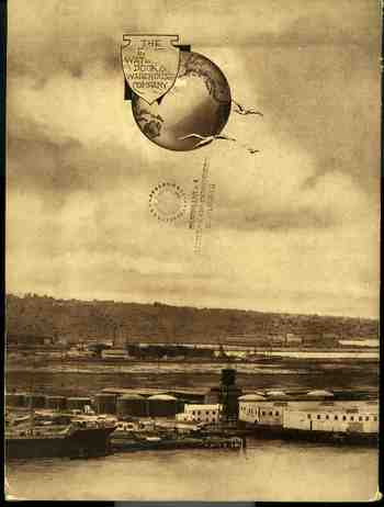
    Listen:  I found another such oddity.  Well, almost.  This is the back cover for a pamphlet called The East Waterway Dock & Warehouse Company:  Harbor Island Terminal”, of Seattle, printed in 1920.  The pamphlet and contents is real enough–what caught my attention was the back cover, which very nearly places the earth in the sky above the earth, albeit innocently.  IT just so happens that this was a design/logo for the company, and it was placed in the sky, raising my hopes at first blush that this was another improbable example of Post #11. It is sort of close, visually speaking, especially when I took out ten minutes to manipulate the logo away from the earth so that the image is more, well, incredible.  But the fact of the matter is that the earlier New York City in Space pamphlet may well be a one-item category, particularly when you consider the content and the rest of its illustration, which are (generously) outre. But I’ll post new image anyway because it is just such a rare visual  idea and almost-feast.

    Blog1sept_10_floating_earth533


  • The Beauty of Drill Bits in the Dark Days of 1918

    JF Ptak Science Books  Post 287

    1ebay_sept_30drill_bit697

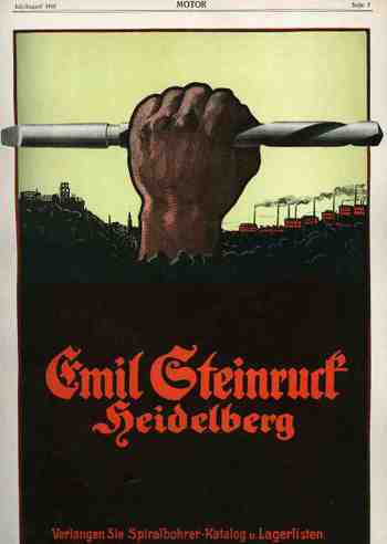
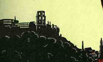
     This striking ad for Emil Steinrurck’s drill bit manufacturing company (Verlangen Sie Spiralbohrer-Katalog und Lagerlisten) appeared in the magazine Motor for July/.August 1918, just a few months away from the German defeat in WWI.  Steinruck’s Heidelberg business was making some massive, industrial  drill bits is all I can say, and they had a designer and artist who figured out exactly how to relate this to the motorheads reading this magazine–all care being taken and monies spent just as the guns of August turned into the corrupted plougshares of November.  What self-respecting machinist wouldn’t, or couldn’t, appreciate the beauty and depth of this thing even if a rusty old railway car was waiting just minutes in the future to spirit away the immediate future of Europe?  The small detail (of the factories and whatever weirdly empty buildings there were in the background) were miniature works in themselves.1ebay_sept_30drill_bit_detail698


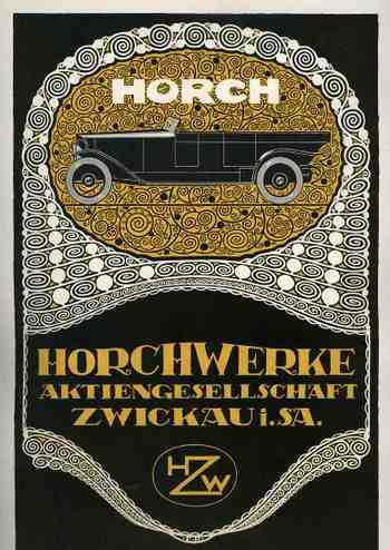
    On the other hand, on the back of this full page ad appears another–a frilly, high-nouveau-y grillwork ad for the Horch automobile, forming the other representative book end to the manufacturing process.  Horch began producing 4.5 hp automobiles as early as 1901, and by 1918 had improve and upgraded to produce high-end luxury automobiles. I can’t determine what exact model of Horch this is in the ad, but I can tell that it is massive, with a tremendous wheelbase.  (Horch would merge/found Audi in 1932 and meet its fate in Allied bombing raids during the war.  It survived but in the hands of the Soviets who used the machinery to produce the Yugo-like Trabant (Trabbi”) sub-compact “car”. I guess that the artwork is sorta beautiful in its way. 
    1ebay_sept_30drill_bit_detail699

    1ebay_sept_30drill_bit_detail700


  • Empty and Missing Things 9: the Skeleton of the Statue of Liberty

    JF Ptak Science Books LLC Post 217

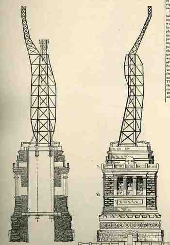
    In the continuing thread of Empty and Blank and Missing People we find perhaps the largest and heaviest of all Blank People–the superstructure of the Statue of Liberty.  This woodcut appeared in the 13 June 1885 issue of The Scientific American, and shows the empty nest for Auguste Bartholdi’s “Liberty Enlightening the World”.  For an empty thing it weighed quite a lot, over 400,000 pounds of iron plate and the awaited repousse copper skin.  It was the tallest free-standing statue in history, but since (and only recently) has been eclipsed (see below for a short list of the tallest modern statues). 

    Blogaugust_25_missing_people_libert


  • The Confederacy Surges in 1868–Thomas Nast Buries George McClellan and Andrew Johnson in Southern Soil

    JF Ptak Science Books LLC  Post 207
    Blogaugust_19nast_union413

    It is in this complicated, otherwise-involved political graphic statement  that we can find one of the great, quiet put-downs in the history of 19th century political cartooning.  The image belongs to Thomas Nast, a remarkable social artist, who worked very heavily between 1860-1885, producing about 3000 pieces similar to this in level of involvement and complexity—a truly remarkable, verb-laden,  Herculean output.  Very little escaped his microscopic/telescopic vision, capturing interests in the big and small, and also along the way creating our popularly-known images of Santa Claus, the republican elephant, the Democratic donkey, and the Tammany tiger; he also helped to re-elect Lincoln in 1864, destroyed Boss Tweed, and challenged the embarrassing mores on public education, the treatment of African Americans, rights of women, and more. His observations were generally very insightful, mostly cutting, occasionally vicious, but spot-on. He must have lived and breathed his art, because by the time he was 50 he was pretty much done, artistically, after an already 35-year career; he was dead at 62, busted and far from home. 

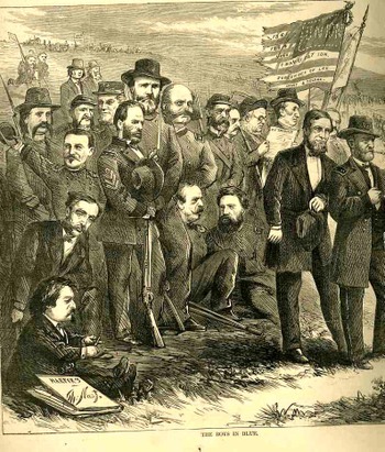
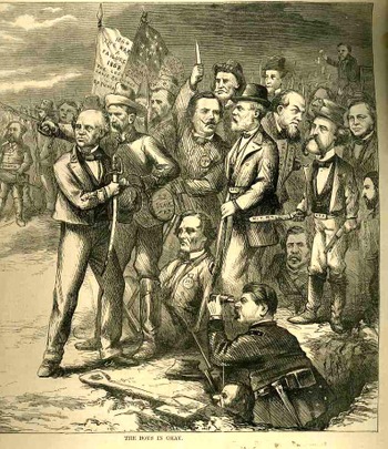
    In this drawing Nast draws the bead on the 1868 presidential election—the first since the end of the War—between the republican U.S. Grant and Democrat Horatio Seymour.  Nast had no use for the democrats in general, finding them basically odious, and actually treasonous, and he lines the two parties up along the old lines of the Civil War, the Republicans as blue and the Dems as gray (and it is generally true to say that the Democratic Party was closely aligned with the South through this period of time).  In spite of the fact that Seymour (seen here at the head of the jumble of graycoats with the blood-dripping sword) was from Ohio didn’t matter—he was seen by Nast as a continued sympathizer and a wreck on the best thing to do for the South following the war.

    The larger issue for Nast (who pictures himself in the image with the Blues at the lower left, with a steely gaze, sharpening his pencil) goes back to the election of 1864, when Seymour ran as the vice president in the )democrat) presidential campaign of Gen. George McClellan, who is, ultimately, the object of the great putdown.  Nast’s distaste/hate goes far back with the little General, who was at one time not only the commander of the Army of the Potomac but was also Commanding General.  McClellan arrived to the war as a hero of great celebrity, which was wasted in about a year.  As a general in command of the North’s leading army, McClellan suffered as a result of his own meticulous, chess board, keep-it-on-a-shelf strategy of carefully considered inaction; he killed himself, suffocated by his alphabet of cautions and a little bit of Confederate diversionary theatrics.  George never had enough men to suit his attacking the skirting Confederate armies, almost always grossly overestimating the strength of his opponent.  He just wouldn’t go. (Lincoln famously remarked on McClellan: “He has got the Slows!”.)  McClellan was an intelligent and sharp, but he was god-awful immobile and immovable. 
    Blogaugust_19nast_south414_2

    But what really got to Nast was McClellan’s campaign for the
    presidency in 1864 against his former Command-in-Chief. Once he was finally, thankfully, relieved of
    his command, McClellan found political interests, winding up as the Democratic contender
    for the presidency. Early on in his
    campaign McClelland adopted a policy—which was subsequently scrubbed but not
    forgotten—calling for ending the war and negotiating a peace and settlement with
    the Confederacy. Nast hated him for this
    move. McClellan actually received 45% of
    the popular vote running against our best-ever president and with the country
    still at war (although he was obliterated in the electoral college 212 to
    21). I have no idea, really, what
    McClellan was thinking.

    Now, getting back to the 1868 election. Again, the republicans and democrats were set
    out on the battlefield and battledress of the just-finished war, blue and gray,
    respectively. In blue we see US Grant
    and Shuyler Colfax (his VP, standing just behind him), while in the crowd we
    can find

    Sherman,
    Greeley, Burnside and a host of the other Union greats. On the opposite side is Seymour with the dripping sword with the
    backing of his VP Francis Blair ; Jeff Davis
    is sitting on the ground, Lee is otherwise occupied, and a host of other
    Confederate icons stand wide and deep.

    Nast again is looking with squinty eyes across the field,
    where he has placed, mole-like, the Union General McClellan, emerging from his
    hole, having dug his way over to the Other Side, and now observing the Unionwith a telescope. Such was Nast’s distaste for McClellan that he placed him, before all
    others, on the opposing side, telling us that the man might as well have fought
    with the South. We also see President Andrew
    Johnson peering out of the hole at nostril level—Nast hated him too, finding
    him a repellent appeaser who sold out the Lincoln
    post-war policies. Grant wound up
    winning the election by a slim popular vote margin with 53% (and this without
    three of the Southern states being readmitted), but trounced Seymour 214-80 in the electoral college.

    And so it was that Nast drew the battle lines for the
    election, making it a north-south issue, and burying alive his reviled odd
    couple of McClellan and Johnson, finding them traitors in the end, in an image
    that could be understood by even the illiterate newspaper reader.
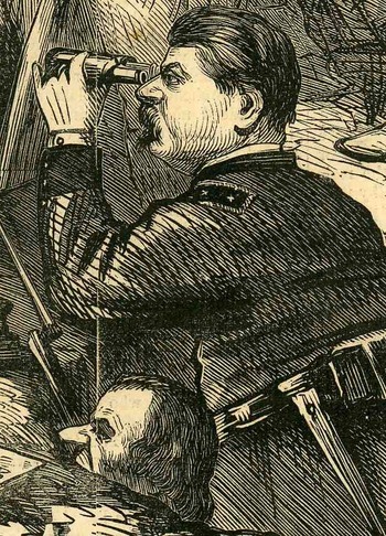
    Blogaugust_19nast_south_det415


  • 20th Century Cartoon Outline Art and the Renaissance

    JF Ptak Science Books LLC  Post 200.5
    Blogaugust_15blank_people_barnaby_c
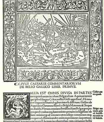
    I just wanted to note that the outline-drawing of Crockett Johnson’s Barnaby (from yesterday’s post)  has some long history.  In just a few minutes I was able to draw on two sources for similar approaches to his art.  The first is from Commentaria..,.(and in the colophon) Impressa mira diligentia Venetiis per Augustinium de Zannis de Portesio….and printed in 1517), and shows a scene from Caesar’s Gallic Wars above the Roman letter text.  The funny thing here is that even these figures are done in very severe outline (and also with a perfectly blank sky), they are surrounded by a very elaborate arabesque floriated border.  (Most of the other woodcuts in this work have shading and other detail work—the blank drawings such as this are certainly outnumbered by them.) 

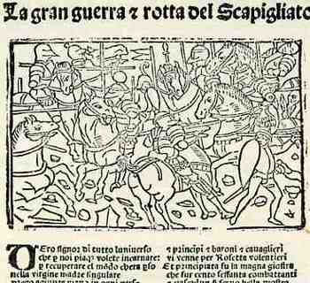
    The second example is a battle scene from La gran Guerra & rotta del Scapigliato (printed in Bressa by Damianum and Jacobum in 1532).  The drawings in the gothic letter text have only brief detail, but the incision is not as clean and crisp as in the earlier work, and simply not as compelling.  There are other earlier examples to be sure, but I just cannot think of them right now.   Suffice to say that the outline drawing has a long history.  The outline drawings themselves are not what I’m referring to in my Blank History, as they are far from being blank, what with the characters having faces and all;  I’m just bringing up some corollary stuff on a bit of the background of outline drawing techniques. 

    Blogaugust_15blank_people_barnaby_2


  • Blank and Disappeared People Follow-Up: a Sin-Laden Manikin, 1871

    JF Ptak Science Books LLC   Post 162 and a quarter
    Blank315

    My old friend Jeffrey Donlan, who  is in charge of what must be a top 1% highest-elevation library in the U.S. (at 7000+ feet) in Salida, Colorado, sent me a playful pinch, asking about what ever happened to the History of Blank People (which I posted about a few months ago)

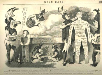
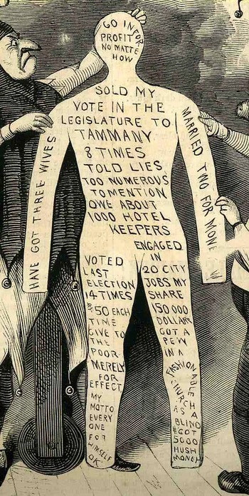
    Well, it isn’t easy coming upon these images of people being made to disappear and/or people being “filled up” (you’d better see the post), but within a day after his contact and within a day of Jeff’s visit, I stumbled upon one (looking of course for an image of matchmakers, as in Lucifer Sticks).  It spilled out of the pages of Harpers Weekly for 1871, and was part of a caricature of the selection process for folks becoming a member of the The Independent Order of Odd Fellows. The work is a strong attack upon the fellowship, with this section showing a possible member being stripped of all his sins and foulnesses and various other transgressions, all of which are taken from his body and applied to a blank manikin. 
    Blank_det316

    Instead of burning the sin-laden manikin, though, the unnamed caricaturist contends that the society of Odd Fellows keeps the maikin, as it might come in handy for them later.  In any event, it is a rare occurrence of finding a Blank Person, weirder still that it was found after someone actually/kinda/sorta/not really asked for it. 


  • Crowds and the Press of Humanity: WWI German Prisoners, November, 1918

    JF Ptak Science Books   LLC  Post 152

    Blogcrowdsphoto_ww1249_2
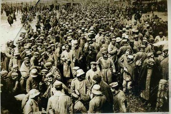
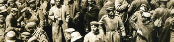
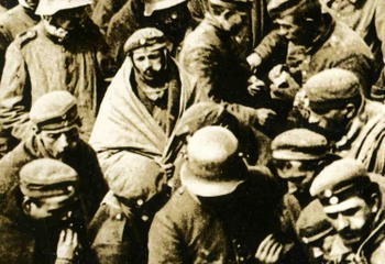
    This image comes from a collection here of First World War news service photographs,  showing German prisoners being readied for transport home, and dated 20 November 1918.  This group had evidently surrendered just before the armistice was signed, and was sent directly and instantly  to a staging area for transport back to the Fatherland.  The way that many newspapers obtained the war images that they published in their papers was via a semi-centralized pool of war images.  The newspaper would request, say, a photo of German prisoners, and would contact one of these photographic agencies—in this particular case, it was the Central News Photo Service of 26-28 Beaver Street, NYC—and purchase the rights for republication, and then print it in the newspaper along with the story.  In almost every case the photo would be accompanied by a caption mimeographed onto an attached piece of cheap paper, and in this case it reads:  “Waiting to Return Home/a photo just received showing a batch of enemy troops who surrendered just before the signing of the armistice, joyously discussing the coming of peace and the opportunity of returning home to their families.”
    Blogcrowdsphoto_ww1_detail_long251

    I seriously doubt that the copy editor could read the minds of either the photographer or the troops in the photo.  I would imagine that they were definitely joyous about going home ALIVE to their families, but when looking really closely at the picture the thing that seems to dominate the actions of the people is food.  Or cigarettes.  But mostly when looking hard at the faces in the photo, the men just look tired.
    Blogcrowdsphoto_ww1_detail_super253

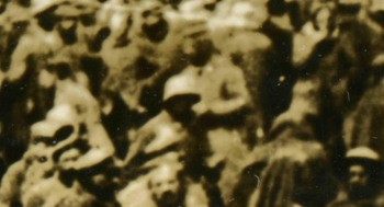
    Looking very closely at these types of images has always been fascinating; look close enough, under high magnification, and the large photo becomes composed of dozens of smaller photos.  The whole is an assemblage of vignettes, each in themselves a work of art.

    Continuing in a more odd tone, I’m also reasonably convinced that after looking at hundreds of faces in a photo like this that you’ll find a picture of yourself.

    Blogww1_crowd258_2

    I did.  This section is a 3200 dpi scan of a 15×10 mm section, and I am undoubtedly and unquestionably the bald bearded man (one of the few people in the image without a hat) at center-bottom. 


  • Atomic Weapons, Eniwetok Atoll, and the Most Obscure Reference to America’s Entrance into Vietnam

    JF Ptak Science Books Post #117

    Atomic_times_detail_masthead159

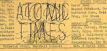
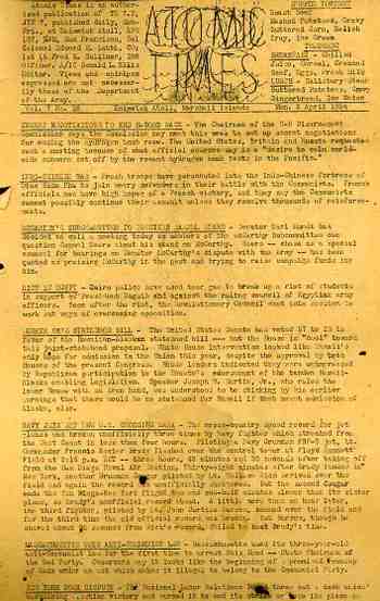
    This issue of the Atomic Times was issued Monday through Friday by the U.S. Army on a mimeographed, single-sheet page, and published at the tip, or bottom, of a very skinny piece of nearly-circular land far out in the Pacific Ocean at Einwetok Atoll, 5 April 1954.  The Marines fought a battle and beat the Japanese Army for possession of the atoll in 1944, and the U.S. government stayed. In 1954 most of it was controlled by the U.S. Army, and the place was being used as a nuclear bomb testing zone for a decade, experiencing 43 tests from 1948 to 1958. The most famous of these test shots was “Mike”, part of Operation Ivy, which was the first detonation of a hydrogen bomb, in 1952. There would be subsequent tests there that, by themselves, represented in a single instance all of the chemical fury unleashed in all Allied bombing in Europe for the entire course of World War Two.

    Atomic_times157

    “The Atomic Times” was a sheet of the daily grind at this remote, if not bustling, outpost of nuclear prolificacy. “Supper Tonight” was announced in the upper right corner (roast beef, mashed potatoes, gravy, buttered corn, relish tray, ice cream”), plus “tomorrow’s breakfast and lunch”; there was a fair amount of reporting on local softball, boxing, swimming and basketball, pus some major league baseball scores. On the front side was the news, with what may well be the loneliest announcement of the coming of America’s involvement in Vietnam. This was the second entry in the news, “Indo-Chinese War”: “French troops have been parachuted into the Indo-Chinese fortress of Dien Bien Phu to join weary defenders in their battle with the Communists. French officials now have a high hope pf a French victory, and they say the Communists cannot possibly continue their assault unless they receive thousands of reinforcements”

    And so it ended, and so it began.

    The siege of   Dien Bien Phu started just a week later or so, on the 13th of March, and lasted 57 days, ‘till May 7th, 1954. The commanding general of the Viet Minh forces, Vo Nguy Giap, achieved an enormous victory over the French—the first time a guerrilla force readjusted itself into a conventional force to defeat a Western army. It was the end of the line for the French, and it just so happened to be the beginning of American involvement

    Dien bien phu

    Just a week after this notice appeared, Dwight Eisenhower made his domino speech:

    “Finally, you have broader considerations that might follow what you would call the “falling domino” principle. You have a row of dominoes set up, you knock over the first one, and what will happen to the last one is the certainty that it will go over very quickly. So you could have a beginning of a disintegration that would have the most profound influences.conference…”


  • Measuring and Comparing: Feeding the London Zoo in Terms of 1944 Telephone Operators

    JF Ptak Science Books LLC   Post #113

    Zoo_story149_2
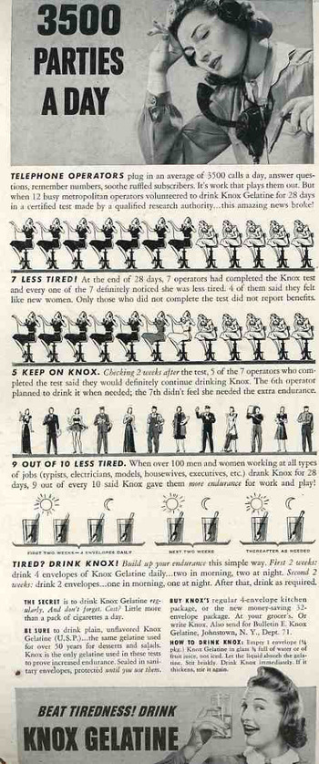
    I’ve put together a relatively large collection of images from 1850-1940 which are graphic comparisons of data and graphical displays of quantitative information..  In general they display the basic concepts of one idea in terms of something else, or they simply exhibit the idea or concept in cold hard one-to-one images.  The two images below are good interesting, standard representations of these categories.

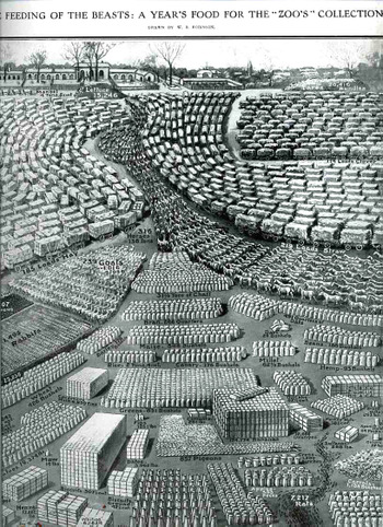
    The first is a very neat and complex display of the food eaten by animals in the London Zoo and was published in the Illustrated London News on May 17, 1913.   The data, found in the report of the Zoological Society of London (for the year 1912) is entitled “The Feeding of the Beasts:  a Year’s Food fore the “Zoo’s” Collection.  The real story though is in the subtitle:  “from shrimps to rats; from onions to oil cakes and mice, the food consumed by the animals at the “zoo” during 1912.    (I’m assuming that the word “zoo” is in quotations as it is a diminutive of “Zoological”, ad was seen as slangish.)  As you can see the language of the undoubtedly stiff report is beautifully brought to life (but not for long) in this work by W.B. Robinson.
    Zoo_story_rats_2
       
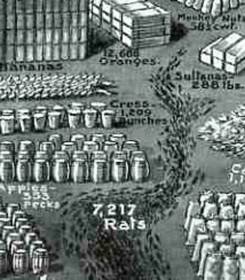
    We see 15,000 pounds of lettuce in a lump and a pile of 4,220 bunches of carrots, along with a serpentine 185 wagons of hay and a snaking 219 wagons of straw; there are giant cubes of biscuits and milk tins, and an even larger cube of 183,000 bananas in boxes; there are orderly armies of goats and rabbits, and a very neat ordering of 19,000 pounds of potatoes in stiff white sacks.  At bottom we see comparatively lonely contingent of 28 ducks (undoubtedly hoping that something else besides what was happening was happening); and of course an antlike column of 7,217 rats. There were also masses of clover, boxes of sparrows, 857 pigeons, 123 pounds of figs, 2 tons of dates, 93 bushels of hemp, 4500 pounds of grapes, 500 pounds of sugar (?), 34,000 eggs, and a slithering line of 25,000 mice.  Most disturbing though is the central figure of a long, quiet column of 318 horses.  I can’t help but feel sorry for them.  It is a remarkable and successful effort to put the data into a form that was somewhat more understandable, if less digestible, and a little more heinous.
    Telephone_ops150

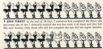
    The second image is a simple but somewhat bizarre rendering, changing counting units of numerals and replacing them with telephone operators—I can honestly say that I haven’t seen this before.  It is quietly bizarre, but still quite effective in making the sales pitch for the noxious element.
    Telephone_ops150_detail


  • Head Replacement ca. 1700–the Baker of Eeklo

    JF Ptak Science Books LLC    Post #111
    Blogbaker_eeklo144

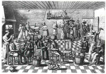
    Here’s a very curious engraving, a little on the light-noirish side, by the Dutch Philibert Bouttats de Jongere (1656-1728).  The copperplate is made from a painting called De Bakker von Eeklo (The Baker of Eeklo) which hangs in the Muiderslot castle in the town of Muiden, near Amsterdam—I found the reproduction in a very charming book by Midas Dekkers called The Way of All Flesh, a Romance of Ruins (2000).  Dekkers thinks about reflects (and I use this word in the clinical, autopsy-room way) on the way of all fleshly ruination—what happens to cause it, what the mechanisms of deformation are, and the effects of time on us all.  He comes to this engraving in a chapter of fighting the effects of the physical and biological mechanics of skin and plastic surgery.  It is a marvelous image—people coming to the bakers for a rejuvenation and reformation of their entire head.  How it seems to happen is this:  people arrive from far and wide and have their heads removed by a baker’s assistant (as at left), where a group of bakers work their wonders (with paints and other stuff) on a revolving table, when the head is sent to what looks like a bread oven for a firing and cooking.  In the meantime the cabbages that are kept in baskets an laying about on the floor are actually put to use—they are placed in the bottom/wound of the removed heads and also serve as replacement headholders until the baked heads are ready. (Cabbage head?)  For some reason all of the bakers are without shirts; it is after all a bakery and it probably is hot, but everyone else is dressed pretty heavily, and looking pretty calm, so maybe there’s something more to the shirtless bit than just heat.  And speaking of calm, most of the head-rejuvinatees are sitting very patiently, with their hands together, or fingertips touching, in classic aspects of ease, and I’m not sure about that, either. 

    But is that really the story here?  The odd part of this odd allegory is that the people in the upper right, entering the bakery, are already carrying heads.  It makes sense in an artful way to have a cabbage replace your own cooking head, but if you were coming to the baker with head-in-hand and set to go, then you wouldn’t need a cabbage head for your own decapitated noggin because, well, they’d lop of your own head and replace it with the new one right away; no cabbages necessary.  So perhaps there are two different things going on here:  one where you get your own head re-worked, and a second where you bring in a head to have put on your own body.

    The big question in the room then is where did these other heads come from?