A Daily History of Holes, Dots, Lines, Science, History, Math, Physics, Art, the Unintentional Absurd, Architecture, Maps, Data Visualization, Blank and Missing Things, and so on. |1.6 million words, 7500 images, 4.9 million hits| Press & appearances in The Times, Le Figaro, Mensa, The Economist, The Guardian, Discovery News, Slate, Le Monde, Sci American Blogs, Le Pont, and many other places… 5000+ total posts since 2008.

Category: Art History

  • The History of Dots: anti-Dots, Bubbles and Circles

    JF Ptak Science Books   Post 1433

    This blog’s series on the History of Dots needs to be folded into the History of Circles section–it seems that whenever I see interesting circles that I am seeing dots, and vice versa; and after all, aren’t circles just unfilled dots?  An anti-dot (or at least so in two dimensions)?  I like the idea, especially since one of the great and revolutionary ways in which particles were found was with the device pioneered by D.A. Glaser (Nobel physics, 1960), the bubble chamber, which through the use of superheated hydrogen (usually) it was possible to track electrically charged particles, often producing dots in their signatures.

    Which leads me to bubbles and anti-bubbles.  We all know what a bubble is–at least a physical one–but what about its opposite?  Its not quite that, really, though there are bubbles that are liquids surrounded by gas rather than the much more conservative and popular way.  And so it is this way that I came to the anti-dot, the circle, and then of course one of its three dimensional relatives, the bubble (and the sphere).

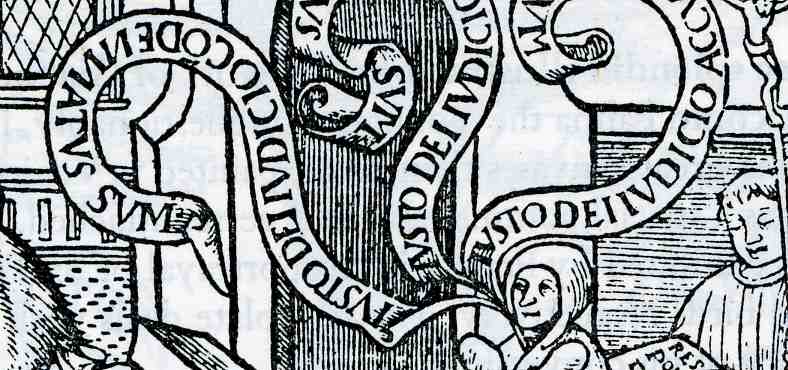
    Earlier in this blog I’ve written a few times about the speech and though bubble/balloon, which was a fantastic invention, enabling to make literal the thinking of the subjects in a painting (and seen probably for the first time in a printed book in 1523, in this work about Bruno Carthasisienna):

    0 blog feb 18 balloon599


    I’m sure that there must’ve been some number of people who regarded it as base and retrograde, that the view of a print or painting should by the art’s elements know what the characters might be thinking, and that by showing the specifics of thought, by boldly stating the thought or speech itself, that the experience is removed from the viewer’s imaginations.  Perhaps these thoughts were common to the people who considered the telephone as an affront to communication as an attempt to replace the written letter, and so on to fax to email to tweet and so on. 

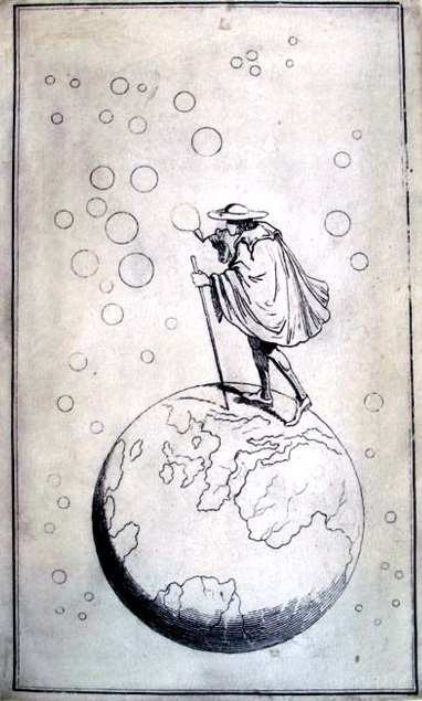
    I have no idea when the first bubble as a bubble appeared in print, though a gorgeous version of a bubble-maker is seen on the cover of another “first”:  the first full-cover illustration on the front cloth cover of a published book1, Sir Francis Bond Heads (1793-1875) Bubbles from the Brunnens of Nassau, which was published by in 1834 by John Murray of London, who 25 years later would publish Darwin’s Origin (where the word “bubble” by the way does not appear).

    Dots  bubbles princeton
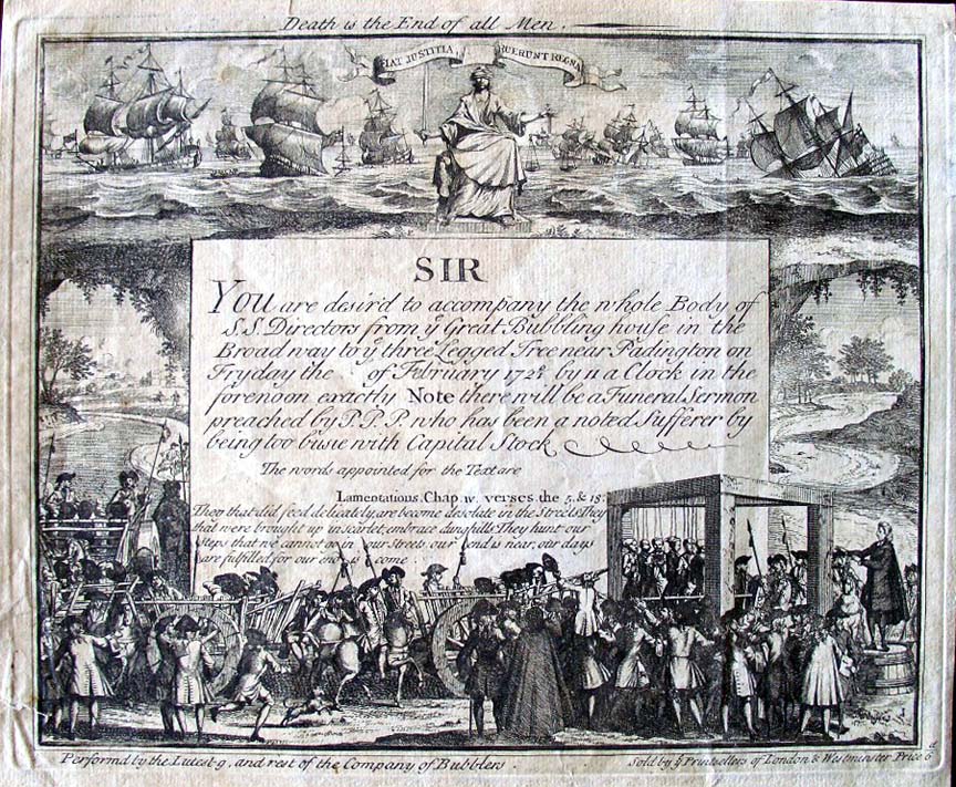
    There are many illustrations and paintings of people blowing bubbles–I’m not sure which one is the most famous but Gerit Dou (1613-1675) certainly comes to mind (with his Still Life with a Boy Blowing Bubbles).  Perhaps a ittle more unusual and also involving a great scientist is the economic bubble, which is the subject of this great print called “A Bubbler’s Funeral”.  An economic bubble is one in which the value of a share of stock in a company or interest becomes hyper-inflated, expanding outward until the price bubble found its pin, and once contact is made, the whole thing goes to shamble, and anyone left holding the enormously inflated stock finds themselves with a stock worth next to nothing. 

    Dots bubbler funeral
    This image was a satire on the Ages of Man, professing to be a ticket for a Bubblers funeral, and was in 1720 aimed at the directors of the South Sea Company, a notorious early 18th century bubble, which had just burst.  Many people lost fortunes in this, including the aged Sir Isaac Newton.   The invitation was for a funeral profession to  “accompany the whole Body of S.S. Directors from ye Bubbling house in the Broad way… to ye three Legged Tree near Padington on Fryday the of February 1720/1″.

    And so ends this first bot on folding the story of circles and bubbles  into this blog’s History of Dots.  I should point out that one of the great bubbles of the last hundred years or so imploded only a dozen yers or so ago–the dot coms. 

    I wonder if the History of Holes thread should also be folded in?

    Notes:

    1. From Princeton University:  “Ellen Morris puts it in anything way, “This period also produced the first full-cover designs: John Murray’s 1834 issue of Bubbles from the Brunnens of Nassau is reputedly the earliest publisher’s cloth binding with a full pictorial design on its cover.” (The Art of Publishers’ Bookbindings 1815-1915).


  • Spirit-Generated Art, 1871: Far-outside Outsider Art

    JF Ptak Science Books    Post 1402

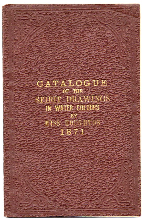
    Houghton219 This slim booklet,  Catalogue of the Spirit Drawings in Water Colours, Exhibited at the New British Gallery, Old Bond Street (London: 1871), offered descriptions of the work of  Georgiana Houghton (b. 1814), an artist who in some way communicated with the spirit world, and allowed her art to be guided by it. She writes in the very first paragraph of her catalog’s introduction, “the execution of the Drawings my hand has been entirely guided by Spirits, no idea being formed in my own mind as to what was going to be produced…”  She explains that the spirits were definitely those of dead people, and after having heard of such possibilities of communication as early as 1859 set out to “obtain mediumship”  by holding hands with her mother at a small table for some months on end waiting for contact–which of course she says happened.  Sundays worked best, “as we should then be less disturbed by evil influences”.   The spirits would communicate at first by table movement, then tapping,  and then through the alphabet by the use of a planchette. So it seems to me that given that she had abandoned her own input in the creative process (even though she had a history of formal art education or instruction), and that the inspiration she received seemed not to be her own, that Miss Houghton was an outsider-Outsider artist, pursuing the spoken artistic needs of others, and then providing her own interpretations of the forms and colors. (We offer the original copy of this catalog at our blog bookstore.)

    It seemed that Miss Houghton was inspired by the spirit drawings of a Miss Wilkinson–it was then that she sought the artistic guidance of a dead artistic sister though without success, and then from a dead brother.  It was the brother who brought her into contact with dead Henry Lenny (“a deaf and dumb artist”) who then guided her hands at first with the planchette, then with a pencil, and finally to watercolors. 

    After ten years of her own spirit drawings, Miss Houghton produced for herself a four-month show at the New British Gallery on Old Bond Street, exhibiting 155 of her works, all exhibited in rented frames for the occasion.  Her reviews seem to have been very-light and  mixed at best,  and for all of her effort and trouble, she sold only one painting,  She did however produce a catalog of the exhibition, which was a great aid to the viewer as the interpretations of the meanings of the forms and colors that Miss Houghton used were written on the backs of the artworks, which were hidden from view by the frames–many of the paintings’ meanings were annotated in the catalog.

    Georgiana

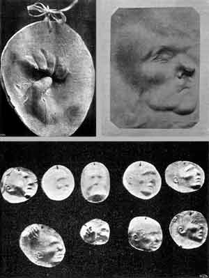
    Miss Stoughton was hardly alone in this field of representing what seems to have been a very actice after-life of the dearly departed, though it seems that not as many participated in her own brand of automatic representation than other methods of spirit communication.  She did appear at the beginning of what would become a significant culture of spiritualism, with spiritual manifestation, telepathic communication from one person to another and then to the dead, thought transference and  magnetisation.  The evidence of spiritual contact was produced on high levels, not the least of which were seances in which the dead appeared as floating ghosts filled with quiet or phantasmal groans and noises, sometimes luminous, sometimes leaving the medium’s body as colored smoke, sometimes appearing as an electric spark, or an imprint on a photographic plate, or an aural shadow produced in iron filings, or an impression made in clay or other accepting materials2.  They offered possibilities for hope and belief that are no less vigorous than our own today, save for their technological limitations.  (An interesting article, “Proof Positive, the Photomatic Body in fin-de-siecle Science, by Alessandro Violi, can be seen here.)

    There is a very interesting article on Houghton and the exhibition by Rachel Oberter called  “Esoteric Art Confronting the Public Eye:  the Abstract Spirit Drawings of Georgiana Houghton” which was published in Victorian Studies 48.2 (2005) 221-232.  About the pre-Abstract abstract and proto-impressionist work, Oberter says:

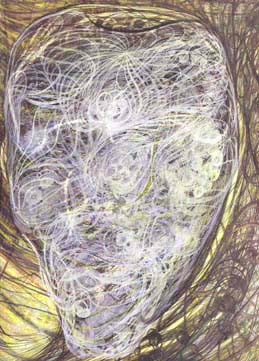
    “Given the lack of abstraction within Victorian visual culture, watercolors such as those painted by the artist Georgiana Houghton in the 1860s and 1870s seem shockingly out of place. In her work The Eye of God from 1862, we see a tangle of transparent straight, wavy, and spiraling lines flowing out of the left corner of the paper and up from the bottom edge of the page as white filaments float across the surface. No recognizable forms appear; all that is visible are lines and colors—yellow, sepia, and blue. There is an organic quality to the undulations, a sense of microscopic detail, and a feeling of being in a deep-sea world or otherwise mysterious place. The vagueness of the imagery contrasts with the specificity of the title, which evokes a dense underlying symbolism. Houghton attributed meaning to particular shapes, colors, and directions in her paintings. While her works were abstract, they remained representational.”

    “The most important tools for decoding these works are the explanations that Houghton wrote on the backs of the drawings [above] . These elaborate descriptions provide a key to the symbolism in the drawing, clarify the message of each work, and name the spirit who acted as Houghton’s guide in the creative process. Houghton believed that these explanations were written by the spirits through her hands; they are automatic writings that complement her automatic drawings. The same spirit who inspired the drawing provided the interpretation on the back—the explanations, one could say, came directly from the source.”

    The catalog does give Biblical references for every one of the works, giving at least a location in the Bible for every artwork.  There are occasional (though sparse) longer descriptions of the work, though the great majority give Biblical citations for what each of the paintings represents. 

    Also of interest is Ms. Oberter’s description of the gallery event:

    “…in 1871 she exhibited her works in a more formal venue: she organized an exhibition at the New British Gallery in Old Bond Street in London. The exhibition, entitled “Spirit Drawings in Water Colours,” lasted for four months and consisted of 155 of Houghton’s watercolors. She rented frames for the occasion and hung the watercolors against the walls of the gallery. This arrangement meant that the backs with the explanations would not have been visible. Yet it was still critical for Houghton that she convey this hidden information to her viewers. In her autobiography Houghton recalled: “The chief object aimed at in this Exhibition, was not so much to display the wondrous powers of the unseen intelligences, as to manifest unflinchingly to the world that true Spiritualism is inextricably bound up with the religion of the Sacred Scriptures” (Houghton, Evenings 2: 53). It was not enough for Houghton that the drawings serve as proof of communication between spirits and humans; it was also important that they convey the relationship between Spiritualism and Christian theology, particularly the insights that the spirits give about God and the Trinity.”


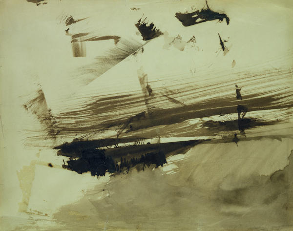
     The artwork of Miss Houghton is an interesting blip in the history of Victorian art, and I’m not exactly sure what to say about it.  It certainly occurs during the first wave of Impressionism, and is wholly different from that new art form as well as the high Victorian fashion of the time; it also is entirely non-representational, an abstract art that precedes that revolutionary phase by about forty years.  Its a little puzzling to me, especially since Miss Houghton seems to have escaped virtually any sort of lasting review or critique.  But again Mrs. Stoughton is not alone in the non-representational art field apart from the automatic spirit manifestations–for example, in addition to an enormous literary output, Victor Hugo produced some 4,000 pieces of art, some of which are exceptional examples (to my mind) of non-representational art that came in a period decades before the Kandinsky and the rest.  Here is Hugo’s “Evocation of an Island”:

    Evocation of an island Painting  - Evocation of an island Fine Art Print

    He was certainly outside the mainstream of Victorian art, and even well outside that of Impressionism. 

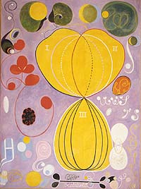
    There was also Hilma of Klint (b. 1862), a woman who like Stoughton also represented the spirit world through her art, and who began painting in non-representational and abstract ways beginning in 1897/8, an example of which is below:

      Hilma klint


    Miss Houghton went on to improve her representation of the spirit world through photography, a very wide selection of her work being available at the Keith De Lellis Gallery, here.

    In the realm of extra-sensical belief, I’m not so sure that these brands of spiritualism would be too much different from any other belief in things that cannot be seen, or heard, or felt in any detectable way, a prayer by any other name.

    Notes:

    1. Our catalog was the property of William Crookes (with his bookplate, and with a signed inscription to him from “Miss Houghton”)  who was an eminent British chemist and physicist and a pioneer in the field of vacuum technology (and remembered now mostly for the Crookes Tubes and his superior approach to experimentation).  He was interested in spiritualism from about the year 1869, pursuing it until his death in 1919.  He was hardly alone in his interests among highly-paced British intellectual elite:  Alfred Russell Wallace, Lord Rayleigh, Oliver Lodge and William James were all extremely interested in the spiritualism phenomenon.  Curious. 

    2.

    Imprints of ghost hands and faces
    Imprints of ghost hands and faces produced by Eusapia Palladino, from Bozzano, Ipotesi spiritica, 1903, in C. Lombroso Ricerche…, 1909


    ·Posted by :

    ·in:

    — —

  • Wheels of Fortune and Destiny–Beautiful Circles of Robert Fludd, Lorenzo Spirito and Sigismondi Fanti (continued)

    JF Ptak Science Books   Post 1429

    Fludd
    (1)  Destiny
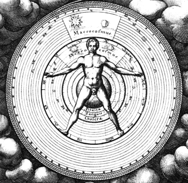
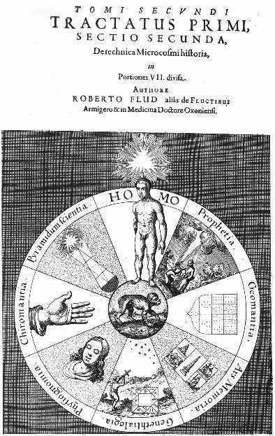
    Robert Fludd’s (1574-1637), title page for his  Utriusque Cosmi . . . Historia (1617) features this complicated astrological wheel with a Vitruvian-man-like image at the vortex of the imaged pulls and pushes of the cosmos.  In addition to everything else, real and imagined, Rosicrucianism and astrology and puffy-birds, Fludd, who was  an English physician, delved deeply into the real stuff of the world in this book in addition to all of the other make-believe–optics, the musical intervals, perspective drawing, hydraulic engineering, construction of lifting machines, military engineering and many other interesting, physical science topics.  But this drawing, right there on the title page, reveals Fludd’s real interests and shows what governs what he does.  Everything else, the math and and the physics, services this need.  Of course the image is beautiful, which is why it is here, but it is also a deeply personal, exploitative, cover-all for the things that Fludd *wanted* to find. 

    Fludd 3

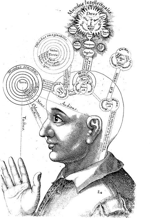
    I can’t resist adding the following Fludd image, which appears in the same book and may be one of the most iconic images of the Fludd opus, these beautiful circles showing the areas of thought and consciousness of the human being:

    Fludd 4

    (2)  Wheels of Forture
    Circlespirito
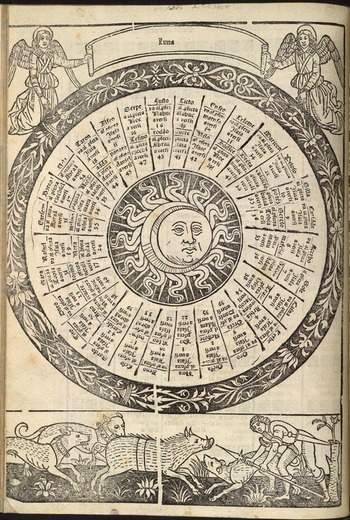
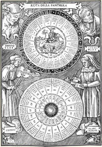
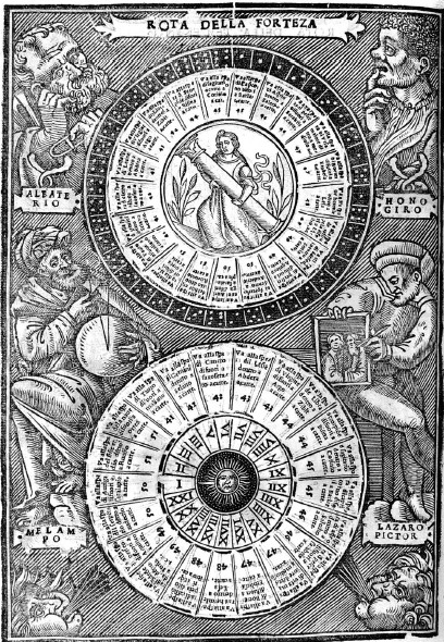
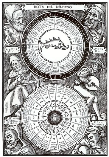
    In Le Passetemps de la Fortune des dez, written by Lorenzo Spirito in the late 15th century1 and published in this pictured format in 1559–a delightful little book with many2 zodical illustrations and the first printed illustrated book on fortune-telling—appears this gorgeous wheel of fortune wood engraving.

    “There are 20 questions, grouped around a wheel of fortune on which are represented four men; to each man a reference is added to a list of kings… These 20 kings in their turn guide the enquired to 20 planets; the table of dice casts attached to these planet contain 56 references to the 20 spheres of the planets. After one has found their way through these stages, they finally reach 20 prophets who each have 56 three-line answers to give….”

    The wheel sends the reader to a king; the king to a sign; the sign, with a throw of dice, to a wheel; the wheel to a prophet, and then to the peek into the future.

    Artikelbild: Losbuch des Lorenzo Spirito von 1482 bot Antworten auf Fragen nach dem Schicksal szmtag

    Spirito 2

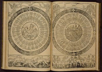
    Referring to the image below: “In this opening, the leopard (left) is cut in a thick outline and modeled with precise curved lines. The leopard’s formal pose is particularly appealing because it projects a dignity commensurate with the animal’s position in the hierarchy of the animal kingdom. The dolphin (right) is similarly cut and set within a sea of curved lines against a well-defined architectural background. The dolphin’s design reflects classical

    Spirito_2_2
    origins. The animal projects an aggressive attitude, suggesting the dolphin’s importance as protector of the city of Venice. The well-designed woodcut borders of the hunt (left) and the putti at play (right) are symbols of the vagaries of life, in which good fortune and calamity are equally possible.

    (3) Wheels of Destiny 2

    In Sigismondo Fanti’s Triompho di Fortuna (Triumph of Fortune), printed in Venice in 1526, the second illustrated fortune-telling book to appear in print.  Fanti’s book, like Spirito’s, functions as a game in which the seeker follows cues that lead from figures of Fortune to houses and then to wheels, spheres, and astrologers, the path determined by either a throw of the dice or the time of day at which the book is consulted.

    Fanti 2As this is not really an area I know very much about I’ll just quote the commentary on this illustration from the Metropolitan Museum of Art:

    “When the reader reaches the indicated page, a choice must be made between two wheels. The upper one represents all the possible combinations (twenty-one) to result from a throw of the dice, while the lower is bordered by the first twenty-one hours of the day. If no dice are handy\—and it’s not too late at night\—the seeker can turn to the lower wheel and choose the segment that corresponds to the current hour.”

    Fanti “The pages representing wheels are bordered by eight alternating frames containing a series of musicians, astronomers, artists, writers, popes, rulers, and other distinguished figures of the past and present, labeled differently at each appearance. Among the artists named are Andrea Mantegna, Raphael of Urbino, and Baldassare Peruzzi, the designer of the frontispiece. On the page shown here, at right, the astronomer and artist are identified respectively as the book’s author, Sigismondo Fanti, and the painter Dosso Dossi (died 1542), who was also from Ferrara and who has been plausibly credited with the design of the figural borders.”

    Fanti3
    NOTES

    1.  Lorenzoi Spirito’s book was very popular, going into at least five printings in the 15th century alone following the first printed edition of 1482.  Fortune-telling works such as this were extremely popular and well-used–so much so that it has led experts in this area to conclude that the books were basically worn out of existence, which might explain why so few of them have survived to the present day.

    2.Description of the Spirito book from Christie’s auction house:  38 leaves. Roman type. 56 lines and headline. 2 woodcut full borders (one incorporating Da Ponte device) repeated to 6 impressions, full-page woodcut wheel of fortune, 20 woodcut portraits of kings from 15 blocks printed 4 to a page, 20 pages of dice throws with 20 woodblocks of signs, 20 circular woodcuts of signs within wheel of text set within one of two borders, 20 portraits of prophets and other Biblical figures.”


  • A Note on Teaching Math, Unexpected Art, and Picturing Things Differently

    JF Ptak Science Books   Post  1427

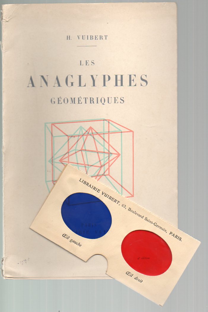
    Vuibert308 Stereo viewing geometrical figures may or may not be useful–I find it a little off-putting, creating a slight dizzying effect, though I’m sure it helps others (particularly children?) see complex geometrical figures a little more easily., especially when it comes to crystalography images. Education was certainly what Henry Vuibert , the author of Les Anaglyphes Geometriques had in mind when he published the work in 1912.  He had a long history in mathematics education, having founded the firm that bears his name back in 1877, a publishing house specializing in school texts in the maths, physics and general sciences.  (We offer the book for purchase at out blog bookstore.)

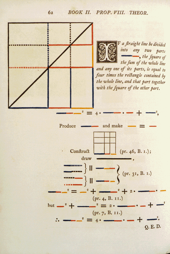
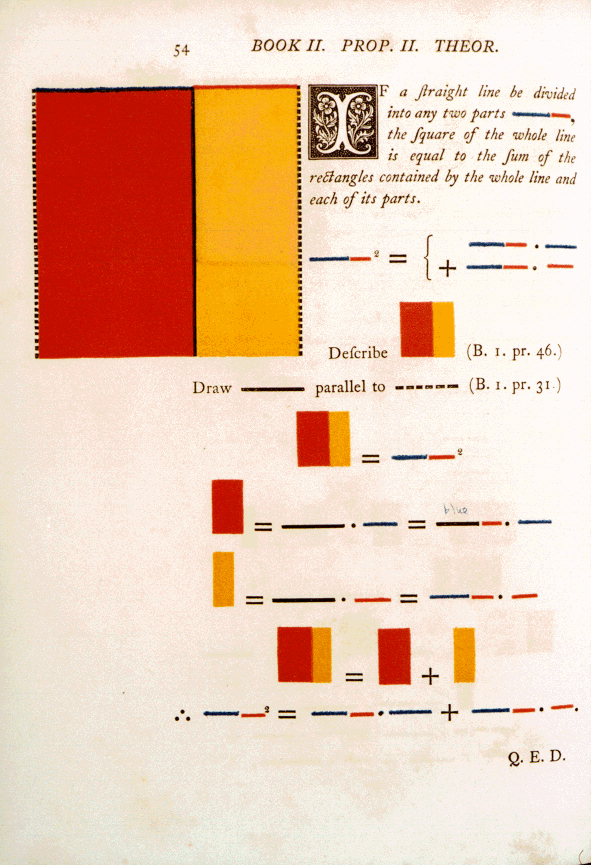
    Vuibert’s book is a very early example of the use of the anaglyphe–examples of the use of the method go back to the 1850’s, when d’Almeida used a version of the idea to punctuate lectures using a magic lantern; the (printing) process of the anaglyphe wasn’t patented until the 1890’s by L.D. DuHaron.  It does confuse me or remind me quite a bit of Oliver Byrne’s beautiful monster The First Six Books of Euclid in which coloured diagrams and symbols are used instead of letters for the greater ease of readers… printed at the Chiswick Press by C. Whittingham for William Pickering in 1847.  The book is, well, unusual and probably not at all usefu11.  Bryne replaced all of the algebraic notation, identifying letters and almost all of the descriptive text with color and color codes, leaving Euclid mysterious, hidden, awkward, impervious, and, yes, beautiful2. As a matter of opinion this work presages the cubists (and especially Piet Mondrian) by 60 years, and all by accident artwork. 

    Byrnes 11.8


    There are certainly much earlier works that tried to get at a fuller representation of geometrical objects, not the least of which was a 16th century Elements of Euclid in which the figures were cut-out paper, pasted into the book and attached to a string so that the reader could pull out the illustration and see it displayed in three dimensions. The elements of geometrie of the most auncient philosopher Euclide of Megara. Faithfully (now first translated into the Englishe toung…3, printed in London in 1570, was no doubt a great and exasperating labor of love, a complex “pop-up” book accomplished with sixteenth century technology.  (The photo below shows the Smithsonian Institution’s copy.)

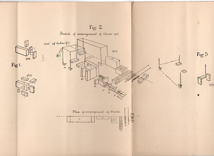
    Of course there’s the very old fashioned way of representing mathematical concepts, and that’s with sticks and stones and blocks and such.  For visceral memory and practical applications, the idea is hard to beat, unless of course, you really beat it , which is difficult to do.  But to me that’s just what Major G. Mackinlay did in his Realistic Arithmetic,  for Teaching Children the Elements of Arithmetic by Means of Special Blocks4, published in London in 1900–his ideas for the use of blocks was very sound and stable; his instructions (and in particular his illustrations) for what to do with the blocks was not.  I am reminded of inscrutable, badly translated and designed instructional manuals for tech stuff that need a manual for the manual. 

    Here’s one of the folding plates describing how to assemble the blocks:

    Math blockis309

    Then there are other sorts of wooden (and etc.) three-dimensional models, such as the (600+) gorgeous geometric designs housed in the Institute Henri Poincare, transferred there from the laboratory of geometry of the Faculty of Sciences of the University of Paris in 19285.  Most of these models were constructed around the time of vast change in mathematics and art (1900-1920), which means that many of them predate the revolutionary ascensions of  Cubism and non-representational art.

    And as long as were at the point of unintentional and under-recogniozed epochal works, I think that there is a broad book that could be done on exactly this topic, calling into play such examples as Georgina Houghton, Victor Higo, Emily Vanderpoel, and many others. 

    Georgina Houghton, for example, produced this non-representational painting in 1870 (or thereabouts):

    Georgiana

     And Victor Hugo, from the 1860’s

    Evocation of an island Painting  - Evocation of an island Fine Art Print

    And Emily Vanderpoel (1900 or so):

    Art-vanderpoel186
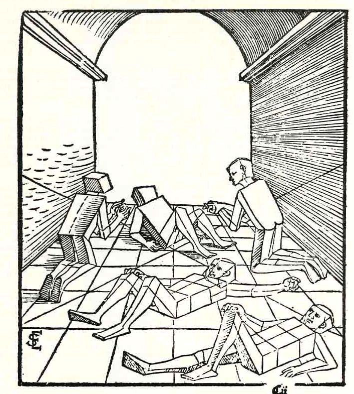
    In another, much earlier case of removing detail and adding abstraction for the sake of simplicity in representing an idea,  Erhard Schoen, in his Unnderweissung der proportzion und stellung der posssen liegent und dtehent, printed in Nurenberg  in 1538, presented these cubed figures (below).  He used simplified geometric form to stand in for the curvy humans, replacing them with proportional stacks of boxes which would more easily explain to the younger reader how to represent the human body in space and in proportion to other things. 

    Schoen

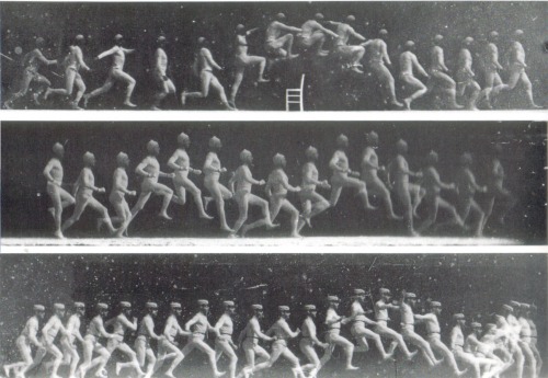
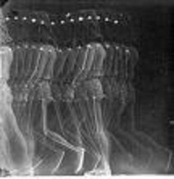
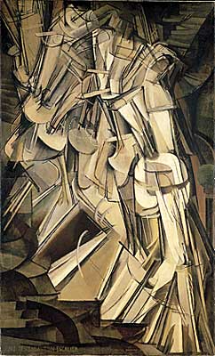
    I think that these were monumentally combative images showing humans in a radical, previously unknown way, much like the moving-through-space-and-time photographs of the somewhat forgotten Etienne Marey, who in the 1870’s created what was essentially the world’s first “slow motion” device. One iteration of Marey’s apparatus was basically a long series of ganged cameras recording a motion for a Marey12 simple task at a given time frame and presented on a continuous strip of photographic paper, sort of like a motion picture with the camera speed set at three frames per second. The resulting images were phenomenal and showed people for the first time the exactness of all manners of simple motions–motions that no longer looked so “simple” once all of its aspects could be studied from captured photographic evidence.  Even the act of hopping over a small stool or bending to pick up a bucket of water were enormously revealing in a way like Robert Hooke’s Micrographia displayed the great detail and complexity of the seemingly simple fly.  Perhaps the most famous of Marey’s series of images was that of a galloping horse, which also for the first time revealed what exactly the horse’s legs were doing and proving that almost every painter in the history of art represented the galloping horse incorrectly.  His series of photographs (as in this sample below) show a fairly close fit to the work of the futurists (like for example Duchamp) who would come into being after another four decades. 

    Marey  And Duchamp’s Nude Descending (1912):

    Duchamp


    I do want to make it clear that this is just a simple note, a thinking-out-loud piece on how attempts to visualize things differently for the sake of explanation or education can come “unintentionally” close to what would become epochal works.  More later.

    Notes

    1. Augustus De Morgan, mathematician and logician, wrote a very highly critical book A Budget of Paradoxes in which he describes hubbub, fakirs, frauds, perpetual motion machines, squaring the circle efforts, millstones and other useless books in the maths, and in here he sniffily dismisses Byrne’s work. At best, to De Morgan, the Byrne book is “curious”. But useless and curious, as I have seen many thousands of times, does not mean that it can’t be attractive and beautiful, and the Byrne book is probably the leading candidate in the Bad & Beautiful category.

    2. In his Victorian Book Design McLean calls the Byrne book “…one of the oddest and most beautiful books of the whole century…a decided complication of Euclid, but a triumph for Charles Whittingham [the printer]”.

    3.  This is also the first appearance of Euclid in English.  The full title: The Elements of geometrie of the most auncient philosopher Euclide of Megara faithfully (now first) translated into the Englishe toung by H. Billingsley, citizen of London; whereunto are annexed certaine scholies, annotations, and inventions, of the best mathematiciens, both of time past and in this our age; with a very fruitfull praeface made by M.I. Dee, specifying the chief mathematicall scieces, what they are, and whereunto commodious; where, also are disclosed certaine new secrets mathematicall and mechanicall, untill these our daies, greatly missed. London, Imprinted by I. Daye, 1570.

    4.  From the Report of the Annual Meeting of the British Association for the Advancement of Science, 1906:


    5.  From the IHP website:  “Most of the models  were created by Martin Schilling in Leipzig between 1900 and 1920 and  a few of them  (in wood)  were made between 1912 and 1915 by J. Caron, Professor of Descriptive Geometry in charge of  the “graphic work” course at the ENS at the beginning of the century (between 1912 and 1915).”

    Also this:   “In the thirties, the surrealists, led by Max Ernst, were interested in these geometric objects. André Breton alludes to them in  “Crise de l’objet” , an article  in the magazine  Cahiers d’Art (May 1936, No. 1-2, p. 21-26.). Man Ray took photographs of the models, which where published in same issue. He would later use them to compose what he called  “Shakespearean Equations”. Many artists, painters, architects and sculptors drew inspiration from them.”


  • Why I Like Pictures

    JF Ptak Science Books  Post 1369
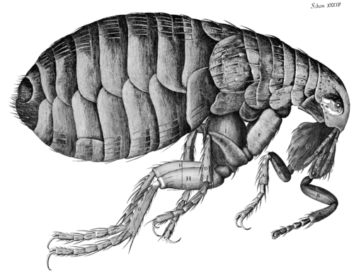
    Hooke--flea


    Printed images are interesting in that they exist at all, at least in pre-modern (ca.1900) times. When you think of the total amount of time that humans have been thinking–like the possibilities of all total ideas for all people for the past, say, 10,000 years—and think about the 10×10^9 neurons firing for everyone all the time, and the numbers of books and pamphlets and journals and such printed before 1900, the access to the archive of the human condition looks a little paltry compared incomprehensible amount of good thinking that has gotten away. (Humans haven’t helped themselves all that much in this regard, given the deep, long, wide history of the planned destruction of libraries throughout time.) 

    There are more stars than books. Lots more—10^22 stars versus 1.3×10^8 books (or the stuff that an odd Google study classified as “books” for their scanning and advertising appetites). There’s also bacteria and other microorganisms alive in/on the human flora than books (and blood cells too for that matter). Until the 18th century (and really into the 19th) the practical means of producing a book were set to restrictive, upper-class access. For most of human history the ability to even record a thought on transportable material was a deep issue; getting it reproduced somehow was extraordinarily difficult, especially if you belong to the not-yet-existent working class. Even if we just consider works that are 1455-1800 era the illustration was not a common thing, which is odd to me since it seems the image could show in less space what was being described in the text (and for argument’s sake here we’ll just say that production facility for the illustration and a page of text were equal). I have a funny feeling that if you weighed all of the pages of text against all pages of illustration in all books published from1455-1800, illustration would be enormously, fabulously outweighed.

    Which is why in my mind “pictures” are so interesting—they are rare, and so that when they were published they were deeply considered objects.

    All this changes though in the nineteenth century when production facilities increase, costs go down, the finished product is available more cheaply to a growing class of people who work for a living and have a disposable income. Newspapers and magazines begin for real in this century, paper costs go down, ability to print at high speeds goes up, and suddenly there exists an addition to the concept of “disposables” —information commodities. For the first time a mass of material is produced to be replaced in the next day or week, disposable reading material. There are more images reproduced and distributed in this century than in the entire history of man on earth. Of course all of this look like nothing, today, now that almost everyone in the U.S. (at least) can be their own publisher/producer of original or found work, which means of course that people in 2086 will look back oat our abilities as we do on the 19th century. And so it goes.

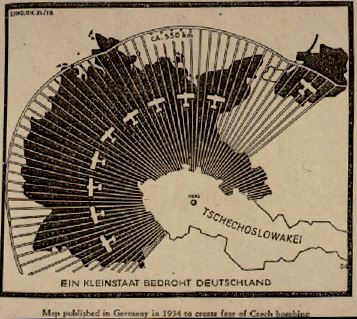
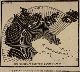
    This is why I like pictures—they’re comparatively rare, and the tell as much of a story as you will allow. I enjoy scientific and technical images as much as anything, for their dreamy amount of detail and revolving possibilities of 3-D display and such; maps too, for pretty much the same reasons (and that one usually doesn’t memorize them, at least not the detailed ones). Of particular interest on this blog has been maps-with-a-purpose, particularly  cartographic propaganda, like this 1937 Nazi-published map showing the “danger” posed by the Czechoslovakian air force to Germany.  Blog jan 3 czech airIt is a graphic representation of the Big Lie, an element of design intended to transmit an idea to a reader who really doesn’t need to do so, being able to get the idea of the the data being presented in the map in one quick visual.
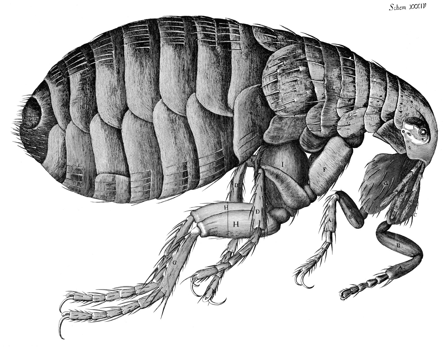
    The scientific images demand that you see the difference with what came before to truly appreciate them—one of my favorite examples of this is Robert Hooke’s engraving of a magnified flea. The microscope was brand new, and this image, which appeared in Hooke’s magisterial,epochal work Micrographia1, presented as much of a new world to people in 1665 as Galileo’s reporting in Siderus on the massive number of new stars that he had seen with the telescope he used to look up rather than just across. People would have had no idea that such a magnificently detailed creature such as this flea existed, as they simply couldn’t see it. Same too for the stars, which (with the exception of Brahe’s Nova and such) had been seen to be “perfect”, an harmonious fixed number, though a relatively simple innovation using materials that had been around for centuries brought a new world to bear. (One is tempted to say that in his new, massive book that Hooke included “only” 38 images; but one has to remember that Hooke did all of the drawings by himself, and actually rushed the book into print as he sensed a market for it which combined nicely for his need for money..Hooke was correct about the market for the book.)

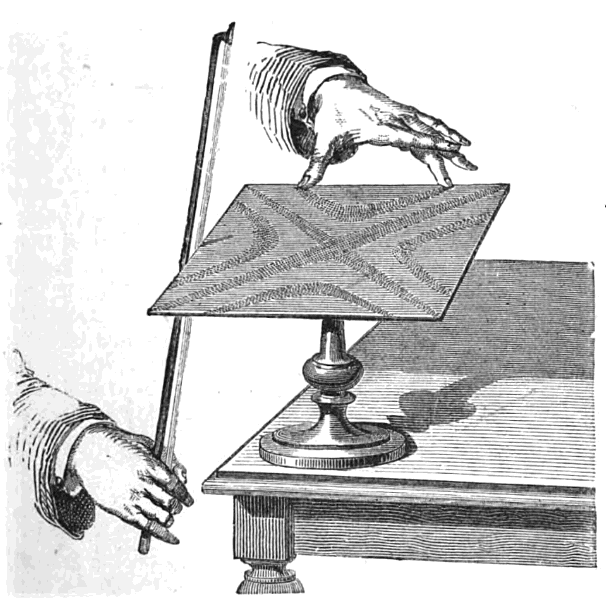
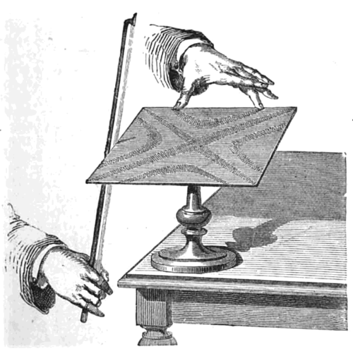
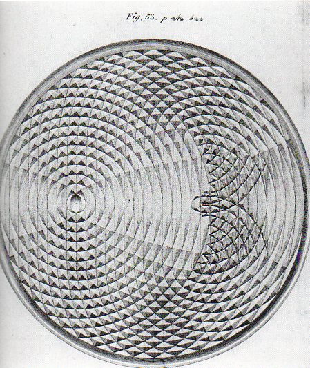
    The purpose of some scientific images are difficult to identify when faced with them for the first time and out of context, but once rectified they can be beautiful renderings of complex relationships, like Ernst Chladni’s patterns of vibration revealed to us via sand on metal plates (in his Discovery of the Theory of Pitch, 1787), and the Weber brothers’ exacting drawings of wave forms  (from 1825) (and shown below, respectively).
    Bowing_chladni_plate

     
    Adding mercury to mercury: the sensational drawings by the Weber brothers as they observed the changing wave fronts made by a drop of mercury into a pool of mercury:
     
    Weber acoustics461

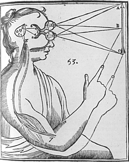
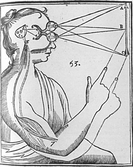
    Rene Descartes depicted the interpretation (in his  Principles of Philosophy of 1644) of light and its physiological reaction in the brain in this iconic image, as follows:
    Cartesian_Vision

    the lines of sight depicting binocular vision, observed (and compressed) by the eye’s “particles” and processed by the pineal gland which in turn manipulate the “fluids” in the control of nerves and muscles. 

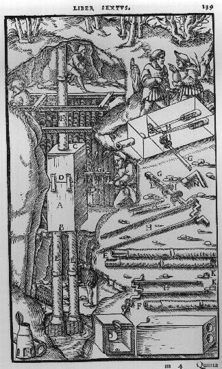
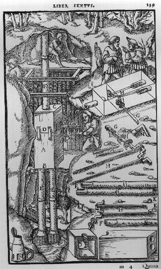
    Agricola’s De Re Metallica (from the first Latin edition f 1556) displays many interesting cross sections of Renaissance mines:
    Agricola

    There is so much more, and it may be possible that there were millions of pages of illustrations during our time period.  Harvey’s demonstration of the flow of blood in the human body pictured by fingers and a forearm (in his On the Motion of the Heart and Blood, 1628), Descartes’ analysis of how the human eye “sees” (An Analysis of the Eye, 1637), Agricola’s cross sections showing how to construct mines (1556), Scheiner’s illustration of the apparatus he built to observe sunspots (1611),  Borelli’s study of the mechanics of the human body (1680), Rosalind Franklin’s x-ray photograph of DNA (used by Watson and Crick to depict the structure of DNA), Thomas Young’s illustration of light-wave interference (1803)

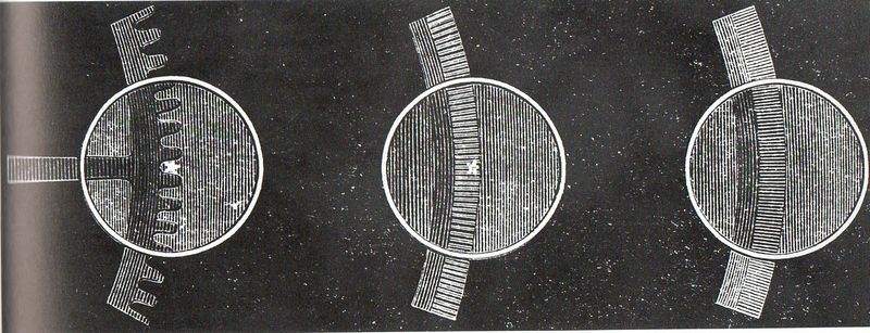
    Then there are the pictures of the interior of the Fizeau apparatus as it captured the velocity of light so:
    Aaa-light fiz gears158


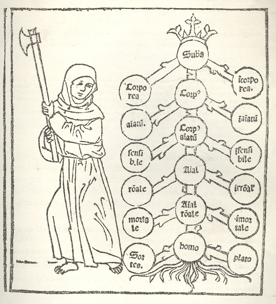
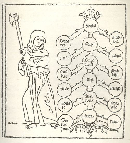
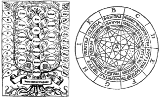
    Classifying images, like this of Porphyry’s (logic) Tree and Raymond Lull’s diagrams of life and decision, are in constant appearance for centuries, excellent ways to provide method and organization to large quantities of information and for problem solving. While not exactly a generator in the sense of Jorge Borges’ Library of Babel or Jonathan Swift’s take on Lull’s writing machine, the antiquarians did produce very interesting, elegant, beautiful ways of story information and ordering information.  The Tree of Porphyry is far more concise–an abbreviation–compared to the infinitely expanding hexagonal rooms filed with books and attendant librarians in  Borges’ universe. 
    1--logic tree

    The Ars Magna/Thinking Machine of the 13th century Lull (also known as Ramon, Raimundo and Raymond, Raimundus and Raymundus Lull, Lully and Lullus and Lulio), was the ultimate organizer of how sentences can be made and knowledge produced/uncovered (particularly if you want to please the logic of the church and the Creator), and which was also written about, described and worried-over by Borges.  There are many other early figures in this category to be sure (Lewis Carroll, William Jevons, and even in a way Mr. Venn, not to mention Leibniz and his calculator,  and all of the changes in scientific method and (English/Dutch) mathematical concentration on applied mathematics of the 17th century that made thinking about the industrial revolution possible.
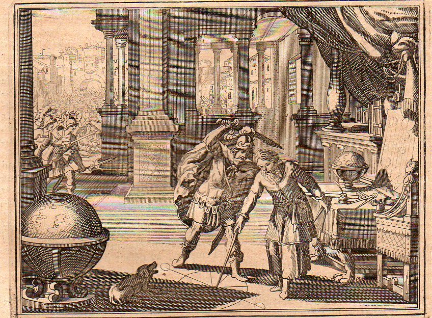
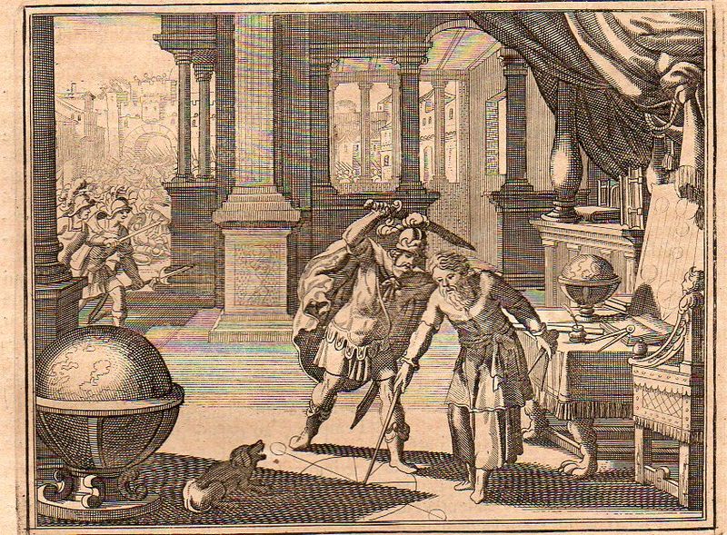
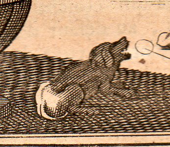
    Images of ebb and tide, of cause and effect, of bones inscribed in clouds and solids manufactured of gas, of the steps of discovery, of the integral drawing of the integral pieces, of cross sections detailed enough so that you too could build your own locomotive, or guide yourself through a paper transverse dissection of the human brain–this is the great essence of images. It is interesting to look at these things forensically, to identify all of their components and articulate the symbolism, to look at the image cautiously, judiciously–sometimes this just results in insights into the artist who may have been tired and was working through just another piece of drudgery and tried to make their work a little more entertaining.  This doesn’t add much to the understanding of the event, but it does give the scene a fullness,  like, for example in this image of the killing of Archimedes from  Histoire Universelle published by the ubiquitous Peter van der Aa in Amsterdam at the turn of the 18th century–it falls in line with many of its comrades of this event  in that it depicts the tragedy in the second before it occurred.  One thing it has that other scenes do not–a barking dog.  Maybe it belonged to Archimedes, maybe not.  But there was a dog depicted here, and it was barking at the scene, probably barking at the man about to stab the mathematician, which means it would’ve been the mathematician’s dog.  But Archimedes certainly didn’t hear the dog if he couldn’t be interrupted by the battle outside his door or the Roman who yelled at him to turn.
    Archimedes 1705348 

    Archimedes dog 1705349


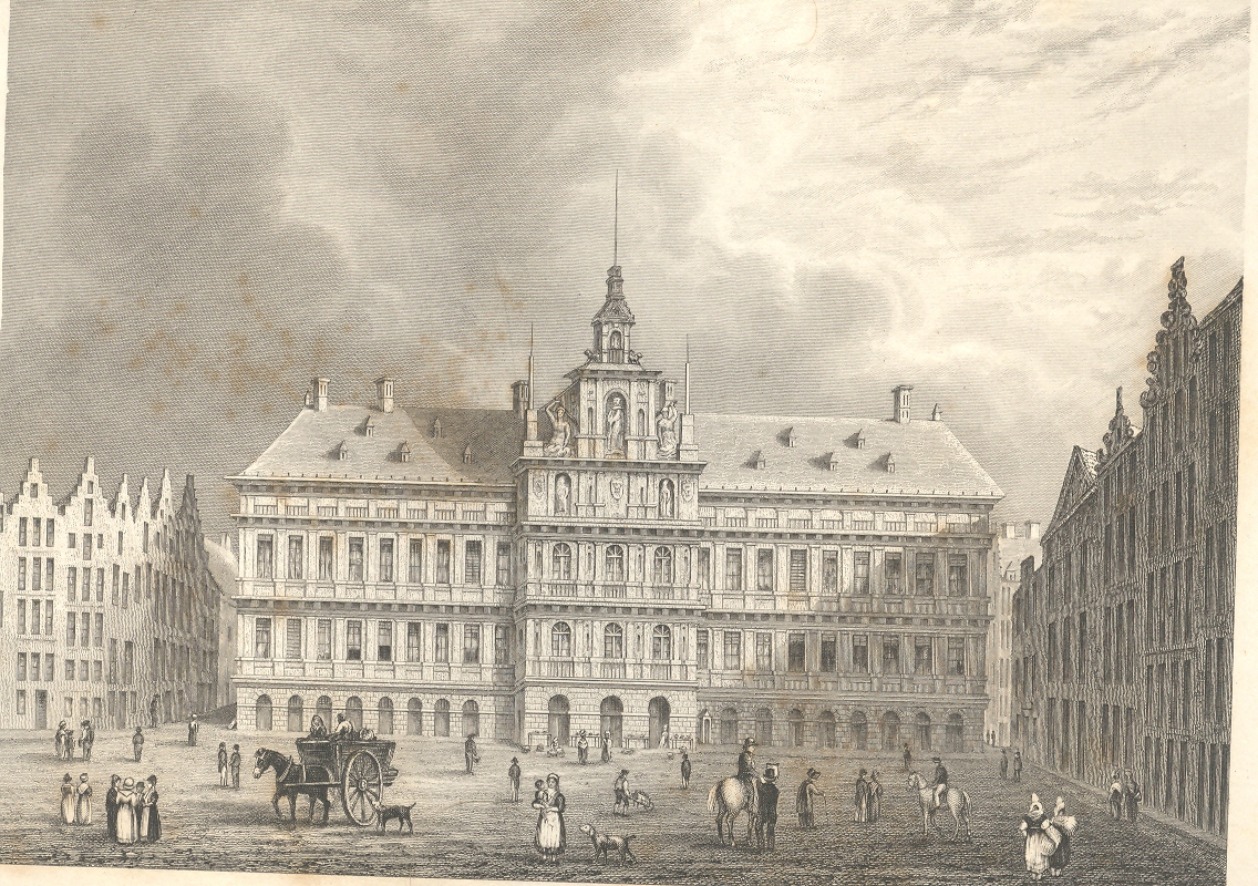
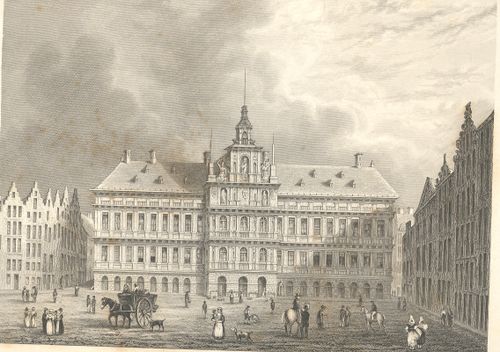
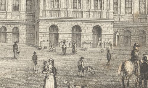
    This blog is written and illustrated around the very loose idea of “the history of ideas”, and is quite image-driven–there are probably about 5,000 pictures reproduced here now, a wide selection of illustrated thinking in the sciences and many other fields.  This includes one classifications of an image series that really don’t exist—I mean they were images intended for one purpose but for the passage of time (and sometimes removing them from context) they become something completely different, entirely new, providing unintentional insights into their artists and times.  I find exploring in images this way to be fascinating, noticing the semi-hidden and/or unnecessary, extravagant, extra-necessary bits that were intentionally placed by the artist, as in this example of Archimedes’ dog, or with the characters that are sometimes found as “filler” and which are basically wholly unrelated to the intention of the illustration.  For example in this application of the imaginary forensic arts microscope, we see this series of pictures of a standard view of the town hall of Antwerp; but what we see advancing under magnification is a very interesting set of occupations displayed in absolutely minute detail.

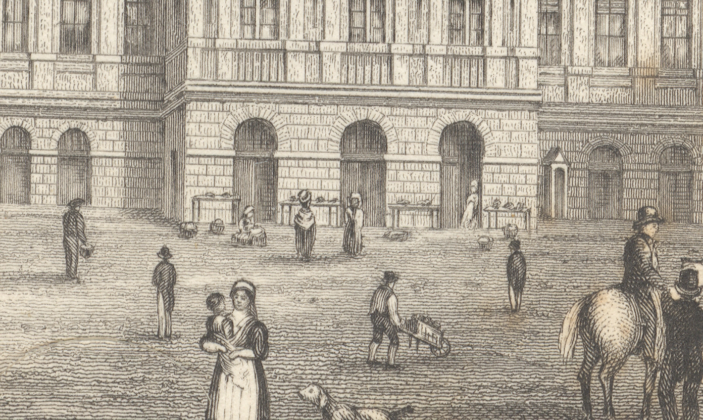
    First, the majority of the engraved image, followed by a close-up of the center of the building (the three doorways), and then by a closer view still of doorway three:
    +++looking closely

    +++looking closely detail

    The truly interesting bit here is barely observable in the original; but, under magnification, we see a very rich and minuscule “engraved photograph” of a slice of daily commerce and street life in Antwerp.  If you look at the central entrance to the town hall you can see three main (and large) doorways, and if you look clos+++looking closely detail2er still, you’ll see something leaning against the portal at right.
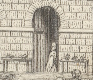
    Extraordinarily, what the artist snuck into the original is a tiny (2mm) figure watching over several tables of her (fruits?/vegetables?) ware, waiting for a customer. There doesn’t seem to be much interest in her stuff, currently, and she has allowed herself a little relaxation, leaning against the doorway.  I’ve found this sort of extremely minor subject matter and its ephemeral connection to the larger work at hand to be just fascinating.  I wonder why such detail would be added–why would the artist, or engraver, take such care and interest in such minor visions.  Perhaps this is just what was at hand on the days the artist fleshed out his work; perhaps it was the work of the engraver, alone, incising yet another semi-boring architectural image; desperate for a little artistic activity, adding some interesting, almost-invisible touches, here and there.  Perhaps no one would ever really notice them, but whoever was responsible for adding such incredible, extra-dimensional details would certainly enjoy knowing they were there, recognized or not.

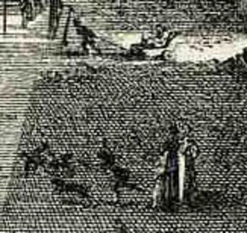
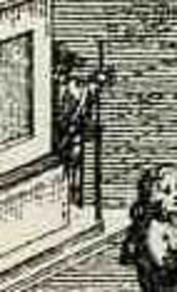
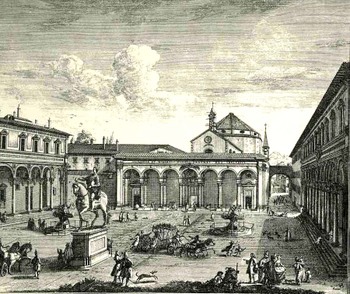
    Another good example is found in Guiseppe  Zocchi,Veduta della Piazza della SS Nunziata Statua Equeftre di Ferdinando Primo, Fonti, e Loggie Lateral,shows more good work with the possibilities of ephemeral populations, where among the many details we see an invalid being pulled in a small cart, and a half-obscured  man with a staff leaning against the back of the monument.  And of course there’s much more–you just need a little magnification to see the human element of the artwork. 
    Bloglooking_closely_1_96123

    Bloglooking_closely_1__carriage_2

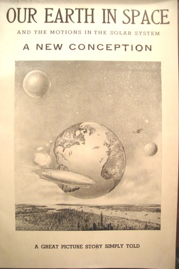
    Bloglooking_closely_1__man_caneAt the end of the day one of the most enjoyable of all image classifications for me  are the classifications of image series that really don’t exist—I mean they were images intended for one purpose but for the passage of time (and sometimes removing them from context) they become something completely different, entirely new, providing unintentional insights into their artists and times. They are also on the outer-edge of being pre-Outsdider Outsider art.  One of my favorite examples in this genre is this 1941 pamphlet which isn’t so much “interesting” as it is interestingly illustrated, where all of the semi-coherent  interest resides, the text having left coherence far behind, somewhere, in it own intergalactic dust. When I first encountered it this was the only instance that I had ever seen of New York City floating in space with the Earth floating happily in the background–now I’ve collected at least three other extra-New-York-City’s-in-space in the last few years. 
     

    Dsc04543


    This is also a nice example of extra-NYCs, where there are several other instances, balancing out the larger collection of the opposing missing-NYCs, like this 1902 example showing the city sunken and out-of-sight, disappeared under its own weight:
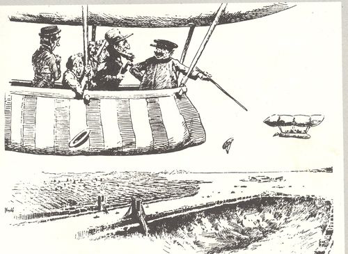
    3--nyc gone

    There’s also the sub- or  supra-category of extra-Earths department, where I have at least five other examples, including this remarkable effort by Victor Segno of Los Angeles, who in 1929 published this fantastic image depicting extra-human empty alien souls being dropped on the earth to repopulate the place after it had been cleared out by “brain waves”.

    And so I guess that would be the perfect place to exit this short appreciation of pictures. 

    ____

    Notes.

    1.  As Hooke states at the end of the 28-page introduction  to the work: …”it is my hope, as well as belief, that these my Labours will be no more comparable to the Productions of many other Natural Philosophers, who are now every where busie about greater things; then my little Objects are to be compar’d to the greater and more beautiful Works of Nature, A Flea, a Mite, a Gnat, to an Horse, an Elephant, or a Lyon.”.
  • An X-Ray of Cubism? Jouffret and Visualizing the Fourth Dimension, 1903 and 1906.
    JF Ptak Science Books   Post 1361

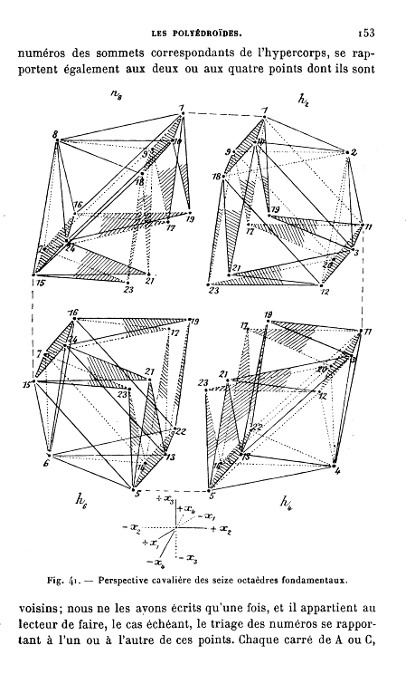
    Is this an X-Ray of Cubism?

    Jouffret

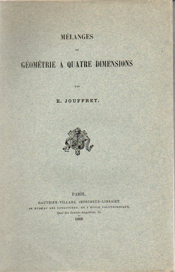
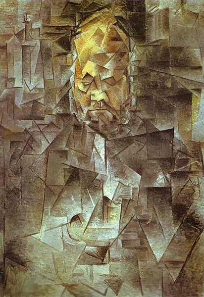
    Emile Jouffret brought an amazing and lovely pair of books to the mathematical dining table, both coming at about the mid-point of a period of perhaps the most sweeping multidisciplinary revolutions in human history.  Published in 19031 and 19062 [and both originals available at our blog bookstore] they both may have had an impact as a visualization tool for the newest movement in art since the creation of Impressionism (1850’s-1870’s): Braque and Picasso’s  Cubism. When you compare the illustrations in the Jouffret books you cannot help but to see a connection to the work of (the morally-lonely) Picasso (and especially in his 1910 portrait of the movement-molding art dealer Ambroise Vollard, below). Georges Braque and the that the two would make in 1906, the first year of the Cubist movement. 

    Jouffret’s 1903 book was hardly the first on the topic, though it may be the first of the major, book-length treatments of the topic, as well as the most  heavily illustrated.  Thinking on the fourth dimension goes back as far as Kant, at least, and the real work begins in the first half of the 19th century.

    The first major3 work arrives with Hermann Grassmann’s “Die Lineale Ausdehnungdlehre” (Theory of Linear Extensions) in 1844 (and the subsequent translations of the work as well as original work by Arthur Cayley); followed by Ludwig Shclafli (1814-1895) “Theorie der vier flachen….” (Theory of Continuous Manifolds, 1852 but not published until 1906), Riemann’s 1854 speech (which was not published until 1867 and which appeared translated by William Kingdom Clifford in Nature in 1873, G.F. Rodwells “On Space of Four Dimensions” (Nature, May 1873),  Dodgson/Carroll‘s  Through the Looking Glass (1872) deep references, Zollner “On Space of Four Dimensions” 

    Jouffret499

    (April 1878 and subsequent publications, and who is referenced in Kandinsky’s [difficult -to-me On the Spiritual in Art of 1912), W.I. Stringham (1847-1909) “Regular Figures in n-Dimensional Space” (American Journal of Mathematics, 1880), and E.A. Hamilton Gordon, “Fourth Dimension”, April 1887, to name some of the major figures.  And then of course comes Edwin Abbott’s Flatland, a Romance of Many Dimensions, by a Square (1884) and Charles Howard Hinton, who published a number of different works beginning in 1880 (“What is the Fourth Dimension?”, 1880 plus Scientific Romances 1884, and The Fourth Dimension, 1904) and lasting through the turn of the century.  There is also H.G. Wells, whose The Time Machine began to appear in parts as early as  1894, though it did appear in the same issue of the  Science Schools Journal as the Hamilton Gordon article, in April 1887, as the “Chronic Argonauts”). Wells’ also approaches the fourth dimension in “The Plattner Story”, in 1896 and The Invisible Man in 1897. Other literary contemporaries of Wells who used the fourth dimension in their work include Oscar Wilde (“The Canterville Ghost”, 1891), George Macdonald (Lilith, 1895), and Joseph Conrad and Ford Maddox Hueffer The Inheritors, (1901)–the most convincing and scientific of all of these literary efforts though lies with Wells. From about this point on–from the time that Jouffret enters the scene in 1903–the fourth dimension has become part of the culture, and a popular culture at that…especially after the Cubists begin their assault on visual representation in about  1906.

    The Jouffret books are beautiful, and very interesting–they would have been better served with a bibliography, which would have been very nice to have–that said, Jouffret does have a fair number of footnotes to earlier work, so it is not as though his work is without attribution.  But it is a very interesting adventure. (Just a note–the fourth dimension and non-Euclidean geometries would get their first bibliography in D.M.Y. Sommerville’s classic  Bibliography of Non-Euclidean Geometry in 1911, which is a must-have for all of those interested in this topic…it is massively packed with all manner of major and minor works as well as obscuriana.  It is not, unfortunately, annotated.)

    1. Jouffret, E.  Traite Elementaire de Geometrie a Quartre Dimensions et Introduction a la Geometrie a n-Dimensions. 

    2.  Jouffret. Melanges de Geometrie a Quatre Dimensions.  Paris, Gauthier-Villars, 1906.  220pp.

    3. Most of the data in this long and winding sentence has been culled from Linda Dalrymple Henderson’s terrific The Fourth Dimension and Non-Euclidean Geometry in Modern Art, Princeton, 1983–most of my references come from the first 45 pages or so of her book, which is the Bible of all modern works on the fourth dimension/math/physics/art.

    Picasso_vollard1910


  • Unintentional Dadaist Anatomy: WIlliam Rimmer, 1877

     JF Ptak Science Books  Post 1360

    Blog==June 29--rimmer backdet

     
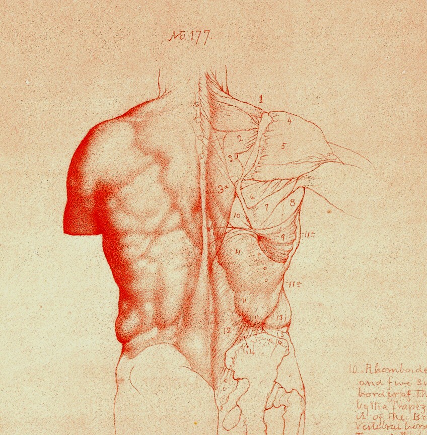
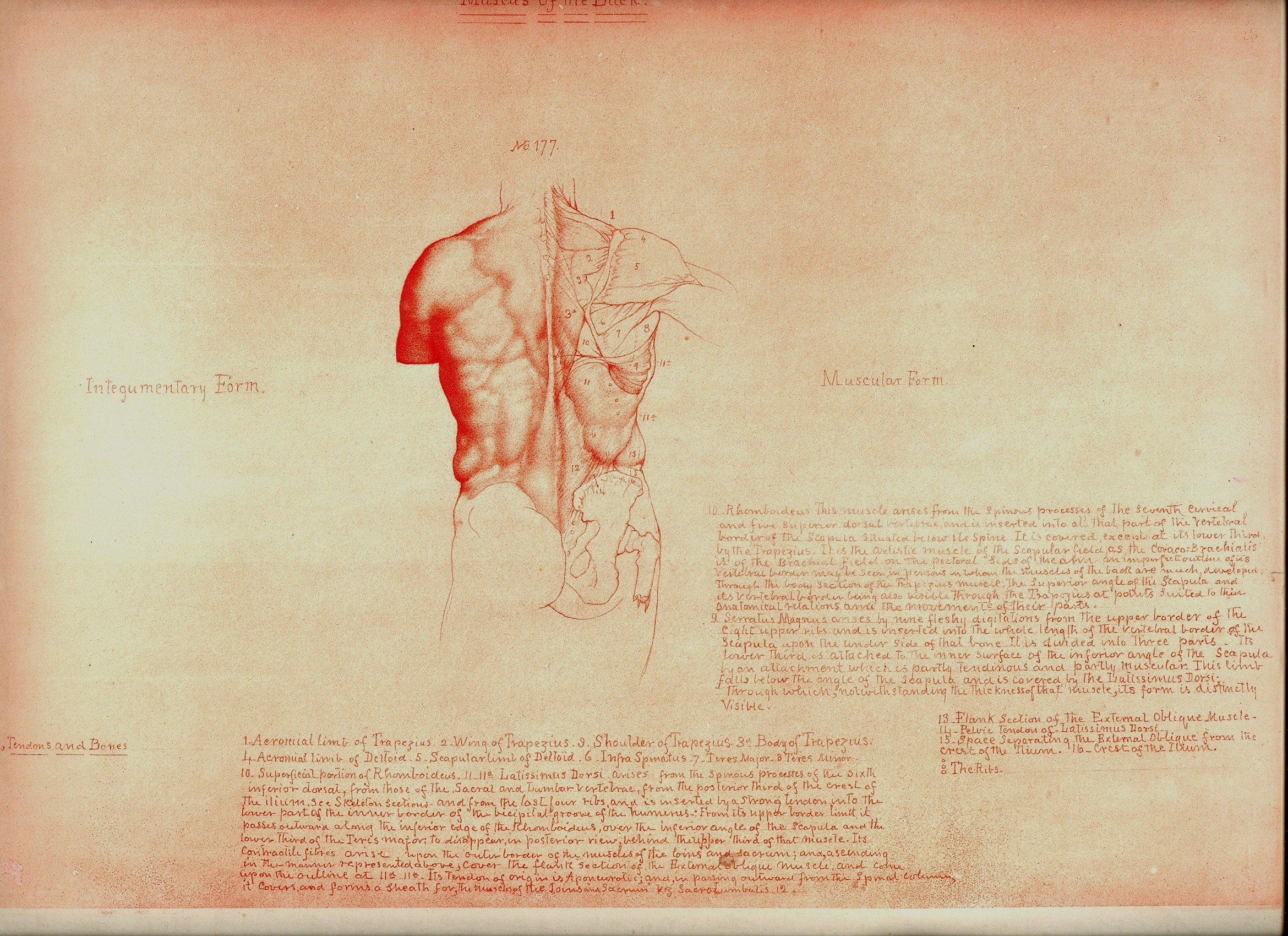
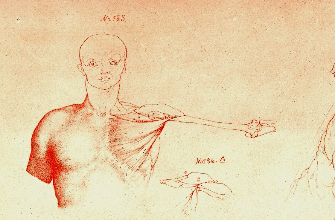
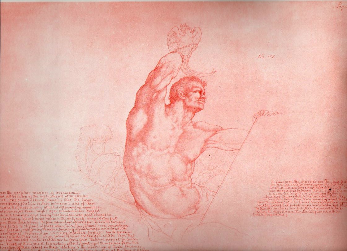
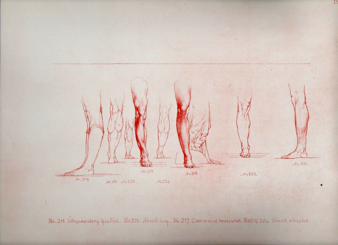
    Looking at old prints sometimes reveals more than just their own history, simple or not:  there are, from time to time, subtle bits of otherness that creeps into the image, if you allow yourself the time to see it.  And sometimes looking at images of the past reveal a little of the future, or the possibility of the future. A great example of this is William Rimmer’s (1816-1879) Art Anatomy, this edition published in 1877 (and about which I wrote earlier in this blog1).

    Blog==June 29--rimmer back

    Blog==June 29--rimmer pecs det

    The work reminds me of at least two touchpoints, one from art, the other literary.  First and foremost, the added elements, the humanist touches and flairs (and I mean Humanist as in the 16th century variety) , the mytholigizing elements, the little designs that are added to the anatomical details

    that run throughout the course of the work,  remind me of the work of the Dadaists that would come forty years later.  As will be seen below, there really isn’t much necessity for all of the added extras, the fabulous add-ons, that Rimmer incorporates in this work.  This part of the work definitely has an antiquarian flavor to it, the major anatomies of the 16th and even into te 17th century having a pronounced artistic flavor to them.

    In a more removed sense, I get a heavy dose of memory of Marcel Proust from the Rimmer images.  In a sense, Rimmer is trying to affect change, an instability, into the most common and stable presentations in art, human anatomy.  There is a strong his history of presenting anatomy in an artistic format–Vesalius is one famous example–where skeletons are posed reading books, or holding their skin or contemplating  a(nother) skull–but not so much past the late 17th century.  Though very few of the “decorated” anatomies have ever taken their artistic license quote so fabulously as Rimmer.  And Proust I think is a Great Destabilizer–he works very hard to push the center of gravity away from where it should be on just about everything.  He drags himself to the proposition at hand, to the memory, to the situation, and though all of his great personal destabilizers–his allegeries, his allegeries to the things that he loves, his allergies to his allergies, his vast catalog of physical complaints, his pale melancholia, his fits, his spectacular memory, his ability to see differently, and on and on, all seemed to coalescence into a colossal ability to see even the smallest detail outside of its small details.  Perhaps this is a stretch, but that is the literary sense-impression I have from Rimmer.

    Notes.

    1. For some reason I never included any of the images available for sale in my blog bookstore–though now I have.

    Rimmer496

    Rimmer495


  • The Very Describable Macro Color of 1930’s Floors–Well…Color, Symbolism and Swastikas in Floor

    JF Ptak Science Books   Post 1334    

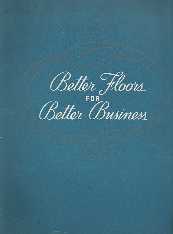
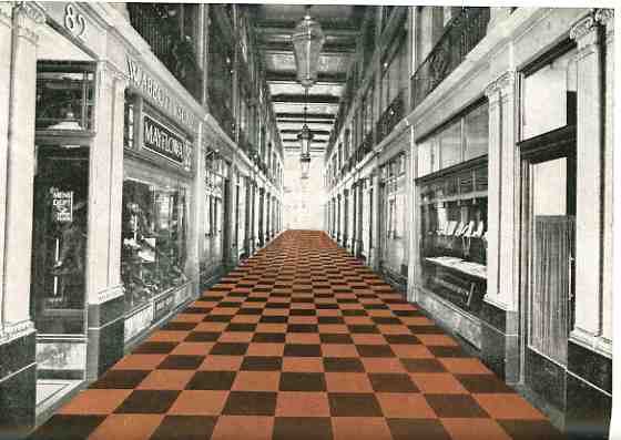
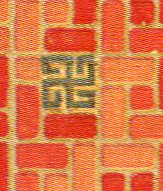
    Color floor--cvr382I remember that the floor of my grandmother’s beauty salon (in Great Barrington, Massachusetts) was a dark (gray on black?) rolled linoleum affair, not much different from the floors that you’d see (if you could see them) in black and white movies from the 1930’s.  Grandma’s floors were probably that old–my memory is from the early 1960’s and the salon was far older than that–and so they looked like you’d expect an old, shiny, kept floor to look.  Plus you’d never really see floors in those older films, anyway, so it was difficult to see even if there was a design, let alone imaging a color.

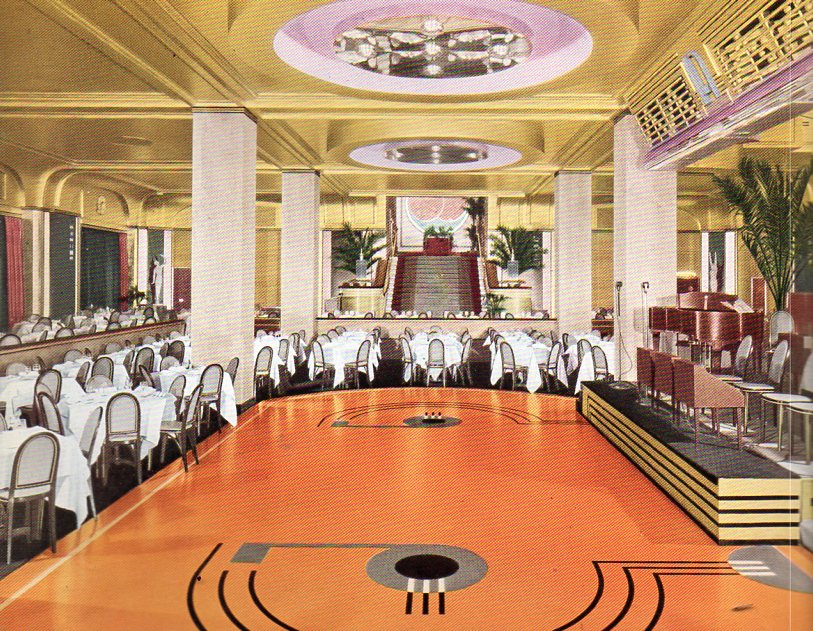
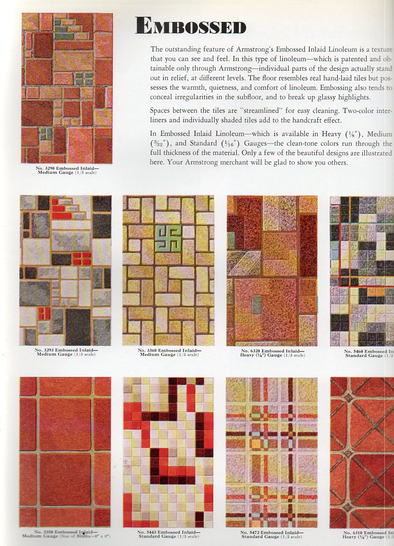
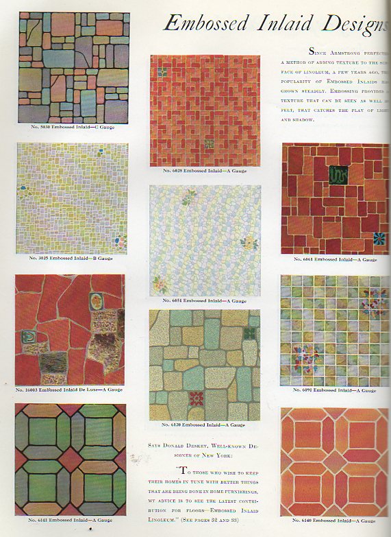
      That’s why it is so surprising to see magnificently-colored floors in catalogs such as Armstrong Cork Company’s  Better Floor for Better Business (1936) and Home Decorator’s Idea Book (1931). (Both of these booklets are available for purchase from our blog bookstore.) Color wasn’t invented after World War II–it just seems that way.  Color photographs, color home films and color motion pictures really didn’t get a popular start until then, so it might be natural to assume that the world was a bit more bland in shades of gray before then.

    Color floor--dining374
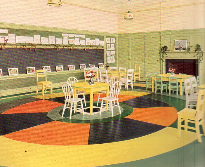
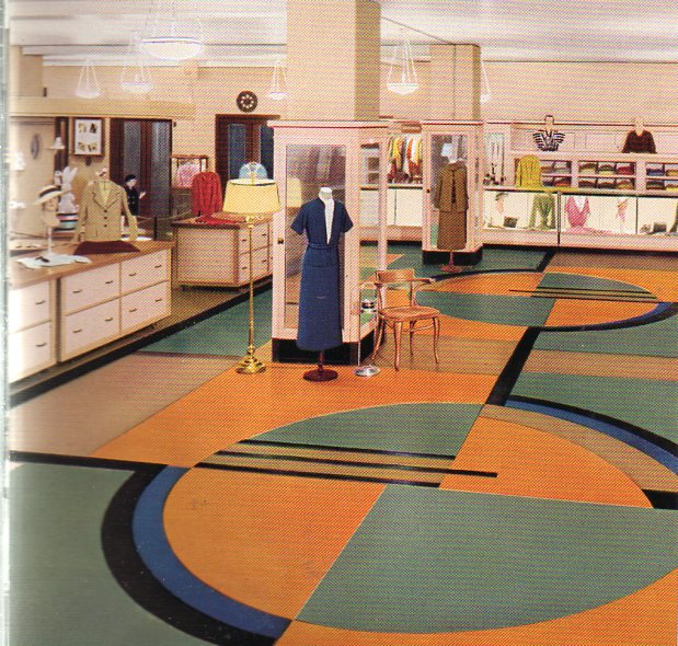
    All the same, these floors are so terrifically colorful that they look to me to be like a tiny design writ large–like a design for nightclub’s matchbook cover done on a 500 square foot canvas. 

    Color floor--kinder375
    [This is a kindergarten room, by the way.]

    Color floor--clothing store376

    000-ebay--Oct 30 rubber floor965See what I mean? These floors are beautiful in a way that escapes beauty.  I don’t particularly like them nor would I want to live on them, but they do have a certain inescapable loveliness to them that is just not beautiful.  Perhaps it is the odd juxtaposition of unexpected color. This is seen in sharper detail (left) in a post that a made (“There Was a Rubber Lady in a Rubber Room…) earlier in this blog.  Or maybe it is the unexpected combination of colors, or the unexpectedness of the colors themselves, that is the driver to this lusciousness.

    And then there are the swastikas.

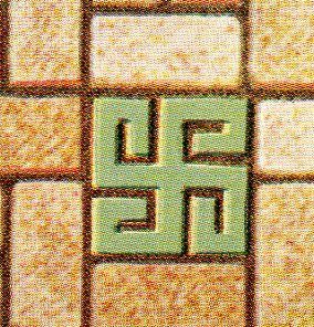
    Now the swastika is a very, very old symbol, thousands of years old, transcontinental, transoceanic, a transcendental image that was completely and forever corrupted by the National Socialist Party, a shameful symbol, a symbol turned into a hatefuil and horrible thing in just 20 years or so, overtaking two millenia of use.  And here we are, in the early- and mid-1930’s, during the time of the Nazis and Hitler and their free use of the swastika, here we are with this Armstrong firm from Lancaster, Pennsylvania, still using the swastika in design elements for their floors. 

    Color floor--swastika 377

    Color floor--swastika 378

    (Here’s one page of floor design elements from the Armstrong catalog at left; and the detail for design number three at right.)

    Armstrong was also in the heart of some country within the United States (Lancaster) that was very rich in symbolist design, but I think that this has nothing to do with anything.  I’m also not making th case for their being fascist leanings at Armstrong–I’m simply pointing out that even as late as 1938 (when another edition of this work appeared again with swastika design) that the image was still acceptable enough to have as part of a part of a floor.  It strikes me as deeply odd.

    Here’s another example from the 1936 catalog (and just to be perfectly clear I’m not highlighting the swastika part–it is offset in different colors in the originals):

    Color floor--swastika 379

    Color floor--swastika 380


    I’m not seeing Nazis in my porridge, though Madison Sqaure Garden was still getting filled up by American Nazis for their German Bund meeting in 1936–I’m just pointing out that it seems surpising that the symbol was still being used in popular design as late as it was. 


  • Art & Artists as Wartime Magi–Making Things Disappear, 1918.

    JF Ptak Science Books  Post 1306

    Its a little difficult to think of Ellsworth Kelly, Jacques Villon, Grant Wood, Laslo Moholy-Nagy and Thomas Hart Benton as painters-for-war.  But its true, and true for many of hundreds of other artists in the 1915-1918 era. Its not as though they were in the trenches gunning down the enemy or lobbing hand grenades into the swirling gunsmoke. They were camofleurs, camouflage1 experts, artists employed as magicians, Wartime Magi, employed/drafted to make ships and such disappear. 

    Ever since it was (sort of) first noticed in 1915 that designs odd to the environment, stark geometric patterns and such, were capable of fooling the eye, people with  design capacity were pressed into service, rendering offensive and defensive instruments of war optically semi-impervious with variations of the then-five-year-old modern nonrepresentational art. That must’ve been a very odd position to wake up to every morning. 

    Of course the idea of camouflage in the animal world is probably 250 million years old–animals and insects have been blending into their environment for eons, and I’m sure too that early hominids did their fair share of walking behind brush.  But the idea of hiding great amalgamations of very heavy metal with paint is really quite modern.

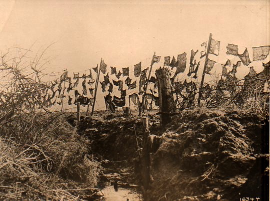
    World War I photos--Camouflage291

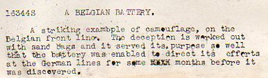
    In this photograph (available at our blog bookstore), the camouflage is more a more futuristic conception of art than the abstract and cubist approaches that were taken during the war, this looking more like assemblages of found material more than anything else.  And, according to the text that accompanied the photograph (which comes from 1918, from the Underwood & Underwood news photo service agency), the camouflage–empty sandbags thrown on a barbed wire fence) successfully concealed a gunnery emplacement for months on end. 

    World War I photos--Camouflage det292

    Notes

    1. A fine bibliography on camouflage appears here, at Leonardo Online.

    The definition of “camouflage” from the Oxford English Dictionary shows that it is a young word, in English:

    (n) The disguising of any objects used in war, such as camps, guns, ships, by means of paint, smoke-screens, shrubbery, etc., in such a way as to conceal it from the enemy; also, the disguise used in this way; freq. attrib.

    1917    Daily Mail 25 May 4/4   The act of hiding anything from your enemy is termed ‘camouflage’.
    1917    Daily Mail 16 July 5/3   The King paid a visit to what is called a camouflage factory.
    1922    C. E. Montague Disenchantment viii. 108   A French aerodrome across which the French camouflage painters had simply painted a great white high-road.

  • Reverse Autopsies of Stick Women–Blank and Empty Art Anatomy, 1941

    JF Ptak Science Books   Post 1304

    Part of our Blank, Missing and Empty series.

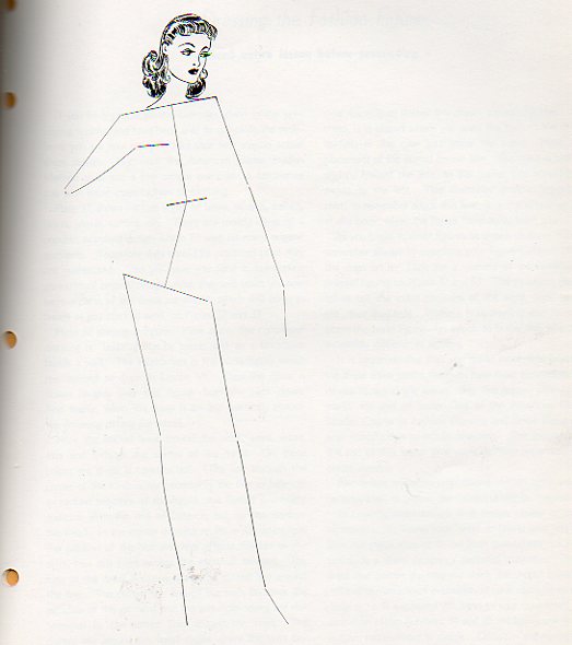
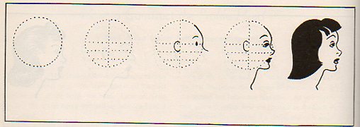
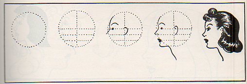
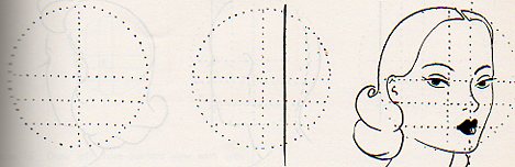
    Coming on the heels of my posts of autopsies of snowmen and donuts comes this semi-remarkable pamphlet (available for purchase here), published by  American Home Studies (of 1700 Eye Street, NW, Washington D.C.1), displaying very restricted instructions on anatomy for art students.  The drawings really work better in reverse, I think, because you really can’t get to the final product from the illustrated series in its how-to sequencing unless you already were finished.

    Blank women--anatomy art full286

    What happens throughout this pamphlet is what we see below–draw a circle, then divide it by drawing lines over imaginary bones, pop in some eyes and lips, and then fill in the rest.  Not too very helpful.  This is especially so when we look at the image above, which the student was supposed to simply cover with clothing after having added the head.  If this was an animated figure, I think I  would find it disturbingly creepy.

    Things become clear by the time you reach the end of the pamphlet, when you are told that you can detach any page from the work and send it to the D.C. address for correction and advice, for a dollar a page.  That’s when the real education occurs. (Many others have done this–the two guys responsible for creating Superman started out selling their services in just this how-to way.)

    Blank women--anatomy art profile284
     
    Blank women--anatomy art profile283

    Blank women--anatomy art profile285


    But I guess as a sort-of artist one would need to have something else going on for themselves so far as business goes, because its painfully clear that the maker of this pamphlet had special but very limited talent. I think that the faces given to these women are drawn by someone who does not like them, given their emotional range and all:  peevish, dull, bored, haughty, disinterested and, well, dead. 

    Notes

    1.  The building at 1700 I is gone now, replaced by another building of the many nameless buildings that create the corridors of I and K streets.  1700 I is basically right across the street from Farragut Square, and only a few blocks from Lafayette, which is across the street from the White House. Nice location.