A Daily History of Holes, Dots, Lines, Science, History, Math, Physics, Art, the Unintentional Absurd, Architecture, Maps, Data Visualization, Blank and Missing Things, and so on. |1.6 million words, 7500 images, 4.9 million hits| Press & appearances in The Times, Le Figaro, Mensa, The Economist, The Guardian, Discovery News, Slate, Le Monde, Sci American Blogs, Le Pont, and many other places… 5000+ total posts since 2008.

Category: Art History

  • The Movies and the Discovery of the Modern Smile

    JF Ptak Science Books  Post 1131

    [A continuation of sorts on an earlier post “Did Teeth Exist in the Renaissance?  Art and the Toothy Smile, 1300-1600”]

    Did more people in the U.S. laugh in 1924 than at any time in American history?

    The mass-consumed smile, the social laugh, the pantomime, the big grin, the sly eye, the devilish smirk, the latent laugh, the absorbed chuckle, the impish grin, were all elements of the human comedy that were difficult to see in the theatrical realm.  When performers were in front (or within, etc) a large audience, many subtleties of humor and comedy inherent in communal story telling that could be conveyed by facial expressions were simply lost.  
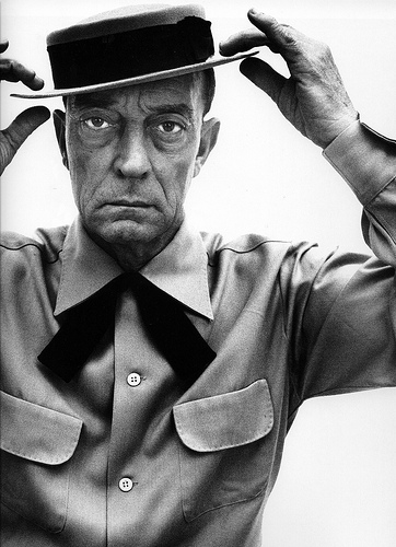
    Keaton
    The culture of the magnified  moment, especially in comedy, I think,  was not discovered until the motion picture was invented.  It was then, and then particularly with the invention of the closeup, that comedians were finally able to display the vast quiet parts of their craft, especially in fine pantomime.  This sort of thing was just not visible in the performers on a vaudeville or burlesque stage.  It was with the motion picture and the close-up that made the facial expressions as keen as and broadly appealing as slapstick, or the good-bad paradigm, or even The Chase.

    Fatty Arbuckle, Chester Conklin, Fred Sterling, Charlie Chaplain, Ben Turpin and especially Buster Keaton (whose facial expressions were exceptionally wide without really ever changing his expression) all came to greater prominence because of the close-up. There were more people from more different social and economic backgrounds  seeing more comedy by more comedians–and seeing more of the comedians–than at any time in human history.  And I guess we can infer that they were laughing more, because the output of comedies (Ben Turpin producing 150+ movies in one year alone, for example) continued to grow.  

    [I think that if you had to identify one single development that would allow the non-comedy to move to the top of the marquee was the invention of the serial–showing a series of episodes, which building one on the other, leading to a longer, intertwined story, developing characters and of course the audience, the returning audience.]

    In the chicken-and-egg scenario, perhaps what moved the laughter forward more so than the close-up was standardization of motion picture practices, especially in the display department.  That allowed movies to be more easily distributed, making for lower prices, more audience, more profit, more movies, more laughter (etc.).

    Standardization is an interesting story, and as much as it seems to take the creative edges off of some things, it adds to it in other ways.  “Standard Operating Procedure”, the codification of law/de jure, defining words in a consistent manner, having the same rails for all trains, establishing consistent screws threads, creating surgical procedures, developing prescription standards, having interchangeable parts for things like guns and cars and gin reapers, having standard weights and measures, and on and on, are all important things that allow us to not have to repeatedly recreate the daily bits and pieces of our lives.  (Even the “little” improvements in this area can have enormous consequences, like, for example, the British Navy standardizing sailing blocks, which went a long way in ensuring ship operation and safety.  Stuff like that seems like just a bit-and-piece, until you look at their long-term effects.

    Anyway, I could very easily be all wrong about this laughter thing, but from where I sit this morning, its an interesting thing to think about.
    ·Posted by :

    ·in:

    — — —

  • Extruding 3-D Shapes from 2-D Art to Create a Cubist vs. Art Deco Chess Set

    JF Ptak Science Books   Post 1129

    Is there room in the history of invented art to reconstruct cubist and abstract paintings by imaging the objects that could’ve passed through the canvases to leaves their geometric footprint?  That is to say, if you took the Woolworth Building in NYC and passed it at an oblique angle through a large sheet of paper, and that paper was permeable enough and the building moving slowly enough to simply leave its “footprint” without tearing or deforming the surface of the paper, the resulting image may look a lot like figures in classic works in the history of art.

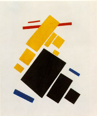
    Malevich.aeroplane-flying


    That is no revelation, really, as the Black Square or Airplanes Flying of Kasimir Malevich could’ve been made by every fourth item on your desk.  But what is interesting to me would be the reverse of this process, where you take that black square and reverse-engineer it, extruding whatever figure it was that could’ve made the black square into its three dimensional counterpart.
     
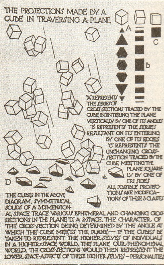
    What comes immediately to mind for me in this regard is Claude Bragdon (1866-1946),  (a New York-based architect with a long set of sleeves for writing in upper dimensional planes of Theosophy and reincarnation and other similarly squishy reaches) who wrote a few interesting books on the fourth dimension and objects and space, writing two of them at a very interesting period of t
    ime for the history of physics and art (1912 and 1913). The books are interesting enough, I guess, and seem to perhaps have had an influence on some influential artists of that time,  but what is of interest here are tow illustrations. 

    Blog--blagden 1348

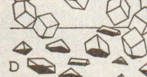
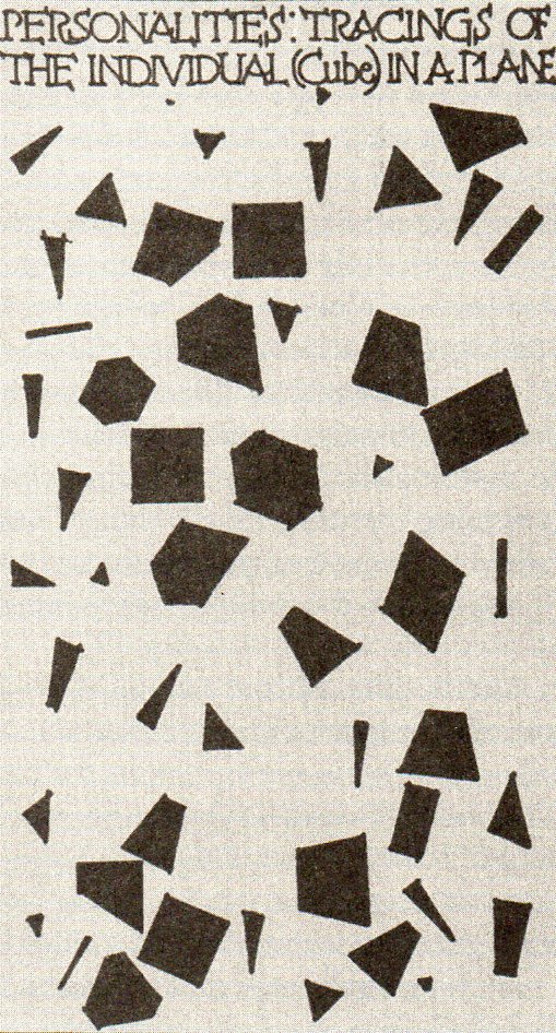
    First is “the Projections made by a Cube in traversing a Plane” from Primer1, showing the impact (at different levels) of a cube falling through a plane.  The second, “Personalities: Tracings of the Individual (Cube) in a Plane” from  Man2, shows the “shadows” of the three-dimensional figures as they lived in their two-dimensional world.  It comes close to the impact of the cubes above, but really only depicts what two-dimensional creatures would see of the three-dimensional beings inhabiting their Bragdonesque world. 

    Blog--blagden 1 det349

    I like  the tracings more as impact points than 2-D renderings of 3-D objects, and in some ways they are very similar. (I have to say that I am surprised that given Bragdon’s expanse of taste and artistic ability that he didn’t arrange these images in an artistic manner–in that sense he entirely missed the boat on adding his own bit to the newly-formed
    Cubist world. He also reminds me of Emily Vanderpoel, who in her own way completely missed the new artform that she was serendipitously creating.)    

    So when I look at something like a Malevich or Mondrian or even (but less so) at a Duchamp (Bride), I find it interesting to manufacture the base of the something that plunged itself cleanly through their canvas, pulling it out again, giving it three dimensions, and incorporating the thing as a piece in a chessboard–the chessboard being the pieces that made the shapes in the canvases resulting in the Art Deco vs. Cubist/Suprematist   Chess Set.   It would be interesting to choose two representative canvases for either style and  see if one (or a couple of ) object(s) could make all of the shapes in the two representative paintings,  populating a chessboard with sameness.

    Blog--blagden 2350

    The bottom line, then, is how different or similar would the extruded three-dimensional figures be that were responsible for this impact in a two-dimensional surface be? 

    (I am reminded too of Duchamp and John Cage sitting down to a game of chess and producing a musical composition via their moves, at  Sightssoundsystems, a festival of art and technology in Toronto, 1968. In this way too an artwork could be made with each move in a game of pieces used to make iconic shapes in the history of art.  “They did not speak. They did not sing, they remained, all of them, silent, almost determinedly silent; but from the empty air they conjured music. Everything was music…” Franz Kafka, Investigations of a Dog.)

    Notes:
       
    1..(Bragdon) A PRIMER OF HIGHER SPACE. (The Fourth Dimension). Rochester: Manas Press, 1913. 8vo, (12), 79pp, including 30 plates.Notes:

    2.. (Bragdon) MAN THE SQUARE. A Higher Space Parable. Rochester: Manas Press, 1912. 12mo, 34pp, 9 illustrations.  


  • Word Art: the Landscape of the Vocabulary of Kandinsky’s “Concerning the Spiritual in Art”

    JF Ptak Science Books   Post 1126

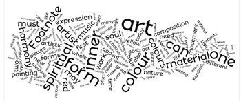
    Confession: this may represent the coziest I’ll ever be with the written lessons of Kandinsky’s Concerning the Spiritual in Art (1910). It seems to me that anyone who is an artist understands this book; to me, though, as a not-an-artist,  it is  inscrutable–the book winds up looking not much more to me than this Word Cloud. Its a shame for me, really, as this is one of my favorite periods in the history of art, and I enjoy color theory, and I like mixing up sensations and analogies to describe cross-field experiences (like the broad use Kandinsky makes here in describing artistic qualities in terms of music) all of which are strong elements of the book. Its a lovely book, with heavy paper, wide margins, and beautifully designed, but the text is mostly just words, and sometimes a jumbled pile at that. I’ve tried to read it many times over the years, but I keep on failing this book.

    Wordlekandinsky

    ·Posted by :

    ·in:

    —

  • French Visionary Architect and Creator of Bad Taste: Jean-Jacque Lequeu.

    JF Ptak  Post 1124

    The history of bad taste is like a history of bad food–you need them to tell you what’s good. — Imaginary quote of Hank Hill

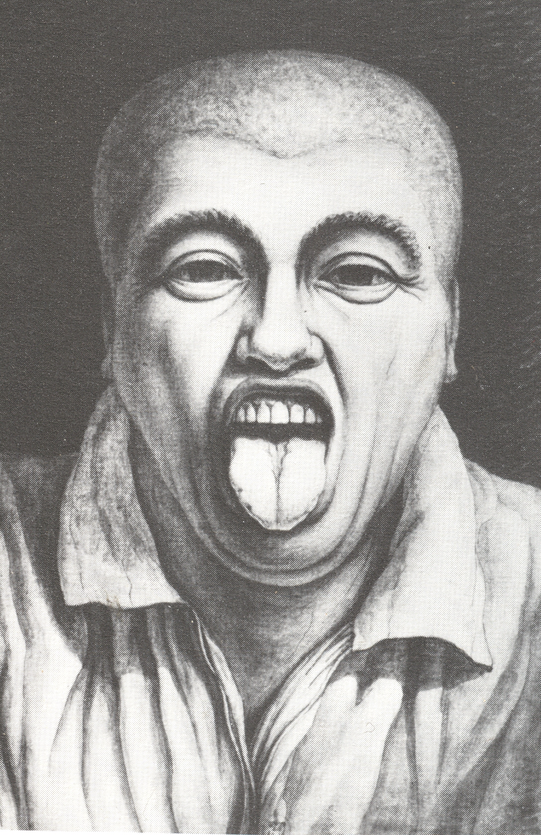
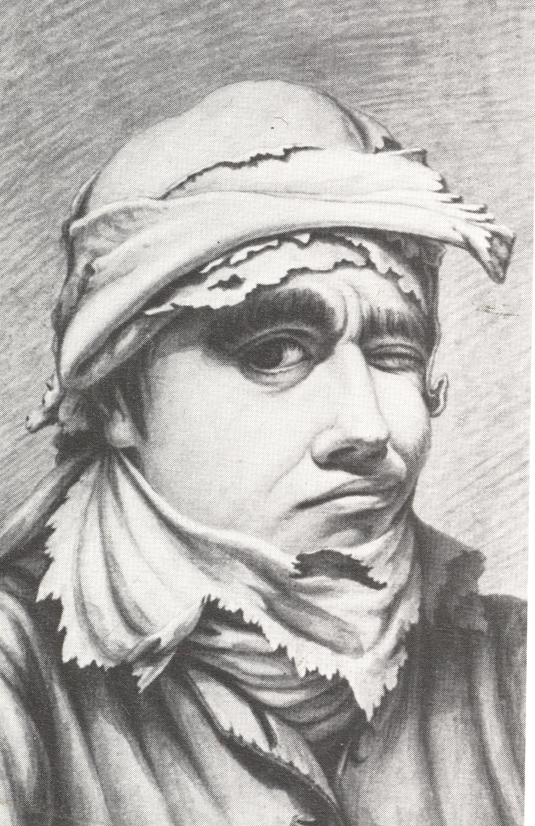
    I you look hard at some of the leading styles of architecture and design of the 1880-1920 periods, you will see elements of the work of the great visionary architect, Jean-Jacques Lequeu,  The Rouen-born and Paris-educated Lequeu’s major problem in this is that he was long dead in some forgotten place before any of this very-late recognition occurred.  Too late for accolade, too late to brand his isolation as something other than bizarre (famous people doing the same sorts of things would be “quirky”), and of course too late to get patrons or backers or clients for him to actually be able to build something.  Anything.  He had a brilliant command of fancy and imagination, coupled what extreme senses of design and composition and material, and also how to make something constructed of all of that stuff stand up. And that’s certainly the promise that he showed when he and his more public-centric work were in favor.  But that was back before the Revolution–before the end of the American Revolution.  Things happened, and Lequeu would spend four decades in high obscurity and low solitude.

     He could’ve been just about anyone after this point, after his acceptable brilliance wore off:  instead, he became a government worker/draftsman, lived in a series of small apartments, and finally wound up taking residence in a brothel room, where he created unequaled images of imaginary/inspired architecture. And between his scrambling for a government existence and creating vast Utopian cities and complexes and bizarre anthropomorphic structure, Lequeu might also have invented Bad Taste, being an early version of Charm City’s own John Waters (sorry Mr. Waters, but you know its true). By virtue of his station in life, I think, Lequeu was exposed to many sides of French impolite and exploratory society which he managed to witness, and capture, and portray in a manner vastly uncommon to almost every other artist of his day. 

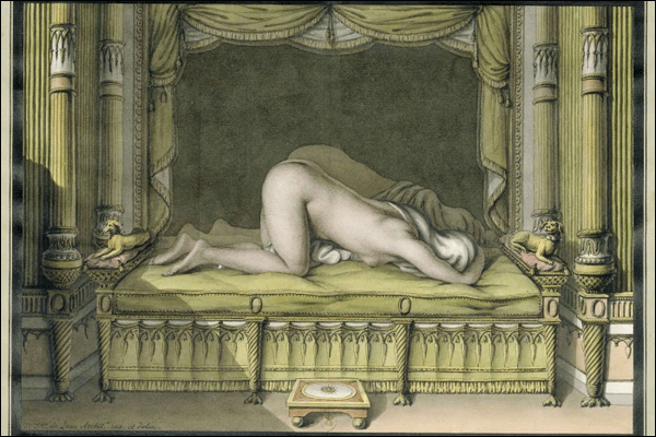
    I did want to concentrate just on Lequeu’s self-portraits here, but I feel compelled to share at least a couple of Lequeu’s fanciful and Columbian adventures into the world of Bad Taste–these are not by any means his great contribution to the history of art, nor do they come anywhere near his great architectural visions, but they are significant  For example, while others (actually, everyone else) was exploring reclining nudes in one refined way or another, Lequeu explored the image from a different angle:

    Lequeu reclining nude
    Not only is the model in an unusual position, and in front of a mirror, but her face and head are completely obscured. A lovely piece of technical gaudiness, this still was not a crowd-pleaser in 1815.  Its not the only thing that Lequeu should be remembered for by any means….but it is something.

    But on to Lequeu’s fearless self-portraits:

    Lequeu 

    Lequeu 8

    Lequeu portrait 003
    Lequeu portrait 005
    Lequeu portrait 006

    Lequeu portrait 007

    I think that you’ve got to admire the guy for his out-loud living. 

    Notes and examples of Lequeu’s architecture, below:


  • Dada Alphabet–Monuments to Quiet Bits

    JF Ptak Science Books   Post 1110   

    Alephbet--toe318


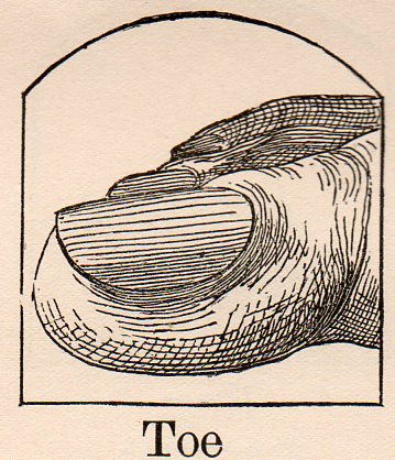
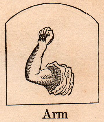
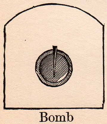
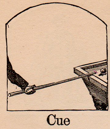
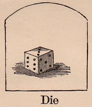
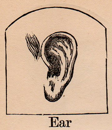
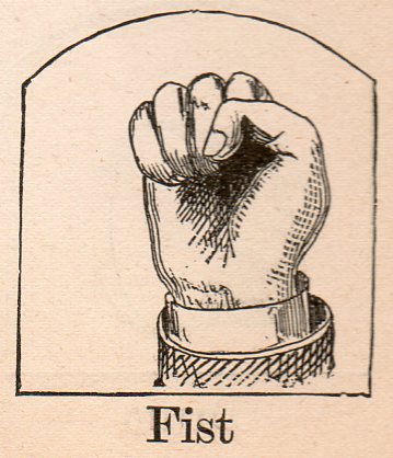
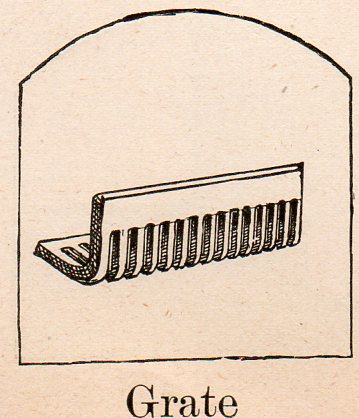
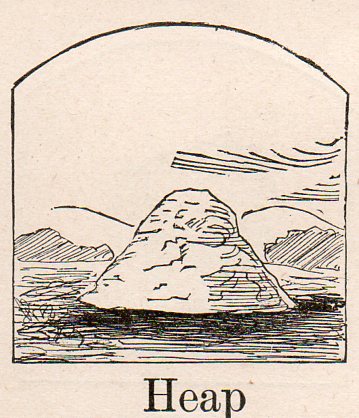
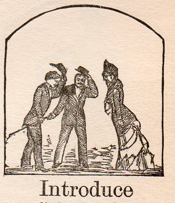
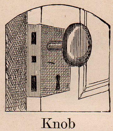
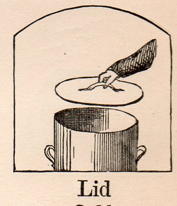
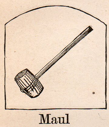
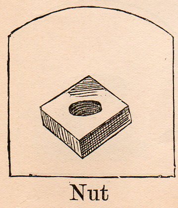
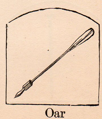
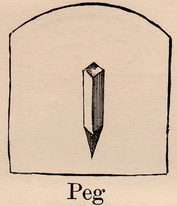
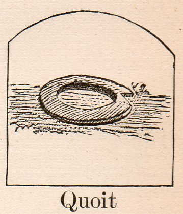
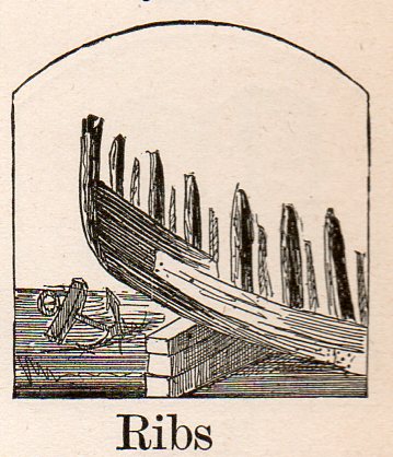
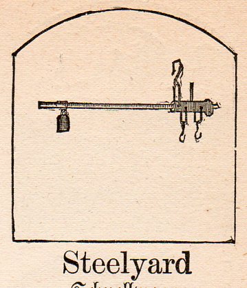
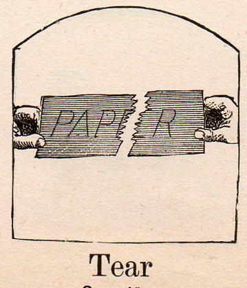
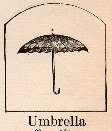
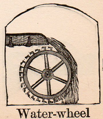
    Following this week’s posts Occupational Alphabet and Touch of Evil action Alphabet is this constructed alphabet of Dada-like images, non-sequiturs taken out of context and which–once placed on a their own stage and on their own easel in the strong Borges tradition of the reader making the book–strongly remind me of the Marcel Duchamp readymades.   The source is Kantner’s Illustrated Book of Objects and Self-Educator in German and English, a self-teaching book for German vocabulary, published in Pennsylvania in 1879.  The woodcut images used to illustrate each word are fantastic, and occasionally stunning, sometimes unexpected illustrations of forgotten objects and actions.  I’ve selected the images that have selected themselves, mostly-solitary images infested with that uncommon, simple quality that illuminates them as Dadaist. 

    The alphabet is sadly not complete–j, x,y and z were lacking images. 

    Alephbet--arm310
    Alephbet--bomb315
    Alephbet--cue311
    Alephbet--die312 

    Alephbet--ear328

    Alephbet--fist319 

    Alephbet--grate331

    Alephbet--heap320
    Alephbet--introduce326
    Alephbet-knob321 

    Alephbet--lid329 

    Alephbet--maul330

    Alephbet--nut313 

    Alephbet--oar314
    Alephbet--peg316 

    Alephbet--quoit332

    Alephbet--ribs322
    Alephbet--steelyard327
    Alephbet--tear323
    Alephbet--u325
    Alephbet--w324


  • Cowboy Porn: Displays of Quiet Lust

    JF Ptak Science Books   Post 1108

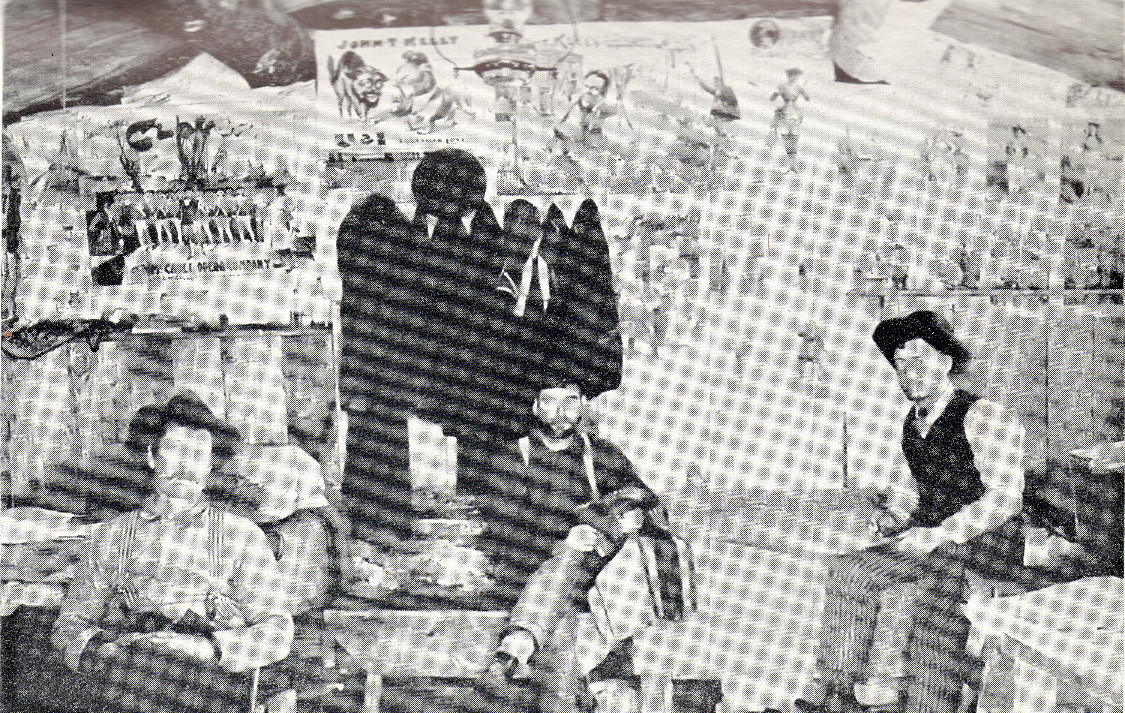
    I wonder when it was that working people (which would mean the overwhelming majority of people on the planet) first decorated their non-cave walls with art?  There aren’t all that many images in the history of art (that I know of, anyway) that depict the inside of a yeoman’s residence with some sort of artwork hanging or stuck on the wall. This is a tricky and potentially meaningless question, trying to differentiate bits of newspaper illustrations nailed to a wall in Montana in 1882 from messianic Aboriginal millenia-old cave paintings and such.  

    Cowboy porn305
    Inside-the-bunkhouse photographs from the American West like this are pretty scarce things–almost as scarce as nighttime photos of sleep-disturbed cowboys on the trail.  They’re just not around.  The remarkable thing about this photograph (from the archives of the Minnesota State Historical Society) is that it also shows a not-subtle vignette into what passed for provoking, night-stabbing man-images for a society of the working stiff. 

    These guys may be cowboys, or may not–there is a rifle on the wall over the shoulder of the striped suspenders guy on the left, and there seem to be a couple of dusters hanging on the wall, and some broad-rimmed hats.  Maybe they really are cowboys. 

    In any event they’re in a rough-hewn bunkhouse with not very much to pass the time, save for these few broadsides and mounted magazine pages.  I find it an interesting peep into an interior life that didn’t get seen very much, especially with such period-hot images of women. 

    And perhaps this paper is nothing more than the barrier that we see so often from FSA photos of the American Dustbowl West–paper put up on the wall to stop a cold draft or dust.  But these look too determined for something as simple as that…

    Cowboy porn det 2307


  • Occupational Alphabet, ca. 1850

    JF Ptak  Science Books   Post 1103

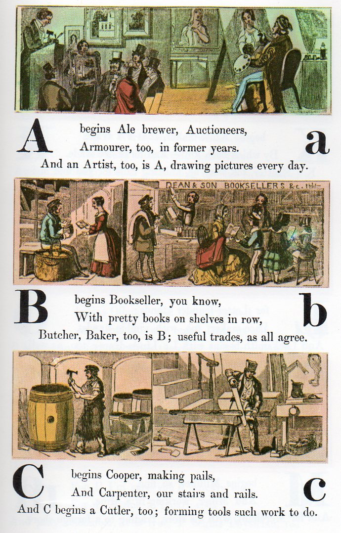
    Its interesting to see what jobs have survived over the years, and what jobs haven’t–particularly those jobs that would have been so widespread and popular that they would be instantly recognized by a child–so much part of the common culture that the initial letter of the job’s name could be used to help children learn the alphabet.

    Alphabet jobs a-c267

    In this version of commonplace employment found in a child’s alphabetical primer of ca. 1850, lists the following professions, most of which are still available for hire: ale brewer (especially here in Asheville, Beer City USA);auctioneer, armourer, artist, bookseller, butcher, baker, cooper, carpenter, cutler, dyer, dairyman, engraver, engineer, fishmonger, fiddle(r), florist, grocer, glazier, hatter, hawker, horse dealer, ironmonger, jeweller, knife-maker, knitter, letter-founder, lace-maker, locksmith, milliner, miner, merchant, nurse, newsman, oilman, optician, omnibus, pastry-cook, physician, rope-maker, rider, shoemaker, shipwright, scavenger, slater, surgeon, sawyer, saddler, tailor, turner, tanner, tinker, upholsterer, vintner, wharfinger, wax-chandler, yeoman, youth, zoologist.

    continued below with FULL ALPHABET:


  • A Domesday Book for Missing and Blank People

    JF Ptak Science Books   Post 1122

    I’ve long been interested in the added, extra stuff found in the foregrounds and empty places of artwork, the eclectic extraiana, the not-necessary pieces, the microworlds of antiquarian visual anthropology. (See here for example, an earlier post in this blog, “Hidden Children, Found Art and Social Vignettes Inside Art”.)  In towns views and architectural studies, where the primary interest is geography and, well, architecture, people are sometimes added to literally flesh out the bank spots, and to add a point of reference and perspective for the viewer.   In many circumstances these added bits turn out to be extremely interesting insights into everyday street life for the period of the artwork, also including societal exuda and discarded people, the social “rejects”, the underclass, the classless, the workers, the laborers, people.  That would be most fo the population of a place. 

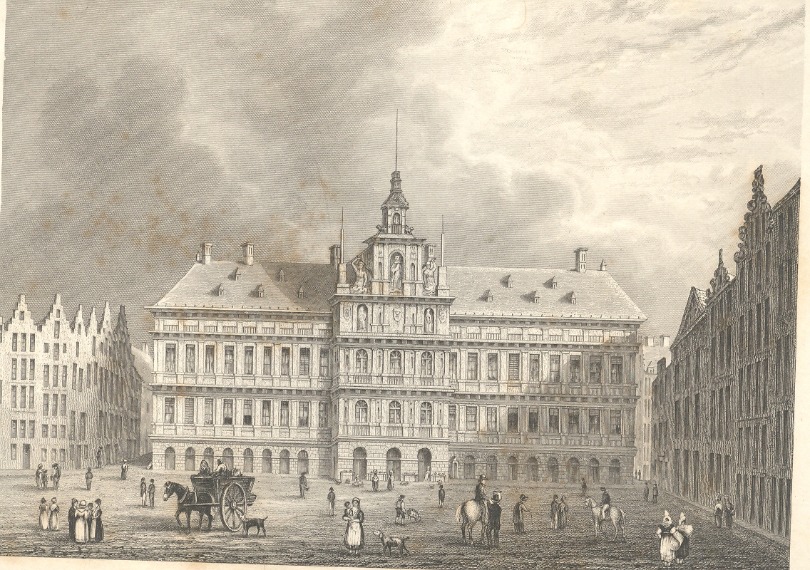
    For example in this application of the imaginary forensic arts microscope, we see this series of pictures of a standard view of the town hall of Antwerp; but what we see advancing under magnification is a very interesting set of occupations displayed in absolutely minute detail (seen in more detail in this earlier post, from which I quote below).

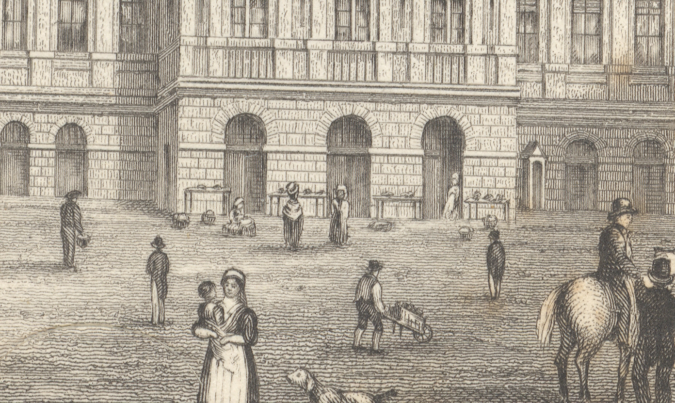
    First, the majority of the engraved image, followed by a close-up of the center of the building (the three doorways), and then by a closer view still of doorway three:

    +++looking closely

    +++looking closely detail

    The
    truly interesting bit here is barely observable in the original; but,
    under magnification, we see a very rich and minuscule “engraved
    photograph” of a slice of daily commerce and street life in Antwerp.  If
    you look at the central entrance to the town hall you can see three
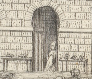
    main (and large) doorways, and if you look clos+++looking closely detail2er still, you’ll see something leaning against the portal at right.

    Extraordinarily, what the artist snuck into the original is a tiny
    (2mm) figure watching over several tables of her (fruits?/vegetables?)
    ware, waiting for a customer. There doesn’t seem to be much interest in
    her stuff, currently, and she has allowed herself a little relaxation,
    leaning against the doorway.  I’ve found this sort of extremely minor
    subject matter and its ephemeral connection to the larger work at hand
    to be just fascinating.  I wonder why such detail would be added–why
    would the artist, or engraver, take such care and interest in such minor
    visions.  Perhaps this is just what was at hand on the days the artist
    fleshed out his work; perhaps it was the work of the engraver, alone,
    incising yet another semi-boring architectural image; desperate for a
    little artistic activity, adding some interesting, almost-invisible
    touches, here and there.  Perhaps no one would ever really notice them,
    but whoever was responsible for adding such incredible,
    extra-dimensional details would certainly enjoy knowing they were there,
    recognized or not.

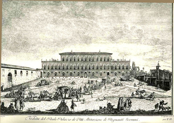
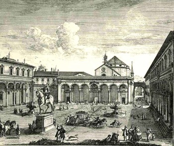
    Here’s another example (seen in an earlier post here) from Giuseppe Zocchi (1711-1767) who was commissioned by he Marchise
    Andre Gerini at mid century to record the greatest of Florentine
    landmarks.  The plaza scene offers a great view for all sorts of people, and the artist/engraver take great advantage of the possibilities:

    Bloglooking_closely_b124

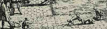
    Among the many people populating the image we find folks interested in a dogfight:

    Bloglooking_closely_b_dog_fight


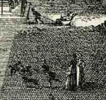
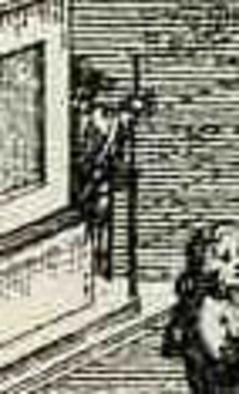
    Another image by Zocchi, Veduta della Piazza della SS Nunziata Statua Equeftre di Ferdinando Primo, Fonti, e Loggie Lateral, shows more good work with the possibilities of ephemeral populations, where among the many details we see an invalid being pulled in a small cart, and a half-obscured  man with a staff leaning against the back of the monument.  And of course there’s much more–you just need a little magnification to see the human element of the artwork. 
    Bloglooking_closely_1_96123

    Bloglooking_closely_1__carriage_2


    Bloglooking_closely_1__man_cane

    There was a class of illustrator that drew on their surroundings, or
    what they saw on their walks, or from their window–the incidental
    people in their artwork were people that they saw, who meant something
    or other to them, who formed an impression in their brains.  There were
    other artists who were perhaps not quite so fortunate in their daily
    lives to come into contact with a variety of people like this–perhaps
    they were sheltered, perhaps they were privileged and of a class that
    would not put them into contact with ordinary people. 

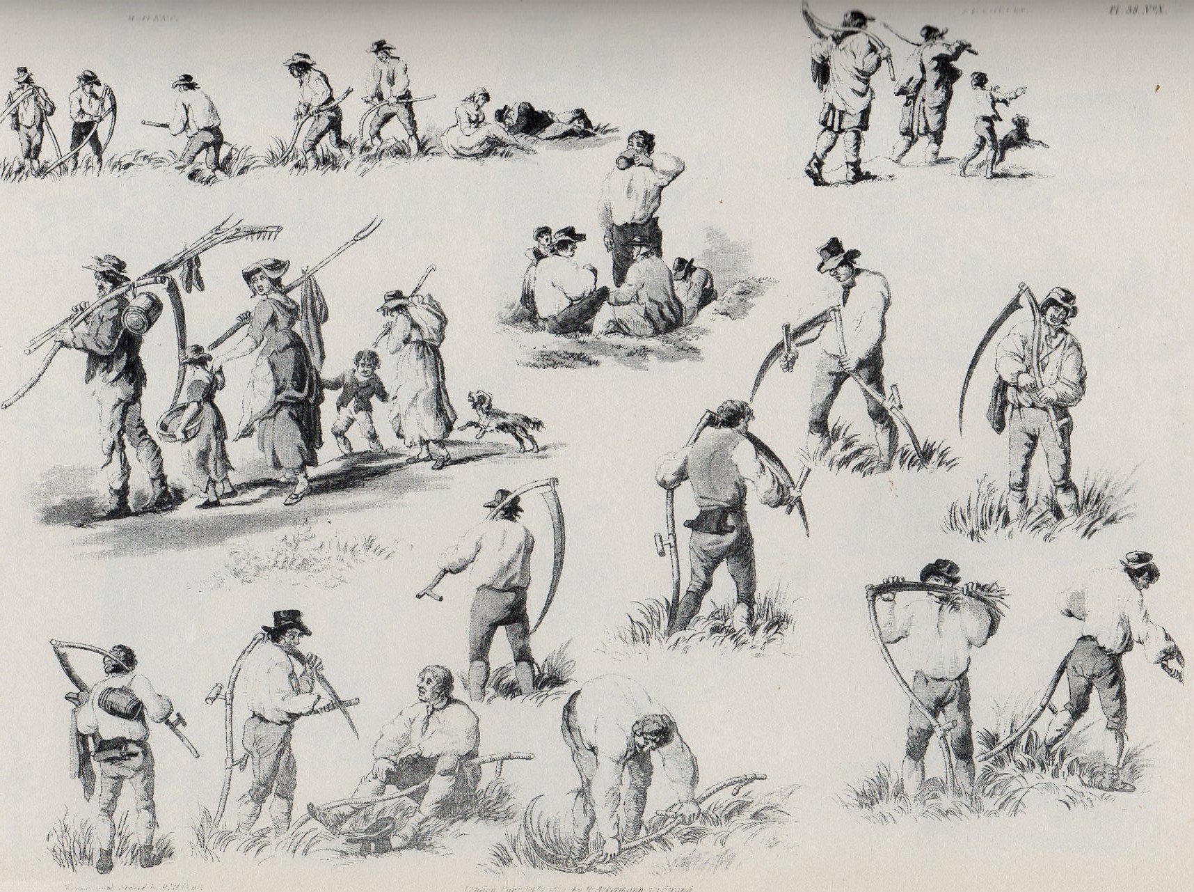
    Perhaps it was this class of artist who need William Pyne’s great-ish
    1845 work, Picturesque groups for the
    embellishment of landscape…1
      It was a work of clip art for its day, really, showing,
    detailing, the attitudes and occupations of working people.  It was a
    book filled with the people who might ordinarily have gone missing from
    the work of the artists needing their images displayed in their brains
    by someone else’s labor; a book filled with figures to plug-up the blank
    spaces, round out that unkind bits that called out for a human touch.

    Interestingly, it shows people at their professions but more often than
    not , it doesn’t actually show people working–its more like people
    readying themselves for work, getting materials ready, sharpening
    things, ordering.   It is impressive nonetheless for its found,
    pre-photography snapshots of working life in England in the 1830’s.  It
    shows potters, leather dressers, gravel diggers, itinerant mowers,
    hay-makers, gleaners, paviers, shepherds, fishermen, knife grinders,
    quarrymen, foresters, woodmen,  basket-makers, coopers, horse rollers,
    cider-makers;  and images of boats, barrels, gypsies, games, county fairs, and on and on. For example, here’s the multi-image engraving for “itinerant mowers”:

    Mowers340
    Perhaps it was only a practice-book of images for people who wanted to
    practice–if so, it wasn’t a book for just anyone, as (so far as I can
    determine) it would’ve cost a working person week’s worth of labor to
    purchase it.    And there are certainly pictures of people doing unusual
    and rare things even for 1843–like sailors washing sails,
    maybe–actions that were not commonly seen.  And it also placed people
    in attitudes of unusual poses, so some people may have looked at the
    book with an eye for artistic anatomy.  But by and large, to me, it
    looks like a missing persons book.  

    Notes:

    1. William Henry Pane (1769-1843), Picturesque groups for the
    embellishment of landscape : in a series of above one thousand subjects :
    comprising the most interesting accessories to rural and domestic
    scenery, shipping and craft, rural sports, pastimes and occupations,
    naval, military and civil employments, implements of trade, commerce and
    agriculture, etc. , the whole forming an encyclopaedia of illustration
    of the arts, agriculture, manufactures, &c. of Great Britain 
    Publisher: London (Bedford Street, Covent Garden) : M.A. Nattali, 1845.


  • History of Lines series: Famous Stick Figures of the Renaissance

    JF Ptak Science Books   Post 1115

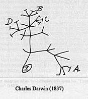
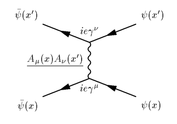
    Darwin treeIn the History of Lines subcategory in this blog (following the separate histories of dots, holes and missing things) I’ve discussed things like Darwin’s evolutionary tree, the length of the coastline of Britain via Mandelbrot’s fractal  geometry and Richard Feynman’s beautiful diagrams, but I’ve not really discussed “stick figures”.  They came up briefly in a short
    Feynman diagram discussion relating to the history of published antiquarian drawings by children (and how the earliest drawings by kids look by and large the same over many centuries), but that has been about it.
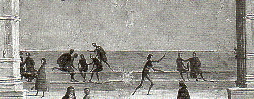
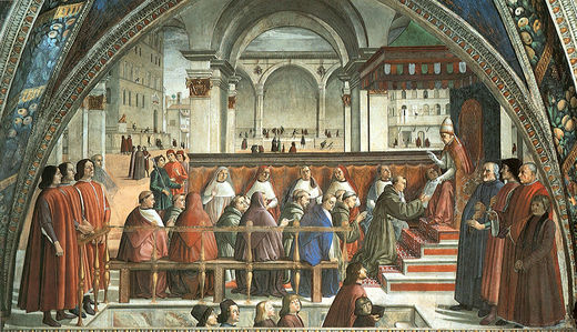
    Stick figures ghirlandaio det335

    Today though I’ve come across stick figures in a very unlikely place–in a great fresco by one of the finest painters of the human form of quattrocentro Florence.  Domenico Ghirlandaio11449-1494 was an enormously popular artist during his day, with many fresco commissions and portraits to his credit; he made good use of eyeball-alone perspective and held a great passion for detail–something that I think got him into a snooty bit of trouble with most of the 20th century’s criticism of his artwork. (Bernard Berenson for one looked down his long and very sniffy nose at Ghirlandaio and announced him a mediocrity.) It cannot be left unsaid that he was also an early and short-lived teacher to Michelangelo. 
                           
    What concerns me right now though is his fresco in the Sasseti Chapel of the Santa Trinita of Florence, painted about 1485, “The Confirmation of the Rule of St. Francis”2. Part of a series of works on St. Francis, this fresco represents the visit of the saint to Rome, though Ghirlandaio moved the “Rome” part to Florence (as the background is filled with famous Florentine buildings).3

    Stick figures--ghirlandaio fconfirmation

    The figures appear to be quite like stick figures from a distance –there they are in the upper-center background above the heads of the seated prelates–but loom less so when given some magnification, when more details come out. Even when looking at the figures this closely, though they still manage to keep a fair amount of the stick-ness, and so contribute a little bit of irony to the beautifully-rendered humans that fill the paintings and frescoes of this great master. 
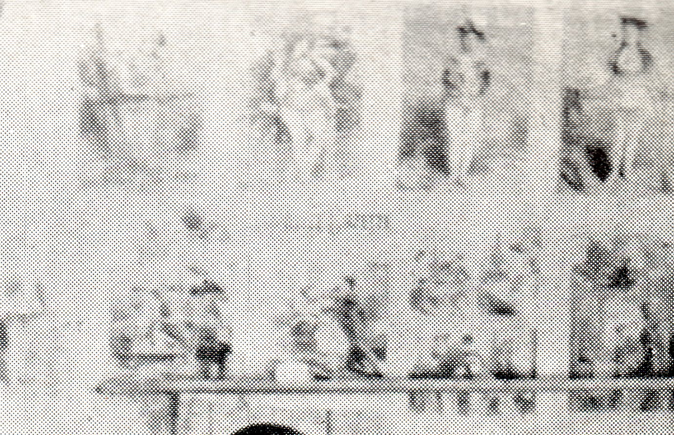
    I guess that once viewed up close the “stick figure” part of the figures that are seen from far away become less so, but, well, they still seem like stick figures from a distance.

    Notes
    1.  The name he grew up with was Domenico di Tommaso di Currado di Doffo Bigordi until nicknamed, renamed, by his father “Ghirlandaio”, or “garland maker”.  Ghirlandaio was apprenticed to his father, probably, who was a goldsmith and whose signature creations were garland-like necklaces

    2.“Ghirlandaio’s most famous achievement is his fresco cycle of the life of Mary and St. John the Baptist for the choir of Santa Maria Novella. Michelangelo served an apprenticeship with him at this time and probably worked on these frescoes. Other examples of his art are the Adoration of the Magi (Uffizi); another Adoration (Hospital of the Innocents); a mosaic of the Annunciation for the Cathedral; a portrait of Francesco Sassetti and his son (Metropolitan Mus.); a portrait of Giovanna Tornabuoni (Morgan Lib., New York City); and the highly realistic portrayal of Grandfather and Grandson (Louvre).”–www.globalgallery.com  It is interesting to see how Ghirlandaio managed to include portraits of
    Florentine nobility in this work–mostly they are the heads of the
    people coming up the stairs in the foreground. “There are portraits of
    Lorenzo il Magnifico / Lorenzo de’ Medici and Agnolo Poliziano with
    Lorenzo’s sons (Giuliano, Piero and Giovanni) and his friends (Matteo
    Franco and Luigi Pulci)…”
                       
    3. “In the background is Florence, with its most celebrated buildings: the Loggia dei Lanzia, the façade of Palazzo Vecchio with its solemn raised podium that was later replaced by the present-day flight of steps; the gilded Marzocco lion (symbol of Florentine democracy); a back-drop of houses in the far left-hand corner and a bell-tower (possibly that of San Piero Scheraggio) where the Uffizi would later be built. In the background is a bustling of small figures, citizens and curious onlookers, possibly an opening and closing of shutters and, in places, a glimmering of gold in the capitals and arch of the consistory hall…”   

    ·Posted by :

    ·in:


  • History of Blank, Missing and Empty Things: Colorful Emptiness

    JF Ptak Science Books  Post 1111 [Part of the History of Blank, Missing and Empty Things series.]

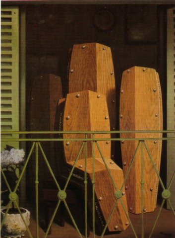
    Magritte balconyStandard introductions to Magritte miss what I most see in his work–it seems to be in a constant state of removal, of emptying, and blankness.  And this is the case even when the canvas is full of images, even when it is full of people, raining people–the underlying effect to me is still the same.  The man just painted blank spaces in full color, some of the most colorful nothingness I’ve ever seen.

    Many of Magritte’s strikingly delineated paintings suggest and portray missing things and emptiness with shadows and barren places, but even when they’re populated by human figures there’s a long memory of the same sort of thing: half torsos, bagged heads kissing, the backs of people facing a mirror in which their back is reflected, empty feet, half-humans, hidden faces, floating hats, draped bodies, the half-disappeared, and so on, all speak to the same emptiness.

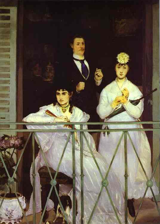
     Perhaps this sense is strongest in me when I see his Perspective: the Balcony of Manet (ca. 1945), especially side by side with the Edouard Manet The Balcony (1868).  I know its unfair to compare the two–but Magritte started it–but Manet is hardly an empty, blank painter.  Once Manet moves through the 1860’s and into real modernity, he is able to paint colossal senses in the boundaries between objects, boundaries that are really mostly suggestions than demarcations.      
    Manet_The_Balcony_1868

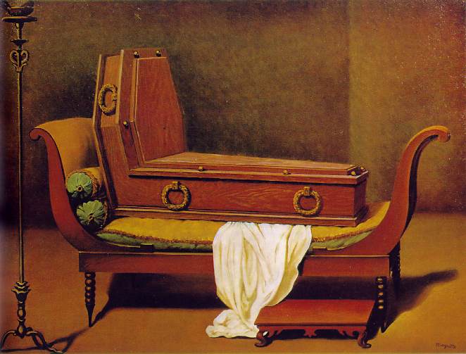
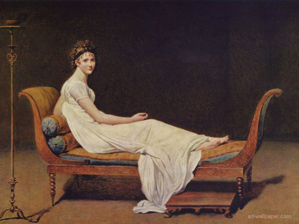
    (This Perspective is from a short series done by Magritte which replaced the subject of a great painting with a coffin.  Another example is Jacques-Louis David’s Madame Recamier and Magritte’s answer.  David’s painting may have been about as avant-garde as Magritte’s, given the time and expectations of artists.)
    Magritte david 
    David's Madame best
         

    Notes:
    From Columbia Encyclopedia online: “Magritte, René  1898–1967, Belgian surrealist painter. Strongly influenced by Chirico, Magritte developed a style in which a misleading sort of realism is combined with mocking irony. His paintings are dominated by an intense quietude and restraint, despite a startling juxtaposition of images. Characteristic works, such as The Red Model (1935; Modern Mus., Stockholm), contain elaborate fantasies constructed around commonplace situations.”