A Daily History of Holes, Dots, Lines, Science, History, Math, Physics, Art, the Unintentional Absurd, Architecture, Maps, Data Visualization, Blank and Missing Things, and so on. |1.6 million words, 7500 images, 4.9 million hits| Press & appearances in The Times, Le Figaro, Mensa, The Economist, The Guardian, Discovery News, Slate, Le Monde, Sci American Blogs, Le Pont, and many other places… 5000+ total posts since 2008.

Category: Art History

  • Children’s Questions, Bernard Berenson and Paulo Uccello

    JF Ptak Science Books  Post 1093

    I love the idea of being able to look at things like a child.  To come towards things with such an authentic and unpolluted curiosity would be an enormous gift for anyone past this age of discovery and exploration–its where some of the great questions are asked.  I have learned so much from my daughters and their friends over the years that it makes me want to be around kids all of the time.  (Well, maybe not “all”…)

    In the history of benchmarks of creativity I’d have to say that the one for the Child’s Question stands among the greatest–at the very least it can show a careful listener how look at things differently–and sometimes savagely so. 

    For me these attempts come in strange ways–sometimes it comes in the form of just imagining that I knew nothing whatsoever about the topic.  (I remember a story about told by the mother of the American dustbowl-era artist Thomas Hart Benton.  Benton was a late speaker–nothing came out of him until he was one and a half years old.  But when it came, it came with a bang: standing on his porch in the early evening and looking at the Moon, he turned to his mother and said “What is that?”.  Magnificent.)

    For example there’s the glorious work by by Andrea Mantegna (1431-1506) in the Castello di San Girogio in Mantua (mainly La Camera degli Sposi).  The oculus is the focal point of a ceiling that stands over what some people consider to be the most beautiful room in the world, painted in almost every aspect and surface by the great Mantegna.
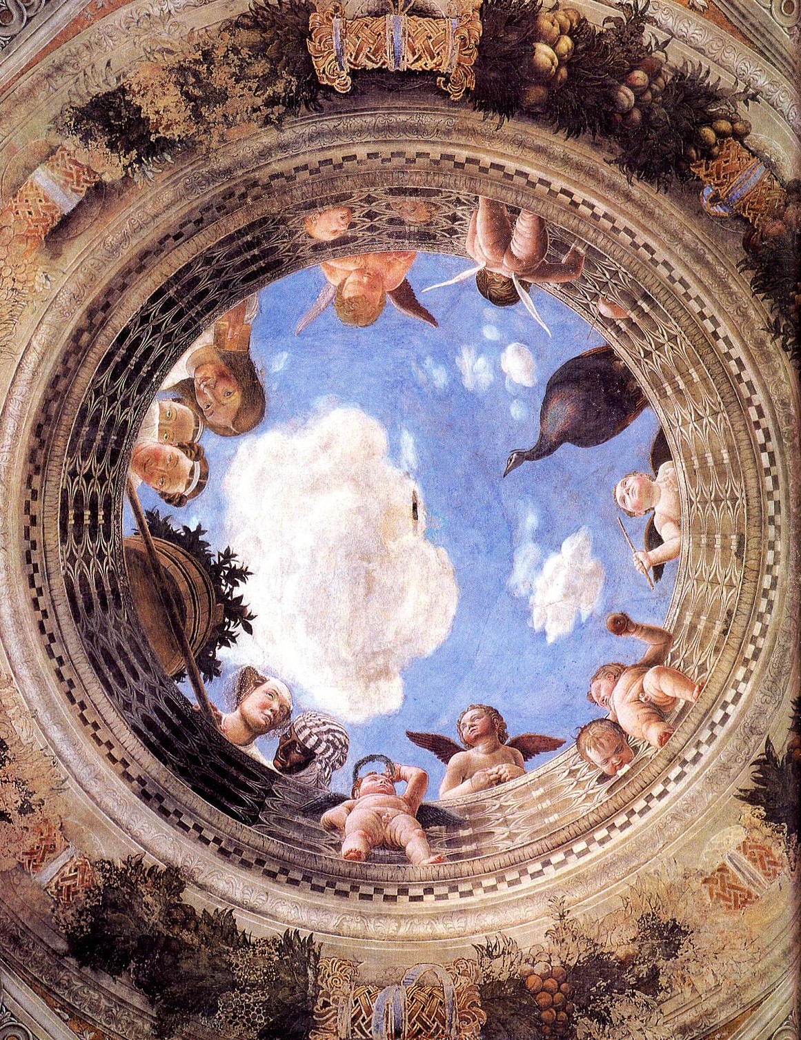
    Mantegna-large It is a magnificent thing created by a great Renaissance master.  But what in the world is going on up there above everyone’s heads?  I guess that you could infer all sorts of mythological and symbolic bric-a-brac to explain the scene, but, if you forgot about all of that, what it looks like is that everyone up there is waiting for a bucket of water (or something) to be poured down on the folks below.  Simple explanations are sometimes the best–and so are the obvious ones. 

    And so I turned to a book that I’ve breezed through but never read, a staple I guess for anyone interested in the  history of art, Bernard Berenson’s The Italian Painters of the Renaissance (1952) to see what he had to say about this work.  But before I got there I stumbled my way through Berenson’s long and thick paragraphs, filled with commas and very long sentences, tumbled my way across the name of Paulo Uccello.  And it wasn’t a pretty fall.

    I was introduced to real appreciation of the great Uccello (1397-1475) by my wife Patti Digh, who had thought long and hard about him through the Great American Novel The Recognitions, by William Gaddis. (Credit where credit is due: I never read the book before meeting Patti, and it is she who first supported the GAN claim for the problematic Gaddis.)  It’s a long and complex book, The Recognitions, and we won’t get into it here–just the part about Uccello.  And it is here that Gaddis makes a wonderful operation about the solids in Uccello. 
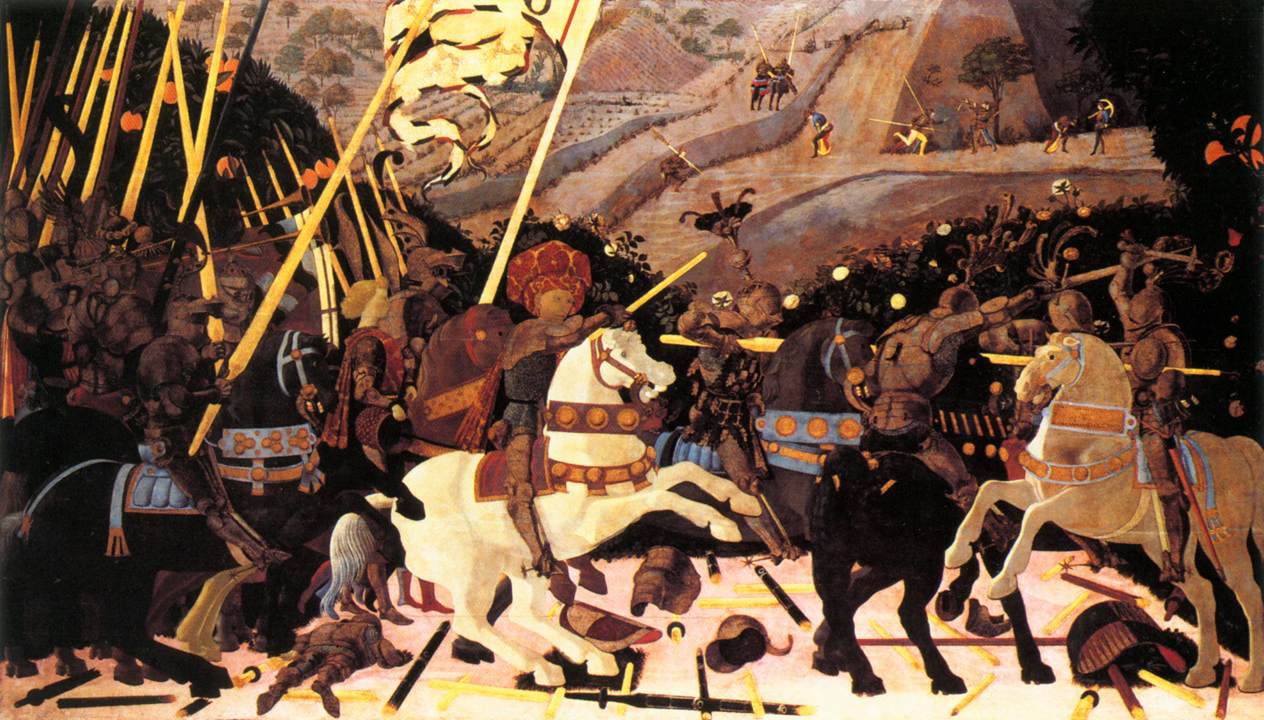
    Uccello

    Uccello was coming out of the Gothic era (sort of) and into the Renaissance (sort of) with a remarkable and just-about revolutionary control of the idea of perspective.  Maybe it was gotten through the polishing of the early doors of Lorenzo Ghiberti, or something else, I don’t know–he was a very private, deeply secretive man whose life (and philosophy) is mostly mystery.  Anyway, he was among the first scientifically-based artists to work in perspective, and he was just simply an important guy in the history of art.  But what Gaddis recognized that in all of this fabulous detail and naturalism, that there are great expanses of pure, unmodified, non-detailed colors.  Horse rumps can be simply white; parts of armor, just big flat blacks.  Beautiful.  The question was: what was he thinking?  In this great porridge of color and scientific delight, where was the detail?  Why did he leave out muscles and shadow and sinew and sweat and whatever, content for some reason to just dress that particular part of the painting in pure color?  It seems very 20th century to me.

    And so now that I had moved away from Mantegna, I wanted to see what Bereneson had to say about Uccello. And with an open mind I was completely invaded: Berenson didn’t really see Uccello as a artist, at all.

    As a matter of fact, Berenson wrote that there wasn’t much of a difference between Uccello’s paining and a map, and didn’t think of Uccello’s efforts “as a work of art”.  He felt that Uccello was more of a scientist whose interest and ability didn’t necessarily relate its subject in an artistic way.

    “Uccello had a  sense of tactile values and a feeling  for colour, but in so far as he used these gifts at all, it was to illustrate scientific problems” Berenson wrote. Ouch. He continues, “In Uccello’s “Sacrifice of Noah’…there is mathematical certainty but certainly…no psychological significance”, which is where he sees no difference between Uccello’s painting and a map.  He claims that Uccello and his successors “accomplished nothing artistically” but did provide the tools for more gifted artists who would come later. 

    Strong stuff from someone who knew his stuff–I only knew the book by looking at the pictures. Berenson isn’t out there alone in his feelings for the beautiful Uccello * and I tried to open my head up to seeing what these guys saw.  But, as Patti said, “they’re just wrong”. 

    I’ll take that over trying to figure out a new way of looking at the fabulous Uccello.   
                                               
    * For example, Donatello found his friend to be lacking in a certain creativity, lacking a depth of uncertainty; also Alberti does not include him in hist famous list of artists in De Pictura.
    ·Posted by :

    ·in:

    — — —

  • Picturing Almost-Nothingness–When Nothing Was Something

    JF Ptak Science Books  Post 1092

    The Great Nothing–a History of Blank, Empty and Missing Things #79

    Perhaps the biggest, blankest, most missing-est thing that we have presently is the universe, or rather the universe before the universe was created.  I can talk about the universe in that way because I’m talking about the one that is most classically conceived as such by much of the Western world:  a deep, multi-thousand-year-old belief that the universe came into being via the hand of a creator. 
    Mantegna--tarocchi_a

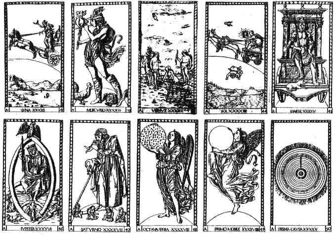
    The universe in question is the one in the hands of the Primum Mobile (pictured above, bottom row, fourth image), one of 50 images depicted in a series known as the Mantegna Tarocchi, drawn and engraved by artists unknown ca. 1465, though it was once believed to be the  work of the great master Andrea Mantegna (and later the possible work of Bacci Baldini).1


    Mantegna vacuum von guer
     From my reading of this image, the universe is held  in the hands of the primum mobile, a spherical container of not-quite-nothing, waiting for the creator to breathe life into it.  The possibility of absolutely nothing was seen as an impossibility, a perfect vacuum, a space of certain nothingness, was a violation of theological belief.  That the sphere existed was a proof that–in the 15th century–you simply couldn’t have a container of nothingness. The very presence of the sphere confirming that there was something being contained by it.

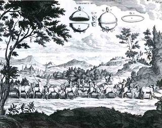
    As a matter of fact the issue of nothingness was very contentious, with the concept of its possibility and the display of a vacuum not achieved until 1672.  This beautiful illustration is from one of the greatest experimental physics books of the 17th century, coming as it does from Otto von Guericke’s  Experiemnta nova (ut vocantur) Magdeburgica de vacuo spatio (Amsterdam, 1672).  (In another minute department, this one is also I guess the greatest book ever written by a Mayor of anywhere (as von Guericke (1602-1886) was mayor of Magedeburg for 33 years).)  The image shows the greatest of von Guericke’s efforts, and one of the greatest (or most important) experiments in experimental science–the dramatic demonstration of the vacuum, showing here that teams of horses could not pull apart two halves of an evacuated sphere, and of course the efficacy of air pressure operating against it (um, the vacuum). The “floating” bits in the sky were an exploded view of the sphere that was the subject of the experiment. 
                   
    What was more important though, and what the general reader today might easily miss, was that von Guericke created something that many scientists and philosophers said didn’t, and couldn’t, exist:  the vacuum.  In modern times, Copernicus depicted the universe as a vast void; Descartes came in the back door (following the ancient and interesting though incorrect theory of Aristotle*), not liking the idea very much, and claiming that such empty space couldn’t exist.  Von Guericke provided the proof that the vacuum, that nothing, did exist.2

    Ultimately the Tarocchi was providing the Standard View of the creation, and did so before t he great assaults on the celestial kingdom got underway at the hands of Copernicus and Galileo, and of course many others–but that was all still 80 years away. 

    Notes: 
       
    1. The series as I said consists of 50 cards, all of which were teaching aids for the richer kids, dividing society, making a hierarchical display of the different levels of society. There were five series, each with ten engravings; the first series displayed the stages of social man,  beginning with the beggar and working through to the pope. [Series E* contained the Beggar, Servant (Fameio), Craftsman (Artixan), Merchant (Merchadante), Gentleman (Zintilomo), Knight (Chavalier), Doge (Doxe),King (Re), Emperor (Imperator) and finally ending with the Pope (Papa).] Series D displayed Apollo and the nine Muses; Series C was dedicated to philosophy and the sciences (showing the seven liberal arts plus astrology, philosophy and theology); Series B showed the seven virtues plus the Genius of the Sun, Time and World (Iliaco, Chronico and Cosmico, repectively).  Series A, composing the last 10 images (numbers 41-50) displayed the heavy hitters, the real weight: the Seven Spheres of the  solar system (the greatest part of the structure of the universe of te time) with the paths of the five planets plus the sun and moon, surrounded by the Octava Spera (the Eighth Sphere) and then by tghe Primum Mobile and Prima Causa (the last, card 50, being the god). 

    In the corners and bottom of the decorative borders is the classification system: the name and Roman numeral are first located along the bottom edge, with the group’s lettrer (E through A) and the group Arabic number located on the corners.

    2. Aristotle (384-322 BCE) theorized that as air became thinner objects moving through it would move faster, which is true; he further speculated that if there was no air at all, that if vacuums did exist, then objects would move infinitely fast, which he correctly assumed was not possible, and thus the vacuum could not exist.


  • Beautiful Title Pages: the Flight of the House of the Virgin Mary, 1524

    JF Ptak Science Books   Post 1086

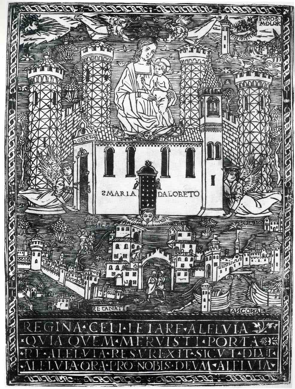
    00-blog-Oct 25 mary flying919


    This is an interesting,
    almost (?)-revolutionary and curious woodcut depicting the flight of
    Santa Maria
    di Loreto, and was printed in 1524.  At the bass of it all the
    print depicts the first of a series of moves of the house of the Virgin
    Mary (mother
    of Jesus) to safe harbors, away from the Moslem/Turkish army that
    invaded
    Nazareth in 1291.  The myth states that
    the structure was picked
    up and moved by angels from
    Nazareth to the Dalmatian town of Tersatto (near Fiume, which is today’s Rijeka, Croatia).  It then made its way to its
    final resting
    place at Loretto, Italy via the two other Italian towns (identified at the bottom corners of the print) of Recanati and Ancona.

    One of the most interesting aspects of
    the print to my eye though is its attempt to display an oblique perspective of the
    town of Loretto, the house being lowered by angels on the other side of the town’s fortifications.

     (In 1854 Pius
    IX consecrated the house as a miracle in his Bull “Inter Omnia” of 26 August 1852, declaring

    “Of all the shrines consecrated to the Mother of God, Immaculate Virgin,
    one is in first place and Shines incomparable radiance: the venerable and most
    August House of Loreto … (…)
    In Loreto, in fact, it venerates the House of Nazareth, so dear to the Heart of God, and
    that manufactured in the Galilee, was
    later (moved) from foundations, and for the divine power, was
    transported
    far beyond the seas, first
    in Dalmatia
    and then to Italy. “
    And it was for this enormous feat of air travel that Pope
    Benedict XV declared St. Mary the patron saint of aviators, on
    24 March 1920.)


    ·Posted by :

    ·in:

    — — —

  • The War of the Diagonals: Mondrian, Van Doesburg and Star Trek

    JF Ptak Science Books  Post 1079

    In a world constructed of nothing but right angles in horizontals and verticals,  how would a diagonal fare?

    Would it be like extraordinary confusion and then recognition of a sphere in a flat two dimensional world (as in Edwin Abbott’s Flatland), or would it be an astonishing moment of discovery like Robert Hooke’s Micrographia images, or a creeping, sweeping acknowledgment of first-seen perspective in Paolo Uccello? 
    De Stijl Mondrian_CompRYB
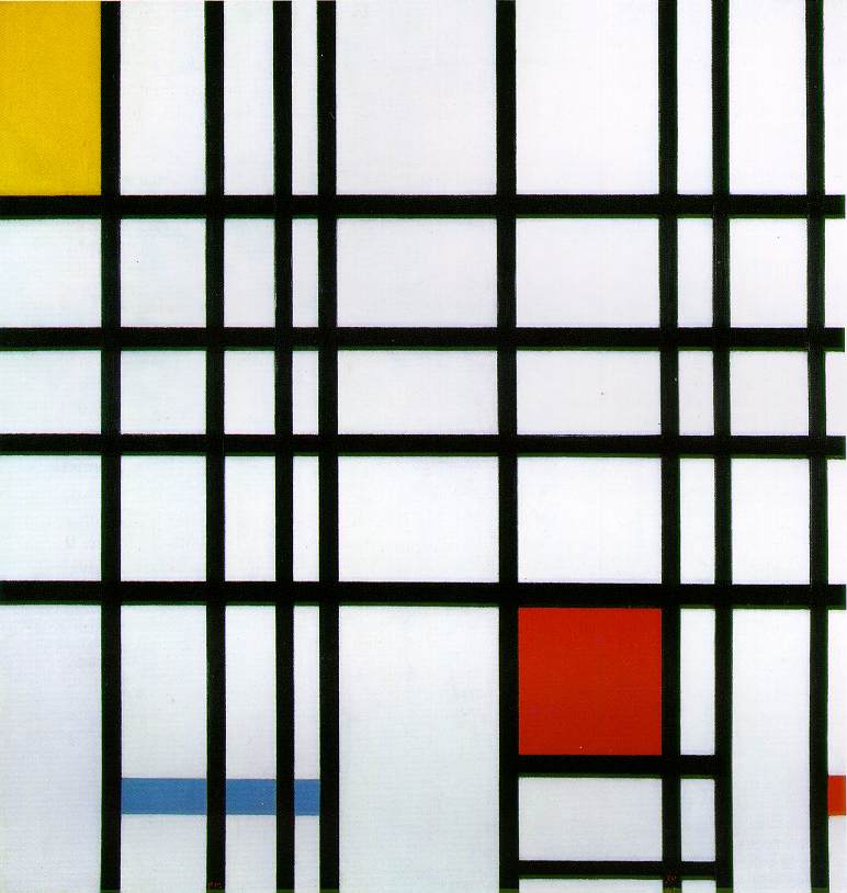
    In the case of the cubist Piet Mondrian, it would be revulsion and disgust.  Mondrian helped establish1 De Stijl (1917or thereabouts), with a philosophy of using lines to transform artistic thought onto canvas, and the lines were all horizontal or vertical, with square and rectangular shapes. These would represent the pure harmonies of expression, along with the primary colors as well as black and white. 
     

    Mondrian wrote “:… this new plastic idea will ignore the particulars of appearance, that is to say, natural form and colour. On the contrary, it should find its expression in the abstraction of form and colour, that is to say, in the straight line and the clearly defined primary colour.”

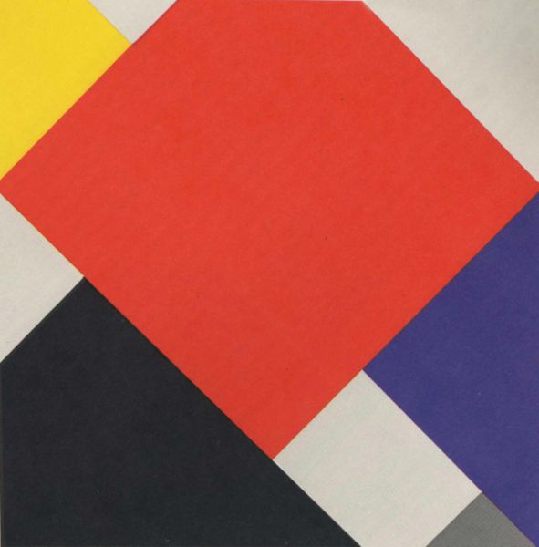
    Stijl co-founder, popularist, artist and editor of the movement’s journal, Theo van Doesburgh and his work (1924) introduced diagonals into the horizontal/vertical field in his painting “Arithmetische Compositie” and Mondrian quits the group.Van Doesburgh felt that the diagonal was more vital and important than the vertical and horizontal.  Mondrian felt that this was wrong, and clearly raked the original ideals of De Stijl, and so quit the movement, which he felt to be compromised by one of its co-founders.
    De Stijl van_Doesburg_Counter-CompositionV_(1924)
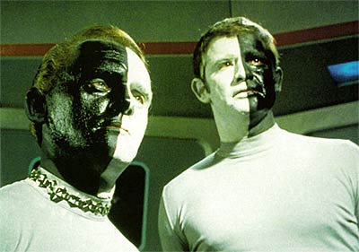
    I can certainly appreciate Mondrian’s need to go; though, honestly, what the debate and reticence reminds me of is an episode from the original Star Trek series, “Let That Be Your Last Battlefield” (1969).  The story is about an intractable difference between two seemingly identical factions of the planet Cheron2–it turns out that the differences between the two sides is a physical one that was inconsequential to the crew of the Enterprise, but of all-consuming importance to the Cheronites.  They were both white and back, their skin color cleanly halving  their bodies on the vertical.  But the “inconsequential” difference was that one person was black on the right side and white on the left; the other was the opposite.  It was this difference that led to their planet-wide schism and abandonment of each other. 

    Its no wonder that the writers of that episode chose the name “Cheron”, which is another accepted spelling of “Charon”, the Greek ferryman who transports the dead to Hades.

    Bele_lokai That’s where this particular schism falls to me, though to those involved I’ve no doubt that the differences were as significant as 2D vs. 3D and flat perspective vs. real perspective, the blatant if not micrographic differences looming mighty small to everyone but those involved. 
    ______
    Notes

    1. In 1917 it was Mondrian who coined the term Nieuwe Beelding (“the New Plastic”) , or Neo-Plasticism, from which De Stijl took its meaning.  He set out the philosophy of the group in that same year in a series of twelve articles in the group’s journal, De Stijl

    2. From Wikia Entertainment:  “Cheron is a Class M planet located in the southern region of the galaxy near the Coalsack, which once supported a humanoid civilization of Cheron natives. In the 23rd century, the area of space was largely unexplored by Starfleet, so the race was previously unknown to the Federation.”

    ·Posted by :

    ·in:

    —

  • Duchamp, the Empty Value of Words, and Bra Dreams 1955

    JF Ptak Science Books   Post 1072

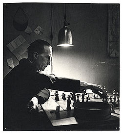
    There is absolutely no chance for a word ever to express anything. As soon as we start  putting ourDuchamp thoughts into words and sentences, everything goes wrong.– Marcel Duchamp

    Which is worth more, wind or stone?  They’re both priceless.  Alexksie Kruchenyh

    This is one of the defining Duchamp quotes for me, the thing that most closely gets at what he was trying to do in his art.  Ultimately I think that he didn’t care about words to define the result of what he was thinking about–or what his art represented.  Or the outcome of a chess game.  To me he was all about the process of getting there, the results not mattering all that much–and certainly not a description of the result.  

    Or perhaps not.  My opinion on Duchamp is that the whole deal for him was a performance, whether he was writing about or discussing or making art, the most important issue was the movement associated with trying to move from place to place.  The destination itself didn’t matter. The message was the thinking, and so identifying it as the same for everyone when the process was so individualized was senseless for him, the message a dynamic thing communicated with images.
    Bras maidenform171
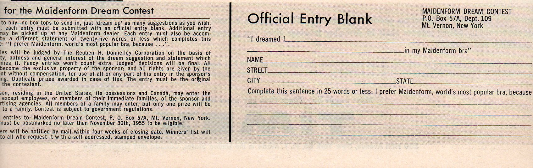
    When trying to use this Duchampian interpretative tool with this odd combination of words and images in this 1955 LIFE magazine ad I still come up a little short on  what was going on.  Maidenform was looking for dreams that women had in Maidenform bras, paying $13,000 for three juicy/saucy/odd samples.  The manikin-like pose, the expressionless face, and the few bits of clothing this woman is modeling apply some sort of robotism on which  rocket-y wire-circled bosoms are encased in a steely industrialism.  On the other hand the bra maker wanted women to share their bra-encrusted dreams.  The central interest is of course making money on bra sales, but underneath that I’m not sure what I come away with as the message in the images outside the obvious peek-inside-the-machine stuff. 
    Bras maidenform form173

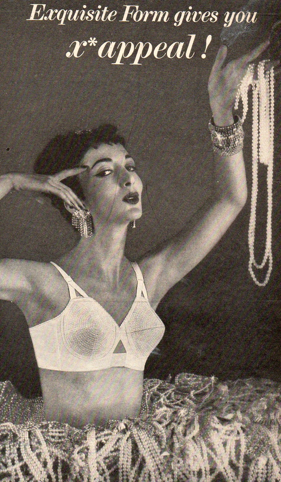
    A little further in the magazine and we find an ad from Exquisite Form (“brassieres give you X* appeal”) that gets to a simpler message instantly.  The instantaneous is lacking in the Maidenform ad, but the inescapability isn’t.

    Bras pearls170


  • The Coming Sameness of Beauty–Lessons from a Soda Bottle of 1947

    JF Ptak Science Books  Post 1050

    The great beauty of beauty is its great unidentifiable qualities–unidentified that is until they are identified, quantified, signified, geometized, libeling the concept of beauty until it is nothing but a soured criminal contempt.
    Barbie-history-2
    In an antiquarian sense one way of establishing what “beauty” meant in a particular time is by looking at painting or sculpture, the idealized form representing gods and goddesses of strength and beauty and grace. For more recent times of less idolatry and more commercialization advertisements using images of women to sell whatever product the seller was trying to push on the viewer could also be used as a certain standard of attraction and beauty. (Assuming of course that we are talking about the recent past when images other than the product itself were being used to try and establish a desire and loyalty to the product. In the history of publishing, this is a relatively recent innovation that I think belongs to the 19th century and not before.)   In the case of using pretty women, the advertiser was trying to associate their product with a certain sense of beauty, or to at least attract the attention of a lazy reader to look at their coal tar soap because a pretty face was lined up next to it.

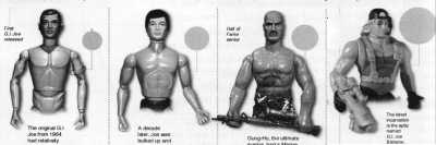
    Another interesting way of evaluating beauty could be found in the evolution of Barbie Dolls or GI Joes.  Or you could consult William Hogarth’s Analysis of Beauty.  And many other things of course, that deal with beauty in the human form (and more, or orders of magnitude more, that deal with beauty outside of ourselves, beauty in the forms of architecture or mathematics or the arrangement of sand or whatever). 
    00--beauty--gi joe
       
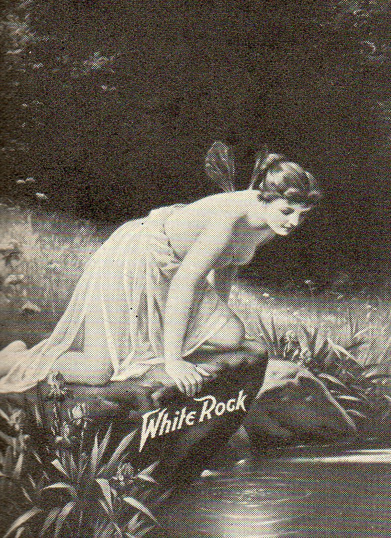
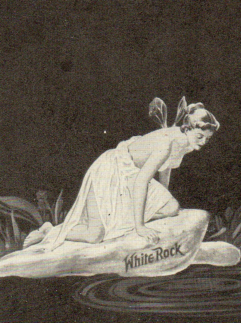
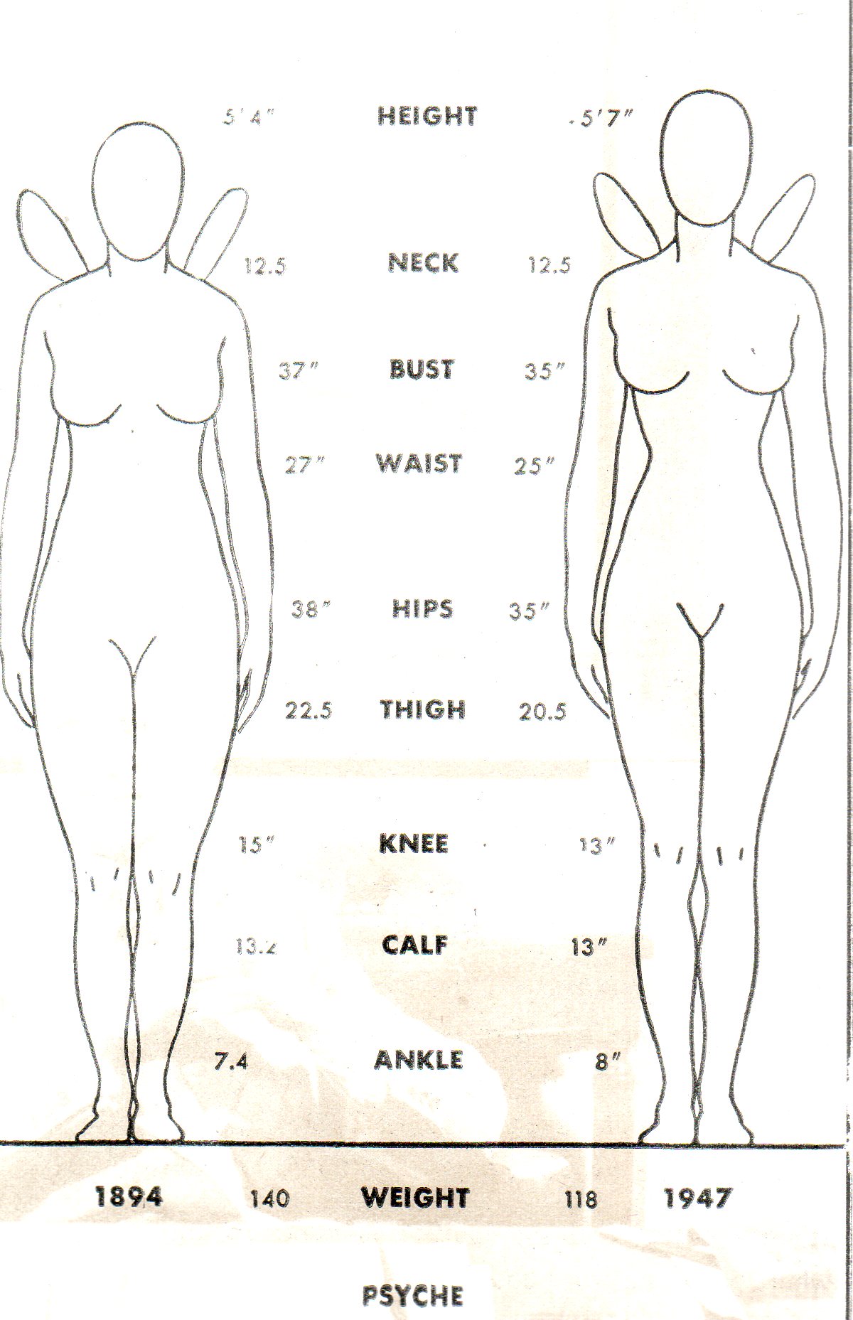
    I’m just going to give beauty 700 words here, or so, and so I’ll concentrate on just one picture of comparative beauty. (I guess that there have been 100 billion words written about beauty, though if you loosened up the definition of what ‘writing about beauty” mean, the number could probably be squeezed up to a trillion, which would mean 4 million books of 250k words each.  Probably the 10^10 is a better guess.)  As it turns out it is a picture from a story in Life magazine for 30 June 1947 of Psyche–the Greek goddess of the soul–used as the logo for White Rock soft drink company’s mineral water.  In general it’s a poor depiction of the goddess, and I’m not so sure that they even had the goddess in mind when the whole thing came into the bottler’s mind (she is after all described as a “sprite” in the LIFE magazine article).

    What is of interest is the change in the image of Psyche on the face of the bottle over the years (shown here for 1893, 1924 and 1947) which is graphically depicted with measurement appraisals.
    00--beauty psyche 1038
    Psyche simply buffed up a little, getting taller, slimming down and generally made to be a little more common.  She did loose her nipples in 1947, or at least they became obscured, trailing away from their depiction in 1893.  (I once attended a U.S. Supreme Court argument on a case dealing with nipples and pasties and strip clubs.  It was a little bizarre, and as my mind wandered I took an interest in the court’s decoration, and particularly the frescoes–which of course included a full-nippled woman, staring down at the court from her height.)   
    00--beauty psyche 3040
    But it struck me that Psyche was simply becoming a more-generic depiction of beauty, which reminded me of this odd bit of beauty sanitizing prevalent among the wealthy of today, or at least among those–actors and advertising types–whose image helps set the stage for the beauty standard.  Now it is possible to vastly augment your appearance via surgical procedures to the common standard of what has been established as “beautiful”.  And the end result of this is that there is merging a certain sameness among the people whose faces everyone seems to know, and whose appearances change the way people think of beauty.  I find it striking that someone (for example)  like the actor Sharon Stone would turn her face into a common mask of someone else entirely, closing the ranks of differentiation in what is presented to mass market audiences as “beauty”.  Everyone is starting to look like everyone else, or so at least among movie actors. 

    And so it is perhaps finally appropriate that I chose Psyche to discuss here, because if the actors tend towards these procedures more and more, they’ll all be wearing the same sort of frozen mask that their ancient Greek precursors used to wear when in performance.  

    00--beauty psyche comp041


  • Dis-inventing the Left-Hand Turn–City Planning with Le Corbusier

    JF Ptak Science Books  Post 1038

    Somebody must’ve invented the automotive right-hand turn, and someone too must’ve come up with the idea of dis-inventing the left-hand turn–for the sake of this post and brevity that person might as well have been Le

    Right hand turn 2006

    Corbusier.  I know that city planners and traffic engineer types must’ve been working on the idea of how to push new traffic through old city streets, and the notion of making traffic not cross against itself must’ve come fairly early on, but I just offhand don’t know when.  It makes sense to me to not have cars make left-hand turns against oncoming traffic–it adds immeasurably (?) to the gas guzzling stop-and-go adventures in driving, the chain reaction of so many cars stopping and piling up behind one solitary driver waiting to make a left-hand turn against a stream of oncoming cars is just enormous.  Restricting the left-hand-turn to three right turns would slash the waiting/idling business and allow traffic to proceed quicker. (In a similar line of thinking my friend Richard Rudman from New Zealand points out that studies prove that restricting highway lane changes also makes enormous sense as well–it gets people to were they’re going quicker and with greater fuel economy if the flow isn’t interrupted by constant starts and fits of changing lanes.)            

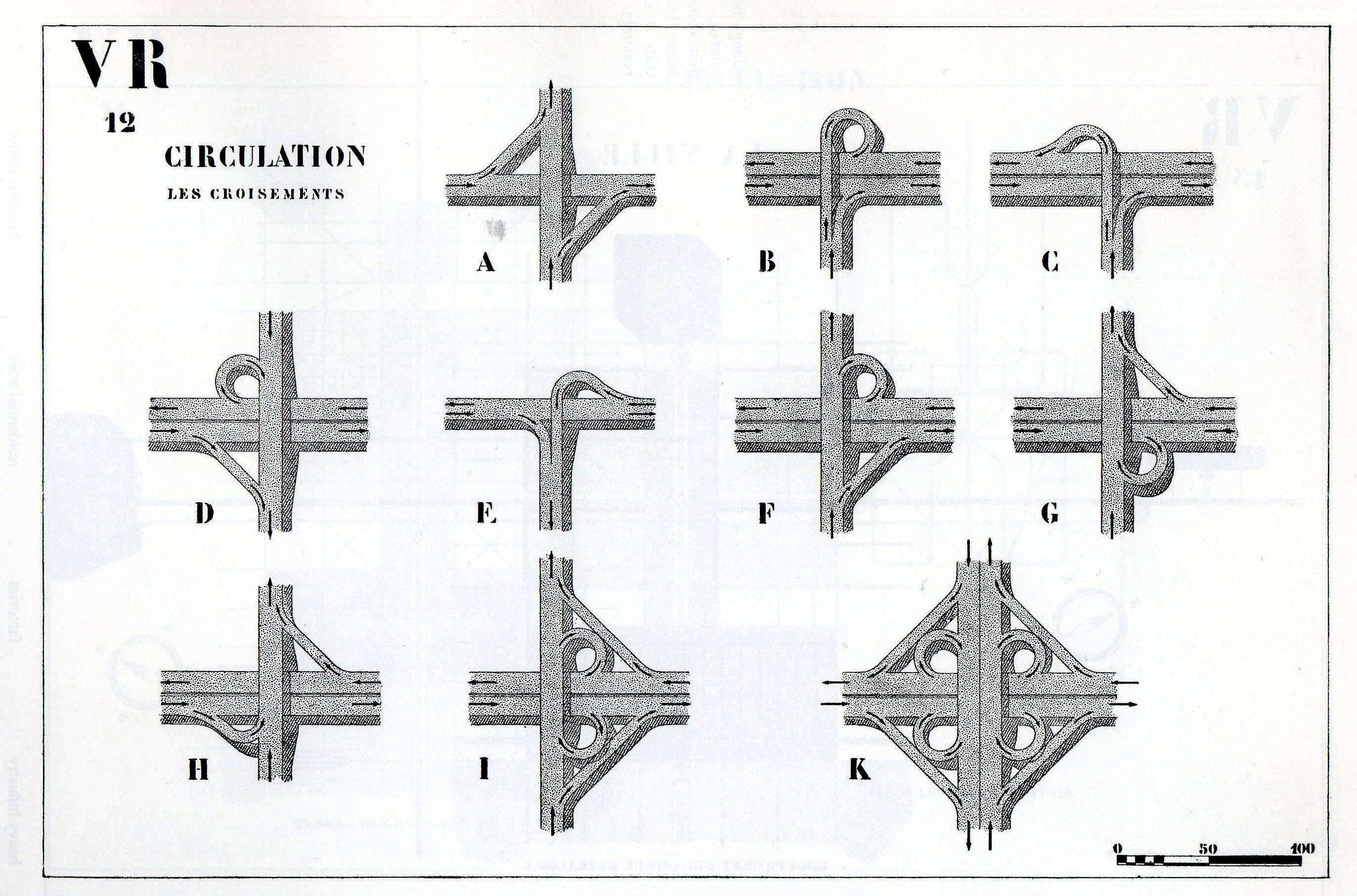
    Further on in The Radiant City we find this visual encyclopedia of right-handed turns:

    Right hand turn 10

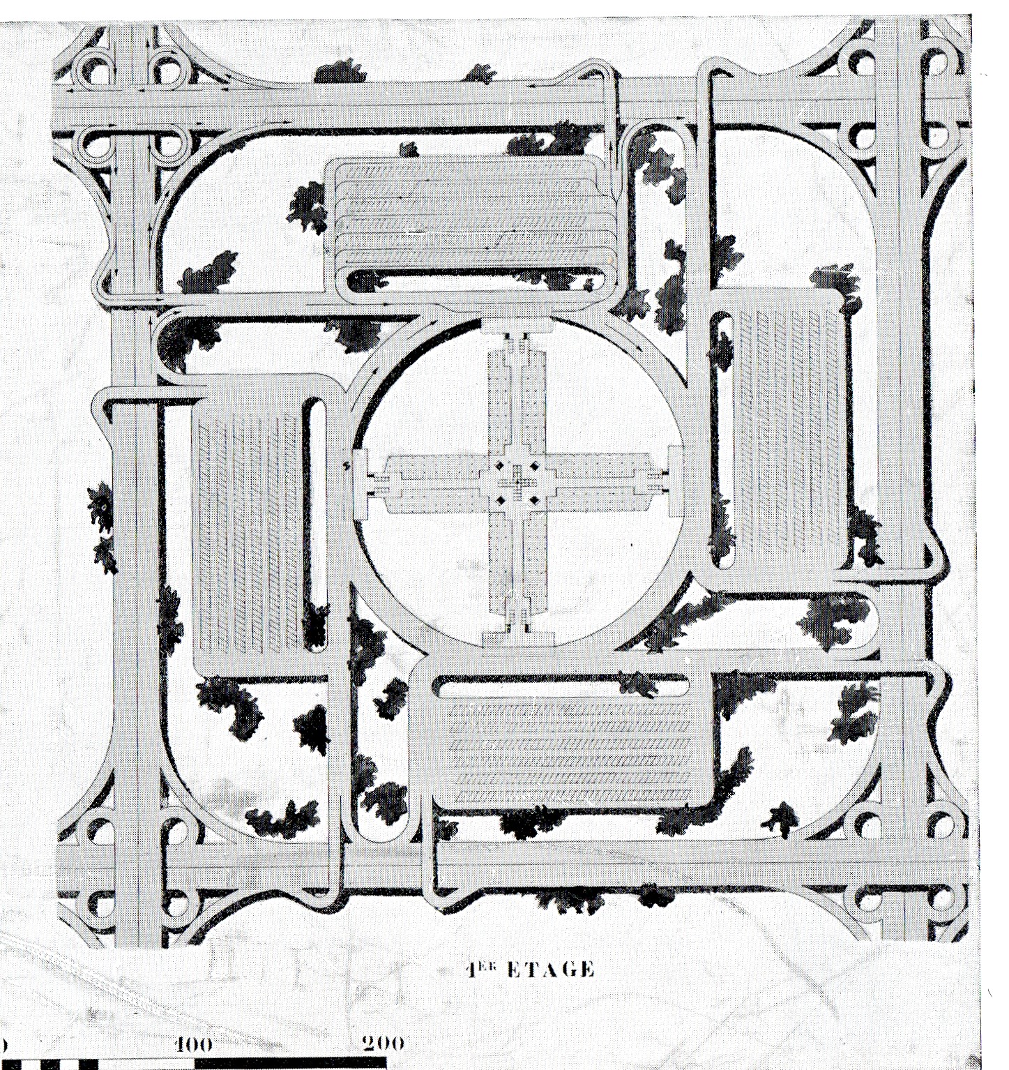
    And so we come to this plan, a part of the 1930’s Radiant City of Le Corbusier.  It is a section of a series of “horizontal skyscrapers”, “Cartesian (works) in steel and glass”, 220 meters tall buildings set in 400 meter square sections.  All of the architecture aside, the street plan is what interests me–all of the traffic here in this section of the Radiant City is in one direction along streets that are largely lacking right angles.  Elsewhere in the book Le Corbu presents his ideas for intersections for large cities–all of the designs remove the cross-traffic turn, keeping traffic flowing without those series of infinite stops.

    I’ve not been a very big fan of this man, but this is the stuff that seems to make sense to me. 

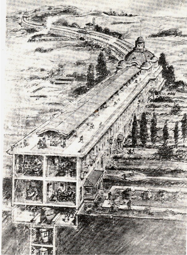
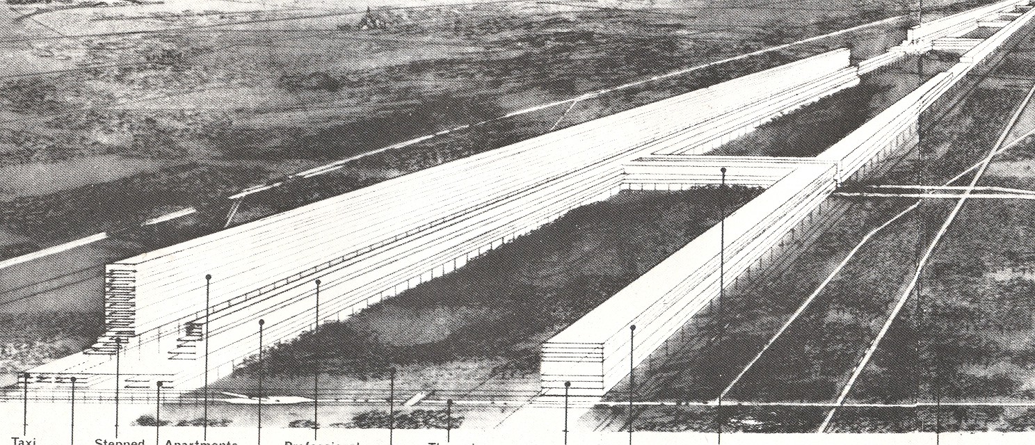
    These ideas are also in vast contrast to the city plans of linear cities (which I wrote about earlier here), seen in the 1910 Chambless image (below) and the 1932 Popular Science city (below that).

    Linear cities 2

    Linear cities

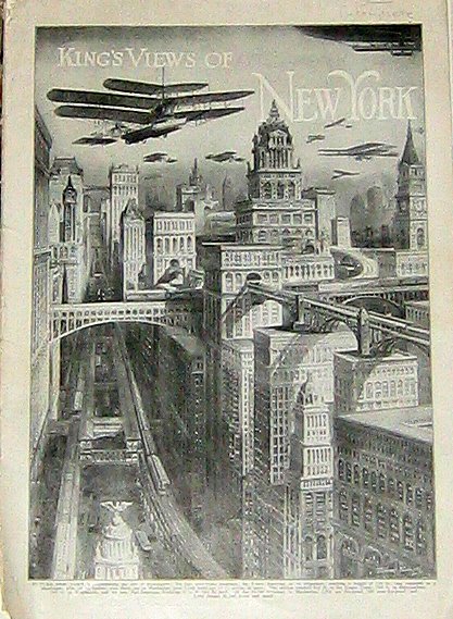
    It is also entirely different from the methods of dealing with traffic that were seemingly very popular in the early/first-third part of the century–massive 12-lane roadways, suspended garganutan affairs with traffic turning everywhere, some of which took place high in the air and in the interiors of massive skyscrapers. (Some of which I wrote about here.)

    Kings new york


  • Windsor McKay’s Animated Sinking of the Lusitania (May 7, 1915)

    JF Ptak Science Books

    Windsor McKay–who for all intents and purposes invented the animated cartoon with his “Gertie the Dinosaur” in 1914 –produced this piece of homeland propaganda on the sinking of the Lusitania, which occurred on this day in 1915. 

    The film was released in 1918 with McKay producing the 25,000 drawings necessary for production.  It caused great emotions and bitterness, considering of course that there was no footage or photographs of the sinking–McKay provided the moving impetus and the viewers’ minds filled in the rest. The RMS Lusitania, which was a Cunard Line ocean liner, was sunk by torpedoes from the German U-Boat SM U-20 eight miles off the coast of Ireland,  killing 1,1989 of the 1959 people on board. 

    Notes:

    McKay (1867-1934) is also remembered for his remarkable cartoon strips Little Nemo and The Dreams of a Rarebit Fiend. 

    ·Posted by :

    ·in:

    —

  • The Great Rarity and Sublimity of Antiquarian Artwork by Children

    JF Ptak Science Books LLC  Post 1014

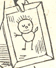
    April 26 kid with frame det

    I think that I can safely say that artwork by children does not make very
    many appearances in Western art prior to the 20th century–published images just don’t appear.  Nor do the
    originals–considering the ephemeral nature of the effort at art by children,
    their work just don’t seem to survive.  Some of that reason–particularly
    in America–was
    the scarcity of materials for kids to produce art with: paper was not
    inexpensive, and neither brushes and paints.  Crayons, invented for chubby
    and reachy fingers, were not invented for the mass market until 1903.  (Crayola sold eight crayons in a box for
    a nickel.  The colors?  Black, brown, blue, red, purple, orange,
    yellow, and green.)   Then of course the artwork would have to be
    saved, somehow, for generations.  As much as it would be fascinating to
    find artwork done at age four by your great-great grandparents, it would have to
    survive the cleansing tendencies of four generations of clean-up.  End
    result:  there’s just not that much antiquarian chldrens’ art floating
    around.

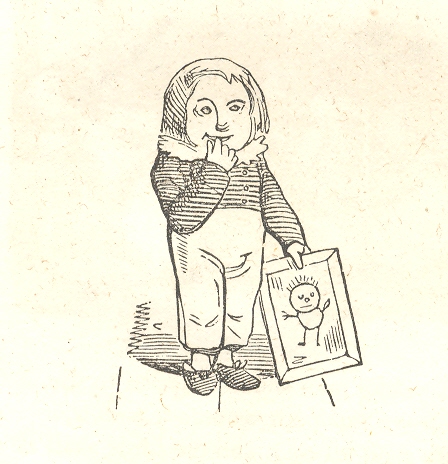
    April 26 kid with frame It also doesn’t appear as art in artwork.  It is possible to
    find numerous examples of kids’ scratches in stone and such in ancient
    graffiti, but it doesn’t appear as elements of fine artwork, or, for that
    matter, in book illustration. 

    Also it seems to me that the artwork for pre-school age children looks about
    the same—3-year-old kids drawing images of other people tend to look pretty
    much identical, and so this way over many centuries.  No doubt some group has studied this in depth
    and in detail, though I don’t know about it—to me, by seat-of-the-pants
    reckoning, the representations of people/animals/sun/sky and so on look like
    they can be coming from the same classroom, even when the art is coming from
    different centuries and from different parts of the globe.  (At least for the 99% of them.)  I find this remarkable.  Then of course things happen, children
    change, they get schooled, educated, informed, indoctrinated, and on and
    on.  But for that early period, the art
    of children has a spectacular commonality.

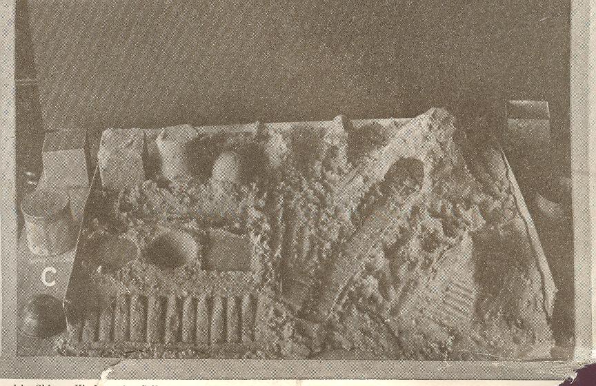
    April 22 children art sand
    Reigning this in, the issue of childhood art was again rallied after finding
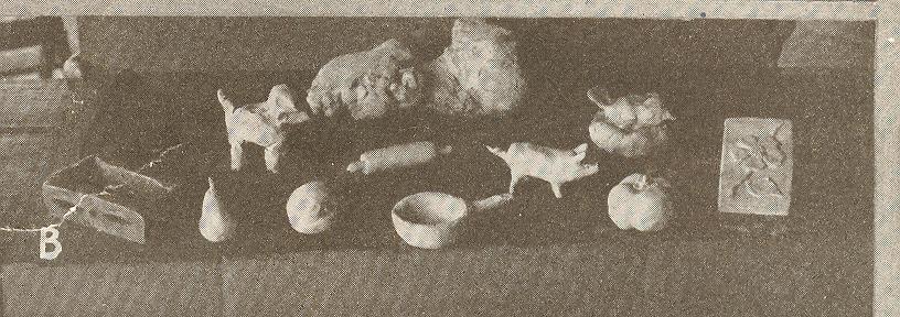
    an illustration of children’s school art—there was a sort of diorama, but then
    there was also an image of clay figures made by kids…and then there was the
    sand castle.  I honestly cannot recollect
    ever seeing a hundred-year-old image of a child’s sand castle.  Some woodcut must appear in Harper’s Weekly or some such magazine,
    showing play at the beach, perhaps the castle making an incidental appearance
    at the edge of the scene.  I was struck
    by the picture, and by its (perhaps) rarity. 
    I have no doubt that kids having been building things in sand and mud
    forever; whether there are many published pictures of the results, I really don’t
    know.

    April 22 children art clay

    There is another fine example (pictured above, at top)  in Thomas Truman’s The Nurse’s Rhyme Book,
    a New Collection of Nursery Rhymes,
    published in Philadelphia
    in 1847.  The book is filled with unusual illustrations and fantastic
    ornamental borders, all used in support of some odd, scary, mean and
    occasionally pretty mid-century posies meant as night-time entertainment for
    the young ones.  Our prize is found on the very last page, the final slug
    of an illustration to a more-finely illustrated book: a coy, small boy, holding
    an example of his art, seemingly drawn on a framed slate. He looks happy,
    pleased, proud to me–on the one hand he is interested in sharing his
    achievement and on the other is really too shy to share, an emotion I’ve seen
    from time to time with my girls. As a matter of semi-fact, this is a rare
    emotion to see displayed in art, the too-shy-to-share routine saved more for
    fluttery self-conscious Victorian grown-ups more so than for children.. 

    Believe me, after having dealt with books and prints as an antiquarian for
    almost 30 years, and also having a collection of sorts of antiquarian
    childrens’ arts, pictures like this just don’t surface very often at all. 
    Over the years I’ve made some annoying phone calls and emails to librarians at
    art galleries (especially at the National Gallery in DC where I was a pester)
    explaining my interest and trying to find out if this struck any bit of memory
    in their brains–I never once had a positive answer. (I expected at some point that
    someone would say, “Oh yes, of course–there’s a census of that that Mr.
    Kemp of Yale did in 1977”. Or something, some sort of memory for this kind of
    image.) This is hardly an academic pursuit, but my occasionally ritualistic
    clawing seems to bear out that these things are just not available.

    All I have to go with here is the sheer emotion of seeing some of these pictures–they strike such an utterly deep chord, and are so astonishing, and personal,and so completely resonating, that I  know they are important..  In a way I think that whatever is in the picture in that little boy’s hand from 1847 is what everyone is looking for

    ·Posted by :

    ·in:


  • The Fate of the Future & the Ironies of Artistic “Futurism”

    JF Ptak Science Books LLC   Post 1013

    “The oldest of us is thirty: so we have at least a decade for finishing our work. When we are forty, other younger and stronger men will probably throw us in the wastebasket like useless manuscripts—we want it to happen! They will come against us, our successors, will come from far away, from every quarter, dancing to the winged cadence of their first songs, flexing the hooked claws of predators, sniffing doglike at the academy doors the strong odor of our decaying minds, which will have already been promised to the literary catacombs.”–from the “Futurist Manifesto”, by F.T. Marinetti, 1909

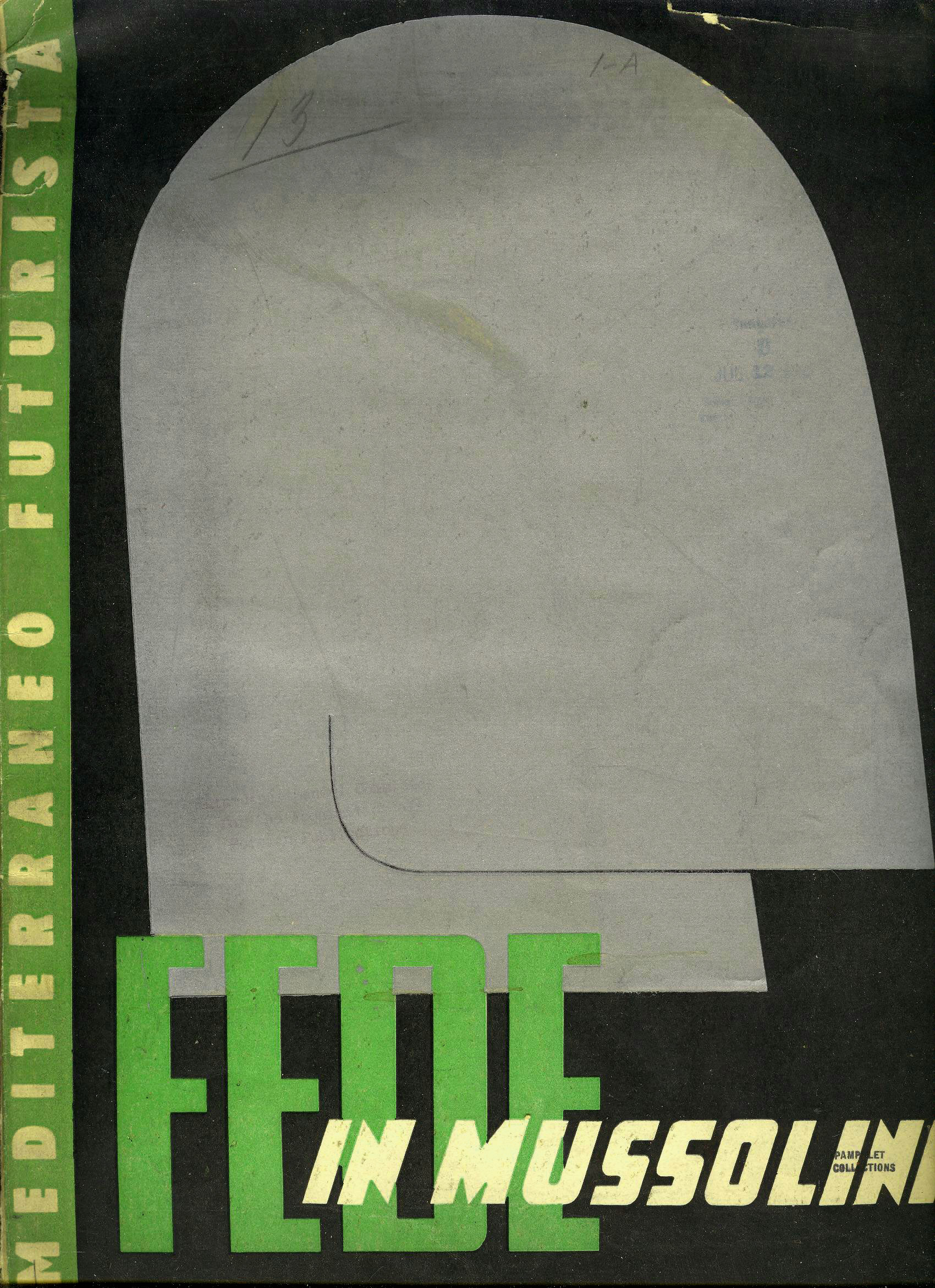
    Mussolini
     

    They came for Mr. Marinetti a little earlier than that, and continued to come, though whoever it was that came couldn’t quite reach the founder of futurism, who seemed to be one invisible step ahead of oblivion.  Or perhaps it was behind?  I’m not sure.

    But futurism as a movement was more in the past than in the future, barely lasting long enough to have anything but a past.

    Not that the movement wasn’t important–it was, obviously–its importance branched out into other areas and movements, morphing into necessary branches, leaving behind a shell of the original tended by the originator.  (It can be argued that this movement helped create the environment for Dadaism and Cubism [or at least Cubist-futurism as in the Russian sense of that art].)  Marinetti had some unsavory and some jsut downright weird political and social ideas, having a long and vested interest in fascism.1  And not only the earliest part of Italian fascism –founded in 1919 with an interest in expanding the democratic process–but the later, Mussolini-controlled Italian fascism as well.  Marinetti sought the protection of Il Duce,2 and even so during the war, when he sought to protect his movement’s art from being designated as “degenerate ” and therefore unacceptable and existence-deniable by Adolf Hitler.

    This is the cover of a magazine edited by Marinetti and others, a hagiographic-porn hommage to the leader of the Italian fascist government, Benito Mussolini, featuring a very striking portrait of the leader on the cover. 

    And so the unlikely prolonged existence of futurism–a movement transformed far beyond itself in a matter of years, held together by pieces of fluff and dust, supported in its old age on the hopes of a noxious political system which was itself doomed to rapid failure.

    “At last they’ll find us—one winter’s night—in open country, beneath a sad roof drummed by a monotonous rain. They’ll see us crouched beside our trembling aeroplanes in the act of warming our hands at the poor little blaze that our books of today will give out when they take fire from the flight of our images.”  –F.T. Marinetti, from his “Futurist Manifesto”, 1909

    Notes

    1. Marinetti’s goal was to establish futurism as the official art movement of the government–something he specifically wrote against in earlier incarnations of himself.  He would come to loggerheads with much of his earlier social opinions, abandoning his beliefs in his never-ending quest to promote his movement.  I must say though that Marinetti did publicly speak against anti-Semitism.

    2. Marinetti sought to have the Nazi traveling exhibition of degenerate art–which included works by futurists–banned from Italy.  So even though the Nazi fascists established futurism as degenerate, Marinetti was able to enlist the aid of Mussolini to shield Italians from what the Nazis thought of the art.  But the futurist manifesto seemed comfortable with the while idea right from the start, as we can see in proposition #9 of its self-proclamation: “We will glorify war – the world’s only hygiene – militarism, the destructive gesture of freedom-bringers, beautiful ideas worth dying for and scorn of woman…”