A Daily History of Holes, Dots, Lines, Science, History, Math, Physics, Art, the Unintentional Absurd, Architecture, Maps, Data Visualization, Blank and Missing Things, and so on. |1.6 million words, 7500 images, 4.9 million hits| Press & appearances in The Times, Le Figaro, Mensa, The Economist, The Guardian, Discovery News, Slate, Le Monde, Sci American Blogs, Le Pont, and many other places… 5000+ total posts since 2008.

Category: Art History

  • History of Holes 12: Caves in mid-Renaissance Art

    JF Ptak Science Books LLC  Post 909

    “When [the soul] is firmly fixed on the domain where
    truth and reality shine resplendent it apprehends and knows them and appears to
    possess reason, but when it inclines to that region which is mingled with
    darkness, the world of becoming and
    passing away
    , it opines only and its edge is blunted, and it shifts its
    opinions hither and thither, and again seems as if it lacked reason.”  Plato, The Republic book. VI, 508d

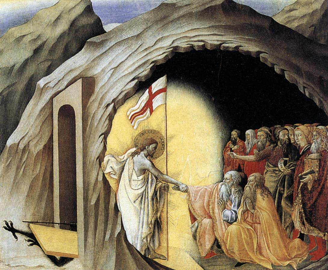
    Cave--osservanza

    Plato
    dipped deep into the myth/metaphor/parable/analogy/allegory of the cave,
    contrasting it with the allegory of the sun, discussing the pursuit of
    knowledge real and not-so.

    I
    like the idea of the half-displayed, semi-schematic, fade-away disposition of
    the cave and how painters dealt with them and their hidden contents in early Renaissance
    art.

    Its
    difficult to show a cave, a dark hole (occurring in all rock types and
    topographic situations, btw) that really hadn’t been dealt with scientifically
    yet—even if humans had been using them one way or another for thousands of
    years. 

    I’ve
    noticed these images time in and time out, and I’ve not really saved them, or
    at least I haven’t segregated the odd etched or engraved images, though they
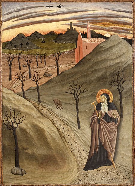
    are all here somewhere, so I can add to this post from time to time.  The image that I’ll use tonight comes from
    Harvard’s Fogg Museum and is the work of the Master of
    Osservanza (Sienese school, fl 1430-1450, manuscript illustrator).  It is a popular image, “Christ in Limbo”,
    though of the others working in this genre we see Christ generally at the
    entrance to a tomb/cave-like place, standing just outside of the doorway (as with Mantegna, Durer, Pacher, Fra Angelico and others). The Master of Osservanza gives us an
    exquisite cutaway view of the cave of limbo, showing both the outside and the
    inside, which is an uncommon and beautiful perspective.

    I should add that the tearingly odd “Saint
    Anthony Abbot Tempted by a Heap of Gold”, also painted by the Master of Osservanza (ca. 1435) depicts the least-likely-of-all-saints-to-be-tempted-by-gold reacting in horror to, well, nothing.  Nothing at all. We see him reacting to what used to be there, but which for some reason was removed, painted-over at some dim point in the dusty past, for reasons that I do not know.  (And so the painting could easily move into my Blank and Empty Things series.) But the desert landscape is so sparse and the sky so surreal with bent clouds that it is easy today to overlook the gold entirely. 

    St. anthony

    [I know there’s SO much more to this business with the caves–I just wanted to get this post started before it all went down the thought-hole.]


  • Unintentional Absurdist Art: Flying Boats with Bucket Feet, 1745

    JF Ptak Science Books LLC  Post 901

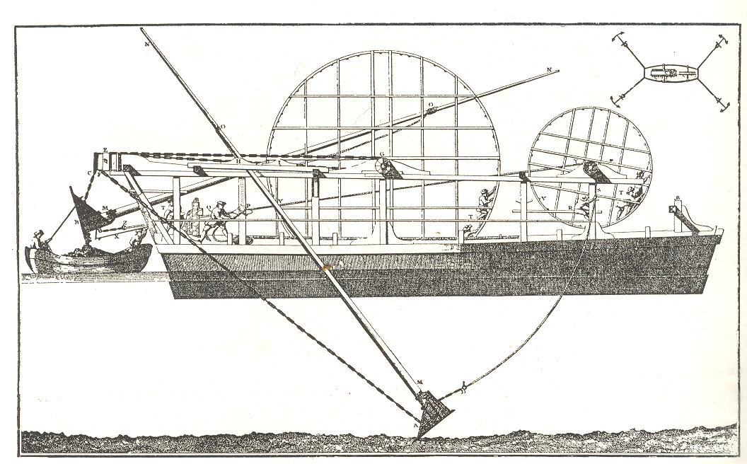
    This
    treadmill-powered French pontoon dredge, printed around 1745, looks for all the
    world as though it is floating in mid-air, propelling itself along with two
    bucket-ended legs, elegantly and impossibly moving its miracle-y-balanced self
    forward against all forms of reason and logic, a clunky 18th century
    non-transforming Transformer.  The
    profile actually and simply shows a dredge at work and just  fails to show the water in which it
    floats. 

    Blog jan 6 absurd

    The
    boat’s dredge is powered by four humans in two treadmills which would move the buckets
    back and forth, scraping up the river silt and then emptying it into the shuttle
    launch aft.  Simple and ingenious—except when
    taken out of context, where it begins to look like some advanced Age of Reason floating
    boat which, although awkward-looking, is not without its charm.  

    Source:  Charles Singer, History of Tecnology, volume IV,
    pg. 634.  Singer loftily notes that this machine
    “is reminiscent of Goethe’s poem Der Zauberlehring
    which inspired Paul Dukas’s well known symphonic poem L’apparenti sorcier” and which would be better known to most folks as
    Mickey’s Sorcerer’s Apprentice gig in Fantasia.


  • Found Dadaist Art–Floating Eyes and Ears, 1650 & 1807

    JF Ptak Science Books LLC Post 857

    Dada found--tp I’ve
    written a few times in this blog (here, here and here) about what I think is
    found/unintentional antiquarian Dadaist art and would like today to continue
    that thread with the following two unusual pieces of art.

    The first
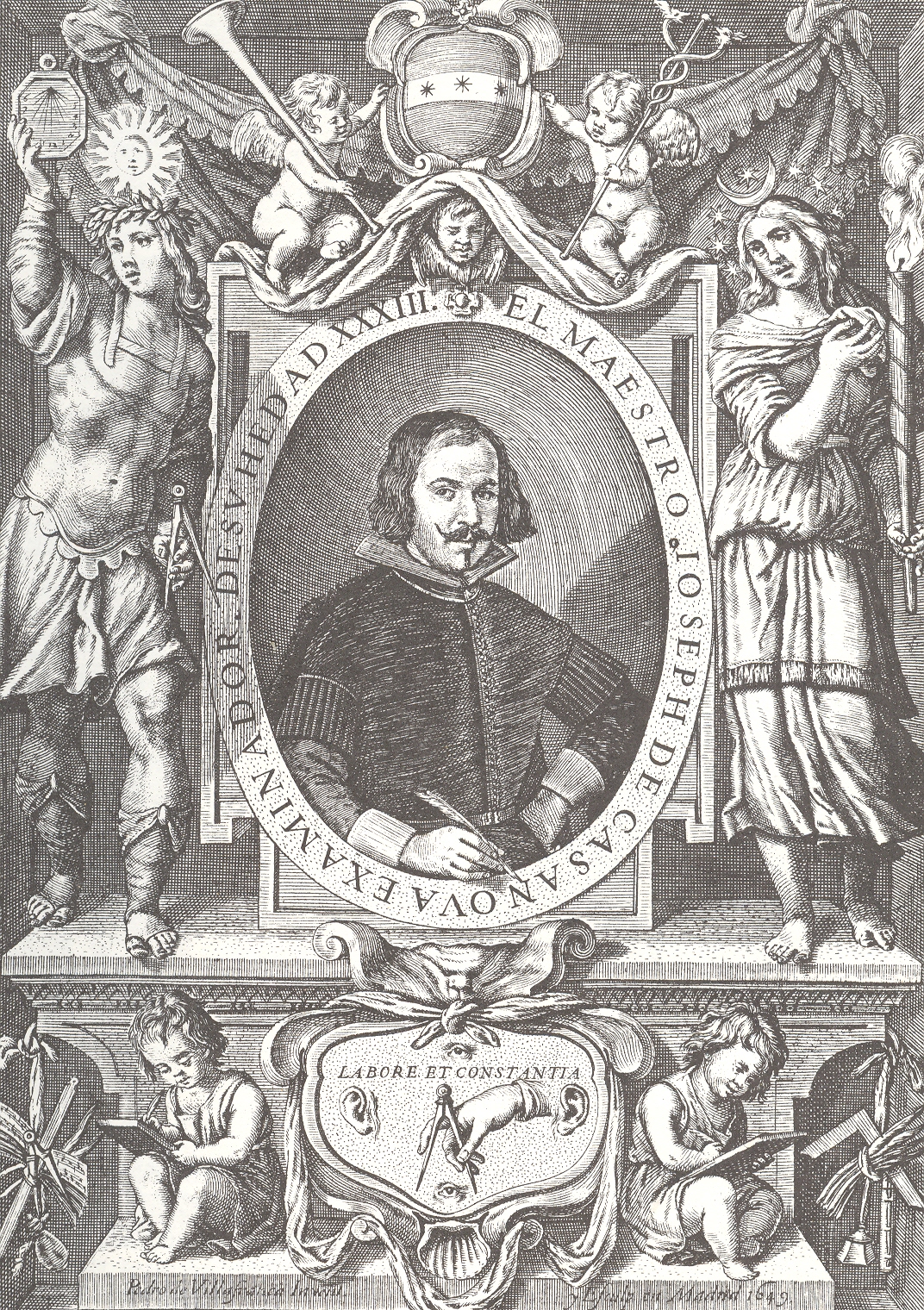
    is a detail from the title page of Joseph de Casanova’s Primera parte del
    arte de escrivir todas formas de letras
    (1650). This is not the Casanova (Giacamo,
    1725-1798) who most people would initially think of—the seductive womanizer of
    the 18th century—but another, earlier, Spanish Casanova (1613-1692)
    who was important in the history of round hand script and the lettera bastarda.  Joseph Casanova ‘s evolutionary handwriting
    style was considerably lighter and easier than most styles, and his influence
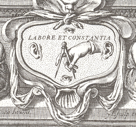
    in changing handwriting practices was substantial.  What is interesting for me is the detail at
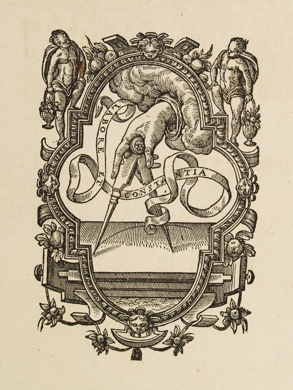
    the bottom of the engraved title page for his book, the emblem containing  “Labore et Constantia”.  Labor and consistency, decorated with a hand
    and compass, ever watching and listening with ears and eyes above and below.Dada found--tp detail

    [This
    design comes from (at least) one earlier source—the printer’s device for Christoph
    Plantijn (Antwerp,
    1583), though without the eyes (below).] I like the floating aspect of the disembodied
    body parts, floating in their little sea of constancy, ruled by a compass. 

    Dada found--multiples  The
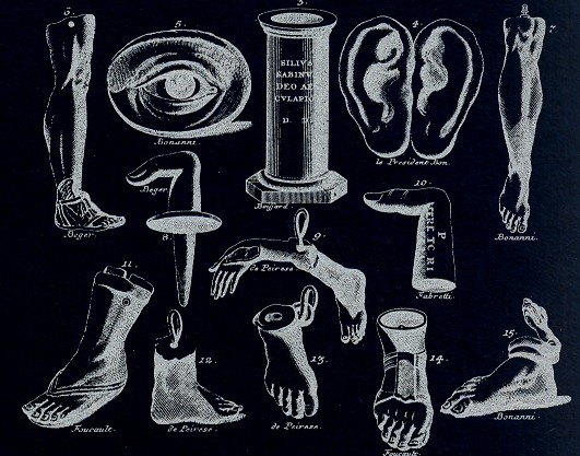
    second image has another set of disembodied eyes/ears (among other things) and
    has all the flavor of the dada/surrealist flourishes of the frammenti of Piranesi.
    This comes from Bernhard von Montfaucon’s Greichische,
    Romische und andere Alterthuemer…
    (Nurenberg, 1807). When taken out of
    context, as a disembodied image, the von Montfaucon certainly has a dadaist taste
    for me, especially if you edit the image a little.

    Dada-found labore 

    Dada found 2--multiples


  • Quantifying Art: the Art-ematics of Roger de Piles and Emily Vanderpoel

    JF Ptak Science Books  Post 890


    “The central nervous system is nature’s Sistine Chapel, but we have to bear in mind that the world our senses present to us… is a ramshackle construct which our brains have devised to let us get on with the job of maintaining ourselves and reproducing our species. What we see is a highly conventionalized picture, a simple tourist guide to a very strange city…”J.G. Ballard “The Kindness of Women” 1992 Source:  Disinformation and the Analysis of Beauty.

     I was thinking about major change in art, looking around for periods of that sort of change came to that period just before the onset of Romanticism.  The critic Roger de Piles (October 7, 1635 – April 5, 1709) wrote about this, about the 18th century version of refusees that we’d meet again in a major way in the 1850-1920 period, as they tried to shake their way free of the long-entrenched boundaries of Classicism.  Along the way of his elegant argument, de Piles stops to consider the merits of the capacities of artists and painters (his delineation), establishing for himself rules of artistic interpretation o0f beauty and artfulness. Correctness.  De Piles judged the imitation of objects, of “la belle nature”, the “exquisite mixture of nature’s forms and colors”1, and did so along four elements of his logic of taste: composition, drawing, color and expression. 

    De Piles employed this methodology in his book Dialogue sur le coloris ( Dialogue upon Colour, 1673)  comparing 49 artists, the complete list transcribed here from Manlio Brusatin Histoire des couleurs (Paris: Flammarion, 1986, pp.103-104), and which is reproduced in Elisabeth G. Holt Literary Sources of Art History, (Princeton: Princeton University Press, 1947), pp.415-416)”, and this then taken in toto from the wikipedia article here. Taking the next but curiously-untaken step, I simply added the totals for each giving an overall “Piles Score”, finding an average of 41.87. (Curiously enough when I was adding this column in my head, column by column, I ended for no reason at Leyden to begin the second column; the sums for the two columns both ending at Leyden were 109.)  :

    Painter//  Composition   Drawing   Color   Expression  =  Piles Score

    Average Piles Score= 41.87  (I don’t really understand his comparisons, and the “zeros” don’t register at all.  I do see that Giovanni Bellini rats out at a 24, Durer at 36, Holbein at 38 and Girgione at 39, while Leonardo rates higher than average at 49.)

    Andrea del Sarto 12 16 9 8  =  45

    Federico Barocci 14 15 6 10 = 45

    Jacopo Bassano 6 8 17 0 = 31

    Giovanni Bellini 4 6 14 O = 24

    Sebastian Bourdon 10 8 8 4 = 30

    Charles Le Brun 16 16 8 16  = 56

    Carracci 15 17 13 13 = 58

    Cavalier D’Arpino 10 10 6 2 = 28

    Correggio 13 13 15 12 = 53

    Daniele da Volterra 12 15 5 8 = 40

    Abraham van Diepenbeeck 11 10 14 6 = 41

    Domenichino 15 17 9 17 = 58

    Albrecht Dürer 8 10 10 8 = 36

    Giorgione 8 9 18 4 = 39

    Giovanni da Udine 10 8 16 3 = 37

    Giulio Romano 15 16 4 14 = 49

    Guercino 18 10 10 4 = 42

    Guido Reni x 13 9 12 = 34

    Holbein 9 10 16 3 =38

    Jacob Jordaens 10 8 16 6 = 40

    Lucas Jordaens 13 12 9 6 =40

    Giovanni Lanfranco 14 13 10 5 =42

    Leonardo da Vinci 15 16 4 14 =49

    Lucas van Leyden 8 6 6 4 = 24

    Michelangelo 8 17 4 8 = 37

    Caravaggio 6 6 16 O = 28

    Murillo 6 8 15 4 =  33

    Otho Venius 13 14 10 10 = 47

    Palma il Vecchio 5 6 16 0 = 27

    Palma il Giovane 12 9 14 6 = 41

    Il Parmigianino 10 15 6 6 = 37

    Gianfrancesco Penni 0 15 8 0 = 23

    Perin del Vaga 15 16 7 6 = 44

    Sebastiano del Piombo 8 13 16 7 = 44

    Primaticcio 15 14 7 10 = 46

    Raphael 17 18 12 18 = 65

    Rembrandt 15 6 17 12 = 50

    Rubens 18 13 17 17 = 65

    Francesco Salviati 13 15 8 8 = 44

    Eustache Le Sueur 15 15 4 15 = 49

    Teniers 15 12 13 6 = 46

    Pietro Testa 11 15 0 6 = 32

    Tintoretto 15 14 16 4 = 49

    Titian 12 15 18 6 = 51

    Van Dyck 15 10 17 13 = 55

    Vanius 15 15 12 13 = 55

    Veronese 15 10 16 3 = 44

    Taddeo Zuccari 13 14 10 9 = 46

    Federico Zuccari 10 10 8 8 = 36

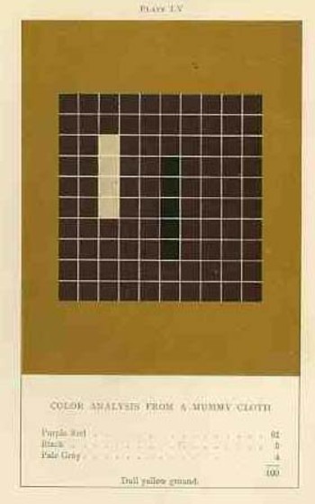
    The upper-deck-problematic Emily Vanderpoel looked deeply and arithmetically into art—she also produced a numerical grid of the artwork that she analyzed, going a step further to re-order the reality of the painting into a representative 10×10 square, distributing the color sense according to a secret algebra that I cannot identify.  She published the results of her work in 1901 and 1903, producing (in two editions) a gorgeous but mysterious book called Color Problems for the Layman, in which she sought not so much to analyze the components of color2 itself, but rather to quantify the overall interpretative effect of color on the imagination.  I know this sounds begging and vague, but I really haven’t been able to make much headway in her theory. 
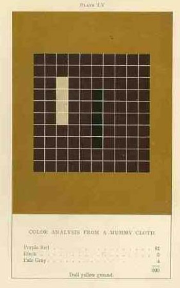
    Blog dec 28 vanderpoel By virtue of this effort, though, Vanderpoel had produced a strikingly illustrated book, with 118 color plates, all very intense, and beautiful, and in its way exceptional—unique perhaps.  Had the book been written thirty years or so hence we’d call it some sort of constructivist/constructionist artform.  But since the artwork in the book comes a decade before the first non-representational artwork in human history (or so), I don’t know exactly what to call it. 

    I really don’t know what it is, but I know that it is not entirely accidental, this pre-non-representational artform, because controlled geometrical color art is not accidental. 

    The net effect is glorious.  I just don’t know how she got there—which isn’t normally a consideration in art, except that this work is an instructional on how to understand color in art and nature, and the explanation of the procedure is ethereal.  Vanderpoel was and remains a respected author on porcelains and other applied and plastic arts.  In this work she looked at her fair share of porcelain, limogues, clay pots, burial urns, glass shards, and the like; she also analyzed clouds, mummy cloths (and casings), dew on morning grass, brocade, the eye of a blue jay, feathers, and another hundred or so poetic arrangements of the stuff of the world.  I still do not know what this book is trying to tell me, but I do know that it is remarkable.   
     Blog dec 28 hogarth

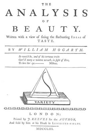
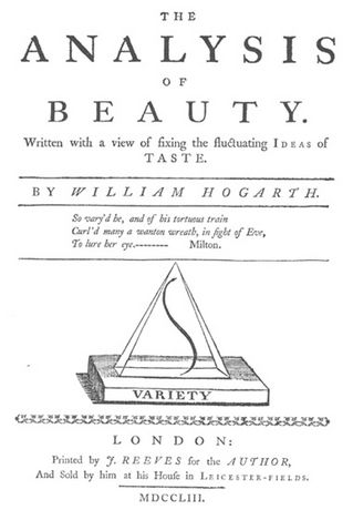
    On a much simpler note, the British artist William Hogarth  (1697-1764) perhaps pathologically induced the use and display of a curve, a single line (a “Line of Beauty and Grace” or “Serpentine Line”), that represented to him the most sublime (and correct) representation of artistic sense.3  It appears on the title page of his Analysis of Beauty (1753), situated within a triangle, and is embedded in a much more wide-ranging treatise on beauty in general (some of which makes sense, some not).  His argument for the line, though is very simple, and he chooses to explain his vision in images more than in words, and so reduces his own interpretation and reduction of artistic form and correctness to a single stroke.  And so if he were to look at Leonardo’s Vitruvian Man or Durer’s proportional man, he would have seen not the proportions as the elements of beauty, but the simple line of the exterior form. 

    NOTES

    1.Charles Abbe Batteux, Les beaux Arts reduits a un meme Principe, 1746.

    2. Color theory is old and pretty—as a matter of fact there is a very attractive gathering of color theory models (in black and white, though) displaying some two dozen or more color models from the last 400 years.  People like Della Porta (1593), our old friend and resident oddball polymath crank Kircher (1646), the smarter-than-you-could-believe Newton (1660), Waller (1686), Lambert (1772), the wide ranging and again polymathic Goethe (1792), Herschel (1817, who also ushered in our understanding of the other light-sensitive shape spacing medium of photography in 1840), the semi-forgotten Chevreul (1835), the beautiful Maxwell (1857), Wundt (1874, the early experimental psychologist who also looked for spirits/spiritmus and ghosts), von Bezold (1878), Rood (1879), Munsell (1918) Kandinsky (1914 and not decipherable by me) and Klee (1924), and so on towards the present, all tried to analyze the prospects of color.

    In trying to quantify the color images of the objects in her study, Vanderpoel establishes a 10×10 square grid, dividing all of the color in that object into individual units numbering to 100.  Then, somehow, she identifies the major colors and places them according to a system that I cannot understand within the grid.

    3. “The eye hath this sort of enjoyment in winding walks, and serpentine rivers, and all sorts of objects, whose forms, as we shall see hereafter, are composed principally of what I call the waving or serpentine lines… intricacy in form, therefore, I shall define to be that peculiarity in the lines, which compose it, that leads the eye a wanton kind of chance, and from the pleasure that gives the mind, intitles it to the name of beautiful”.—Hogarth, The Analysis of Beauty

    Elsewhere Hogarth writes that while the human body is beautiful not so much for its proportions, but “the more pleasing turns, and intertwinings of the lines, which compose its external form”. 


  • On the History of Normalcy: Oskar Sclemmer & Dance, 1927

    JF Ptak Science Books LLC  Post 876 

    Jean Bouillard (the famous physician), Joseph de Lalande
    (astronomer and director of the Paris Observatory), the Paris Academy of
    Sciences, the French Academy of Sciences, Jacques Babinet, and the University
    of Bologna are examples of people and entities sharing something fantastically
    uncomfortable—they all ridiculed the initial presentations of what would become
    some of the most magnificent achievements of the last 500 years.  Bouillard incredibly and improbably insisted
    that Edison’s phonograph was impossible and a hoax, Lalande thought it utterly
    impossible to fly, the Paris Academy found it absurd that steam could be applied
    to locomotion, the French Academy rejected Lavoisier’s findings that meteorites
    do indeed come from space, and the great Bologna
    spat on the idea of Galvani’s researches. So it goes.  There are thousands and thousands of cases
    like these.  Jenner, Semmelweis, Galileo,
    Harvey, Copernicus—all produced monumental achievements, and all faced
    incredible scorn and rebuke. Some had it even worse than this: Dante, Marco Polo,
    Walter Raleigh, Cervantes, Cellini, Voltaire, Pushkin, Turgenyev, Dostoyevsky,
    Baudilaire, Verlaine, Machiavelli, and etc.(and Galileo) not only found vast
    rejection, but were also imprisoned. (Some actually produced works in prison
    that would also be rejected: Raleigh wrote his
    history of the world in the White Tower, Pushkin, Eugene
    Onyegin; Marco Polo, his travels.  Plato
    of course was also sold as a slave.) This list in general could go on and
    on–an encyclopedia of mistaken thought and stubbornness could easily be
    produced from centuries of thought like this, thinking that went outside the
    boundaries of “normalcy”. 

     Blog Dec 14 schlemmer

    The funny thing about “normalcy” is that all it seems to
    measure is the time it takes to move from one state of “normalcy” to the next.  People should know better than to expect that
    there should be no periods of extended non-change.

    It is interesting to think about how new ideas like these
    are perceived.  I came to think about
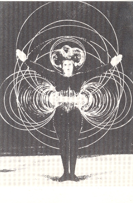
    this searching for a picture of the wire costume for the black series in Oskar
    Schelmmer’s (1888-1943, designer, artist, dancer and by 1923 the Master of Form
    at the Bauhaus) Triadic Ballet (“Triadisches Ballett”)1 of 1927. Better
    than a still, I actually found clips of the dance on youtube, which just floors
    me.

    I imagine that Schlemmer didn’t find a very happy reception
    to his dance and costumes.  He was
    outside the sphere of even those re-inventing dance in Germany in the early
    1920’s.  His concept of movement, among
    other things, differed from those of the other pioneers of this period, people
    like Mary Wigman, Francois Delsarte, Emile Jacques-Dalcroze and Rudolf von
    Laban—his inspiration came not from the center of the dancer’s experience, but
    from the costume itself, “which eliminates the torso” and “which the dancers
    measure out rather than feel out or explore”2. 


    It is phenomenal to me to see these changes in dance in such
    a short time, and how much of this movement would have been nearly impossible
    to conceive as an art form only a decade or so earlier. Except to the minority
    of people like Isadora Duncan and Ruth St. Denis,
    who had already rejected the restricting forms of classical ballet—the work of
    Schlemmer must’ve felt like a lightning strike.


    1. See this on Musikperformance.

    2..From Germany in the Twenties, the artist as Social
    Critic, a Collection of Essays
    , 1980, pg. 91.


    ·Posted by :

    ·in:

    — —

  • Pre-Histories of Famous Things: Art Nouveau

    JF Ptak Science Books LLC  Post 867

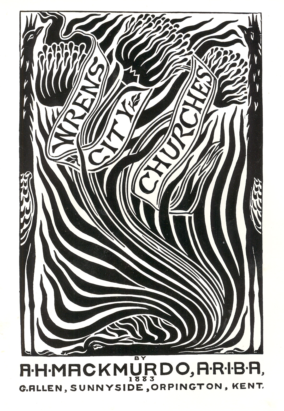
    This may well be the very first book illustrated in the
    style known as Art Nouveau–Arthur Mackmurdo’s
    Wren’s City Churches—coming a dozen
    years before the revolutionary Gismonda poster of Alphonse Mucha. The 1895
    poster by Mucha caused an enormous stir, so much so that this style, which would
    be known shortly thereafter as Art
    Nouveau
    , was initially known as Style
    Mucha
    .  But that didn’t stick; Art Nouveau and Jugendstil did. 

    Blog 12 6 mackmurdo


    Where does this leave the 1883 breakthrough design by multi-talented
    designer-architect arts-and-crafts-inspired Mackmurdo?  His design for the Wren certainly has the
    pathology of Nouveau and stands far apart from the very sedimented regulatory
    aspects of the Grande Ecole schools of the day: 
    flowing, organic, deeply stylized, intuitively suggestive.  Mackmurdo’s title page is lovely, curvilinear
    and simple:  its main base are three
    flowers with 21 leaves, bounded by two birds (chickens, perhaps but certainly
    not wrens), and fills the requirements of the new style.  Except there wasn’t a new style yet, not for
    years to come; Arthur Heygate Mackmurdo (1851-1942) was out there well ahead of
    the curve, and seems to have been out there all by himself. 


  • Prehistoric Surrealism, Part 6: Mueller’s Anatomy, 1845

    JF Ptak Science Books LLC  Post 866 

    Blog 12 4 dada--throat

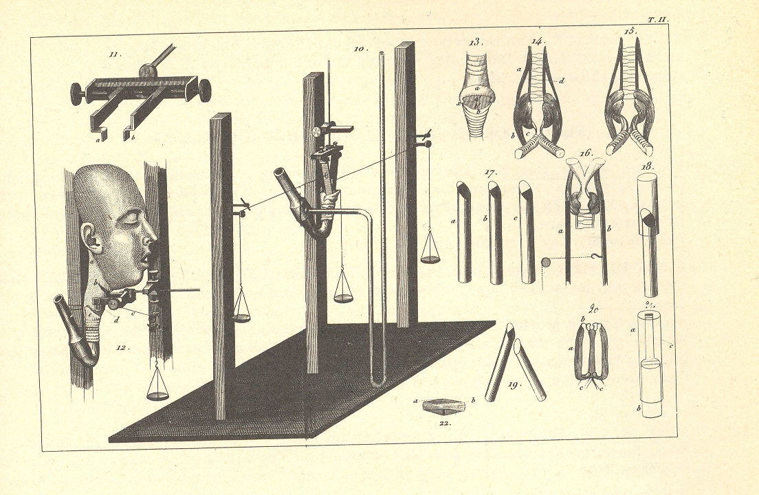
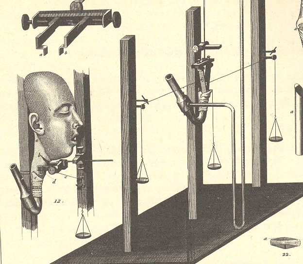
    This image occurs in Johannes Mueller’s Manuel de
    Physiologie
    (translated from the German editions of 1838-1840, Handbuch der
    Physiologie des Menschen
    ) and—removed from context—looks to me as though it
    could belong in a Surrealist Salon in 1915 as part of a revolutionary new
    artistic movement.  The print is part of a revolutionary work, though,
    back in its original context.  Mueller
    (1801-1858) was responsible for introducing the sciences of comparative chemistry,
    psychology and physics into the field of comparative physiology.  Mueller’s textbook was extremely important
    and was translated rather quickly into many languages. 

     Blog 12 4 dada--throat detail

    Notes:

    A wiki article on Mueller (who was chair of anatomy and physiology at Humboldt University of
    Berlin, or Humboldt-Universität zu Berlin, 1833-1858) points out that he
    was teacher and mentor to a number of fabulous scientists: ” Hermann von Helmholtz, Emil du Bois-Reymond, Theodor
    Schwann
    , Friedrich Gustav Jakob Henle, Carl Ludwig
    and Ernst
    Haeckel
    .”


  • Time’s Bad Hair Day: 1540

    JF Ptak Science Books Post 863

    Blog 12 4 time hair detail


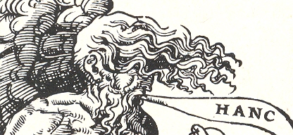
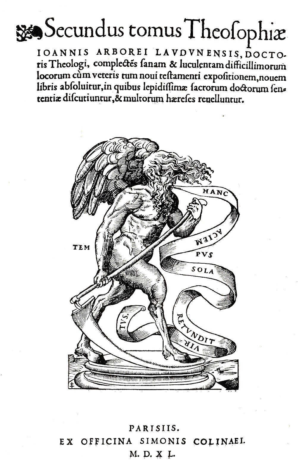
     This image proves that even Time itself can have a bad hair day, from time to time.  The woodcut image appears as the printer’s mark (of Simonem Colineum, or Simon de Colines) in the second volume of Johann Arboreus’ Theosophia, complectens difficillorum…, which was printed in Paris in 1540. 

    Blog 12 4 time hair

    Time isn’t very pretty here, and is made to seem a little Satanic, what with cloven hooves and the legs of some animal, strong torso and swift wings—the hair hiding the eye(s) completes a picture of damnable doom, and of whatever end we’re coming to.  Except for the righteous, though not quite: the word balloon describing Time’s spoken admonition is “Hanc Aciem Sola Retundit Virtus”, which means “only good deeds dulls the blade”.  That doesn’t necessarily mean “stops” the blade, which is bothersome.  I think that if someone were coming for me I’d like the blade as sharp as could be…

    ·Posted by :

    ·in:

    — —

  • The Illustrated London News *WAS* Deliberately Funny (in 1908)

    JF Ptak Science Books LLC  Post 862

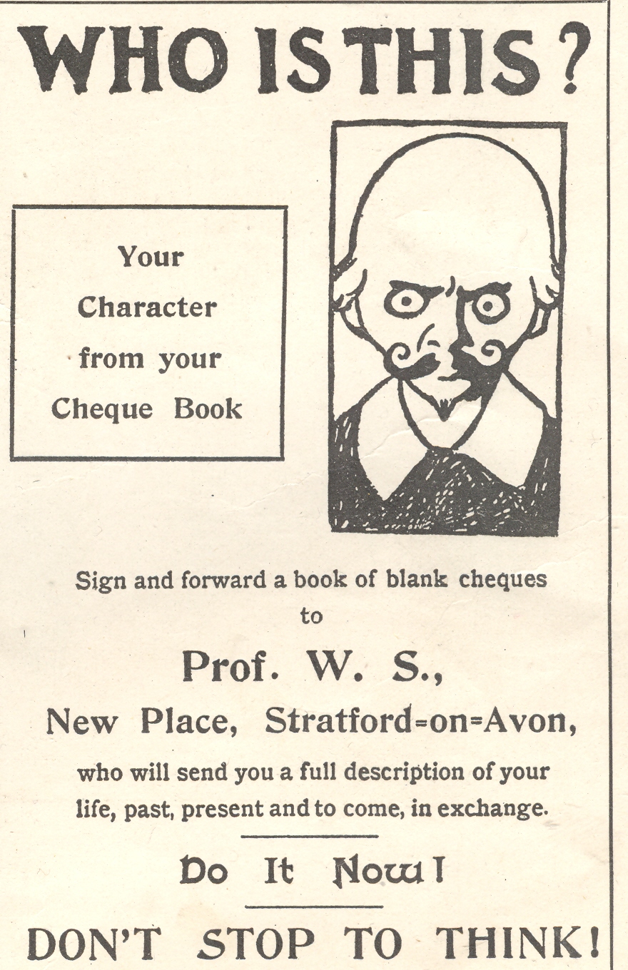
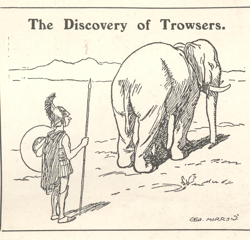
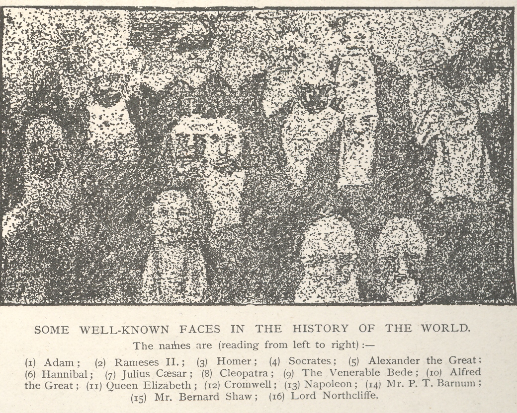
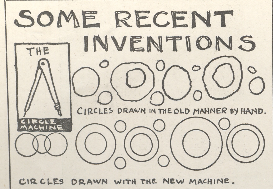
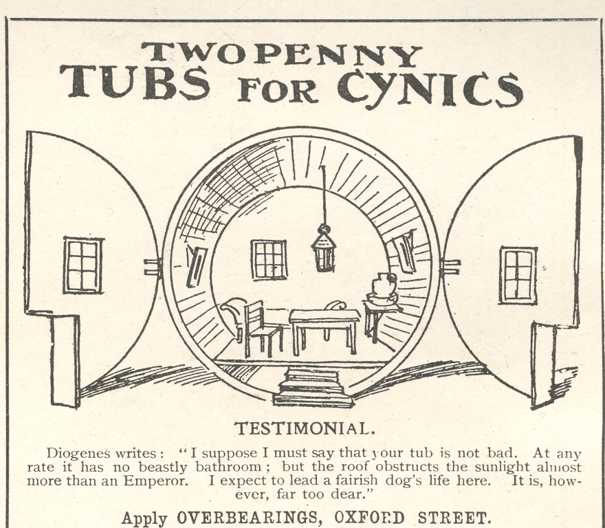
    I have more-or-less browsed the Illustrated London News for the 1890-1945 period now, and I can safely say that it was usually very interesting, almost always well written, beautifully illustrated, and almost never funny. I’ve mined many things from it over the years, and have posted dozens of things to this blog on the bits and pieces of interesting material present in–literally–every issue.  (It has endless info and unusual pictures on early aviation, fantastic coverage of WWI, and aspects too nunerous to mention.)  Again, humor was not a consideration or intended, even when it was–it was usually so stiff-lipped that you couldn’t move your mouth for fear of breaking it off.

    And then I stumbled upon the page 134 of the June 25th, 1908 issue which has FIVE funny things on it!  At least I think so–the funny shines like an avant garde nova.

    For example:

    + Dec 2 ILN shakes

    + Dec 2 ILN funny elephant 

    + Dec 2 ILN weird 

    + Dec 2 ILN circle

    + Dec 2 ILN cynics

    ·Posted by :

    ·in:


  • History of Blank & Empty Things #22: God in a Hole in the Sky

    JF Ptak Science Books LLC   Post 858  Blog Bookstore

    I think that I’ll start a thread on The History of Holes–which this post would secure nicely–though it will have to be differentiated from The History+ Dec 2 god hole of Dots and The History of Blank and Empty Things somehow.  Still, I like the idea.

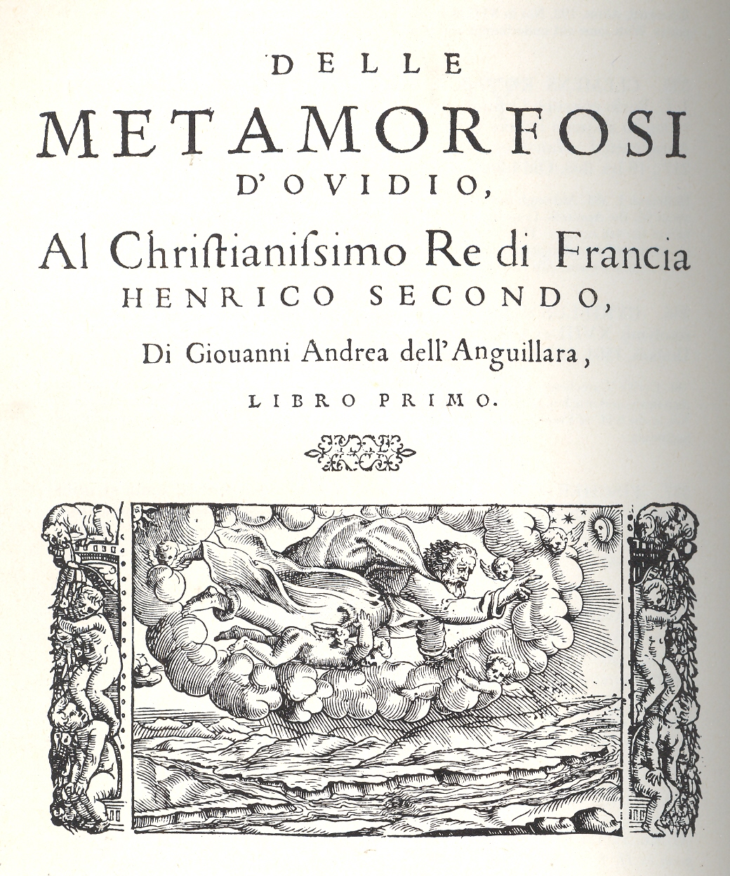
    These title page illustrations may or may not reveal a hole
    in the sky, a glimpse into a blank heaven. 
    God knows that Heaven awaits its geology from Charles Lyell or cartography from Jed Hotchkiss, so this iconography that
    I’m creating for these two Renaissance views of the blank canvas of the universe
    may well be incomplete or completely wrong—but it is intriguing that there isn’t
    even a suggestion of what God’s environment might be.  This assumption that one might possibly be
    shown the celestial surroundings may also be enormously presumptive and
    unknowable/unseeable by human eyes, but since we are being shown a corporeal form
    of the Creator I thought that the  logic
    was also there to portray the Creator’s milieu, but it is not to be.  

    + Dec 2 god hole 2

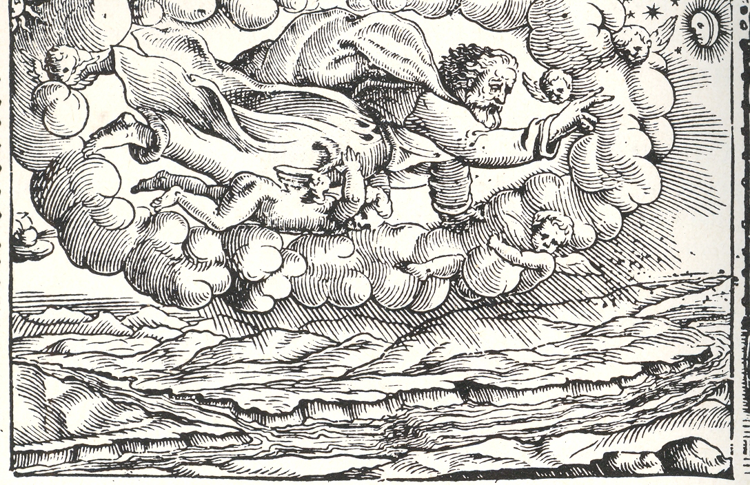
    The first title page is for the narrative poem Le Metamorfosi, Ovid’s  Metamorphoses,
    translated into Italian by Gioseppe Horologgi, and published in Venice in 1563.  It is certainly appropriate that God appears
    on the title page of this work, as Ovid tells the story of creation of all
    things and the history of man in the book’s 151 chapters—appropriate more so as
    this was one of the most popular intellectual biblio-tools of philosophers and
    writers right through the Middle Ages (having wide effect on Chaucer and Shakespeare on down).

    The image seems to catch the Creator in the act between the
    fourth and fifth days, floating in a cloud-framed hole in the sky.  Beyond the hole there is a white emptiness—which
    makes me think that there is something; if there was nothing, I guess we’d have
    the absence of all color, or blackness. 
    Or perhaps not.  In any event I
    find the opening in the fabric of creation and its blankness/emptiness somehow
    restful. 

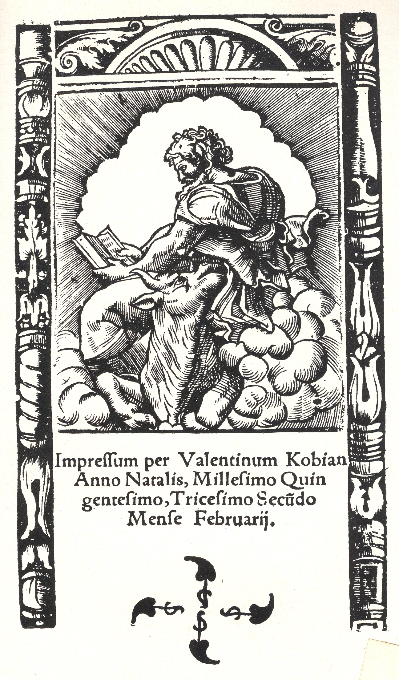
    The second image is a little more open to debate as to
    whether that is God in the cloud, reading, or not; I prefer to believe it
    so.  The image is the colophon for Johann Virdung’s2 (ca. 1465-1535, of Hassfurt0 Nova medicinae methodus…3, an astrological-medical book written by
    a celebrated astrologer, professor and correspondent of Joahnnes Trithemius.

    + Dec 2 god hole 3

    If this is to be the Creator in the clouds, reading a book,
    then I would take the white blankness behind him to be another opening in the
    sky.   The small interesting bit about the title page
    is that it spells out the year and the month and the day on which the book was
    printed, which was not very common at all, not a bit.

    I’ve certainly noticed white/blank/empty skies in prints,
    but I’m not so sure that the celestial hole has registered with me before
    today.  It has the potential for an
    interesting idea, in the opposite-of-a-black-hole category. Maybe. 

    Notes:

    1. The contents of the work, as follows:  Book I: Cosmogony, Ages of Man, Gigantes, Daphne, Io;; Book II: Phaëton, Callisto, Jupiter and Europa;;Book III: Cadmus, Actaeon, Echo and Pentheus;; Book IV: Pyramus and Thisbe, Perseus and Andromeda.;Book V: Phineas, the Rape of Proserpina;Book VI: Arachne, Niobe, Philomela and Procne; Book VII: Medea, Cephalus and Procris; Book VIII: Nisos and Scylla, Daedalus and Icarus, Baucis and Philemon; Book IX: Heracles, Byblis; Book X: Eurydice, Hyacinth, Pygmalion, Adonis, Atalanta, Cyparissus; Book XI: Orpheus, Midas, Alcyone and Ceyx; Book XII: Iphigeneia, Centaurs, Achilles; Aesacus; Book XIII: the Sack of Troy, Aeneas; Book XIV: Scylla, Aeneas, Romulus; Book XV: Pythagoras, Hippolytus, Aesculapius, Caesar.

    2. Lynn Thorndike:  Johann Virdung of Hassfurt again Isis
    25, 1936, p. 363; Faust and Johann Virdung of Hassfurt, Isis 26,
    1936/37, p. 321

    3.  Full title:
    Nova medicinae methodus, nunc primum & condita & aedita, ex
    mathematica ratione morbos curandi
    . 
    Available here!

    Other Virdung and astrology titles located at this marvelous
    site, here.