A Daily History of Holes, Dots, Lines, Science, History, Math, Physics, Art, the Unintentional Absurd, Architecture, Maps, Data Visualization, Blank and Missing Things, and so on. |1.6 million words, 7500 images, 4.9 million hits| Press & appearances in The Times, Le Figaro, Mensa, The Economist, The Guardian, Discovery News, Slate, Le Monde, Sci American Blogs, Le Pont, and many other places… 5000+ total posts since 2008.

Category: Art History

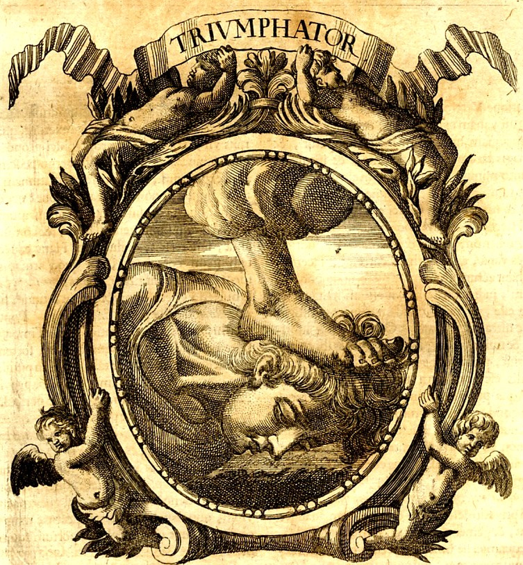
  • Foot of God, Pt 2: Continuing Thread on Odd Things in the Sky

    JF Ptak Science Books LLC  Post 853  Blog Bookstore
    ++ Nov 26 foot god

    I am going to indecently
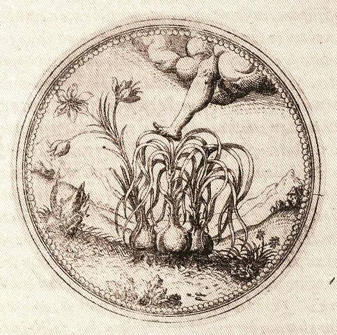
    add to my “foot of god” series with this metal engraving from the accomplished
    Joachim Camerarius1’ Symbolorum et
    Emblematum…
    (published in four volumes at Nuremberg from 1590 to 1605).  There is so much to offer from these books, I
    freely admit, but I’m afraid that I’m stopped at this foot-from-the-sky
    image. 
    ++ Nov 26 foot god

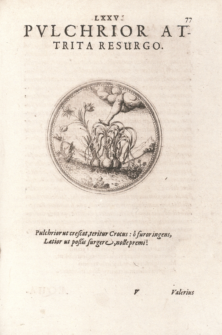
    The engravings, executed
    by Hans Sibmacher, were among the first executed in metal, and the book itself
    was the first of its kind to present botanical emblems. (The other three
    volumes contained emblems for animals of land-sea-air.) They are splendid and
    concise, and filled with soft detail. 
    And still I’m left with the foot. 

    The legend is mostly a
    mystery and doesn’t help me with the foot—it says something about beauty and
    growth and madness and reward—and the saffron crocus.    This plant has been a commodity for
    thousands of years, used for therapeutics and dyeing and spice.  It takes quite a lot of these plants to
    produce a gram of powder—about 150. 60,000 plants are necessary to produce a
    pound of saffron, which is getting to be quite pricey.  Given this, saffron was very often imitated
    and counterfeited—a crime taken quite seriously in many places, and perhaps
    none more so in Bavaria where (in 1444) a conviction meant death.
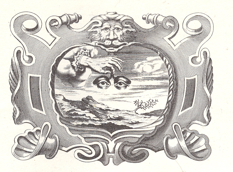
    ++ Nov 26 eyes in sky

    And as long as we’re
    talking about odd antiquarian images the sky, I’d like to point out the work by
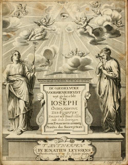
    the Jesuit Franciscus Nerrincq
    (1638-1712), De goddelycke voorsienigheydt2, in which there
    are several odd eyes that burn their way through the atmosphere.   Eyes/eye of the creator occur frequently in
    religious presentations and emblems, but not so very often as hands holding a
    pair of eyes.  I know all of this is very
    heavy stuff in the history of Christian iconography and the progression of
    emblemata, but I’d rather deal with the images out of context here and have
    them stand on their own without interpretation. 
    ++ Nov 26 eye title page

    NOTES

    1.From the Encyclopedia Britannica, 11th
    edition, volume 5:  JOACHIM CAMERARIUS
    (1534-1598), German botanist and physician, son of the
    classical scholar of the same name, was born at Nuremberg on the 6th of November 1534. After finishing his studies in Germany he visited Italy, where he graduated as doctor of medicine. On his return he was invited to reside
    at the courts of several princes, but preferred to settle in his native town of Nuremberg, where he had a botanical garden and formed extensive collections. He
    wrote a Hortus Medicus (1588) and several other works. He died at Nuremberg on the i 1th of
    October 1598.

     2.  De goddelycke voorsienigheydt uytgebeeldt in Joseph
    onder-coninck van Egypten : verciert met sinne-beelden ende sede-leeringen
    .  The entire book can be seen here.

    The University
    of Utrecht
    emblem
    collection
    is extensive and easy to navigate—there is drop-down box for
    available titles, and once selected, the book comes up with biblio info on the
    right and a drop-down of thumbnails for the entire book at left.  It is a joy to navigate. 

  • Emerging Patterns and Hidden Visible Art

    JF Ptak Science Books LLC  Post 851  Blog Bookstore

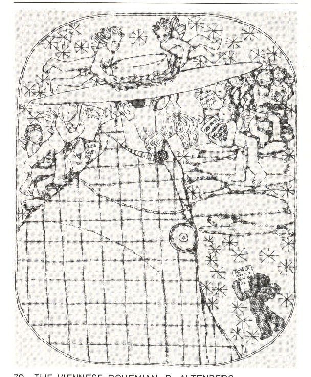
    Even when I know
    that this picture is coming, when it is rounding the bend, I still can’t see it
    for the portrait it is supposed to be. 
    The lithograph is by Berthold Loeffler (1874-1960), a prolific Viennese
    designer, artist and
    professor at Kunstgewerbeschule (1907-1935) whose prodigious
    commercial

    ++ Nov 24 altenberg

    output covered about every other letter of the artistic alphabet.  This work is a portrait of his mostly-forgotten
    fellow-Viennese writer, Peter Altenberg1 for the Kabaerett Fledermaus of
    1909.  The portrait is all squares and
    one big button to me, and I have to consciously look for the rest of the
    picture in spite of knowing that the stuff is there. 

    It is an unusual picture of emergent art—for me not quite
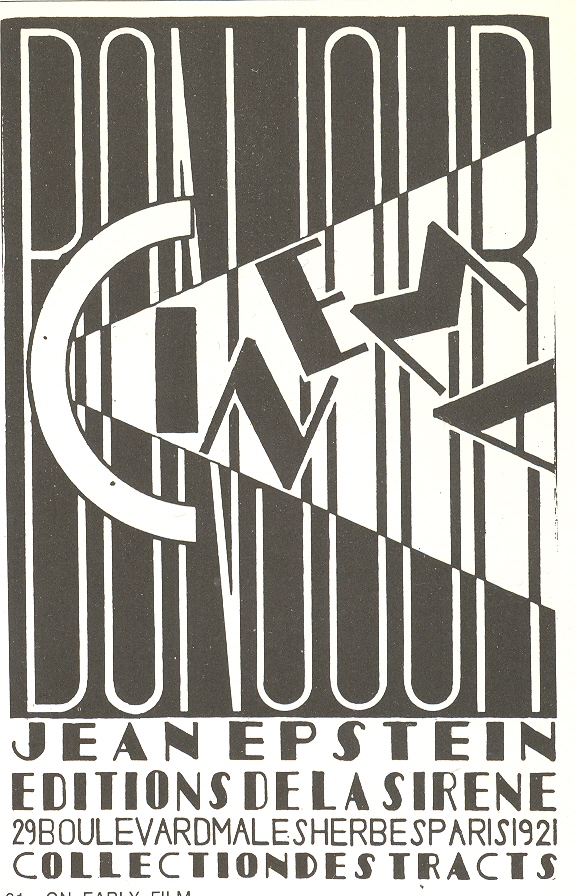
    like, for example, the cover of the pamphlet Cinema by J. Epstein, where the letters are a jumble for just a
    moment and then snap into view.  The
    Loeffler portrait is much more densely hidden in a much more straightforward
    manner, and fools my mind every time. 

     Notes++ Nov 24 cinema

    1.Altenberg is probably a product of his time, or a time of
    his product.  Described as the bohemian’s
    bohemian, he lived an outre lifestyle in little cafes and bars, wearing capes
    and broad-brimmed hats, and was evidently something of an effeminate womanizer
    with a very deep interest in very young girls. 
    There you go.  Altenberg stood
    quite high in that world, as Alban Berg put some of his postcard-poetry to
    music in his Five songs on picture postcard texts by Peter Altenberg,
    which caused a near-riot in its premier, abruptly stopping the performance
    which would not see the light of day again for another 40 years.

    ·Posted by :

    ·in:

    — —

  • Found Images Within Images: Dropping Your Hat in the Punic Wars

    JF Ptak Science Books LLC  Post 850  Blog Bookstore

    There is a
    particular class of illustration in which, among the secondary figures of the
    image, there is a small happening, an everyday trifle, that has been captured by
    the artist and included in the overall communication for no necessary
    reason. (for example, see here and below1). I’ve written about this a little
    before on this blog in posts about finding images-within-images: the
    unecessaries among the unnecessaries, the bits and pieces of everyday human existence
    that in and of itself is not worth commentary but which nearly everyone
    experiences.  Small bits, they are, of a
    tremendous human nature, the things that are done in private, or are so
    universal but inconsequential that they are shocking to see when illustrated in
    print.

    ++ Nov 24 dropped

    Titus Livius (59
    BCE-17 ACE), better known to the English-speaking world as Livy, was a superior
    among superiors of Roman historians, writing on the history of his city and
    country.  His work, Romische Historie…,
    published in Mainz by Johann Schoeffler 1450 years later in 1514, was one of
    the most beautifully illustrated books ever produced in that city.  This is a considerable statement, as Mainz was the birthplace/hotbed
    of moveable type printing, being home to Johann Gutenberg and a number of other
    early presses. 

    And in looking at
    this fantastic work by Livy, I am a little embarrassed to find this spectacular
    bit of human tendency displayed in this woodcut depicting a naval engagement
    during the Punic Wars.  It is a beautiful
    thing, this scene of warfare depicted on tranquil seas and ribbony waves,
    determination in every face.  But what I
    noticed in the small boat at bottom right is a man reaching out into the water—not
    for a dropped oar, or to help a man overboard, or to catch his falling
    sword. 

    ++ Nov 24 dropped det
    He was reaching for
    his dropped hat. 

    I have reason to
    doubt that during the Punic Wars there may have been an unwritten chapter, “On
    the History of Dropped Hats During Warfare”. 
    Surely soldiers dropped their hats during the history of roman conquest,
    but I’d say that retrieving the headgear was more important at the Battle of
    the Bulge in protecting your noggin from badly splintering trees traveling at
    you at 180 mph and other such places than a wool cap dropped from a ship in pitched
    battle two hundred meters from shore. 

    I like this so
    because it is probably the first reaction that most of us would have—just a
    habit, battle raging or not—and just utterly human.  Just a little piece of back-history that
    doesn’t go anywhere and is lost to experience. 
    I’m sure that Herr Gutenberg dropped his hat at odd times, as did the
    unknown artist of this print.  Just an
    odd bit, like the first things printed on Gutenberg’s press being religious indulgences
    for people paying their way past Purgatory (and worse).  The fact that the indulgences preceded the
    great bible by several years doesn’t really matter, and neither does retrieving
    a dropped hat in a sea battle—but they do make interesting stories.   

    1.  Some other Found Images posts:

    Found Images: Penny Lane and the Inexpensive Treat, London, 1896

    Found Images of the Great Wheel, 1895

    Finding Hidden Images in Antique Prints: 18th
    Century Forensic Social X-Rays of Florence
    by Guiseppe Zocchi


  • Bad Ideas Department: Really Big, Really Bad–Mussolini’s Monster.

    JF Ptak Science Books LLC  Post 849  Blog Bookstore

    “Building
    skyscrapers is the nearest peace-time equivalent of war. In fact, the analogy
    is startling, even to the occasional grim reality of a building accident where
    maimed bodies, and even death, remind us that we are fighting a war of
    construction against the forces of nature.”
    -Col. William A. Starrett, Skyscrapers and the Men Who Build
    Them
    (1928)

    Indeed!  I wonder if Starrett (whose book, or at least
    its cover, is beautifully designed and a roaring bore to read) had this
    proposed building (below) in mind—if so, we could’ve skipped right past WWII
    and declared WWIII. 

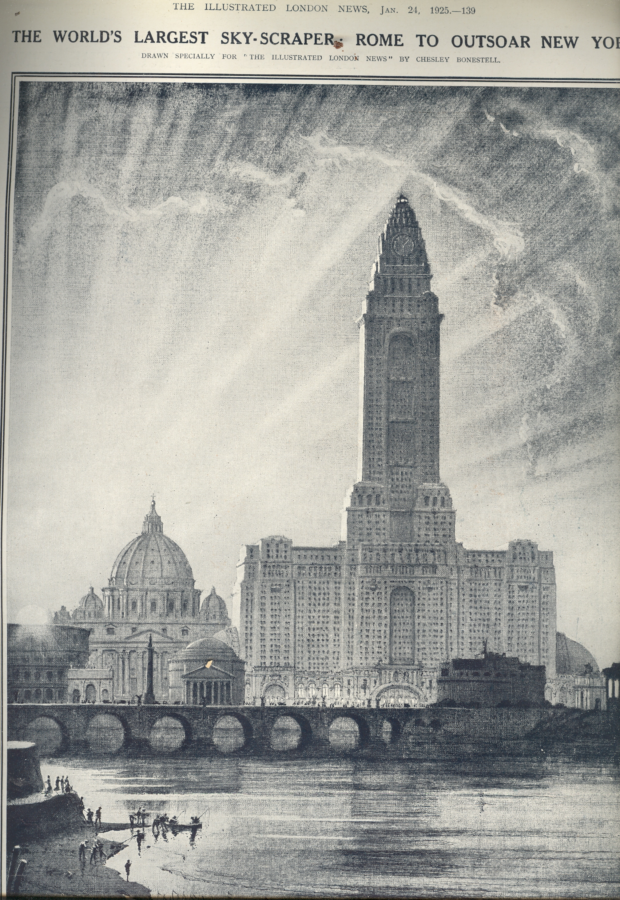
     00 blog nov 23 rome

    It’s a good thing
    that the Roman skyline isn’t punctured here and there by skyscrapers—especially
    those that would’ve been built during the Fascist era.  Take, for example, this planned 1100-foot
    monster, proposed in 1925, in the third year of Mussolini’s government.  This is an idealized cityscape of course,
    created to show height comparisons with famous buildings, but this thing
    (looking very much like Moscow
    University
    ) would’ve
    created a hole in the sky and thrown a suffocating, shadowing presence all over
    the city.  Granted it isn’t as monstrous
    as many of the international style buildings could’ve been had they been a fifth
    of a mile high–that work was left to the cobbled hand of Philip Johnson in
    America—but it is still horrible enough all on its own.  More horrible to think that it could’ve
    swallowed whole the seven biggest buildings in Rome, and was taller than the seven greatest architectural
    wonders of the ancient world stacked one on top of the other. 

    It is curious to
    note that this spaceship-like building was drawn for The Illustrated London News (24 January 1925) by Chesley Bonestell
    (1888-1986), an artist and designer, and known as “the Father of Space Art”.  The best thing that this building could’ve
    done was to light its afterburners and take off. 


  • Out of Context Department: Artists Taken by the Devil, 1620

    JF Ptak Science Books LLC  Post 848  Blog Bookstore 

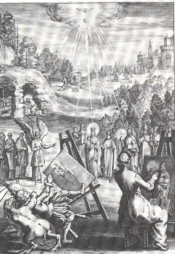
    Mark Twain said that Adam only took the apple not because it was delicious or attractive but because it was forbidden.  I wonder why this operative of Satan was so interested in this artist (pictured below), who was seemingly and boringly making his way through a standard portrait of an imagined vision of the Holy Mother. She and the other holies (some of whom appear to be “simply” human and clerical compared to the rest of the iconic foundations of Christianity) are being bathed in pure holy light; an angel at left, seemingly with nothing else to do, unnecessarily points to the main attraction, making sure that the artists knew that it was the folks with the halos who were to be painted. .  [It would be surreal and interesting to imagine a short sequence in which we see these two artists working busily on their unseen canvases, sweating as the oils fly, recording the celestial scene before them, golden and glowing people illuminated by the light of the creator; finished, the artists reveal their work, one painting the holy congress, while the other turns his  godless landscape canvas featuring the odd tower at right-rear. “I could never paints hands” he might’ve said.]

    ++ blog ++ nov 15 artist The engraving is the work of Bortius a Bolwert (1580-1643 and a pupil of the much better-known Abraham Bloemaert) for A. Suquet’s morality and Heaven/Hell peepbook, Den wech des eeuwich levens…which was printed in 1620. I don’t know what the original message was for this image, unless it was something simple, some punishment for a less-than-pure artist painting purity; perhaps the devil took the artist at death, showing the reader that not only is death available to call at any time, but that the devil was right there, too, to whisk you away to the lake of fire even while your oily hommage to the creator was wet on your easel.  It might well simply be in the dance of death tradition–so beautifully and haltingly executed by people like Albrecht Durer–showing Death visiting people of all ranks and professions, the moment of extinction coming at the time most perfectly illustrating the deathee’s station of life. 

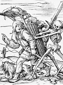
    Also appearing under such titles as Ars moriendi, Memento mori, Vanitas, Dancs Macabre,  the Skeleton Dance,  la Danza de la Muerte, Totentanz, and the Chorea Machabæorum, among others, the idea of the Dance of Death existed as morality plays and in literature for many centuries.  In the years before printing in Europe, there were many versions of time’s massacre in frescoes in churches and chapels all across Europe (see here for an interesting chronological listing) as well (of course)as in myriads of manuscripts.  In addition to Durer, some of the early post-Gutenberg masters of this genre included Konrad Witz,  (1460); Bernt Notke,  (1463); Hans Holbein the Younger (1538),  Daniel Nikolaus Chodowiecki,r Johann Elias Ridinger.  (See here for an introduction to and explanation fo the Holbein cycle.) Holbein pedler
    In music too the Dance of Death scenario is seen many times:  the Danse Macabre (by Camille Saint-Saëns, 1874); Songs and Dances of Death, (by Modest Mussorgsky, 1875); Dance of Death in Symphony No. 4, 2nd Movement (by Gustav Mahler, 1901); Mattasin oder Toden Tanz, (by August Nörmiger, 1598);  (Dance of Death), in Ballad of Heroes, (by Benjamin Britten, 1939); Dance of Death, in Trio in E Minor, op. 67 (by Dmitri Shostakovich, 1944); Totentanz ( by Franz Liszt, 1849 AND Felix Woyrsch in 1905 AND Arnold Schoemnber in 1914 AND Wilhelm Kempff in 1931, and on and on.  I didn’t mean to go on about this, but just wanted to make the point that the Looming Nature of Death really was so in Medieval and Renaissance Europe–and where death as waiting at virtually every turn, the Devil wasn;t too far behind. 

    (Also, see Bibliodyssey for a wonderful woodblock book of the dance of death.)

    ·Posted by :

    ·in:

    —

  • Early Ennui in Art–a Peek at the Illustrated History of Boredom

    JF Ptak Science Books LLC  Post 839  Blog Bookstore

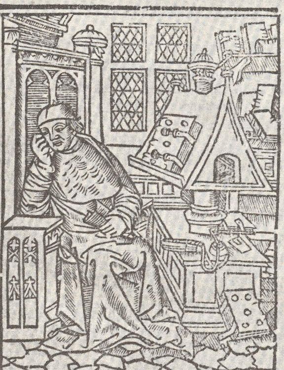
    0 ebay nov 18 ennui What struck me about this print–instantly–was the emotion of our languid reader: ennui.  Ennui is a very uncommon emotion in early prints, at least for my experience.  As a matter of fact only .75% of all published prints exhibited “ennui” as its “reigning and ruling emotion”. Of course that’s an imaginary statisitc–after all, made-up and imaginary statistics (yes, there is a difference) are much more reliable to their subjects than are real statistics, which  can offer problems in envisioning a particular reality.  But ennui really is uncommon, and this man is wrapped in nothing but.

    0 ebay nov 18 ennui 001

    Perhaps we don’t see ennui, or boredom, earlier on in art (and
    in literature for that matter) because the free time for feeling these emotions
    hadn’t yet been invented.  So to speak.  Boredom is a luxury affordable by the few.  Certainly this reader, seated near his Jacobian
    bookcase with several large books in a comfortable setting, could certainly afford
    the idea of free time and thus the added fabulousness of boredom.  And so it is that we see him enjoying his shroud,
    here.  


    The woodcut comes from a famous and early work on family medicine,
    hygiene really, Healthe, for all manner of
    syckenesses and diseases…
    by Andrew Borde, and printed in 1557.  

    A history of boredom might well be in order…


  • Found 17th Century Dadaist Art

    JF Ptak Science Books LLC  Post 827  Blog Bookstore

    ++ blog nov 9 scarlattini 001

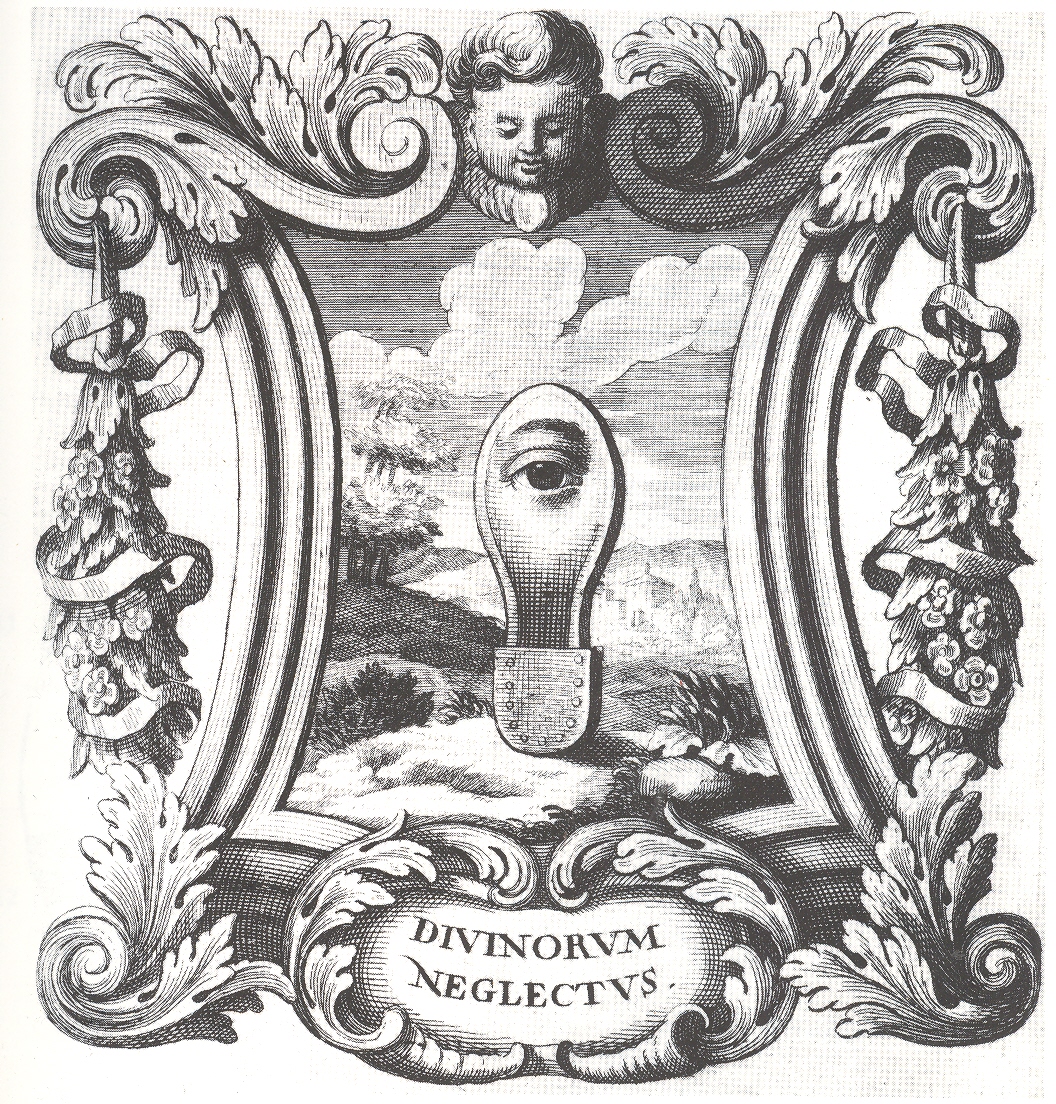
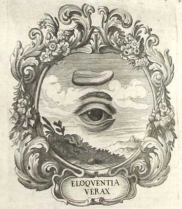
    I found these iconographic images by Ottavio Scarlattini1 (1623-1699)
    simply irresistible–and even though I really don’t quite understand them (at
    least in their correct and original sense and intention), lost to me as they
    are to a more classical education and deeper understanding of Baroque
    symbolism, I can imagine plenty of re-iconographized (?!) meanings.  Not having a more specialized knowledge to
    understand their published intentions perhaps allowed them to have a  strangely modernistic pull on me, making many
    of these Scarlattini designs seem more Dadaist than a 17th century work
    displaying visual characterizations of morality tales wrapped around human
    anatomy. .  If  you changed the vocabulary to interpret this
    artwork—or just simply removed its intention– it changes its era, and moves
    very cleanly into the genre of the surreal. 
    It feels to me that this sort of transformation is not at all common,
    especially when you move the centuries and the genres so crisply and
    elegantly. 

    Doesn’t the “Divinorum Neglectus” suggest something that could’ve
    been produced by  more-antiquarian versions of Raoul Haussmann or Hannah Hoech or Paul
    Delvaux?  It does me.  If you made this a three-dimensional piece it
    could feel like Ernst or Duchamp, its emblematic/hieroglyphic nature
    transforming before your eyes.    (I wonder if Duchamp or Dufuy were influenced
    by the iconographists from this period?)

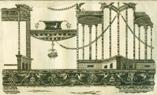
    This transference game works nicely with other emblem books, and even with some of the large and spare frescoes from Herculaneum when rendered in black and white as engravings…and also for some of the Framenti of Piranesi, but not too many other places in Western art.  Yes?

    ++ blog nov 9 scarlattini

     ++ blog nov 9 triumph

    An engraving of a fresco from Herculaneum (printed ca. 1760):

    Herculaneum Architektur5-jpg

    Notes:
    1. SCARLATTINI, Ottavio  HOMO ET EJUS PARTES, FIGURATUS ET SYMBOLICUS,
    ANATÓMICUS, RATIONALIS, MORALIS, MYSTICUS, POLITICUS, ET LEGALIS, COLLECTUS ET
    EXPLICATUS CUM FIGURIS, SYMBOLIS, ANATOMIIS. opera et studio R. D. Octavii
    Scarlatini,. nunc primum ex italico idiomate latinitati datum a R. D. Matthia
    Honcamp, (.). II volúmenes en un tomo. L. Heckenauer grabador, and printed in
    1695.


    Scarlattini produced one of the great masterworks of
    emblematic knowledge while at the same time writing on human anatomy and
    physiology. 

    The entire book located here http://www.uni-mannheim.de/mateo/camenaref/scarlattini.html

    ·Posted by :

    ·in:

    — — —

  • “Lesser Light Rules the Night…”—an Early Picture of Multiple Universes?

    JF Ptak Science Books LLC  Post 823  Blog Bookstore

    Blank and Empty Things #56

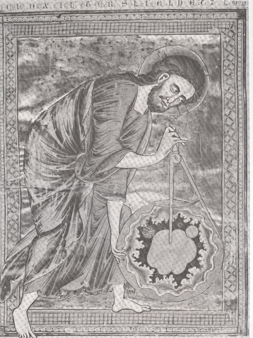
    This sort-of
    famous image, found in a French Bible
    Mortalisee
    made in Reims in the 13th century,

    Creator measuring

    displays The
    Creator measuring its creation, a sphere of the universe containing all of the
    stuff of creation, and including the Earth (pictured at upper right).  At least that is what I think this is—Creator
    stepping into the frame (its right foot outside the drawn border of the image),
    holding everything that it has made, and holding it all in the midst of another
    environment of some sort.  What that
    place might actually be, I don’t know. 
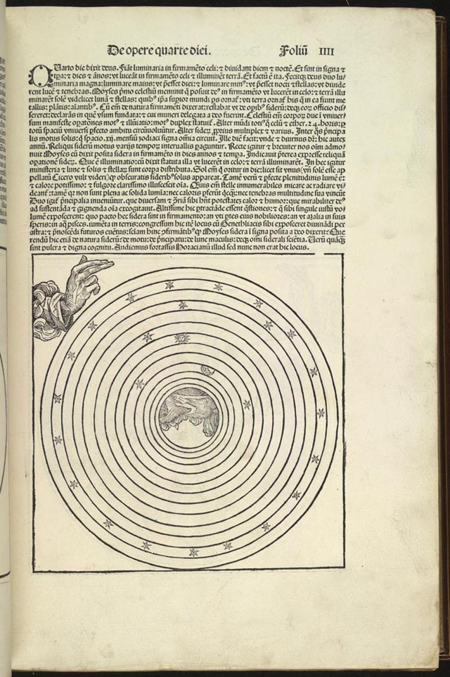
    Is that the space in-between the light created on the fourth day
    (pictured below from Schedel’s so-called Nuremberg Chronicle of 1493), the space
    that wasn’t the greater light to rule the day and the lesser light to rule the
    night?  In this spirit it was the stars
    that were supposed to separate these two lights, but the stars themselves in
    many of the concentric circle cosmologies weren’t part of the Heavenly sphere
    itself, which is what the Reim’s illustrations seems to say.  I suppose that it is all simply displayed
    somewhere in the OT, but from where I sit right now, this looks like a
    painfully early Western image of multiple universes. 

    Creator 4th day The other thing is:  what is the Creator looking at?  It is definitely very focused and wide-eyed, and is lasered on something about half of the diameter of the universe to the right, just on the other side of the dividers. Is this the biggest of the Blank and Empty Things that can be imagined? 


  • Beautiful Title Pages 7: Gorgeous Design for Childen by Christoph Weigel, 1726

    JF Ptak Science Books LLC  Post 819  Blog Bookstore

    “O Babees yonge, my Book only is made for youre lernynge” says what well may be the first book made in the West for children, written in the 14th century.  It was made for the eyes of noble blood, of course, and was basically a contribution towards how the children should act and behave, rather than teaching them anything outside of their immediate interactions with each other or their parents.  Books of manner and behavior was the dominant—if perhaps the only(?)—category of books for children until the late 16th century.

    John Locke, in his Thoughts on Education (1691), suggests that “when a child begins to read, some easy, pleasant book, like Aesop’s Fables or Reynard the Fox, with pictures if possible, should be put into his hands”. He adds, “What other books there are in English of the kind above-mentioned, fit to engage the liking of children, and tempt them to read, I do not know, but am apt to think, that children, being generally delivered over to the method of schools, where the fear of the rod is to enforce, and not any pleasure of the employment to invite them to learn, this sort of useful books, amongst the number of silly ones that are of all sorts, yet have had the fate to be neglected; and nothing that I know has been considered of this kind out of the ordinary road of the hornbook, primer, Psalter, Testament, and Bible.” (This quote from C.M. Watkins article in The Atlantic Monthly, 1880.)

    Preview

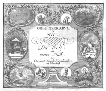
    Perhaps the most beautiful of early books for children is found behind this deeply designed title page, brought to us by Christoph Weigel (German, 1654-1726), the author, illustrator and engraver of Die Welt in einer Nuss oder die Historien vom Aufgang der Welt…1 published in Nurnberg in 1726.  The book was a tall, thin production, with 16 pages of text and 43 engraved plates, much like this one, emblazoned with emblematic studies and dedicated to a particular point in the historical continuum.  And it was intended, believe it or not, for children—the title can be basically translated as “The World in a Nutshell” and was absolutely intended for kids, compressing all of the human story into 16 terse pages and a whole bunch of gorgeous illustration. This image shows the second millennium after the birth of Christ, illustrated with seven engravings (secula septem).

    Notes:

    1. Weigel, Christoph: Die Welt in einer Nuß oder Die Historien vom Anfang Der Welt samt deren Zeit-Rechnung bis auff unsere Zeit auf eine besondere und ganz leichte Art kurz zusammen zufassen oder ausgebreitet in einem Augenblick auf einer einigen Tafel zu wiederhohlen, fürgeschrieben und fürgebildet. [Nürnberg]: 1726

    A short timeline of Early Children’s Literature:

    Orbis Pictus (1658) by John Amos Comenius: perhaps the first book of stories written for children to be illustrated. 

    Charles Perrault, the inventor, perhaps of the new genre of the fairy tale,  wrote (in the 1660’s-1690’s) tales that include Le Petit Chaperon Rouge (Little Red Riding Hood), La Belle au bois dormant (Sleeping Beauty), Le Maître chat ou le Chat botté (Puss in Boots), Cendrillon ou la petite pantoufle de vair (Cinderella), La Barbe bleue (Bluebeard), Le Petit Poucet (Hop o’ My Thumb), Les Fées (Diamonds and Toads), La Marquise de Salusses ou la Patience de Griselidis (Patient Griselda), Les Souhaits ridicules (The Ridiculous Wishes), Peau d’Âne (Donkeyskin) and Riquet à la houppe (Ricky of the Tuft).  Some of the stories were simple, some not; some were hard, some not.  Reading the originals (or close to them) and reading them fully leaves them outside my taste, especially for kids.

    A Token for Children. Being An Exact Account of the Conversion, Holy and Exemplary Lives, and Joyful Deaths of several Young Children (1672) by James Janeway. One of the first books specifically written for children and which shaped much eighteenth- and early nineteenth-century writing for kids–as you can tell, not a happy go.  Its a wonder we’re all not dead.

    The Pilgrim’s Progress from This World to That Which Is to Come by John Bunyan (1678):  Christian allegory serving as a model for many more such works to come.

    A Little Pretty Pocket-Book (1744) by John Newbery: avery early book of really nothing but fun and a few promos.

    The Governess; Or, Little Female Academy (1749) by Sarah Fielding: Often described as the first novel for children

    Lessons for Children (1778-9) by Anna Laetitia Barbauld.  A best-selling book series made for little and grubby hands, easy to hold, wide margins and easy to read and adaptable to different age groups. 

    The Brothers Grimm (German: Die Brüder Grimm also Gebrüder Grimm), Jacob (1785–1863) and Wilhelm Karl (1786–1859). Myths and stories told without holding back on what might cause years’ worth of nightmares. Very tough going by today’s standards. Very.

    Hans Christian Andersen (1805–1875) fairy tale-ist,  “The Snow Queen”, “The Little Mermaid”, “The Emperor’s New Clothes” and “The Ugly Duckling”; storie smore suited for a kinder and more comfortable bedtime once th elights go out.

    ·Posted by :

    ·in:


  • The Devil in the Mirror, ca. 1560

    JF Ptak Science Books LLC  Post 817  Blog Bookstore

    There’s plenty of interesting images in the Renaissance and Baroque
    featuring images caught as reflection in a mirror, none more famous I guess
    than Van Eyck’s marriage scene (which I’ve written about several times in this blog, most recently in “Original Reflections: unique experiences with mirrors, Van Eyck and Brunellesci, here).  What is unusual here is that we
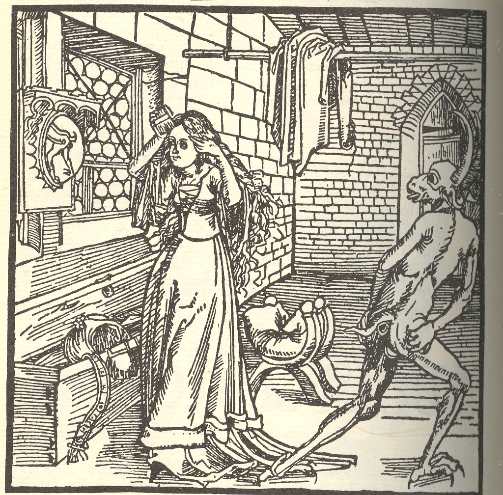
    see the Devil in the mirror (actually the devil’s hindquarters), which to my
    experience is very uncommon. Also I thought the phraselet “the Devil in the
    Mirror/Mirrour” was well used and worn, but, as it turns out, it is hardly so,
    though there’s a near-alphabet of things that the devil could be in. 

    Blog 11 01 devil mirror For example, when looking through FirstSearch/WorldCat (a massive catalogue
    of books in libraries world wide and a cataloguing librarian’s best friend) for
    the things that a devil might be in, as in the phrase “the devil in the ____”
    we find the devil in a belfry, book (a Dalton Trumbo novel!), bush, candle, cheese,
    classroom, cross, dark, details, drain, desert, deep blue sun, flesh, fog,
    gateway, hills, junior league, kitchen, Middle Ages, milk, modern world,
    mountain, New World, shape of a woman. 
    The devil in the mirror turns out only to be so in a song. 

    None of this amounts to a hill of 
    ____  (beans, cocoa, molasses,
    moolah, fritos), but I found it unusual that the phrase and the whole
    devil-in-a-mirror idea to be so scarce. 
    Unless he can’t be seen in a mirror….No wait, that’s a vampire

    I know I’m wasting this image with this trivial pursuit when a decent writer would be looking at Satan over the ages, or its virtual non-appearance in the Bible, or the different names of the devil or its infernal helpers, and its other unholy images, or the history of Hell itself., or of the history of guilt, or fear (see Jeff Donlan’s lovely appraisal of Daniel Gardner’s The Science of Fear, which doesn’t really have anything to do with the devil but is a great idea) or temptation, or general unacknowledged dark worry.  I just stuck to the picture. 

    This naturally leads to looking at some antiquarian
    book titles involving devils and the nonsense and hokum that they got into.  Here’s a few lovely examples of titles-as-long-as-opening-paragraphs;
    it seems that the less old they are the less detailed they become.  But I’m probably wrong about that, too. 

    The displaying of supposed witchcraft : wherein is
    affirmed that there are many sorts of deceivers and impostors, and divers
    persons under a passive delusion of melancholy and fancy but that there is a
    corporeal league made betwixt the devil and the witch, or that he sucks on the
    witches body, has carnal copulation, or that witches are turned into cats,
    dogs, raise tempests or the like, is utterly denied and disproved ; Wherein
    also is handled, the existence of angels and spirits, the truth of apparitions,
    the nature of astral and sydereal spirits, the force of charms, and philters;
    with other abstruse matters
    /
     
    Author: Webster, John,
    1610-1682.

    War with the
    devil, or, The young mans conflict with the powers of darkness in a dialogue :
    discovering the corruption and vanity of youth, the horrible nature of sin, and
    deplorable condition of fallen man : also a definition, power, and rule of
    conscience, and the nature of true conversion : to which is added an appendix
    containing a dialogue between an old apostate and a young professor, worthy the
    perusal of all, but chiefly intended for the instruction of the younger sort
    /
     
    Author: Keach, Benjamin,
    1640-1704.

    A Whip for the Devil, or, The Roman conjuror
    discovering the intolerable folly, prophaneness and superstition of the papists
    in endeavouring to cast the Devil out of the bodies of men and women by him
    possest …
    /
     1683

    I find these title strangely satisfying, much like the dime library westerns of the late 19th century with their tow-parter extendo-titles:  Valerie of the Blazing Sands; or, Colonel Ingraham and the Satisfied Sod Buster, a Tale of Woe and Heroism and such.