A Daily History of Holes, Dots, Lines, Science, History, Math, Physics, Art, the Unintentional Absurd, Architecture, Maps, Data Visualization, Blank and Missing Things, and so on. |1.6 million words, 7500 images, 4.9 million hits| Press & appearances in The Times, Le Figaro, Mensa, The Economist, The Guardian, Discovery News, Slate, Le Monde, Sci American Blogs, Le Pont, and many other places… 5000+ total posts since 2008.

Category: Art History

  • Bubble Cosmology: J.J. Grandville and a Soapy, Watery “Little Bang”, 1844

    JF Ptak Science Books LLC  Post 705  Blog Bookstore

    Finding the Big Bang in a bowl of soapy water.
    ==Blog August 5=primum

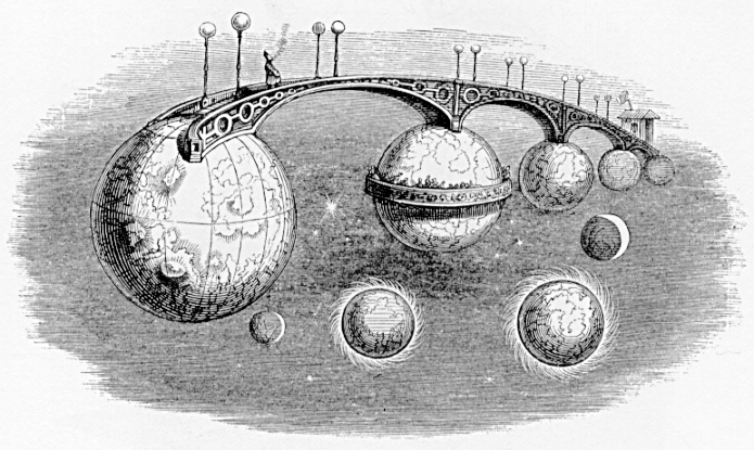
    Last year I wrote a little aboutJ.J.Grandville’s interplanetary
    bridge connecting some of the planets (and including a balcony constructed of Saturn’s
    ring [sic] in an early Victorian Grad Tour solar system walkabout.  Grandville (the pseudonym of Jean Ignace Isidore Gérard,
    born in 1803 and staggering too quickly out of life in 1847) was an extraordinary
    talent working somewhat out and ahead of his time; he had superb visions of the
    future, and of the past, and most of them were fantastic and fanciful, though
    not without some very stinging social commentary.  He has been called a proto-Surrealist and I’d
    have to agree, though for me he had a larger production of social commentary in
    his work than any of the “real” Surrealists of the 20th
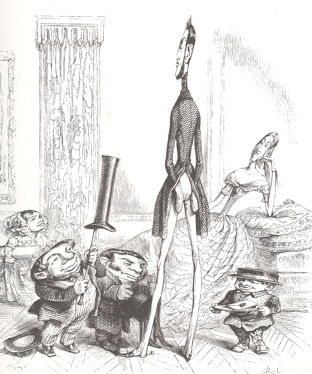
    century.  For example, in his Un Autre
    Monde
    (“Another World”) he depicts people’s 
    social stature literally—the taller and thinner, the more socially important;
    the shorter and stouter, the more disposable/replaceable; the images are funny,
    convincing and wincingly penetrative.
    Grandville-large

    This being said, I have a special interest in the
    astronomically-based images that he produced, and so far as I can tell, there
    weren’t many of them in his vast output. 
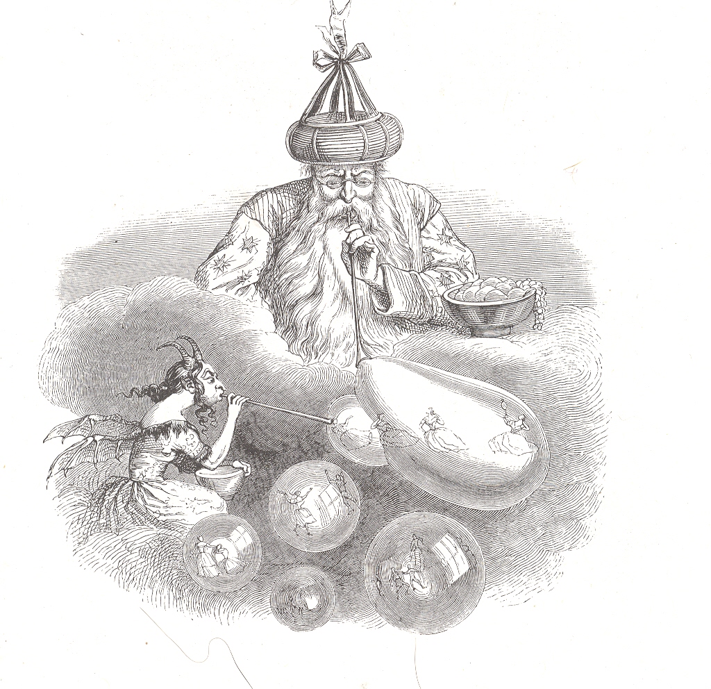
    In chapter 25 (“The Mysteries of Infinity”) of Un Autre Monde
    Grandville rolls out the great maker of the universe, the Primum Mobile, the
    Motive Force, the First Mover.   The old scamp was busy and on display for Grandville’s character Hahbble, who
    floats around in the cosmos, and comes face-to-face with what in the end is
    Einstein’s dice thrower, as much as the great physicist didn’t want him to be,
    nor is he subtle (Raffiniert ist der Herr Gott,  aber boshaft ist er nicht!)  The malicious (“boshaft”) part would be
    supplied by someone else looking intent and dangerous, while the great maker turns out to
    be a magician who is happily creating the matter of all stuff by making it all out of
    bubbles.

    (I feel relatively certain that Grandville is the first artist to propose the
    bubble theory of cosmology, and he is among a select and restrictive minority
    who allocated such a seemingly meaningless activity with the creation of creation.  I like its playful nature, though I wonder if
    his approach was seen as a deep mockery and perhaps heretically insulting to
    the religco-forces that helped and plagued the 19th century. Mostly it seems he was left behind int he appreciation part of acknowledgment, glory faded before his eyes; his work wasn’t necessarily prized during his lifetime, and
    he had his share of brutal reviews for his great adventures.  Paul St. Victor, art critic, wrote that
    Grandville “wanted to dance on the clouds in leaden shoes”and “tried to get to
    heaven on a bus”.  That’s a tough go. Death did bring him some fame as M. Grandville slept with the worms; publishers used his illustrations mostly without gratuity to any estate, the images showing up all over the place through the end of the 19th century.  His cuts were used again and again,the blocks being progressively degrade until the fineness of Grandville’s eye and incision were lost to overuse–it is easy to see the difference in crispness and clarity between the early printngs of his pictures with the later ones, his sharp edges getting rounded by greed and use and time.3)

    I imagine this magician to be “almost” infinitely large and
    small (what does “almost” infinitely mean?) , blowing bubbles on a large galaxy
    scale, the bubbles containing other 
    galaxies; or smaller yet, other solar systems; and smaller yet, other
    planets.  And taking it down to the other
    extreme, he could be sub-atomic, blowing bubbles of existence and shaping the bumpies
    of quantum foam in spacetime, letting loose the primordial bits that would
    become molecules that would or would not rise from the unpretty Dirac sea,
    living just on the other side of measureable in space and time, shaving
    barely-measureable slivers away from Planck length1 and Planck time2.  Or maybe the old man is putting the white
    into Schwarzchild wormholes. 

     Maybe he’s just blowing the bubbles of possibility and
    chance, and his unacknowledged accomplice is injecting the mote in god’s eye.

    Notes:

    1. The Planck length 1.616 x 10 -35 (meters) which is the
    smallest measureable space in the universe (comprised of Planck’s constant, the
    gravitational constant and the speed of light) which in turn leads to

    2.  Planck
    time, which is the amount of time it takes for light to traverse one Planck
    length in a vacuum,  5.39 x 10 -44 seconds),
    which is basically the smallest measureable unit of time, or for time that
    would mean anything. 

    3.  While ill with his own fatal bit, he composed
    his own epitaph;  Here Lies Grandville;
    he loved everything, made everything live, speak and walk, but could not make a
    way for himself”. 

    There’s actually quite 
    a nice turn of phrase in the wiki article on Grandville—quite nice,
    really—which I include here:  “Though the
    designs of Grandville are occasionally unnatural and absurd, they usually
    display keen analysis of character and marvelous inventive ingenuity, and his
    humour is always tempered and refined by delicacy of sentiment and a vein of
    sober thoughtfulness.” He evidently lived a hard-ish life, not the least of which
    were the deaths of his wife and two children in the early 1840’s.  

     Some of Grandville’s other interesting works include:

    Les petites miseres de la vie humaine (The Petty Sorrows of
    Human Life) 1843

    Un Autre Monde  1844

    Cent Proverbes  1845

    Jerome paturot 1846

    Les Fleurs animees (The Personified Flowers) 1847
      ==Blog August 5=tall


  • Dots in Revolutions of Modern Art: Seurat & Kandinsky

    JF Ptak Science Books LLC  Post 683  Blog Bookstore

    Part of the History of Dots series

    It is interesting to think of the importance of dots in the first revolutionary changes in 500 years in the history of art.  Honestly, there wasn’t anything epochal that happened between the re-discovery of perspective (ca. 1330-1400) and the arrival of Impressionism (and just afterwards of non-representational art) in the 1872/3/4-1915 period.  

    Suerat Dots aren’t brought to bear formally in the revolutionary movement until the early 1880’s.  Impressionism for all intents and purposes is formed with the Societe Anonyme in 1872 (whose members included Monet, Pissarro, Degas, Sisley, Morisot and eleven others), and perhaps more realistically in 1874 when the Societe exhibited its first salon.  (The first show held at the Nadar Studio in Paris in April 1874; a tiny, one month long affair, compared to mammoth exhibitions like the Universal Exposition in Paris in 1867.) 

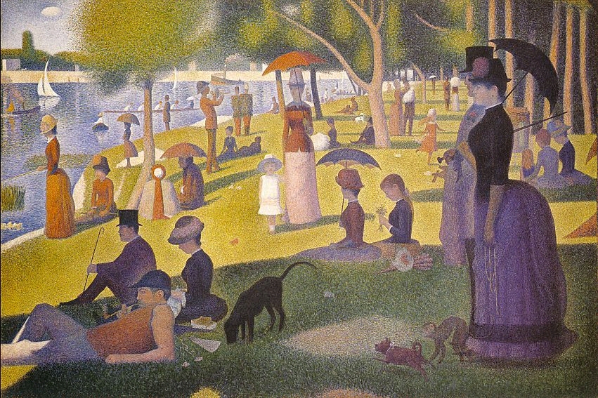
    It was Georges Seurat who brought the whole world to the dot experience with his artisitc method of Pointilism, in particular with his magnificent Un dimanche après-midi à l’Île de la Grande Jatte, an enormous work given its composition—dots.  The dots replaced the brushstroke, and their placement in relation to their color was an absolutely brilliant innovation, establishing a perfect result for the viewer when examining the work as a whole.  (It may well be that the French chemist an designer Michel Chevreul made this discovery a few decades earlier, noticing the effect and changes in color depending on placement and—in his case, with fabric—color in the dyes for his material.)

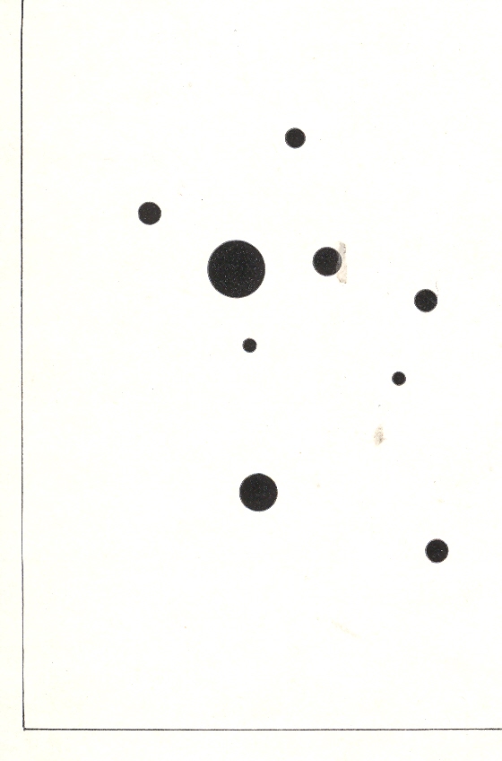
    Wassily Kandinsky (1866-1944), the discoverer of nothingness in art and the introduction of the first BLOG==july 13=kamd non-representational paintings in art history (1913) used his fair share of dots in his exploration of the previously invisible.  One good example is his 9 Points in Ascendance (1918), which is nothing but black dots, an impossible composition just two decades prior to its creation. 

    In the middle of this appeared the half-tone illustration, the great liberator of photographic illustration in popular publication.  Invented in the late 1870’s by Stephen Henry Horgan and used in the Illustrated London News for the first time in 1881, it made the publication of accurate images much feasible and economical.  No longer were readers dependent on the accuracies of artists interpreting photographs or photographed scenes—the photographs themselves were now publishable at little cost and in high quality, vastly increasing the veracity of published reports dependent upon images.  This was revolutionary in its own way, democratizing the sharing of images and icons.

    And so in just thirty years the lowly dot availed itself of some of the most spectacular achievements in modernism.  Of course we can say the same of the line, but this is, after all, a history of dots. 

    ·Posted by :

    ·in:

    — —

  • Vision: Looking Straight Up, Down, Across and Through–1525-1905

    JF Ptak Science Books LLC  Post 679  Blog Bookstore

    “Vision:  a device that belongs to those who have it. Far-reaching and fore-shortened, it is something that works best when used closely, loosely, finely and not at all. A gift-and-a-half and a half-a-bother.”  
    The imagined Devil’s Dictionary of Ambrose Bierce

    [See also my post Perspectives: Inside Looking Out, Outside Looking In]

     
     There is a BLOG==july 9--perspective Downsmall series of posts on this blog that deal with the perspective of lookinBLOG==july 9--perspective upg at things straight-on:  straight up, straight down, straight across.  As it turns out, in my many years of looking at prints and images, view that look directly up and down are pretty uncommon.  Some of the earliest straight-on images actually offered a new vision to people who were so long accustomed to not looking at things in this way.

    BLOG==july 9--perspective Down

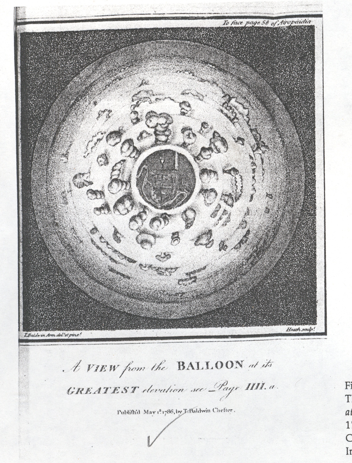
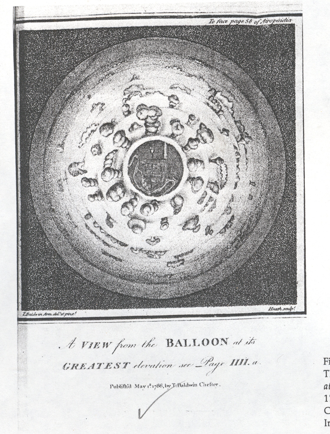
    And for a long time it was just not possible, not really, to look straight down at something from a height, or at least until the invention of flight at the hands of the Montgolfier brothers in 1783.  This first image offers a view looking straight down from a balloon through a bank of clouds and onto a town, and was drawn and published in 1786.  It must have been shocking to see this for the first time in that year, the image so unexpected and mostly not imaginable.  One of the other aspects here is that the viewer is looking obliquely down from the tops of clouds, the first time that this was ever done—so far as I can determine—with a scientific vantage point. 

    BLOG==july 9--perspective up

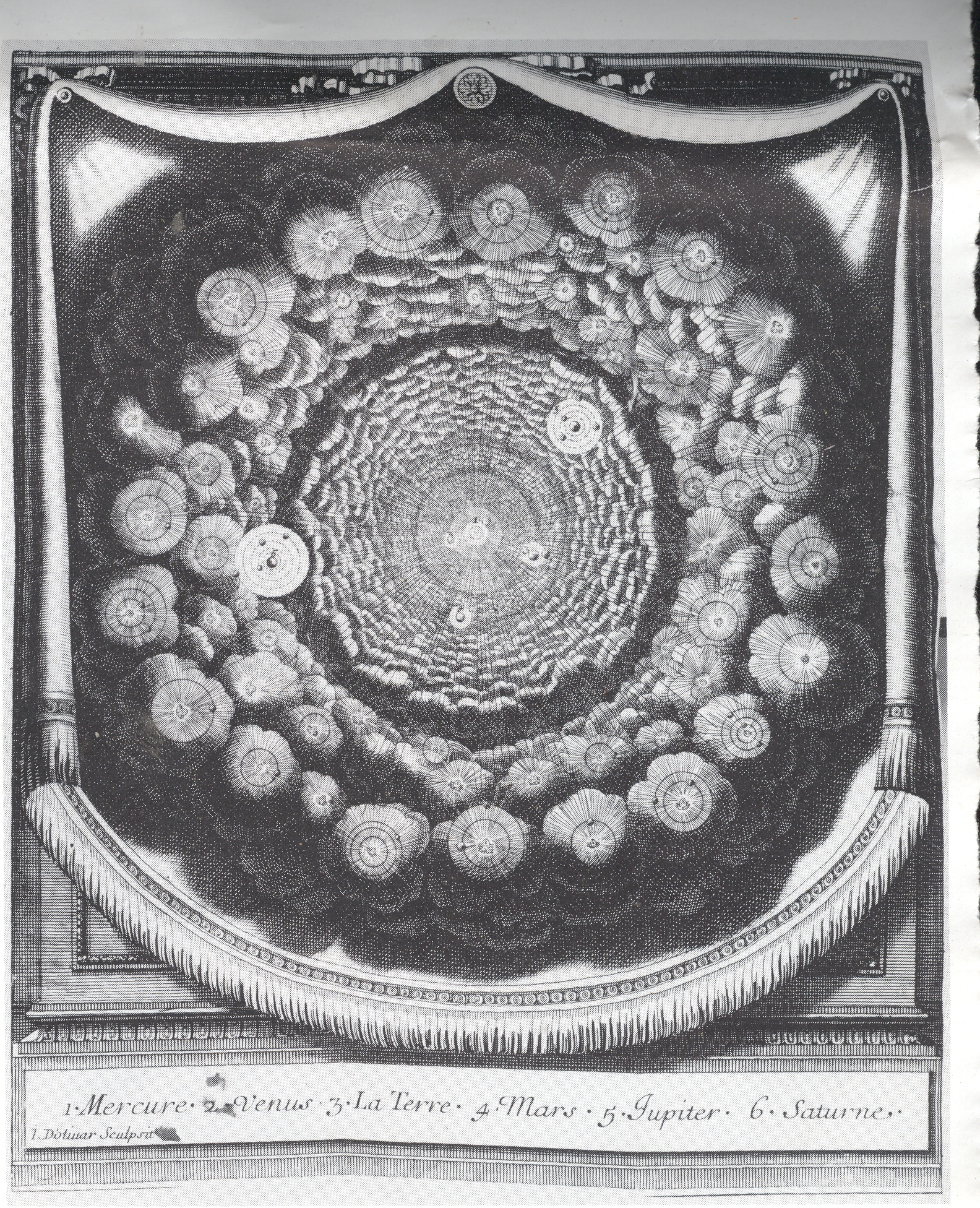
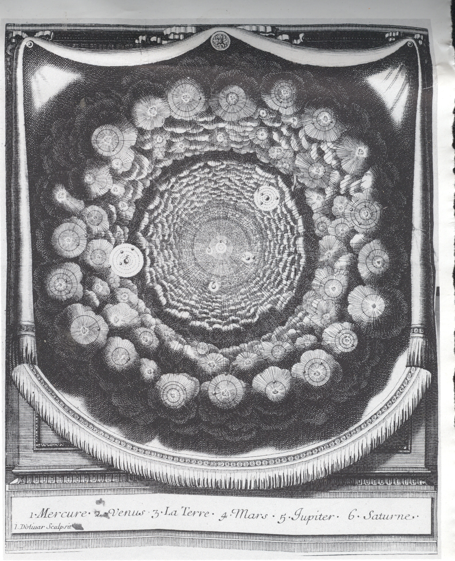
    The seeming complement to this image is from Entretiens sur la Pluralitie de Mondes (Conversations on the Plurality of Worlds), written by the great French philosophe Bernard le Bouvier de Fontenelle in 1686 (just a year before publication of perhaps the greatest work in the history of science, Newton’s Principia Mathematica). The Plurality was a best-seller by the best-selling Fontenelle. An excellent attempt by a rather restricted writer to engage the population-at-large, writing a high-pop book on what was basically the history of astronomy and cosmology of the preceding century. Copernicus was a major feature of his imaginary conversations with a muse as he wandered through a metaphorical garden of questions, with the observations of Galileo and Cassini also very prominently featured. But what interests me here is the great similarity between the two, the view from the balloon looking down, and the Fontenelle, looking up.  (Or what would pass for “up” in space.)  Except that the cloud-y looking things in Fonetenelle aren’t clouds at all, but solar systems.  This was a radical, church-pounding idea at the tiem, displacing the unique centrality of the human condition, offering the possibilities of other lives on other solar systems and other planets

    BLOG==july 9--perspective across . 

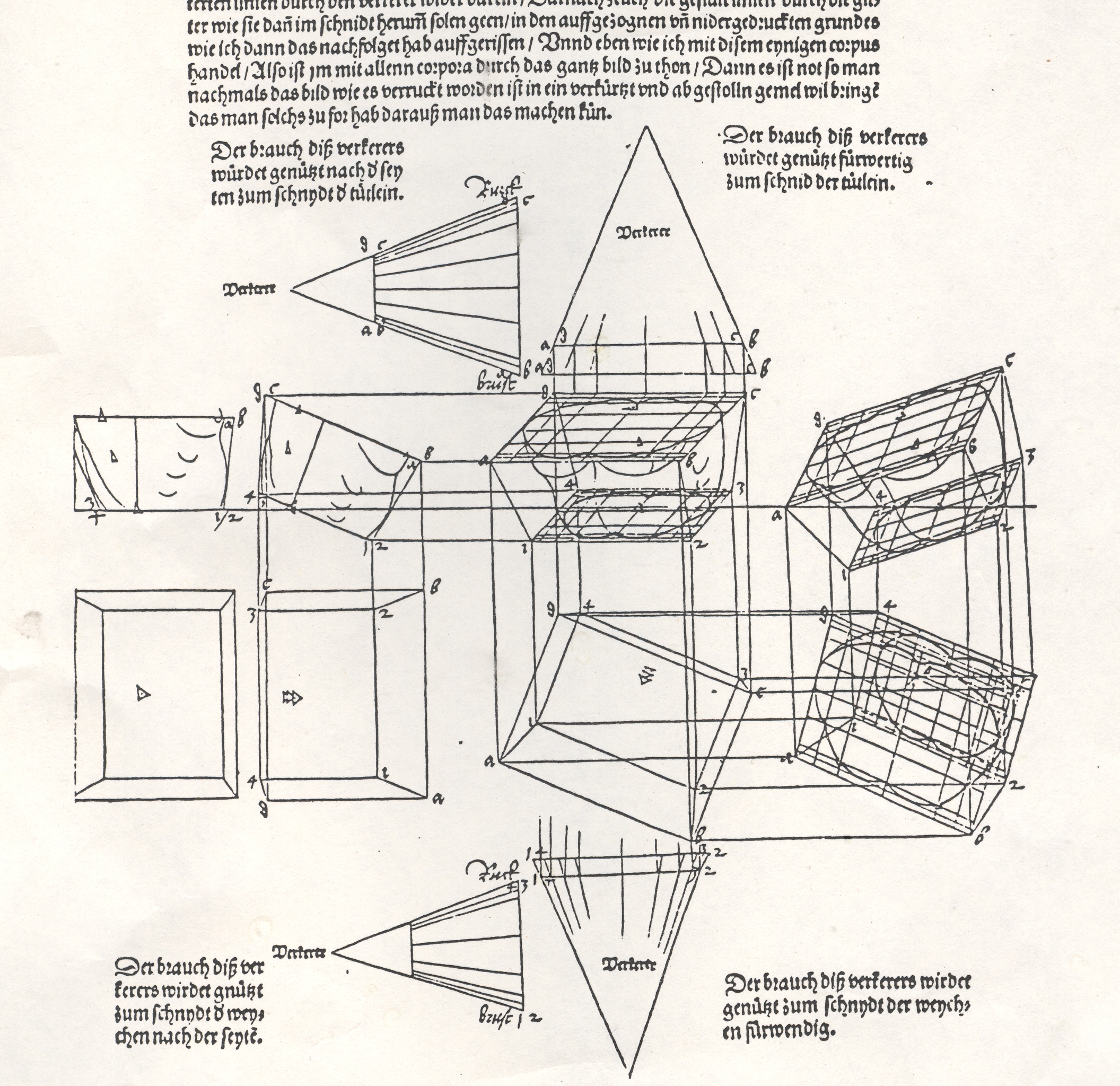
    Albrecht Durer’s (1471-1528) drawing of a geometrical man was an amazing–startling, even–object to the early 16th century consciousness. His Underwysung der Messung (“Treatise on Measuring”) written about 500 years ago (in 1525) set the stage for this next work–it is here that we find some of the most recognizable of Durer’s illustrations of the instruments that he employed to do his perspective work:   his …Symmetria partium…humanorum corporum (1537) was a masterpiece, and a key piece of revolutionary visionary thinking.  Durer–so far as I can tell–created an orthographically rotating human figures in three-dimensional trapezoids, creating incredibly human-like non-human forms.  Supra-human, perhaps; mechanized, calculated, structural. His use of stereometry, the science of measuring volume, was adapted to this study of human form and the relationship between that and movement.

    By doing this one could rotate the figures, pinch them, stretch them, and the proportions would remain exactly the same.

    They were in a sense a CAT scan.  And in this way the person in 1525, seeing this for the first time, would be experiencing something like the sensation of seeing an X-Ray for the first time in 1895 or a magnified flea in 1626.  It was a spectacular effort an a major key to understanding movement, and anatomy, and of course map making.

    This was a new way of thinking about the body, challenging the god-grace and ubiquitous church-inspired revelation of the body and how it worked.  This was not a necessarily easy time in which to picture humans in such a scientific way.  (In 1553 the physician and theological scholar Michael Severtus would be burned at the stake by John Calvin for his views on the Trinity, Nicean Creed and other related things, though his undeniably revolutionary idea of cardiopulmonary circulation was in itself a direct challenge to church teachings).

    Durer’s innovation accommodated empirical observation and allowed for proportional change.  Its importance in relational drawing, anatomical and  technical, cannot be understated, which I think trumped it as a subversive agent to orthodoxy.

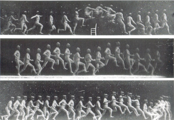
    Blog--july 9--marey Fast forwarding a bit there are the images of arrested time by Etienne Marey (who was a technoid and physician) and  who was able to capture motion of all sorts–he was able to develop a picture so to speak of the movement of blood in the body via his instrument to calculate blood pressure, and he also created a shotgun-style camera that made the world’s first high-speed photographs of movement.  And so it cane to pass that in the late 1870’s and early 1880’s people were instantly able to see what a horse looked like when it galloped or what the body did *exactly* when jumping over a chair.  When you couple this with fourth-dimension material one wonders why it took several more decades to bump into these images in the art world of the earliest part of the twentieth century.

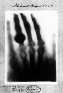
    Blog--july 9--roentgen In 1895 50-year-old Wilhelm Conrad Röntgen’s ephochal discovery was announced (“Ueber eine neue Art von Strahlen”. “On a New Type of Ray”), built upon the work of J. Plucker (1801-1868), J. W. Hittorf (1824-1914), C. F. Varley (1828-1883), E. Goldstein (1850-1931), Sir William Crookes (1832-1919), H. Hertz (1857-1894) and the horribly odious Phil Lenard (1862-1947 and who didn’t die soon enough). The experiment revealed as much to humans as did the experiments and inventions of Hooke and Leeuwenhoek on the invisible worlds revealed by their microscopes. Bertha, Roentgen’s wife, sat for 15 minutes while her husband passed his rays through her hand; she ran from the room once she saw the results, revealing her very bones and no doubt a strong sense of the fragility of life, and the strong presence of death.  Many had the a similar reaction to the Kandinsky’s shapes and Malevich’s white circles and red rectangles and Ibsen’s drama and Einstein’s dancing dust and the rogue syncopation of jazz—these newnesses were threatening to all of the established ways of looking at physics, and art, and theatre, and listening to jazz.  It was a new perspective which challenged the firmly established vision of these things, upsetting the nature of comfort and acceptance.    It is probably a very natural reaction to try and protect established memory—but memory is made all of the time, and so should be relatively flexible…at least it is mechanically healthier to allow a little bending than to be rigid and brittle. 

  • A History of Blank, Empty and Missing Things #49: Yves Tanguy’s Empty Skies

    JF Ptak Science Books LLC  Post  675  Blog Bookstore

    Blank & Empty Things Department #49

    [For another interesting example in this series see: Maps of the Cosmos of Moles, 1671: Astrology, Pseudoscience & Furious Belief]

    Tanguy--mama 1927 Surrealist, spider-eating, red-ink-drinking, bohemian template
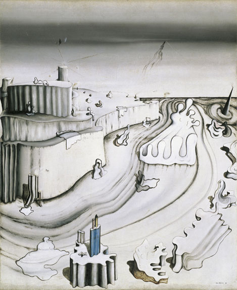
    Montparnassian Yves Tanguy (1900-1955) is perhaps the blankest, loneliest,
    emptiest painter of the Surrealist movement. 
    It seems odd to mare that statement, even to me, what with the
    tremendously lonesome images of the somewhat-earlier Giorgio de Chirico (1888-1978), but
    Tanguy has a different lonesomeness/empty quality to him partially because of his very restricted color palette.  Whereas de Chirico’s
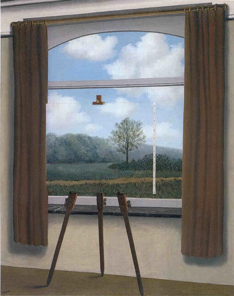
    (pictured just below) paintings are alive with color, Tanguy seems to put the unused

    Magrittecolors back into
    their tubes, painting in his all-white and unblemished studio.  He gives his paintings an odd quality, milky
    somewhat—especially in his skies, which to me look particularly empty, even
    though they have substantial texture.(This is differentiated from earlier posts in this blog that deal with blank skies in Renaissance prints, which were truly, completely blank and without any detail whatsoever.)  The
    play and wash of it all in his paintings gives me the sensation of a taste, and
    not a good one—seeing some of his work elicits a metallic, coppery taste, high
    in the back of the mouth.  I don’t get
    any of that sensate confusion form the others like de Chirico, or Magritte, or  Francis Picabia, or Marcel Duchamp, or Max Ernst, or Jean Arp, or Man Ray, and etc (though De Chirico does come close).

    Tangu--promotory


    Tanguy was undoubtedly influenced by de Chirico early on in
    his life, even before his painting career began.  The standard story is that in 1923 while
    riding a bus Tanguy saw an unusual, arresting image in the window of a store—he
    jumped form the bus, rushed back to the image and saw that it was a painting by
    de Chirico in the window of Paul Guillaume’s gallery.   He was much taken by it, and very soon
    afterwords began his painting career in earnest, becoming recognized and
    semi-established within a few years.  (It
    is interesting to note that the critic who first gave him positive feedback, F.
    Fels, very soon thereafter wrote to Tanguy “You’re finished.  You’re going to wind up a surrealist.” ) He
    did “wind up” a Surrealist, but he was hardly “finished”.

    And what I’m talking about here with the Big Lonely is just limited to the Surrealists–there are plenty of other operating in this millieu (intentional or not), not the least of whom (and painting at about the same time) is the sensationally lonely Edward Hopper, the man who invented shadwos for shadows.  But that’s another story.


  • Missing Images in Art: Depictions of Art by Children

    JF Ptak Science Books LLC  Post 668

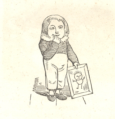
    Blog==June 29-nurses I think that I can safely say that artwork by children does not make very many appearances in Western art prior to the 20th century.  Nor do the originals–considering the ephemeral nature of the effort at art by children, their work just don’t seem to survive.  Some of that reason–particularly in America–was the scarcity of materials for kids to produce art with: paper was not inexpensive, and neither brushes and paints.  Crayons, invented for chubby and reachy fingers, were not invented for the mass market until 1903.  (Crayola sold eight crayons in a box for a nickel.  The colors?  Black, brown, blue, red, purple, orange, yellow, and green.)   Then of course the artwork would have to be saved, somehow, for generations.  As much as it would be fascinating to find artwork done at age 4 by your great-great grandparents, it would have to survive the cleansing tendencies of four generations of clean-up.  End result:  there’s just not that much antiquarian chldrens’ art floating around.

    It also doesn’t appear as art in artwork.  It is possible to find numerous examples of kids’ scratches in stone and such in ancient graffiti, but it doesn’t appear as elements of fine artwork, or, for Blog==June 29-nurses detthat matter, in book illustration. 

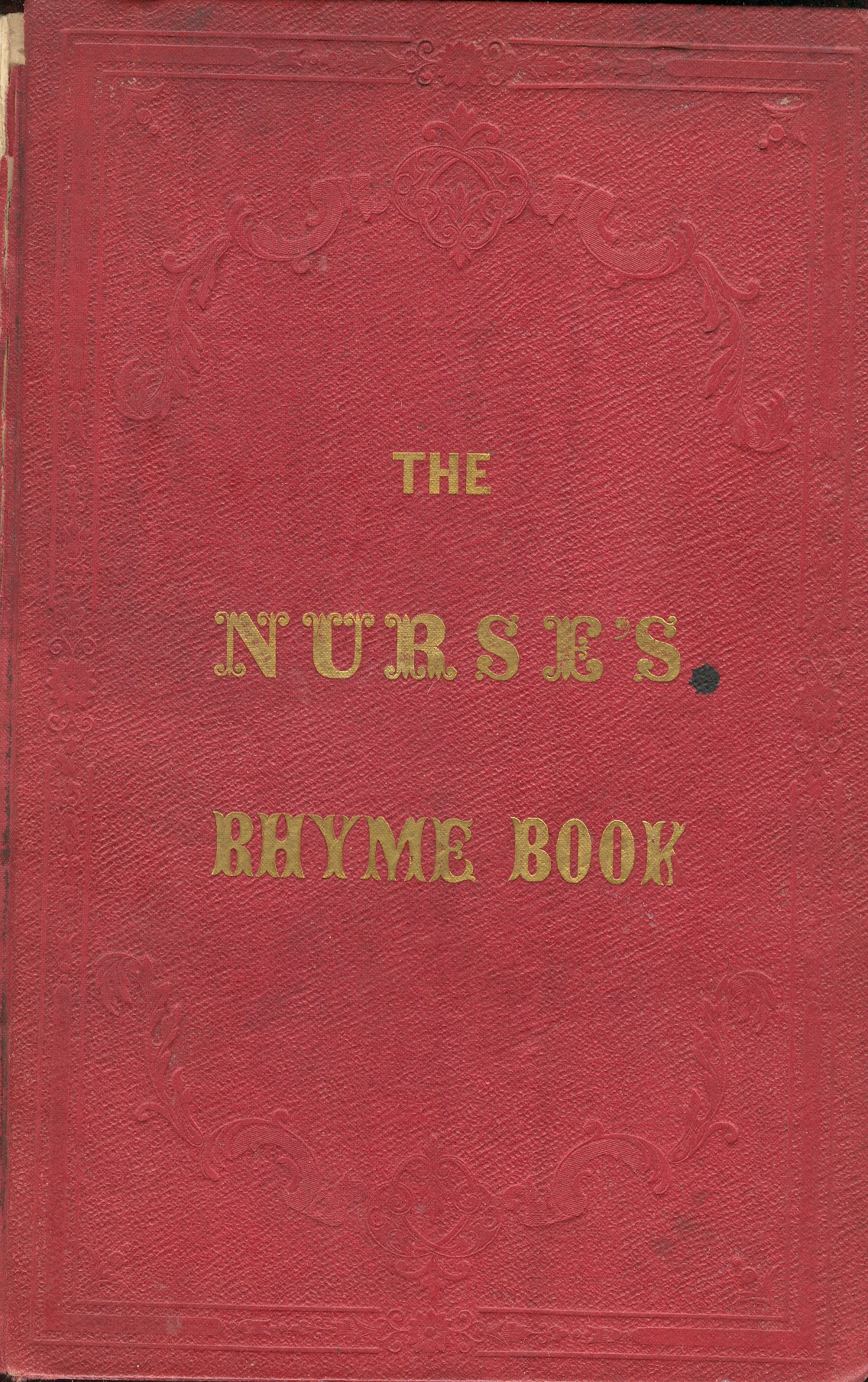
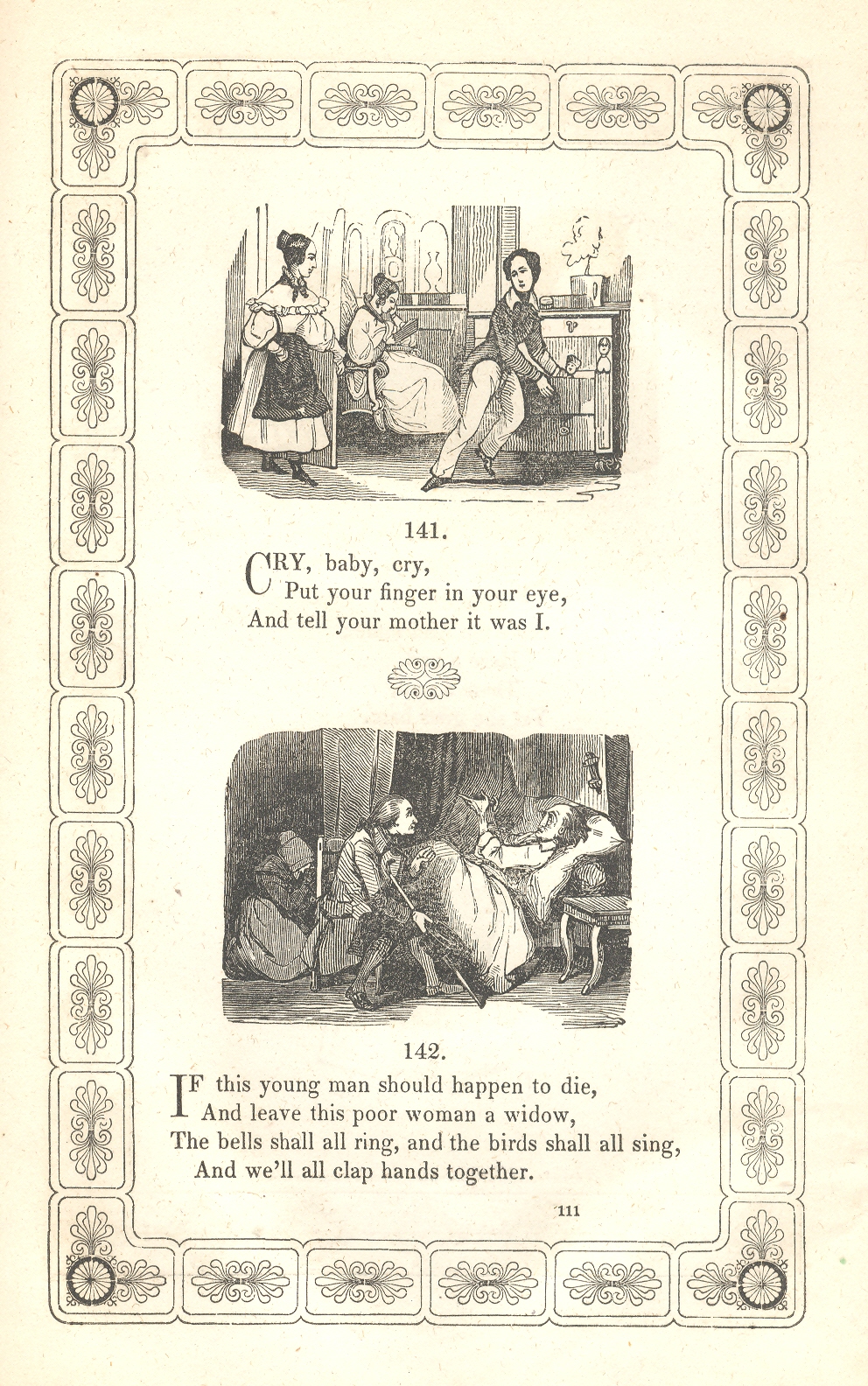
    There is an example however in Thomas Truman’s The Nurse’s Rhyme Book, a New Collection of Nursery Rhymes, published in Philadelphia in 1847.  The book is filled with unusual illustrations and fantastic ornamental borders, all used in support of some odd, scary, mean and occasionally pretty mid-century posies meant as night-time entertainment for the young ones.  Our prize is found on the very last page, the final slug of an illustration to a more-finely illustrated book: a coy, small boy, holding an example of his art, seemingly drawn on a framed slate. He looks happy, pleased, proud to me–on the one hand he is interested in sharing his achievement and on the other is really too shy to share, an emotion I’ve seen from time to time with my girls. As a matter of semi-fact, this is a rare emotion to see displayed in art, the too-shy-to-share routine saved more for fluttery self-conscious Victorian grown-ups more so than for children.. 

    Believe me, after having dealt with books and prints as an antiquarian for almost 30 years, and also having a collection of sorts of antiquarian childrens’ arts, pictures like this just don’t surface very often at all.  Over the years I’ve made some annoying phone calls and emails to librarians at art galleries (especially at the National Gallery in DC where I was a pester) explaining my interest and trying to find out if this struck any bit of memory in their brains–I never once had a positive answer. (I expected at some poin tthat someone would say, “Oh yes, of course–there’s a census of that that Mr. Kemp of Yale did in 1977. Or something, some sort of memory for this kind of image.) This is hardly an academic pursuit, but my occasionally ritualistic clawing seems to bear out that these things are just not available.

    And why this interest?  There is a simple, inherent sweetness in all of this, full of life and hope; something that crosses the generations, looking pretty much as though the emotion in the art was produced yesterday, if not for some of the content. . And that is another charm–like giving a small child a camera to photograph what they see (as in the case of my daughters Emma and Tessie) and see the remarkable results of their 40-inch tall version of my adult world.  The insights can be remarkable–not only do we see things from a new physical angle, but also the things of interest, the center of attention in the picture, the stuff that has aroused their interest and curiosity enough to take a picture of, can be incredible and totally unexpected.  That is perhaps the greatest interest for me in looking at children’s artwork:  it has the continued potential to be slam-brake innovative and filled with the unexpected insight; and it is just not a”normal”view of the world. And in a way the art can hold a key to your own antique memory of childhood; every picture has a possibility for the recovery of your own forgotten insight. 

    Blog==June 29-nurses full pg


  • Dadaist Images in 19th Century Prints: William Rimmer’s Artistic Anatomy, 1877

    JF Ptak Science Books LLC  Post 667

    Blog==June 29--rimmer pecs det Looking at old prints sometimes reveals more
    than just their own history, simple or not: 
    there are, from time to time, subtle bits of otherness that creeps into
    the image, if you allow yourself the time to see it.  And sometimes looking at images of the past
    reveal a little of the future, or the possibility of the future.
    Blog==June 29--rimmer pecsBlog==June 29--rimmer backdet

    I wrote a little about this in the odd
    art/color textbooks of the pre-Kandinskian Emily Vanderpoel , about whose color
    theory I still understand not at all, though the images that she produced as
    illustrations to these bizarre theories are stunning, pre-modernist, and unintentional
    creations.

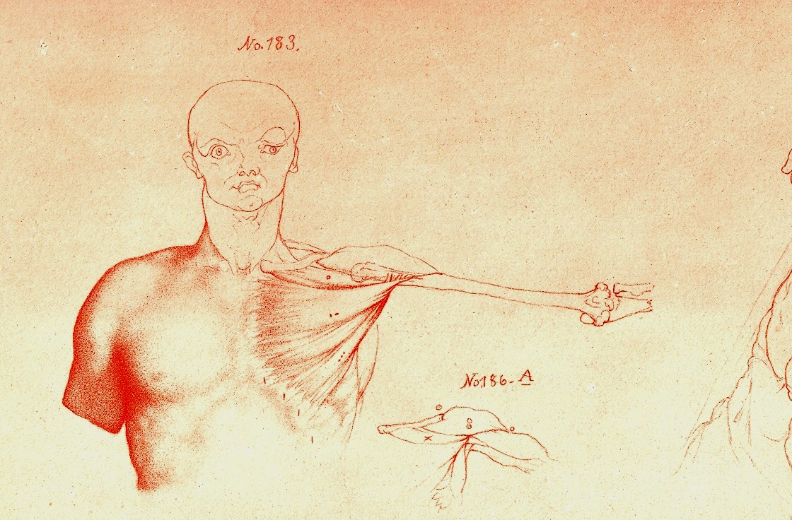
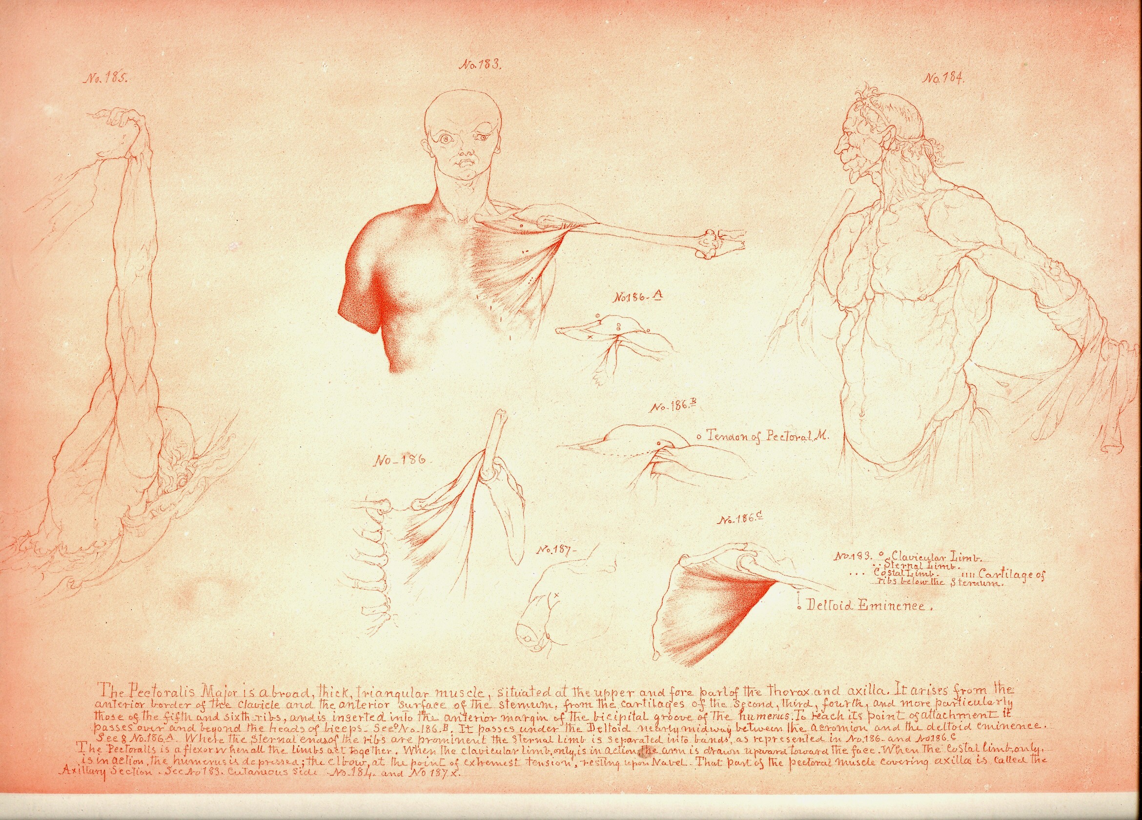
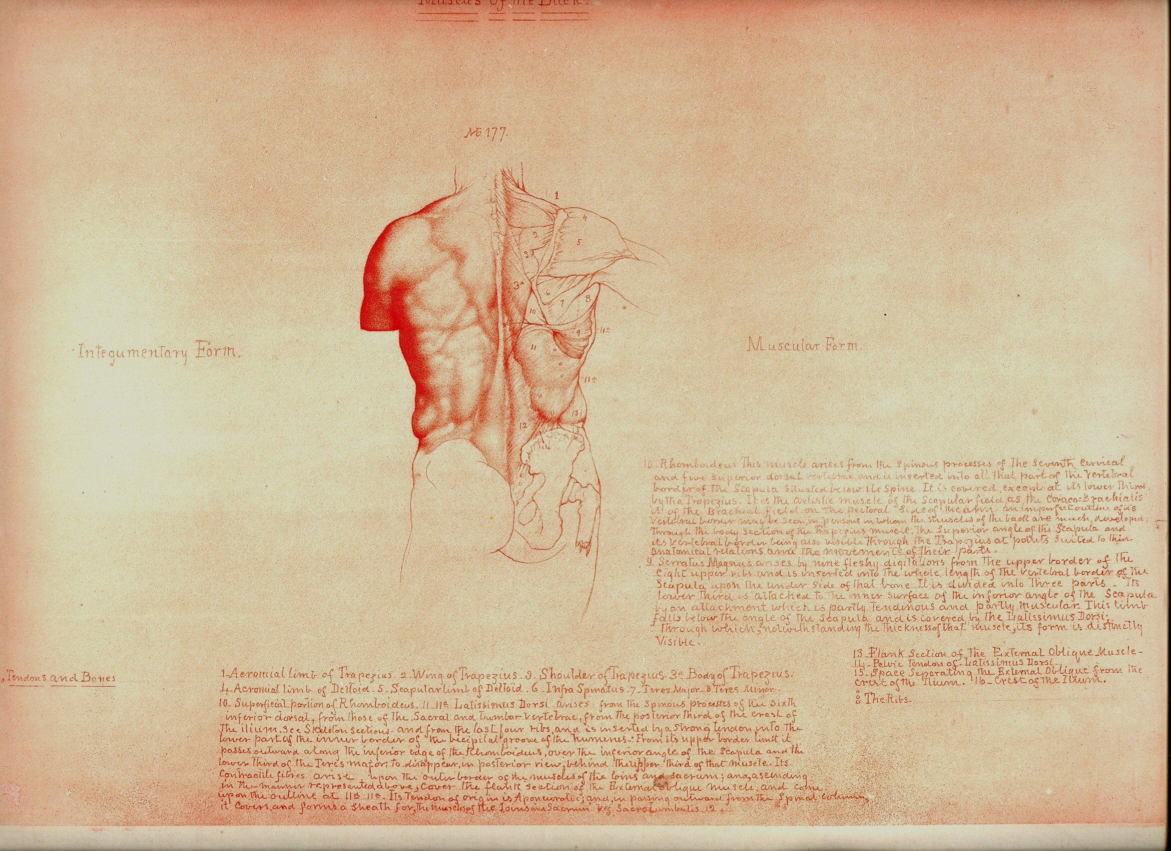
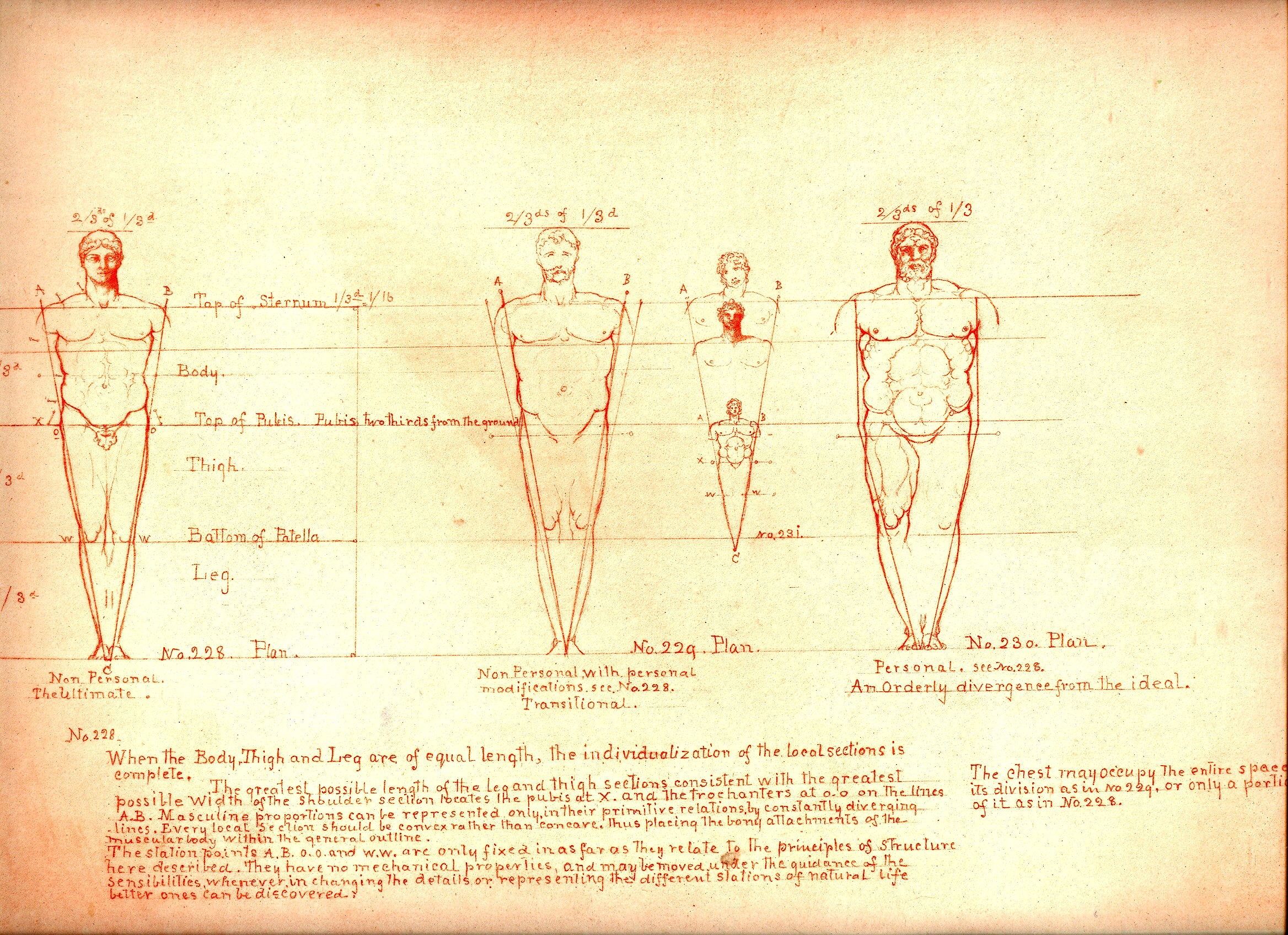
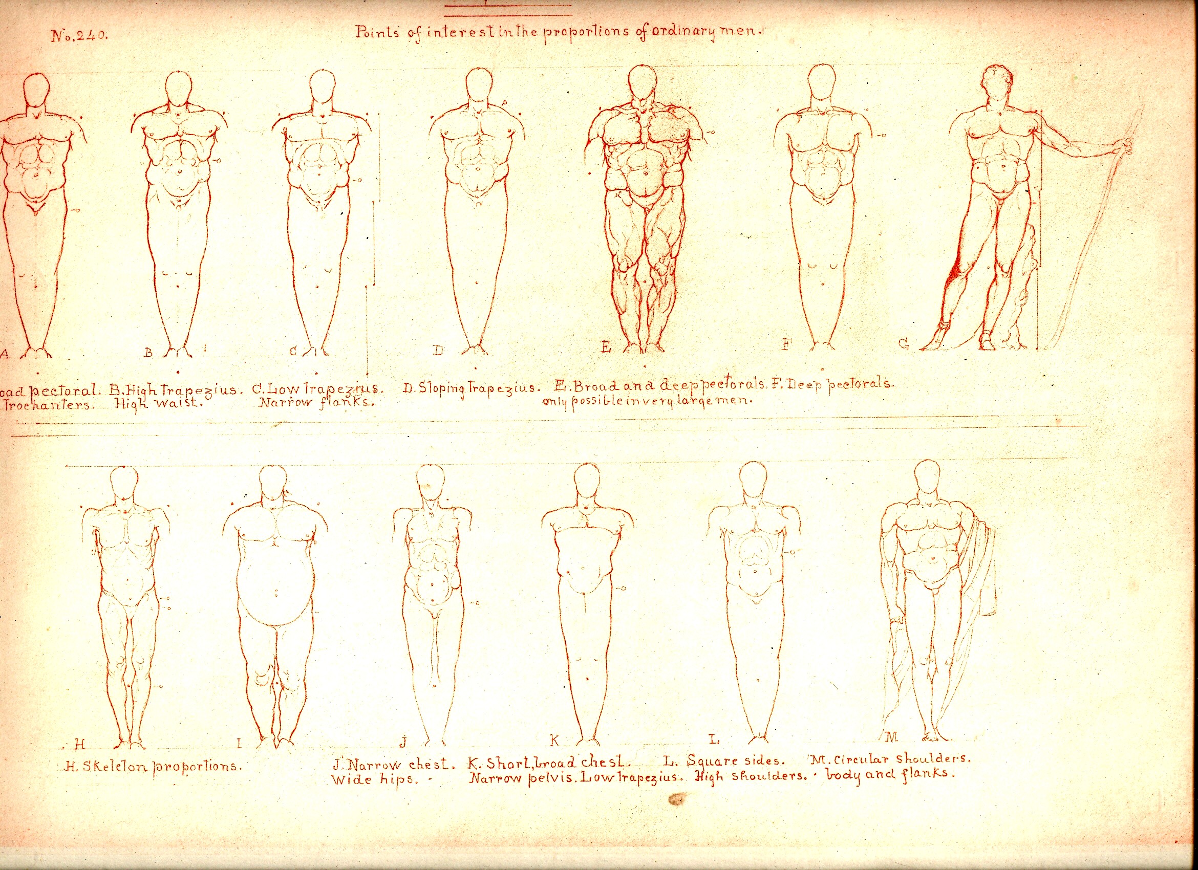
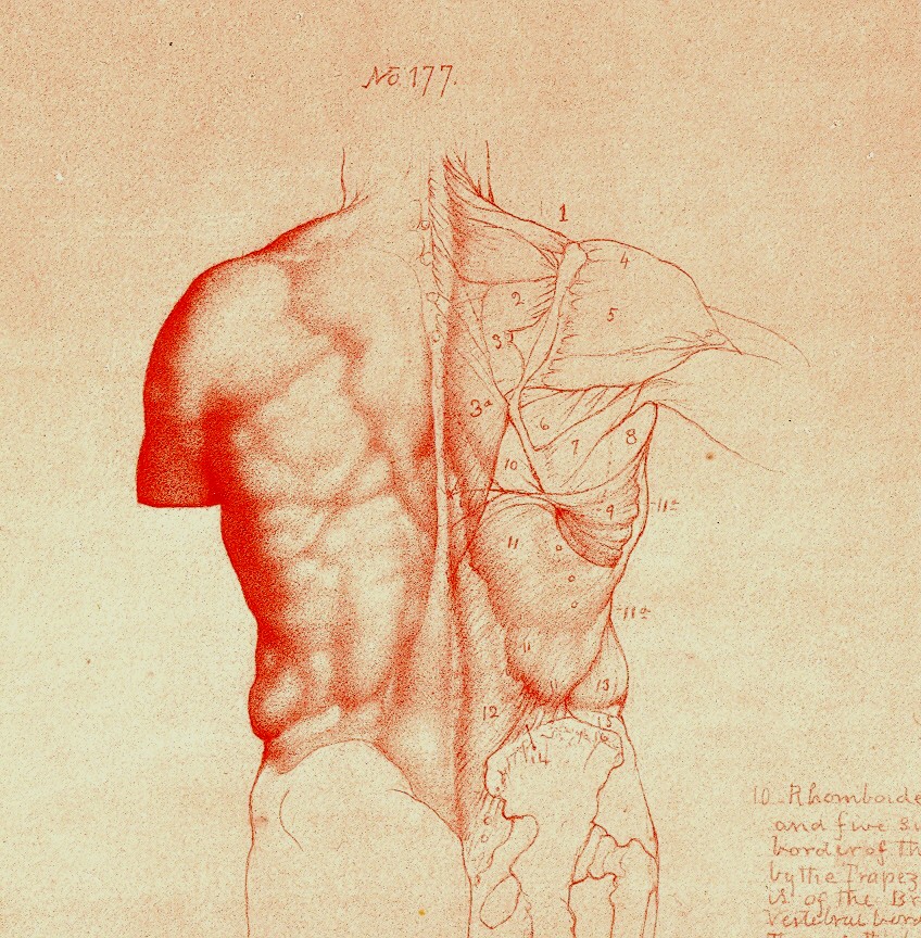
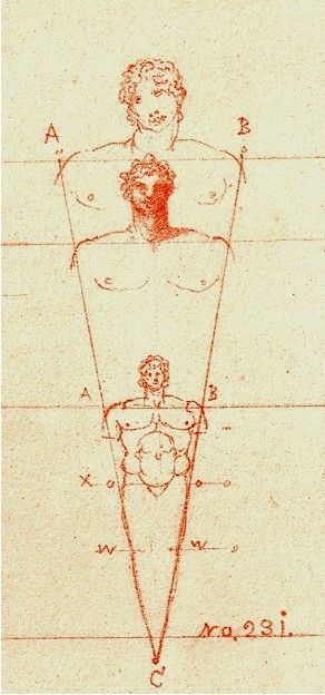
    William Rimmer’s (1816-1879) Art Anatomy (1877 and subsequent
    printings) is another such adventure. 
    Rimmer was a very accomplished artist, and was also a fine
    anatomist.  He was very concerned and
    interested in what happens to the skin, forced into action by all of the stuff
    underneath it.  He pursued the movement
    of muscle, and bone, and the interplay of the two, and produced a wonderful
    exponent of artistic anatomy. 

     And inside
    of these images is something else, sometimes. 
    There is an undoubted Leonardoesque quality to many of his drawings, the
    figures appearing with deft lines and interesting shadings, many times

    Blog==June 29--rimmer back

    surrounded by the author’s notes and explanations  But there’s also something else—some of the
    images are just, well, a little bizarre given the time in which they were
    executed.  Some of the details are
    positively modernist, begging to be identified as a 1920’/1930’s creation, or
    Dadaist, or something—just not 19th century.  I’ve included some further examples below

    Blog==June 29--rimmer little man .

    Blog==June 29--rimmer muscle


  • Detail in Renaissance Paintings: Carpaccio’s Venice

    JF Ptak Science Books LLC  Post 627   Blog Bookstore

     While finishing yesterday’s post on the occasional
    nothingnesses of details in Renaissance painting and using one of the painting
    by Vittore Carpaccio to make my point, I stumbled upon another image by this
    Renaissance master that was almost all detail,
    and of great somethingness. 
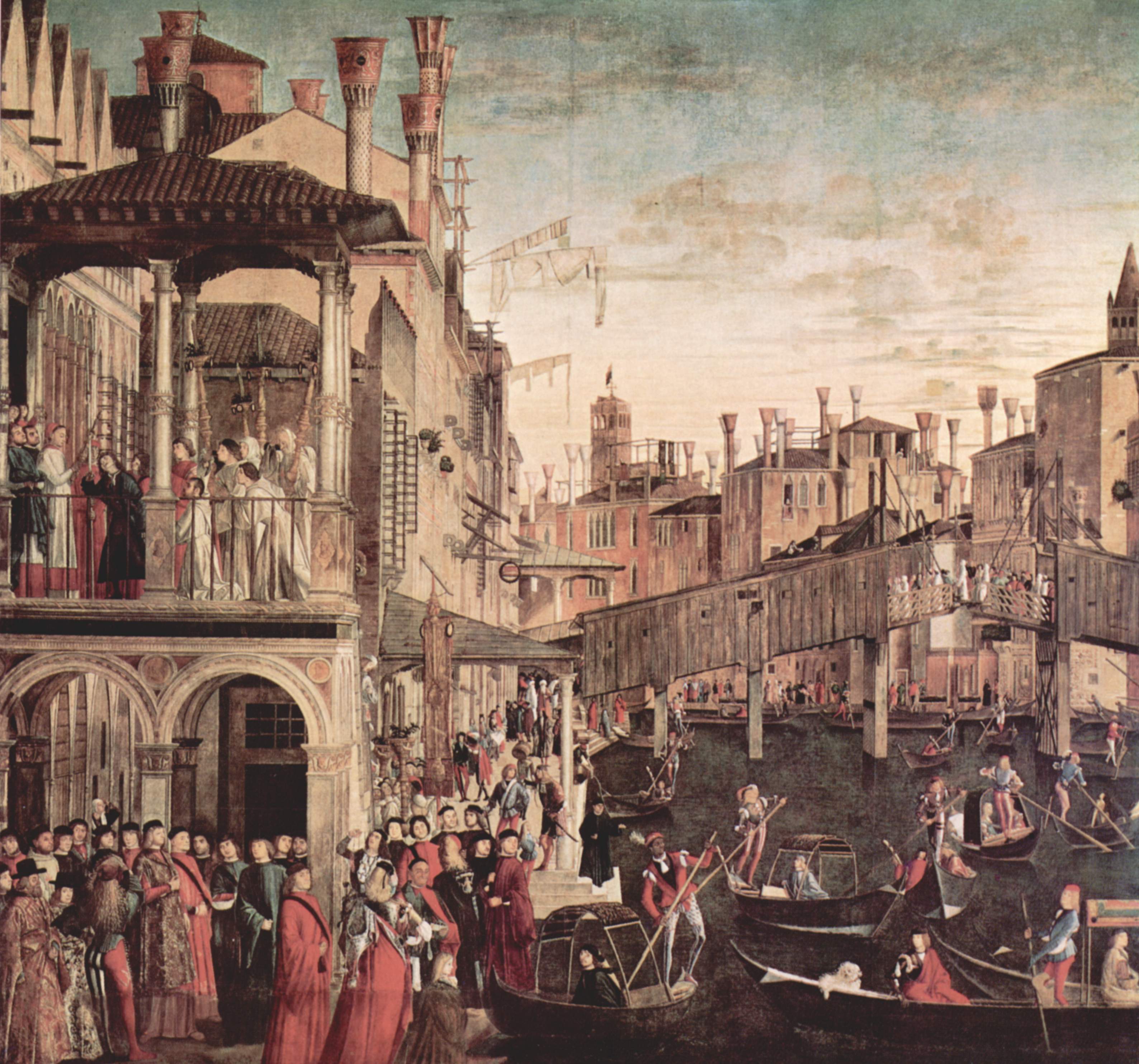
    Blog--may 25--madmanThe painting
    is
     Il miracolo della reliquia
    della Santa Croce
    (“The Healing of a Madman”, painted in 1494), which is a
    large, extraordinary and detail-filled canvas of a street scene in Venice. The subject of the painting is Francesco
    Qerini, the Patriarch of Grado (which was the old name for the Patriarch of
    Venice, one of the four Sees, with patriarchs reaching back to the 6th
    century), who was healing a mad/possessed man of whatever aliments finding
    safety in him, and evidently accomplishing the task with a tiny piece of the original
    cross of Jesus, given to Qerini ‘s patriarchy in the 14th
    century.

    The miracle itself takes up only a very small portion of the painting—you
    can find it in the upper left, in a spacious loggia, the “madman” (I think)
    crooking his head to look up at the outstretched crucifix; a quiet, almost
    secondary acquiescence to all of that other energy in the painting.  Even though not the intentional subject of
    the painting, it is the wooden  Rialto Bridge  (the version built in 1458) that takes center
    stage, though I guess one could say that the key area of interest was the city
    of Venice 
    itself.  Or the throngs of its citizens
    enjoying the airy passage through the city. 
    The focal point does seem to be the bridge, which had the capacity to
    open for taller ships, and was a focal point of transfer for the
    community. 

    There is some reason for this outside of the artistic sense—the paining was
    one of nine commissioned by the Confraternity of the Scuola Grande di San
    Giovanni Evangelista, which was a major concern in Venice.So it would seem that Venice
    was meant to be as much a part of the appeal of the painting as was the miracle
    that called for the attention in the first place.  

    This was a very crowded scene, the foreground and background material and
    subjects as important as the subject itself; it was a greatly democratized work
    calling as much attention to the city of Venice as the miracle being worked
    within it—and it still remains a calm and quiet vision  Perhaps it is the steadfast of the objects
    above the street, like the pot-like chimneys (at least 26 showing) and the
    clothes-drying poles with their flag-like fare that contribute to the quietness
    above the bustling city street.  Experts
    say that this is a superb rendering of the cityscape, with accurate coloring, a
    beautiful documentary of life in Venice 
    just at the end of the 16th century. 
    In addition to the cityscape we see all manner of small life in the many
    people in the painting:  passengers in
    the gondola are carrying pets (at least one dog and a bird), the stores at the
    foot of the bridge, an open air market (with sellers lined up with small
    tables), plus all manner of styles in dress.

    It is a wonderful example of the opposite of yesterday’s post:  something where all of its comparative “nothings”
    were the most important part of the unit.


  • Where Was Disgust and Horror in Italian Renaissance Painting?

    JF Ptak Science Books  Post 613  Blog Bookstore

    St. john


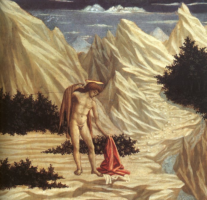
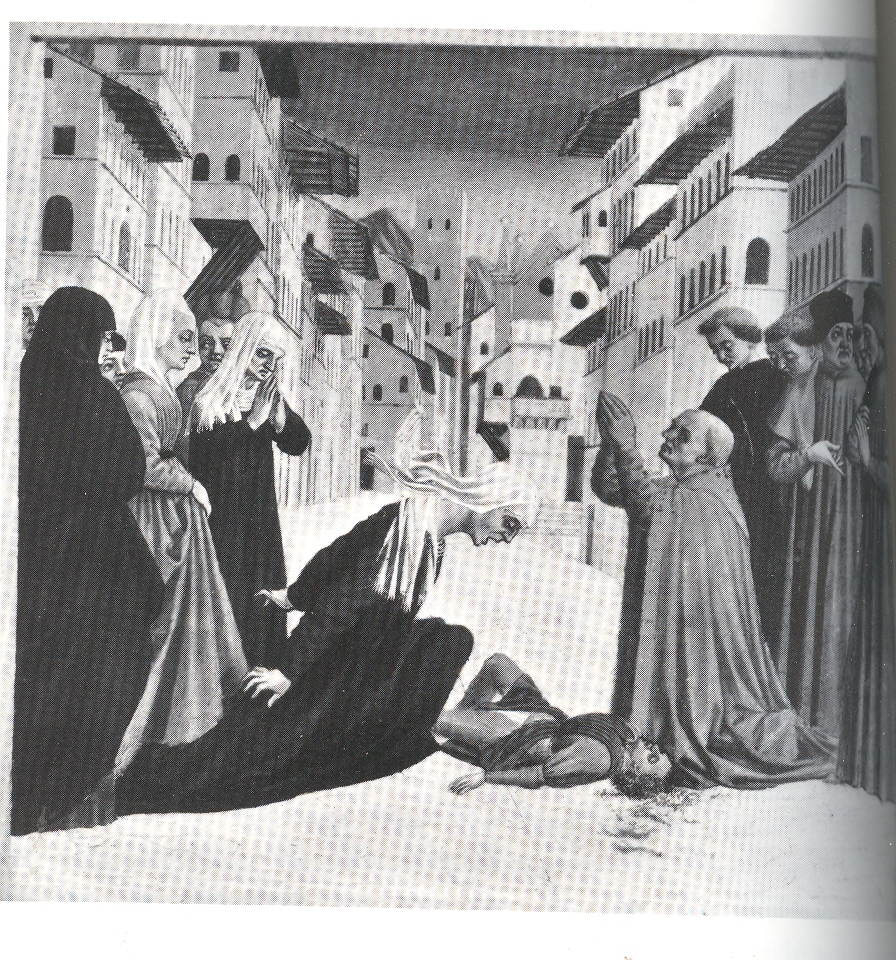
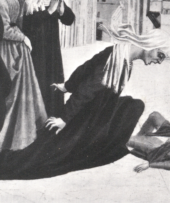
    When considering the alphabet of emotions displayed in Italian Renaissance art, it seems to me that Horror and Despondency seem not to appear very often. (Again, this is for the Italians–not the northern Renaissance.)  This flimsy conclusion may be of my very own not-very-well exposed weakness and may be fantastically wrong—well, I think the odds are more in the favor of this being modestly wrong rather than fantastically so.   This inspiration took hold when looking at an uncommonly-reproduced work by Domenico Veneziano (b. Venice, ca. 1400 and dying in Florence in 1461) displaying a posture and an emotion that I have seldom seen.  I am a little familiar with Veneziano–having lived in Washington DC for 29 years I visited the National Gallery many many times, and themiddle point of the visit was almost always at Veneziano’s fantastic and weird St John in the Desert (ca. 1445) or with his St. Francis Receiving His Stigmata.  (There are more examples of his work in the Continued Reading section below.)  But this image was new to me and astonishing–it is the Resurrection of the Child , and the painting’s main character,  the mother of the injured child, displays a character of grief and body language that is singular to my experience.  (The image appears in James Ackerman’s superb Distance Points, Essays in Theory and Renaissance Art and Architecture (MIT, 1991, p. 86)

    Veneziano

    Veneziano 001

    When I think of all of the Pietas (by Botticelli, Raffaellino de Gardo, Berruguete) I cannot recall seeing this level of  grief, or horror, or terror; or curling fingers in the deepest base of despondency in the features of Mary or just about anyone else.  Actually, Carol Crivell approaches this sort of emotion, but it seems fairly scarce in the history of Renaissance Pietas.  Rending scenes of the dead and bleeding Christ, and rape scenes, lamentations, still do not approach this sort of expression as we can see in  Perugino’s Lamentations and Cruxifiction, Antonello Messina’s Rape of Helen,andCarpaccio’s Meditation on the Dead Christ.

    There are occasions when St. George shows some real fear and horror (Cosimo Tura’s  St. George), and mothers are spectacularly despondent over the killing of their babies (Matteo di Giovanni Massacre of the Innocents), but to me the myriad of images showing the Temptations of St. Anthony and the ravages of time and the seven deadly sins and on and on, just, really, never come quite to this level of terror in Veneziano.  I’m probably off base with this, but honestly, the contrasting pull of the mother’s body both lunging forward and pulling backwards, the enormous passion of her face, the curling fingers, are almost too much to bear.  You can hear her scream as her body works against itself, pulling her apart. And when comparing Veneziano’s Resuscitation with others in this genre–Ghiberti’s child being brought back to life by St. Francis, Lippi’s Drusiana by St. John the Evangelist, for example–this deepest of all expressions of horror isn’t there.  I imagine that the other images of terror and horror are wrapped in Holy cloth and Infinite Wisdoms, these people being saints and all, but when it comes right down to mortals and losing their children, there’s no room for holiness, and Veneziano allows the truth of the emotion to come pouring out. 

    ·Posted by :

    ·in:


  • Blank and Missing Things: Backgrounds in 15th Century Prints

    JF Ptak Science Books LLC  Post  Post 607  Blog Bookstore

    Blog--may 4-- blank drunkenmohammedGenerally speaking, printmaking (in Europe)  began in the early 15th century.  It was, as Peter Parschall* elegantly says, “the
    earliest efficient means of reproducing a complex image in large numbers”.  The method of pressing wood blocks onto paper
    started in the as early as the 1420’s; the intaglio process—printing from
    engraved metal plates—began a little later, in Germany, in the 1430’s.  This places the mass-distribution print distinctly
    ahead of the Gutenberg curve by at least a generation. (It is interesting to
    note here that the great Vasari wrongly put the beginning of print making
    considerably later, around 1460.)   Of
    course in China the practice
    of making prints on papers was already many hundreds of years old at this
    point, but Asia was still a world awayBlog--may 4--blank christ, its
    influence not to be really felt for hundreds of years.

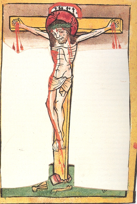
    What strikes me is the lack–and absence–of backgrounds in many of these early, pre-1490 prints. 

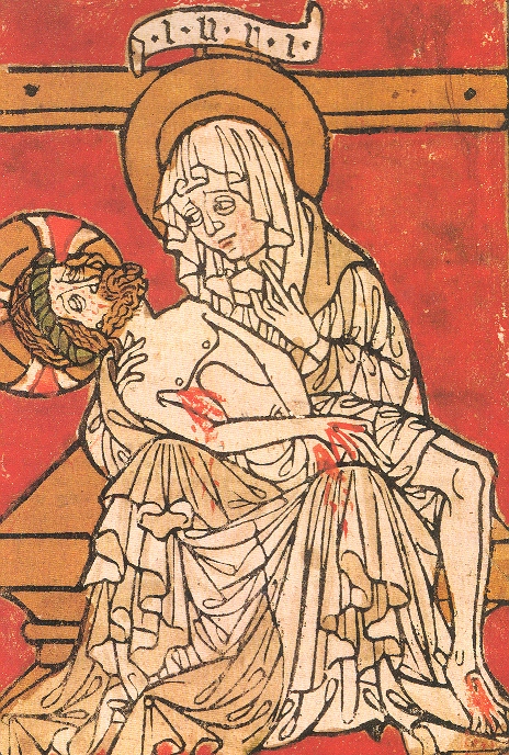
     Once you start paying attention to the non-backgrounds in these prints, they seem to be everywhere.  This print of Christ Crucified (German, ca. 1460.) is an excellent example of completely-blank blank background.  The most emotional of all the scenes of the Passion, the Pieta from Stilft Lambach (South Germany, ca. 1420-1430, “Now there stood by the cross of Jesus, his mother…”, John 19:23) is blank–save for a chair and part of the cross–though deeply and bloodily colored. 
    Blog--may 4--blank pietaThis is also one of the visualizations of the scene in which Mary cradles the body of her dead son in her lap; many other images do not show this close contact.  Also, even though the blood of the wounds of Christ are exceptional and highly visible–and perhaps the main object of veneration in this print–Mary’s very great grief , depicted mainly in her oversized and mournful eyes, may well be the real chief object of interest in this image, abandonment of Mary cults or not.


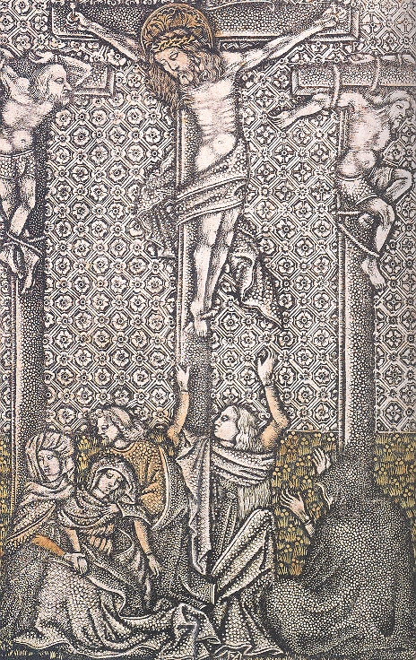
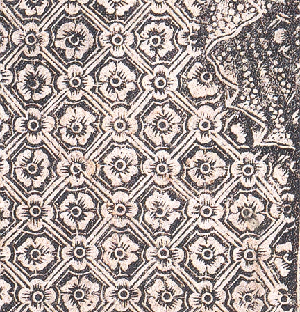
    On the other extreme of the Blank Background is the ornamented and highly designed background, as in the example below.  Calvary was printed in Bavaria in 1460 or so and is a metal cut print, meaning that the image was literally hammered and cut, which gives the paper such incredible depth and detail.  I’ve noticed a number of these designs in metal prints though none in wood–again, I’m not a scholar in this area; my observations are just that, from an accumulation of looking at prints for decades on end. 

    Blog--may 4--blank not blank

    Blog--may 4--blank not blank detail

    Blog--may 4--blank not blank2

    I don’t have anything to offer here on this–just the observation. 

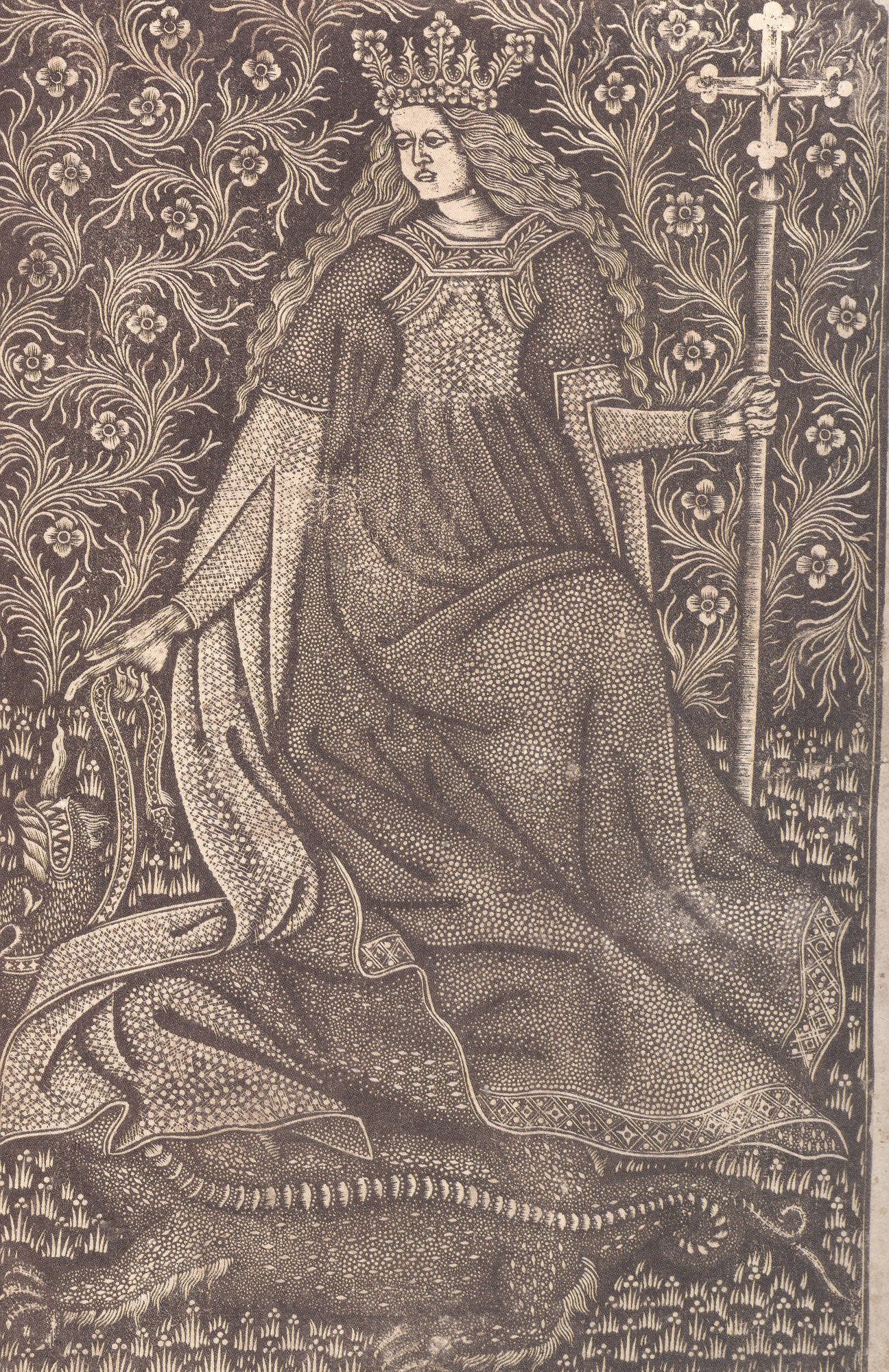
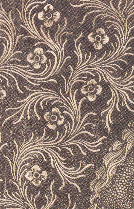
    The last image is that of St. Margaret, a south German metal cut print in the last quarter of the 15th century.  This is a simply extraordinary print, the whole having the feeling of a finely embroidered work.  The swirling grape vine background (?) is moving and fine and fluid, and so unlike anything else at this time in print history.  It was a glorious way to render a background that was both there and not there.

    *[Parshall, Origins of European Printmaking, National Gallery of Art, D.C., 2005.]

    Blog--may 4--blank not blank2 001


  • The Finnegan’s Wake of the 15th Century

    JF Ptak Science Books  Post 632  Blog Bookstore

    Blog may 30 philo


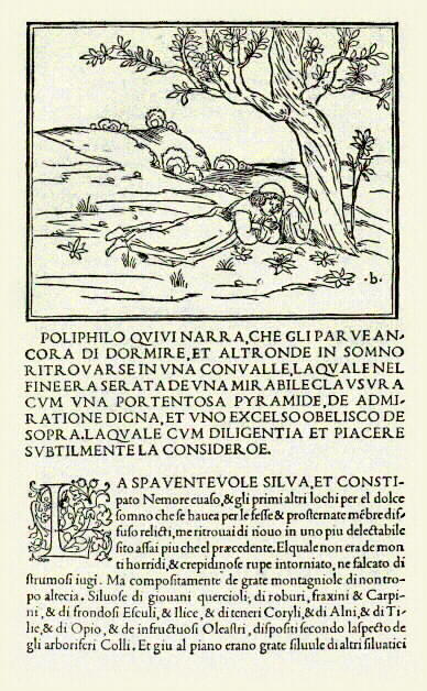
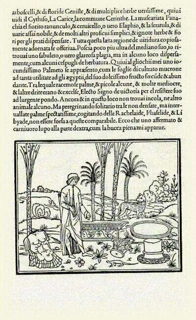
    Since I had a go at early illustration earlier today in this blog I thought to write something about a book that is probably one of the most beautifully printed books not only of the Renaissance but of all time.  The Hypnerotomachia Poliphili (The Strife of Love in a Dream)
    by Francesco Colonna was the greatest achievement by the greatest printer of the Renaissance (Aldus Manutius in Venice), a spectacular combination of story and type and design and illustration; an imaginative, secular Humanist self-romance like no other printed to that time.  ) See the entire text HERE.)


    Blog may 30 polyphilo dreams

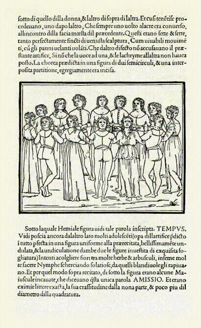
    Hypnerotomachia means “the strife of love in a dream”, and the reference to Poliphili refers to the narrator of the story, Poliphilo, telling of the love affair between Polia and Poliphilo—the master text of the whole story though is a description of ancient art and architecture,  all told in a wonderful ”macaronic mélange” of Italian and Latin, and which were the “exact accounts” seen in Poliphilo’s dreams about Polia.. It is a  modernist book for being printed in the last year of the 15th century (1499), and stands for vitality and grace and superb design, and according to George Painter was the Finnegan’s Wake of the fifteenth century.  Painter continues, and writing that “Gutenberg’s forty-two line Bible of 1455 and the Hypnerotomachia of 1499 confront one another from opposite ends of the incunable period with equal and contrasting pre-eminence.  The Gutenberg Bible is somberly and sternly German, Gothic, Christian and mediaeval; the Hypnerotomachia is radiantly and graciously Italian, classic, pagan and renascent. These are two supreme masterpieces of the art of printing, and stand at the two poles of human endeavor and desire! “(Cited by Alan Thomas, Fine Books, 1967, pp 71-4).


    Martin Lowry in his The World of Aldus Manututus  (Ithaca, New York, 1979) makes another interesting statement on this masterpiece: “(Hypnerotomachia) was a linguistic and literary debauch, choked with recondite imagery, erudite periphrases, and exotic verbiage: a work so bizarre that many critics have felt a certain uneasiness at Aldus’ agreeing to print it.” 

    Blog may 30 poliphilo dreams

    It is truly an astonishing accomplishment, and its significance in the design of type and of the book really cannot be underestimated.  As E.P. Goldsmidt stated (in The Printed Book of the Renaissance, 1950, p. 52): “In the North an astonishing proportion of all Renaissance ornament and accessory design can clearly be proved to derive from Colonna…”

    The book is summarized here and below:


    ·Posted by :

    ·in: