A Daily History of Holes, Dots, Lines, Science, History, Math, Physics, Art, the Unintentional Absurd, Architecture, Maps, Data Visualization, Blank and Missing Things, and so on. |1.6 million words, 7500 images, 4.9 million hits| Press & appearances in The Times, Le Figaro, Mensa, The Economist, The Guardian, Discovery News, Slate, Le Monde, Sci American Blogs, Le Pont, and many other places… 5000+ total posts since 2008.

Category: Art History

  • Unfinished, Blank and Empty: Durer, Gaudi, Schubert, Mozart, West, Stuart

    JF Ptak Science Books LLC  Post 588       Blog Bookstore
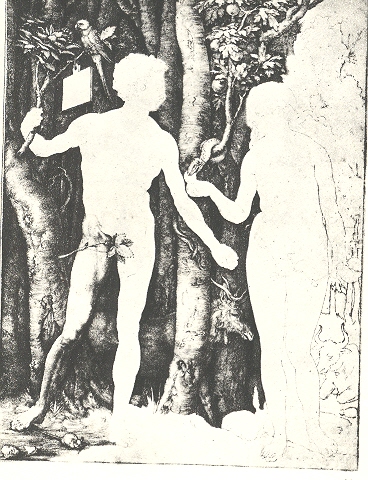
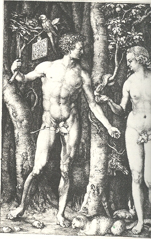
    Unfinished in some ways is part of something that is not there, part of the missing, the blank, the empty.  One aspect of this calling to emptiness is seen in this semi-completed, semi-empty trial proof version of Albrecht Durer’s intaglio Adam and Eve (1504) , the finished and full state of which is seen below.  The unfinished bit is easier to see but hard to find, sometimes.  Leonardo comes to mind several times:  the magnificent Sforza equestrian statue and St. Jerome Praying in the Wilderness come to mind, as with his Study for the Adoration of the Magi.  Gilbert Stuart’s ultra-famous mostly-finished portrait of George Washington wound up in thousands of schoolrooms across the United States as well as—cropped—one the one dollar bill. Nearly-as-famous Benjamin West left unfinished another icon of revolutionary American history, the American Peace conference, half of the historical figures faded unfinished into history.

    There are some things that are unfinished but really aren’t so:  say, for example the not-endable Ulysses, complete and incomplete in its circularity.  Mozart’s Requiem, a piece of music that helped drive the poor man to his death, was unfinished though completed by another hand.  Blog--blank durer 001
    There are unfinished examples of architecture bounding into the urban landscape, fantastic examples of extraordinary things.  The great Schloss Neuschwanstein, the empty and unfinished dream of the “mad” and mysteriously murdered King Ludwig of Bavaria, is certainly one.  This building ironically seems for me more compelling, filled far more than Uncle Walt’s doppelganger in Orlando.  The greatest structure of the Drippingly Baroque is another unfinished masterpiece, the work of Gaudi in Barcelona, the Sagarda Familia.  Started in the 19th century and stopped with Gaudi’s death in 1926, the Sagarda’s forest of towers was only 15% complete—the city is still at work on it, with 40% more to go.  

    We could look at these images while listening to audio examples of the unfinished:  the tidied-up requiem of Mozart, Schubert’s unfinished 8th Symphony, and Mahler’s unfinished 10th  come to mind.

    There are spectacular monuments to unfinished business: American Federal treaties with Native Americans (almost all of which were signed, documented and not enforced; empty, blank, broken); the assurances to the millions still waiting for some verifiable change in the townships of South Africa; promises of decent wages and health coverage for the marginalized “partners” of oblivious behemoth  monsterstores. [I can think of one major player whose corporate name spelled backwards relates to railroading the law, driving that point home to employees, suppliers and patrons.  “Tram Law.”] A history of unfinished business would be massive, and then, once you got to the end, all you’d be doing would be driving a Ford Pinto off the end of an unfinished bridge.
    Some things that looked sort-of finished are later revealed to be not so:  Einstein’s Unfinished Symphony of relativity (titled so in Listening to the Sounds of Space-Time  by Marcia Bartusiak) is one. Mathematics—all of mathematics—also comes to mind, the great edifice nearly “completed” by Hilbert until one of his famous questions got answered by Goedel, and then all became unfinished again.  One day everything seemed filled-up; the next, well, it wasn’t.

  • “Emerging” as a Verb: a Note on Patterns in Science and Art

    JF Ptak  Science Books LLC  Post 583
    Blog Bookstore

    And all that appears confusedly on walls is very like the vibration of bells:
    you can hear in their ringing all the sounds or words you want to imagine.”
    – Leonardo da Vinci 1492

    Finding recurring events, schemes and objects, finding predictability, finding a pattern, making a pattern emerge seems to be what we do here on earth.  After all, the stuff that we use to organize our existence into transferable bits of knowledge–points and lines and symbols that stand for sounds which stand for other things which constistute language–don’t exist, but they do tell us pretty much everything we need to know about our environments, real and imagined.

    Blog--emerge

    Stars are (as my daughter Emma pointed out when she was four) “messy” until imaginary lines are drawn between them; the relationship of the elements are mysterious until a (a) they were “discovered” and (b) table of relationships was figured for them.  Mathematics, the queen of the sciences, is nothing but making patterns emerge.  Art* and aesthetics developed over millennia to arrive at things like paint and the golden ratio [(a+b)/a=a/b] and perspective, making images and other representations emerge from the chosen media.  Patterns emerge from massive, seemingly too-complex entities:   even the weather’s patterns emerge (to within a particular range). (Better yet, with weather, it is extraordinary to see how small variations of the initial condition of this sort of dynamical system can produce large, long term variations. Have a look at one of the greatest works on the circulation of the atmosphere at my blog store.)

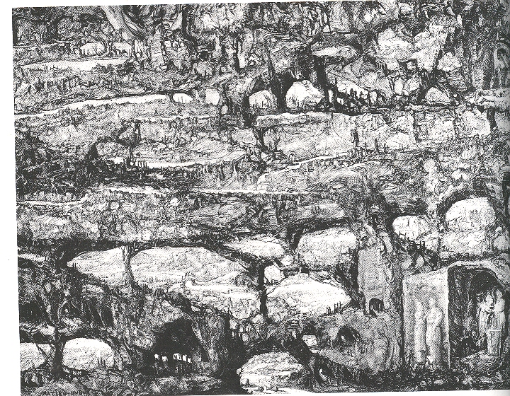
    In a slightly odd and definitely beautiful book by Jurgis Baltrusaitis, Aberrations, an Essay on the Legend of Forms (MIT 1989) I found a fantastic illustration of the work of Mathieu Dubus (1590-1665/5). Dubus evidently was a pre-modern modernist, and painter of fantastic landscapes, though (apparently) very few have survived the years.  He was an outsider to the great Golden Era of Dutch art of the 17th century, probably a little too far afield for most tastes, though his associate and contemporary, Hercules Seegers (Seeghers), another experimentalist-as-artist, found far more afield, at least so far as royal patrons were concerned.  (Segers was also collected somewhat by Rembrandt, who owned at least one of his paintings.  In his own bit of “emerging”, Rembrandt actually purchased one of the metal plates from which a Seegers print was made, and reworked it, making it his own,  publishing prints from the “combined” effort.)  It is also interesting to note that if Dubus was included in the Big Books on Dutch art of this era, he would fall between the beautiful Gerard Dou (small, exquisite, dark, very layered) and Jakob Duck (who had a very Dickensian taste for street/common/low life).

    The Dubus work, The Destruction of Sodom and Gomorrha.,  is exceptional, and odd–I still don’t understand if the image was actually painted on an old and decaying wall, or if was painted on agate that looked like a decaying wall, or if was painted on canvas and made to look like the above.  No matter–the effect is that the artist used the “natural” occurrence of breaks and segments to make his picture of the great destruction from Genesis emerge from the seemingly “found” surface. It is a remarkable image, and I’m fairly well certain that the 17th century wasn’t ready for it.

    It is remarkable that humans have sought for thousands of years to make representations of their environment and ideas more clear; and it wasn’t until the second decade of the twentieth century that artists sought the “reverse”, until, finally, a person wasn’t able to tell what a painting was “of” unless told so.  (Jackson Pollock told the story many times of seeing his work exhibited upside down.) 

    *”Art is the imposing of a pattern on experience, and our aesthetic enjoyment is recognition of the pattern.” is what Alfred North Whitehead (1861-1944, English philosopher and mathematician) said, sucking the very life out of the discovery part of the whole experience. 


  • Humanist Secular Prints in the Renaissance: Bedroom vs Boredom Eyes

    JF Ptak Science Books LLC   Post 563

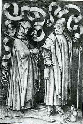
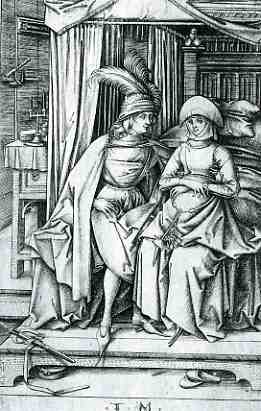
     blog 26 mar humanist 1733At about the same time as the development of a tonal system in the art/print world–which appeared later of course than that in the painting world, given the means of production for the printed medium–came the introduction of the deeply and occasionally troubled vernacular.  The examples below are works done in a cycle by the semi-problematic Israhel van Meckenem (ca. 1450-ca.1510), whose productive and highly-skilled period of productivity swirled around that of Mantegna*, Schongauer, Durer, de Barberi, and Raimondi.  He  is not well remembered in the histories of early printmaking, even though  he had magnificent skills, though not as prodigious as those of his contemporaries.  It is interesting to note that in addition to his artistic and technical prowess, van Meckenem also had a hard touch for business.  For example, answering a particular and immodest call, he produced images exploiting fears of death and eternal death.  Some prints  were, upon purchase and display, supposed to ward off the Plague.  Others presented images of Christ, purchased by hopefuls as indulgences to free them of the burden of thousands of years in Purgatory**.
     blog 26 mar humanist 1735


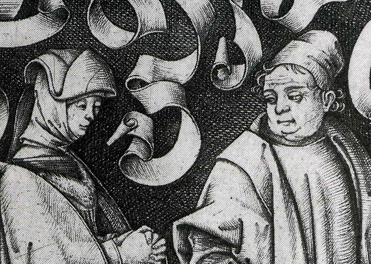
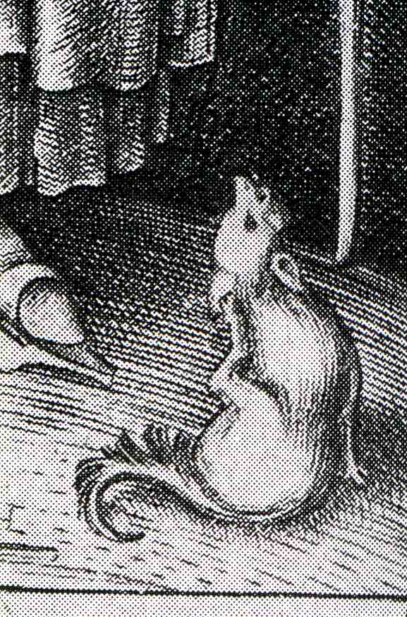
    This series captured my eye because of the eyes it captured.  It is a lusty series of profane images, or at least they were one-way lusts and desires.  In general, the women in this series seem pretty resistant, if not militant and disgusted, by the fumbling and obvious (or oblivious) suggestions of the men.  The women are distant, arms crossed, leaning away, eyes averted.  In the example above, a church-going couple are, well , going to church, but the man/husband seems to be thinking of a different sort of worship–for her part, the woman/wife keeps her hands very prayerfully clasped, knuckle-busting tight; the scrolls in the back seem to be ready for the thought-balloon legend “oh dear sweet god leave me alone!”.  The busty-jowled, pigdog man’s emotion is clearly displayed in his fat-lidded eyes..  (As a humorous aside, if you look closely in the right bottom corner of the print you’ll see a small doggie scratching itself, which I take to be the artist’s statement on the whole scene.  I’ve included a detail at the bottom of this post.)

     blog 26 mar humanis knife737
     blog 26 mar humanis knife738

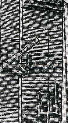
    Next is this slightly ambiguous scene of a puffy-plumed man staring hard at his “date”, sitting at the edge of a bed.  Her look is non-committal; his isn’t.  (Perhaps she is pregnant? )  The wonderful bit about this scene though is the knife in the door above the latch, sunk deep into the wood by the man to keep whatever was going to happen private. 

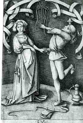
    The final image shows a dancing man–his purse loosened and on the floor to free him up, I guess–trying his best to impress his lady.  The woman, obviously, wants no part of the foolishness.  Her body language is slight but VERY clear.  He tries to hold her hand; she only lets him touch her, her fingers straight and her thumb relaxed, not gripping anything at all.  She just wants to get the hell out of there. 

    And so we have a modest introduction to foolish sexual dalliance, ca. 1500.

     blog 26 mar humanist 1732
      blog 26 mar humanist 1736


    * Andreas Mantegna has been credited with beginning printmaking in Italy, as has the Master of the Playing Cards in Germany. 

    ** Some of the prints were sold with indulgences for 45,000 years out of Purgatory.  The problem with these things is that no one knew if 45,000 years meant anything at all in terms of time-in-eternity.  My guess is that you’d need a whole lot of those things to make any difference at all. 


  • A History of Missing Dots: Donne’s (Missing) Discovery of Platelets, 1842

    JF Ptak Science Books LLC  Post 547Blog 13 donne detail

     blog 13 donne703 

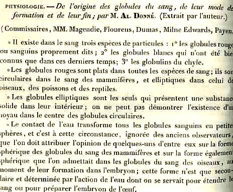
    Alfred Donne (1801-1878), physician, experimenter, microscopist and photographer, is best known for things other than what he should probably be best known for:  his discovery of the third element of the blood, platelets.  Donne had a wonderful vision, and was among the very first on the scene to write about and employ the spectacular invention of the daguerreotype in chemistry and microscopy.  As a matter of fact Donne, along with his collaborator Leon Foucault,  produced the very first engraved images of photomicrographs for his cytology paper of 1840. (He was also the first to use electricity in producing a medical illustration, and was among the first modern physicians to write on the great efficacy of mothers using their own milk in breast feeding their children.)  The discovery of platelets paper of 1842*–preceding two other works published in the same year–does indeed identify the new object, but actually fails to make a methodological examination of the new body, calling the new units “globulins du chyle” (or small globules
    derived from plasma).  He also fails to make a drawing of what he saw; so, the combination of these two important elements asked the reader to accept his findings on faith, the tools of reproduction of his observations not being present.  And so we remember Donne for some other significant things, na dless so for his lightly-interpreted and un-illustrated “dots”.

    *Donne, Alfred. De l’origine des globules du sang, de leur mode de formation et de leur fin. Comptes rendus de l’Académie des Sciences, Paris, 1842, 14: 366-168. 

    (Overall the history of the
    discovery of platelets is convoluted: 
    Leewenhoek (1675) and Henson (1782)  were the first to fully describe the “undefined”
    particles of the blood; Donne’s work was then more fully described by Beale in
    1850, and then again (identified as “small corpuscles” by Zimmerman in 1860 and
    then again by Schultze in 1874 and Laptschinski (also in 1874). William Osler
    then enters the scene in 1880, followed by Giulio Bizzozzero who was the
    first, in the years 1881 -1882, to establish central role of platelets
    not only in physiological haemostasis, but also in thrombosis.  Anyway it is a longish and not-clear
    history.)

    .


  • Return to the Poem-amatic: Tristan Tzara’s Dadaist Poetry Engine

    JF Ptak Science Books  LLC  Post 530

    Scan0001

    Each thing we see hides something else we want to see.
    –Rene Magritte

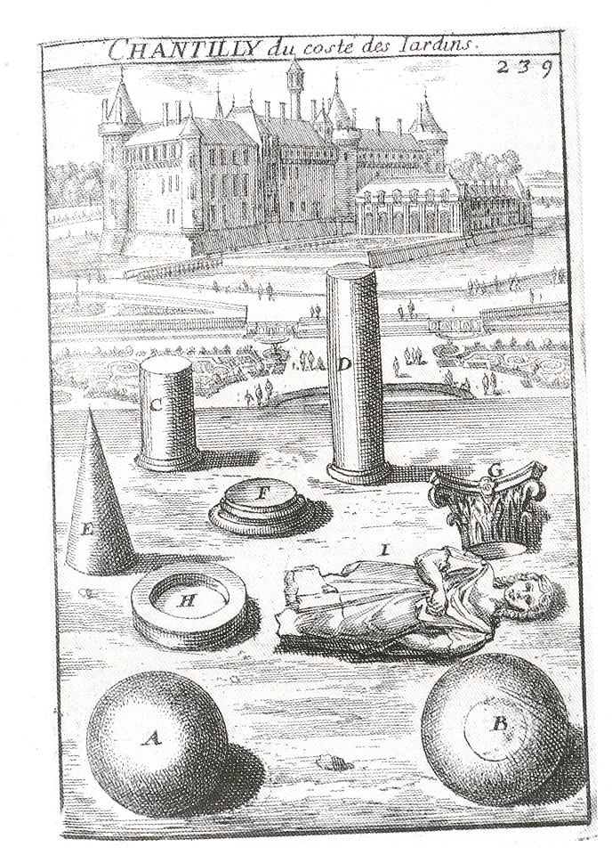
    I am very fond of images like this–images that show us  everything and nothing. The engraving was meant to show some of the ephemeral antique bric-a-brac collected by whatever collector was currently residing at Chantilly.  Remove that explanation, and the meaning of the engraving goes spinning into whatever space you open for it.  It is a wonderful thing to open these dis-associated image combinatorics to free interpretation, each viewer finding their own meaning in a mysteriously composed components. 

    This of course was an unintentional artifact of the artist and engraver.  Images like this–confusing, anti-intuitive, misleading–weren’t constructed to be so (at least not in a major and determined way) until the arrival of the Dadaists in the 20th century.   This was a short-lived, proto-archaic (?) group with a confusing history, a tumultuous existence, and a short and sure ending.  They were disengaging from the avant garde to form a group that went somewhat beyond*
    Dada

    (Even the naming of the group is a story of unusual ripeness and spoilage, no one being able to tell the truth of how it came into being.  Suffice to say that “dada” either was or wasn’t found by an accidental grazing through Larousse by Tristan Tzara in February 1916.  At least Hans Arp tells this as the true story, saying too that he was there, along with his 12 children and a brioche in his left nostril. Anyway the naming doesn’t seem to matter terribly much to a group like this that disposed of and twisted names proper and otherwise.)

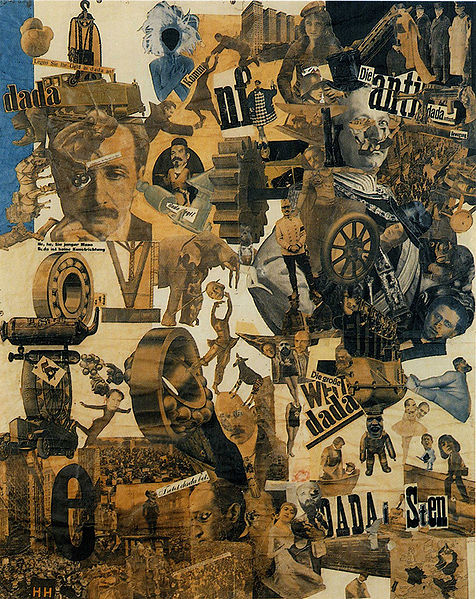
    An example of a Dadaist work is at right, by Hannah Höch, Cut with the Dada Kitchen Knife through the Last Weimar Beer-Belly Cultural Epoch in Germany, 1919)

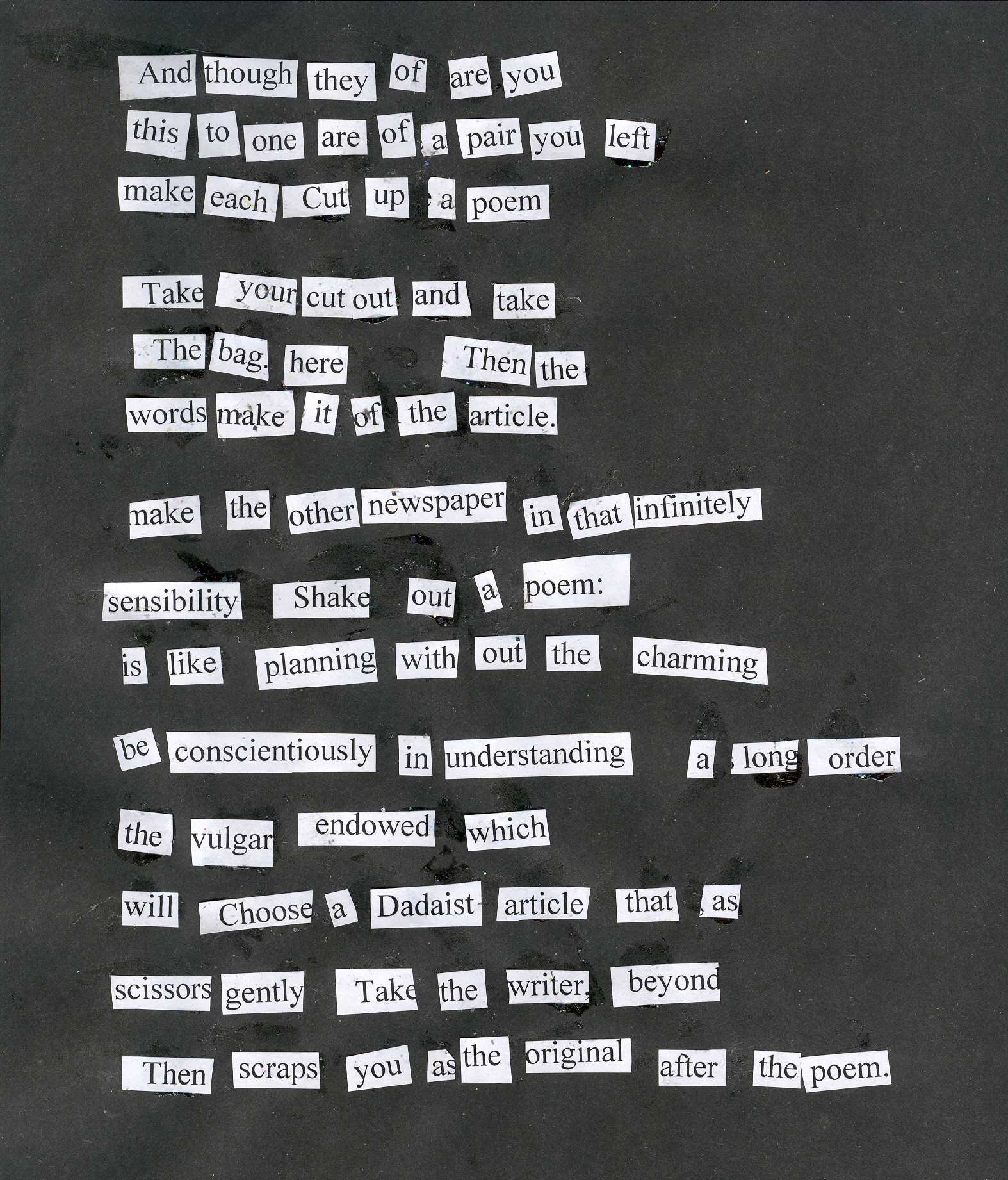
    The Dadaists, born in the Cafe Voltaire, were interested first in the written arts, and didn’t move to painting and the plastics for a couple of years.  The first among these creative equals was probably Tristan Tzara  (born Samuel or Samy Rosenstock, also known as S. Samyro, 1896–1963) who was first a writer and poet before an artist.  True to the Dadaist great non-existent history, Tzara set forth a method of constructing poetry.  It was basically an engine for a simultaneous poem, as in the “bruitist” Futurists tradition, which built upon the work of Hugo Ball, who in turn was the inventor of the sound poem (Lautgedicht). And so tongue deep in cheek, Tzara set forth these principles:

    To make a Dadaist poem:

    • Take a newspaper.
    • Take a pair of scissors.
    • Choose an article as long as
      you are planning to make your poem.
    • Cut out the article.
    • Then cut out each of the
      words that make up this article and put them in a bag.
    • Shake it gently.
    • Then take out the scraps one
      after the other in the order in which they left the bag.
    • Copy conscientiously.
    • The poem will be like you.
    • And here you are a writer,
      infinitely original and endowed with a sensibility that is charming though
      beyond the understanding of the vulgar.

    Scan0002 (Some few weeks ago I made a post about an automatic poem-making device–the poem-amatic fist micrroscope–a
    fun little bit about making poems of ordinary printed pages by
    recording what you saw of them in the visual field seen through the
    barrel of a semi-closed fist. 
    Then there is the entry “Poetry from Found-Wordist and Book Pathologist
    Mr. Ignatio Norme
    , Found-Wordist and Page Number Collector (Boston, Mass.;
    1923-1988))” in my growing and imaginary museum catalog called Weltin and
    Wantin.
      Mr. Norme constructed poems in
    much this same way, except that he stripped his poems out of the lines of his
    books. His effort is here, called Primo VI, the Analysis of Man//Fantasies
    brillantes
    (by  “the man who found obscure
    phi-related connectivity between random word placement, page number and the poetic
    ideal”).

    Now.
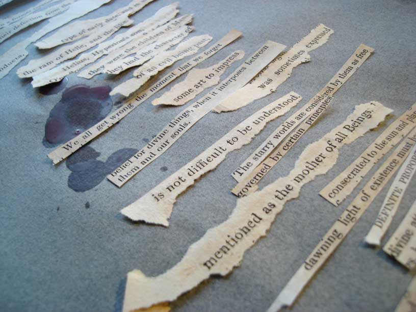
    I tried this out, but not with newspaper–rather I did it with Tzara’s instruction itself, and let me tell you, it doesn’t work.  There’s just too much left to chance, and, frankly, too many prepositions, too much grunting work.

    On the other hand, if you lay out the pieces before you and determine to allow yourself 15 minutes to select a poem from the scattered bits on the table, then the method does stand some sort of chance.
    Here’s what I came up with, and it is almost something or other; at least I think that  is probably not nothing.  In the very least, though, it is a very interesting exercise, trying to get your mind to find a poem in strips of paper.  In that way Mr. Tzara was perfectly correct. 

    (Below is a fragment of Mr. Norme’s work.)

    Blog--norme

    _______

    *  Dada is the groundwork to abstract art and sound poetry, a starting
    point for performance art, a prelude to postmodernism, an influence on
    pop art, a celebration of antiart to be later embraced for
    anarcho-political uses in the 1960s and the movement that lay the
    foundation for Surrealism.
    —Marc Lowenthal, translator’s introduction to Francis Picabia‘s I Am a Beautiful Monster: Poetry, Prose, And Provocation


  • God in Reverse: the First Painted View of Future Action (1912?)

    JF Ptak Science Books LLC  Post 529

    Jeff Donlan from Salida, Colorado, sparked this post with his comment from yesterday*.  I don’t think that Matyushin  really knew where he was going , either, even though he was writing in the years (1896-1916) when this issue of time and space and motion was being hammered on god’s holy anvil.  The thinking that the artist of this time were in some way responsible for shaping the social vessel necessary for the scientific development of these ideas has never been attractive to me.  Frankly this image wound up in the dead idea cemetery (along with the cemeteries of lost ideas, the cemeteries of blind ambitions, of fear, of lust-conquered-love and vice versa; the cemeteries of hollow illusion, near-achievement, and good will; the cemeteries of childhood despairs, of extra vowels, of dropped change, of the thoughts behind bad thoughts, and of ill-gotten gains.  There are no cemeteries evidently for incompetencies or mediocracies, as these things, in addition to being lifeless, cannot be killed.)

    This issue is strongly entertained by Linda Dalrymple Henderson in her Princeton-published doorstopper The Fourth Dimension and Non-Euclidean Geometry in Modern Art, where she prettily and exhaustively declares “nope” to the egg-chicken possibility of the space/time issue being born in art and nurtured-up in the sciences, which is fine with me. 

    That’s not to say that the art produced in the sciences to illustrate fourth- and nth-dimensional space weren’t without (great) artistic qualities.W.L. Stringham  (“Regular Fgures in n-Dimensional Space”, 1880), E. Jouffre  (Traite elementaire de geometrie a quatre dimensions, 1903), H.P. Manning (Geometry of Four Dimensions, 1914) are excellent and early examples of gorgeous illustration illuminating complex issues, and are also published many years before the works of Braque and Picasso and Metzinger and Gleizes and Le Fauconnier and of course Duchamp.  These artists are all producing their important work before 1912, but are also definitely coming after some of the major work in the history of the fourth dimension.  

    But getting back to Matyushin and to the title of this post:  I wondered when the first painted images depicting future action was painted. “God” comes into this because, I think, a case might be made for the depcition of future action via the depiction of the progression to life-after-death states (and marching towards heaven/hell.)  Removing god from the equation takes us,  maybe, to the backwards spelling of god:  “dog”.

    Blog--bella
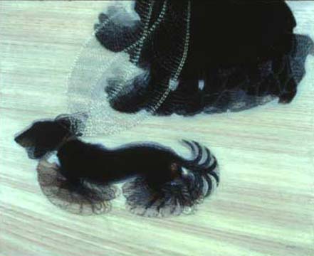
    Giacomo Bella’s  Dynamism of a Dog on a Leash (1912) may well be the god-reverser, the first painting of the future, with simultaneous views of space and time, wrapped up in the gift of speed.  Whether this is accurate or not I really don’t know–Duchamp’s Nude Descending was painted and almost and nearly exhibited in this same year (having been throw out of the art exhibition by friend and foe alike because his work was too risky)–I really like that this “first” involved the picture of a doggie, even though it is vastly inferior to the Duchamp and all.  

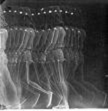
    This is a complex issue that I’m just passing quickly through–I’m not sure that this whole issue wasn’t dealt with first(artistically) in the comics, the space/time bit perhaps getting an early cover in places like Windsor McKay’s Little Nemo in Slumberland (1908) and Lyonel Feininger’s The Kin-der-Kids (1909).  Then there’s the issue of Etinne Marey’s beautiful studies of motion, which look a tremendous lot like the things to come in Duchamp et cie twenty years later, but that’s another story. But I think it highly poetic that this issue boils down to a stumpy dog, Little Nemo, a French polymath with a gun camera, and M. Duchamp (who didn’t take any of it seriously). 

    Blogmissingmarey_one

    __________

    * “Pictures
    like these are porn for the unhappy multitasker. What Matyushin could
    not know in 1915 is that when we rush fast enough, our left brain shuts
    down and the right brain takes over suffusing us with an intense
    feeling of oneness. We don’t really see the totality; we just feel we
    do. I don’t know that this is true, but I feel that it is as I rush
    through this so I can write my library column before I forget…”  This was said in response to the following: “
    Mikhail Matyushin, in 1915: “Only motion cystallizes outward appearance
    into a single whole…a speeding train fuses the separatness of the
    cars into a compact mass…”  He goes on to say that “when at last we
    shall rush rapidly past objectness we shall probably see the totality
    of the whole world”, though I think that he got that part of it
    backwards, or perhaps inside out.”

    ·Posted by :

    ·in:

    —

  • Crowds #5: Clarity and Confusion in Displays of Human Masses.

    JF Ptak Science Books LLC  Post 523

    0 abay feb 23 crowd617

    I do enjoy looking at pictures of crowds–big crowds.  Images of the crowd are much easier to find in the 19th century and onwards (and particularly in photographs), though big displays of human seas (such as they were) began to show up in the late 15th century, and then, more as a matter of course, in the early 16th century.  What is enjoyable for me are the numerous vignettes that make up the whole, discrete visions within the larger visual field, a sweep of smallnesses that can seemingly stand on their own had they been bigger. 

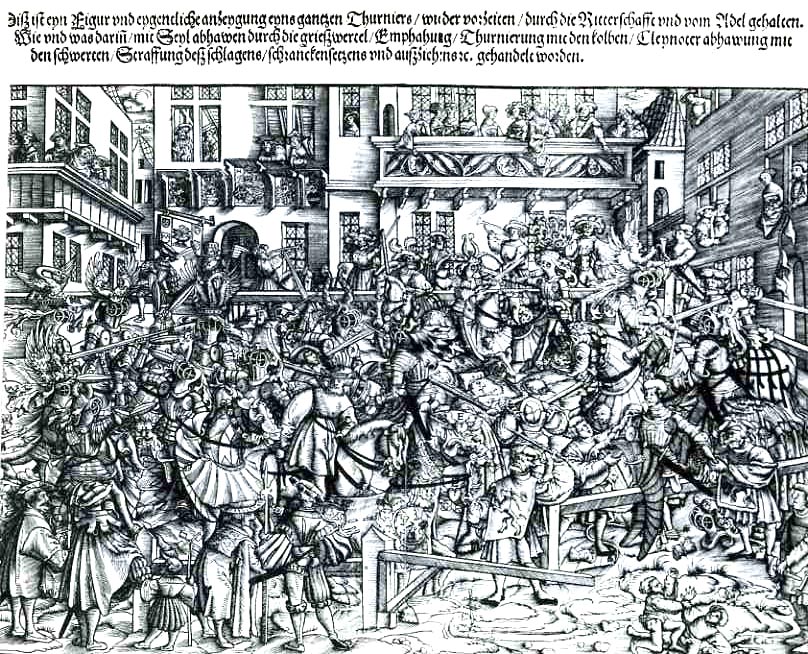
    Depicting crowds can be a chore successful and not–for example, the image to the left, an amalgamated porridge of controlled mock combat, a sweeping chaos with appreciative bystanders, is so busy, and has so many constituent parts, that there 

    0 abay feb 23 crowd618

    really isn’t a “whole”.  I can hardly see the thing, for crying out
    loud, for all of the disconnected action.  The artist who produced this
    remarkably good/bad image for Georg Ruexner’s fantastic Anfamg, Ursprung und Herkomen de Thirnirs in Teutscher Nation
    (published in 1530) clearly had interest only in the details of the
    action; and thus the overall image is a beautiful confusion of starts
    and fits, defiant in its general appeal to comprehension.  The impression to me is a miserably layered oneness of discordant activity, a sloppy relief of enormous detail, the whole worth far less than the sum of its parts. 
    The only place that your eye gets a chance to rest and focus is on the two dozen or so spectators who are in the windows and balconies overlooking the small square where the tournament was taking place–their appearance, and also that of the small assembly of musicians at center, offer a calming influence to the rest of the picture.
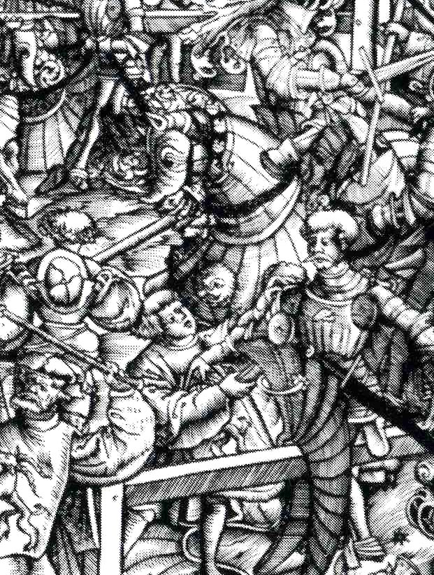
    One bit that leaps out at me, though, are the two small boys who seem to be having a fistfight, right there at the bottom-right of the image.  I can tell you that pictures of boys fighting finding their way into piece of renaissance art is a very rare thing.  Perhaps the artist was trying to send us a message, after all?

    (I know this is a pretty big complaint, particularly since the book is a monumental work on The Tournament, and it was done within the first 65 years or so of the invention of movable type printing, but I just found the thing so opitcally  corrosive that I wanted to surface it. )

    0 abay feb 23 crowd620

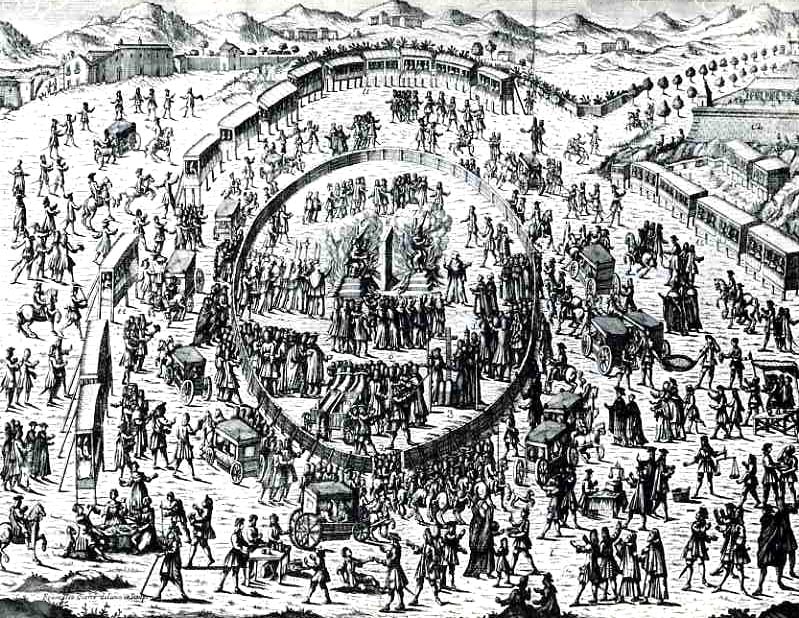
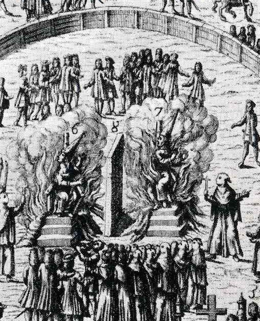
    The second example, coming to us from Antonio Mongitore (L’Atto Pubblico di Fede Solennemente Celebrato nella citta di Palermo, 1724) depicts an earlier scene, and one of complexity and order.  Unfortunately, the cohesion centers around the execution of two tried/convicted heretics–god knows what they did to deserve this cleansing sentence. It didn’t take all that much during the Inquisition to find yourself in deep black waters, as Mother Church seems to have been extraordinarily thin-skinned; the slightest abrasion to their slight slate of moral indignities could result in being hurt in foul way, and then burned alive at the stake. 

    But in looking closer at this image, I’m not sure sure that these two unfortunates were actually being burnt–it may be that they were being roasted alive.

    0 abay feb 23 crowd619

    They are seated, and the pyre seems to be only behind them–perhaps
    the flames hadn’t reached them yet; but people were in fact roasted,
    cooked alive, which may be even more girzzly than being consumed
    entirely by flames.  The two are being approached, or watched, or
    offered too-late benedictions by a line of clerics shielded by a
    crucifix–perhaps they were just reminding the condemned exactly who it
    was that they had pissed off. 

    There is no doubt that this was
    a popular diversion for those not in fear of being burnt at the stake,
    as there are probably hundreds of people in attendance, including those
    in a semi-circle of pre-modern “skybox” accommodations–undoubtedly the
    holier folks.  Piety of witnessing best in privacy and all that. 


  • Children’s Games in Art in the 16th & 17th Centuries: van de Venne and Brueghel

    JF Ptak Science Books LLC  Post 503

    0 blog feb 5 van de venne537
    Adrieaen Pietersz vasn de Venne, must’ve been familiar with
    the work of Peter Brueghel.  I’m not
    saying that Brueghel owned the genre of vernacular allegory, but he certainly
    comes pretty close to that.  In any
    event, van de Venne (1589-1662), a Delft artist who produced this illustration which so much reminds me of Brueghel worked
    a hundred years after the great master—(the elder Brueghel belonged to the
    Netherlands Renaissance, and died in 1569). 
    Having been raised in Deflt, studied in Leiden and died in the Hague, I
    suspect it would’ve been impossible not to come under the influence of Peter or
    the others in the Brueghel family collective, though it would’ve been Peter
    (the elder, who was also known as “the Peasant”) who it seems to me lays the
    greatest claim to some of van de Venne’s thinking.    

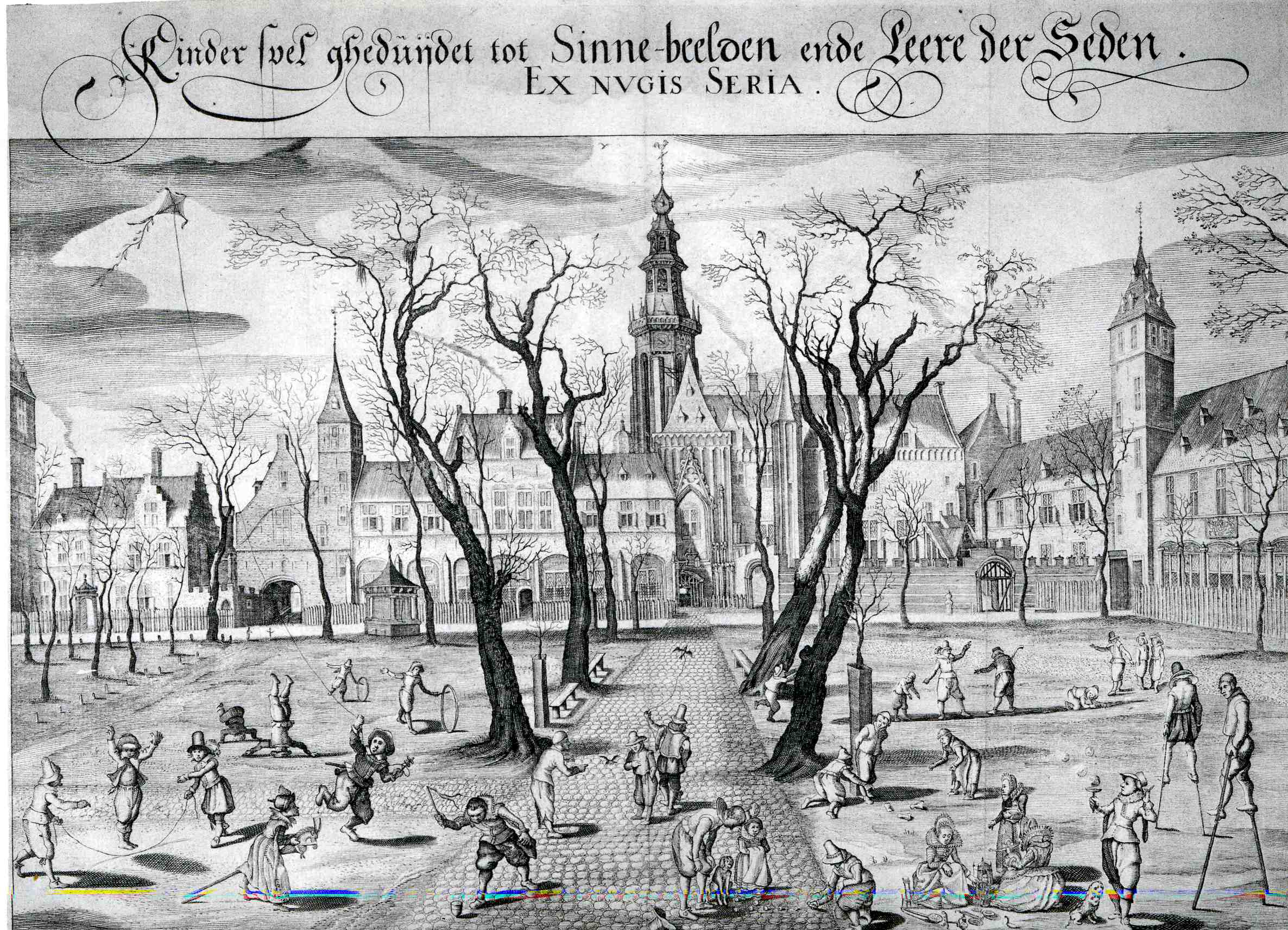
    The subject of van de Vene’s painting (shown here above)  of children’s game is as much a
    parable as it is a recording of games that kids played in the Netherlands in the
    early 17th century.  The
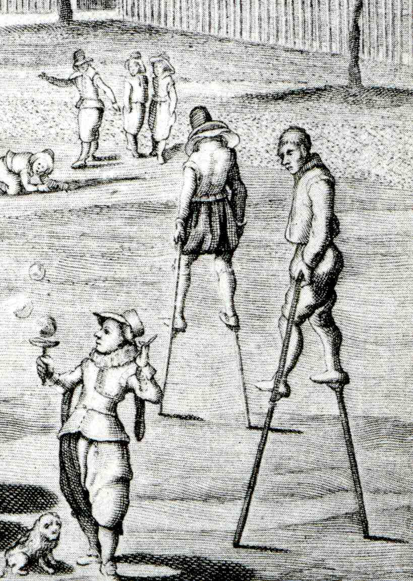
    children are occupying themselves with supreme simplicity, allowing their
    imaginations to form the areas that the physical toy could not; around them we
    see older folks, walking on stilts, seemingly above all of the childish
    bric-a-brac of living.  I think too that
    the spare trees decorating the walk in front of the square of churches in the
    background are there to illustrate what he saw as the lack of imaginative
    fertility of the churches’ reach into the world of the living.  It seems a pretty harsh painting to me once
    you get beyond the fantastic depiction of children at play.  (This genre, of kids playing, is not a very
    wide one in the history of art, believe me.) 

    I think that when you look at the works of van de Venne and
    then at those of Peter Brueghel, there is a close 0 blog feb 5 van de venne538
    connection, as though the
    later painting was simply an intellectual descendant of Brueghel  This is especially true when you look for
    example  at such Brueghel paintings
    as  Ass at School, 1556, Parable
    of the Sower
    , 1557, Landscape with the Fall of Icarus,
    c.1554-55,  Netherlandish Proverbs, 1559,The Fight Between Carnival and Lent,
    1559, Portrait of an Old Woman, 1560, and Temperance, 1560.  This becomes especially, easily clear when

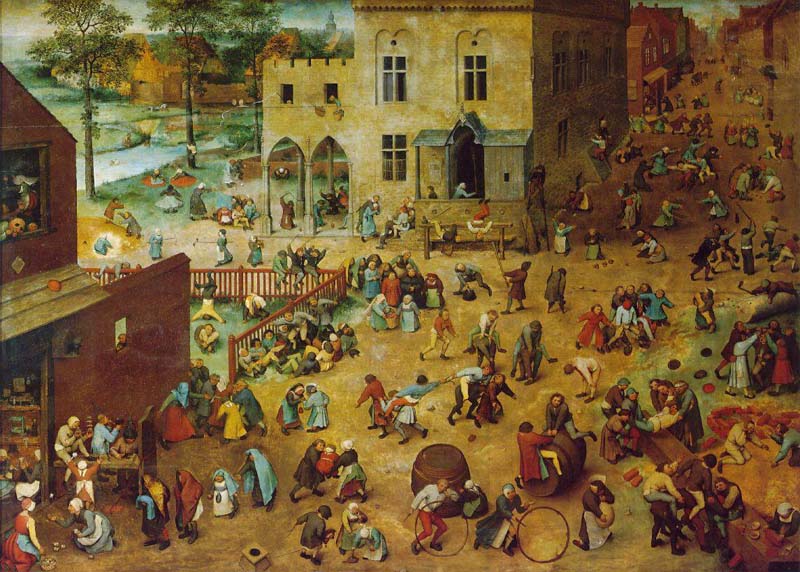
    you see the Children’s Games, Brueghel’s spectacular
    1560 achievement in which 250+ children are shown at play at some 80+ games,
    seemingly taking over the square of this small town.  This is a painting of enormous importance in
    the preservation of time spent at play. Evidently the experts have identified
    almost all of the games being played and toys being used;  the toys are all known, but there are a few
    games that remain a mystery to 21st century eyes. 

    Van de Venne seemed not to have had followers in his footsteps,
    exactly.  He went on in the later quarter
    of his career to specialize in depicting his subject matter in painting in
    various forms of gray, with his principal subjects in his genre paintings being
    peasants, the poor, the maimed, the ugly, the infirmed, the out-of-place, and
    children.  Seems as though this approach
    did not lend itself to the glorious revival of sumptuousness and color that was
    coming to the Netherlands just at the time of van de Venne’s death.  

    And, just  for the record, the Brughel painting:

    Bruegel_games 

    Richard Muhlberger, in What Makes A Bruegel A Bruegel? (New York: Metropolitan Museum of Art and Viking, 1993, pages 15-16)
    tells us that:

    “Brueghel painted an entire town inhabited by about two
    hundred fifty children. At first the image seems to capture a
    holiday, but soon it becomes clear that the painting is meant to be an
    encyclopedia of children’s games. Because most of them are still
    played today, eight-four have been identified, while others not known
    to the twentieth century have yet to be recognized.”

    “Brueghel did not want to emphasize one game above the others. Not
    able to crowd them all up front, he painted them as if looking down at
    them from above so that none is blocked from view. While the distant
    children are smaller than the ones up front, their costumes are still
    bright. No matter where the children are, even in the shadows, Brueghel
    painted them as if they were in the noonday sun… At first it looks as
    though the boys and girls are scattered at random, like jacks thrown on
    the ground. Brueghel knew how to organize large crowds into patterns.
    The figures in the foreground of the painting are arranged in lines
    that fan out from the lower left corner and catch the viewer’s eye
    first. Of course, being formed of children, the lines refuse to be
    exactly straight! The youngsters in the street behind them are placed
    in small groups that form a back-and-forth curving line… Brueghel
    made all of the children’s faces similar. Differences in clothing are
    slight, and not many colors are used. But each child looks like an
    individual because of the way the artist painted bodies: No two are
    alike. After all, it is in the figures’ movements that the viewer can
    tell what games are being played. By focusing not on personalities but
    on the games, Brueghel gave them a universal meaning.”


  • Points of View: Inside Looking Out, Outside Looking in, and in-Between

    JF Ptak Science Books LLC  Post 500

    0 blog feb 2 outsdide in512

    One of the exercises I’ve undertaken in this blog is to try and see stuff from a different perspective, or from an uncommon point of view, which can give a little bit of fire to the common bit.  And so that brought categories of posts like Blank and Empty Things, History of Smallness, Outsider Logic, Naive Surreal, the History of Dots, Bad Ideas, and the like.  One small category (with only a few posts) is Looking Straight at Things, where the point of view for the observer is directly in front of the object, giving it a flat perspective–from my experience, this is an uncommon antiquarian  viewpoint, especially when one looks straight up or straight down at something.  Another small posting is


    0 blog feb 2 outsdide in513

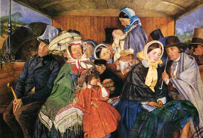
    You Are There, where the observer is placed inside the body of the subject of the print, so that “you” can see “your” hands drawing the first map ever drawn in an aeroplane, and that sort of thing.  Following on the heals of these last two is a new category, Inside Looking Out & Outside Looking In, where the viewer is rewarded with a similar you-are-there experience, as we see in these three examples.  The first (above)  is by Charles Rossiter (1827-1890), whose painting To Brighton and Back for 3/61 done in 1859 (almost exactly at the mid-point of the artist’s life), puts the viewer on the opposing bench of the open-windowed railway car, with an oddly blank view of the passengers in the opposing section of the car.  I can almost see my knees in the bottom of this panting, as I sit, sandwiched between a big-thighed someone and a big-armed someone-else, watching the small trials of human destinies unfold before my squinty-closed eyes, trying to enjoy the memory of the beach as we jostled our way back to London.  (I would hope that I was decent enough to stand and allow the young mother and her baby standing there in the middle of the painting to have my seat, but it looks like this viewer is as unmoved as the rest of the semi-gentlemen of the car.)

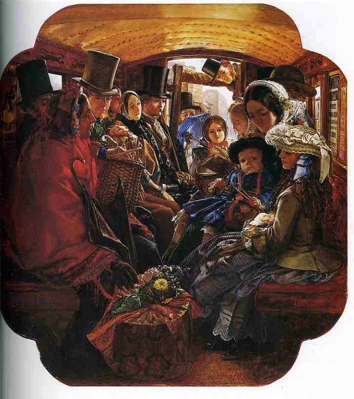
    Next is William Maw Egley (1826-1916), whose Omnibus Life in London2, also published in 1859, gives a wonderful view from beyond the back of the cab/bus, giving a very colorful overview of flouncy and mega-dressed inner-city mass transit.  The red shawl business woman in the front-left definitely seems a little at odds with the rest of her traveling companions, though most are taking an interest in her beautiful basket of flowers. 


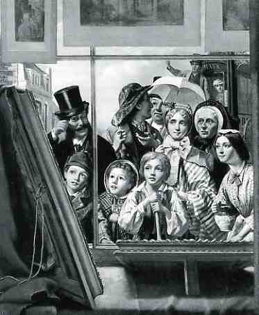
    0 blog feb 2 outsdide in514 The next and last image is a little odd, showing a view from the inside of a print shop looking out at people who are looking in.  The print, One Touch of Nature Makes the Whole World Kin (1867)  by Thomas P. Hall, is otherwise semi-satisfying in a mid-Victorian kinda way, what with the luminous and wondrous eyes filled with the beauty of the painting at left.  Hall’s work does live up to its name, though, the artist interestingly including a silk-hatted fob connoisseur with a monocle, some few children, a child laborer (a street sweeper, I guess, not unlike The Last Picture Show),  three generations of women, a drayman with a pipe, and an omnibus driver–a good assortment and spectrum of people in such a small group.  

    There are no doubt collections of such images, not the least of which is a vast array of 17th century Dutch artists (like Gerard Dou) whose metier is of people looking through/resting on windows/windowsills.  But I just happened upon these three in the course of my day, and liked them, and tried somehow to string them together  so that they could be strung along with other like-positioned images some time in the future. 

    Notes:


    ·Posted by :

    ·in:


  • Looking at Things Straight On, Part 3: Perspective Books in the 16th Century

    JF Ptak Science Books LLC  Post 496

    0 blog jan 24rodler'422

    Hieronymus Rodler (who died in 1539) wrote one of the greatest books of the Renaissance on the use and care of the relatively-newly-discovered practice of perspective. Perspectiva, Eyn Schon nuetzlich buchlin und underweisung der Kunst des Messens...(Useful Booklet and Instruction in the Art of Measurement), published in Frankfurt a.M. in 1546 (as a second edition following the 1531 first). I say “newly” because Rodler wrote his book to help explain, or at least somewhat simplify, the 1525 Underweysung der Messung (Instruction in Measurement)  by Albrecht Durer, a great work of some substantial complexity and difficulty.

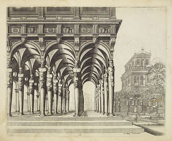
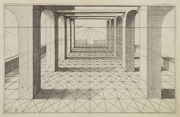
    The works of Wenzel Jamnitzer  (1564 and 1568), Heinrich Lautensack (1564) and Hans Lencker (1567), all fine examples of earlish work in perspective and al quite lovely–but it is  Hans, or Johannes Vredeman de Vries (ca.1527-1604, “The King of Architects” among the Dutch, at least), whose Perspective of 1604 rises to the greatest heights, a book filled with superb copperplate engravings of the master’s work, vanishing points into which all the lines of the engraving converge, sucked as it were into a perspective Black Hole.   That, and of course there are so many of them that look exactly at the center of a receding horizon.  (And this continues two earlier posts written along the same vein, here.)

    Perspective de vries

    In his dedication to the reader (“To the Studious Viewers of Optics”), Vredeman de Vries writes that 

    “My eyes and mind took pride
    In Sacred Optics. Thereunto allied
    was a fructifying labor,  forty years
    I plied this art devoutly, Here appears
    a doctrine worn by time. That art is famed
    For trustworthiness which trusty rules have framed…
    This art, which guides the eye and soothes the brain,
    with images, but never cheats the sight
    with lying views…”

    I have purposely not said anything about early artists (like  Uccello, Filippo Brunelleschi, Leone Alberti (Optics),  Piero della Francesca, Piero della Francesca, Federico Commandino, Jan van Eyck, Leonardo, and Serilo and Vignolla, Raphael, and so on) and the development of perspective in painting because, well, I can’t figure out how to do it in a paragraph.  But you can certainly consult fine books like Samuel Edgerton The Renaissance Rediscovery of Linear Persepctive (1975)  and Hubert Damisch The Origin of Perspective  (1994) for a bigger taste of teh issue. Me, I just wanted to look straight-on at some 16th century perspective  illustrations…

    Perspective de vries2