A Daily History of Holes, Dots, Lines, Science, History, Math, Physics, Art, the Unintentional Absurd, Architecture, Maps, Data Visualization, Blank and Missing Things, and so on. |1.6 million words, 7500 images, 4.9 million hits| Press & appearances in The Times, Le Figaro, Mensa, The Economist, The Guardian, Discovery News, Slate, Le Monde, Sci American Blogs, Le Pont, and many other places… 5000+ total posts since 2008.

Category: Art History

  • Odd Art Department: Art Brut in Advertising?

    JF Ptak Science Books LLC  Post 810  Blog Bookstore

     + blog 10.26 tauranga

    There’s not much in this illustration–the entire back page of an oversize pulbicity tourist pamphlet–to suggest any sort of professionalism, or training, or, well, ability.  But there it is, badly drawn, with unusual (if not bad) coloring, trying to entice people to visit this seaside resort in New Zealand. 

    Maybe this is more “outsider art”
    than Art Brut.  Art Brut was a term used by
    Jean Dubuftet to describe raw/rough art produced by non-artists (and those
    mostly mental asylum residents1).  Art
    critic Roger Cardinal coined “outsider art” as a English-language adaptation of
    the Dubuffet term2, and has since come into use to describe unusual,
    technically naïve and unschooled Otherness of artworks.  This cover illustration is certainly bearing
    a pretty good-sized helping of otherness to it, from its pale, weird coloring
    to its basic inability to draw.  Somehow
    though it is attractive to me, and ultra-calming when it is not troubling.  It is just one of those peculiar works that
    is good and bad at the same time.

    Notes:

    1. A spectacular and early example
    of Art Brut is found in the phenomenally detailed, insightful-of-other-worlds
    work of  Adolf Wolfli.

    2. “Those works created
    from solitude and from pure and authentic creative impulses – where the worries
    of competition, acclaim and social promotion do not interfere – are, because of
    these very facts, more precious than the productions of professionals. After a
    certain familiarity with these flourishings of an exalted feverishness, lived
    so fully and so intensely by their authors, we cannot avoid the feeling that in
    relation to these works, cultural art in its entirety appears to be the game of
    a futile society, a fallacious parade.” – Jean Dubuffet. Place à
    l’incivisme
    (Make way for Incivism). Art and Text no.27 (December 1987 –
    February 1988).


  • History of Boredom: St. Joseph’s Ennui in the Nativity?

    JF Ptak Science Books  Post 809   Blog Bookstore

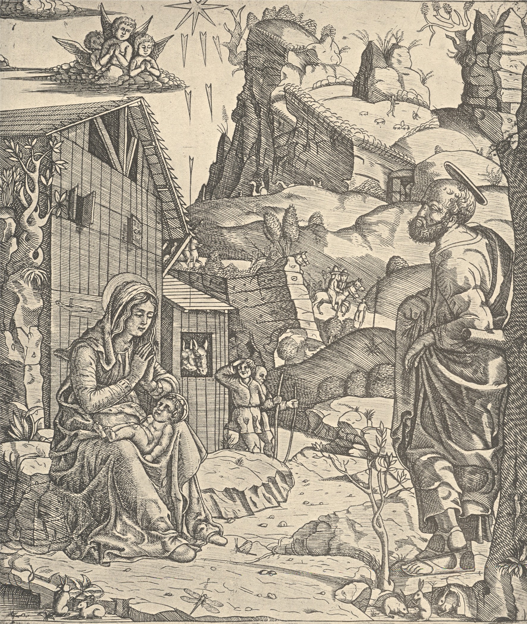
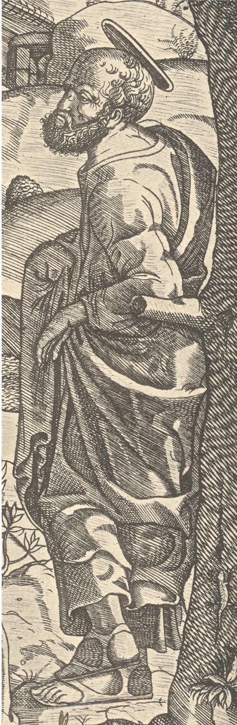
    This woodcut, the work of the semi-anonymous “Italian Monogrammist” and printed around 1510, shows the newly arrived Christ in the arms of his mother, taking the airs outside the stable. What is unusual to me here is the attitude of St. Joseph, who adopts a dictionary-ready pose of nonchalance:  he is leaning against a tree, his left arm propped up at the elbow on a tree limb, his feet crossed at the ankles, with a look of I-don’t-know-what on his face. 

    + blog 10.26 nativity

    He is definitely not of the standard Josephs that one sees in this scene.Perhaps he is communicating a certain type of tiredness, but I doubt it. The man is staring off into space, not looking at wife and baby, not looking at the many visitors coming through the tunnel in the mountain and excitedly rounding the nearby turn in the road, not looking at anything that we can see.  He’s not seeing the invisible stuff either:  not the praying angels and not the sun-ray daggers.He’s not tired, not excited about the baby and wife, not excited about the visitors, and in a pose of resident uncaring relaxation–boredom might be the easiest and best explanation, except, well, it doesn’t make for a good story. 

    + blog 10.26 nativity det


  • Unusual Views, Continued: Looking Straight Down, Found-Dadaist, 1919

    JF Ptak Science Books LLC  Post 804  Blog Bookstore

    The idea of representing a view straight down, of looking
    straight down from some height, is a relatively recent occurrence, this view
    being somewhat rare in the antiquarian world pre-balloon or pre-heavier-than-air
    flight.  The pre-human-flight reason for
    its scarcity is understandable, but even after the first Montgolfiers’1
    ascension in 1787, there’s another 120+ years of scarcity yet to come before
    these views would start to pop up in common (and uncommon) literature..  Now I’m not talking about cartography, which
    is basically a straight-down view of the world—what I’m referring to (and where
    I’ve posed a few time before in this blog, particularly here)
    is that same view but not as a map per se, but what you would see if you were dangling
    out of a plane or balloon.  The
    extraordinary map of Imola by Leonardo would certainly classify because of its
    you-are-there qualities:  essentially it
    would be like a bird’-eye or oblique view, but straight down.

    + blog looking down berlin

    I think that this view was avoided because (in
    pre-flight days) of the high imagination that it took to picture the view, and,
    secondly, because of how this view created its own special Flatland2 and
    crunched, flattened, everything down to what becomes somewhat (and sometimes
    entirely) unrecognizable.  This point was
    just hammered home to me while trolling through an interesting book by Matthew
    Biro, The Dada Cyborg3. Biro makes a
    great find of unintended/found Dada illustration in the Berliner Illustriete Zeitung4 in which a photographer makes images
    of passing pedestrians, turning them into quite something else due to the
    squashed depth of field and non-perspective. The photos make the point
    perfectly of why artists might have avoided this straight-down
    perspective.  The Found Dadaist result is
    interesting in itself. 

    [My apologies for so many hyphenated words in this
    post! Here’s some more in case the reader demands them: – – – – – – – – – – – –
    – – -.]

    Notes:

    1. The two brothers launched 4 June 1783, just
    before the end of our Revolutionary War, rising up in a 37,000 cubic foot
    balloon of alum-coated taffeta.

    2. Edwin Abbott’s fantastic and popular 1884 satire
    of English society, depicting the world of wants and desires in terms of a
    two-dimensional world structure (and desires for a three-dimensional
    existence).  Brilliant and simple; well, maybe
    not so simple.

    3. The Dada
    Cyborg, Views of the New Human in Wiemar Berlin
    ,
    University of Minnesota
    Press, 2009.

    4.  The
    issue for 29 December 1919.  This is the Berlin version of the
    weekly newspaper that I browse through, the Leipzig
    Illustriete Zeitung
    . 

    ·Posted by :

    ·in:

    — —

  • History of Boredom: “Nothing” in the Window

    JF Ptak
    Science Books  Post 802  

    + window statrers

    Looking at little things has its rewards, though what rewards those are may be a little oblique.  Today’s post is relegated to looking at the sidewalk on a stroll rather than the surroundings, and the sidewalk view is more like Baudelaire’s sidewalk botanist than Proust’s golden Parisian sidewalks. So it goes.

    + window statrersdet

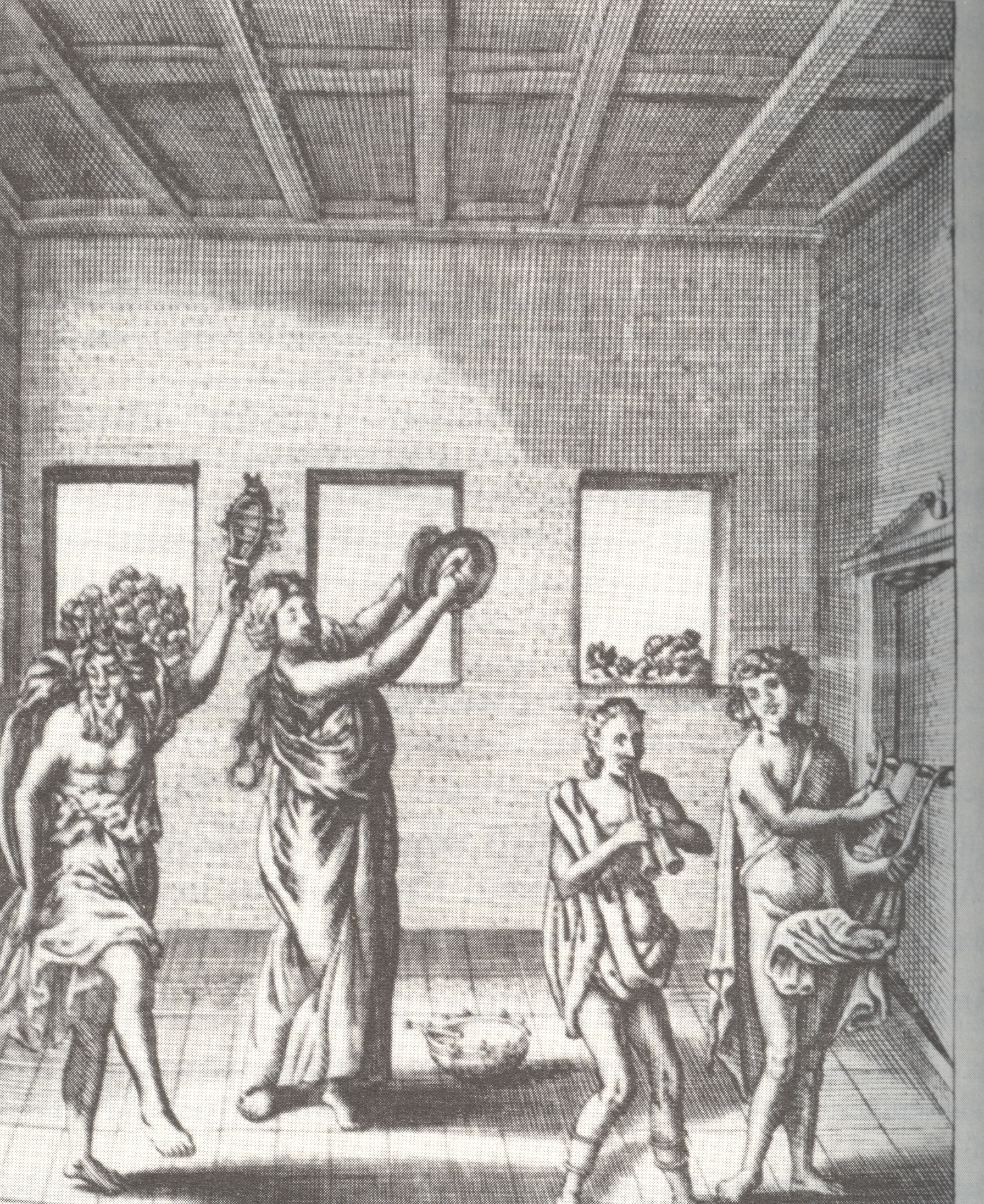
    Petrus Ciacconius Toledanus (Pedro Chacon,1525-1581) was a scholar who wrote on many things; this book, De Triclinio sive De modo co
    nvivandiapud priscos Romanos…(printed in 1664, 63 years after the author’s death) , takes a wide and classically scholarly look at bathing practices…and that includes bathing in water or in wine, and bathing once or six times a day, with dinner in the water or not, what to wear bathside, and all sorts of other bathing entertainments and necessaries.

    Arnolfini

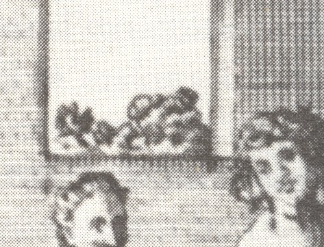
    But that’s not why I’m making this short stop here—it’s the odd bit in this illustration that has my attention.  I’m also not sure about the activity in the print—I’m fixed on the little bit of shrubbery that we can see in the background windows.  Having looked at thousands and thousands of images like this, I must say that seeing natural nothingness like this outside a window is very unusual.  In the unknown, unused and non-existent
    art appreciation genre of “Boring Things Seen Through Windows”, this print would be standard fare.

    But the real issue here for me is that the window is just a window in this print.  It doesn’t have any of the heavy significance associated with windows-in-art of the past, the window dripping with symbolic/spiritual significance (illumination, enlightenment, vision, godhead, divinity).  The window as a simple source of light or vehicle to relieve crowded interiors seems to be

    VanEyck_TheArnolfiniMarriage,detail

    overwhelmed by the religious/needy windows at least t
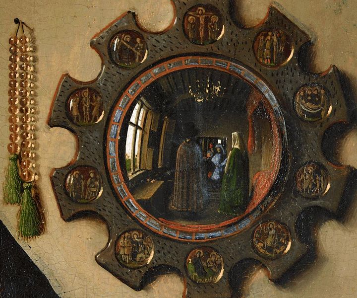
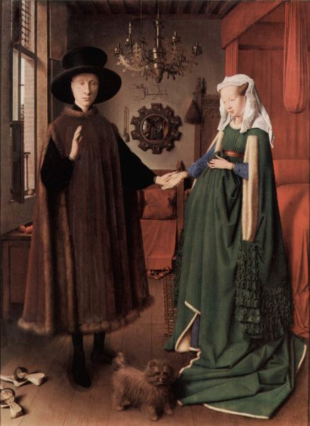
    hrough the first half of the 17th century.  (At least that’s my sense of it—I haven’t a single figure to back anything up.) The little windows that creep into the work of Van Eyck–especially in the famous “The Marriage of Giovanni Arnolfini and Giovanna  Cenami” of 1434—are interesting examples of the window as a simple source of light. (In the “Marriage” painting the window is much more visible in the iconic reverse double-painting seen in the mirror on the wall in the background.)

    St. Jerome

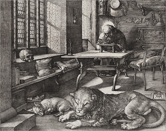
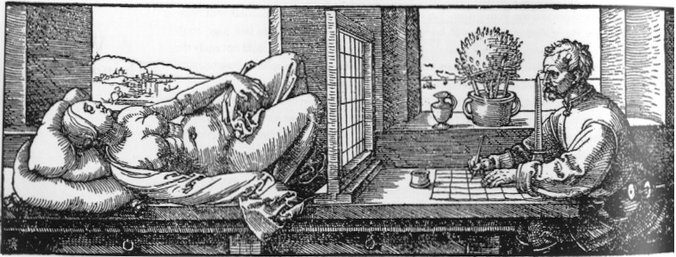
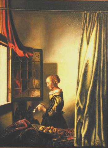
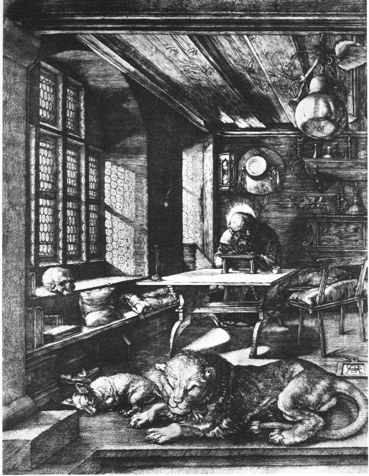
    Same too for the windows in some Vermeers, where you can virtually feel the breeze coming through them and into the  occasionally stuffy rooms.  And also for Durer:  while his great study of St. Jerome has a presiding possibility of Pure Holy Light coming into his room, it might also just be sunlight; on the other hand there is little doubt that the windows in his famous depi
    ction of an artist working a perspective study of a model through a dividing screen have nothing to do with the spiritual, and are just simple mundane windows.

    Durer


    By the 17th century there is a new genre of paintings having people looking out of windows (as with the case of Gerrit Dou, where we observe what seems like every one of his subjects looking out through a window),

    VermeerGirlAtOpenWindowLetter

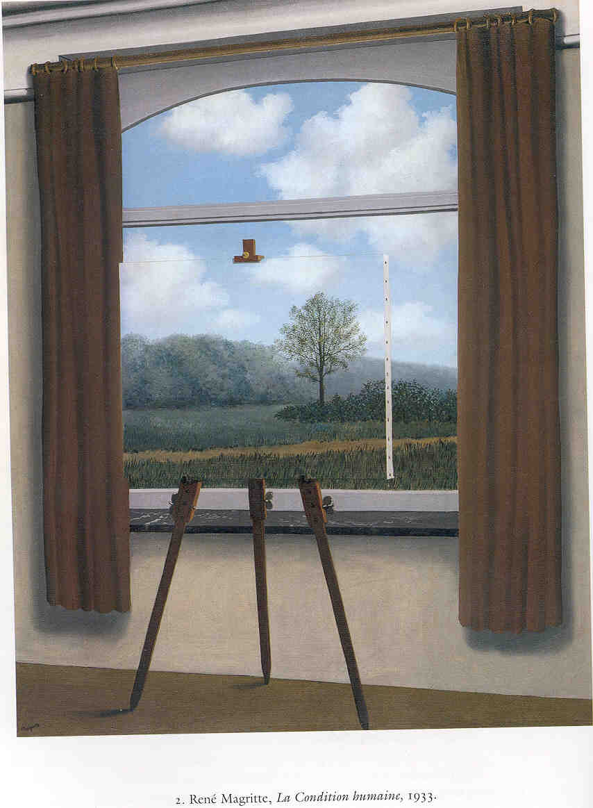
    which means I guess that the observer is the one who might shine in.  Enter the 20th century and the window takes on new meanings, as in bent/draped windows in Dali, or floating windows looking into the lonely world of Magritte, or the solitary nothing-but-a-window sculpture of Duchamp. 

    Magritte

    The unintended nothingness of the 16th century is what I think I like the best.

    Notes:

    For some pretty interesting books written on the window in art, see: Carlo Gottlieg, The Window in Art (University of Michigan, 1981, and which is a nice chronological treatment of the window, plus some psychological stuff) and Suzanne Delehenty, The Window in Twentieth-Century Art (1986), among others.  These will point the way.


  • A Short Note on Forks and Art

    JF Ptak Science Books LLC   Post 791   Blog Bookstore

    I was on my way to something else when I stopped to look at
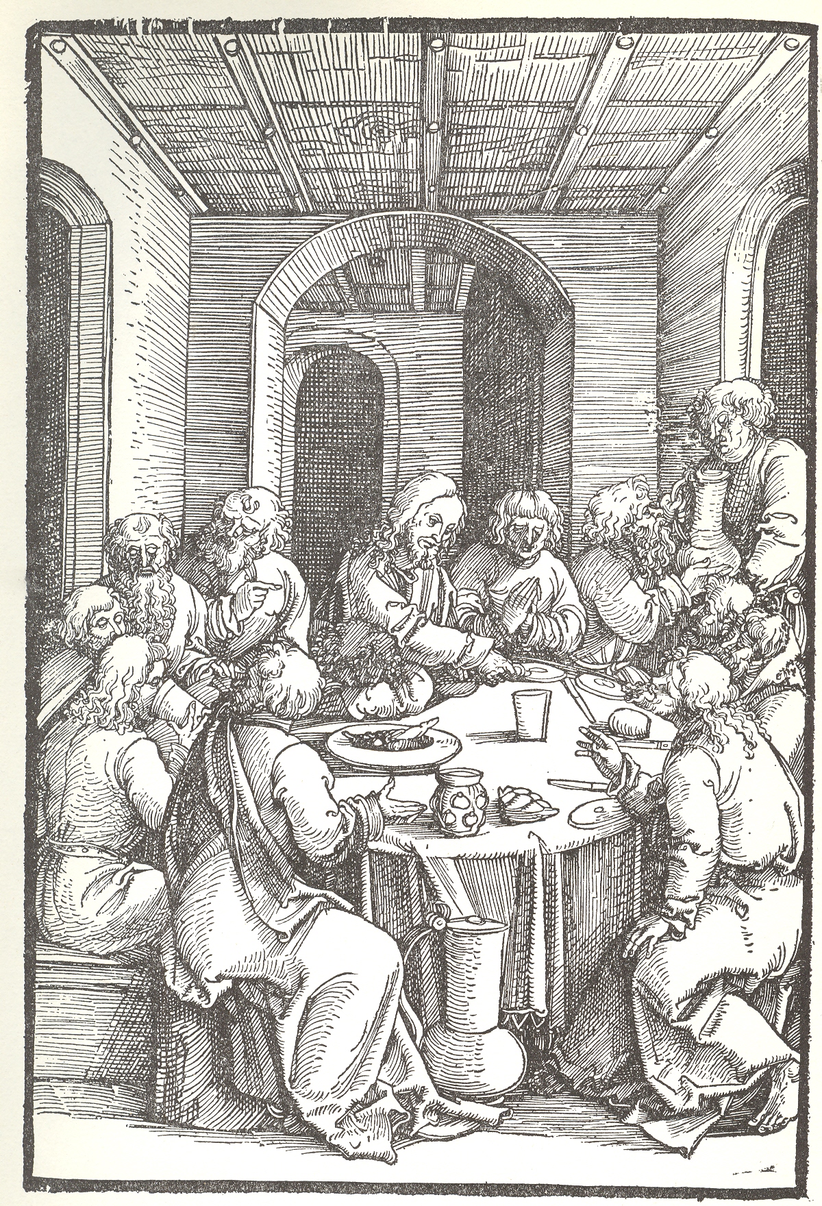
    this engraving by Ulrich Pinder, his last supper, the Speculum passionale, published in Nuremberg in 1507.  It has a nice perspective, an interesting ceiling,
    and a crowded table with very little on it in the way of food.  And no forks. 
    Knives—yes of course—and big containers of some sort of liquid, but no
    forks.  As it turns out, the fork really
    hadn’t made a strong appearance in northern Europe until the end of the
    century, brought back evidently from travelers in Europe.  The first appearance in a painting, in
    another Last Supper, I believe, occurs at least by 1599.

    + fork

    I know, there’s no spoons either, but they had been around
    for a long time, and just didn’t make an appearance on this table for reasons
    unknown.

    “I observed a custome in all those Italian Cities
    and Townes through which I passed that is not used in any other country that I
    saw in my travels, neither doe I think that any other nation of Christendome
    doth use it, but only Italy. The Italian, and also most strangers that are
    cormorant in Italy, does alwaies at their meales, use a little fork when they
    cut the meate . . . their forkes being for the most part made of iron or steel,
    and some of silver, but these are used only by gentlemen. The reason of this
    their curiosity is because the Italian cannot endure by any means to have his
    dish touched by fingers, seeing that all men’s fingers are not alike cleane.
    Hereupon I myself thought to imitate the Italian fashion by this forke cutting
    of meate, not only while I was in Italy,
    but also in Germany, and
    often-times in England
    since I came home.”
    Thomas Coryate, Coryat’s Crudities (1611)
    See:

    Forbes, R. J. “Food and Drink,” Charles Singer,
    et. al. eds. A History of Technology. Oxford:
    Oxford University Press, 1956. Vol. II: The
    Mediterranean Civilization and the Middle Ages, c. 700 B.C. to c. A.D. 1500
    :  page 126.

    Braudel, Fernand, Civilization and Capitalism 15th-18th
    Century
    , vol. 1: The Structures of Everyday Life: The Limits of the
    Possible
    , London:
    Collins, 1981:  page 209.

    ·Posted by :

    ·in:

    —

  • A Stone-Cold Masterpiece of Naive Art: Teresa Ottalo, ca. 1860

    JF Ptak Science Books LLC  Post 773  Blog Bookstore

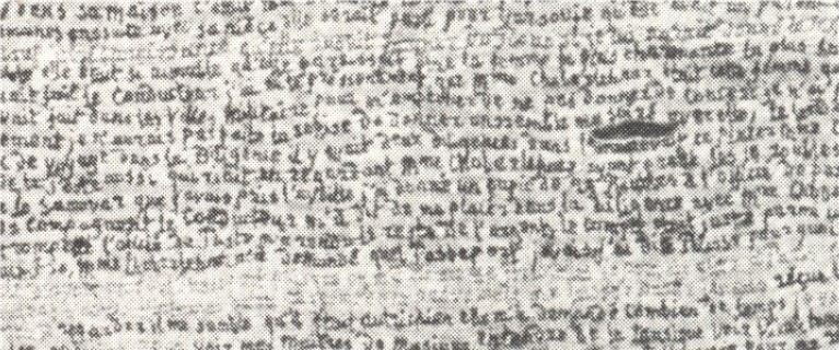
    As a collector of naive art–particularly produced with letters or numbers–and as a person generally interested in naive and outsider (and art brut and letterist and found )art, I was astonished to find this spectacular work by Terea Ottalo (ca. 1800-1870).  First of all, I make this to be about 200 lines long, and about 50 inches tall.  The words are, well, minute.

    Secondly:  this magnificnet thing was EMBROIDERED.  Breathtaking, really.

    I haven’t yet found out anything about Ms. Ottalo, except some basic references of her affiliated “school” of art.

    I do know that this, whatever it is, is a masterpiece. 

    ++00++ 9.29 teresa ottalo

    And an unfortunately smudgy detail, such as it is–I cannot offhandedly find a good, clear, high resolution image of anything at all by Ms. Ottalo.  This will have to do for now, but I think it gives a reasonable idea of the fineness of this work (found in Michek Thevoz’s Art Brut, Skira, 1976)–this sample detail represents less than 10% of the overall image:                                                                                                                                        

    ++00++ 9.29 teresa ottalo detail

    ·Posted by :

    ·in:

    — —

  • Skeleton of the Sun and Sky: Henry Van de Velde pre-Abstract Art, 1884

    JF Ptak Science Books LLC  Post 758  Blog Bookstore

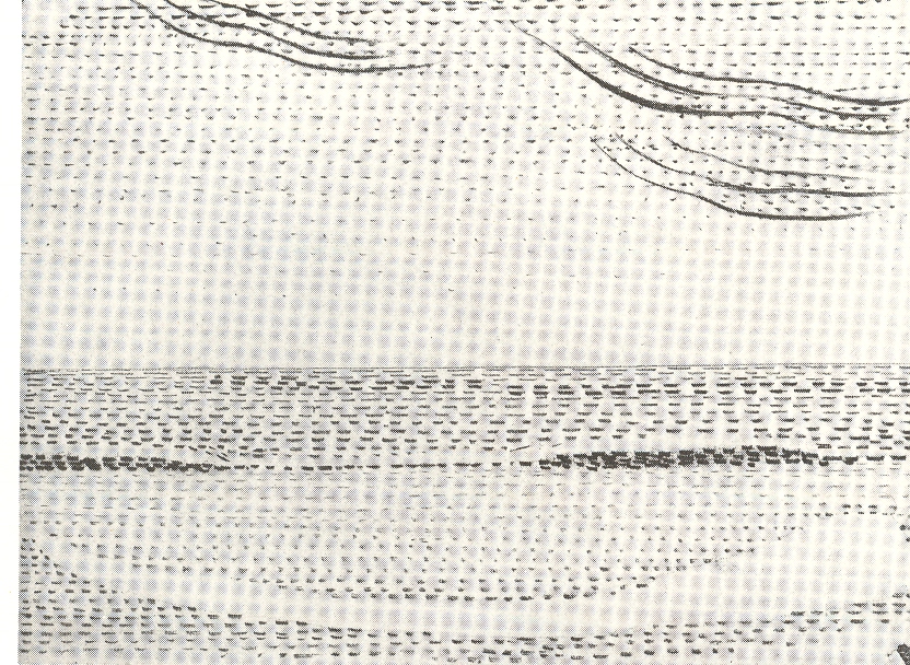
    I wonder if Henry van de Velde (1863-1957) as one of the earliest people to paint what he saw as an x-ray of the stuff of existence.  His artwork, “Sun at Ocean (Rhythmic Synthesis”) which I found in  Werner Hoffman’s Turning Points in Twentieth century Art, 1890-1917 and which was executed in 1888/9, looks to me to be absolutely incredible
    ++00++ 9.17 vna de velde
    for its time, a nearly non-representational, proto-abstract something, done three decades before these genres came into being.

    His representation of known objects seems to be nearly, completely, removed—what we have left here is the representation, or impression, of the subject of the painting.  We can see the sky and sun and ocean there still, but just barely: their representation in skeletal form shows us the bare bones of the world, like a pre-X-Ray X-Ray (which didn’t come around until the very ready and able Wilhelm Roentgen bumped into it in the winter of 1895).

    It is hard to think of how unusual this artwork would’ve been, even given some historical consulting. The Impressionists, who had crept up into the artworld existence to their first show in 1874, were seen as being a radical, revolutionary, avant garde movement.  Their reception was not a cordial one, as they were threatening the established order of the instructionally-regulated world of art that had stood for centuries.  Van de Velde’s work was far outside of Impressionism, or at least it would seem so to me, making it more radical still.

    I’m not sure where van de Velde’s work stands in the history of Modernism (ca. 1875-1916, when virtually very major discipline encountered massive change).  It doesn’t seem to be a prototype for abstract art, which doesn’t seem to have precedents in the 19th century outside of found-art in mathematics of the fourth dimension.  This new world of art seems to begin suddenly in 1907 with the work of Braque and Picasso, and then Marcel Duchamp, and Nayral (1910) and Gris (1911), followed by many others including Gleizes and Marcoussis and Metzinger and Villon (all in 1912).  The Impressionists on the other hand have a very rich history of impressionistic works leading up to their major debut in 1874:  like Courbet’s “Portrait of Baudelaire” (1848/50), or Cezanne’s “Man with a Blue Cap” (1865), or Bourdin’s “Cloud Study” (ca. 1859), on Monet’s “Still Life” (1859, with the disappearing bread), or Degas’ “Semiarmis…” (1861) or Pissarro’s “The Road” (1864), or the glorious modern self portrait of Cezanne done in 1865.  There are many others.

    Van de Velde’s art leaves me puzzled, probably because I really don’t know about the painting phase of his life (an activity he gave up in 1892); probably because I just don’t know enough, and am not art scholar.  I don’t know why this isn’t significant, unless, of course, the work was not seen, or was unknown, or was simply rejected.

    But that still leaves us with the artwork itself: a skeleton. Scaffolding.  Stage setting.  Fragments of the remaining object.  Simplification: a rediscovery of the material of the world reduced to its barest essentials, to a geometrical simplicity of nothing but lines, dashes, suggesting a larger form.  It is the amount of weight in the “suggestion” of form that makes this work so incredible—up to this time, I think, there weren’t any other works of art where so much was open to interpretation, and so much of the optical characteristics of the subject had been removed.  (Rodin’s statue of Balzac, showing the author seemingly ripping himself from his stone, was much hated when it was shown in 1897, the “unfinished” parts seen as ugly and crude by many.  This would seem a good example of the weight of suggested form in pre-20th century art.)

    1889.  Decades before Malevich, Rodchenko, Balla, Severini, Tatlin, El Lissitzky, Klee, Kandinsky.  (And Mondrian, the biggest question mark for me and greatest possible inheritor of this work.) I just don’t get it where van de Velde “went”.  He did go on to a terrific career in design and architecture  in worlds outside of this effort; I just don’t know what happened to “Sky and Sea’…maybe Henry just didn’t like itpreferring his gorgeous nouveau design motifs.  After all, he survived this artwork by almost 70 years (!), and perhaps he laid it aside as a youthful flourish.  As I said, I really don’t know.  


  • Political Majesty at the Interior and Exterior of Creation (1588 & 1680)

    JF Ptak Science Books LLC  Post 742  Blog Bookstore

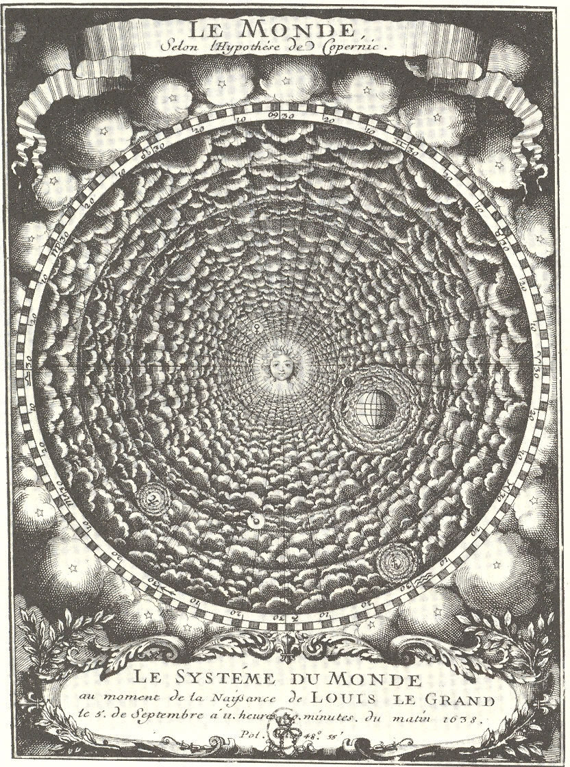
    This engraving Le
    Monde Selon l’Hypthese de Copernic. Le Systeme du Mondeau movement de la
    Naissance de Louis le Grand le 5 de Septembre 11. heures 20 minutes du matin
    1638
    , is a

    +++Louis Grand Universe singular representation of the universe at a singular moment in
    time.  And that moment in time was the
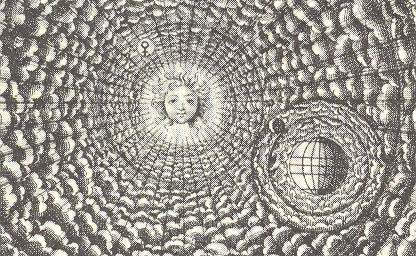
    birth of Louis le Grand, or Louis XIV, the Sun King, pictured at the moment of
    his birth at the center of the Copernican universe. The future (72-year-long
    reign) king smiles benignly at us from the center of the universe.

    +++Louis Grand Universe 2

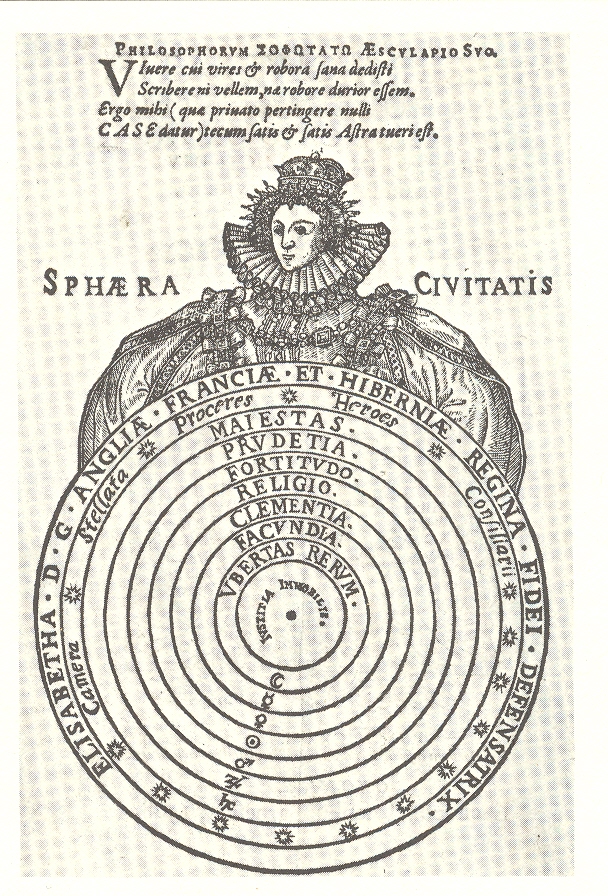
    On the other side of the coin is the all-reaching embrace of
    the deity-like Queen Elizabeth, who cradles the nine successive spheres of the
    universe.  The innermost sphere is
    occupied by the Earth, the center of all things, around which are labeled the
    seven spheres of the planets:  “urbetas
    rerum” (immovable justice) of the Earth, “facundia” (eloquence) of Mercury, “Clementia”
    (clemency) of Venus, “Religio” as the Sun, “Fortitudo” (fortitude) of Mars, “Pridetia”
    (prudence) of Jupiter, and “Majestas” (majesty) of Saturn.  Beyond the sphere of Saturn is that of the
    fixed stars (consisting of the Star Chamber, the nobles, Lords, Counsellors);
    and beyond that, in the last sphere, is Elizabeth.   


    +++Louis Grand Universe 3

    The image appears in John Case’s Sphaera Civitatis  (1588,
    The Sphere of the Commonwealth) who
    writes in his preface “How well civic machinery accords with heaven’s form, and
    how it is distinguished by like figures, our republic, unique, will declare on
    behalf of many. Do you see the stars, wheeling around in their alternating
    course, and Justice, who weighs causes in her balanced pans, the unchangeable
    center of our universe?” [Full text here.]


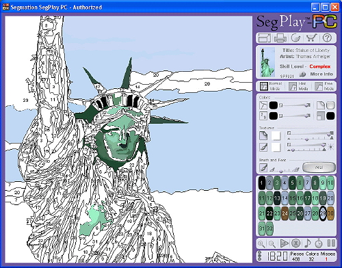
  • A History of Blank and Empty Things #53: Painting by Number and Pop Art

    JF Ptak Science Books LLC  Post 740  Blog Bookstore

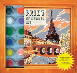
    I wonder if Mr. Billy Collins has ever approached the
    ineffable connection between paint-by-number art and Andy Warhol?  It seems that paint-by-number (PBN) came from
    nearly nowhere, a near state of being nowhere and nothing, just after WWII, to
    the point of selling millions of sets by 1952. 

    Paint by number 1

    It was an astonishing thing, really, how the PBN craze took over America.  And it just so happens that 1952 was the
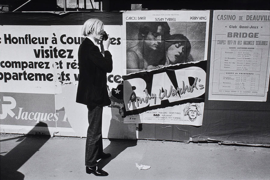
    first one-man show for Andy Warhol, and was also the beginnings of the Pop Art
    movement, which seems to me a rush to the most common denominator trough the commoditization
    of consumerism and popular culture, creating art out of visible
    nothingness.   Warhol in particular
    trained his sites on images that were already twisted around people’s neurons
    and living in their memories.  Art was
    made from images injected into the heads of consumer buying units, a delightful
    confusion of imagination and the already imagined, a reaction to a familiar sub
    rosa
    advertised image.

    Perhaps Warhol’s art was part of a larger whole, an
    illustrator to a bigger point, a performance unintended to stand alone.  But that is what happened, the art separated
    from the wider message, and soared to great acclaim. 

    Paint by number 2

     Warhol seems more like a paint-by-number color memorist,
    filling in the blanks of an already-mostly-formed memory burned into the long
    term memory via years of advertising and severe repetition.  Nearly the entire broadcast industry was
    created to support this memory-making process: 
    Seinfeld, Spongebob, The Office, Your Show of Shows, and all the rest,
    created not necessarily for your pleasure but as a series of  interchangeable 11-minute-long placeholders
    to hold the viewer/listener to the point where they would be exposed to 180
    seconds of product identification.  It is
    the repetitious memory formation that the folks depended upon so that when you
    go down the supermarket aisle looking for an 89-cent can of tomato squeezings
    called “soup” that the 799 exposures to the Campbell Soup Company’s product
    line will direct you their way, a primitive bit of biological programming.  And for all of the trimmings and
    philosophical-critical digressions, Warhol capitalized on creating art on vast
    shared memories, coloring in a shared image, reaching into the minds of
    millions for something that everyone could see and understand—and not have to
    think about, not lose one neuron in interpretation, and enjoy it like an comfy
    old slipper. 

    Paint by number 3

    Where Warhol succeeds and PBN fails is at the art/appreciation
    point—few people took the PBN seriously as an art form, mainly because it wasn’t
    presented as such, except for those who somehow took the thing too seriously.
    Warhol took his creations seriously from the very beginning—and perhaps there
    was really nothing more than the defense of his art that was the art
    itself.  It just seems to me that, in the
    history of art, it tool 1500 years or so for linear perspective to be
    rediscovered, another 500-odd years beyond that to bend and mystify nature in
    the form of Impressionism, and another 30 years to lose all recognizable
    natural forms all together.  And then after
    Braque and Duchamp and Kandinsky and the Blaue Reiter, and the Fauvism,
    Suprematism, Vorticism, Dadaism, Deco, De Stijl, Surrelaism, Concrete art,
    Abstract Impressionism, and on and on, that after all of this since Nude
    Descending, that we are lead to Pop Art and silkscreens of soup cans.  It just seems to me to be more about the
    packaging than the package, which might just well be a wrapped bit of
    nothing. 


  • Paul Klee, Henry Darger and Puppets, Real and Imagined

    JF Ptak Science Books Post 717  Blog Bookstore


    While he was serving in the German army, Paul Klee’s 1917 journal entry (#1032) contained this pearl, coming being advice from his sergeant to him and the rest of the non-com grunts:  “Let’s not kid ourselves, at our workshop– you won’t get ahead. There you’ll find advancement.”

    Klee (born in the same year as Einstein and died in the second year of the European War, 1940) was a leading and inventive modern painter, who along with Franz Marc and Wassily Kandinsky created the Blaue Reiter movement, and who worked in close proximity to many of the major art movements of the new era.  He was an iconic, creative artist of vast influence.
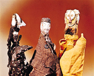
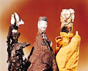
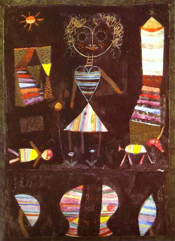
    ===blog==aug 19==klee puppet color What struck me today was this image of Klee’s hand-made toys and this seldom-seen image of the puppets he created for his boy, Felix, around 1922.  (Felix was 13, Paul  43.)  Evidently Klee made 50 or so of these puppets, 30 of which have survived.  They are lovely and whimsical and are examples of quick, creative work with found and manipulated objects.  I can certainly visualize Klee getting drawn into the project—his diaries too show that he was interested in his son’s development, taking note of the different small, developmental things that lots of folks can miss when their child is growing up.  The puppets are intimate, made for his son for play, and are composed of bristle and bone and nutshells and electrical outlets and bits of gingham and cloth and wire and buttons.  Stuff from the junk drawn or whatnot box.  Klee did construct more elaborate puppets for his connection with the theatre, and of course was also a sculptor.  But I do like these little puppets, much in the same way as I enjoy the small toys made by Alexander Calder for his kids.
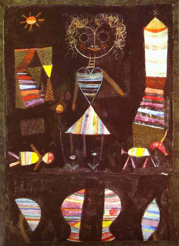
    ===blog==aug 19==klee painting puppet 1923

    And somewhere in there imagining Klee getting a little lost in constructing these puppets arose the image of Henry Darger, the severely-imaginistic, primarily invisible-in-life  outsider artist who found his fame in post mortem glory.  Darger’s  (1892-1973) work—and life—were discovered only after his death, when his apartment in Chicago became an archaeological dig by his landlords, and his massive and outré output became “discovered”.  The process of discovery seemed not to interest Darger in life, as he had extremely limited contact with people and was basically an Invisible in work, pushing mops and brooms for most of his life to make his rent.  In the meantime, in the lifetime not at work, Darger was very busy in his own created world, typing out a 15,000-page novel/world called  The Story of the Vivian Girls, in What is known as the Realms of the Unreal, of the Glandeco-Angelinnian War Storm, Caused by the Child Slave Rebellion…  (This is just one of his works of fiction—another is a 10,000-page work called  CrazKleey House: Further Adventures in Chicago, and another is a  work of autobiography (?), where Darger spends 200-odd pages on his early life before slipping away into a 4,800-page diversion on a tornado called “Sweetie Pie”.)
    His artwork was primarily concerned with this constructed environment of the Vivian girls, and I must say that it is fascinating to me, but only forensically—I don’t “enjoy” it per se, even though it is phenomenal, and fantastical.  The subject matter—often veering into bestial brutality towards children, with lots of dripping redness–is just too deeply twisted and disturbed for me to enjoy, though I do have an appreciation for the stuff that surrounds it all. 

    And so what does this all have to do with Paul Klee and puppetry?Darger
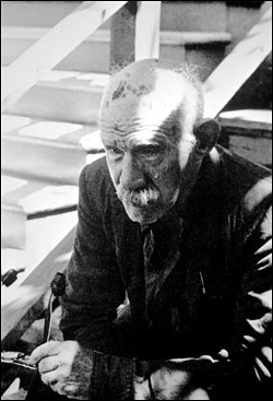
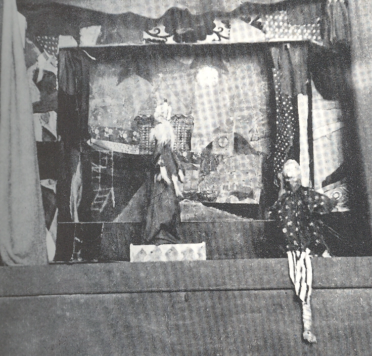
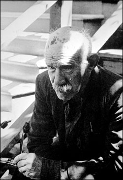
    Nothing, except in a fiction that I’ve had in my head about Darger (pictured at right)   for as long as I’ve known about him, and which is also wholly unsupported by fact or reasonable supposition.  Listen:  from the first moments that I knew of him, I pictured Darger returning to his rooms at night after a day of cleaning, mopping, scrubbing, taking abuse for spills not cleaned, and then reliving the entire day at night in miniature.  In my own story, Darger created small figurines and puppets through which he re-enacted his day, complete with sets of the rooms in which he worked.  Perhaps he lost himself in these moments, finding a vindication in miniature stages in his second-story walk-up that he couldn’t in his daily life, allowing his creative, 50,000-page nighttime imagination to open up. 

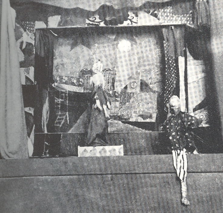
    That’s what I had in my own head when I saw the image of the Klees’ theatre, and puppets.  Certainly my Darger idea is not what Klee had in mind; nor is it anything that was in Darger’s mind, either.  Just mine.