A Daily History of Holes, Dots, Lines, Science, History, Math, Physics, Art, the Unintentional Absurd, Architecture, Maps, Data Visualization, Blank and Missing Things, and so on. |1.6 million words, 7500 images, 4.9 million hits| Press & appearances in The Times, Le Figaro, Mensa, The Economist, The Guardian, Discovery News, Slate, Le Monde, Sci American Blogs, Le Pont, and many other places… 5000+ total posts since 2008.
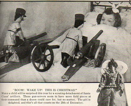
I don’t know the Illustrated History of Santa and Gun Gifts, but I guess that a book could be written if one already doesn’t exist. Well, that or something associating Santa with unusual, or questionable, gifts in his bags of joy could be made into something, something disappointing. I’m not that person to collect those sorts of images because I have always held Santa in very high esteem, and I don’t care to have too many of those images floating in my mind, exploiting some dark corners of unknown memories, disturbing the happy bits with unneeded and unwanted visual info. But, well, these pictures below, found in the December 1916 issue of the uncommonly-seen journal, Illustrated World, provides a little glimpse into the manufactured desires of kid-wishes for toys during wartime, and so I’ll pass them along. These things do tell us something about the period–like the famous multiple images of Santa hanging cigarette carton Christmas ornaments (seen here in the post on Gift Porn, 1954), or a smoking Santa stuff a stocking with a box of Lucky Strikes–so it makes sense to make sense of them.
I guess kids have fairly well always wanted toys (or not) guns for Christmas, gifts from Santa, or at least so long as Santa has been around or identified as so, and to see Santa with a rifle would not be so unusual, especially given that this was deep into the second year of the bloody Great War. (I have another interesting image here, somewhere, showing Santa distributing presents to British troops in trenches, riding a tank, but presently I can’t find its stack in a stack of stacks.)
Perhaps the issue of playing with guns and cannons and so on was a way of easing fear and distress during wartime; perhaps it meant something soothing for the developing mind of a child. I don’t know.
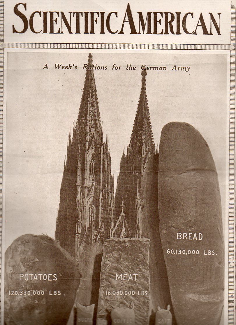
In the history of pictures of bread, this loaf seems to be about the biggest. The 60-million-pound loaf is meant to represent a week’s ration for teh newly-fighting German army. The war, the Great War, WWI, was just beginning when this article hit the newsstands on 22 August 1914. There wasn’t much yet printed in the Scientific American regarding the war, and it seems as though this was the first cover of the magazine to deal with the new world-ender. But in the blazes of the guns of August (B Tuchman) the end of the conflict might’ve looked a little close at hand. I doubt that many would’ve seen the 100,000,000 dead and wounded that would come as a result of the war, at this point just finishing its first month.
I am not sure why, but the editors of SA chose to think about supply for their first stab at making a cover-comment about the war. It does give some idea of the sheer numbers of people involved, at least on the German side. Hoiw this is iterated by a 400-foot-tall loaf of bread, I can’t exactly say.
(Are potatoes one tenth the density of :”meat”? The potato sack and the meat chunk look to be about the same size, though the meat bit is less than a tenth of the weight of the potatoes.)
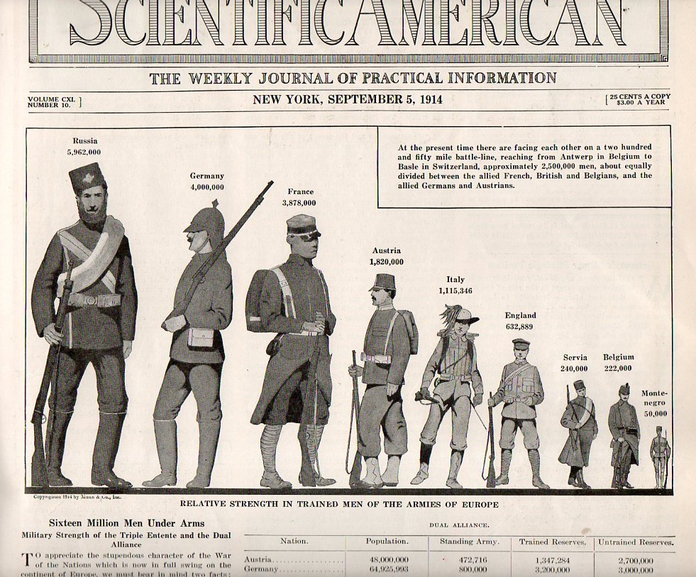
Two issues later–5 September 1914–we see the following artistic display of quantitative data, a much more effective way of generating understanding on the differences in troop strengths among the waring countries:
The United States would not get involved in WWI until 1917, and so American statistics were not included in this image. But if they were, the U.S. Army’s size would be somewhat larger than little Montenegro there at the far right. Given the American population of 92,000,000, the army was quite small, with barely 98,000 soldiers under arms (half of whom served overseas). (Montenegro’s force of 50,000 was somehow pulled out of a population of 350,000 people–Belgium, with a population of 7 million, had an army more than double the size of that of the U.S.) Of course this was a peacetime, hands-off army for the United States, and by the end of 1914 President Wilson expanded the standing army to 140,000; by 1918, when the newly-instituted draft1 really kicked in, more than 4,000,000 people would be in the armed services, half of whom would serve overseas.
Notes
1. Beginning in 1917 all males between the ages of 21 and 30 were required to register for the draft/military service, and by September 1918 more than 23,000,000 men had done so. This was an extraordinary leap from the Army totals for 1914.
It may be that the history of human locomotion is the story of fast sitting. Except for some of the earliest incarnations of powered movement, it seems one of the most significant engineering aspects moving a person forward is how that person should be carried in the vehicle. And, well, it seems that in the vast majority of cases, the person is sitting. (There are of course exceptions, notably in say the standing of the engineer in the Tom Thumb when that locomotive set the land speed record;or the Wright Brothers’ powered aircraft, where the pilot was laying down; or say in a chariot powered by a team of horses. Even in some of the earliest versions of steam-powered tractors, the mammoths were steered by a standing operator. It seems though that in very quick order the operator in most of these vehicles find themselves in a seated position.)
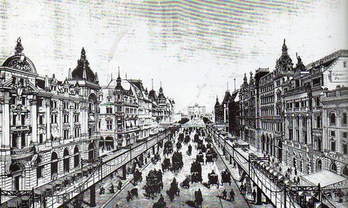
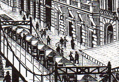
A very curious application of moving seated humans is seen in this woodcut of a chaired walkway–for all intents and purposes, the pedestrians looking to use the moving sidewalk would have been offered a chair instead. It seems as though as its base that this was a very simple form of an elevated subway or trolley, though without the train.
The moving seated sidewalk was the dreamchild of Alfred Speer (1823-1910), of Passaic, New Jersey, and it seems as though it might have been the first form of mass rapid transit in the city for which it was intended, which was NYC. It stood fairly high in the opinions of some prominent New Yorkers (like Horace Greeley and Peter Cooper) when it was presented in the early 1870’s, and even passed the New York State Legislature in an act authorizing funding for the program in 1873 and 1874–but it was each time vetoed by Governor John Dix, and the people-moving dream ended there, right before the Centennial. (See here for the New York Times obituary for Speer., and see All Ways NY blog for a longer look at Speer’s moving sidewalk, here.)
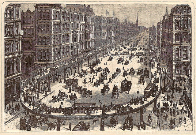
Here’s another version of Speer’s idea, though this look more like a moving sidewalk, complete with trolley cars, all of which were stationary objects located on the moving walkway. The idea of course was to free up the chaos and gridlock of the very busy areas of Broadway by placing a large chunk of the confusion on a moving second floor. It seems as though it might have been a good half-year idea or so, and the $3.7 million dollar price tag might’ve been a hefty one if you calculated the cost per minute of relieved traffic.
JF Ptak Science Books Post 1652 (Part II of an earlier post on Rooftop Airports, here.) Part of this blog’s History of the Future series.
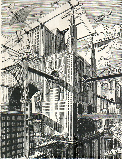
I really just wanted to post these two images before I lost them again. I’ve written earlier here about high-rise, in-town/downtown airports settled on the tops of buildings (or loaded onto newly-constructed structures over rivers and etc.), but these two images offer a nice distinction on the height’s of elevated airports of the coming future. The first is by the great Paul Frank, and appears in Amazing Stories for 1928:
The taller of the two airports seems to be 75 stories above the ground, maybe more–its hard to tell. It is interesting to see that there is another (of no small size) right next door, but not quite so high. The 500′-tall elevated walkways/roads are impressive.
In April, 1936 another artist saw an even taller airport, which caps off an enormous building that seems at least not only twice the height of the Empire State Building (just newly completed), but also far wider. If you made the “…tropolis” airport signifier on top the midway of the landing field, I calculate the width of the building to be at least 600′, meaning it would be something like 250×600′, or about four acres (or more) per floor. Big building, with an enormous volume.
[Picture source:Modern Mechanics, April 1935, as pictured in Dark Roasted Blend]
And here, another big rooftop creation of a 16×17 checkered grid, complete with, well, nothing at all, not even guard rails or fences–this would be rooftop-airport-landing Old School. The runways aren’t even particularly long, though I have no doubt that the magazine’s cover space dictated most of the size, anyway.
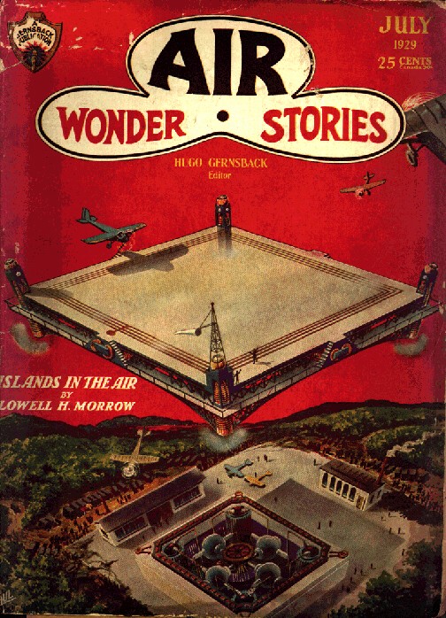
Of course the idea of very-elevated high-rise airports become secondary when you introduce the idea of floating/flying airports, as we see in this fantastic idea by (again) Frank Paul in the July 1929 issue of Air Wonder Stories. (This image and next from frankwu.com website dedicated to the artwork of Frank Paul, a great and wonderful thing.)
And of course when the idea of the flying airport fails, you can always go for the flying city, with airport:
This is again Frank Paul, from November 1929’s Amazing Air Stories, and depicts–of course–New York City removed from the ground to levitate, above its former self. Luckily there isn’t just a hole in the ground where is used to be, the rock and bedrock picked up along with the buildings and the rest of the (non bridge) infrastructure. It is still a busy place. I presume that given the crowding of the place that there are still high-elevation rooftop airports in the floating city.
There are other sorts of air-borne airports, though they are mainly built on/in large airplanes and airships, and really don’t qualify for a post on the simple rooftop airport. Perhaps it is time now for an all-inclusive Odd Places for Airports post to appear here…
For example:
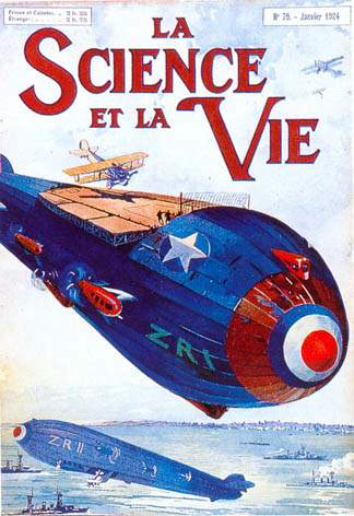
The magnificent possible, 1924, saw another kind of airborne airport:
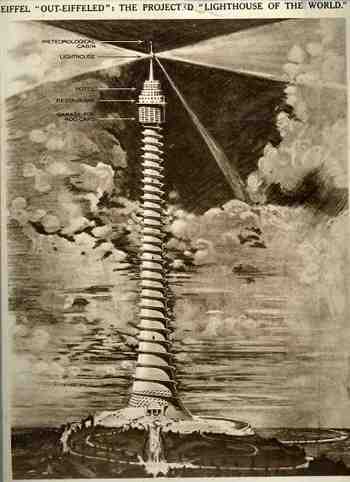
This was the handiwork—that is really too demeaning—the inspiration, the dream, of Eugene Freyssinet (1879-1962), an accomplished French engineer turned architect, and widely viewed as the “father of reinforced concrete”. Freyssinet graduated from two of the most prestigious French engineering institutions (the Ecole Polytechnique and the Ecole Nationale des Ponts et Chaussees in Paris) and was really quite an innovative engineer—beautiful even. His airship hangers at Orly airport are instantly recognizable as elemental design features of concrete—elegant, useful, practical, and huge.
I don’t know what happened exactly with his design for the Paris International Exposition of 1937. The building just isn’t right—even the timing of its underlying deification of the automobile is off by decade, at least*. His effort to construct a half-mile high reinforced concrete tower with an exterior corkscrewing road for autos climbing up the building to a parking lot is just, well, off. Setting aside the difficulties in using this building material for a structure of this magnitude, there would’ve been an astonishing amount of vibration problems from the grueling efforts of the cars on the (probably) two miles of road to the top. (The image comes from the Illustrated London News for 1 June, 1933.)
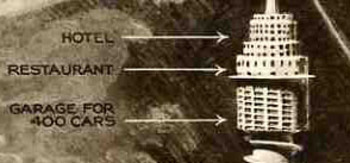
And all of this effort for what was effectively the world’s most gigantic restaurant, because outside of the parking garage, that’s all this building was meant to be. The eatery would’ve begun where the Eiffel Tower stacked on top of the Empire State building would end. The room was big enough to accommodate 2000, who after eating could repair to the hotel upstairs, or who could’ve gone upstairs from there to take the rays in the solarium.
Somehow this was all supposed to cost 500,000 pounds (about $75,000,000 in today’s currency, which might by you one or maybe two ultra-swanky pre-war condos in NYC…500k pounds was only about 2 million 1937 dollars, which would’ve paid for 5% of the Empire State Building), Freyssinet noting that it would cost less to build than the Eiffel Tower (which would’ve been true if you didn’t take inflation from 1889 into account). I have no idea how that would’ve worked out, given that the Eiffel was a steel skeleton and this would’ve been concrete. All told, however, none of it made very much sense, and the structure wasn’t even very pretty.
*(Cars traveling up the outside of a building so that you can park your car in a lot 2000 feet in the air…certainly the car was king (and queen too for that matter) and that fact become new and abundantly clear, but it happened earlier, in the early 1920’s. The need to drive a car into Jove’s lap just wasn’t necessary as the world nudged its way to war in 1937.)
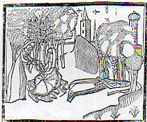
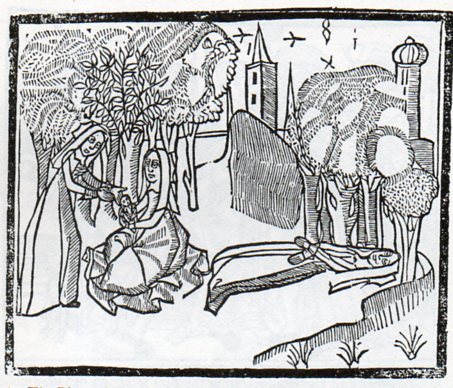
Sir Thomas Mallory (c. 1405 – 14 March 1471), translated and compiled a collection of mostly 14th century romances regarding King Arthur known and published as the Le Morte Darthur/Le Morte d’Arthur. It was first published by the great William Caxton in 14851and became quite popular, being reprinted with additions and corrections in 1498 by William Claxton and then again by Wynkyn de Worde (in 1529). It is, in its way, beautifully illustrated, or at least interestingly illustrated–I can’t really say for sure if the woodcuts were done with great care or not. But their effect is significant, and, whether naive or not or careless or not or simply at the artistic limit of its executor or not, the images do have their own peculiar beauty. One that struck me in particular was this,
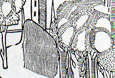
the “floating river”, an out-of-perspective element of a very stationary world, a controlled chaos-ness in a static landscape. I’m not sure what is going on with the trees, if the blankness is a part of reflected light, or if it is a representation of spaciousness between the limbs, or if they are simple wormholes in the woodblock. Everything in the image seems to have its own sphere, locked into their own environment, existing apart from everything else.
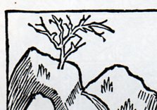
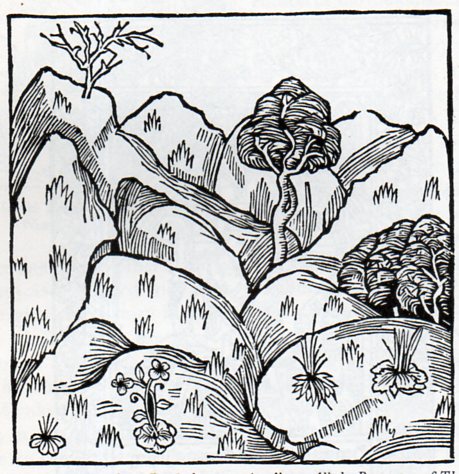
I see the same issue with many other such works, bits dropped into place in a scene or landscape, all making their way into the viewer’s mind on their own, not really a part of a cohesive whole. This may have been the intent, or again it may have rubbed up against the outer limit of what the artist (and their tools, and medium, etc.) was able to actually produce. Here’s another example:
Its another lovely, lonesome image of separates from the beautifully-named book by Bartholomaeus Anglicus All the Properytees of Thyings, which was published in Westminster in 1495 (and also known as De proprietatibus rerum, also translated as On the nature of things, or On the properties of things), and which was originally written around 1225). The book was a bestiary, a marvelous encyclopedia, a collection of all things as known in the 13th century–it would be interesting to represent all that is know today and compact it into a workable, logical, usable (printed !) book of a thousand pages. The question of organization of knowledge would be the key, of course, and how to make one flow to another complementarily as practicable…it would be an interesting project (for someone else) to try and arrange the basis of human knowledge in a finite space like that. The author of the book above organized his work as follows, in 19 books: “god, angels, (including demons), the human mind, or soul, physiology, of ages (family and domestic life), medicine, the universe and celestial bodies, time, form and matter (elements), air and its forms, water and its forms, earth and its forms including geography, gems, minerals, and metals, animals, and color, odor, taste and liquids.” The 2012 variety of categories would be somewhat different.
Notes:
1. This period, from say 1494 to 1525, was one of great creativity. For example: 1494, Pacioli: Everything About Arithmetic, Geometry and Proportion; 1498, Leonardo da Vinci: Last Supper; 1500, Michelangelo, Pieta; 1504, Michelangelo: David and Bosch Garden of Earthly Delights; 1505, Leonardo Mona Lisa; 1506, work begun on St. Peter’s Basilica; 1508-1512 Michelangelo paints the Sistine Chapel; 1511, Erasmus, Praise of Folly; 1512: Erasmus, De Copia; 1513, Machiavelli The Prince; 1516, More, Utopia; 1517, Start of the Reformation.
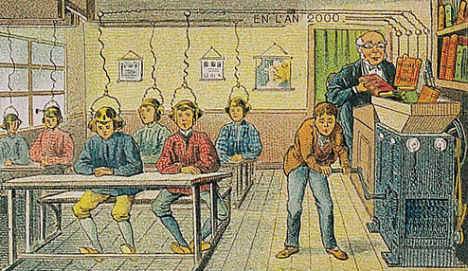
This entry is a simple exhibit of French postcards from the edge–of the near-future. The future that they spoke to wasn’t all that far away standards of change in the history of history–they called out to a history 85 years away from 1900, 85 years to the great beginning of where the future would take new and entirely different steps up from Victorian discovery and breakthroughs. There are some novel intuitions, including electrically-induced knowledge, production-line robotics, and television, but overall the thinking being done and displayed on these postcards wasn’t very edgy.
Electricity, perhaps the defining improvement of the 19th century, would still be a main source of power and energy, though with new and incredible products. For example , the classroom in the year 2000 would distill information directly into the minds of students by some sort of electrically-based information crunching apparatus, which would evidently grind the good stuff from the pages of books and be electrically implanted directly into the brain. Why the machine was manually operated is a mystery.
Artificial or synthetic food–or food, at least, as we do not recognize it now, here being consumed like vitamins. Even though the food-ness of food is gone, the social ambition of replacing spent energy resources has not changed, the coming-together at the dining table remaining intact as a practice even without the demand of the time it once took to actually eat food. [Image source and notes, below.]
“… Living only for the moment, turning our full attention to the pleasures of the moon, the snow, the cherry blossoms and the maple leaves; singing songs, drinking wine, diverting ourselves in just floating, floating; … refusing to be disheartened, like a gourd floating along with the river current: this is what we call the floating world..”.–Asai Ryōi, in his Ukiyo monogatari“Tales of the Floating World”, c. 1661
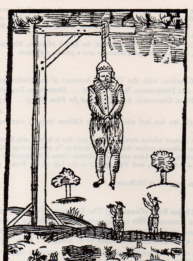
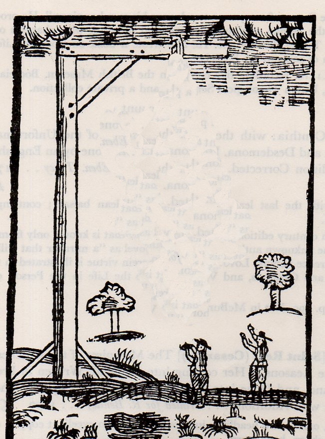
Unfortunately I have lost (!) the reference for this image, but my guess is that it is definitely English and that it comes at the times of the Civil War(s) of 1642-1651. This image below shows the hanging of some poor fellow–and though it seems to be a crown (?) that the man is wearing I can’t imagine who the royal person would be do be executed in such a manner. It seems to me that the mode of execution was beheading (as with Charles I) and also by firing squad, and I just don’t know who was hanged. In any event, I’m after the weird, removal bits from the image more than what it says to us from history. And the out-of-context item hjere of course are the “floating” trees:
JF Ptak Science Books Post 1644 [Part of the Series on the History of Blank, Empty and Missing Things.]
“Other maps are such shapes, with their islands and capes! But we’ve got our brave Captain to thank” (So the crew would protest) “that he’s bought us the best- A perfect and absolute blank!”–Lewis Carroll, The Hunting of the Snark.
[This post fits perfectly in our History of Blank, Empty and Missing Things. Ditto for the series on The History of Lines–making this a great confluence for a History of Blank and Missing Lines (in the History of Nothing series).]
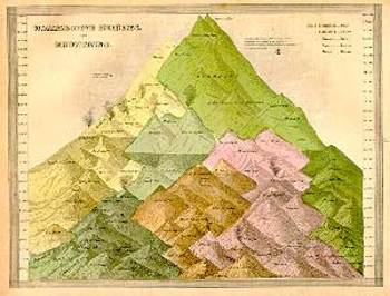
For all of the brilliance of all of the cartographers and map makers who have drawn a line in the sand or strung a strand of quipi or drawn a celestial rendering on a cave wall or imagined the Americas in 1504 or ventured out and away from the Medieval T-maps or drew maps of other worlds or fashioned spiraling maps of Hell, I think the maps I most like are maps of imagined places. Of course I enjoy the extremely rigorous and steadfast maps (like those of the German Stieler Company of Gotha who for a hundred years routinely drew the most detailed maps in a particular scale than any other mapmakers in creation—you know, the big maps of the U.S. that would locate minute places like Truman Capote’s “out there” town of Holcomb, Kansas) and of course maps of the solar system and galaxy and universe (as knowledge expanded and collapsed and expanded again). And of course there are the representational maps showing the comparative heights
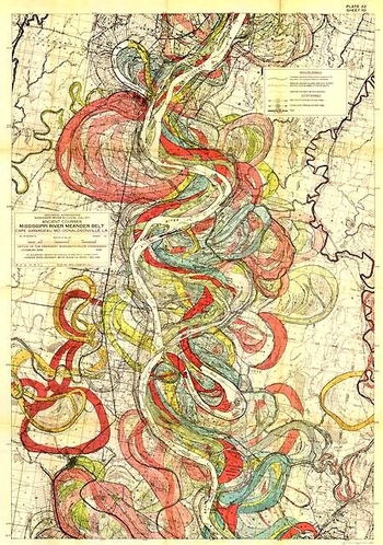
of mountains and lengths of rivers, or the grouping of all the world’s lakes, or the divorce rate map of the United States at Centennial, or the heights at which different sorts of trees are found, or geological speculations on the thrust of the Appalachian chain, or the wanderings of the course of the Mississippi River (below), and other hosts of things.
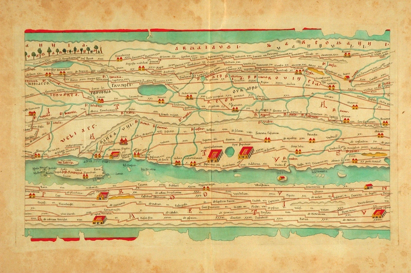
As much as detail is attractive to me—complex, staggering information correctly displayed—there is also the opposite: the quick, thoughtful, spare map. The Tabula Peutingeriana is sort of like that—this is a 17th century reproduction of an ancient Roman map that was, basically, a road map of the world (or the Roman World) that was linear and included all manner of detail of the roads themselves, with little else. It is a spectacular thing—one version I had once was 14 inches high and 16 feet long, just a skinny map of how to get around in the world from 2000 years ago. There was of course nothing “quick” about how the map was made, coming at the expense of countless hours of careful observation, keen observation, and lots of general human tragedy.
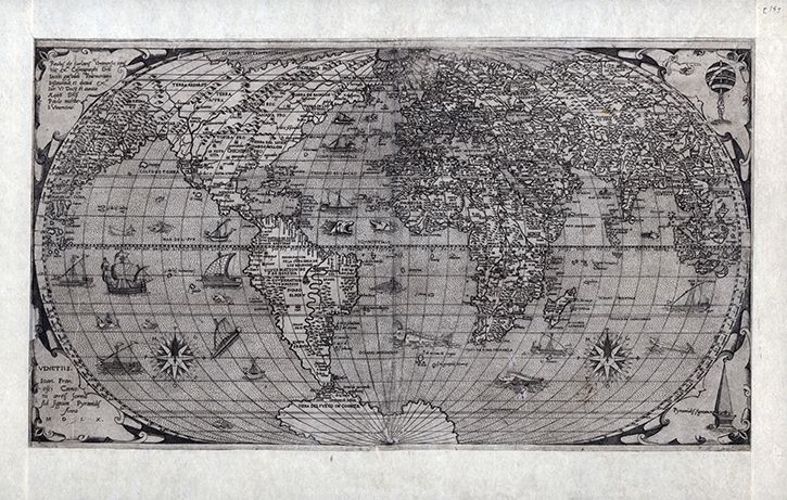
Folrani’s world map of (ca.) 1575 (which appeared in Antoine Lafrery’s (1512–1577) Geografia tavole moderne di geographia) is a glorious thing and a fantastic accomplishment for its time (and also being the first map to use the name “Canada”). It has a sumptuous artistry to it in addition to including (and excluding) certain of the newly known discoveries. In this version of the map he chose to not use the newly-incorporated Straits of Ainan
[I’m sorry to say that I’ve misplaced the original source for this map–I will try and supply. My apologies.]
In another edition of the m-which appeared a few years later–North America is still attached to Asia, but now there is added another bit, a gigantic land mass to the south, Terra Incognita. This was basically put together by some sightings in the southern seas that located different land masses, and Forlani took it upon himself to connect all of those pieces of information and draw them into one continuous land mass, greatly expanding his own version of Antarctica from a few years earlier. It is a wonderful example of leaving something(big) out and making something else (even bigger) up.
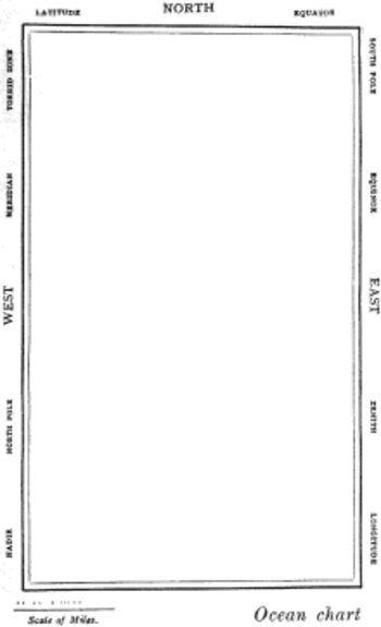
But the map that I think I love the most illustrates Lewis Carroll’s The Hunting of the Snark, an Agony in Eight Fits, and occurs in the Bellman’s tale, starting the second fit. It begins:
The Bellman himself they all praised to the skies- Such a carriage, such ease and such grace! Such solemnity too! One could see he was wise, The moment one look in his face!
He had bought a large map representing the sea, Without the least vestige of land: And the crew were much pleased when the found it to be A map they could all understand.
“What’s the good of Mercator’s North Poles and Equators, Tropics, Zones, and Meridian Lines?” So the Bellman would cry: and the crew would reply, “They are merely conventional signs!
“Other maps are such shapes, with their islands and capes! But we’ve got our brave Captain to thank” (So the crew would protest) “that he’s bought us the best- A perfect and absolute blank!”
Sometimes there is nothing so fine as something that beautifully illustrates the nothing that isn’t there, and this lovely map, unencumbered of all of the elements and details that define the mapness of something, perfectly explains the origin of its need.
For a lovely work on the complexities and simplicities and just sheer beauty of what things like maps are check out former Ashevillean Peter Turchi’s Maps of the Imagination, the Writer as Cartographer.
[Part of the Atomic and Nuclear Weapons series and the History of Blank, Empty and Missing Things series.]
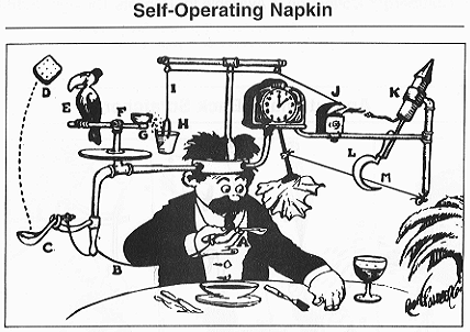
I think no plumb line was ever so worked with pulleys and wheels, strings and catclaws and other Rube Goldberg devices as were the demographic studies of nuclear warfare.It is as though their compass rose had no compass, with everything centered on the center, no way out, no way in: just there.A faceless clock face describing “G-2 o’clock” whenever it pleased.These studies seem to me the nuclear warfare equivalent of the Bellman’s map (described earlier in this blog as the most perfect map ever constructed): a pretty polygon describing a totally blank surface.
I have a number of these things here, some of which are restricted-distribution publications, works of statistical fancy/fantasy meant for other eyes in the same community dedicated to the fancies described, a tautological audience for self-referential.
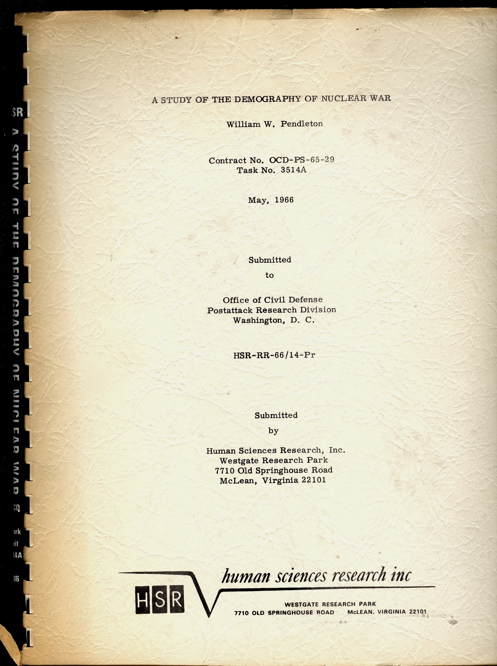
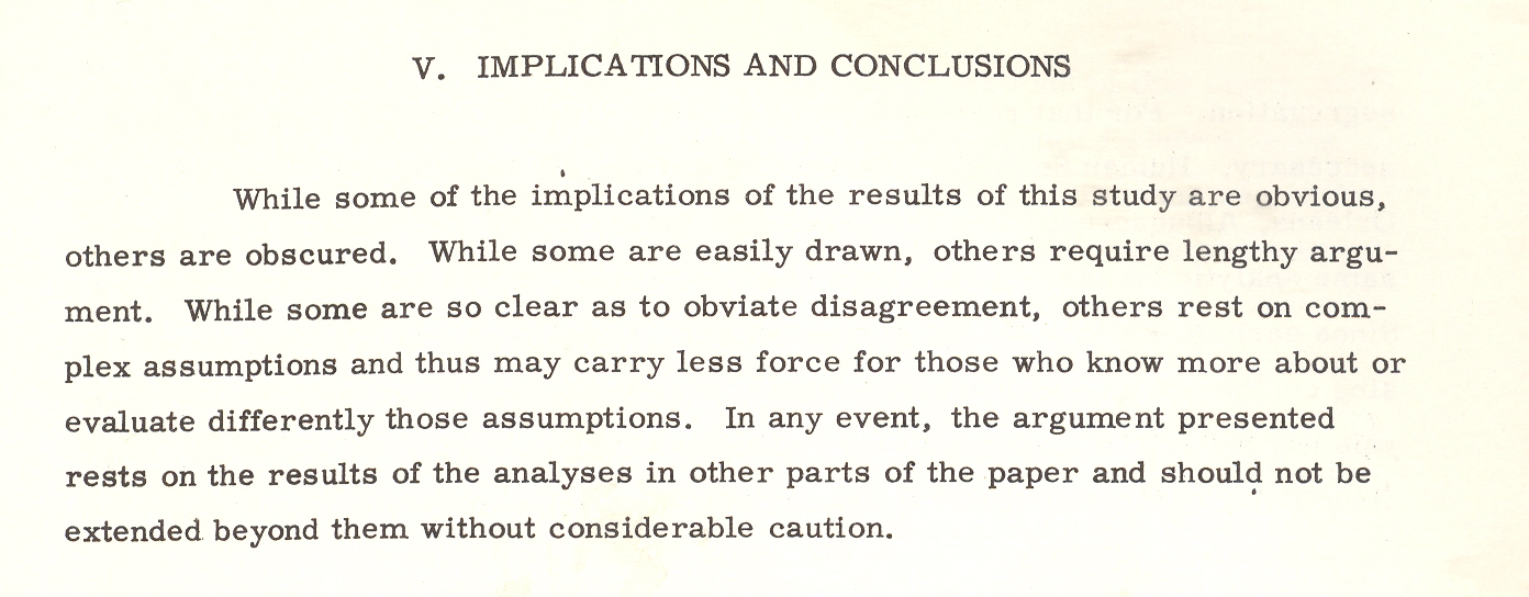
One such bit, plucked from this pile is William W. Pendleton’s A Study of the Demography of Nuclear War produced by “Human Sciences Research, Inc.” [This item is available for purchase from our blog bookstore.] Outside of its statistical foray in survivability and the procreative prospects of the left-overs of vast nuclear exchanges, the work is a solemn attempt at institutionalizing the death requirements of nuclear combat.The necessity of overwhelming carnage is presented in ironic and underwhelming language, the first bits of which are seen in the conclusion of pamphlet’s abstract1:
“Cities differ in the kinds and magnitudes of change to which they might be subjected. Considerable variation in the demography of surviving populations can be expected; that variation would be related to policy decisions; and those decisions should therefore be examined for their demographic implications.” [Emphasis mine.]
Put another way, the city is the main focus of the survivability equations, and the chances of the humans being bombed in those cities would change with—god help us—the amount of bombing.
Cities differ in the kinds and magnitudes of change to which they might be subjected.
This is the key I think to understanding documents like this, making a simple foundation statement so convoluted and tortured that it and most of what follows make any sense outside of restating themselves. Which I guess is a strength.
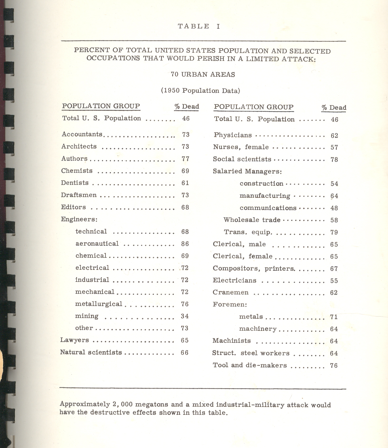
Back to the pamphlet and the interesting table that attracted my attention.According to one study [and for the sake of brevity I’m not going to describe the scenarios or data estimation methods and so on] the U.S. would suffer 46% casualties [meaning immediate deaths and not as a result of radiation or illness or starvation or the encyclopedia of whatever that would lead to death somewhere down the road].The resulting demographic of the “perished” by job description postulates that the most-killed category of worker would be: (#1) aeronautical engineers, 86% dead; (#2) transportation equipment salaried manager, with 79% killed; (#3), social scientists, with 78% of them going down with their clients; (#4), authors, with 76% gone.
Authors?Of what, I wonder?The good ones with the bad?Are authors different from writers?And what do you call folks who produce tv shows?Since the stats here are for 70 cities there’s no wonder that there aren’t any farmers in this table, as the majority target areas (some 450 cities cited elsewhere as targetable, including my own little burgh of Asheville, N.C.) would naturally have city folk in them.And so I’m guessing that three-quarters of all “authors” in 1960/6 were living in these target cities and were going to go up in smoke.The aeronautical engineers category is more understandable as every one of those industries employing 50 or more people would be a target; frankly I’m surprised that given the possible firepower of the Soviet Union in 1966 that 14% would survive; I’d guess offhand that the number would be 2%.
Even though this stuff is spread out in only 98 pages or so it would keep a person busy segregating the Orwellian gems from those not; it would be a tricky business as most of the “text” in the “not” category would be largely limited to prepositions.
Here’s another bit:a parenthetic poke at the post-attack composition of Congress. It is stated that the “postattack” (hyphenated no longer) Congress would be “quite different”. It would also be (“in their eyes”) “more Conservative than the pre-attack (hyphenated!)Congress.It isn’t a cause for great prognosticational (?) liberty to assume that the Congress might be more Conservative, but why on Earth did the author qualify the assumption by saying “their eyes”?Pish and posh.
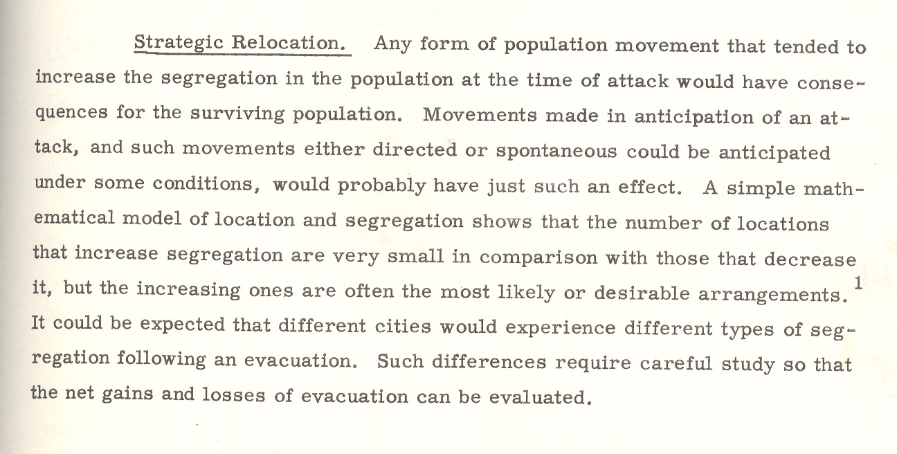
The paper goes on its merry way, connecting the necessaries of Goldbergian delight, and somehow nothing ever happened, which to me is a secret miracle.Especially given the weight of papers like this one, which seems to medicate the effects of war, assuming that there will be a Congress and that people will report back to work once the factories are rebuilt and that there will be more segregation in the colossal world of post-attack America, and on and on into the red dawn.
Mr. Mencken’s view of Warren Harding comes to mind when I read this stuff and wonder about how it was that we didn’t blow the whole place up:
“I rise to pay my small tribute to Dr. Harding. Setting aside a college professor or two and a half dozen dipsomaniacal newspaper reporters, he takes the first place in my Valhalla of literati. That is to say, he writes the worst English that I have ever encountered. It reminds me of a string of wet sponges; it reminds me of tattered washing on the line; it reminds me of stale bean soup, of college yells, of dogs barking idiotically through endless nights. It is so bad that a sort of grandeur creeps into it. It drags itself out of the dark abysm of pish, and crawls insanely up to the topmost pinnacle of posh. It is rumble and bumble. It is flap and doodle. It is balder and dash.”
Notes
1. The abstract from the above paper: “The basic problem with which this report is concerned is that of determining the kinds of demographic change that might result from a range of nuclear attacks, ascertaining the effects of those changes on the future of the surviving populations, and indicating possible areas for Civil Defense action and planning. Earlier studies of the demography of nuclear war were examined and their relevant conclusions and methodology incorporated in the report. A different methodology–expected to be more sensitive to compositional effects–was then designed. The new methodology was tested and found to be more effective than the old. Surviving populations representing a wide range of variation in attack conditions were created on the basis of both old and new methodologies, and the demographic significance of these populations was examined. Assuming a range of post-attack demographic conditions, a series of projections was made on the surviving populations. The demographic significance of the recovering populations was then examined. On the basis of the analysis a series of recommendations relevant to Civil Defense planning was made: Within the framework of this analysis the crucial variable is the demographic pattern of the city. Changes in composition, as well as size, could be of substantial magnitude and would last for generations in some cases. Cities differ in the kinds and magnitudes of change to which they might be subjected. Considerable variation in the demography of surviving populations can be expected; that variation would be related to policy decisions; and those decisions should therefore be examined for their demographic implications.”





 :
:

 of mountains and lengths of rivers, or the grouping of all the world’s lakes, or the divorce rate map of the United States at Centennial, or the heights at which different sorts of trees are found, or geological speculations on the thrust of the Appalachian chain, or the wanderings of the course of the Mississippi River (below), and other hosts of things.