JF Ptak Science Books Quick Post

Should woman be allowed to vote such are the tragedies that awaited, via 1904 sensibilities
A Daily History of Holes, Dots, Lines, Science, History, Math, Physics, Art, the Unintentional Absurd, Architecture, Maps, Data Visualization, Blank and Missing Things, and so on. |1.6 million words, 7500 images, 4.9 million hits| Press & appearances in The Times, Le Figaro, Mensa, The Economist, The Guardian, Discovery News, Slate, Le Monde, Sci American Blogs, Le Pont, and many other places… 5000+ total posts since 2008.
Contact johnfptak at gmail dot com
JF Ptak Science Books Quick Post
Should woman be allowed to vote such are the tragedies that awaited, via 1904 sensibilities
JF Ptak Science Books Post 1673
The Eiffel Tower is iconic; and being iconic makes it susceptible to be used as a standard of measure, at least so far as graphical displays of information is concerned. Here are four examples of Large Quantities of Things Being Explained in Terms of Eiffel Towers.
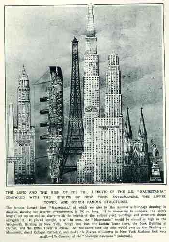
This wonderful display (appearing in The Illustrated London News for 26 March 1927, page 518) of quantitative data isn’t quite as whimsical as it appears in detail, though I can think of only a few (antiquarian) times that I have seen a ship made part of a cosmopolitan vertical cityscape. It is a great way of comparing two disparate, out-of-place equals, and certainly can get the idea of the size of something as stand-alone and solitary as a great ship to children (and adults, too) by comparing it to something as obvious as a tall building., This time its really just comparing the length of the SS Mauretania with the heights of some famous and notable buildings. (The Mauretania, 1906-1935, was a fabled, luxurious and fast ocean liner of the Cunard line; it was refitted for a resurgent oceanic service at about this time.) In the larger, expanded second image we see the Mauretania stacked up against (from left to right) the Washington Monument (555′), the Woolworth Building (792′), the Mauretania (790′), the Eiffel Tower (984′), the Larkin Building (proposed at 1208′), the Book Building (873′), the Koln Cathedral (512′) and the Statue of Liberty (305′). The Larkin Building (not the F.L. Wright structure of the same name) was a proposed super-tall of 110 floors for 330 W. 42nd Street that was proposed in 1926 and not canceled until 1930, and which would’ve been the tallest building in the world. (For an interesting site on the cancellation of tall buildings, see HERE.) In any event, this was a big ship–the largest in the world when it was launched as a matter of fact–and the drawing is wonderful. Upon closer inspection, there is a terrific amount of detail in the cross section of the ship.) (This original print is available at our blog bookstore.)
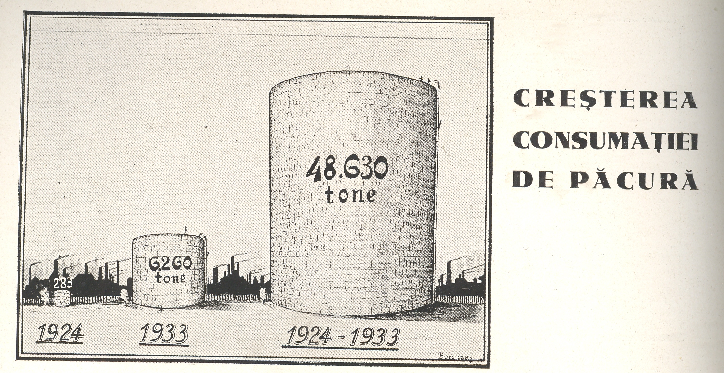
Continuing a long, developing thread on the graphical display of quantitative data–and especially that which uses man-made objects for comparison—is this interesting bit from a Romanian mining publication from 1933.
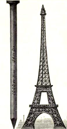
This image and data is from the generally useful data and interesting if not useless info Scientific American Reference Book. A Manual for the Office, Household and Shop, by Albert A. Hopkins, and published in 1903. It gloriously depicts the annual American finish nail production in terms of Eiffel Towers: there were evidently 10-million 100-pound kegs of these nails made in 1902; if they were made into one big nail, it would be this one–52′ in diameter and 1000 feet tall. I guess another useful visual bit would be the representation of the number of new houses built/kegs of nails, which would make this image a little more meaningful; though, perhaps, we may not be going for meaning, here, necessarily.
The huge mound next to the Eiffel Tower shows the consumption of wood in Romania over a ten year period, a stack of wood 700 metres long and 1500 metres high. Evidently this wall has only the most rudimentary depth of a metre, as the legend reads that the volume of the woodpile is 1,050,000 metres cubed, which is the same as its square area. So somebody missed something, here, though the artist did supply some nice shadowing.
Just above it appeared this comparison for the amount of oil consumed over the same ten year period
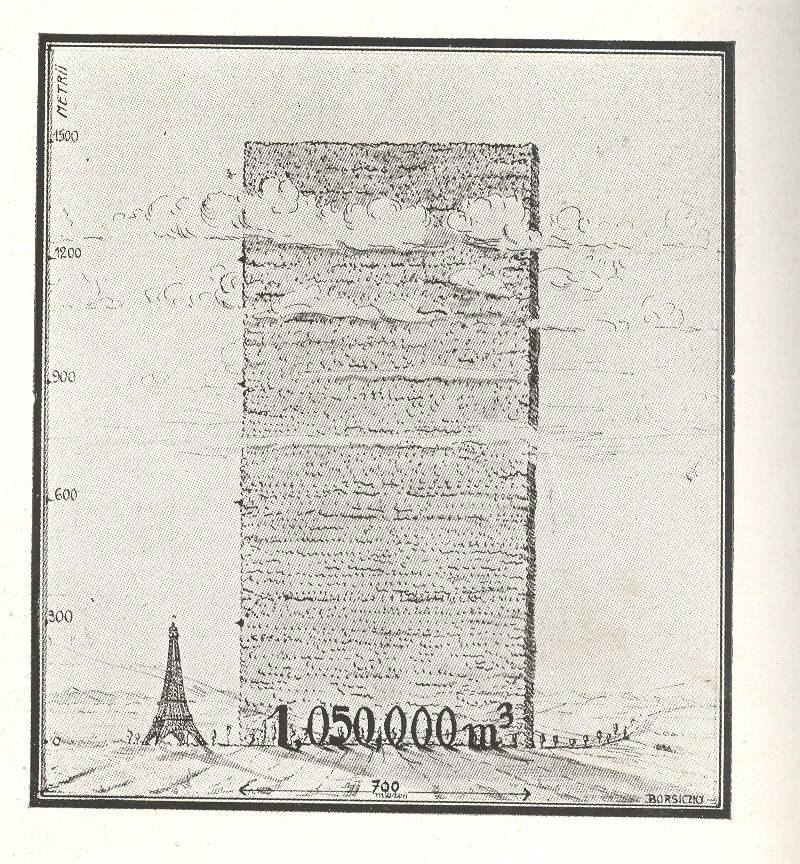
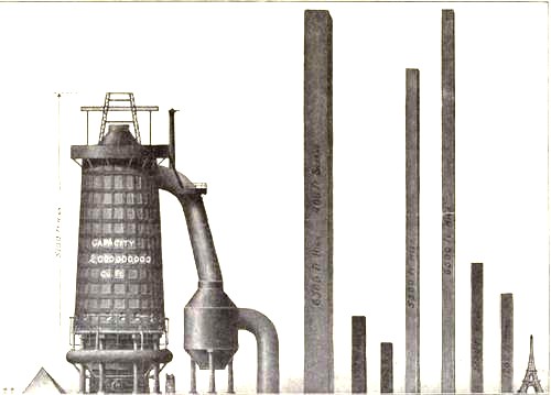
I love comparison like this, representing big, hard-to-associate numbers of something against another quantity that can be instantly understood–the relationship between the two might be tenuous and complex, but at least it can give you some sort of handle on what would normally be an inaccessible, stand-alone number. Plus, any time that you can show what an ungraspable concept might “look like” and be explainable to a 10-year-old, well, you’ve got something.
JF Ptak Science Books Post 1670
Dort, wo man Bücher verbrennt, verbrennt man auch am Ende Menschen.“–Heinrich Heine, saying that if people burn books, they’ll burn people, too, which have been proven to be the case.
Usually this story goes the other way around, where people of the world set books on fire–or entire libraries on fire (like the House of Wisdom, Baghdad, in the 13th century), some of them more than once (and in the case of the library at Alexandria, six times.) Books are burned in repulsion and revulsion not only by their readers but also (and in greater numbers) by rulers who don’t want their potential readers to have any potentiality, or potential, reversing the flow of unwanted information back to the source. (The illustrious and esteemed have burned people as well as the villains–Thomas More sentenced John Tewkesbury, a London leather merchant, to the flames for “approved burning” for keeping banned books; for good measure More also had the works of Martin Luther burned, as well.)This later has a very long history, which is taken a step further when said leaders reach out to burn the books and their authors, sometimes at the same time. This infamously happened to Michael Servetus (1511-1553, and who I wrote about here) and of course many others, entire castes of scholars burned or buried for being in the way.
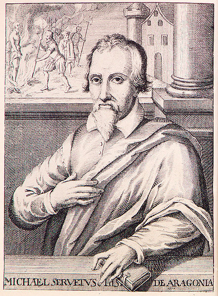
[Engraving of Servetus, being a good double-portrait showing him in the high life and then, in the upper left corner, being burned alive for his political activities ans for his books, which disturbed the notion of the heart-centered body and seat of all wisdom much favored by the clergy, replacing it with his notion of the heart as a muscle, as a functioning part of the body rather than its seat of wisdom.]
The first mass, organized book burnings in the United States were instituted for self-preservation of an economic way of life–local merchants banned together to form book burning brigades for the threat to their livelihood, the Sears & Roebuck catalog, which I wrote about here. Not quite on the scope of rejecting the lives and works of authors of what were deemed to be salacious or threatening to the core of the social structure, but in the long run perhaps they were something approaching that.
The “Memory Hole’ is the euphemism for the dispatch and destruction of books in George Orwell’s 1984, not too far removed from the institutionalized book burning in Fahrenheit 451, though seemingly a furious leap forward from Reverend Lovejoy from The Simpsons.

Reverend Lovejoy: “Oh hello Lisa! Can you recommend any books for my mobile?” Lisa: “Ooh absolutely! Well you know, anything by Jane Austen.” Reverend Lovejoy: “Jane Austen. Thanks Lisa, I’ll get right on it!” (Reverend Lovejoy drives away and reveals his Book Burning Mobile.) [Thanks to The Lisa Simpson Book CLub.]
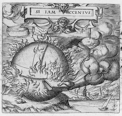
And for the first emblemata, above, comes the legend:
Alta Dei flammas vox toto suscitat orbe, God’s voice on high stirs up flames in all the world,
Dum nimis auerso mens mala corde furit. While all too strongly the evil mind rages with averted heart.
Sed pia mens humilis paret. Sic excoquit aurum, But the pious mind obeys in humility. So the furnace melts out gold,
Et paleas eodem deuorat igne focus and with the same fire devours the chaff
And as it turns out the book to set the world on fire is the Bible, which is I guess appropriate given the number of books sought out and burnt by Mother Church, though I must say that far more books were banned than burned. (I think so, anyway–there’s a number of iterations of the list of banned books–the Index Librorum Prohibitorum–which was kept from the mid-16th century to the mid-20th. I think that there is no massive list for books that were both banned and burned.) Its a harsh-looking metaphor, particularly given the story of the Flood.
And in some cases the Bible-burning metaphor was hardly that but an actual event, and tragically ironic in the case of William Tyndale. Tyndale was a scholar who among many other rich things brought to bear a new translation of the Bible done into English, which was a first, and which greatly displeased the ruling head of England at the time, King Henry VIII. Henry had already burned translations of the Bible that he could not abide and thought heretical–not the least reason of which would have his multiple marriages condemned–and continued on to not only do so with Tyndale’s work, but also to Tyndale himself. At the end of a long and complex story, Tyndale was found to be a heretic, and in 1536 was strangled to death on a platform before a large crowd, his head chopped off, and his body burned. After a few years Henry authorized multiple new translations of the Bible to be printed, all based on Tyndale’s work. Tyndale stayed dead, though–his work had an enormous impact on other English translations of the Bible, not the least of which is the King James Version of 1611, where the overwhelming majority of the NT and OT was Tyndale’s.

JF Ptak Science Books Post 1678
Herbert Quick did a fair amount of thinking about the military use of poison gas, and it winds up, in the final analysis, thinking that it was tolerable. What About Chemical Warfare? (published by the Newspaper Enterprises Association in 1921) is certainly a possible title for a Duck-and-Cover A-Bomb or You and Your Hormones kind-of-film–it has that certain stripe to it, bearing the certainty of wrongness that becomes more visible with each passing month. (The pamphlet is available for purchase from our blog bookstore, here.) But Mr. Quick took the slow boat around his issue, thinking about it a little long and out loud, before coming to his final conclusion in the chapter titled “Gas Warfare Cheapest and Most Effective Arm of Defense”.
{See here for my post on Willis R. Whitney’s letter/proposal for establishing the American chemical warfare capacity, 1917.]
He points out the enormous impact in the war effort that relatively small chemical corps played in WWI–something on the order of hundreths of one percent of all serving soldiers were employed in the combined chemical corps, saying “how small a body to produce such great results!” Which is true, assuming that by “great” he meant ‘widespread’, though it is unclear exactly what he was talking about.
Mr. Quick (born in the first year of the American Civil War and dead four years after the publication of this pamphlet, writing evidently from the cushion of old age) does make a case for poison gas being not so inhuman as presented by most civilized people, pointing out both its high quick-death rate and survivability/recovery rates, which seems to be giving/taking at the same time. No matter: “But woe to the army or nation that does not keep up with the times. The Angel of Death will breathe in their faces” he writes.
The author also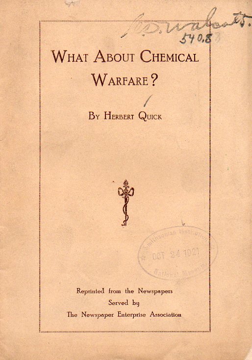 warns that though Germany was “stripped” of her war-making capacities, he thought it was not so of the industries necessary to produce poison gas. He points out that Germany can produce these munitions in secret, and that if any “militaristic nation conquers the world in the future”, it will be through the use of the poison gas it developed in secret.
Defense was also important: “in the absence of efficient defense worked out beforehand, our great cities might be wiped out with gas bombs dropped from aircraft”. Mr. Quick believes that protecting cities is possible, writing simply “preparation will prevent such a crisis”. Indeed. Unfortunately no ideas about this defensive posture were forthcoming, though he did bring himself around to writing about gas as a defensive tool. Against looters. And rioters. And snipers. “Gas puts the sniper in the power of his enemy” Quick writes, using the Marine action in Vera Cruz, Mexico, as a good example of where gas (“gas grenades”) would have come in handy.
The bottom line is of course the bottom line, practically stating that poison gas as a weapon was indisputably more cost-conscious than anything else, by far, each dollar spent on chemical warfare being worth “from three to five hundred for the army”. Poison gas services Quick says should be pursued, because “gas warfare cannot be stopped until all war is stopped”.
Gas warfare “gives the educated, intelligent nations the advantages over the people of lower civilizations”.
“When both sides are prepared it is much less inhumane than war with bullets and high explosives; but it means horrible annihilation to the army which is unprepared.”
It is an interesting exercise to replace “poison gas” with other types of weapons, just to see how it reads.
Mr. Quick was up and down in his treatment of poison gas and war, though almost entirely down. One thing he didn’t see, that no one saw, really, was the use of a particular gas that was used to destroy millions of people, and which was developed quite in the open in Germany for many years, used for killing rats. The Nazis simply used it instead on people. No one saw Zyklon-B coming, and no one could have, even when they did.
See also my post here on Hermann Goering and Zyklon-B.
William Shockley–a future Nobelist and probable weak member of a Nobel-team that invented the transistor and which included John Bardeen and Walter Brattain, or I should say rather a team of Walter Brattain and John Bardeen including William Shockley–sent forth a memo on the mathematics of destruction and the use of the atomic bomb. He was part of a largish team working on what to do with the new technology once the bomb had been used and the war won. (I’ve written more on this paper here.)
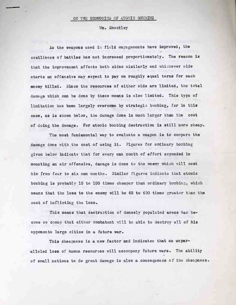
This paper was written towards the end of 1945 and is on five pages and runs about 1500 words, and is an extension of work he had already been doing for Henry Stimson with Quincy Wright on evaluating the combinations of casualties that would lead the Japanese to surrender. He begins this paper with a logical statement of the issue of the economics of conventional and atomic bombing, ending with the sentence “For atomic bombing destruction is still more cheap”. What Shockley is getting to is the overall cost of the amount of destruction caused per square mile, and the conclusion that he draws over these five pages is the destruction caused by the atomic bomb is 1/100th the cost of conventional bombing per square mile destroyed (“atomic bombing is probably 10 to 100 times cheaper than ordinary bombing”).
Shockley also recognizes that the problem in the near future will be the increasing cheapness of producing atomic (and greater) weapons, and their developing accessibility to small nations. “This cheapness is a new factor and indicates that an unparalleled loss of human resources will accompany future wars. The ability of small nations to do great damage is also a consequence of the cheapness.” He writes further that taking this thinking to its “logical conclusion”, that at some point in the future a single individual will be able to use this new technology to destroy the world. The main point though that he was making in this line of thinking was the dispersion and proliferation of the new technology–that an arms race would occur, and that it would be dangerous, and that it could be very very bad. Shockley has of course nothing to say about any of that or the implications of his finds as that was not his charge.
After figuring that the cost of destruction by the atomic bomb was about $600,000 per square mile (compared to $6,500,000 per square mile for conventional bombing), Shockley concludes that “since the atomic bomb art is in its infancy, we may well expect future economies of a factor of 10 in cost per square mile destroyed…”
·Posted by :
·in:
JF Ptak Science Books Quick Post
I would not have made the intuitive leap to what this “game apparatus” would become from the simple reading of the opening two paragraphs of the patent description for it by its creator, J. Brunot:
“This invention relates to apparatus for playing board games and more particularly to apparatus designed to facilitate scoring procedures in connection with the playing of such games. In many board games playing pieces are placed on certain contiguous or successive areas marked out on the board and the placing of the playing piece on certain predetermined areas results in an adjustment of the score of a player either by adding a bonus to the score or subtracting a penalty therefrom.”
“Usually the predetermined areas which result in adjustment of the score are marked in a characteristic way in order to show how the score is to be adjusted. However when a playing piece is placed on one of the predetermined areas it covers this marking and it has been found that frequently the playing piece has subsequently to be lifted in order to discover how the score should be adjusted. The object of the present invention is to provide board game apparatus in which the occasions for such subsequent lifting of a playing piece are eliminated or substantially reduced…”
[Patent 2,752,158 GAME APPARATUS James Brunet and Helen Brunot Newtown Conn Application October 28 1954 Serial No 465,222 priority application Great Britain June 11 H54 5 Claims Cl 273 135]
The patent drawing offers a much better visual clue, but it still really doesn’t bear a great witness to what the apparatus would become:
And the story on the answer to what this is can be found at the SCRABBLE Association history section.
JF Ptak Science Books Post 1675
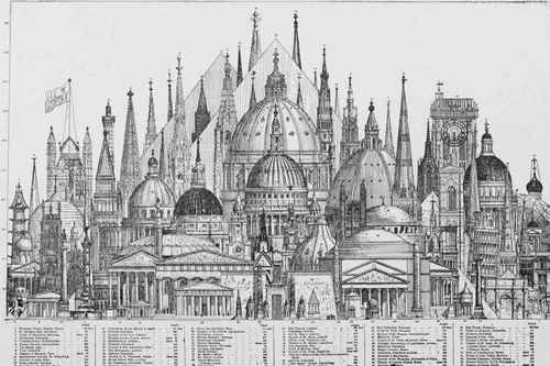
The 1876 U.S. Centennial Exposition (formally called the “International Exhibition of Arts, Manufactures, and products of the Soil and Mines) in Philadelphia was a grand and fabulous showing of all things American, celebrating the hundreth anniversary of the signing of the Declaration of Independence. One of the crowning objects of the fair was to be the never-built 300-metre tall Centenniel Tower, pictured here in the 24 January 1874 issue of Scientific American. The structure appeared in relief against the background of other tall things built by humans, show in a relatively new fashion for displaying quantitative data comparisons in the same scale.

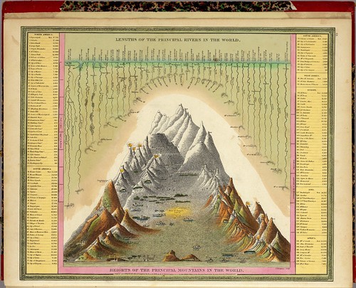
The practice of showing, say, the comparative heights of mountains and lengths of rivers by loading up all of the samples on one piece of paper for the ease of recognition was begun in the 18th century, but only rare; it began with some fits and starts in the 1820’s again and then much more widely around mid-century, and seeming to peak at the end of the century before going somewhat dormant for the next few decades or so.
Another nice example of comparative heights of buildings:
And this as well:
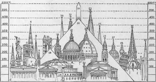
[Source with key to the images found here, at Chestofbooks.com]
The excellent Bibliodyssey blog contributed a good healthy post on the subject of comparative heights of mountains map (here) with many fine examples of the art. Its a curious thing to me that the business of using same-scale comparisons in architecture is relatively new, coming (I think) as an invention of Etienne Durand in the 1840’s.)
Here is one such example:
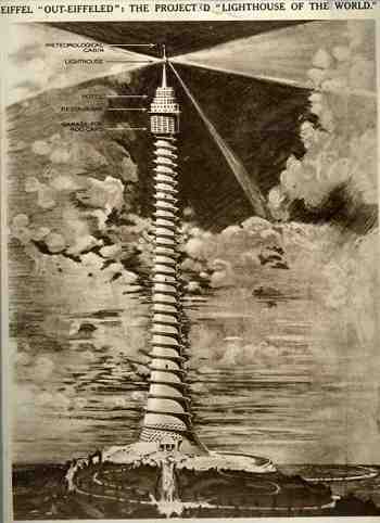
But getting back to the tower itself and it unbuiltedness, here’s another example of an unbuilt tower–taller and bigger than the Centennial–which was proposed by Eugene Freyssinet (and which I wrote about earlier in this blog here):
Another in what is a long line of unbuilt towers would be this contribution by Vinnie Ream Hoxie (ca. 1874-6) which was his response to the finishing of the not-completed Washington Monument. Congressional sympathies towards spending money to complete the Washington Monument dried up to nothingness in 1856, just eight years after construction on the monument was begun. The consequence was that the monument was only a nubbin for several decades, standing about a third complete–it was Hoxie’s idea no doubt to provide a sort of quick-and-dirty approach to finishing the project. Of course this looked like exactly what it was, and the idea died its own lonely death, thank goodness.

It had little appeal, at least to me. It is somewhat reminiscent of the exhibition of the completed forearm of the American Statue of Liberty, which as it turns out was also exhibited at Phildelphia in 1876, years before the completion of the rest of the statue. Short and stubby.

There are many other entries in the history of unbuilt towers, but their day will have to wait (for this blog, anyway).
·Posted by :
·in:
JF Ptak Science Books Post 1651
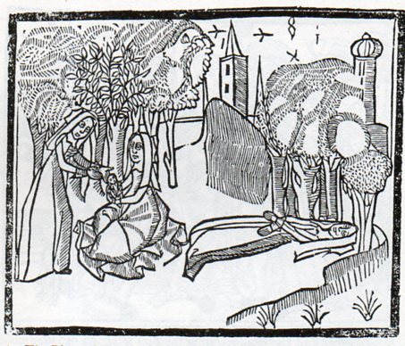
Sir Thomas Mallory (c. 1405 – 14 March 1471), translated and compiled a collection of mostly 14th century romances regarding King Arthur known and published as the Le Morte Darthur/Le Morte d’Arthur. It was first published by the great William Caxton in 14851and became quite popular, being reprinted with additions and corrections in 1498 by William Claxton and then again by Wynkyn de Worde (in 1529). It is, in its way, beautifully illustrated, or at least interestingly illustrated–I can’t really say for sure if the woodcuts were done with great care or not. But their effect is significant, and, whether naive or not or careless or not or simply at the artistic limit of its executor or not, the images do have their own peculiar beauty. One that struck me in particular was this,
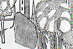
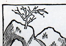
the “floating river”, an out-of-perspective element of a very stationary world, a controlled chaos-ness in a static landscape. I’m not sure what is going on with the trees, if the blankness is a part of reflected light, or if it is a representation of spaciousness between the limbs, or if they are simple wormholes in the woodblock. Everything in the image seems to have its own sphere, locked into their own environment, existing apart from everything else.
I see the same issue with many other such works, bits dropped into place in a scene or landscape, all making their way into the viewer’s mind on their own, not really a part of a cohesive whole. This may have been the intent, or again it may have rubbed up against the outer limit of what the artist (and their tools, and medium, etc.) was able to actually produce. Here’s another example:
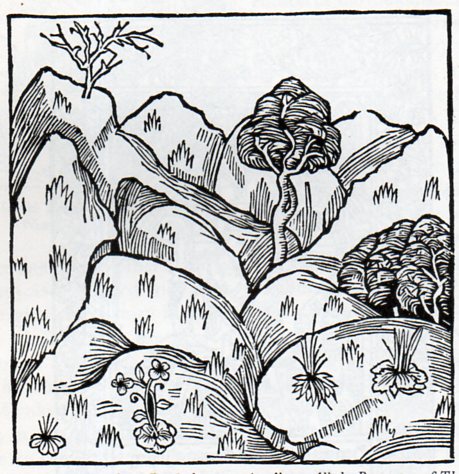
Its another lovely, lonesome image of separates from the beautifully-named book by Bartholomaeus Anglicus All the Properytees of Thyings, which was published in Westminster in 1495 (and also known as De proprietatibus rerum, also translated as On the nature of things, or On the properties of things), and which was originally written around 1225). The book was a bestiary, a marvelous encyclopedia, a collection of all things as known in the 13th century–it would be interesting to represent all that is know today and compact it into a workable, logical, usable (printed !) book of a thousand pages. The question of organization of knowledge would be the key, of course, and how to make one flow to another complementarily as practicable…it would be an interesting project (for someone else) to try and arrange the basis of human knowledge in a finite space like that. The author of the book above organized his work as follows, in 19 books: “god, angels, (including demons), the human mind, or soul, physiology, of ages (family and domestic life), medicine, the universe and celestial bodies, time, form and matter (elements), air and its forms, water and its forms, earth and its forms including geography, gems, minerals, and metals, animals, and color, odor, taste and liquids.” The 2012 variety of categories would be somewhat different.
Notes:
1. This period, from say 1494 to 1525, was one of great creativity. For example: 1494, Pacioli: Everything About Arithmetic, Geometry and Proportion; 1498, Leonardo da Vinci: Last Supper; 1500, Michelangelo, Pieta; 1504, Michelangelo: David and Bosch Garden of Earthly Delights; 1505, Leonardo Mona Lisa; 1506, work begun on St. Peter’s Basilica; 1508-1512 Michelangelo paints the Sistine Chapel; 1511, Erasmus, Praise of Folly; 1512: Erasmus, De Copia; 1513, Machiavelli The Prince; 1516, More, Utopia; 1517, Start of the Reformation.
Some samples of other bestiaries (compiled by The Medieval Bestiary):
Hrabanus Maurus : De rerum naturis
Isidore of Seville : Etymologies
Lambert of Saint-Omer : Liber floridus
Brunetto Latini : Li Livres dou Tresor
Jacob van Maerlant : Der Naturen Bloeme
Konrad von Megenberg : Das Buch der Natur
Thomas de Cantimpré : Liber de natura rerum
·Posted by :
·in:
JF Ptak Science Books Post 1666
The depiction of the anthropomorphic Sun featured with a broad toothy smile seems a commonplace fixture in modern times–at least in the very popular media–but it seems to me that the Sun was an impressively dour character in the most misty and moldy past. Its a much harder issue for me to locate a happy Sun than a phlegmatic one, as we can in the coming examples. Here, for instance, the Sun is actually disappointed, and dark:
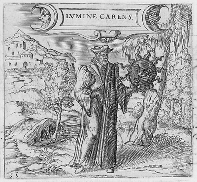
[Georgette de Montenay/Anna Roemer Visscher, Cent emblemes chrestiens (c. 1615)]
The Sun (representative in this case of the Christian god) disavows the heavily robbed false philosopher, finding nothing but fault in the erroneous thinking and pronouncements, so much so in fact that it distances itself from the phonylogian by turning itself black and devoid of light, absenting the light that was supposed to be shone via the heretic’s teaching.
Feigning to be a philosopher with your long cloak
You bring forward all false theories about the pure Sun.
First learn to recognize what is the true light.
The balmy day does not shine in obscure night
Conversely, the sun would also shine to dispel the false teaching of other philosophers, as so, though this time without any face at all:
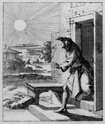 [Source: Pieter Huygen, Beginselen van Gods Koninkrijk (1689)]
But mostly it seems the Sun appears to those who came before with a mostly blank expression:
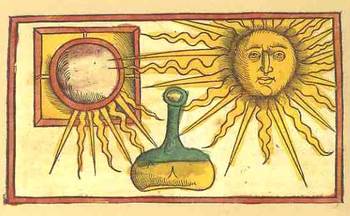 Where was the smilign Sun hundreds of years ago? Anthropomorphic images of the Sun have appeared in books in the West for several hundred years, and in almost every case where the Sun has a face, it is usually expressionless, its mouth drawn into a mid-Western farmer/Abe Lincoln horizontal, a tightly drawn nothing. Two thin lips, firmly repulsing all emotion. The face of the Sun was insurmountable, a tabula rasa, showing perhaps that there was nothing there at all inhabiting this iconographic image of The Creator to give the poor observer a glimpse into the depths of the future.

This observation seems to stand for Sun Gods and Goddesses as well, even the ones who are being tugged or pulled or charioted a cross the vaults of the heavens—the Nordic Sól, Greek Helios , Roman Sol Invictus, Vedic Surya and of course Elijah ascending to Heaven in a Chariot of Fire, all seem pretty intractable. But in general images that we see of Sun deities like Apollo, Greece and Rome; Freyr, Norse; Garuda, Hindu; Huitzilopochtli (Uitzilopochtli), Aztec; Inti, Inca; Liza,West African; Lugh, Celtic and Re (Ra) and Isis, and on and on, show a small, set pair of lips, if they have a mouth at all, and this going back beyond the Sumerians (Shamash).
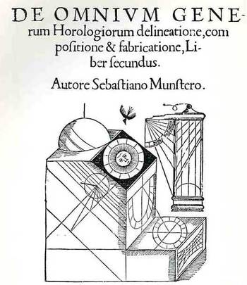
When the Sun really loses its human personae in the 17th century (the scientific sun and stars beginning much earlier, as in for example Allessandro Piccolomini’s Della Sfera del Mondo, 1552, with simple star maps unadorned by icons and written in the vernacular), it is replaced with starry images which seem to somehow have more emotional authority than the sun images with faces. Perhaps the sun was meant to have this Delphic, blank-mirroring quality, given its importance as a giver (and taker) of things,

and that it was not within human capacity to understand it as an emotive entity, especially during bad times. But in those times of Good and Bad it wasn’t necessary to see a frown or a smile on an image of the Sun, I guess because of the complaints of redundancy.
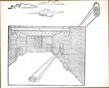
No matter, though, as the modern astronomical text took care of the Sun and its missing buckets of smiles in due course—until more modern times, when the Sun is made to have a matching disposition, a result of kinder modern artists.
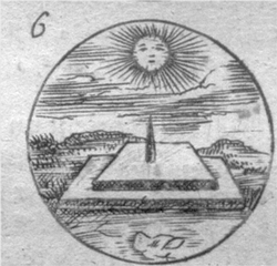
This Sun seems to rule with an ennui Daniel de la Feuille, Devises et emblemes (1691); and then again, in the following superbly engraved work by Jacob Cats, Sinne- en minnebeelden (1627):
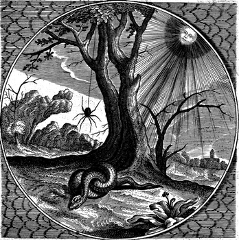
The Sun here seems to have a knowledge-worn expression, a sense of having-seen-it-all, in this beautiful work by Georgette de Montenay/Anna Roemer Visscher, in Cent emblemes chrestiens (c. 1615)
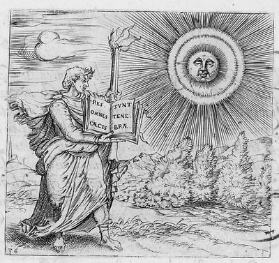
And again from the Montenay we see a smirking Sun (definitely not a smiling one) judging the efforts of humans once again, and finding them coming up far to short:
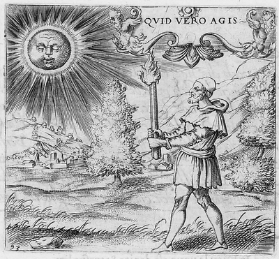
I guess you could make a case for an “amused” Sun in the Montenay, though in a third-person sort of Royal way of being removedly amused. Here–in a rare and very important work in the history of alchemy–we see a rising Sun in an amused state, welcoming the book’s author, on his alchemical pilgrimage.
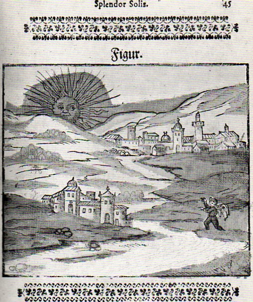
In another illustration from this book (by Salomon Trismosin, Auretum Velius oder Guldin Schatz und Kunsthkammer, printed by Georg Straub at Lake Constance in 1598/9, and also known as “Splendor Solis”) we find the following expected facial posture:
![[trismosin, salomon (?pseud., fl. 1473?). <i>aureum vellus, oder guldin schatz und kunstkammer.</i> rorschach: 'gedruckt in des f. gottshausz s. gallen reichshoff' leonhard straub, 1598-99.]](http://www.christies.com/lotfinderimages/D54552/trismosin_salomon_aureum_vellus_oder_guldin_schatz_und_kunstkammer_ror_d5455284h.jpg) |
And so on and on this continues, this presentation of the Sun as both removed and judging, until–in some cases–the business of representing the Sun anthropomorphically disappears altogether, even in allegorical representation, like so:
The Man in the Moon will just have to wait his turn, though I can’t resist the following couple of images, the first of which shows the Moon in a phase of nothingness and a nil expression:
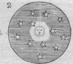
[Source: Daniel de la Feuille, Devises et emblemes (1691)]
And then this classic image from an iconic and early science fiction film:

And from the 1905 motion picture version of Jules Vernes From the Earth to the Moon called A Trip to the Moon–upon the approach, the Moon’s surface was blank, but quickly developed a face, which was sort of smiling–until struck in the eye by the Verne capsule.
Offhand, though, my memory doesn’t offer too many smiling-Moon expressions.
JF Ptak Science Books Quick Post Addition to the Extra-Earth Series
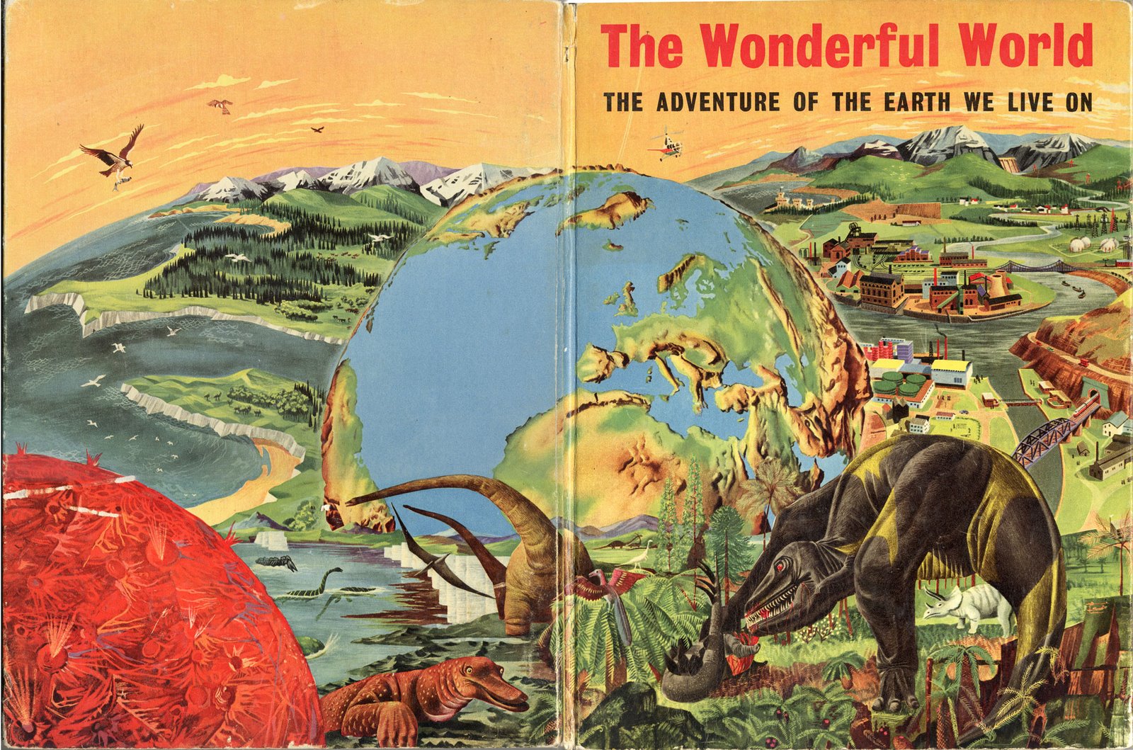
Today a reader of this blog forwarded a lovely image for the series on Extra-Earths that appears here–one installment of which (with links to the others) appeared just this morning.
The Wonderful World–the Adventure of the Earth We Live On (by James Fisher, and with art editor F.H.K. Henrion, and published by Hanover in 1954) is a clunky title even for expressing its idea to juvenile audiences. And speaking of which, if the intended reader was eight years old, the cover art might be a little confusing: what is that bubble-Earth doing there, and why is there a T-Rexy thing standing there on a mountaintop overlooking a city and observing the whole Earth-emergent process?
But when we look inside the book (at the images provided by our reader, Kevin, from his own 2006 blog (“The Balloonist”) entry on this book, we can see the elements of the cover’s montage, and which would I guess alleviate a young reader’s consternation with the confusing image:

JF Ptak Science Books LLC Post 1664
See the other Extra-Earth posts: Mondo Bizarro, Science Afflictions and the Dubious Mind—Bad Science, Part 1. NYC in Space (?!) here and Extra-Earth Humano-Alien Souls From Outer Space Repopulate Earth-Hell!!(??) here.
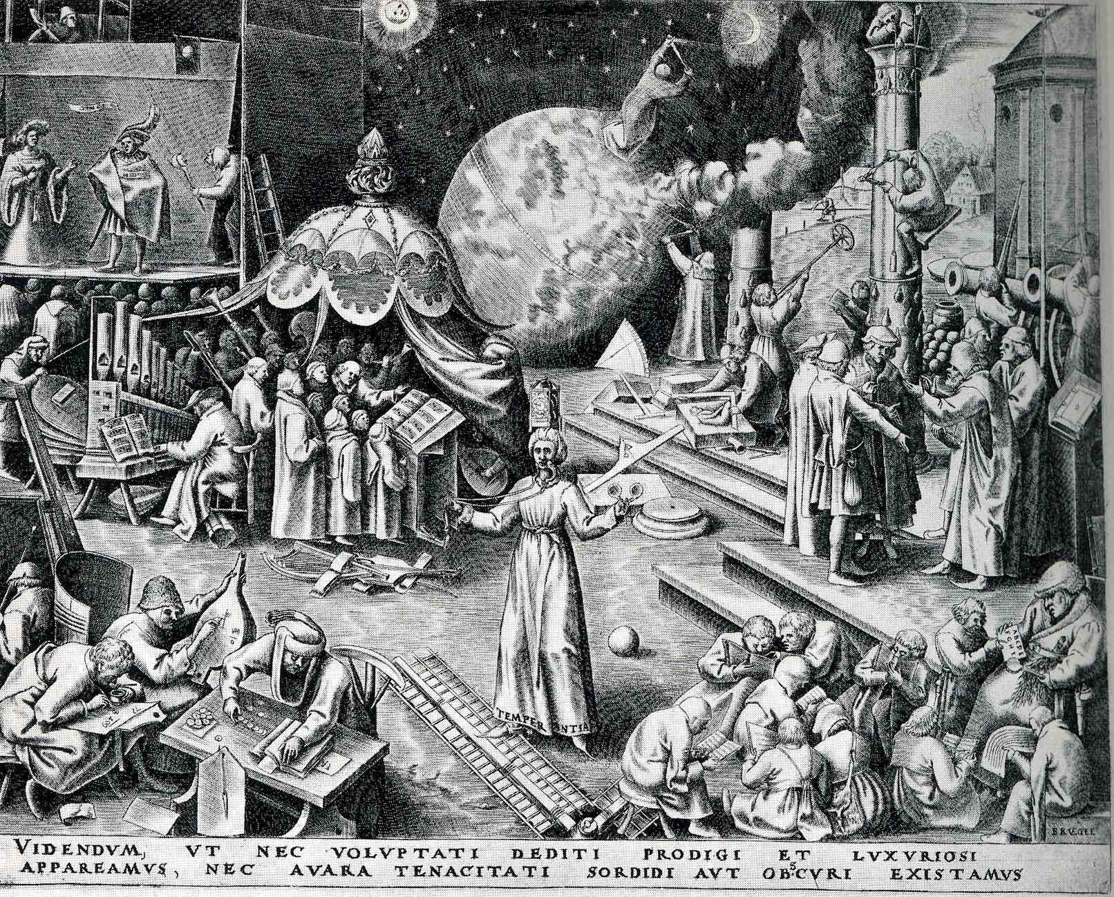
Peter Brueghel (the elder, born ca. 1525 and dying in 1569), was the Dutch semi-discoverer and king of “normality” of Renaissance art–and by “normality” I mean that he depicted non-royal things that were generally off the palette for almost everyone else, finding subjects in peasants and small life (hunting, meals, working at agriculture, festivals, dances, and so on). Brueghel was also perhaps the first painter to depict a landscape for the sake of its own beauty, without being a backdrop for a religious study or building or historical scene. He was extraordinarily prolific in his skimpy 45 years, fully populating his scenes with suites of busy and evolving life.
Browsing through some of his work, I came across the print called “Temerpance”, which in general I think was supposed to warn us against excessive pleasure, but which really just confused me a little.
(TEMPERANTIA; and then, VIDENDVM, VT NEC VOLVPTATI DEDITI PRODIGI ET SVXVRIOSI//APPAREAMVS, NEC AVARA TENACITATI SORDIDI AVT OBSCVRI EXISTAMVS. “We must look to it that, in the devotion to sensual pleasures, we do not become wasteful and luxuriant, but also that we do not, because of miserly greed, live in filth and ignorance”.)
To me, it looks like people here are pretty industrious, mostly engaged in scientific or musical pursuits: lots of books, musical instruments, people writing and reading. But I guess that these were sensual pleasures, pleasures of the mind and heart, and not a pleasure devolved from the godhead. Perhaps the complete opposite is true: the print showing the triumph of the pursuit of the mind over sensual graft, lifting mankind above the filth and ignorance of the body. Sheesh.
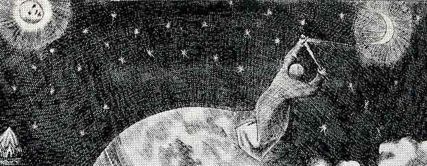 But the real grit of my interest is the action lurking in the background, the man, the astronomer, making measurements in the sky, triangulating the Moon and the Sun (perhaps). What on earth is he standing on? He does seem to be standing on earth in the background of the earth on which thee people in the foreground are standing–which means, with a stretch, we have the fourth entry in this blog’s short “Extra Earths” category.
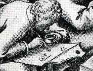
The more I think about it, and the more closely I look at the print, this confusion must be my own–this must be Brueghel’s way of showing the possible worlds that exist outside the sensual and self indulgent. He shows children (and adults) learning their ABC’s at the feet of teh schoolmaster at bottom right, a theatre scene at upper left, a large musical ensemble (complete with choir). An industrious man measures his fields, while builders to his right measure their progress and trueness on a column; at bottom right we see an “accountant” of the times working his tables and figures, while another to his right works on a math problem, clutching his pot of ink. The figure in the middle (with “temperance” written in the hem of his garment), reminds us of our mortality, with a sword in one hand and a clock on his head. All in all, it is a delightful scene of industry and invention–and it has an extra earth.
Of course the extra-earth is allegorical, but, still, it is an unusal thing to see.
 :
: