A Daily History of Holes, Dots, Lines, Science, History, Math, Physics, Art, the Unintentional Absurd, Architecture, Maps, Data Visualization, Blank and Missing Things, and so on. |1.6 million words, 7500 images, 4.9 million hits| Press & appearances in The Times, Le Figaro, Mensa, The Economist, The Guardian, Discovery News, Slate, Le Monde, Sci American Blogs, Le Pont, and many other places… 5000+ total posts since 2008.

Category: Maps, Cartography, History of Mapmaking

  • Hobo Signs Map, 1870

    JF Ptak Science Books   Post 1750

    Bloghobo_b200

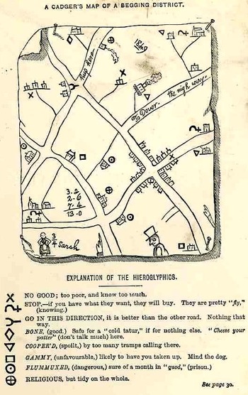
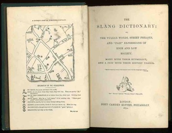
    This is the frontispiece to the delightful work with the luscious title of The Slang Dictionary; or, the Vulgar Words, Street Phrases and Fast Expression of High and Low Society… printed in London by John  Camden Hotten, in 1870.  It is a hobo or “cadger” (“a  mean or vulgar fellow who would rather live on other people than work for himself”)  map (or the map of “a tribe of vagabonds”) of Maidstone, in Kent, drawn by a “screever” (a sidewalk chalk artist who normally would draw religious images for money), and showing the various chalked and etched signs that the hoboes (“and other mendicant marks”)  would leave for one another, being a key to the town, for what was practicable, safe, dangerous, and the like.

    Recorded antiquarian hobo and tramp symbols like these are really quite rare, given their ephemeral nature to begin with; of course the need to record these obscure signs by polite society was not on a high order.  There are many indications that signs such as these existed, but not many illustrations.  For example in the book The Triumph of Wit; or, Ingenuity Display’d in its Perfection, edited by John Shirley. (1724), as well as works by Holyland and Borrow there is a description of English gypsies and their travels, and a short description of their use of boughs and sticks, set out for each other, so that a duplication of effort by different bands or families would not occur.

    (The figure of the woman, wonderfully named “3/4 Sarah”, probably connects this Sarah to a sort of popular dance.)Bloghobo_a199_2

    Hotten also published the following interesting and title-bending work in 1874:  THE ORIGINAL LISTS OF PERSONS OF QUALITY;  EMIGRANTS; RELIGIOUS EXILES; POLITICAL REBELS; SERVING MEN SOLD FOR A TERM OF YEARS; APPRENTICES; CHILDREN STOLEN; MAIDES PRESSED; AND OTHERS WHO WENT FROM GREAT BRITAIN TO THE  AMERICAN PLANTATIONS 1600-1700, WITH THEIR AGES, THE LOCALITIES WHERE THEY FORMERLY LIVED IN THE MOTHER COUNTRY, THE NAMES OF THE SHIPS IN WHICH THEY EMBARKED, AND OTHER INTERESTING PARTICULARS.


  • Dissecting a Map of Woman’s Heart

    JF Ptak Science Books    Post 1697

    [This is an addition to an earlier post here featuring dozens of maps of imaginary places.]

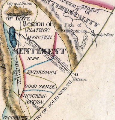
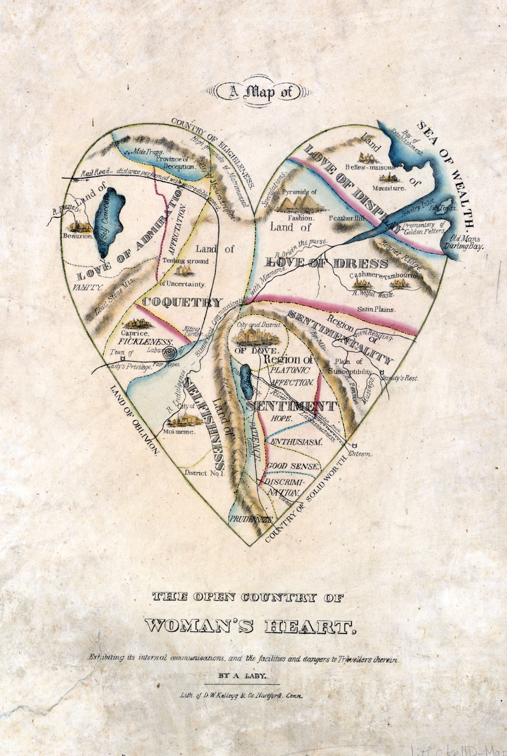
    I suppose that this map, “The Open Country of Woman’s Heart, Exhibiting its internal communications, and the facilities and dangers to Travellers therein” may well abe a reverse insight into woman, or at least an insight into what the early 19th century thought might be penetrating insight.

    I can see four distinct parts of this heart, with a fifth element existing at the heart’s center–love.   The regions surrounding love central are not entirely appealing by today’s standards, and were more than likely the work exhumed from a male surveyor’s approximations.  The overall map as so:

    Maps--imaginary WOman[Source: the Beauty, Virtue and Vice website (here)]

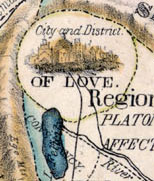
    At the very center lies the City and District of Love:

    Maps--imaginary WOman center
    penetrated somewhat at the lower left by a morsel-shaped lake running through the Land of Constancy.  Running due south are some rather appealing places in the Land of Sentiment:  Platonic affection, hope, enthusiasm, good sense, discrimination, and at the very bottom bit, prudence. 

    The remaining autopsy is somewhat less generous, at least from our position here in 2012:  the lands surrounding the Land of Sentiment and the heart’s heart are Love of Admiration, Land of Coquetry, Land of Selfishness, Region of Sentimentality, Love of Dress and Love of Display.  And within these lands exist uncomfortable accommodations.

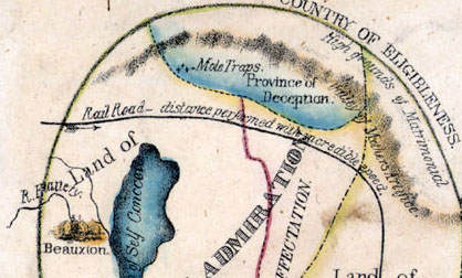
    And the details, in four sections; the first, the northwest quadrant, or the right atrium:

    Maps--imaginary WOman   NW

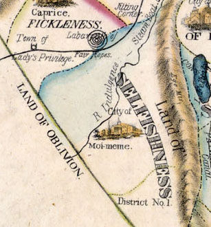
    The southwest quad, or right ventricle:

    Maps--imaginary WOman  SW
    The north east quad, or left atrium:

    Maps--imaginary WOman  NE

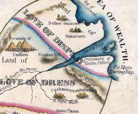
    And of course the fourth quadrant, the south east or left ventricle:

    Maps--imaginary WOman  SE


  • The Most Beautiful Blank Map in the World–the Bellman’s Fit from the Hunting of the Snark

    JF Ptak Science Books   Post 1644  [Part of the Series on the History of Blank, Empty and Missing Things.]

    “Other maps are such shapes, with their islands and capes!
    But we’ve got our brave Captain to thank”
    (So the crew would protest) “that he’s bought us the best-
    A perfect and absolute blank!”–
    Lewis Carroll, The Hunting of the Snark.
    Peutinger
    [This post fits perfectly in our History of Blank, Empty and Missing Things.  Ditto for the series on The History of Lines–making this a great confluence for a History of Blank and Missing Lines (in the History of Nothing series).]

    For all of the brilliance of all of the cartographers and map makers who have drawn a line in the sand or strung a strand of quipi or drawn a celestial rendering on a cave wall or imagined the Americas in 1504 or ventured out and away from the Medieval T-maps or drew maps of other worlds or fashioned spiraling maps of Hell, I think the maps I most like are maps of imagined places.  Of course I enjoy the extremely rigorous and steadfast maps (like those of the German Stieler Company of Gotha who for a hundred years routinely drew the most detailed maps in a particular scale than any other mapmakers in creation—you know, the big maps of the U.S. that would locate minute places like Truman Capote’s “out there” town of Holcomb, Kansas) and of course maps of the solar system and galaxy and universe (as knowledge expanded and collapsed and expanded again).  And of course there are the representational maps showing the comparative heights
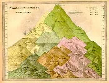
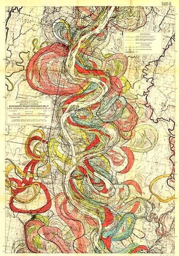
    Mountain of mountains and lengths of rivers, or the grouping of all the world’s lakes, or the divorce rate map of the United States at Centennial, or the heights at which different sorts of trees are found, or geological speculations on the thrust of the Appalachian chain, or the wanderings of the course of the Mississippi River (below), and other hosts of things.

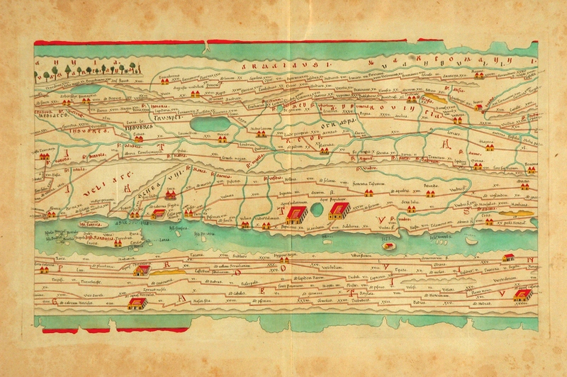
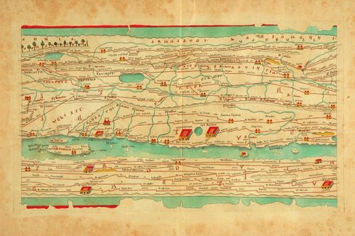
    As much as detail is attractive to me—complex, staggering information correctly displayed—there is also the opposite:  the quick, thoughtful, spare map.  The Tabula Peutingeriana is sort of like that—this is a 17th century reproduction of an ancient Roman map that was, basically, a road map of the world (or the Roman World) that was linear and included all manner of detail of the roads themselves, with little else.  It is a spectacular thing—one version I had once was 14 inches high and 16 feet long, just a skinny map of how to get around in the world from 2000 years ago.  There was of course nothing “quick” about how the map was made, coming at the expense of countless hours of careful observation, keen observation, and lots of general human tragedy.
    Mississipi

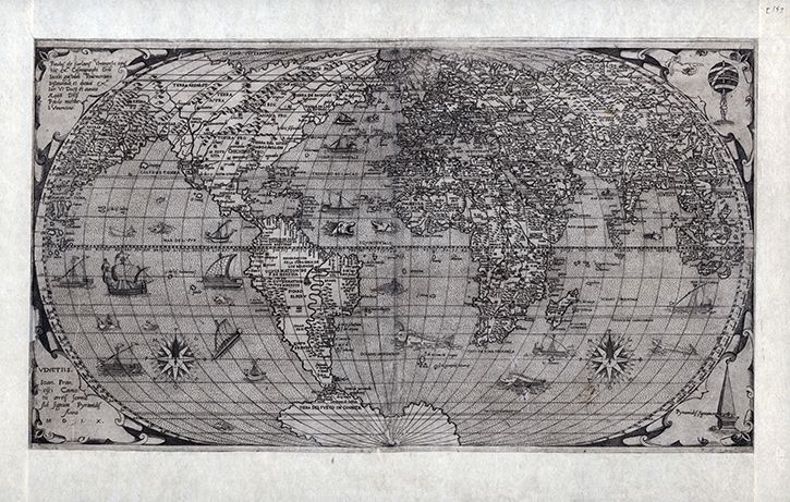
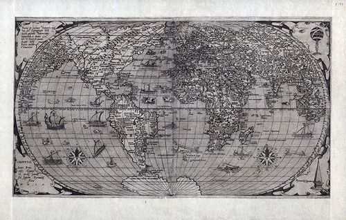
    Folrani’s world map of (ca.) 1575 (which appeared in Antoine Lafrery’s (1512–1577) Geografia tavole moderne di geographia) is a glorious thing and a fantastic accomplishment for its time (and also being the first map to use the name “Canada”).  It has a sumptuous artistry to it in addition to including (and excluding) certain of the newly known discoveries.  In this version of the map he chose to not use the newly-incorporated Straits of Ainan
    Folrani maps

     [I’m sorry to say that I’ve misplaced the original source for this map–I will try and supply. My apologies.]

    In another edition of the m-which appeared a few years later–North America is still attached to Asia, but now there is added another bit, a gigantic land mass to the south, Terra Incognita.  This was basically put together by some sightings in the southern seas that located different land masses, and Forlani took it upon himself to connect all of those pieces of information and draw them into one continuous land mass, greatly expanding his own version of Antarctica from a few years earlier.  It is a wonderful example of leaving something(big)  out and making something else (even bigger) up.

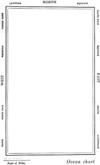
    But the map that I think I love the most illustrates Lewis Carroll’s The Hunting of the Snark, an Agony in Eight Fits, and occurs in the Bellman’s tale, starting the second fit. It begins:

    The Bellman himself they all praised to the skies-
    Such a carriage, such ease and such grace!
    Such solemnity too! One could see he was wise,
    The moment one look in his face!

    He had bought a large map representing the sea,
    Without the least vestige of land:
    And the crew were much pleased when the found it to be
    A map they could all understand.

    “What’s the good of Mercator’s North Poles and Equators,
    Tropics, Zones, and Meridian Lines?”
    So the Bellman would cry: and the crew would reply,
    “They are merely conventional signs!

    “Other maps are such shapes, with their islands and capes!
    But we’ve got our brave Captain to thank”
    (So the crew would protest) “that he’s bought us the best-
    A perfect and absolute blank!”
    Snarkmap

    Sometimes there is nothing so fine as something that beautifully illustrates the nothing that isn’t there, and this lovely map, unencumbered of all of the elements and details that define the mapness of something,  perfectly explains the origin of its need.

    For a lovely work on the complexities and simplicities and just sheer  beauty of what things like maps are check out former Ashevillean Peter Turchi’s Maps of the Imagination, the Writer as Cartographer.
  • History of Lines–Where is “there”? The Medieval T-O World Map

    JF Ptak Science Books   Quick Post  

    Lines--t map639

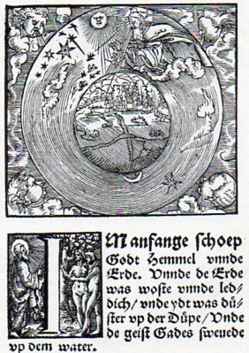
    This woodcut cosmological illustration from a 1526 Bible is a subtle and very late printed rendition of a great and classic Medieval idea.  At the center(or thereabouts)  of the globe of the Earth there is a seeming confluence of two great rivers, but what it reminds me more of is the T-O map, the orbis  terrarum, the direct descendant of the

    Lines--t map638

    Greco-Roman map making.  The T-O map makes distant and deep calls into the past, finding a home in Macrobius (around 400 CE) and Orosius (5th century )and more famously with Isidore of Seville (ca.  600), a work known to most folks today because of its appearance in Seville’s Etymologarum of 1472, which is also the first map printed in Europe (pictured below). (Why is took almost 20 years after Gutenberg to print a map is mysterious to me.)

    Generally Jerusalem would appear at the center of this sort of map, which would have appealed to the necessary people that the publication needed to have the appeal of.  The Mediterranean would separate Europe and Africa from Asia, while all of the land masses (the stuff outside of the “T” structure” were surrounded by the great “O”, the ocean(s).

    Sixteen years later a remarkable map of the world would appear in Ptolemy’s Geographia, an Ulm-printed masterpiece that appeared in 1486. 

    . Ptolemy's world map (around 140 CE);copy Ulm edition of 1486.
    But I think that the crossed lines from the Luther Bible of 1526 was really just a suggestion of the past, not meaning to lean on the Medieval world at all.  Still, though there they are. 

  • History of Lines (Note)–Getting There for the Common Reader. Sebastian Munster, 1551
    JF Ptak Science Books   Quick Post for the History of Lines*series

    Lines munster636  det c

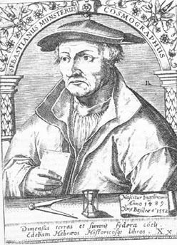
    Sebastian Münster

    Sebastian Munster (1488-1552) did not contribute a great or even an original work in the history of mathematics, or even in surveying, or map making.  What makes his Cosmographia  important, and what made it so very successful (entering 24 editions over a hundred years), was that he was among the first scholars of the time to put all of this disparate material together, and to give credit where credit was due, and to present an accumulation of important information in a scholarly, reasoned way.  He also made all of this accessible to the general reader, so that the information and methodology could be spread very wide.  It was in fact the first time that the stuff of the world in general was described in German–that of course is very important; but the fact of the matter is that the presentation and scholarship that resulted in this work was in itself ground-breaking.

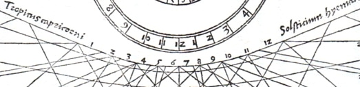
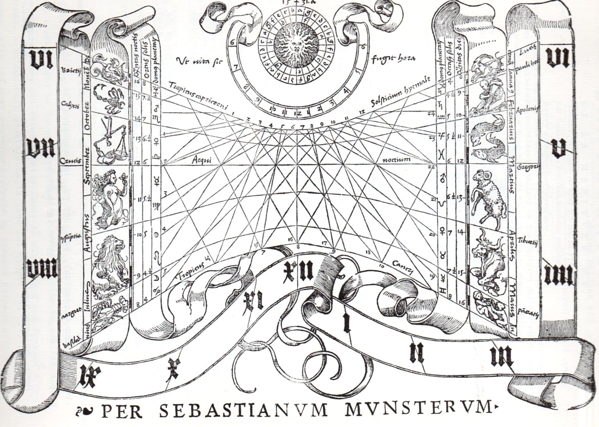
    I’ve chosen an image from another of Munster’s works, his Rudimenta mathematica1, which was a practical work on time reckoning, and another work of celebrated importance.

    1. Rudimenta mathematica : haec in duos digeruntur libros, quorum prior geometriae tradit principia seu prima elementa, unà cum rerum et uariarum figuraru[m] dimensionibus, posterior uerò omnigenum horologiorum docet delineationes, 1551. 

    And the full image, one of the woodcuts illustrating the section on the construction of sun dials:


    Lines munster636

    Contents of the 16th century editions of the Cosmographia.
    1. Book I – Astronomy, Mathematics, Physical Geography, Cartography
    2. Book II – England, Scotland, Ireland, Spain, France, Belgium, The Netherlands, Luxembourg, Savoy, Trier, Italy
    3. Book III – Germany, Alsace, Switzerland, Austria, Carniola, Istria, Bohemia, Moravia, Silesia, Pomerania, Prussia, Livland
    4. Book IV – Denmark, Norway, Sweden, Finland, Iceland, Hungary, Poland, Lithuania, Russia, Walachia, Bosnia, Bulgaria, Greece, Turkey
    5. Book V – Asia Minor, Cyprus, Armenia, Palestine, Arabia, Persia, Central Asia, Afghanistan, Scythia, Tartary, India, Ceylon, Burma, China, East Indies, Madagascar, Zanzibar, America
    6. Book VI – Mauritania, Tunisia, Libya, Egypt, Senegal, Gambia, Mali, South Africa, East Africa

    Note on introducing line fragments for the History of Lones series:

    * I think that if I had a sense for design and some artistic talent that I could perhaps make something interesting out of bits and pieces of the details of a hundred famous lines.  Or two hundred.  Unfortunately, I don’t possess those talents, so I’ll just have to write about it as though it has been done, already.  If we could whisk ourselves away 50 years into the past to the great world of early broadcast television, back into the days of glorious black and white, it would be interesting to present the details singly and first on a game show like the lovable “What’s My Line” show. (Another guest, another one of the hundred or two that could appear, can be seen below*, though I think this one is a dead giveaway.)


  • Invasion Routes to the U.S.,1940

    JF Ptak Science Books  Post 1532

    This is a supplement to some earlier posts on this blog relating to the possibilities of the invasion of America:  Mapping the Invasion of America, 1942 (which is the most-viewed post from this blog, with over 500k readers), The Invasion of America, 1935,  and The Invasion of America, 1942, Part II to name a few examples.

    INVASION us  INVASION ROUTES

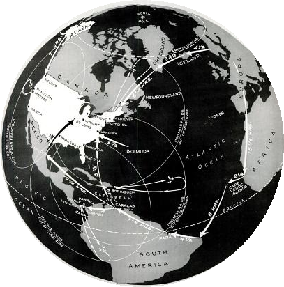
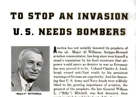
    In the 27 May 1940 issue of Life magazine appeared an article on Franklin Roosevelt’s call to American action in constructing an entirely new air force.   For years the air corps arm of the American military lingered in a kind of low-numbers unresolved limbo–but by May of 1940, it became painfully obvious that something drastic must be done.  By this point the European War was about eight months old, and the possibility of Nazi victory looked very real.  After all, the Blitzkrieg had been very successfully employed in Poland, and in May was used in the invasions of Finland, Norway, Denmark, Belgium, the Netherlands and Luxembourg. And France, of course.  By late May, 1940, France was already pretty much done, the Parisian capital falling weeks later on 23 June, with the country capitulating ten days later.  May also saw the collapse of the British and French armies along France’s northern coastline.  (The rescue of the 350,000 troops on the beach and in the harbor of Dunkerque had not yet taken place (but would within the next few days). It was bad stuff.)  In the light of the Nazi victories and the imminent fall of France, it was also time for people to start thinking about the invasion of England.
    Invasion-US

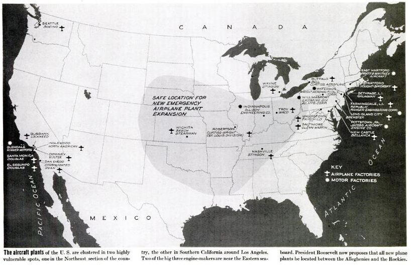
    Roosevelt and his adviser knew that America was headed into conflict, and knew that the country needed to get onto a war-time production basis. One way to begin preparations was for FDR to call for the increased production of the newest and one of the most important aspects of modern warfare, the airplane.  And not only an “increase” in production did the President call for, but a mountainous bump, an order of magnitude more in manufacturing of military planes. Earlier in 1938 the call for a 5,000-plane-a-year air force was shot down as being unrealistic–and perhaps so, even though the Nazis were just at the beginning of their outward thrust.  So in May, 1940, Roosevelt stepped up and asked for 50,000 aircraft. 

    No doubt the war in Europe gave everyone great pause, or scared them silly.  Two years before the number of 5,000 planes produced per year was seen as ridiculous–now the business of producing 50,000 a year seemed feasible–incredible, even, but the means of production were present, and so was the raw material and manpower.  It was seen that of the 84 aircraft production plants then functioning only 23 were producing military planes, so there could be a modernization of existing plants as well as the construction of new aviation installations. The production totals for the year 1939-1940–1,247 aircraft, including 477 produced for the U.S. Army and Navy, 311 for Great Britain, and 459 for France–represented only a small percentage of what the existing factories could actually produce. (And it turned out of course to be just the case, as we can see from the production numbers in the “notes” section, below.)

    There was also a certain amount of scare factor involved with waking up the American public to the needs for getting involved in the European conflict in the year-and-a-half before Pearl Harbor–that the Nazis wouldn’t stop in Great Britain, and that “invaders” could and would attack the United States. The need for increasing American war production was not only to supply the allied forces in Europe for stopping Hitler, but also would keep the Nazis away from the United States.  (Summarizing the points discussed by the President and other government officials, the map of the invasion of America looked something like the global view we see above.)  So if Roosevelt couldn’t stir the hearts and minds of the American public for keeping Europe aloft in American-built planes, then keeping the Nazis off Main Street might work. 

    What the map shows are the lines of attack for the un-named Nazi invaders–their aircraft making their way slowly across the Atlantic via Iceland-Greenland–Newfoundland, and across Europe -Africa-Cape Verde-Brazil-Paraguay-then across the Caribbean and right into Wilmington, North Carolina; and then of course all of the way across the Soviet Union to Alaska and then into Washington state.  The plan was that these advanced forces would come in, establish an airfield, grow , and then move closer to the U.S., stopping to construct bases all along the way.  The response, oddly enough, was for us to build “bombers” so that the airbases could be blown up.  That would also extend the effective range of air coverage from the United States to deal with the very-slowly-approaching enemy.  The circles on the map show the effective round-trip range of loaded American bombers and the territory that they could cover.  In general the map, in its own way, portrayed the United States as approachable to foreign invasion.  Some of this reasoning is a little inscrutable, but Washington was playing a game that needed to be won. 

    Invasion us 2
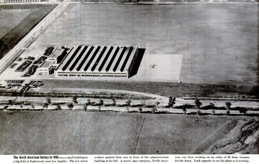
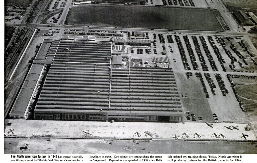
    These interesting before and after pictures of a ramped-up aircraft production industry were to supply some proof that the job could be done, and that this factory could very well be a template that the dozens of others could follow:

    [Aircraft production facility, “before”]

    Invasion US factory before [Aircraft production facility, “after”]

    Invasion US  factory after

    Notes

    Production numbers for U.S. aircraft manufacturing, 1940-1945:

    Type of airplane Total 1940¹ 1941 1942 1943 1944 1945²
    Grand total 295,959 3,611 18,466 46,907 84,853 96,270 45,852
    Combat airplanes 200,443 1,771 8,395 24,669 53,183 74,564 37,861
    Very heavy bombers 3,740 – – 4 91 1,147 2,498
    Heavy bombers 31,685 46 282 2,513 9,574 15,057 4,213
    Medium bombers 21,461 52 762 4,040 7,256 6,732 2,619
    Light bombers 39,986 453 2,617 5,954 11,848 12,376 6,738
    Fighters 99,465 1,157 4,036 10,721 23,621 38,848 21,082
    Reconnaissance 4,106 63 698 1,437 793 404 711
    Support airplanes 95,516 1,840 10,071 22,238 31,670 21,706 7,991
    Transports 23,900 164 525 1,887 6,913 9,925 4,486
    Trainers 58,085 1,676 9,294 17,237 20,950 7,936

    1,352


  • A History Blank, Empty and Missing Things #76–the American Bison Extermination Map

    JF Ptak Science Books   Post 1512

    Part of this blog’s series on Blank, Empty and Missing Things.  (My thanks to Blanche McCallister for setting me on this path this morning.)

    “A disgrace to the American people in general, and of the government in particular.”  “The men who killed bison for their tongues and who shot them from railroad trains were murderers.”–William T. Hornaday, on the extermination of the American bison, particularly in the 1870’s.

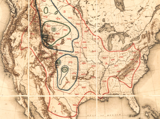
    William Temple Hornaday was an early–and probably a founding–member of the American conservation movement, and was also director of the National Zoological Park. He wrote a tremendously bitter and accurate report for the U.S. National Museum in 1894 on the extermination of the American bison, an absolute head-shaker, detailing the history of the bison in North America and its destruction at the hands of sportsmen, hunters, mindless dolts and many others who massacred tens of millions of the animal (“murdered” is the word Hornaday uses constantly).  To put the whole issue in perspective, Hornaday issued a famous map showing the shrinkage of the North American bison herd, setting out the enormity of the issue instantly on one piece of paper, a summary of hundreds of pages of bad stories and big numbers.

    Maps Hornaday


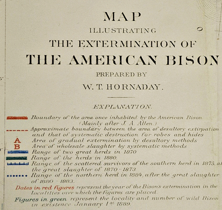
    Hornaday Map legend (1)

    And the legend

    [William T.Hornaday,  “Map Illustrating the Extermination of the American Bison”.  published in the 1886-1887 Report of the National Museum, Washington, D.C. entitled The Extermination of the American Bison, and printed by the ubiquitous Government Printing Office in 1894.  This full text version comes from the Library of Congress site.]

    The map certainly provides a real context to the numbers collected by Hornaday–numbers so big that it is hard to put them in any perspective.  For example, for the year 1873, the Atchison, Topeka and Santa Fe Railroad carried out 250,000 bison robes, 2.7 million pounds of bones and 1.6 million pounds of meat.  Generally the robe count was estimated at being about 1/6 of all the bison killed, so of the 1.2 million of taking this train ride in this one year (of aggravated annihilation) there was 1.6 million pounds of meat.  Now the refrigerated car was available at this time, so it was possible for meat to be transported to market, like 100 million pounds worth, but that was not of interest to anyone.  Not really.  Except of course for the bison tongue, which was sometimes the only thing removed froma  slaughter of thousands.  The tongue was a delicacy, and sold for 50 cents.  Just for the record, bison calf skins were sold for 50 cents, as well; adults were $1.25.  (Fifty cents in 1873 would be what the lowest-paid cowboy would be paid per day, half a dollar to the guy at the tail end of the cattle herd, the dust-eater.)  Over a three year period for the same railroad, 1872-4, there were 450,000 robes shipped, plus 2.2 million pounds of meat, and 16 million pounds of bones.  Again, this is about a pound-per-bison of meat, not even the weight of a tongue.

    Hornaday records the murder and murderers, repulsed at his findings–his revulsion comes through, as does the overwhelming lesson of carelessness and stupidity in dealing with the American landscape, and the creatures that lived on it. 

    The iconic photographs of bison skulls awaiting shipment are incredible, but I think it is the Hornaday map that gives the entire issue an overall correspondence to the magnitude of the destruction.


    And here’s a map of one of the last bison hunting expeditions, this undertaken for specimens for the National Museum, showing the enormous, continent-covering herds reduced now to individual dots on a large landscape.

    Image 192 of 208, The extermination of the American bison.    

  • Spaghetti Map of the Army-McCarthy Hearings, 1954

    JF Ptak Science Books   Post 1489

    Some things are complex, and complicated and pretty–you don’t realize that they are this involved, exactly, because of the elegant way in which they are presented.  An anti-gravity undertaking by Brunelleschi, in creating his dome, was an enormous challenge,  solved with circles within circles, a series of nine of them enclosed in a polygon, the result being one of the most beautiful and iconic achievements in the history of architecture (and engineering).

    And then sometimes things are complicated and complex and look and behave that way, their messiness outdistancing their own necessities.

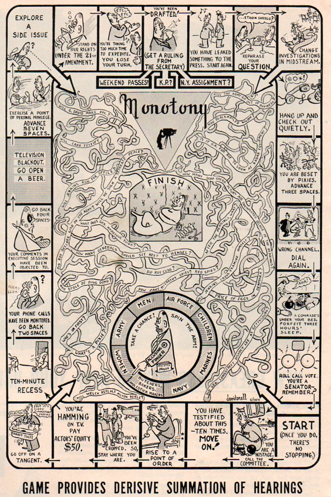
    Which gets us now to this game, a mass of entwined spaghetti, which was a tongue-in-cheek poke at the Army-McCarthy Hearings of the spring of 1954, a popular review in the tradition of Thomas Nast that is very effective.. The “Army” was the U.S. Army, and the “McCarthy” was Senator Joesph McCarthy, of Appleton, Wisconsin, a man who was about at the end of a short, meteoric career of vast unsubstantiated accusation, discord, lies and fraud. The hearings were supposed to sniff out Communists in the Army and the defense industry, because that’s what McCarthy did, being a rabid impersonator of a man with a decent mission. The hearings were long, involved, and traveled nowhere fast although much ground was covered.

     The bottom line to the whole affair was that as the first televised Senate hearings, McCarthy drew a huge audience, estimated at some 80 million people over the course of the event. And what happened was that “Tail-Gunner Joe” (an appellation he gave to himself that among many other things in his personal and public life were exaggerations) found out that he was seen better int eh minds of Americans when he was not being televised. In short, he was outed for many as a crude, threatening liar, and his career of ruining people in his quixotic quest for deeply-rooted Commies was about over when the last lights in the hearing room went out.

     Joe McCarthy would be dead in about three years, his liver failed, evidently (as his biographers say) from too much drink. He was a dangerous and divisive man, but one who had many friends and supporters to keep him re-elected and in power. (He was a darling of the Kennedys, being a favorite of Joe Kennedy, the godfather of Robert Kennedy’s first child, and one who dated two of the JFK’s sisters. Being Catholic and a vehement Commie-hunter went a long way with Joseph Kennedy, who had his own set of issues with power and rule.)

    McCarthy hearings495

    [Image source:  LIFE magazine, 21 July 1954, page 42.]


  • Architecture of Insanity

    JF Ptak Science Books   Post 1474

    Insane asylum485

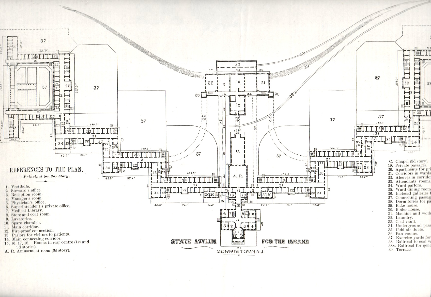
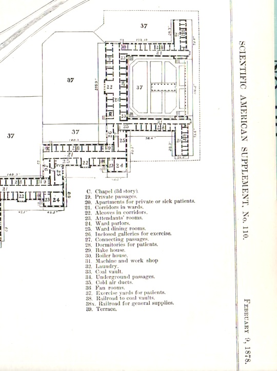
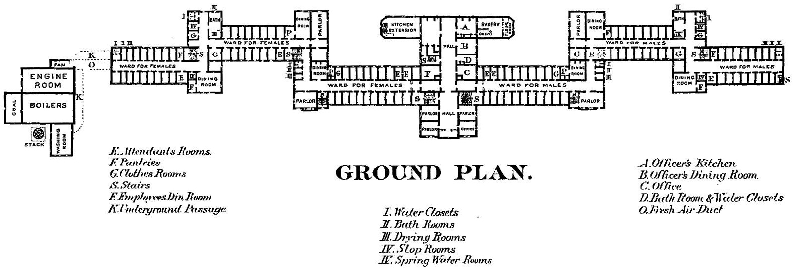
    I was browsing an 1878 issue of The Scientific American, looking for an article on torpedoes, when I came across this stunning architectural plan of the Morristown (New Jersey) State Asylum for the Insane–I recognized its design as something I had seen before, several times, at least.  This design required a lot of land and a lot of bricks–the building was a few stories high and laid out far and wide, built to accommodate 2,000 patients.  The design was intended to allow patients comfortable living space, room for privacy as need be, exercise area and plenty of open yards around the structure for sun and fresh air.  Of course building like this were quickly filled and filled some more, requiring the space for rehabilitation to be used for stockpiling other patients until more appropriate situations arose, which they mostly seemed not to.

    Insane asylum486

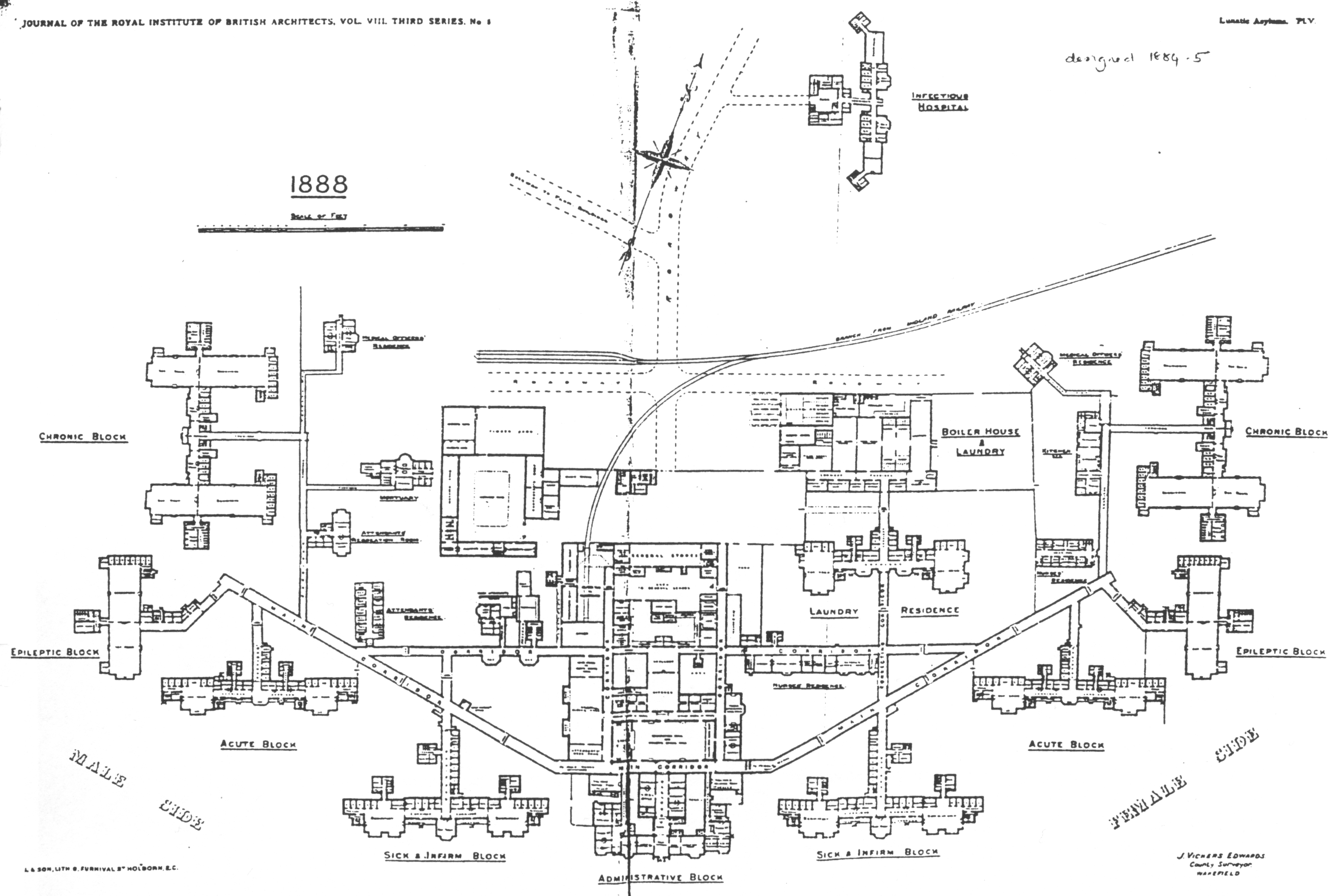
    And so I went looking around the web for other examples of mental/insane asylums, places constructed for the good of the society and partially to aid people who were suffering from some sort of yet-to-be-defined mental illness.  From what I have found so far, there is a definite them to a good many of them, resembling in some fair manner the Morristown design (above). 

    (An interesting and lush/ruinous photo essay on Morristown can be found here.)

    I suppose that in some ways these architectural plans are maps, outlines to an elusive wellness; given the (generally) small staffs, the abilities of the time to diagnosis mental illnesses, the limited capacities for treatment, and general overcrowding, that the “wellness” part of the desired ends of these plans/maps was almost entirely allegorical. I suspect that if for some reason you found yourself in an extended stay in a place like this and weren’t insane, then you would be after a while.

    The Glasgow Lunatic Asylum, designed by the  architect William Stark (1770 – 1814):

    Lunatic  glasgow

    [From:  Thompson, John D. & Grace Goldin. The Hospital. A Social and Architectural History. Yale University Press, New Haven and London. 1975.]


    Insane asylum maryland state hospital

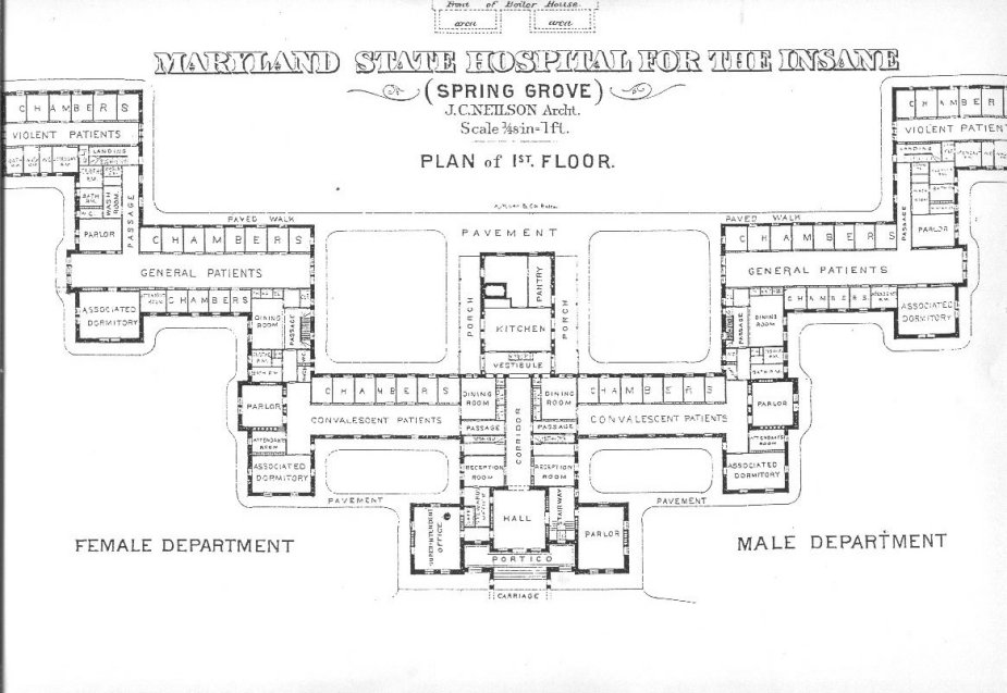
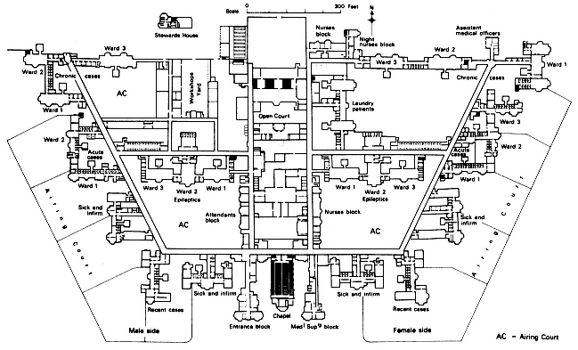
    Maryland State Hospital for the Insane (here)–in this plan, the further away you get from the main entrance, the more deeply “disturbed’ the patients.  It must have been a long walk from the “violent” ward to freedom. 

    Lunatic cane hill

    Cane Hill, the Third Surrey County Pauper Lunatic Asylum, built 1882 (details here)


    Lunatic claybury county

    Claybury Lunatic Asylum, Woodford, Essex:

    Insane ipswich

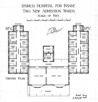
     The Byron House, constructed 1915, at the Ipswich Lunatic Asylum (Byron house was to become the infamous Karrala House.)

    Lunatic buffalo richardson

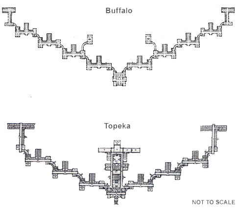
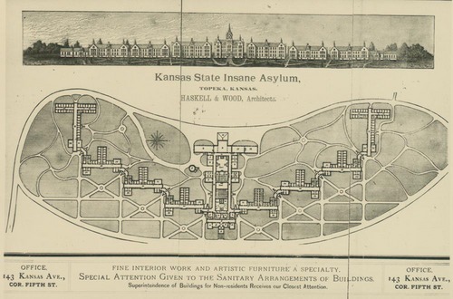
    Buffalo lunatic asylum, a spectacular structure designed by H.H. Richardson, with grounds and landscaping by none other than Frederiick Law Olmstead and Charles Vaux  The image above (and below) are the Kansas State Lunatic Asylum constructed 1880.  Information on these two institutions and the man who brought them about is located at the Kirkbride Buildings blog, here.

    Lunatic kansas


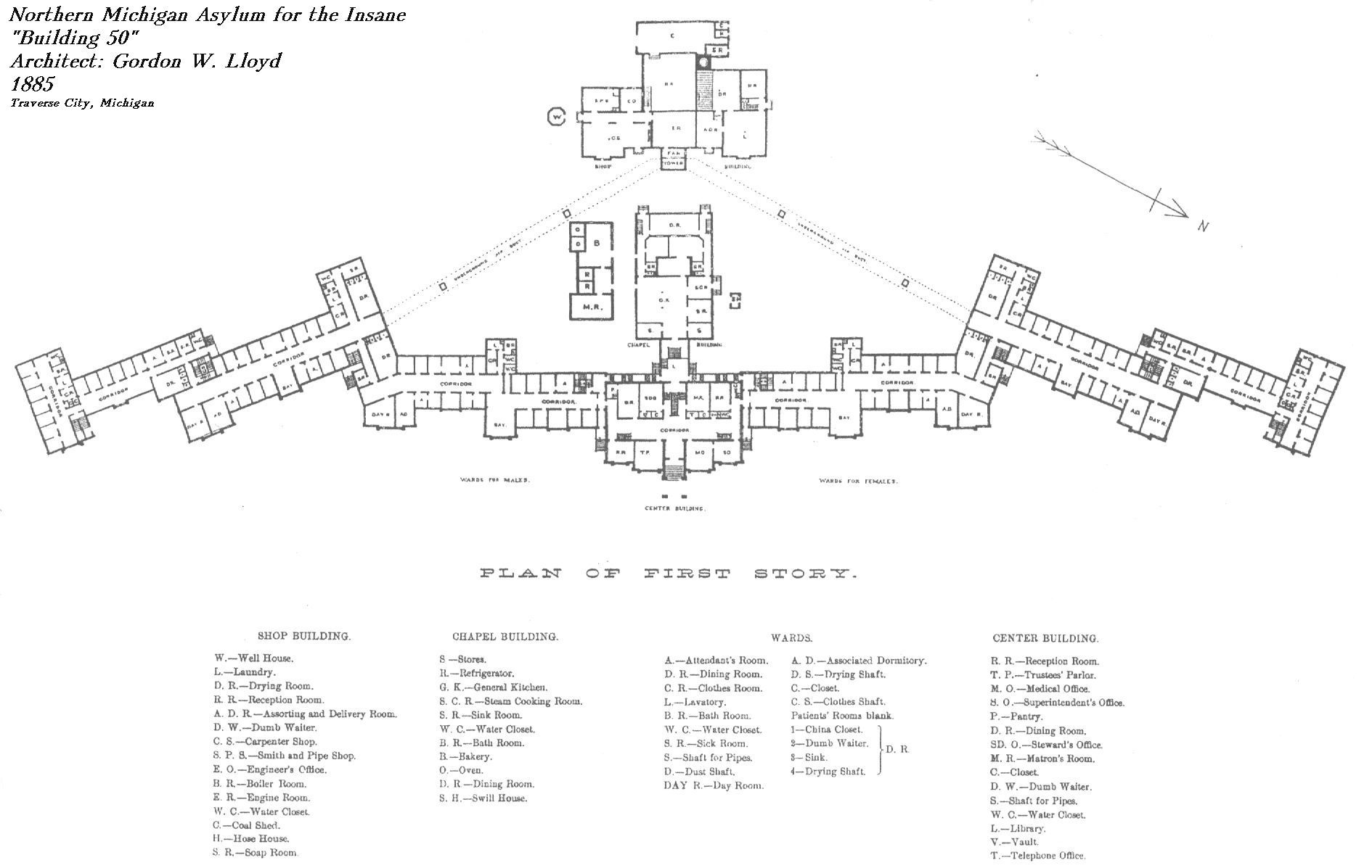
    Northern Michigan Asylum for the Insane, built by Gordon W. Lloyd in 1888:

    Lunatic  northern michigan

    Seacliff Lunatic Asylum, New Zealand:

    Lunatic seacliff


    HArrisburg (PA) State Lunatic Asylum, the first to be built according to the Kirkbride Plan:

    Lunatic  harrisburg

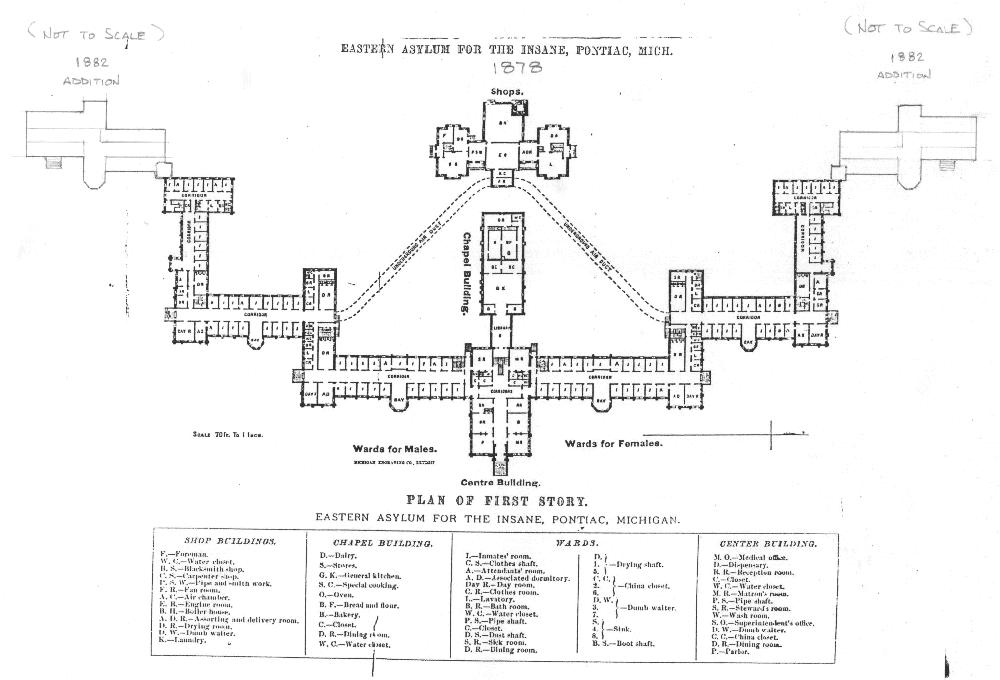
     Eastern Asylum for the Insane, Pontiac, Michigan, constructed 1882:
    Lunatic  eastyern asylum


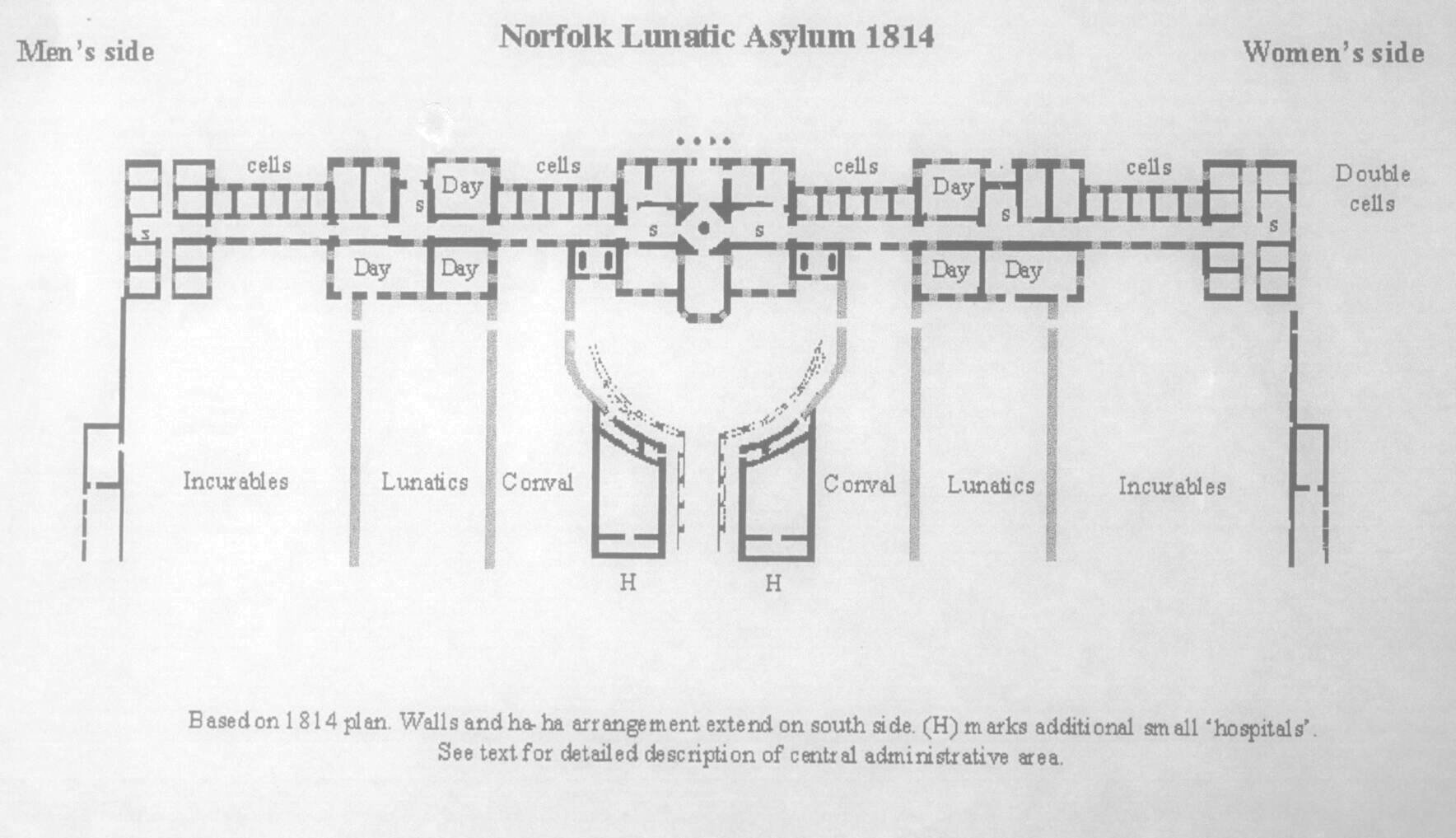
    Norfolk, England, Lunatic Asylum, 1814

    Lunatic norfolk

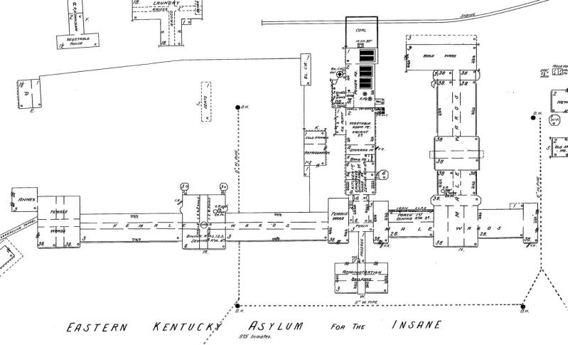
     Eastern Kentucky Asylum for the Insane:

    Lunatic--eastern KY hospital for the insane


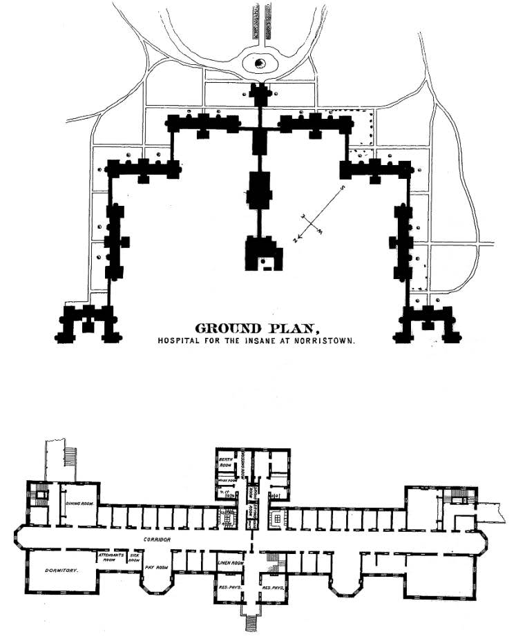
    Norristown Hospital for the Insane:

    Lunatic--norristown hop for the insane


  • Backwards Atlas?

    JF Ptak Science Books   Quick Post

      Atlas470
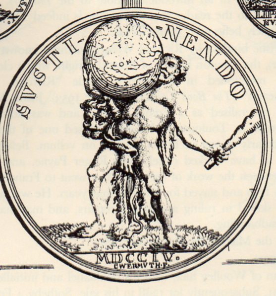
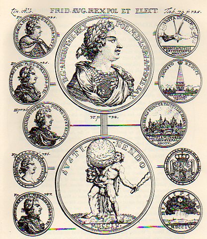
    I found a rather unusual image in this sniffy but no doubt very useful book on heraldry.  On the reverse side of a medal shown below (“Augustus II D.G. Rex Pol M. D Lit. D. Sax. I.C.M.A.”, or declouded it is August II, D.G., King of Poland, Grand Duke of Lithuania, Duke of Saxony, Julich, Cleves, Berg, Angria, and Westphalia) we see a compromised image of Hercules, the only time that I can remember seeing him balancing the sphere on his chest.  It looks very uncomfortable. 

    Atlas469

    Originally Atlas was supporting a sphere representing the sky, a punishment that he stand on the Earth and support the Heavens so that the two did not meet.  Over modern time Atlas has been given a new burden to bear, and generally it is that of the Earth rather than all creation. 

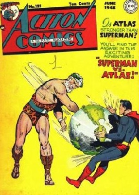
    Of course if we went looking a little further to see what else Atlas might be doing with his burden, there is the following:

    Atlas
    where for ten cents it would have been possible to see the outcome of this epic battle; but since I can’t spend the ten cents here, we’ll never know.  It is interesting to see the representations of the mountains on the globe–given their bumpiness I’d say that their scale would relate to those peaks being 50 miles high.

    And just for the sake of it “Atlas” became associated with a colletion of maps bound in a volume in  Antonio Lafreri’s  Tavole Moderne Di Geografia De La Maggior Parte Del Mondo Di Diversi Autori (1572) not because he employed the word first, but rather because he used an image of Atlas on the book’s title page–the first use of he word comes a little later in the work of Gerald Mercator.