A Daily History of Holes, Dots, Lines, Science, History, Math, Physics, Art, the Unintentional Absurd, Architecture, Maps, Data Visualization, Blank and Missing Things, and so on. |1.6 million words, 7500 images, 4.9 million hits| Press & appearances in The Times, Le Figaro, Mensa, The Economist, The Guardian, Discovery News, Slate, Le Monde, Sci American Blogs, Le Pont, and many other places… 5000+ total posts since 2008.

Category: Maps, Cartography, History of Mapmaking

  • Looking Straight Down Department: the Topography of Hell

    JF Ptak Science Books    Post 1920

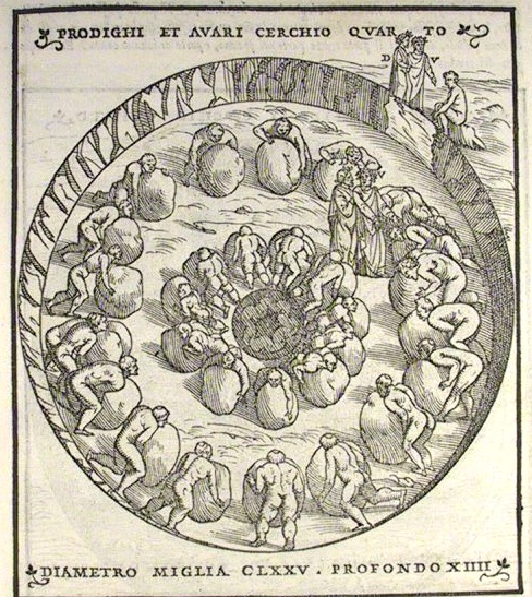
    The interesting thing about Hell–Dante’s Hell–is that it has been shown and reconstructed and imagined for a long time–eight centuries–and, outside of painting, most of the representations seem to be in cross-section. That is why this image from the famous exposition by Alessandro Vellutello’s 1544 struck me so strongly–it is a mostly straight-down look at the miserly and the prodigal in the fourth circle of Hell. 

      InfernoVIIfullpage

    InfernoVIIfullpage

    “… I saw multitudes
    to every side of me; their howls were loud
    while, wheeling weights, they used their chests to push.
    They struck against each other; at that point,
    each turned around and, wheeling back those weights,
    cried out: Why do you hoard? Why do you squander?’ –Canto VII, lines 25-30

    This image depicts the great, tiring but tire-less, endless, despicable joust of the miserly and the prodigals, going at each other with large, difficult-to-move stones.  Pluto is supposed to be in the middle, but I don’t see him here.  The artist though has made the men basically unrecognizable, giving them little character to their faces and virtually no differences in their bodies–Virgil tells Dante that they have lost themselves to something else, that there is no “there” there, that Dante–who would normally speak with the people he was coming into contact with–would not be able to interview them as they were too absorbed in their vicious need. 

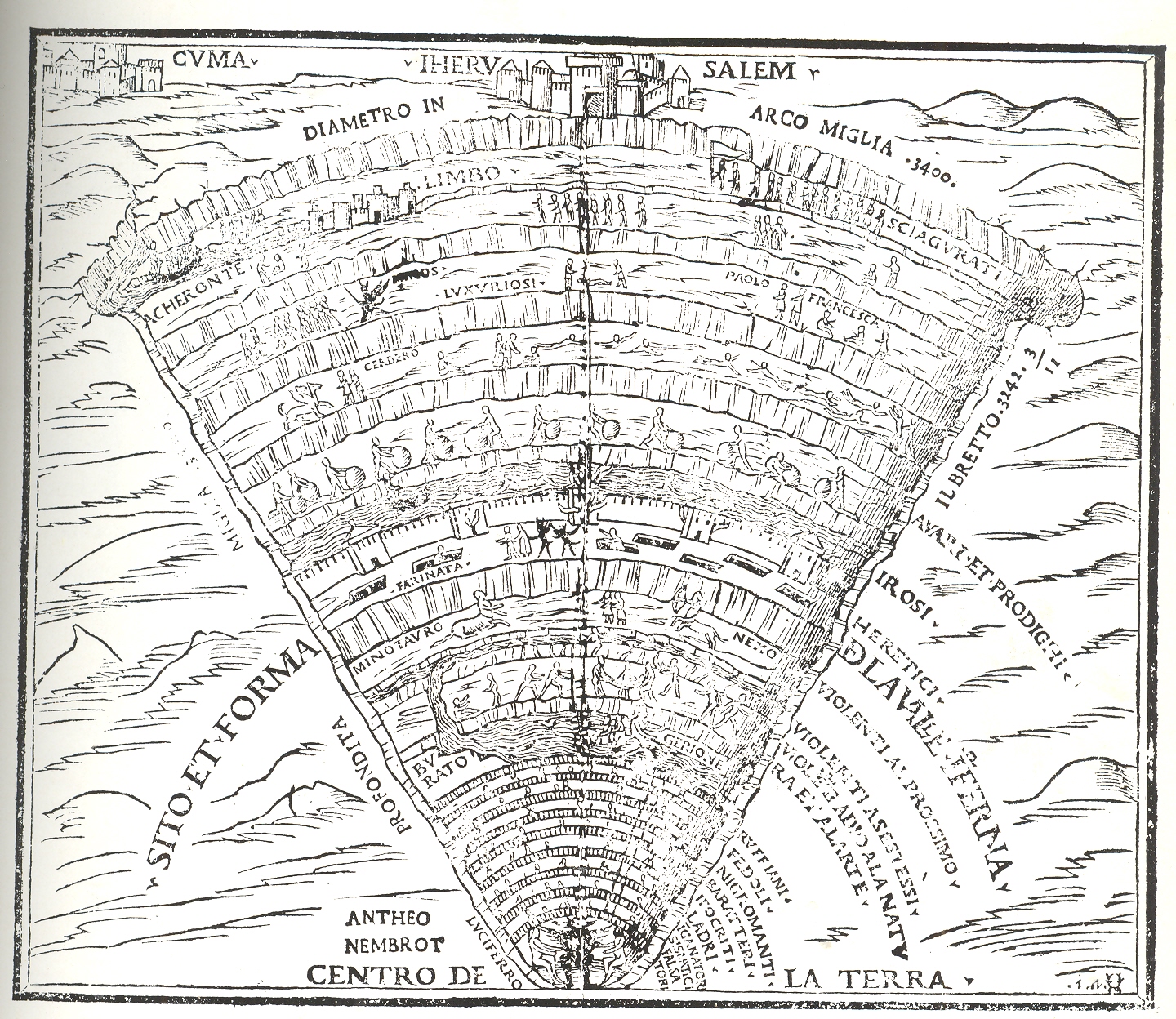
    As has been seen in the many maps constructed for the Divine Comedy over the years–but especially during the Renaissance–Hell for Dante was a real place, a nine-layered inverted cone of measured depth and width commensurate with the sin, and established under the city of Jerusalem.  Dante visited the place

    “… but who art thou
     That hast inquir’d of us?” To whom my guide:
     “One that descend with this man, who yet lives,
     From rock to rock, and show him hell’s abyss.”      (Inferno XXIX, 89–92, trans. Cary)

    entering Hell on Good Friday and emerging from Purgatory on Easter morning, taking three days to travel through the two places and straight through the center of the Earth. 

    Here are a few examples of the cross sections that are the great standard bearers of Dante’s visions:

    The  Hell of Dante by Pietro da Fino, 1568:
    Frontispiece of Hell

    The circles of Hell from Commedia di Dante insieme con uno dialogo circa el sito, forma et misure dello Inferno by Filippo Giunta, Florence, 1506.

    The circles of Hell

    Again, just a few examples of the cross sections of Hell to contrast with the scarce looking-straight-down-at-Hell image above. 


  • Thematic Maps: Finding Russia in the U.S. Midwest


    JF Ptak Science Books  Post 1899

    Putting objects of different classifications into the same scale for the sake of comparison is a relatively recent idea in the history of printing.  It really wasn’t until Etienne Durand’s architectural textbooks of the 1850’s that buildings by different architects were displayed on the same scale on the same page. Likewise, too, the cartographic depiction of mountain heights and islands and lakes and rivers side-by-side and on the same scale didn’t take place in earnest until mid-19th century. 

    My favorites relating to geographical items are those that take, say, all of the major islands in the world and remove them to a single sheet of paper, all in scale, so that it would be easier to compare their sizes without the distraction of the rest of the map.

    Here’s another, just recently found in the warehouse:

    Thematic europe in Russia 782_edited-3

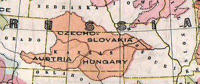
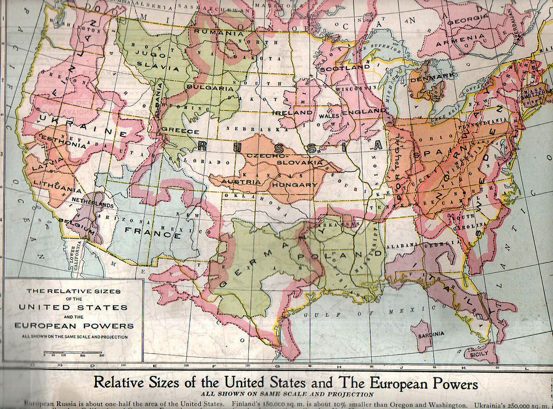
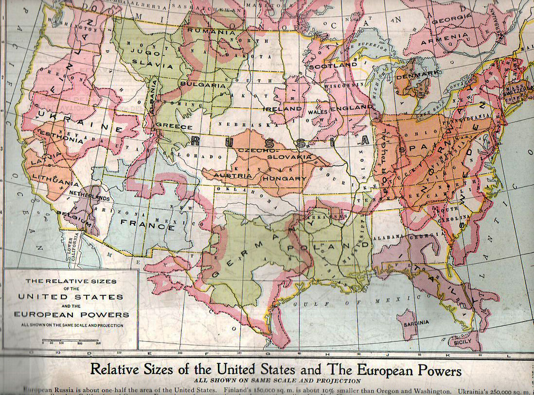
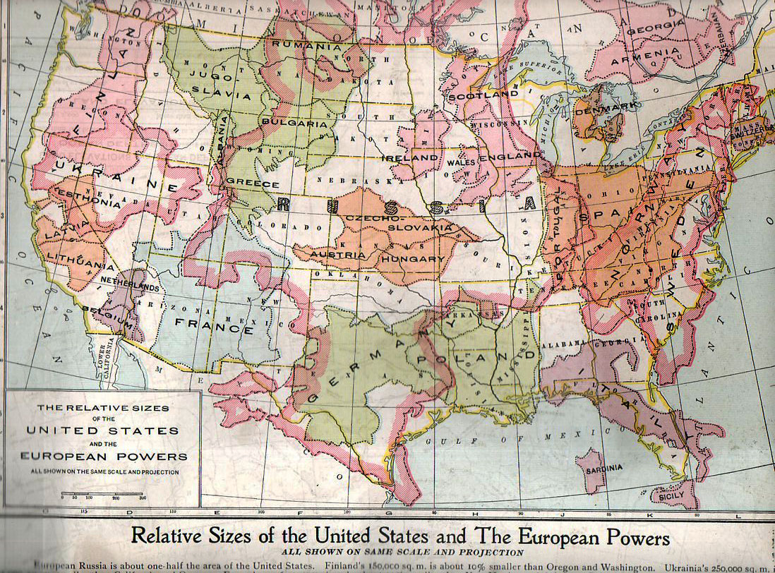
    This map, “Relative Sizes of the United States and the European Powers” was published by the People’s Handy Atlas of the World in ca. 1920,  appearing in print just a couple of  years after the map of Europe was changed by WWI.  (As a matter of fact this map very liberally used and without credit an earlier version published by the Geo. F. Cram company in their war atlas of 1914; it again appeared in the European War Book (by Canfield, published in 1917), calling on the information in this version and adding color. The People’s History also published a 1913 version of this map though I cannot find an example of it.)  Here’s the map in full:

    Thematic europe in  us782

    It really does put things into perspective, giving the reader a good, strong look at just how small some of these countries were in comparison with the United States. Many of the combatants of WWI are here–and its quite sobbering to think of the enormous casualties incurred in some countries and the very small area that those millions of dead and wounded would have taken if placed in a similar locale in the U.S.  An excellent example of this is Belgium, fitting very nicely into less than a tenth of the state California, where so much killing and suffering occurred.  Thinking of France as battlefield that was limited to about 60% of the size of the combined four states of New Mexico, Arizon, Utah and Colorado, and then thinking of most of the largest battles of WWI taking place in an area about a quarter of that is, well, incredible.  Using this as a guide, less han half the state of Colorado would’ve been the seat of the battles of Verdun (976,000 casualties), Marne (750,000), Somme (1.2 million), Cambrai (700,000) Arras (278,000), the Spring Offensive (1.5 million) and the Hundred Days Offensive (1.8 million),plus all of the rest of the action, and you get a little bit of a better idea of the bloodiness of that acreage. 

    Placing things in comparison in the same scale, side-by-side, is an excellent means of insight. 

    Casualties in World War One (taken with thanks from the site First World War

    Country Dead Wounded Missing Total
    Africa 10,000 – – 10,000
    Australia 58,150 152,170 – 210,320
    Austria-Hungary 922,000 3,600,000 855,283 5,377,283
    Belgium 44,000 450,000 – 494,000
    Britain 658,700 2,032,150 359,150 3,050,000
    Bulgaria 87,500 152,390 27,029 266,919
    Canada 56,500 149,700 – 206,200
    Caribbean 1,000 3,000 – 4,000
    France 1,359,000 4,200,000 361,650 5,920,650
    Germany 1,600,000 4,065,000 103,000 5,768,000
    Greece 5,000 21,000 1,000 27,000
    India 43,200 65,175 5,875 114,250
    Italy 689,000 959,100 – 1,424,660
    Japan 300 907 3 1,210
    Montenegro 3,000 10,000 7,000 20,000
    New Zealand 16,130 40,750 – 56,880
    Portugal 7,222 13,751 12,318 33,291
    Romania 335,706 120,000 80,000 535,706
    Russia 1,700,000 5,000,000 – 6,700,000
    Serbia 45,000 133,148 152,958 331,106
    South Africa 7,000 12,000 – 19,000
    Turkey 250,000 400,000 – 650,000
    USA 58,480 189,955 14,290 262,725


  • Rainography: a Map of Rain in the British Isles, 1911

    JF Ptak Science Books  Quick Post

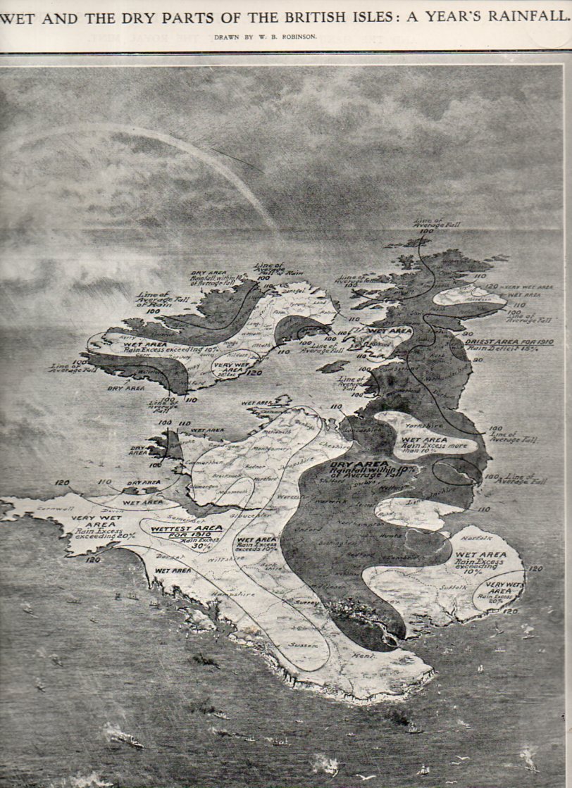
    “The Wet and the Dry Parts of the British Isles: a Year’s Rainfall” birdseye view appeared in the Illustrated London News on 28 January 1911, and it is a lovely and scarce example of a meteorological graphical display of quantitative data rolled into an oblique view.

    Rain731


  • Golfography: a Map of Golf Around London, 1920

    JF Ptak Science Books   Quick Post

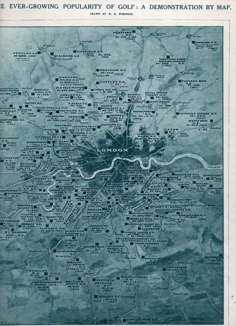
    I just happened upon this, but since it is the British Open and all I though to publish it here.  The map was composed for the Illustrated London News, 3 July 1920, by W.B. Robinson. It shows the number of links around the city of London–seems like a lot to me, and this data doesn’t even include miniature golf, which was very big at this time. The Key: M = a “membership” club; L = Ladies; A = “associate”, and the year underneath is the year the course was organized.  The game is evidently older in Scotland, but around London golf dates to the time of James I. 

    Golf730


  • A Fine Graphic: “A Table of the Cheifest Cities and Towns in England”, 1600

    JF Ptak Science Books   Quick Post

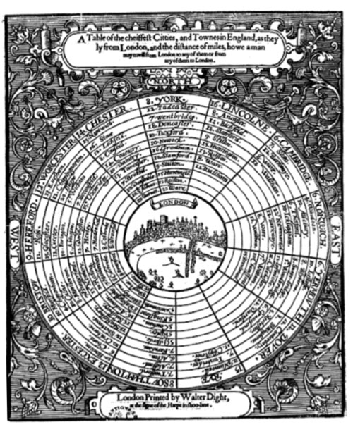
    Here’s a rather remarkable and ingenious display of information and distance usually reserved to show the structure of the solar system.  A Table of the Cheifest Cities and Towns in England, printed in London in 1600, the work of an anonymous thinker, utilized the standard and generally universal salient for the planets to show distances of cities and towns from the center of the British universe, London.  

    Source: Doug Eskew, “Coriolanus and the Paradox of Place”, here.


  • Antiquarian Comparative Analysis: Lakes, Islands, Mountains

    JF Ptak Science Books   Post 1817

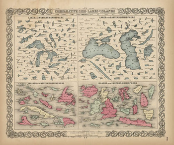
    Blogjuly_19_comparative_big_colton 1856 may have been the first time that these 150+ lakes and islands of the Western and Eastern Hemisphere were ever been printed on the same page and in the same scale exclusive of their associative land masses and placed contiguously, side-by-side.  They were, of course, seen in a common perspective before on any world map, but I think that this is the first year in which the islands and lakes of the world were displayed without oceans and land masses, and the effect is a little odd.  If you take away the color and the text the image takes on a very definite biological flavor (I keep thinking of that tiny bone in the ear for the small lakes…)  In any event it is far easier to compare these features without the distractions of the non-lakes and non-islands clouding and confusing our perspective fields.

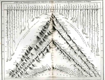
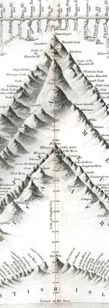
    This was also the beginning of the heyday of publishing comparative this-and-that in atlases:  from 1840-1880 or so was the period in which the majority of descriptive comparatives were published.  This is when you would see comparatives of the lengths of rivers and the heights of mountains and waterfalls beautifully displayed in atlases.  I don’t know what happened after then, but the publication of this sort of data really fell off, with the heights of mountains/lengths of rivers stuff relegated to filling the empty areas in double-hemisphere world maps 
    Blogjuly_19comparative_1836350
    Here’s a relatively early image of this type called “A View of the Comparative Lengths of the Principal Rivers and Heights of the Principal Mountains in the World”, published by Orr & Smith in London (1836), featuring 44 rivers and a hundred or so mountains.  It is a lovely and graphically pleasing work, and an early effort in displaying the dissected river and mountains in such a forensic-like way.
    Blogjuly_19comparative_1836_detail_

    This I think is my favorite genre of specialty map, and I plan to write on them in great detail (and heavily illustrated) in just a bit; but, for now, I’d just like to surface this map by George Colton, and admire it, and try to imagine the kind of impact it must’ve had on people back there in 1856 who were seeing this sort of data displayed so for the first tine.  It would have been a huge revelation to see the lakes and islands compared side-by-side; it was a fresh, new idea, and an insight in how to look at things in general.


  • An Interesting Concentric Graphic and the Number 12 (Twelve XII 2^3X3)

    JF Ptak Science Books   Post 1819

    Oh TIme, thou must untangle this, not I; it is too hard a knot for me t’untie! — Twelfth Night. 2.2.40-41

    Graphic bouvelles
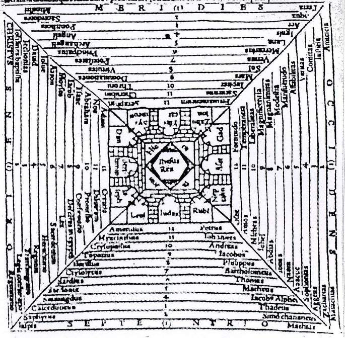
    I really should have included this in yesterday’s post about a terrific and creative image of concentric circles used early-on to display concepts of terrestrial distance and importance (A Table of the Cheifest Cities and Towns in England, printed in London in 1600,  ), as they both use this organizing concept in a bit of an uncommon way.  This image appears in  Charles de Bouelles’ beautifully titled Que hoc volumine continuentur; Liber de intellectu; Liber de sensu; Liber de Nichilo; Ars oppositorum; Liber de generatione; Liber de sapiente; Liber de duodecim numeris; Epistole complures, and printed in 1510 in Paris (from which also appears another interesting image on the “evolution” of the rock from being to thinking to being again, here), and maps the importance of the city of Jerusalem, but more importantly places its significance in the histories of the number twelve, centering on the city itself and the twelve tribes of Iraeli, and then branching out in more creative listable ways.

    Besides the twelve tribes, there are the twelve constellations of the ecliptic, Apostles, knights of the Round Table, trials of Hercules, Olympians, sons of Odin, books of Paradise Lost and the Aeneid, hues of the color wheel, inches, months, dozen, virtues, Olympians, half unit of the day, and on and on. 

    There are twelves enough to carry out just about any iconographic need, and that limited to just occidental resources.

    Source:  Les Pierres du Songe, Etudes sur les graffiti medievans, here.


  • Earths inside the Earth–a Short Note on Inner Civilizations. And Maps.

    JF Ptak Science Books   Post 1782

    There should or could be an enjoyable history written on the internal living history of the Earth, or Earths-within-the-Earth, because the idea is quite old, and latches itself like a good idea on top of a bad idea inside a decent idea.  The end result though is not so great, but, given the longevity of the interior Earth idea and the people who perpetuated it over time, I would like to read a history of the thing, even if it went nowhere.  I guess the history could be fiction and come out with almost the same result, but well, some of the happened-history is stranger than fiction. 

    I was brought to think about this by a patent granted to Herbet Francis Williams-Lyouns (British, 1863-1933).  Lyouns was a painter but for some reason cooked up this idea for an international exhibition just before the year 1900.    The patented idea was for a free-standing globe/sphere with a series of stairways that would get paying folks to a lighthouse at the top.  From what I can tell the thing was to be 150 feet high or thereabouts–it is difficult to tell since there are no technical specifications in the patent itself.  There was nothing really to suggest dimension and without physical specifications I’m not sure exactly what Lyouns was patenting, except for a big globe with a lighthouse on top that could be populated with a paying crowd. 


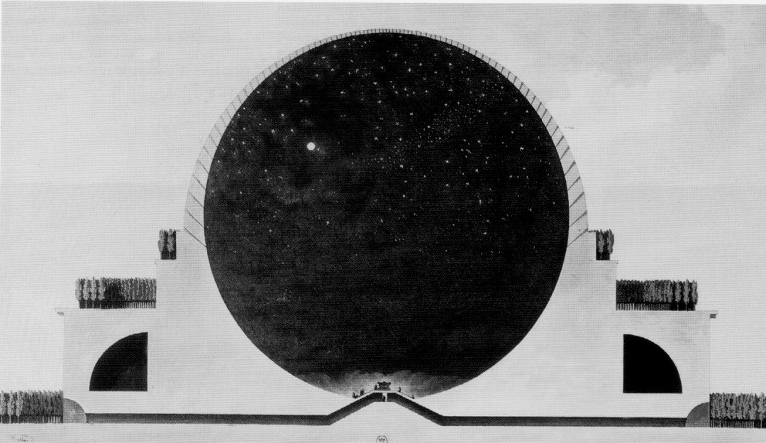
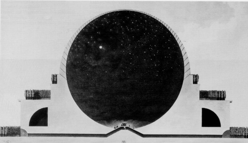
     It seems that Lyouns was patenting the idea for being able to ascend a hollow globe to a what would seem to be a redundant lighthouse (certainly there could have been some other structure a little more appropriate or crown-y) at the top, though I know I have seen several earlier visionary drawings about such a beast. One of these ideas belonged to Etienne Boullee (1728-1799), who designed a great hollow sphere for a cenotaph for Newton—Boullee however did not muck up the interior of his space with a massive stair structure, and kept it simple, with his folks milling about on the ground enjoying what was supposed to be an internal night sky.  Some of the others are pre-patent era, though I do recall one of a hollowed-globe interior for viewing a moving diorama that was definitely of the patent era–perhaps that inventor simply didn’t patent the apparatus.

    [The interior of the Lyoun globe, which I guess represent a giant winding staircase.]

    The Lyoun bit also reminds me of the Crystal Palace of 1851–rather, of a cartoon for the Crystal Palace, featuring the Palace at the top of a globe that was fully and completely, falling-off-the-sides inhabited.  Which makes it a bit different from the globe of Lyoun, which seems as though it could’ve been inhabited on the inside, only, and which steers us exactly to the opposite (?) of the Earth’s-Interior-Earth business.  After all, I started talking about other stuff and civilizations living underground, inside the Earth, possibly inside a massive hollowed out section of the Earth. 

    (Finding the top of the world was easier in 1851–at least to this illustration, showing the Crystal Palace of the Great Exhibition of 1851 sitting firmly in place above all. I can imagine that if you were sitting in Hyde Park along with the 1851-foot long building, it would be easy to think that you were indeed at the top of the food chain.  The structure was the crowning achievement of the  Exhibition:  it was almost one million feet under iron and wood and glass, and could hold tens of thousands of people who could view the enormous gardens housed there.)

    I’m talking about Jules Verne and his journey to the center of the Earth, and H.G. Well’s Morlocks, and a dim memory of Superman’s Mole Men, and E.R. Burrough’s Pellucidar sitting at some great depth below the Earth, and on and on, back into the misty past, past hollow Earth theories of even some great men like Edmond Halley, and back into mythological and anthropological stories of great antiquity.  But those stories will have to wait for a later tell.
    Boulle newton

    [Boullee’s cenotaph for Newton.]

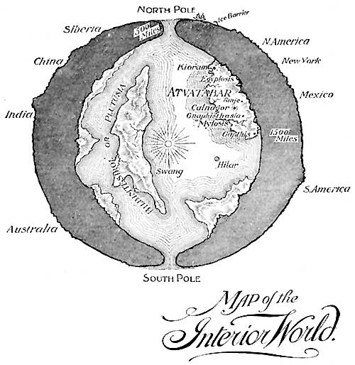
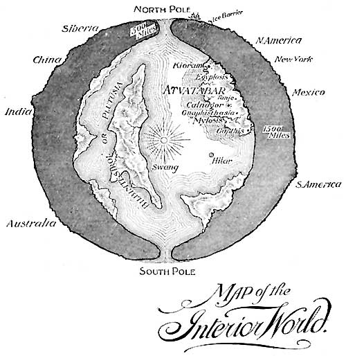
    One bit I’d like to point out is this extraordinary leap of imagination, an actual map of the interior civilization of the Earth provided by William R. Bradshaw to the readers of his Goddess of Atvatabar, which was published in 1892.  The story itself seems terribly purple and looks like a very difficult read–but the pictures are interesting in their own rippling ways.  And then there’s the case of the map–one of the very few I can think of that depict a civilization inside our own homey Earth. (I’d mention others but I can’t think of any straight away.)
      Earth Interior William BRadshaw

    [Map of the Interior World, William Bradshaw. Source: Project Gutenberg, here: http://www.gutenberg.org/files/32825/32825-h/32825-h.htm]

    Another example of a map of interior Earths was brought to my attention by Rebekah Higgitt (of the excellent Teleskopos blog ), who sent me to the Petri Dish blog (of Katherine Pandora, and her post “Hollow Heads, Science, Fantasy, and What’s as Plain as the Earth Beneath our Feet”) and the internal Earth of WIlliam Reed (in 1906, illustrating his Phantom of the Poles):

    Reed's Hollow Earth

    And yet a third example, making my way through the Petri Dish article and found at the website of Engines of our Ingenuity by John Lienhard (from his post 2180, “Hollow Earth”):

    Americus Symmes' Hollow Earth

    [Symmes’ Hollow Earth published long after his death by his son, Americus Symmes.]

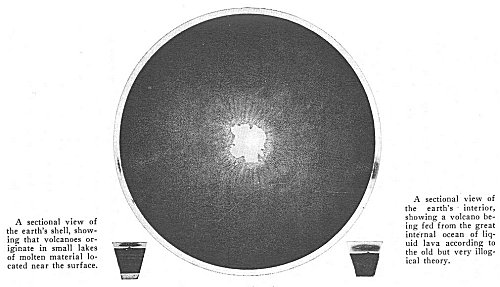
    And then another example, this from Marshall B. Gardiner, A Journey to Earth’s Center. 1920, which also shows the interior “central sun”:

    And a cross-section of the Earth from Gardiner:
    http://www.sacred-texts.com/earth/jei/img/36400.jpg

    The literature of this hollow Earth business is very wide and long and not very deep, and includes a fair amount of scientific-y whoo whoo.  The sci-fi part of it looks mor eintereting, though from the little that I have read now most of it is very tight-fisted in the good-writing department.


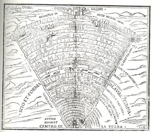
    This maps talk excludes Inferno maps like the following, for example–obviously–as there are many:
    Blog--feb 9--dante

    The classic sort of image may be something like this fantastic depiction of the Inferno of Dante (shown here in the Comedia published in Venice by Gregorio de Gregoriis in 1515.

    I should guess that there’s ample room for a collection of inner-Earth civilizations, and perhaps that will come to pass.

    A few more of the patent images for the Lyouns patent:

  • Imaginary and Empty Space in Imaginary and Empty Maps

    JF Ptak Science Books  Post 1776  [Part of the Series on Blank, Empty and Missing Things.]                                                                                                           

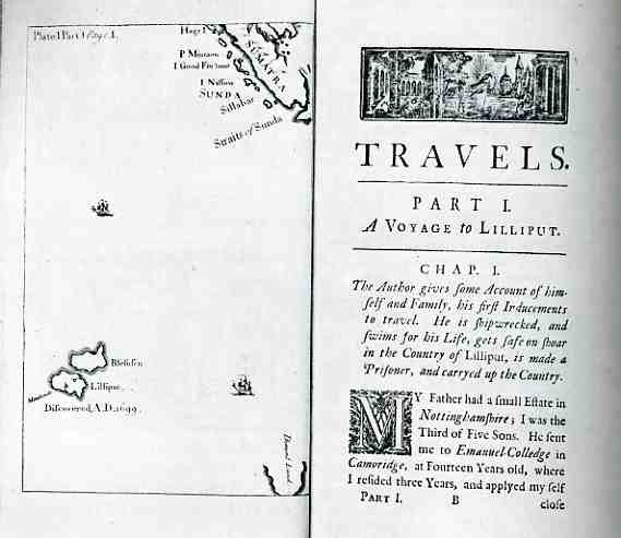
    000-ebay--Nov 4--gulliver996 Jonathan Swift’s Gulliver’s Travels (1726, amended 1735), or Travels into Several Remote Nations of the World, in Four Parts. By Lemuel Gulliver, First a Surgeon, and then a Captain of several Ships, is a great work that spills over into many different categories, being a forerunner to the modern novel, a sort-of children’s book that was for adults, as prototype of science fiction story, and of course a brilliant satire.  The satiric nature of the book is pervasive and extremely visible, but yet the whole thing works splendidly, exposing and investigating the nature of corruption (of mind/soul), perception, value, the naming of things, the nature of judgment, and, of course, the soul of political intrigue.

    Everyone remembers the voyage of Gulliver to Lilliput, but there were other voyages as well, the book including: “A Voyage to Lilliput (May 4, 1699 — April 13, 1702)”; “A Voyage to Brobdingnag (June 20, 1702 — June 3, 1706)”; “A Voyage to Laputa, Balnibarbi, Glubbdubdrib, Luggnagg and Japan  (August 5, 1706 — April 16, 1710)” and  “A Voyage to the Country of the Houyhnhnms (September 7, 1710 – December 5, 1715)”.   But what I’d like to concentrate on here is the emptiness of the space around the empty non-existent (sorry) islands of Lilliput and Blefusco, which I think fits as a subcategory in this blog’s continuing series of posts on empty and blank spaces.  The islands are well away from just about everything, being unfindable only if you’re a youngish sea captain blown off course, far to the south of remote and removed Sumatra.  

    File:Athanasius Kircher's Atlantis.gif

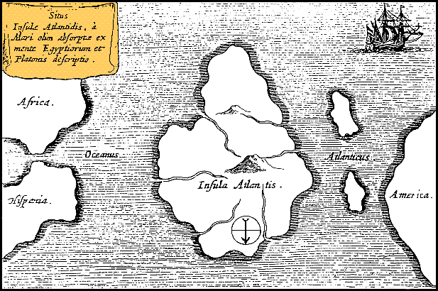
    [Map of Atlantis, from Athanaseus Kircher’s Mundus Subterraneus, 1669, with north situated at the bottom of the map, as indicated by the arrow.  It is doubtful that anyone believed Atlantis could have been the size of half of the Atlantic Ocean, as we see above; but if we look at teh relation in size of  Spain to Atlantis the possibility for that size grows brighter.]

    Even maps of Atlantis seem to make that place less removed than Lilliput, and there’s more detail to the interior of that island than Swift’s almost-entirely blank pair.  But Lilliput, as an imaginary place, looks particularly blank in a sea of blank, punctuated by two lonely little boats.  There’s just an awful lot of blank, white space in this map…  


  • “Seven People to Make a Shadow”: Andersonville Prison, 1865

    JF Ptak Science Books    Post 1760

    While reading about the story of Andersonville Prison I was much taken with a passage from the diary of Sgt. David Kennedy (of the 9th Ohio Cavalry), held at that prison, writing on 9 July 1864:

    ‘ Wuld that I was an artist & had the material to paint this camp & all its horrors or the tounge of some eloquent Statesman and had the privilege of expresing my mind to our hon. rulers at Washington, I should gloery to describe this hell on earth where it takes 7 of its occupants to make a shadow.’

    Seven men to make one shadow.  That does pretty much tell the story of Andersonville.  It was known also as Camp Sumter, in Sumter County (Georgia), constructed and then opened in February 1864–quite late in the war–to hold 13,000 Union prisoners.  That was a hoepful sentiment and held little planning, as the site held nearly 32,000 prisoners at one time, filled twice beyoind a capacity that even in the best conditions was too high. The prison was ill-conceived, not well made (except for the stockade fence constructed by slave laborers, which was pieced together so well that a person inside the stockade could not see anything whatsoever of the outside world through an imperfect join in the fence). So the view left to the prisoner was of other prisoners in fetid and deplorable states, lumber of the stockade, the poor Earth and disgusting mud of the central section of the stockade fed by a stream and turned into a disease-breeding swamp, and the sky. 

    The actual photograph (above) and the artist’s rendition, clarification, amplification, below:

    [Source:  Library of Congress. Andersonville prison, Georgia. Group of prisoners.   ca. 1864-1865  “Drawing of prisoners among tents, showing starvation, crowding, poor clothing among prisoners.” 
    From “U. S. Navy. Edisto Island. Morris and Folly Islands. Fort Warren, Mass. Andersonville Prison, Miscellaneous.” photographic album, p 74 ([Andersonville Prison]).

    Of the 45,000 Union soldiers held at the prison in its short life (February 1864-May 1865) nearly one-third of them died, most killed by ill-treatment, malnutrition, exposure, poor sanitary conditions, and starvation. 

    The map below gives a good view of the size of the swamp (“Whole Content of Stockade 25 1/2 acres, including swamp…”)

    [Source: Robert Knox Sneden scrapbook (Mss5:7 Sn237:1), Virginia Historical Society.  In the Robert Knox Sneden diary, 1861-1865 (v. 5, p. 606). 1 map : pen-and-ink and watercolor ; 18 x 14 cm.]