A Daily History of Holes, Dots, Lines, Science, History, Math, Physics, Art, the Unintentional Absurd, Architecture, Maps, Data Visualization, Blank and Missing Things, and so on. |1.6 million words, 7500 images, 4.9 million hits| Press & appearances in The Times, Le Figaro, Mensa, The Economist, The Guardian, Discovery News, Slate, Le Monde, Sci American Blogs, Le Pont, and many other places… 5000+ total posts since 2008.

Category: Maps, Cartography, History of Mapmaking

  • Europa Agonistes: Maps of States of Agitation

    JF PtakScience Books  Quick Post 


    Follow Me on Pinterest


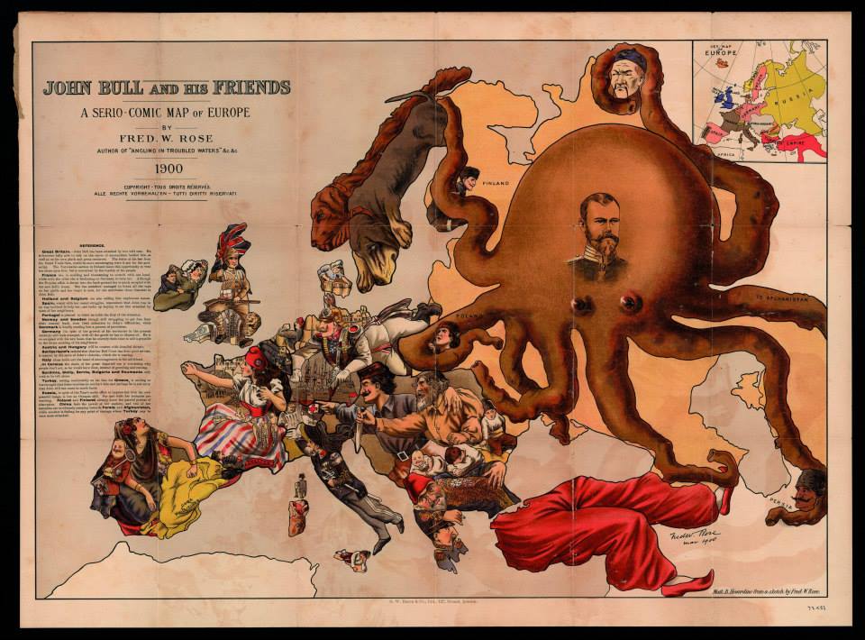
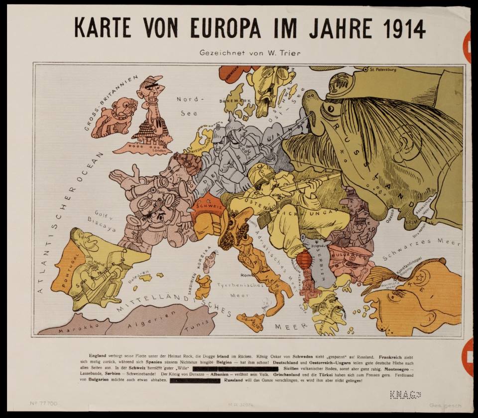
    I’ve collected a dozen maps here showing an animorphization of battlefield Europa over a period of about 40 years, from the Franco-Prussian War to the beginning of WWI.  They are biting and vicious, and no one seem to receive this bitter sword more savagely than the Russians.  The maps basically need no commentary, so I won’t contribute any.  (Thanks to Mark Dylan Sieber‘s Les Curiosites de Cartes, whose Twitter feed started this interest.)

    Europa c

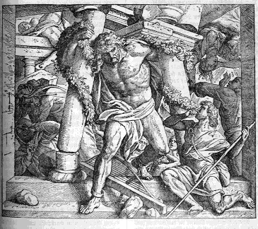
    Thou art become (O worst imprisonment!)
    The Dungeon of thy self; thy soul
    (Which men enjoying sight oft without cause complain)
    Imprisoned now indeed,
    In real darkness of the body dwells,
    Shut up from outward light
    To incorporate with gloomy night
    For inward light alas
    Puts forth no visual beam
    (–John Milton, lines 155–163, Samson Agoniste, published with Paradise Regain’d, 1671)
    Samson


    Europa e


  • Propaganda Maps: the Big Lie and the Surrounding Threat to Germany, 1927

    JF Ptak Science Books  
    Bloggermany_surrounded328

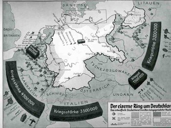
    These two displays come at different ends of the beginning of WWII and, in a way, couldn’t be further away from themselves in the stories they were trying to tell(some truth, some fiction), and were separated in time by  11 years or so.   The first “Der eiserne Ring um Deutschland” (“The Iron Ring and Germany”) shows Germany surrounded by imaginarily aggressive (and aggressively-portrayed) neighbors nine years after the end of WWI.  They both display subsets of the Big Lie superset described by Hitler in 1925 in Mein Kampf (actually, sort of better described by the German term Lügenfabrik, or “lie factory”, used by Goebbels in his descriptions of the British.  The “Big Lie” was basically a lie so big and so preposterous, so outrageous, so impossible, that no one would possibly utter something so insane and dubious, and so therefore the massive untruth is taken as true.) 

    This representation depicts the threat posed to Germany-making an iron ring-by the potentially hostile French, Italians, Belgians, Czechs and  Poles.  It shows the ring composed of a combined army of 13.1 million men versus the standing army of Germany, which in 1928 was given as 100,000, and listing virtually no heavy weapons and no air force whatsoever.. (The interesting bit here is that neither the Soviet Union nor Great Britain is included in these aggressive forces, the Soviets less-so than the English.)   The designer goes so far as to shade in areas of Germany that were under immediate threat, extending from the Donau to the Rhine, to a 50-mile-wide area all around the country, with East Prussia almost entirely consumed.  (Certainly the Treaty of Versailles was a very troubling document closing the end of the war and, it cam be argued, opening the door for the next one.  It took six months to sign the peace treaty following the cessation of hostilities in November 1918, and the troubled negotiations produced a troubled treaty, ripping Germany up and saddling it with unrealistic retributions that began to wither in only four years, with the treaty virtually dissolved by 1935.)
    Blognazi_brit_aircraft325

    It is no wonder when looking at propaganda such as this that Germany was immured with fear of national collapse at the hands of land-hungry neighbors, and that there was a huge need to re-instate the army and a system of “self protection”.    (By 1936, only 8 years later, it was beyond question about what Germany was up to-I can say that after having at least breezed through every page of the Illustrirte Zeitung (Leipzig)  from 1930-1940, that even a very casual reader could’ve tracked, graphically, the interest in military reporting and militarism in the page’s of what would’ve been the German equivalent of LIFE magazine.  By 1935 there was so much glorification of weapons and the Nazi manifesto that it should’ve been a surprise to no one when the Germans moved into their neighboring countries.)  This was by no means the earliest depiction of this rampant sale of fear or fear mongering (a design which has existed for thousands of years and not at all a creation of the present republican administration), but it is a very big and bald one, a somewhat staggering one, a bright shining lie.  (A Bright Shining Lie by John Paul Vann is by the way a great book on American involvement in Vietnam.) 

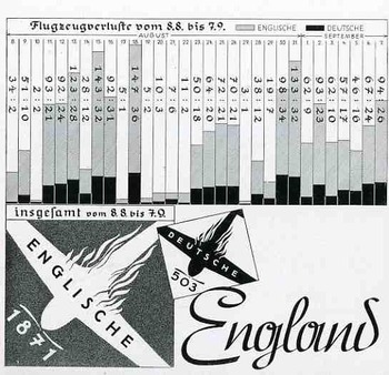
    The second image, a graph showing the successes of and very limited damage to the German Luftwaffe at the beginning stages of WWII, in August 1940.  This was a bad time for the Allies, this part of the war coined by Winston Churchill in 18 June 1940 in the House of Commons:  “The Battle of France is over. I expect the Battle of Britain is about to begin”. 

    Hitler’s Luftschlacht um England would start by air, where the Brits were far less the equal in military capacity, rather than by a land/sea assault, which would’ve tested the British at their strengths.  This second part of the assault on England was Unternehmen Seelöwe, or “Operation Sea Lion”, which would’ve begun the land assault following the victorious air campaign. 
    The graph shows aircraft losses from 9 July to 8 August, 1940, the German losses in black, and the British in gray.  As you can see, it was a pretty lopsided affair, made even more dramatic by the fictitious number of English planes being destroyed.

    This would all change, of course, with the Germans losing this battle, in a big way, with a resulting decisive victory for the Brits. (Who would of course muscle their way through the war another seven months before the U.S. was attacked and entered the war.) . It would coming to a screeching and collapsing reverse for the Germans by May 1941.  The results of the battle, in terms of aircraft and humans, were,  for England: 1,023 fighters: 376 bombers, 148 coastal command aircraft  for a total of 1,547 aircraft and  544 pilots and aircrew killed.  There were also 27,450 civilians killed and 32,138 wounded.  The Germans lost 873 fighters and 1,014
    bombers for a total of 1,887 aircraft and  2,500 pilots

    I could find no graph of course showing the results of the endgame in the Zeitung.


  • A History of Antiquarian Water: Line Segments

    JF Ptak Science Books   Follow Me on PinterestPost 2022

    Images of rivers and oceans in 16th century maps can be beautifully-rendered objects.  Water can appear as lines thick and languid, curling and wavy, sparse, tentative, adventurous, willing, dashed, timid.  Cold. Mostly cold, and full of loneliness and foreboding.  And sometimes the sea is just a blank–it is more common to see blank skies in engravings and woodcuts before, say, the 1540’s, but the blankness is usually covered by rhumb lines and compass roses and lines of longitude and latitude, compared to the blankness of blank skies, where there is usually nothing to spare us from the blank.

    Today I’d like to have a look at the strong and long lines delineating activity in water as the first part of a short series of posts looking at the design of the representation of water by lines.  Then, when the lines are done, we’ll take a look at dots. 

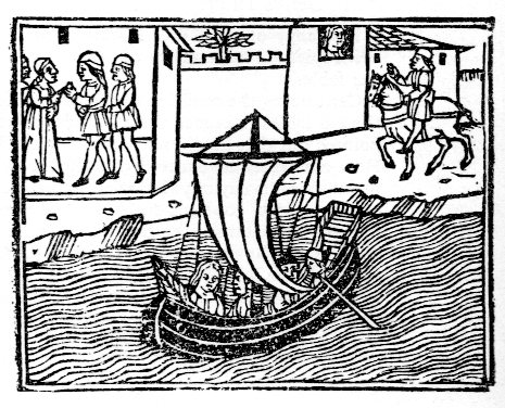
    This example occurs in Masuccio Salernitano’s (Tommaso Guadati, fl. c. 1476) Novellino, published in Venice by Bartholomeo Zanni in 1510, a tall book of a Decameron-ish flavor, with 50 stories told in five sections, mostly of a waning erotic nature.  The lines here are long and very languid. I also like the face in the window. 

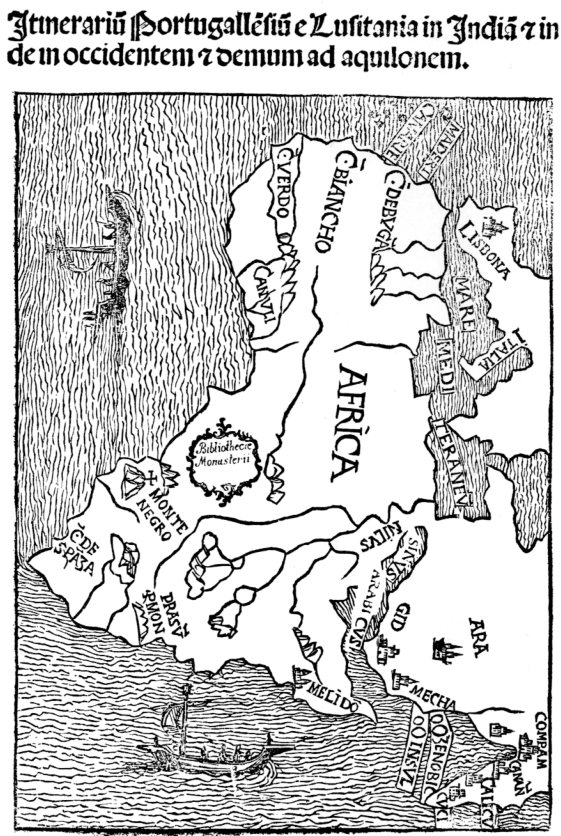
    Water masuccio267This complex of lines illustrates the map of Africa found in Montalboddo Fracan’s Itinerarium Portugallensium, which was about the earliest published collection of Spanish and Portugese travel and exploration relating to the New World.  The work was exceptional and very significant–and very popular, going through fifteen editions in 22 years to 1528. 
    Water africa266

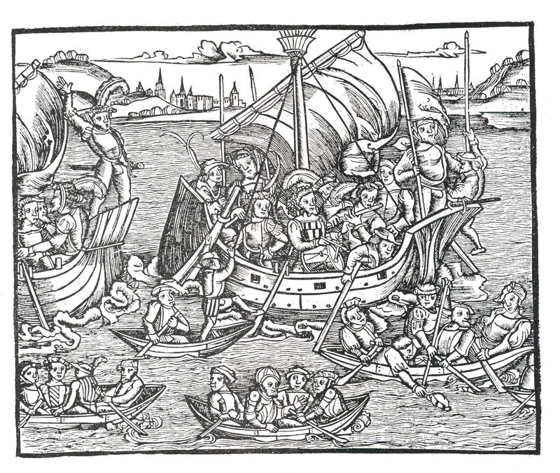
    Titus Livius (59 BCE-17 ACE), better known to the English-speaking world as Livy, was a superior among superiors of Roman historians, writing on the history of his city and country.  His work, Romische Historie…,published in Mainz by Johann Schoeffler 1450 years later in 1514, was one of the most beautifully illustrated books ever produced in that city. This is a considerable statement, as Mainz was the birthplace/hotbed of moveable type printing, being home to Johann Gutenberg and a number of other early presses. 

    Water Livy Punic

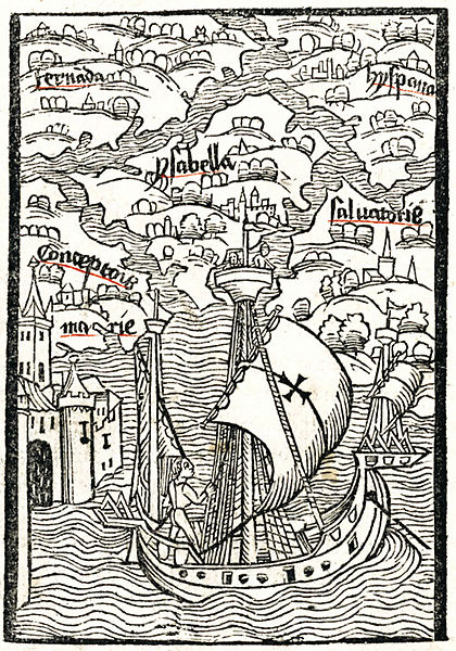
    One of the most famous printed water scenes is from the (numerous) editions of Christopher Columbus’ letter describing his voyage to the New World. It was written (or at least finished)  soon after his arrival in Lisbon 4 May 1493, almost exactly 520 years ago, and quickly found its way into print. This image (depicting Hispaniola and Isabella) was printed in Basel in 1494, and served to illustrate the somewhat hopeful and inflated description of what he found on his new voyage.

    Water Collbus Basel

    [Source: Wiki, here.]

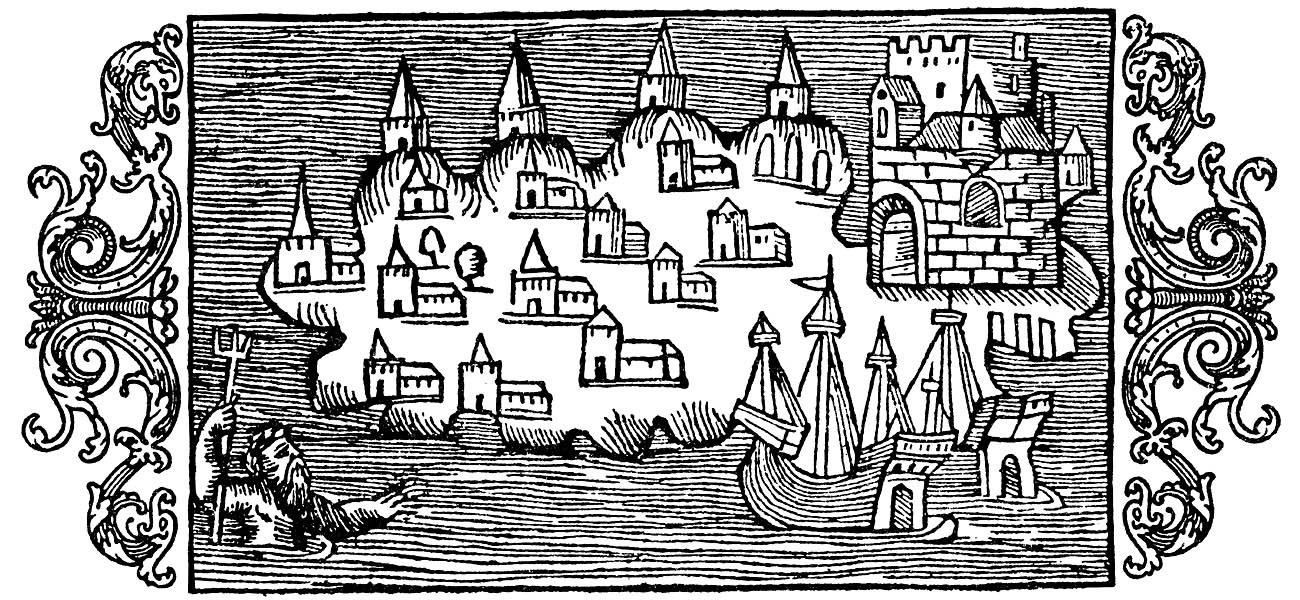
    This image from the mid-16th century is found in the fantastic work on the history of Scandanavia (and etc.) in Olaus Magnus’ Histotria di gentibus septentrionale (“History of the Northern Peoples”, 1555).

    Water Magnus[Image source: http://www.avrosys.nu/prints/index.htm]

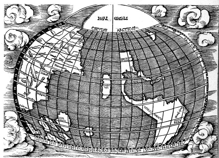
    The seas in the map of the Western Hemisphere in Joannes de Stobnicza’s Introductio in Ptholemei Cosmographium (Cracow, 1512, and widely believed to be copied or at least very heavily inspired by the Martin Waldseemueller’s 1507 map of the world) are very tightly drawn, neatly unifrom, and lovely, as wesee below).  This recitation could go on for quite some time, but this gets the point across on heavy lines.  Next stop: dots. 

    Water strob268


  • A Found View of Brooklyn and Map of Green-Wood Cemetery, 1846

    JF Ptak Science Books   Quick Post 

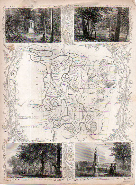
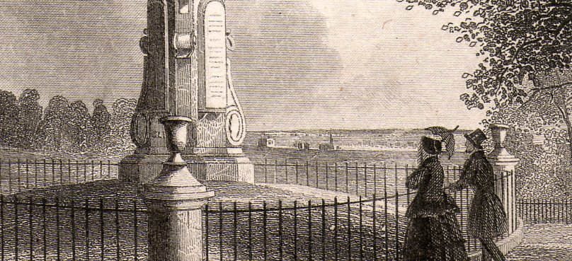
    Green-Wood223This interesting engraving shows a map of the relatively new Green-Wood Cemetery in Brooklyn, U.S.A. It was engraved by James Smillie (1807-1885) and published in 1846, 16 years after opening and addressing a need of the quick-growing burrough whose population grew from 47k in 1840 to 139k in 1850 to 279k in 1860. (Brooklyn would overtake Manhattan in population by 1930, with 2.5 million vs. 1.8 million for Manhattan. More population stats here.)  What interests me most is that small vignette at the bottom right, which shows a quiet scene at the rise in the cemetery called Ocean Hill–what it reveals in the background, though, is an uninterrupted view across Brooklyn and the Hudson River, and on into New Jersey.  Pastoral, Farmlands.  Its a found bit of history, a quiet, privileged view. 

    (The church in the engraving is about 2mm wide in the original.)

    Green-Wood224

    Green-Wood224


  • A Map of the Human Ability to Replace Itself, 1610-1723

    JF Ptak Science Books   Post 2009

    Follow Me on Pinterest


    Blogmissing_man041_3

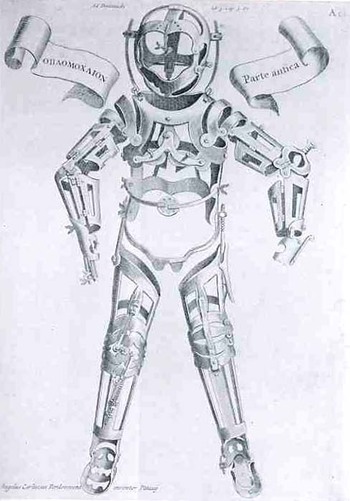
    This woodcut of applications and applicators to injured humans, lacking the human, waiting for the human, the missing human, was made by Hieronymous Fabrizzi (or Jerome Fabricius, 1537-1619), and found in his Opera Chirurgica, printed in 1723.  Even though this is a pretty straight-forward image, it strikes me as a little odd, a little off,  looking a bit like inhuman trappings, the entrapments of a human waiting to be built, an artificial skin with artificial bones.  It was much less than that, and in its way, much more—it was a statement of the advances of medicine in the 16th century, a map of the ability of man to replace himself; a map of the artificial man. Perhaps the image of our own artificial man, showing our ability to replace organs, bone, skin, limbs, etc.may come to look to the people of the near future the same way that we here in the present look back on Fabricius’ mage. 

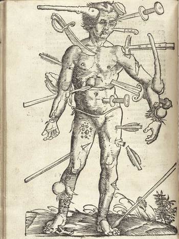
    A Map of Getting Wounded

    Gersdorff_p21v_3

    This map of the wounded man was a very popular, much reproduced image, seeing publication in many works since it first appeared in Johannes de Ketham’s Fasciculus Medicinae,  printed in the year Columbus set sail for India.  It was a battle map, really—a battle for the human body, showing the effects of what happened to that body when someone tried to erase its existence.  The image is graphic, realistic and fairly gruesome, and highly useful.  It was accompanied by instructions on how to deal with all of the trauma, and to save the man thus that he could fight again.  In its way, this might be the earliest issue of M.A.S.H.  This woodcut, as the next, appeared in Hans von Gersdorff. Feldtbüch der Wundartzney (printed in Strassburg, by  H. Schotten, in 1528).

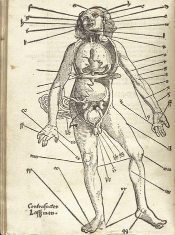
    A Map of Letting the Blood out of the Human Body.

    Gersdorffx400jpg_other_2

    Well, it really wasn’t like that, not how I mean by by snippy modernist viewpoint looking back on medical history with no contextual appreciation.  Bloodletting was an approach to healthfulness, as blood was seen as one of the four major elements (or “humours”) of the human body that needed to be kept in balance.  This was accomplished via the application of leeches or by the more common (and quicker) practice of venesection, or opening a vein to allow the blood to come out. (Let’s reference Steve Reich’s magnificent “Bruise Blood” creation of 1966 at this point—I don’t think that I’ll ever have a better chance to drop a reference to this piece of revolutionary music in regards to venesection again.)  Thus this map was map for the practiconers of bloodletting—the physicians, and more probably the barbers and other assistants who would inherit this lesser procedure from the more-busy doctors.  In the history of maps of anatomy and the general practice of mapping the human condition, this woodcut x-ray of the best places to drain human blood would not survive close to the age of modernity, disappearing almost entirely by the 18th century, and becoming much more scarce well before that.


  • Visionary Map: the Earth Without Water, 1694

    JF Ptak Science Books   Post 2020  Follow Me on Pinterest

    Part of the series on the History of Blank, Empty and Missing Things

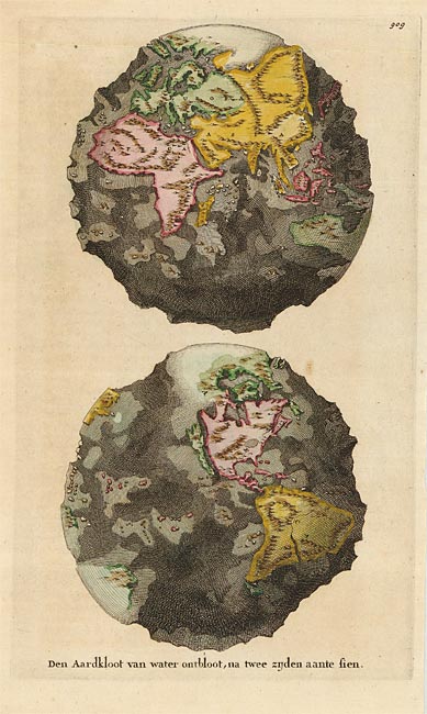
    I stumbled upon this fantastic leap into science affliction, an attempt to display the absolutely enormous idea of draining the Earth of all water revealing its ultimately rocky structure.  And this in the relatively young modern cartographic days of 1694. 

    Map world without water
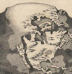
    This map (“Den Aardkloot van water ontbloot, na twee zijden aante sien”, published in Amsterdam in 1694 by Wilhelm and Jan Goeree in a Dutch edition of the expansive and imaginatively suggestive cosmo-theo-geographical work, Telluris Thoeoria Sacra) reveals the half-believed idea of California being an island was we can clearly see the enormous canyon separating it from the North American mainland. On the other hand, the “opposite” (in a way) belief takes place in the north, showing a large and towering land mass at the North Pole.

    Map world no water detail N Amer_edited-1

    All-in-all, given the state of geographical knowledge for the unseen stuff of the Earth, this was an excellent attempt to reveal the structure of the globe.  Sure, the depths of the oceans are a little off, the idea and the attempt to depict it was an extraordinarily interesting display for the time, especially with limited hard data.  This is even a more-remarkable series of observations considering the theoretical framework in which all of this was taking place. 

    Burnet (1635-1715) poured out his pounding heart into the pages of his sacred history, teaching people about the structure and history of the  Earth with generally little or unsuccessful regard to science–but no matter.  (Burnet did try to figure out where all of the water came for the flood, which is  a great question.  It is impossible for it to come from a natural rain of any sort, and Burnet probably came to the conclusion this the answer for the flood couldn’t come from the surface of the Earth.  So to keep things in compliance with his faith, Burnet established that the water necessary for the flood came not from the surface of the sphere, but below it, in the hollow Earth which was actually filled with water.) This was a work of structured faith and a belief  system, and wasn’t seen as much more than that except to the initiated. But a resulting map of the structure of a waterless Earth seems to me a more powerful piece of imaging than an Earth simply covered by water. 

    [Black and white image source  Barry Lawrence Ruderman Rare Maps, here.; color version from Oldmaps.com, here]


  • History of Lines–Big Lines, June 1944

    JF Ptak Science Books   Quick Post 

    DDAy lines

    [Source:  the Library of Congress, here.]

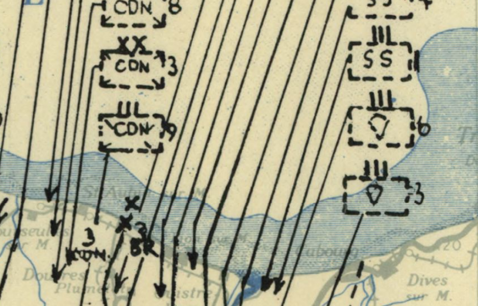
    The idea of being on the receiving end of these lines on 6 June 1944 is terrifying.  General Rommel pretty much figured out what was going to happen, and sort of when it was going to happen, but he was kept out of the strategy loop even though he was in charge of the German defences here, unable to convince Hitler to move men and machines southward to meet the invasion where he thought it was going to come rather than strengthen the position of defence in a place where he knew the invasion wasn’t coming, which was Pas de Calais. The pull of war by this time had destroyed the Luftwaffe, and German high command had been destroyed by Hitler–or at least communications and straegy within the command system of the German army was very highly compromised.  In any event, once the invasion had begun, there was not much hope for the Germans–it had been a complete surprise, with the huge efforts of misdirection playing themselves out beautifully. So beautifully, as a matter of fact, that once the invasion was well underway it was still a matter of no small debate as to where the “real” invasion would take place.  Even after the airborne divisions began landing some hours before the assault began, it was only the elderly and problematic General von Rundstedt who reacted appropriately, believing that the airborne assault was far too large to be a feint, and ordered two reserve panzer divisions to Normandy.  the amount of men and materiel moving onto Normandy was gigantic, impossible, overwelming, as some part of this map makes clear. 


  • History of Holes: the Battle of the Bulge, 1944-5

    JF Ptak Science Books   Post 2013  History of Holes

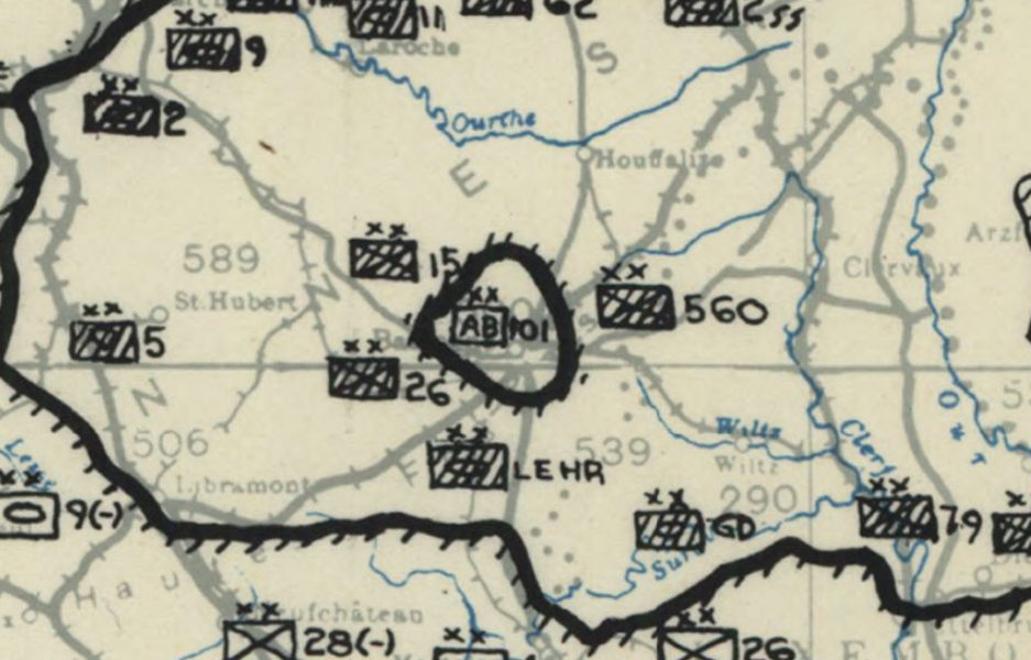
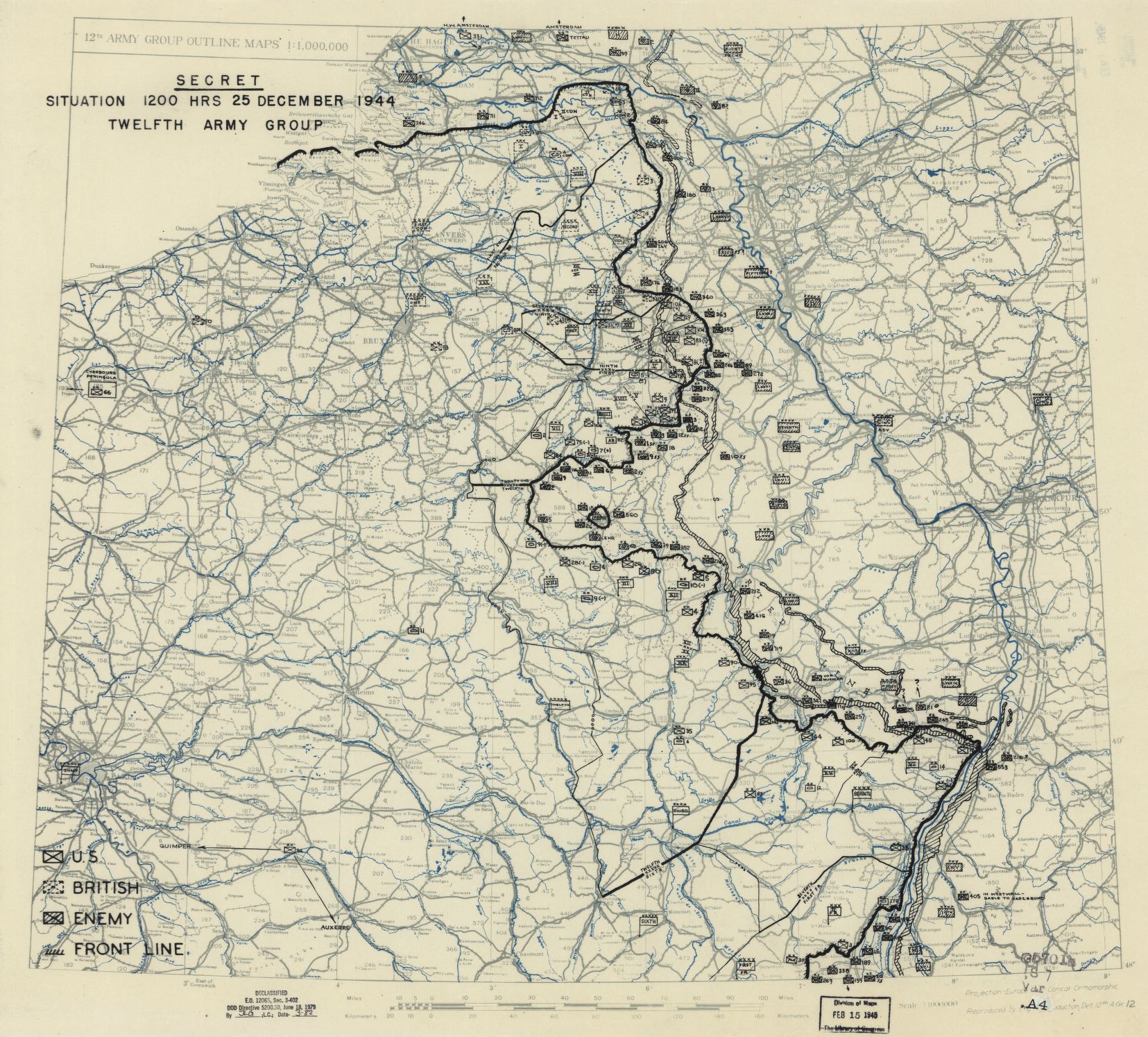
    This detail is from a pivotal moment in time in a crucial battle in the endgame of the European Theatre of WWII.  It is Christmas, 1944, and the action takes place in the Ardennes.  The German forces made a very unexpected assault through thick and very problematic wood, pushing Allied forces back along a long front, forcing a very perceptible bulge in the line–a bulge pointed the wrong way.  The bulge was pretty much in the middle of the line and in the middle of the bulge was a famous circle, and inside this circle was the 101st Airborne division in the town of Bastogne, and it was surrounded for the time being by overpowering elements of the Wehrmacht, including three infantry divisions and a panzer division  The boxes with the cross-hatches are all enemy forces, and for a time, the “AB101” stood quite by themselves.

    Bulge Dec 25

     The full map from which this detail is made is found at the Library of Congress site, here; the full suite of eleven maps showing the development of the battle from 16 December 1944 to 18 January 18, 1945 is also found here.

    Bulge dec 25 larger still


  • How High is the Sky? A Cross Section of Black and Red Earths

    JF Ptak Science Books    Post 2000

    [This is numbered post 2,000–a number that does not include another 500 or so “Quick Posts”–written for this blog since beginning in February 2008.]

    Preyssinger Earth plan

    • “Der Erde und Ihre Atmosphare” from Astronomischer Bilderatlas, by Ludwig
      Preyssinger, published in 1853 (with 12 engraved plates1, following the
      first edition of 1840, which had 10 plates). Source: found at Michael Stoll’s flickr set, a superior and large image, here.]

    Our older daughter Emma asked that question years ago, when she was six or seven.  It was a great question, and one of those questions, really, that only kids can come up with. It is also reminiscent of Ruth Krauss and Maurice Sendak’s A Hole is to Dig, a classic work published in 1952 with these sorts of question/responses, a kid-cratic method of inquiry and answer, that is possible generally only with a younger and fluid mind.  (“What is a hole? A hole is when you step in it you go down” and “a hole is to dig” and so on.)

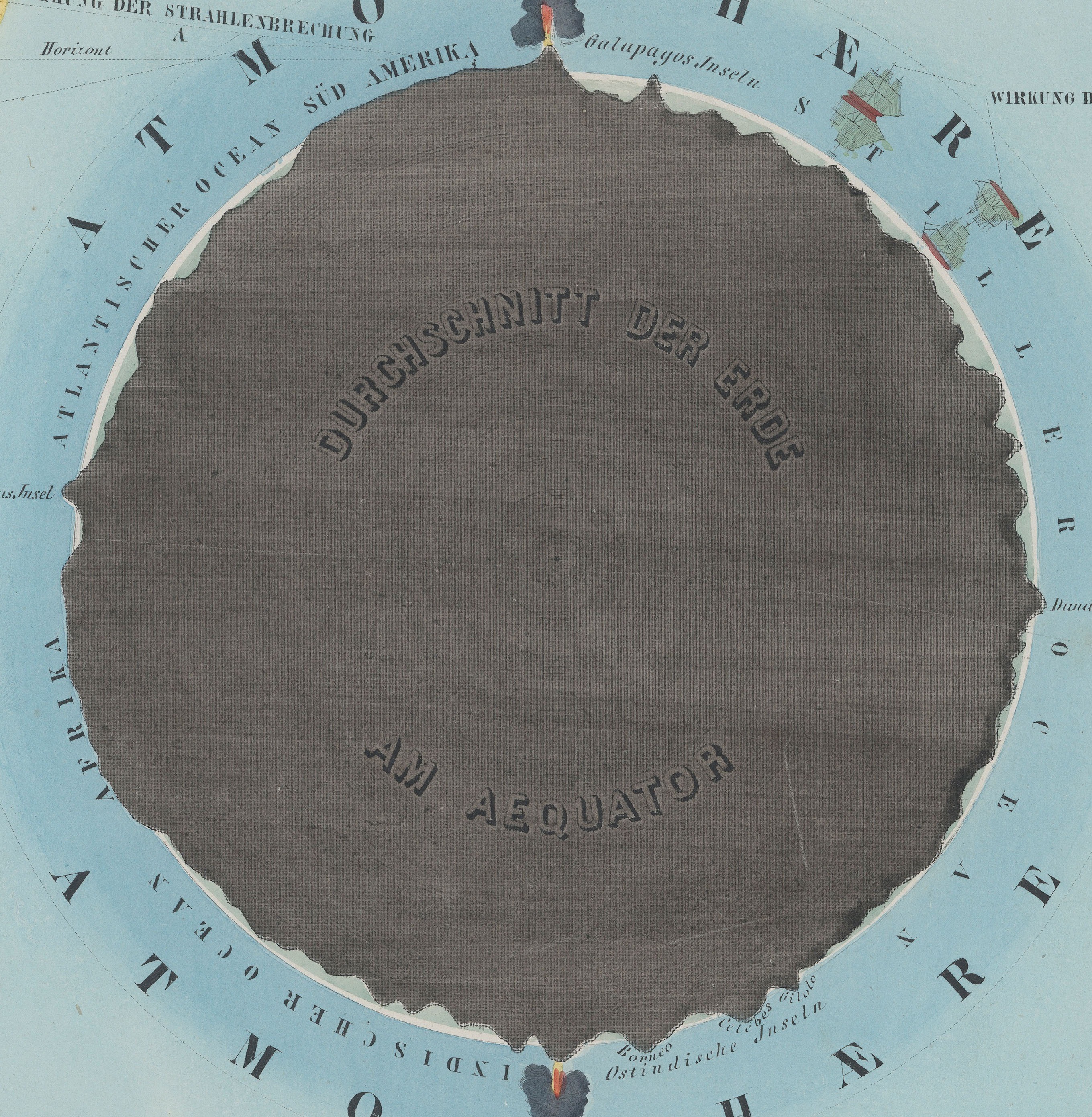
    People from long ago certainly knew that clouds were not nearly as high as the Sun and Moon and stars, but how high could they be? How high was the sky?  How thick was the envelope of air around the Earth?  Exploratory balloon ascents could help that question along, but only somewhat: heights attained in the first 80 years or so of ballooning reached 43,000 feet. (The question of ballooning and the limits of the atmosphere comes up early, as we can see with Jane C. Webb Loudon, the author of the anonymously-published The Mummy!: Or a Tale of the Twenty-Second Century  in 1827, interestingly published nine years after Mary Shelley’s Frankenstein:  “… and the  hampers are filled with elastic plugs for our ears and noses, and tubes  and barrels of common air, for us to breathe when we get beyond the  atmosphere of the earth.”)  In 1803, the record stood at 24,000; in 1835, 26,000; in 1862, 39,000; the record of 43,000 feet was reached in 1927, and at a great cost. On the other hand, more than half of the atmosphere exists at 3 miles above the Earth, and 70% of it is at 5 miles and under; at 22 miles exists about 99% of the atmosphere, and at 62 miles the atmosphere is so thin that it is a virtual vacuum, and is basically negligible. (The exosphere reaches out though to about to about 6,200 miles, but that’s where free moving particles are able to escape the Earth’s gravity and get swept away by the solar wind.)

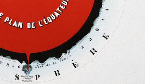
    Herr Preyssinger was trying to exhibit this atmospheric density in his illustration #10 to his beautiful astronomical atlas. (I should add here that Preyssinger’s work is a very uncommon production, made so that several of the engraved plates coul dbe held up to a solitary light source in a dark room and be illuminated cut-outs in the paper which also had transparent material on the verso to difuse the light…very smart.)  His illustration for the atmosphere was very effective, and was set against a plan of the earth made at the equator.  I’ve also included the same plate #10 from a French edition of the same work made slightly later, though the interior of this Earth is colored in a brilliant red.

    Preyssinger Earth plan detaik_edited-1
    So when the engraving above was printed in 1862, the balloon ascension record stood at about 5 miles, getting humans to above 70% of the ocean of air.

    Relative to humans getting high above the ground, the atmosphere is high; relative to just about everything else–like the 99% at 22 miles compared to the 7,900 or so miles of the Earth’s diameter, the atmosphere is but a thin slip. IF we reached that distance down into the Earth, we would just be touching the outer mantle.

    Preyssinger red larger

    •  Fromt the French edition, printed in 1862, here.  French explanation (Astronomie Populaire ou Description des Corps
      Celestes, Astronomie Populaire en Tableux Transparents..
      .., published in
      1862) of plate X, here. 

    Preyssinger Earth plan det

    Notes:

    1. Twelve plates, as follows:  Die Central-Sonne und die Ansicht von der Fixsternwelt; Himmelskarte; Darstellung des Sonnensystems; Vergleichende Darstellung der Grösse der Planeten; Die Sonne und verschiedene Erscheinungen derselben; Der Mond durch das Fernrohr gesehen; Transparente Darstellung der Mondsphasen; Finsternisse; Ansicht von den Jahreszeiten; Die Erde und ihre Atomsphäre; Kometen und Aerolithen.


  • Model of Utah Beach, Normandy, France, 1944

    JF Ptak Science Books    Quick Post    Follow Me on Pinterest

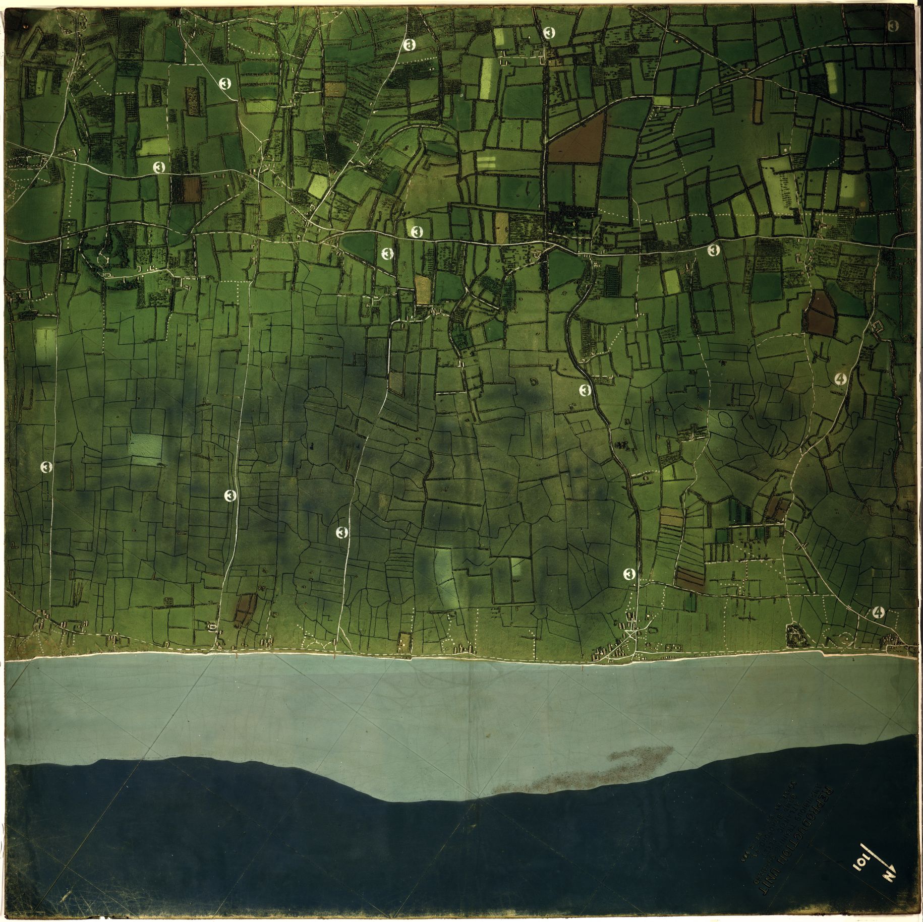
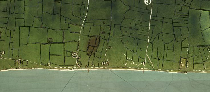
    In all that I have seen relating to the mammoth planning and logistical operations concerning teh invasion of Europe by the Allied Forces on 6 June 1944 I don’t think I’ev ever seen such incredibly detailed relief map models such as the one below.  The original image resides at the Library of Congress and its catalog information describes it on a scale of  1:5,000  and a vertical scale of 1:2,500, with the model being two sections of  120cm squared (so 120x240cm (or about 3×6 feet). THE map “shows the tide lines, slope of the beach, buildings beyond the beach, and the location of hedgehogs” and the placement of anti-aircreaft weapons.  The image is very expandable.

    Utah Beach Model Part 1

    And a detail:

    Utah Beach Model Part 1 det