A Daily History of Holes, Dots, Lines, Science, History, Math, Physics, Art, the Unintentional Absurd, Architecture, Maps, Data Visualization, Blank and Missing Things, and so on. |1.6 million words, 7500 images, 4.9 million hits| Press & appearances in The Times, Le Figaro, Mensa, The Economist, The Guardian, Discovery News, Slate, Le Monde, Sci American Blogs, Le Pont, and many other places… 5000+ total posts since 2008.

Category: Maps, Cartography, History of Mapmaking

  • Unusual Elevations

    JF Ptak Science Books  Quick Post

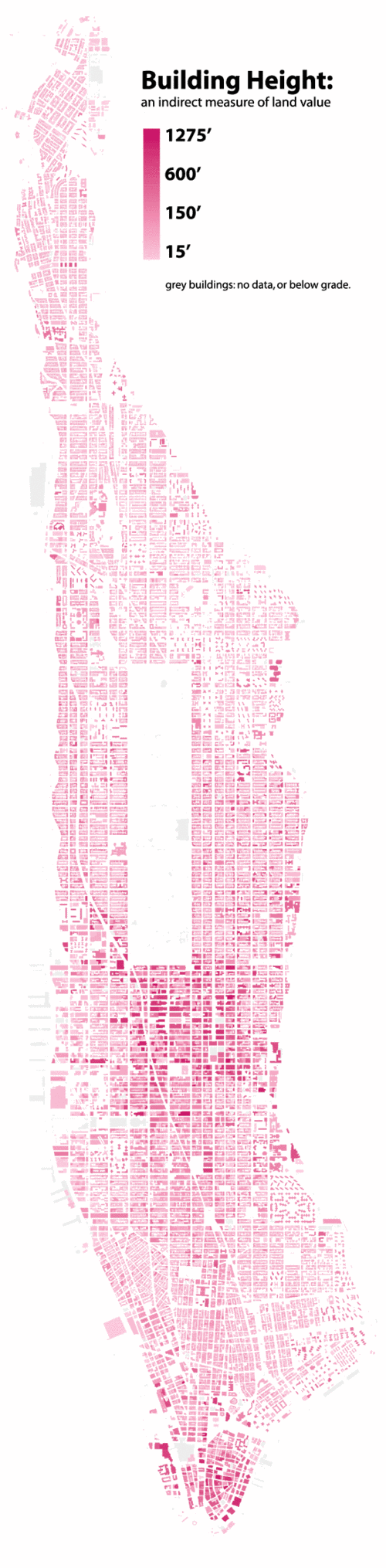
    It has seemed to me that an elevation map of the United States may be an interesting way of collecting and categorizing regional similarities and differences. For example, high desert folks probably have more affinity to one another than suggested by state maps–so to for Eastern states high elevation people in the Appalachian chain, similarities indicated more so by the number of feet above sea level than a state lines between North Carolina and Virginia (and so on). So far as I can tell no such map exists–but it came back to mind seeing this wonderful and innovative map of Manhattan building heights, brought to us by Bill Rankin of Radical Cartography.  


    Map manhattan-heights


  • Map of the Information Dirt Road, 1971

    JF Ptak Science Books   Quick Post

    Arpanet3

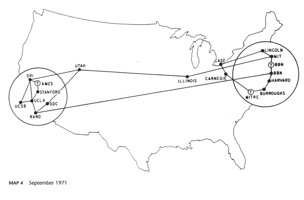
    [Source: An Atlas of Cyberspace. See also Mappa Mundi for a good article on the 1980 version of this map, here.]

    I can feel the enormous hail coming down on me right now for this title–but by comparison, this 1981 map of ARPAnet must seem somewhat like the first three minutes of creation in the Big Bang saga, in its way.  This was absolutely, positively a remarkable accomplishment for the time, but compared to what it would become–measured in any number of different ways–this map seems proto-historic.  Compared to not being able to construct this map because there was no ARPAnet–well, that would have been a devastating thing. 

    The other thing about looking at the picture of the birth of something was that–unlike many other revolutionary creations–there were many people of high influence who saw the possibilities of the expansion of the thing.  Even Graham Bell and Edison had a difficult time looking into the future of the telephone…


  • Exceeding Excess–on Lots of Detail in Maps (1891)

    JF Ptak Science Books    Post 2275

    One of my favorite atlases of all-time is Adolf Stieler’s Hand-Atlas (Hand-Atlas über alle Theile der Erde und über das Weltgebäude, published in Gotha, Germany, by Justus Perthes) and edited by August Petermann.  I love this series (there were eight editions and a number of intervening printings to 1891) because the maps seemed so impossibly detailed for their scale.  They have so much detail and such great relief that in some very odd way they almost do not look like maps.  The sheets have massive amounts of info, particularly so with areas in which you do not expect it.

    This post came to be because I bumped into an old Stieler-friend–the six-sheet map of the United States.  I have four different flavors of the map, but the one I like the most is from 1891.  The sheets are all produced to be pieced together contiguously, so that they form a map 28″x52″–and there is so much detail the work looks a little like carto-graffiti, except of course that it isn’t, and that all of the extremely small and fine engraving piles one next to the other make for a very accurate and full map of the country.  

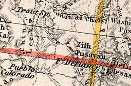
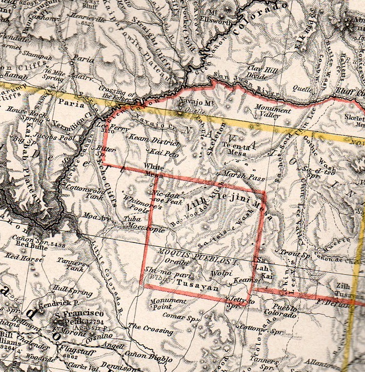
    Take, for example, the Four Corners region, mainly for north-east Arizona:

    Stieler189
    This is about 50% larger than the original, about a 2″x3″ section of one 15″x18″ section of the six-section map, and it is just packed with detail.

    And here, a smaller detail, of about a one square inch section of map, concentrating on the Canyon de Chelly.  Now I know this area a little, and about the history of its cartography (somewhat), and I can safely say that this is just tremendously detailed given the scope of the map.  The remarkable thing about the Stieler atlas is that all of the maps are like this.  Extraordinary–not particularly beautiful in the traditional over-the-fireplace sense f beautiful, but fantastic as, well, maps (of particular and perhaps peculiar scientific loveliness).   

    Stielerdet190


  • New Orleans at the Top of the U.S., 1861

    JF Ptak Science Books  Quick Post

    Mississipi River

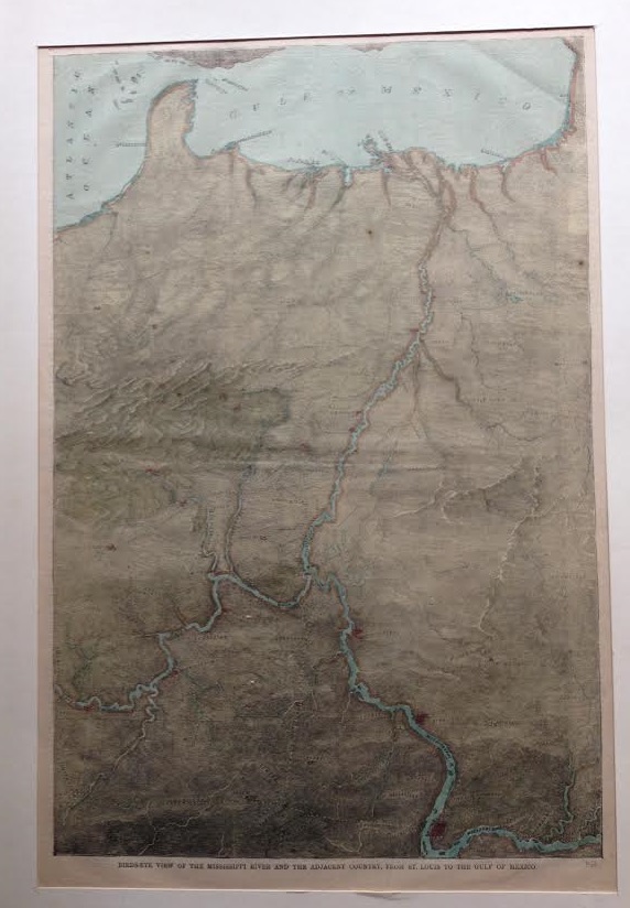
    Maps with unusual perspectives have long been interesting to me, and this map of the Mississippi River certainly fits this category.  Printed in Harper’s Weekly on July 6, 1861, and entitled “Bird’s-eye View of the Mississippi River and the adjacent Country, from St. Louis to the Gulf of Mexico” it displays the river from north-to-south, landing New Orleans at the top of the United States.  I’m not altogether certain why this perspective was used –perhaps it was just to acquaint readers with possible “western” battlefields for the brand-new Civil War, showing the terrain from a different position for the sake of running old geographic info through a news interpretative lens.  

    It displays this middle-ish section of  the country from just east of Knoxville (and almost to the mountains in which I am sitting) and then south to Charleston, and north along that same line to Vincennes and the Wabash River;  then on west to St. Louis and Rolla and south to Galveston. We can easily see the entire Florida peninsula–truncated, owing to the bird’s-eye view part. There are probably dozens of cities shown, all of which are on one railway or another. The terrain is very interestingly cut and also very useful.  And again, New Orleans sits on top of it all, perhaps to emphasize its importance in the future fight for the river and the middle of the country in the three-month-old Civil War.  

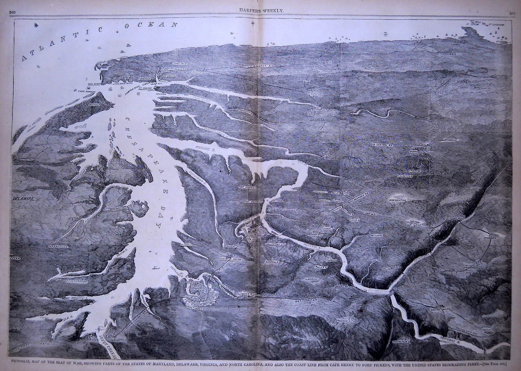
    Harper’s Weekly published several perspectives like this–for example, here’s another very creative and imaginative view of the theater of war looking southeast from high above Baltimore, and surveying the country that leads south and encompassing the entire coastline to just beyond Savannah.  It is a very interesting portrayal of the terrain, especially for the Blue Ridge, and for giving a good idea of what was on the road between Washington and Richmond.  

    Chesapeake[Image source: the Philadelphia Print Shop]


  • CartographArtia of the Flight of Homing Pigeons

    JF Ptak Science Books  Quick Post 

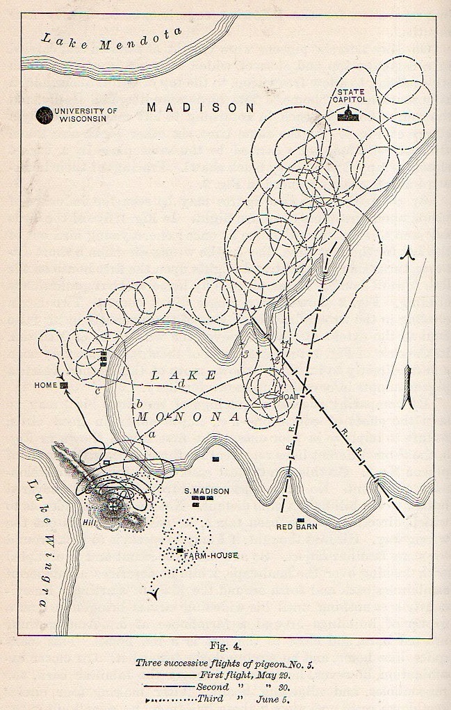
      Homing pigeon151

    Non-representational art was still nearly twenty years in the future when this lovely cartographic artwork was published in 1894.  And what we are seeing here in the collection of circles and spirals is a representation of three trials of a homing pigeon finding its way home in the Lake Monona region of Madison, Wisconsin.  C.F. Hodge Ph.D. (of Clark University, psychology) wrote “The Method of Homing Pigeons” for Popular Science Monthly (volume 24, 1894), showing at least in this found instance that behavioralists (yet named at this point) enjoyed working with pigeons well before C.B. Ferster recommended them over rats to B.F. Skinner (mainly because, as Ferster said, he didn’t like rats).

    Actually Hodge was more of a neuro/pathology person, but for now I’m just interested in the artwork generated by his experiments.  


  • A Town for Escaped Slaves–Surrounded by Livestock & Swamp (1862)

    JF Ptak Science Books   Post 2248

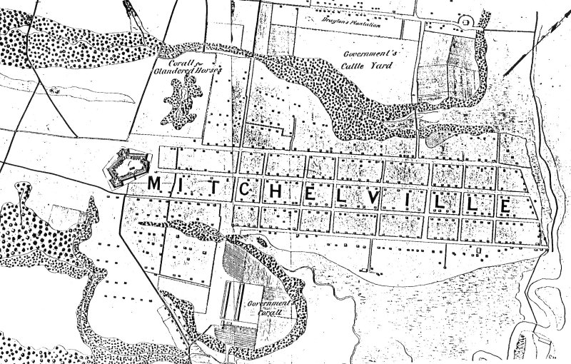
    The “Port Royal Experiment” established in 1862 by the Union Army at Mitchelville, Hilton Head Island, Beaufort County, South Carolina for freed slaves was certainly a very interesting  and perhaps life-saving idea for many freed slaves.  Well, the “freed” slaves weren’t really that–they escapes their servitude when the Union Army took control of Hilton Head and surrounding areas early in the war on November 8, 1861.  The island became a staging area for Union forces and was fortified–it also attracted the attention of escaped slaves,m who by 1862 had sought a form of asylum there, numbering around 600.  They were not exactly welcomed to the island, as there were prejudices against African Americans in the Union ranks as well–in fact some needed protection as the lower low-lifes among the Northern ranks stole from the escaped slaves what little they had.  In any event, it was a difficult situation, with no clear way of dealing with the new ex-slave population from a legal.administrative point of view.  These ex-slaves were considered as ‘contraband” of war, and my early 1862–on Hilton Head at least–the solution was found in establishing a town for them.


    Mitchellville

    The town was created by and  named for Kentuckian and Major General Ormsby M. Mitchel–he wouldn’t survive the year, dying of yellow fever in Beaufort S.C., and then buried in Green-Wood Cemetery in Brooklyn (and as it turns out his marker is not far from my mother’s mother’s family.  Furthermore he is the O.M. Mitchel I know from the history of astronomy, his life before the military and before his country needed him.  He wound up at the troubled Albany observatory right before leaving for the war).  

    Mitchelville was necessary and perhaps it was even sufficient for the time–certainly it had its share of trouble during the war, and then with ownership of land issues after the war, and so on. 

    What struck me about this map was the placement of Mitchelville.  

    It was mostly surrounded by poop.

    Situated on a cotton field–some of the slaves who lived there used to work those same fields for the land owner who directed the Confederate unsuccessful defense of the island–the town had a huge swamp to its south, with a ‘government corall” just west of that; the northern boundary of the town was a large “government cattle yard”, and the to the west was a fort and horse coral.  And then to he east was the ocean.  Hot, swampy, and mostly surrounded by cows and horses, the town doesn’t look particularly appetizing.  On the other much larger hand, the people living there were no longer slaves.  


  • The Newspaper Frontier, 1880: Cutting Texas (Almost) in Half

    JF Ptak Science Books   Post 2240

    The idea of the frontier in American history has been around for quite some time, made famous and mostly-invented (and closed) by Frederick Jackson Turner in 1893, and expanded, imagined, enticed, magnified, micro-analyzed, and  generally messed with ever since.  There have been all sorts of frontiers introduced into the study of the birth, expansion and filling-up of this country, from the very earliest colonial periods of Indian frontiers, “far-western” river frontiers of the Connecticut, Delaware, Hudson (!) and Susquehanna, to the Appalachian frontier of the early western reaches of the colonies, to the transportation frontier, the slavery frontier, the gold and mining frontier, the gun frontier and so on.  

    TExas newspaper

    I’ve got another bit to add:  the newspaper frontier.  

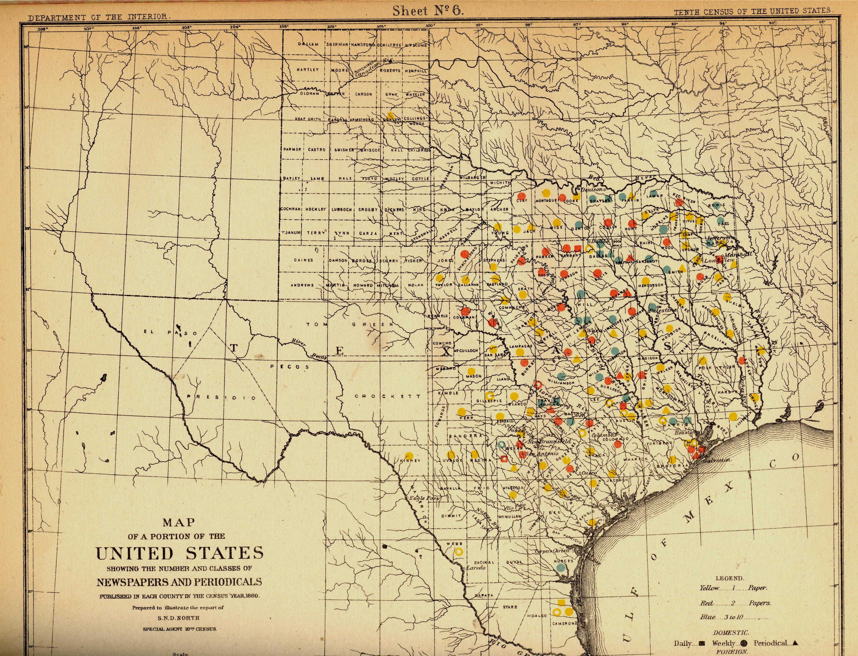
    I just happened upon a volume of the US Census of 1880, with a special report by S.N.D. North entitled History and Present Condition of the Newspaper and Periodical Press of the United States…and published in 1882.  What provoked me was the map of Texas newspapers for 1880.  It very clearly, and like no other map of its kind, delineates a fantastic line/frontier between the Texas with newspapers and the Texas without newspapers. We see very clearly that the frontier of the newspaper stops fairly abruptly (and wonderfully) at the 100th meridian, with only two newspapers in all of the rest of Texas found beyond that point (and those just barely beyond the 100th.  And it’s the 100th meridian that mostly marks the vertical middle of the country, running through North and South Dakota, Kansas, Nebraska, the Texas/Oklahoma borders, and so into Texas—if you folded this map vertically in half it folds virtually on the 100th meridian.  An odd bit, it is, half of the country and then approaching half of Texas. 

    I should report that the newspapers west of the 100th meridian were in Kinney County (population 4,440) with the Fort Clark News (established in 1880, at exactly the year of census) and Donley County (population 160, with the monthly Clarendon News and a 50-cent annual subscription rate).  The newspaper development also sort of followed the frontier fort development, almos tall of which (but four) were east of the 100th. 

    Of course the population and easier-natural-resources are located east of this point, I know, but it is still quite a jolt to see the line of newspapers get drawn in the sand so vividly.  There isn’t anything else quite like this so far as the newspapers go, except, a little, for Florida, where the line gets drawn north and south, splitting the peninsula roughly in half, the southern part holding only five counties at this point..  But it is a much more robust image for Texas given the number of newspapers that were being published—280 periodicals and newspapers for Texas versus 45 for Florida, with 11,374 in the entire country*—so that the difference between the have-newspapers and haven’t-newspapers in Texas is that much more vivid. 

    Texas needed more papers:  there were 1.5 million people living in the massive state in 1880, almost twice as many as there were in 1870, and almost half of what there would be there in 1900. That was another story, entirely—even in 1880, which is only 130 years ago, there were only 270,000 people living in the entire state, not even close to half of the county population of Pinelas today.I’m just enjoying the surprise of the straight-edge frontier in Texas. 

    The deal too was that Texas wasn’t at the top of the lisst for average area for each publication per square mile, with each periodical providing coverage for 936 miles. But that again is for Texas east of the 100th meridian–throw in the rest of the state, and that number skyrockets. (There were 13 states with a higher mileage distribution than Texas, topped by Indian Territory,m with basically nothing, with each paper servicing an area of 21,000 square miles.  

    Also, Texas’ 225 counties had 119 counties publishing newspapers and/or peridoicals, compared to the national figures, which were 2,605 counties and 2,073 publishing papers.  

     *Just for the sake of comparison, the number of newspapers and periodicals per state for 1880 was as follows: Illinois, 1017; New York, 1411; Pennsylvania, 973; Ohio,  774; New Jersey 215.  Also, oddly, the average circulation of the Florida and Texaspapers was roughly the same: 1,282 for Texas and 1306 for Florida (with an average for the country at 4137). 


  • Iconography–the World on a Globe on a Title Page (1537)

    JF Ptak Science Books   Post 2235

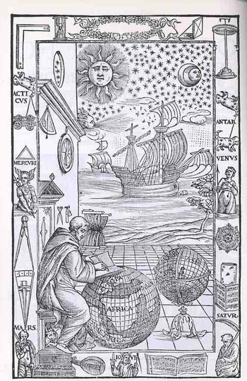
    This magnificent piece of tidy work (below) was executed for a new edition of Johannes de Sacrobosco’s (latinized for John Halifax or Holywood, a teacher of mathematics and astronomy at the University of Paris, a monk/scholar/astronomer ca. 1195-1256) Tractatus de Sphaera Mundi  by Fra Mauro Fiorentino (1492-1556), and gives us all a chance to have a bit of fun reading late Renaissance iconography. The work is entitled Sphaera volgare novamente tradotta con molte notande additoni di geometria, cosmographia, arte navicatoria et stereometria (and so on), published in Venice in 1537, and as stated in the title this is an augmented edition of Sacrobosco with Mauro adding segments on geometry, cosmography, navigation and perspective. (Full text of this classic here.)
    Blogtpamerica105

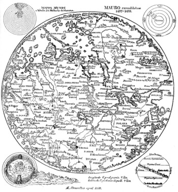
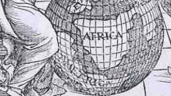
    The wood engraving is of particular interest because of the globe upon which Fra Mauro is writing—as you can more clearly see in the detail; shot (below) we can see a large continent labeled “America” just hundreds of miles off the coast of Africa.  The Americas still make only guest appearances on globes at this point, and seeing it here, as a bit of an afterthought, is a treat (considering how easy it is to overlook it).  There is another Fra Mauro, much more famous than our’s above, whose cartographic workshop produced a seminal, magnificent  map of the world in 1453, thus bringing the two Mauro’s together, if only slightly, via their maps (one great, the other incidental).

    From the Sphaera, chapter one:  

    THE FOUR ELEMENTS. — The machine of the universe is divided into two, the ethereal and the elementary region. The elementary region, existing subject to continual alteration, is divided into four For there is earth, placed, as it were, as the center in the middle of all, about which is water, about water air, about air fire, which is pure and not turbid there and reaches to the sphere of the moon, as Aristotle says in his book ofMeteorology. For so God, the glorious and sublime, disposed. And these are called the “four elements” which are in turn by themselves altered, corrupted and regenerated. The elements are also simple bodies which cannot be subdivided into parts of diverse forms and from whose commixture are produced various species of generated things. Three of them, in turn, surround the earth on all sides spherically, except in so far as the dry land stays the sea’s tide to protect the life of animate beings. All, too, are mobile except earth, which, as the center of the world, by its weight in every direction equally avoiding the great motion of the extremes, as a round body occupies the middle of the sphere.

    Looking a little more closely at the elements of this image we find a number of interesting bits.  Working from the upper right hand corner across and down we find a right angle (for the architectural and building parts of the book), then a sand clock, a decorative laurel wreath with a pocket sundial (!) right next to it, ending with an object that looks as though it might be a physical sciences demonstration tool (I’m guessing).  Working down from the “what is it” we see the first cut of a three-times-repeated constellation that I think has nothing to do with the word “Antar” beneath it. 
    Mauro_map

    “Antar” probably refers to the famous Arab warrior-poet, subject of lots of attention over the centuries including two works by Bach and Rimsky-Korsikov (and also the name of Apollo as worshiped at Actium) Below Antar is an armed and clothed (?!) Venus, major domo goddess of love and beauty and for whom existed innumerable cults (witnessed by just some of the famous Venuses as Venus de Milo ,Venus de’ Medici, Capitoline Venus, Esquiline Venus, Venus Felix, Venus of Arles, Venus Anadyomene (also here), Venus, Pan and Eros, Venus Genetrix, Venus of Capua, Venus Kallipygos, Venus Pudica, and so on into the sweaty  night.)


    Following Venus is, I think a complex compass rose, though it may also be a calendar—I can’t quite tell from the detail of the cut.  This is turn is followed by a heavily fortified book (actually this sort of bonding, meant for heavy use, was relatively common at this time)and a score of (5-line staff) music. 

    Returning to the right angle and moving down we se the same constellation under which hangs a very stable-appearing wagon, with a triangle beneath it , followed by a representation of Mercury, the messenger of the gods, who in turn is positioned over a large set of dividers.  On the wall over the head of Fra Mauro we see two precision instruments—a surveying tool and an astrolabe.  The two small tools near Mauro’s head seem to be a scale and a pair of scissors. 
    Blogtpamerica_detail

    The central panel shows two caravans (approximately 100-footers?), being driven by a favorable wind to hospitable shores beneath a starry and benign firmament. 

    The bottom tier is the most emblematic of the set of images, as we see the related Saturn-Jove-Mars all together.  Saturn is also Kronos, which is why we see the old horned man caring the scythe of time’s reckoning; he is also the father of Zeus, also known as Jupiter (Juppiter Optimus Maximus Soter (Jupiter Best, Greatest, Savior)), also known as Jove, who stands here crowned and warning us with a sword and dividers.  Jove in turn was the father of Mars, who here doesn’t look terribly war-like at all.  Punctuating the spaces between these three are a keyboard instrument, a lute and a score of music.  I’m not sure that these lyrical/musical devices had anything to do with the three generations of super gods, but there you have it. 

    The ending of the Sphaera: 

    ECLIPSE DURING THE PASSION MIRACULOUS. — From the aforesaid it is also evident that, when the sun was eclipsed during the Passion and the same Passion occurred at full moon, that eclipse was not natural — nay, it was miraculous and contrary to nature, since a solar eclipse ought to occur at new moon or thereabouts.

    On which account Dionysius the Areopagite is reported to have said during the same Passion, “Either the God of nature suffers, or the mechanism of the universe is dissolved.”
  • Being in Regret–Verdun, 1916-1918

    JF Ptak Science Books  Post 2215

    IMG_6842

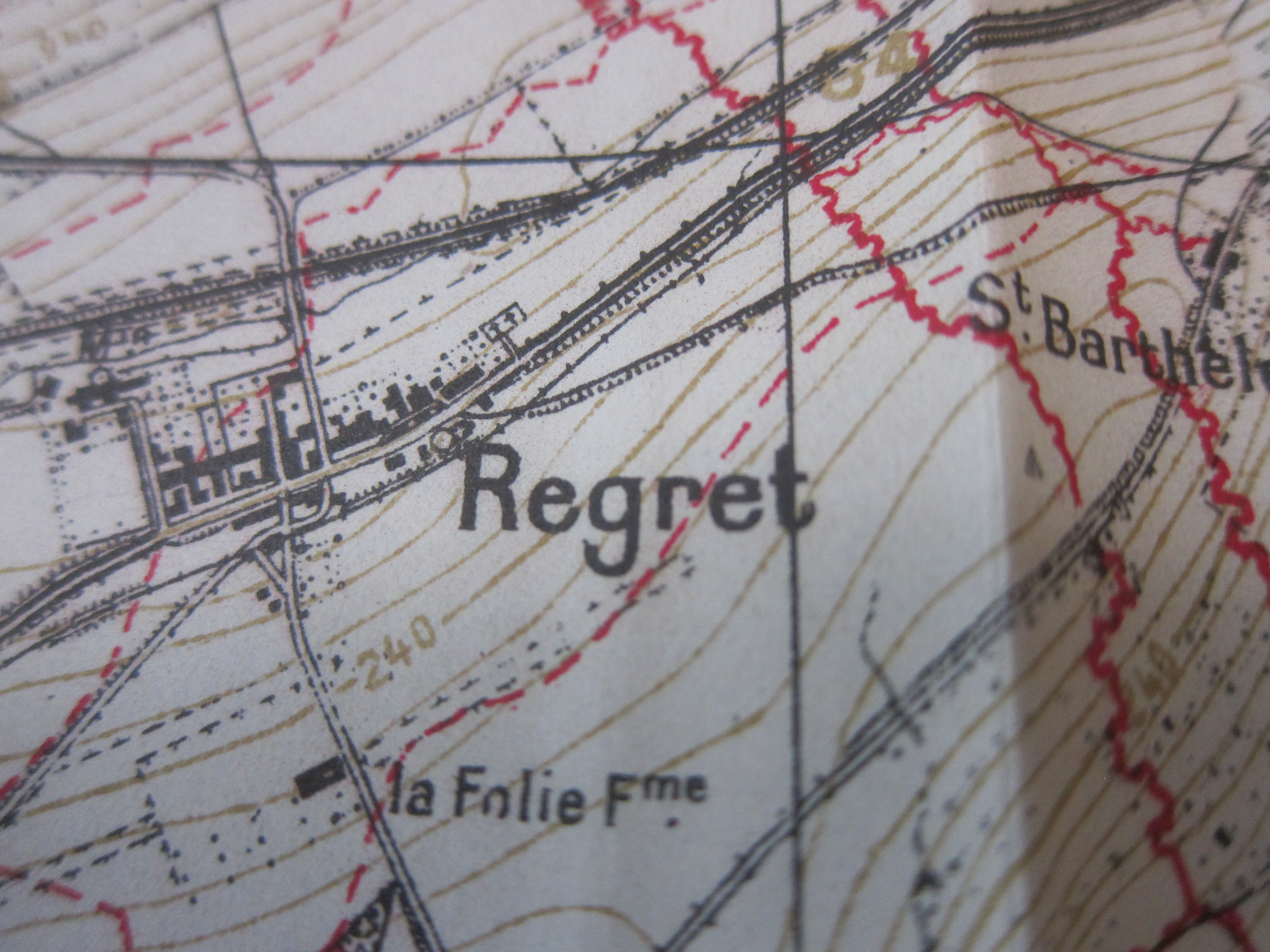
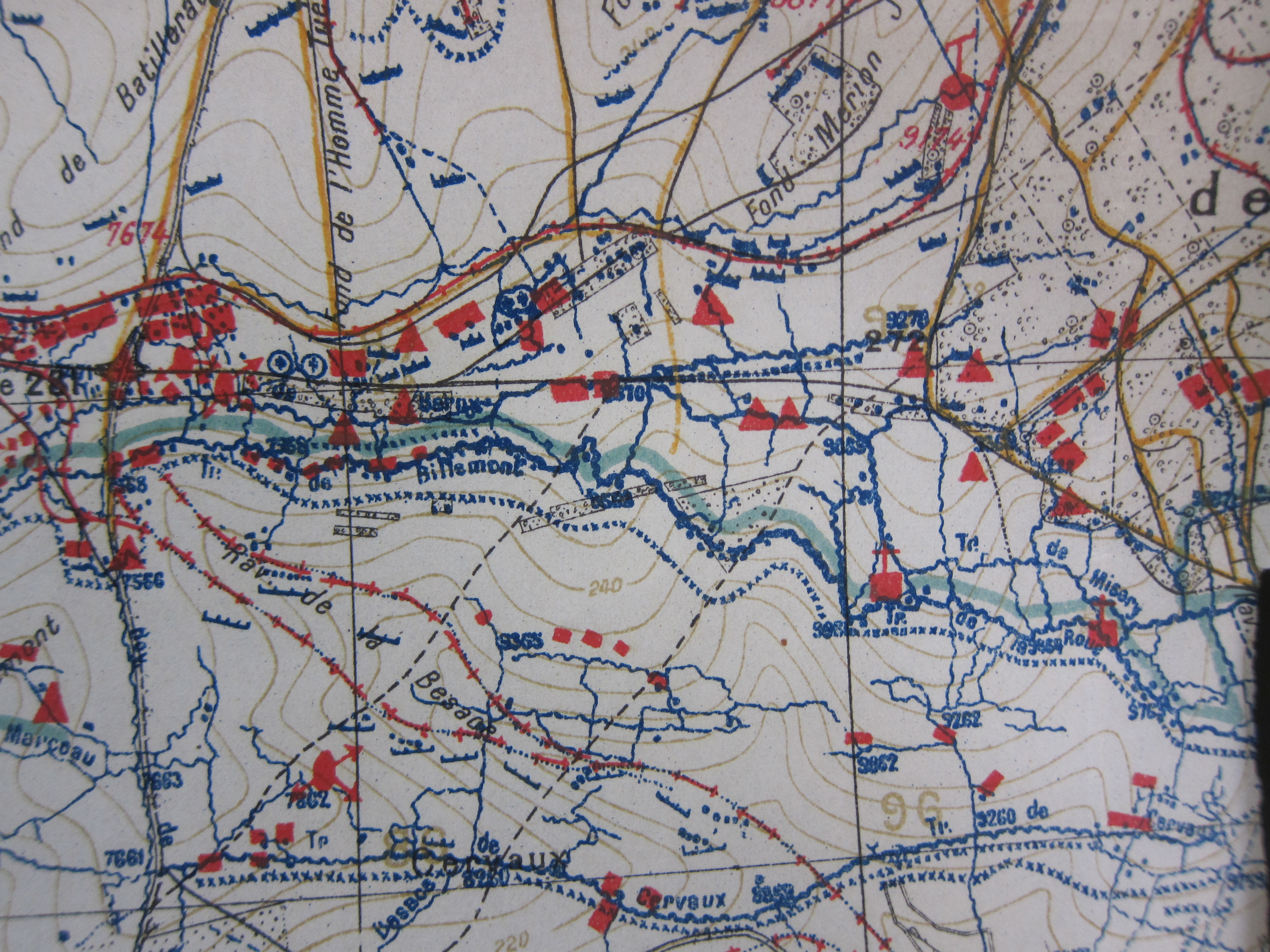
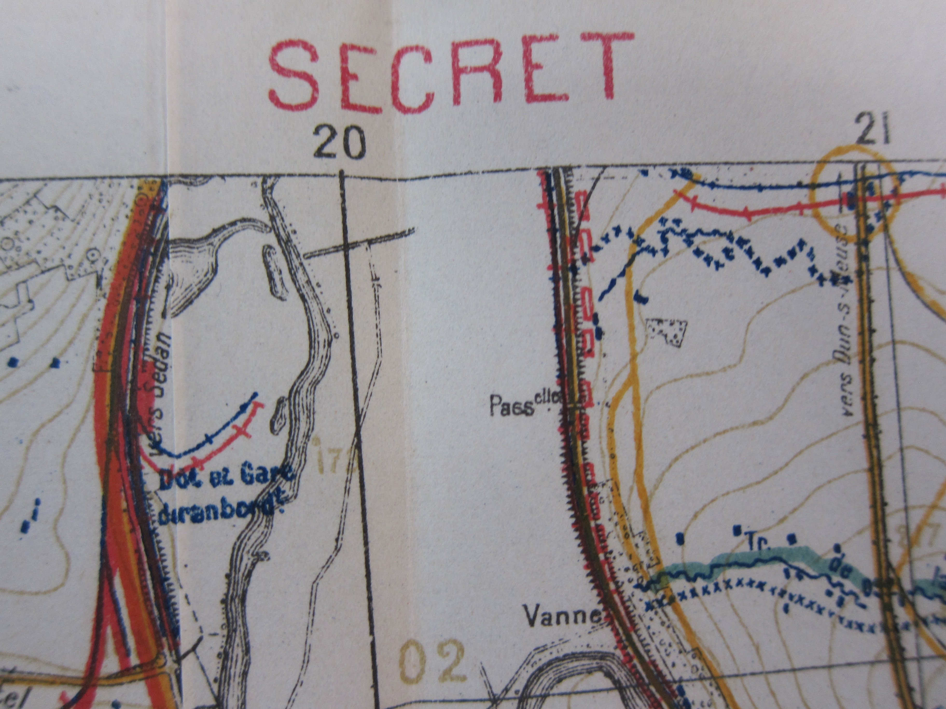
    I was looking through a very heavy volume from 1924 of Military Engineer and came upon a very large folding map1.  It was vanilla on the outside and stayed so, opening only the back of the map through one, two, three, four (!)  unfoldings,  not yet revealing itself, until it was at it full width, and then unfolded once down, which opened to the middle of the map, which was a mass of lines and shading of brown and gray.  Another unfold up, and then another down, and more of the same, so much detail that the context still was hidden. I unfolded the bottom half of the map three more times and at the bottom was the town “Regret”.  My right hand obscured the name of the much larger and antique-fortified town, which turned out to be the military-sacred city of Verdun.  When I unfolded the top of the map–making it about four feet long–I saw that it was for development of the battle and lines of communication and placement of troops and so on for part of the Autumn of 1918. And trenches.  

    (This was actually “Verdun B”, the mate of “Verdun A”, which together form a huge and wildly complex 4×4′ map. )

    IMG_6843

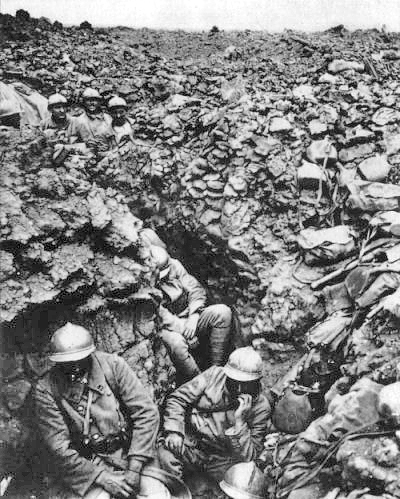
    This was a reprint six years later of the 34th edition of this particular map–that is a lot of editions.  But this was a lot of place, Verdun.  A fluid place of ordered killing chaos that was as dynamic as it was occasionally static, starting in a very contained space of massive fighting that took place from 21 February to 18 December, 1916. The map is of a place that was about the longest, costliest, and deadliest battles that humans have come to, so far.   Casualties were about the same on each side (370,000 French and 340,000 German) and totaled about 710,000 people, though scholars argue the point, some coming to a figure much higher, approaching a million.  That makes 70,000-100,000 per month for the battle, which was like a war in itself. 

    There were probably two million soldiers in motion here, at Verdun, in a relatively tiny area, with front lines extending about five miles or so, the battlefield being fairly narrow from point to point, perhaps totaling 20 square miles of heavily bombarded/shelled ground.  It was a terrifying place to be, and I’m certain that it must have scarred forever hundreds of thousands who survived the ordeal.  

    IMG_6844

    Unfortunately Verdun 1916 was only about the half-way point of the war, with these maps generated to show artillery targets for the American entry in the war for action that would take place just before the end of the war on the 11th hour of the 11th day of the 11th month of 1918. This was the French Fourth Army and the American First Army which attacked on a front from Moronvillers to the Meuse on 26 September 1918 through the end of September, and from which the German army began its gradual withdrawal from the area, continuing right up to Armistice Day.  

    Ultimately whenever I think of this war things usually boil down to Dalton Trumbo’s Johnny Got his Gun, which was required reading in my freshman year of high school in 1970.

     Verdun


    Notes:

    1.  Journal of the Society of Military Engineers, volume 16, 1924; the map titles are “Tranchee Francaise schematique a la date de 1er Sept 1918″ and “Carte Generale des Objectifs d’Artillery”.  


  • History of Lines–the Extent of Birds, 1862

    JF Ptak Science Books    Post 2207

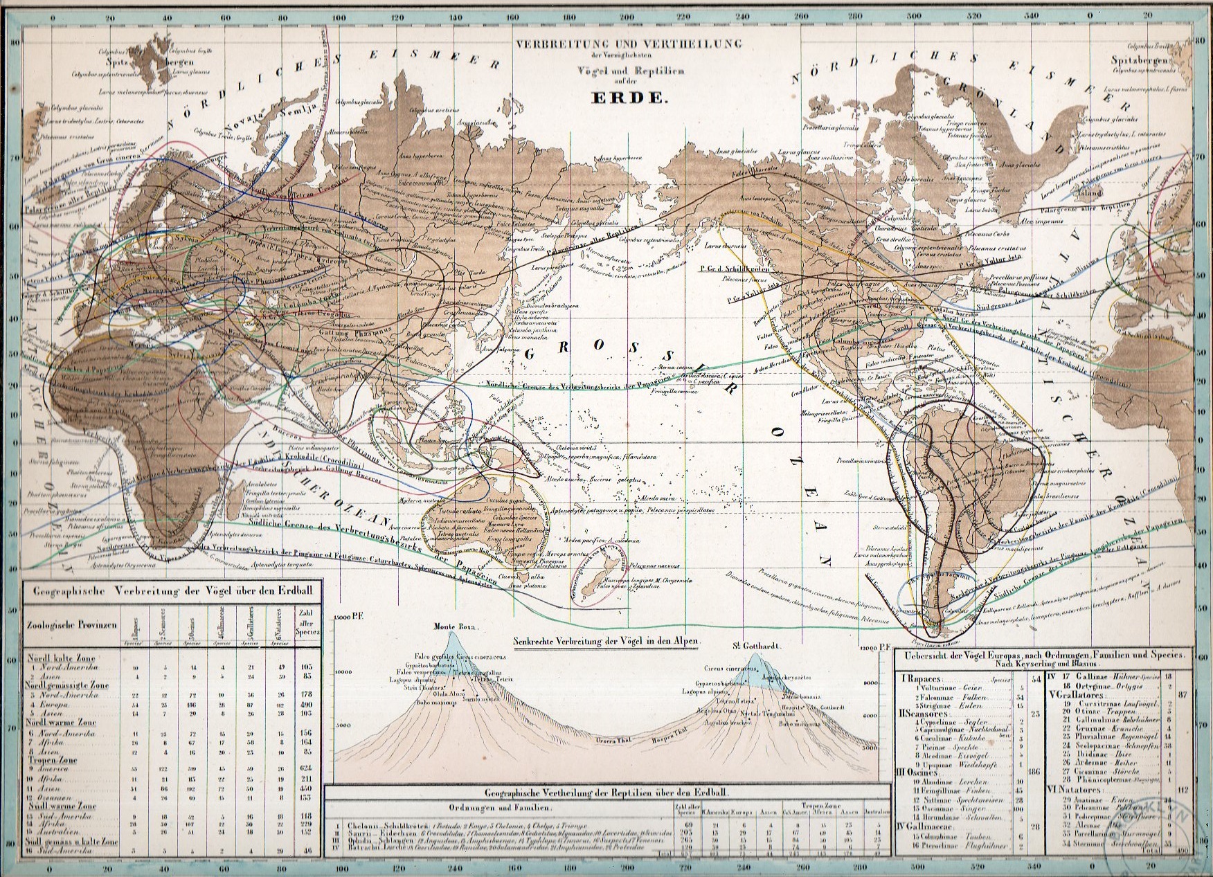
    World lines020

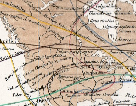
    There are many places and objects named for the German Alexander von Humboldt (1769-1859)–even so in the United States–a recognition and honor paid to a great observer and cataloger of things, the first biogeographer, the scientific traveler’s traveler, the man who Charles Darwin called the greatest scientific traveler ever.1  von Humboldt amidst much else also wrote–at the end of his life–a book that began as a composition of lectures that he gave in the 1840’s, developing into a monumental work called Kosmos, a General Survey of Physical Phenomena of the Universe, which was published from 1845 until three years after his death in 1862.  He meant what he said in the title, and tried to arrange all of the stuff of nature into a comprehensible and logical whole, gathered across five volumes.  It is a brilliant masterwork of vision and orderliness, and from what I’ve read it is like walking into a 3-D library of what was known of much of hte scientific world of the mid-19th century, the very structure and organization of the book being a scientific achievement.  

    There was a sixth volume to the work, an atlas, that is one of the crowning achievements of the 19th century for the display of scientific data.  It is about half-again as tall as the standard-sized text and twice as wide, so the book isn’t very big, and the maps are all single-page–but for as relatively small as they are there is a ton of information in them, more so when you realize what must have had to go into the collection of the data to begin with.  

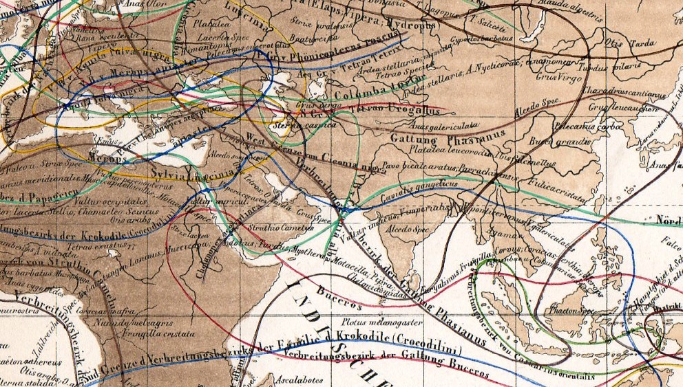
    I was very taken with this first representative because of its flowing lines (that show the range and occurrence of bird and reptiles) that make it a separate thing of beauty…had I the capacity to remove everything from this map save for the natural history lines, it would stand as an interesting work of very-pre-non-represnetational art.  I’m certain that the folks of the 1860’s poured over this and other maps in Kosmos, as well of course as the text themselves–this may have been among the first atlases to display some of its data in this way, and would’ve been fascinating. (Kosmos was actually a very popular work, the first volume selling out in a few months…it was a very popular book.)

    World lines017

    World lines018

    Notes:

    1. Found in the Darwin Correspondence Project » Letter 13277 — Darwin, C. R. to Hooker, J. D., 6 Aug 1881, just before Darwin’s death.

    You can purchase this map–my store has this and another 25 or so original maps from this atlas for sale. Send me an email and I’ll send you descriptions…

    Kopsmos--geological