A Daily History of Holes, Dots, Lines, Science, History, Math, Physics, Art, the Unintentional Absurd, Architecture, Maps, Data Visualization, Blank and Missing Things, and so on. |1.6 million words, 7500 images, 4.9 million hits| Press & appearances in The Times, Le Figaro, Mensa, The Economist, The Guardian, Discovery News, Slate, Le Monde, Sci American Blogs, Le Pont, and many other places… 5000+ total posts since 2008.

Category: Maps, Cartography, History of Mapmaking

  • Inland Empire NYC, 1931

    JF Ptak Science Books   Quick Post

    NYC map pamphlet160

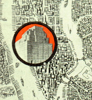
    I found this fine map decorating the front and back covers of an interesting pamphlet called Union Inland Terminal Number One, in the Heart of the Port of New York, which was published in 1931. This was an advertising vehicle publicizing the coming building, which was built by the Port Authority in 1932. It was a transport/shipping hub for trucking, handling tons and tons of freight from the port. The building was enormous–at about 3,000,000 square feet, it was the largest building in NYC until 1963. It stands today as a mixed-use building at 111 Eighth Avenue (between 15th &16th, 8th & 9th).  In any event, the pamphlet design is lovely–the image below shows it open, front and back.  

    NYC map pamphlet159


  • Maps of Human Hair Streams (1902)

    JF Ptak Science Books     Daily Dose from Dr. Odd

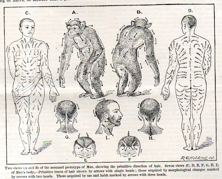
    There is something exceptional about the exceptional.  In this case, the category is maps, and in this instance the map that takes us away, far away, from the expected or standard is one showing the flow of human hair streams.  (It fits very nicely with other exceptional maps found on this site, like Maps of the Cosmos of Moles–just browse the “maps” section in the archives.)  

    Hair map contract087

     This unlikely title is the creation of Dr. Walter Kidd (Fellow of the Zoological Society, London) and his attempt to reconcile the the influences of gravity, inheritance, genetics, Weismannianism, and other assorted biological bits via his study of hair growth patterns.  The article appears in the (many) pages of the Scientific American Supplement for 13 September 1902, on page 22, 328. (Yes, the Supplement was paginated consecutively over dozens of years of publications, a cumbersome manner of ordering an 8-foot stack of paper over dozens of volumes.)  In any event, this was an article to simply explain some of Kidd’s ideas and the chart that would appear in a more lengthy treatise of 153pp published in the next year by Adam Black.  Contemporary views of Kidd’s book were not very supportive of his work.  I should add that I was attracted to this article solely for the possibility that this may well be the first map of directional hair growth. (I think the idea is pretty interesting, but I’m just not in the mood for it presently.)

    Hair map contract086

     Some of the other posts on this blog dealing with unusual hairiana include the following:


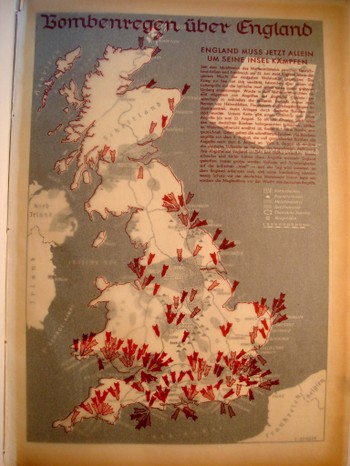
  • Bombing Britain–Maps of the Attack Against the U.K. from the German Side, 1940

    JF Ptak Science Books  (an earlier post edited and expanded)

    Dsc04742_2
    It is essential to look at objects from alternative angles, especially in science, in order to determine the correctness, or fitness, of a finding, or opinion.  Even when consolidating data or evidence regarding the confirmation of an established bit,  you may very well find other strands of loose data that could help illuminate even a well established or iconic societal “given”.

    That the war was not going well for the Allies in September 1940 is an understatement—and the chief allies at this point excluded the United States, happily now recovering from the Depression, and still a full 14 months away from entering the war. 

    Dsc04739

    What is very weird to me is that after having looked at every issue of LIFE magazine at least three times  from the start to the end of World War II, that there are more advertisements using war images than there are images of the war itself.  This actually continues into the spring of 1942, when LIFE got really busy, the war got really messy, and people started really dying.  And frankly even the coverage of Pearl Harbor in no way lived up to what I thought the coverage of a photo-magazine like LIFE would be. This is not a scientific study.  It just strikes me as odd, or propagandizing, that there should be such relatively scant, or undervalued, coverage of the fighting when sanitized images of that same fighting were being used to sell socks and shaving cream and cigarettes and such.  I understand the power of hearts-and-minds campaigns, but this seemed so amateurish, boorish even, that it just didn’t approach the level of a psychological ploy to pacify an American public that had virtually no interest in attending the European Theatre. 


  • The Unexpected Unintentional Unusual: Maps of America

    JF Ptak Science Books  Post 2162   An offshoot of the Unintentional Absurdist series

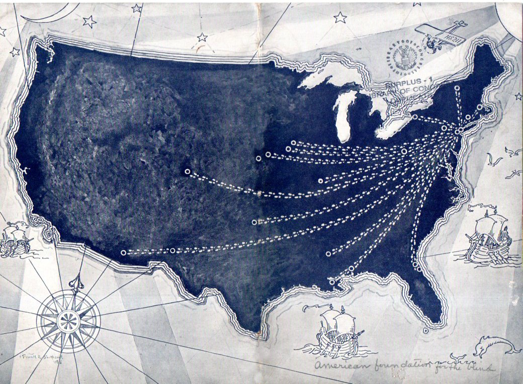
    After all of this time on this blog–six years now and 3,000 posts–I think that I would have paid more attention to Unintentional and Unexpectedly Odd Maps of America that bobble up here and about in the home collection. The are odd and strange maps though none really relegated to America–there are strange maps of NYC (as in NYC being disappeared, or lifted by strange anti-gravity implements to float serenely above its hollowed ground below)–but none of the entire country.  And so a few have come up, unexpected and unusual things, though not so much in and of themselves, but separately.  What I mean to say is that the maps (for the large part) make sense with regards to their texts–not terribly much though without.  And so, here are the first few (and brief) examples:
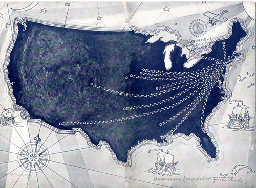
    Maps of US GIMP

    This rather strange example was printed as the covers of a pamphlet in 1928 and comes from the American Foundation for the Blind, simply showing the progression of the agency’s representatives extending out beyond the originating point of New York City, though on  first sight the map is very unusual, and naively odd.

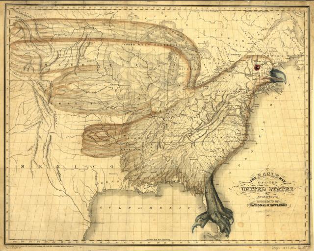
    This sort of map in the “Unexpected” category differs from the intentional oddness of maps like (the very recent) map of the U.S. showing distances to McDoanld’s, or I.W. Moore’s 1833 map incorporating an eagle into the design of the early RepublicMaps Eagle America
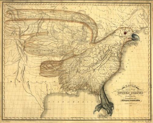
     or even the Porcineographic map of the U.S. of 1876:

    This porcineograph

    Again, they are very unusual images–particularly the latter–and they were trying to be so.  The Unexpected Unusual map is unusual but not by choice. 

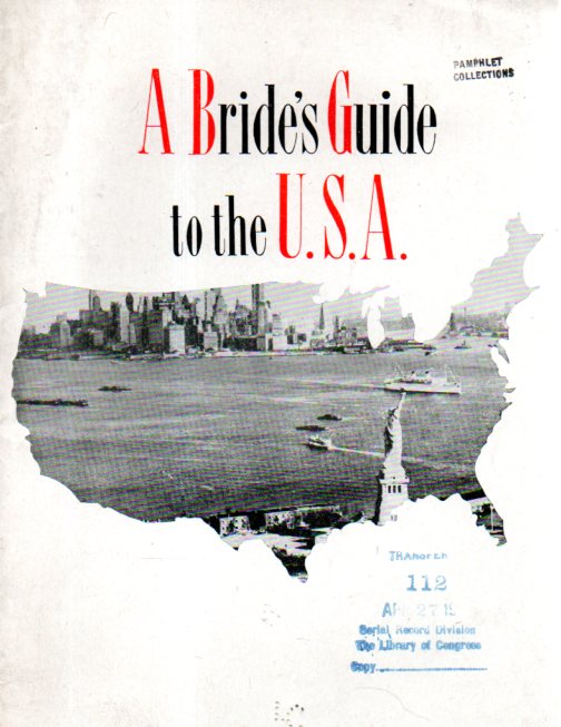
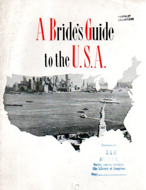
     Another example is the cover illustration for A Brides Guide to the U.S.A., which was intended for the (British) brides of American servicemen returning to the U.S. following the end of WWII.  More than anything, the whole arrangement of the pamphlet is just a little off.Maps of US 2 odd043
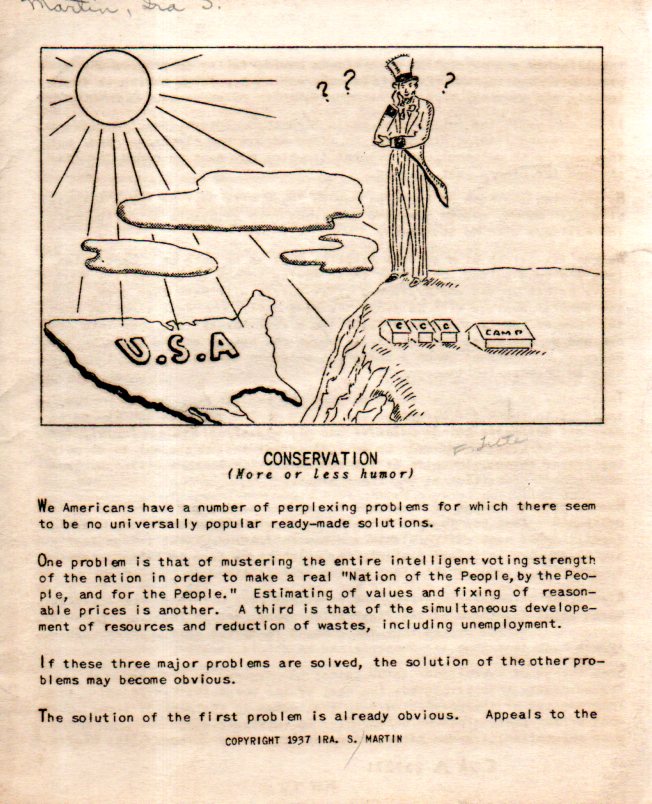
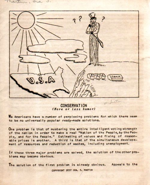
    And lastly, for now, comes a puzzling map from an oddly-named pamphlet called Conservation (More or Less Humor) which was an appreciation of some of C.C.C. camps (Civilian Conservation Corps) and shows little sign of authorship (“S. Martin”) and none of place of publication.
    Maps of US 3 odd044

     The whole production is pretty happenstance, somewhat crude, and probably quickly undertaken and completed, giving it an air of slim and slippery mystery.  The end result for the pamphlet cover, though is unusual, and a little creepy, somehow, and in a way it is a great representative of the Unexpected/Unusual/Unintentional in maps.  


  • NYC Ice–Glacial Mapping, 20,000 BCE

    JF Ptak Science Books  Quick Post   Part of the History of Lines series

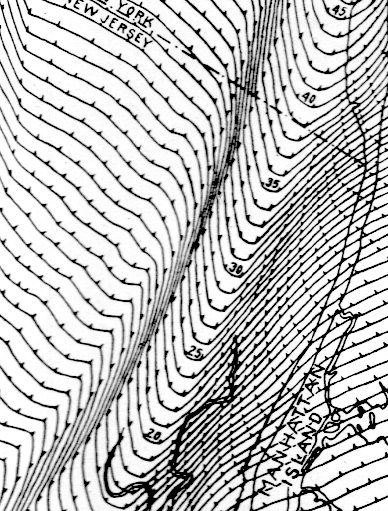
    In grazing “The Geology of New York City and Vicinity”, a pamphlet by Chester Reeds and printed by  the American Museum of Natural History (NYC) in 1926, I found these maps of the extent and thickness of the last glaciers in the region, and thought them quite lovely. 

    NYC glacier027

    This was the southernmost lobe of the Laurentide ice sheet, a vast plain of enormous ice that covered most of North America, the last bit of which dissipated around 22,000 years ago.  The maps reconstruct a bit of that glacial topography–the physical kind, not the one you’d experience walking around TriBeCa ina  brown suit.  Where the lines are closest together is the channel where the Hudson River would flow. 

    And the full map, one of three in the segment:


  • North American “Bird’s-Eye” View, 1558.

    JF Ptak Science Books  Quick Post

    The birds’-eye-view has always been of interest on this blog–particularly those that were pre-flight, when the iteration of distance and proportion and perspective were adventures in logic and design and mathematics–and imagination. 

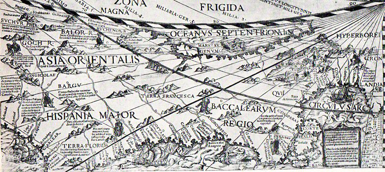
    The example below is from the upper left corner bit of a cordiform wall map of he world, a massive and old 4’x6′ effort, which was designed by Caspar Vopell (a map and globe maker, and a professor of mathematics at the University of Cologne) and printed in 1558, and was mostly the result of the map-maker’s projection.

    Vopell map819
    The map of course is spectacular, and the imagination and planning and vast expertise that went into the depiction of North America was impressive–staggering even.  It was an enormous leap of faith, that showed all of the new discoveries, stretching from Greenland to northern Florida, around part of the Gulf Coast, across the Southwest and California, and then on to, well, Asia.  Vopell depicted the west of North America as a part of Asia–and that according to Charles V, who collected/received information of all sorts of new discoveries and voyages.


  • Curious Maps & Images: Tornadoes, 1765

    JF Ptak Science Books   Quick Post  

     Follow Me on Pinterest

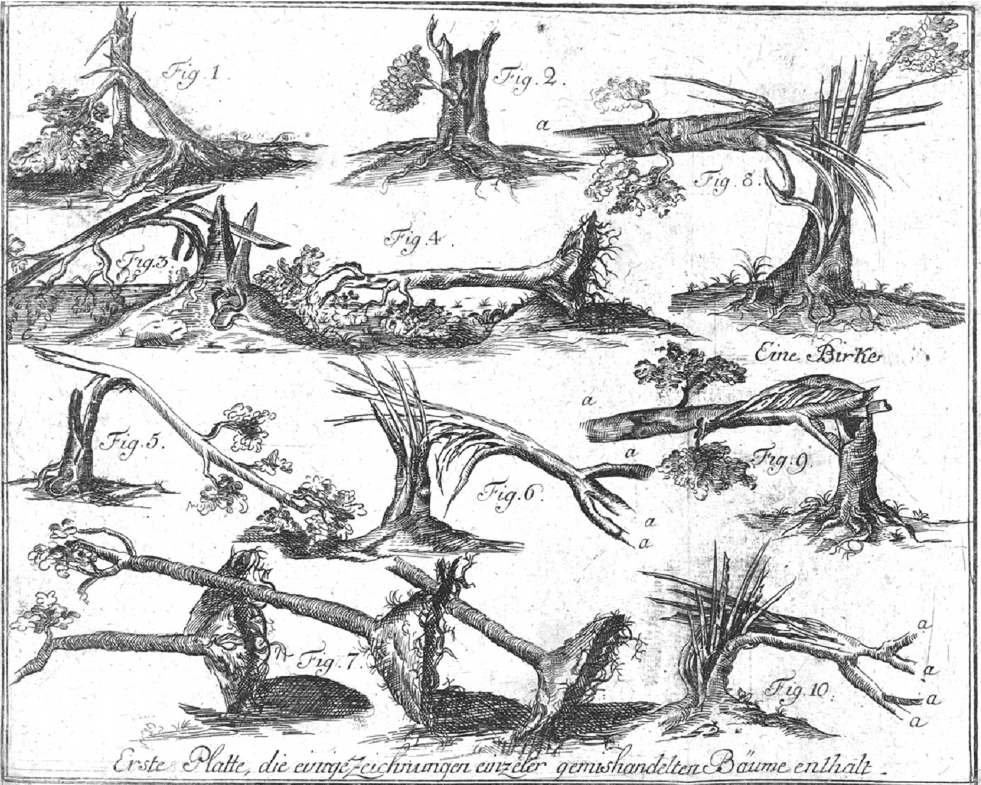
    Tornado trees

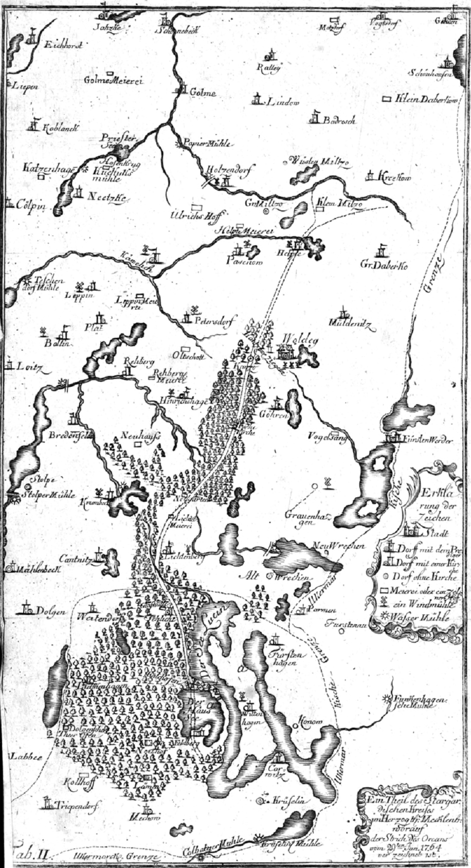
    In my experience antiquarian images of trees damaged and destroyed and torn up (and “enormously devastated”) by tornadoes are very uncommon things–ditto maps of the paths of tornadoes. (I found this image via a very interesting but seemingly unnamed blogsite, located here, dedicated to early images of waterspouts and tornadoes.)  They are found in Gottlob Burchard Genzmer (1711-1771), Umständliche und zuverläßge Beschreibung des Orcans welcher den 29. Jun. 1764 einen Strich von etlichen Meilen im Stargardischen Kreise des Herzogthums Mecklenburg gewaltig verwüstet hat, published by Friedrich Nicolai,  in Berlin (and Stettin), in 1765. [Full text] 

    Tornado map

    In any event, I have not much to say on these images save for the fact that I find them to be extraordinary, and wanted to share. 


  • A Map of Nobody Marching Through the Southern Mountains, 1865

    JF Ptak Science Books   Post 2137  One of a series of posts on the History of Blank, Empty,and Missing Things 
    Follow Me on Pinterest


    Civil war--mil map sherman asheville188

    In the history of blank, empty, and missing things in maps there can be maps with large expanses of nothingness (as in the case seen here with the Bellman’s map from Lewis Carroll’s The Hunting of the Snark, an Agony in Eight Fits), maps with mostly everything that was to be expected to be expected but intentionally wrong (as with these propaganda maps of the Polish and Czech “threats” to Germany), maps with large expanses of nothing because there was simply so data to be displayed, and so on.  And then there are the cases of perfectly good maps that are accurate and secure, but do not display what was thought to be there on the map but wasn’t because it really wasn’t there. 

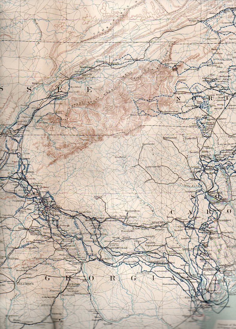
    In the store that I maintained in downtown Asheville, North Carolina, I was often asked about what sort of Civil War action occurred around those parts.  It is the sort of question that jumps out from maps showing troop movements during the war that you see on maps–maps without contour lines, or anything else that might show elevation. The answer to that question about Civil War battles here in the southern reaches of the Appalachians is that there was very little official action–and for the most part the reason for that is because there are in fact the Southern Highlands, and in the mid-19th century this very large region was just too bloody difficult to fight in or fight for. 

    This all becomes cartographically apparent when you look at the region with maps that give you an idea of the terrain. 

    There is an amazing map that shows you the extent to which this land was inhospitable for combat. The Military map of the marches of the United States forces under command of Maj. Gen. W.T. Sherman, U.S.A. during the years 1863, 1864, 18651…., which was originally published in 1865 but more widely known for its inclusion in the Atlas to Accompany the Official Records of the Union and Confederate Armies2 (full text here) in 1895.  As the map graphically shows, there are plenty of blu and gray lines depicting troop movements of the armies, though nearly all swarm around our mountainous region.

    http://farm6.static.flickr.com/5247/5281408282_bdec02e5a4.jpg

    Apart from the difficult terrain, the mountains, and general inaccessibilty, there wasn’t all that much to fight for up here–and so, aside from some regional skirmishes and a lot of political and social conflict, they didn’t.

    Civil war--mil map sherman asheville188

    At least not until the very end of the war, in the Battle of Asheville, April 6, 1865, where about 1500 soldiers met each other about 750 feet away from where we used to live, three days before Appomattox. The action there was indecisive, though Asheville was not taken by Union forces.

    And the detail:

    Civil war--mil map sherman asheville189

    Notes


  • Civil War Maps by the Great Mapmaker of the Confederacy, Jed Hotchkiss

    JF Ptak Science Books  Quick Post

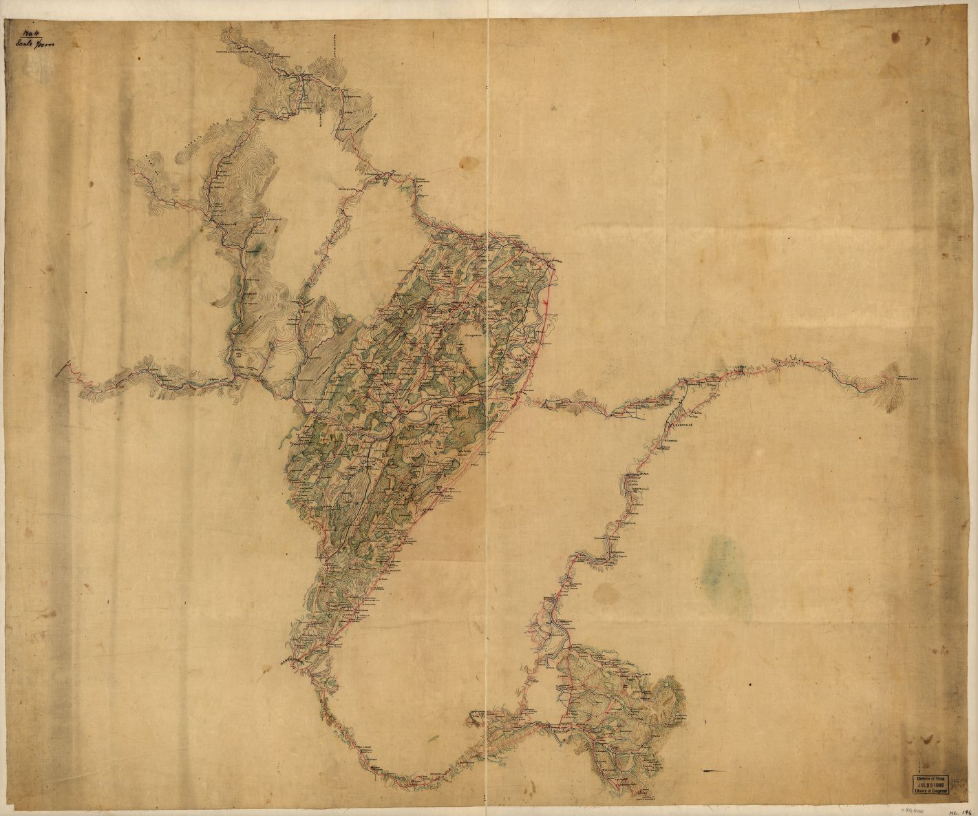
    I was searching for the “Make Me a Map of the Valley” map, the Stonewall-Jackson-directive map, that was made to devastating effect by the Confederacy’s leading cartographer, Jedediah Hotchkiss.[More on Hotchkiss here from the Encyclopedia of Virginia.] I saw this on display at the Library of Congress years ago–it is an enormous thing, about 22 square feet and more than 7 feet long (or tall, as it was displayed vertically then), filled with minutiae and just a splendid map of great detail put to extreme use by General Jackson (and Lee, and others).   The LC has the Hotchkiss Collection, their “jewel in the crown” of the Civil War maps there, and there is a great amount of it on display on the LC website.  The Big One, though, is not there in full.  I copied a few of some of the maps most interesting to me, and at the bottom is a link to the other 120 or so maps online by Hotchkiss.  

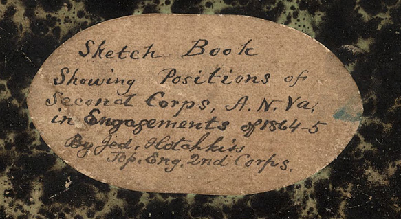
    Hotchkiss sketchbook cover copy

    [Above:  title for one of Hotchkiss’ workbooks, Sketch book of Jed. Hotchkiss, Capt. & Top. Eng., Hd. Qrs., 2nd Corps, Army of N. Virginia : [Virginia], “Shows general maps of northwestern Virginia and parts of
    Montgomery County, Maryland, with some showing roads, troop movements,
    and the names of some residents…”

    “The Hotchkiss Map Collection contains cartographic items made
    by Major Jedediah Hotchkiss (1828-1899), a topographic engineer in the
    Confederate Army. Hotchkiss made detailed battle maps primarily of the
    Shenandoah Valley, some of which were used by the Generals Robert E. Lee
    and Thomas J. “Stonewall” Jackson for their combat planning and
    strategy. Several of the maps have annotations of various military
    officers, demonstrating their importance in the military campaigns…”–from the LC site.  A good, long essay on the collection by Clara LeGear appears elsewhere on the LC site, here.

    All maps are expandable after being opened.

    Map of the Shenandoah Valley from Harrisonburg to Mt. Jackson, with
    topographical detail along the principal roads from Thornton’s Gap to
    Swift Run Gap and along several valley roads in northwestern Virginia:

    Hotchkiss mt jackson


  • History of Lines: Lines of Sight

    JF Ptak Science Books   Quick Post   History of Lines 

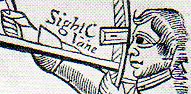
    These are particularly fine and relatively early printed images depicting a specific kind of line of sight–this one, a positioning, rather than a line of sight in fire control, or radial velocity, EM radiation or acoustics wave propagation, or targeting…this instrument was used to establish an imaginary line in perceived objects. 

    Sextant 237This is a detail from Andrew Wakley’s  The mariner’s compass rectified : containing tables, shewing the true hour of the day, the sun being upon any point of the compass ; with the true time of the rising and setting of the sun and stars, and the points of the compass upon which they rise and set … With the description and use of those instruments most in use in the art of navigation. Also a table of the latitudes and longitudes of places, published in 1763 and reprinted many times after that. (Full text is available from Google books and also from the Haithi Trust which offers a text version of the book as well.)