A Daily History of Holes, Dots, Lines, Science, History, Math, Physics, Art, the Unintentional Absurd, Architecture, Maps, Data Visualization, Blank and Missing Things, and so on. |1.6 million words, 7500 images, 4.9 million hits| Press & appearances in The Times, Le Figaro, Mensa, The Economist, The Guardian, Discovery News, Slate, Le Monde, Sci American Blogs, Le Pont, and many other places… 5000+ total posts since 2008.

Category: Maps, Cartography, History of Mapmaking

  • In Really, Really, “Dark” Africa (1879)

    JF Ptak Science Books    Quick Post

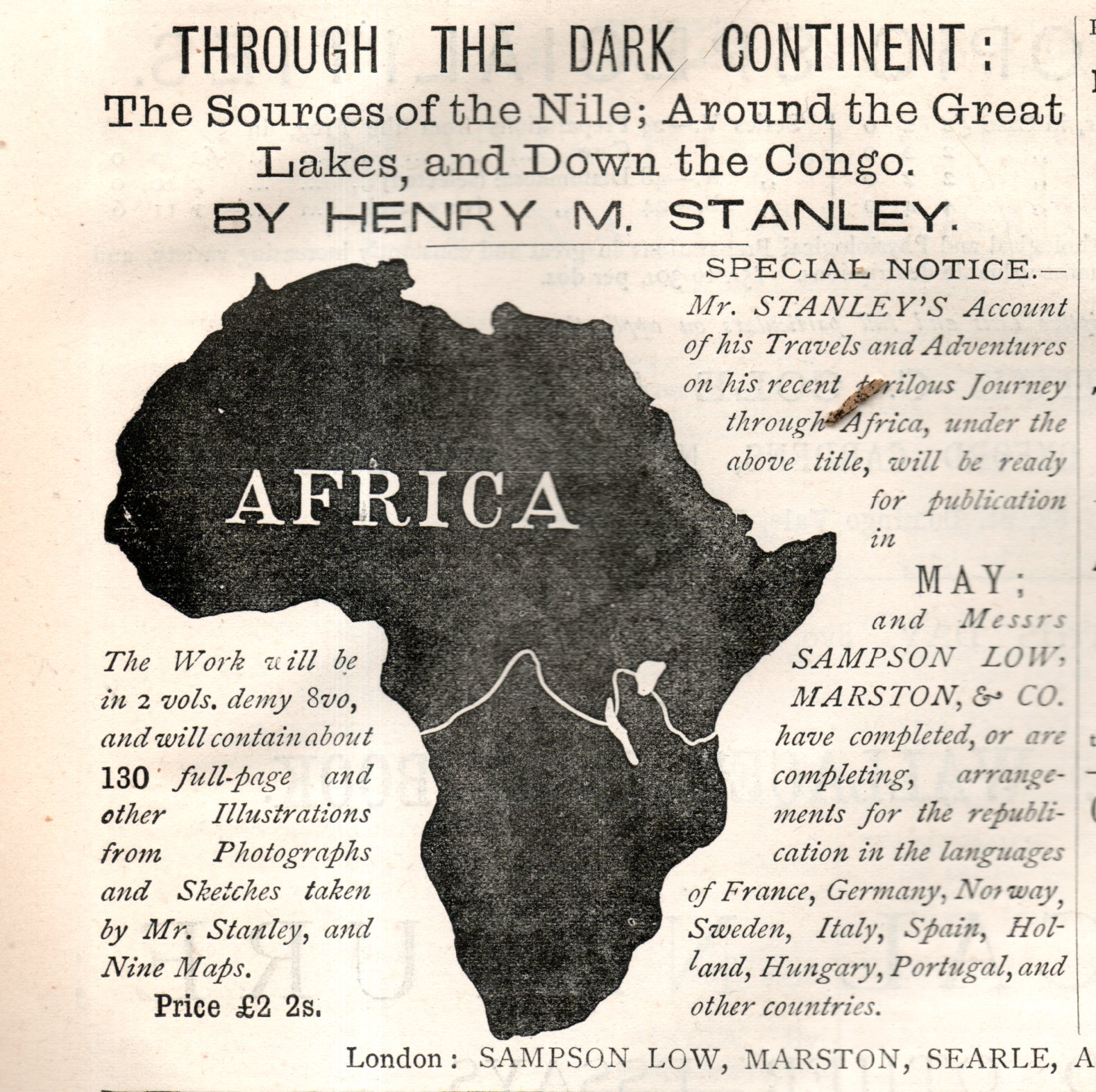
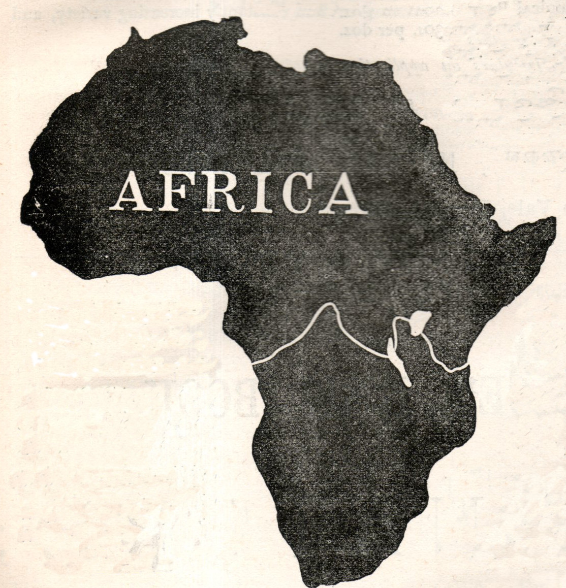
    Advertisers for Henry M. Stanley’s Through the Dark Continent could not paint Africa any darker than they did in this ad which appeared in the journal Nature on May 3, 1878.  Stanley plowed his way through Africa from 1874 to 1877, and was quickly into print on his return, which may have been more armed Imperial Pushing than it was a geographical expedition.  

    Africa, dark715detail

    Stanley published another book, In Darkest Africa. twelve years later in 1890, no doubt alluding to the unimaginably dark places of a dark place.  

    And just for the sport of it I had a quick tour around the massive 75,000,000-item database of library holdings in WorldCat and found that there may be only one other book earlier than Stanley’s published with dark/darkest Africa/Continent in the title (Christian Liberia, the Hope of the Dark Continent, with Special Reference to the Work and Mission of Edward S. Morris, 1838). After Stanley’s book was published there are easily dozens of other books using that phrase published between 1878-1900. So there’s that. In my long career of looking at maps I cannot recall the continent appearing on world maps as simply an entirely blacked out/filled-in geographical region–certainly in earlier maps of Africa (or at least before 1900) the unknown spots were simply left blank; the older the map the more likely it was to be that the blank spots were filled in with unusual representation of flora and fauna.  But never, it seems to me, was it just entirely black.  

    The full add looks like this:

    Africa, dark715


  • Beautiful Lines: Depicting Voyages of Discovery, 850-1850

    JF Ptak Science Books   Quick Post

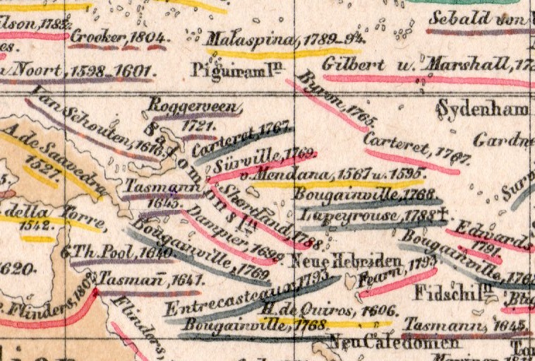
     This small detail (measuring about 1/3″ square) is from a fine, detailed, and oddly beautiful map (itself only about 12×9″) which was published in the atlas volume1 to accompany the best-selling encyclopedic presentation of the natural history knowledge of the world to that time, Baron Alexander von Humboldt’s Kosmos, which was published over a period of several from 1845-1862.  

    Map visualization ocean currents657

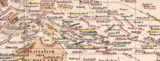
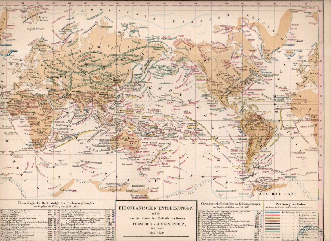
    The map is titled Die Ozeanischen Entdeckungen und die  um die Kunde des erdballs verdienten  Forscher  und Reisenden vom Jahre 840-1850, and depicts voyages of discovery for a milennium, 850-1850. It is a terrifically-detailed map, even among highly-detailed maps. (This detail is taken froma 1×2″ section seen here:)

    Map visualization ocean currents656


    And the full map:

    Map visualization ocean currents655

    Notes:

    1.  The atlas was by T. Bromme, Atlas zu Alex. V. Humboldt’s Kosmos in zweiundvierzig Tafeln mit erlauterndem Texte. Herausgegeben von Traugott Bromme. Stuttgart. Verlag von Krais & Hoffman. (with second title page) Atlas zur Physik der Welt in … Bromme, 1851. 


  • A Solid Ring of Neutrality–German Propaganda, 1940

    JF Ptak Science Books  Quick Post

    German trade war539

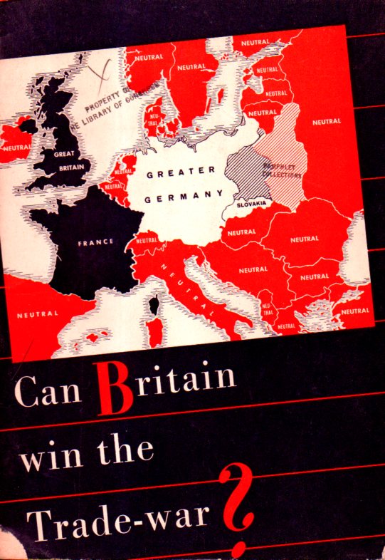
    One thing is for sure–this pamphlet, which has no place of publication or date–was definitely a German war propaganda effort, printed in English, published in Germany, and I guess distributed wherever the English-language-winds and luck would take it.  My copy come from a collection that I purchased from the Library of Congress, and it is luckily stamped August 6, 1940, for the date it was received by the library. So the summer (or earlier) of 1940 is the date: the Battle of Britain had begun in July, Dunkirk had been evacuated June 4, France surrendered a few weeks later, and the war was not going well for the U.K.  Germany was still a year away from their disastrous attempt to conquer the Soviet Union with Operation Barbarossa, and at this time in 1940, the U.S.S.R. was its vital trading partner. Great Britain was waging a successful economic war/blockade against Germany, which was without any real finance and with no reserves to purchase foreign goods, so in spite of the successes of the invasions and Blitzkreig, the Brits were enjoying a certain level of success. And so this pamphlet appears, one of others, a small part of a hearts-and-minds campaign to try and apply pressure to Britain’s allies to convince her to sue for peace.  

    German trade war540

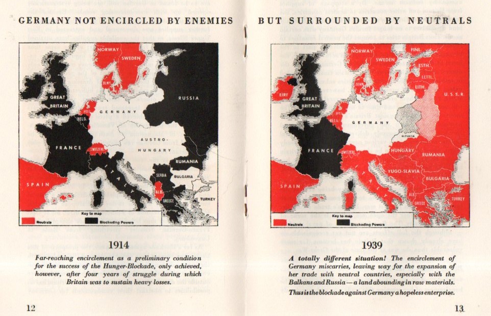
    The main thrust of the maps of the pamphlet was to show Germany surrounded by not-threatening allies, pillowed by neutrals and countries it had overtaken (with no attempt made to label Poland).  The interior map (above) is a very faint attempt to show the comparative strength of Germany being surrounded by neutrals in 1939 as compared with being surrounded by enemy countries in 1914. The message of course was that Germany was strong in 1914-1918 in spite of the “threatening” neighbors, so with relatively benevolent neighbors in 1939 they would be even more effective as a war-making national machine.  Perhaps this had some influence somewhere, maybe among the Vichy French.  And some elements in the U.S. 

    The Nazis certainly liked their red.


  • Beautiful Lines: Depicting the Climate, 1851

    JF Ptak Science Books  Quick Post

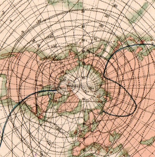
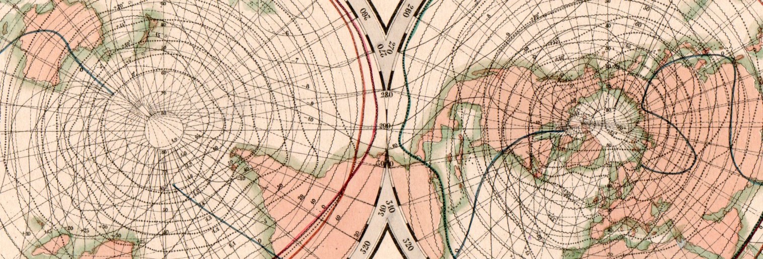
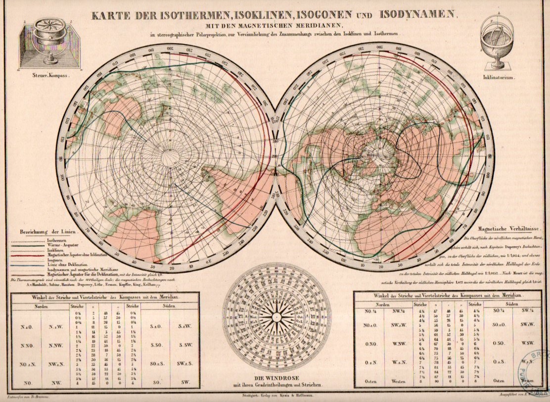
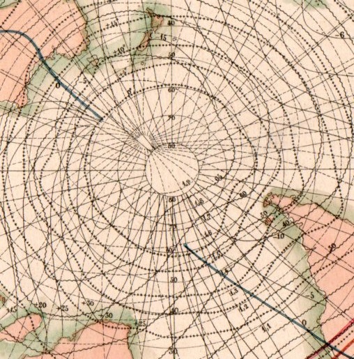
    This beautiful network of lines tells the early story of weather in cartographic form. They appear on Karte der Isothermen, Isoklinen, Isogonen und Isodynamen mit der Magnetischen Meridianen, and was published in the atlas volume1 to accompany the best-selling encyclopedic presentation of the natural history knowledge of the world to that time, Baron Alexander von Humboldt’s Kosmos, which was published over a period of several from 1845-1862. The map demonstrates and visualizes climatic information showing isothermes, isoclines, isogones and isodynamics, with the magnetic meridian.

    Map visualization isotherm653

    [This is a detail of the Northern Hemisphere section of the double-hemisphere map, which is reproduced below.]

    Map visualization isotherm654

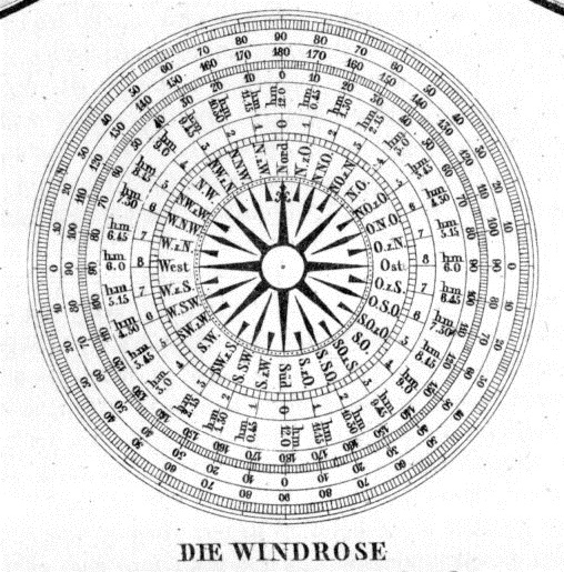
    At bottom there is also a beautiful 32-point wind rose:

    Map visualization isotherm651

    And this, the full version of the map:

    Map visualization isotherm650

    And the detail of the Southern Hemisphere:

    Map visualization isotherm652

    Notes:

    1.  The atlas was by T. Bromme, Atlas zu Alex. V. Humboldt’s Kosmos in zweiundvierzig Tafeln mit erlauterndem Texte. Herausgegeben von Traugott Bromme. Stuttgart. Verlag von Krais & Hoffman. (with second title page) Atlas zur Physik der Welt in … Bromme, 1851. 


  • A Very Early Comparative Display of Lakes and Islands (1851)

    JF Ptak Science Books  Quick Post

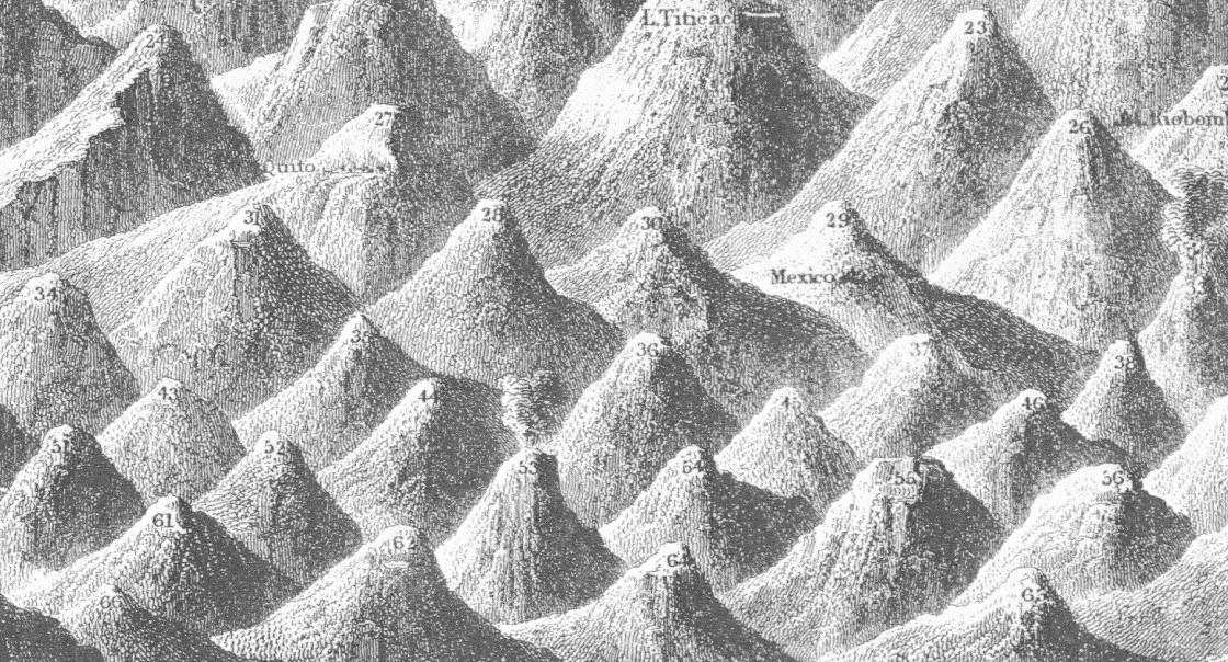
    Mountain comparative detail mtns

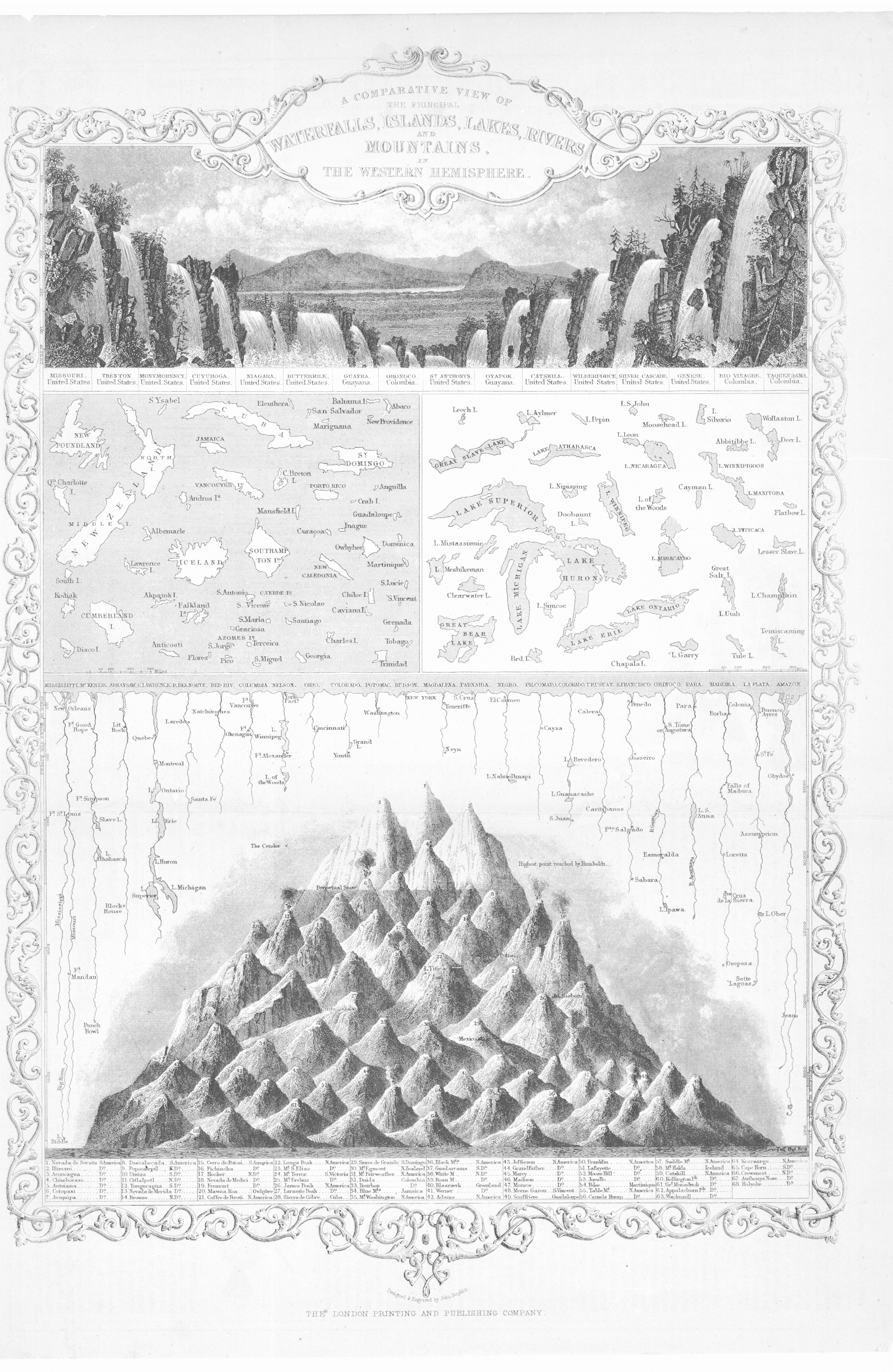
    The 1850’s  may have been the heyday of atlases appearing with illustrations of comparative river lengths/mountain heights;  from 1840-1880 or so was the period in which the majority of descriptive comparatives were published.  This is when you would see images of the lengths of rivers and the heights of mountains and waterfalls beautifully displayed in atlases, everything visually presented in high design and memory-forming fashion.  I don’t know what happened after 1880, but the publication of this sort of data in beautiful and provocative formats really fell off, with the heights of mountains/lengths of rivers stuff relegated to filling the empty areas in the corners of double-hemisphere world maps.  

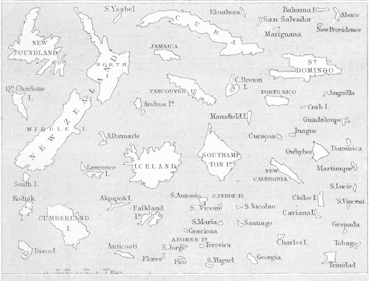
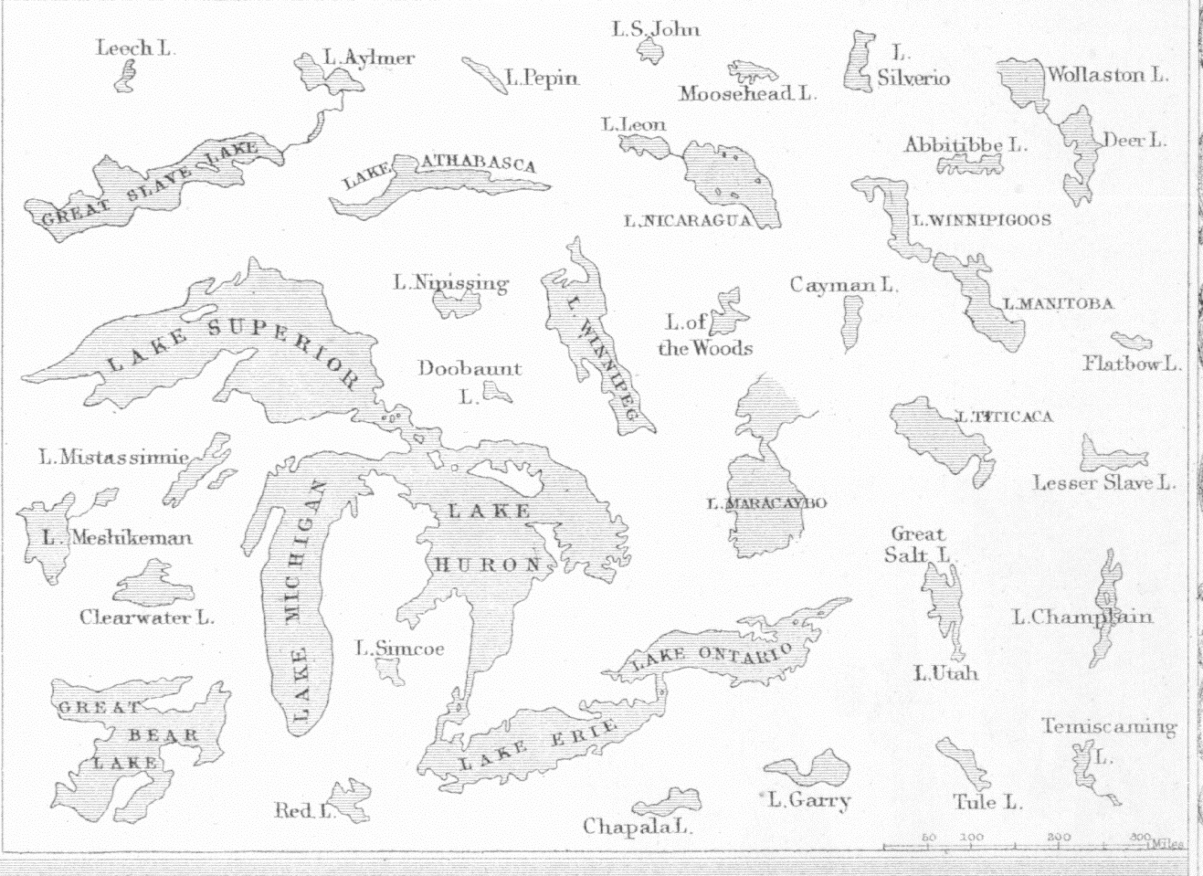
    The example below (from R. Montgomery Martin’s Illustrated Atlas, 1851) is interesting because in addition to the standard mountain/river material, there is also the height of waterfalls; and, in a move that was probably very early as a practice, there are two sets of images that show lakes and island compared to one another on the same scale. Of course maps are composed of data that is necessarily set in the same scale, but here we see just the lakes and just the islands removed from their context and laid into a pool of similar objects.  It is a mystery why this would’ve taken so long to happen, but it is also the case that the first comparative architecture depicting different buildings placed in an illustration that were on the same scale did not occur until the work of J.N.L. Durand in the surprising “late”year of 1800 (in his Recueil et parallèle des édifices de tout genre…), which is a curious thing.A Ver

    Mountain comparative

     And the detail of the lakes and islands:

    Mountain comparative detail islands

    Mountain comparative detail lakes


  • L.A. Through the Looking Glass, 1912

    JF Ptak Science Books   Quick Post

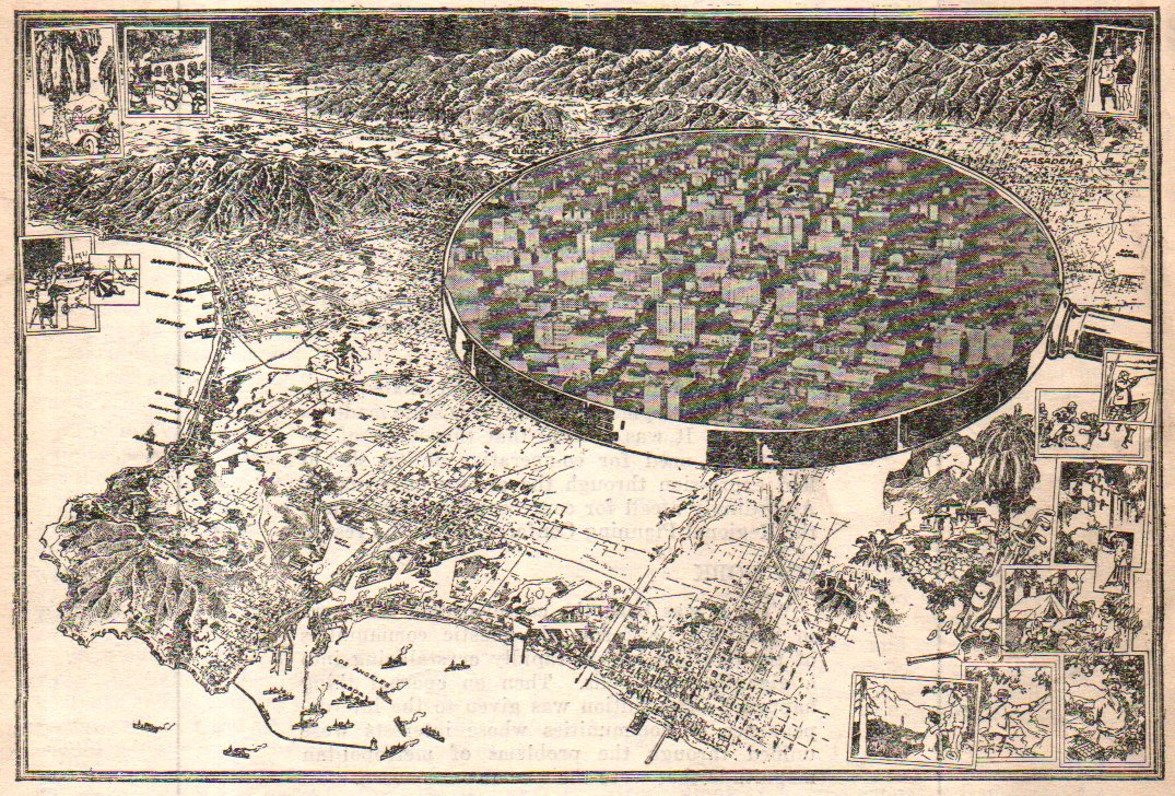
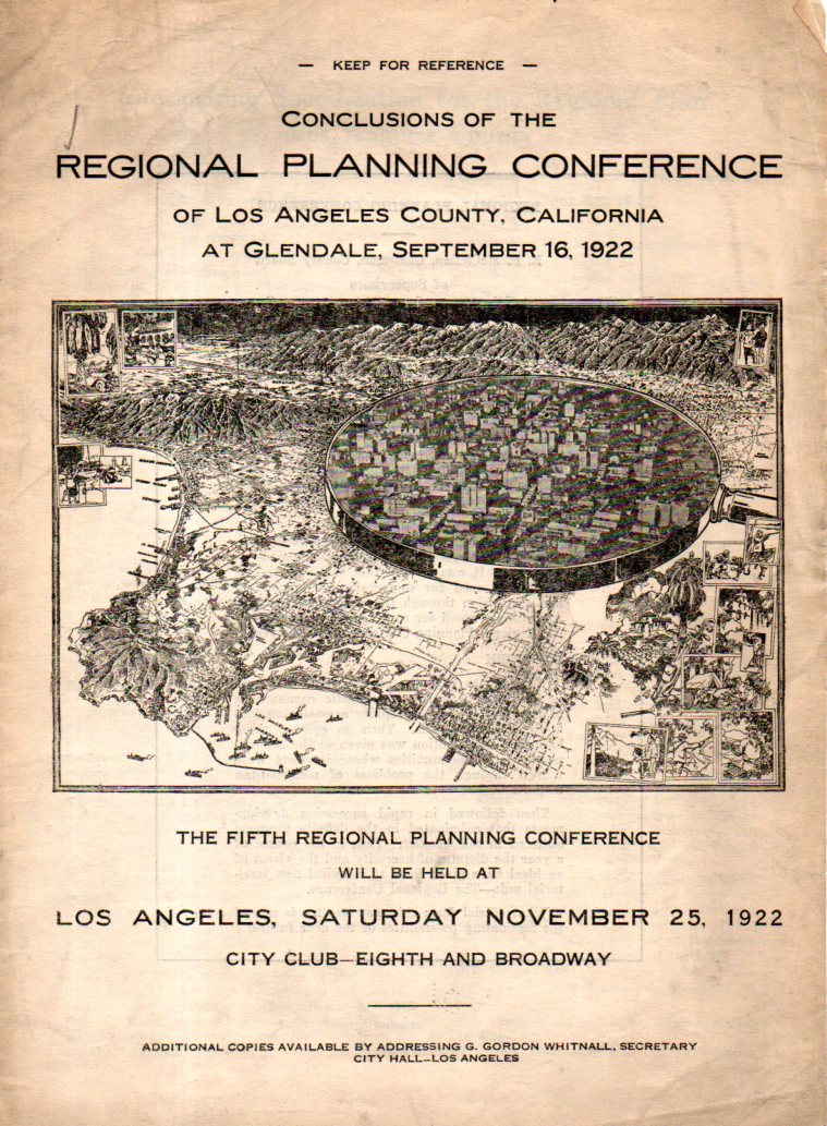
    This is an unusual bird’s-eye view of the Great Los Angeles area, the downtown area shown larger under a magnifying glass. It forms the central image of the cover of a pamphlet on the regional planning conference for L.A. County which took place in September 1912. I have not seen an image of the map online, and checking WorldCat I see that there is only one copy of the work located in libraries world wide (and this at Harvard), and so I’ll share it here.  

    LA Map529

    The metal ring of the magnifier does have the appearance of a 20-story tall wall, but it really is part of the instrument. It reminds me too of a mirror, of the mirror of the other Alice, the one from Lewis Carroll’s  Through the Looking-Glass, and What Alice Found There (1871), where Alice steps through the looking glass–in this case what we see in this lookig glass is the L.A. of the future that the planners could see.  

    The map is a detail from:

    LA Map530


  • The “Where, When, and How” of Attacking Berlin (1943)

    JF Ptak

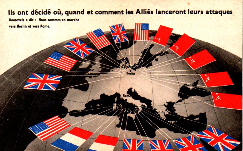
    I found this arresting map in a tiny publication called …Sans Condition, which was published in the first half of 1943. The publication is only 12 pages long but has a number of evocative images of Germany being bombed and lines of German POWs, in general a propaganda piece for French-speaking folk (which was printed god-knows-where) produced deep in the war and at a time when the tide has about turned on the Nazi regime.  

    The title of this post is the title of the map,  “Ils ont decide ou, quand et comment les Allies lanceront leurs attacques”–and you don’t need to know French to know what it says.  

    Map Berlin attacked426

    And the cover, which is basically “Surrender Without Condition”:


  • A Bestiary in Maps?

    JF Ptak Science Books   Post 2351

    In the history of cartography besides the construction of map-y maps there are maps that stray beyond the strict geographical diction of necessity, some of which edify the data and others which creatively explain or decorate it.  There are unusual maps of hobo travel, the Garden of Eden, Hell, Heaven, moles, hair growth direction, slavery, suffering, invasion routes, time, prisons, aliens, population density, disease, education,  paved roads, trolley, electric lights, sewers, fire damage, and on and on, some of which are created in a way to make the map more identifiable and to also make it, well, fun, or at least more accessible.  Then there are maps whose explication or decoration or alliteration have little to do with the geographical reasons for the map existing in the first place. And this leads us to today’s post.  

    I think it certainly possible to assemble a bestiary of maps–maps that take the qualities of an animal, or animals…I’ve seen a number of maps that show distributions of animals without taking their forms, and a lesser number representing a geographical area by an animal, but I do think it is possible to wrangle together not only the bestiary but also nearly an entire alphabet of animal maps.  That will need a little work.  For the start of it we have the following: 
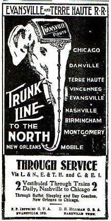
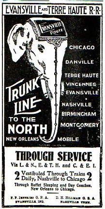
    Map--trunk line367

    [Source: the Confederate Veteran, volume 11, 1903, page 184.] This needs little comment except to say that it is interesting and that it shows up in an interesting publication.

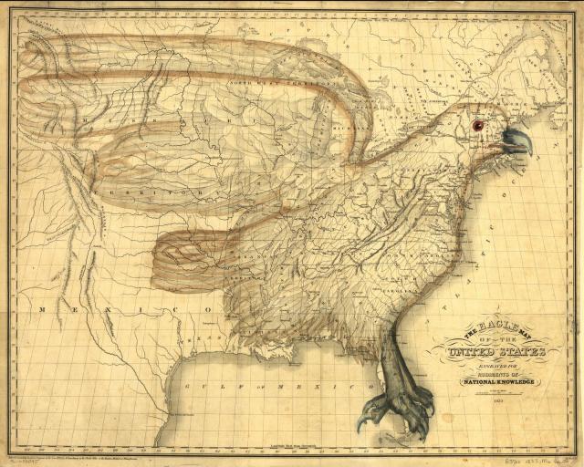
    Next is a great and rare classic, I.W. Moore’s 1833 map incorporating an eagle into the design of the early Republic, from  the Library of Congress (here):
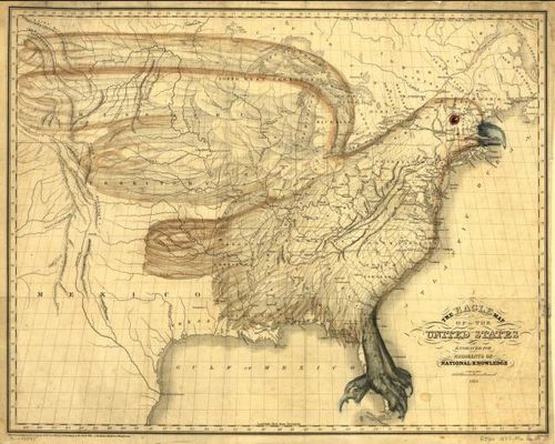
    Maps Eagle America

    The full text of the book in which it appears here (At Archive.org) and the cumbersome text relating to the map (on pp 244-249) is included below in the notes section.  

    There are also the advertisement/comical efforts like the Porcineographic map of the U.S. of 1876:

    This porcineograph

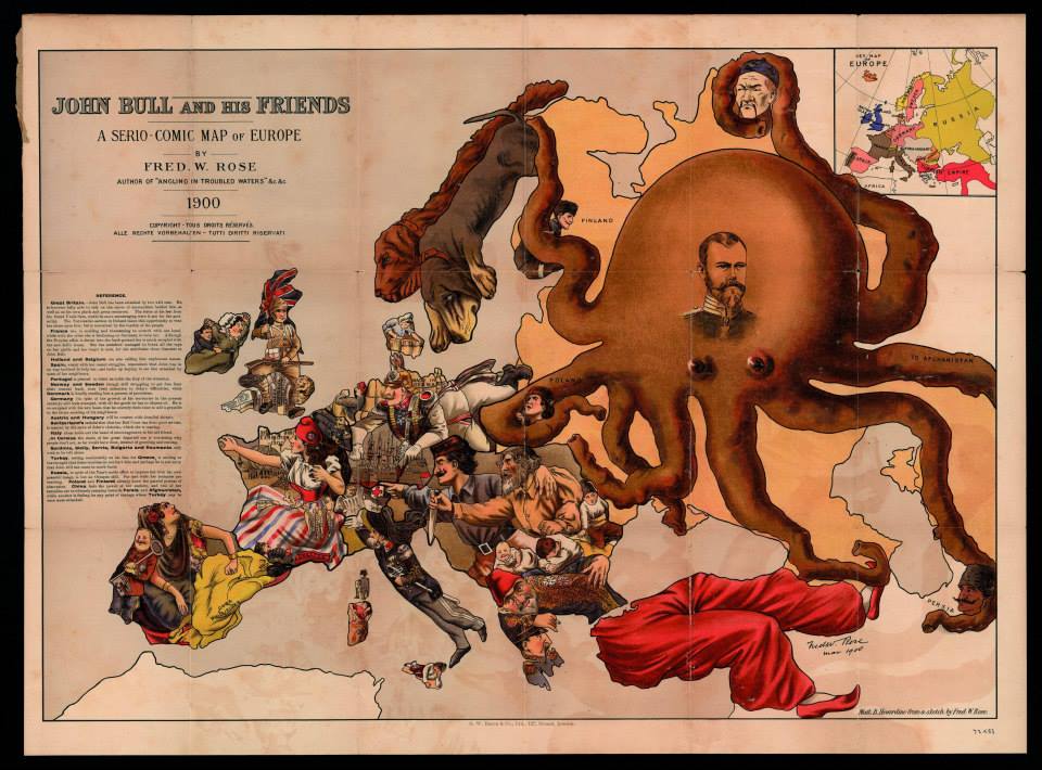
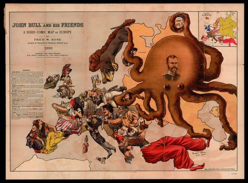
    And the Russian octopus map,  John Bull and His Friends. A Serio-Comic Map of Europe By Fred W. Rose…printed in 1900, and found at the Yale University Library Digital Collections, here:
    Europa c

    [With thanks to Mark Dylan Sieber‘s Les Curiosites de Cartes, whose Twitter feed started this interest.]

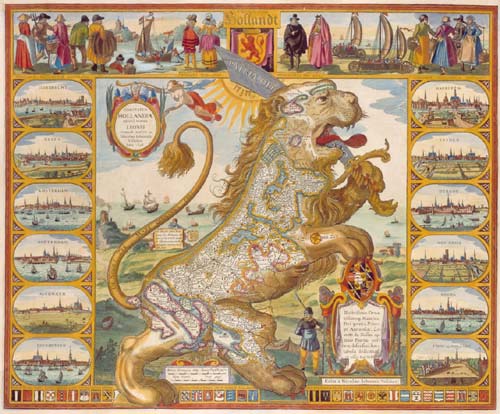
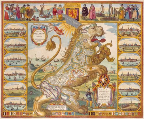
    There are also more maps in a “series” similiar to the Leo Belgicus:
    Leo belgicus

    [Source: Wikipedia, here.]

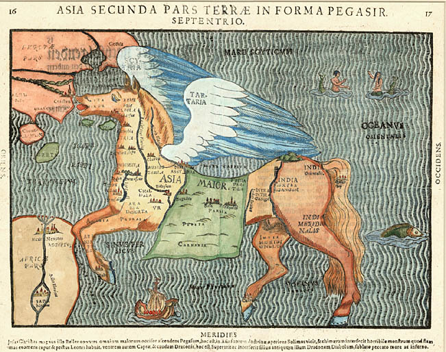
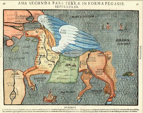
    And then there’s the mythological part, with Pegasus, with Heinrich Bunting’s  Asia Secunda Pars Terrae In Forma Pegasir (1581):
    Maps pegus

    [Source: Barry Ruderman’s mapselling blog, here.]

    Well, this is a start, anyway, covering Elephant, Lion, Octopus, Eagle, Pig, Horse..  It may be a long haul…

    Notes:

    CHAPTER XXXIX. 
    
    THE EAGLE MAP. 
    
    On presenting to the public a map upon the con- 
    struction here imperfectly exhibited, if an apology 
    be not necessary, perhaps at least, some notice of the 
    origin of the idea, and some of the reflections of the 
    author upon it, may not be misplaced. 
    
    The first sudden impress of the form of the figure 
    upon his attention, was under a combination of pe- 
    culiar circumstances. A map of the United States 
    happened to hang upon the wall of his apartment, 
    upon which a dim lamp light was reflected. The ef- 
    fect of the light, in the particular position in which it 
    was accidentally placed, seemed, as reflected from the 
    various colourings of the map, to cast a shade over 
    the state of Maine, and to mark a kind of separation 
    between it and the adjoining territory. The close 
    connexion of this state, as, always, under a common 
    view, necessarily combined with the great general 
    ground plan of the Union, he conceives to be the 
    principal reason why the notion of the figure has not 
    before been apprehended. 
    
    On its first presentation, he was disposed to discard 
    the idea, as merely a sportive play of the imaginar 
    tion, unworthy of notice. The figure, however, once 
    impressed, could not be eflaced from the imagination; 
    but was ever afterward in view when his eye happen- 
    ed to glance on a map, till he was at length induced 
    to give the subject a share of consideration, regarding 
    its possible usefulness and moral bearing. 
    
    Arguments which presented in favor of construct- 
    ing a map embracing the plan of the figure, appeared 
    conclusive with relation to the youth engaged in the 


    THE EAGLE MAP. 245 
    
    study of the geography of our country. Those argu- 
    ments were founded upon an apprehension of the in- 
    creased facility with which lessons may be impressed 
    and retained upon the youthful memory, when the 
    aid of figure, adapted with a tolerable degree of accu- 
    racy to the subject of study, can be resorted to. To 
    this opinion it is presumed teachers in general will 
    readily yield their accord, without further remark 
    upon the questions of Why? or Wherefore? 
    
    When extending his reflections further, the recollec- 
    tion was of course present, that the figure of the eagle 
    was the figure adopted by our national councils, as our 
    national badge. In this point of view, the coincidence 
    appeared as a circumstance peculiarly striking. A fur- 
    ther singular and surprising coincidence presented it- 
    self, in the circumstance that the bird is placed in a 
    position perfectly correct, with respect to a corres- 
    pondence with the lines of latitude and longitude; no 
    variation from the common principles of constructing 
    maps being required, to place it in a natural position. 
    
    As the subject has occasionally occupied a further 
    extension of thought, a variety of serious moral reflec- 
    tions have occurred to the mind of the author, in 
    which he is not disposed to anticipate his intelligent 
    readers, who are altogether capable of reflecting for 
    themselves. He will, therefore, under this head, con- 
    tent himself with offering a supposition of a single 
    example, illustrative of the manner in which visible 
    objects, as they stand associated in the mind with 
    ideas of order or deformity, may possibly be more or 
    less productive of moral effects. 
    
    If, from a selfish, or misguided policy, the citizens 
    of any one state, should propose to separate their in- 
    terests from the interests of the Uiiion, and claim a 
    right to withdraw from the general connexion, the 
    ugly chasm which would be produced by carrying 
    their design into effect, would be aptly represented 
    by supposing a line of separation drawn round the 
    seceding state, and admitting its whole internal de- 
    clinations, and even its very name, to be blotted out 
    21* 


    246 THE EAGLE MAP. 
    
    from the eagle map of the United States, — the signs 
    and notices, of all the delightful alternations of river, 
    mountain, hill, and plain — of cities, the seats of com- 
    merce and refinement — of villages, the abodes of in- 
    dustry and social enjoyment — of the rural residences 
    of friends whom we love — all shrouded, in a shade 
    of gloomy, impenetrable darkness — and then observ- 
    ing the distortion which would be thus effected, in the 
    beautiful figure before us. Thus, might not a moral 
    repugnance be strengthened, against the open or in- 
    sidious attempts, of artful, designing men, who might, 
    for some ignoble or selfish end, be disposed, by de- 
    ceiving their fellow citizens, to attempt a disorganiza- 
    tion of the republic? 
    
    In the common representations of the eagle as the 
    American ensign, an allusion seems to be generally 
    intended to a martial spirit; and it is therefore repre- 
    sented with an aspect of fierceness, and in an attitude 
    prepared for war. Here, on the contrary, having 
    possession of the whole country, and no enemy to 
    contend with, it is designed to appear as the placid 
    representative of national liberty, and national inde- 
    pendence; with an aspect of beneficent mildness, and 
    in an attitude of peace. 
    
    It is therefore to be conceived of, as having be- 
    come wearied and disgusted, with the oppressions, 
    perpetual discords, and tyrannizing of power over 
    right, prevailing from age to age in the old world, 
    and as having, in consequence thereof, taken its flight 
    across the western ocean, in search of a resting place; 
    where its administration of equal rights might be duly 
    appreciated and respected. 
    
    Having arrived at the shores of this western world, 
    and taken its aerial circuits with the continent under 
    review, it appears as though arresting its flight — its 
    wings raised with a graceful, natural, and easy curve, 
    as relinquishing their hold on the buoyant atmosphere 
    —and its feet extended, as in the act of gently settling 
    on the rocks of the Florida reef, to exercise a benign 


    THE EAGLE MAP. 247 
    
    presidence over a territory equal to the length and 
    l)readth of its own shadow. 
    
    Thus it appears as overshadowing the whole ex- 
    tent of the United States and territories, excepting the 
    state of Maine, and the home of the natives in the 
    distant regions of the west. The citizens of Maine, 
    it is presumed, will not be offended at the impossibi- 
    lity of comprehending their department in the Union, 
    within the regular form of the figure, when we assign 
    to it the appellation of the cap of liberty, attached to 
    the eagle's head. 
    
    The present small map, is supposed to be sufficient, 
    in its internal delineations, to serve the purposes of 
    illwstrating the subjects of the volume which it ac- 
    companies. It may also serve to impart a fair gene- 
    ral idea of the design of the figure. Yet it has not 
    the least pretension to showing a specimen of the 
    elegance, with which the combined circumstances of 
    coincidence of figure, and geographical utility, are 
    capable of being represented. By an enlargement of 
    the scale alone, the proportions of the figure would 
    be presented to the eye, with a general aspect greatly 
    improved. 
    
    It is contemplated to issue, simultaneously with 
    the present volume, proposals for publishing by sub- 
    scription^ an eagle map of the United States, upon a 
    large and liberal scale; to be executed by the ablest 
    artists in a superior style; and intended to furnish an 
    appropriate ornament, to decorate our halls of legis- 
    lation, judicature, literature, and science, with the 
    library of the retired gentleman, the office of the law- 
    yer, and the retreats of the farmer, manufacturer, and 
    merchant. It is conceived that the ornament would 
    be likely to be viewed with peculiar interest and gra- 
    tification, because of the circumstance of containing, 
    in correct proportion, a representation of our beloved 
    country. 
    
    In the large map proposed, much of the common 
    minutia will be omitted in the engraving, in order to 
    show the figure with greater advantage and beauty. 


    248 AGRICULTURE. 
    
    All the most important items, will, however, be re- 
    tained, and the place of the smaller supplied by a 
    neatly printed and bound accompanying volume of 
    references; so arranged, as to render all the usual pur- 
    poses of a map of the United States complete. In 
    exchange for the omitted minutia, will be engraved, 
    the regions of our different mineral and vegetable pro- 
    ductions, with various other interesting and ornamen- 
    tal delineations, never heretofore presented in similar 
    works. 


  • Propaganda and the American West, 1884

    JF Ptak Science Books    Post 2338

    Public Domain Map

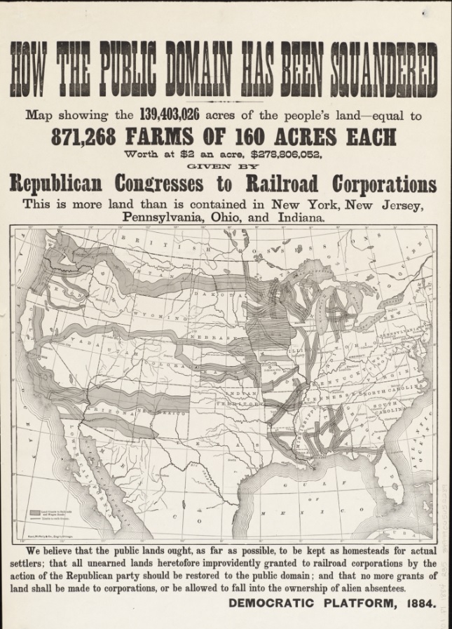
    [Image source: Boston Public Library, here.]

     This propagandistic political broadside and map had an influence in the thinking of voters in the 1884 presidential election–and in fact it was mostly wrong.  That “wrongness” was perpetrated for the Democratic Party at the expense of the Republicans, and held influence for dozens of years in helping to form the idea that the Republicans gave away huge chunks of American land to railroad companies in corrupt deals.  

    The map: How the public domain has been squandered, map showing the 139,403,026 acres of the people’s land – equal to 871,268 farms of 160 acres each, worth at $2 an acre, $278,806,052, given by Republican Congresses to railroad corporations , published by the Rand, McNally & Company, Chicago, 1884, is the culprit.

    Well, some healthy percentage of those land deals were rigged/crooked–but not nearly all; and in fact there were huge sums of money raised by the government in granting enormous land offerings to the railroad companies, who were also monetarily encouraged to continue making their ways west.   There were definitely multiple aspect in all of this.


  • A Good Example of a Bad Map, 1867

    JF Ptak Science Books  Post 2327

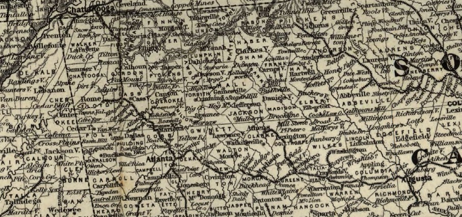
    When I had an open shop I almost always maintained an antique map/print part in the front,airy, high-ceiling space and had my hardcore science stock in the back. (People who were after that sort of book/info had tunnel vision, generally, so location hardly mattered, so long as the books were there, a trait and characteristic I highly admired.) Generally speaking this was not true with the map/print buyers, or at least the occasional purchaser, so they had “pretty” dedicated to their comfort.  

    Over the years I heard many thing from people trying to noodle out the reasons for old maps, and all of that was fine, and even the not-self-flattery comments flowed by like a lazy stream with a snapping turtle in it.  The one comment I did not like and which I always corrected had to do with how “bad” a map of North America (or wherever) was when it was drawn in say 1783.  Long story short, the maps were spectacular given the era and the technical capability and the amount of information on hand. (Also if people were told they needed to go out right now and make a map with standard 19th c mapmaking/surveying instruments, most had absolutely no idea how to procede.)  There aren’t all that many “bad” maps floating around, except for those determined to be misleading that have been issued by various intelligence and mapping agencies around the world.

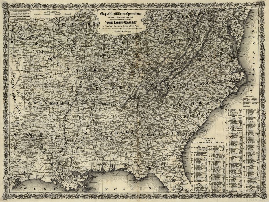
    That said, there are some badly designed maps, and when you have a map with a badly constructed premise for presentation that makes the thing difficult to use, you have created a “bad map”.

    I say this because I just bumped into one, and here’s a detail of what I’m talking about:

    BaD MAP

    Just because you pack data onto a map doesn’t make it good, and this one is about as gritty as a half-cooked cornmeal pancake.

    So, when you have the time and the capacity and the data and you produce a map that is unyelding and impenetrable in spite of all the good it has going for it (not the least of which is interest), then you have created a bad map.  

    Source: Library of Congress

    “Map of the military operations during the war of 1861-1865 designed expressly to accompany The lost cause,” a standard southern history of the war.  George Woolworth Colton, 1827-1901, and published in New York by  E. B. Treat & Co., ca. 1867.

    Bad map 2