A Daily History of Holes, Dots, Lines, Science, History, Math, Physics, Art, the Unintentional Absurd, Architecture, Maps, Data Visualization, Blank and Missing Things, and so on. |1.6 million words, 7500 images, 4.9 million hits| Press & appearances in The Times, Le Figaro, Mensa, The Economist, The Guardian, Discovery News, Slate, Le Monde, Sci American Blogs, Le Pont, and many other places… 5000+ total posts since 2008.

Category: Maps, Cartography, History of Mapmaking

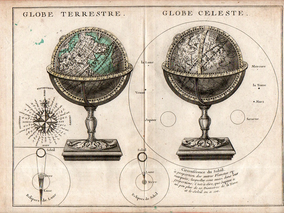
  • Details in Terrestrial/Celestial Globes, 1723

    JF Ptak Science Books   Quick Post

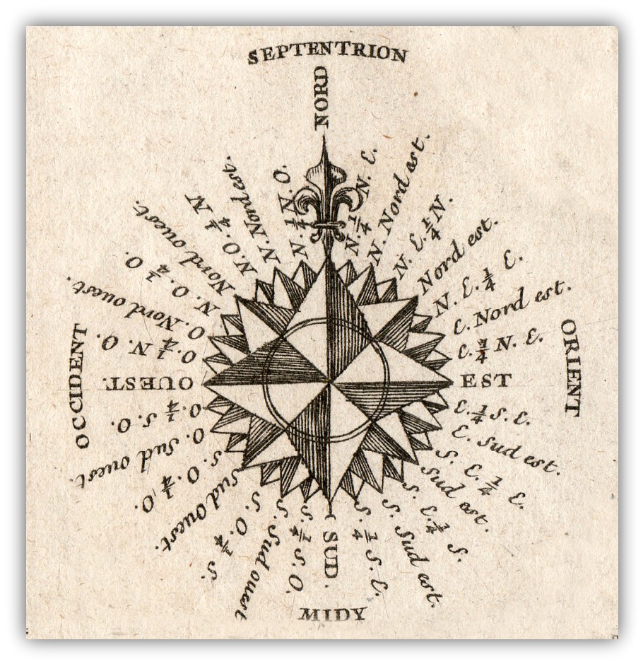
    The main object in this engraving–the presentation of two globes, one terrestrial and one celestial–is perhaps less interesting than secondary figures accompanying it.  The two small insets of solar and lunar eclipses are instructive and pretty, while the compass rose is full and surprisingly stubby, making that example fairly uncommon–and much more attractive when isolated and cleaned up a bit.  So too for the rudimentary but elegant comparison of the sizes of the planets compared to the Sun that surrounds the celestial globe–again, isolated and defined, the image is striking. 

    Map Globe Terrestre Globe Celeste detail

    • The original map is available here at the blog’s bookstore.

    Map Globe Terrestre Globe Celeste117This from the full image:

    Map Globe Terrestre Globe Celeste115


  • The Beauty of Dirt

    JF Ptak Science Books  Quick Post

    “All the roots hang down
    Swing from town to town
    They are marching around
    Down under your boots
    Below the gopher holes
    Where they all unfold
    There’s a world going on underground
    Underground”–Tom Waits (“Underground”, with audio)

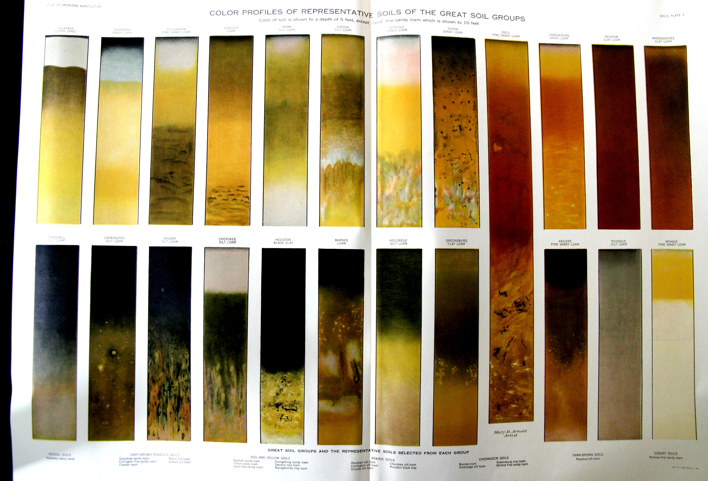
    Dirt isn’t just the stuff that one gets rid of, of course–it is the basis of all that we are. Varieties of dirt are the stuff of the connoisseur and the expert, and when laid out properly, and particularly in a scientific manner, dirt is exceptionally beautiful. For example, this exceptional and large illustration appears in the Atlas of American Agriculture, which was printed in a very unpretty/dustbowly year for soil, 1936.  (The image is clearer once you click in and expand.)

    SOil samples

    The lithograph is also available for sale at the blog’s bookstore, here. 


  • Small, Compact, Unusual Comparative Heights of Mountains Map

    JF Ptak Science Books   Quick Post–revisited and expanded

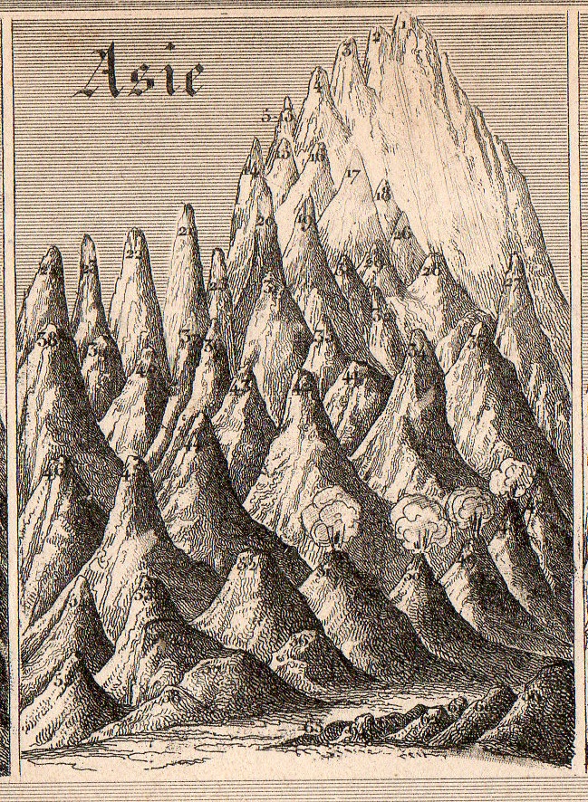
    Mountains small compact114[Small detail from the quantitative display, below; measures 2×2 3/4″.]

    • I wrote about this earlier on this blog but went back to it today to expand it a little and add to the illustrations–and to also place it in the for sale section of the blog. 

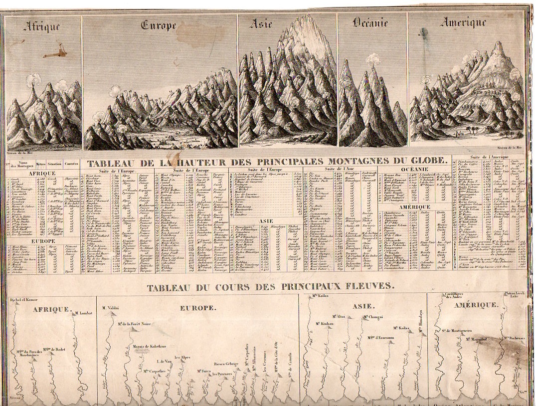
    Generally the dozens of maps/charts showing the comparative heights of mountains and lengths of rivers maps that have come through the store part of this blog have been somewhat large–or at least larger than the present example, which may be about the smallest (at about 11×8″) detailed representative of this genre that I have seen. 

    Mountains small compact113

    “Tableu de la Hauteur des Pricnipales Montagenes du Globe” was published in Guillemin’s Atlas universel de Geographie Ancienne et Moderne, and published by Langlume in 1845.  It is also at the beginning of the more-modern heyday for publishing maps and charts such as these.  (The practice began modestly at the end of the 18th century, came into a high tide in the 1850’s/1860’s or so, and then pretty much disappeared by the 1880’s.) 

     There’s a lot of comparatively-displayed information presented on 88 square inches, including the lengths of 30 rivers and the heights of about 500 mountain peaks distributed over Africa, Europe, Asia, Oceania, and the Americas.  And for as much imagery and data there is on this sheet, the whole is very nicely designed, a real success in the display of quantitative data.  


  • Big Paper History: 1806 Chronology of the Years 14-1800

    JF Ptak Science Books Post 2478

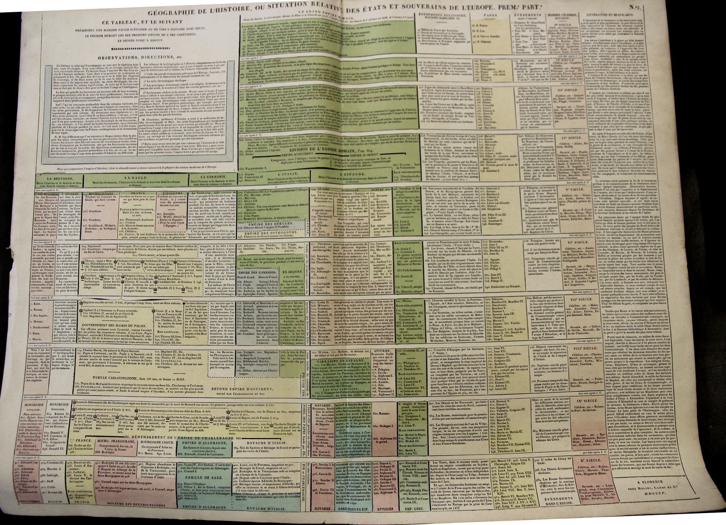
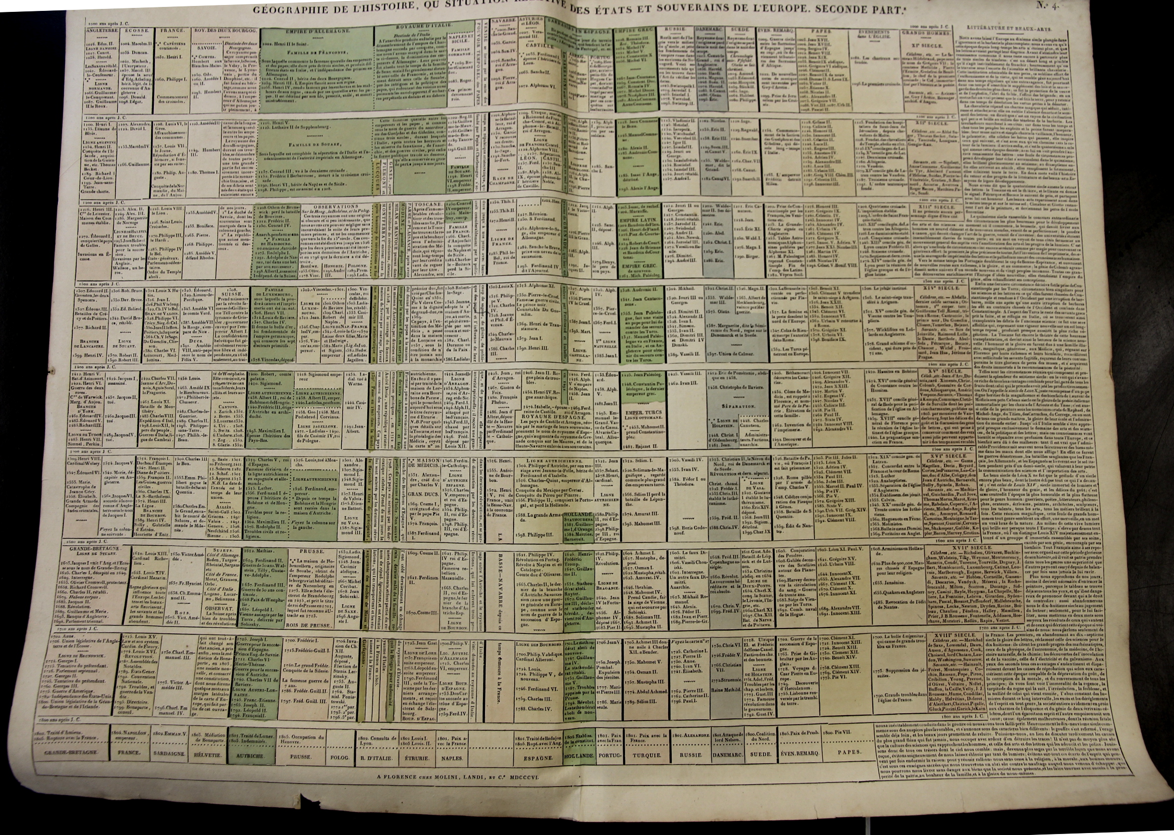
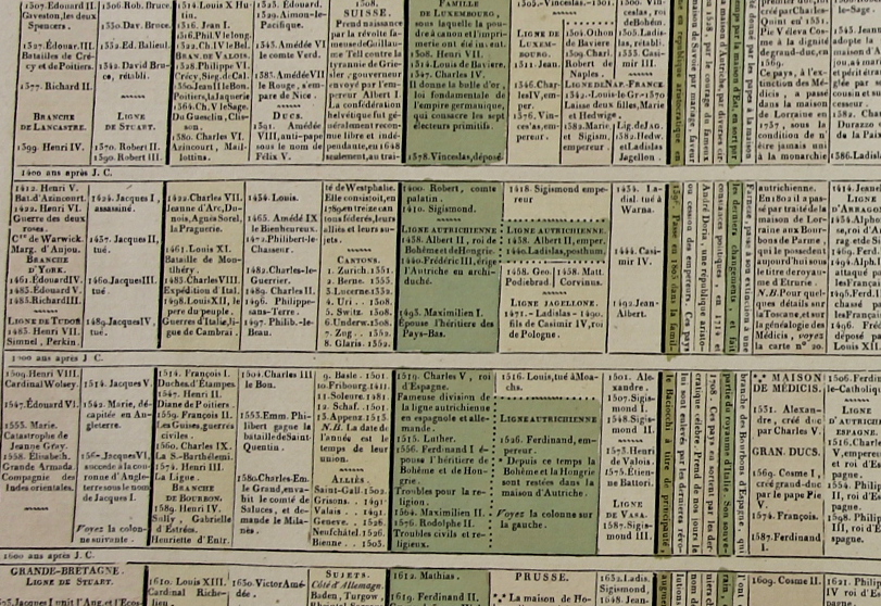
    Starting at the year 14 (ACE) with the reign of Augustus Caesar this large two-sheet chronology organizes the rulers of the Western world so far as it was known into the early 19th century. (“Geographie de l’Histoire. ou Situation Relative des Etats et Souverains de l’Europe (in two parts), published by Molini and Landi, in Florence, in 1806.) There are 15 major divisions from the year 400-1800, with a short bit at the top of the first chart covering the previous 386 years or so.  The columns show the rulers of reach century for Britain, France, Germany, Italy, Spain  (then subdividing as necessary). There is one column for the “nations barbares” that covers everyone else in about 2″ per century; there is another column for the chronology of Popes; one column for a general history of the Christian church, one column for celebrated and famous people, and then a final column for literature and the arts. 

    Maps_Chronology_LeSage_1_

    • You can own these!  Check them out on the blog’s bookstore, here. 

    At the very least the chart helps you keep your rulers straight, so to speak–it is also the sort of engaging display of data that if it was hanging up and accessible that people would read it all the time in passing. 

    The sheets are large (27×21″ or 68x53cm, and combined (as I have done in the past) they make a very imposing display 42×27″ (106x68cm).  The coloring (except for the odd darkish green) is fairly subtle but evident and useful in distinguishing the blocks of data at an easy glance. 

    Maps_Chronology_LeSage_2

    I’ a big fan of this sort of arrangement and display of data, trying as I used to in graduate school (and still do now) to fit the appropriate memory triggers on any given subject onto one sheet of 8.5×11″ paper.  It is a highly useful memory exercise, creating your own memory palace. 

    Maps_Chronology_LeSage_3

    These charts appear in A. Le Sage (Comte de La-Casas) Atlas historique chronologique et géographique ou Tableau général de l histoire universelle présentant un moyen sûr et facile de classer avec fruit tout ce qui s est passé depuis la création jusqu à Jésus Christ espace de 4004 ans….


  • The Long and Short and Low and High of Rivers and Mountains, 1862

    JF Ptak Science Books   Quick Post

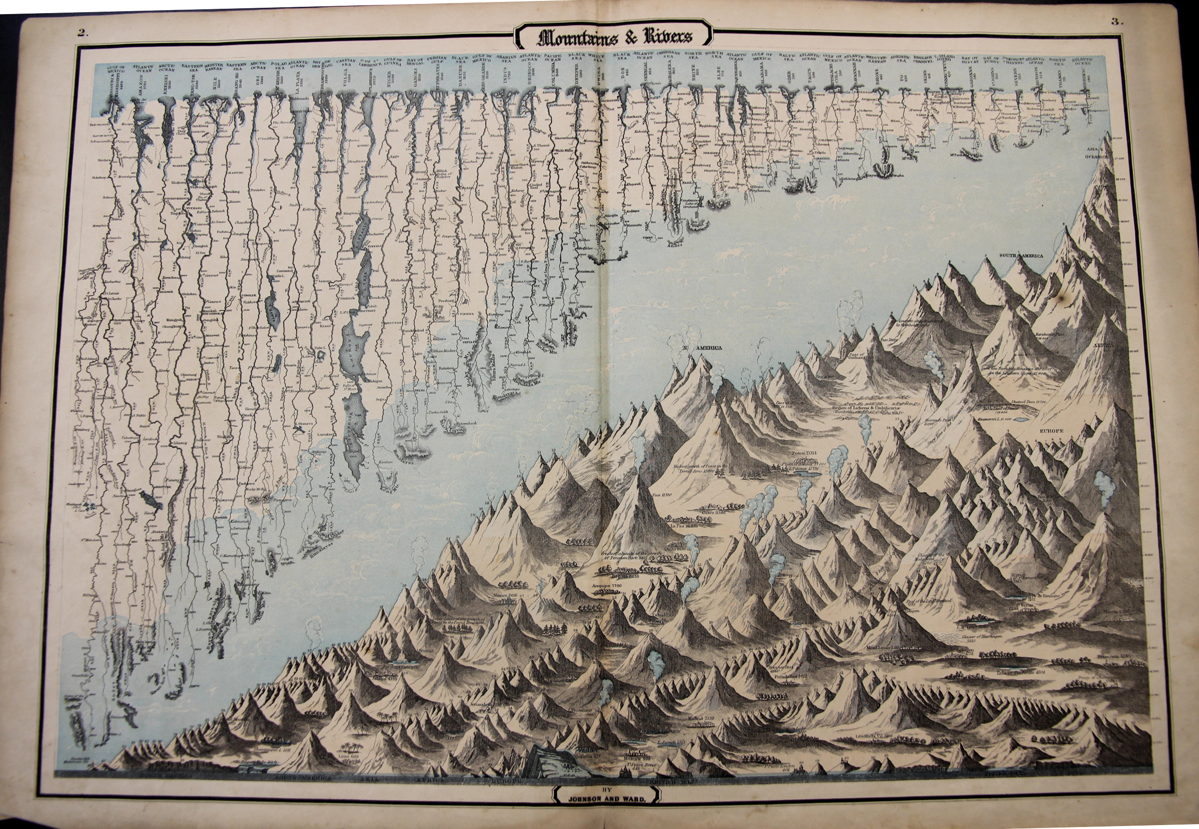
    This map may be simply named (“Mountains & Rivers”) but the information it displays is hardly so. As a matter of fact there are probably a thousand data points in this flowing, pleasingly-design comparative display of information–and the closer you look, the more there is. 

    Mountains and Rivers 1862

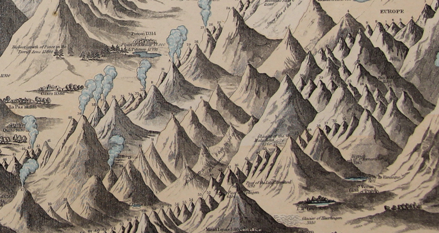
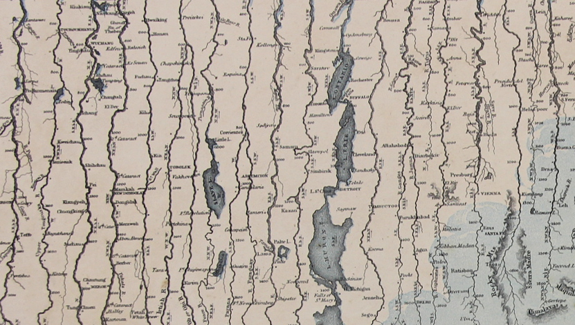
    In the mountains section there are hundreds of pieces of data locating the elevations at which cities and towns are found, and the altitudes of the extent of different types of trees, and of course the comparative heights of enumerated mountains set off by the continents.  Above the mountains floats the fantastic display of the lengths of rivers, listing 43 in all, showing cities at the various stages of each river’s progress. 

    It really is a glorious thing.

    Mountains and Rivers 1862 detail

    “Maps & Rivers” was printed and published by Johnson & Ward in 1862 and appeared in Johnson’s New Illustrated Family Atlas; there is at least one earlier version that appeared in 1856 with a different background and with ornate Celtic-inspired borders, though I prefer this version with the simple border and the full blue-sky-and-clouds background.  For my experience this is one of the richest of the genre published in the mid/late 19th century.

    • The original map is available for sale at the blog’s bookstore, here. 
    • Mountains and Rivers 1862 detail rivers

  • A Tiny and Obscure Appearance of California as an Island, 18th c.

    JF Ptak Science Books  Post 2466

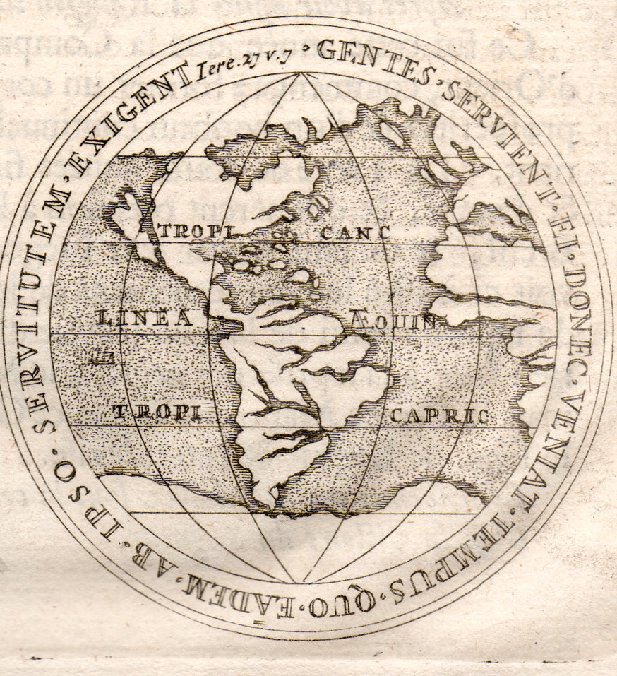
    There is a long history of portraying California as an island, and this may be one of the most obscure instances.  The source is not known (though ca. mid/late 17th c), but it seems to me to be a depiction of Dutch East India Company medallions (depicting city views of Leyden, Harlem, and Breda), and the California map turns up on the reverse of one of them, as bottom.  The original is only about 2.5″ in diameter–here it is, enlarged:  

    California as an Island001

    Antonio de la Ascensíon is credited with first giving flight to the idea that the California Peninsula was in fact an island–and so, beginning in 1620, California would frequently make guest appearances on maps as an island. (Fray Antonio was born in Salamanca in 1573/4 and studied there and at the College of Pilots in Seville; he was ordained in the Order of Discalced Carmelites, and sent off to Mexico. As a cosmographer he accompanied Sebastian Vizcaino (1548-1624) on his expedition to California to find a good port for Spanish galleons coming from Manila, which is when Antonio produced his diaries with the famous island maps.)  This map was created during a period where there was heavy competition for trade routes and geographical knowledge was actual currency, so there was some amount of cartographic information that was proprietary. When the abbot’s map was lost to/and recovered by the Dutch, the changes that were made to California were codified and published–the Spanish thought it not necessary to correct the misinformation. Perhaps.  In any event, it seems plausible that the Spanish crown had no interest in involving itself with what may or may not have been the loss of proprietary information, and so let the island business slide.  Until1751, when the King of Spain issued a proclamation saying that California was indeed not an island.

    This practice continued to about 1747, when there was more than ample evidence to suggest that the island status of California was erroneous–still, it took several decades for the last of the island-maps to make its appearance. 


  • Map of Rivers and Waterfalls, 1851

    JF Ptak Science Books    Quick Post

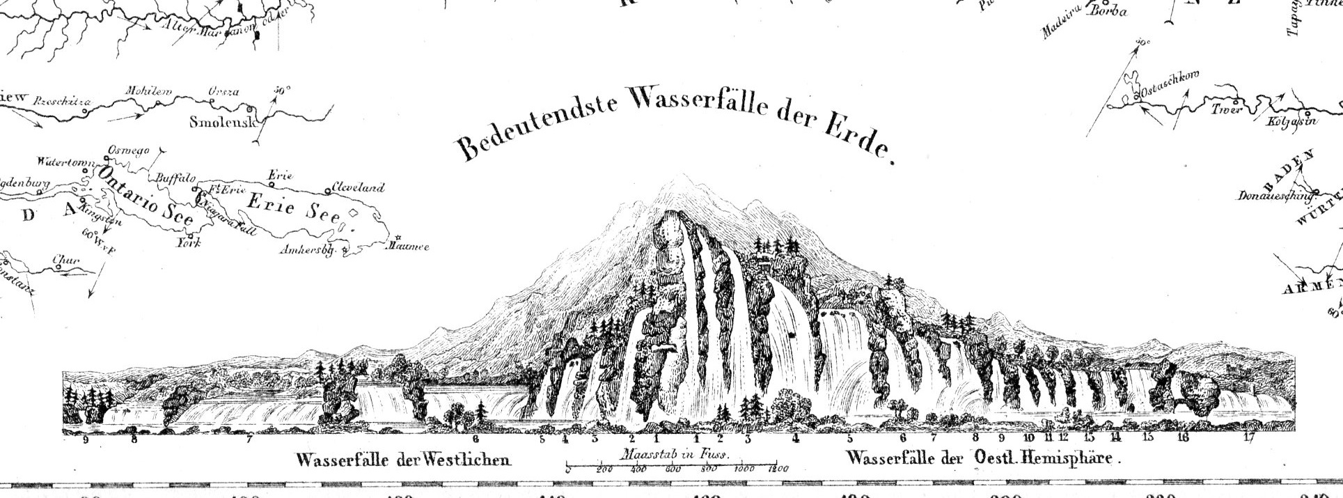
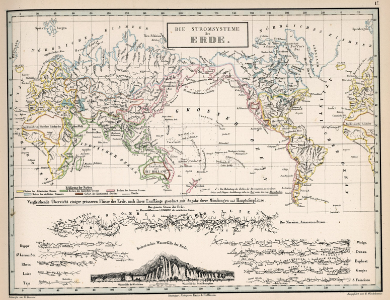
    Maps Rivers Waterfalls981

    Before the Neil deGrasse Tyson version and update of Carl Sagan’s landmark television series, Cosmos, there was Alexander von Humboldt, and his enormously influential book of the same title, printed in 1845-1862.  Well, von Humboldt’s (1769-18591) book was actually Kosmos when published in German, which is where it started its life (and which von Humboldt suffered mightily for in it English translation), and in which this map appears.  Von Humboldt was enormously studied and educated and of a high scientific mind over many subjects, one of those 19th century figures who seemed as though they could know everything, a polymath of high order (along the lines of Goethe and von Helmholtz and Thomas Young and others).  He was a meteorologist and biogeographer before those sciences existed; a naturalist, geographer, archaeologist, and explorer, a natural philosopher of magnitudes.

    • The original maps is available for sale at the blog’s bookstore, here.

    Kosmos reflected his lifelong interest in order, and what he did was astonishing–he attempted to unifying the complexities of nature in one book (of five volumes), binding the various branches of science together in a cohesive whole, attempting to show how the laws of the universe acted here on Earth.  It was a very influential work, very progressive, a masterwork of scientific method.  Kosmos.

    Maps--River system


  • An Extraordinary Map of Battle Death–“Body Density Maps”, 1918

    JF Ptak Science Books   Post 2461

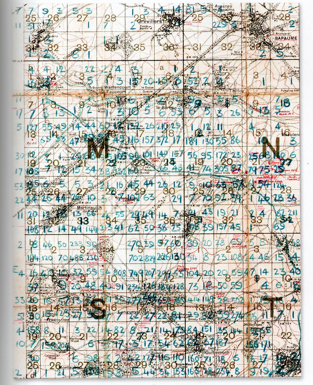
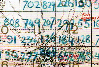
    At first glance this detailed and dense map looks foreboding and somehow off-putting–at least for me, and that was before I understood what the numbers represented.

    The blue numbers on this section of a larger map refer to soldiers killed on the battlefield of the 1916 Somme battlefield. It is the work of Lieutenant Colonel Arthur Messer (Assistant Director of Graves Registration and Enquiries in France), who undertook to record the crosses of the Fallen on the battlefield and register their location, and then to re-inter the bodies together in larger cemeteries.  

    MAP DEATH DENSITY977

     [Source: John Hughes-Wilson, The First World War in 100 Objects, Firefly Books, 2014.]

    What we are seeing here are pieces of four 6×6 grids (one complete and three partial) numbered (in red) 1-36, each one of these squares further subdivided into four section.  Each larger square composed of 36 squares is 1000×1000 yards total, meaning that each one of the 36 subdivisions is about 166×166 yards, and each of the four segments of one smaller square is 83 yards. The blue numbers indicate a soldier killed on that field of battle which means that in the large 36-square “M” subdivision  #18 that there were 210+29+372+17 fatalities, or 628 on a 166×166 yard field, or in one case 372 killed on a 83×83 yard plain.   The deaths were even more intense on other areas of the field–in Square S #11 there were 749+207+234+126, or 1,416 deaths in that 166×166 yard field, and 749 on the 83×83 yard field.  It is hard to visualize such loss. I picture a U.S. football field–there are 22 players on the field during play, and that seems to populate the area pretty well–casualties of 749 soldiers on a similar area would be nearly 35 times that, meaning that placed equidistantly and with a few feet on the sides they would cover the field.  There are, what, 75 people on a football team?  That means at the beginning of the game when all of the players and coaches and staff and cheerleaders and member of the band run out onto the field to take their places, they would all be dead–and then some.  That is a lot of death.  

    MAP DEATH DENSITY978

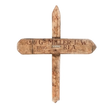
    According to the Imperial War Museum, temporary markers for fallen soldiers looked like this:

    Wooden cross

    After the war the Imperial War Graves Commission replaced the wooden crosses with stone markers.  

    The wooden markers would then returned to the family.  

    [Source: http://www.iwm.org.uk/learning/resources/remembrance-in-the-first-world-war]


  • Ghost Trails of the Mississippi River: Harold Fisk’s Geological Map of 1944 (Expanded)

    JF Ptak Science Books   Post 144 (from 2008) expanded
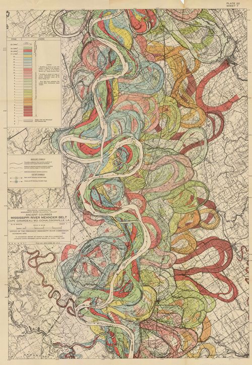
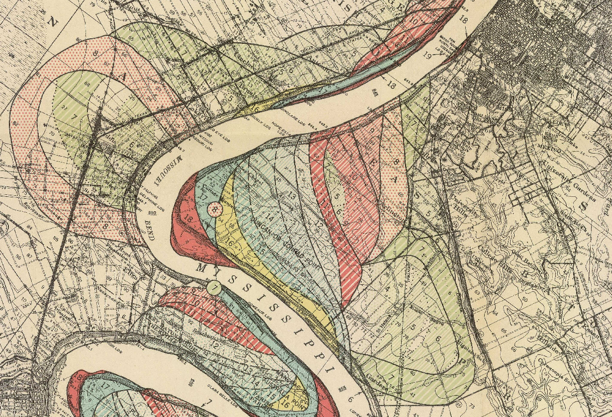
    Fisk map plate 22

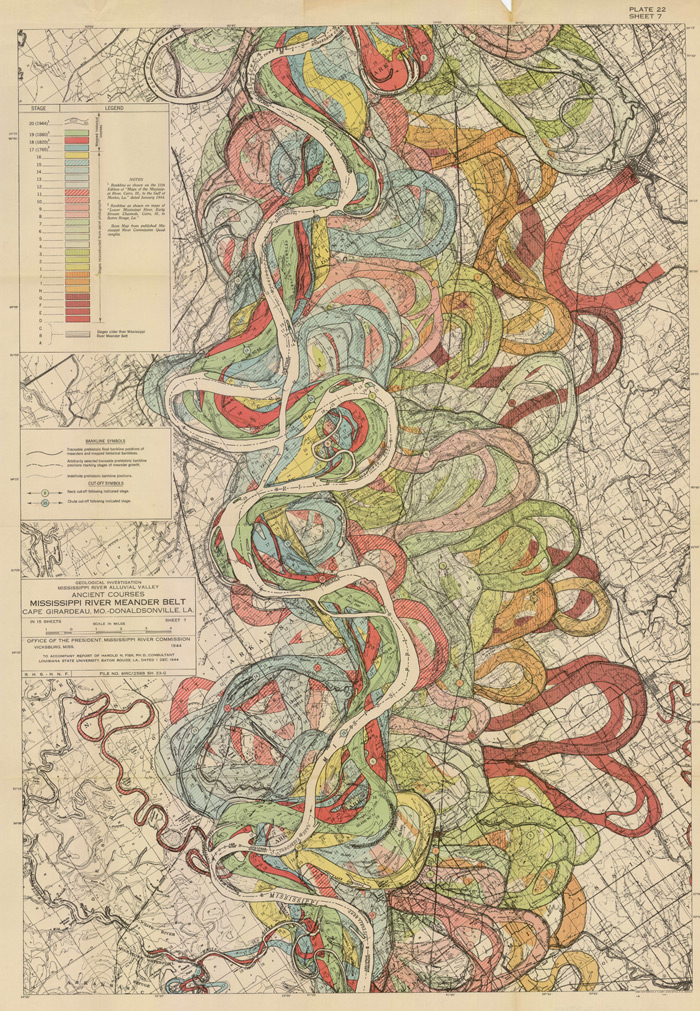
    Understanding the Mississippi River was the skeleton key to understanding pre-Civil War America.  There was really nothing else quite like it—the Ohio River and the attention paid it by Collot and others  was of great importance to understanding the early far Western (east of the Mississippi River) adventures of Colonial and Post-Revolutionary America, as was the Missouri to early 19th century American exploration and settlement, but the Mississippi loomed over all.  Like saying that Babe Ruth was a fabulous baseball player or that Richard Feynman was a brilliant physicist is a bland statement of the obvious—the understatement hollowing and becoming more brittle the more deeply their “records” are studied showing how truly incomparable they were—the Mississippi, “The Father of Waters”, is really the Big Deal in the history of the U.S. 

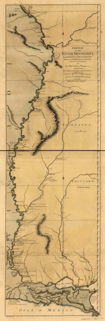
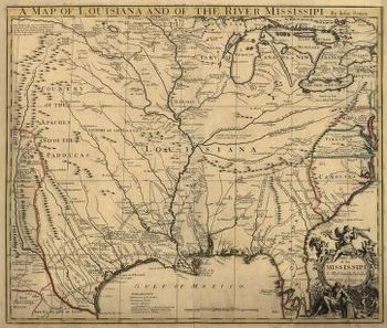
    And in spite of the fantastic maps made of river through the 18th and 19th centuries (like these gorgeous and iconic examples by John Senex in 1721 (A map of Louisiana and of the river Mississipi [i.e. Mississippi] : this map of the Mississipi [i.e. Mississippi] is most humbly inscribed to William Law of Lanreston, esq.)  or Robert Sayer  (Course of the river Mississippi, from the Balise to Fort Chartres; taken on an expedition to the Illinois, in the latter end of the year 1765. By Lieut. Ross of the 34th regiment: Improved from the surveys of that river made by the French. in 1772, or even Coloney & Fairchild’s Ribbon Map of the Father of Waters (below, a whopper, measuring in at 337 cm (and which was issued on a wooden spool for the use of travelers on board steamships moving along  the river), there were very few that gave you an idea of the *history* of the river.

    That was achieved in spectacular flourish by  Harold Fisk (in the map above) in 1944 in his Geological Investigation of the Alluvial Valley of the Lower Mississippi River (U.S. Department of the Army, Mississippi River Commission, 78p) The map showed the very ghost trails of the river over time, and trying to show where it wasn’t was the great question.  He tried to reveal the history of the valley by mapping  and dating all physiological features of the river and tried to reconstruct the channel changes with what were to become speculative appreciation.  Nevertheless, he did make a tremendous attempt at explaining the courses of the Mississippi over time by utilizing his own excellent maps and a little generative thought.  This might not be the most accurate map of the courses of the Mississippi over time, but in 1944 it was really a spectacular achievement in cartography and general thought.  And the thing was just drop-dead beautiful.

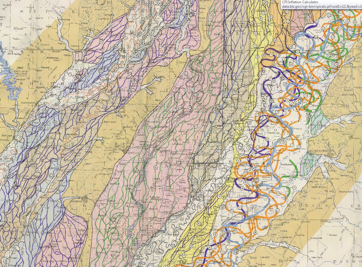
    Here’s another sample from the suite of maps:
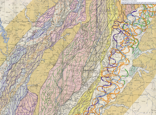
    Fisk Map

    [Source: http://biotech.law.lsu.edu/climate/mississippi/fisk/plate_15-1.pdf]

    And another detail, from map 15, in the vicinity of Baton Rouge:
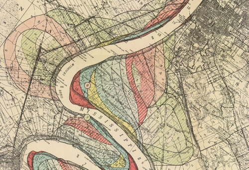
    Fisk map baton rouge

    • The full text is available here from the LSU library: http://biotech.law.lsu.edu/climate/mississippi/fisk/fisk.htm
    • For a very quick, elegant overview see Radical Cartography which has all 15 of the maps displayed at once, along with a key chart :  http://www.radicalcartography.net/index.html?fisk
    • Also go to the U.S. Army Corps of Engineers site and click on the “Fisk oversize” link in the left-hand “documents” column:  http://lmvmapping.erdc.usace.army.mil/index.htm
     

    Mississippisenex

    Mississippi_1765

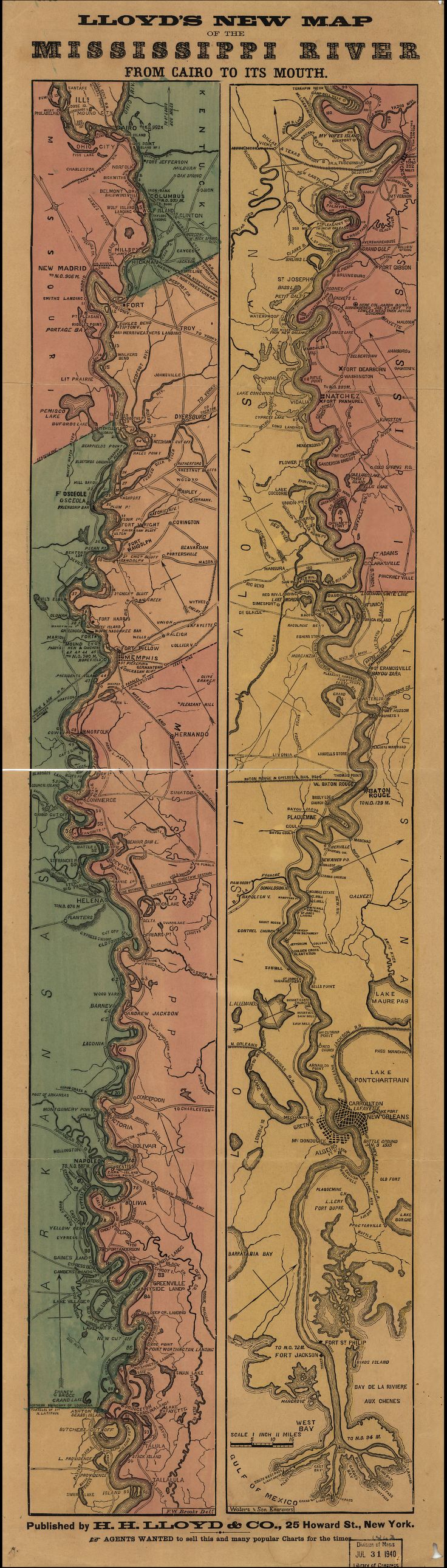
    Lloyd’s new map of the Mississippi River from Cairo to its mouth:
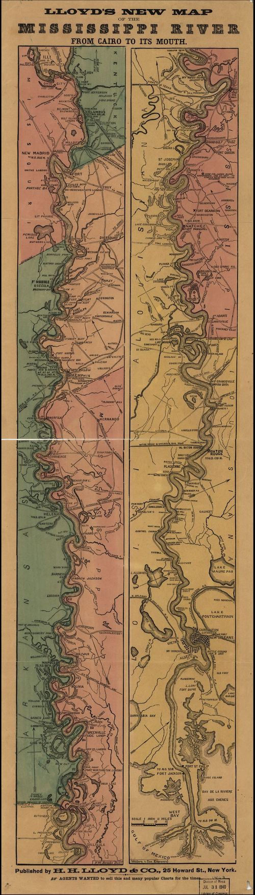
    Mississippi Lloyd map[Source: Library of Congress, http://www.loc.gov/item/99447107/]

    And the great “Ribbon map of the [Fa]ther of Waters.Created / PublishedSt. Louis, Mo. : Coloney & Fairchild, 1866”: 

    (Very zoomable version here:  http://www.loc.gov/resource/g4042m.ct000797/  The initial image comes up about 4mm wide (1)–don;t be discouraged, just start clicking away at the magnifier and it will zoom right in…)

    Mega-long scroll follows:

  • A Map of Currents and Seaweed, 1886

    JF Ptak Science Books    Post 2457

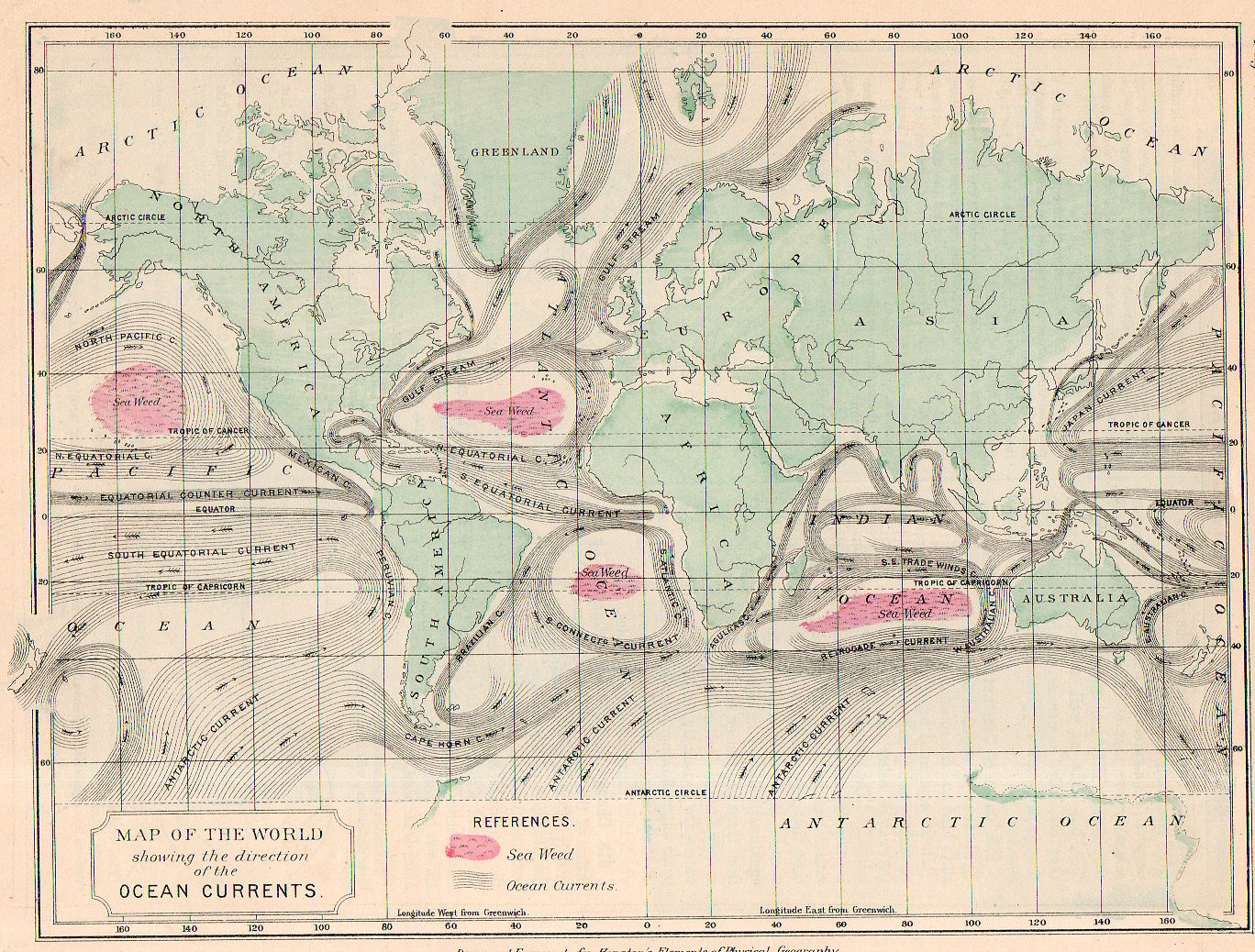
    Map ocean current 1886968

    I think that if you squinted your eyes a little to deform your visual field and then looked at this map of the Earth’s ocean currents that what you might see is…Mars.  At least that’s what I can see if I concentrate on it, or at least the Mars of 1880 or thereabouts, with its large and blotchy seemingly mobile and ambiguous forms skirting around the planet.

    • “This map may be purchased at the blog’s bookstore, here.  

    That said this map does represent a high achievement, displaying the elements of the still young-ish science of oceanography (or at least in the form presented by Matthew F. Maury) and showing the movements of the ocean currents.

    Map ocean current 1886969

    This maps comes about a century after the first map to truly distinguish the Gulf Stream (the B. Franklin/Folger map of 1768-1785) and shows the remarkable activity that must have come with the acquisition of the data necessary to show on even this popular map.  There were earlier attempts, of course, notably by the great/problematic Athanasium Kircher in his Mundus... of 1662 though his effort was largely theoretical (and for what it was worth likened the currents to something similar to blood moving though the body, which at least used the work of William Harvey) given the lack of available hard data.  (Eberhard Happel is on a similar wavelength as Kircher with the currents map, and published his map a few years later, though he was mainly a science popularizer who “relied” heavily upon the Kircher map and was nowhere near to being Kircher’s intellectual rival, his map is still interesting given its very heavy lining and beauty.) 

    In any event, the Houston map is clear and concise–and given its 7″x 9″ size, remarkably compelling.

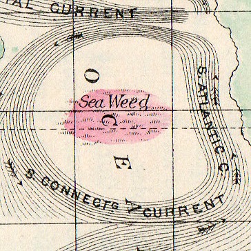
    And I just love the seaweed mapping.