A Daily History of Holes, Dots, Lines, Science, History, Math, Physics, Art, the Unintentional Absurd, Architecture, Maps, Data Visualization, Blank and Missing Things, and so on. |1.6 million words, 7500 images, 4.9 million hits| Press & appearances in The Times, Le Figaro, Mensa, The Economist, The Guardian, Discovery News, Slate, Le Monde, Sci American Blogs, Le Pont, and many other places… 5000+ total posts since 2008.

Category: Maps, Cartography, History of Mapmaking

  • A Remarkable Map of Concentration Camp Satellite Camps

    JF Ptak Science Books   Quick Post

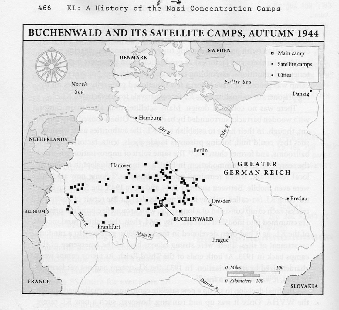
    I just started reading Nikolaus Wachsmann’s KL, a History of the Nazi Concentration Camps, published this year by Farrar, Straus, Giroux, a daunting and promising 864-page overview/history of the Nazi killing complexes.  The very first thing I found when I opened the book–incredibly–was this map, showing the satellite camps supporting Buchenwald. “Just” Buchenwald.  It was shocking. 

    Kl

    I knew about the support camps, but I must say I never knew how many, how so many, there were of them.  Evidently, according to Prof. Wachsmann, there were more than 77 satellite camps for Dachau main camp, and that overall there were probably around 560 (page 464). This was completely unexpected.

    I’ll report further on this book when I actually read it–for the moment, though, I wanted to share this devastating map.  


  • A “What Is THIS?” Map of Manhattan (1938)

    JF Ptak Science Books   Quick Post

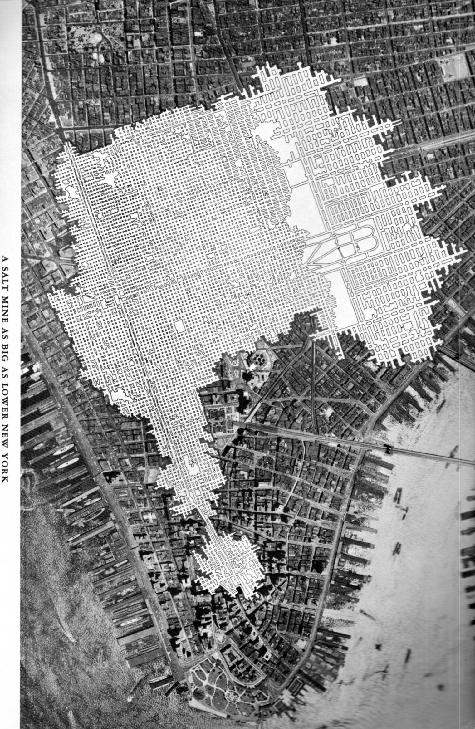
    The Chaco-like overlay in this map of midtown/lower Manhattan has a lot of creative opportunities in it–like showing a map of an enormous and  mysteriously removed Manhattan, or just-discovered earthworks that were somehow dug into bedrock, and so on.

    SALT map218

    But it isn’t. It is a salt mine comparative overlap using Manhattan as a unit if measurement.

    Talk about the “Great White Way”– this elaborate footprint of salt works, with its wide and short-ceilinged rectangular tunnels that are all illuminated white surfaces would challenge anything that Broadway (ca. 1948) offered. “A Salt Mine as Big as Lower New York” is an unusual map to my experience–of course there must be many of these maps available through the years by the companies that mined salt (and coal, and so on) but to my experience they are not often published for public consumption.  The map below is an exception, and simply depicts the rock salt mine at Retsof, NY, (“the largest in the world”).It appears in the unevenly-titled  Salt Empire of the Largest Producer of Salt in the World, and was published by the International Salt Company in 1935.


  • The Savage Stain: Slave Ownership Map in the U.S., by County (!) 1860/1.

    JF Ptak Science Books  Quick Post

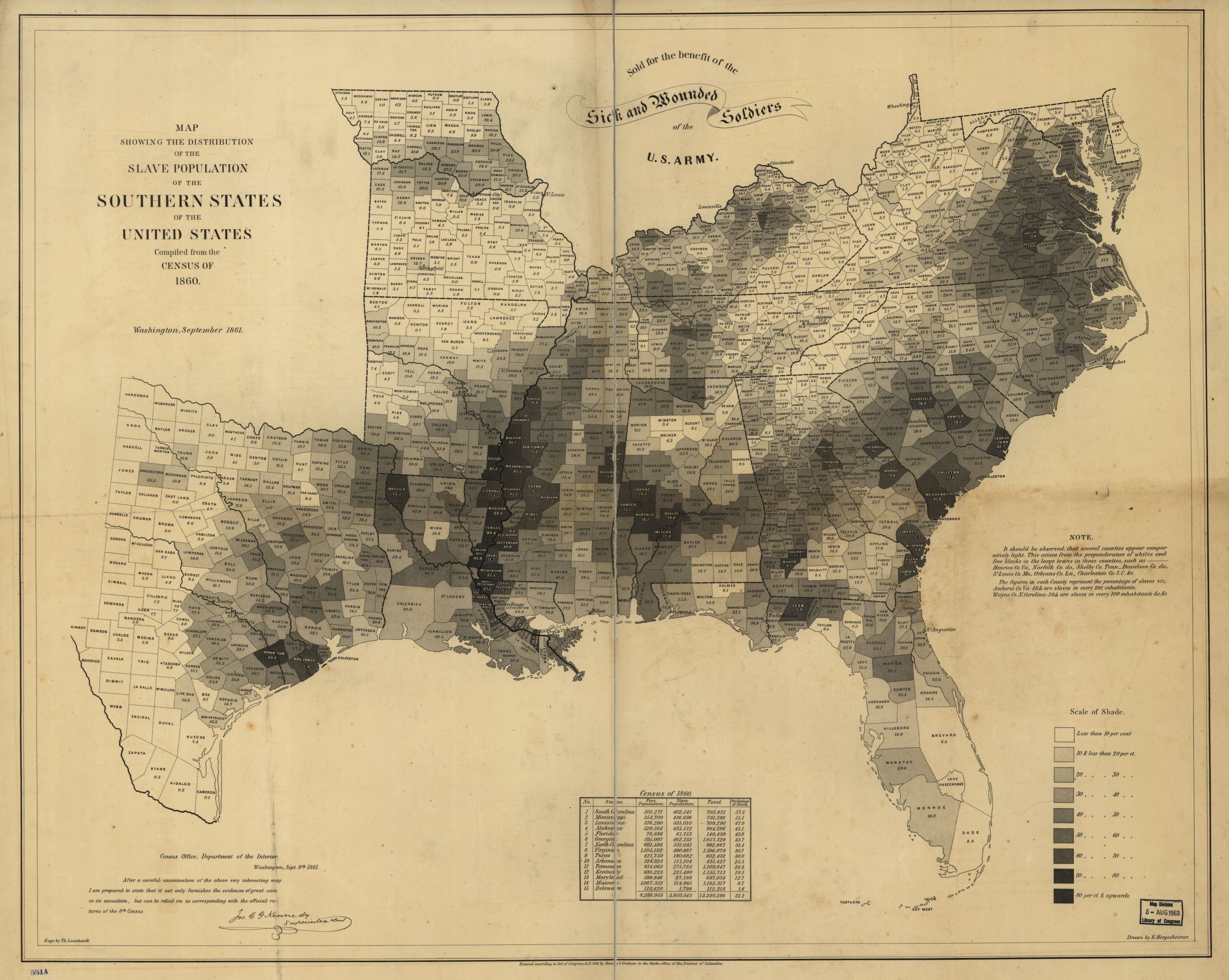
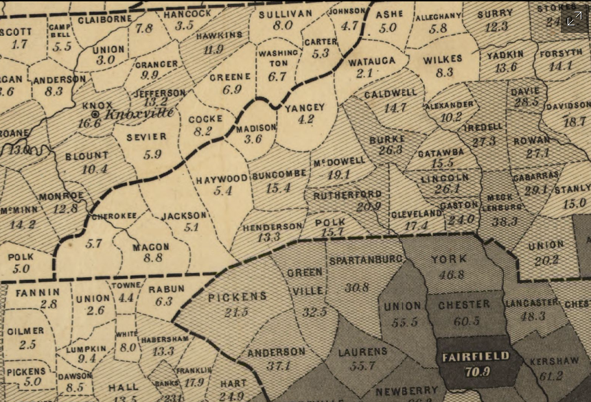
    Continuing several posts on slavery made here over teh last few days is this extraordinary map depicting slave ownership in the U.S. on the county level (!) based on data from the 1860 census and then published in 1861. Titled Map showing the distribution of the slave population of the southern states of the United States. Compiled from the census of 1860, I find it an enormous success in putting all of this data on one piece of paper, especially since the proportion of slave ownership is depicted also in shades of gray so that a visual impression of the state of slavery in this country can be seen and comprehended almost instantly.  

    The image below is clickable and expandable; mega files are found at the originating site of the Library of Congress (link follows).

    Map--slavery 1860 full

    [Source: the Library of Congress: http://www.loc.gov/resource/g3861e.cw0013200/]

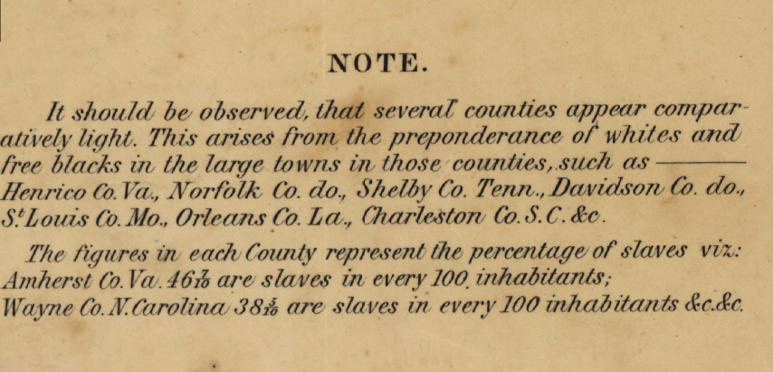
    Map--slavery--detail note

     And a detail:

    Map--slavery--detail of map


    Adolph Von Steinwehr

    Hergesheimer, E.
    Hergesheimer, E. (Edwin)

    “Scale ca. 1:3,000,000.-  LC Civil War Maps (2nd ed.), 13.2-  “Entered according to Act of Congress, A.D. 1861 by Henry S. Graham.”-  “Sold for the benefit of the sick and wounded soldiers of the U.S. Army.”-  “Census Office, Department of the Interior, Washington, Sept. 9th, 1861. After a careful examination of the above very interesting map I am prepared to state that it not only furnishes the evidences of great care in its execution, but can be relied on as corresponding with the official returns of the 8th Census. [Signed in facsimile] Jos. C. G. Kennedy, Superintendent.”-  Map indicates by gray patterns, the percentage of slaves in each county. “It should be observed, that several counties appear comparatively light. This arises from the preponderance of whites and free blacks in the large towns in those counties. . . The figures in each county represent the percentage of slaves. . .”–Library of Congress website  http://www.loc.gov/resource/g3861e.cw0013200/]


  • Civil War Maps with an Unusual “Drowned World” Perspective (1861)

    JF Ptak Science Books   Quick Post

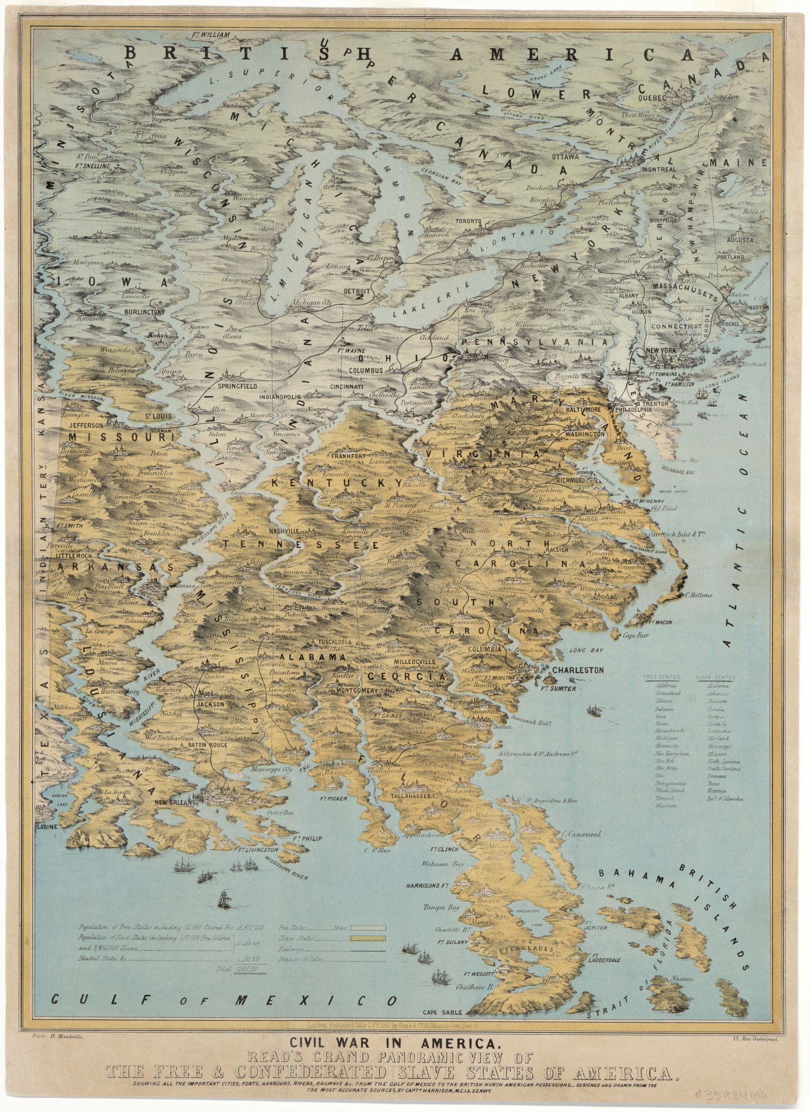
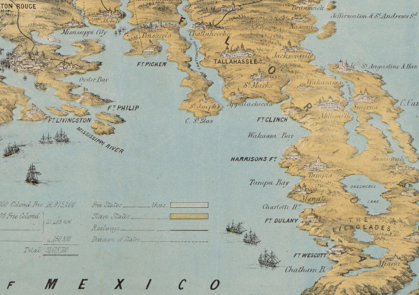
    The cartographer responsible for this unusual map successfully emphasized the rivers and mountains of a region–so much so that they are mostly completely out of perspective/scale to the other elements of the map.  The effect is magical.scary/startling in some ways, especially when you look at the detail for places like Florida and points along the Mississippi River. They remind me of J.G. Ballard’s The Drowned World, particularly with Florida, which look to be mostly submerged.  I know what the cartographer was trying to achieve in establishing the importance of natural boundaries, but this was probably a little overboard, so much so that he may have lost the “c” in “cartographer”.

    Here’s a clickable version of the map, with some zoom capacity:

    Maps-_Civil War--unusual perspec large[Source (including all details, below): Library of Congress, http://www.loc.gov/item/2014589394/]

    • Civil War in America : Read’s grand panoramic view of the free and confederated slave States of America : showing all the important cities, forts, harbours, rivers, railways &c. : from the Gulf of Mexico to the British North American possessions, 1861
    • Read’s grand panoramic view of the free and confederated slave States of America

    It seems as though I have seen something similar to this reckoning what the Florida “coasts” would look like according to global warming trends in the next century:

    Maps--Civil War--Unusual persp  FL

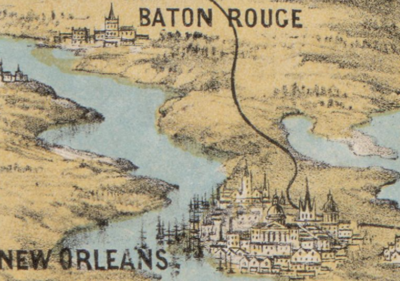
    Of all the city profiles the one for New Orleans looks a little like it could be accurate, if for no other reason than for the large number of ship masts:

    Maps--Civil war--Unusual Persp New Orleans

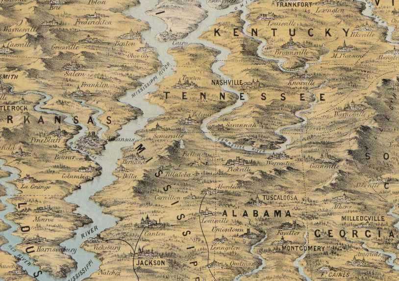
    The Mississippi looks mighty indeed–if this was drawn to scale the river would be 50+ miles wide in many areas:

    Maps--Civil War--unusual perspective MS river


  • The History of Meat Maps: “Fluid Beef” Atlases

    JF Ptak Science Books   Post 2488

    • [Please be aware that there were 75 blog posts and another 30,000 words made on this blog in June, 2015–check them out by going to the Recent Posts block at right]

    Meat, seaweed, “beef fluid”, corn, pasta, spices, shrimp, bananas–have all served as a bases for the construction of maps–not maps of _____-producing areas, but the maps themselves being made of the actual thing (or image of it) itself.  Antique examples of this semi-anti-accomplishment are tough to find, with the Moderns being a little more common (as we can see on the Time magazine site, the background of the maps being negatives of antiquarian maps).  

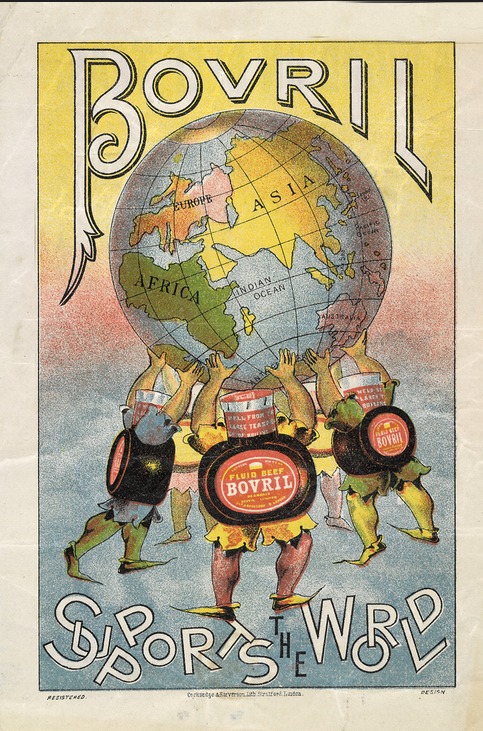
    And so I just had to stop and collect up this image found on Flickr of the rectifying and emboldening Bovril “fluid beef” holding up the world, like an Atlas constructed of water and suspended beef-ish squeezings, which is a lot less appetizing than the original myth.  I can’t think offhand of another atlas-like entity made of meat-things holding up the world. 
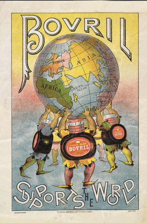
    Maps of meat foodI do not know what the land mass is off the African west coast, except that it shouldn’t be there.  Probably it was supposed to be a too-close South America.  

    Also I should point out that the idea for constructing non-food things from food does go back a long way–there are numerous sculptural items in art and architecture that employ food/foodbits going back many century. The most famous of these maps, I guess, is the semi-magnificent The Porcineograph, produced by the Forbes Lithographic Manufacturing Company of Boston in 1876 or so, which defines the states and territories of the U.S. in terms of their regional foods.  

    This porcineograph

    [Map source:  the Library of Congress.]

    And before proceeding any further, I must at least make reference to another master in this field, an earlier, perhaps revolutionary figure (without producing a revolution), Giuseppe Arcimboldo (also spelled Arcimboldi; 1527-1593), who painted (in his non-conventional works) fantastic portraits and images using fruits, vegetables and other natural objects as the sole source of representation.  On the other hand his influence may not have been so very well known, as many of his works were stolen during war time in the mid-17th century, and he fell rather deeply into obscurity until being revived and resurrected by the Surrealists in the 20th century. 

    http://www.lessing-photo.com/p2/400706/40070643.jpg

    [Image source: http://www.giuseppe-arcimboldo.org/]

    Also in a nearby carrot patch lives some of the work of Nicolas de Larmessin (1640-1725)–an enormously creative and productive artist–who in his way created a genre similar to the great and ancient Dance of Death/.Danse Macabre/Totentanz--though his was the Dance of Life, and in some cases he used mostly food to construct and decorate his portraits.  

    There are more of these examples, to be certain, but that’s all there is time for today.  It is probably some sort of bona fide sub genre, although not a big one, and even there it may all be invisible.  

  • History of Lines: Chronology of European History, ACE 14-1813

    JF Ptak Science Books  Quick Post      History of Lines series

    MAPS--PANTOGRAPHY 4 DETAIL158

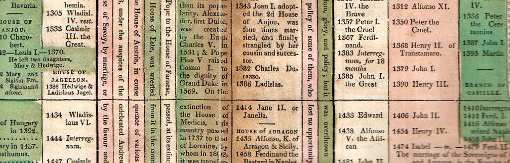
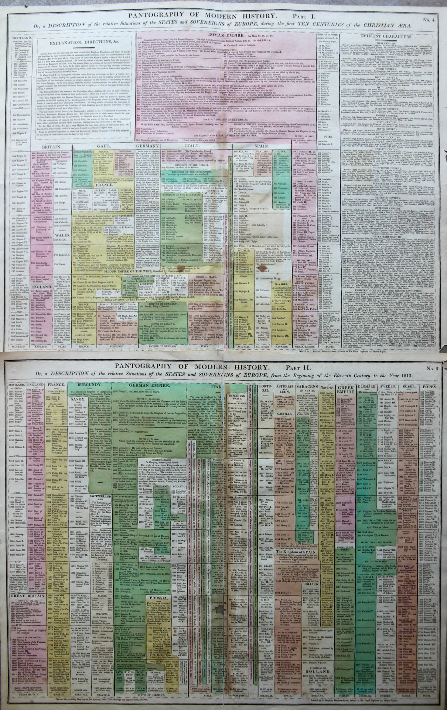
    The “Pantography of Modern History” packs a lot of information into a relatively small space, surveying a good chunk of the history of the West from the year 14 to 1800.  (It is very similar and may be a pirated English version of a French effort that I describe in this post, earlier on this blog.) The sheets are 16×20″ making the full pantography 32×20″ or so–I reckon that there are about 1000 data points on the four square feet or so of paper.  There are some descriptions of events but most of the effort is keeping the ruling heads in order.  This version is a little easier to follow than the French because the design is somewhat sparser, making the bits easier to discern.

    Maps--Pantography _3_

    I’m a big fan of this sort of data display.  

    • Published in Lavoisne’s Complete ….Geographical Atlas, printed by J. Barfield,  1815. “Pantography of Modern History. Or, a Description of the relative Situations of the States and Sovereigns of Europe, during the first Ten Centuries of the Christian Era” Accompanied by “… from the Beginning of the Eleventh Century to the Year 1828”. 

  • The Nothing Frontier, 1900

    JF Ptak Science Books   Post 2485   Part of the History of Nothing series

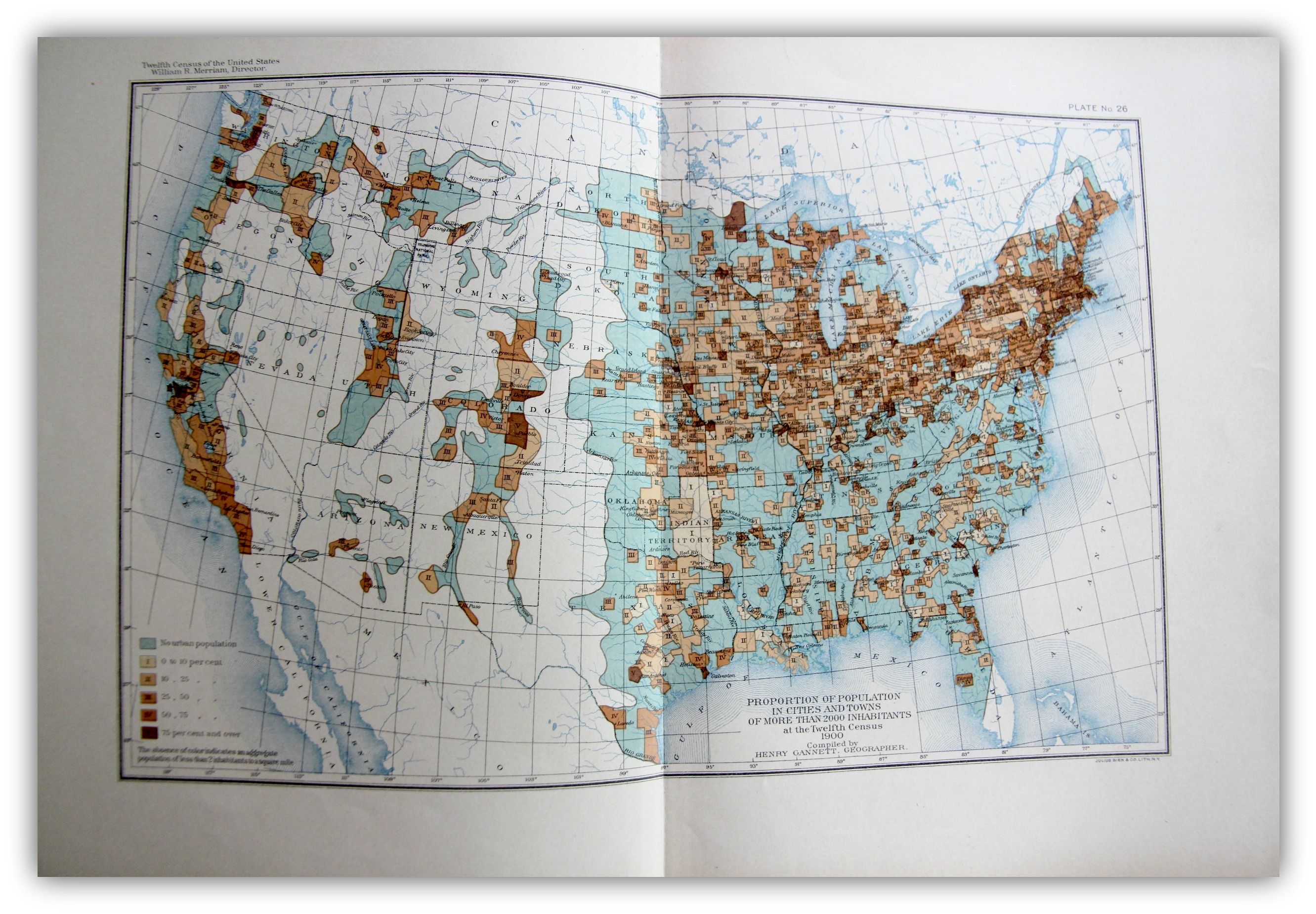
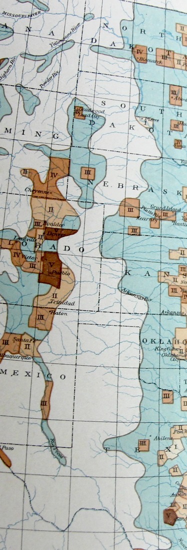
    The “frontier” in the history of the U.S. West is a pretty big deal, and old, the academic concept of  the frontier pressing its way back 13 decades, when for the most part once it was introduced it was pronounced to be “closed” by the man who reinterpreted it, Frederick Jackson Turner1.   On my shelves alone there are books on the mining frontier, the mineral frontier, the transportation frontier, the Indian frontier, the military frontier,the farming frontier, and so on, divisions allotted by wealth, nationality, numerous geographical attributes, and the like. One thing I think that I have not seen was the Nothing Frontier, where there are divisions divided by, well, sort of “nothing”. This is mostly a prosaic statement, slightly poetical, dependent on visual clues. And of course there isn’t “nothing” there because there is always “something”–there just isn’t very much of it.  And when things get colored-coded on map depending upon percentage distributions, and that object of measurement is left to a null color or no color at all, then it appears that the divisions one left to nothing.

    Maps--Census 1900 Urban

    [The image above is very expandable.]

    This can be seen if you squint somewhat you can see an example of it in plate 26, “Proportion of Population in Cities and Towns of More than 2000 Inhabitants…” Statistical Atlas, prepared under the Supervision of Henry Gannett (Geographer of the the Twelfth Census), printed in Washington by the U.S. Census Bureau, 1903. This map–which is part of an historic series of atlases published with U.S. census data–shows the distribution of urban population in five shades of brown (as seen in the legend) plus a blueish color for “no urban population” as well as no color (“The allowance of color indicates an aggregate population of less than 2 inhabitants to a square mile”).

    Maps Census 1900 Urban detail

    It is that absence of color that makes it a frontier-ish sort of frontier, a part of the Made Up Frontier, this one being very straightforward north/south, Big Bend to Montana, pretty much the Lonesome Dove trail from the rough Big Bend Texas to nearly Canada.  

    I know it is just a thing I made up just now looking at the map, but given some effort, maybe the idea actually has some legs.  

    Notes

    1. Turner, Frederick Jackson. The Frontier in American History, Harvard University, 1920, full text via Project Gutenberg,  http://www.gutenberg.org/files/22994/22994-h/22994-h.htm


  • Pride in a 3mm House on the Dead Man’s Walk, 1855

    JF Ptak Science Books   Post 2483

    Jornada136

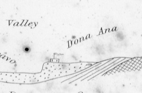
    Sometimes maps have an unusual ability they can Maps can record human achievement and anti-achievement and show human impact on the environment and vice versa, which is standard,  especially if you can see a little deeply into it.  Sometimes though there are the little bits–extras–that find their way onto the paper that opens a window to the emotional involvement of people and space, added by the artist or engraver or whoever it might be that last touches the plate before prints are made from it.  

    This certainly seems to be the case in this cross-section of tough New Mexico earth.

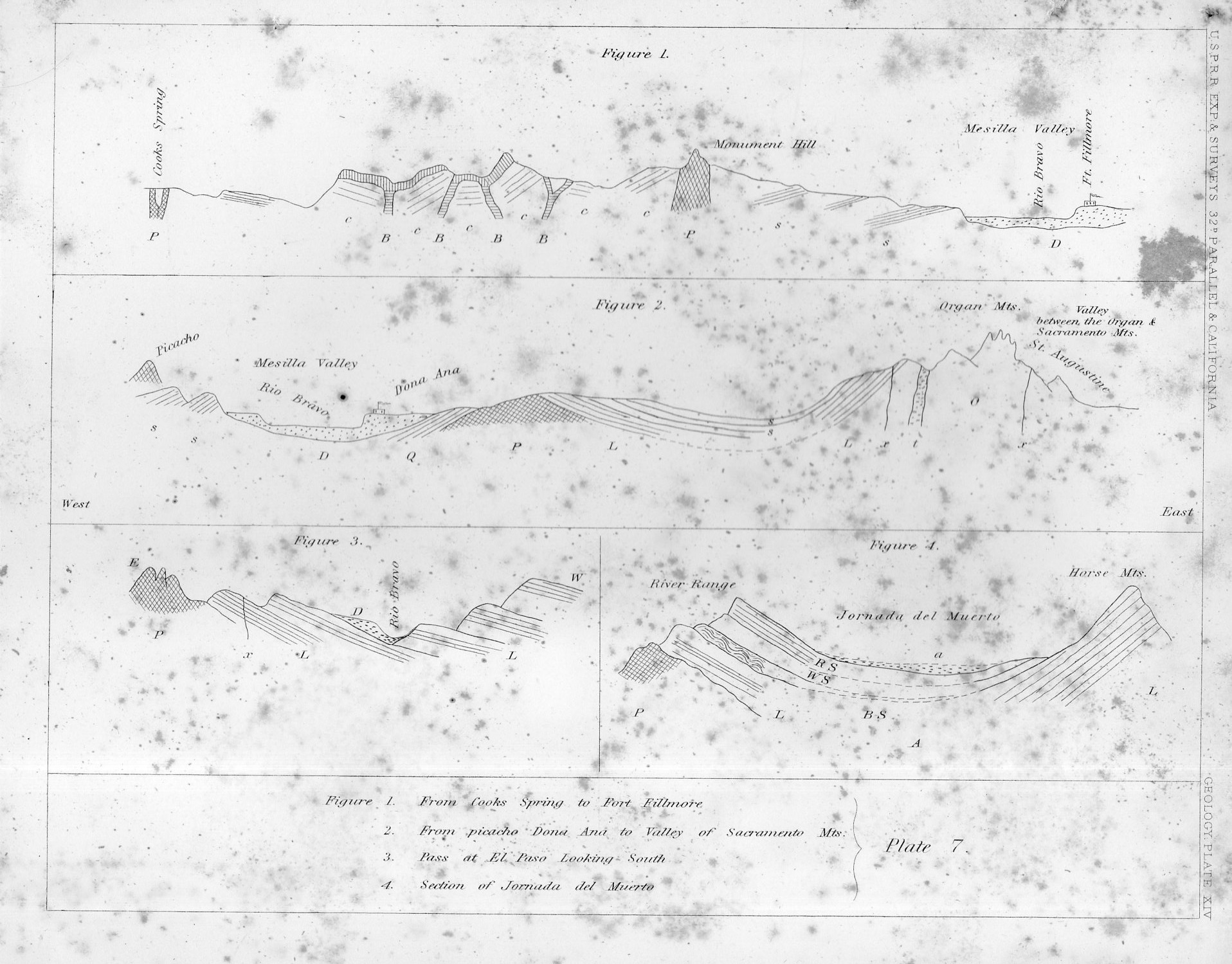
    That little adobe building represents the Dona Ana Land Grant back in 1855, when those pioneers had a few decades of roots in the very hot ground there in New Mexico, across from the Rio Bravo, commanding the Mesilla Valley.  In the original print, published in the great U.S. Pacific Railroad Survey1 in 1855, the structure is only about 3mm long–very easy to miss until you start looking closely at the sheet, which itself is only 2×2.5 cigarettes high and wide.

    I thought the structure had a personality, and looked stolid, strong, and maybe even proud with its long fluttering banner, sitting there in the heights above the river, a strong place perched at the edge of the Jornada del Muerto (“The Dead Man’s Journey” or more prosaically and according to Mr. McMurtry, “The Dead Man’s Walk”)

    Jornada135
    Notes:

    1. The full title of the eight-volume publication, which was an exhaustive treatment of the U.S. west from the mud below to the birds above, Reports of Explorations and Surveys to Ascertain the Most Practicable and Economical Route for a Railroad from the Mississippi River to the Pacific Ocean Made Under the Direction of the Secretary of War, which was published by the U.S. government from 1853-6.


  • Filling-in the Map, 1863

    JF Ptak Science Books  Quick Post

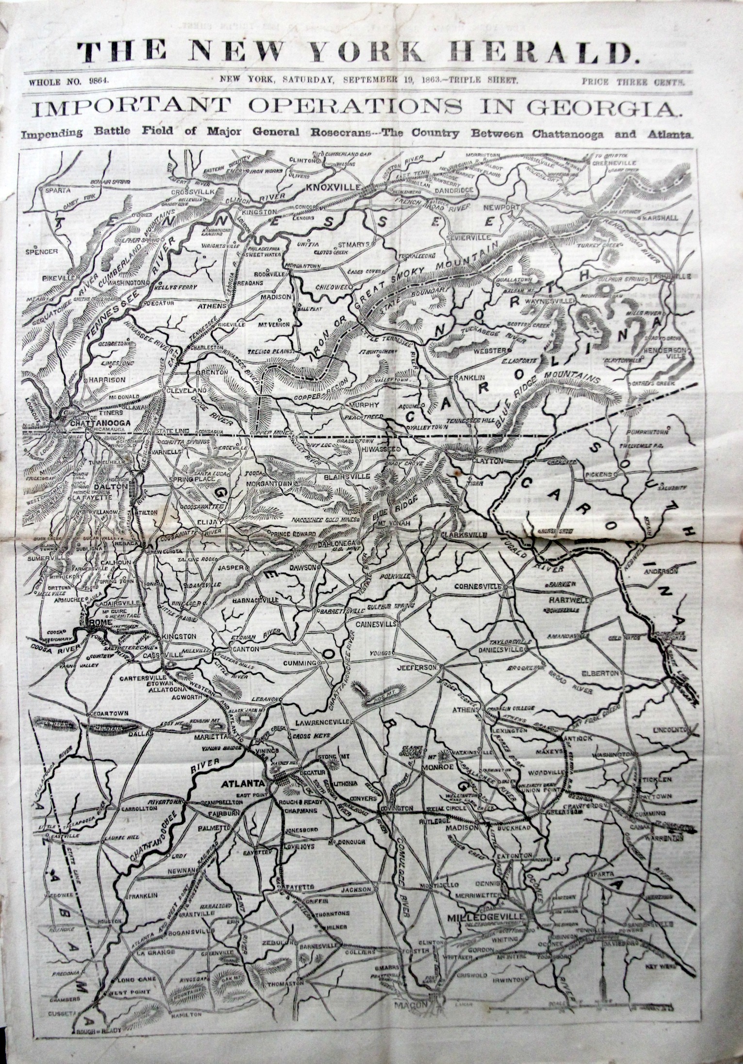
    The “Impending battle” here in the sub-head of this issue of the New York Herald that I picked up recently was Chickamauga. 

    I doubt many knew what was coming. 

    The map fills the entire front of the paper and is 24 impressive inches tall. It moves from the Clinch River east across Greeneville/Knoxville to Asheville, then south to Milledgeville, and across the state west nearly to Alabama, and north to Atlanta, west to Rome, and then north again to Dalton and Chickamauga.

    General Rosecrans had made his move south-east days before, and the battle was actually engaged the day before, on the 18th; on the 20th, it would be over, Bragg and the Confederates with a major victory that would be overturned in the next two months by U.S. Grant.  There were more than 36,000 casualties on this field of battle, the second highest amount of the Civil War next to Gettysburg that occurred two months earlier.

    The map was waiting to be filled in. With more.

    Civil War NY Herald Map


  • Details in Terrestrial/Celestial Globes, 1723

    JF Ptak Science Books   Quick Post

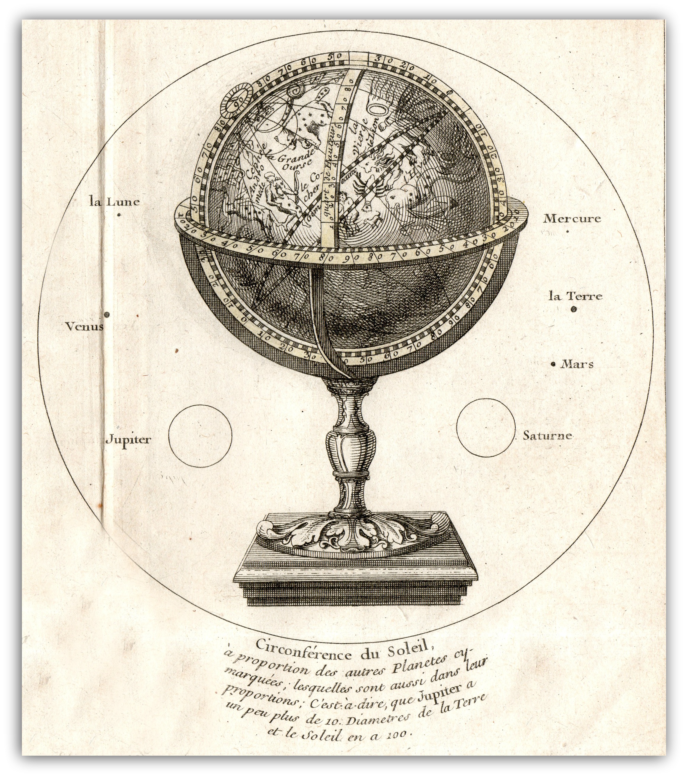
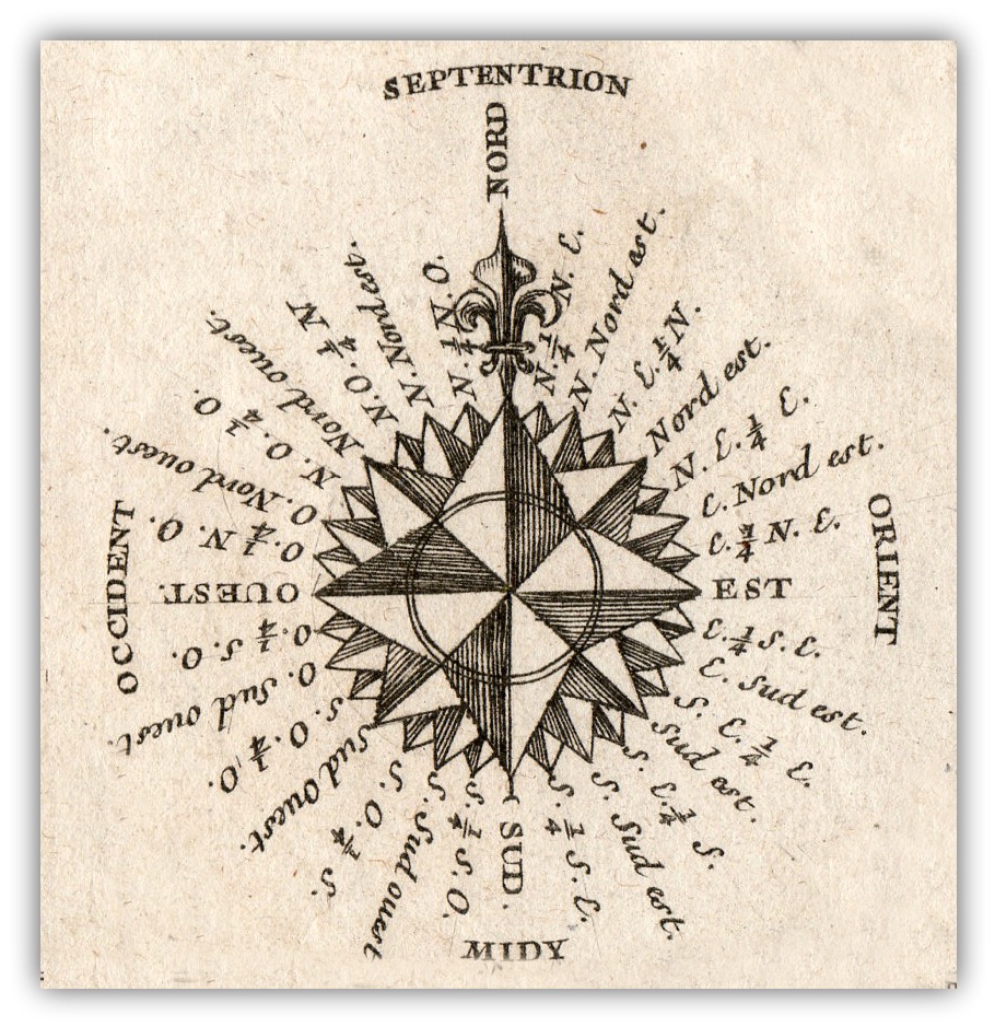
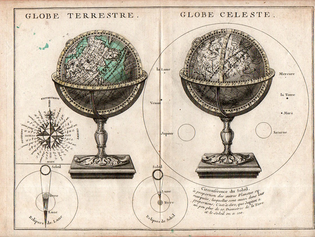
    The main object in this engraving–the presentation of two globes, one terrestrial and one celestial–is perhaps less interesting than secondary figures accompanying it.  The two small insets of solar and lunar eclipses are instructive and pretty, while the compass rose is full and surprisingly stubby, making that example fairly uncommon–and much more attractive when isolated and cleaned up a bit.  So too for the rudimentary but elegant comparison of the sizes of the planets compared to the Sun that surrounds the celestial globe–again, isolated and defined, the image is striking. 

    Map Globe Terrestre Globe Celeste detail

    • The original map is available here at the blog’s bookstore.

    Map Globe Terrestre Globe Celeste117This from the full image:

    Map Globe Terrestre Globe Celeste115