A Daily History of Holes, Dots, Lines, Science, History, Math, Physics, Art, the Unintentional Absurd, Architecture, Maps, Data Visualization, Blank and Missing Things, and so on. |1.6 million words, 7500 images, 4.9 million hits| Press & appearances in The Times, Le Figaro, Mensa, The Economist, The Guardian, Discovery News, Slate, Le Monde, Sci American Blogs, Le Pont, and many other places… 5000+ total posts since 2008.

Category: Maps, Cartography, History of Mapmaking

  • World Map of the The Geography of Homer

    JF Ptak Science Books  Quick Post

    • “For the paths of night and of day are near”–Odyssey, X 86.

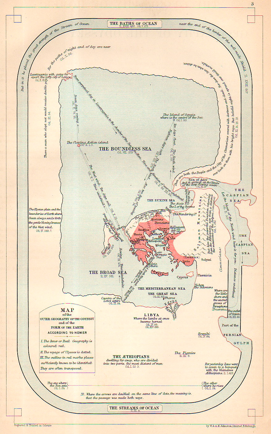
    Map of the Outer Geography of the Odyssey and the Form of the Earth According to Homer is a wonderful map of the creation of Homer (ca. before 900 BCE), across the Soundless Sea to the outer bounds of the paths of the oceans.

    Map Geography of Homer951

    Source:


    • This map is available for purchase at our blog’s bookstore, here.  

    A fine collection of ten other Homeric World maps can be found (with a lengthy essay) at Cartographic Images, here.  


  • Superior, Tiny, Mountain Height Profile Insets, 1856

    JF Ptak Science Books  Post 2446

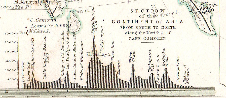
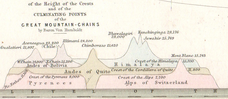
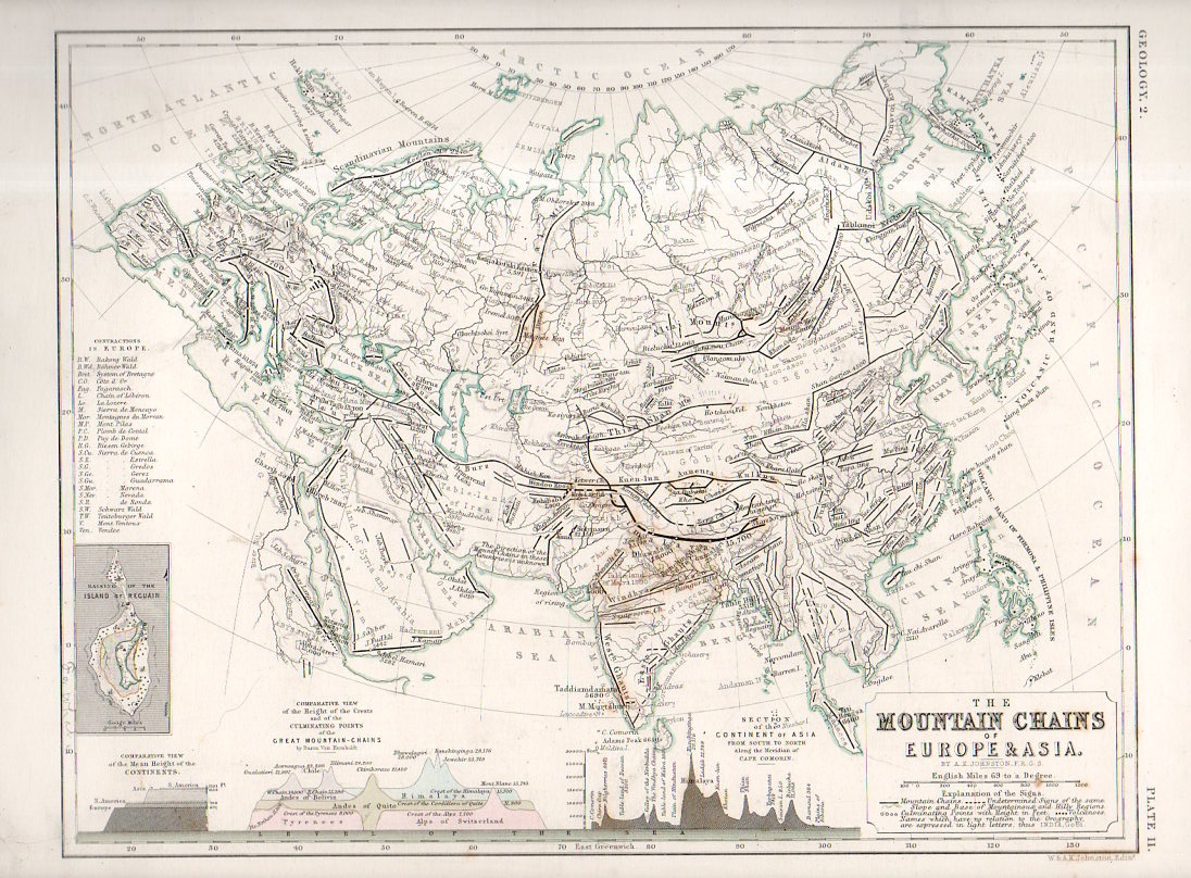
    One of the favorite parts of map reading–especially for 19th century maps–is finding the small, add-on gems of represented data clinging to the sides of the main map, along the margins and in the corners.  Although this map by W. and A.K. Johnstons in itself a fine work of art  and displays some knotty and previously hard-to-com-by data, the two bits at teh bottom of the map just give the overall project a deep lustre.    Alexander Keith Johnston (1804 – 1871) came to this task via the suggestion of Alexander von Humboldt, the results of his own phenomenal research and exploration finding their way into Johnston’s atlas.   

    • The original map may be purchased via our blog bookstore, here.

    Geological mountain ranges934

    This version of “The Mountain Chains of Europe and Asia” is found in the second edition of the Johnston’s The Physical Atlas – A series of maps & illustrations of the Geographical Distribution of Natural Phenomena embracing I. Geology II. Hydrography III. Meteorology IV. Natural History, published in 1856 (following the first edition of 1850).  

    Geological mountain ranges935

    Each of the small inset measures about 1″x1.5″ in the detail of the following:

    Geological mountain ranges933

    Notes:

    Some contemporary notices on the Johnston Atlas: 

    “For the first time, in this country, the principles of graphic representation are here applied to the delineation of the most important facts of external phenomena. Simple but significant symbolical signs have been introduced to an extent, and with an effect, hitherto never contemplated. The contents of the many volumes, formerly the sole depositories of information regarding the different kingdoms of nature, have been condensed and reproduced with a conciseness, precision, completeness, and promptitude of application altogether unattainable by any other agency.”–from a longer description for the atlas found at Chest of Books, here.  

    “This splendid volume will fill a void long felt in this country, where no work has been attainable presenting the results of the important science of Physical Geography in a distinct and tangible form. “–Forgotten Books (here)


  • A Tiny and Obscure Appearance of California as an Island, 18th c.

    JF Ptak Science Books  Post 2466

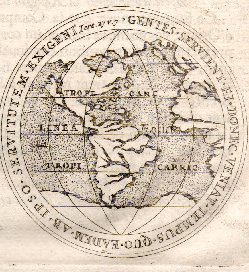
    There is a long history of portraying California as an island, and this may be one of the most obscure instances.  The source is not known (though ca. mid/late 17th c), but it seems to me to be a depiction of Dutch East India Company medallions (depicting city views of Leyden, Harlem, and Breda), and the California map turns up on the reverse of one of them, as bottom.  The original is only about 2.5″ in diameter–here it is, enlarged:  

    California as an Island001

    Antonio de la Ascensíon is credited with first giving flight to the idea that the California Peninsula was in fact an island–and so, beginning in 1620, California would frequently make guest appearances on maps as an island. (Fray Antonio was born in Salamanca in 1573/4 and studied there and at the College of Pilots in Seville; he was ordained in the Order of Discalced Carmelites, and sent off to Mexico. As a cosmographer he accompanied Sebastian Vizcaino (1548-1624) on his expedition to California to find a good port for Spanish galleons coming from Manila, which is when Antonio produced his diaries with the famous island maps.)  This map was created during a period where there was heavy competition for trade routes and geographical knowledge was actual currency, so there was some amount of cartographic information that was proprietary. When the abbot’s map was lost to/and recovered by the Dutch, the changes that were made to California were codified and published–the Spanish thought it not necessary to correct the misinformation. Perhaps.  In any event, it seems plausible that the Spanish crown had no interest in involving itself with what may or may not have been the loss of proprietary information, and so let the island business slide.  Until1751, when the King of Spain issued a proclamation saying that California was indeed not an island.

    This practice continued to about 1747, when there was more than ample evidence to suggest that the island status of California was erroneous–still, it took several decades for the last of the island-maps to make its appearance. 


  • Map of Rivers and Waterfalls, 1851

    JF Ptak Science Books    Quick Post

    Maps Rivers Waterfalls981

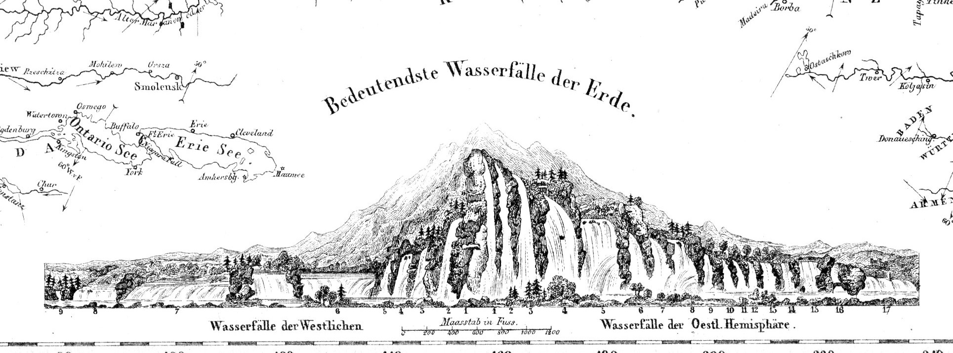
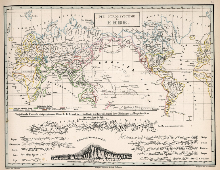
    Before the Neil deGrasse Tyson version and update of Carl Sagan’s landmark television series, Cosmos, there was Alexander von Humboldt, and his enormously influential book of the same title, printed in 1845-1862.  Well, von Humboldt’s (1769-18591) book was actually Kosmos when published in German, which is where it started its life (and which von Humboldt suffered mightily for in it English translation), and in which this map appears.  Von Humboldt was enormously studied and educated and of a high scientific mind over many subjects, one of those 19th century figures who seemed as though they could know everything, a polymath of high order (along the lines of Goethe and von Helmholtz and Thomas Young and others).  He was a meteorologist and biogeographer before those sciences existed; a naturalist, geographer, archaeologist, and explorer, a natural philosopher of magnitudes.

    • The original maps is available for sale at the blog’s bookstore, here.

    Kosmos reflected his lifelong interest in order, and what he did was astonishing–he attempted to unifying the complexities of nature in one book (of five volumes), binding the various branches of science together in a cohesive whole, attempting to show how the laws of the universe acted here on Earth.  It was a very influential work, very progressive, a masterwork of scientific method.  Kosmos.

    Maps--River system


  • An Extraordinary Map of Battle Death–“Body Density Maps”, 1918

    JF Ptak Science Books   Post 2461

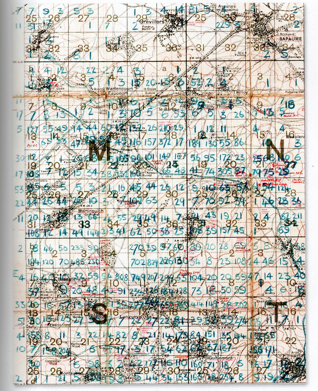
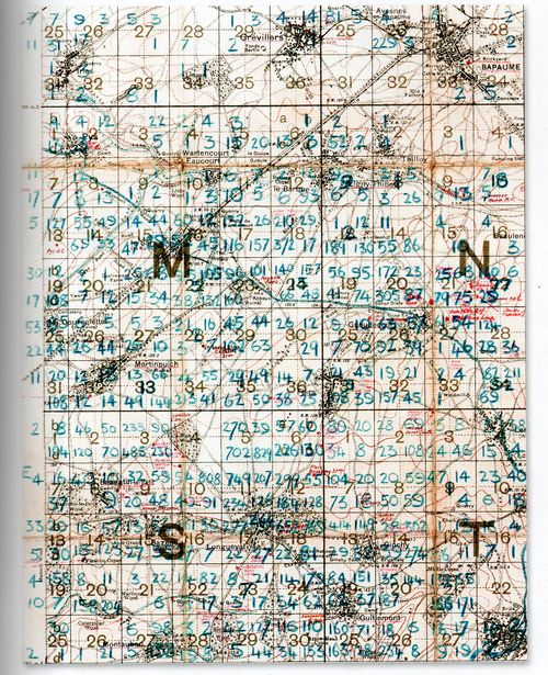
    At first glance this detailed and dense map looks foreboding and somehow off-putting–at least for me, and that was before I understood what the numbers represented.

    The blue numbers on this section of a larger map refer to soldiers killed on the battlefield of the 1916 Somme battlefield. It is the work of Lieutenant Colonel Arthur Messer (Assistant Director of Graves Registration and Enquiries in France), who undertook to record the crosses of the Fallen on the battlefield and register their location, and then to re-inter the bodies together in larger cemeteries.  
    MAP DEATH DENSITY977

     [Source: John Hughes-Wilson, The First World War in 100 Objects, Firefly Books, 2014.]

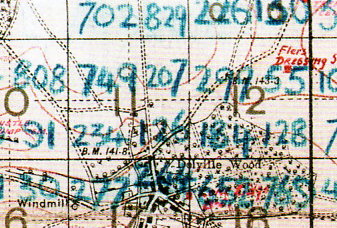
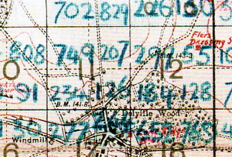
    What we are seeing here are pieces of four 6×6 grids (one complete and three partial) numbered (in red) 1-36, each one of these squares further subdivided into four section.  Each larger square composed of 36 squares is 1000×1000 yards total, meaning that each one of the 36 subdivisions is about 166×166 yards, and each of the four segments of one smaller square is 83 yards. The blue numbers indicate a soldier killed on that field of battle which means that in the large 36-square “M” subdivision  #18 that there were 210+29+372+17 fatalities, or 628 on a 166×166 yard field, or in one case 372 killed on a 83×83 yard plain.   The deaths were even more intense on other areas of the field–in Square S #11 there were 749+207+234+126, or 1,416 deaths in that 166×166 yard field, and 749 on the 83×83 yard field.  It is hard to visualize such loss. I picture a U.S. football field–there are 22 players on the field during play, and that seems to populate the area pretty well–casualties of 749 soldiers on a similar area would be nearly 35 times that, meaning that placed equidistantly and with a few feet on the sides they would cover the field.  There are, what, 75 people on a football team?  That means at the beginning of the game when all of the players and coaches and staff and cheerleaders and member of the band run out onto the field to take their places, they would all be dead–and then some.  That is a lot of death.  
    MAP DEATH DENSITY978

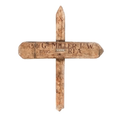
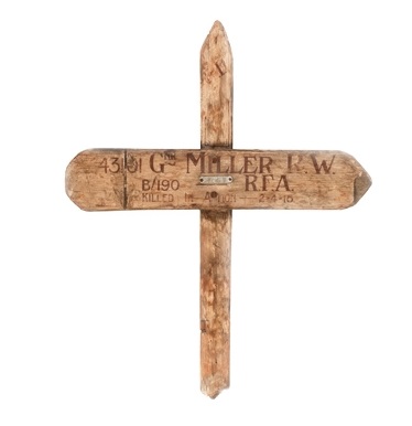
    According to the Imperial War Museum, temporary markers for fallen soldiers looked like this:
    Wooden cross

    After the war the Imperial War Graves Commission replaced the wooden crosses with stone markers.  

    The wooden markers would then returned to the family.  

    [Source: http://www.iwm.org.uk/learning/resources/remembrance-in-the-first-world-war]


  • An Excruciatingly Detailed Map of Los Angeles, 1903

    JF Ptak Science Books   Post 2445

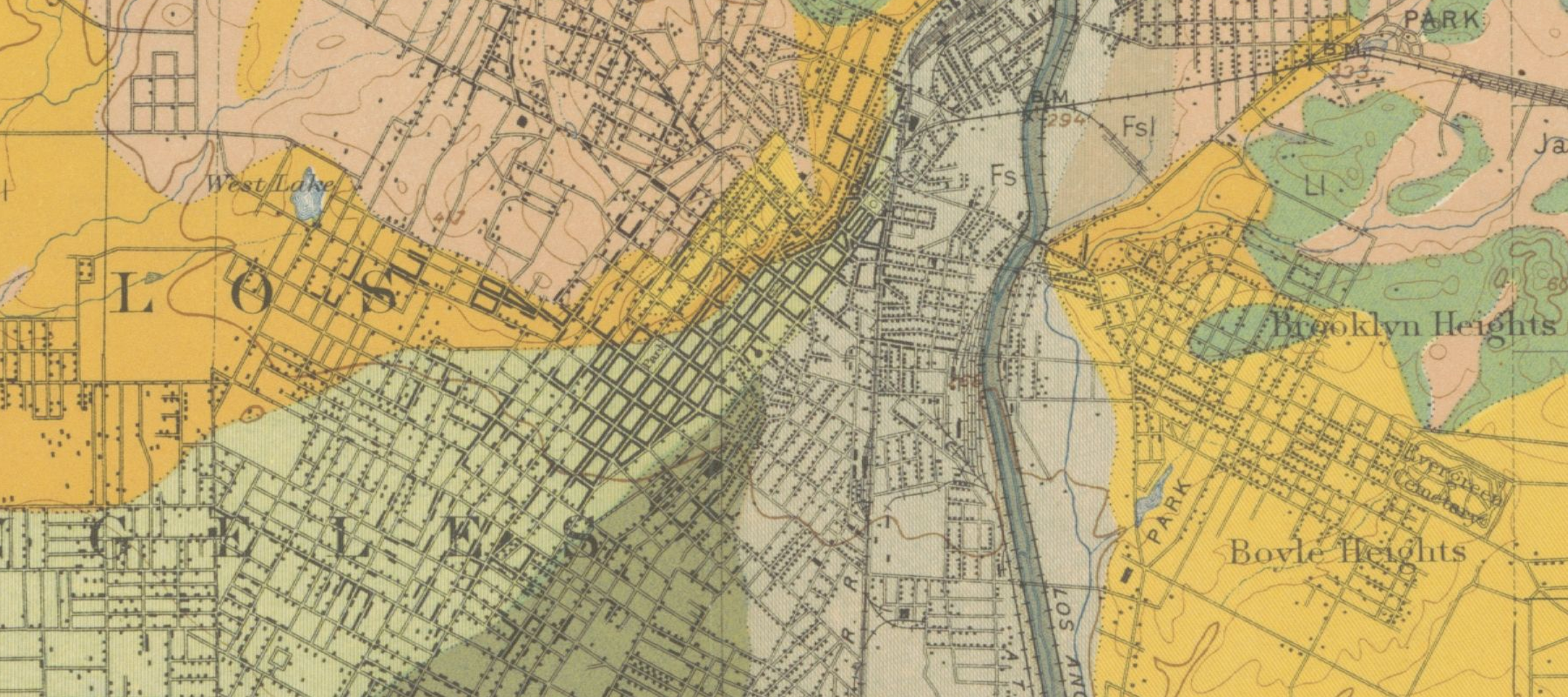
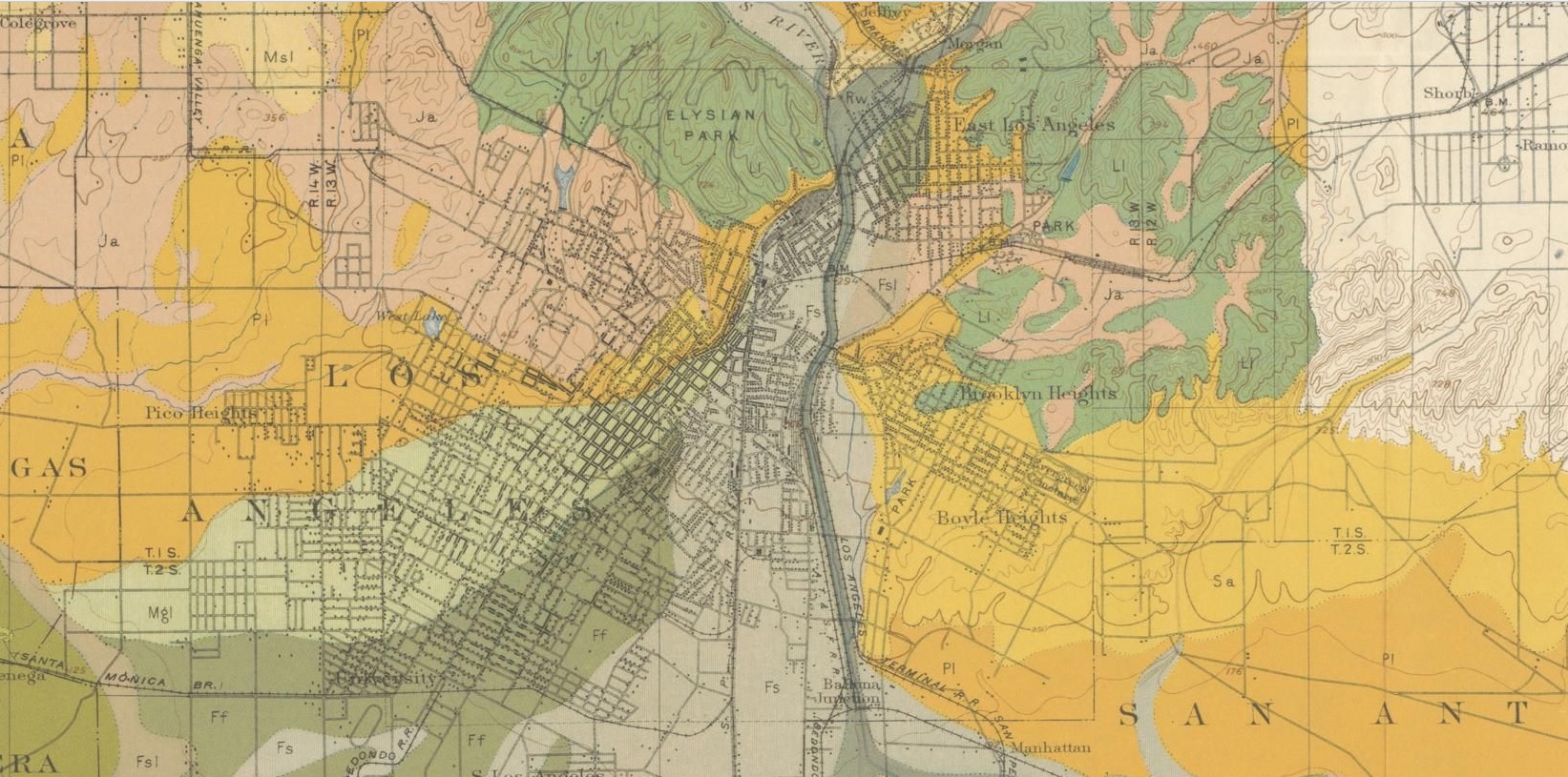
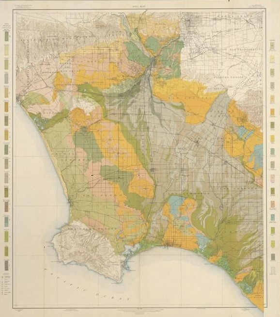
    Soil survey maps have long been favorites of mine–not because of the soils part (which is a fascination all on its own) but for the terrific amount of human geography.  The maps are usually quite large and cover areas that are quite small (relative to other maps), and the folks who went out to collect the data also helped to collect much of the human-impact stuff as well.  Not only are roads and canals located, but so are distant farmhouses and barns. As you can see in the first detail ,individual structures are located along the streets in LA central.  The maps are really pretty extraordinary.  

    LA Soil Map 1903  Really big detail

    [Mesmer, Louis. Soil map, California, Los Angeles sheet., Map, 1903]

    And a bit lesser detail:

    LA SOil Map  1903

    And the full map:

    LA SOil 1903 Full

    This copy is NOT my copy of the map–it is simply too large for me to digitize. The copy that I’m working with above is from   Texas History, with a fine, full, interactive and very zoomable map, here:  http://texashistory.unt.edu/ark:/67531/metapth193395/m1/1/zoom/

    • “Map shows soil composition, roads, railroads, city and town street layout, structures, and watershed. Includes soil profile and legend. Relief shown by contours and spot heights. Scale [ca. 1:62,500].”–from the Portal to Texas History website (as above)  Baltimore : A. Hoen & Co. Lith, 1903. 35×30″

    That said, I think my copy is in better condition, and can actually be purchased from the blog’s bookstore, here.  


  • Two Very Early Los Angeles Maps, 1850-1855

     JF Ptak Science Books   Post 2443

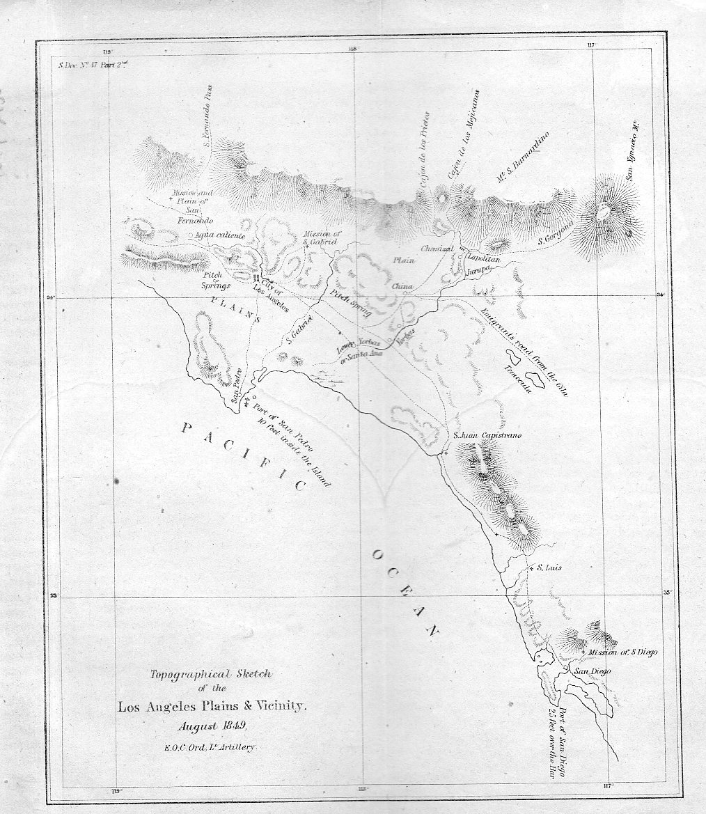
    Well, one is a map and the other is a view, but that is harder to say in a title. They are extremely early for what they are. The first item1, depicted just below, is a map drawn by the accomplished Edward Ord of (mostly) the entire Los Angeles Plains, reaching down to San Diego in the south and up to the“Mission and plain of San Fernando”  in the north. It is a small but important map, one of the very first scientific maps of the region. It is a military map of the area–drawn just after the American conquest–and it is also a gold rush map.  It appeared as one of the illustrations in the first significant scientific work on the California gold rush: Philip Tyson’s Information in Relation to the geology and topography of California, which was published in 1850.  

    • (All of these items are available for purchase via the blog’s bookstore, here.)

    Los Angeles 1850917

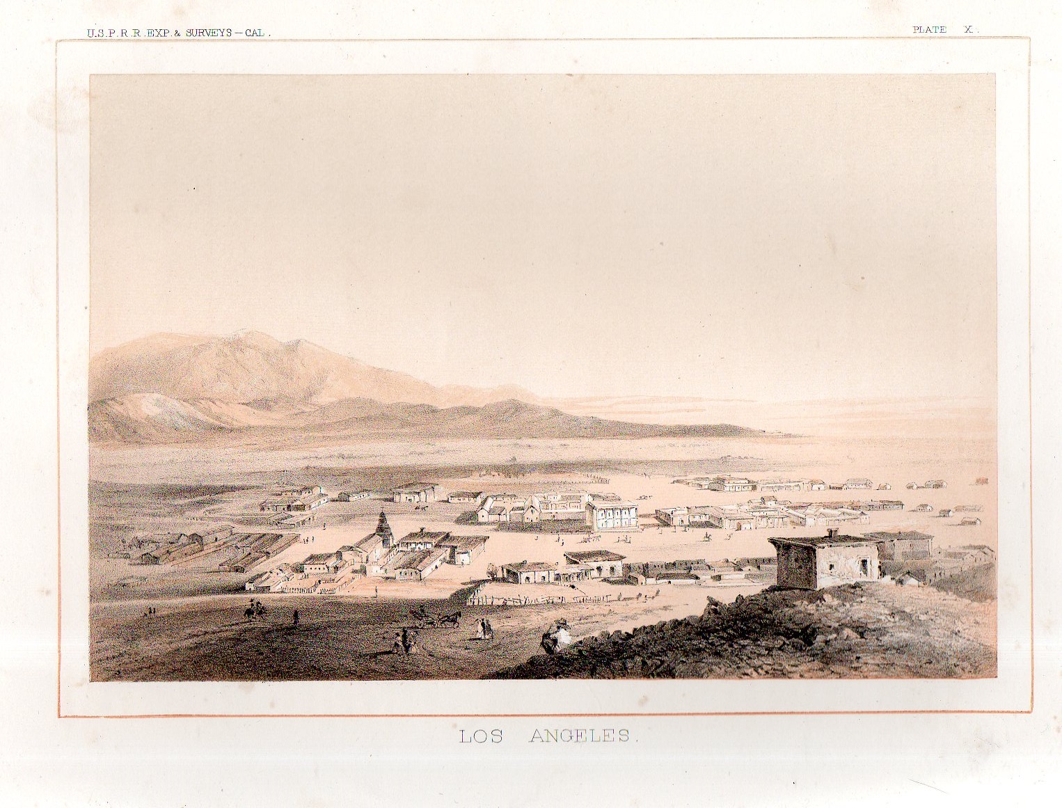
    From the first scientific rendering of Los Angels in 1850 comes the first view of the city–it is tiny by the modern standards of a small time but here in 1855 it was fairly well seasoned and developed, with at least 100 structures.  The first L.A. bird’s eye view appeared in the great survey of possible routes for the transcontinental railway called the USPRR Surveys (or the U.S. Pacific Rail Road Survey2).

    Los Angeles 1855918


    Notes:

    1. See this interesting popular story on the map in  Los Angeles Magazine  http://www.lamag.com/citythinkblog/citydig-the-los-angeles-plains-plainly-sketched/

    Also if you’re interested in reading Ord’s correspondence regarding the map see here in The Army Surveys of Gold Rush California: Reports of Topographical Engineers, edited by Gary Clayton Anderson, Laura Lee Anders

    2. The fuller title: Explorations and Surveys for a Railroad Route From the Mississippi River to the Pacific Ocean…Report of Explorations for a Route…Near the 38th and 39th Parallels of North Latitude .. Volume V , Washington: GPO, 1855. 


  • Maps: Climate Change, Population, Drought

    JF Ptak Science Books  Quick Post

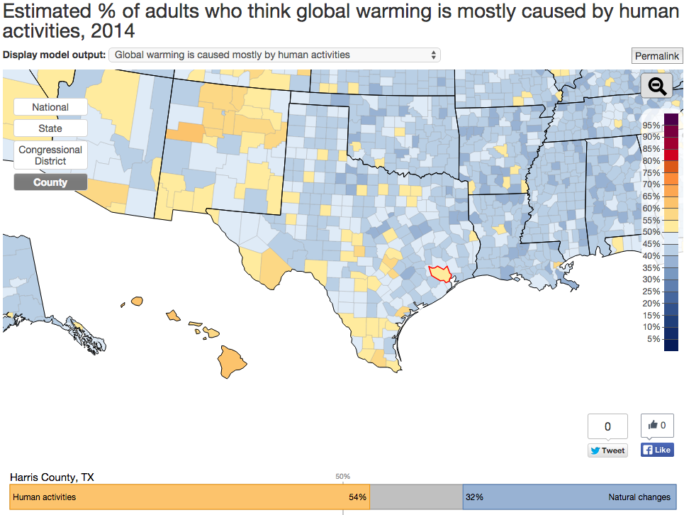
    Interactive Map on Global Warming Opinions

    Click a state and more detailed parts of the questionnaire are revealed, including whether the climate change is largely a result of human action and thirteen other questions arranged in the three areas of policy  support, risk perception, and beliefs.  

    One odd thing is the percentage of people opposed to renewable energy R+D–I’m not sure why 21% would say so, why someone would be against becoming more-or-less self-sufficient. Another 25% are opposed to regulating CO2 emisisons, which combined with the renewable opposition is frustrating to comprehend.  

    Data map global warming

    SOURCE:  http://environment.yale.edu/poe/v2014

    Population

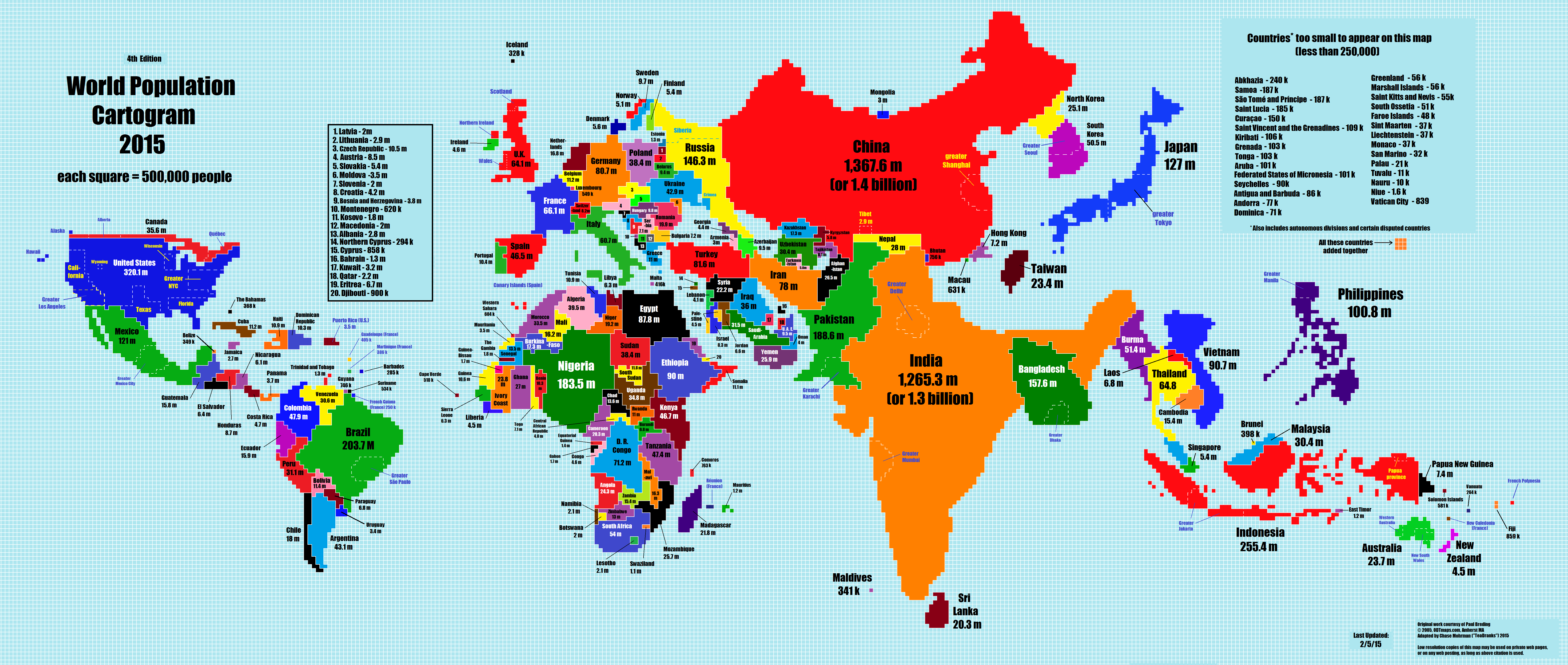
    The 2015 World Population Cartogram, showing country population in discrete blocks equal to one million people each.  Not a projection but looks like one, and interesting:

    Data maps pop growth

    SOURCE:  NPR blog, here  http://i.imgur.com/I81xSNt.png


    Drought Map, 2011-2015.
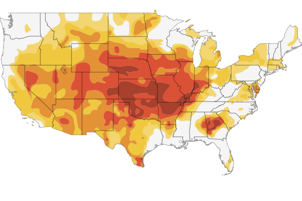
    Data map interactive drough mapThere’s a fine and scary interactive map if you follow the link to the NPR site showing the development of the drought situation in 1200 counties in the U.S.

    SOURCE:  http://www.npr.org/2012/07/18/156989764/interactive-mapping-the-u-s-drought


  • History of Lines–Straightening out the Thames

    JF Ptak Science Books   Quick Post

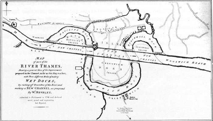
    The architect Willey Reveley straightened out curves and curved out straight lines. 

    Thames River straightening

    Source: Wikimedia. 

    As we can see here he had the idea of constructing a straightaway through the three famous bends of the River Thames in East London.  The straight part would be used for commerce while the bends would become docks and yards.  

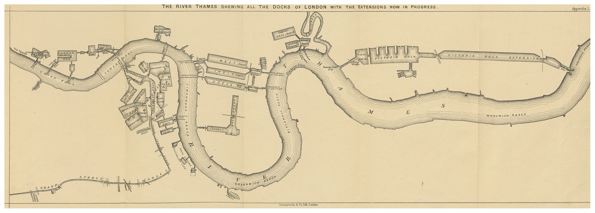
    Another vision by Reveley is seen below, from page 113 of Alexander Forrow’s The Thames and its Docks, a Lecture (London), 1877 (the full text available at the Internet Archive):

    River thames 2Source:  Wikicommons 

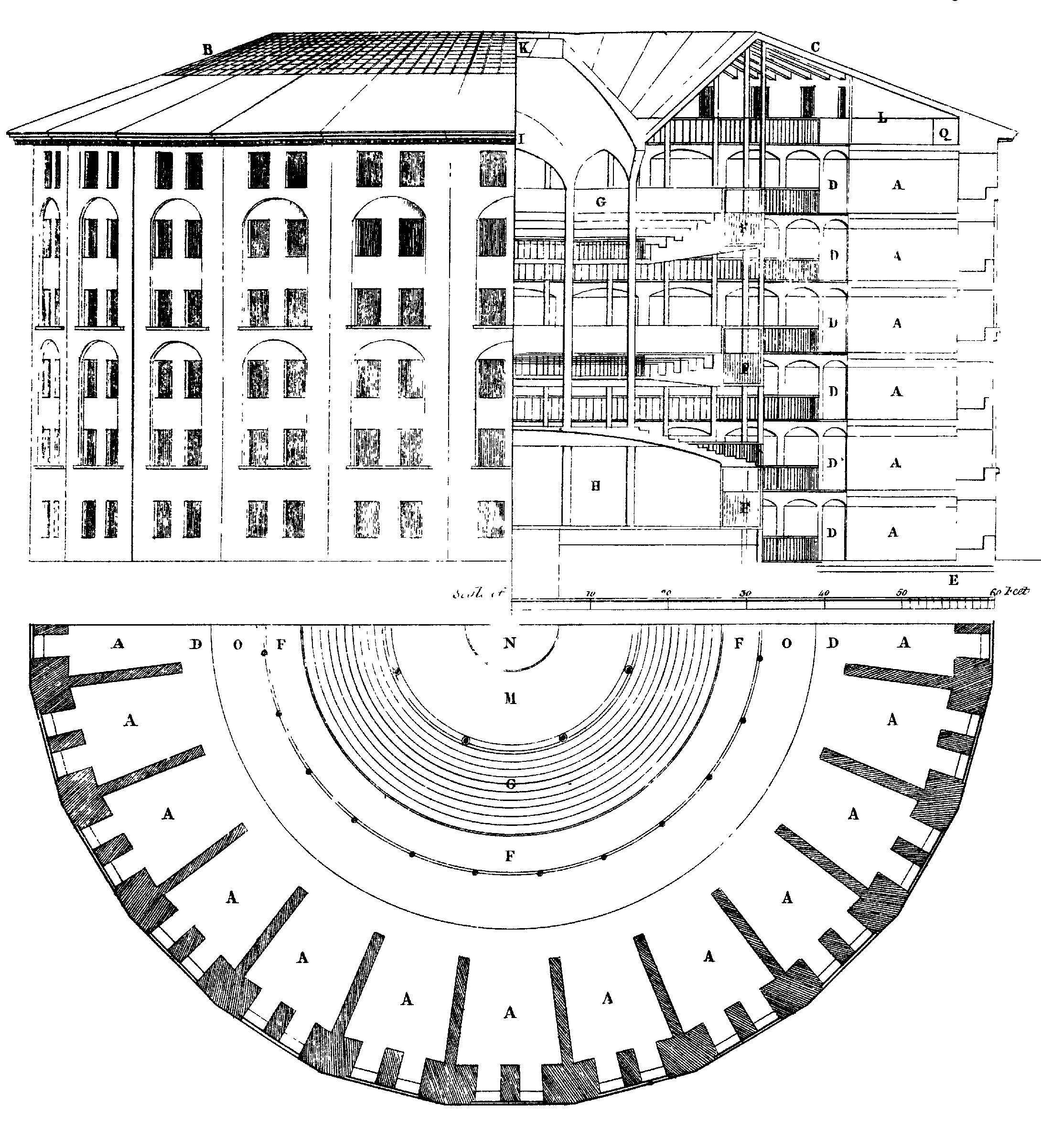
    With all of this straightening-out of the river thinking going on in Reveley it is interesting to see that when he applied his brain to the the world of very straight lines as they exist in prisons that he went the other way–following the idea and commission by Jeremy Bentham, Reveley created plans for a circular prison. Bentham’s Panopticon was an idea that wouldn’t leave Bentham and occupied at least one small part of his brain throughout the 1790’s–I’m not sure where in Reveley’s head the idea lived, but it didn’t live there for long, as the architect died at a very young 39 in 1799. Bentham (born in 1748) lived until 1832, and never did see his Panopticon constructed. (Then again, he may come to see it if someone showed it to him, as his head has been preserved as an on- and off-again display at University College…)


    File:Panopticon.jpg

    Source:  http://upload.wikimedia.org/wikipedia/commons/1/11/Panopticon.jpg


  • Nazi Propaganda Map for a European Hearts and Minds Campaign

    JF Ptak Science Books  (Post 193 from 2008) Expanded and with better images. 

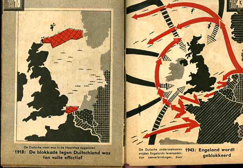
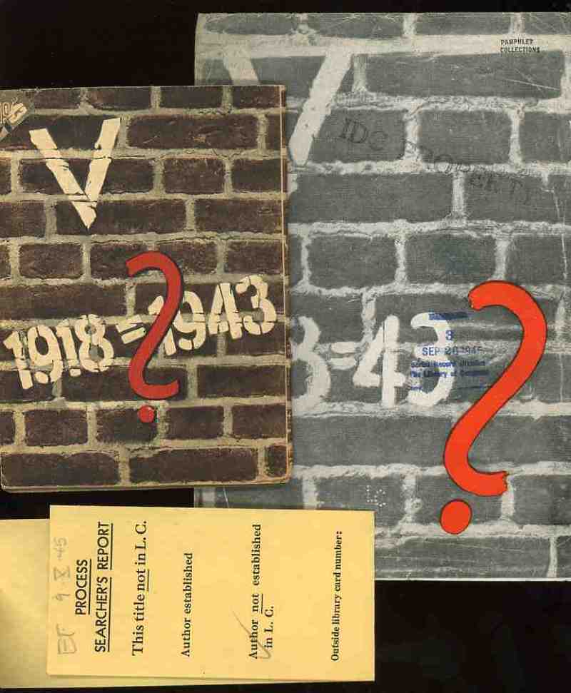
    Nazi Maps D Propaganda1

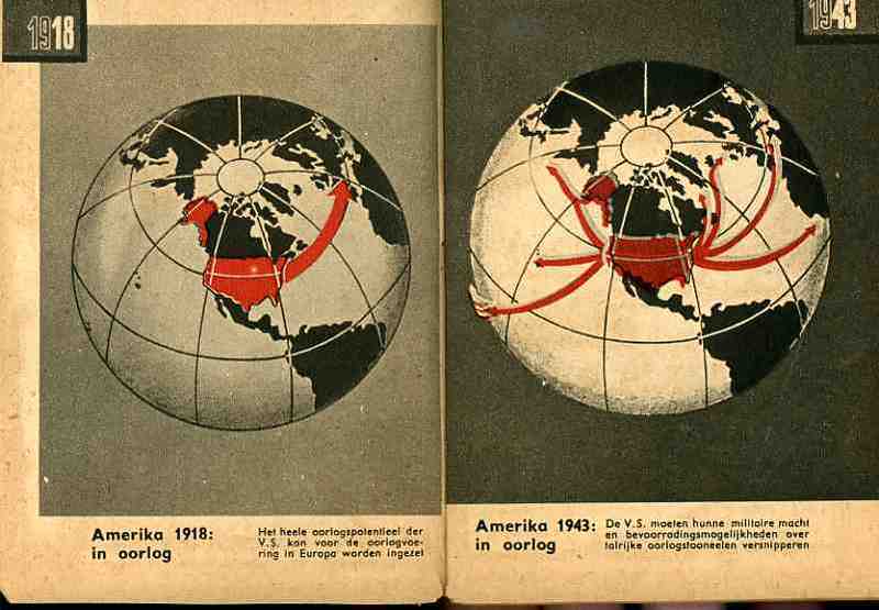
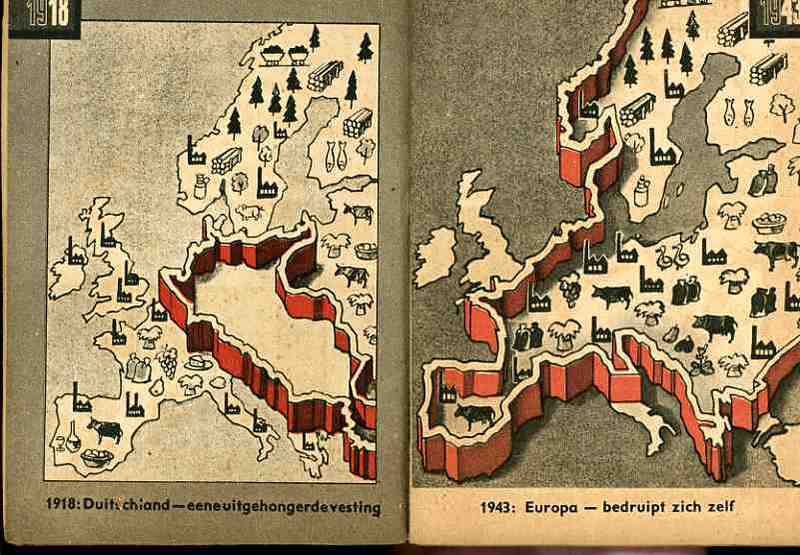
    These two, related, pamphlets were the products of the Nazi Propaganda engine and sought to affect the moral and intellectual stamina of the people in the occupied countries of the Netherlands and France in 1943.   Each stressed the enormous differences in the German state that took place in the 25 years between the end of World War I and the third year of the Nazi European part of World War II.  I’ve no idea whatsoever about the grander symbology  (if any) of these numbers associated with these two pamphlets (the Roman numeral for “5” and the 25 years of the difference and the “13” points (of the French propaganda) aside from the obvious mathematical implications.

    Nazi Maps D Propaganda2

    (The only interesting bit that I can find in the “18=43” from the French pamphlet is Luke 18:43 “Immediately the man could see again and began to follow Jesus, glorifying God. All the people saw this and gave praise to God.”. )   I find it curious that identical symbolism (?) was used for the two countries, and that the French version was simple comparative text (summarizing the differences in the two periods of time) while the Dutch version was mainly a picture book. 

    Nazi Maps D Propaganda3

    I would reprint the French version if it wasn’t so bloodily hateful.  (Suffice to say that this is so by looking at one example: in the last of the second issue of 13 points  Goebbels et alia wrapped themselves in the insulating fabric of the German “people” in the “resistance” against “Jewish saboteurs”—not the German political machine, and not the German military, but the German people, insinuating that the Nazi annihilation of the Jewish people was de facto sanctioned by the will of the German nation.  This is of course part and parcel of the fictitious and loathsome Protocols of the Elders of Zion (of which Henry Ford was a happy reader), a French work that was completely stolen and plagiarized by Imperial Russia in the early 1880’s and which, later,  Hitler used to both build his hate against the Jewish people and use (and acknowledge ) as the template for his early actions in the Nazi Party.)

    Nazi Maps D Propaganda4

    The maps used in the Dutch publication are fairly general and issue a stark warning about the growth of Germany–and how Germany continues to grow through war.  The first that we reprint, above, tries to get the point across to the occupied people that England has more problems to deal with than would concern their attention with the Netherlands.  The second part of the first map crazily shows the attack upon England and the effectively exhausting attention it has to pay to many points of invasion.  Ditto for the second map, showing the spread of American concerns–the U.S. in 1943 would have far more to deal with in many points in a two-ocean war than to concern itself with or have the ability to think about the liberation of Europe and the Netherlands.  The last map shows the supposedly extraordinary growth in Germany’s  industrial and agricultural capacity. 

    In short, the maps tell its readers to just keep quiet, the German nation is mighty, and just wait for the end of the victorious German war.  The maps also addressed non-readers–of course the Dutch literacy rate was extremely high, but you didn’t have to be able to read the description of the map to understand its blunt message. (This makes me wonder if the maps really weren’t intended for scare tactics against children.)  As Boss Tweed once infamously reported–that he had no fear of editorials because his constituency couldn’t read–he hadn’t counted on the political cartoons of Thomas Nast–which could be understood by a non-reader–and which wound up being one of the direct causes of his exposure and downfall.