A Daily History of Holes, Dots, Lines, Science, History, Math, Physics, Art, the Unintentional Absurd, Architecture, Maps, Data Visualization, Blank and Missing Things, and so on. |1.6 million words, 7500 images, 4.9 million hits| Press & appearances in The Times, Le Figaro, Mensa, The Economist, The Guardian, Discovery News, Slate, Le Monde, Sci American Blogs, Le Pont, and many other places… 5000+ total posts since 2008.
When I see images like this, I can feel a symphony of bad ideas rattling my bones.
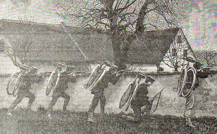
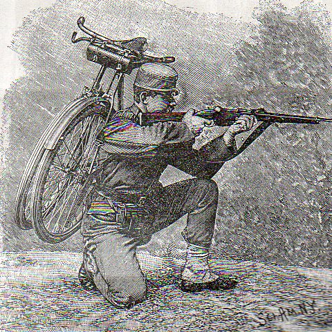
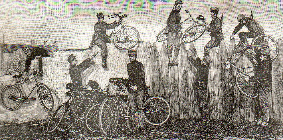
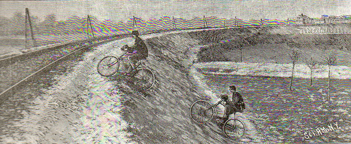
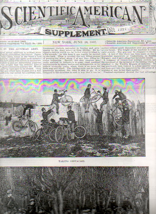
Of contrivances great and unnecessary, that of bringing the bicycle into the field of war–banking on a fabulous interest in the machine and riding a wave of enthusiasms enjoyed by millions–is among the loftiest of lofty unnecessaries of the past 150 years or so. When these pictures were published in 1897 interest in the bicycle was shattering; it was a popular conveyance, and then in just two or three years, an explosion: millions of people suddenly needed one. Bikes seemed to be everywhere, which forced people to imagine new and different uses for the machine. And so the Austrian army came up with a plan to include the bike in its plans of war, and it proved to be as about as useful as a double-decker horse. And just like that–poof–the fragility of the bike’s expansive uses fell right off the table, along with the popular interest in it, which by the turn of the century saw the millions who had turned towards the bike turn away.
It is difficult to image a more unpleasant (real) use for the bike than this. The pictures seem as though they are part of a Monty Python montage, but they were indeed deadly serious–though I do need to credit someone, anyone, who came up with the idea of a folding bike to make it slightly more transportable. (Overall though it seems almost as useful as a folding tuba. Or sousaphone.) If employed I think the idea would’ve proved to be more deadly to the biker than whomever the biker was attacking. Or, more likely, fleeing.
One can only shudder and what it must’ve been like, sitting on top of that fence, handing bikes (with lights and horns) from one side to the other, bullets flying, attempting an attack with 75 pounds of cumbersome trouble slapped to your side. It must have felt insane.
(The original print is available from our blog bookstore, by the way.)
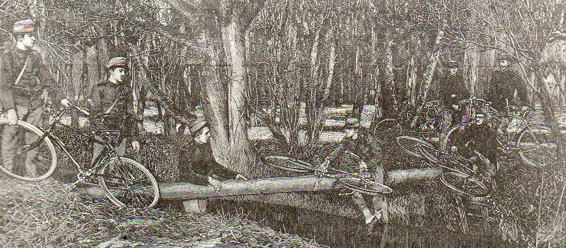
I think these men would have heard the music too as they slogged their ways through brush and trees and muck and the like, sliding their bikes along that log to keep them dry while the men stood in the wet. They would’ve heard the music too, a short little symphony played on folded instruments, which sounded as bad as it looked.
If I put my literary specs on and do a little free-association, what I see in these two figures is a Proustian thing, characters in search of time, freezing time, preserving it. Time, and everything else, everything that can be associated with a human experience captured and recaptured, recirculated, resuscitated, replayed, re-envisioned, remembered, recognized, over and over again. Kind of like a memory hell, in a way, only in Proust’s hands it all sounds and tastes so beautiful. Another peek without those wicked mega-specs and I see two robots from a pulsing Disney film, actions in search of characters–the possibilities are endless, particularly if you develop a little narrative. The real story of what is happening here is complex version of a simpler solution.
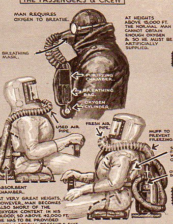
And the key to it all: hypoxia.
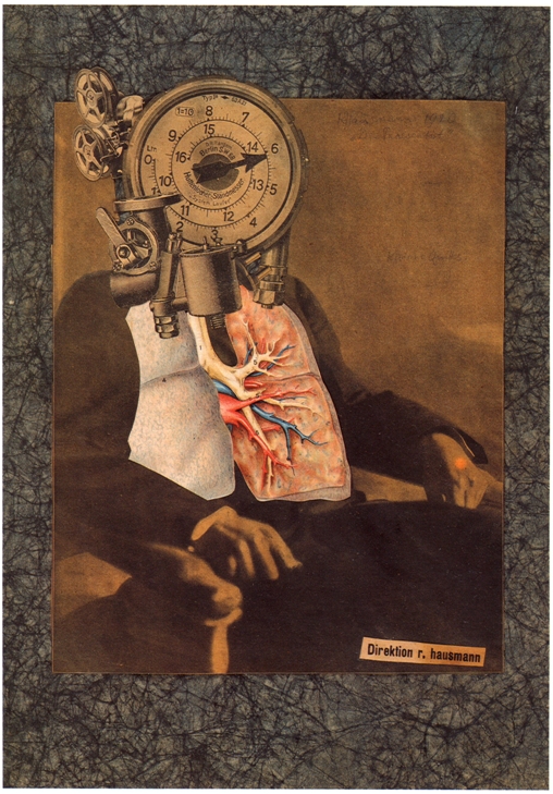
But I can’t leave this without at least a mention of Raoul Hausmann, whose “Self Portrait of a Dadasoph” is related to this line of collecting consciousnesses:
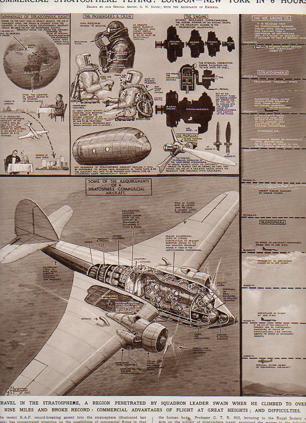
When this next image was published in the Illustrated London News in October 1936 the practical application of tropospheric flight was just about a reality. I should really say “popular” more so than “practical”. It presented two approaches to a looming problem in the progress of aviation–reaching altitudes in excess of 10,000 feet begins to present a host of problems to the passenger of that aircraft. The solution was to combat the pressures of high altitude flight, one of which was to pressurize each passenger and crew member in their own “space suit”. The combination of the artist G.H. Davis1 and the technical assistant compared this solution to the problem with a more simple and elegant solution. And that was relatively simple, at least in thought experiments: rather than pressure everyone individually, you could place everyone in a pressurized environment within the aircraft. And this is the point that the artist/techie make–earlier engineers came up with simple solutions to traveling at high altitudes–they just weren’t simple enough. And compared with the better design, the initial, simple, designs look a little monstrous.
Notes:
1. I include Mr. Davis as an iconic figure in the history of 20th century technical illustration–he has been featured on this blog many times.
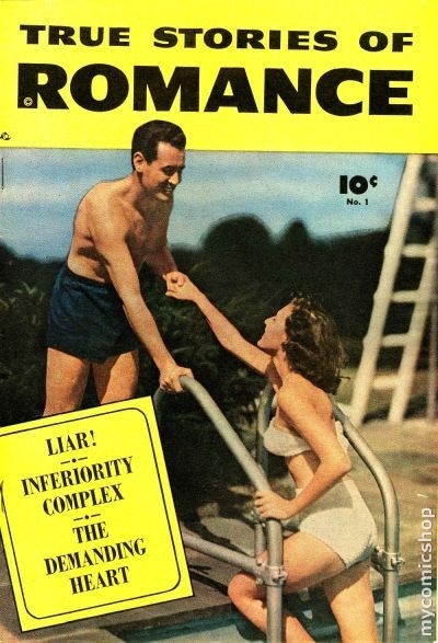
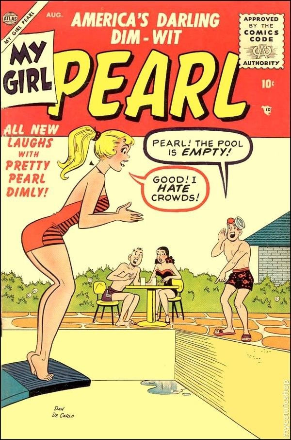
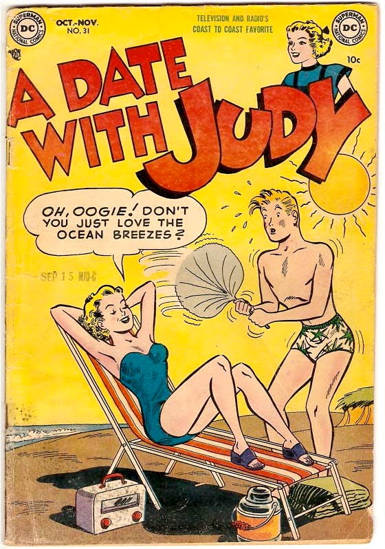
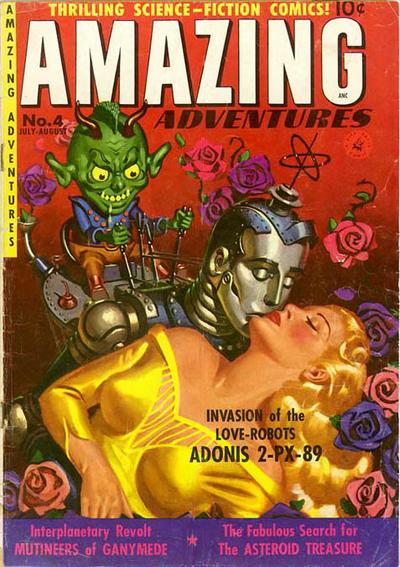
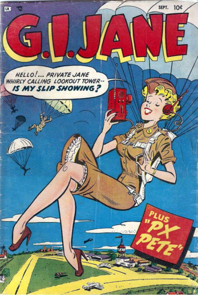
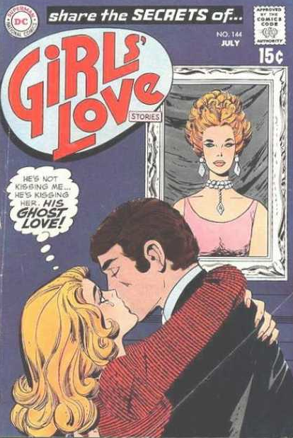
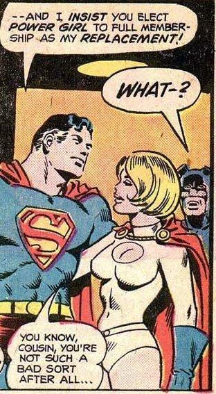
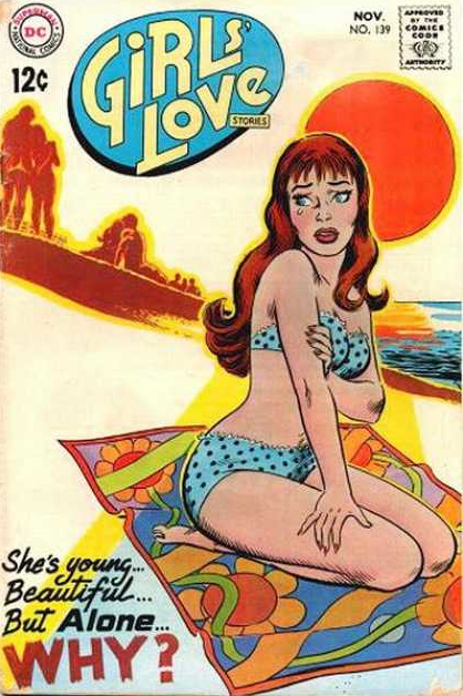
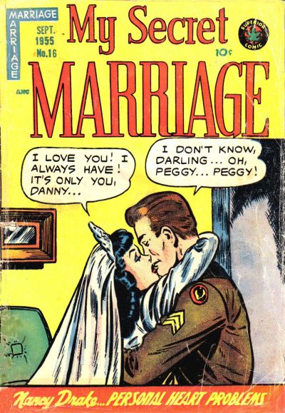
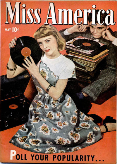
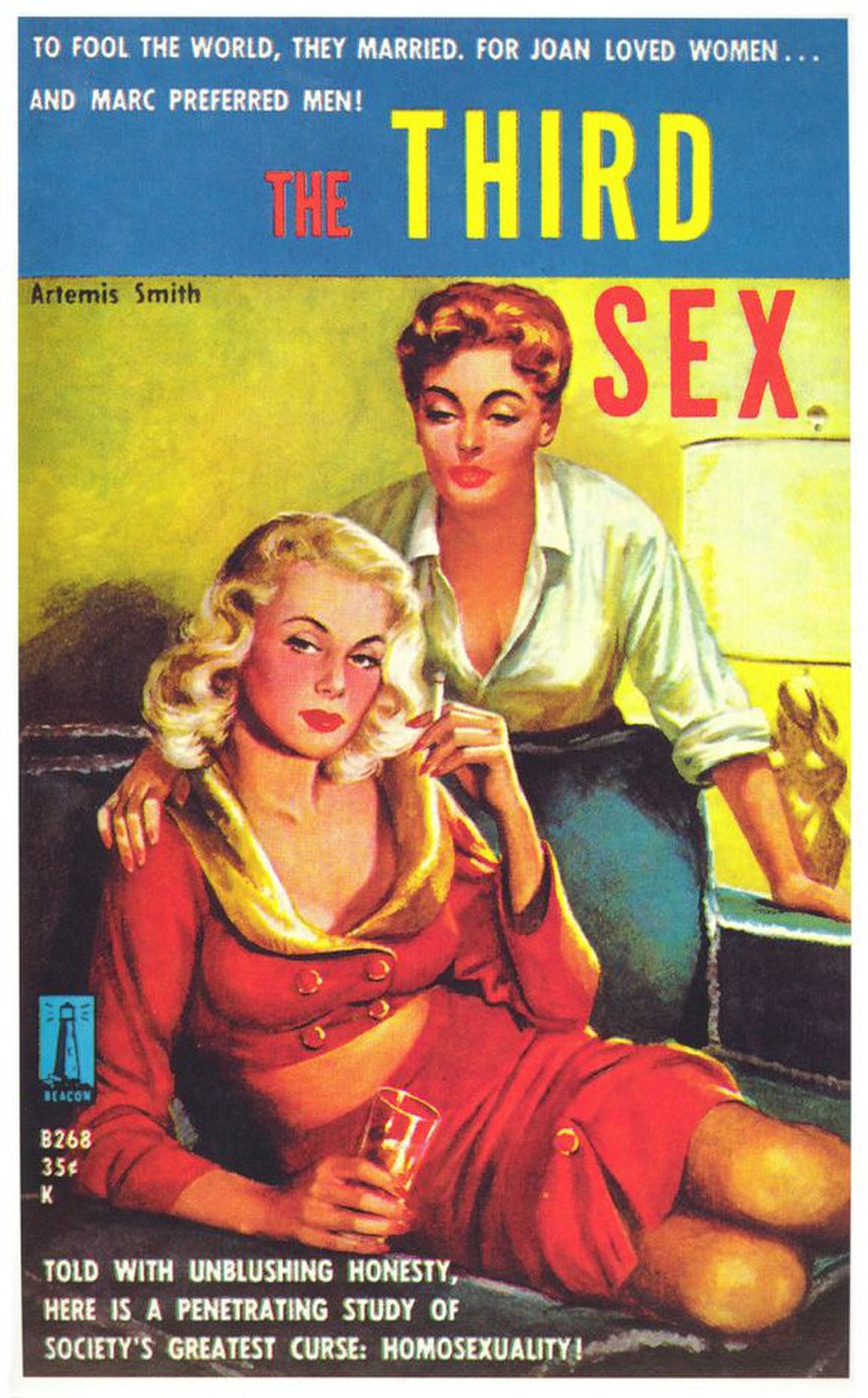
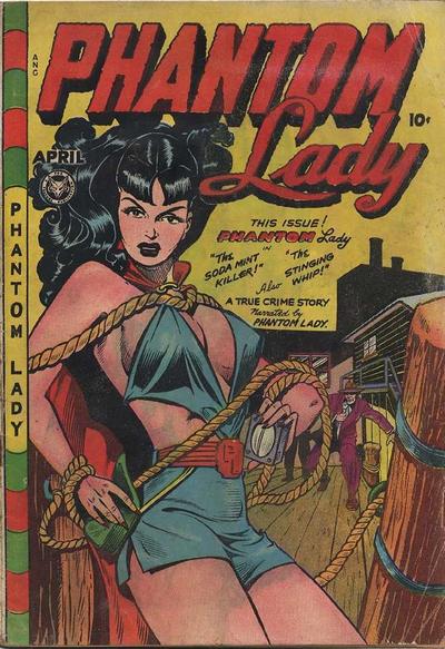
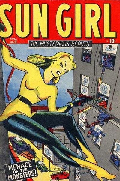
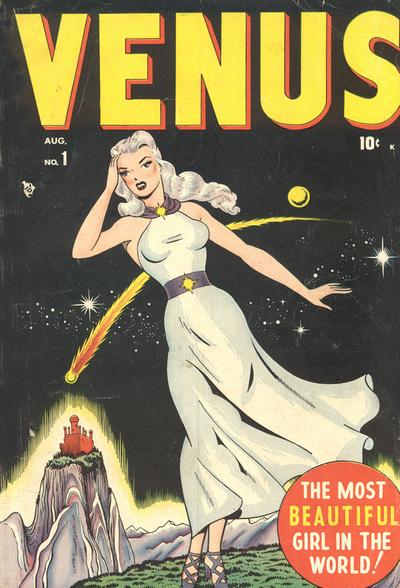
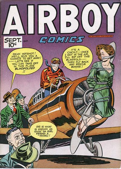
In a continuing series of odd alphabets (Occupational Alphabet, Action Alphabet and a Touch of Evil, Alphabet of Giants) that I’ve posted to this blog I offer this, a collection of covers of paperback novels, pulps, mystery magazines, true loves, romance, and of course astonishing science fiction. That these are considered “Golden Age” is interesting–I understand the overall feel of what “Golden Age” is supposed to mean, though the messages in the images (even exclusive of their texts) are definitely not-so-golden from where we sit in 2011.
I think that looking at this sort of material is important when considering the fleeting history of normalcy, and that these images help to define what was popularly considered to be the edge of “normal” for that time.
A is for Ambidextrous
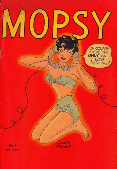
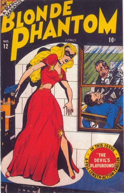
B is for Blonde
C is for Complete Love
D is for Dumb
E is for Effortlessness
F is for Future (Love)
G is for GI Jane
H is for Hope
I is for Insist
J is for Junk
K is for (amazon) Knights
L is for Lonely
M is for My, Mine, Maybe
N is for Night
O is for Out
P is for Popular Q is for Queer (“Society’s Greatest Curse”) In 1959–the year this book was published–the gay issue outranked nuclear holocaust, civil rights, the Cold War, and everything else according to the cover copy.
(Couldn’t not include this one, possibly the first of its genre when published in 1950, and which over time has sold – 4 million copies.)
Years ago when I lived in DC a new, upstart newspaper, The Washington Times (a conservative, Sun Yung Moon Unification Church organization-owned entity that is painful to italicize) spent years trying to establish a toehold in the area readership. For years they spent a dollar per daily reader trying to get their message out–the cult leader himself, Rev. Moon, has stated that the paper has cost over a billion dollars to keep “competitive”. Since its founding in 1982 the paper has always lost money but has kept its focus on target–recently though there have been breaks in its rigid far-right exterior, changing some of its rhetoric to be more accommodating, like for example in 2009 deciding to use the word “gay” rather than “homosexual”. The paper was owned by New World Communications–a branch of the Unification Church–from 1982 to 2010, when the paper was sold directly back to Moon for $1. The paper is still in publication a,most 30 years later. And even though the Unification Church says that the paper is independent from editorial control, former editors of the thing have said otherwise. [New World Communications owns UPI by the way. Happy Happy World World]
For several years running as a matter of fact the Washington Times threw their newspaper onto my lawn, a freebie, news gratis–they just kept coming, day after day, even after I called them requesting that they stop the free delivery. They didn’t. I simply didn’t want to be included as a statistic as a “reader”, because grass-reading was evidently a statistic they could deal with. Had I been a lawyer I think I would’ve sued them for littering, as that was about the extent of the value of their newspaper, to me. I guess if you give something away long enough, people get used to it, and then, after many years, they are guilt ridden to buy, or–like a phantom song from the radio that you’ve heard so many times that you know it by heart even though you don’t like it–it becomes part of your routine.
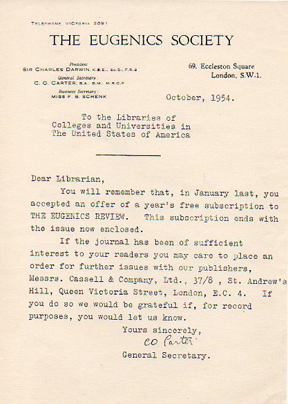
That’s what I thought of when I saw this circular slide out of one of the volumes in the warehouse of the Journal of the Eugenics Society. It warned librarians that the free ride their library had been given by the society was about to end–maybe–and that if the institution wanted to receive any further issues, they would need to buy them.
Unlike the Washington Times–still in business today–the Eugenics society didn’t make it. It died decades ago. Died a death long overdue, died in its seventh decade. Pieces of it lived from ancient times, famously with Plato, developing in more modern times into a societal, philosophical, scrapingly biological branch of pseudoscience, aimed generally at improving the human population through a more-or-less longitudinally dreamed belief system. It was squared away and rounded up with social stats of Karl Pearson and number crunching of Francis Galton (who misunderstood the writing of his cousin, the beautiful Charles Darwin). And in spite of coming into a sort of Renaissance in the early twentieth century, it was mostly put away by Nazi monsters, who broke whatever basis in reality that eugenics had, almost entirely dealing the belief system a mortal blow. Some people still felt comfortable with it enough to use it to continue a practice of population control by sterilizing anti0social elements–including prostitutes and drug addicts, and people of low IQ, but mostly, almost entirely, poor people–up until the 1970’s.
It looks like a desperate thing to me, this flyer (available from our blog bookstore, here). It may well have been real, it may have been the case that it wasn’t this piece of propaganda that I see it as to help sell a fatal science…but I don’t think so. It looks pathetic, paper collar and starched shirt and doctorates and cufflinks and privileges notwithstanding. And it reminds me of the desperate attempts of propaganda machines like The Washington Times to get its message across–even when it is very clear that there are not nearly enough people to fund it, a message machine in desperate search of an audience.
For sweetest things turn sourest by their deeds, Lilies that fester smell far worse than weeds–Wm Shakespeare
In the long history of indoor stink, few things have succeeded (prior say to the year 1800) in eliminating odor like a piece or two of Buffalo hide. Actually its a piece of metal tubing that probably gets top billing for stink-eliminator, but that’s getting ahead of the story.
And the story is an easy one: people for thousands of years have been living indoors, and in climates where you need to keep warm in the winter, and to be able to see stuff in the dark, people have needed to burn things for their heat/light sources that basically emit rotten odors. This is a gross generalization*, but there have been many nomadic cultures whose housing consisted on things like tents and yurts, simple structures with people living inside and burning a fire with nowhere for the smoke to exist. Tens of millions of people–maybe hundreds of millions–have lived this way, in a small, contained space, living with their sooty smoky fire, and the rancid fat or whatever that was burning in their lamps, all of which was mixed with cooking and living smells, all heated up and kept in the small space. Like an oven of sorts. (Dante commented frequently on the smell of Hell in the Inferno, and it wasn’t a pretty thing, what with the heat and the decay. I don’t think he had much to say about the ‘taste” of place, but definitely had other things to say about how they felt, and looked, and sounded. Probably people coul drelate quite closely to the smells portion.)
I’m not saying that this is a global assertion, but it certainly applied to a lot fo people. Some of this unpleasant odor was masked with perfume, but I would say that this was probably not terribly effective, especially when compared to the methods that were effective.
Many Indian tribes in the North American Plains had tepees that were vented, holes in the tepee skin that were covered with Buffalo hide (or some sort of leather) that would allow smoke to escape; also there would be lower vents to allow air to come in. Fires in enclosed spaces do consume oxygen, just like people, and so at some point the fire and the people would compete for O2.
Kivas in New Mexico also were vented , and many would also have an under-the-structure tunnel devised to allow air to come and feed the fire from underneath. Great, workable ideas that were healthy, not to mention very effective in combating stink.
Perfumes and scents, herbs and the like just didn’t stand a chance against the overwhelming odors that were produced by internal fires and lamps, but it really wasn’t until the invention of the proper (and lined) chimney that relief was found. Well, that and the Franklin Stove–it was Benjamin Franklin’s idea to have an iron stove with a roaring fire, the smoke being captured in pipe above the heating element and vented immediately outdoors. That was really one of the earliest methods by which nominally-monied people could afford to heat their environment in a healthy way, removing smoke form the environment as well as other nasties that were the direct consequence of unvented and tight indoor living.(“fish and visitors smell after three days”)
_____
*really, this is a roomy approximation. Romans (with the hypocaust), Chinese, and Koreans, among others, used sophisticated systems in antiquity. This is just a general conversation.
Earlier in this blog, about two years ago, I wrote a piece on David Byrne’s beautiful Knee Plays, which included a song “In the Future”. The post was about Byrne’s vision of the future which was bounced off the belly of “futurist” Herman Kahn, a man who was widely influential and whose thinking (I do believe) was widely incorrect. He was also a proponent of possible first-strike (that is, American-initiated) nuclear warfare, deeming the scenarios “winable”., a broad thinker on Thinking-the-Unthinkable, and coiner of the word “megadeath” when used in conjunction with his nuclear end-game games. A main component of the template for Dr. Strangelove in Kubrick’s movie by that name, Kahn and the think tank he helped found (the Hudson Institute) had the ear of the Reagan administration, among others, and it shows.
Here’s the revised post, expanded some.
David Byrne, former Talking Heads member, produced a series of twelve short pieces to be used in the Philip Glass (and Robert Wilson*) Opera CIVIL warS in 1985. (“Opera” may not be the right word for this piece, as I think it was one only in so far as the composition needed an opera house to be performed in.) The Byrne pieces, called ”Knee Plays”, were meant to fill in the spaces, the spaces in-between, place holders, between the sections of the day-long multimedia production.. Glass had used this idea of inter-pieces to the whole earlier in 1976 in his at-the-edge Einstein on the Beach, in which the connective elements were meant to not only join the pieces of the production together, but were also meant to stand alone, as a cohesive unit, if removed from the opera. (Glass said they were “short connecting pieces which appear throughout the work much as prelude, interludes and post-ludes. Taken together they form a play in themselves”)
One of the Knee Plays, “In the Future” (Knee Play Number 12) is a slippery, stacatto brass section accompanying Byrne’s 51 sophisms about life in the future. About thirty years earlier, “futurist” and think-tank-filler (or maybe it was “Think Tub”?) Herman Kahn (1922-1983), occupying a lot of space at the RAND and Hudson Institutes (he was also known in many circles as the “Fat Man”), diligently recorded his myopic views of the future. He is generally regarded as a systems theory and military strategy guy, and is most remembered for (as he claims, perhaps) introducing the term “Vietnamization” which described the ultra-failed de-escalation (?) process and withdrawal for the United States from Vietnam (attention Obama administration). Superluminarily speaking though his contribution to thought on constructing and implementing thought regarding nuclear weapons exchange (pointless to refer to this as “war”) in several books, including On Thermonuclear War (1960), Thinking About the Unthinkable (1962) and, On Escalation (1965), where he famously put The Bomb on the table of use possibilities. In addition to these books—which he is busily trying to forget out there in his afterlife, somewhere, maybe in a penitential place where you are forced to think endlessly about paths-to-bad-decisions) is that 1967 peek into the future, The Year 2000. Petroleum and oil are not issues. Computers are of minor societal importance. And then other things of no importance happen.
When you take Byrne’s Knee Play 12 and place it next to Kahn and other mis-spent prognosticators, the musician looks positively brilliant. Some of the stuff has come to pass, some hasn’t; some will, and some won’t. Some are open to a little interpretation, and some, a lot. Overall, though, if you think through these little future bullets a little carefully, David Bryne looks very good. Byrne’s lyrics/list is below.
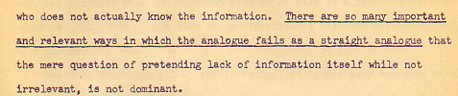
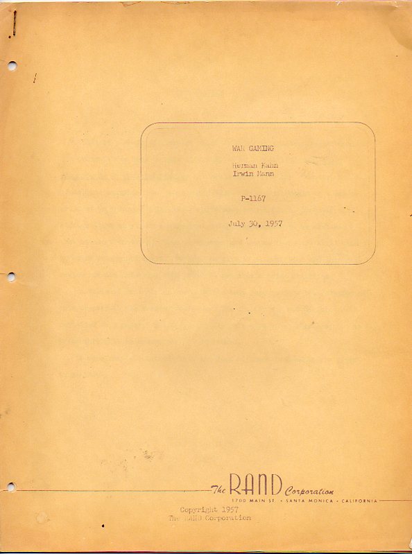
Kahn’s writing is necessarily less elegant than Byrne’s, and probably less elegant than most other people in general including those who don’t write, though it does lower itself to some height of governmental semi-speak. For example, from his July 1957 RAND paper “War Gaming” (available at our blog bookstore, HERE), we find this nugget:
I have no doubt that Kahn looks like a warrior to many people–he no doubt was something of one, so long as that warrior could wear a white button-down shirt and not get dirty. Simply because a person is thought of as a “warrior” doesn’t make them a ‘good” one, either, and I think that I would nominate Herman Kahn as an example of one: in my own approximation of Kahn-speak, he would “generate the apparent non-non appearance in definable though undefined parameters as a non-good non-warrior in circumstances that defined or not define him/them in this semi-stable manner”.
I think it is important to look at documents like this–documents that helped establish military policy–to see how their authors were able to convince people in government that they could divide by zero.
*Robert Wilson is a phenomenal conceptualist and theatrical designer. On the liner notes to CIVIL warS is found the interesting note on Wilson and Byrne: “At first, Robert Wilson asked David to compose pieces for several sections of The CIVIL warS, but on account of David’s limited time, he composed only The Knee Plays part. The CIVIL warS was supposed to be played in its complete form at the Olympic Games in Los Angeles, but if one plays every part, it takes at least eight hours. There was also a financial problem for playing every part. So only some parts of it were staged there. David himself was very interested in composing for such a play and dance and this time again he enjoyed this work very much. Last time, for The Catherine Wheel, he used recorded tape, but this time he made musicians play on the stage.”
(Featuring a prominent role for The Tuba)
IN THE FUTURE (KNEE PLAY 12)
In the future everyone will have the same haircut and the same clothes In the future everyone will be very fat from the starchy diet In the future everyone will be very thin from not having enough to eat In the future it will be next to impossible to tell girls from boys, even in bed
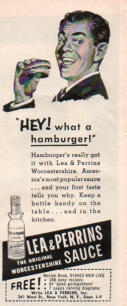
I was looking for something completely different when I stumbled over this simple ad for Worcestershire Sauce. What was instant recognizable to me was that the hamburger was just exactly that–a hamburger. There was the burger and the buns, and that was it. except of for the fancy Worcestershire sauce, brought to America from the old country. In the ultra-centrifuge micro-cautionary ads of today, it would seem impossible to show a food product in such simplicity and so remarkably unposed–the buns are uneven, and imperfect, and there’s nothing about the burger to suggest itself as good except for the smiling, suited man.
McDonalds was selling burgers at this time, and for 15 cents a pop. I’ve seen television commercials advertising burgers for a buck here in the present, cheaper than what the thing was in 1956, that dollar covering only 12 cents of expense then. The current burger is cheaper still if you consider it as part of an hourly minimum wage; the 1956 minimum was 75 cents/hour, while 2010 is about ten times that; that means that the 1956 hamburger was 1/5 of the hourly wage, while the product in 2010 was 1/7 of the minimum wage. The extreme cheapness of the current hamburger must make it seem a good deal for people working at or below the minimum wage, providing a food-like product to fill the belly for very little money in exchange, and with very little nutritional value. Perhaps that explains why 50 million Americans eat a a hamburger place of some sort every day–it is a vastly successful business model predicated on delivering an almost entirely valueless version of an essential component of daily life, with constant advertisement duping people with greasy heart clogging goodness delivered by a bouncing clown or a little girl with freckles. But of course there were worse things–this one just happened to catch my attention this morning.
The hamburger has maintained its cheapness over the years, and certainly is one of those things from the ’50’s whose back-then price has translated into a more-expensive price with CPI-adjustments over time. There are other staple-like thingas that were more expensive in 1956 than now: milk/gallon: 92 cents 1956 and $7.44 in 2010 dollars) and coffee, 93 cents (1956) or $7.52 (2010). Gasoline was 23 cents/gallon or $1.86 in 2010 dollars. (Gasoline pricing is another, more complicated story, for another time.)
Don’t forget to order your copy of Dishes Men Like! It has seven pages of carving diagrams.
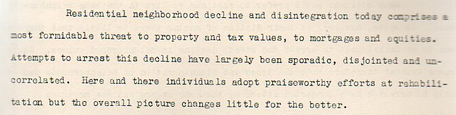
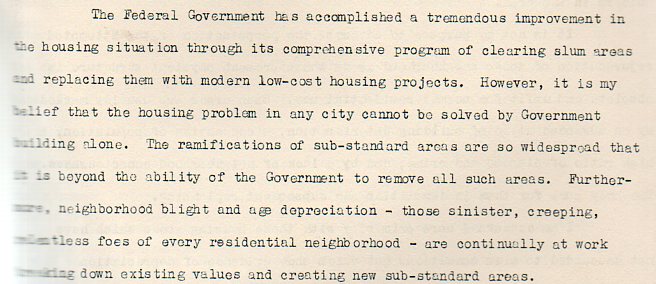
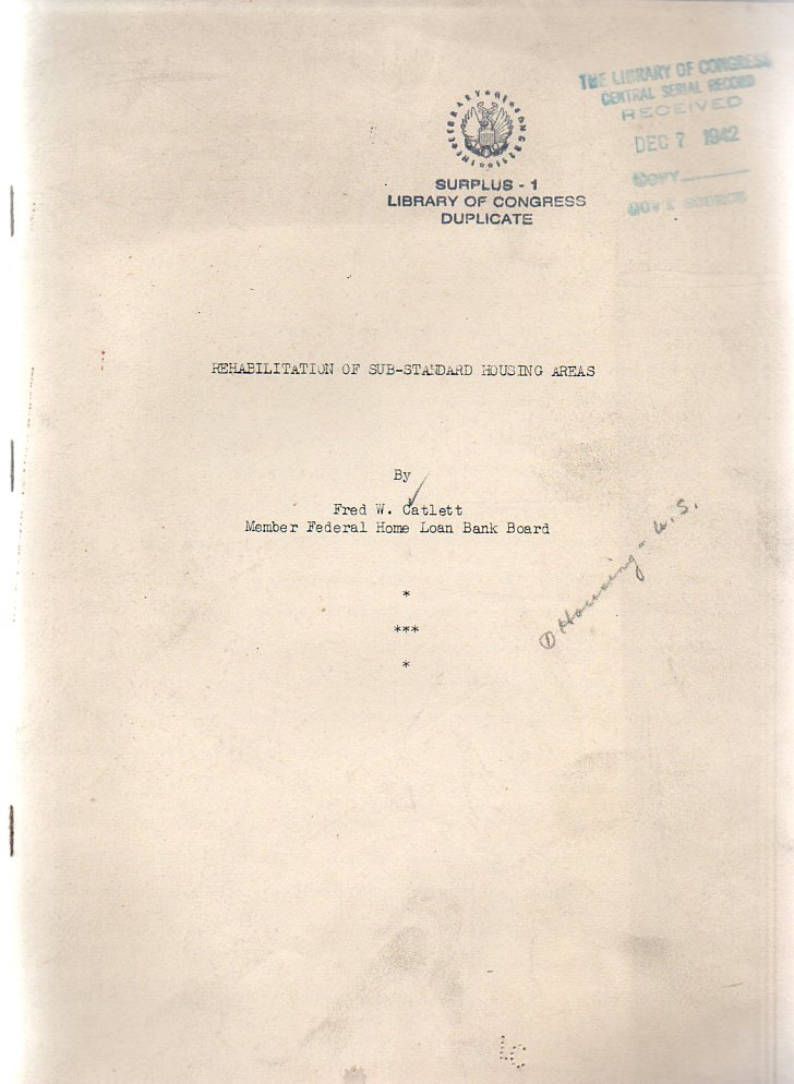
Fred Catlett’s Rehabilitation of Sub-Standard Housing Areas (1942) isn’t so much about “rehabilitation” of the houses themselves but to their neighborhoods and surrounding areas–the “inadequate” housing would be demolished, disappeared, replaced, to re-insure the valid tax basis of the larger area/neighborhood. Nothing is said about where the original people would go while their old neighborhoods were being razed or whether or not they would return to the new housing.
The vocabulary here isn’t so surprising in and of itself, but rather with teh overwhelming completeness of it. I’d suspect that at some point Mr. Catlett (“Member Federal Home Loan Bank Board”) would throw some sort of bone to the interests of the occupants of those substandard houses, some interest or emphasis to the people involved. And even though the pamphlet is only 12 pages long, maybe 5000 words, it was certainly long enough to share some concern or kindness to the occupants of those houses.
“Better housing projects break up slums but not until fine homes have decayed and been ruined and many thousands of dolalrs in loses have been suffered”writes the author. I understand that the man was protecting the material bases of his institution, but ot have the entire document be absent of any consideration to the people being houses I find remarkable. (The original pamphlet is available from our blog bookstore.)
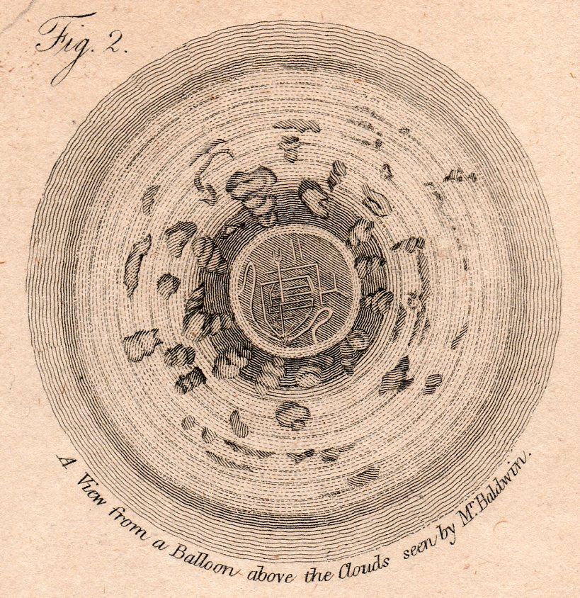
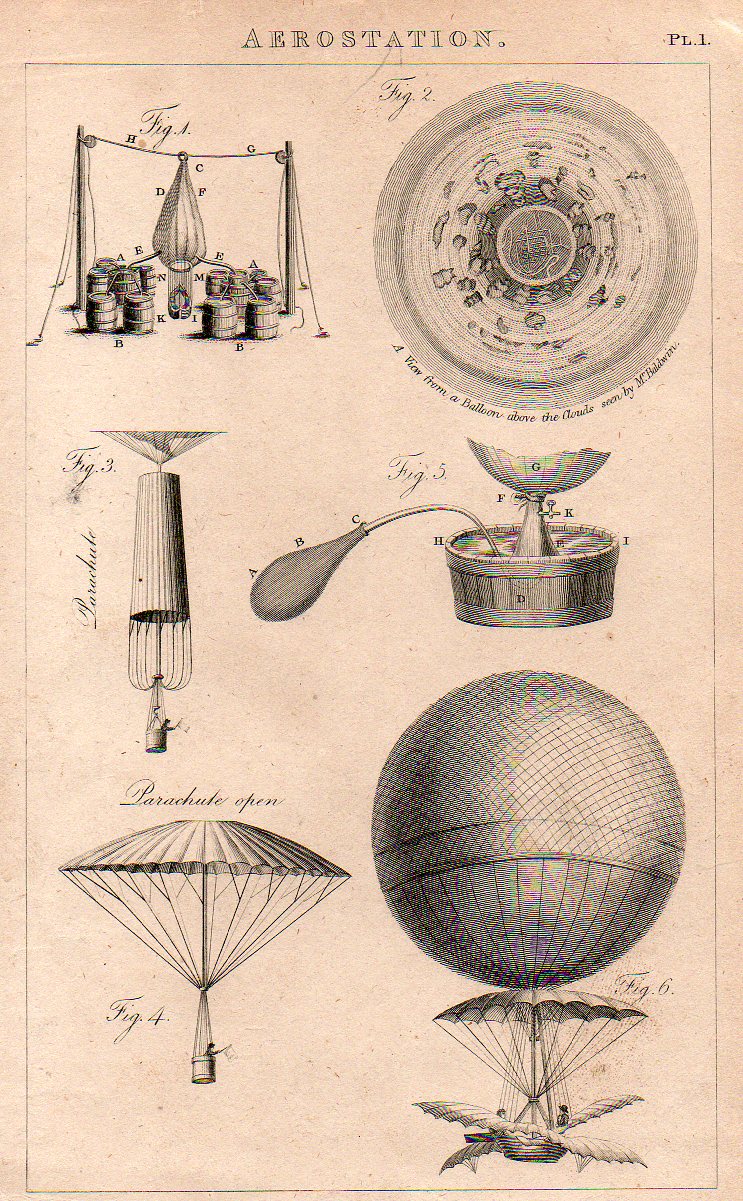
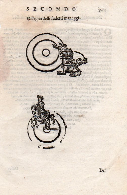
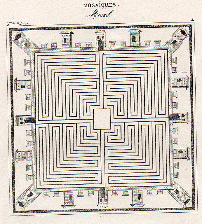
The idea of representing a view straight down, of looking straight down from some height, is a relatively recent occurrence, this view being somewhat rare in the antiquarian world pre-balloon or pre-heavier-than-air flight. The pre-human-flight reason for its scarcity is understandable, but even after the first Montgolfier ascension in 1787, there’s another 120+ years of scarcity yet to come before these views would start to pop up in common (and uncommon) literature.. Now I’m not talking about cartography, which is basically a straight-down view of the world—what I’m referring to is that same view but not as a map per se, but what you would see if you were dangling out of a plane or balloon. The extraordinary map of Imola by Leonardo would certainly classify because of its you-are-there qualities: essentially it would be like a bird’-eye or oblique view, but straight down.
All of the images are available to purchase from our blog bookstore, here.
The first image is that made from a balloon, a lighter than air affair, and engraved and printed around 1810 or so. It has a very uncommon vertigo-ey affect, like a map of Dante’s leveled creations, though what we’re seeing is a very
…which is a detail from this engraving, made in London around 1810.
There are of course a number of other lovely design elements, not the least of which is the man in the parachute, bottom left. (My guess is that the flag held by the man was not for patriotic reasons but rather for more practical concerns, light judging wind strength and duration.
Another interesting image is this instructional from a source printed around 1620 (I don’t know the source here, either–I purchased the print loose many years ago like many of the others here at Pageant Bookshop in NYC). It shows a slightly oblique angle (below) and then the flat-perspective view at top:
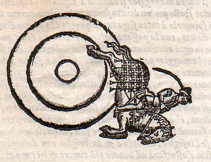
And then the lovely detail:
Then there’s this beauty, showing an idealized town square, presented in mosaic as though seen from above, continuing this thread of flat-perspective–basically looking at some central part straight down, and then taking the objects surrounding the central figure and simply laying them on their backs, as so):
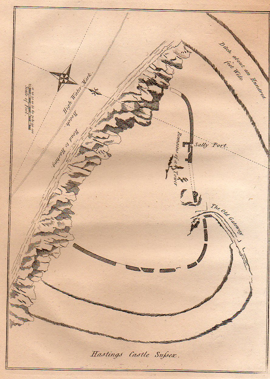
Lastly for now is this quite flat persepective of the remains of the Hastings Castle (East Sussex), which was built right after 1066 but before the battle. The (limestone) cliffs that did so much damage to the castle are clearly visible, though what was left of the castle is not. The view of the area of the castle shows the grounds both in perspective and plan and also from directly above. Its a more-naive approach to imaging that was done so well (on occasion) by the U.S. Coast Survey when it rendered a coastline with an inset of what the coastline looked like from the water–both were superior efforts, but a little odd if you took the map at face value. This map makes no pretense on perspective correctness, though it is overall a fine map, nicely displaying the necessary details accureately though not correctly (?)
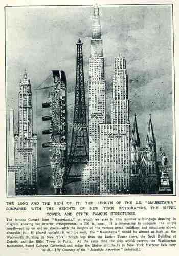
This wonderful display (appearing in The Illustrated London News for 26 March 1927, page 518) of quantitative data isn’t quite as whimsical as it appears in detail, though I can think of only a few (antiquarian) times that I have seen a ship made part of a cosmopolitan vertical cityscape. It is a great way of comparing two disparate, out-of-place equals, and certainly can get the idea of the size of something as stand-alone and solitary as a great ship to children (and adults, too) by comparing it to something as obvious as a tall building., This time its really just comparing the length of the SS Mauretania with the heights of some famous and notable buildings. (The Mauretania, 1906-1935, was a fabled, luxurious and fast ocean liner of the Cunard line; it was refitted for a resurgent oceanic service at about this time.) In the larger, expanded second image we see the Mauretania stacked up against (from left to right) the Washington Monument (555′), the Woolworth Building (792′), the Mauretania (790′), the Eiffel Tower (984′), the Larkin Building (proposed at 1208′), the Book Building (873′), the Koln Cathedral (512′) and the Statue of Liberty (305′). The Larkin Building (not the F.L. Wright structure of the same name) was a proposed super-tall of 110 floors for 330 W. 42nd Street that was proposed in 1926 and not canceled until 1930, and which would’ve been the tallest building in the world. (For an interesting site on the cancellation of tall buildings, see HERE.) In any event, this was a big ship–the largest in the world when it was launched as a matter of fact–and the drawing is wonderful. Upon closer inspection, there is a terrific amount of detail in the cross section of the ship.) (This original print is available at our blog bookstore.)











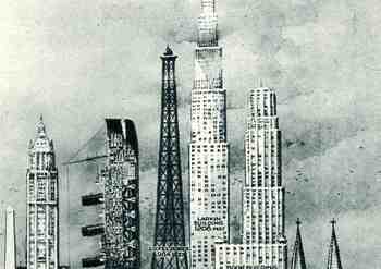 a few (antiquarian) times that I have seen a ship made part of a cosmopolitan vertical cityscape. It is a great way of comparing two disparate, out-of-place equals, and certainly can get the idea of the size of something as stand-alone and solitary as a great ship to children (and adults, too) by comparing it to something as obvious as a tall building., This time its really just comparing the length of the SS