A Daily History of Holes, Dots, Lines, Science, History, Math, Physics, Art, the Unintentional Absurd, Architecture, Maps, Data Visualization, Blank and Missing Things, and so on. |1.6 million words, 7500 images, 4.9 million hits| Press & appearances in The Times, Le Figaro, Mensa, The Economist, The Guardian, Discovery News, Slate, Le Monde, Sci American Blogs, Le Pont, and many other places… 5000+ total posts since 2008.

Category: Absurdist, Unintentional

  • An Alpha-Vile Alphabet Autopsy of Lost Emotions

    JF Ptak Science Books

    Alpha-vile alphabet038

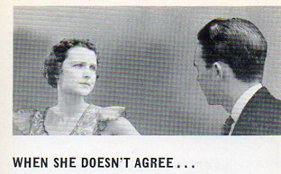
    Following yesterday’s post on semi-indulgent expressions from pamphlet covers printed at the end of the Depression of business motivational ideals come these images, found as text illustrations to these marvelous non-sequitur works.  Although only four pages long, these pamphlets (leaflets, really) have provided–pound-for-pound–more images of quietly bizarre, unexpected images than just about any source that I have seen.  Taken out of context these posed photographs ask more questions and provide for more imaginative jungle trots than their disappointing original intentions.

    A is for Annoyed, which Mrs. Harrison is, annoyed that Mr. Harrison has yet again forgotten to paint his bald spot.  He thinks that his wife is over-reacting, pushed over the edge of reasonableness from her quack prescription of Neck-So-Thin dietary supplements.  He keeps his opinion to himself. 

    Alpha-vile alphabet q034

    B is for Bowls of Business–there is no telling what the kitchen scene means so far as business is concerned for this woman in 1937.  Perhaps she is calling in a good deal from her bra-phone  (the ‘phone cord seems to be going right into her heart) on a sale on bed pillows for bowls.  I know that when she pushes back from the table her wooden chair will make a high-skreetching sound against the linoleum uni-fit flooring; her merchant husband, Mr. Beemish, will be awakened from his late sleep by the sound, again, and demand that she return the bowl to bed, pillow or not.  Mr. Beemish was slightly feverish, wondering if he should go to his shop with window displays of nothing.  The milkman–late again–shares a cigarette on the front porch with the ice man.  The cigarette smoke rises to Mr. Beemish’s  bedroom window as he strains against his own miniature pillow to hear what the men are saying, while thinking of nothing but his ice melting and his milk getting warm.  And his pillow-less bowl. 

    Alpha-vile alphabet 031

    ·Posted by :

    ·in:

    —

  • An Alphabet of Unintentionally Semi-Absurd Motivational Images, Business Publications, 1930’s

    JF Ptak Science Books   Post 1367

    Biz alphabet--e014

    This alphabet fell into place almost by itself as I wandered through this maze of business motivational pamphlets published by Men of America Inc (of Chicago), all printed in the late 1930’s to about 1941.  The design of the covers of this series is sensational (and I gulp wind as I say this) in very short and limited ways, just like it is sensational to watch a motionless penguin for a long time and then to see it suddenly turn its head to the left.  But these images served a very dedicated purpose when they were printed, and were even perhaps useful,or successful, as this publication saw at least 500 different numbers in this series.

    Perhaps more interesting–where did these models come from? 

    I think many of these covers are fantastic: charmingly naive, naively bizarre, cluttered with fantastically abandoned sentiments, and dripping with design elements all but forgotten and/or abandoned.  They are beautiful in their own special way.  And I’m not so sure that I wouldn’t want to go back in time, read them and take their lesson to heart. (All are available for purchase via our blog bookstore.)

    A is for AIM to keep workers happy and profit happier

    Biz alphabet--a007

    B is for BURN and hoping for a better-built candle

    Biz alphabet--b008

    C is for CAPITALIST, an exclamation point in a land of question marks

    Biz alphabet--c010


  • Children, Artillery and the Geometry of Cannon Fire

    JF Ptak Science Books  Post 1366

    Cannons ha003

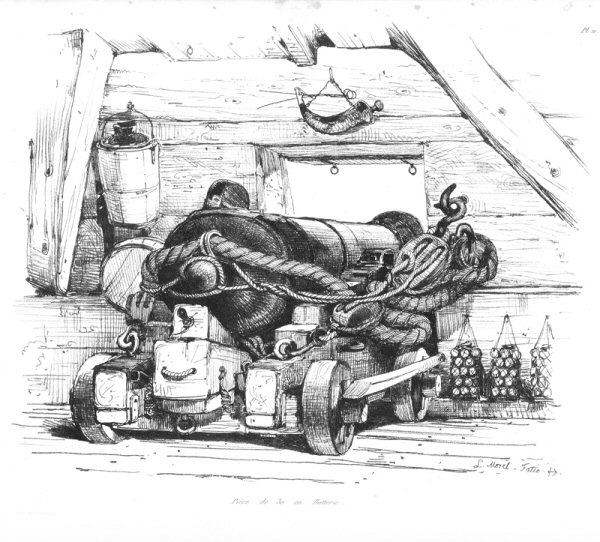
    There were many integral components to firing a cannon on a ship, not the least of which were the Powder Boys, the small, young, semi-strong kids who would run the gunpowder from a below-decks armory to whatever gun deck was needed.  It was a relatively simple procedure, filling up a longish tube (cannon  derived from the Italian  cannone–or large tube–which came from the Latin canna from the Greek  kannē , meaning something like a reed or any similar hollow thing) with gunpowder and then cannonball/shot and then wad, then causing the gunpowder/propellant to ignite and throw the ball.  Basically, that was it, though you needed to maintain the cannon, aim it, and so on (don’t forget to first swab the bore from unexploded gunpowder so you don’t blow things up!).

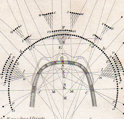
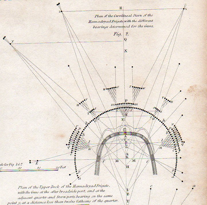
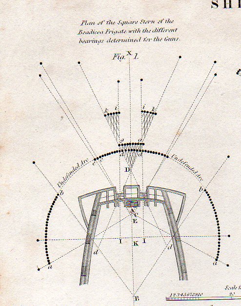
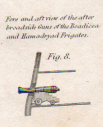
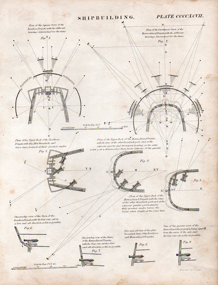
    The (first)  image above of found modernist/semi-dadaist artwork comes form 1812 and was found in Rees’1 Encyclopedic Dictionary from the article on “Shipbuilidng”   and illustrates the ways in which the stern of a ship can be outfitted with cannons–actually, the sterns of the HMS Bodiceae (28 18-pounders)  and HMS Hamadryad  (36 guns). Also by this time cannons had been carried on naval ships for nearly four hundred years, while the first cannons appeared on the ground in Europe another few hundred years before that. 

    Cannons ha002


    In the third detail (below) we see the coverage of the four cannons placed in the stern of the Bodicae, mainly pointing out its weaknesses, showing the undefended arc, which comprises about 1/3, or about 60 degrees of the defensive posture.  The Hamadryad on the other hand shows 100% coverage of the 180+ degrees of attack possibilities shown, along wioth secondary and teriary areas of fire coverage covered by mor ethan one gun.

    Cannons b004

    A fine,tiny detail from the full engraved sheet:

    Cannons little005 And the full sheet, available at our blog bookstore:

      Cannons001

    This is pretty much all that was needed to fire a cannon, except the men of course.

    File:Antoine Morel-Fatio pl10.jpg

    NOTES:

    1.   I’ve written about before here, just enter “Rees” in the google box and there will be a dozen or so other posts.


  • Elements for a Whiskey Alphabet Drawn from the Bible of Booze Names

    JF Ptak Science Books  Post  1363

    Booze alphabet532 It may or may no be the case, but this large, flaking book that is balanced on top of a petulant pile of paper, Registered Beverage Trade Marks Covering the Period from 1881 to 1939 Compiled from the records in the United States Patent Office (Distilled Alcoholic Liquors) may be the keys to the kingdom of names of booze(s) trademarked in this country.  15″ tall, and inch thick, and 296 sheets big, this work (copyrighted y the Trade Mark records Bureau (in the National Press Club Building in DC, the one with the problematic parking garage) lists some 7,500 names of whiskey, cordials, gin, rye, bourbon and who knows what else.  I cannot find the book in any online database, big or small, and I’m not sure where this info might be housed and housed in one spot.  I have no doubt that people somewhere need this data, unwieldy and unusable as it might be–you see, it is organized only according to a six/seven digit number which I guess is the trademark filing number, or something; there is nothing else useful about the thing, the data floating around without regard to year or place or liquor type. [The book is available from our blog bookstore, here.]

    So I sat down with the book for an hour pulling out interesting, odd, out-of-place, from-another time and bizarre names, including all manner of expected animal names like bull and elk, and then unicorn; and lots of sunny this-and-that, sloping/sunny/grassy hills, mountains, clubs; and of course the Old _____  category seem fairly filled up. 

    If I spent a little more time on this entire alphabets could be produced relating to nothing but names from the animal kingdom, flora, the sciences, professions, religion, states of mind, altered states,  literature, and the labels that suggest a possible medical benefit.  One of my favorite categories is the “conversational liquor label”, the label that speaks to you, invites you, tells you what to do with the bottle of booze:  Hava Cocktail and Uneeda Whiskey are good examples of that, as are You’re Lookin Good, Uvanta and Yugeta whiskeys. Another is the liquor name ending in “o”, like the beautiful Famo, from St. Jo, MO, which unfortunately wasn’t trademarked in ’00.  The label of suggested promise and outcome is another good one:  Kentucky Courage, Pleasant Dreams, Invincible Rye, Solace Whiskey and Ready Money are all good examples of the implied end-of-bottle pillow-fluffer…maybe, especially, The Old Solution whiskey.

    And then of course, there are those where the (creative) spirit has just flown away, like the lumpily-named Standard Spirits Whiskey, its hometown of New Orleans embarrassed by the lack of effort–especially in the light of some many hundreds of imaginative creations, like the fabulous Bone Factor Whiskey (1903), which like som many other great names  (Yellow Hammer Whiskey) comes from Louisville, Kentucky.

    Antediluvium Whiskey, NYC, 1898; Anti-Grippine Whiskey, Philadelphia, 1906; Ash Cake Whiskey, Lynchburg, VA. 1899, Auto Crat Whiskey (St. Louis, MO), 1905

    Bank Check Whiskey, Boston, 1900; Bone Factor, 1903;

    Caloric Whiskey, 1904; Cremo Whiskey, 1902; and the confusing Chickencock “potable spirits”, 1929

    Devil’s Island Benefactor Gin, 1905; Daily Mash Whiskey, 1935; Dandilyon Whiskey, Columbus, OH, 1906;

    Electric Whiskey, Cincinnati, 1890;

    Flow Whiskey, Pittsburgh, 1908; Famo Whiskey, St. Jo, Mo 1894; Faust’s Own Whiskey,  Phila, 1900.

    Gopher Gin, St. Paul, 1902; Gas Away, Columbus OH, 1902; Galoxy Whiskey, NYC, 1905; Gong “ethyl alcohol, etc,” 1932′ Georgia Watermelon, 1911

    Hen Bolt Whiskey, 1889;  Hava Cocktail, NYC, 1933; Hospitality Gin, Louisville, KY, 1900

    Index Whiskey, Cincinnati, 1906; Invincible Rye, 1900

    Jupiter Gin, Boston, 1905; Judge’s Preference, Boston, 1905;

    Kentucky Courage Whiskey, Lexington, 1900

    Marconi Whiskey, Birmingham, 1903

    Old Tom Gin, 1887 (There are any number of Old ____ labels: Old Crow, Old Man River, Old Count, Old Court, Old Coon, Old King Cole, Old Rock, Old Moss, Old Soldier, and so on–there’s a specialized sub-alphabet in this category, alone.)  Perhaps my favorite “old” is The Old Solution, Baltimore, 1900.

    Peeper Whiskey, Lexington, KY, 1880; Pen and Pencil Club Rye, Phila, 1894; Pleasant Dreams Whiskey

    Radium Whiskey, Terre Haute, 1905; Rolling Fork Whiskey, Lexington, KY, 1876; Ready Money Whiskey

    Sun Shot Cordial, Birmingham, AL, 1901; [SWASTIKA emblem, no name] Whiskey, Frankfort, KY,  1902; Suburban Whiskey, Boston, 1909; Solace Whiskey, Balto, 1900

    Tidal Wave Whiskey, Houston, 1905

    Uncle Tom Whiskey, Cincinnati, 1905; Uneedda Whiskey, Davenport IA, 1899;  Uvanta Whiskey, Louisville, KY, 1905

    Vitoline Brandy,  St. Paul, 1897

    Yugeta Whiskey, Plymouth, PA, 1906; You’re Lookin Good Whiskey, D.C., 1902; Yellow Hammer Whiskey, Louisville, 1905

    Zeno, Ace of  Clubs Whiskey

    And to sew up the specialty market in school-named liquors, Lawrence McCormick of Baltimore trademarked whiskey names for Brown, Yale, Harvard, Princeton, Cambridge, Cornell, Swarthmore, Chicago, Oxford and of course Lehigh University, not to mention various label designs that featured books and “philosophical instruments” emblazoned on shields and rocks and such, all perhaps for those in search of higher education.

    Unfortunately there are no images of the labels in the book, though I guess if someone could find 200 or so they’d have themselves a snappy coffee table book of their own. 



  • Antique pre-Dada Ingredients of the Anatomy of the Senses

    JF Ptak Science Books  Post 1362

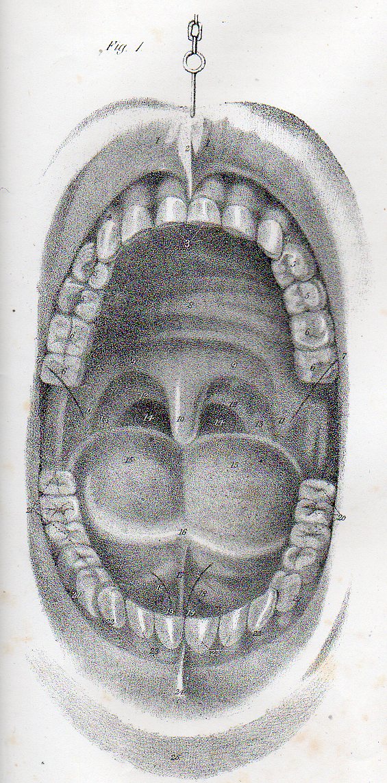
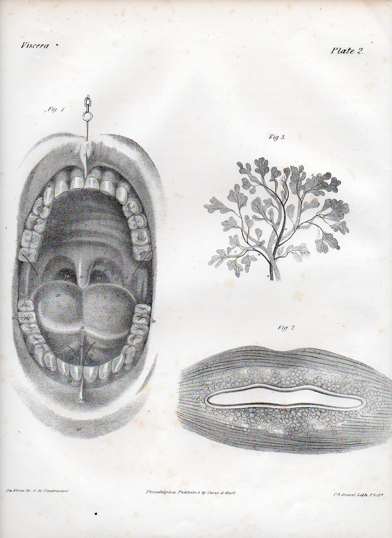
    Dadaist senses mouth det503

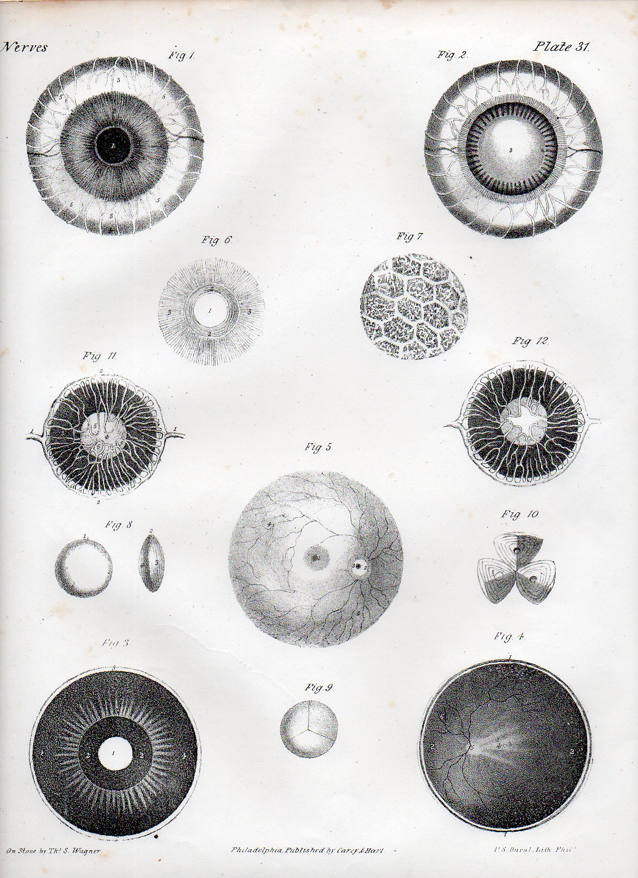
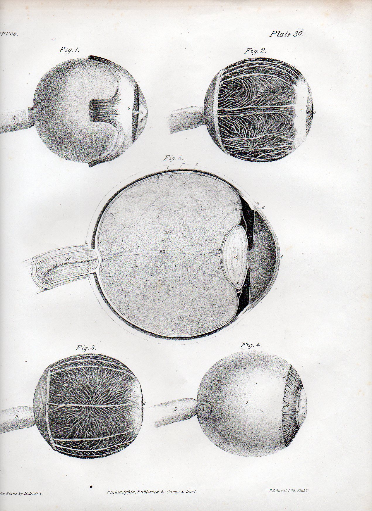
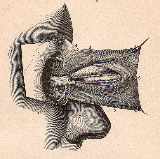
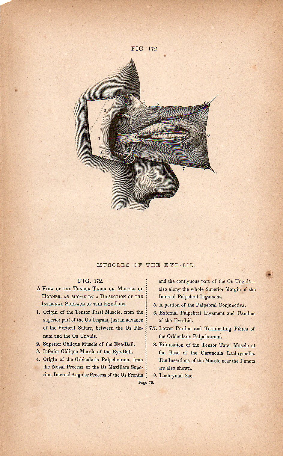
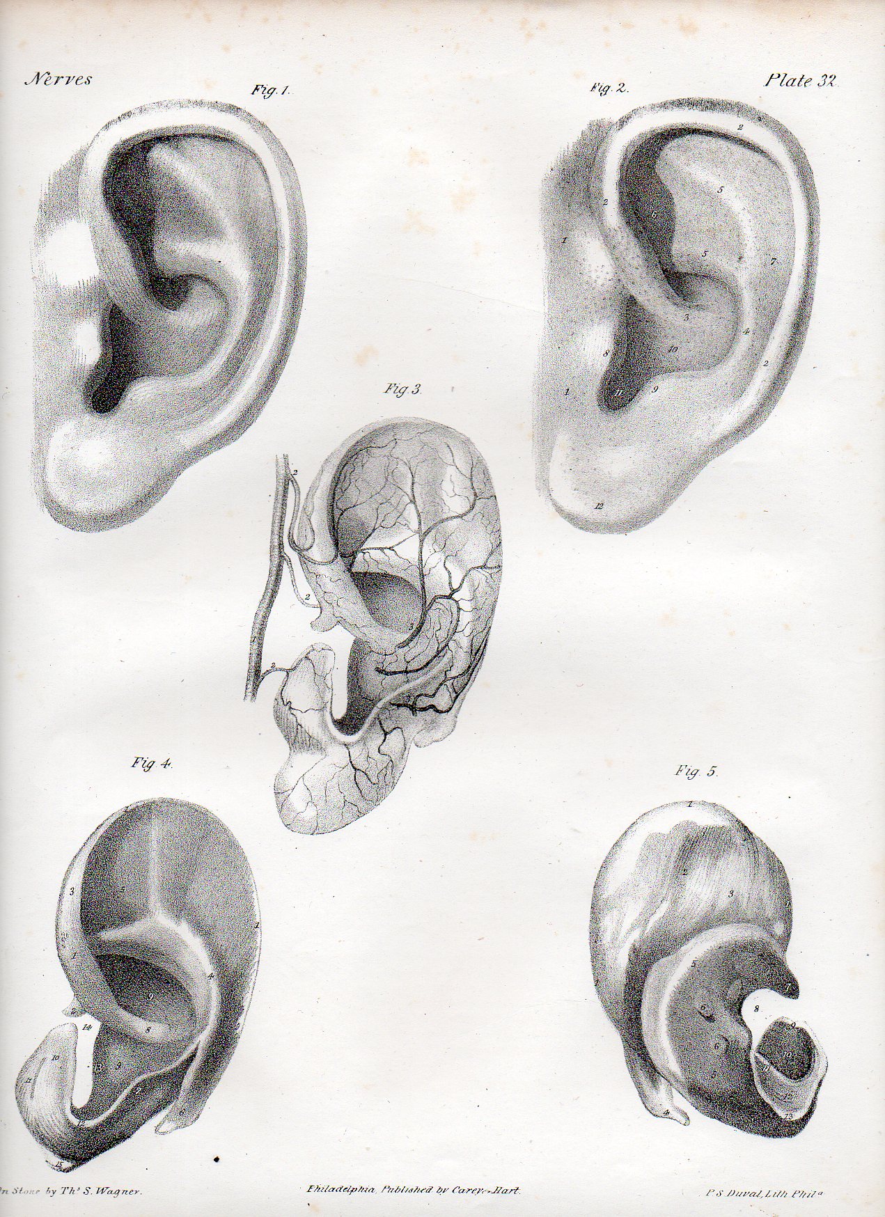
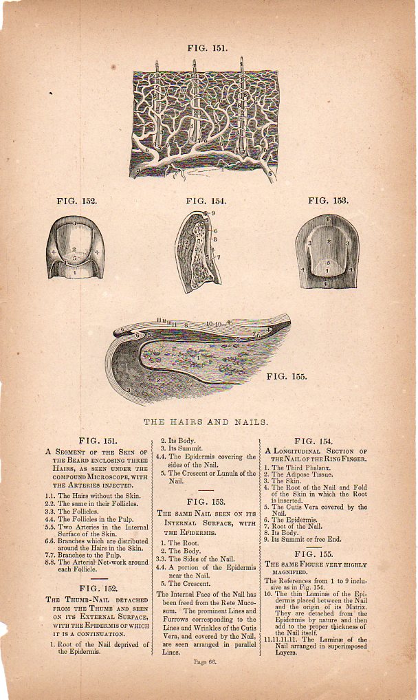
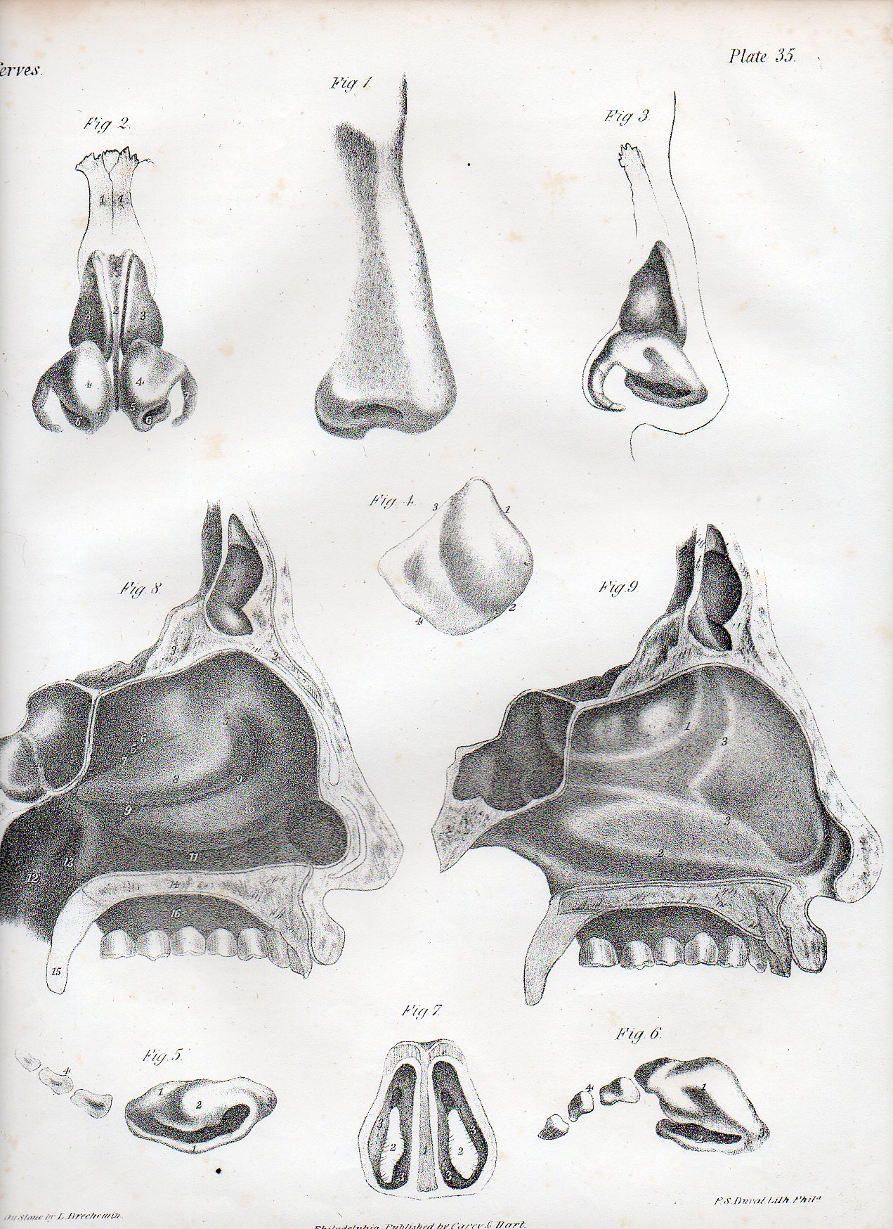
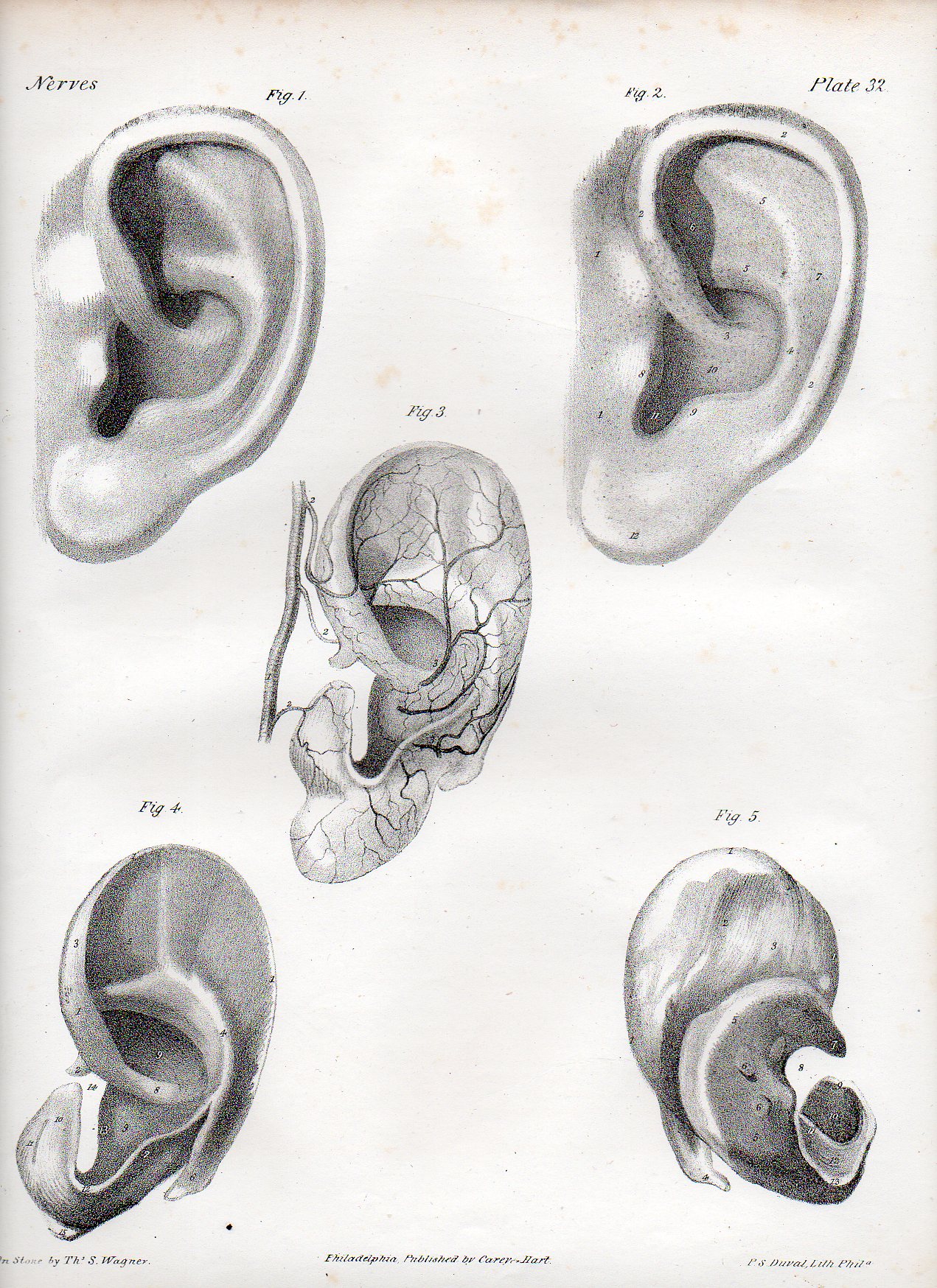
    Some of the strangest, occasionally least-of-their-time scientific illustration seems to come in the area of anatomical illustration–for me, anyway.  When taken out of context, some medical illustration looks positively modern, or post modern, as we can see with the following examples [all o fwhich are available from our blog bookstore].

    The first image is a detail from a series of images by the Irish-born Quain brothers:  Jones Quain (1796-1865),  an anatomist and professor of Anatomy and Physiology at the University of London; and Richard Quain (1800-1887), professor of anatomy in 1832 at the University of London, then surgeon at North London Hospital, and president of the Royal College of Surgeons. The illustrations are from a later and smaller printing of their beautiful 1844 work The Anatomy of the Arteries of the Human Body, with its Applications to Pathology and Operative Surgery, in Lithographic Drawings with Practical Commentaries.  Taken out of context, removed 80 years or so, taken to Germany, and they might be bits and pieces (or entire works for that matter) of a Dadaist exhibition in Berlin in 1925. 

    The full image of the image above is from:

    TASTE

    Dadaist senses mouth502

    SIGHT

    Dadaist senses eye 2507

    Dadaist senses eye506

    And this beautiful detail:

    Dadaist senses eye 4509

    Dadaist senses eye 3508

    SOUND

    Dadaist senses ear505


    TOUCH

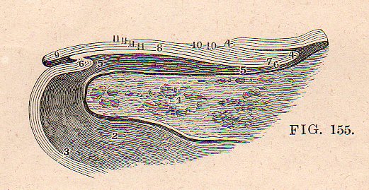
    This remarkable cross-section of the fingertip.

    Dadaist senses touch det501

    Which is a detail from:

    Dadaist senses touch500

    SMELL

    Dadaist senses nose504

    HEARING

    Dadaist senses ear505


  • Unintentional Dadaist Anatomy: WIlliam Rimmer, 1877

     JF Ptak Science Books  Post 1360

    Blog==June 29--rimmer backdet

     
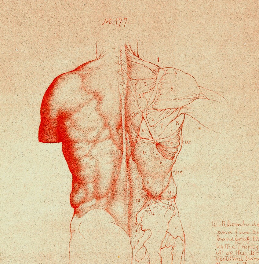
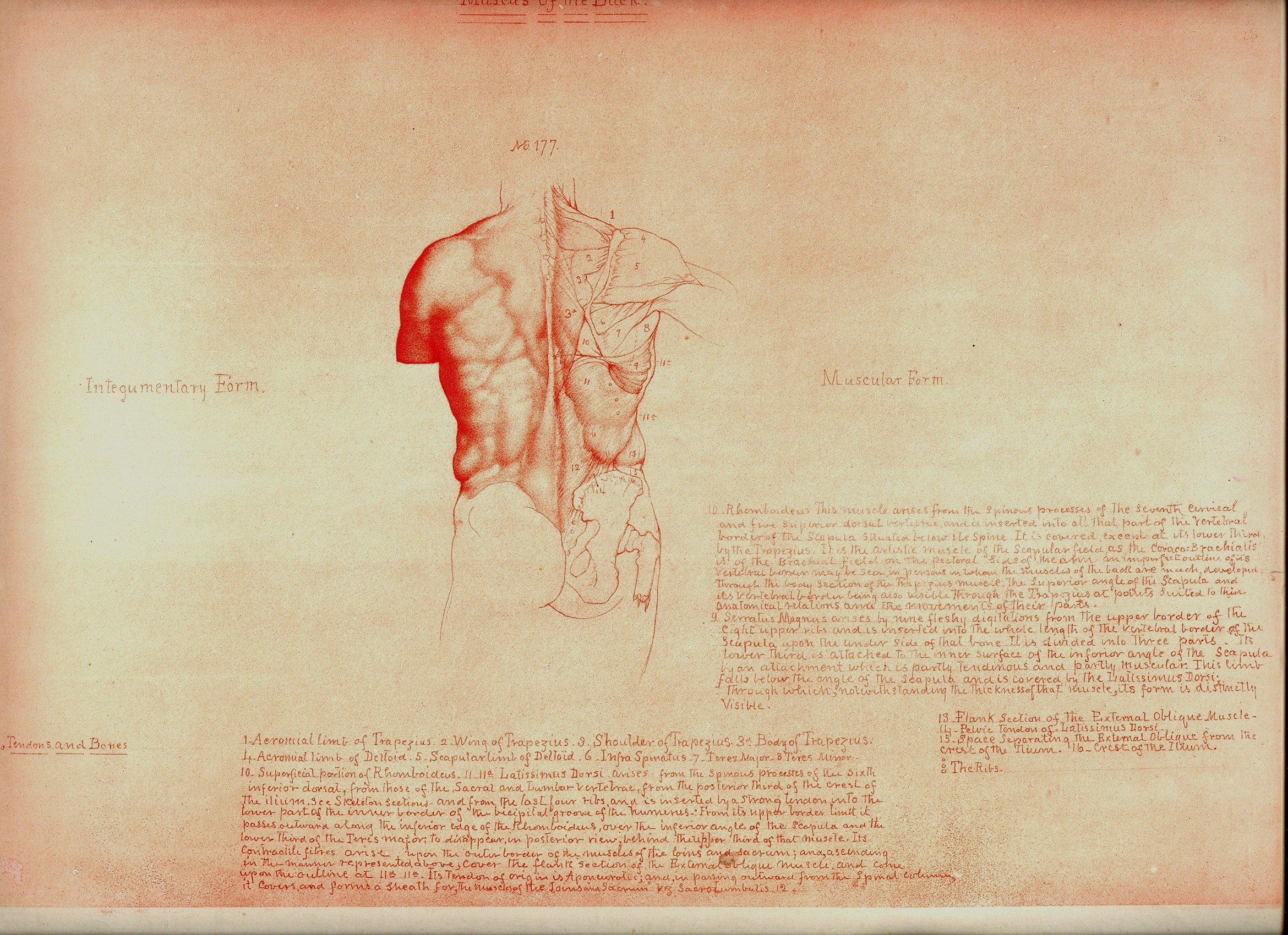
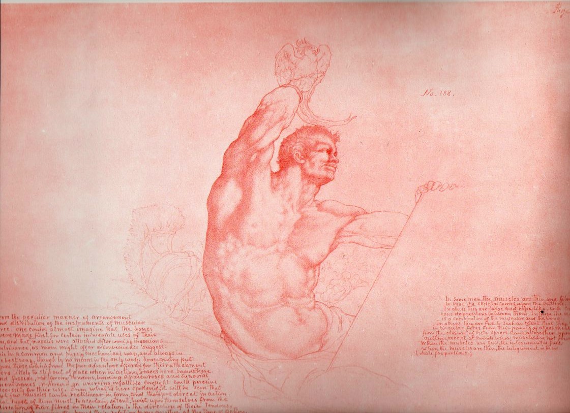
    Looking at old prints sometimes reveals more than just their own history, simple or not:  there are, from time to time, subtle bits of otherness that creeps into the image, if you allow yourself the time to see it.  And sometimes looking at images of the past reveal a little of the future, or the possibility of the future. A great example of this is William Rimmer’s (1816-1879) Art Anatomy, this edition published in 1877 (and about which I wrote earlier in this blog1).

    Blog==June 29--rimmer back

    Blog==June 29--rimmer pecs det

    The work reminds me of at least two touchpoints, one from art, the other literary.  First and foremost, the added elements, the humanist touches and flairs (and I mean Humanist as in the 16th century variety) , the mytholigizing elements, the little designs that are added to the anatomical details

    that run throughout the course of the work,  remind me of the work of the Dadaists that would come forty years later.  As will be seen below, there really isn’t much necessity for all of the added extras, the fabulous add-ons, that Rimmer incorporates in this work.  This part of the work definitely has an antiquarian flavor to it, the major anatomies of the 16th and even into te 17th century having a pronounced artistic flavor to them.

    In a more removed sense, I get a heavy dose of memory of Marcel Proust from the Rimmer images.  In a sense, Rimmer is trying to affect change, an instability, into the most common and stable presentations in art, human anatomy.  There is a strong his history of presenting anatomy in an artistic format–Vesalius is one famous example–where skeletons are posed reading books, or holding their skin or contemplating  a(nother) skull–but not so much past the late 17th century.  Though very few of the “decorated” anatomies have ever taken their artistic license quote so fabulously as Rimmer.  And Proust I think is a Great Destabilizer–he works very hard to push the center of gravity away from where it should be on just about everything.  He drags himself to the proposition at hand, to the memory, to the situation, and though all of his great personal destabilizers–his allegeries, his allegeries to the things that he loves, his allergies to his allergies, his vast catalog of physical complaints, his pale melancholia, his fits, his spectacular memory, his ability to see differently, and on and on, all seemed to coalescence into a colossal ability to see even the smallest detail outside of its small details.  Perhaps this is a stretch, but that is the literary sense-impression I have from Rimmer.

    Notes.

    1. For some reason I never included any of the images available for sale in my blog bookstore–though now I have.

    Rimmer496

    Rimmer495


  • Found Sound: Kircher, Pythagoras, Blacksmiths & Earbones

    JF Ptak Science Books  Post 1358

    [Above:  a gorgeous display of ear bones of humans and animals: reading across the top:  man, cow, hors,e dog, leopard, cat, rat, pig and sheep, coming from Athanasius Kircher’s book on sound and acoustics, and about the first of its kind:  Musurgia Universalis, printed in Rome in 1650.  Image from Special Collections of the University of Glasgow library, and which is the bottom half of the engraving reproduced int he “notes” section1.]

    It seems that almost all of human history’s hearing has been impressionistic–a collection of aural landscapes that would disappear as soon as they were ended, unless of course someone was there to write down what was heard on papyrus or sand or mud or clay or paper.  Finding the sound was important because, well, it was a single-shot phenomenon, unless it was repeated by the presenter, or someone else copied the presentation, or wrote it down so that it could be read and interpreted later.  It was a phenomenal invention of Mr. Edison’s that brought the possibility capturing sound so that it could be played over and over again, the experience becoming a simple piece of technology available to anyone who could afford it.

     The odd thing now is that virtually everything is findable, recordable, archivable.  We can also hear just about anything from just about anywhere.  Before the telephone–invented by Mr. Bell only 135 years ago–in order to hear something from a distance beyond the normal auditory range, a person would’ve needed the assistance of objects such as these “propagation horns” from Kempsten’s Phonurgia nova (of 1673, pictured at left).  Sir Samuel Morland, a fantastic English polymath (1625-1695) also produced an instrument similar to this in his stentoro-phonica, constructed in the 1660’s  It is in a way similar to the giant listening devices devised and constructed by the Imperial Japanese Army in the earliest days of WWII, prior to their use of radar.   Or, if one was a monarch or other highly placed aristocratic or ruling class person, one could have used something like Kircher’s listening device, found again in his Musurgia Universalis of 1650 so that a little eavesdropping might go on from one far-placed room to the next. 


    Wheel-mounted acoustic locators for detecting enemy aircraft over Japan in the 1930s
    [Kircher’s device, below.]
    If one were to construct a monument to “found sound” certainly an important element of it would have to involve Pythagoras, who by virtue of walking past a group of blacksmiths heard something in their pounding that struck him deeply, exciting his foundational ideas about pitch.
    We see him featured prominently in the frontispiece to the Kircher work mentioned above–well, that and a lot of other symbolism as well.

    The blacksmiths are seen at middle bottom, and the man to their left is Pythagoras, pointing to them with a staff, seeming to lean on a marble pillar, but what that really is is a manuscript of his theorem regarding pitch.  reigning over all is a sun representing the Holy Trinity, its rays anointing the earth in the forms of light and angels, the world scene in the center, surrounded by the zodiac and hosting the seated Musica, all representing the ealier beliefs of mathematical/artistic/musical relational proportions, the music of the spheres. [There are other interesting appearances:  musical instruments at the feet of Pythagoras, Pegasus (perhaps?) at the top of the stairs at middle-right, mermaids in the distance, and of course the figure at right, surrounded by all sorts of musical instruments as well as a golden owl.  Of lesser importance but of high interest is the figure just to the right of Pythagoras’ elbow, a figure who seems to be singing, or yelling, or attempting to hear an echo,]
    Perhaps the most significant manufactured found sound–in the tradition of Swift and later that of Burroughs and Gysin–was Kircher’s absolutely fabulous  music-making machine, the arca musarythmica.  It was with a device such as this that any person of any (in)sensibility could compose a slightly pre-arrnaged piece of music, combining previously tranbscribed scores together at random to produce a wholly new musical composition. As described  on the Glasgow Library site, the instrument functioned so: 

     

    The arca musarythmica is a device by which a non-musician could compose a piece of four-part music using prearranged musical fragments inscribed in wands arranged in columns inside the box. Each type of wand corresponded to a particular metrical unit e.g. 4, 5, or 6 syllables, and on each wand there were examples of florid counterpoint on one side and more simple note-against-note settings on the other. Once the phrase to be set had been analyzed into its fundamental syllabic units, each of these could be set to an example taken from a wand of the appropriate type
    I don’t reckon that I’d like the music much (have there been any recordings of anything ever “composed” in this way?) but I sure would like the object. 
    Notes:

    1.

  • Baroque Weeping Baby Skeletons, the Creation of Man, Genesis and a Tiny Bit of All That.

    JF Ptak Science Books  Post 1357

    Jean-Jacques Scheuchzer’s Physique Sacree (published 1732-1737) is an enormous, plumply illustrated thing, an extraordinarily diverse work on the Old Testament and the antique sacred and its relationship to the panoply of natural philosophy.  Its  759 illustrations are usually given overly-encrusted decorated borders by a diverse and at times bizarre selection of themes from biology, geology, astronomy, physics, chemistry, and whatever else seemed to work. It is a production of the High Baroque and high imagination, working within the very definite confines of ecclesiastical squareness and scientific roundness–and somehow the pegs all seem to fit, for Scheuchzer.

    The image that I latched onto [and which is available at 200% if you click through it]  illustrates Genesis I 26, 27:

      Baroque480

    “26: And God said, Let us make man in our image, after our likeness: and let them have dominion over the fish of the sea, and over the fowl of the air, and over the cattle, and over all the earth, and over every creeping thing that creepeth upon the earth.
    27: So God created man in his own image, in the image of God created he him; male and female created he them.”

    Indeed.  We can see the pure holly light (appreciably wide as it gets to its subject than when it started, where it is also degraded)  extending diagonally across the image to a surprised/fearful Adam, who is popped into a landscape of the newly-created.  But it is the border illustration that is most extraordinary to me–it is an 11-segment depiction of the birth process, told almost exclusively in baby skeletons.  The story begins at top-right corner, with perhaps a hint of conception, and then through  developmental stages II (embryonic) and then III/IV (taking us through the third month) and then V through VII (showing perhaps through the seventh month or so), displayed in a top- and bottom-middle display, and not in order.  I really don’t know enough of developmental anatomy to say what is depicted in images VIII through XI, except to note that–of course–they are all skeletons, and the last is weeping. 

    Spermatozoa seem to be missing in images I and II, or at least Scheuchzer didn’t make an attempt to show them at work, even though he must’ve been aware of their existence, discovered  fifty years earlier (in 1677) by Leeuwenhoeck.  But this discovery certainly didn’t get in the way of maintaining the theory and belief in the homonuclus–the tiny, preformed person carried completely within the sperm and implanted in the woman who served basically as an oven, a receptacle.  Scheuzcher believed on the other hand that the homonuclus was located in the ovaries–still part of the preformationist camp, but getting closer to elevating the importance of woman in embryological development.

     [All that said I don’t know the reason for the weeping skeleton; or, for that matter, what the things are that the two skeletons at upper left are holding.]

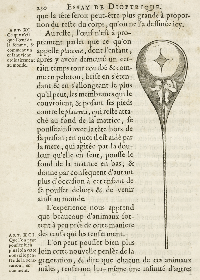
    The homunuclus, famously illustrated in Nicolas Hartsoeker’s Essay de Dioptrique in 1694: 

    Ovary Hartsoeker


  • Contrary Big Crowds Series–a Chaos of Hats and an Order of Heads with No Hats

    JF Ptak Science Books–Quick Post

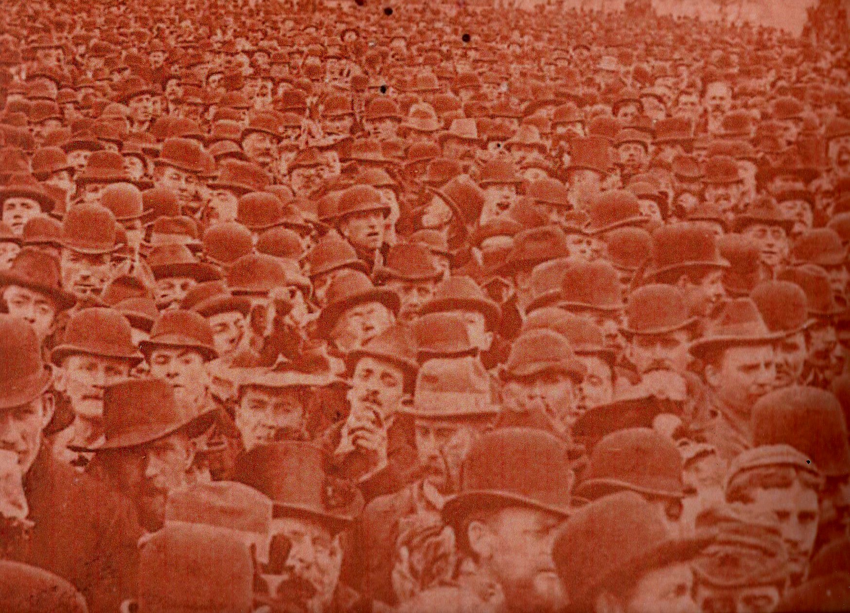
    Coming upon this image of a sea of hats, which in the fine tradition of naming collections of self-similar things-like a gaggle of geese or a murder of crows–a ‘Chaos” of Hats, I needed to find its contrary, and a relatively orderly and ordinary one at that. [I compiled a list of  oddly-named groups in an earlier post here called An Unkindness of Ravens and a Murder of Crows.]

    Hats454

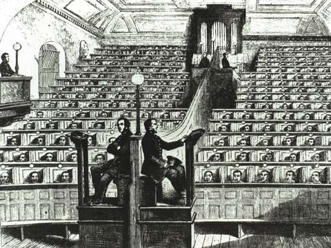
    What better than an Order of Heads?  This image is of a church or social service at Pentonville Prison in 1855.  The penitentiary engraving is real;  but the  truth be told,  the Chaos photo is a manipulated image, about a half of the original of something I made, mainly because I just wanted to see  a very hatty crowd around the man in the middle pointing at the camera. 

    Hats heads

    As it turns out, Pentonville–serving North London loyally since 1816, and still doing so–was the home for a bit of Oscar Wilde and Boy George.  It was also the place where Arthur Koestler began composing his thoughts for his magnificent Darkness at Noon.


  • Birds with Stone Wings: Athanasius Kircher, 1664

    JF Ptak Science Books   Post 1347

    The great semi-mystifying polymath Athanasius Kircher (1602-1680) lived for a long time and filled his life with ideas and words,  producing dozens of books during his time on Earth, some of which were never published even though written, some manuscripts lost forever. His was a massive output of extraordinary breadth, most of which was original to him, and a lot of which was original to others and not credited, as was often the case with some scholarship at this time in history.   He wasted little time what I can see, writing on a spectacular range of subjects, enlightening people, confusing people, generating great theories and some bad ideas. 

    The image below comes from his Mundus Subterraenus (“Athanasii Kircheri Mundus subterraneus in XII libros digestus… “), published in 1664, and which was concerned mainly with geology and the theory of the Earth.  Kircher a product of the great Jesuit institution, the Collegio Romano, postulated the structure of the interior of the Earth, the origin of heat, the source of the tides, the composition of light, mechanics, the structure of music, linguistics, astronomy, and of course the existence of the Virgin Mary in amber.  There was also a fair amount of work on one of his side interests that populated a number of his works, alchemy and the search for the organization of materials.

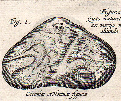
    But what I am looking at today with Kircher is the Mary-in-Amber part, his investigations (and theorizing, and documentation) on naturally-appearing, organic objects found in inorganic material–rocks and minerals–like these birds:

    Kircher  lapidibus birds451

    Which is a detail from  

    Kircher  lapidibus birds449
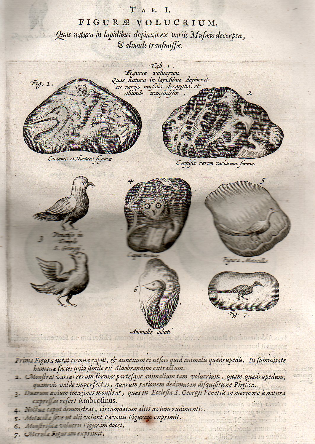
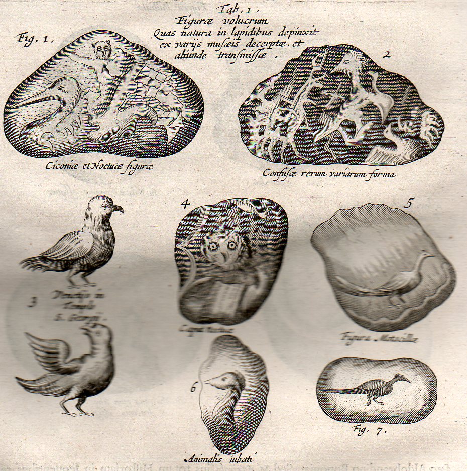
    The engraving (the original of which is available from our blog bookstore), entitled Figure Volucrum, quas Natura in lapidibus depinxit, ex variis Museia decerpt et aliunde transmissa (or “Figures of winged creatures, painted by nature on stones, taken from various museums, and otherwise transmitted.”) shows Kircher’s collection of anthropomorphically based inorganic items.  It is a remarkable exercise to try and place yourself within the context of the scientific world of Kircher’s time, 350 years ago, and try to explain these naturally-occurring phenomena, without even the benefits of the conception of long geologic time, or of expanded time in general. 

    The descriptive text (at the bottom of the engraving) from Kircher on these objects is translated, as follows:

    1.  The first figure represents a head of a Stork, together with some, but I do not know what, quadruped. At the top is something like a human face. Extracted from Aldobrandinot (see PI. XXIII. Fig. 1).
    2.  Shows various forms and parts of animals, winged creatures as well as quadrupeds, although very imperfect, the cause of which we give in the physical examinations (see PI. XXIII. Fig. 2).
    3.  Represents the figures of two birds expressed by nature on marble in the church of St. George’s, at Venice, referred to by Ambrosinua (see Vol. VII. PI. II. Figs. 3, 4).
    4.  Shows the head of an Owl, surrounded by rudiments of other birds (see PI. XXIV. Fig. 2).
    5.  Represents the figure of a Wagtail, or as others prefer, of a Peacock (PI. XXIV. Fig. 3).
    6.  Shows the figure of a monstrous bird (Vol. VII. PI. II. Fig. 4).
    7.  The figure of a Merle (Vol. VII. PI. II. Fig. 5).

    A closer look at the image:

      Kircher  lapidibus birds450