I posted something yesterday on this, but made a video of the whole thing (plus extras) this morning, with some decent music.
A Daily History of Holes, Dots, Lines, Science, History, Math, Physics, Art, the Unintentional Absurd, Architecture, Maps, Data Visualization, Blank and Missing Things, and so on. |1.6 million words, 7500 images, 4.9 million hits| Press & appearances in The Times, Le Figaro, Mensa, The Economist, The Guardian, Discovery News, Slate, Le Monde, Sci American Blogs, Le Pont, and many other places… 5000+ total posts since 2008.
Contact johnfptak at gmail dot com
I posted something yesterday on this, but made a video of the whole thing (plus extras) this morning, with some decent music.
JF Ptak Science Books Post 1298 (This is the second post written on this pamphlet–it is a stunner to me every time I see it. The earlier post was written in September 2008 and can be found here.)
Here’s an interesting entry from the instrumental librarians’ tool WorldCat, a massive 75 million item book database that I use with some frequency, trying to determine whether some obscure-sounding/looking pamphlet or book is actually Not Around, like not in library collections. (When something just isn’t there, not located, it makes the work even more interesting to me.)
Poland’s Designs on Germany has the sound and feel of a piece of propaganda, right from the start, just from the supra-obvious title page and the very feel of the production. Looking for my proof-in-the-pudding–the printing information and source for the information–I found none. Another strike for the propagandist. (And another interesting point: the phrase “Poland’s designs on Germany” is a non-starter on Google, not located on the web, or in JSTOR, or in other pay-for web commercial communities.)

(This item is available for purchase at our blog bookstore.)
Then of course there was the content, which is a simple, serial distribution of The Big Lie, painting Poland as an aggressor, hungry for German land and people. So far as I can tell there is nothing truthful in this work whatsoever, or at least I should say nothing that is assertive to the point of Poland being an “aggressor”. There are seven maps illustrating the points. These are the great hallmarks of The Big Lie–a lie so vast that no one is supposed to think it possible that someone would tell a lie so fantastic, that no broadcast lie could be so incredibly big as to have been invented and told, and so the lie must be true. Hitler wrote about this admiringly in Mein Kampf, expressing an idolotry for the idea in print, recognizing it as a powerfull tool of subversion and propaganda, and then went ahead and followed the instructions.
Then comes the entry in the WorldCat–I found that the year was 1939. It would be in September of the year that Hitler would attack Poland and the war would begin. Who would have thought that the Nazis were acting in self defense?
The WorldCat entry:
Poland’s Designs on Germany as expressed since the British guarantee. [Berlin W 62, Rauchstr. 27] [Dt. Informationsstelle],
1939
23 S. : 7 gez. Kt. ; 8.
Other Titles: Polnische Ansprüche auf deutsches Reichsgebiet. engl.
Locations Library
Germany BAYERISCHE STAATSBIBLIOTHEK
Germany BIBLIOTHEK DES HERDER-INSTITUTS
Germany DIE DEUTSCHE NATIONALBIBLIOTHEK
Germany STAATSBIBLIOTHEK ZU BERLIN
And there it is: “Dt. Infomrationnsstelle” is the Deutsche Informationnsstelle, the German Information Centre. The GIC exists today in name only, but during the National Socialist period leading up to the war and during WWII it was an outlet for German propoagandistic works. There are no copies of this particular work, evidently, in libraries in the United States. This is too bad, because this is a tremendously insulting document, an insistent, insinuating, unforgiving document to the ridiculous, perverted manner of thought and logic of the Nazis.
·Posted by :
·in:
JF Ptak Science Books Post 1254
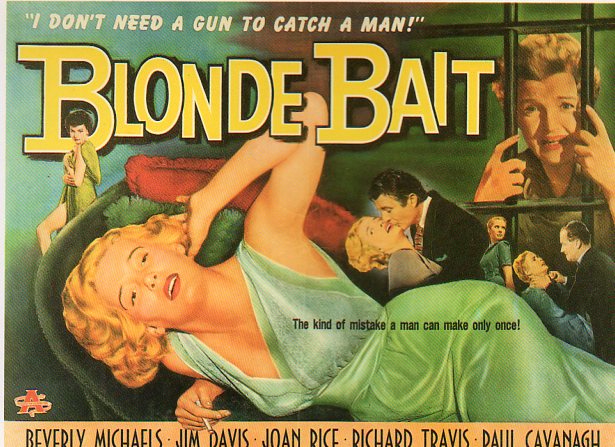
 There was a certain something going on in the 1950’s with nova-express B-film ladys-in-trouble/bad girl/smashnose kissing movies that were made for $5,600 in three days with two days of quality control. The posters made for these beauties were a thing unto themselves, a self-contained and self-limiting genre, a found case of bizarro design and muted inelegancies.
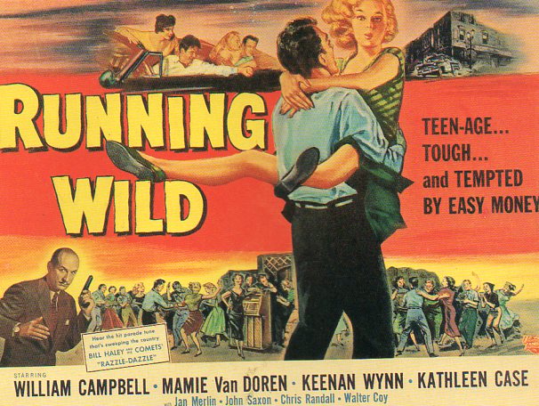
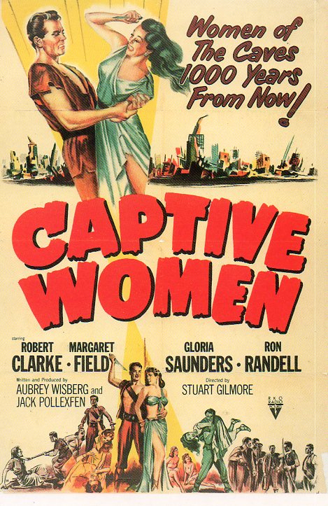
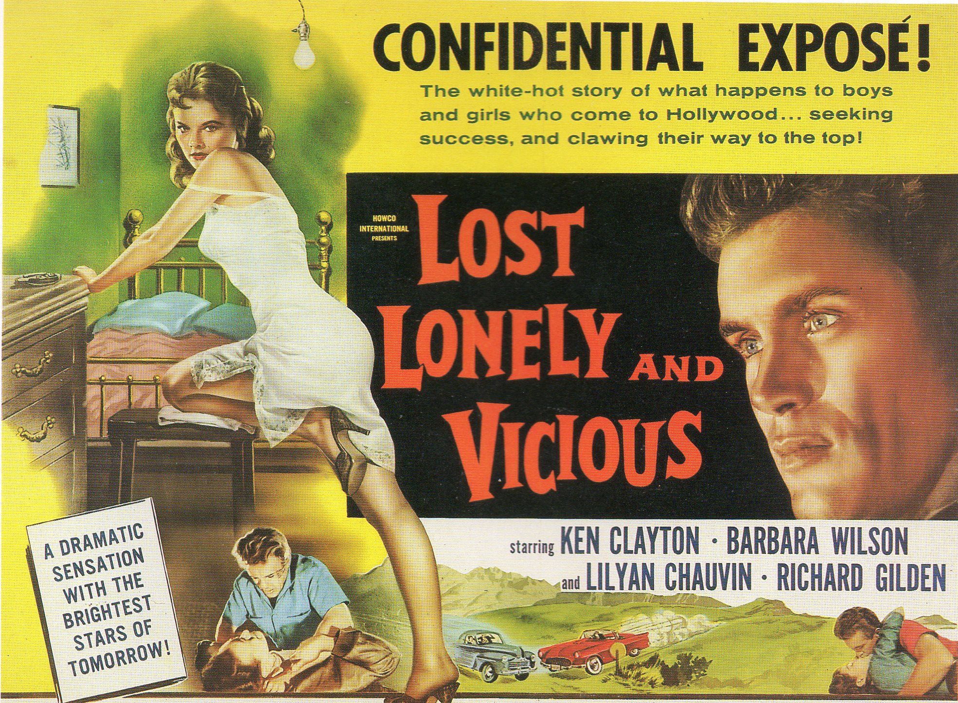
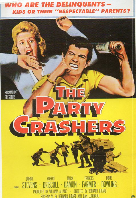
The posters look like their movie names: Juvenile Jungle, Betrayed Women, Girls in Prison, One Girl’s Confession, Dragstrip Girl, Girls on the Loose, Pick Up, Girls in the Night, Live Fast Die Young, Alimony Running Wild, Hot Rod Rumble, Running Wild, Blonde Bait, Captive Women, The Party Crashers and of course Lost, Lonely and Vicious.
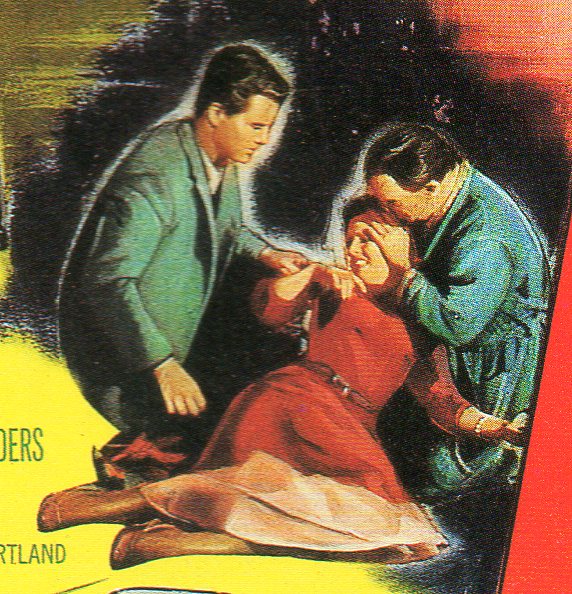
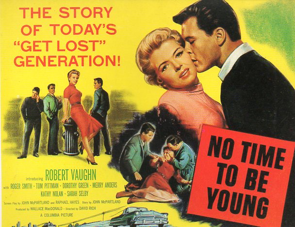
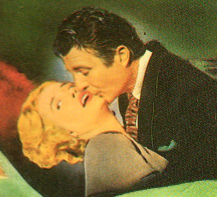
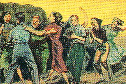
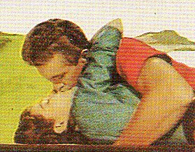
Generally I think that folks see the big design and the colors, but lurking behind all of that are usually image-bits that sorta tell a part of the story of the film, but in a stubby, grubby way. So I decided to do a little archaeological dig into some of these and give those small images some life through magnification. Sometimes they’re surprising and look good big; sometimes they’re just badly design and goofy, and would look better smaller, very much smaller—dot-small. Here’s a few examples (I’ll show the detail first and then the larger, full image of the poster after):
Detail

Full poster:
Full poster:
Detail

Full poster:
Detail:
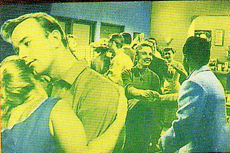
Detail:
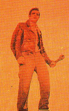
Full poster:
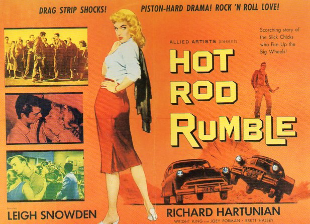
Detail
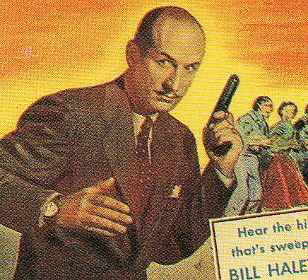
Detail

detail
Full poster, 1955.
Detail:
detail:
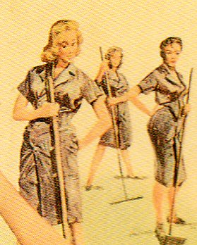
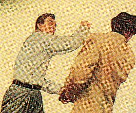
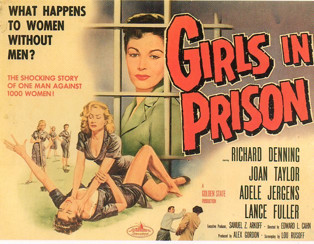
Detail:

detail:
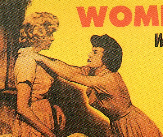
Full poster, Betrayed Women, 1955:
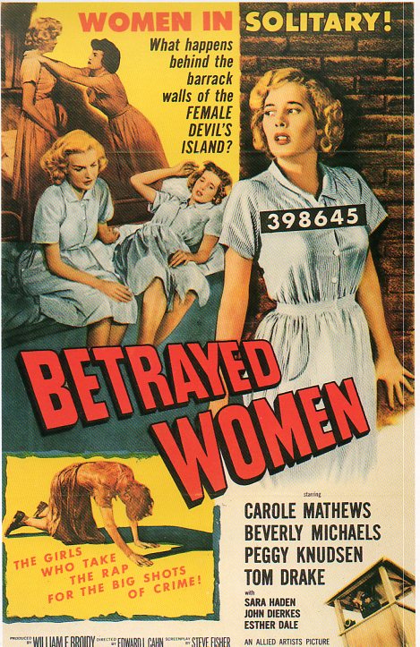
Detail:
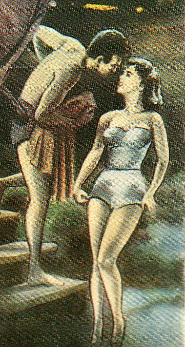 |Full poster, Juvenile Jungle, 1958
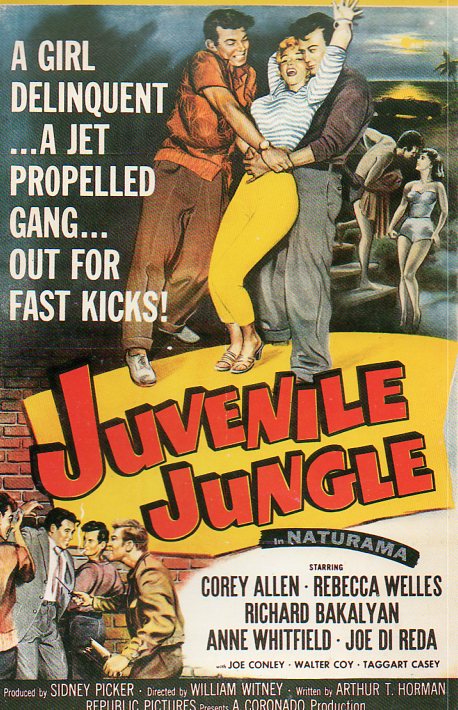
detail:
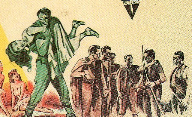
Full poster, Captive Women, 1952
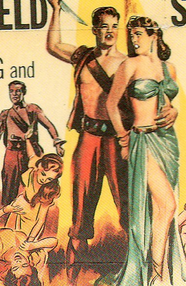
Full poster,Captive Women, 1952
Detail:
Full poster, Lost, Lonely and Vicious, 1952:
Detail:
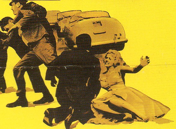
Detail, Party Crashers, 1958
JF Ptak Science Books Quick Post
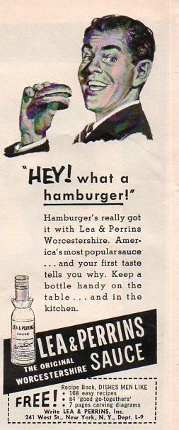 I was looking for something completely different when I stumbled over this simple ad for Worcestershire Sauce. What was instant recognizable to me was that the hamburger was just exactly that–a hamburger. There was the burger and the buns, and that was it. except of for the fancy Worcestershire sauce, brought to America from the old country. In the ultra-centrifuge micro-cautionary ads of today, it would seem impossible to show a food product in such simplicity and so remarkably unposed–the buns are uneven, and imperfect, and there’s nothing about the burger to suggest itself as good except for the smiling, suited man.
McDonalds was selling burgers at this time, and for 15 cents a pop. I’ve seen television commercials advertising burgers for a buck here in the present, cheaper than what the thing was in 1956, that dollar covering only 12 cents of expense then. The current burger is cheaper still if you consider it as part of an hourly minimum wage; the 1956 minimum was 75 cents/hour, while 2010 is about ten times that; that means that the 1956 hamburger was 1/5 of the hourly wage, while the product in 2010 was 1/7 of the minimum wage. The extreme cheapness of the current hamburger must make it seem a good deal for people working at or below the minimum wage, providing a food-like product to fill the belly for very little money in exchange, and with very little nutritional value. Perhaps that explains why 50 million Americans eat a a hamburger place of some sort every day–it is a vastly successful business model predicated on delivering an almost entirely valueless version of an essential component of daily life, with constant advertisement duping people with greasy heart clogging goodness delivered by a bouncing clown or a little girl with freckles. But of course there were worse things–this one just happened to catch my attention this morning.
The hamburger has maintained its cheapness over the years, and certainly is one of those things from the ’50’s whose back-then price has translated into a more-expensive price with CPI-adjustments over time. There are other staple-like thingas that were more expensive in 1956 than now: milk/gallon: 92 cents 1956 and $7.44 in 2010 dollars) and coffee, 93 cents (1956) or $7.52 (2010). Gasoline was 23 cents/gallon or $1.86 in 2010 dollars. (Gasoline pricing is another, more complicated story, for another time.)
Don’t forget to order your copy of Dishes Men Like! It has seven pages of carving diagrams.
JF Ptak Science Books Post 1252 (Rapid Post)
Part of the series Blank, Empty and Missing Things
Fred Catlett’s Rehabilitation of Sub-Standard Housing Areas (1942) isn’t so much about “rehabilitation” of the houses themselves but to their neighborhoods and surrounding areas–the “inadequate” housing would be demolished, disappeared, replaced, to re-insure the valid tax basis of the larger area/neighborhood. Nothing is said about where the original people would go while their old neighborhoods were being razed or whether or not they would return to the new housing.
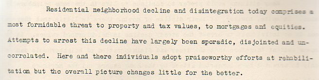
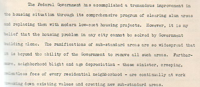
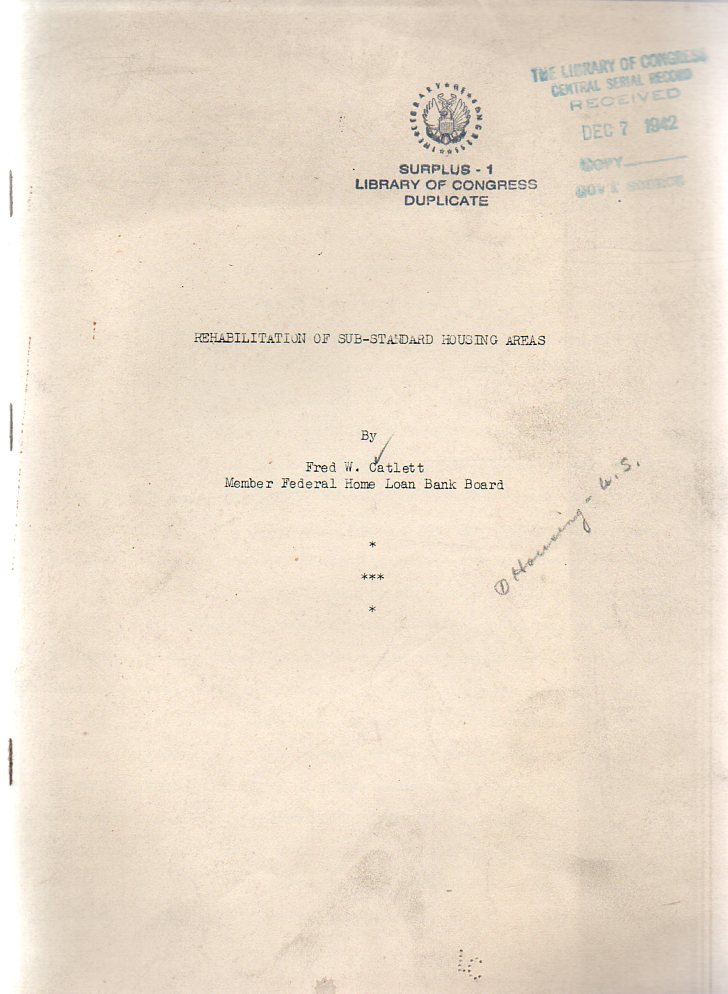 “Better housing projects break up slums but not until fine homes have decayed and been ruined and many thousands of dolalrs in loses have been suffered”writes the author. I understand that the man was protecting the material bases of his institution, but ot have the entire document be absent of any consideration to the people being houses I find remarkable. (The original pamphlet is available from our blog bookstore.)
·Posted by :
·in:
JF Ptak Science Books Post 1295
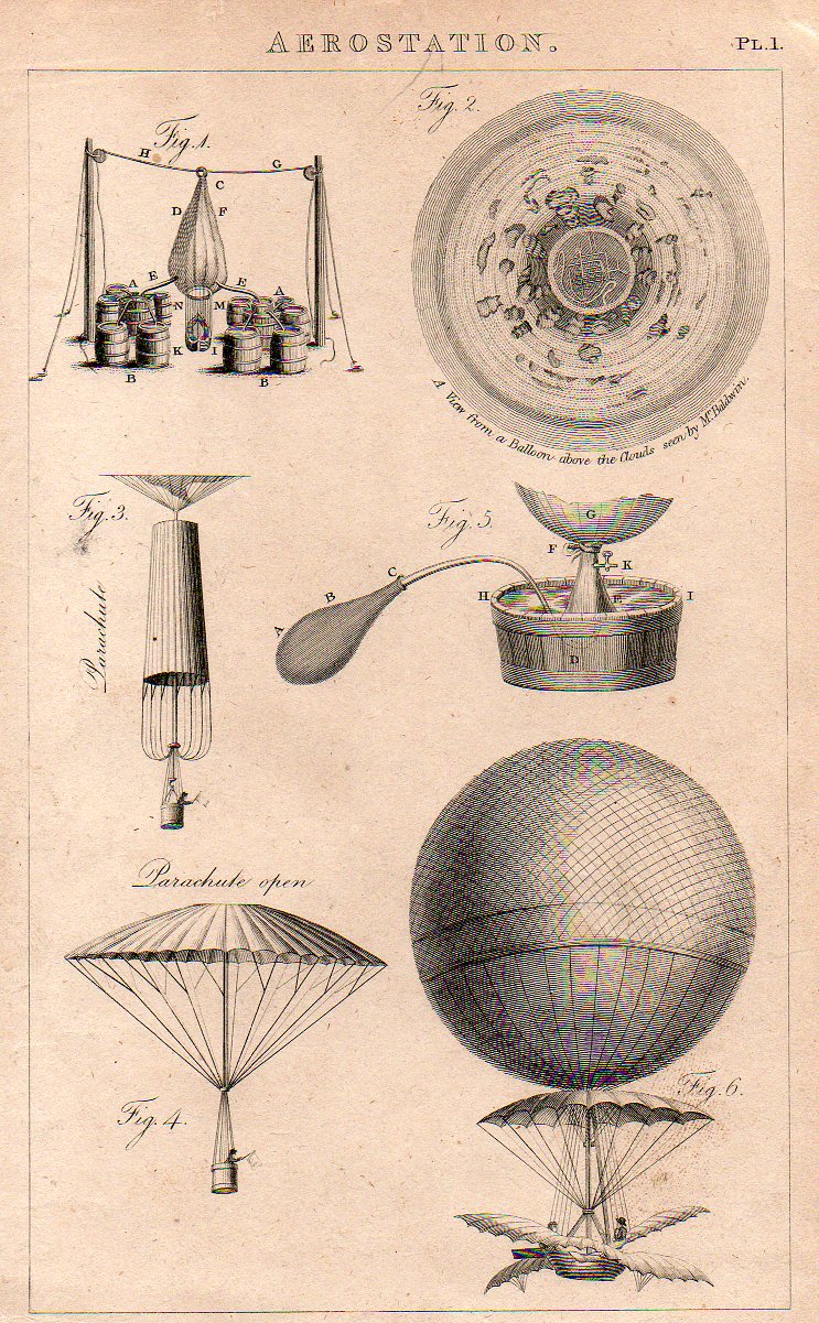
The idea of representing a view straight down, of looking straight down from some height, is a relatively recent occurrence, this view being somewhat rare in the antiquarian world pre-balloon or pre-heavier-than-air flight. The pre-human-flight reason for its scarcity is understandable, but even after the first Montgolfier ascension in 1787, there’s another 120+ years of scarcity yet to come before these views would start to pop up in common (and uncommon) literature.. Now I’m not talking about cartography, which is basically a straight-down view of the world—what I’m referring to is that same view but not as a map per se, but what you would see if you were dangling out of a plane or balloon. The extraordinary map of Imola by Leonardo would certainly classify because of its you-are-there qualities: essentially it would be like a bird’-eye or oblique view, but straight down.
All of the images are available to purchase from our blog bookstore, here.
The first image is that made from a balloon, a lighter than air affair, and engraved and printed around 1810 or so. It has a very uncommon vertigo-ey affect, like a map of Dante’s leveled creations, though what we’re seeing is a very
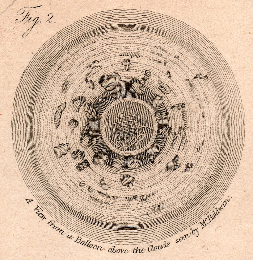
…which is a detail from this engraving, made in London around 1810.
There are of course a number of other lovely design elements, not the least of which is the man in the parachute, bottom left. (My guess is that the flag held by the man was not for patriotic reasons but rather for more practical concerns, light judging wind strength and duration.
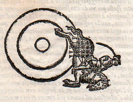
Another interesting image is this instructional from a source printed around 1620 (I don’t know the source here, either–I purchased the print loose many years ago like many of the others here at Pageant Bookshop in NYC). It shows a slightly oblique angle (below) and then the flat-perspective view at top:
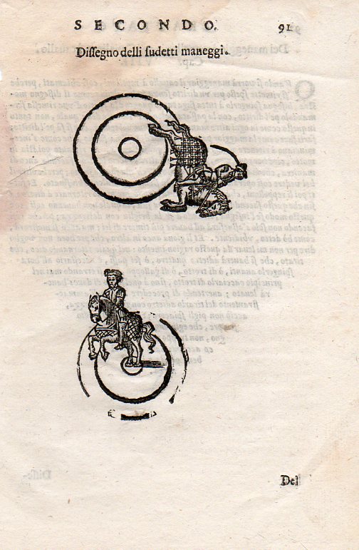
And then the lovely detail:
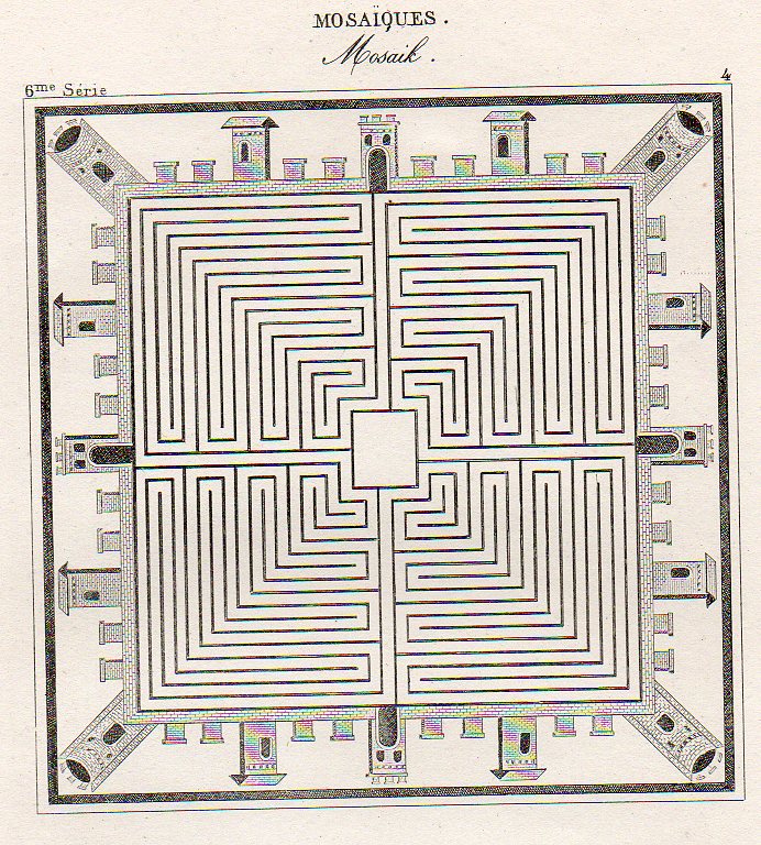
Then there’s this beauty, showing an idealized town square, presented in mosaic as though seen from above, continuing this thread of flat-perspective–basically looking at some central part straight down, and then taking the objects surrounding the central figure and simply laying them on their backs, as so):
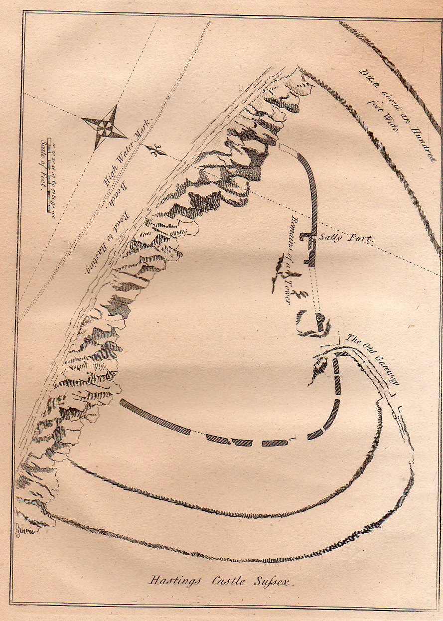
Lastly for now is this quite flat persepective of the remains of the Hastings Castle (East Sussex), which was built right after 1066 but before the battle. The (limestone) cliffs that did so much damage to the castle are clearly visible, though what was left of the castle is not. The view of the area of the castle shows the grounds both in perspective and plan and also from directly above. Its a more-naive approach to imaging that was done so well (on occasion) by the U.S. Coast Survey when it rendered a coastline with an inset of what the coastline looked like from the water–both were superior efforts, but a little odd if you took the map at face value. This map makes no pretense on perspective correctness, though it is overall a fine map, nicely displaying the necessary details accureately though not correctly (?)
·Posted by :
·in:
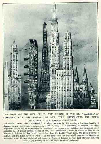
This wonderful display (appearing in The Illustrated London News for 26 March 1927, page 518) of quantitative data isn’t quite as whimsical as it appears in detail, though I can think of only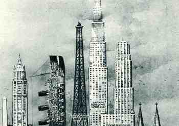 a few (antiquarian) times that I have seen a ship made part of a cosmopolitan vertical cityscape. It is a great way of comparing two disparate, out-of-place equals, and certainly can get the idea of the size of something as stand-alone and solitary as a great ship to children (and adults, too) by comparing it to something as obvious as a tall building., This time its really just comparing the length of the SS Mauretania with the heights of some famous and notable buildings. (The Mauretania, 1906-1935, was a fabled, luxurious and fast ocean liner of the Cunard line; it was refitted for a resurgent oceanic service at about this time.) In the larger, expanded second image we see the Mauretania stacked up against (from left to right) the Washington Monument (555′), the Woolworth Building (792′), the Mauretania (790′), the Eiffel Tower (984′), the Larkin Building (proposed at 1208′), the Book Building (873′), the Koln Cathedral (512′) and the Statue of Liberty (305′). The Larkin Building (not the F.L. Wright structure of the same name) was a proposed super-tall of 110 floors for 330 W. 42nd Street that was proposed in 1926 and not canceled until 1930, and which would’ve been the tallest building in the world. (For an interesting site on the cancellation of tall buildings, see HERE.) In any event, this was a big ship–the largest in the world when it was launched as a matter of fact–and the drawing is wonderful. Upon closer inspection, there is a terrific amount of detail in the cross section of the ship.) (This original print is available at our blog bookstore.)
JF Ptak Science Books Post 1293
Mmmmm…Can’t you just taste the goodness, the frivolity, the downright holiness of these seasonal ads? What an odd set of emotions these images are able to surface on quick-boil. Who knew (in this first image) that this LIFE magazine ad from 1954 would reveal the true value of electronics–managing cancer sticks? (These same folks are today working on quantum computing multi-universe porn–stay tuned.) The model still has pearly-white teeth while smoking and drinking coffee, radiant in her half-a-halo of cigarettes. The lit cigarette between her fingers is at first almost invisible (or at least it was to me), seeming to be just another of those rolling off the AccRay Electro-conveyor belt, an endless supply for her pleasure. (The “electronic” part of this ad are also Lilliputian; its a nonsensical drawing with no scale, unless the cig company wanted to get across to its potential smoking community how “big” their cigarettes are.)
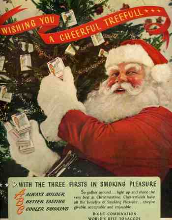 And could poor old Santa get any lower than this? Out of all the things he has carried in his sack over the years, Chesterfield Cigarettes may very well be the worst of them. Plus, not only is Santa delivery them as presents, he’s decorating the tree with them as well, and hardly acting the camera-shy sort that he is. Chesterfield (Leggett & Morris Tobacco Co.) combined some of the best loved elements of childhood (the ABC’s “Always Buy Chesterfield”) and Santa Claus to not only convince adults to think of the product as a Gift(ing) Unit, but also to lull children into a sleepy, memory-clouding impression of Chesterfields being somehow good (what with these two primary associations and all). “Chesterfields have all the benefit of Smoking Pleasure (capitalized in the original) “they’re givable, acceptable and enjoyable¦” I wonder what they, meant, exactly, by using the word “acceptable”?
I’ve seen Santa in other embarrassing poses like this in the pages of LIFE magazine for this period: flying through the air in his sleigh loaded down with boxes of cigarettes, placing boxes of them under the tree, stuffing stockings with cartons, and the like. I’m sure that he regrets it now, though.
All sorts of people were pressed into the service of selling tobacco products like this—sports figures, movie stars, doctors, adventurers; an entire alphabet of personalities and personality types got into the act. A sitting president had never been involved, though a person who would become president was. 
I’m sure Ronald Reagan regretted this ad at some point in his life as well (“beautiful Christmas Car Carton” or not), though I suspect that he would’ve kept that close to the vest.
This is a simple ad for a butane-based lighter (appearing in LIFE magazine for 18 December 1950), lighting the way down Cigarette Road. Actually, it was more a highway than a road, and a superhighway at that. Government-sponsored warnings about tobacco health issues was still more than a decade away: medical doctors were part of the advertising machine, as were actors (including RWR), sports figures, and virtually anyone else with a mouth.
This is a simple ad for a butane-based lighter (appearing in LIFE magazine for 18 December 1950), lighting the way down Cigarette Road. Actually, it was more a highway than a road, and a superhighway at that. Government-sponsored warnings about tobacco health issues was still more than a decade away.
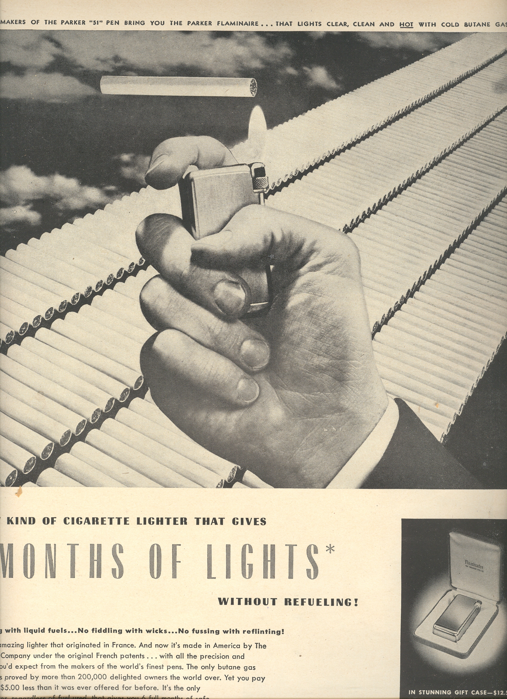 It seems to me that there are about 300 cigarettes in this ad, and that looks like a lot—point of fact though is that in 1950, the average American (of 18+ years) smoked about 3,522 cigarettes a year, which means about 10 cigarettes a day for everyone in the country. Not 10 per smoker; 10 for everyone in the entire country, smoker or not, who was over 18 years of age.
The average smoker in 1950 smoked about 2.5 packs a day, or 50 cigarettes or so—that’s equal to this line of cigarettes being smoked every six days.
There were virtually no brakes.
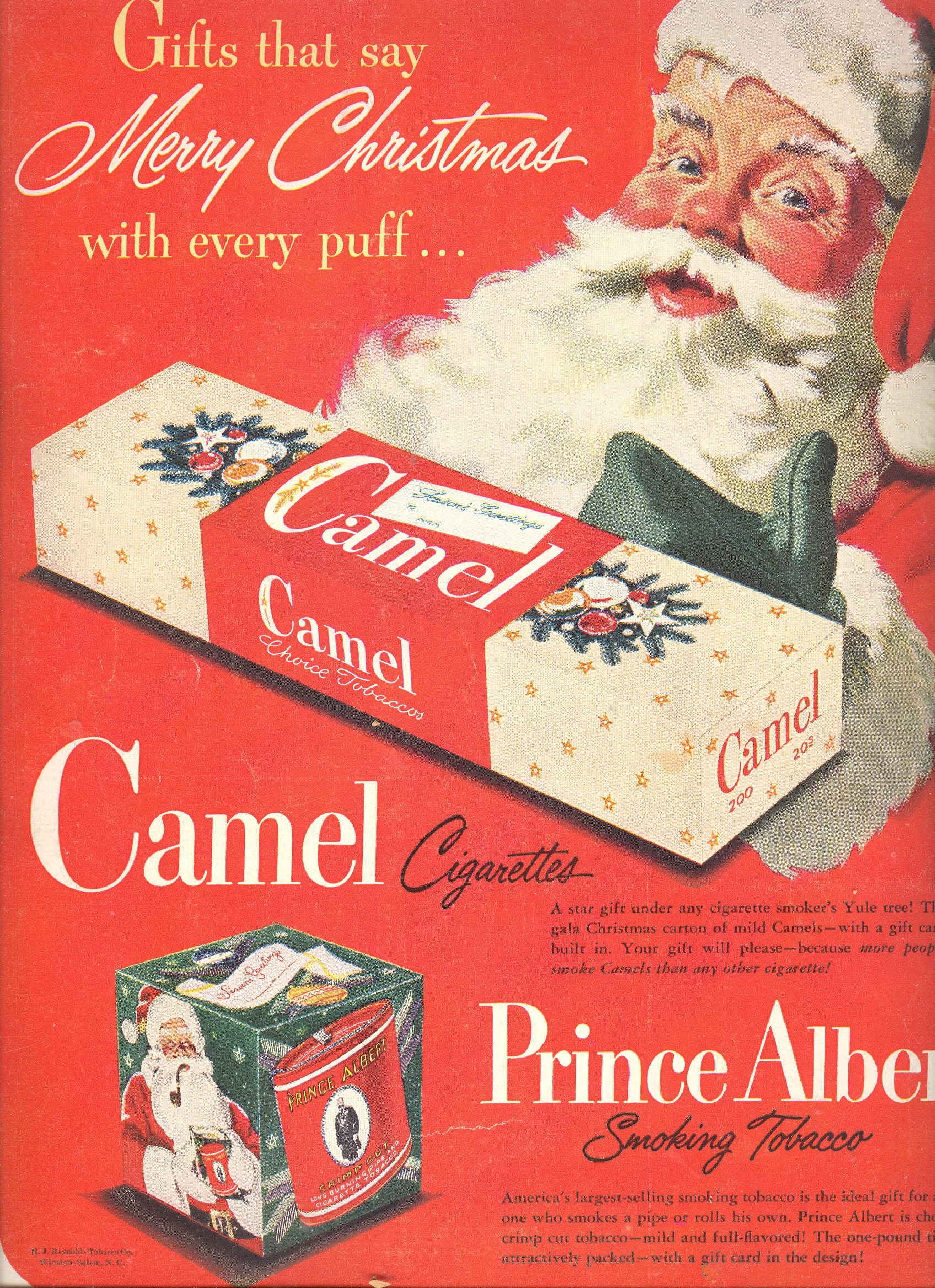
Even Santa (a pipe smoker) got into the business. This was a standard, acceptable, vanilla-packaged advertisement.
United States Cigarette Consumption, , 1900–2007
First number is total consumption in billions; second number is per capita yearly consumption for people 18+.
1915 17.9 285
1920 44.6 665
1925 79.8 1,085
1930 119.3 1,485
1935 134.4 1,564
1940 181.9 1,976
1945 340.6 3,449
1950 369.8 3,522
1955 396.4 3,597
1960 484.4 4,171
1965 528.8 4,259
1970 536.5 3,985
1975 607.2 4,123
1980 631.5 3,851
1985 594.0 3,461
1990 525.0 2,827
1995 487.0 2,515
2000 430.0 2,092
2005 376.0 1,716
2007 360.0
Source: Tobacco Outlook Report, Economic Research Service, U.S. Dept. of Agriculture.
JF Ptak Science Books LLC Post 699 Blog Bookstore
JF Ptak Science Books Post 1250
“There were giants in the earth in those days; and also after that, when the sons of God came in unto the daughters of men, and they bare children to them, the same became mighty men which were of old, men of renown.” Genesis 6:4-5 (KJV).
Our dog Blue is a giant Jack Russell Terrier–mix. He’s a Jack St. Bernard/Jack Russell–a St. Jack–and at 50+ pounds is either a Giant Jack or a mini St. Bernard. He behaves like the St. Bernard. One wonders about the mechanics of the thing–similar to Mr. Gulliver in Jonathan Swift’s A Voyage to Brodbingnag (1727), in which the hero (or anti-hero) though he is disgusted by the gigantic women of the place nevertheless seeks and accomplishes some sort of romantic union with the handmaidens of the giant queen. And this all puts me in the mind of giants–actually, I’d like to put together an Alphabet of Giants, with this being the beginning. And to start at the beginning is Athanasius Kircher–the incredible Kircher, who produced thousands of pages of excellent analysis and cutting-edge technical/physical thinking as well as hundreds of pages of highly imaginative scientificiana–and his generic giant, featured in Mundus Subterraneus in 1646.
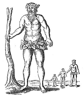
Giants have certainly been around for a long time, though imaging that imagination is less ocmmmon early on in the history of the illustrated book.
There’s no lack of giants in ancient mythologies and legends–the Hindu Daitya, Mohamed’s depiction of a 100-foot-tall Adam, the Greek Antaeus (the children of Heaven and Earth, of Uranus and Gaea), the sleepy Encedladus, the Nephialim, and so on. One of the most glorious of the big people stories is the beautifully-named Gigantomachy, in which the gods of Olympus engage in an enormous confrontation with Chaos and Aleyoneus. The “good” (though not very) guys win.
There’s actually about half-an-alphabet residing just within the Greek Titans (Atlas, Crius, Cronus, Coeus, Gaia, Hyperion, Iapetus, Mnemosyne, Oceanus, Phoebe, Prometheus, Rhea, Theia, Themis, Tethys), but I’d like to expand this if I can. A fuller, more diverse listing of giants and giant-groups follows: Anakim (Jewish mythology, references in the Old Testament), Argus Panoptes (Greek mythology), Bestla (Norse mythology), Cyclopes (Greek mythology), Daityas (Hindu mythology), Epimetheus (Greek mythology), Fachan (Celtic mythology), Gargantua and Pantagruel, Gigantes (Greek mythology), Gog and Magog (Jewish mythology), Goliath (Book of Samuel of the Bible), Hecatonchires (Greek mythology), Iovan Iorgovan (Romanian mythology), John Henry (American folklore), Jotuns (Norse mythology), Kaour (Celtic mythology), Menoetius (Greek mythology), Nimrod (Jewish mythology, OT), Oni (Japanese folklore), St Christopher (Roman Catholic saint),Talos (Greek mythology), Titans (Greek mythology–Atlas, Crius, Cronus, Coeus, Gaia, Hyperion, Iapetus, Mnemosyne, Oceanus, Phoebe, Prometheus, Rhea, Theia, Themis, Tethys), Zipacna (Mayan mythology).
For the most part I’ve stayed old with these images, except for the 50-Foot Woman, the Giants are generally not from the modern fantasy/sci fi gernre.
So, Part 1:
A. ALICE. John Tenniel’s Alice in Lewis Carroll’s Alice’s Adventures in Wonderland.

A. Arthur. King Arthur’s Giant.

B. Beanstalk Giant. Jack and the Beanstalk, John D. Batten

B. Bunyan, Paul. By Allen Lewis.

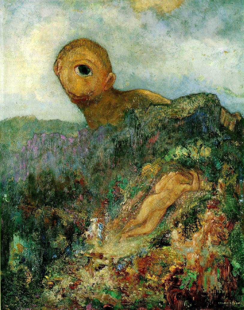
C. Cyclopes. By Ordilon Redon.
.
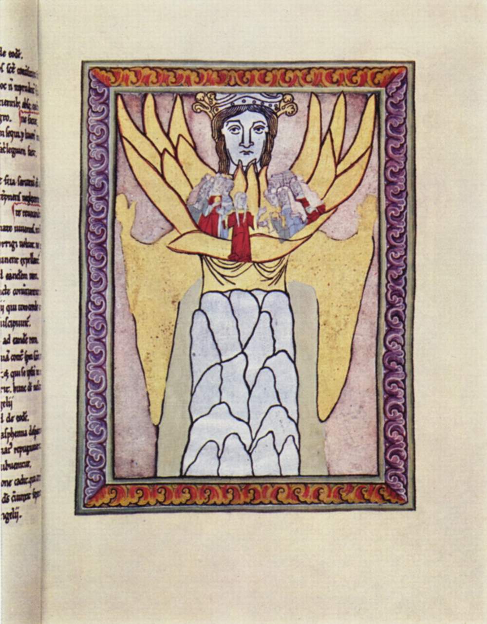
E. Ecclesia. “Ecclesia”, or the depiction of Church as the Bride of Christ is a representation of a woman giant, and is seen in Scivias, by St. Hildegard of Bingen (1098-1179).
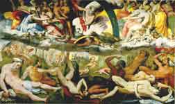
F. Fatna. The giants Fafner and Fasolt seize Freyja in Arthur Rackham‘s illustration of Richard Wagner‘s Der Ring des Nibelungen


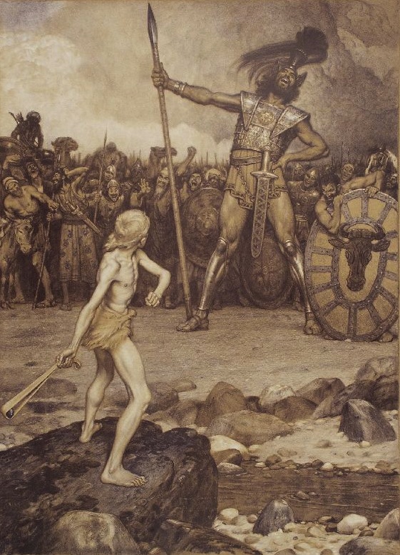
K. The Kraken.

O. Oni (Japanese folklore.)

P. Pantegruel.

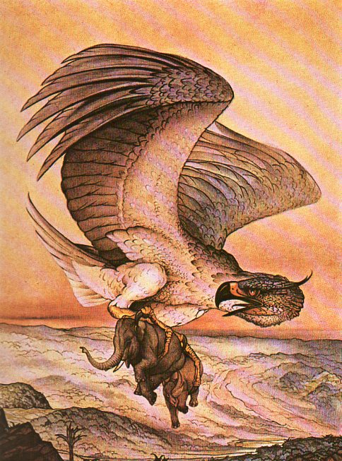
R. Rukh. “The Rukh which fed its young on elephants”, by E.J. Detmold. For The Second Voyage of Sinbad the Sailor from The Arabian Nights, 1924.
W. Woman, 50-Foot.

Women don’t often appear though as giants–at least until modern times.
Z. Zeus.

Zeus and three Gigantes, drawing based on the Zeus Pergamon Altar.
JF Ptak Science Books Post 1282 [With 20 extra images in Continued Reading section]
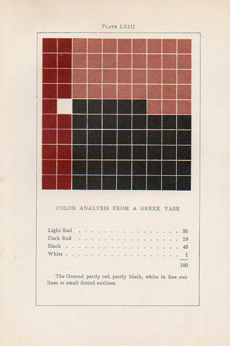
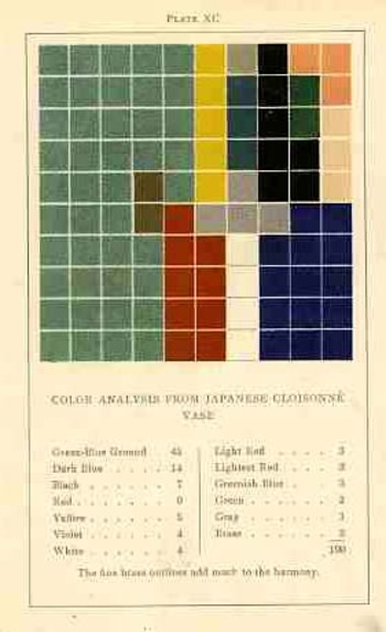
[Earlier in this blog, about 1200 posts ago, a million words ago, I wrote about an extraordinary book by an aesthetician named Emily Vanderpoel. It is “extraordinary” in a narrower sense, and that “extraordinary” might not actually be positive for its original intent. The extra-intent of the book, what has come out of it for me, was something that was unintentionally accomplished by the author. The images that she used to illustrate her color theory ideas–the basis of which are not really comprehensible to me–turn out to be artwork in themselves, a found art, the artistry of the images taking over the original intention for the arrangement of their color. And so I’ve returned to the post, to add a bit to the test, and to also add 20 of the original images of this incredible work for sale at our blog bookstore..]
The idea of how we put parameters to something like the visual field is a gargantuan topic—it is something that architects and geometers and physicists and mathematicians (in general) have dealt with forever.
Mapmakers have perhaps the most visualized aspect of this on paper, performing the semi-miracle of translating three dimensions into two; physicists have a more difficult time, taking the opposite approach, sort of , and translating two or three dimensional space into x-number of dimensions. Anatomists had a difficult time of their subject until relatively recently in human history, what with the sublime religious curfews on messy knowledge and all coming into play, poking around into the heart and such as though it was an affront to the sanctity of the creator (M Servetus’ ideas on the circulation of the blood via the heart, making the heart a tool and not the brain or some odd conjunction of creative divine power, cost him his life, burning slowly alive at the stake…how mysterious the whole world of RNA Genotype-Phenotype Mapping and such would seem to him if he could have a peek into the future/present from wherever he is.)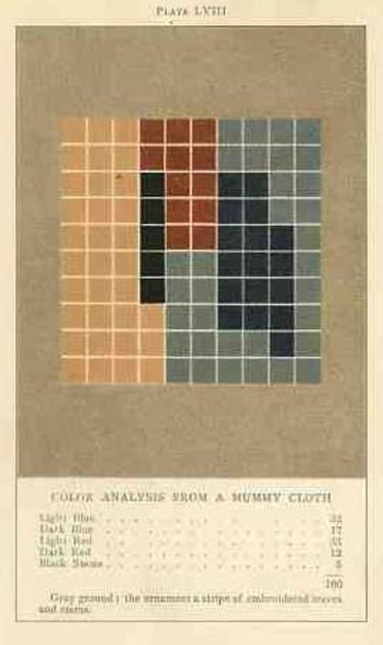
Color theory is old and pretty—as a matter of fact there is a very attractive gathering of color theory models (in black and white, though) displaying some two dozen or more color models from the last 400 years. People like Della Porta (1593), our old friend and resident oddball polymath crank Kircher (1646), the smarter-than-you-could-believe Newton (1660), Waller (1686), Lambert (1772), the wide ranging and again polymathic Goethe (1792), Herschel (1817, who also ushered in our understanding of the other light-sensitive shape spacing medium of photography in 1840), the semi-forgotten Chevreul (1835), the beautiful Maxwell (1857), Wundt (1874, the early experimental psychologist who also looked for spirits/spiritmus and ghosts), von Bezold (1878), Rood (1879), Munsell (1918) Kandinsky (1914 and not decipherable by me) and Klee (1924), and so on towards the present, all tried to analyze the prospects of color.
Not in this list is the very highly problematic Emily Vanderpoel, who in 1901 and 1903 produced (in two editions) a lovely but mysterious book called Color Problems for the Layman, in which she sought not so much to analyze the components of color itself, but rather to quantify the overall interpretative effect of color on the imagination. I know this sounds begging and vague, but I really haven’t been able to make much headway in the work.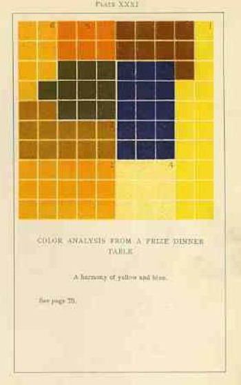
I’m attracted to this effort because of its attempt at quantifying such abstract thoughts.
By virtue of this effort, though, Vanderpoel had produced a strikingly illustrated book, with 118 color plates, all very intense, and beautiful, and in its way exceptional—unique for it time perhaps. Had the book been written thirty years or so hence we’d call it some sort of constructivist/constructionist artform. But since the artwork in the book comes a decade before the first non-representational artwork in human history (or so), I don’t know exactly what to call it.
I really don’t know what it is, but I know that it is not entirely accidental, this pre-non-representational artform, because controlled geometrical color art is not accidental.
In trying to quantify the color images of the objects in her study, Vanderpoel establishes a 10×10 square grid, dividing all of the color in that object into individual units numbering to 100. Then, somehow, she identifies the major colors and places them according to a system that I cannot understand within the grid.
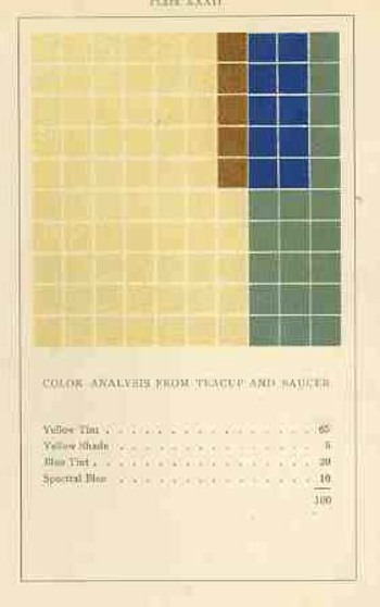
The net effect is glorious. I just don’t know how she got there—which isn’t normally a consideration in art, except that this work is an instructional on how to understand color in art and nature, and the explanation of the procedure is ethereal. Vanderpoel was and remains a respected author on porcelains and other applied and plastic arts. In this work she looked at her fair share of porcelain, limogues, clay pots, burial urns, glass shards, and the like; she also analyzed clouds, mummy cloths (and casings), dew on morning grass, brocade, the eye of a blue jay, feathers, and another hundred or so poetic arragenments of the stuff of teh world. I still do not know what this book is trying to tell me, but I do know that it is remarkable.