A Daily History of Holes, Dots, Lines, Science, History, Math, Physics, Art, the Unintentional Absurd, Architecture, Maps, Data Visualization, Blank and Missing Things, and so on. |1.6 million words, 7500 images, 4.9 million hits| Press & appearances in The Times, Le Figaro, Mensa, The Economist, The Guardian, Discovery News, Slate, Le Monde, Sci American Blogs, Le Pont, and many othr places… 5000+ total posts since 2008.

Category: Perception

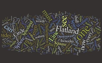
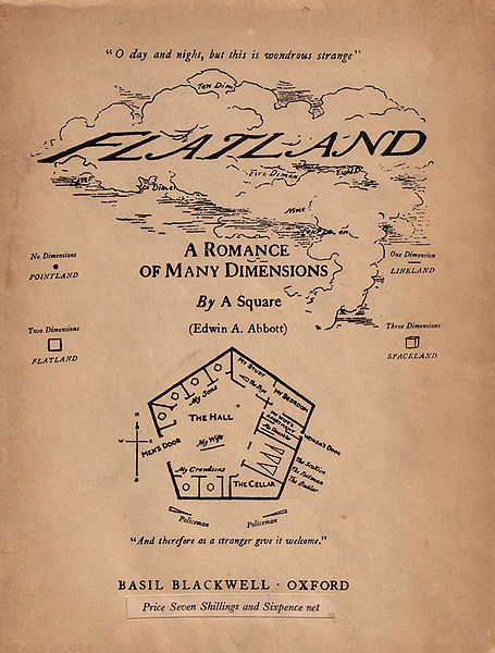
  • Word Art: the Geographical Vocabulary of Edwin Abbott’s “Flatland”

    JF Ptak Science Books   Quick Post  

     Edwin Abbott’s slender Flatland, a Romance of Many Dimensions is perhaps one of the best books ever
    written on perception and dimensions, a beautifully insightful book that
    was quick and sharp, and in spite of all that was also a best-seller. 
    Written in 1884 when Abbott was 46 (Abbott would live another 46 years
    and enjoy the book’s popular reception), it introduces the reader to a
    two dimensional world with a social structure in which the more sides of
    your object equals power and esteem.  Thus the lowest class would be a
    triangle (three sides) while the highest (priestly) class would be
    mega-polygons whose shape would approach a circle.  Abbott’s magistry
    comes in explaining to the three-dimensional reader what it was like to
    be in a two-dimensional world.

    Wordleflatland

    Flatland

    ·Posted by :

    ·in:

    — —

  • On Interior Views–Looking Someone Else’s Inside, Out

    JF Ptak Science Books  Follow Me on Pinterest Post 1996

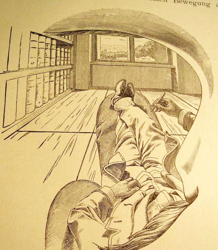
    I cannot think of another illustration by a scientist or philosopher who attempts to explain their own–literal, interior, physical–view of the world and then offer what this looks like to the reader from inside his own head, looking out through his own eye.  That’s exactly what the (unnamed but very Escher-esque?) artist did for Ernst Mach, who is doing precisely that right here on page 15 of his influential book  Die Analyse der Empfindungen. (That’s the  fourth German edition, also known in translation as The Analysis of Sensations and the Relation of the Physical to the Psychical, published in Jena in 1903.) It is a very unusual point of perspective, seeing the world under someone else’s eyebrow and over their moustache.Mach perspective copy
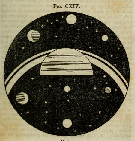
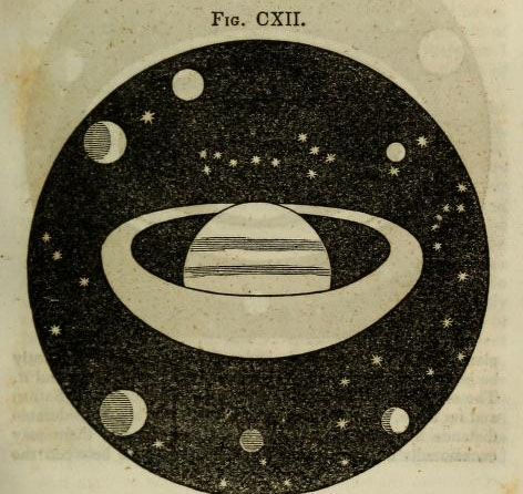
     In a sort-of-similar vein, there is another point of view that is extremely uncommon, another you-are-there perspective, though not interior to the person making the observation, but nearly so.  Here’s an example, just found, and an early one, this imagined from the far side of one of Saturn’s rings, looking back on the planet, and experiencing the distorition in perspective due to the closesness of the observer. 

    Astronomy dick view of sat from ring
    Another image, this one showing the view directly from “the first or second satellite” of Saturn, looking back and across the planet’s rings:

    Astronomy dick view saturnn's rings from satellite
    [Source:  Thomas Dick, Celestial Scenery, 1838, available in full at the Internet Archive, here.]


    ·Posted by :

    ·in:

    — —

  • History of Holes–the First Images of Holes Made by Insects?

    JF Ptak Science Books   Post 1995   Part of a series on The History of Holes #45Follow Me on Pinterest

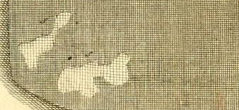
    Reaumur close-up det
    [Detail from one of the earliest images of holes made by insects? From Reaumur, citation following.]

    There are many different ways of looking at antique (or any other) scientific images.  Sometimes you see exactly what they’re supposed to be showing, and other times the viewer sees something more. Sometimes this “something more” is useful, and sometimes it is simply a side bit, not adding to the understanding of the image content, but curious nonetheless, useful in other ways.

    And so is the case with this miniature/micro observation of this engraving which appears in the great work on the lives of insects by  René-Antoine Ferchault de Réaumur:  Memoires pour servir a l’histoire des insectes, which was printed in six impressive volumes (some 26cm tall) in Paris from 1734 through at least 1742,  illustrated throughout with 269 engraved plates, many depicting more than one subject. This was the masterwork of its time on insects, a great effort made and achieved on insect architecture, biology, and behavior–it was a careful and exacting work, magisterial.  Reaumur (1683-1757) was an exceptional talent and observer, writing for the Academie des Sciences on a really wide variety of subjects for over fifty years–and even with this large output, most of his work was delivered posthumously to the Academy.   

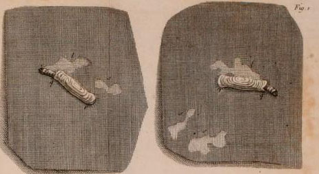
    My attention was drawn to him from an illustration in Barbara Maria Stafford’s Good Looking, Essays on the Virtue of Images (MIT, 1996, palte 93), which depicted the holes made by moths in cloth in volume 3 of the Memoires.  The first image, above, is a detail from the Reaumur engraving, with the full plate, following:

    Reaumur holes detail
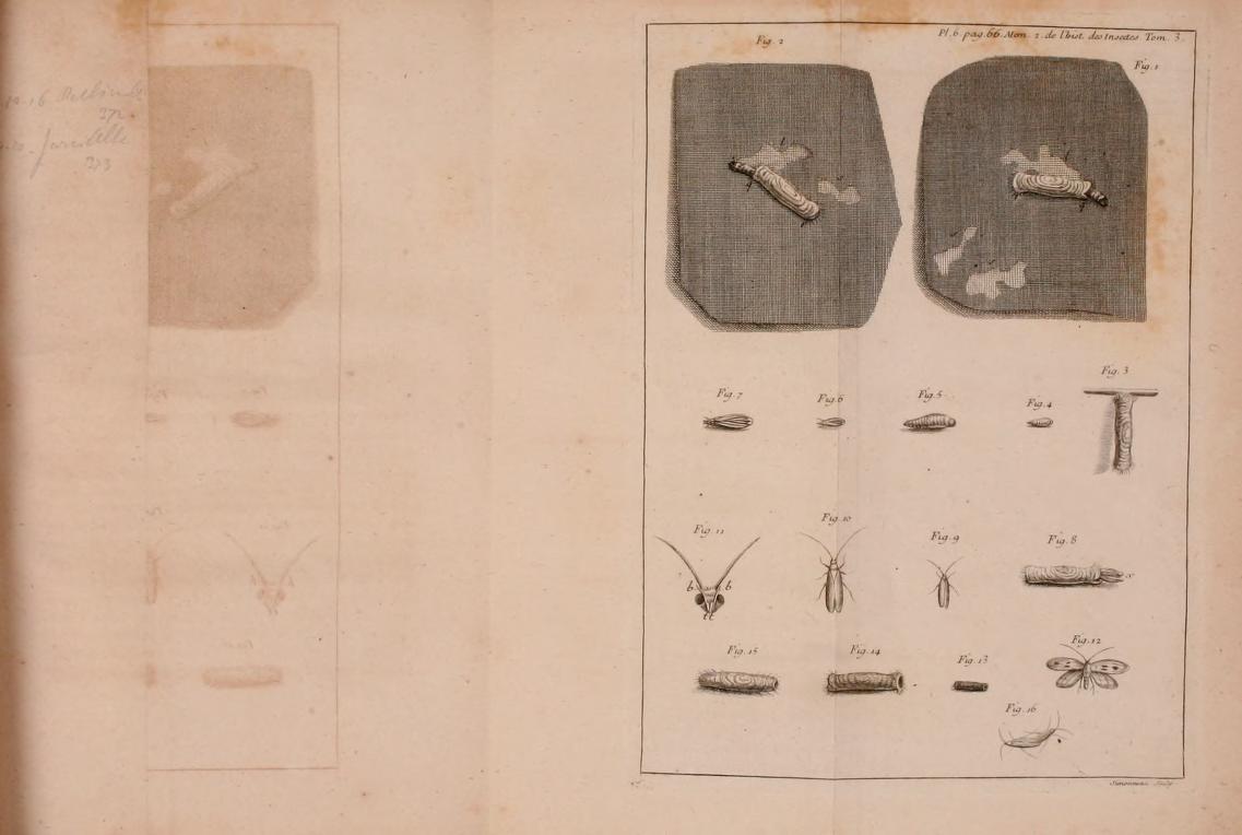
    [Reaumur, Memoires pour servir a l’histoire des insectes… volume III,  from the Internet Archive, here.]

    And more:

    Reaumur holes
    The series on this blog concentrating on the history of holes may or may not make any contribution to anything at all, save for perhaps serving as an outpost on looking at images from a different perspective. 

    And just for good measure, here’s an image of the ghost of the image of the mothy hole, an image imprinted on the page opposite the page on which the original image was printed, the ghosted mirror image of the hole captured in an ink/iron impression on paper. 

    Reaumur holes ghost

     Here are the links for the six volumes of Reamur’s Memoires:

    Mémoires pour servir à l’histoire des insectes (1734-1742)

    • Tome I : Sur les Chenilles et les Papillons, Imprimerie royale, Paris, 1734, 654 p., 50 pl. ;
    • Tome II : Suite de l’Histoire des Chenilles et des Papillons et l’Histoire des Insectes ennemis des Chenilles, Imprimerie royale, Paris, 1736, 514 p., 38 pl. ;
    • Tome III : Histoire des Vers mineurs des feuilles, des Teignes, des fausses Teignes, des Pucerons, des ennemis des Pucerons, des faux Pucerons et l’Histoire des Galles des Plantes et de leurs Insectes, Imprimerie royale, Paris, 1737, 532 p., 478 pl. ;
    • Tome IV : Histoire des Gallinsectes, des Progallinsectes et des Mouches à deux ailes, Imprimerie royale, Paris, 1738, 636 p., 44 pl. ;
    • Tome V : Suite de l’Histoire des Mouches à deux ailes et Histoire de plusieurs Mouches à quatre ailes, savoir des Mouches à Scies, des Cigales et des Abeilles, Imprimerie royale, Paris, 1740, 728 p., 44 pl. ;
    • Tome VI : Suite de l’Histoire des Mouches à quatre ailes avec un supplément des Mouches à deux ailes, Imprimerie royale, Paris, 1742, 608 p., 48 pl. ;
    • Tome VII : Histoire des fourmis, Paul Lechevalier éditeur, Paris, 1928, 116 p. & Histoire des scarabées, Paul Le Chevalier éditeur, Paris, 1955, 340 p., 21 pl.

    ·Posted by :

    ·in:

    — — —

  • WWII as Advertising Prop, 1943

    JF Ptak Science Books 

    Follow Me on Pinterest

    4-1 prop meat 001
    I was making my way through LIFE magazine for 1943 and was struck by the ratio of the number of advertisements using the war as a backdrop (and American soldiers as convenient props) for sales against the actual space dedicated to war reporting.  Concentrating on just two randomly selected  weekly issues (November 1 and November 15 1943) I was surprised to find  28 ads (most of which were full-page); there was no war reporting in November 1 and just half a story (on the history of the Prussian General staff) in November 15.  Most of the ads were directly war-related, the companies mostly relegated to vast production of war goods, like General Motors, Cadillac and Boeing. The others were less clear, like the ad pictured here for Green Giant peas and corn.  This company was informing the home front that if there were shortages of their product it was because they were selling it to the Army or Navy–others were more adventurous for their spirited attempt at patriotism. I’m not sure that Wembly Ties really needed to include a GI in their ad, nor did I like the use of American soldiers to sell Interwoven socks. 

    ·Posted by :

    ·in:

    —

  • Breaking Bad in Half: a Book to Exhaust and Maim the Reader

    JF Ptak Science Books

    “Sometimes a book is just entirely bad, and sometimes it is entirely nothing. It is impossible for a book to be both very bad and very nothing. Impossible.  Except for this book, whose badness is exceeded only by its nothingness, and vice versa“. –Oscar Wilde

    And so into this black hole of imaged Wildeian description we go, into a very real-ish book.

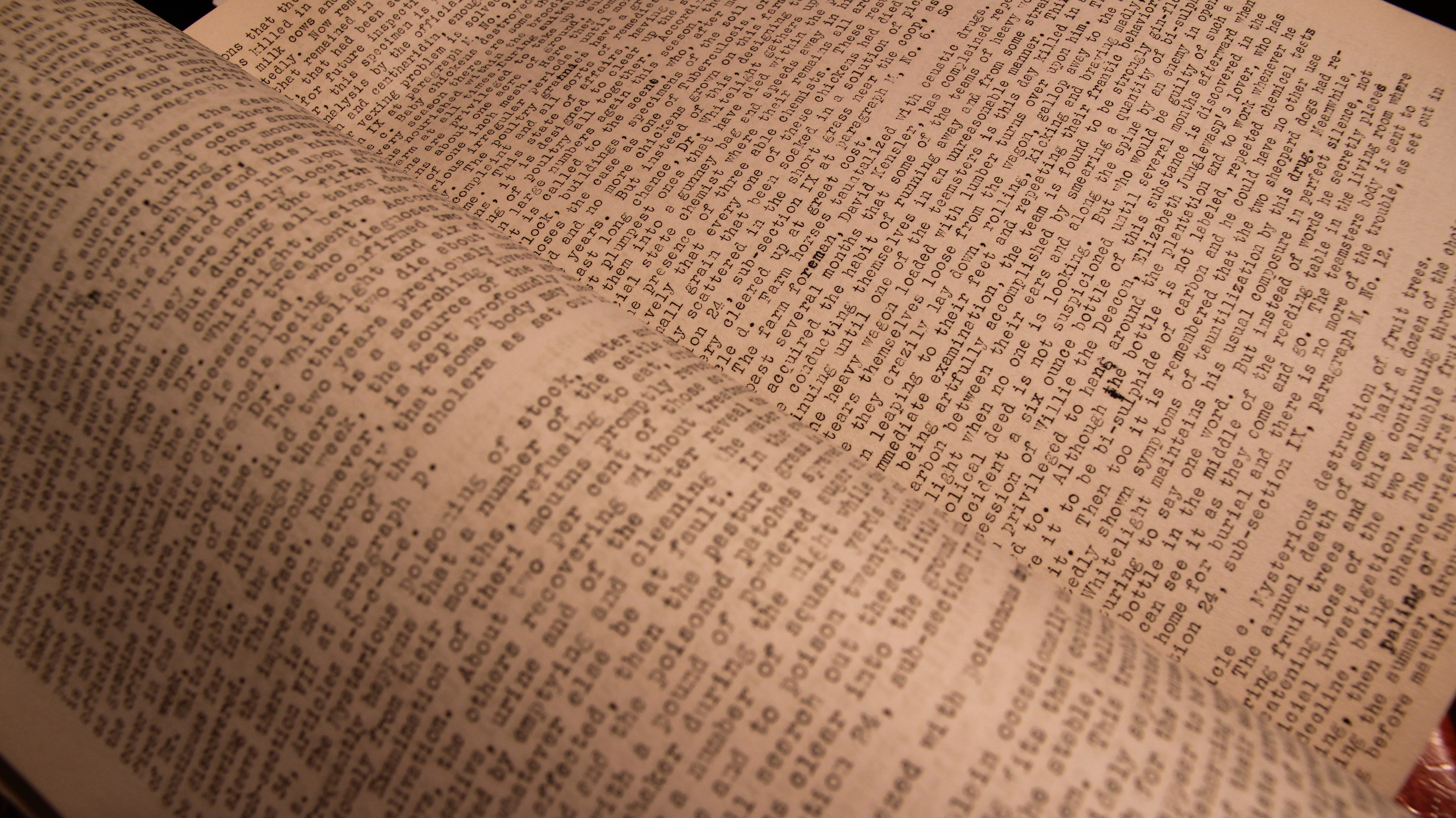
    I found a novel tonight, bought long ago and long ago mostly lost.  It was written by a doctor who worked in the District Hospital in Lima, Ohio, and written in 1934.  The Lima Hospital was the largest poured concrete structure in the world when it was built in 1915, and stayed so until the Pentagon was completed.  The hospital was established for the criminally insane, had 14″-thick walls, and reinforced steel bars laid into the walls that went “right down to bedrock”. 

    It was somewhere in there that this doctor wrote something that was really so toweringly bad that it escapes comprehension. I own the carbon copy of the unpublished work, which is typed on 14×8.5″ sheets of paper, front and back, running 94 pages. It is a very crowded affair, with 90 lines of single-space typed lines, making the work about 115,000 words long. 

    There wasn’t enough space evidently for paragraphs, which gives the work a kind of insistent, casket-cramped cruelty.  To read it takes your breath away for its dullness–the book moves so weirdly and at the same time so very slowly that it doesn’t move at all even while moving.

    Manuscript insane one

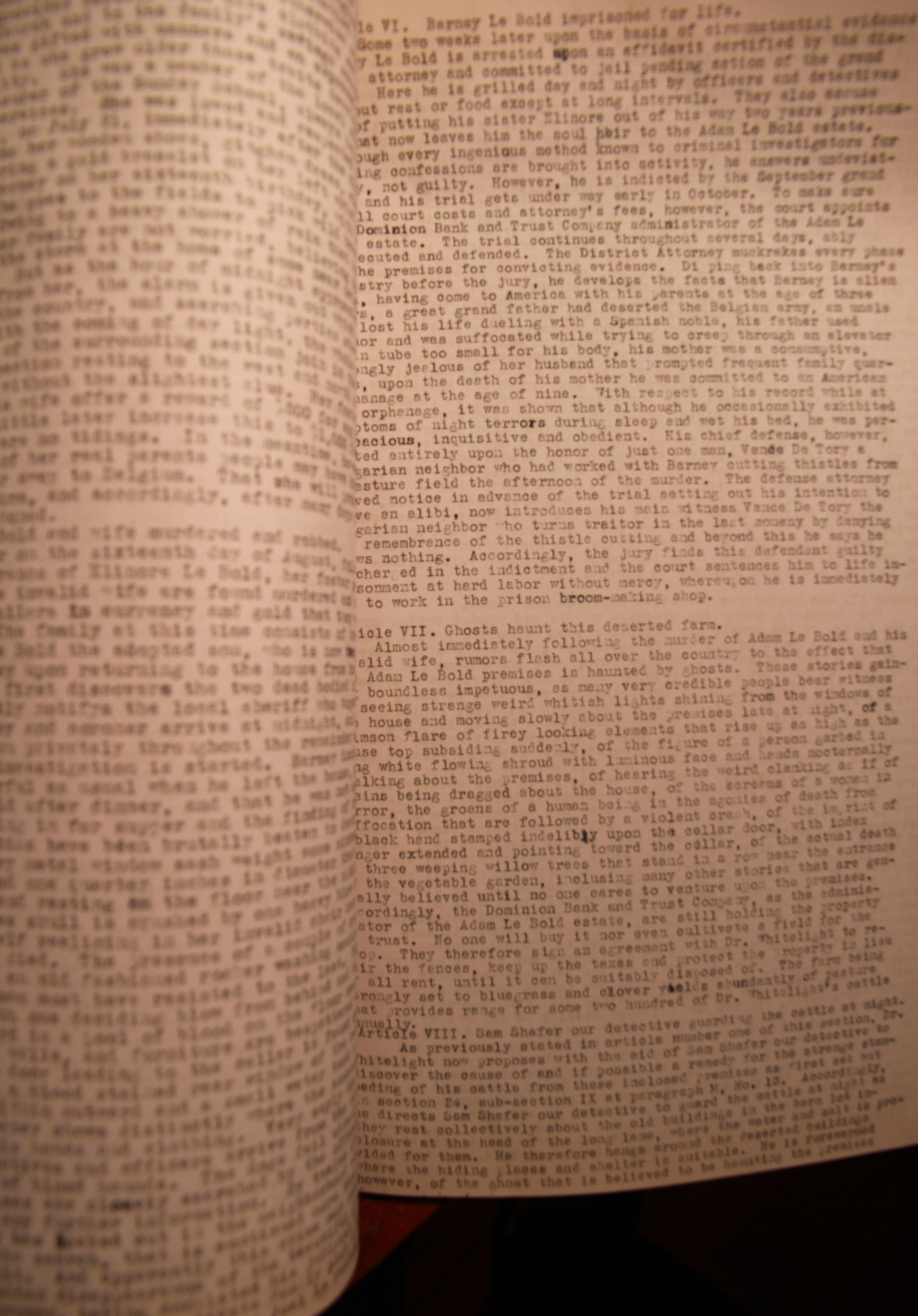
    A few months ago I found the seven-foot-long scroll of the book’s plan–a work of crowded magnificence of nothing and confusion, being very orderly at the same time.  It went to a friend of mine who created artwork around it, and as it happens made a very noticeable appearance in a very significant yearly show in NYC last week. I was stunned to find that there was actually a text to go with the scroll-outline–it emerged from the warehouse this week, so perhaps this too will find a very celebrated life as art as well. Certainly the book would go nowhere on its own as a book, though it stood a chance at surviving on the grounds of its considerble design weirdness, which is of a complexified beauty.

    Manuscript insane two

    In the meantime, before all of the letters slide themselves off the page from sheer boredom and before the thing is resurrected as a magnificent artistic effort, I’ll share some ianges of the extra-ordinary book of reversed brilliant badness. I’ve also culled a few imaginary descriptions of the book from writers known and not:

    Potboiler scribbler:

    “He couldn’t speak.  He could barely see. Blinded by the flames ignited inside his eyeballs from the novel in his lap.  The words were like molten lead, sucked off the page by his eyes, forming a vacuum in his brain.  It was a bad book”.

    The first-time published novelist’s approach:

    “He couldn’t speak the words of the thoughts in his head, because they and all of his breath were stolen by the magic of the complete badness of the book in his lap”.

    Gertrude Stein:

    “The book was bad and bad, and bad was the book. Even the badness of the bad was bad, a whole new insight into being bad. It was the bad book by which bad books are called bad”.

    Ernset Hemingway:

    “He didn’t read the book so much as he looked through it.  It was easy–there was nothing there. As bad as it was, it could get no worse. So he shot it, and poured a drink”.

     You might wonder what this book is about.  Me too.


  • On Inferred Narratives of the Last Word in Novels

    JF Ptak Science Books  Post 1968  Follow Me on Pinterest

    I was reading the ending of Vladimir Nabokov’s Lolita and found it a highly unusual occurrence that the novel ended on its single-word title.  It doesn’t seem to happen very often at all (though it also occurs in Toni Morrison’s Beloved).  And so I set to check out the last words of some significant works of fiction that are on the shelves here at home and see what these books ended on, and to give this project an hour of search.  Nothing comes very close to Nabokov, though Dalton Trumbo’s Johnny Got His Gun ends with “gun”, and Italo Calvino’s  If on a Winter’s Night ends with the entire title, along with the author’s name: “Just a moment, I’ve almost finished If on a winter’s night a traveler by Italo Calvino.” (Thomas Pynchon’s The Crying of Lot 49” ends with the title of the book, as well). But on my hour’s journey into ending, that was about it.  It all seems a little useless, except that there were a few nice bits that broke away from this time-hole.

    First, when you read the words and their books, they sorta/maybe suggest the essence of what came before–I think if you squint your eyes a little and connect the last word to the title, the word occasionally feels like a micro-summation.  Second, I found that when taken together and in order, the last word of each of the short stories in the beautiful Jorge Luis Borges’ Ficciones (edited by Kerrigan for Grove Press in 1962 with a number of different translators) presents themselves as not-bad found poetry/musical word arrangement. Third, it might be a fun idea to set up a chess set of pieces composed on the one side by Last Words in Great Fiction and on the other the Last Words in Famous Scientific Papers. 

    Another interesting bit is a challenge to write a paragraph using the following last word from the accompanying list of novels (you can have your choice of punctuation and prepositions and whatever else is necessary).  Dr. Seuss managed to create a great classic with a 236-word allowance from his publisher and somehow managed to write The Cat in the Hat, so there is a precedence for such things.  Taken as a random group, the words aren’t necessarily a collection of momento mori, but could make a nice beginning for something. 

            Found Poetry in the Last Word of the Short Stories in Borges’ Ficciones:

    Burial memempschosis

    counsel him,

    chance ruins, hope, heart

    congestion me foreseen,

    fired morning evil,

    man

    infastructure

    plain.

                          –I added punctuation and the spacing.


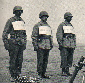
  • Seemingly-So-But-Not: Labels on Black Soldiers,1949

    JF Ptak Science Books   Quick Post

    This image stabbed me right in the eyeball.  It popped out while I was grazing in a heavy lap-busting volume of The Illustrated London News for 26 March 1949–the yearly volume resists being held in just one hand.  Anyway it was first a photo of new tanks in an American cavalry regiment; beneath that, though, was this image:

    Negro troops980

    ·Posted by :

    ·in:

    — —

  • Blank & Empty Things Series: Self-Referencing Languages and Babel

    JF Ptak Science Books      Part of the History of Blank, Empty and Missing Things.

    Follow Me on Pinterest


    Blog--14 nov--fantastic arch


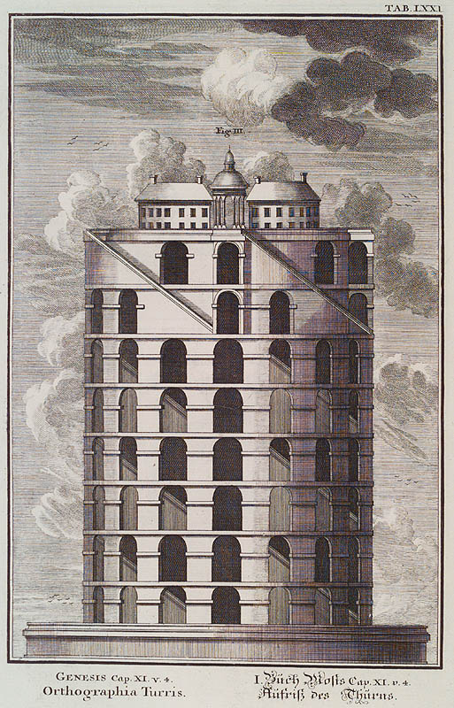
    Returning to Jean-Jacques Scheuchzer’s1 magical, inventive, fact-bending naive-surreal work on universal history based on the Old Testament, I’ve found these two glorious and odd images of the Tower of Babel.  The first (“Genesis Cap.XI.v.4. Orthographia Turris.Mediummetalis”) is terrific, shocking even in its abrupt construction and flat-out stumpiness, because it is one of a very small minority that shows the structure to be canonical, with a little church at top. The enormous stairway is just completely out of proportion to the purpose of the structure, the effort falling into some sort of odd advanced-child category.

    If Italo Calvin’s “Invisible Cities” or (better yet) Jorge Borges’ “The Circular Ruins” were to be illustrated, this image would fit right in.

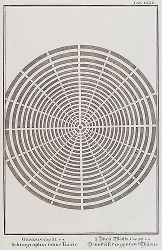
    The other very unusual bit here, is that Scheuchzer also provides a plan for the city that was to be built around the tower–I’m pretty sure that I haven’t seen references to this before, and the Biblical references to it are no help whatsoever in determining its physical aspects.

    There are probably very few things that could be as blank or as empty as combative, competing, nonsensical and completely self-referential language or communication.  Well, except for Scheuchzer’s very empty town plan locating the tower in an urban setting–a listless place of surrounded circles of nothingness for a place in which everything is said and nothing is understood.  Ground Zero for blank Blog--nov 14--planlanguage.


    Notes:

    Two interesting books that I should mention that address the ideas
    of fantastic/imaginary architecture and decay are C. W. Thomsen, Visionary
    Architecture: From
    Babylon to Virtual Reality,   (Prestel, 1994) ; and  Paul Zucker, Fascination of Decay (Gregg  Press, 1968).

    1.  Kupfer-Bibel, in welcher die Physica sacra, oder geheiligte
    Natur-Wissenschafft derer in heil. Schrifft vorkommenden naturlichen
    sachen, deutlich erklart und bewahrt,
    printed in Augsburg and  Ulm
    by  C.U. Wagner, 1731-1735. Offered in four volumes, illustrated with
    758 plates, it is a magnificent work, if not altogether correct, or
    even near- correct, with an enormously confused pedigree, implying the
    wisdom and text of the Bible (and the old Testament at that) as the
    background for a physical history of the world.


  • Chess Pieces of Dusty Greats vs. Celebrity Mistakes: Robt Hooke vs. Paris Hilton

    JF Ptak Science Books   Post 1954
    Follow Me on Pinterest

    • QUESTON:  If great but not-popularly-known scientists could be represented as a chess piece, and that chess piece was on a game board opposite Popularly-Known-Celebrities-Not-Known-to-Scientists (and etc.), what piece would the great and dusty Robert Hooke be? And conversely, (on that opposite side), what piece would someone like, say Paris Hilton be?

    See also earlier posts: The History of Dots Part 9: the Cell and Robert Hooke  and Horse Poop and the Stars: Robert Hooke, 1673 (No, it Wasn’t Pegasus) and When a Compliment is Not: Newton and Hooke and the “Shoulders of Giants”

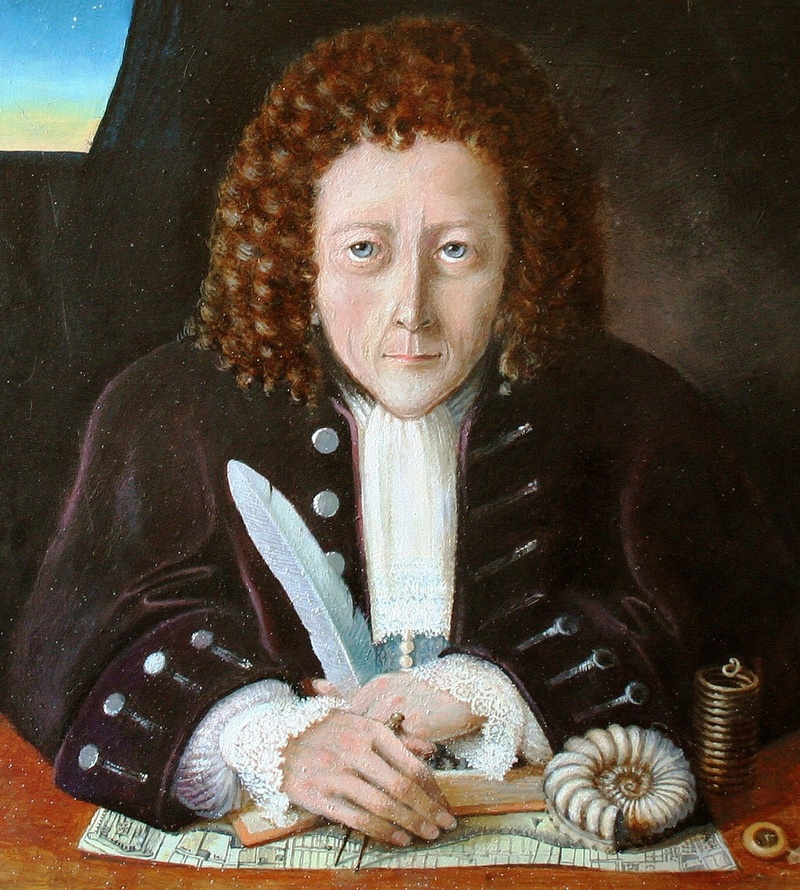
    I wonder about poor old Robert Hooke.  He was such a tremendous thinker, a terrific rush of ideas, with revolutionary insights in many fields; he was a leading architect, a physicist, a microscopist, a chrononaut, a mathematician, an everything. He carried the Royal Society for years, carried on hundreds if not thousands of experiments, and of course was famously on the other side of a bad series of arguments with Isaac Newton.  At the end of his long life, Hooke was afraid of not being remembered, of not having enough money to see
    himself through hi sold age, afraid of others taking credit for his
    work.  He just seemed not to matter, anymore, in the last decade of his
    life (and a period in which he was still doing significant work), and I
    just wonder why he managed to become so semi-invisible.

    13_Portrait_of_Robert_Hooke

    He was so dedicated.  I have an image of him scurrying with a friend, removing the estimable library of a patron and donor to the Society, trundling the books in wheelbarrows across a mile and then-some of bumpy London streets finding a home for these great treasures.  He was an older man at this point, marching these books across parts of the city that he helped to restore after the fire, passed buildings that he helped to build and design, bumping his way through London, a great and famous scientist, saving books by the handful. [An idealized portrait of Hooke, at right.]

    He was a tireless,
    relentless observer and experimenter, who lost little effort in a stranded idea
    and pursued interesting and problematic questions relentlessly.  More than others too he chased his won glory—minor
    but long and insistent—the years of which wore thin on many people in the
    scientific community.  But there were
    many characteristics of the man that made him not quite so lovable and
    endearing—not that Newton was any of those things, as he was not, but if you
    are going to be a secondary luminary to a super nova you’ve got to have
    something else going for you that the other man doesn’t have—sharing, helpful,
    greatly generous—to get you into the long pre-dusty pages of history. Also it would’ve
    helped if Hooke chose his battles with a little more aplomb and ingenuity—the
    war which began in 1672 with Newton went very badly for Hooke and followed him
    to the grave (and far beyond).

    He just didn’t “catch on”, I think–at least he not for the long term.  His brain teemed with ideas, but perhaps by the last decade of his long life, his tireless brain still working on innumerable bits, he just sucked the air out of a room. 

    He also never had his likeness recorded during his lifetime.  And that is saying a lot.  And I still don’t know why.

    Back to chess:  I figure Hooke to be a Knight.  I prefer Knights.  He moved like a Knight.  He importance was “higher” than that of a Knight, but, well, the Knight seems a good fit (and so he seems to get downgraded, in a way, even in this game).  And Paris Hilton?  I think she might be a queen (with a small “q”)–as someone who is ultra-well-known but not for anything in particular except for the quality of being well-known. 

    ·Posted by :

    ·in:

    — —

  • The Solids in Bellini (?) Is the Blankness a Heritage of Uccello or Bartleby?

    JF Ptak Science Books   Post 1943 (Part of the series on the History of Blank, Empty and Missing Things.)
    Follow Me on Pinterest 

    “Where is abstract without solids, I ask you?” — William Gaddis, on the solids in Uccello, The Recognitions, 1955

    Actually, I think that there’s plenty of abstract without solids, so long as you’ve seen solids before.

    I’ve returned to a slightly recurrent theme in this blog dealing with the great Paolo Uccello (1397-1475) and his study of perspective–but most directly as he was observed by William Gaddis in his Great American Novel The Recognitions.  (I am forever grateful to my brilliant Patti Digh for really hooking me into Gaddis so many years ago–Patti was long intrigued by Gaddis and wrote her UVa master dissertation on his Big Book. Gaddis’ book can be found here.) Among other things Uccello is recognized as being one of the greatest and among the earliest artist to re-discover the science of perspective, and was throughout his life a passionate student and practioner. 
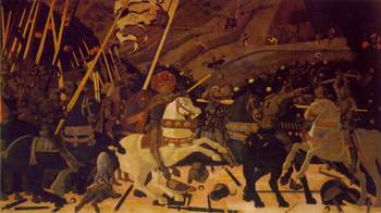
    Blogsan_romano[Much of Uccello’s work can be found at Paolo Uccello Complete Works website, here.]

    “Painting is exquisite as the punishment for the thinker.”–William Gaddis, The Recognitions

     The “solids’ recognized by Gaddis (and not really
    discussed, and mentioned only twice in the book I believe) are incredible to me.  Looking at his painting Battle of San Romano 
    (1457) we see Perspective in her place; but when we look at, say, the rumps
    of the horses, we see almost no detail, just a mass of color, a solid,
    with spectacular plainness. What in the world was he thinking?  He could
    certainly have painted the horse and the other solids with texture and
    detail, but he didn’t, and to me it seems antithetical to the painting. 
    What in the name of all motherly things was he thinking?  And who else
    on earth was using such huge amounts of plain solids in their
    paintings?  I’m not aware that anyone else was, and I am relatively
    clueless as to why he did it, abandoning detail in order to raise awareness of the surrounding parts of the painting, or perhaps heightening  a sense of the not-yet-existent abstract, or drawing attention to the perspectival aspect of the work?
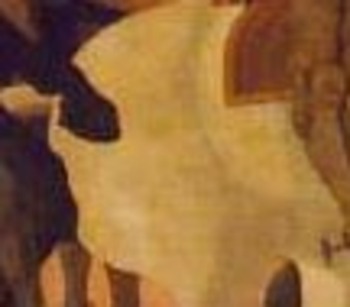
     

    Blogsan_romano_rump[A detail of the missing detail, above.]

    But the solids are not just limited to Uccello, though they may have appeared there first, especially as the “exhibited” variety of this thinking. Jacopo Bellini (ca. 1400-ca. 1470) was a contemporary, living pretty much during the same period of time as Uccello, and who was responsible as much as anyone else for introducing oils in painting and establishing the Venetian style.  He was a brilliant artist, the teacher of Mantegna, ran a fabulous studio, and was the father of two great artists. (One son, Giovanni, was a highly regarded artist who was also the teacher of Girgione and Titian.) 

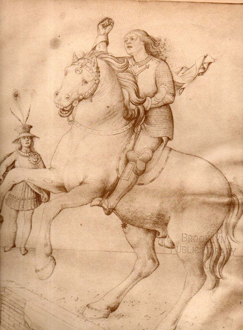
    In looking through two volumes of Jacopo’s drawings, I was struck by the number of times that horses and other objects appeared without detail, as solid solids, or mostly solid, quite outside the way in which these things were painted in the 15th century. Pacing though the books flipping through the open pages is like looking at a pop-up book in reverse–each set of pages opened are like looking into, looking through, the book, into space.  They are collections of perspective. And they are populated by those other solids, which was surprising.

    His horses appear very much like those in Uccello–except of course that these images were personal, workbooks for the artist, idea-machines and memory devices.  There was plenty of detail in other aspects of these drawings, but the lack of the detail int he Uccellian manner really struck me.

    Christiane L. Joost-Gaugier’s “Jacopo Bellini’s Interest in Perspective and its Iconographical Significance” found in  Zeitschrift fuer Kunstgeschichte  (1975)
    makes a very learned and eloquent case for the overwhelming interest
    that Belinni had in the study of perspective–not to the exclusion of
    all other things, because there were still patrons to be satisfied and
    religious and triumphal scenes that needed to be  painted–and
    concentrated on that interpretation focusing on Bellini’s stylebooks. 
    (Most of Bellini’s output has been lost, but there are two volumes of
    manuscript studies that have survived.)

    “Though
    many of Jacopo Bellini’s drawings are reminiscent of model-book notions
    in that they illustrate a variety of suggestions for the representation
    of traditional themes – for example Flagellations, Adorations, Davids,
    and animals -they are, taken as a whole, entirely different from model
    book drawings. Jacopo rarely concentrated on a subject for the sake of
    its thematic content. Almost never does a bald statement of fact appear
    to describe, for example, a biblical event. Rather than focusing on the
    event itself, Jacopo’s compositions characteristically are concerned
    with other things. In the vast majority of cases the subject is set
    within the context of a variety of architectural motifs or in that of an
    extensive naturalistic world. It would appear that for Jacopo Bellini
    biblical subject matter was a justification for his participation in a
    variety of other new interests. Primary among these was the special
    attention given to perspective…”
    No mention of course of the Uccello horses.  And perhaps they’re really not there there, but it certainly looks like they are, at least to me.  They might not have been there for Gaddis, either, as Bellini doesn’t show up in the book, Gaddis thinking more about Uccello, and then even more so of Hieronymous Bosch, Hugo van der Goes, and Hans Memling.

    And here it is, Bellini’s solids, an example:
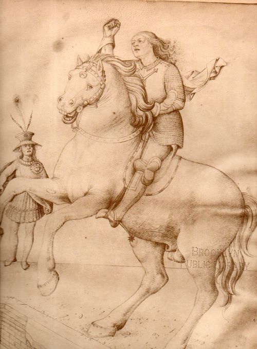
    Solids bellini913
    There are others as well, examples of what, I am not sure–fantastic visions into blankness and into the future of what painting would become 450 years hence.

    Perhaps they were just place-keepers, to be filled-in as neededm just a shrt-hand expression of a horse rather than a transcendental imperative.  After all, Bellini knew horse muscles, and decided in his workbooks that he just didn’t need to draw them, or that in the sense of Bartleby the scrivener that he’d prefer not to. 

    Notes: