A Daily History of Holes, Dots, Lines, Science, History, Math, Physics, Art, the Unintentional Absurd, Architecture, Maps, Data Visualization, Blank and Missing Things, and so on. |1.6 million words, 7500 images, 4.9 million hits| Press & appearances in The Times, Le Figaro, Mensa, The Economist, The Guardian, Discovery News, Slate, Le Monde, Sci American Blogs, Le Pont, and many othr places… 5000+ total posts since 2008.

Category: Perception

  • Two Dimensions to Three and Back Again (1588)–a Bit of an Optical Illusion

    JF Ptak Science Books  Quick Post

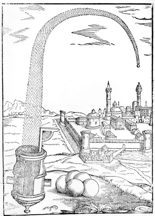
    Luis Collado de Lebrija, the Royal Engineer of the Army of Lombardy and Piedmont, wrote his superior artillery manual Practica Manuale di Artegliteria and published it in 1588–he was one of the five leading military engineers of the late 16th century. The image below is an interesting one from that book, showing a large cannon bombarding what possibly might be a Turkish city. In any event, the trajectory of the very large shell seems to me to be a little odd at first, looking as though it was shot high and straight up, coming down to the right; but looking at it again, the trajectory is back on track going forward 1000 meters than going up and down. And then, again, another look, and the perspective seems flat again, and back and forth it seems to go if you let it.   

    Collado cannon018


  • An Escher-Like Non-Escher Architectural Image

    JF Ptak Science Books  Quick Post

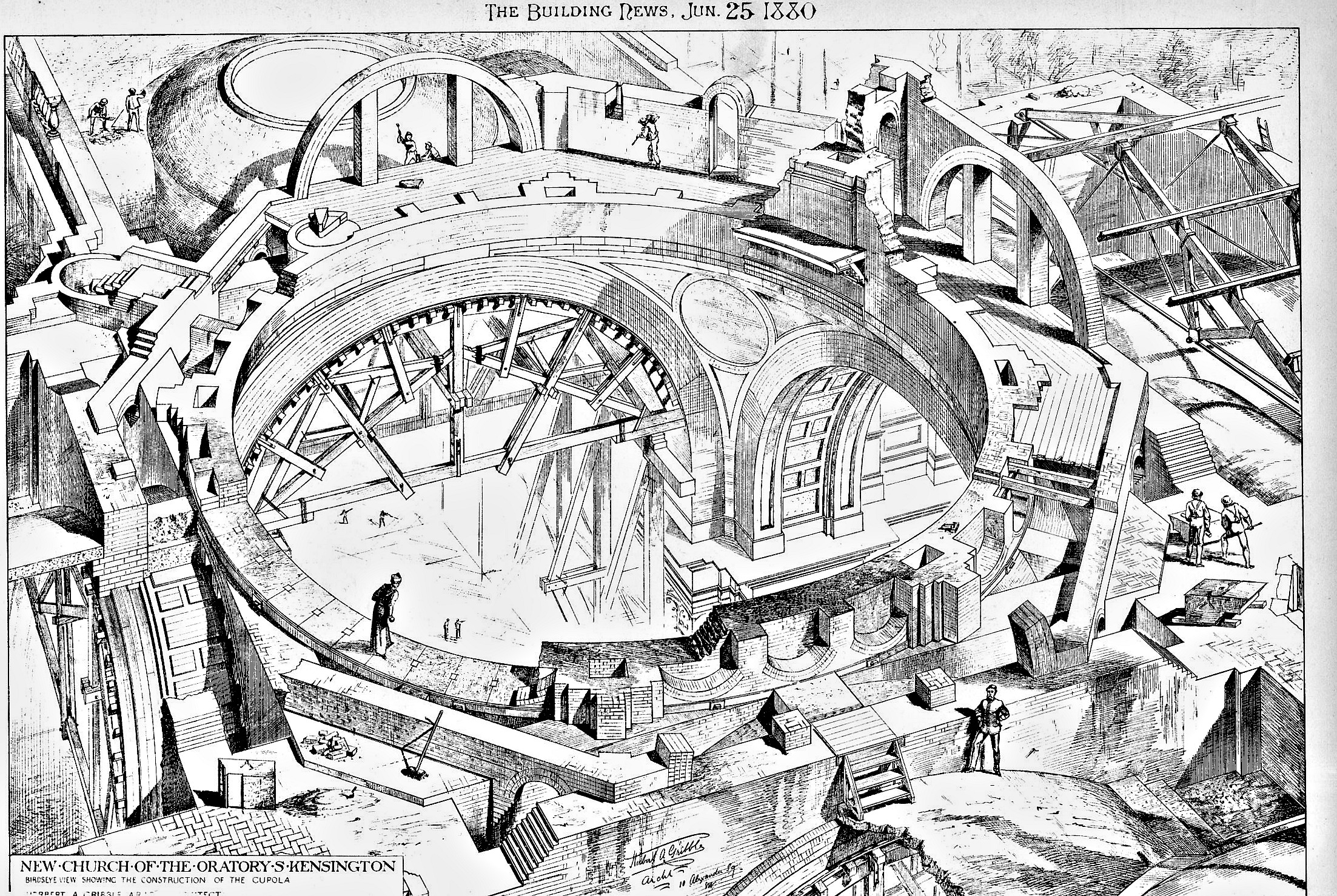
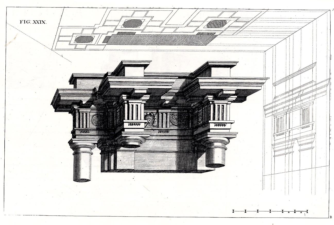
    This image really lifted itself from the page–it is from 1880 and has to me a very heavy scent of M.C. Escher to it.  This would be a very “found” aspect of pre-Escher (1898-1972), but it does have an indefinable quality to it that seems very 20th-century. What we are seeing here is a perspective of the construction of the “New Church of the Oratory of South Kensington” (known as the Brompton Oratory), but I think given the various stages of completion of the structure the whole of it takes on a spherical, three-dimensional quality, and has a somewhat impossible-looking aspect, as though from multiple viewpoints. I think we’re looking down through the naive, and though it is supposed to be representating a three-dimensional figure it seems profoundly not so. 


    Escher architecture463

    [Source: The Building News, June 25, 1880; Herbert Gribble, architect.]

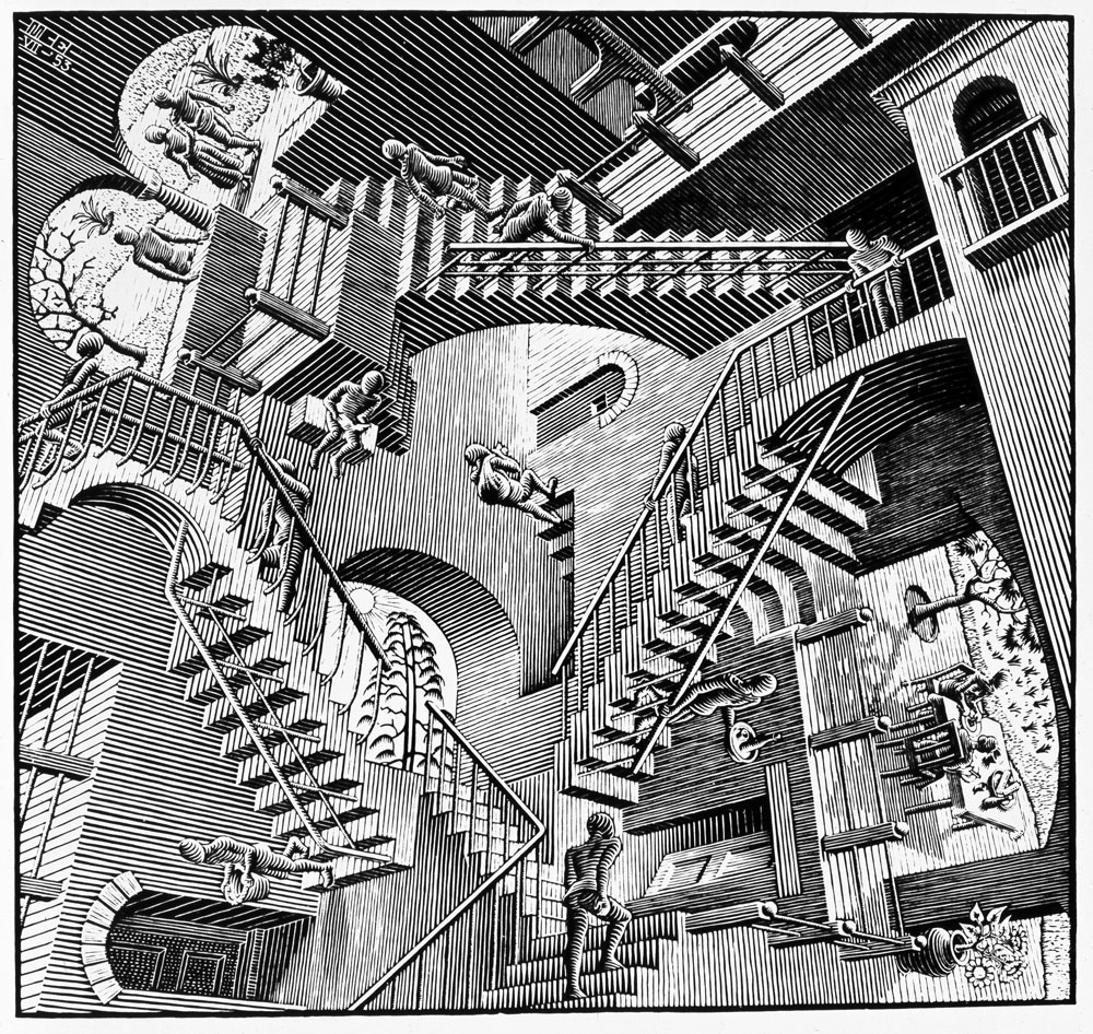
    What it reminds me of directly is Eshcer’s  relativity, from 1952:

    Escher relativity

    I know that what I’ve said about the Building News image is reaching, and it wasn’t dealing with unusual geometries, or tessellations, or the oddish curved perspectives of Escher, but, well, it does somehow have that quality.  

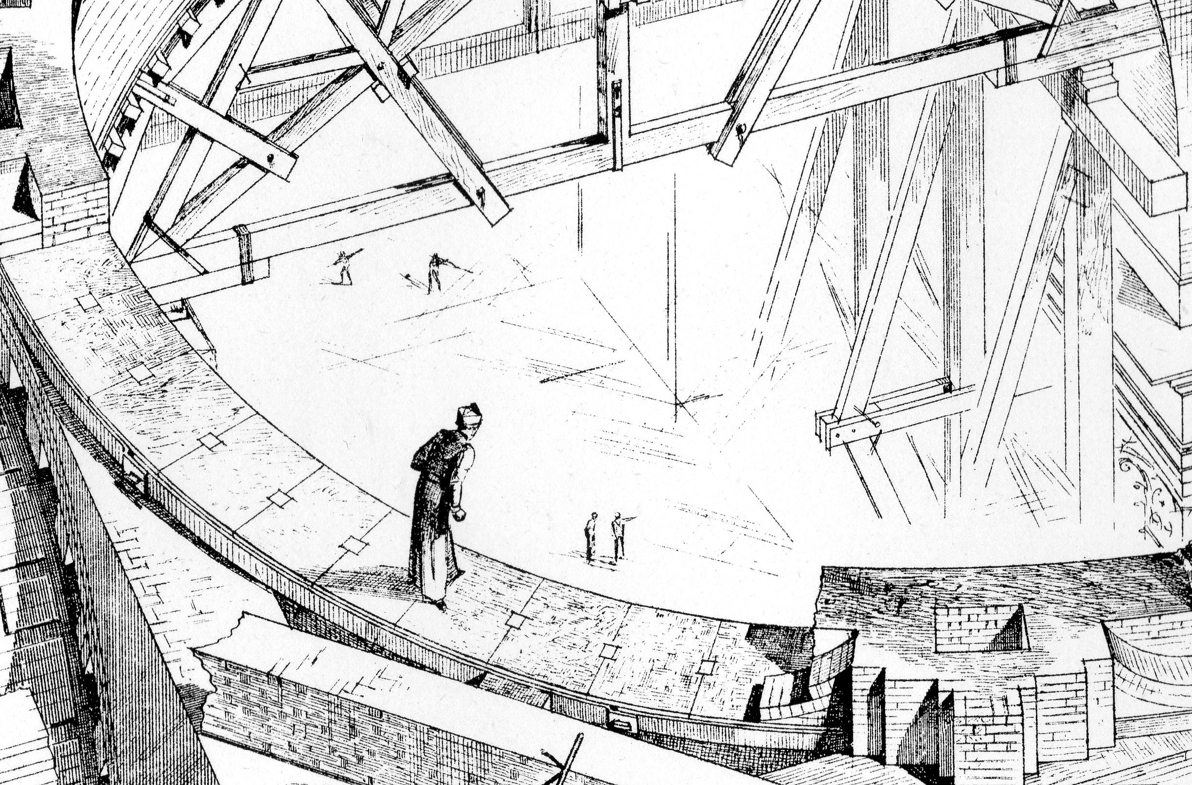
    And an interesting detail:

    Escher architecture464


  • The Shadows of a Color “Photograph”, 1436

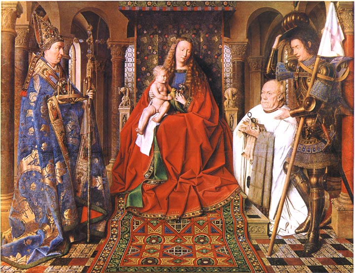
    Was it really Jan van Eyck and not J.C. Maxwell who produced the first color photograph?  Van Eyck’s after all is hanging up in Bruges in the Groeninge Museum, and Maxwell’s, well, Maxwell’s dissipated in about half an hour, leaving only an historical trace.  The problem of course is that Van Eyck’s oil (“Virgin of the Canon  van der Paele”) was done 403 years before the Daguerre invention (building of course on the work of others, notably Niepce, his former partner), so it really doesn’t count because it really doesn’t exist.  His work though *does* exist, but not as a photo—it was, is, a painting, finished in 1436, and it stands in my mind as looking so much like a perfect capturing of a moment that it seems a (luscious) snapshot. 

    Van Eyck virgin of the canon[Source: Victorian Web, http://www.victorianweb.org/painting/whh/replete/P40.html]

    In her book Color and Meaning, Practice and Theory in Renaissance Painting (1992), Marcia Hall makes the point (on page 69) that it is the lighting in this painting that makes it so extraordinary—and differentiates it entirely from the predictable light or “stage illumination of the Italians”.  Its an excellent point.  The light source in the painting is emanates as though it were a half-hour before sunset in Santa Fe; or here, in Hendersonville N.C., when there is a very low and nearly complete cloud ceiling and the sun manages just before sunset to peek through between the mountains and the cloud layers to blaze its extraordinary, horizontal-like brilliance making everything and anything that reflects that light into a work of private art. The figures in this painting by Van Eyck reflect a softer version of that light in such a manner—they are sharply illuminated, luminous, in all of their very human glory and frailty.  We have sharp relief, great detail, deep shadow—and much of that is missing in Italy at this time.

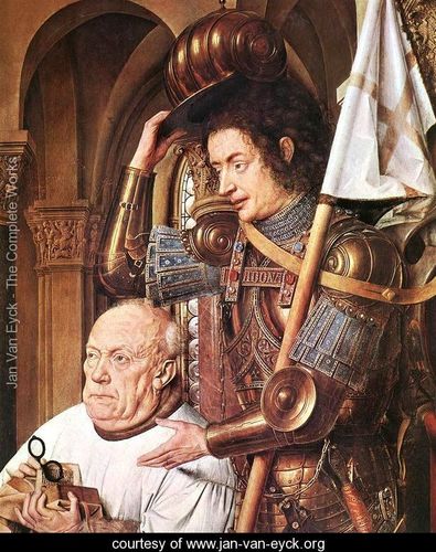
    The photo parts come in here:  the characters are caught in the middle of some very small, obscure action, and the smallness of their movements are captured perfectly

    Even though they are emotive of course the faces of the great Masaccio are relatively plain; Gozzoli, Fra Lippi, the magnificent Fra Angelico, Pisanello, Ghirlandaio, della Francesca, Veneziano, di Credi,. Perugino, and even the emotive and colorful Rafael, all working in about the same decades as van Eyck, simply do not give this anatomical expressiveness to the faces of their subjects.

    Van eyck virgin of the canon detail[Source: Jan Van Eyck . org, www.jan-van-eyck.org]

    So the extreme light and the detail in the faces gives the van Eyck this fantastical quality—on the other hand the perspective and the proportions of the characters in relation to the objects in the room and the room itself are off, secondary, not important—this too in sharp contrast to the great inventors, re-discovers, innovators of the scientific perspective.  (This homage belongs to a slightly earlier time, to Giotto and Uccello, but their work is just a bit to early for discussion with van Eyck.)  Marcia Hall goes on in her appraisal about the way in which van Eyck applied his color (“binding his pigments in a drying oil”) to give his subjects their incredible color depth, and this of course is a major element in understanding the picture (coming as it does from a stone-cold expert). 

    What I’m thinking now, the aspect that is giving this painting its “photographic” quality, its supra-realistic event, is this new use of light, new angle, with the immersion of anatomical detail and the “different”–Northern–perspective. 

    This is a very, overly, simple observation and simplification, but I think in general that it is true.

    ·Posted by :

    ·in:

    — —

  • Paolo Ucello and the Forest of Pikes

    JF Ptak Science Books   Quick Post

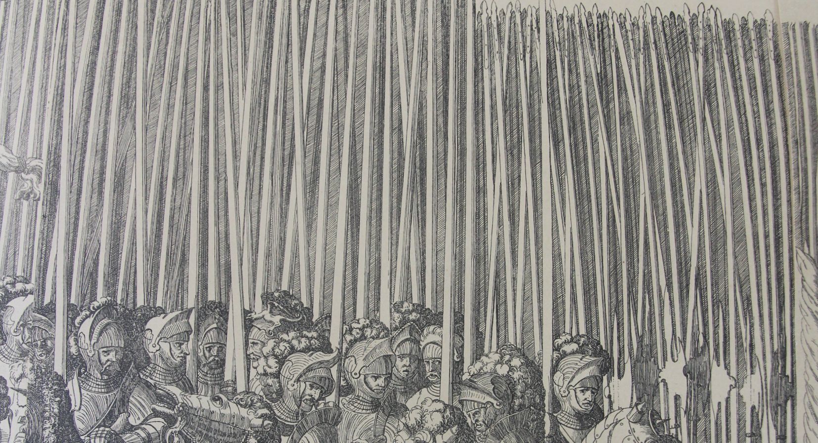
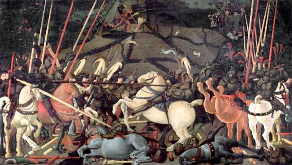
    Yes, yes, I know this isn’t the work of the beautiful Paolo Uccello, but it does remind me of his Battle of San Romano (ca. 1435, and 60 sq ft of brilliance) one of the great works by one of the leading early Renaissance artists.  It is the spears, which is about the first thing that I see in Uccello–that and of course the horse rumps, which are part of the issue in William Gaddis’ great American novel, The Recognitions, in which he discusses the famous “solids in Uccello”.  And he’s right–there is little or no detail in some big splashes of color, as in the horses. Big, solid, colors–what in the world was Uccello thinking about using those great blocks, nearly 600 years ago?

    Processional spears detail

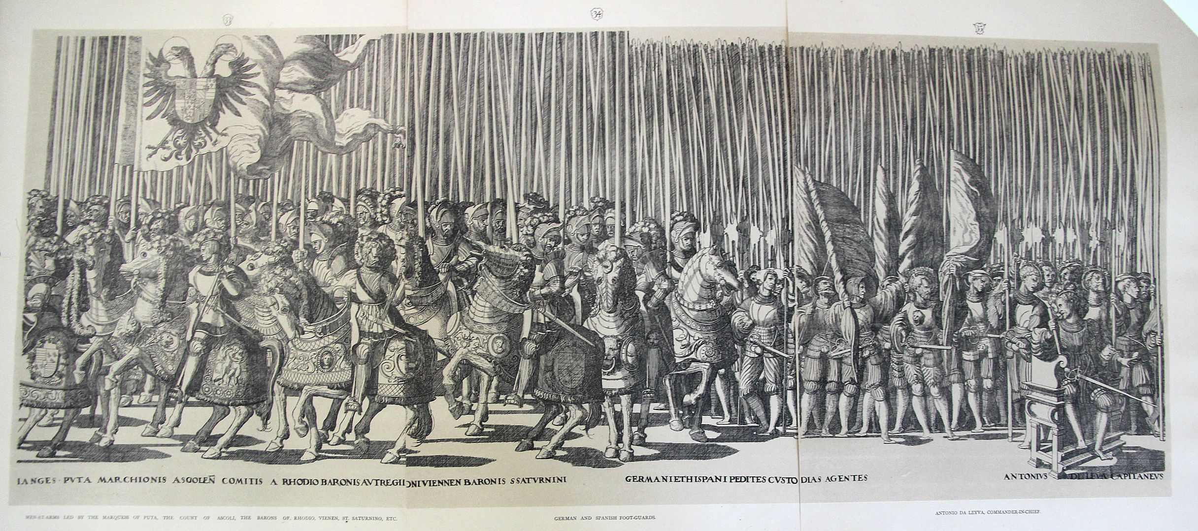
    This is a detail from the larger three-section image (below) which is itself a small detail from the 20-section whole of one of the most famous festival books of the mid-Renaissance, this the work of Nicolaus Hogenberg (c.1500-1539). Gratae et laboribus aequae posteritati. Caesareas sanctique patris longo ordine turmas aspice. The original was published in 1540 and excessively rare (very valuable) in the first and second editions–my copies come from much later, int he late 19th century.  That said, it is at least a thrill to have them right there in front of you, in their great massiveness.  

    Processional large

    • [ The full original work can be seen at the British Library collection of Festival Books, the Coronation of Charles V http://special-1.bl.uk/treasures/festivalbooks/pageview.aspx?strFest=0086&strPage=049&print=1]

    And the Battle of San Romano that I’m dreaming of:

    Uccello romano

    [Source: the National Gallery,  http://www.nationalgallery.org.uk/articulate/projects/bf/bf_painting.html]

    ·Posted by :

    ·in:

    —

  • A Victorian YouTube and the Anti-Hermit Hermit

    JF Ptak Science Books  

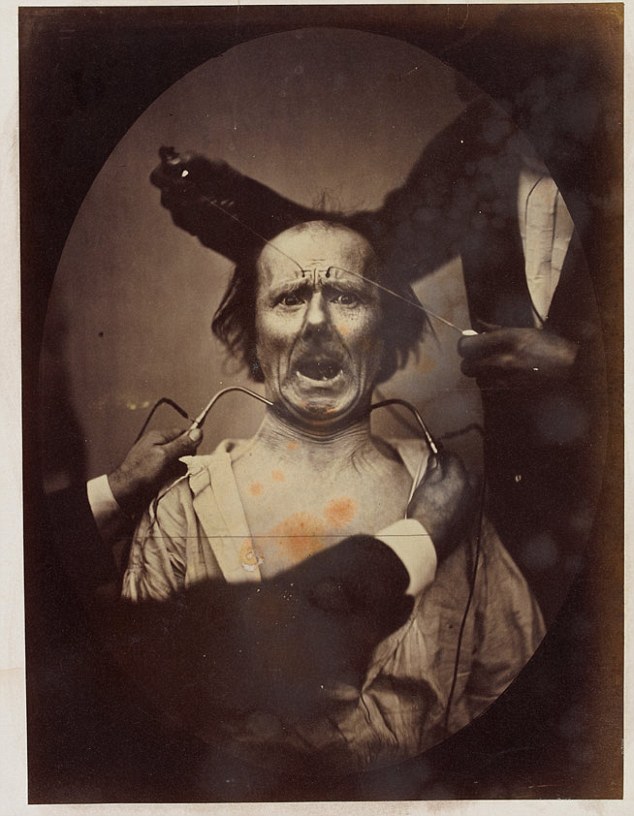
    The “eccentric” versus the “insane” in Victorian England may well have been identified by the amount of available disposable income–if you could afford your whimsy and misery, then you were “eccentric”; if not, then you  were “insane”, which also meant that you were culpable of being scooped up by The Authorities and interned if you turned out to be a larger/smellier/more obnoxious nuisance than a simple dot of the street.   That or you may have wound up as an electrically-prodded subject in an experiment by Charles Darwin (Expression of Emotions….).   In this way the past telescopes nicely into the present, less the electrical stimulation bit. 

    Darwin Expression[Image Source:  Daily Mail, here.]

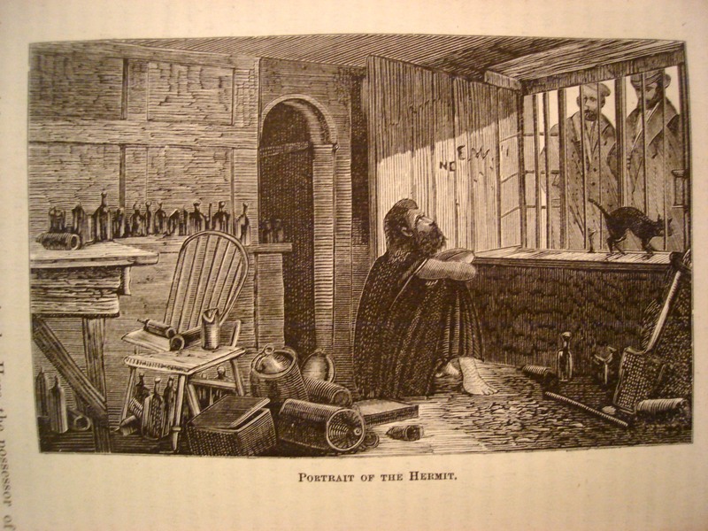
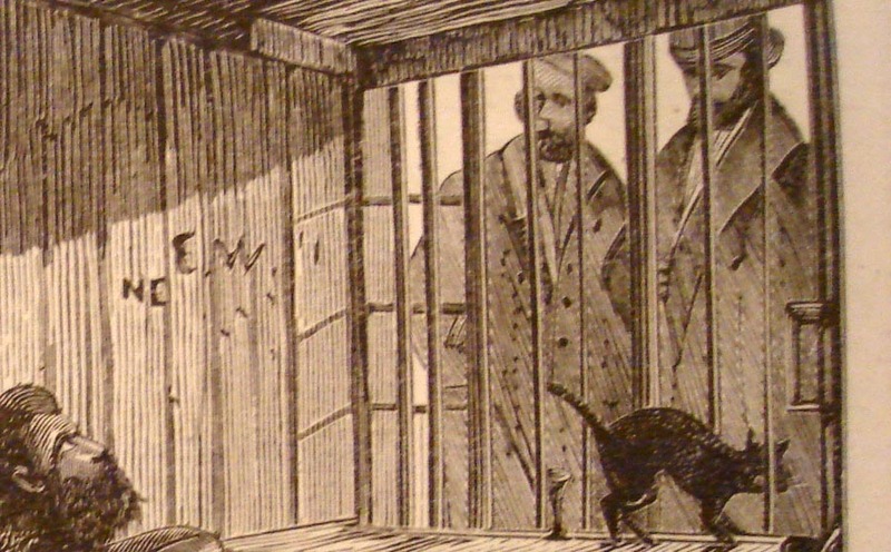
    The image shown below is that of Mr. James Lucas, “the Hermit of Red-Coat’s Green, (near Hitchens)”, living his life in a most uncommon hermit-like fashion, even for a hermit.  Seems to me that a hermit would be removed from society and be away from people; Mr. Lucas may be of a singular caste of that genre, living his life alone in the very midst of society–he lived in the kitchen of his townhouse, in a single room with a window to the street.  There he lived out his life in full and constant view of the passersby on the busy sidewalk.  Crowds would come by and stare, and Mr. Lucas would stare back–he would rarely, if ever, communicate, though he would (“he was not miserly”) give out “farthings and gin” to “swarms of tramps”, no to mention sweetmeats to children.   He’d watch people watching him.

    Hermit Insane

    He also didn’t write (except we are told “upon a check”), and made no physical effort to retain anything that he thought about; nor was the reason for his uncommon lifestyle made known.

    He was one son of “an opulent London merchant”, and in time proved to be an incorrigible and strong-willed non-conformist (with the funds to do so in some comfort).  He evidently went completely over the edge when his mother died, and after a year of keeping her body in the house removed to the kitchen, where he spent the rest of his days (living there from 1850 to 1874).

    Hermit Insane detail

     After he died and his room cleaned out for the sale of the family’s property, it was discovered that the floor was covered in two feet of ashes and soot from the kitchen fireplace.  Without the family money Mr. Lucas surely would’ve wound up on a cadaver table long before his seventieth year, suffering real social Dickensian travail rather than that which existed just in his mind.

    ·Posted by :

    ·in:

    — —

  • The Leech Explorers of 1833

    JF Ptak Sciene Books   Post 2507

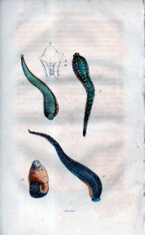
    D.B. Smith’s “On Medicinal Leeches”, which appeared in the Journal of the Philadelphia College of Pharmacy (January, 1833, pp 265-271), may or may not have the first illustration in a U.S. journal of a medical leech. Or at least that’s according to what D.B. Smith says, who claims that an image of the little critters with multiple jaws and lots of teeth “appeared here for the first time”. It seems to be a little late for that to be happening for the first time, as using leeches in medical practice to prevent disease and infection goes back a long way before this article, far beyond the earliest written mention of it goes (in a Galen manuscript, about 2,000 years ago). On the other hand the medical journal was still a pretty new idea at this point in the history of science in the U.S.A–the very first medical (and scientific) journal in general does not appear until 1797 (with the Medical Repository) so it is possible that in the 36 years of scientific/medical journal publishing history to this point it is entirely possible that this short article can claim its “firsts”.

    Leeches030The article is not without its very muted bells and whistles, but what attracted me instantly was the bit in it about the leech explorers. The Leech Explorers of 1833–it is an exploit-ish title, perhaps even needing a bit of a Busby Berkeley dance routine to support it in a Leechy Atlas sort of way. 

    We find out that at about that time, in the 1820’s and 1830’s at least, there was a bit of a European leech mania.  Of course, manias are difficult to explain in their appearance but not so much in their disappearance, and the leeches just got in line with the rest of the other manias, like the dancing mania, tulip mania, bibliomania, arithomania, fortune telling, magnetism mania, and so on. 

    What happens with the leeches at 1833 is there was a definite leech supply failure–in Paris alone 5 million leeches were used every year, emptying out 300,000 litres of Parisian blood (according to the Encyclopedia Britannica). The demand for leeches was so great that leech dealers would extend their range to Spain, Corsica, Germany, and even to the far reaches of Turkey, and finding no satisfaction, opened their hearts for new and true sources of leeches, and “explored”. 

    For some reason this struck me as enchanting and exotic–images of leech dealers and leech dealer mule trains hauling large buckets of dirt filled with leeches, bumping slowly along at very slow speeds for thousands of miles.  And since leeches are living things and need to stay that way in order to function in the medical sense, they need to make the long journey alive and well. I wonder if there were ever leech highwaymen?  Or leech saboteurs–competing leech explorer/dealers making life difficult for their competitors, like you might encounter with gold miners.  In any event, the Leech Explorers idea was a bright and confused point of light in an otherwise not terribly interesting story about American leeches of 1833. 

    Notes:

    See:  Charles McKay, Memoirs of the Extraordinary Delusions and Popular Madness of Crowds, full text: http://www.gutenberg.org/files/24518/24518-h/dvi.html

    ·Posted by :

    ·in:

    —

  • Unfathomable Dots–324,198 Stars and Knowing the Structure of the Milky Way, 1873

    JF Ptak Science Books  Post 1107 (from 2010, Appended April 27, 2015)
    [A continuation of our History of Dots  series.]

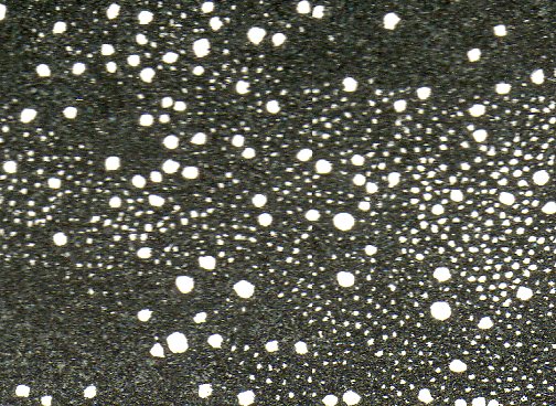
    Stars--vivible stars 2 det304


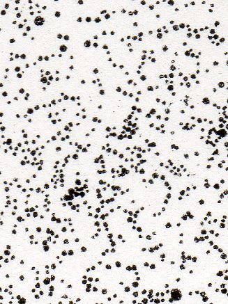
    The history of dots must have some fair share of its content filled with a very varied history of astronomy, which just goes to show that even within the seeming-sameness of microscopic investigations of dots that its subcategories could be so vast and differentiated. (The image above is a small detail from the following image, below.)

    Dots aren’t necessarily just dots–even in representing the stars, dots have a rich history. The first star-dots published in the West appear in 1482, taken from the work of the first century astronomer and philosopher Hyginius1, and is a book that contains maps of the constellations composed of such beautiful light-encrusted bits.  There wouldn’t be another work like this one, strangely, for another 75  years. Alessandro Piccolomini’s2 work of 1559 (which would be the first true star atlas), and again we see the familiar representation. 

    Galileo’s dots were very aggressive.  By 1610 he had produced his fifth and most powerful telescope, allowing things to be seen one thousand times closer, using it to make enormous discoveries–discoveries so big in fact that their towering significance is a but hard to understand today in the context of early 17th century knowledge. It was all published in his fantastic Sidereus Nuncius on March 4, 1610—the extraordinary  very title page3 of the book proclaiming some of the great discoveries of Galileo’s adventure.

    One monumental outcome of Galileo’s work was expanding the number of stars in the sky, which was basically mucking around with the perfect plan of the creator–formerly a cornerstone for the existence of a divine being.  With the exception of comets and eclipses the sky had remained immutable, a perfect score of the creator’s creation, until 1572, when Tycho Brahe noticed something new in Cassiopeia, something that was not a comet—a “something” that was a star. This was momentous because the night sky had been seen for centuries as being complete—a new star, the Nova of Brahe, contradicted this high belief, offering the possibilities of newness where there had not been one previously.  And so too with Kepler’s new star of 1602.

    One of the things that Galileo brought to the world was an entirely new sky, revealed to him through his telescope—so many stars that he could only guess (though he reckoned that there was an order of magnitude more stars than previously known “stars in myriads, which had never been seen before….and which surpasses the old, previously known, stars by ten times”).
       
    Which brings me to the images that I stumbled on today from “Statement of Views respecting the Sidereal Universe”4which was  the work of the astronomer and great popularizer,  Richard A. Proctor (“B.A. (Cambridge), Honorary Fellow of King’s College, London”).

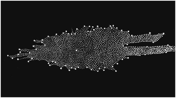
    Proctor’s dots challenge all dots that have come before so far as theorizing on the structure (and extent) of the Milky Way is concerned.  Proctor refers to William Herschel’s5–the man who first gave the Milky Way its shape and who fixed our own sun in an inferior and not-particularly-special place inside that map–statement that the extent and constitution of the Milky Way is “unfathomable”. 
     
    Proctor gets there by presenting a map of the night sky with stars visible to the naked eye:

      Stars--vivible stars 2303
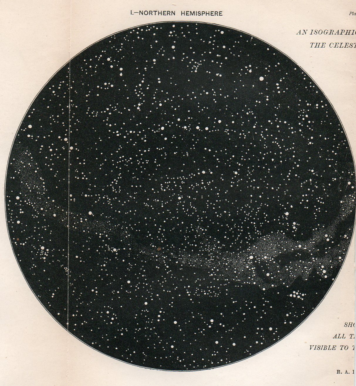
    And then the double hemisphere map of the northern and southern skies “We have here the first step towards just views of the constitution of the Milky Way, or rather the next step beyond the great, but little noticed, discovery of Sir W. Herschel’s, that the bright clouds of the Milky Way are for the most part spherical clusters of stars.”(Page 546.)

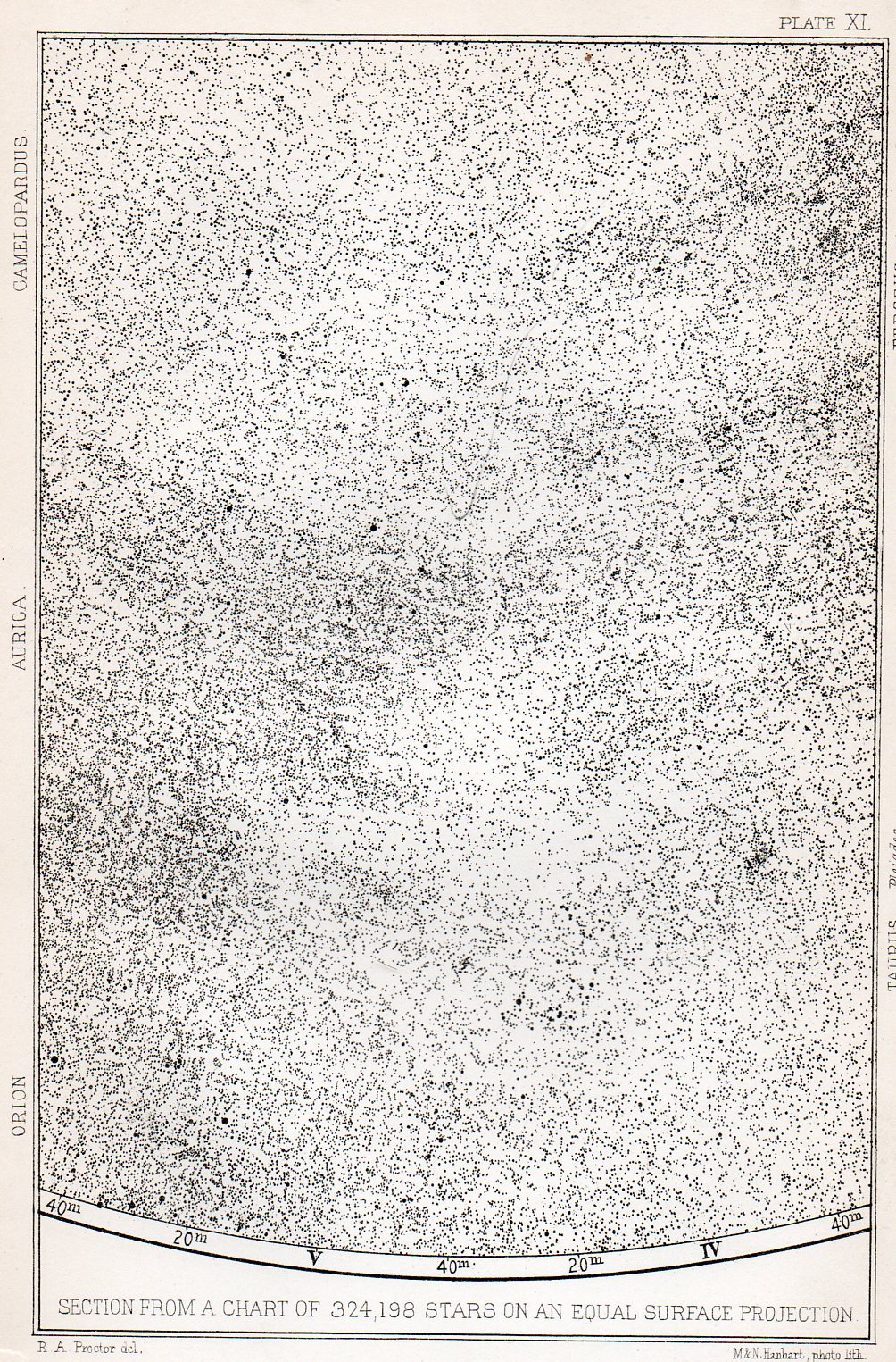
    Finally is the crux of the matter: two sections of an fantastic map displaying 324,198 stars visible via a 2.5 inch aperture telescope.

    Stars--324k300
    (The following being a small detail in the above section:)

    Stars--324k deyt301
    He comments:“I assert, without the slightest fear of contradiction by any possessing such knowledge, that the broad teaching of the equal-surface chart. 0/3 24,000 stars disposes finally of all theories of the constitution of the sidereal universe which had previously been enunciated. The chart does not definitively indicate a new theory—rather it suggests the idea that the constitution of the sidereal universe is too complex to be at present ascertained. But it completely negatives (i), the stratum theory (even in the modified form apparently retained by Sir W. Herschel) ; (ii), the flat-ring theory of Sir John Herschel ; and (iii) the infinitely extended stratum theory, with condensation towards the mean plane, which Struve adopted.” (Page 547)

    I think that for 1873 the verbose Mr. Proctor got his point across.     

    Notes

    1. Hyginius Mythographus (fl. 1st century A.D.). Poeticon astronomicon. Edited by Jacobus Sentinus and Johannes Lucilius Santritter. Venice: Erhard Ratdolt, 14th October 1482. The first star atlas per se, standing alone in its field for a century.

    2. Piccolomini, Alessandro.  De la Sfera del Mondo.  1559                              

    3.  Galilei, Galilei  Sidereus Nuncius (known in English as Starry Messenger), published 1610
    The title page reads: Great and very wonderful spectacles, and offering them to the consideration of every one, but especially of philosophers and astronomers; which have been observed by Galileo Galilei … by the assistance of a perspective glass lately invented by him; namely, in the face of the moon, in innumerable fixed stars in the milky-way, in nebulous stars, but especially in four planets which revolve round Jupiter at different intervals and periods with a wonderful celerity.

    4. Journal of the Royal Astronomical Society, Paper, Abstracts and Reports of the Proceedings of the Society from Niovember 1872 to June 1873, vol XXXIII, London, printed by John Strangeways, 1873.                    

    5. It seems that few people now remember Frederick William Herschel as a great discoverer of alternative existences, but, well, that’s pretty much what he did–and he did it during a time that must’ve made his astronomical discoveries seem like science fiction .For example, in 1785 Herschel published a revolutionary image of the “Stellar System” (the Milky Way), showing its irregular pattern and the off-center placement of our sun amidst a panoply of other stars.
    (His image was remarkably and substantially correct, with the most grievous error being the placement of the sun too close to the center of the galaxy.) It was an image which bought the concept of a not so humano-centric idea into popular philosophy, and that our sun was a star among stars in a sea of stars.

    Herschel


  • Chuck Close Convict Optics, 1936

    JF Ptak Science Books   Quick Post    An Episode in the History of Dots

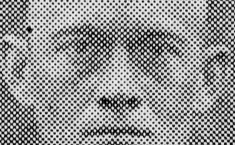
    There is no telling, sometimes, where an interesting/odd bit might occur. I guess you could make the case that they occur everywhere and that it is just our inability to see them that limits their appearance.  This may be the case with the following, a magnified part of a small part of a chart, where dots turn into squares:

    Convict farm909 detail

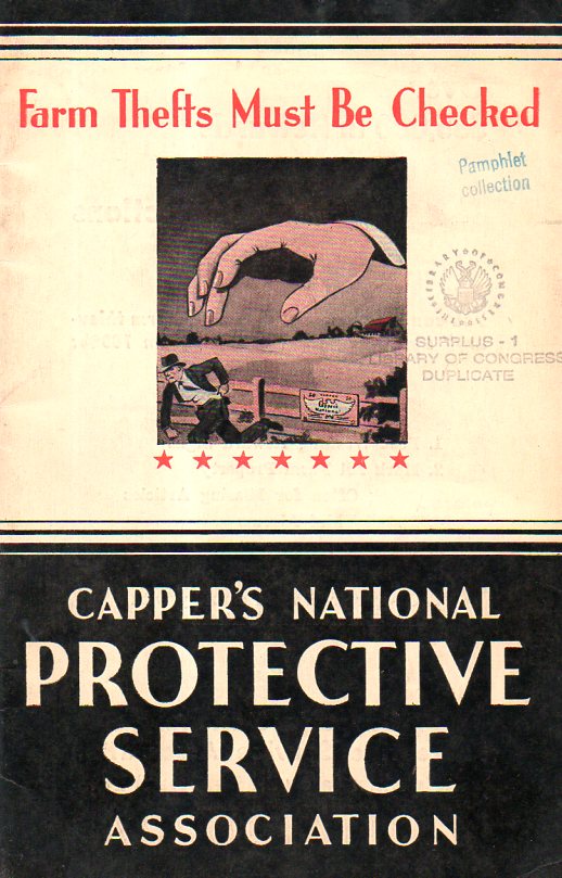
    The pamphlet topic is certainly a modest vanilla flavoring–prevention of farm theft (1936). However the cover is striking, so it is an easy thing to pick up.  There’s a bunch of anti-crime/catch-’em stuff and help on how to do that inside–there is also a two-page spread of mug shots of examples of people caught and convicted utilizing the services offered in the pamphlet. That’s where Mr. Close comes in.

    Convict farm samp-ler910

    One interesting thing about the enlargement is that you can make the image go from near-negative to positive by tightly squinting your eyes–which is something I think you cannot do with the pre-pixelated Mr. Close.  

    In any event, it was a very nice find, found in an unusual and serendipitous place. 

    And the cover:

    Convict farm cover911


  • On Making Things That Are There Not There: Camouflage, 1917

    JF Ptak Science Books   Post 2400

    Its a little difficult to think of Ellsworth Kelly, Jacques Villon, Grant Wood, Laslo Moholy-Nagy and Thomas Hart Benton as painters-for-war.  But its true, and true for many of hundreds of other artists in the 1915-1918 era. Its not as though they were in the trenches gunning down the enemy or lobbing hand grenades into the swirling gunsmoke. They were camofleurs, camouflage1 experts, artists employed as magicians, Wartime Magi, employed/drafted to make ships and such disappear. 

    Ever since it was (sort of) first noticed in 1915 that designs odd to the environment, stark geometric patterns and such, were capable of fooling the eye, people with  design capacity were pressed into service, rendering offensive and defensive instruments of war optically semi-impervious with variations of the then-five-year-old modern nonrepresentational art. That must’ve been a very odd position to wake up to every morning. 

    Of course the idea of camouflage in the animal world is probably 250 million years old–animals and insects have been blending into their environment for eons, and I’m sure too that early hominids did their fair share of walking behind brush.  But the idea of hiding great amalgamations of very heavy metal with paint is really quite modern.

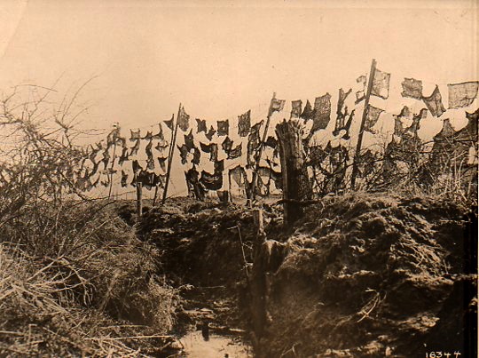
    World War I photos--Camouflage291 [The original photograph is available for purchase at the blog’s bookstore, here.]

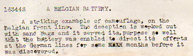
    In this photograph the camouflage is more a more futuristic conception of art than the abstract and cubist approaches that were taken during the war, this looking more like assemblages of found material more than anything else.  And, according to the text that accompanied the photograph (which comes from 1918, from the Underwood & Underwood news photo service agency), the camouflage–empty sandbags thrown on a barbed wire fence) successfully concealed a gunnery emplacement for months on end. 

    World War I photos--Camouflage det292 

    Notes

    1. A fine bibliography on camouflage appears here, at Leonardo Online.

    The definition of “camouflage” from the Oxford English Dictionary shows that it is a young word, in English:
    “(n) The disguising of any objects used in war, such as camps, guns, ships, by means of paint, smoke-screens, shrubbery, etc., in such a way as to conceal it from the enemy; also, the disguise used in this way; freq. attrib.


    1917    Daily Mail 25 May 4/4   The act of hiding anything from your enemy is termed ‘camouflage’.
    1917    Daily Mail 16 July 5/3   The King paid a visit to what is called a camouflage factory.
    1922    C. E. Montague Disenchantment viii. 108   A French aerodrome across which the French camouflage painters had simply painted a great white high-road.

    ·Posted by :

    ·in:

    — —

  • Marble Clouds and their Emotional Shadows: Cloud Geometries in Art

    JF Ptak Science Books   Post 1942 (Part I, reposting from 2012) 

    I silently laugh at my own cenotaph 
    	And out of the caverns of rain.  Percy B. Shelley, "The Cloud", 1820
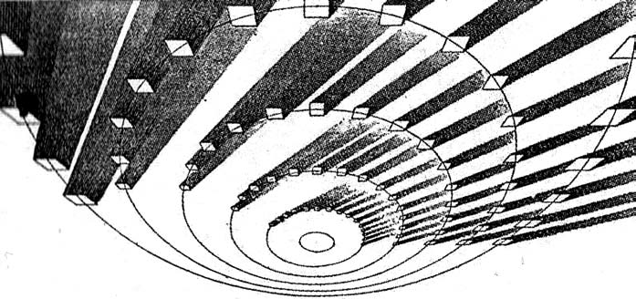
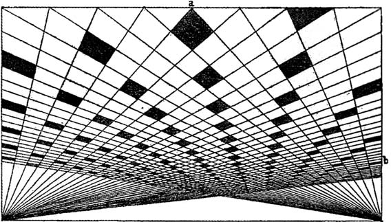
    [John Ruskin, Cloud Perspectival, 1860. Source for all Ruskin images:  “Cloud Studies: The Visible Invisible”, by Mary Jacobus, here.]

    John Ruskin (1819-1900) was still a very young man when he published the start of a series of works in art criticism,Modern Painters, in 18431.  To refer to it as a great work in critical theory is painting the work with a narrow brush, though–it had a very sweeping overall effect, and addressed all manner of issues integral to art, and was a developing vision of what art was looking at in the 19th century.  Ostensibly it began as a defense of the work of J.M.W. Turner and the way in which that man represented nature in his pre-Impressionist, pre-Expressionist work. Ruskin makes the case that the works that were so grating part of the art world i the 1830’s were highly consistent with centuries of representing nature in art–and not only that, but presenting evidence that turner did so like no other artist in history.  Ruskin would weave further volumes of Modern Painters through the body of his other work for the next 17 years, publishing the last installment in a fifth volume in 1860.

    Turner (1775-1851) was a great Romantic and a lot of that work tends towards a very full and very early expression of Impressionism and Expressionism, something that not everyone was ready for in the first quarter of the 19th century. This is particularly so in his paintings of clouds, and even more so in cloud/ocean interaction.  They are sweeping and breath-taking and very emotional works, in some ways like the late string quartets of Beethoven–powerful, provocative, internal dialogs of the deep power of nature. He must stand with John Constable as the Cloud Man of the 19th Century, or perhaps Constable stands with him.  They both in a way stand with Luke Howard, the scientist who was really the first classifier of clouds–an undertaking which in some impossible way escaped the recognition of the greatest classifiers it he history of science–and who did so in a paper in 1802, written at a time when Constable and Turner were both young artists.

    Turner and Constable both painted clouds like perhaps no others before them; and Ruskin, in his deep appreciation for the importance of the representation of nature int he art, also made a contribution to the understanding of clouds that was of an extraordinary nature. In the fifth volume of his Modern Painters Ruskin attempts a perspective study of clouds, and may have been about the first to do so. The illustrations of this effort I think are incredible, and remind me very much of installing a sort of rigidity to clouds, a cloud geometry, veritable studies of stones and blocks in the sky.  The imaging part of this exercise must have been an enormous thing back there in 1860, to think of clouds in a perspectival way, floating very large geometric objects in the sky. The astonishing results are seen (above) and following:
     And this:
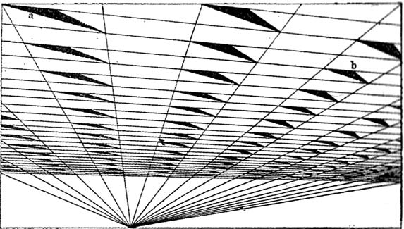
    [John Ruskin, Cloud Perspective: Curvilinear., Modern Painters, Vol. V, Plate LXV.]

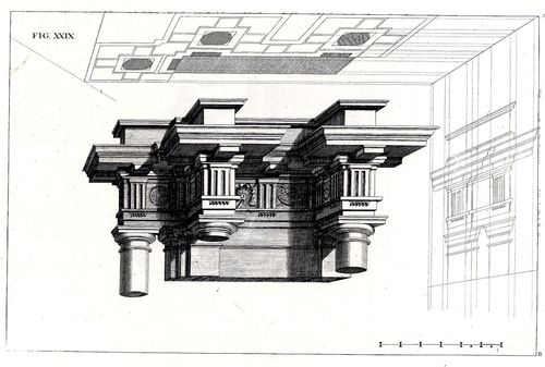
     In a way the first image reminds me of Andrea Pozzo’s work in his monumental   Rules and examples of perspective proper for painters and architects (1693):
     Pozo

    but really more in the way that Pozzo’s work seems to be elevated and floating in a heavy perspectivist space, bigger and blockier sky-borne marble than with ruskin.  But still, the disembodied floatiness of the Pozzo work is ethereal.

    Ruskin does round out his blocky and beautiful geometry, which definitely reminds me of work w=that would appear 90 years later:  Ruskin, again:
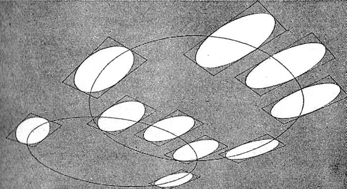
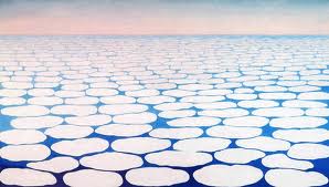
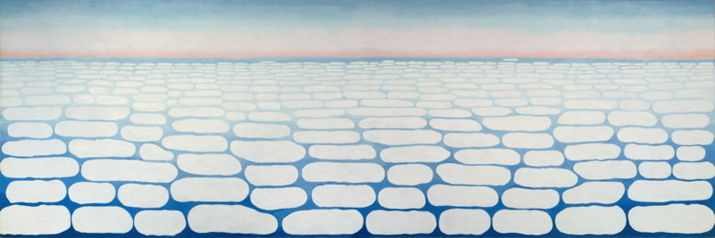
    And  Georgia O’Keefe’s Clouds III (1963), though her clouds tend towards a more rigid geometry in Clouds IV (1965, following):
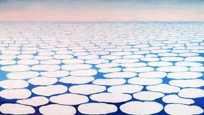
    Clouds O'KeefeO’Keefe, Clouds Above the Sky III, 1963
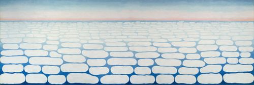
    Clouds okeefe sky above iv 1965

    O’Keefe, Clouds Above the Sky IV, 1965

    Ms. Georgia is definitely seeing her clouds with different eyes than Ruskin, and they are entirely different creatures–but still, the two come together in my head as relatives. The clouds, I mean.

    I started looking around for early hard-line cloud geometries and thus far I haven’t found very much, though there is a tremendous example by Henry Van de Velde’s (1863-1957) “Sun at Ocean (Rhythmic Synthesis”) which I found in  Werner Hoffman’s Turning Points in Twentieth century Art, 1890-1917 and which was executed in 1888/9, looks to me to be absolutely incredible for its time, a nearly non-representational, proto-abstract something, done three decades before these genres came into being.
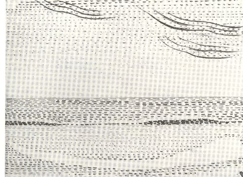
    Clouds van de velde
    I don’t know where the designer Van de Velde fits in the early history of non-representational art, but his effort in the second to last decade of the 19th century certainly seems to be very unusual for its time, and a good example of creative cloud representation. 

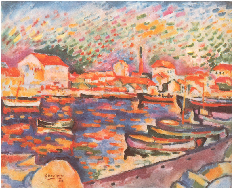
    Non-standard cloud imagery is much easier to finding the 20th century, like those of Georges Braque in his La Ciotat Harbor (1906):
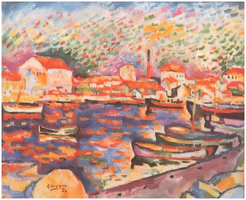
    Clouds braque
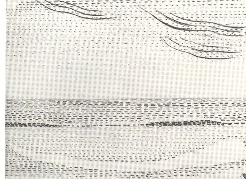
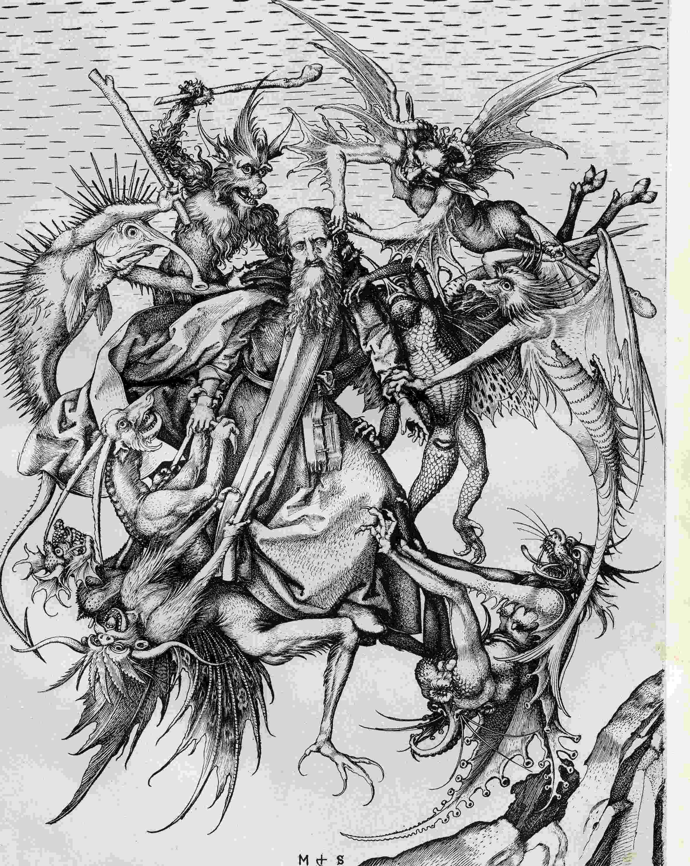
    Even this starts to have the look of something earlier, particularly if you turned the clouds-in-art clock way back, say, into the Renaissance. For example Martin Schoengauer‘s spectacular  The Temptation of St. Anthony, which was printed in 1470/5, has a beautiful, fluid circularity to it, full of an earthy roundness even as the saint is pursued by demons.  But the sky in the background is populated with nothing but dashes to suggest clouds, and which also starts to look something like the Fauvist and Expressionist works to come, 400/500 years later.
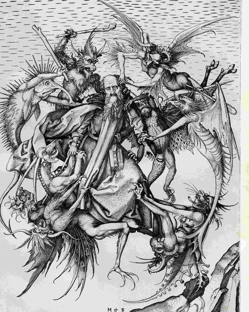
    Clouds schoengauer

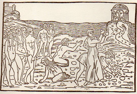
    (There are many examples of the sky being simply not represented at all, particularly in woodblock,

    like this image from Ovid (Accipe Studiose Lector P. Ouidij Metamorphosin...printed in Venice in 1509:
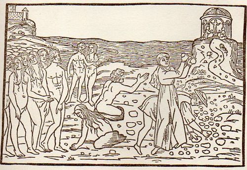
    Clouds no couds livy913

    “You could not see a cloud, because
    No cloud was in the sky:
    No birds were flying overhead —
    There were no birds to fly”.–Lewis Carroll, Through the Looking Glass.

    There are many non-sky images like this. 

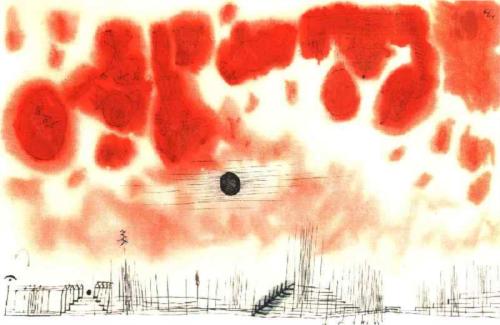
    Another interesting modern example is this Paul Klee (though it comes fairly late in that career, in 1940):
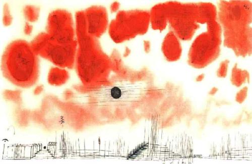
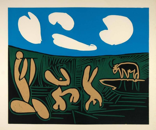
    Clouds Paul Klee 1940And an example from the ubiquitous Picasso, still later, in 1962:
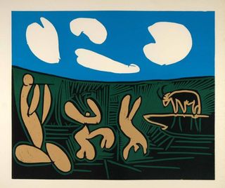
    Clouds Picasso

    But earlier images are harder to locate.  The obvious early-ish source (though still much later in the century) would be Van Gogh (say, with Starry Night) and Monet, though the fractalesque Van Gogh gets much closer to the re-interperative power of the Ruskin images than the reflected impressionist beauty of the Monet.

    Clouds Monet
    On a cursory look around the antiquarian painterly sky-world, it is becoming obvious that the cloud geometries of Ruskin are very uncommon. 

    Notes

    1.  For full text of Ruskin’s  Modern Painters , see  (1873)volume 5 for (1860) and  (1873)