A Daily History of Holes, Dots, Lines, Science, History, Math, Physics, Art, the Unintentional Absurd, Architecture, Maps, Data Visualization, Blank and Missing Things, and so on. |1.6 million words, 7500 images, 4.9 million hits| Press & appearances in The Times, Le Figaro, Mensa, The Economist, The Guardian, Discovery News, Slate, Le Monde, Sci American Blogs, Le Pont, and many other places… 5000+ total posts since 2008.

Category: Perception

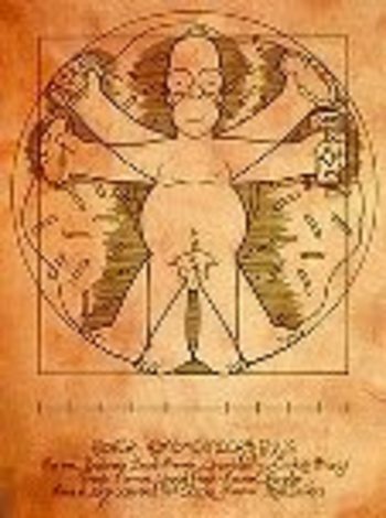
  • Homer Simpson on Perspective: the Rare Antique Image Looking Straight Down from a Height

    Blogstraight_homerJF Ptak Science Books LLC  Post 20

    I welcome the chance today to use our non-classical Homer instead of the beautiful Paolo Uccello to look at an issue of imaging a certain form of perspective drawing.  I’ve always been intrigued by antiquarian images that looked straight down, or up, at things–90 degree, perpendicular, real straight-on stuff, giving a feel for depth (or height) and perspective.  Funny thing is that in the wide world of scientific images, they really don’t show up very often.

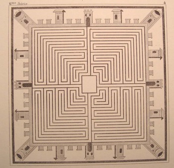
    A Mock-straight-down is found in this prettily-designed example (French, ca. 1860)–it seems to be view form a height of 250 feet or so down on the square of a low- (Western) renaissance town. That’s partly true, except that it is a mosaic from Pompeii (or Herculaneum), found imbedded in the floor of one of those mummified houses.  Dsc04640
    Another pretender is this god’s-eye view (from Abraham Rees’ mammoth encyclopedia of 1800-1820) of the universe, centered upon our own helio-centric Solar System, which is centered, nested, amidst a whorl of other (contiguous and touching but not overlapping) solar systems, all of which is held in the Dsc04642
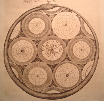
    infinite but knowable confines of an ourobus.   This
    again qualifies as a straight-down/up if and only if (iff) you squint real hard and imagine you’re seeing the scene through your CreatorView (TM!) glasses.  (The Creator needs glasses?)

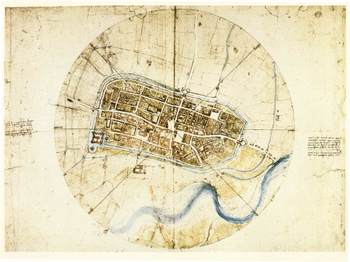
    The drawing by Leonardo of the town of Imola (currently resident with the Windsors) does come quite close to the concept–it has more artistic features than the common city plan , and is definitely at a perpendicular to its subject.Blogstraight_imola
    But it is this that is so terribly interesting to me–a small part of a
    little print from an unidentified encyclopedia from the turn of the
    19th c. It shows a picture of the earth looking straight down from a
    balloon, looking through an opening in the cloud cover, down to a small
    town. There is an iconic work on the representation of the world as known to succeeding generations where the picture of the world is seen through a succession of gradually diminishing clouds (being opened like drapes over time), but I honestly cannot think of an early image of looking at clouds from above and straight down.  My sense is that this image would have caused as much Dsc04639_2
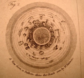
    interest and wonder as the first (Soviet) images of the other side of the Moon (back in 1959). 

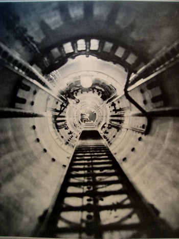
    Even when moving into the pre-satellite 20th century image, the straight-down picture is a rarity. In the last few years after having looked at dozens of thousands of popularly-published images (for another project), the straight-down/up were a scant tenth or perhaps hundredth of a percent of the total. There were a number of photographs made looking straight up (as in the two examples here, looking up the main mast into the crow’s nest of the Queen Mary, and the other with the same view, only in the Bremen. 

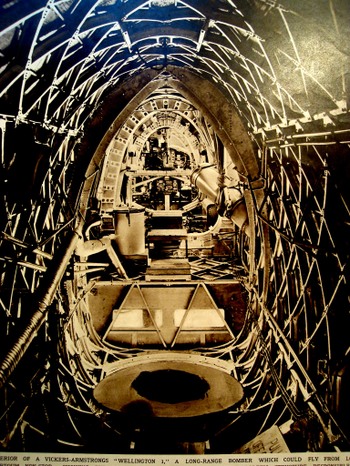
    Occasionally the view like this will show up (looking laterally through the Vickers-Armstrong “Wellington I” bomber aircraft (June 1939)

    I can’t leave this topic without mentioning two recent additions to this genre–the first is the Eames’ wonderful PowerDsc04643_2
    of Ten movie (go to youtube HERE, where in 40 steps we look at existence from quark to quasar. 

    The second is a little goofy but I like it nonetheless–the introduction to the Jodie Foster movie Contact (go to youtube HERE)  built on the bones of the Carl Sagan book. Here we swing out from the Earth and into space, following a broadcast-audio trail of humanity into the not-too-distant time/space (ignoring the signal degradation bit but so it goes), and then leaving that quickly behind, hurling itself backwards, to the outer reaches of the universe, until (and we don’t see this in the youtube clip) we wind up back in the iris of the heroine (and a bit too much like the Dave Bowman trip in “2001 a Space Odyssey”).  Dsc04644
    But we don’t see stuff like this very often, and I’m happy to go along for the ride. It really is just about seeing something new, after all.

    Perhaps the lack of this perspective is summed up by our old friend Homer J. Simpson. In one episode of the Simpsons (long ago and far away…or last week) Homer explains (to Lisa?) why cartoon characters’ faces are always oblique in profile. Homer turns and looks directly into the
    camera,” and his face gets all pancakey. It’s just not done “because it’s goofy” he says. And at least in Homer’s case, the proof is definitely in the puddin’.
    Dsc04645


  • The Wrong Stuff, Righted–the Attack on Darwin’s Descent, 1871

    JF Ptak Science Books LLC Post 17

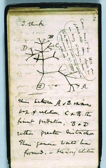
    I enjoy the good defense of the wrongfully accused–The Encyclopedia of Incorrect Reviews of Literature andDarwin_first_tree_2
    Science
    is an enormous and multi-generational work, filled to its festering brim with The Bad Stuff:   Everyone is represented here, glory rendered to trifle:  Hamlet was ripped by Voltaire (“vulgar and barbarous”) while Pepys raped Midsummer Night’s Dream (“insipid, ridiculous”); Moby Dick was “trash, bedlam literature”; Kipling couldn’t write in English (SF Examiner 1889); and Max Eastman weirdly and famously trashed Hemingway and his manhood in the New Republic while reviewing For Whom the Bell Tolls in 1940 (“lacks the serene confidence that he is a full-sized man”).   Perhaps one of the very prettiest of the bad/wrong review was made by The Bookman (the professional bookseller’s reviewing organ in the United States) in 1906, in reviewing Sinclair’s The Jungle:  “His reasoning is so false, his disregard of human nature so naïve, his statement of facts so biased, his conclusions so perverted, that the effect can be only to disgust many honest, sensible folk with the very terms he uses so glibly”.  Well put; better still if it were correct.  The list goes on and on and touches, well, just about everyone (including Dr. Seuss).  What I really enjoy is the response to the bad review, especially when the bad review was, simply, bad. 

    One good example, .a great example, really, is Thomas Stebbing’s response to an inciting, raw and hateful attack upon Darwin’s Descent of Man by The Times of London newspaper (April, 1871).  Incredibly, or predictably, The Times saw the work as an attack upon society: it accused Darwin of undermining authority and principles of morality, opening the way to “the most murderous revolutions”. A “man incurs a grave responsibility when, with the authority of a well-earned reputation, he advances at such a time the disintegrating speculations of this book.” Stebbing’s  review of the Review is drippingly but properly sarcastic, pointing out obvious errors in specific and the tone of the article in general in the defense of theAntievolutionleague_2
    book. Darwin’s “facile method of observing superficial resemblances” (says The Times) moves  Stebbing to issue the following: “they may fancy that truth is worth discovering , even when it seems to involve some contradictions to our pride and some loss of comfort to our finer feelings…”  It is a gorgeous line ending a proper, staid defense of what would seem prima facie to be something in need of no defense whatsoever—in 1871 or 2008. 

    Reverend Stebbing, a Darwinian, Naturalist and fellow of the Royal College of Surgeons, lived another 55 years after this article was published—one year longer than the issuance of the (negative, anti-Darwin) verdict in
    the Scopes/Monkey trial.  I wonder what he was thinking on that day in 1925…

    ·Posted by :

    ·in:

    — —

  • The Sovietesque Disappearance of Pacioli’s Rhombicuboctahedron

    JF Ptak Science Books LLC  Post 23

    What?

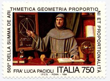
    I’m lodging a complaint, 16 years after the fact (though new to me), about the Italian commemorative stamp honoringBlogpacioli
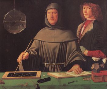
    the great Fra Luca Pacioli—a great mathematician, inventor of modern bookkeeping, and friend and dispersal-agent of/for Leonardo da Vinci—it also seems to be the first representation of a living mathematician.  The stamp is based upon and freely rearranges (to the point of obsidian abstraction) elements of the famous painting by (perhaps) Jacopo Barbari (and painted in 1495), which now hangs in the Museo di Capodimonte (Naples). 

    The painting has been reproduced in mathematics books and such many times over—with good reason, as it is a gorgeous work and is filled with lots of mathematical bits and pieces. 

    The stamp, however, is a curious and annoying work if you are at all familiar with the original.  The most glaring but not most important change is the Soviet-like loss of the figure to the right of Pacioli—althoughBlogpacioli_stamp
    not positively identified, some believe it is Guidobaldo, and others believe it to be the very pretty Albrecht Durer.  He’s gone, replaced by some sort of out-of-century bookcase.  I’m not saying that whoever this happened to be needed Stalinist disappearing  for political reasons, but it upsets the entire composition of the painting, and leads to other more foul errors. 

    The closed red book on the table is moved and an hour glass is placed on top of it, taking up the slate that was there in its place in the original, which is now hanging on the wall.  It is highly unlikely that Pacioli would provide a demonstration in this matter. 

    Also the mathematical notes here are slightly different from the (correct) references to Euclid’s Elements Book XIII, proposition 12 (If an equilateral triangle is inscribed in a circle, then the square on
    the side of the triangle is triple the square on the radius of the
    circle.)

    An armillary sphere makes a curious appearance, and a few of the mathematical tools on the table top make disappearances.  The sphere may be the artist’s attempt to make up for the loss of other symbols, as the sphere represents the Platonic music of the spheres, successive levels of forms being built one on the other and so representing the universe.  (Plato’s
    Republic, where, in the Myth of Er he wrote,
    “. . . Upon each of its circles
    stood a siren who was carried round with its movements, uttering the
    concords of a single scale.”
    [Republic p.  354])

    The important item that is kept on the stamp from the original (though moved) is the polyhedra form, the dodechahedron, one of the great Platonic solids, and a figure composed of 12 pentagons.  It is a highly symbolic link between ancient thought and the rise of the new mathematics and even newer art. 

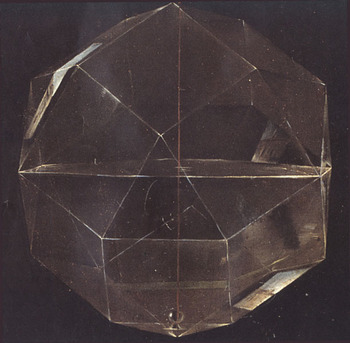
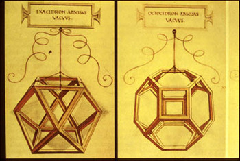
    The most important missing item, though, is the glass object hanging at the left of the painting—it is theBlogpacioli_rhomhb_close
    rhombicuboctahedron.  This object is one of the thirteen semi-regular (or Archimedean) solids, and has 26 faces made of 18 squares and 8 equilateral triangles, with 24 vertices and 48 edges.  It is constructed of glass and hangs by a string, and is half-filled with water.  It is spectacularly shown in the painting by Barbari—it is simply a glorious achievement of perspective and light and shadow.

    And, as it turns out, reflection.   In a superb 90-page article by Nick Mackinnon: (“The portrait of Fra Luca Pacioli”, The Mathematical Gazette, 77 (1993) pp. 130 – 219).  Mackinnon combs through the painting with microscopic precision, and in this case reveals that there is an exterior reflection (of s house) on one of the bottom panels of the figure. (Good work!  He even goes on to try and figure out what it is we are looking at in the reflection.) 
    It is annoying for this figure (or a shadow or hint of this figure) not to be on the stamp because of its beauty and symbolism.  It is none other than Pacioli’s friend, Leonardo, who illustrates his book Divina proportione—a masterpiece of thinking and illustrating, introducing the concept of the divine proportion (phi) and its importance in design and in nature in general. Perhaps of greatest significance though are the illustrations of some of the figures in the book, which I believe are the first time that people are able to see geometrical drawings in perspective, which is a very big deal. 

    Unfortunately this link is pretty much missing without the Rhombicuboctahedron—you don’t have to know how toBlogpacioli_da_vinci
    say it to appreciate it.  (Or as Bernard Malamud writes in the Natural, when discussing a spaghetti dinner “I don’t know how to spell it, but it sure eats good”.)

    All I’m saying is that the designer for the stamp shouldn’t been consulted, and the Italian government should just have used the original as the basis for the stamp.  After all, they didn’t remove the backgrounds of the Mona Lisa or the Last Super because they were too-conflicty with their subjects in those commemorative issue stamps, did they?

    Oh, I forgot–they did. 

    Here are a few good books to consult if you’re interested in polyhedra:

    H.S.M. Coxeter, Regular Polytopes.  Coxeter was perhaps the most impressive geometer of the 20th century.
    Peter R. Cromwell, Polyhedra.
    H. Martyn Cundy and A.P. Rollett, Mathematical Models
    Alan Holden, Shapes, Spaces and Symmetry. (Very pretty!)
    Peter Pearce, Structure in Nature is a Strategy for Design.
    Magnus Wenninger, Polyhedron Models.  (Paper construction!)

    ·Posted by :

    ·in:

    —

  • Underground Horses, 1875

    JF Ptak Science Books   Post 22

    Unusual cross sections have always fascinated me–they are an X-ray of the techy-inards of the physical world , showing you a slice (literally) of the Unseen and Unapproachable. 

    Mine_height_2

    The first engraving here is of an (unidentified) Western-U.S. mine, printed 1869, and shows the comparative depth of an un-effacing mining operation in terms of height, nestling it in against Trinity Church (NYC).  The “21 stories” depth  of this mine would have been astonishing to the 1869 mind thinking of it in terms of height. Few office buildings in NYC for example exceeded 5 or 6 stories at that time. [It was in 1872 that the tall buildings’ fortune turned, as C.W. Baldwin (working for the Otis Company) invented the geared hydraulic elevator, meaning that buildings could now be taller than the strength and endurance of its occupants’ legs.  (Actually, to my mind it is the invention of the elevator safety brake that clinched the deal, making it safe to enter an elevator and expect to survive the experience.  There’s a lot of other stuff that comes into play, not the least of which is steel framing, lightening the buildings weight and displacing the weight from its’ normal receptacle of the foundation, but I digress.) ] So trying to imagine something that was 15 time the height of the spire of Trinity Church was doing some pretty large-scale imagining. 

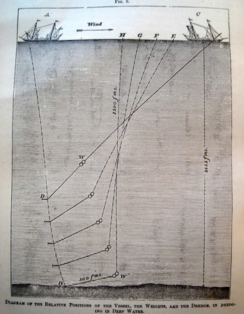
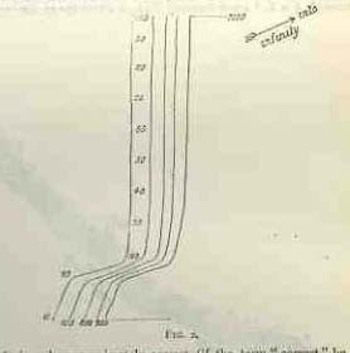
    A corollary the the height of the mine is, perhaps, a cross section of the depths of waters. Here we see an 1877 illustration from an article on new methods of determining the depths of ocean waters, giving a very clear indication of the enormous “height” of the ocean even in its most measurable (and not-so-deep) section.

    Depth_sounding 

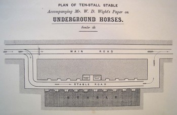
    I simply could not resist this 1875 engineer’s drawing (“Plan of Ten-Stall Stable….for W.D. Wight’s Paper on Underground Horses”)–and yes indeed these were horses kept underground, used for hauling the heavier wagons (on tracks) of whatever, brought out to these larger chambers by men doing the same work with lighter loads in smaller areas.  (For perhaps the best description ever of men at work in a coal mine, see the gorgeous George Orwell’s Down and Out in Paris and London)Underground_horses

    This is one of those images I think that will elicit a pretty light-hearted reaction until your brain catches up to the reality of what the print is really depicting.

    Coal_mine_black_3


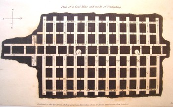
    This  image is actually much rarer than a mining cross section–it is a plan (looking from the top and down) of a mine showing the mode and direction of ventilating the whole bit, printed in 1818.  (As it turns out it is rarer still to see a plan depicting a mine’s numerous layers–I’ve honestly not seen another one of these done before 1900.)  What an incredible image this must have been to the early 18th-century eye, seeing such a novel, and rare, depiction of (important!) data.

    Mine_cross_mosaic

    In the Victorian panoply, the technological temple ma have had an entryway mosaic constructed from the idea of the mine cross section or plan–it is a structural, semi-architectural bit after all, made to withstand advanced weight and pressure.  Or how about a mine cross section template for a stained glass window?  I can imagine the Temple of Technology boasting a design schema of nothing but elements like these–those people trusted, perhaps even worshiped, the small and great mechanical machines and contrivances of their era.  All you have to do is look at the housings for even some of the simplest objects and you’ll find a metallic skin of awe and beauty, a symbol of admiration and respect for analog creativity.


    Mine_stained_glass


  • Seeing, Sight & Memory: Jevons, Bruno, Borges, Heller and Proust

    JF Ptak Science Books LLC  Post 12

    Can We See More or Less than We Used To Be Able To See?

    Jevons An early study of attention and perception (or “How Many Items Can it Embrace at Once?”) popped out at me while muscling my way through another year of Nature magazine for 1871.  The article was by  W. Stanley Jevons  (“The Power of Numerical Discrimination,” 1871)  who contributes an interesting and very early experimental bit on the success of the brain to correctly formulate an accurate memory when in a flash shown a number of items. (That is to say, when shown a certain group of X-number of items instantaneously and then removed, how often will the mind be able to remember the correct number upon recall–and without committing them to memory per se or counting them?) In this fascinating study Jevons records not only right/wrong answers but how “close” the remembered fit is to the original number, and in effect is a pioneering scientific effort towards understanding our abilities and limits in information processing.
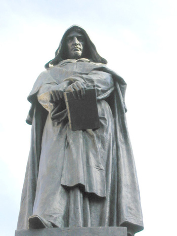
    Its important to distinguish Jevons’ experimental work on apprehension from earlier (and much earlier) philosophicalJevonsbruno_2 and semi-scientific work on memory formation and retention.  This of course goes back as far or as deep as you want to go—taking a stab at random we’ll use Simonides who while trying to organize poetry and other data in his head came upon the idea of using Mnemonics and using associative processes in art and poetry to establish his own history of memory. (I should point out that one of the early-modern experimenters in the formation of memory was Giordano Bruno  who wound up being tortured and burnt at the stake for other offense against The God while trying to formulate a truthful approach to science; evidently the memories that would be threatened by his scientific approach proved to be too much for the righteous in power, and he was removed before he could threaten corrective memory any further.) 

    It is interesting that many of the crimes of science punished by the Catholic Church during this period (1450-1650) were as much crimes against memory than they were crimes against the future—changing and challenging collective memory often proved fatal.

    Getting back to Jevons—who was a very smart guy and who applied himself to a number of fields, not the least of which was constructing a logic machine: his experiment proved to be a springboard for a host of others, some of which didn’t do Jevons justice, misreporting his finding, misrepresenting the stuffy, and so forth.  Perhaps the greatest of these was the greatest of the efforts based on his—Raymond Cattell —who for some reason stated in his very influential textbook of 1907 that humans can remember around 7 things (without counting) when the objects are flashed before their eyes.  And for a hundred years this figure stuck, even though the Jevons report issued a more complex summation, and saying, anyway, that the number was around 10. 

    And what bothered me a bit with the Jevons experiment is what people remembered when shown the objects (beans)—would his results have varied if subjects were asked how many were shiny or odd-colored or deformed or whatever rather than just a simple number, the results could’ve been more interesting.  (I don’t doubt that these issues have been taken up in the 20th century but haven’t looked).  Sometimes people are just looking in the wrong places—for example operant psychology labs tested rats via visual stimuli until it was discovered that rats were olfactory geniuses and that humans were using them wrong all along. 

    It would be interesting to know what the history is of human capacity for image formation.  Considering the growth of distractions and the enormous amount of true and trash stimuli—visual bombardment from television, outdoor advertisements, the sheer amount of  growth of human construction and interaction—have humans enhanced this spatial/memory information processing capacity?  Consider  the growth of (just) eye movements over the last few hundred years, with the visual sense being subjected (for all classes of people) to enormously and fractally-expanded print sources, television, digital communication and so on—has this expanded this neural capacity?  Has “space invaders” aided bean counting? 

    I don’t know, though I do wonder (literally) what the effect exponentially-growing mass input of (mostly junk) data  might be doing to our noggins.  Maybe the effects lean more towards dissolving privacy and reflective time—when does a person think if interruptive stuff is coming into your head at all points of the day, with the brain trying to interpret incomplete and ambiguous strings of sensory inputs? 

    Jevonsyossarian Seems scary to me.  Maybe memory is affected, maybe it makes it go away, shriveled because recollection is being eliminated.  Or demented like the wonderful Yossarian (his first name is John, btw) from Joe Heller’s beautiful Catch-22 who develops for himself a condition in which he remembers everything twice (whatever that means).

    It would be interesting to see a war of societies in which the sides were a culture that rememberJevonsborges7 nothing versus a culture that remembered everything.  The unspeakably lovely Jorge Borges wrote something touching on this in “Fumes the Memorist,” in which the humble narrator is capable of forgetting nothing, being able to recall explicitly everything within eyesight, perfectly—the problem is though that it takes a day to remember the events of another day.  What would happen in such a culture where everyone forgot nothing? 
    Memory Madeline single

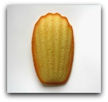
    And I’ve just been dealing here with visual memory, really—and as Proust makes plainly clear (and Borges and other prove), vision isn’t everything.

    ·Posted by :

    ·in:

    —

  • Things That Were But Almost Weren’t, Part II: the Disappearance of Alex Bell

    JF Ptak Science Books LLC Post 10

    Part (A)–Alex Graham Bell as a Purposefully Forgotten Element in the History of the Telephone,
    and
    Part (B)  the Author Who Forgets Bell Fails to See the Future of the Telephone as a Communication Device.

    Blogbell
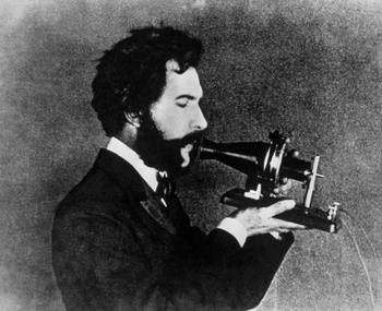
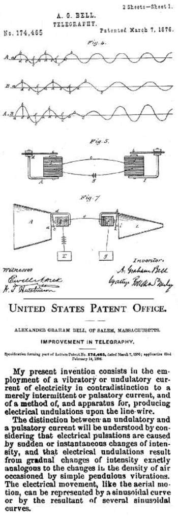
    Well, Alexander Graham Bell didn’t totally disappear in these very early reports on the telephone (published in  the  very influential Nature, an Illustrated Weekly Journal of the Science, London, May and August, 1876), but might as well have.  The author of these two reports, published just on the heals of Bell’s announcement in America in March 1876, was J. Munro and he was not a Bell-believer.  In these two reports Munro champions Elisha Gray   as the inventor of the telephone, and does so with the exclusion of discussing Bell. There are however numerous other references to others working in the field–which was crowded in 1875 and 1876–so at least according to my line of thought the omission of Bell needed to be accomplished with some severe and anti-penetrating thought. 

    Now it must be stated that the history of the patent for the telephone from 1861 to 1876 is indeed complex and trickyBlogbellpatent
    , and there are at least four others who may be considered to have preceded Bell, in some regards that is, but the fact that Bell was granted the patent and that he resisted all claims and attempts at penetration against his patent(s) beginning even within a year of the invention, says something pretty rock-solid about his place in the priority of the invention.  Munro does come around to this , somewhat in his early summation and history of the telephone (Heroes of the Telegraph), but his desire for not-Bell comes through very strongly.  (It should be noted that Sir William Thomson  , who introduced the telephone to Europe in the fall of 1876, thought of it being the most perfect development of the telegraph, a “speaking telegraph” if you will, and hence the name of Munro’s book.) 

    In the second paper (the first appeared 15 May 1876, the second 24 August 1876)  Munro continues on with his appreciation of  the telephone’s musical virtuosity to the exclusion of using the telephone for spoken communication. “There is a possibility here, we must admit, of a curious use of electricity. When we are going to a dancing party there will be no need to provide a musician”, he writes, as the dancers will be able to pay their electrician for the privilege of getting their piano via wire. It is understandable to some degree to appreciate the telephone as a sort of radio, but Thomson had by this time made his report of the spectacular sensation of hearing *spoken words* coming from the telephone and what that experiment meant, and it is hard to understand (even at such great distance and hindsight) how Munro could’ve missed this report from Thomson, and how he could no make the intuitive leap to using the new invention for communication rather than amusement.  I think Munro just plain got it wrong, or got it only partially right, which in this case makes him totally wrong. 

    (I should note here for the sake of clarity that when Thomson heard the spoken words that he missed, or the telephone missed, all of the monosyllables–still, one could assume that improvements would be made and that at some near point they could be understood.)


  • A New Class of Scientific Image? Synesthesia, Francis Galton and Picturing Thought

    JF Ptak Science Books LLC  Post 9

    A Quick Note on an Interesting Image:
    Is this the First Published Illustration of the Mental Imaging of an Active Thought?

    Prestogalton_vis_closeup
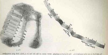
    I was stumbling through my collection of Nature (A Weekly Illustrated Journal of Science, London) magazine when I found a fantastic article by Francis Galton  (“Visualized Numerals”, Thursday, January 15, 1880) concerning (in one aspect)  the mental visualization of the act of doing mathematics. That is to say, what images people formed in their brains as they performed mathematical functions–this was even illustrated (!)

    Fascinating!  Scholars have pointed to this article as perhaps the earliest scientific effort on synesthesia , but what strikes me is how he tried to describe the intimate or logical function with the visualization of the act….I think that is what makes this effort so spectacular.

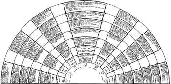
    I’m not associating memory devices (like the memory palaces of Matteo Ricci or Robert Fludd’s spectacular creations from his Ars Memoriae, or the beautiful schematic of Civlio Camillo’s memory theater,  for example which are more (basely speaking) Prestogalton_closeup_2
    visual aids for restructuring already-completed thought patterns) with this question; l I’m not so sure that it applies. These are more issues of phylogenic memory, and concerned with memetics and semitoics rather than the actual formation of an idea.

    People have certainly written on images in the mind before Galton–the question is if anyone has illustrated what they think this process looks like? I’m also not so sure if this directly relates to Aristotle’s elements/colors affirmation or Pythagoras’s numerals and colors or Scriabins music and color associations, or Cardano and his color/flavor and the planets associations….

    Galtoncamillo
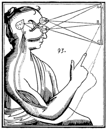
    I guess the question is—where does this image fall in the history of the illustration of abstract thought?  I’m not including famous examples of the physical aspects of sight as with Descartes etc; just the image of what people see in their heads as they are formulating thoughts and ideas.

    We’ll have more later.  I just wanted to put something up here as people have wanted to see the Galton article and Nature (1880) is not a terribly common thing to find. 
    Galtondescartes

    It would also be just plain wrong not to mention two things at this point—the works of Frances Yates , which is a gorgeous and insightful work on memory.  And secondly, I need to acknowledge the work of Barbara Stafford (University of Chicago) who for decades has produced the most beautiful and the most interesting works on what scientific images *are*. 

    ·Posted by :

    ·in: