A Daily History of Holes, Dots, Lines, Science, History, Math, Physics, Art, the Unintentional Absurd, Architecture, Maps, Data Visualization, Blank and Missing Things, and so on. |1.6 million words, 7500 images, 4.9 million hits| Press & appearances in The Times, Le Figaro, Mensa, The Economist, The Guardian, Discovery News, Slate, Le Monde, Sci American Blogs, Le Pont, and many othr places… 5000+ total posts since 2008.

Category: Perception

  • Bubble Aeronautics

    JF Ptak Science Books  Quick Post

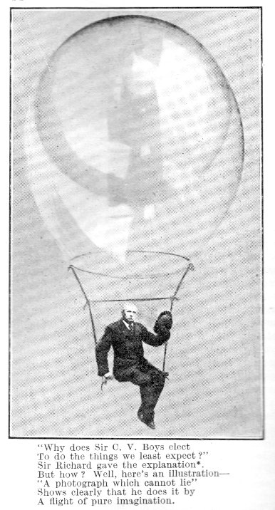
    CV Boys (1855-1944), the great experimentalist and all-around physicist/mechanic, wrote a classic book on bubbles in 1889 that found success and went through several editions—the bubble book not surprisingly was called Soap Bubbles and it was a fascinating journey through the world of bubbles and was they were indeed so fascinating and better called “bubbles” to the popular mind rather than “rotating films”. Late in life (and 53 years after the publication of the book) in the October 17, 1942 edition of the journal Nature Boys writes a funny little note called “A Flight of Pure Imagination” which is illustrated by a photograph Boys’ made in 1912 showing an aeronaut in a gondola of a big bubble balloon. It is a wonderful picture and accompanied by a nice verse about Boys, who for some reason, 30 years later, decided to republish his “permissible diversion”.   

    Boys478

    ·Posted by :

    ·in:


  • Slow Lightning–a Pollockless Event from 1881

    JF Ptak Science Books   Quick Post

    When I saw this letter to the editor of Nature (in the May-October 1881, volume 23, page 284) I thought immediately of Jackson Pollock–but of course he wasn’t even close top being born yet. The boy from Cody, Wyoming was born in 1912, and he went from a Western no-longer-frontier-town to his greatest period of production in about 37 years.  Those three years, from 1948-1950, were like lightning, but slow…like seeing the progression of a lightning strike from the ground up, then replayed again backwards, and then faster.  And with many more than just a single strike.  That isn’t what W.M. Flinders Petrie of Bromley, Kent, was talking about of course–still 25 years and a world removed from non-representational painting–but that is what his title excited in me, here in his future.  In any event, the article is an interesting read, Pollockless and all.   (Another piece of long and interesting reading is found here, with Richard Taylor’s theory on Fractal Expressionism and the fractal dimension of Pollock’s painting.)

    "Having just seen the statement of Prof. Tait (Nature, 
    vol. xxii. p. 341) quoted, as a final authority, against the possi- 
    bility of distinguishing the source from the termination of a 
    lightning flash, I wish to record a storm that I saw. 

    ·Posted by :

    ·in:


  • German Propaganda in Sweden, 1943

    JF Ptak Science Books   Post 2239

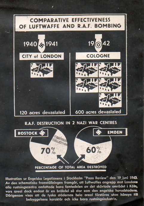
    “Sveriges folk vet inte mycket om alt detta”/Swedish people do not know much about this…” 

    This is an unusual graphic–or at least a graphic display of information found in an unusual location, a publication in Swedish quoting sources from the Free Press from Stockholm (19 June 1943) on the effectiveness of Luftwaffe vs R.A.F. bombing.

    It is supposed to be a graphic proof for the ferociousness of the Allies, published in a pamphlet called Konst i  spillror (roughly, Art and Rubble, or Art in Rubble, something like this) which I believe was a German attempt to win Swedish hearts and minds by displaying the destructive force of teh other side of the war. The subtitle of the pamphlet is on the destruction of European cultural treasures in Antwerp, Nuremberg, Koln, Lubeck, Karlsruhe, Munich…plus bombed cemeteries, schools, hospitals, and so on. The locations are in Germany, mostly, or German-held areas, and decry the barbarity of the war in the hands of the British, Canadians, and Americans.  

    WWII graphic077

    I do not have proof of this as propaganda, but it certainly feels like it.  Sweden was a neutral country during WWII, managing to maintain its neutrality for the entire conflict. There were evidently soem concessions made to both sides–for Germany the major bit seems to have been allowing the German 163rd rail transport across Sweden in the attack on the Soviet Union (which I imagine was an enemy of my enemy move). On the other hand the Swedes accepted Jewish refugees from Norway and accepted all of the Danish Jews who were supposed to be sent to concentration camps.  I can understand the Nazis wanting to try to make inroads into the national psyche, but I have a hard time imagining that this campaign succeeded on any level. 

    My copy is a photographic negative of the original, made during the war, and was once part of the Library of Congress Pamphlet Collection.  As I said, I could be wrong in this interpretation, but I feel fairly confident that it is so.


  • Mental Arithmetic by Sound, Imaginary Symbols, and Smell–1894

    JF Ptak Science Books   Quick Post

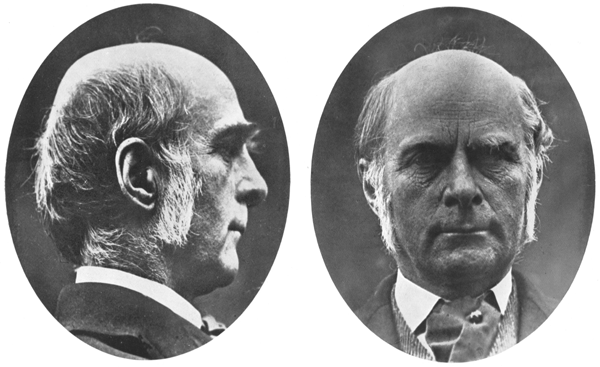
    Crusing through some issues of Nature down in the studio–this is the current  long-lived Nature, though mine are from 1869-1949, so not-so modern–I was working my way through a few issues before all hell breaks loose with the Roentgen publications in late 1895, and found this very interesting article by Francis Galton.  Now Galton was a very interesting man with very advanced interests in many different fields, though he does have some unfortunate bits to his personality and eugenic-based beliefs, so he is an extremely accomplished if not a problematic man. Actually one of my earliest posts on this blog (more than 2,500 posts ago–yes there are only 2147 numbered posts but there are also something like 500 unnumbered “quick posts” as well) was relating another occasion of thumbing my way through another Nature volume, and finding Sir Francis again, though in this one he wrote what may be among the earliest papers on synesthesia (“Visualized Numerals”, 1880, appearing here, with full text). 

    The present Galton (in 15 November 1894) is his review of work done by Alfred Binet, “Psychology of Mental Arithmeticians and Blindfold Chess-Players”, who looked at the extraordinary abilities of  “two groups of remarkable men”, one of which possessed fantastic mental calculating abilities, and the other with the capacity of playing multiple games of chess while blindfolded.  A closer look at the first group revealed two men who relied on quite different benefits: one having a great ability to calculate according to “imagined sounds” and another who “relied on…imagined sounds”, both endowed with considerable numerical abilities as well as memories. 

    Galton reviews a number of calculators and then remarks on experiments he performed on himself, trying to “visualize” a calculating process via olfactory means.   The rest of the story of this fascinating article can be found here.  (Also see–from Galton.org–a bibliography of his journal articles works in psychology.)

    • This is somewhat off the mark, but it may be interesting–given Galton’s olfactory/math experiment–to have a quick look at an earlier post on this blog regarding the first photograph of a smell, here.

    I should say that Galton wrote more for Nature than any other journal, some 115 contributions from 1870-1910.

    See also this take on the Galton from J.M. Stoddart’s The New Science Review, 1894/5:

    ·Posted by :

    ·in:

    —

  • When You Leave out the Detail, Where Does it Go?

    JF Ptak Science Books   Post 2140   Part of the series on the History of Blank, Empty, and Missing Things.


    Follow Me on Pinterest

    When modern art was becoming modern, and artists were reveiling more of nature and life by using less of its components and using more of suggestion and motion and color–leaving out the “detail”–where indeed did that detail, well, go?

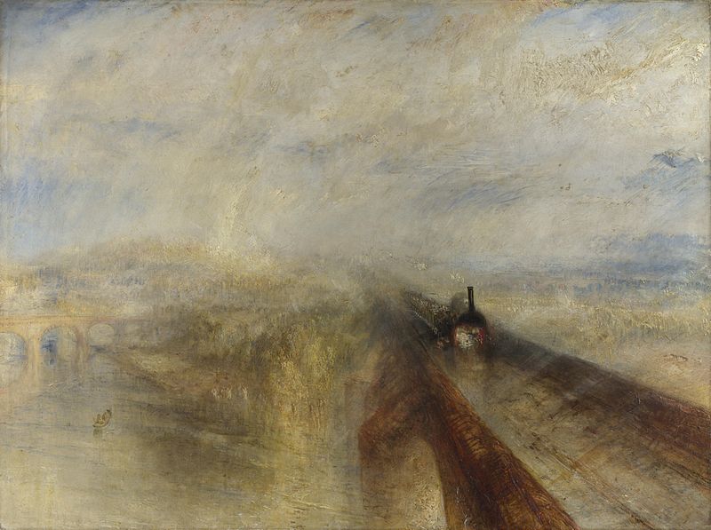
    Detail turnerIt is interesting to imagine a composite world to our’s, a place where that missing and removed detail goes.  For example, when JMW Turner painted a train passing over a river on a bridge, he was more suggestive of the scene than he was in reality-based descriptors.  [Rain, Steam and Speed – The Great Western Railway, 1844.]  The intricacies of realism and reproductional relativity is not there, the action and train and river implied, artistic impressions and whatever else was in the artist’s toolbox or mind’s eye. 

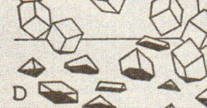
    Perhaps the seeping detail from one world to the next is more like the sphere entering the two-dimensional world of Flatland, or better yet the reverse of Charles Bragdon’s 1drawings of the footprints of 3-D objects passing through a 2-D plane…the detail of the Turner seeping through the canvas and into the opposing DetailWorld, falling like rain. Maybe it is a world of non-representational images and impressions awaiting the attention and arrival of detail to give it all a solid, easily distinguishable representation of the imagined world around the easel in that Other Place.

    Detail bragdon

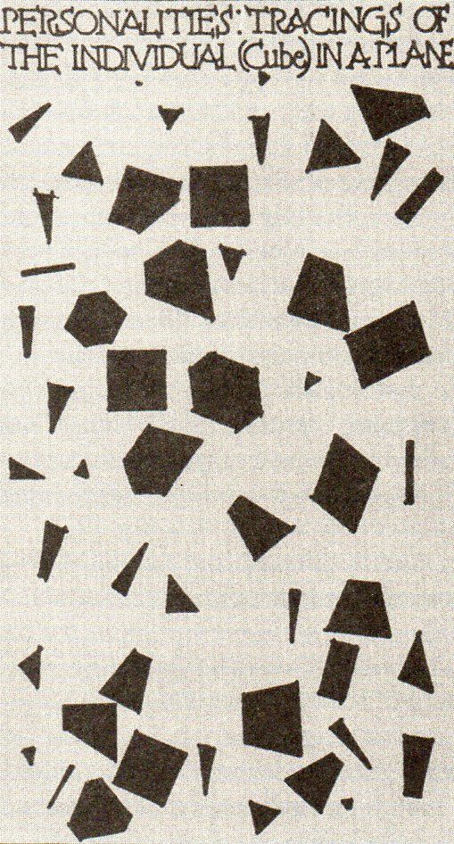
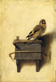
    Another beautiful image by Bragdon is from “Personalities: Tracings of the Individual (Cube) in a Plane” from  Man, the Square2 shows the “shadows” of the three-dimensional figures as they lived in their two-dimensional world.  It comes close to the impact of the cubes above, but really only depicts what two-dimensional creatures would see of the three-dimensional beings inhabiting their Bragdonesque world.  Blog--blagden 1 det349 All of this was put into my mind by seeing this image (The Goldfinch, 16540  by Carel Fabricius.  Clearly we can see a bird on a perch, chained to the upper rung, with another rung below, but as much as we can see  the detail  we don’t.  So much of this image is suggested and implied, hundreds of yers before Impressionism:  the face of the bird is barely there, the second rung dissolves into the wall, the shadows are muted and half-existent, and so on.  The details of the painting are as much missing as they are there.

    Detail fabricius

     And of course the world of detail would disappear more and more, until by 1911, it existed hardly at all, the representational world drifting off the canvas completely, for those who wanted that to be the case. 

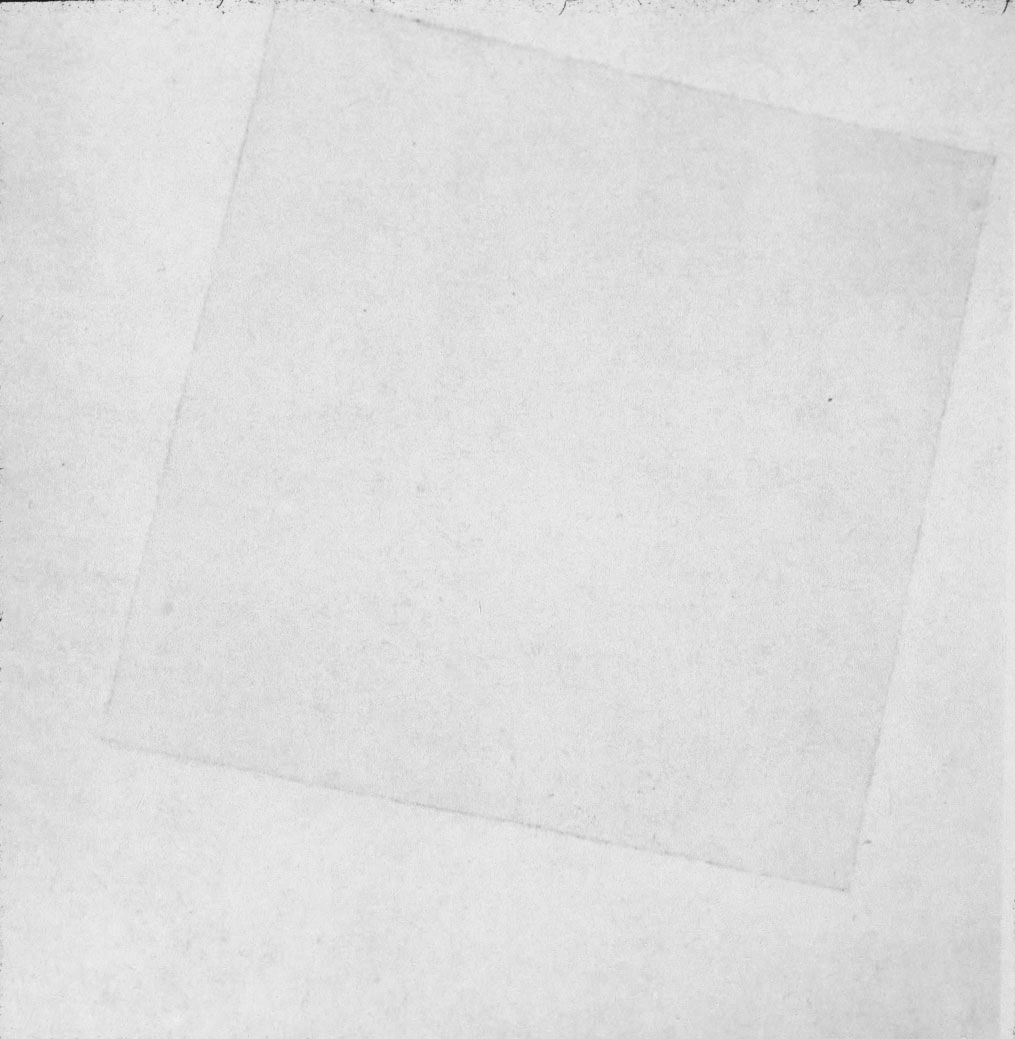
    Again, as much as say Kasimir Malevich made all of the detail go away in his Suprematist paintings like a white square on a white square (White on White, 1917/18, which I can say is not served well at all with images online or in books, as the artwork is really pretty textured and detailed),

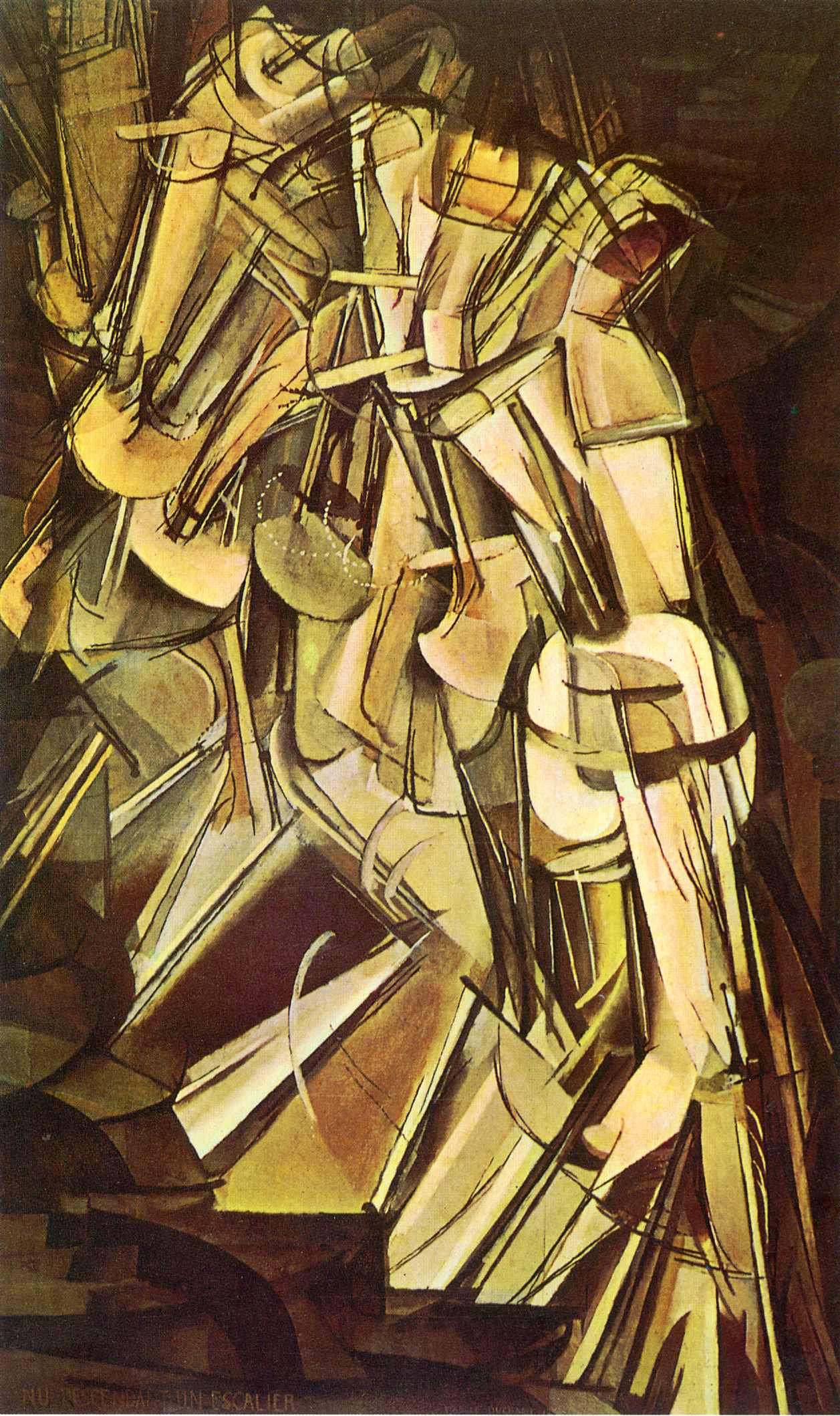
    Detail  white squareat about the same time ither artists like Marcel Duchamp were both taking away details of one sort while adding new details of another never-yet-done sort, as in his Nude Descending (1912), where we begin to see the representation of the fourth dimension in art:

    Detail duchamp

    Perhaps the rain of details into DetailWorld work in reverse for the unexpected details of stuff we can’t see in our world? 

    Well. We know that there is no DetailWorld, but I think it is certainly interesting enough to think of these revolutionary changes in art and trying to imagine the enormous amount of painterly stuff that the innovations/discoveries replaced, if they were to all go to one place.  In a way it is analogous to the changes in the mountain that I can see now from my living room window–mostly it is invisible when the patch of woods between our house and the mountain is all leafed out (seeing the forest for the trees), but with autumn and winter here at about the same time, it is easier to appreciate both the trees that I can see when I can’t, and the mountain that I can’t see sometimes when I can. 

    Notes:

    1.(Bragdon) A PRIMER OF HIGHER SPACE. (The Fourth Dimension). Rochester: Manas Press, 1913. 8vo, (12), 79pp, including 30 plates. 

    2. (Bragdon) MAN THE SQUARE. A Higher Space Parable. Rochester: Manas Press, 1912. 12mo, 34pp, 9 illustrations.  


  • A Note on Graphical Display and a Mechanical Heart, 1876

    JF Ptak Science Books  Post 2138
    Follow Me on Pinterest


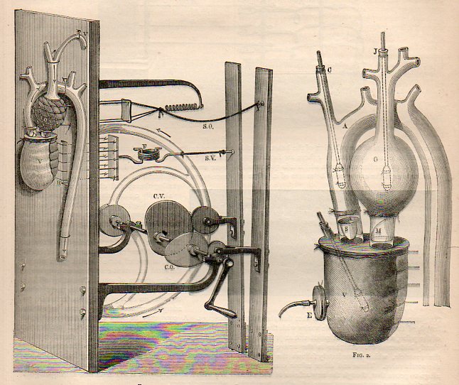
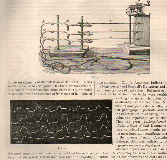
    Marey mechanical heart816

    This quick note comes as the result of a short chase on the detection of the pulse and the ability to determine death–as far back and even before Pliny life was determined by the audible heartbeat, which is where the trouble began, because one can still be very alive with a faint heartbeat. This was a major concern when dealing with folks who were thought to have expired, because in the mid-19th century and before the instruments necessary to make a careful and accurate appraisal of whether the heart was still working were yet finely developed.  Laennec’s stethoscope appeared around 1816, but as much of an improvement as it was this instrument awaited considerable refinements before a truly solid identification of a non-working heart could be established. The gaps in the determination of the arrival of death led to mortuaries where the supposed-dead were left to themselves at room temperature for three days, awaiting the ultimate determination of death which was putrefaction (as in the Munich and Frankfurt Leichenhaus and the Vienna  Zentralfriedhof). Earlier in the history of the determination of death methods were quicker and more brutal (if the patient was still alive) involving bellows-driven tobacco-smoke enema,  as well as tongue pulling and nipple twisting.  (See an earlier post here on the Worst Jobs of the Nineteenth Century for more on this.)

    Marey mechanical heart817

    This led to Etienne Marey (1830-1904), a versatile experimenter and premier instrumentalist who was a scientist, physiologist, and motion-picture/chronographer pioneer, who in the 1880’s created what was essentially the world’s first moving-photographic “slow motion” device. One iteration of Marey’s apparatus was basically a long series of ganged cameras recording a motion for a  simple task at a given time frame and presented on a continuous strip of photographic paper, sort of like a motion picture with the camera speed set at three frames per second. The resulting images were phenomenal and showed people for the first time the exactness of all manners of simple motions–motions that no longer looked so “simple” once all of its aspects could be studied from captured photographic evidence.  Even the act of hopping over a small stool or bending to pick up a bucket of water were enormously revealing in a way like Robert Hooke’s Micrographia displayed the great detail and complexity of the seemingly simple fly.

    Aside fron being one of the founders of cinematography, the other aspect of Marey’s interest in capturing and manipulating time was in medicine, where by the time this article of interest in this post was published in 1876 he had already established himself as one of the greatest cardiovascular physiologists.  What we find in this review in Nature (Thursday, January 6, 1876) of Marey’s Physiologie Experimentale (Paris, 1876) was the editor’s keen interest in the mechanical heart Marey had constructed to show the actions and functions of the heart–the first time, the article notes, that all aspects of the action of the heart were exhibited correctly in one model. 

      Of particular interest was the recording device for the pulse of the heart, which was one in a series of devices such as that improved upon, something Marey himself had done with the first-introduced sphygmograph (“pulse wrtier”) of Karl von Vierdodt in 1854.  The 1875/6 Marey instrument made major advancements in continuous graphical registration in instruments of continuous noninvasive arterial responses.


  • An Interesting Three-Part Perspective, 1560

    JF Ptak Science Books  Quick Post 

    Follow Me on Pinterest


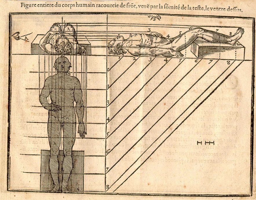
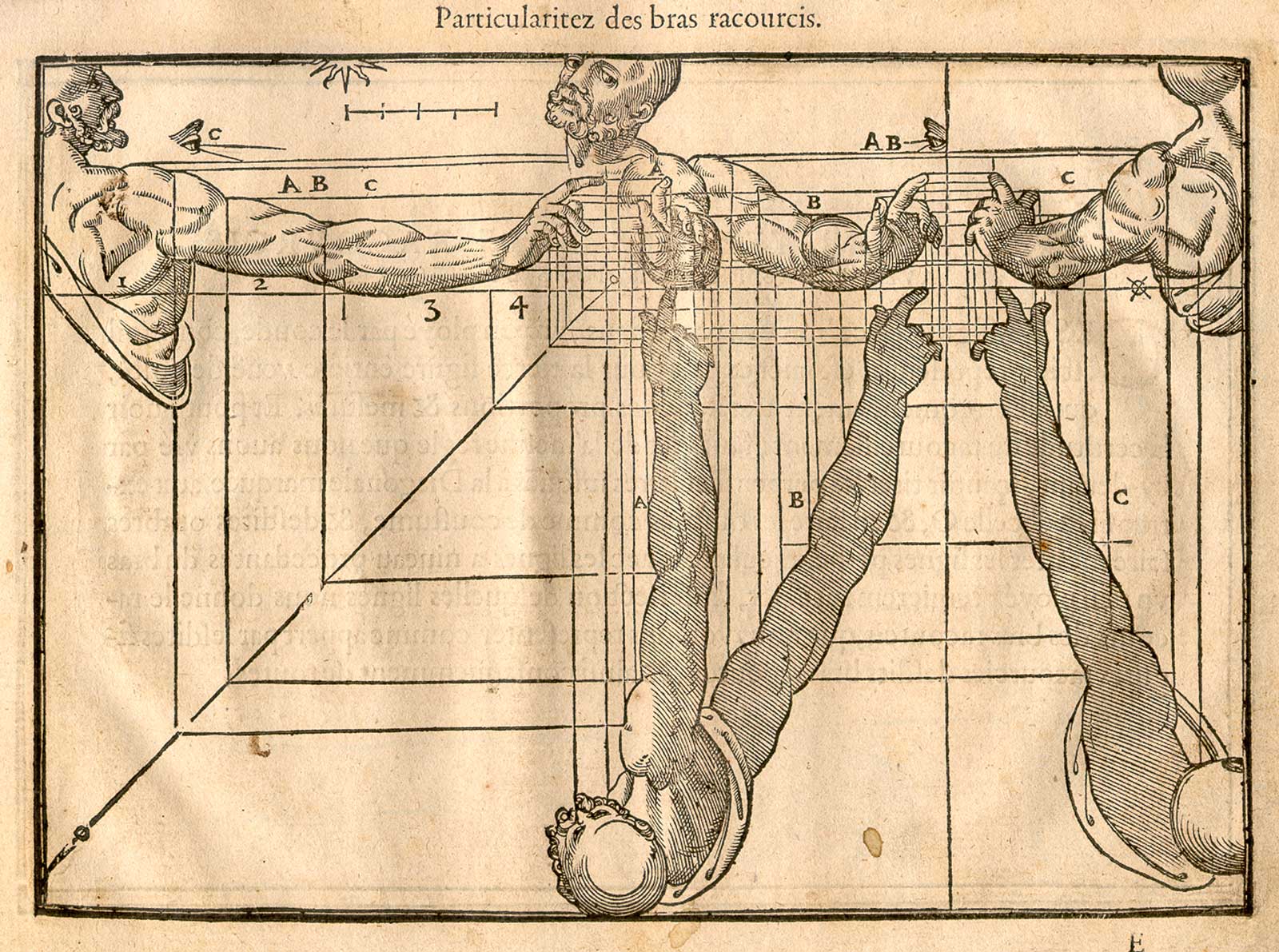
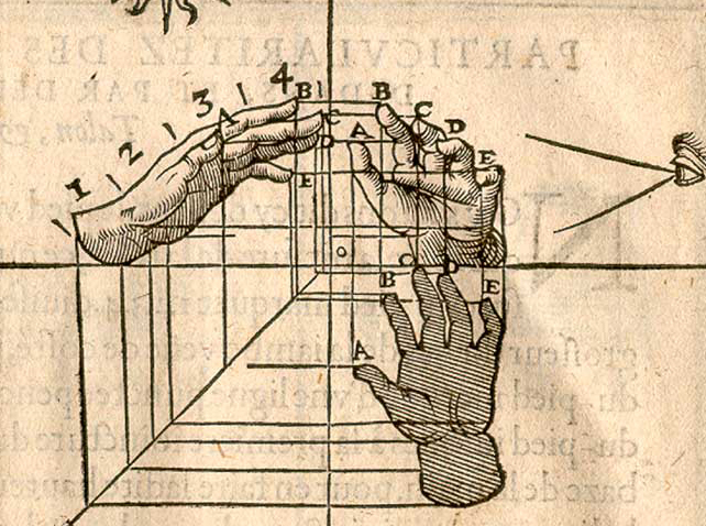
    I’m not sure if I’ve ever seen a 16th century human perspective drawing showing the body in plan and elevation and cross-section.  Jehan cousin the younger (1522-1595, in France), the son of Jean Cousin the Elder (1490-1560), a painter and sculptor, produced such an image in his Livre de Perspective, which was published in 1560. Well, the image definitely was published in 1560, though the artist may have been father and it may have been son–they worked closely together, and the Younger was taught at great length by the Elder, so much so that their work became indistinguishable. Nevertheless, the images I think are quite extraordinary, as we see below: 


    And so by Andreas Mantegna, a classic example:

    The following images come from the 1608 edition of the Cousin Perspective. a number of which are fairly unusual (all from the Library of Congress site, here):

    Cousin_p16

    ·Posted by :

    ·in:

    — —

  • An Interesting 3-Section Perspective, 1560

    JF Ptak Science Books    Post 2069


    Cousin_p09 det
    [Detail from engraving in the seventh image, below]

    I’m not sure if I’ve ever seen a 16th century human perspective drawing showing the body in plan and elevation and cross-section.  Jehan Cousin the Younger (1522-1595, in France), the son of Jean Cousin the Elder 91490-1560), a painter and sculptor, produced such an image in his Livre de Perspective, which was published in 1560. Well, the image definitely was published in 1560, though the artist may have been father and it may have been son–they worked closely together, and the Younger was taught at great length by the Elder, so much so that their work became indistinguishable. Nevertheless, the images I think are quite extraordinary, as we see below: 


    And so by Andreas Mantegna, a classic example:

    The following images come from the 1608 edition of the Cousin Perspective. a number of which are fairly unusual (all from the Library of Congress site, here):

    Cousin_p16


  • Notes on the History of Lines: Sight Lines

    JF Ptak Science Books   Quick Post    History of Lines 

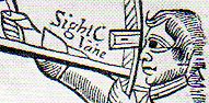
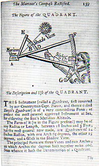
    These are particularly fine and relatively early printed images depicting a specific kind of line of sight–this one, a positioning, rather than a line of sight in fire control, or radial velocity, EM radiation or acoustics wave propagation, or targeting…this instrument was used to establish an imaginary line in perceived objects. 

    Sextant 237This is a detail from Andrew Wakley’s  The mariner’s compass rectified : containing tables, shewing the true hour of the day, the sun being upon any point of the compass ; with the true time of the rising and setting of the sun and stars, and the points of the compass upon which they rise and set … With the description and use of those instruments most in use in the art of navigation. Also a table of the latitudes and longitudes of places, published in 1763 and reprinted many times after that. (Full text is available from Google books and also from the Haithi Trust which offers a text version of the book as well.)

    The full page from which the detail is drawn:

    Sextant 236


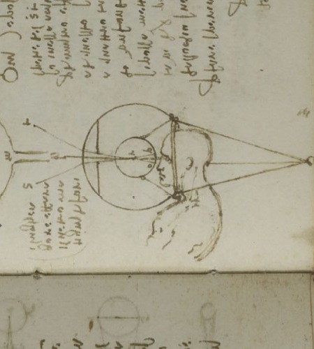
    There is a certain continuum in developing sight lines that comes to mind, as with this famous image drawn by Leonardo in 1508, perhaps the first modern interpretation of how the eye functions, kept privately in manuscript, the result of theory and experimentation:

    Leonardo eye

     Which leads us to the sigh lines of Albrecht Durer, illustrating (some 17 years later) the use of a perspective tool, the vielo, in his work The Drawing Manual published in 1525:

    http://www.oneonta.edu/faculty/farberas/arth/Images/ARTH_214images/Durer/durer_perspnude_large.jpg


  • Dots and Lines in Optical Diversion

    JF Ptak Science Books     Part of the History of Dots series  Post 2007

    Follow Me on Pinterest

    Long is the line in the history of art–far less so the dot. 
     
    Artyping216

    The line has been part of a long and deep inheritance of rendering a truth, factual, perspectival presence–in general, at least. Certain symbolic and metaphoric elements will sometimes confuse and collapse bits of the image, but the effort for centuries has been to present a balanced nature as close as practicable to its perfection.  That was the strength of the line. 

    The strength of the dot was in doing something not quite the opposite but approaching it. 

    It is interesting to think of the importance of dots in the first revolutionary changes in 500 years in the history of art.  Honestly, there wasn’t anything epochal that happened between the re-discovery of perspective (ca. 1330-1400) and the arrival of Impressionism (and just afterwards of non-representational art) in the 1872/3/4-1915 period.  
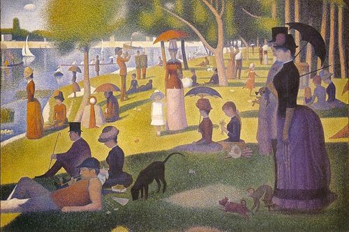
    Suerat Dots aren’t brought to bear formally in the revolutionary movement until the early 1880’s.  Impressionism for all intents and purposes is formed with the Societe Anonyme in 1872 (whose members included Monet, Pissaro, Degas, Sisley, Morisot and eleven others), and perhaps more realistically in 1874 when the Societe exhibited its first salon.  (The first show held at the Nadar Studio in Paris in April 1874; a tiny, one month long affair, compared to mammoth exhibitions like the Universal Exposition in Paris in 1867.) 

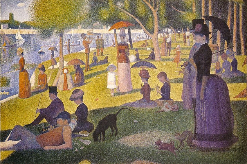
    It was Georges Seurat who brought the whole world to the dot experience with his artistic method of Pointilism, in particular with his magnificent Un dimanche après-midi à l’Île de la Grande Jatte, an enormous work given its composition—dots.  The dots replaced the brushstroke, and their placement in relation to their color was an absolutely brilliant innovation, establishing a perfect result for the viewer when examining the work as a whole.  (It may well be that the French chemist an designer Michel Chevreul made this discovery a few decades earlier, noticing the effect and changes in color depending on placement and—in his case, with fabric—color in the dyes for his material.)

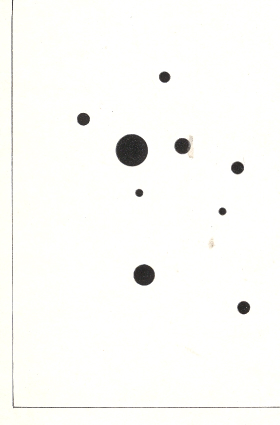
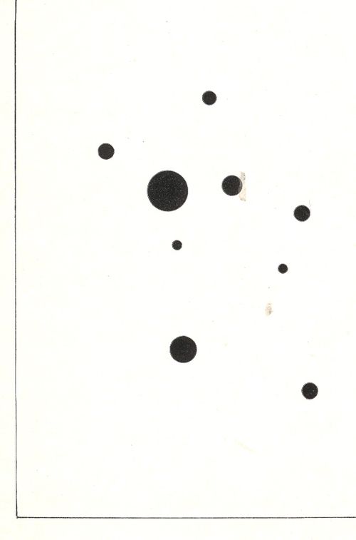
    Wassily Kandinsky (1866-1944), the discoverer of nothingness in art and the introduction of the first BLOG==july 13=kamd non-representational paintings in art history (1913) used his fair share of dots in his exploration of the previously invisible.  One good example is his 9 Points in Ascendance (1918), which is nothing but black dots, an impossible composition just two decades prior to its creation. 
    In the middle of this appeared the half-tone illustration, the great liberator of photographic illustration in popular publication.  Invented in the late 1870’s by Stephen Henry Horgan and used in the Illustrated London News for the first time in 1881, it made the publication of accurate images much feasible and economical.  No longer were readers dependent on the accuracies of artists interpreting photographs or photographed scenes—the photographs themselves were now publishable at little cost and in high quality, vastly increasing the veracity of published reports dependent upon images.  This was revolutionary in its own way, democratizing the sharing of images and icons.


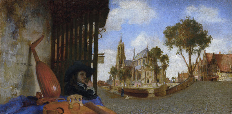
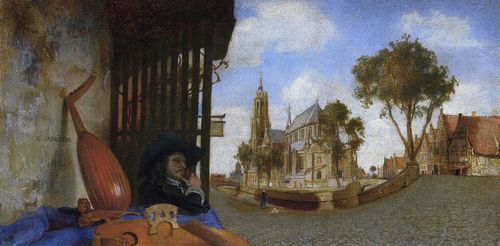
    That said about dots, the line was surely used to transport a bit of reality in art, even before the 18th century–among the earliest appearances being with Hans Holbein in his The Ambassadors of 1533, and a beautiful and very famous use was made by Andrea Pozzo in his illusionistic works at S. Ignazio in Rome in 1685 (and which I mention in an earlier post).  Certainly Carel Fabritius attempted and succeeded in this throughout his career, playing with the substance of perspective, as we can see here in his View in Delft, in 1652:
    Fabritius
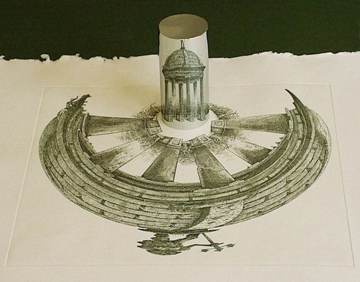
    Also the lines of the anamorphic image severely distorted the presentation of reality–if you had the mirror to distort it and if you had the mirror to reconstitute it:
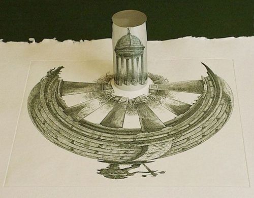
    Anamorphic art
    Source:  Anamorphic Art

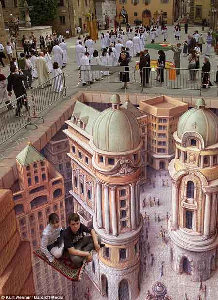
    This example is much more recognizable in widely-circulated images of the modern work of  people like Kurt Wenner, who have continued in the tradition of Leonardo’s researches in the difficulties of wide angle distortion:
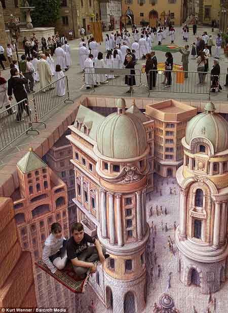
    Anamorphic art b
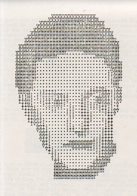
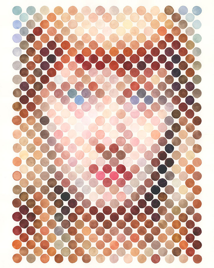
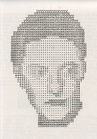
    Seeing this collection of dots in the construction of human faces I was reminded very strongly of the portraits made on the typewriter by Julius Nelson in his work, Artyping, published and sold for a dollar by the Artyping Bureau of Johnstown, Pennsylvania, in 1939 (and pictured first, above).  Nelson was an instructor in “secretarial science” in Windber High School in Pennsylvania and no doubt put together this pamphlet as something expressive of his artform and as an advertisement for his profession.  This was hardly the first time that anyone used the typewriter artistically, as I can recall some measure of artistic expression in type in Punch magazine as far back as 1869, though portraiture by typewriter does not appear to be a very wide section in the art world between those times. In any event, a portrait that he made here is rather close to those presented on the Modern Metropolis site–the “Dot Portraits”  Nathan Manire.
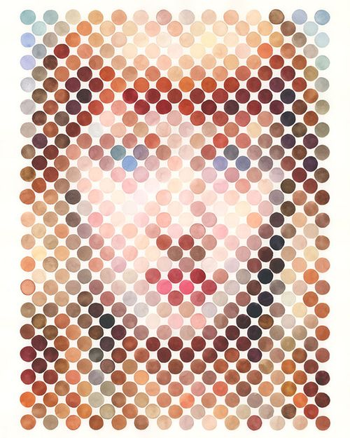
    Dot portraits

     Modern Art would have the final dispositional comment on the typewriter as an instrument of art, when Claes Oldenburg made his Soft Typewriter in 1963:
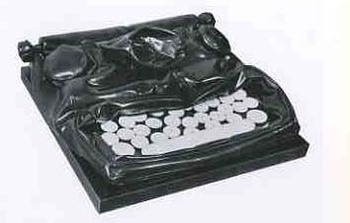
    Blogtypewriter_nwrriter_soft036_2 

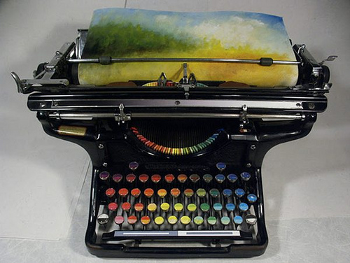
    And then, of course, the magnificent resurrection of the typewriter artform, replacing the spplication of black or red with something a little more complex:
    Typewriter chromatic
    [Source: the chromatic typewriter, by Tyree Callahan, found here  http://www.samanthahahn.com/blog/2012/01/16/chromatic-typewriter/]