A Daily History of Holes, Dots, Lines, Science, History, Math, Physics, Art, the Unintentional Absurd, Architecture, Maps, Data Visualization, Blank and Missing Things, and so on. |1.6 million words, 7500 images, 4.9 million hits| Press & appearances in The Times, Le Figaro, Mensa, The Economist, The Guardian, Discovery News, Slate, Le Monde, Sci American Blogs, Le Pont, and many othr places… 5000+ total posts since 2008.

Category: Perception

  • The Most Beautiful Perspective Drawings of the Baroque?

    JF Ptak Science Books  Quick Post

    Follow Me on Pinterest

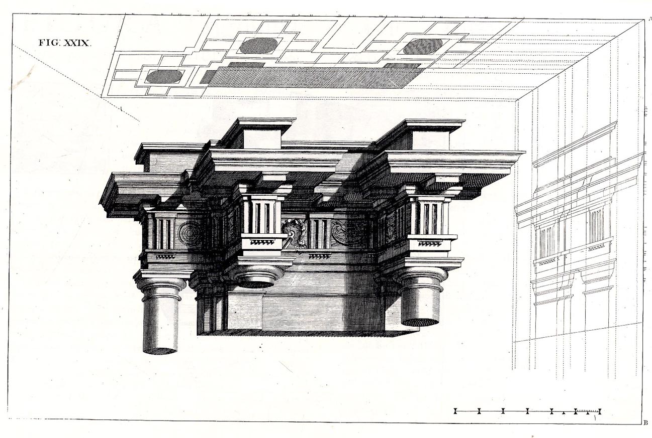
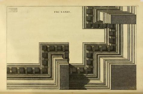
     The fantastic Jesuit Andrea Pozzo published results of his researches on perspective in his Perspectiva pictorum et architectoru (1693),
    explaining how he was able to compellingly, unbelievably  represent
    three-dimensional images on two-dimensional spaces, this image showing
    plan and projection and profile, effectively giving you a
    three-dimensional cross section of the architectural element…and having them seemingly float in space. His work is just absolutely gorgeous. 

    Pozzo 7


    Pozo
    Pozo 2


  • Marble Clouds and their Emotional Shadows: Cloud Geometries in Art

    JF Ptak Science Books   Post 1942 (Part I)
    Follow Me on Pinterest

    I silently laugh at my own cenotaph 
    	And out of the caverns of rain..  Percy B. Shelley, "The Cloud", 1820
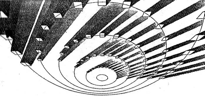
    [John Ruskin, Cloud Perspectival, 1860. Source for all Ruskin images:  “Cloud Studies: The Visible Invisible”,
    by Mary Jacobus, here.]

    John Ruskin (1819-1900) was still a very young man when he published the start of a series of works in art criticism, Modern Painters, in 18431.  To refer to it as a great work in critical theory is painting the work with a narrow brush, though–it had a very sweeping overall effect, and addressed all manner of issues integral to art, and was a developing vision of what art was looking at in the 19th century.  Ostensibly it began as a defense of the work of J.M.W. Turner and the way in which that man represented nature in his pre-Impressionist, pre-Expressionist work. Ruskin makes the case that the works that were so grating part of the art world i the 1830’s were highly consistent with centuries of representing nature in art–and not only that, but presenting evidence that turner did so like no other artist in history.  Ruskin would weave further volumes of Modern Painters through the body of his other work for the next 17 years, publishing the last installment in a fifth volume in 1860.

    Turner (1775-1851) was a great Romantic and a lot of that work tends towards a very full and very early expression of Impressionism and Expressionism, something that not everyone was ready for in the first quarter of the 19th century. This is particularly so in his paintings of clouds, and even more so in cloud/ocean interaction.  They are sweeping and breath-taking and very emotional works, in some ways like the late string quartets of Beethoven–powerful, provocative, internal dialogs of the deep power of nature. He must stand with John Constable as the Cloud Man of the 19th Century, or perhaps Constable stands with him.  They both in a way stand with Luke Howard, the scientist who was really the first classifier of clouds–an undertaking which in some impossible way escaped the recognition of the greatest classifiers it he history of science–and who did so in a paper in 1802, written at a time when Constable and Turner were both young artists.

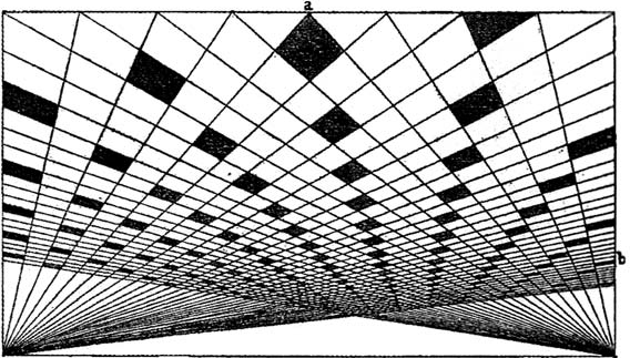
    Turner and Constable both painted clouds like perhaps no others before them; and Ruskin, in his deep appreciation for the importance of the representation of nature int he art, also made a contribution to the understanding of clouds that was of an extraordinary nature. In the fifth volume of his Modern Painters Ruskin attempts a perspective study of clouds, and may have been about the first to do so. The illustrations of this effort I think are incredible, and remind me very much of installing a sort of rigidity to clouds, a cloud geometry, veritable studies of stones and blocks in the sky.  The imaging part of this exercise must have been an enormous thing back there in 1860, to think of clouds in a perspectival way, floating very large geometric objects in the sky. The astonishing results are seen (above) and following:
     And this:
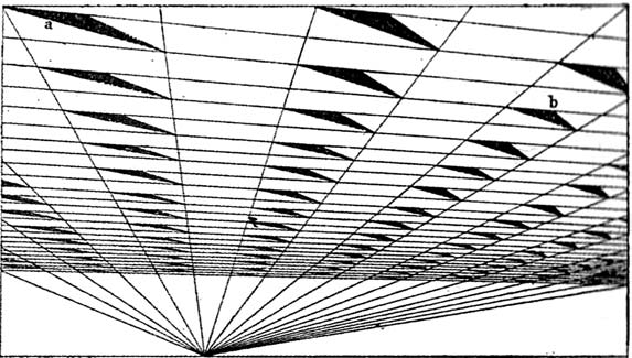
    [John Ruskin, Cloud Perspective: Curvilinear., Modern Painters, Vol. V, Plate LXV.]

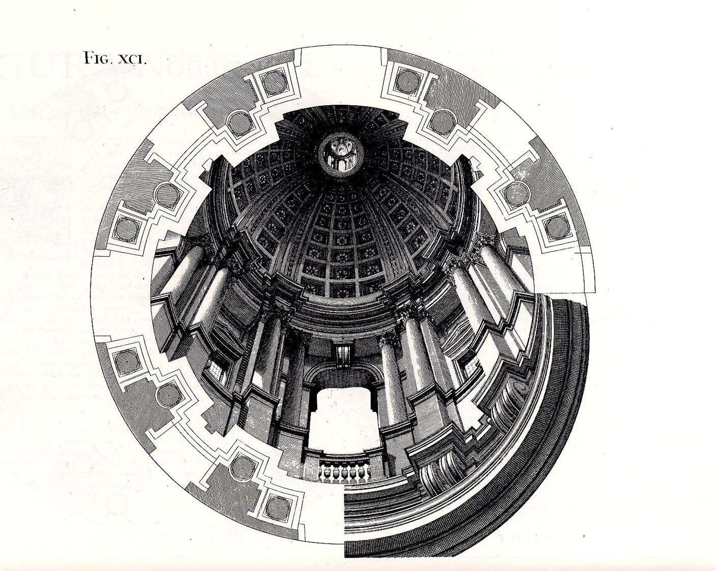
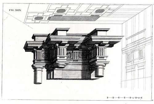
     In a way the first image reminds me of Andrea Pozzo’s work in his monumental   Rules and
    examples of perspective proper for painters and architects
    (1693):
     
    Pozo

    but really more in the way that Pozzo’s work seems to be elevated and floating in a heavy perspectivist space, bigger and blockier sky-borne marble than with ruskin.  But still, the disembodied floatiness of the Pozzo work is ethereal.

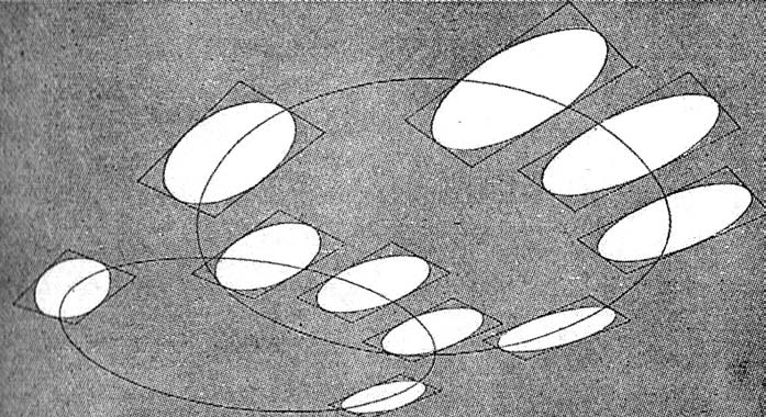
    Ruskin does round out his blocky and beautiful geometry, which definitely reminds me of work w=that would appear 90 years later:  Ruskin, again:
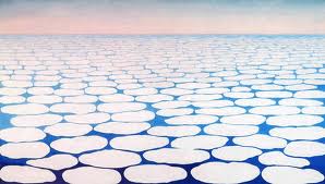
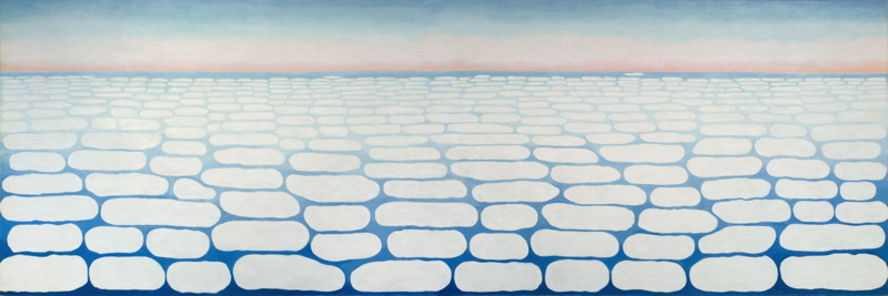
    And  Georgia O’Keefe’s Clouds III (1963), though her clouds tend towards a more rigid geometry in Clouds IV (1965, following):
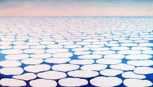
    Clouds O'KeefeO’Keefe, Clouds Above the Sky III, 1963
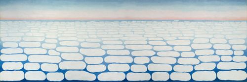
    Clouds okeefe sky above iv 1965O’Keefe, Clouds Above the Sky IV, 1965

    Ms. Georgia is definitely seeing her clouds with different eyes than Ruskin, and they are entirely different creatures–but still, the two come together in my head as relatives. The clouds, I mean.

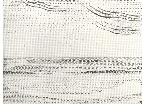
    I started looking around for early hard-line cloud geometries and thus far I haven’t found very much, though there is a tremendous example by Henry Van de Velde’s (1863-1957) “Sun at Ocean (Rhythmic Synthesis”) which I found in  Werner Hoffman’s Turning Points in Twentieth century Art, 1890-1917 and which was executed in 1888/9, looks to me to be absolutely incredible for its time, a nearly non-representational, proto-abstract something, done three decades before these genres came into being.
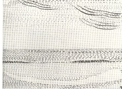
    Clouds van de velde
    I don;t know where the designer Van de Velde fits in the early history of non-representational art, but his effort in the second to last decade of the 19th century certainly seems to be very unusual for its time, and a good example of creative cloud representation. 

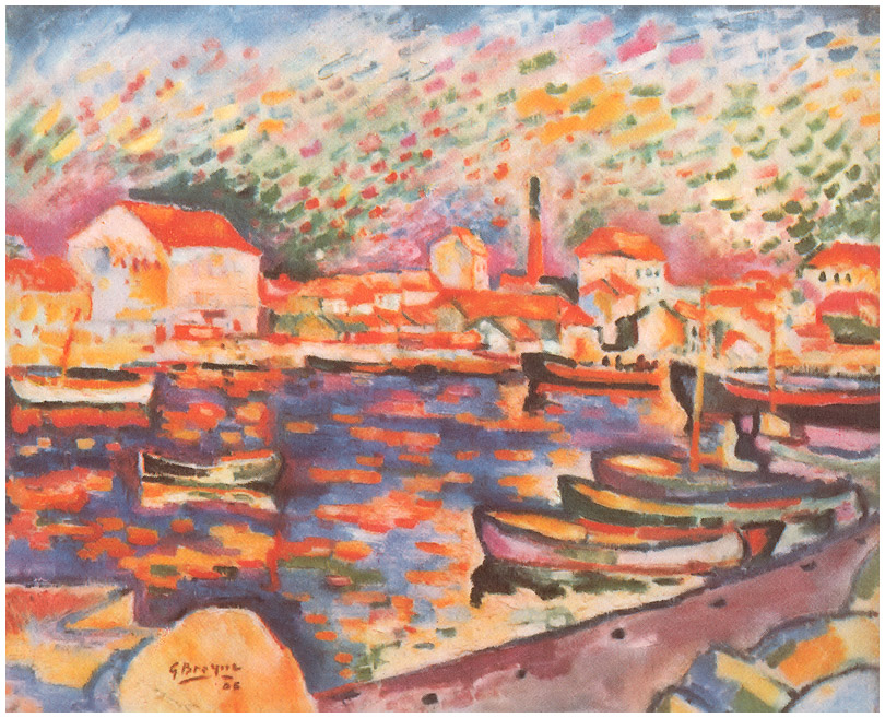
    Non-standard cloud imagery is much easier to finding the 20th century, like those of Georges Braque in his La Ciotat Harbor (1906):
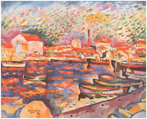
    Clouds braque
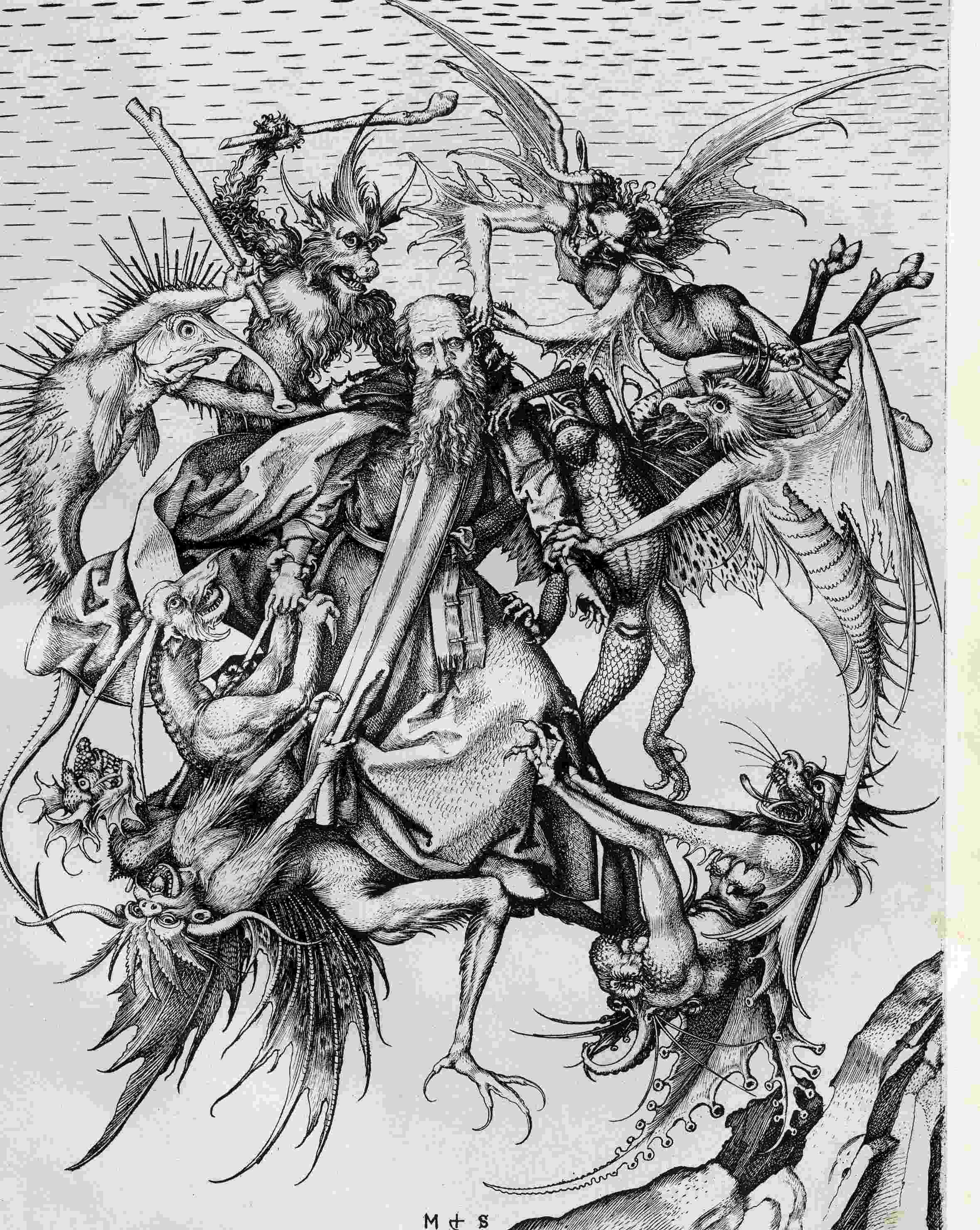
    Even this starts to have the look of something earlier, particularly if you turned the clouds-in-art clock way back, say, into the Renaissance. For example Martin Schoengauer‘s spectacular  The Temptation of St. Anthony, which was printed in 1470/5, has
    a beautiful, fluid circularity to it, full of an earthy roundness even
    as the saint is pursued by demons.  But the sky in the background is
    populated with nothing but dashes to suggest clouds, and which also starts to look something like the Fauvist and Expressionist works to come, 400/500 years later.
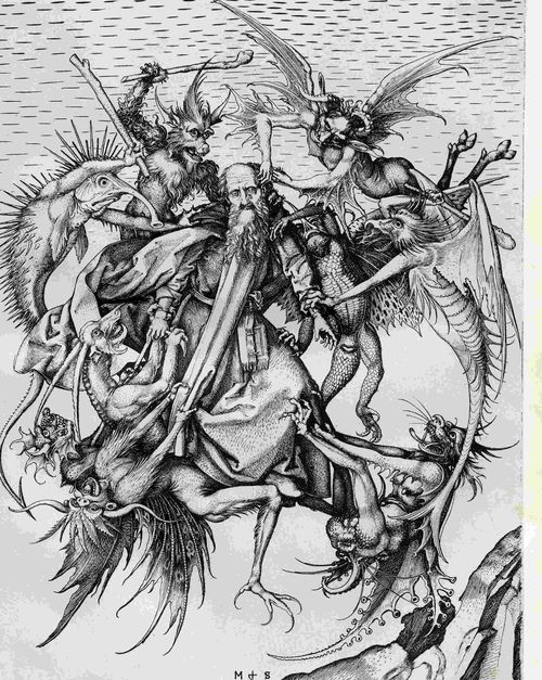
    Clouds schoengauer

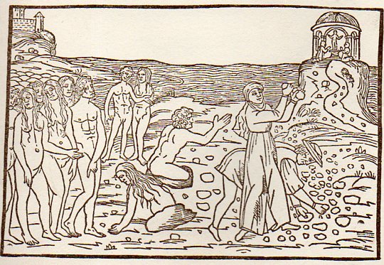
    (There are many examples of the sky being simply not represented at all, particularly in woodblock,

    like this image from Ovid (Accipe Studiose Lector P. Ouidij Metamorphosin...printed in Venice in 1509:
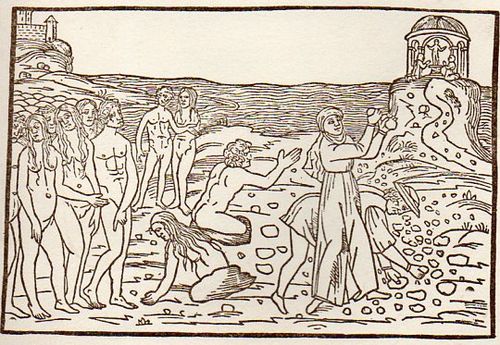
    Clouds no couds livy913

    “You could not see a cloud, because
    No cloud was in the sky:
    No birds were flying overhead —
    There were no birds to fly”.–Lewis Carroll, Through the Looking Glass.

    There are many non-sky images like this.

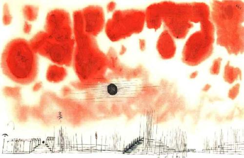
    Another interesting modern example is this Paul Klee (though it comes fairly late in that career, in 1940):
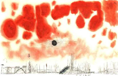
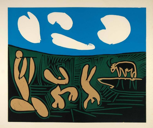
    Clouds Paul Klee 1940And an example from the ubiquitous Picasso, still later, in 1962:
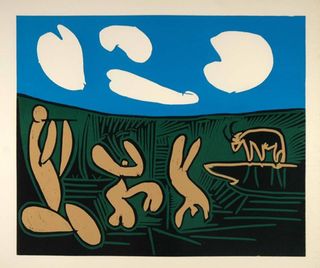
    Clouds Picasso

    But earlier images are harder to locate.  The obvious early-ish source (though still much later in the century) would be Van Gogh (say, with Starry Night) and Monet, though the fractalesque Van Gogh gets much closer to the re-interperative power of the Ruskin images than the reflected impressionist beauty of the Monet.

    Clouds Monet
    On a cursory look around the antiquarian painterly sky-world, it is becoming obvious that the cloud geometries of Ruskin are very uncommon. 

    Notes

    1.  For full text of Ruskin’s  Modern Painters , see  (1873)volume 5 for (1860) and  (1873)

  • What the Eye of God Sees: Gassendi’s Vision, 1658

    JF Ptak Science Books   Post 1938
    Follow Me on Pinterest


    Gasseni eye of god det_edited-1
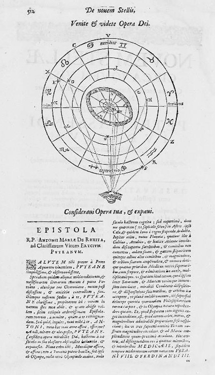
    Pierre Gassendi (1592-1655) published this God’s-eye-view of creation a few years after his death in the fourth volume (Astronomica) of his six-volume Opera Omina.  His friends and supporters of course saw to the publication of this mathematician/philosopher/logician’s work1 back there in 1658, so Gassendi–a very prominent thinker from a long-line of thinkers nearly on the verge of great discovery here and there and certainly a witness to it–made his greatest adventure in publishing only in death. 

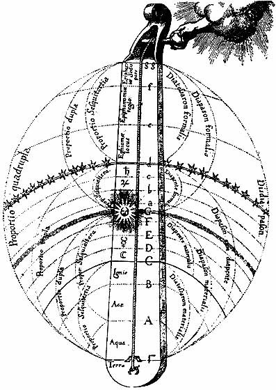
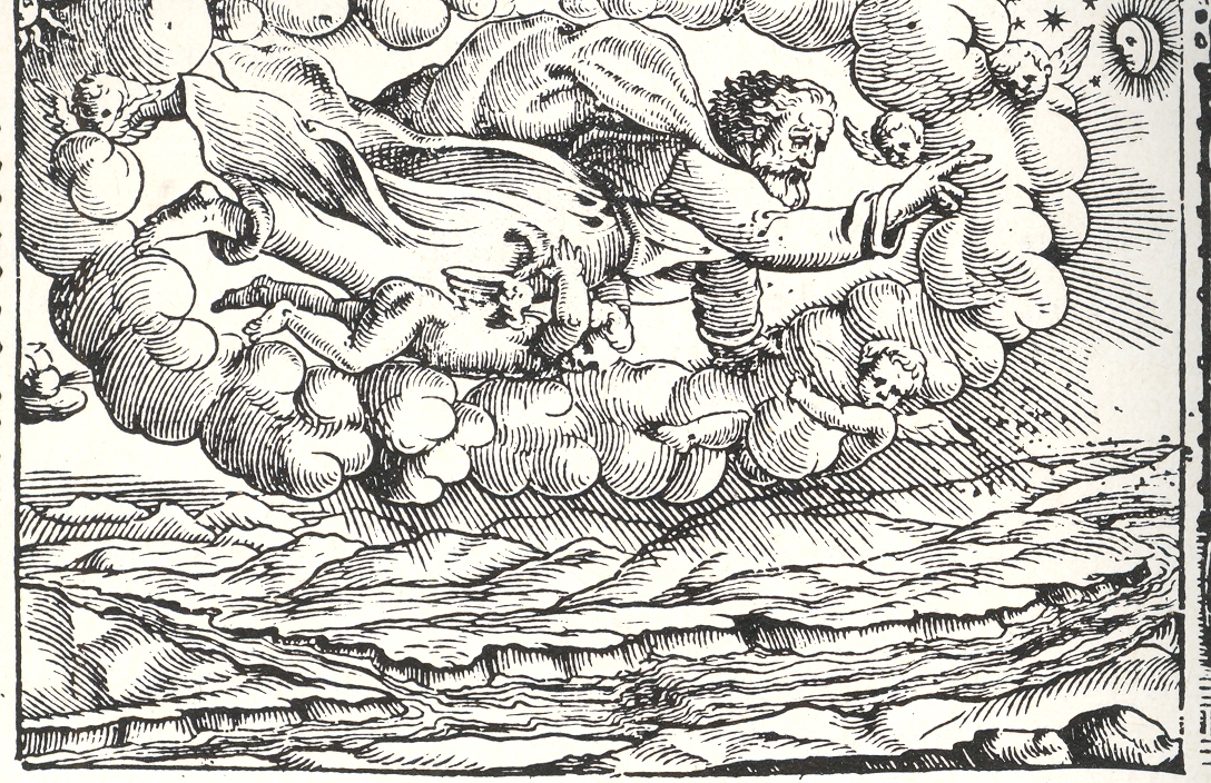
    Imaging a physical god is a tricky business in the history of the printed book. Bits of the creator of the universe turn up in book illustrations over hundreds of years, though I am not sure when the very first picture of a part of god appears.  The hand of the creator (generally seen as the Primum Mobile) is not terribly uncommon in images of a scientific nature in the 17th and 18th centuries, and is perhaps best exemplified by Robert Fludd’s famous Monochord:

    Robert fludd celestialOf course there are many instance of the full-bodied god being seen through a break in the clouds, though in all the instances of this that I have seen the tantalizing peak into whatever region it is that this god exists is left entirely blank, a small white space. As so:

    God in the sky

    (Title page is for the narrative poem Le Metamorfosi, Ovid’s  Metamorphoses,
    translated into Italian by Gioseppe Horologgi, and published in Venice in 1563. See an earlier post on this blog, A History of Blank and Empty Things: God in a Hole in the Sky, here.)

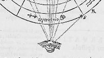
     The eye of god is also not very uncommon, and is represented by an eye and also in a sacred triangle.  Less common though are images like Gassendi’s, which in a way, in an odd and almost offhand way, give the reader a sense of what it is that god might be seeing in  agodly-lineof-sight  Perhaps this is incorrect–but in judging his image with others in my experience it seems to me that the representation is a little more “personalized” here than just about anywhere else.

    Gasseni eye of god

    Notes:


  • The Theatre of the Infinite Horizon

    JF Ptak  Science Books   Post 1937

    Follow Me on Pinterest

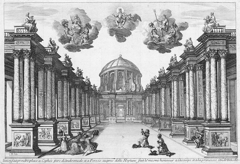
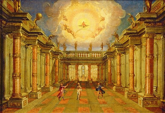
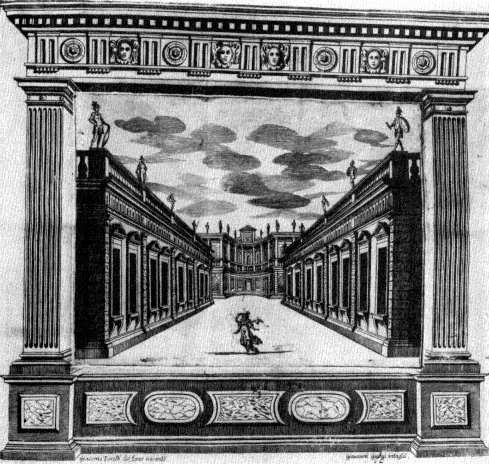
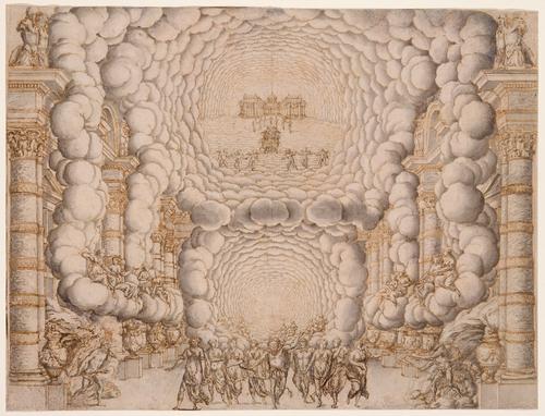
    I am hardly an historian of the theatre (and having said that will give me a chance to make some mistakes in what I am about to say) but so many of the stage designs of  Giacomo Torelli look to be concentrated at an infinite horizon that I wanted to collect a few of them in one place.  Torelli (1608-1678) was an artist and artistic-technician who brought engineering skills to the stage, and was evidently a much-sought-after designer, given his very special

    Theatre perspective-Torelli

    [Image source: WIki, here.] Set design for Act 5 of Pierre Corneille’s Andromède as first performed on 1 February 1650 by the Troupe Royale at the Petit-Bourbon in Paris.]

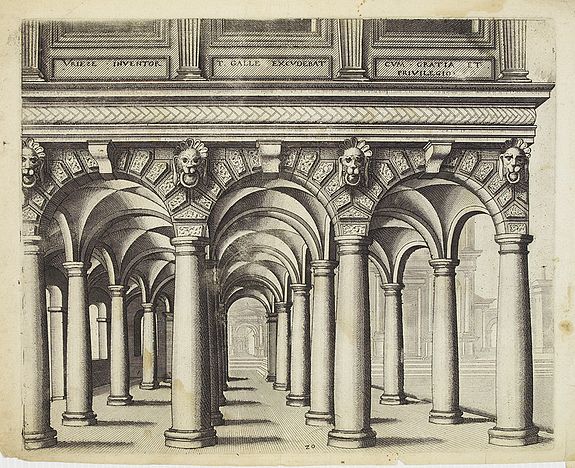
    I do have to say that the Torelli puts me in mind of the perspective king of 17th c Continental architecture, Vriedman de Vries  (1527 – c. 1607), especially with the columns (from his Architectura, 1633):


    Vriedman de Vries[Source: Swaen.com]

    talents and innovations.  He was absolutely interested in one-point perspective and the techniques used to gather the audience’s vision and suck it all into the low-center of the back of the stage, giving the production a fabulous quality of depth and distance. (He also provided the ingenuity and gearwork for quick changes of massive scenery by one stagehand, working under the stage with pulleys and winches, hauling large elements on and off stage during a performance.  His work can be seen in the iconic Encyclopedie of Denis Diderot in a section for “Machines du theatre” in 1772.)

    The other thing that strikes me immediately with these images is their absolute usefulness in toy paper theatre. By making eight copies of the first image (above) and by cutting out each seven layers of columns (the opening space between the two sides becoming progressively smaller), and then the last  and eight level of the mansion in the background and then standing them up and placing them all-in-a-row with an inch between them (accordion style), one could make a lovely 3-dimensional miniature stage.  (Scene changes would be an entirely different matter.)

    [Source: see note #1, below]

    Torelli 2

    [Source: Copia-di-Arte.com, here.]  

    Torelli 3

    [Source: Publishing.cdlib.org, Operain Seventeenth Century Venice, the Creation of a Genre, by Ellen Rosand.]

    Torelli 4

    [Francesco Buti/Isaac de Benserade, “Les Noces de Pelée et de Thetis”; Source:  Oesterreichisches Theatre Museum,  here]

    Notes:

    1. Bryan, Michael| (1889). Dictionary of Painters and Engravers, Biographical and Critical. Volume II : L-Z,
    new edition, revised and enlarged, edited by Walter Armstrong &
    Robert Edmund Graves. Covent Garden, London: George Bell and Sons


  • The Visual Genetics of Color and an Unintentional Pre-Modernist Masterpiece

    JF Ptak Science Books Post 1282–continued, & now with the Full Text book!

    Follow Me on Pinterest

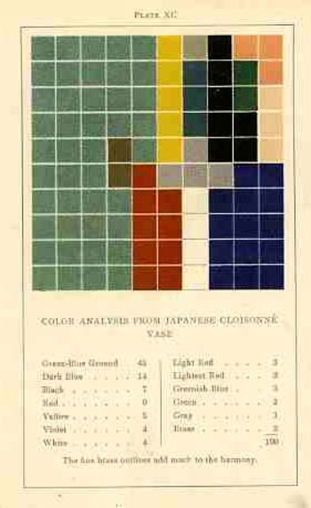
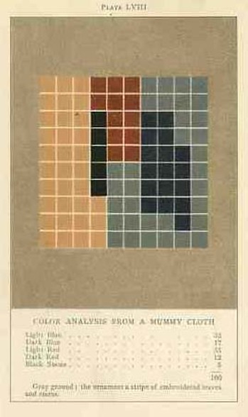
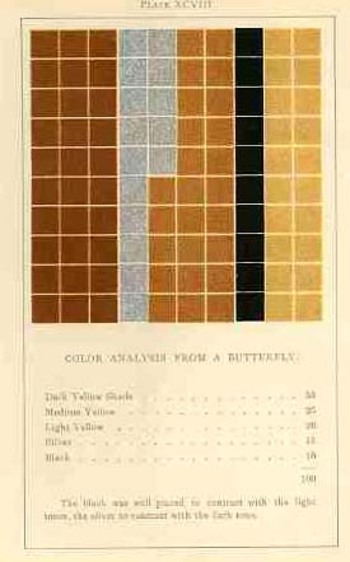
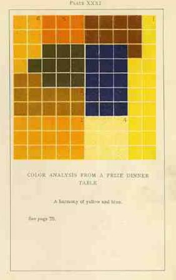
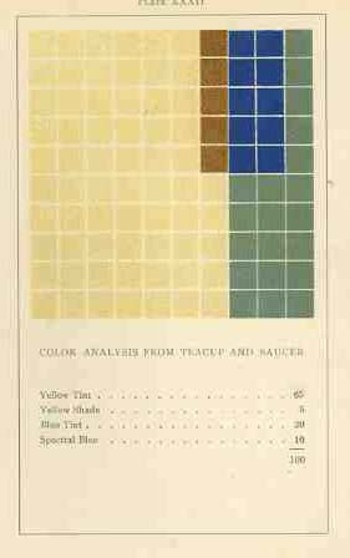
    [Earlier in this blog, about 1200 posts ago, a million words ago, I wrote about an extraordinary book by an aesthetician named Emily Vanderpoel.  It is “extraordinary” in a narrower sense, and that “extraordinary” might not actually be positive for its original intent.  The extra-intent of the book, what has come out of it for me, was something that was unintentionally accomplished by the author.  The images that she used to illustrate her color theory ideas–the basis of which are not really comprehensible to me–turn out to be artwork in themselves, a found art, the artistry of the images taking over the original intention for the arrangement of their color.  I’ve found the book now at the Internet Archive in all of its glory, and downloaded only 150 times.  I’m still at a loss to know why this work hasn’t received more attention

    The idea of how we put parameters to something like the visual field is a gargantuan topic—it is something that architects and geometers and physicists and mathematicians (in general) have dealt with forever.

    The full text is available HERE via Internet Archive.

    Blogcolorvander_2poel_063
      Mapmakers have perhaps the most visualized aspect of this on paper, performing the semi-miracle of translating three dimensions into two; physicists have a more difficult time, taking the opposite approach, sort of , and translating two or three dimensional space into x-number of dimensions.  Anatomists had a difficult time of their subject until relatively recently in human history, what with the sublime religious curfews on messy knowledge and all coming into play, poking around into the heart and such as though it was an affront to the sanctity of the creator (M Servetus’ ideas on the circulation of the blood via the heart, making the heart a tool and not the brain or some odd conjunction of creative divine power, cost him his life, burning slowly alive at the stake…how mysterious the whole world of RNA Genotype-Phenotype Mapping and such would seem to him if he could have a peek into the future/present from wherever he is.)
    Blogcolorvanderpoel_062

    Color theory is old and pretty—as a matter of fact there is a very attractive gathering of color theory models (in black and white, though) displaying some two dozen or more color models from the last 400 years.  People like Della Porta (1593), our old friend and resident oddball polymath crank Kircher (1646), the smarter-than-you-could-imagine Newton (1660), Waller (1686), Lambert (1772), the wide ranging and again polymathic Goethe (1792), Herschel (1817, who also ushered in our understanding of the other light-sensitive shape spacing medium of photography in 1840), the semi-forgotten Chevreul (1835), the beautiful Maxwell (1857), Wundt (1874, the early experimental psychologist who also looked for spirits/spiritmus and ghosts), von Bezold (1878), Rood (1879), Munsell (1918) Kandinsky (1914 and not decipherable by me) and Klee (1924), and so on towards the present, all tried to analyze the prospects of color.

    Not in this list is the very highly problematic Emily Vanderpoel, who in 1901 and 1903 produced (in two editions) a lovely but mysterious book called Color Problems for the Layman, in which she sought not so much to analyze the components of color itself, but rather to quantify the overall interpretative effect of color on the imagination.  I know this sounds begging and vague, but I really haven’t been able to make much headway in the work.

    Blogvanderpoel_1057
    I’m attracted to this effort because of its attempt at quantifying such abstract thoughts.

    By virtue of this effort, though, Vanderpoel had produced a strikingly illustrated book, with 118 color plates, all very intense, and beautiful, and in its way exceptional—unique for it time perhaps.  Had the book been written thirty years or so hence we’d call it some sort of constructivist/constructionist artform.  But since the artwork in the book comes a decade before the first non-representational artwork in human history (or so), I don’t know exactly what to call it. 
    Blogvanderpoel_2058

    I really don’t know what it is, but I know that it is not entirely accidental, this pre-non-representational artform, because controlled geometrical color art is not accidental. 

    In trying to quantify the color images of the objects in her study, Vanderpoel establishes a 10×10 square grid, dividing all of the color in that object into individual units numbering to 100.  Then, somehow, she identifies the major colors and places them according to a system that I cannot understand within the grid.

    Blogvanderpoel_3059

    The net effect is glorious.  I just don’t know how she got there—which isn’t normally a consideration in art, except that this work is an instructional on how to understand color in art and nature, and the explanation of the procedure is ethereal.  Vanderpoel was and remains a respected author on porcelains and other applied and plastic arts.  In this work she looked at her fair share of porcelain, limogues, clay pots, burial urns, glass shards, and the like; she also analyzed clouds, mummy cloths (and casings), dew on morning grass, brocade, the eye of a blue jay, feathers, and another hundred or so poetic arragenments of the stuff of teh world.  I still do not know what this book is trying to tell me, but I do know that it is remarkable.   


  • Inside Looking Out, Part II: From Inside the Eye, Nostril and NYC.

    JF Ptak Science Books  [Extending Post 1813]

    Machbook

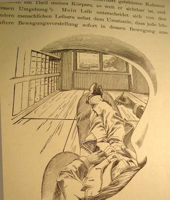
    I cannot think of another illustration by a scientist or philosopher who attempts to explain their own, literal, view of the world and then offer what this looks like to the reader from inside his own head, looking out through his own eye.  That’s exactly what Ernst Mach is doing right here on page 15 of his influential book Die Analyse der Empfindungen,  the fourth German edition (“The Analysis of Sensations and the Relation of the Physical to the Psychical”, published in Jena in 1903).

    There is nothing in this world for Mach that is not admissible to the human brain that is not empirically verifiable–that is, the world is nothing but awash in sensation and that sensation itself forms part of the experience of, well, experience. I’ve actually never been interested in the philosophy of science, and this is one of the reasons why.  Nevertheless I boldly break through my own prejudices to enjoy this phenomenally original image, drawn from the inside of Mach’s working mind, looking out through his eye socket, over his mustache, under his eyebrow, around his nose, out across his body and then leaping into the rest of the world.  I think he does make his point about the essential.

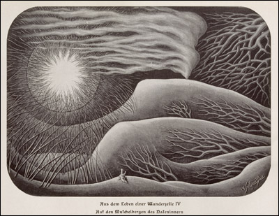
    Another interesting perspective is achieved by the one-and-only Fritz Kahn in 1926 with his imagery of viewing the world from deep within a human nostril. 

    Kahn, fritz nostrill
    This is a different sort of interpretation (from his Das Leben des Menschen/”The Life of Man”, printed in Stuttgart in 1931, volume 5, and found at the National Library of Medicine site section “Dream Anatomies” here https://www.nlm.nih.gov/dreamanatomy/da_g_IV-A-06.html) from the Machian view,  Dr. Kahn’s (1888-1968, a gynecologist and a renowned popular science communicator) being more of a landscape with the solar apogee of the nostril opening to the outside world. 

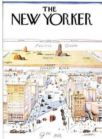
    Steinberg_352

    And similar in a way to the Mach’s internal view of the outside world is this classic Saul Steinberg New Yorker cartoon of the world view of the New Yorker (and of course this includes only Manhattan). I know some number of people who have transposed their bodies much like Herr Mach into the Steinberg map–except that their worldview ends basically at the Hudson River (Mach’s feet) with the rest of the world being the sliver out there beyond the river (Mach’s window) until you go 359 degrees around the world to get back to the East River (and back inside Mach’s noggin).  It is an unusual world view to have, but someone has to have it so that we can at least identify it so. 

    I just like the picture. 

    Notes 


  • Roentgen, Marey, & Malevich on the Edge of Modernity

    JF Ptak Science Books   Post 1924


    Pleasant_1bertha
    The 1895/1896 issues of Nature magazine are compliantly normal until the first weeks of
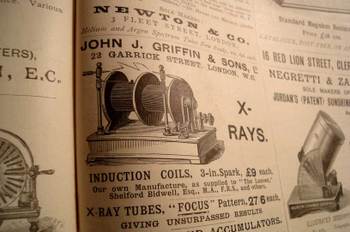
    1896 when the first of a flood of articles is published about the astonishing discovery of 50-year-old Wilhelm Conrad Röntgen. The English-language popular science journal announcement of his December 28, 1895  “Ueber eine neue Art von Strahlen” (“On a New Type of Ray”), appeared on 16 January 1896, and began the introduction of a new state of human experience.  Roentgen’s experiments—built upon the work of J. Plucker (1801-1868), J. W. Hittorf (1824-1914), C. F. Varley (1828-1883), E. Goldstein (1850-1931), Sir William Crookes (1832-1919), H. Hertz (1857-1894) and the odious Phil Lenard (1862-1947)—revealed as much to humans as did the experiments and inventions of Hooke and Leeuwenhoek on the invisible worlds revealed by the microscope.  There are more than 150 articles on the Roentgen (and soon to be “X-“) Ray, all published within 12 months of the original announcement, almost all excitedly, trying to comprehend, elucidate, expand, verify, this new world. 

    Blogxraybigads_2
    [The news of the discovery is first and most popularly reported in the January 6, 1896 London Standard:  “The noise of war’s alarm should not distract attention from the marvelous triumph of science which is reported from Vienna. It is announced that Professor Routgen (sic) of the Wurzburg University has discovered a light which for the purposeBlogxrayad
    of photography will penetrate wood, flesh, cloth, and most other organic substances. The Professor has succeeded in photographing metal weights which were in a closed wooden case, also a man’s hand which showed only the bones, the flesh being invisible”. By the end of the month the news was completely absorbed, worldwide.]

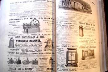
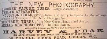
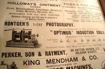
    I looked at the advertising in these issues (my copies of Nature for these decades generally have the original paper wrappers for the weeklies, complete with ad copy), looking for the first time that a Roentgen machine was offered for sale to the general public.  As it turns out, they popped up 12 March 1896 (once), 19 March (twice), and then about once a week for the rest of the year.  A little surprising, I think, a little light to my Monday-morning quarterback’s eye—I expected more; bigger, more, splashier.  But the ads are small and sedate, hardly similar to the discovery they represent. 

    Blogfeb_22marey
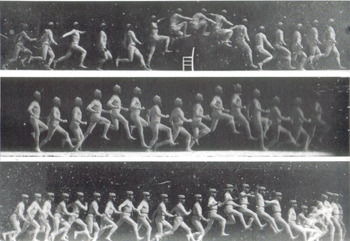
    The rest of the world, the rest of the advertising world, stayed the same–the Roentgen discovery and the enormous possibilities and promises of his “new photography” lived in their own unique sphere, unencumbered by their sassy new brother.   This mild response seems dimmer still when you compare it to that which greeted other (relatively) simple but still major advancements in the world of photography.  Take for example Etienne Marey, who was a technoid and physician who was able to capture motion of all sorts–he was able to develop a picture so to speak of the movement of blood in the body via his instrument to calculate blood pressure, and he also created a shotgun-style camera that made the Blog_feb_22_nude
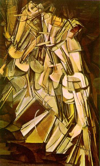
    world’s first high-speed photographs of movement.  And so it cane to pass that in the late 1870’s and early 1880’s people were instantly able to see what a horse looked like when it galloped or what the body did *exactly* when jumping over a chair.  When you couple this with fourth-dimension material one wonders why it took several more decades to bump into these images in the art of 1907+. 

    (Duchamp Nude Descending series, 1915; above, Marey, 1881)

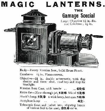
    And what indeed was normal in these pages?  Magic lanterns
    and magi lantern slides appearMagiclantern
    at all levels; the gorgeous Wimshurst machine gets heavily advertised; the redoubtable Negretti & Zambra advertised all manner of excellent scientific instruments (biographs, thermogrphs.  Nadeer Bros. advertised a pretty standard cell, and the ancient Crossley displayed their “new” oil engines, “suitable for all classes of agricultural work”.  J.H. Stewart was selling their semi-automatic electric arc lamp, while across the page was Newton & Company’s “Newtonian” arc lamps for lanterns (“self feeding and focus keeping”).  Microscopes and prepared slides abound, and Thomas Bolton advertises discretely and effectively for their “living specimens for the microscope”. 

    The Physical Review, the American upstart in the science world advertises that its third volume was available, while its distant cousin, the Psychological Review, advertised its own third volume.  Booksellers seem to take the most space, thank goodness. 

    Blogxrayepps
    There are a few medical throwbacks:  Epp’s Cocaine takes out occasional tenth-page ads for their “cocoa-nib extract, tea-like” selling its ‘gentile nerve stimulant”.  Right underneath is “Holloway’s Pills”, promising to cure biliousness, sick headache, indigestion, and all (?!) internal complaints.   These are brilliant simple samples of the skeleton of science in world-dominant Great Britain, in a world dominated at that time by H.A, Lorentz, Ernst Mach , Roentgen, Korteweg, de Vries, Bateson, Jean-Baptiste Perrin, Pierre Curie, Zeeman, Becquerel, Joseph Thomson,  Ernest Rutherford, Marconi, Ramsay, Fitzgerald.  And so on. 

    Nothing offered for sale here offered any significant clue to the pregnant world of modernity that was nearlyBlogxray3
    there—the world would become ‘modern” almost immediately following Roentgen, with revolutionary, epochal changes in art (in non-representational form more so than Impressionism), theater, literature, music.  Just about everything changed (except politics).  But there is no hint to paradigm shift hidden in the ads, just as they were with the machines selling the promise of Roentgen’s “new photography.  There’s something about the fine glass, superb turning of the screw, and a perfectly oiled gear though that makes this sort of perfection seem so lonely in the world of larger change.  Bertha, Roentgen’s wife, sat for 15 minutes while her husband passed his rays through her hand; she ran from the room once she saw the results, revealing her very bones and no doubt a strong sense of the Blog_feb_22_malevich
    fragility of life, and the strong presence of death.  Many had the same reaction to the Kandinsky’sBlogxrayad2
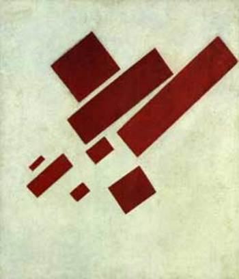
    shapes and Malevich’s white circles and red rectangles and Ibsen’s drama and Einstein’s dancing dust and the rogue syncopation of jazz.  It is probably a very natural reaction to try and protect established memory—but memory should be more flexible than that, I think, to keep a healthy mind.

    (Malevich’s 8 Red Triangles, 1915)


  • On Seeing Things Backwards Series, 1: UNIVAC and the 1952 Election

    JF Ptak Science Books   Post 1917

    Univac-cronkite
    Leonardo wrote backwards and from right to left, Benjamin Button lived backwards at the hands of Scott Fitzgerald, Rene Magritte’s man in the bowler saw the back of his head, Herrimann’s Ignatz the Mouse I am sure saw the back of his head looking around the world with the world’s most powerful telescope, rugby passes are all done backwards, paper images of vue optiques appear backwards, lightning for all intents and purposes starts backwards from the ground up, reverse mathematics are worked from theorems to axioms, and the Chicago River (1900) was engineered to flow backwards for the foreseeable future, while the Mississippi River famously flowed backwards for just a bit in the New Madrid Earthquake of 1812. 

    I can only imagine what audiences must have felt when they saw the first moving pictures played backwards–seeing them played forwards was a novel-enough (and revolutionary) idea, but the simple idea of reversing the direction of the film would have proved to be equally fascinating. 

    Imagine the first time you witnessed a staged train wreck on film, back there in 1897, and imagine being able to see it played over and over again, until you were filled.  I’m not so sure that there were even any still photographs of a train wreck as it occurred to this point, even with advances in film speed and lens, so seeing the even unfold in front of you at leisure must have been overwhelming.  Now imagine these same folks seeing the event and watching the locomotives reconstitute themselves.  It would have been an extraordinary event.  Even observing the Etienne Marey sequences and seeing what actually happens when a person bends over to pick up a pail of water would have revealed almost as much in new detail as when Galileo was in the middle of his earliest observations. 

    Looking at things backwards is a good idea so far as thinking about engineering problems and of course in checking experimental results in the sciences–its not so good an idea though to change the results produced by the scientific method because they’re not a good intuitive fit to expected parameters.

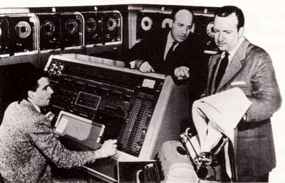
    Such was the cased with the first (and successful) employment of a computer to predict the outcome of a presidential election.  THe computer was the UNIVAC (the world’s first commercial computer and a blazingly fast machine at 10k operations a second, nearly six orders of magnitude lower than “superfast” by contemporary standards), which was brought in by Remington Rand to CBS News to crunch the numbers on the tight race between General Dwight Eisenhower and Gov. Adlai Stevenson (II) on 4 November 1952.  (Stevenson was the son of a former U.S. Vice President and would run again against Eisenhower in 1956.) Pioneers Pres Eckert and John Mauchley, along with Max Woodbury (and programmer Harold Sweeney, who is seated at the UNIVAC’s control panel and who seems never to be mentioned in the iconic photo at top, with Eckert at center and anchorman Walter Cronkite at left).   CBS News Chief Sig Mickelson and Cronkite were not comfortable with the proposal, but ran with it anyway, sensing a moment of the-future-is-now.

    The Eisenhower/Stevenson race was seen by the large majority of pundits to be too close to call, so when the UNIVAC’s results pointed to a landslide for Eisenhower (438 electoral votes and 43 states to Stevenson with 93 electoral votes and 5 states) folks got very sweaty and nervous, not trusting the outcome. As this was still a very early age in human-machine interaction, and the computed results fell far away from perception and expected response, changes were made in the UNIVAC’s programming to determine a more “reasonable” response by the machine, the new results making the race very tight and fitting human expectations and giving Eisenhower a very slim margin of victory.  As poll results started to sweep in an hour or so later indicating that Eisenhower was showing with a huge victory, the UNIVAC was again reprogrammed and at about midnight the announcement was made that the UNIVAC had indeed been correct in the first place.  The final results were 442 electoral votes for Eisenhower and 89 for Stevenson.  In the next presidential election in 1956 the three networks all had computers working for them–with them–and a different perception had been formed on working with computers. 


  • Master of Little but Curious About it All (1839)

    JF Ptak


    M of A868
    This print has been hanging here and there at home for many years–it has always been amusing, and somehow warming. 

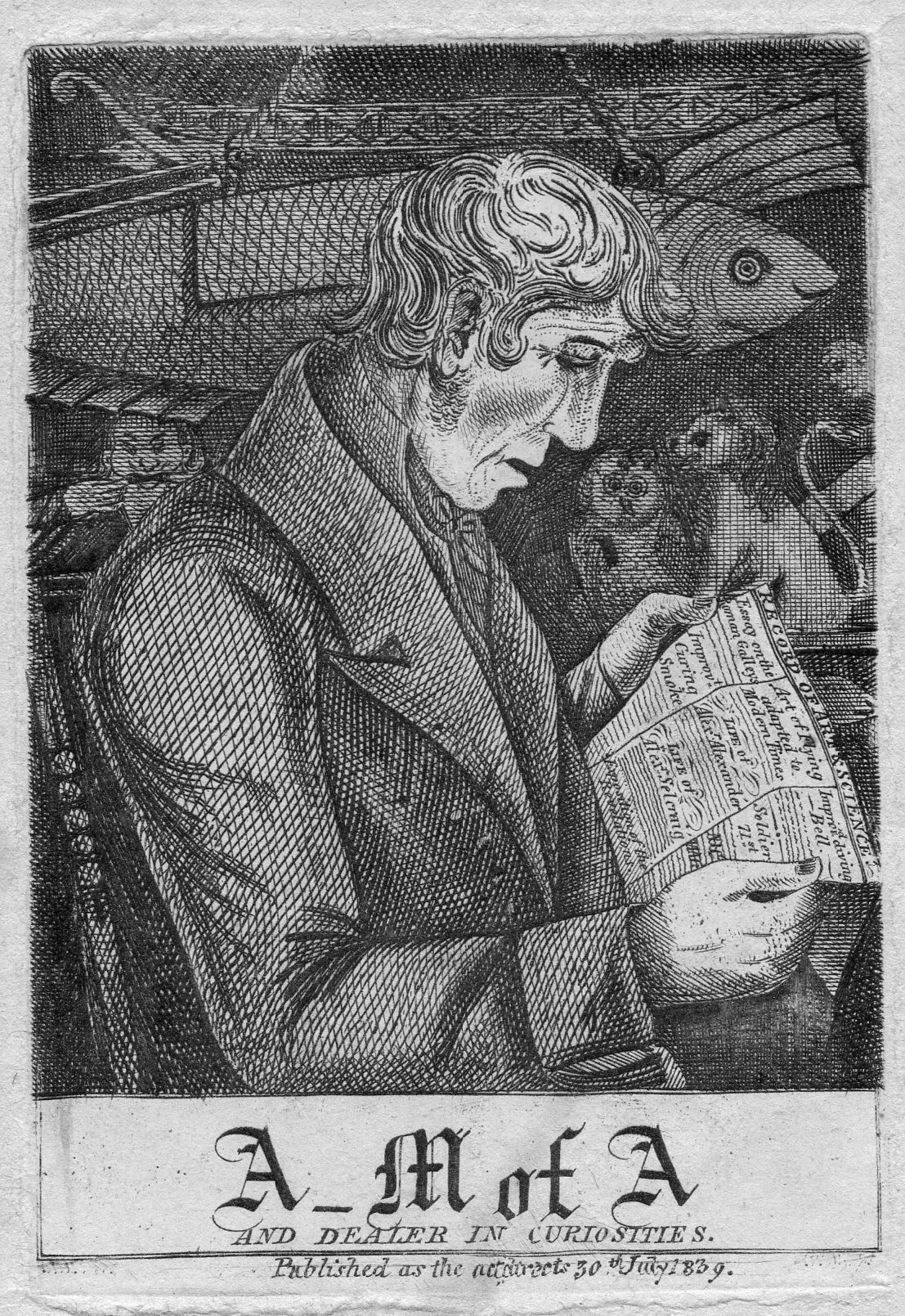
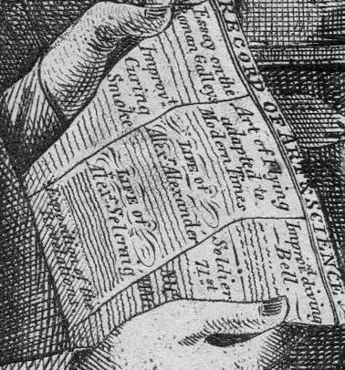
    “A _M of A, and Dealer in Curiosities” was “published as the act directs 30 July 1839”, is an etchign which depicts,
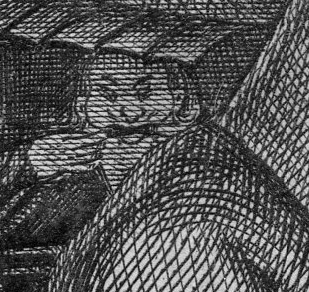
    M of A face I guess, a lettered/educated man who winds up as a seller of scientific and intellectual bric-a-brac and interesting bits, perhaps wonderful natural history/physics materials, perhaps trivialities.  He seems satisfied to me, regardless of the little man over his shoulder making a face, a reminder perhaps to not take the curiosities too seriously.  [There’s also another face off to the right, peering into the image (see below).]

    The Record of Arts & Science that our dealer is reading has some interesting parts to it:, including something on new mechanical flight and a new diving bell–it would’ve been more interesting historically if it had mentioned the brand-new Daguerre invention. 


    M of A reading


    ·Posted by :

    ·in:

    — —

  • Imago Frammeni: Boulle, the Dogon, Jouffret, the Simple and the Complex

    JF Ptak Science Books  Post 1914

    Changing the Mind’s View of Simple and Complex Ideas via Different Image Perspectives

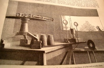
    I’m always very interested in curious things, or standard, “average” things pictured in non-standard ways, as theDsc04588
    change in perspective can lead to entirely new observations and discovery.  Seeing this illustration in an article by J. Norman Lockyer (Nature 1881) I was shocked by its clarity and usefulness—Lockyer was simply showing the arrangement of his apparatus for his solar spectrum experiments but the angle of observation (being at such an oblique angle as is normally found) was just, so, well, “correct”.  The image I thought was perfect for the reader—not only that, it was designed artistically and with grace, and one can see exactly what Lockyer was up to.  Diagrams would’ve worked almost as well, but there is just something so extraordinary here that you could just about work from the image if there was no description. 

    Dsc04579_2

    Looking at things differently is hard work—that’s why I think it is always good to refresh the neuronal sap and look at great examples of unusual , insightful imagery.

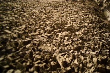
    Sometimes it works to read the description of what the image is before actually viewing it to see the differences of the image that you form in your brain before seeing the thing itself.  For example, when reading about the Dogon, a cliff-dwelling people of the plateau of Bandiagara, south of Tombouctou, and how they would make houses and then towns out of the rocks fallen from cliffs, you get what is probably a pretty benign image.  When you see photographs of these structures it seems as though the brain just simply isn’t ready for their impossible nature, though you quickly, instantly, recover (once you convince yourself the photo is real) and—voila—your mind has been expanded.  (This photo is from an expansive work by Bernard Rudofsky, Architectures without Architects, Doubleday, 1964.) 

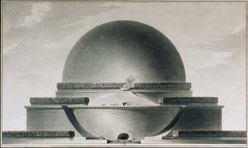
    The (internally) spectacular Etienne Boullee can greet us in the same way with some of his eye-popping architecturalBoulle1
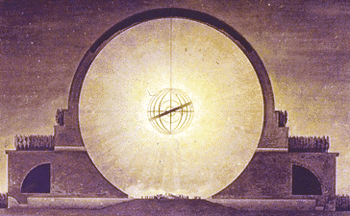
    creations (unbuilt architecture by an architect, in this case, compared to the built architecture of the non-architects above).  Boullee’s “Plan du Cenotaphe de Newton”, a gigantic memorial to Newton  that was dancing with necessary privacy in Boullee’s brain during the French Revolution (and also during a particularly un-Newtonesque time in on-your-knees-to-Cartesian-principles France)  is another superior example.  Reading the description of the structure just doesn’t quite do, and it seems whatever grand comes of that is tarnished and stripped away  by the obesely florid sentiment of none other than Ledoux’s poetic sentiments “…O Newton!  Sublime Mind!  Vast and profound genius!  I conceived the idea of surrounding thee withBoulle2
    thy discovery…”.  Oy.   Boulle adds to this inspirational atrocity by saying of the sphere:  “…we must speak of a grace that owes its being to an outline that is as soft and flowing as it is  possible to imagine…”   And once the demand of “oh  dear god just please show me the picture” is met, we are left with a turned-around brain and another heavenly exaltation, or profanity.  The Cenotaph is just Grand-Canyon-Spectacular. 

    Complex can turn on the simple in this way, where we can have those “a-ha” moments from, say, early efforts at picturing the fourth dimension or non-Euclidean geometry to a new perspective of looking at Roman ruins.  The arrival on the non-Euclidean geometries  in the 19th century posed new issues, not the least of which was representing the ideas.  Our saintly Hermann von Helmholtz believed –contrary to most elevated opinions—that the human mind could indeed intuit complex space and figures of these geometries.  (The difficulty not only from the obvious intellectual hardships in picturing the concepts but also because the geometry of Lobachevsky http://www-groups.dcs.st-and.ac.uk/~history/Mathematicians/Lobachevsky.html was called somewhat into doubt when some of its results were cast in doubt by contemporary astronomical observations.—and this even though so far as the great Gauss was concerned there was no deviation in Euclidean values.)   Helmholtz did this by employing the three-dimensional pseudosphere model of Beltrami.  (Reluctance to these ideas would end soon enough, for, as Linda Dalrymple Henderson points out with such sotto voce, “the convenience of Euclidean geometry would prove inadequate once Einstein” hit in 1905.)

    Dsc04585
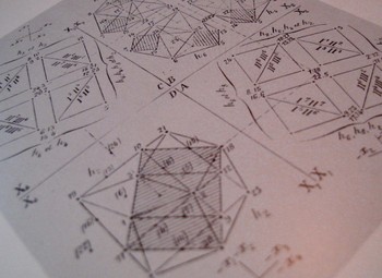
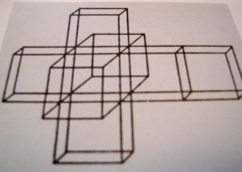
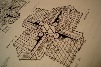
    The work of Beltrami  and H.P. Manning  (Geometry of Four Dimensions, 1914), and Jouffret  (Traite elementaire de geometrie a quarte dimensions, Paris 1903) in illustrating these complex ideas (the titles of which were in themselves daungting as with Jouffret’s “plane projections of the sixteen fundamental octahedrons of an ikosatettrhroid”) would in themselves prove to be entirely irresistible to the world of the arts.  Charles Howard and Maurice Princet I think had as much to do with  the creation of cubism and abstract art and the imaging of time than anyone, including the painter (I shudder to say his name) of Les Demoiselles (1907) or the lovely Georges Braque (Houses at Estaque, 1908) or Jean Metzinger or even the sublime comedian Duchamp’s Nude DescendingDsc04584
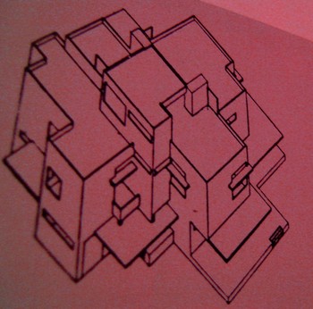
    (1914).  The hypercube starts to show up a lot in some Bauhaus genres and even into the palette of Frank Lloyd (“Stinky”) Wright (with his St. Mark’s Tower plan, NYC, 1929).Dsc04589 I can only imagine the shock to the brains of these creative geniuses in seeing the display of such a novel idea.  (For the ultimate treatise on this see Linda Dalrymple Henderson’s The Fourth Dimension and Non Euclidean Geometry in Modern Art, Princeton  1983).  And no the art didn’t come first. 
    Dsc04578

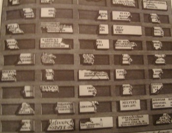
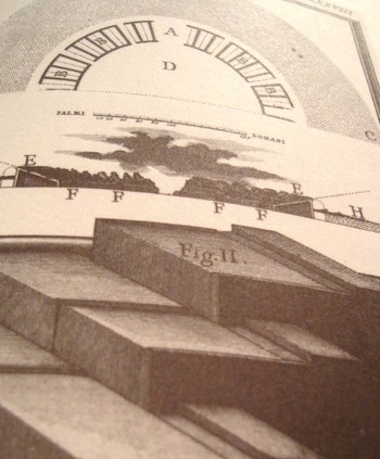
    But coming back to the simple, and in the same frame as the first example that we mentioned in Lockyer, we have the unlikely find of Giovanni Piranesi.  In my opinion his most spectacular work is found in his frammeni (the diverse bits and pieces of architectural and sculptural bric-a-brac found objects that are collected together on one stage) and in his archaeological detail.   His attention to new perspective in showing the crucial aspects of structure and building in Rome is tremendous andDsc04590
    unexpected—as an example we see here the child’s-eye-height view of three steps of the reconstruction of the theatre of Pompey.  I must say that I’ve seen a lot of architectural images in my time but nothing quite comes to me so surprisingly as this step-level view of the reconstruction of a Roman theatre,  This happens throughout the lesser-known Piranesi, with great details of tools, and cross sections of the very deep Dsc04591
    footings of bridges, and so on.  It is really refreshing, lovely, unexpected work. 

    We’ll return to this subject from time to time as I have hundreds of interesting examples to draw from—for example, the remarkable Emily Vanderpoel’s Colour Problems (which has surfaced in this blog from time to time) which is ostensibly an undecipherable attempt to quantify color arrangement in art but through the lovely examples displaying this attempt pre-date the modern re-invention of non-representational art by at least a dozen years.  Stay tuned! Dsc04592