A Daily History of Holes, Dots, Lines, Science, History, Math, Physics, Art, the Unintentional Absurd, Architecture, Maps, Data Visualization, Blank and Missing Things, and so on. |1.6 million words, 7500 images, 4.9 million hits| Press & appearances in The Times, Le Figaro, Mensa, The Economist, The Guardian, Discovery News, Slate, Le Monde, Sci American Blogs, Le Pont, and many other places… 5000+ total posts since 2008.

Category: Absurdist, Unintentional

  • The Unbearbale Lightness of Nerves, Homer Simpson Hair, & Rhino Chins of the Renaissance, Part I

    JF Ptak Science Books   Post 1480

    In the structured and orderlZocchiy world of Renaissance painting and illustration I find the semi-wild, stringy, lonely, unruly strands of this and that, the minor elements of an artistic composition, to sometimes be most interesting.  This is so mainly because they could be considered ephemeral pieces of the work, minor additions to a developed scene, not particularly necessary to the whole.  But they there are, and sometimes they are highly unusual.  In the larger scheme of things these elements can be background or foreground figures, sometimes added for the purposes of scale in what is supposed to be an architectural study–but there are times when these small figures, sometimes occupying perhaps a tenth of a percent of the illustrated scene or less, are given vast and vivid lives by what may have been an engraver desperate for a little artistic freedom.  And so that’s why we see unusual aspects of the population peopling-up a city square scene, showing off a town hall or cathedral. 
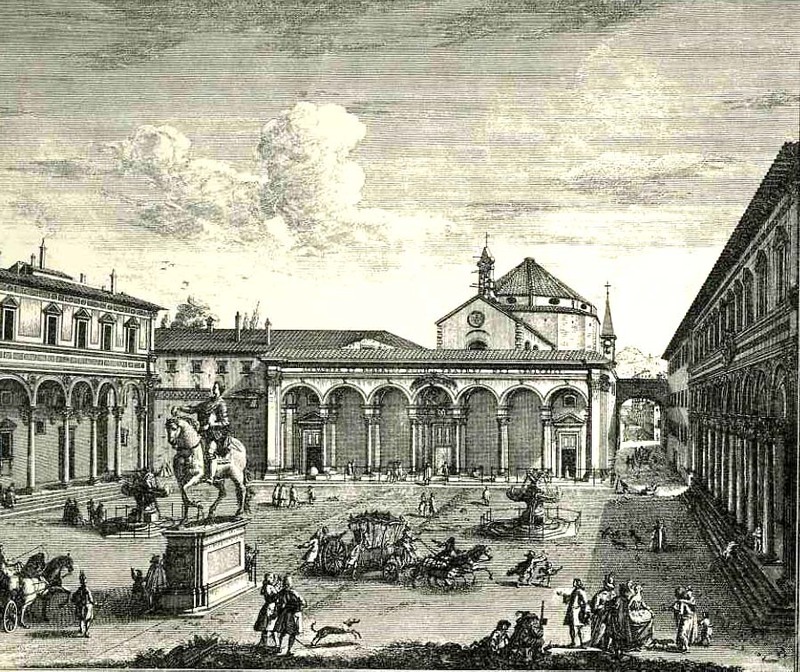
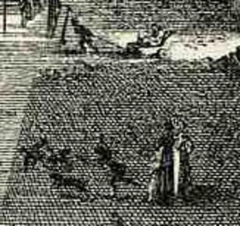
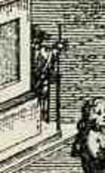
     For example in the engraving Veduta della Piazza della SS Nunziata Statua Equeftre di Ferdinando Primo, Fonti, e Loggie Laterall by Giuseppe Zocchi (1711-1767) it would’ve been easier certainly to leave the plaza empty, but Zocchi doesn’t, filling in the empty spaces with several dozen people, most of  whom are really rather busy.  In addition to royal coaches and animated discussions, we can find a number of unusual images.  There is a very curious sub-scene of a women with three children, one of whom seems to be falling, or leaping, the woman holding her hand straight out in front of her.  Directly above them we can see a man pulling a small carriage with another person in it.  Is this person a child?  Are they elderly?  Infirmed?  And what about the (probably elderly) figure who we can half see, leaning their back against the equestrian statue, holding a staff?  Why bother adding half of figure (from the rear)?  Why on earth did Zocchi choose to add
    Bloglooking_closely_1__carriage_2
    characters like these when it would be substantially easier to show a gent walking with a stick?  Is the artist expressing a little semi-invisible artistic freedom, or just using his powers of observation to make the commissioned part of the art more interesting?  Or perhaps Zocchi has nothing whatsoever to do with these tiny figures—perhaps it is all the work of the engraver, who was responsible for translating Zocchi’s paintings into metal, adding these figures as he went? 

    I think it is fascinating!  Perhaps what the story is here is that these were really just simple street scene, common street life, and the artist simply included them in the work?  That would make them 18th century snapshots of common life in Florence, something that wasn’t ordinarily captured by very many artists at all.
    Bloglooking_closely_1__man_caneWhat I’d like to look at today seems even more ephemeral than found people in town squares–it is, quite literally, the smallest bits of the artwork:  the dissected tendons, the hair on the remaining skull of Death, the stubble on the chin of a rhinoceros, and to look at the great liberty and beauty with which these fragments are represented, particularly if they are lonesome, segregated things of high simplicity.  Lean, articulated, severe, lonely, small elements.

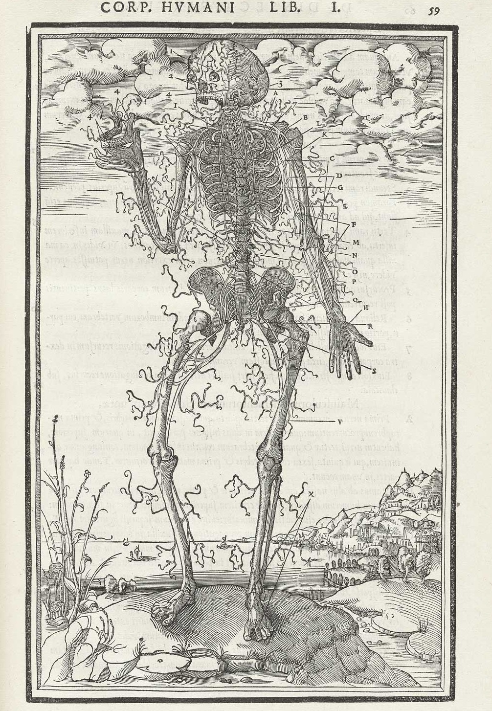
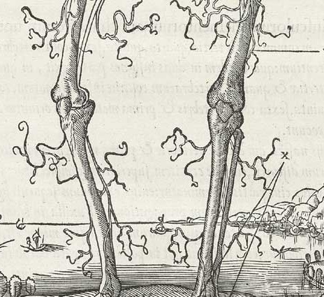
    The first example comes from Charles Estienne’s De dissectione partium corporis (“On the dissection of the parts of the human body”), which was printed in 1545 and which was very nearly the first truly extraordinary anatomy book, almost beating Vesalius to the punch, had it not been for some printing foibles.  One of the illustrations that I’m focusing on is his dissection of nerves, the spindly, flowing ones being cutaneous nerves that supply skin sensation (thanks to Alex Baker for the correction!) , which look for all the world to be beautiful dendritical elements being blown by a breeze, maypole wrappings come undone, celebratory flags…something beyond tendons.  I know that the artist and designer are simply trying to show the reader their structure and so it makes sense to display them like that, but they have a certain classical beauty in their representation that seems far beyond what might be considered necessary for the task at hand. 
     

    Estienne_p059 b
    And the full image:

    Estienne_p059

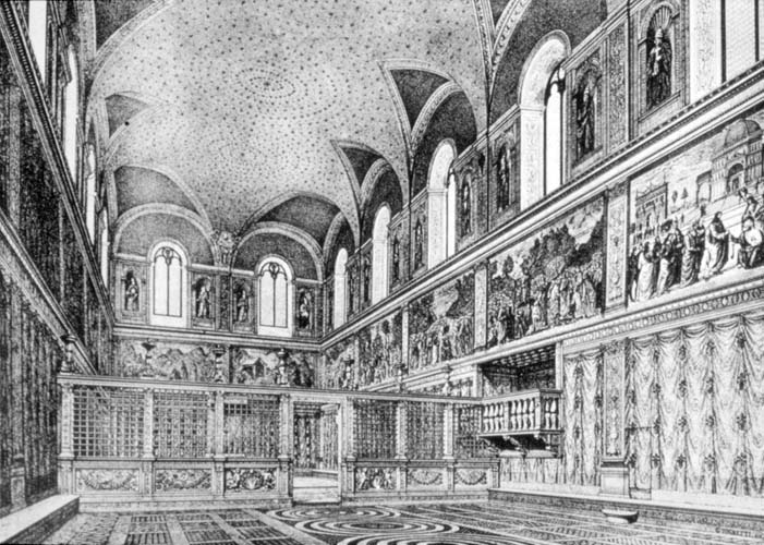
     This is completely different from sparse and the orderly control of empty space; nothing at all like, say, the Sistine Chapel ‘before”, with its ceiling beautifully and lightly decorated with stars (I guess gold on a sea of deep blue?):
    Sistine

    I have found a number of examples of little bits of hair dancing on the top of its head (or skull) as though the few strands were luxirant manes floating in oil like a halo around the lucky owner–but no, our artist (below) depicted one of Death’s mortal victories in vestigial Homer Simpson-like lonely hairs.
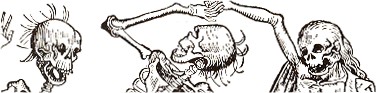
    Death hair2

    The full image (below) is called “Imago Mortis”  (the World of Death) and appears in Hartmann Schedel’s Liber chronicum (more commonly known as the Nuremberg Chronicles), one of the greatest illustrated (or certainly the most lavishly illustrated)  books of the 15th century.  Printed by Anton Koberger in Nuremberg on 12 July 1493, the Liber chronicum was basically just that, a walk through the known and imagined knowledge of the mid-Renaissance with the great humanist Schedel acting in the role of conductor.  There’s certainly much of interest and disinterest in this book; Schedel was not afraid to make a guess (and even a wild one) when facts didn’t fit or were unavailable.  (For example, he famously re-used the same view of a city to illustrate different cities.)  But for my lowly interests, its the hair of Death that interests me.
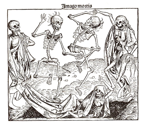
    Death hair
    And just in case you don’t know the “Homer Simpson” reference:
    Hair homer
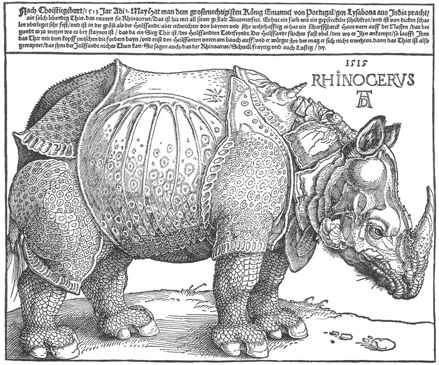
    Albrecht Durer does manage to come into play here, if not for some of his trees or the bits of string that he renders holding other bits aloft, but for his famous if not-terribly-original rhinoceros, which he had never seen though which he had seen images of, and for which he had taken the trouble to include the beast’s chin hairs:
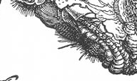
    Dürer_rhino_full det

    Dürer_rhino_full
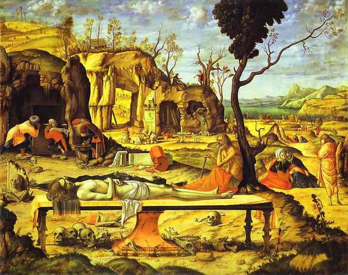
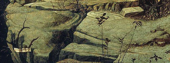
    And another example, this times for trees, in Carpaccio’s Mediations on the Dead Christ (Berlin), where we see the sparse and gangly dendrical-like bits on the trees on the hill in the background, as well as on the dead branch of the half-dead tree in the foreground:
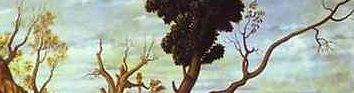
    Unbearable tendons  carpaccio detail

    Unbearable tendons  carpaccio
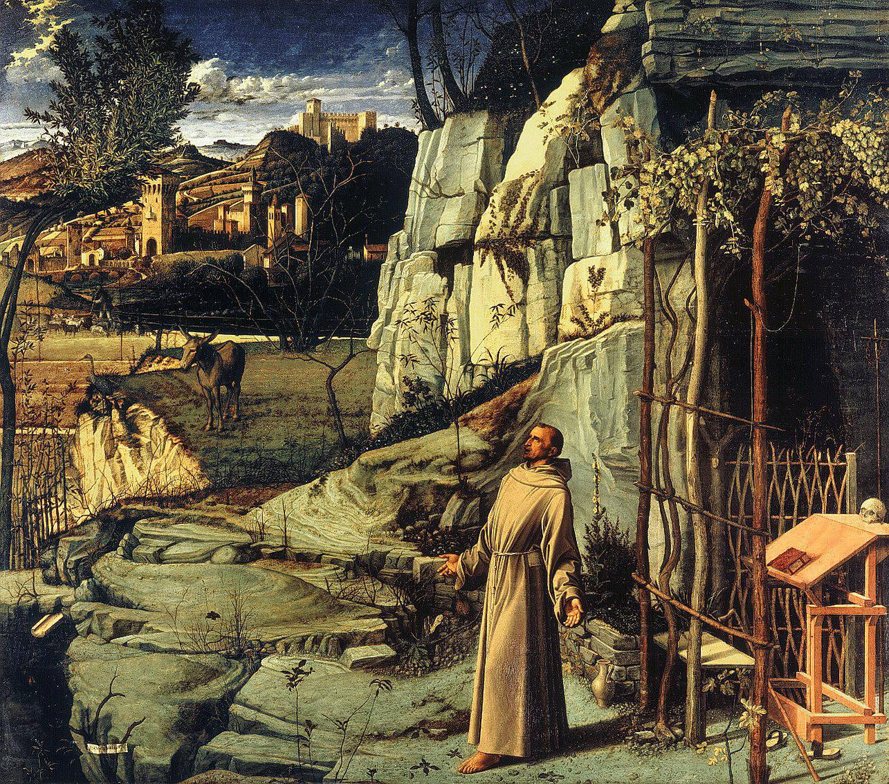
    This sparseness is almost there but not quite so in Bellini’s Stigmatization of St. Francis, which is in general a very dense composition with many competing elements, perhaps making the foreground weeds a little more singular:
    Unbarable  st francis detail

    Unbarable  st francis

    This uniqueness extends too into the geological strata foreground of Mantegna’s Madonna of the Quarry, or rather to the shelf of ground on which the Madonna stands. 
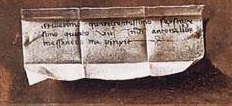
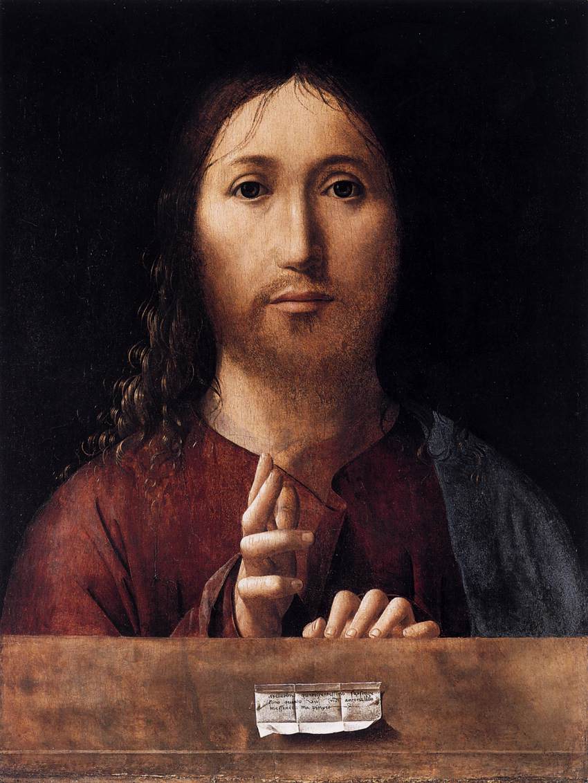
    This sort of solitary expedition into spareness and quiet can be found in many places, if you just look for it; for example, in the bit of scrolled paper used as a small trompe l’oeil in Messina’s Salvator Mundi (1465):
    Unberable  messina b
    a detail from
    Unberable  messina
    as can be seen in many paintings over the centuries…
    End Part I.

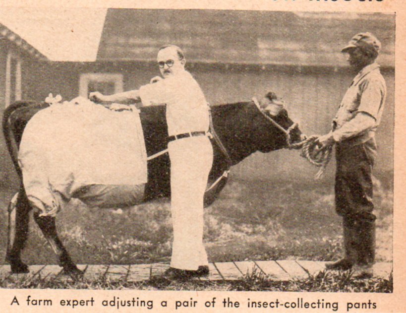
  • Questionable Quidity Department: Cow Pants

    JF Ptak Science Books   Quick Post Quidity

    This image comes from a stockpile of loose bits that have fallen out of various magazines–this one from Popular Science for October, 1937.

    Bizzaro cow pants'511


  • Species of Explosions: Human Anatomy, Explained

    JF Ptak Science Books   Post 1479

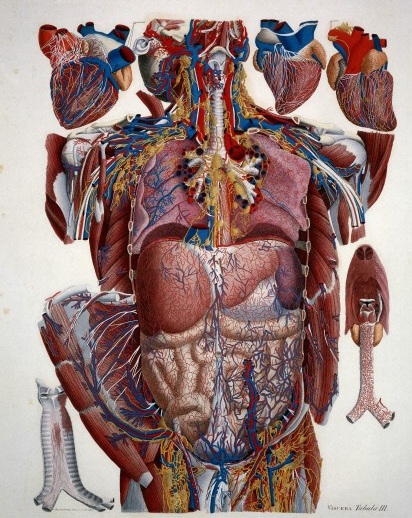
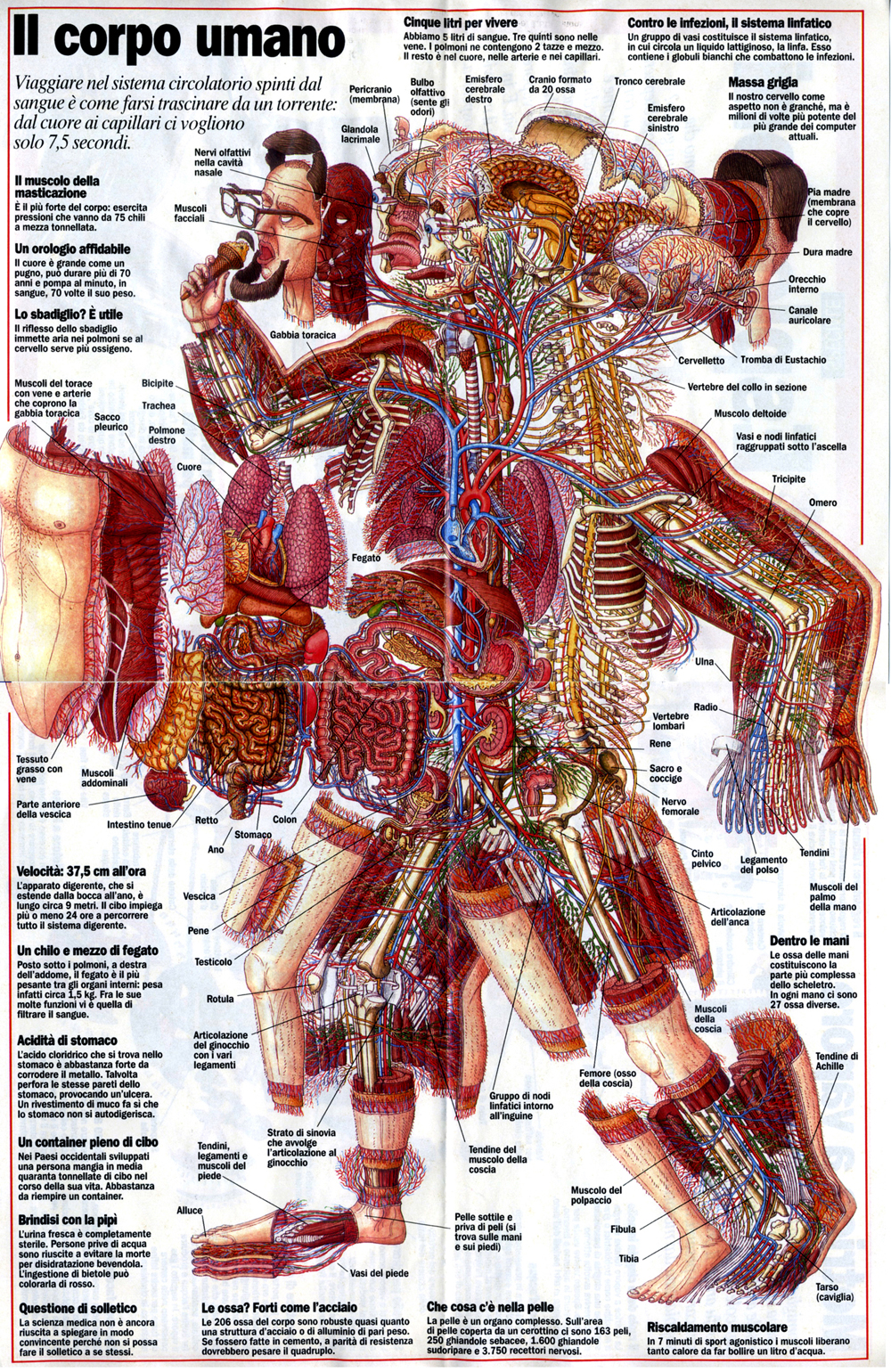
    Anatomia universale... by Paolo Mascagni and Antonio Serantoni

    Species of explosions come in all sorts of shapes and sizes, and basically release some sort of energy (chemical, nuclear, mechanical and so on), but in the cases we’ll look at here they are none-of-the-above.  The energy released in these explosions are in the form of potential, a knowledge-driven, controlled and reversibly ordered demolition, a deconstruction in slow motion.  The medical “explosion view” for the study of anatomy is a remarkable thing, especially when you considered not only the pre-Cat and pre-MRI times, but also the pre-Xray (1895) days of imaging the inside of the body–the images not only show you the bits and pieces alone but also in relation to the other bits around them.  The body becomes an archaeological dig, each level preserved so that a viewer could easily see the dependencies and relations between one thing and another. 

    Take for example Paolo Mascagni’s (1755-1815) beautiful Anatomia universale (an example seen above), which was printed in Florence in 1833 and has the look and sensibility of something much later.  Mascagni is able to achieve this depth not only from the exploded view, but also for the (somewhat exaggerated) coloring setting the specimen on top of a blank background the combination of the color and the background giving the whole thing a 3-D-ish feel–and if not that, then certainly a living image in which there is some fair amount of depth. 

    Anatomy exploded
    Another version of the exploded view which is also quite effective from the same work by Mascagni is his “exploded thorax”, showing a more limited display of the more closely-aligned organs. 

    When these views appear today–which is generally much more uncommon given the other technical ways of envisioning multiple layers of complex associated items–they have more of a sense of the antiquarian, retro feel to them, though they are no less useful for it.  As a matter of fact  I still prefer these views for understanding technical and engineering  and architectural complexes than anything else. And the modern master of this genre for me is Stephen Beisty, who performs his magic mostly in the tech and engineering fields, but who occasionally dips into the messy wet stuff of biology, as we can see in this fabulous exploded view:

    Anatom exploded beisty

    There are of course many other examples of (drawn) exploded views in the history of anatomical illustration, but I think these will do for now as good examples of the art.


  • Electro-LUXurious 15: Electroplating the Human Dead, 1891

    JF Ptak Science Books   Quick Post

    This is the 15th installment of a new series on United States Patent Reports on electrical quackery and unsubstantiated bric–a-brac from the newly-electric world of the period of 1870-1900–the following is a little outside the norm, being French, but I couldn’t resist it. 

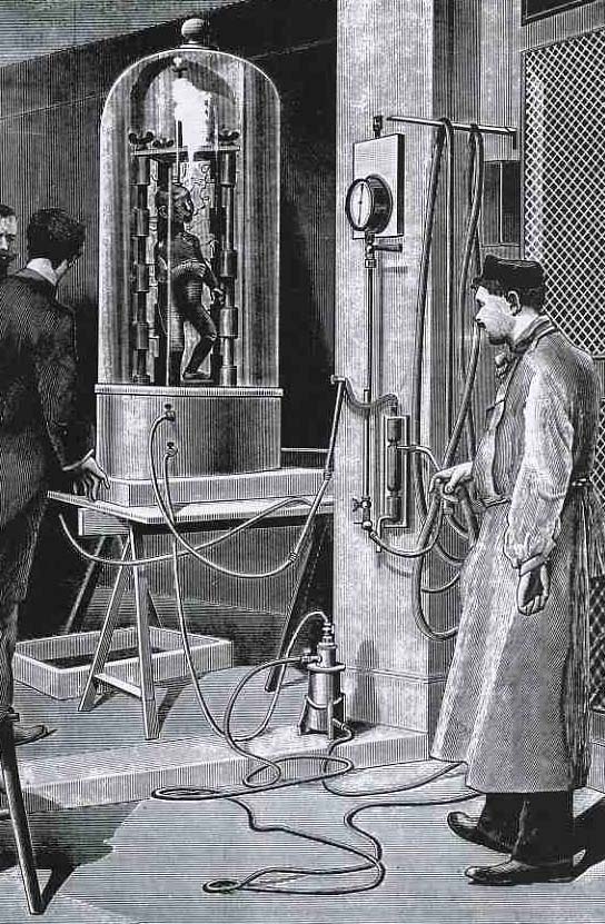
    Electropunk electro the dead
    When a picture just isn’t enough…

    And while we’re at it, let’s consider the work of Dr. Varlot (of the Paris Hospital) in electrocuting the dead.  Actually, what he proposed was another pretty gruesome use of electricity, though this one didn’t make promises of miraculous cures, or execute anyone.  Varlot proposed to “metalize” the dead (as we see in this very unsettling image of a child being electroplated) for, well, some purpose, purpose unknown.  It just seems and seemed like a bad idea, all the way around–a poster child for Bad Ideas everywhere. The medical uses of an electroplated baby seem very limited, and I can’t imagine anyone wanting to do such a thing to a dead child of their own.  It is wrong on every level.

    The engraving comes from Leonard de Vries, Victorian Inventions” (1971), who quotes the original source (the Scientific American for 1891) with this description of the procedure:

    “Dr Varlot, a surgeon in a major hospital in Paris, has developed a method of covering the body of a deceased person with a layer of metal in order to preserve it for eternity.  The drawing illustrates how this is done with the cadaver of a child.  The body is first made electrically conductive by atomising nitrate of silver on to it.  To free the silver in this solution, the object is placed under a glass dome from which the air is evacuated and exposed to the vapours of white phosphorous dissolved in carbon disulphide.  Having been made conductive, the body is immersed in a galvanic bath of sulphate of copper, thus causing a 1 millimetre thick layer of metallic copper to be deposited on the skin.  The result is a brilliant red copper finish of exceptional strength and durability.”

    Another method of electroplating the dead (in 1934) is discussed in the interesting blog, Quigley’s Cabinet, here. 


  • Things-out-of-Place Department: Books in Anatomies and Bridges in Impressionist Paintings

    JF Ptak Science Books   Post 1478

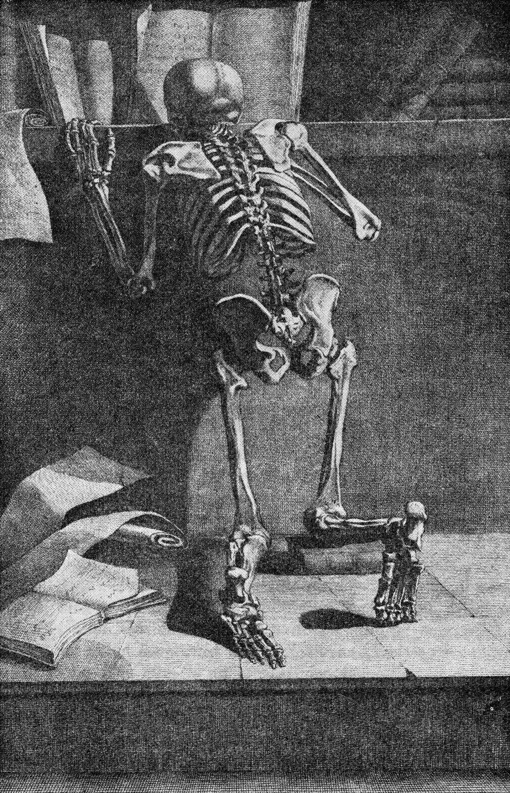
    I’ve been making a few entries over the last few days on antiquarian anatomy books, and wonder now about books in anatomies. I’m not certain what the appeal is, but it has a strange and immediate affinity for me to bridges in pre- and early Impressionism, a direct line to these bridges and to the other technological and engineering entities that were depicted in these canvases.  I’m not sure what the connection is to the two outside of the obvious verb-y part of “bridge”, but there seems to be an innate connection between the two, for me.  Somehow the book shouldn’t be of interest to the lifeless and dissected cadaver, but it is, and images of the two together turn up here and there in the history of anatomical illustration.  As much as the anatomist and artist work together to try to remove their subject from the confines of a book so that their work is freer and more accessible to the reader, to remove the illustrations from the pages of the book in which they appear, they do sometimes employ the image of the book to make a more prosaic and allegorical point.And as the object of design and wonder and beautiful geometry, one might think of the bridge as a object in Impressionist paintings from that movement’s earliest periods would be not quite the sort of thing that would be the subject of as many paintings as they were.  The unnatural angles of their supplementary parts  seem to make them not quite the fit for the early Impressionists.  But they were, and probably so for their 90-degree assaults on the natural landscape. 

    Perhaps what I think of the aesthetics of the treatment of bridges during the Renaissance, and the adoration of the Rialto and Pone Vecchio and all the rest, just wouldn’t make their way to the Impressionists’ canvases. But of course basically most ot them did paint bridges–Seurat, Cezanne, Van Gogh (a fantastic, small stone-and-wood miniature drawbridge), Derain, Pissarro, Renoir (the Pont-Neuf), Marquet, Sisley and of course and perhaps most famously, Monet (Charing Cross, Giverny, and all the rest)–all painted bridges.  I guess the bridge is just a shorthand for the representation of engineering and technology in general in Impressionism, which to my eye seems quite strong. 

    But getting back to books in anatomies:

    Ontleding des menschelyken lichaams by Govard Bidloo and Gerard de Lairesse

    Govard Bidloo approached the issue of the book in a most unusual fashion, making it appear as though the dissected hand and forearm were emerging from a semi-opened book, the long index finger coming to a pointing pose, suggesting perhaps that the viewer take heed of what is contained in the work. The image appers in Bidloo’s Ontleding des menschelyken lichaams (or Anatomia Humani Corporis) and was printed in Amsterdam (at what may have been the pinnacle decade of Dutch book publishing) in 1690; the book was illustrated by Gerard de Lairesse (1640-1711), a leading light in the Golden Age of Dutch painting, and perhaps one of the most famous painters alive there after the death of Rembrandt. There’s all manner of symbolism going on here, but what I like the most is the little crutch under the cadaver’s hand’s thumb. 

    Jacques Gamelin’s Nouveau reueil d’osteologie et de myologie, dessine d’apres nature (1779)  places skeleton and books togehter again, though this time their can be little doubt about the overall message that the designer and author tried to send to their readers. 

    Int he long run, and I guess in the short run as well, neither the bridge in Impressionism nor the book in anatomies is quite so much out-of-place as they are simply unexpected.

    Note:

    Van Gogh’s bridge at Arles–not an essential image whatsoever for this post–I just like the bridge. Van Gogh painted the bridge four times in oil and once in watercolor, all in a very short time.  (His stay at Arles was about 444 days, during which he made about 200 paintings, being some of his greatest work.

    Vincent Van Gogh Miscellaneous Buildings Technology Modern Age Impressionism Neo-Impressionism


  • History of Falling: Parachutes as Aerial Minefields and Pilots’ Escape Vehicles

    JF Ptak Science Books  Post 1466

    Lots of these images have to do with walking and falling, walking and falling at the same time, walking and catching yourself from falling over and over again, but in general that walk is only one step, so far as parachutes go. 


    The parachute has certainly been around for a long time–from ancient times if you squint your eyes hard enough–though it appears that it was in the Renaissance that the idea was taken more seriously as a practicable thing:  at  least it was first depicted then.  Here for example is a form of falling that was seen as flying (Homo Volens or Flying Man), in this depiction of parachute-use by Fausto Veranzio  Fausto (1551–1617) in his book of technological marvels called Machinae Novae (1595).  Of course Leonardo left a footprint here as well, and before Veranzio.

    File:Homo Volans.jpg

    More convincing and potentially beneficial parachutes were constructed for balloon escapes/aviator descents in the 19th century, as seen with the work of André-Jacques Garnerin (1769-1823), who was the inventor of the frameless parachute (a framed version seen below).  

    File:First parachute2.jpg

    And in all that time of development through the nineteenth century, it still took another eight or nine years or so after the Wright’s flights to have employed the idea for pilots of the modern airplane.  There was a series of varied “firsts” of leaving an aeroplane by parachute in 1911 and 1912, the earliest of which involved the pilot of an aircraft to fly with his parachute in his lap, then throwing the whole thing from the plane with the pilot following. Parachute history during this time, like 1910-1920, is a little complicated, filled with fits and starts, mostly not very successful, and most of them of a quality and dependability to make you want to land your aircraft even if you were flying only smoke and flame.

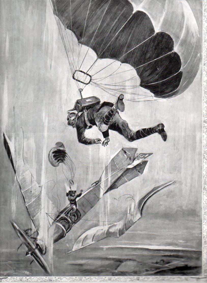
    The image below seems to depict the 1912  exploits of the American and British inventors who at about he same time developed a parachute that could be worn in a box on the aviator’s back, contained in a box with a removable panel.  It was a very heady development, and the whole idea–seen here in the pages of The Illustrated London News for 28 September 1912–must have seemed like science fiction to the casual reader, the caption beginning

    Parachute bomb454

    “…our illustration appears to be somewhat fantastic…”  The ripchord, one of the most important elements of a parachute, didn’t get introduced into the fray until about 1916, and the real utility of the parachute doesn’t seem to be developed until 1920 or so.  In the meantime, the whole business of flying was pretty much being done without a safety net, so to speak. 

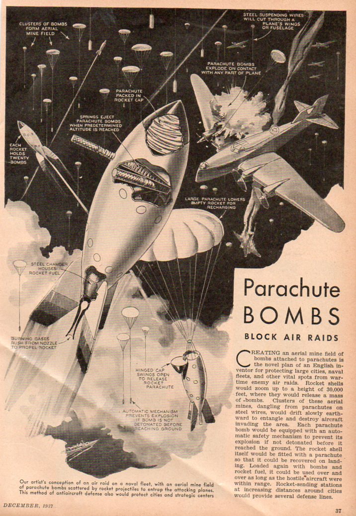
    But what I realloy wanted to get to in this post is something that did look “somewhat fantastic” to the readers of its day, as it does to me now:  parachute bombs.  As a late-night, five-martini idea it looks great, especially in 1937.  But the fact of the matter is that it does look like a bar stool plan similar to barrage balloons if barrage balloons were smaller, higher, fell and had bombs.  One element of surprise though may have been what would happen to the great percentage of these bombs that were fired above and floated back down to Earth with their warhead still attache to the parachute and unexploded.  The article states that the warhead would be disabled

    Parachute bomb453

    before it hit the ground, but then what?  I suspect that there would be thousands of these buggers littering the land/cityscape, which means that there would have to be an equivalent of an ambulance corps riding around finding, collecting and hauling these things off.  Seems like a non-started to me.  Plus there would be far more effective anti-aircraft elements developed very soon after this, not to mention the terribly significant mathematical and technical developments that would go into the fire control issue of the weaponry. ( But that’s another story, another long story, dealing with how to get aircraft out of the air–there’s some very sophisticated AA weaponry produced during WWI, s decade and a half before these parachute bombs, that would seem to make these things a bad afterthought.)


  • Packed Tight in the Renaissance–Another Look at Quiet Crowds

    JF Science Books   Post 1464

    Crowded435
    I’ve written quite frequently on this blog about the forensic components of crowds, seeing the interesting bits of smallness inherent in virtually every crowd scene ever made. [For example, see Ephemeral Uniqueness of Large Crowds here, or just enter “crowds” in the “search” box at left.]  Today’s installment looks at some older representations of crowds, or people or things just packed tightly together. 

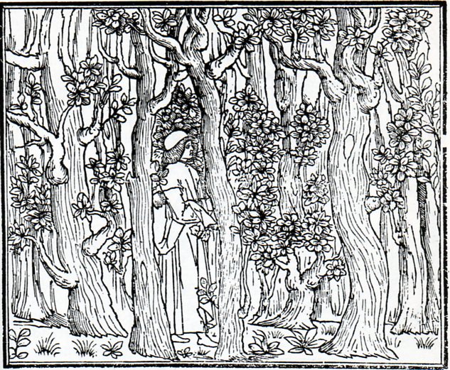
    It seems a little trite to lift this image from a superb example of Renaissance printing, and to attach it to a short post about crowds and being crowded, but so be it.  The image in question is from the semi-great Hypnerotomachia Poliphili1 (from Greek hypnos, ‘sleep’, eros, ‘love’, and mache, ‘fight’, or something like  Poliphilo’s Strife of Love in a Dream), which was a dreamscape novel hat was richly illustrated and beautifully designed, if not well written. Be that as it may, whether or not it was/is a dripping romance of sodden accomplishments and drippy sentimentality, it did encompass a weird allegorical element that linked architecture and feminine appreciation of sexuality with Poliphlio’s dream-search for his beloved Polia.   The book seems to have everything going for it except for a good story line and an author. 

    Be that as it may, I liked this image of Poliphilo entering the woods in his search for love–crowded, dense, low growing branches, and so on.  Visually it is very striking with lots of verticals; allegorically, it is extremely sweet.

    Crowded436

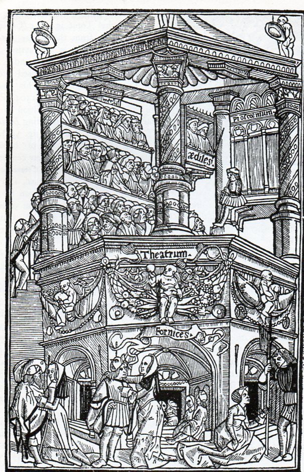
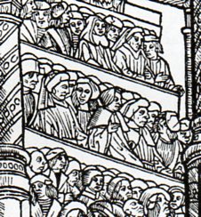
    Next (above) is this lively theatre image from Terence’s Comediae, printed in Lyon in 1493.  The Comedies of Terence were probably the thing that gave Latin a more-appealing public personae, something that was approachable to all and involved bits of life from all stations, much more so entertaining than a droning speech from the floor of the Roman Senate. (And in detail the crowded bit:)

    Crowded437

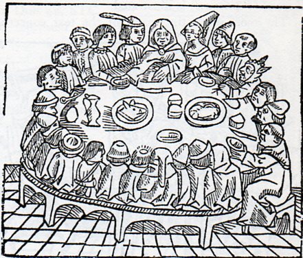
    And here’s some jowl-to-cheek seating in “The Pilgrims at Table”, from the Westminster edition of the Canterbury Tales, printed in 1484 by the great William Caxton:

    Crowded438

    There are no forks yet on the table–they wouldn’t come about for another few decades.

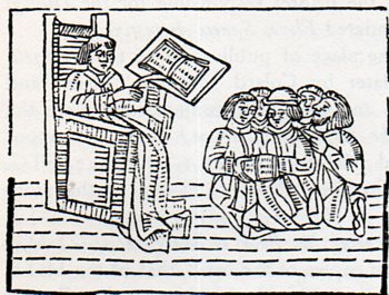
    And what are we to make of this scene–are these students as fearful of their instructor as they seem?

    Crowded439
    No–I think that its all about the book.  Books were very expensive when this woodcut was printed in William Caxton’s fantastic  Mirrour of the World (1481), and so if there was one book allowed for the classroom it was a lot, and all these people were trying to do was to huddle together so that everyone could get a look at the printed page. 

    There’s a certain stillness to the crowds above, much more so than most–there’s definitely no granular behavior about them, no extra-sensory physics to the ebb and flow.  They’re mostly just sedentary, but packed closely together. 

    Notes

    1.  This book was printed almost at the last moment of the 15th century, in December 1499, by Aldus Manutius in Venice. 


  • The General Mother of General Foods: Everywhereville, 1948

    JF Ptak Science Books   Quick Post

    General Foods425

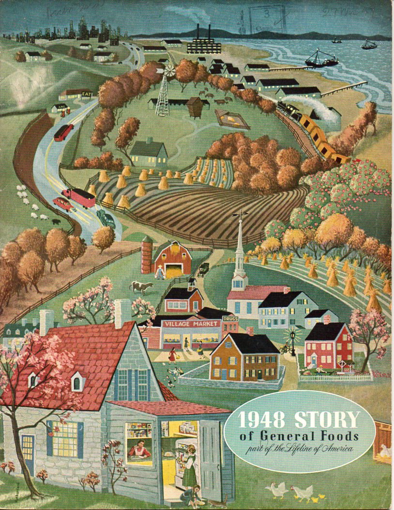
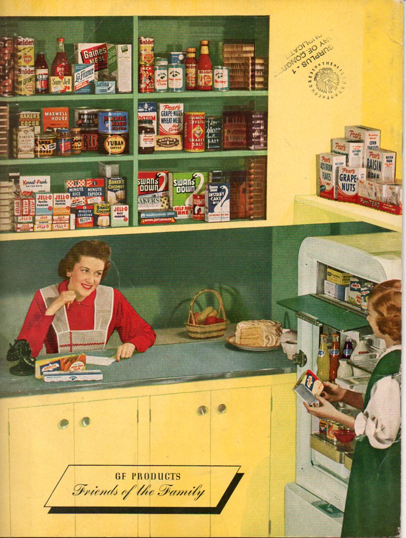
    Soylent Green is the touchstone for me whenever I see the name “General Foods”.  After all, can anything be so large and multi-directional than this, a firm whose name implies that they deal with so many different sorts of foods from so many different sources that it is impossible for them to choose any direction whatsoever?  Like General Electric, except that General Foods is much more diverse.

    And who would be best for General Foods to address in the pamphlet of their general stockholders annual meeting than the General Mom?  They evidently found her, and imaged her inside the kitchen of a cushioned little home outside of Everywhereville, right there on the bottom-left of the cover of the report. 

    General Foods423

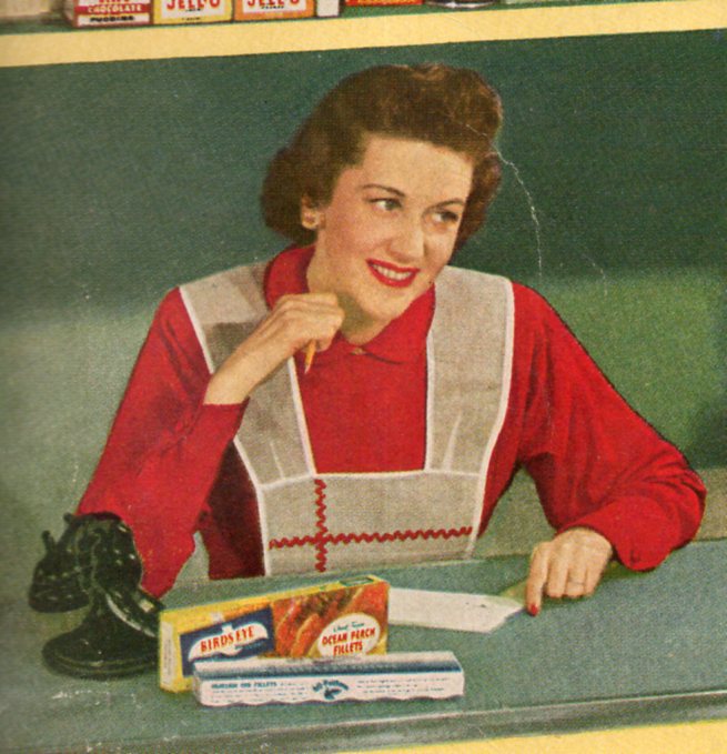
    She’s right there, right above us, right now.  If you turn over the pamphlet, you get a close-up:

    General Foods424

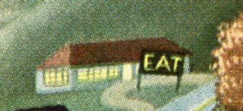
    She’s resting her thinking brain, taking a bit of a break while she thinks of other General Foods merchandise to buy from the grocer to add to her food collection–right now she is distracted.  Her attention is not directed to her daughter holding the frozen peas, but rather at the other stuff in the freezer–if you follow her line of sight, that’s where she winds up, I think. There’s a lot of wavey, Thomas Hart Benton-y stuff going on in the artwork on the front cover; homey, small town naive graciousness, with a large farm between it and the distant city.  It is dusk, the houses are glowing, and there’s nothing but wholesome American qualities of the imagined good life for the eyes of the stockholders of General Foods, the annual report of which lies within.  As a matter of fact just about the only bit on the cover to remind us of food is the kitchen seen at bottom, the “general market” just above, and the distant diner, reminding or demanding everyone to “EAT”.

    General Foods426


  • Monumentally Large (1400′) Wind Turbine, 1932

    JF Ptak Science Books   Quick Post

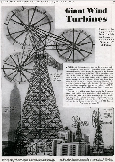
    Here’s a big idea:  a fantastically oversized, super-heavyweight wind turbine from 1932.  This monster was 1400 feet tall, fully 700 feet taller than the tallest modern wind turbine.  Actually, by conjecture, it looks as though the wind collecting units (or blades, or whatever these things are) might be 250′ long just by themselves, forming collecting space over 500 feet wide.  So that’s six blades at 250′ each per collecting unit, times three.  18 250′-foot long blades per structure.  It feels as though you could ride this thing to the Moon.  I have no idea how much the structure weighed.

    Giant-turbines
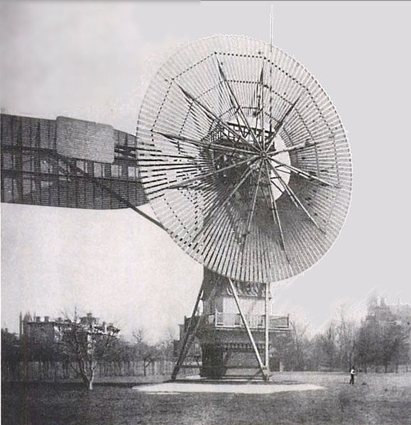
    For comparison’s sake, here’s a photo of the first successful wind turbine:

    579px-Wind_turbine_1888_Charles_Brush

     Charles F. Brush’s 1887 accomplishment, built in Cleveland (Ohio) was 60 feet tall and weighed 4 tons.  The beast above would have single blades that were four times the size of this entire structure. (Or thereabouts–the 60′ tall thing doesn’t look quite right in this photo, seems to be somewhat taller.)


  • A Monumental and Fantastically Bad Idea: Draining the Mediterranean

    JF Ptak Science Books   Post 1460 

     “Simply the thing I am shall make me live.”–from Jorge Luis Borges, “Shakespeare’s Memory”

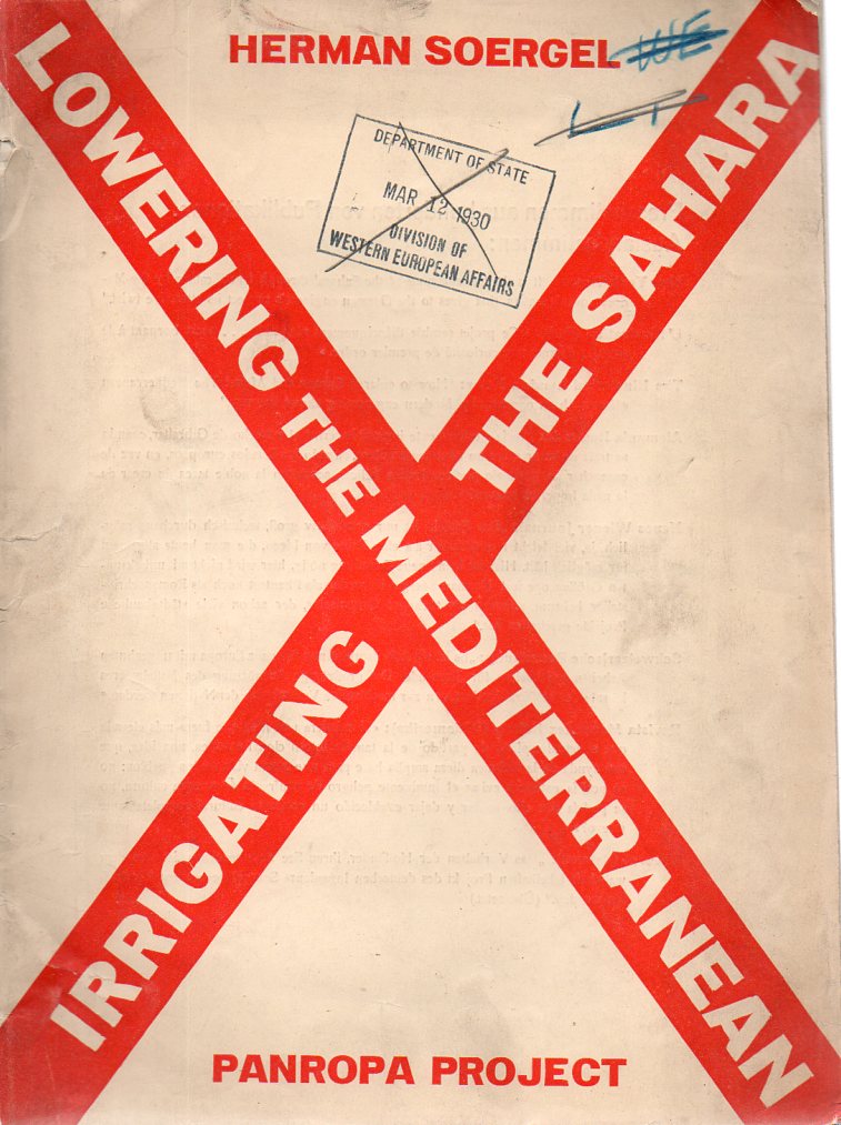
      Soergel403
    It would be a Purgatory, or worse, to suddenly wake up one morning with another person’s memory–worse yet than to have wished it, only to find that you didn’t want it at all.  This evidently works out with memories high and low, though it is tempting to want to wish to see what the inspiration looked like for one idea located in a particular memory.  Or maybe not.  But I am curious about when and here the author of the pamphlet above got his idea, and what it looked like to him–did he hear or see or smell something that prompted the inspiration for this reverse-monumental jolt, something that may well be one of the worst engineering ideas of the 20th century? [This pamphlet is available for purchase at our blog bookstore, here.]

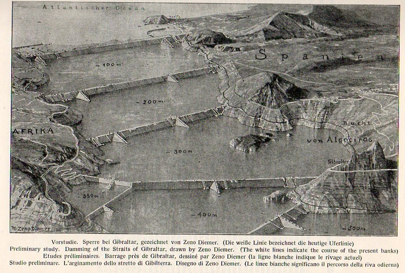
     It is interesting to pursue a loose thought like this to its not-necessarily logical end.  Such is the case with the self-styled Paneuropic ideas of Hermann Soergel (1885-1952), the author of the above. Soergel was a Bauhaus architect and author of a number of works on design and far more ethereal, floating-castle ideas. His most spectacular contribution—incubated in the mid-1920’s and still clinging by its fingertips as an idea among some current thinkers—was to put a dam across the straights of Gibraltar.  The dam would generate electricity of course, but most importantly to Soergel, it would also empty an enormous amount of water (lowering the sea by 200 metres)  from the Mediterranean leaving vast new expanses of land to be developed and colonized over generations into the future.  The water of course would have to go somewhere, and that somewhere was the Sahara Desert, somehow in its wake creating farmable and productive lands. Soergel was creating a certain, very wide, fantastical future of uncertain monumental prospects.

    Soergel405
    A “brief outline” of the idea was published in this four-language pamphlet, Lowering the Mediterranean Irrigating the Sahara (Panropa Project), which was published by J.M. Gebhardt in Leipzig in the very bumpy year of 1929. (The Weimar years in Germany were already into deep bumpiness; the rest of the world would follow suit in October of that year.)  To be fair, Soergel didn’t plan on emptying the entire Mediterranean, just a bunch of it–at least enough to be able to rename it.

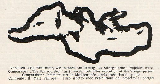
    Soergel404
    [Here’s a map of the new Mediterranean, or the Mediterranean that would be made to go away.  As you can see at this point Sicily and Italy become enormous, and the Greek Islands are combined to form one large land mass–this last bit alone is enough to form total and complete reisstance to this idea. Also at this stage perhaps 150 or so miles of new lands have been reclaimed from the sea all along its former borders–more so in Turkey.  There is no mention as yet of any new islands that are formed in the sea water’s wake.]  As it turns out Soergel thought that this plan would add at least 660,000 KM2 to the base of the surrounding countries of the Mediterranean, or roughly the equivalent of the combined land masses of Italy and Germany.  Having the sea pulled back from hundreds if not thousands of seaside towns and cities would no doubt be a “problem”, for them; but that doesn’t matter to Soergel, as they were inferior thoughts to the grand idea of emerging a new continent.  Great bog (and a good simulation with a powerful computing capacity) only know how the changes in the Mediterranean would affect the climate–well, that in combination with the thousands of new square miles of inland sea and canals in the previous Sahara desert.  There are of course many other problems. 

    The master plan at work was that the world would be divided into three economic spheres in the future, all beginning with the letter “A”:  American, Asia, and the new land to be created by Soergel, “Atlantropa”, which was the former Europe expanded into the new dry beds of the Mediterranean and North Africa.  And also of course Egypt, which would be covered with “thousands” of canals and become semi-submerged by the new borders of the meandering sea.  This would be the way for Europa t==Blog July 21==shakespeares memorieo compete with the rest of the world in the future. 

    [I should point out that the image above comes from the Illustrierte Zeitung (Leipzig) for August 1931, and is a drawing by an artist named “AS. Christ” depicting a cross section of one of the bridge/dams of Soergel’s Panropa’s ideas.]

    Perhaps it is actually three steps to get from the idea of damming up the straits of Gibraltar to the osmosis of Shakespeare’s memories into someone else’s brain—a squinting acquiescence of the middle touch being the brilliant Jorge Luis Borges.  You see it was in the Argentine master’s last published story, “Shakespeare’s Memory”, that we meet Herr Soergel (as Hermann Sorgel) again.  But so far as I can remember Soergel exists only as a fictional character, with no reference to his real-life self.  In this wonderful story, Soergel inherits the memories of William Shakespeare—these bits come to him slowly but surely, until they start to conflict with his own memory, and things get difficult.  The man with Shakespeare’s memories winds up phoning strangers on the telephone, giving them away at random, until Soergel is left with his own mind again.  Superior as Bill’s memories were, they still weren’t Hermann’s, who wanted his own life back in the end. 

    And so from the titanic, pan-europic technodream of Bauhausian Hermann Soergel to the dead brains and living memories of William Shakespeare, all through the fingers of the beautiful Jorge Luis Borges.  

    I’m sorry to report that at the end of it all, near the end of the pamphlet, Soergel releases his opinion on the political importance of his project.  And yes, his aim was to form an alliance between the new PanAmerica (of the “three Americas” with the new Pan-European African Union to thwart “the yellow peril” which “arises from the racial antipathy of India, China and Japan.  Soergel writes that “the fate of occidental civilization…will be settled on the Mediterranean”. 

    After it is all said and done, perhaps the best reiew of the work by Soergel is provided by the graphic designer who put the Big Red X on the cover of his work.  It fits.