A Daily History of Holes, Dots, Lines, Science, History, Math, Physics, Art, the Unintentional Absurd, Architecture, Maps, Data Visualization, Blank and Missing Things, and so on. |1.6 million words, 7500 images, 4.9 million hits| Press & appearances in The Times, Le Figaro, Mensa, The Economist, The Guardian, Discovery News, Slate, Le Monde, Sci American Blogs, Le Pont, and many other places… 5000+ total posts since 2008.

Category: Absurdist, Unintentional

  • Famous Folks Leaning

    JF Ptak Science Books Quick Post

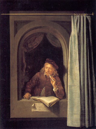
    Leaning, Oppenheimer I’m going to have to keep this category open while other famous leaners pop into my head.  For right now, presently, right at this moment, I’ve only a few,  but I’ve managed to break the leaning category into two segments:   leaning, without aid; leaning, with aid (or leaning against or on something).  Also for completely arbitrary reasons I’m excluding entire genres of people who must necessarily find themselves  leaning for one reason or another: speed skaters, sailboat racers, acrobats, gymnasts, yoga folks, speed bike racers, rollerderbyists, and people leaning away from the dead or some other font of pity, and so on. No Medieval or Renaissance anatomist drones “leaning” into their cadavers with sharp tools (as in Mondino’s directing a dissection from the late 15th century), or the endless peasants leaning into their farm tools as they work or catch a quick nap in the images creLeaner douated by the Breughels, nor any series of Adams and Eves leaning hard into their bleak future after having accepted the bait that doomed humanity, leaning first towards and then away from the Great Fall.   I just want relatively unexplained leaning, or leaning for the fun of it.  And of course no leaning Towers of Pisa–and no lounging, as in the image of Man in the creation of man scene in the Sistene Chapel.  And  no half-body leaning, as with say the images of all of those portraits that were so beautifully done by Gerrit Dou, featuring his subjects playing with trompe l’oeil and perspective, leaning a bit out of windows, outwards towards the viewer, or kids blowing bubbles leaning against open windowsill (as in this from Frans van Mieris)  or Jean-Baptiste-Siméon Chardin, The Soap Bubble (1739).

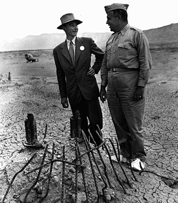
    I’m just looking for people leaning, for no good reason.  (First up was Robert Oppenheimer leaning away from the not-understood General Leslie Groves.)

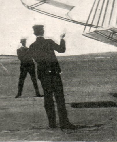
    Wilbur (?) Wright, 1901:

      Wright brother full 1901490
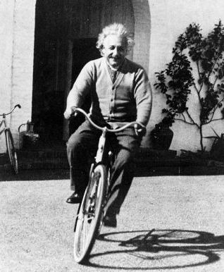
    Albert Einstein, California, 1935:

    Leaning--einstein

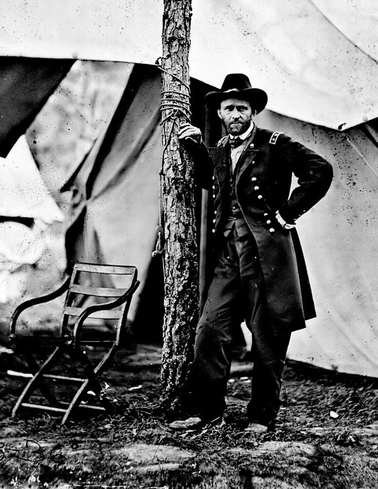
    General Ulysses Grant, 1863:

      Leaning ulysses
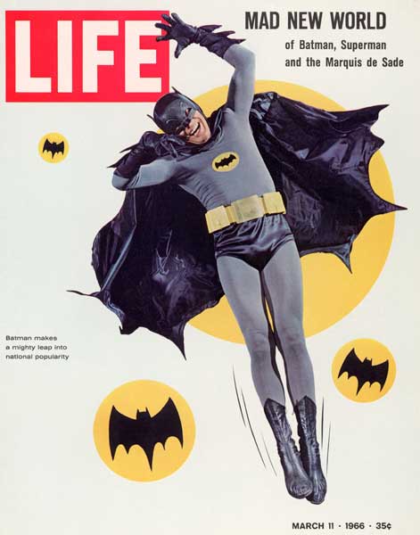
    Batman, 1966 (but seriously, Heath Ledger’s Joker wound up doing a tremendous amount of leading in that movie):

    Leaning batman

    Leaning joker

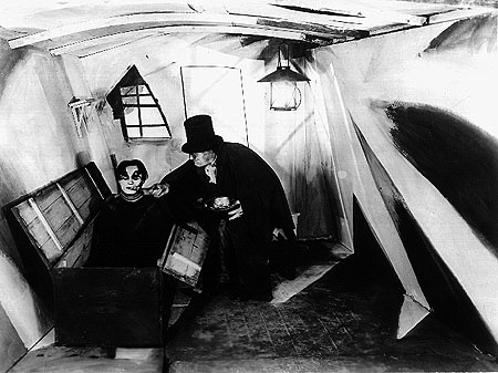
    And speaking of the leaning Joker, there’s always Dr. Caligari, who lives in a leaning world:

    Leaning caligari

    I’d love to hear from others who might have suggestions for other leaning people!


  • Searching for Structure: Triangles and Trees

    JF Ptak Science Books  Post 1494

    Structure512

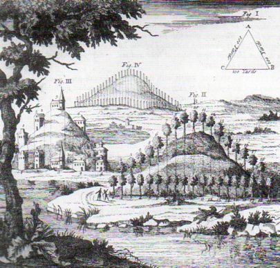
    It was this lovely engraving from Richard Bradley’s A General Treatise of  Husbandry and Gardening..., printed in London in 1721/2, that brought up the issue of structure in creation, and how that issue was in one way approached by the new tool in the scientific toolchest, the microscope. 

    “…the Contrivances of the Almighty Creator is as visible in the meanest Insect of Plant, as in the greatest Leviathan or the strongest Oak.  To touch upon all the Wonders this Instrument shews us would be infinite”–William Molyneux, on the microscope, in his A Treatise of Dioptricks in Two Parts (1692, quotation fro the second edition of 1709 via Marjorie Nicholson’s Science and  Imagination, Cornell, 1956.

    The question that the microscope—newly introduced and popularized by Robert Hooke in 1665 and Anton van Leeuwenhoek in 1674–was so able to address at this time was the question of the structure of things, and whether the Almighty Creator allowed for unrestrained creativeness or if the cosmos was subject to patterns and forms.  The microscope was so tremendously nimble that it allowed its observers the luxury of finding “correct” answers on either/both sides of the issue, that arguments could be well made and sustained for variety and regularity. But of course all found the reason for either end of the argument deeply seated in the e hands of god, as seen in the lovely quote below by the great early microscopical popularizer, Henry Baker1. 

    But this is just the tiniest bit of a nod at the question of structure in the history of science, a search for the relationships between, well, things small and large:  atomic, molecular, cellular, organism, population, ecosystem,solar system, universe.  The issue of structure may be the only issue–perhaps if you were made to select one question to have answered, automatically, an answer for everything, it might be this issue of how things stand in relations to one another.

    Which gets us to this 1721 engraving of a tree-covered hill, following the designs of a human creator, a re-animator of the natural landscape according to a theory of beauty, part of which hangs in the form of a triangle  in the right-hand upper corner.  A three-sided strategy of the relationships in nature, provided by a human vision. A very small  appreciation of an attempt to recognize the relationships between things, and in this case, the beauty of trees and hills. 

    Notes:

    1.  “The first Part of this Treatise discovers in the Particles of Matter composing Salts and saline Substances, Properties whose amazing Effects would surpass all human Belief or Conception, were we not convinced of their Truth by the strongest ocular Demonstration. That beautiful Order in which they arrange themselves and come together under the Eye, after being separated and set at Liberty by Dissolution, is here described and composed but one kind of figure, however simple, with Constancy and Regularity, we should declare it wonderful: What must we then fay, when we see every Species working as it were on a different Plan, producing Cubes, Rhombs, Pyramids, Pentagons, Hexagons, Octagons, or some other curious Figures peculiar to itself; or composing a Variety of Ramifications, Lines, and Angles, with a greater Mathematical Exactness than the most skilful Hand could . draw them?”

    “Sensible of my own Ignorance, I pretend not to account how this is done: all I know is, that Chance or Accident cannot possibly produce Constancy and Order, nor inert Matter give Activity and Direction to itself. When therefore these Particles of Salts are seen to move in Rank and File, obedient to unalterable Laws, and compose regular and determined Figures, we must recur to that Almighty Wisdom and Power which planned out the System of Nature, directs the Courses of the Heavens and governs the whole Universe.”  — Original, shorter quote of Henry Baker in his Employment of the Microscope (1753) found in Nicholson’s book; the above, longer version is from the 1764 (and second) edition, found here.


  • The Long Fight for Captializing the “N” in “Negro”

    JF Ptak Science Books   Post 1483

    N “I believe that eight million Americans are entitled to a capital letter.” W.E.B. BuBois

    The history of the power of words is long and complex, and for the most part is on one side or the other of the political and social mirror, at least in the United States. Controlling the meaning of a word or phrase controls the idea which alters the way people approach it, defining the very heart of what may control the impulse for war or peace, which means that people may die as much for words as they will for ideas.

    Sometimes the idea of control is even simpler than the word—it may be a simple letter.

    Like the letter “N”.

    Since the American Civil War (now in its 150th year as of last month) when the use of the word “Negro” was used to describe African Americans, it appeared in print overwhelmingly with a small “n”. The idea was simple—to use a capital “N” would give a certain amount of respect and social diligence in referring to this race of people with a proper salutation; the small “n” minimized all of that, a symbol that these people were not worthy of having the initial letter of their race capitalized, and that because of their inferiority.

    This was also the case with the word “Colored”, which was used in the decades before the Civil War and then lightly after that, giving way to for a short time to “Freedman” and then Negro–”Colored” appeared in print as “colored” in the vast majority of times.

    The capital N was a rallying point, a common point of singularity for a large percentage of the Black population in the U.S.–and a very tiny percentage of the White population. We can deduce this because major papers such as the New York Times did not adopt a policy of using the capital “N” until 1930. And as a matter of fact the federal government documents printed “negro” small “n” beyond 1930, even though heavily lobbied to use the more enlightened and respectful “Negro”. The issue was evidently sidestepped throughout the Hoover administration.

    There was in the country a racism so entrenched and engrained that African Americans were seen as being wholly unworthy of being dignified with a capital “N”, and it was the natural way of things. As the editor of the Eatonton, Georgia, newspaper Messenger said when asked about the capitalization issue, that he would not be a party to it, because “it would lead to social equality.”

    And that’s just what everyone ws trying to avoid. And like the federal government, the control of the capital “N” extended into historical control as well. When W.E.B. DuBois wrote an article for the venerable American Historical Review, the editor, J. Franklin Jameson, refused to allow the use of DuBois’ capitalized “Negro”. As the editor of the Dictionary of American Biography, Jameson refused the capital “N” in the publication until it was terminally embarrassed into doing so, in 1937.

    And so it goes, 60 or 70 years of fighting for the minimum respect of capitalization.

    And this doesn’t even address the use of the reviled “n” word, which is a story unto itself. And in which there was also debate over the years as to whether or not that be capitalized.

    Notes:
    The major source of the information in this post comes the fantastic article by  Donald L Grant (12/01/1975). “Some Notes on the Capital \”N\””,  Phylon (0031-8906), 36 (4), p. 435, who did a splendid job of research.  There’s also a bit of memory pulled from H.L. Mencken’s The American Language (4th edition), which was clear and concise, even though Mr. M. had a small social problem here and there with minorities.  It must be said in his defense that the magazine he edited, The American Mercury, “always” used the capital N. 


  • Questionable Quidity Department: Cigarette-attached Ash Tray

    JF Ptak Science Books  Quick Post

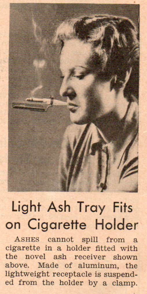
    In the entire invento-sphere of things crying out for suitable invention, this “innovation” in smoking is surely not one of them.  Perhaps if you needed an additional bit of strangeness in developing the quirkyness of an impossible boss for a character in a movie–someone who needed to be able to be free of the responsibility of flicking the ashes from their ciggie as they screamed at a subordinate, or a cook using the device to free up both hands while preparing a meal, or etc.–then I guess this invention could be part of the genius of a role.   Beyond that, I don’t know…particularly if there was a smoke-in-bed version.

    Perhaps the downfall of such a device is seen in the eyes of the model, which are transfixed on the ashes in her nose tray.  Maybe the settling of the ashes two inches from your nose would be a hypnotic event, altering the wearer’s sense of place and attention, giving you poor vision, and a certain sense of smoky sullenness.

      Bizzaro 509


  • The Unbearbale Lightness of Nerves, Homer Simpson Hair, & Rhino Chins of the Renaissance, Part I

    JF Ptak Science Books   Post 1480

    In the structured and orderlZocchiy world of Renaissance painting and illustration I find the semi-wild, stringy, lonely, unruly strands of this and that, the minor elements of an artistic composition, to sometimes be most interesting.  This is so mainly because they could be considered ephemeral pieces of the work, minor additions to a developed scene, not particularly necessary to the whole.  But they there are, and sometimes they are highly unusual.  In the larger scheme of things these elements can be background or foreground figures, sometimes added for the purposes of scale in what is supposed to be an architectural study–but there are times when these small figures, sometimes occupying perhaps a tenth of a percent of the illustrated scene or less, are given vast and vivid lives by what may have been an engraver desperate for a little artistic freedom.  And so that’s why we see unusual aspects of the population peopling-up a city square scene, showing off a town hall or cathedral. 
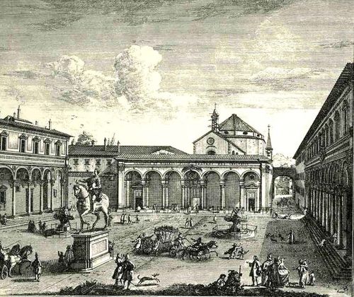
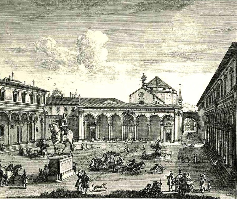
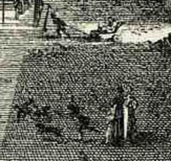
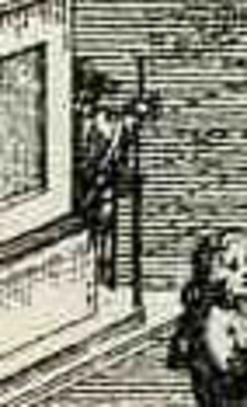
     For example in the engraving Veduta della Piazza della SS Nunziata Statua Equeftre di Ferdinando Primo, Fonti, e Loggie Laterall by Giuseppe Zocchi (1711-1767) it would’ve been easier certainly to leave the plaza empty, but Zocchi doesn’t, filling in the empty spaces with several dozen people, most of  whom are really rather busy.  In addition to royal coaches and animated discussions, we can find a number of unusual images.  There is a very curious sub-scene of a women with three children, one of whom seems to be falling, or leaping, the woman holding her hand straight out in front of her.  Directly above them we can see a man pulling a small carriage with another person in it.  Is this person a child?  Are they elderly?  Infirmed?  And what about the (probably elderly) figure who we can half see, leaning their back against the equestrian statue, holding a staff?  Why bother adding half of figure (from the rear)?  Why on earth did Zocchi choose to add
    Bloglooking_closely_1__carriage_2
    characters like these when it would be substantially easier to show a gent walking with a stick?  Is the artist expressing a little semi-invisible artistic freedom, or just using his powers of observation to make the commissioned part of the art more interesting?  Or perhaps Zocchi has nothing whatsoever to do with these tiny figures—perhaps it is all the work of the engraver, who was responsible for translating Zocchi’s paintings into metal, adding these figures as he went? 

    I think it is fascinating!  Perhaps what the story is here is that these were really just simple street scene, common street life, and the artist simply included them in the work?  That would make them 18th century snapshots of common life in Florence, something that wasn’t ordinarily captured by very many artists at all.
    Bloglooking_closely_1__man_caneWhat I’d like to look at today seems even more ephemeral than found people in town squares–it is, quite literally, the smallest bits of the artwork:  the dissected tendons, the hair on the remaining skull of Death, the stubble on the chin of a rhinoceros, and to look at the great liberty and beauty with which these fragments are represented, particularly if they are lonesome, segregated things of high simplicity.  Lean, articulated, severe, lonely, small elements.

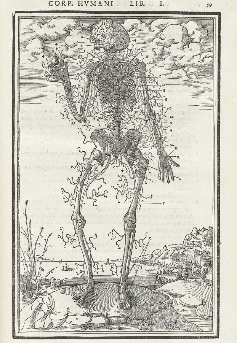
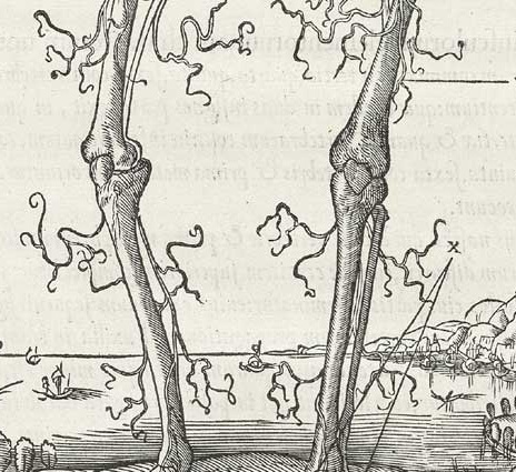
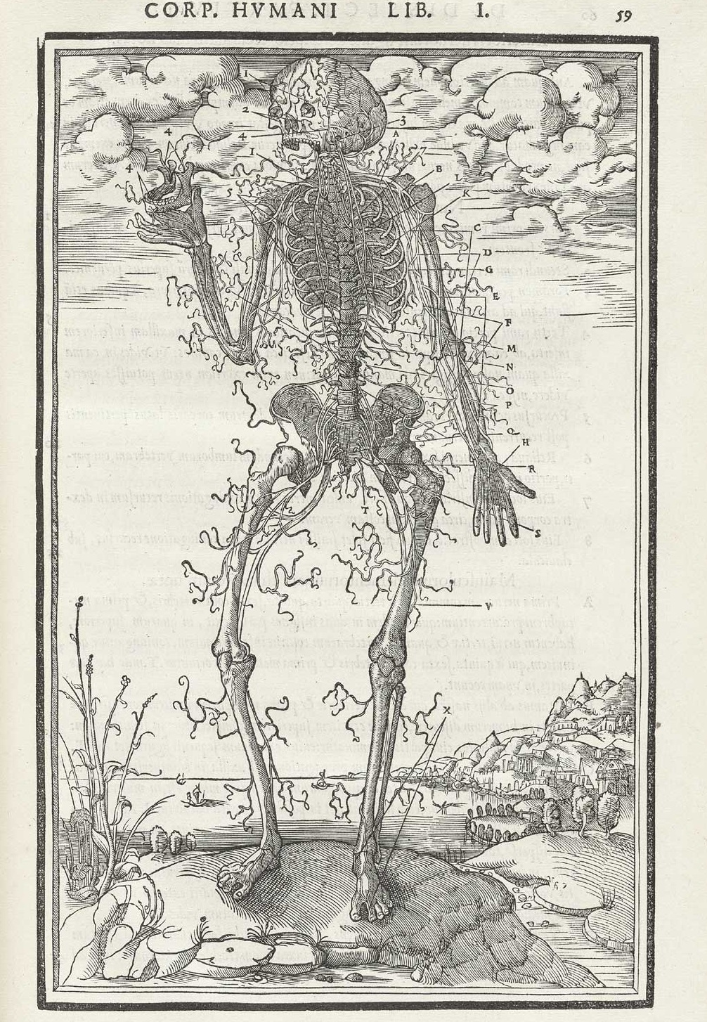
    The first example comes from Charles Estienne’s De dissectione partium corporis (“On the dissection of the parts of the human body”), which was printed in 1545 and which was very nearly the first truly extraordinary anatomy book, almost beating Vesalius to the punch, had it not been for some printing foibles.  One of the illustrations that I’m focusing on is his dissection of nerves, the spindly, flowing ones being cutaneous nerves that supply skin sensation (thanks to Alex Baker for the correction!) , which look for all the world to be beautiful dendritical elements being blown by a breeze, maypole wrappings come undone, celebratory flags…something beyond tendons.  I know that the artist and designer are simply trying to show the reader their structure and so it makes sense to display them like that, but they have a certain classical beauty in their representation that seems far beyond what might be considered necessary for the task at hand. 
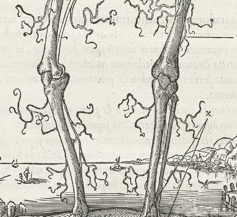
     

    Estienne_p059 b
    And the full image:

    Estienne_p059

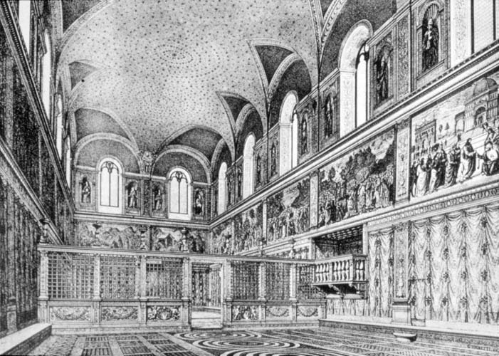
     This is completely different from sparse and the orderly control of empty space; nothing at all like, say, the Sistine Chapel ‘before”, with its ceiling beautifully and lightly decorated with stars (I guess gold on a sea of deep blue?):
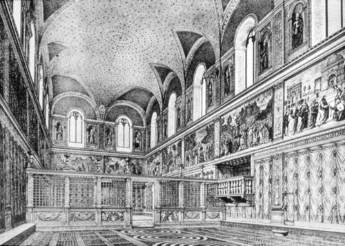
    Sistine

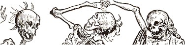
    I have found a number of examples of little bits of hair dancing on the top of its head (or skull) as though the few strands were luxirant manes floating in oil like a halo around the lucky owner–but no, our artist (below) depicted one of Death’s mortal victories in vestigial Homer Simpson-like lonely hairs.
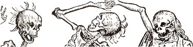
    Death hair2

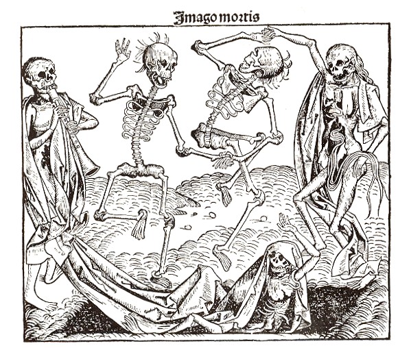
    The full image (below) is called “Imago Mortis”  (the World of Death) and appears in Hartmann Schedel’s Liber chronicum (more commonly known as the Nuremberg Chronicles), one of the greatest illustrated (or certainly the most lavishly illustrated)  books of the 15th century.  Printed by Anton Koberger in Nuremberg on 12 July 1493, the Liber chronicum was basically just that, a walk through the known and imagined knowledge of the mid-Renaissance with the great humanist Schedel acting in the role of conductor.  There’s certainly much of interest and disinterest in this book; Schedel was not afraid to make a guess (and even a wild one) when facts didn’t fit or were unavailable.  (For example, he famously re-used the same view of a city to illustrate different cities.)  But for my lowly interests, its the hair of Death that interests me.

    Death hair
    And just in case you don’t know the “Homer Simpson” reference:

    Hair homer
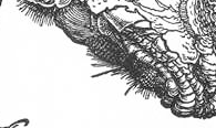
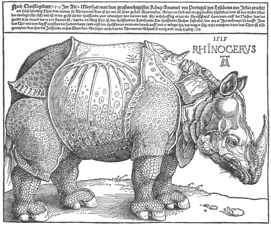
    Albrecht Durer does manage to come into play here, if not for some of his trees or the bits of string that he renders holding other bits aloft, but for his famous if not-terribly-original rhinoceros, which he had never seen though which he had seen images of, and for which he had taken the trouble to include the beast’s chin hairs:
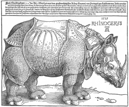
    Dürer_rhino_full det

    Dürer_rhino_full
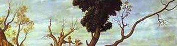
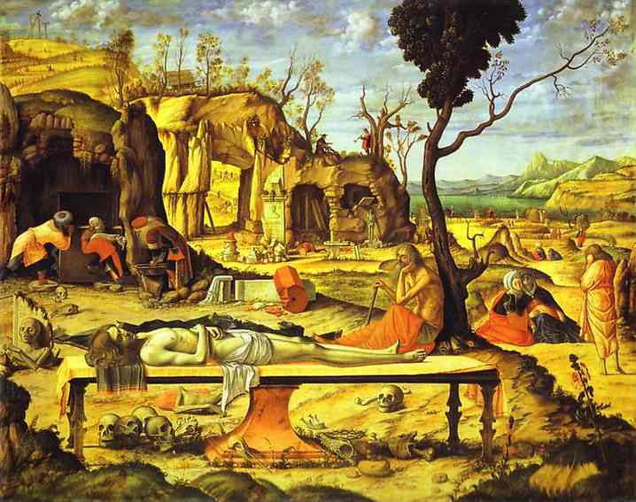
    And another example, this times for trees, in Carpaccio’s Mediations on the Dead Christ (Berlin), where we see the sparse and gangly dendrical-like bits on the trees on the hill in the background, as well as on the dead branch of the half-dead tree in the foreground:
    Unbearable tendons  carpaccio detail

    Unbearable tendons  carpaccio
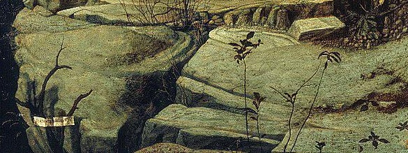
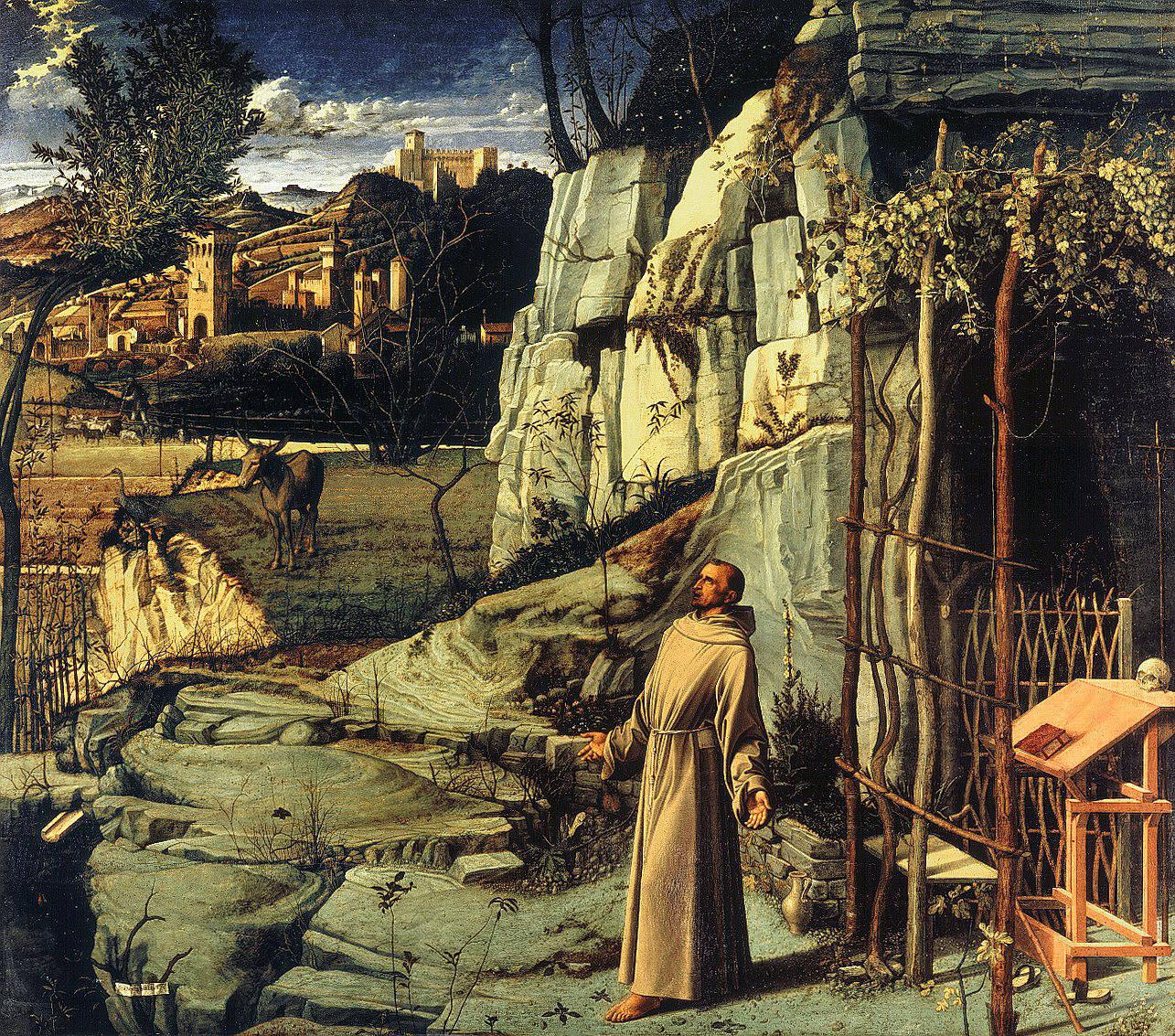
    This sparseness is almost there but not quite so in Bellini’s Stigmatization of St. Francis, which is in general a very dense composition with many competing elements, perhaps making the foreground weeds a little more singular:
    Unbarable  st francis detail

    Unbarable  st francis

    This uniqueness extends too into the geological strata foreground of Mantegna’s Madonna of the Quarry, or rather to the shelf of ground on which the Madonna stands. 
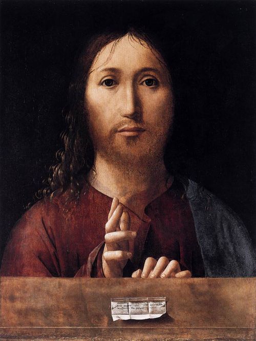
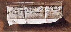
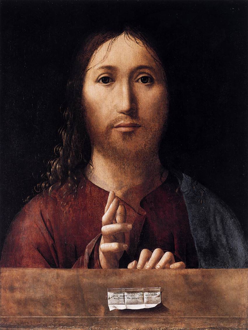
    This sort of solitary expedition into spareness and quiet can be found in many places, if you just look for it; for example, in the bit of scrolled paper used as a small trompe l’oeil in Messina’s Salvator Mundi (1465):
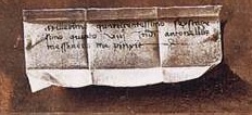
    Unberable  messina b
    a detail from
    Unberable  messina
    as can be seen in many paintings over the centuries…
    End Part I.
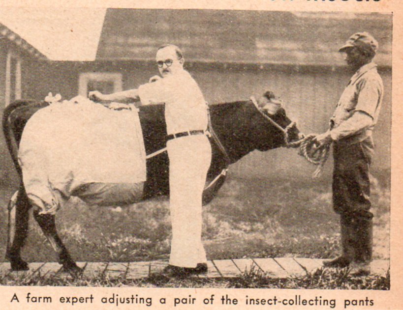
  • Questionable Quidity Department: Cow Pants

    JF Ptak Science Books   Quick Post Quidity

    This image comes from a stockpile of loose bits that have fallen out of various magazines–this one from Popular Science for October, 1937.

    Bizzaro cow pants'511


  • Species of Explosions: Human Anatomy, Explained

    JF Ptak Science Books   Post 1479

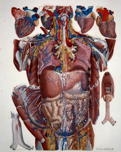
    Anatomia universale... by Paolo Mascagni and Antonio Serantoni

    Species of explosions come in all sorts of shapes and sizes, and basically release some sort of energy (chemical, nuclear, mechanical and so on), but in the cases we’ll look at here they are none-of-the-above.  The energy released in these explosions are in the form of potential, a knowledge-driven, controlled and reversibly ordered demolition, a deconstruction in slow motion.  The medical “explosion view” for the study of anatomy is a remarkable thing, especially when you considered not only the pre-Cat and pre-MRI times, but also the pre-Xray (1895) days of imaging the inside of the body–the images not only show you the bits and pieces alone but also in relation to the other bits around them.  The body becomes an archaeological dig, each level preserved so that a viewer could easily see the dependencies and relations between one thing and another. 

    Take for example Paolo Mascagni’s (1755-1815) beautiful Anatomia universale (an example seen above), which was printed in Florence in 1833 and has the look and sensibility of something much later.  Mascagni is able to achieve this depth not only from the exploded view, but also for the (somewhat exaggerated) coloring setting the specimen on top of a blank background the combination of the color and the background giving the whole thing a 3-D-ish feel–and if not that, then certainly a living image in which there is some fair amount of depth. 

    Anatomy exploded
    Another version of the exploded view which is also quite effective from the same work by Mascagni is his “exploded thorax”, showing a more limited display of the more closely-aligned organs. 

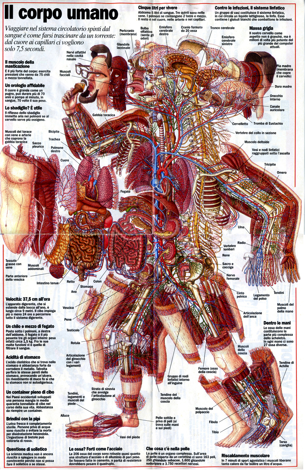
    When these views appear today–which is generally much more uncommon given the other technical ways of envisioning multiple layers of complex associated items–they have more of a sense of the antiquarian, retro feel to them, though they are no less useful for it.  As a matter of fact  I still prefer these views for understanding technical and engineering  and architectural complexes than anything else. And the modern master of this genre for me is Stephen Beisty, who performs his magic mostly in the tech and engineering fields, but who occasionally dips into the messy wet stuff of biology, as we can see in this fabulous exploded view:

    Anatom exploded beisty

    There are of course many other examples of (drawn) exploded views in the history of anatomical illustration, but I think these will do for now as good examples of the art.


  • Electro-LUXurious 15: Electroplating the Human Dead, 1891

    JF Ptak Science Books   Quick Post

    This is the 15th installment of a new series on United States Patent Reports on electrical quackery and unsubstantiated bric–a-brac from the newly-electric world of the period of 1870-1900–the following is a little outside the norm, being French, but I couldn’t resist it. 

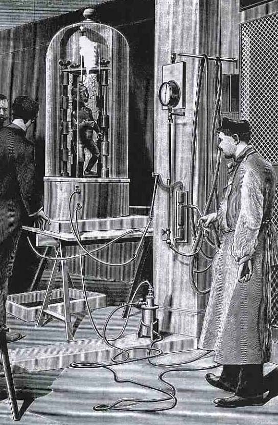
    Electropunk electro the dead
    When a picture just isn’t enough…

    And while we’re at it, let’s consider the work of Dr. Varlot (of the Paris Hospital) in electrocuting the dead.  Actually, what he proposed was another pretty gruesome use of electricity, though this one didn’t make promises of miraculous cures, or execute anyone.  Varlot proposed to “metalize” the dead (as we see in this very unsettling image of a child being electroplated) for, well, some purpose, purpose unknown.  It just seems and seemed like a bad idea, all the way around–a poster child for Bad Ideas everywhere. The medical uses of an electroplated baby seem very limited, and I can’t imagine anyone wanting to do such a thing to a dead child of their own.  It is wrong on every level.

    The engraving comes from Leonard de Vries, Victorian Inventions” (1971), who quotes the original source (the Scientific American for 1891) with this description of the procedure:

    “Dr Varlot, a surgeon in a major hospital in Paris, has developed a method of covering the body of a deceased person with a layer of metal in order to preserve it for eternity.  The drawing illustrates how this is done with the cadaver of a child.  The body is first made electrically conductive by atomising nitrate of silver on to it.  To free the silver in this solution, the object is placed under a glass dome from which the air is evacuated and exposed to the vapours of white phosphorous dissolved in carbon disulphide.  Having been made conductive, the body is immersed in a galvanic bath of sulphate of copper, thus causing a 1 millimetre thick layer of metallic copper to be deposited on the skin.  The result is a brilliant red copper finish of exceptional strength and durability.”

    Another method of electroplating the dead (in 1934) is discussed in the interesting blog, Quigley’s Cabinet, here. 


  • Things-out-of-Place Department: Books in Anatomies and Bridges in Impressionist Paintings

    JF Ptak Science Books   Post 1478

    I’ve been making a few entries over the last few days on antiquarian anatomy books, and wonder now about books in anatomies. I’m not certain what the appeal is, but it has a strange and immediate affinity for me to bridges in pre- and early Impressionism, a direct line to these bridges and to the other technological and engineering entities that were depicted in these canvases.  I’m not sure what the connection is to the two outside of the obvious verb-y part of “bridge”, but there seems to be an innate connection between the two, for me.  Somehow the book shouldn’t be of interest to the lifeless and dissected cadaver, but it is, and images of the two together turn up here and there in the history of anatomical illustration.  As much as the anatomist and artist work together to try to remove their subject from the confines of a book so that their work is freer and more accessible to the reader, to remove the illustrations from the pages of the book in which they appear, they do sometimes employ the image of the book to make a more prosaic and allegorical point.And as the object of design and wonder and beautiful geometry, one might think of the bridge as a object in Impressionist paintings from that movement’s earliest periods would be not quite the sort of thing that would be the subject of as many paintings as they were.  The unnatural angles of their supplementary parts  seem to make them not quite the fit for the early Impressionists.  But they were, and probably so for their 90-degree assaults on the natural landscape. 

    Perhaps what I think of the aesthetics of the treatment of bridges during the Renaissance, and the adoration of the Rialto and Pone Vecchio and all the rest, just wouldn’t make their way to the Impressionists’ canvases. But of course basically most ot them did paint bridges–Seurat, Cezanne, Van Gogh (a fantastic, small stone-and-wood miniature drawbridge), Derain, Pissarro, Renoir (the Pont-Neuf), Marquet, Sisley and of course and perhaps most famously, Monet (Charing Cross, Giverny, and all the rest)–all painted bridges.  I guess the bridge is just a shorthand for the representation of engineering and technology in general in Impressionism, which to my eye seems quite strong. 

    But getting back to books in anatomies:

    Ontleding des menschelyken lichaams by Govard Bidloo and Gerard de Lairesse

    Govard Bidloo approached the issue of the book in a most unusual fashion, making it appear as though the dissected hand and forearm were emerging from a semi-opened book, the long index finger coming to a pointing pose, suggesting perhaps that the viewer take heed of what is contained in the work. The image appers in Bidloo’s Ontleding des menschelyken lichaams (or Anatomia Humani Corporis) and was printed in Amsterdam (at what may have been the pinnacle decade of Dutch book publishing) in 1690; the book was illustrated by Gerard de Lairesse (1640-1711), a leading light in the Golden Age of Dutch painting, and perhaps one of the most famous painters alive there after the death of Rembrandt. There’s all manner of symbolism going on here, but what I like the most is the little crutch under the cadaver’s hand’s thumb. 

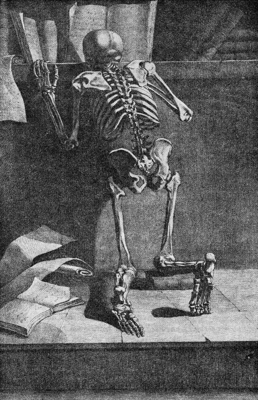
    Jacques Gamelin’s Nouveau reueil d’osteologie et de myologie, dessine d’apres nature (1779)  places skeleton and books togehter again, though this time their can be little doubt about the overall message that the designer and author tried to send to their readers. 

    Int he long run, and I guess in the short run as well, neither the bridge in Impressionism nor the book in anatomies is quite so much out-of-place as they are simply unexpected.

    Note:

    Van Gogh’s bridge at Arles–not an essential image whatsoever for this post–I just like the bridge. Van Gogh painted the bridge four times in oil and once in watercolor, all in a very short time.  (His stay at Arles was about 444 days, during which he made about 200 paintings, being some of his greatest work.

    Vincent Van Gogh Miscellaneous Buildings Technology Modern Age Impressionism Neo-Impressionism


  • Electro-LUXurious 14: The Happy Electric Chair, 1890

    JF Ptak Science Books   Quick Post

    This is the 14th installment of a new series United States Patent Reports on electrical quackery and unsubstantiated bric–a-brac from the newly-electric world of the period of 1870-1900.

     The history of the electric chair is odd, and ironic.  The “electric chair” that we think of first when we hear the phrase is actually the “electrocution chair”, and it comes into being after the introduction of the medicinal electric chair, which was designed as a palliative, electrical ointment of sorts for people with virtually any form of physical complaint.  Thomas Edison introduced the notion of the lethal use of punitive electricity in a brilliant if not diabolical ploy, suggesting in 1888 that Hew York State  pursue the new procedure of executing its condemned via the use of an electrified recliner, using the Westinghouse AC system–and thereby forcing the association of his competitor Westinghouse’s  electricity with electrocution in the mind of the general public. (I can only imagine being a Westinghouse exec and waking up to that bit of Edisonian showmanship; there’s an earlier post on this blog here that discusses the electric chair in more detail.)

    These chairs below are good examples of the earlier quack/medicinal sparking loungerettes, even if they are dated a little later (1890).