A Daily History of Holes, Dots, Lines, Science, History, Math, Physics, Art, the Unintentional Absurd, Architecture, Maps, Data Visualization, Blank and Missing Things, and so on. |1.6 million words, 7500 images, 4.9 million hits| Press & appearances in The Times, Le Figaro, Mensa, The Economist, The Guardian, Discovery News, Slate, Le Monde, Sci American Blogs, Le Pont, and many other places… 5000+ total posts since 2008.

Author: JF Ptak

  • Housekeeping and Categories

    JF Ptak Science Books

    We’re in the midst of having a new blog site! In addition to the new big coming changes, I’ve been told for the first time how many posts are in my various categories. And that there are 6,630 images posted in the blog. 

    So, the 2,400 posts (including 1902 full-blown “posts” and nearly 500 “quick posts”) break down in the following way…some of the 96 categories are clearly just under-employed (like “Art” and “Zoomology” and “Contraries”), but that I think is my own sloppy categorization hurriedness:


    Absurdist, Unintentional (474) 
    Alphabets (14) 
    American History: Western Exploration & Native Americans (37) 
    Anticipation, History of (118) 
    Architecture and Building (123) 
    Art (32) 
    Art History (256) 
    Astronomy (68) 
    atomic and nuclear weapons (101) 

    ·Posted by :

    ·in:


  • The Source that Inspired Many Copies and Imitations: The Teacher, 1496

    JF Ptak  Quick Post

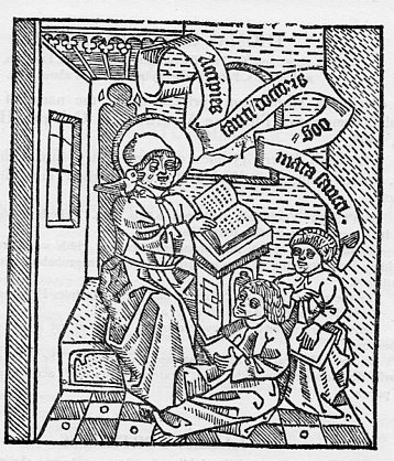
    Well, this is more properly called “the Acciples”, but for the sake of modernity we’ll keep to “the teacher”, and it is a beautifuil woodcut image has been reproduced and copied many times over the centuries.  The source for it all is Promptuarium argumentorum dialofice ordinatorum, which was printed in Cologne by Henricus Quentell in 1496.  The work is in the field of pedagogics and philology, and so the stout attention of the pupils and teacher to one another.

    Reading802


  • German Rocketry, 1920’s & 1930’s: Cover Designs

    JF Ptak Science Books   Post 1901

    Rockets ley794

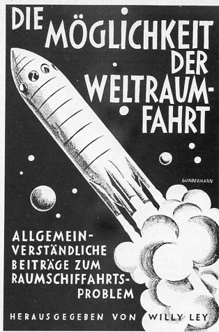
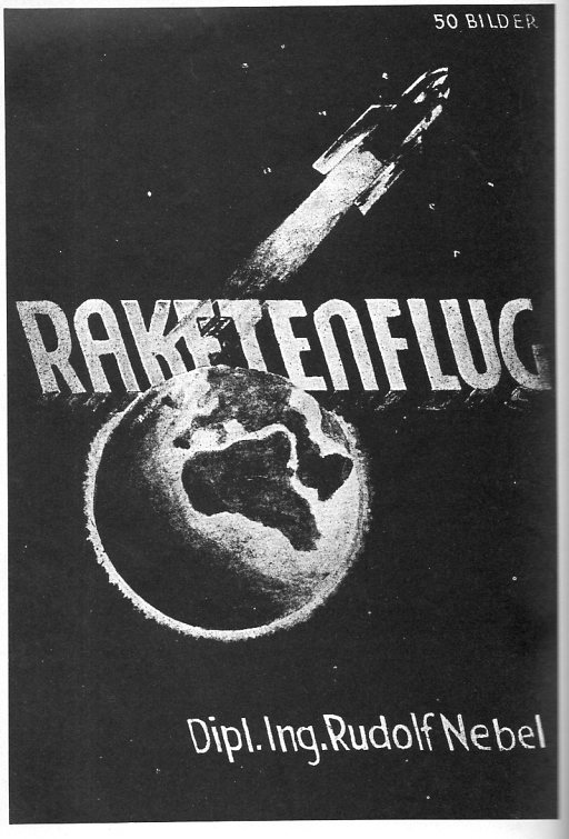
    I’ve selected a few representatives of design for the covers of pamphlets and books published in the field of rocket development and space flight published in Germany in the 1920’s and 1930’s (with one from the 1951).  They have a certain expectant sameness them, and, as leading publications in their field, have a remarkable similarity in their (black and white) design.  The combined efforts of these works wound up in the engineering labs of Peenemuende and then int he V-1 and V-2 rockets that pulverized the United Kingdom during WWII.  Later this same expertise, and some of the same engineers, “wound up” in the United States developing the American space program.  The most famous of these Paperclipped scientists was Wernher von Braun, whose name is so intimately connected with the Vengeance Weapons as well as the Apollo space program.  It is interesting to note that for many years if twas impossible to find von Braun’s name on any exhibition description in the Air and Space Museum in D.C.–it just wasn’t there, so far as I could tell, on no displays, even though I went looking for it pretty closely.  On the 30th anniversary of the Moon landing, I went to von Braun’s grave to see if it had been remembered in any way–there wasn’t anything there, just his simple small slab, next-door to and within eyesight of a Jewish cemetery. 

    Rudolf Nebel (1894-1978), very early member of the Raketenflugplatz, assistant to Hermann Oberth and very nearly the first to successfully conduct an experiment with a liquid-fueled rocket, beaten to the finish line by a man whose work he was not familiar with, Robert Goddard.  He defined right-wing in the Weimar era, and was part of a paramilitary organization called Stralheim; Wernher von Braun seems to have succeeded in the avenue that Nebel tried to travel along.  Nebel published this work in 1932, a year before the Nazi party came into power, and before his crotchety problems with teh SA began.

    Rocket nebel797


  • Blankness and Design in the Title Pages of Great Scientific Works (Part 1)

    JF Ptak Science Books   Post 1900

    As I’ve written about on this blog before, Blank, Empty, Blank and Missing Things can be of great importance.  For example, if human conversation wasn’t mostly filled with nothing, it would be difficult for us to process anything, everyone sounding like several mockingbirds calling away at once, all of the time.  Music would be difficult if there were no silent interludes. And of course since existence is made up vastly of nothingness, to have it be filled would present a, um, problem.  It also might be interesting to invent an 18th century board game based on the discovery of nothing through the ages…or maybe 16th century, when the idea of zero in mathematics was first coming into widespread use.

    My interest in Nothing today comes along with design and epochal scientific publications–or at least highly significant appearances of great ideas.  Sometimes the typography and design of the title pages of Great Works turn out to be very surprising–and sometimes that surprise in blankness is an unintentional result.  

    Also we’ll just discuss relatively recent works of the past 150 years or so. Design changes quite a bit from the 18th to the 19th century so far as scientific and technical title pages go–the earlier design (and particularly the illustrated versions) are another matter.

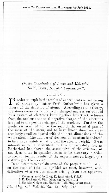
    First, the intentional bits, like this fine example of Niels Bohr’s superb introduction to the rest of the world of modern atomic theory (based upon the Rutherford model and Planck’s quantum theory),  “On the Constitution of Atoms and Molecules” (in the Philosophical Magazine for July 1913).  In this case (which actually is a three-part paper), the offprint to the publication has an upper part that is blank because it excludes the closing paragraphs of the preceding article–offprints being the separately-published and bound author’s article that were meant to be distributed privately and prior to publication of the appearance of the contribtution in the journal.  

    Blank title bohr790
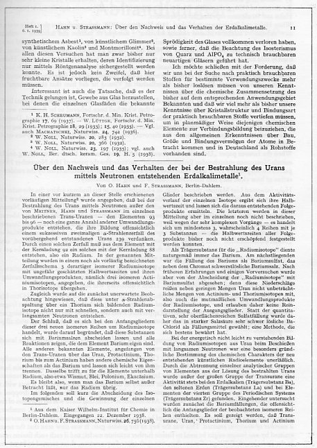
    Before I proceed though perhaps it would be interesting to see an attempt at anti-nothingness in design, which in many cases can be a work of high design art in themselves. For example, even though most of the white page is filled up, 

    Blank title hahn788
    this is still somehow quite balanced and pleasing. (Otto Hahn and Fritz Strassmann delivered a series of eleven seminal papers from 1933 to 1939, this being one of the most important, signaling the discovery of nuclear fission, an event that started its own sort of chain reaction in physicists who awoke with the sudden realization of how very doable all of this was, and how close so many other scientists were to having discovered this themselves.)


  • Thematic Maps: Finding Russia in the U.S. Midwest


    JF Ptak Science Books  Post 1899

    Putting objects of different classifications into the same scale for the sake of comparison is a relatively recent idea in the history of printing.  It really wasn’t until Etienne Durand’s architectural textbooks of the 1850’s that buildings by different architects were displayed on the same scale on the same page. Likewise, too, the cartographic depiction of mountain heights and islands and lakes and rivers side-by-side and on the same scale didn’t take place in earnest until mid-19th century. 

    My favorites relating to geographical items are those that take, say, all of the major islands in the world and remove them to a single sheet of paper, all in scale, so that it would be easier to compare their sizes without the distraction of the rest of the map.

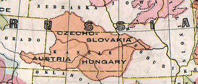
    Here’s another, just recently found in the warehouse:
    Thematic europe in Russia 782_edited-3

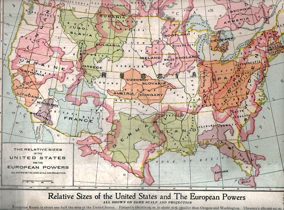
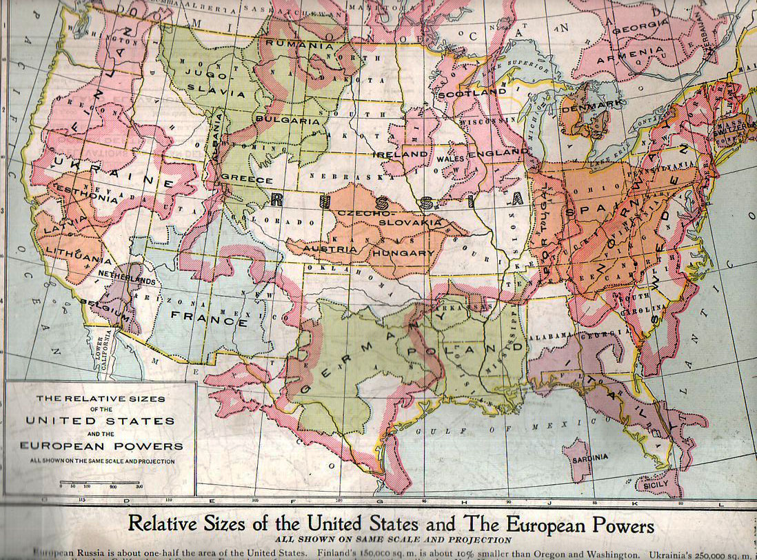
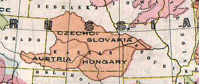
    This map, “Relative Sizes of the United States and the European Powers” was published by the People’s Handy Atlas of the World in ca. 1920,  appearing in print just a couple of  years after the map of Europe was changed by WWI.  (As a matter of fact this map very liberally used and without credit an earlier version published by the Geo. F. Cram company in their war atlas of 1914; it again appeared in the European War Book (by Canfield, published in 1917), calling on the information in this version and adding color. The People’s History also published a 1913 version of this map though I cannot find an example of it.)  Here’s the map in full:
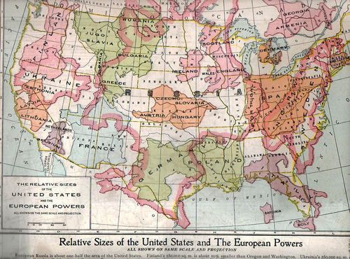
    Thematic europe in  us782

    It really does put things into perspective, giving the reader a good, strong look at just how small some of these countries were in comparison with the United States. Many of the combatants of WWI are here–and its quite sobbering to think of the enormous casualties incurred in some countries and the very small area that those millions of dead and wounded would have taken if placed in a similar locale in the U.S.  An excellent example of this is Belgium, fitting very nicely into less than a tenth of the state California, where so much killing and suffering occurred.  Thinking of France as battlefield that was limited to about 60% of the size of the combined four states of New Mexico, Arizon, Utah and Colorado, and then thinking of most of the largest battles of WWI taking place in an area about a quarter of that is, well, incredible.  Using this as a guide, less han half the state of Colorado would’ve been the seat of the battles of Verdun (976,000 casualties), Marne (750,000), Somme (1.2 million), Cambrai (700,000) Arras (278,000), the Spring Offensive (1.5 million) and the Hundred Days Offensive (1.8 million),plus all of the rest of the action, and you get a little bit of a better idea of the bloodiness of that acreage. 

    Placing things in comparison in the same scale, side-by-side, is an excellent means of insight. 

    Casualties in World War One (taken with thanks from the site First World War

    Country Dead Wounded Missing Total
    Africa 10,000 – – 10,000
    Australia 58,150 152,170 – 210,320
    Austria-Hungary 922,000 3,600,000 855,283 5,377,283
    Belgium 44,000 450,000 – 494,000
    Britain 658,700 2,032,150 359,150 3,050,000
    Bulgaria 87,500 152,390 27,029 266,919
    Canada 56,500 149,700 – 206,200
    Caribbean 1,000 3,000 – 4,000
    France 1,359,000 4,200,000 361,650 5,920,650
    Germany 1,600,000 4,065,000 103,000 5,768,000
    Greece 5,000 21,000 1,000 27,000
    India 43,200 65,175 5,875 114,250
    Italy 689,000 959,100 – 1,424,660
    Japan 300 907 3 1,210
    Montenegro 3,000 10,000 7,000 20,000
    New Zealand 16,130 40,750 – 56,880
    Portugal 7,222 13,751 12,318 33,291
    Romania 335,706 120,000 80,000 535,706
    Russia 1,700,000 5,000,000 – 6,700,000
    Serbia 45,000 133,148 152,958 331,106
    South Africa 7,000 12,000 – 19,000
    Turkey 250,000 400,000 – 650,000
    USA 58,480 189,955 14,290 262,725


  • Unusual Title Pages: Burning Metal, 1530

    JF Ptak Science Books   Quick Post

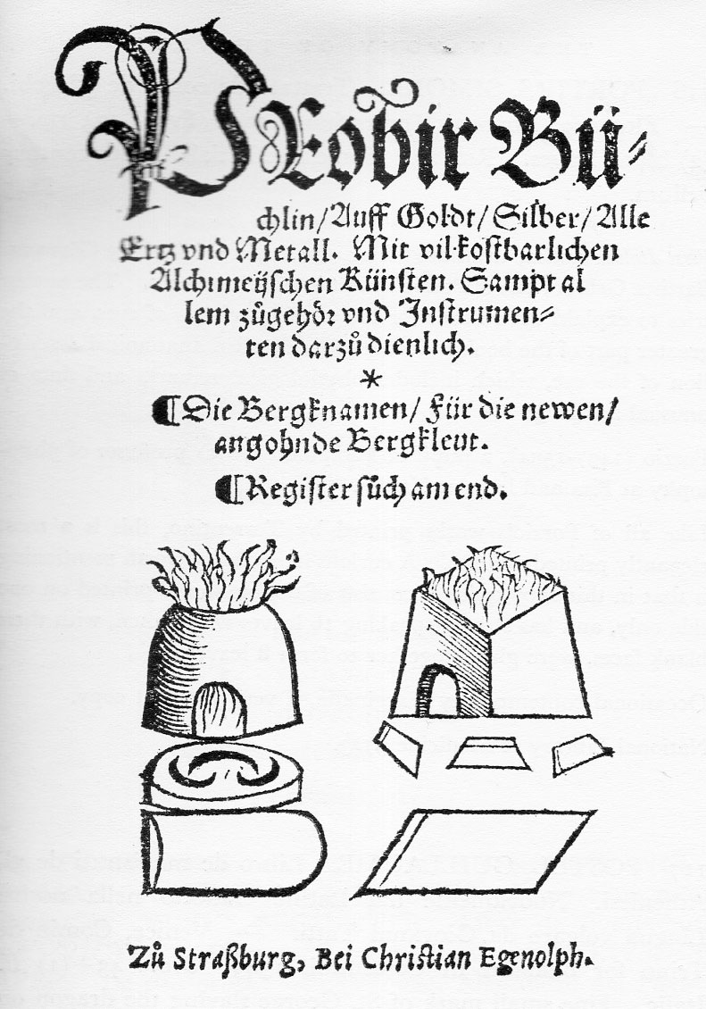
    Title pages burning metal774

    The Probierbuchlein (Probir Buechlin/auff Goldt/SIlber/Alle ertz und Metall. Mit vil kostbarlichen Alechimeijischen Kunsten…) printed in Augsberg by Christian Egenolph in the autumn of 1530, was the first German book to deal with the significance of alchemy and metallurgy.  I think it usual to think of the work of Georgius Agricola (1495-1555)  and his justifiably famous  De Re Metallica, but the anonymous (?) Pribierbuchlein predates the work by at least 36 years. There’s not much else of a comparison between the two works save for the earliness of the Probierbuchlein, as it was 48 folio leaves and somewhat restricted–but first is first, and it may have made the way easier for Agricola, whose own efforts paved the way for the systematic study of the Earth   Agricola made fundamental contributions to mining geology and metallurgy, mineralogy, structural geology, and paleontology, and outlined them all beautifully in a book that was ten times the length of the Probierbuchlein, and also fabulously and sumptuously (and usefully) illustrated.


  • Bus-Punk, 1934

    JF Ptak Science Books     Quick Post   [Also see an earlier post here on Air-Punk & Underwater 19th Century Cyborgs]

    Bus776

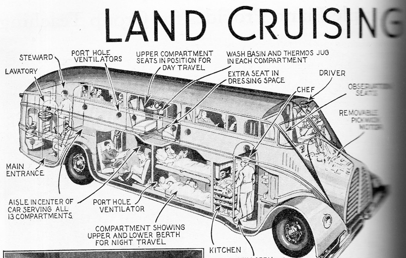
    This land-whale of a vehicle, a bus design for “Land Crusing De Luxe”, is left mostly to our imagination so far as specs and stats go.  It looks as though it would accommodate perhaps 14 people on a long haul.  There were two levels of living space as well as room for two (or four?) in sleeping quarters…perhaps a more luxurious class was seated downstairs.  In any event there were three attendants on the bus for its not-many passengers, including a chef, a seward and a driver. (Elsewhere in the article the driver is referred to as a “pilot”.)  

    I’m sure this would have been a beautiful thing–I picture is red on black, with an ultra-shine.  I’m also sur ethat it would have been a delsight.

    Source: Popular Mechanics, August, 1934.


  • Great & Lost-in-the-Dust Books: Love & Sex and the Freedom from Sin, 1549

    JF Ptak Science Books   Quick Post 

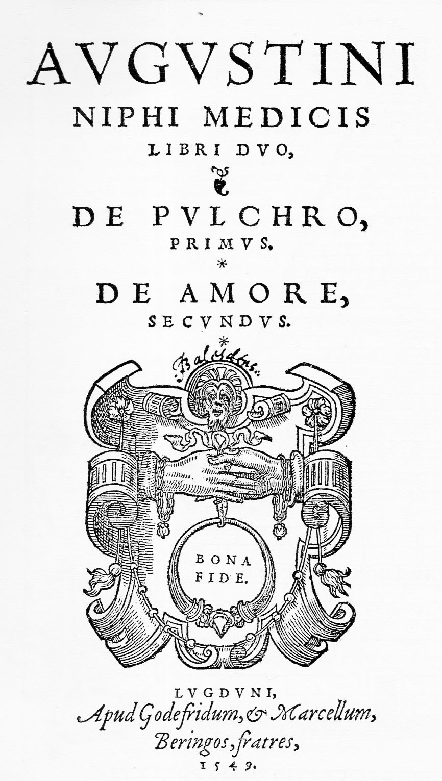
    In Agustus Niphus, Libri Duo de pulchro liber primus, de amore librer secundus, and printed in Lyon by Beringen in 1549, the scholar and Aritotelian Agostino Nifo of Sessa (1473-1546) wrote two significant treatises on the nature of beauty and love (liber primus and secundus, respectively).

    The amazing thing about this work is that Nifo analyzes the conditions of love and sexual expression as respondents to a  psychological basis, and since this was so, that love and sex are a product of the mind and not necessarily a simple undisclosed deire, that the act and thought coul dno tbe considered to be of siunful natures–basically, the two were as natural a thing as could be, and one does not condemn the acts of nature.

    Title pages bona fide775


  • Great & Lost-in-the-Dust Books: Anti-Astrology (1523)

    JF Ptak Science Books  Quick Post

    Scepper anti astrology773
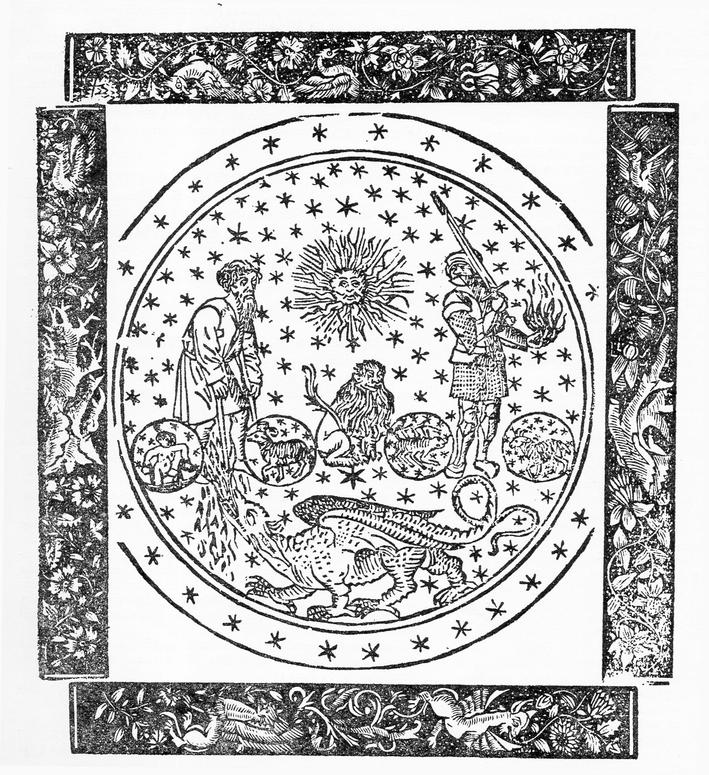
    Cornelius Duplicius Scepper (1500-1555) not only presented a beautiful book for publication in 1523–it was a work of deep scholarship, and it was edgy. Not skeptically-edgy, but a scientific-presentation-edgy, dismissive-via-the-facts-edgy. 

    The book (only two copies of which are found in libraries worldwide–at Brown and Oxford–though an online version is found here), Assertionis fidei adversus astrologos, sive signicationibus  coniunctionum superiorum planetarum anni millesimi quingentesimi vicesimi quarti, was published in Antwerp for Franc. Byrckman on  16 May 1523.  (The colophon at end describes the publication data so: “Symon Cocus, & Gerardus Nicolaus … excudebant. Anno salutis humanæ  MD.XXIII die xvi Maij. Impensis honesti viri Francisci Byrckmā …”)

    The book evidently takes great and scholarly pains to point out any number of errors in miscalculations by astrologers, the weight of which and the diligence in historical presentation amounted to the book being a refutation of the claims of astrology. Among his many refutations is one that is quite simple and elegant: Scepper figures out that the starry firmament is at least 65 million miles from Earth, which means that the great vault is deeper and bigger still, and so given the size and the distance and the number of elements involved, it would be asking quite a bit of common sense to believe that all of that was having an effect upon the individual lives of Earthlings.  Pretty good stuff for almost 500 years ago.

    And just for the fun of it, here’s a compilation video of tasty astrology debunkers, including Sagan, Dawkins, Tyson, Nye and Randi. Actually the James Randi part at about 4 minutes is absolutely priceless. 


    Notes:

    Scepper also wrote a biography/history of Charles V: Rerum á Carolo V. Caesare Avgvsto in Africa bello gestarum commentarij elegantissimis iconibus ad historiam accommodis illustrati. Authorum elenchum, è
    quorum monumentis hoc opus constat, sequens pagella indicabit in 1555.

    The colophon:

    Scepper colophon


  • The Devil’s (Gun) in the Detail (1489)

    JF Ptak Science Books  Quick Post

    Devil gun detail

    When I went to research this phrase, above, I was surprised to learn that it is about half as old as I. Playing on a slightly older  expression, “Le bon Dieu est dans le détail” (the good God is in the detail), commonly attributed to Gustave Flaubert (1821-1880), and of course “God in in the detail/s”, the “devil” part seems to be only from the mid/late 1970’s–a surprise.

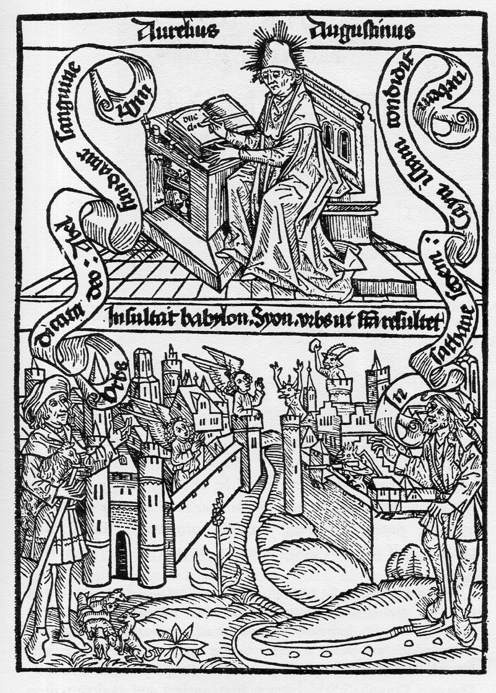
    Nevertheless, we are still left with a surprise in this devilish detail from the incunabulum of St. Augustus, De civitate dei….(this printed in Basel by Johann Amerbach on 13 February 1489).  It shows it in its two panel woodcut the illustrious saint at top, working away at his desk; and at the bottom a battle between the cities of Babylon (founded by Abel) and Zion (“Syon”, by Cain).  In this battle Zion is defended by devils, and the devils are armed. 

    Devil gun772
    The angels of Babylon appear sympathetic but unresponsive to the devil-play, while an angel at top left seems to be blessing its devil enemy who seems to be scaring/screaming at her. In any event this is a lovely and complex image coming in the fourth decade of moveable type printing. 

    Now:  regarding Zion and Augustine, I really don’t know why the writer is putting devils in charge of the defense of “the city of the living god”. The many-times-mentioned Zion of the Old Testament,  “…Zion, the perfection of beauty, God shines forth” (Psalms 50:2), doesn’t seem to be calling for devils.  But then I don’t know this history of Jerusalem during the Byzantine period, 4th/5th century.  So far as wars and savages launched against Jerusalem, it was destroyed twice, attacked 52 times, captured/recaptured 44 times, and beseiged 23 times–perhaps this representation wasn’t too terribly much out of the ordinary.