A Daily History of Holes, Dots, Lines, Science, History, Math, Physics, Art, the Unintentional Absurd, Architecture, Maps, Data Visualization, Blank and Missing Things, and so on. |1.6 million words, 7500 images, 4.9 million hits| Press & appearances in The Times, Le Figaro, Mensa, The Economist, The Guardian, Discovery News, Slate, Le Monde, Sci American Blogs, Le Pont, and many other places… 5000+ total posts since 2008.

Category: Perception

  • Found Dadaist Art–Floating Eyes and Ears, 1650 & 1807

    JF Ptak Science Books LLC Post 857
    Dada found--tp I’ve
    written a few times in this blog (here, here and here) about what I think is
    found/unintentional antiquarian Dadaist art and would like today to continue
    that thread with the following two unusual pieces of art.

    The first
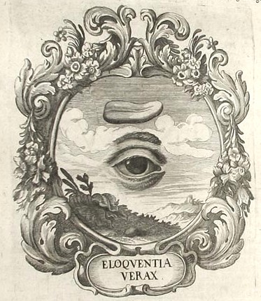
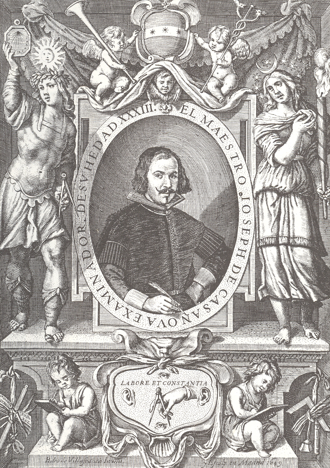
    is a detail from the title page of Joseph de Casanova’s Primera parte del
    arte de escrivir todas formas de letras
    (1650). This is not the Casanova (Giacamo,
    1725-1798) who most people would initially think of—the seductive womanizer of
    the 18th century—but another, earlier, Spanish Casanova (1613-1692)
    who was important in the history of round hand script and the lettera bastarda.  Joseph Casanova ‘s evolutionary handwriting
    style was considerably lighter and easier than most styles, and his influence
    in changing handwriting practices was substantial.  What is interesting for me is the detail at
    the bottom of the engraved title page for his book, the emblem containing  “Labore et Constantia”.  Labor and consistency, decorated with a hand
    and compass, ever watching and listening with ears and eyes above and below.Dada found--tp detail
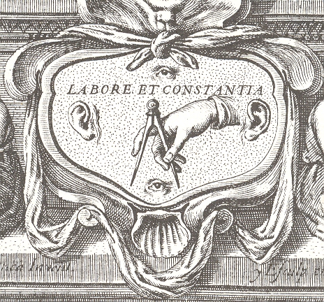
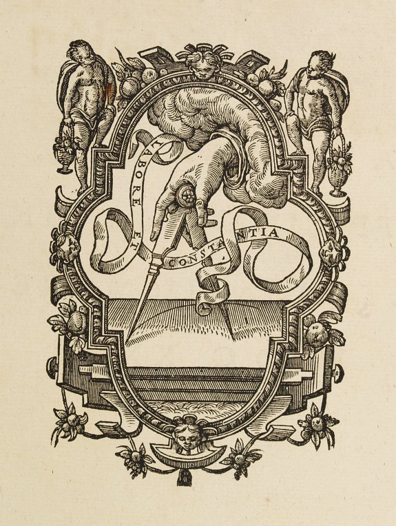
    [This
    design comes from (at least) one earlier source—the printer’s device for Christoph
    Plantijn (Antwerp,
    1583), though without the eyes (below).] I like the floating aspect of the disembodied
    body parts, floating in their little sea of constancy, ruled by a compass. 
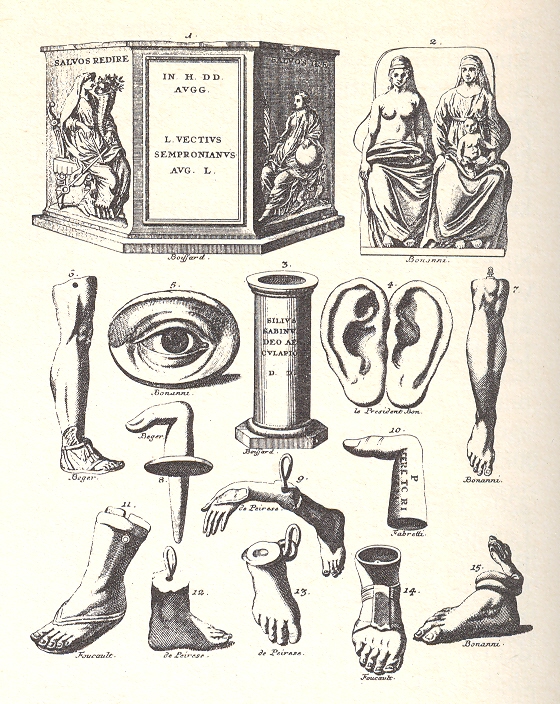
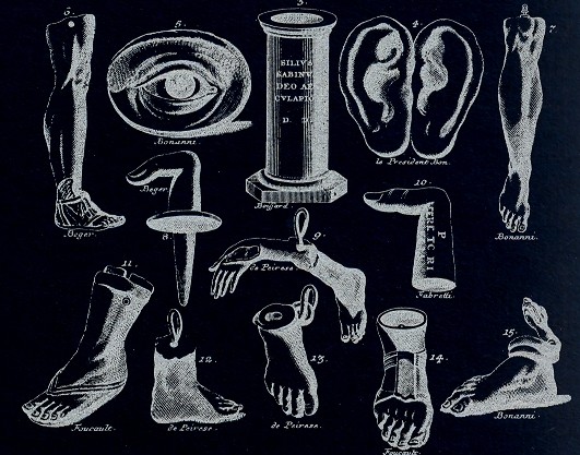
    Dada found--multiples  The
    second image has another set of disembodied eyes/ears (among other things) and
    has all the flavor of the dada/surrealist flourishes of the frammenti of Piranesi.
    This comes from Bernhard von Montfaucon’s Greichische,
    Romische und andere Alterthuemer…
    (Nurenberg, 1807). When taken out of
    context, as a disembodied image, the von Montfaucon certainly has a dadaist taste
    for me, especially if you edit the image a little.
    Dada-found labore 

    Dada found 2--multiples


  • Emerging Patterns and Hidden Visible Art

    JF Ptak Science Books LLC  Post 851  Blog Bookstore

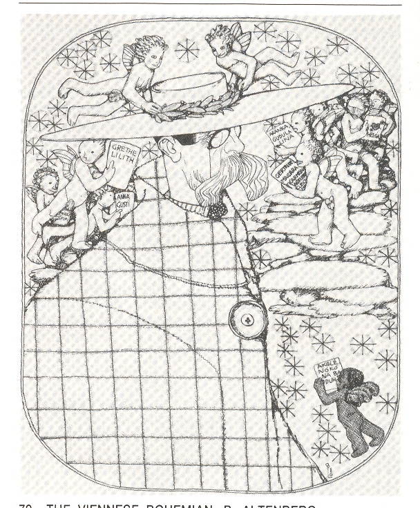
    Even when I know
    that this picture is coming, when it is rounding the bend, I still can’t see it
    for the portrait it is supposed to be. 
    The lithograph is by Berthold Loeffler (1874-1960), a prolific Viennese
    designer, artist and
    professor at Kunstgewerbeschule (1907-1935) whose prodigious
    commercial

    ++ Nov 24 altenberg

    output covered about every other letter of the artistic alphabet.  This work is a portrait of his mostly-forgotten
    fellow-Viennese writer, Peter Altenberg1 for the Kabaerett Fledermaus of
    1909.  The portrait is all squares and
    one big button to me, and I have to consciously look for the rest of the
    picture in spite of knowing that the stuff is there. 

    It is an unusual picture of emergent art—for me not quite
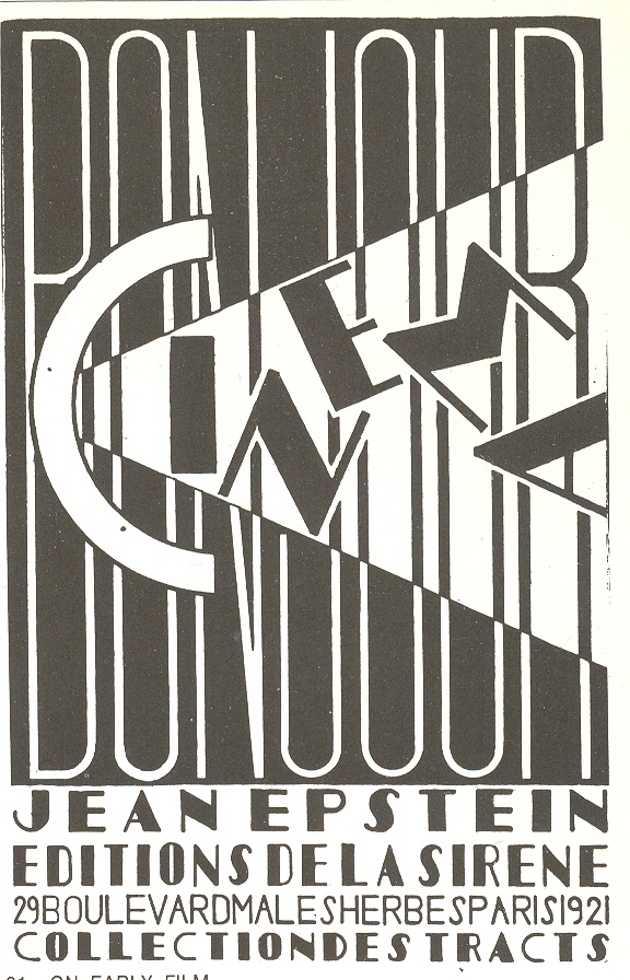
    like, for example, the cover of the pamphlet Cinema by J. Epstein, where the letters are a jumble for just a
    moment and then snap into view.  The
    Loeffler portrait is much more densely hidden in a much more straightforward
    manner, and fools my mind every time. 

     Notes++ Nov 24 cinema

    1.Altenberg is probably a product of his time, or a time of
    his product.  Described as the bohemian’s
    bohemian, he lived an outre lifestyle in little cafes and bars, wearing capes
    and broad-brimmed hats, and was evidently something of an effeminate womanizer
    with a very deep interest in very young girls. 
    There you go.  Altenberg stood
    quite high in that world, as Alban Berg put some of his postcard-poetry to
    music in his Five songs on picture postcard texts by Peter Altenberg,
    which caused a near-riot in its premier, abruptly stopping the performance
    which would not see the light of day again for another 40 years.

    ·Posted by :

    ·in:

    — —

  • Found 17th Century Dadaist Art

    JF Ptak Science Books LLC  Post 827  Blog Bookstore

    ++ blog nov 9 scarlattini 001

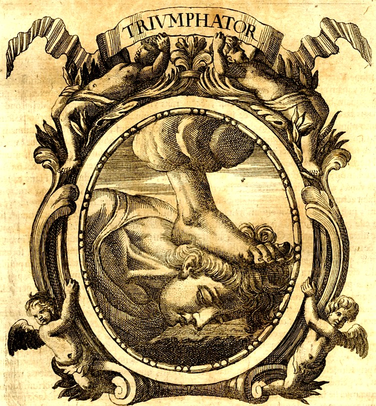
    I found these iconographic images by Ottavio Scarlattini1 (1623-1699)
    simply irresistible–and even though I really don’t quite understand them (at
    least in their correct and original sense and intention), lost to me as they
    are to a more classical education and deeper understanding of Baroque
    symbolism, I can imagine plenty of re-iconographized (?!) meanings.  Not having a more specialized knowledge to
    understand their published intentions perhaps allowed them to have a  strangely modernistic pull on me, making many
    of these Scarlattini designs seem more Dadaist than a 17th century work
    displaying visual characterizations of morality tales wrapped around human
    anatomy. .  If  you changed the vocabulary to interpret this
    artwork—or just simply removed its intention– it changes its era, and moves
    very cleanly into the genre of the surreal. 
    It feels to me that this sort of transformation is not at all common,
    especially when you move the centuries and the genres so crisply and
    elegantly. 

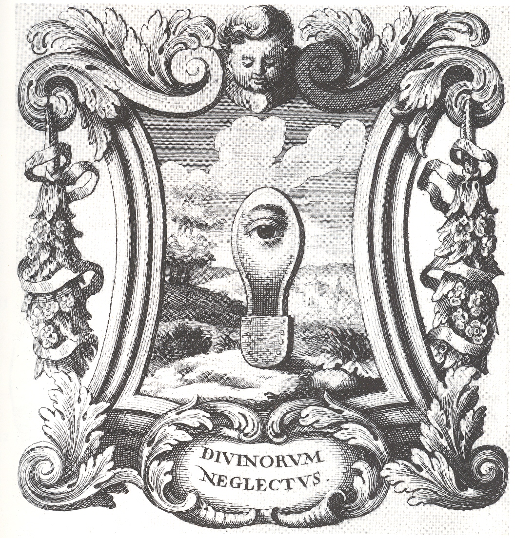
    Doesn’t the “Divinorum Neglectus” suggest something that could’ve
    been produced by  more-antiquarian versions of Raoul Haussmann or Hannah Hoech or Paul
    Delvaux?  It does me.  If you made this a three-dimensional piece it
    could feel like Ernst or Duchamp, its emblematic/hieroglyphic nature
    transforming before your eyes.    (I wonder if Duchamp or Dufuy were influenced
    by the iconographists from this period?)

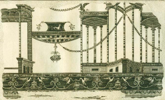
    This transference game works nicely with other emblem books, and even with some of the large and spare frescoes from Herculaneum when rendered in black and white as engravings…and also for some of the Framenti of Piranesi, but not too many other places in Western art.  Yes?

    ++ blog nov 9 scarlattini

     ++ blog nov 9 triumph

    An engraving of a fresco from Herculaneum (printed ca. 1760):

    Herculaneum Architektur5-jpg

    Notes:
    1. SCARLATTINI, Ottavio  HOMO ET EJUS PARTES, FIGURATUS ET SYMBOLICUS,
    ANATÓMICUS, RATIONALIS, MORALIS, MYSTICUS, POLITICUS, ET LEGALIS, COLLECTUS ET
    EXPLICATUS CUM FIGURIS, SYMBOLIS, ANATOMIIS. opera et studio R. D. Octavii
    Scarlatini,. nunc primum ex italico idiomate latinitati datum a R. D. Matthia
    Honcamp, (.). II volúmenes en un tomo. L. Heckenauer grabador, and printed in
    1695.


    Scarlattini produced one of the great masterworks of
    emblematic knowledge while at the same time writing on human anatomy and
    physiology. 

    The entire book located here http://www.uni-mannheim.de/mateo/camenaref/scarlattini.html

    ·Posted by :

    ·in:

    — — —

  • The Bumpy Earth and the Loss of Perfection, 1543

    JF Ptak Science Books LLC  Post 800 

    The idea of the Earth as a sphere is an ancient one, proved over and over
    again across the centuries, most famously proved by Aristarchus with a stick
    and a hole and a shadow. The idea of the Earth as perfect, as a perfect sphere,
    is an old belief wrapped in layers of hopeful scientific thought, God’s
    creation and the cradle of mankind necessarily being perfect (Summa aside).  This was a rigidly enforced perception and a
    religious assumption, just like the belief that the Earth was the center of this
    universe, and that a vacuum was a theological and therefore physical
    impossibility.  (See my post On the Discovery of Nothing.)+ earth perfect

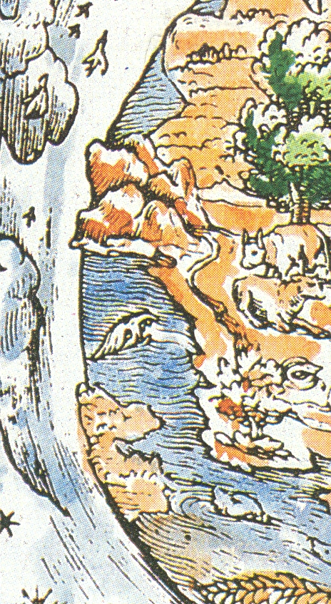
    The
    woodcut illustrated here—a depiction of a robbed and medaled God lording over
    his creation—is interesting in its depiction of what seems to be a not-perfect
    sphere of the Earth. The planet is definitely not smooth around its perimeter,
    and the inclusion of three-dimensional mountain rendering accentuates this
    depiction, which to me seems all very novel. 
    The source for this image is given as a “Martin Luther Bible of 1543”,
    but that is wrong, unfortunately, which makes it less of a story. 
    If this woodcut was really done in 1543 it would’ve occurred in the same
    year as two monumental publications: 
    Nicolas Copernicus’
    De revolutionibus orbium coelestium and Andreas Vesalius’
    De humani corporis fabrica (On
    the Fabric of the Human Body)
    ,
    marking what is the birth of modern science.  (The print appeared in Luther’s translation of the Bible in 1534.)

    + earth perfect det

    But offhand I don’t see Luther’s “Bible” for this year, and in general 1543 is not a good year in general for Luther
    so far as I’m concerned.  He busily
    published
    Von den Juden
    und ihren Lügen
    (On the Jews and Their Lies ) and  Vom Schem Hamphoras und vom Geschlecht
    Christi
    (On the Holy Name and the Lineage of Christ), both of which
    were horrible anti-Semitic attacks, and worse. 
    For example, from the first work, he wrote that the Jews were a “base,
    whoring people, that is, no people of God, and their boast of lineage,
    circumcision, and law must be accounted as filth.”, and
    in the second wrote that it was not an immoral act for not killing Jews.  This really has nothing to do with the point
    of this post, but I just couldn’t let the reference to 1543 slide by without
    mentioning this very ugly tragedy of Luther’s  theology. 


  • A Question about Einstein and Missing (?) Modernism

    JF Ptak Science Books LLC  Post 799 

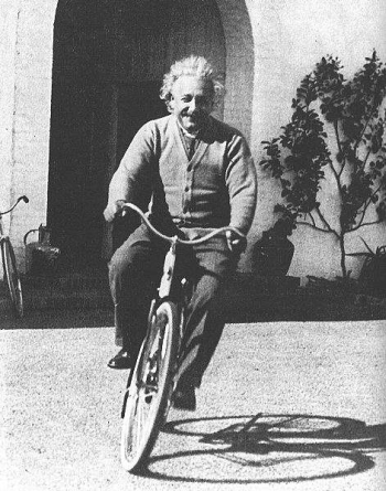
    Einstein-bicycle1 How much was Einstein affected by the many pieces of what was the greatest
    revolutionary period in history?  The
    period from, say the pre-Impressionists (1860 or so) to the period just after
    Cubism (again, say 1920), saw epochal changes across the sciences, medicine,
    the arts, literature….virtually everything. I cannot think of any period in
    intellectual history that approaches this 60-year period. Actually, the gargantuan
    changes can be shaved down to the period of Einstein’s living memory beginning with the stunning discovery of Roentgen’s
    x-rays in 1895 to the invention of non-representational painting in 19111.  Breathtaking, really. 

    In all of this, I wonder how Einstein saw the vast changes that were not in
    the fields of physics or mathematics? 
    Poincare, Boltzmann, Planck were analyzed and understood and appreciated
    and etc.  But what about Strindberg, and
    Schoenberg, and Seurat, and Leger, and Joyce, and Malevich, and Duchamp, and
    Kandinsky, and Klee?  Einstein certainly
    loved music and had a deep understanding of it, but it was with Mozart and Bach
    that he found beauty.  The music of the
    sphere, the primum mobile, the hand
    of the creator, were found in these two men.  Beethoven was too melodramatic; Wagner (in
    1939) was disgusting.  Others were just
    too simple, too light. 

    I don’t know what he felt about Schoenberg, or Joyce, or Klee.  Perhaps they were too messy, too
    unstructured, too removed from the fundamentals of nature that he felt Mozart
    found and displayed.  I just don’t know. As the architect of one of the most fundamental changes in the history of science, I wonder if (and why) he stood so seemingly unaffected by so many of these other enormous changes.

    Notes:

    1.  There are a number of books that address these revolutionary changes, but only one, I think, that looks at the great broad swath of revolutionary activity across many fields:  William Everdell’s The First Moderns (U Chic). A lovely book.

    ·Posted by :

    ·in:

    —

  • Pig Iron vs. Eiffel Tower: Visualizing Difficult Numbers and Concepts

    JF Ptak Science Books   Quick Post  

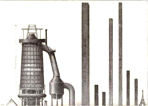
    Several years ago I wrote about some triumphantly unusual images (plus one on the 1891 10-ton Eiffel Tower bullet) of the Eiffel Tower–today I’d like to add another, a queer image which manages to loose the Eiffel Tower (and the Great Pyramid) in representations of pig iron production.

    Diagram steel eiffel 

    I love comparison like this (which appeared in the Illustrated London News for 1910), representing big, hard-to-associate  numbers of something against another quantity that can be instantly understood–the relationship between the two might be tenuous and complex, but at least it can give you some sort of handle on what would normally be an inaccessible, stand-alone number. Plus, any time that you can show what an ungraspable concept might “look like” and be explainable to a 10-year-old, well, you’ve got something. 


  • An X-Ray of the Earth, 1756

    JF Ptak Science Books LLC   Post 787   Blog Bookstore

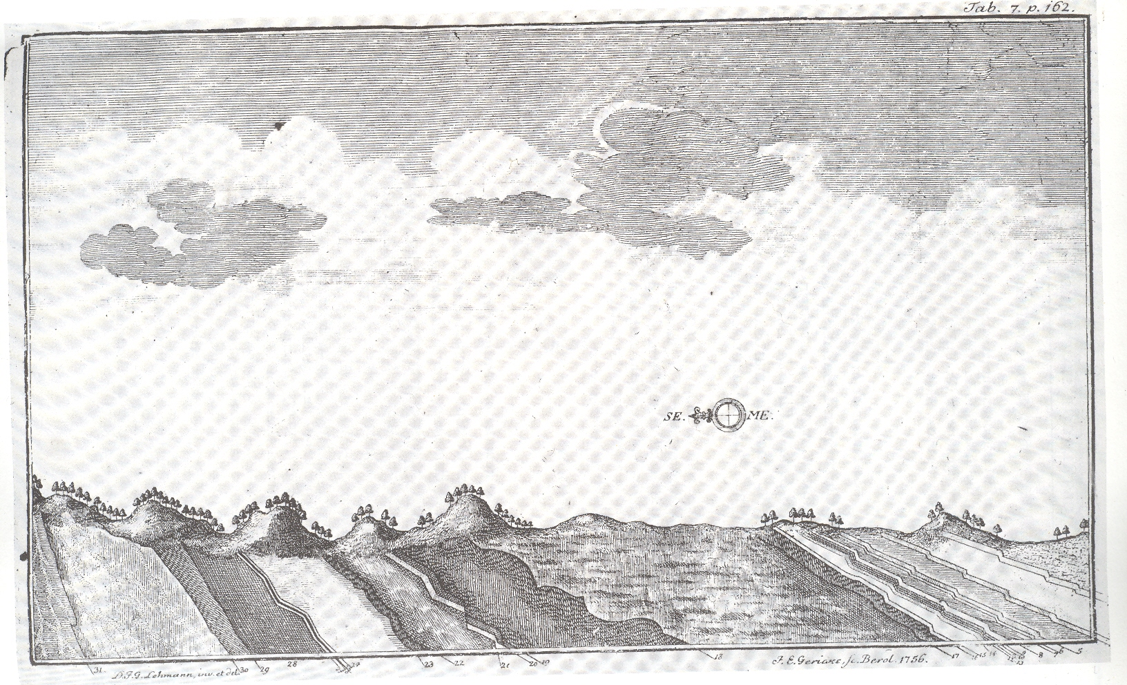
    I’m not sure why there was so much included in this engraving that had
    nothing to do with its subject matter. 
    The essential part of the image is the cross section at bottom:  the image of landforms, created by the man
    most responsible for the establishment of stratigraphy, the German
    physician/chemist/mineralogist/geologist Johann Gottlieb Lehmann (1719-1767).  What Lehmann accomplished was a sensational,
    x-ray-like interpretation of the surface of the earth, a privileged vision
    distant from the real birth of the science of geology in the work of James
    Hutton more than 50 years later. (Hutton was about the first to treat the entire
    corpus of the geology of the earth and which was also completely removed from myth
    and fable.  His work formed the basis for
    that of Charles Lyell who in turn provided some of the intellectual basis for Charles
    Darwin.)  He seems to be the first to
    create such a slice of the earth, illustrating an orderly, historical formation
    of the various layers (and not an unrelated jumble), and the first steps
    towards establishing the laws of formation of geological sequence.

    + lehmann

    Outside of the spectacular introduction to the workings of earth in this cross
    section, I’m taken by the enormous sky, and the very lonely compass, placed,
    seemingly haphazardly in a blank field, creating a very considerable blank space above the great discovery.
    The scientific greatness of the images aside (can I even say such a
    horrible thing?), the engraving looks to me like a modern surreal work. 

    Book Note:  Lehmann, Johann. Versuch einer Geschichte von Flotz-Gebuergen,…1756, printed
    in Berlin
    .  “This unpretending treatise must be
    ranked as one of the classics of geological literature”—Archibald Geike


  • Selling to “Simple” Women, 1939: “She’s Not Interested in Bloody Meat”

    Post 882 (revised; part of the History of Women Series; also see Women Meat Pioneers.)

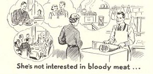
    Women--bloody meat
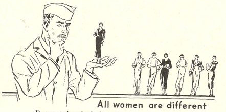
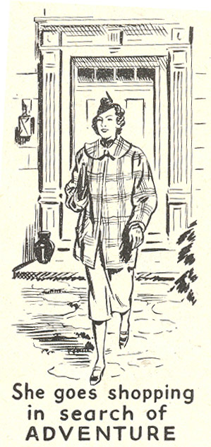
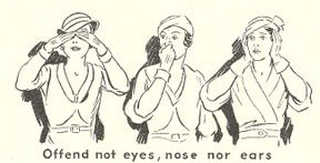
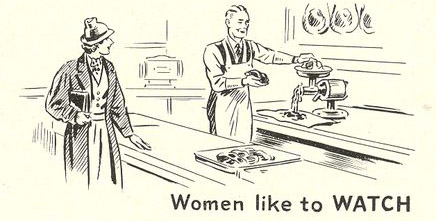
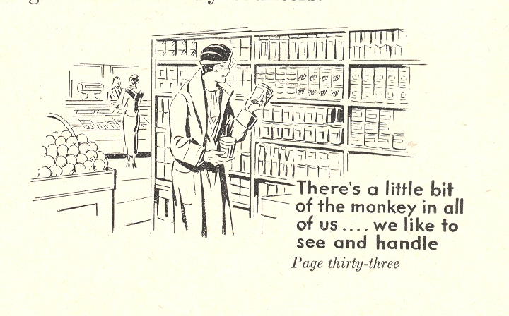
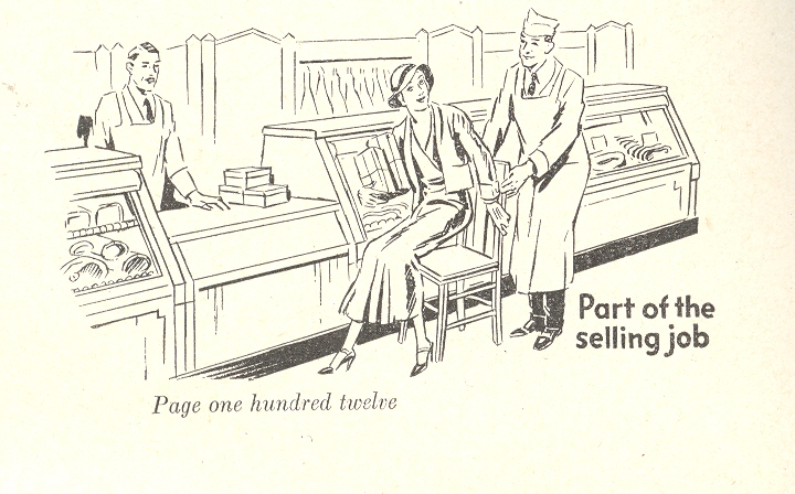
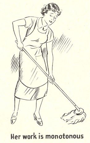
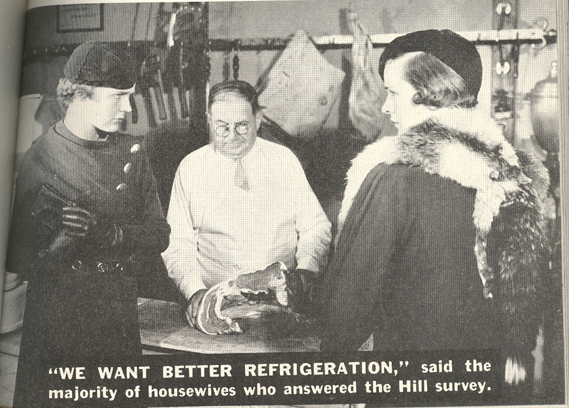
    These sales-happy customer relations images from a  modern food merchandising catalog (Modern Merchandising, 1939) come at an interesting time in the history of eating—or lesser yet, the history of buying food.   The pamphlet addresses the growing idea of the super market, a notion still new in the minds of consumers —it seemed as large to the consumer familiar with the 1920’s concept of a market as it seems tiny to the megamarket people of the present.The illustrations–all quite small, margin-inhabiting affairs, space killers, no bigger than 1×2 inches–are there to help the grocer deal with women customers and better understand “them”. 


    Women--all different 

    Women--shopping


    I’ll address the interesting merchandising changes here in another post—right now I’d like to focus on the marginal drawings in the bottom corners of the text.  They may be small and offhanded–generally they are less than two square inches–but the messages they delivered, marginalia or not, were very strong.  Over and over again these bits demand the sub-class of women, emphasizing their trivial, ephemeral interests—bits of Nothing reinforcing large bits of Something.  

    Women--offend not eyes

    The messages beneath the images, collectively: “women judge meat by appearance:; “there a little bit of the monkey in all of us…we like to see and handle”; “offend not eyes , nose nor ears”; “part of the selling job”; “women like to WATCH”; “her work is monotonous”; “she goes shopping in search of adventure”; “she’s not interested in bloody meat”. They present cascading reactions: they’re somewhat funny to my eyes, and then uncomfortable, and outrageous, and then simply sad that their solemn pronouncements on the status of women would be so acceptable, their as-yet unidentified sexism and bitter “racism”a non-sequitur.

    Women--like to watch
    .

    + women monkey 


    + women sitting down 


    Women--her work


    + women want more refrig


  • Odd Art Department: Art Brut in Advertising?

    JF Ptak Science Books LLC  Post 810  Blog Bookstore

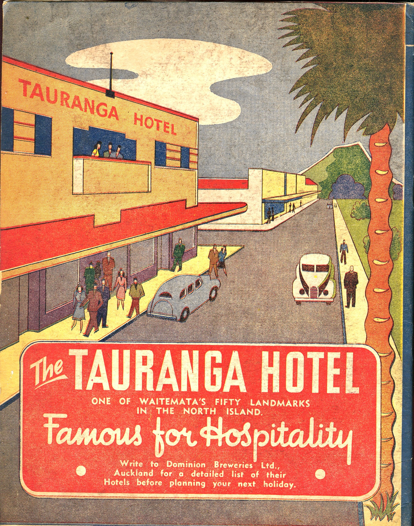
     + blog 10.26 tauranga

    There’s not much in this illustration–the entire back page of an oversize pulbicity tourist pamphlet–to suggest any sort of professionalism, or training, or, well, ability.  But there it is, badly drawn, with unusual (if not bad) coloring, trying to entice people to visit this seaside resort in New Zealand. 

    Maybe this is more “outsider art”
    than Art Brut.  Art Brut was a term used by
    Jean Dubuftet to describe raw/rough art produced by non-artists (and those
    mostly mental asylum residents1).  Art
    critic Roger Cardinal coined “outsider art” as a English-language adaptation of
    the Dubuffet term2, and has since come into use to describe unusual,
    technically naïve and unschooled Otherness of artworks.  This cover illustration is certainly bearing
    a pretty good-sized helping of otherness to it, from its pale, weird coloring
    to its basic inability to draw.  Somehow
    though it is attractive to me, and ultra-calming when it is not troubling.  It is just one of those peculiar works that
    is good and bad at the same time.

    Notes:

    1. A spectacular and early example
    of Art Brut is found in the phenomenally detailed, insightful-of-other-worlds
    work of  Adolf Wolfli.

    2. “Those works created
    from solitude and from pure and authentic creative impulses – where the worries
    of competition, acclaim and social promotion do not interfere – are, because of
    these very facts, more precious than the productions of professionals. After a
    certain familiarity with these flourishings of an exalted feverishness, lived
    so fully and so intensely by their authors, we cannot avoid the feeling that in
    relation to these works, cultural art in its entirety appears to be the game of
    a futile society, a fallacious parade.” – Jean Dubuffet. Place à
    l’incivisme
    (Make way for Incivism). Art and Text no.27 (December 1987 –
    February 1988).


  • Portraits Within Portraits: Images of Exhaustion, Defeat and Old Youth

    JF Ptak Science Books LLC  Post 806  Blog Bookstore

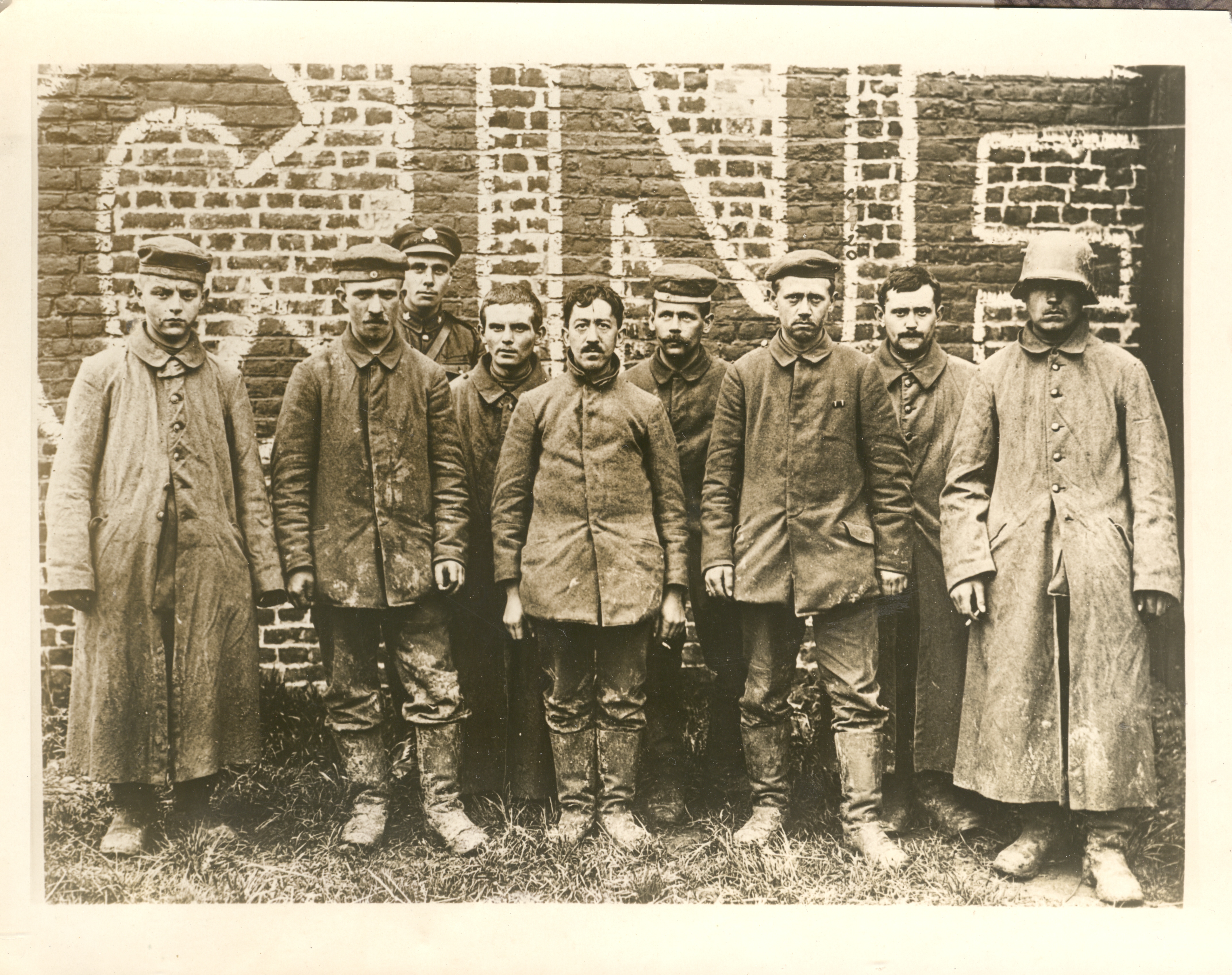
    + blog 10.24

    Earlier today I made a post on some of the images in my collection of WWI News Service Photographs. (These were photos that were sold by an image agency to newspapers and journals which looked for stock photos of, well, whatever, and after paying a use fee would include the photo in the story they were reporting.)  This photo is one of three in a series that show German POWs being marched around a town in France and stopped here and there for a photo.  The picture was taken deep into 1918, within a month or two of the end of the war,.when the Germans were already defeated.  From the look of things, these soldiers were done: tired, mostly beaten, dirty. They at least had most of their buttons on their coats (which is actually a very big deal, keeping your overcoat closed in cold weather to keep warm and alive), their boots looked warn but intact, and they looked not terrible undernourished (though I doubt anyone in the group weighed more than 150 pounds).  

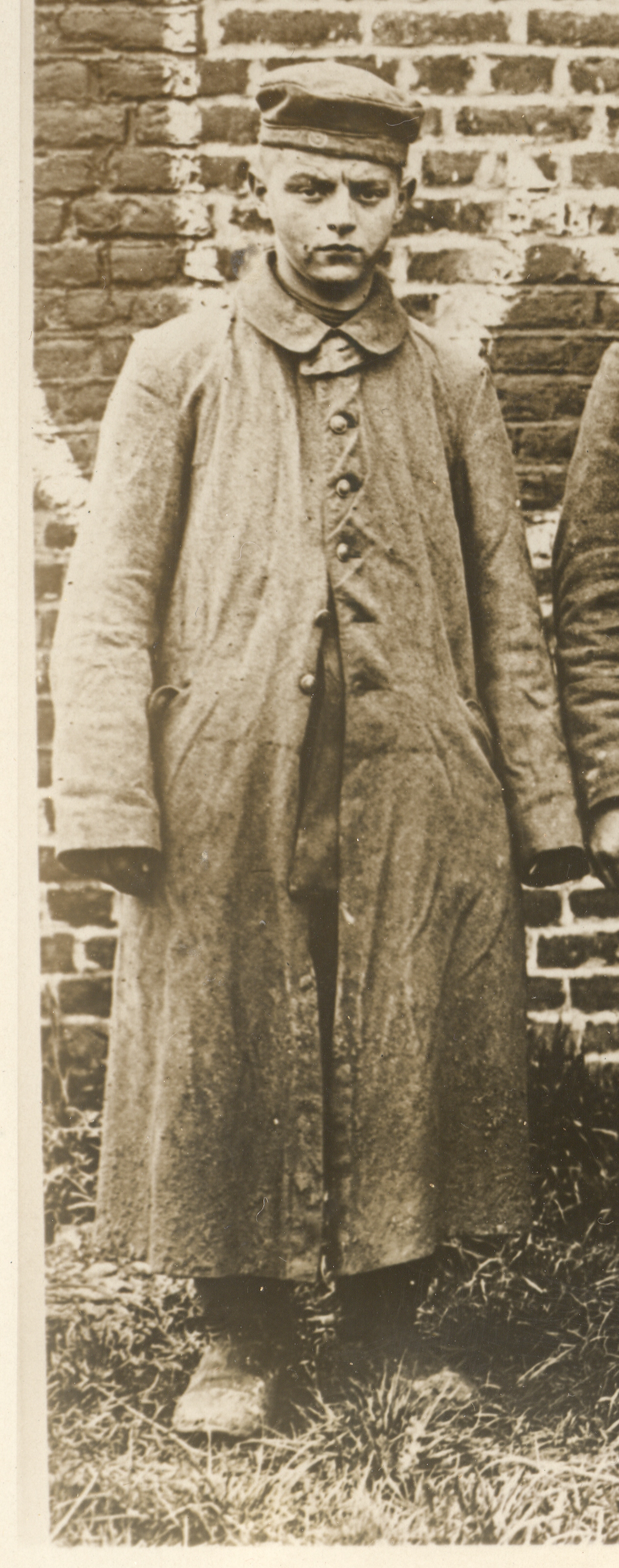
    + blog 10.24 boy left

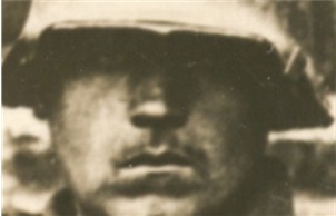
    The group is bookended by two remarkable figures:  the soldier on the left looks not 16 or so, but with a not-new ground in toughness.  He’s all smooth face and baby fat, though he has at least survived the grueling fighting.  The soldier on the right could be the prototype for any number of propaganda posters that popped up in Berlin in the early 1930’s advocating the sold-out but not defeated German soldier of the Great War whose fate must be avenged. 

    + blog 10.24 eyes

     Almost everyone was cupping a ciggy.

    Lastly, the guy third from the left seems to be a Canadian guard, not that this group was going to try to escape.