A Daily History of Holes, Dots, Lines, Science, History, Math, Physics, Art, the Unintentional Absurd, Architecture, Maps, Data Visualization, Blank and Missing Things, and so on. |1.6 million words, 7500 images, 4.9 million hits| Press & appearances in The Times, Le Figaro, Mensa, The Economist, The Guardian, Discovery News, Slate, Le Monde, Sci American Blogs, Le Pont, and many other places… 5000+ total posts since 2008.

Category: Perception

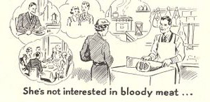
  • Selling to “Simple” Women, 1939: “She’s Not Interested in Bloody Meat”

    Post 882 (revised; part of the History of Women Series; also see Women Meat Pioneers.)

    Women--bloody meat
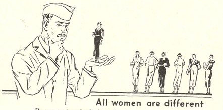
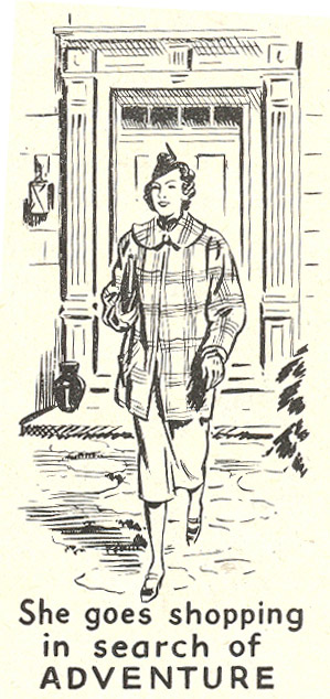
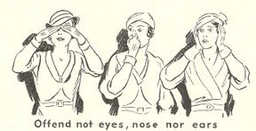
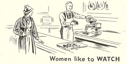
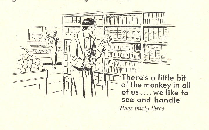
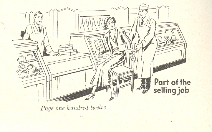
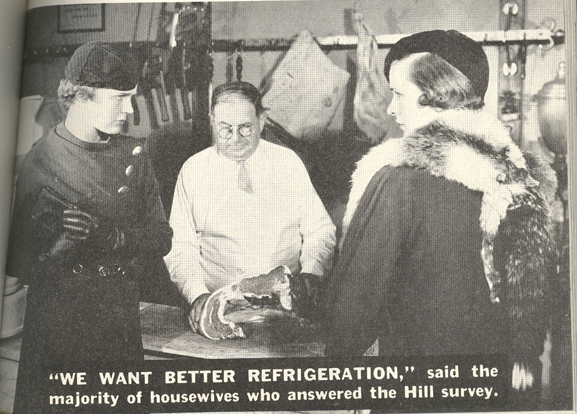
    These sales-happy customer relations images from a  modern food merchandising catalog (Modern Merchandising, 1939) come at an interesting time in the history of eating—or lesser yet, the history of buying food.   The pamphlet addresses the growing idea of the super market, a notion still new in the minds of consumers —it seemed as large to the consumer familiar with the 1920’s concept of a market as it seems tiny to the megamarket people of the present.The illustrations–all quite small, margin-inhabiting affairs, space killers, no bigger than 1×2 inches–are there to help the grocer deal with women customers and better understand “them”. 


    Women--all different 

    Women--shopping


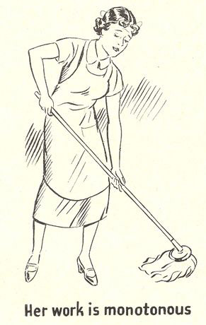
    I’ll address the interesting merchandising changes here in another post—right now I’d like to focus on the marginal drawings in the bottom corners of the text.  They may be small and offhanded–generally they are less than two square inches–but the messages they delivered, marginalia or not, were very strong.  Over and over again these bits demand the sub-class of women, emphasizing their trivial, ephemeral interests—bits of Nothing reinforcing large bits of Something.  

    Women--offend not eyes

    The messages beneath the images, collectively: “women judge meat by appearance:; “there a little bit of the monkey in all of us…we like to see and handle”; “offend not eyes , nose nor ears”; “part of the selling job”; “women like to WATCH”; “her work is monotonous”; “she goes shopping in search of adventure”; “she’s not interested in bloody meat”. They present cascading reactions: they’re somewhat funny to my eyes, and then uncomfortable, and outrageous, and then simply sad that their solemn pronouncements on the status of women would be so acceptable, their as-yet unidentified sexism and bitter “racism”a non-sequitur.

    Women--like to watch
    .

    + women monkey 


    + women sitting down 


    Women--her work


    + women want more refrig


  • A Stone-Cold Masterpiece of Naive Art: Teresa Ottalo, ca. 1860

    JF Ptak Science Books LLC  Post 773  Blog Bookstore

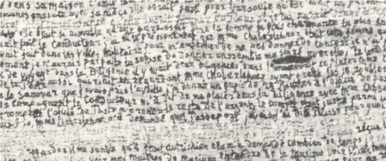
    As a collector of naive art–particularly produced with letters or numbers–and as a person generally interested in naive and outsider (and art brut and letterist and found )art, I was astonished to find this spectacular work by Terea Ottalo (ca. 1800-1870).  First of all, I make this to be about 200 lines long, and about 50 inches tall.  The words are, well, minute.

    Secondly:  this magnificnet thing was EMBROIDERED.  Breathtaking, really.

    I haven’t yet found out anything about Ms. Ottalo, except some basic references of her affiliated “school” of art.

    I do know that this, whatever it is, is a masterpiece. 

    ++00++ 9.29 teresa ottalo

    And an unfortunately smudgy detail, such as it is–I cannot offhandedly find a good, clear, high resolution image of anything at all by Ms. Ottalo.  This will have to do for now, but I think it gives a reasonable idea of the fineness of this work (found in Michek Thevoz’s Art Brut, Skira, 1976)–this sample detail represents less than 10% of the overall image:                                                                                                                                        

    ++00++ 9.29 teresa ottalo detail

    ·Posted by :

    ·in:

    — —

  • Skeleton of the Sun and Sky: Henry Van de Velde pre-Abstract Art, 1884

    JF Ptak Science Books LLC  Post 758  Blog Bookstore

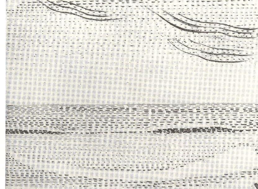
    I wonder if Henry van de Velde (1863-1957) as one of the earliest people to paint what he saw as an x-ray of the stuff of existence.  His artwork, “Sun at Ocean (Rhythmic Synthesis”) which I found in  Werner Hoffman’s Turning Points in Twentieth century Art, 1890-1917 and which was executed in 1888/9, looks to me to be absolutely incredible
    ++00++ 9.17 vna de velde
    for its time, a nearly non-representational, proto-abstract something, done three decades before these genres came into being.

    His representation of known objects seems to be nearly, completely, removed—what we have left here is the representation, or impression, of the subject of the painting.  We can see the sky and sun and ocean there still, but just barely: their representation in skeletal form shows us the bare bones of the world, like a pre-X-Ray X-Ray (which didn’t come around until the very ready and able Wilhelm Roentgen bumped into it in the winter of 1895).

    It is hard to think of how unusual this artwork would’ve been, even given some historical consulting. The Impressionists, who had crept up into the artworld existence to their first show in 1874, were seen as being a radical, revolutionary, avant garde movement.  Their reception was not a cordial one, as they were threatening the established order of the instructionally-regulated world of art that had stood for centuries.  Van de Velde’s work was far outside of Impressionism, or at least it would seem so to me, making it more radical still.

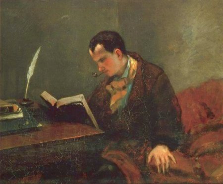
    I’m not sure where van de Velde’s work stands in the history of Modernism (ca. 1875-1916, when virtually very major discipline encountered massive change).  It doesn’t seem to be a prototype for abstract art, which doesn’t seem to have precedents in the 19th century outside of found-art in mathematics of the fourth dimension.  This new world of art seems to begin suddenly in 1907 with the work of Braque and Picasso, and then Marcel Duchamp, and Nayral (1910) and Gris (1911), followed by many others including Gleizes and Marcoussis and Metzinger and Villon (all in 1912).  The Impressionists on the other hand have a very rich history of impressionistic works leading up to their major debut in 1874:  like Courbet’s “Portrait of Baudelaire” (1848/50), or Cezanne’s “Man with a Blue Cap” (1865), or Bourdin’s “Cloud Study” (ca. 1859), on Monet’s “Still Life” (1859, with the disappearing bread), or Degas’ “Semiarmis…” (1861) or Pissarro’s “The Road” (1864), or the glorious modern self portrait of Cezanne done in 1865.  There are many others.

    Van de Velde’s art leaves me puzzled, probably because I really don’t know about the painting phase of his life (an activity he gave up in 1892); probably because I just don’t know enough, and am not art scholar.  I don’t know why this isn’t significant, unless, of course, the work was not seen, or was unknown, or was simply rejected.

    But that still leaves us with the artwork itself: a skeleton. Scaffolding.  Stage setting.  Fragments of the remaining object.  Simplification: a rediscovery of the material of the world reduced to its barest essentials, to a geometrical simplicity of nothing but lines, dashes, suggesting a larger form.  It is the amount of weight in the “suggestion” of form that makes this work so incredible—up to this time, I think, there weren’t any other works of art where so much was open to interpretation, and so much of the optical characteristics of the subject had been removed.  (Rodin’s statue of Balzac, showing the author seemingly ripping himself from his stone, was much hated when it was shown in 1897, the “unfinished” parts seen as ugly and crude by many.  This would seem a good example of the weight of suggested form in pre-20th century art.)

    1889.  Decades before Malevich, Rodchenko, Balla, Severini, Tatlin, El Lissitzky, Klee, Kandinsky.  (And Mondrian, the biggest question mark for me and greatest possible inheritor of this work.) I just don’t get it where van de Velde “went”.  He did go on to a terrific career in design and architecture  in worlds outside of this effort; I just don’t know what happened to “Sky and Sea’…maybe Henry just didn’t like itpreferring his gorgeous nouveau design motifs.  After all, he survived this artwork by almost 70 years (!), and perhaps he laid it aside as a youthful flourish.  As I said, I really don’t know.  


  • Great Sceintific Understatement Department: Isaac Newton as the First and Only above Equals

    JF Ptak Science Books LLC  Post 719 Blog Bookstore

    Newton2

    Earlier in this blog I’ve addressed some great understatements in the history of science and technology.  For example:

    –the Wright brothers’ telegram to their father on the successful flight at Kitty Hawk, telling him to “inform Press” [sic], and misspelling Orville (“Orvelle”)

    –the announcement of the invention of the telephone, giving Mr. Bell a scant 200-word mention in the London-based journal Nature.

    –the alpha and omega element of the severe understatement of George Gamow on discovering the background radiation of the Big Bang.

    –and the atomic bomb/nuclear Armageddon bit from the National Emergency Planning Council:  ( “Because of recent changes in the technology and potential tempo of war and because of the base power of force is in being (including equipment and supplies), there is general recognition that any future war in which the United States is engaged, especially if it is an unlimited nuclear war, may be decided without significant additional military demands upon the nation’s industrial economy.” Hmm. He continues: “That is not to say, however, that the post-attack economy would not face enormous logistical support problems.” There is no human element of this equation. “The logistic requirements of survival and recovery would present very heavy demands.”)

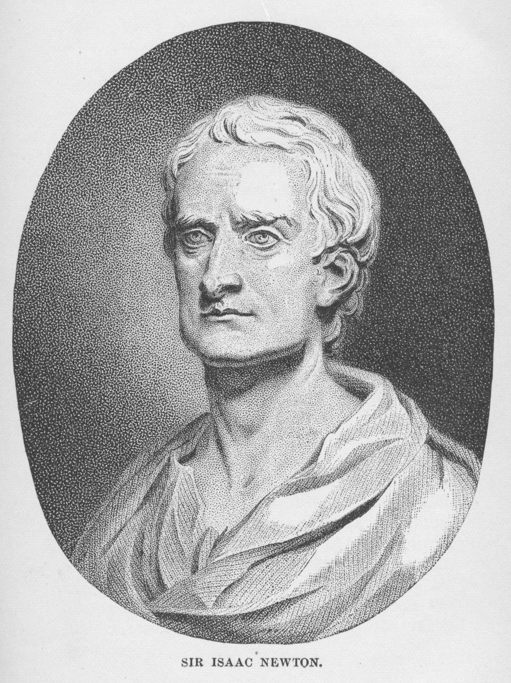
    Newton It is rare to see such terrific understatement concerning some of the scientific worthies, but this one (below) found in a  penetrating, interesting and very entertaining work  Devices of Wonder (2001) is really pretty remarkable.  The book illustrates an exhibition co-curated by Barbara Stafford (Chicago), and the passage comes in a part of the book by Frances Terpak.  I hate to take someone to task like this, particularly having written such a fine book, and further hate to drag anyone over coals that at all times wait for me, but Terpak’ description of Newton’s accomplishments as “innovations” (page 194)  goes far beyond the line.  Within two sentences she does discuss Newton’s “monumental” stature and “great experiments”, but alas the cat is out of the bag.  If Newton’s Opticks and Principia and et cetera are “innovations”, then virtually nothing else is; everything else being at least not-innovations, identifying a world of sameness.  I know that this is a simple editorial oversight, but it is a big one, at least in my head, and does fit perfectly (even if by mistake) into the blog’s “great understatements” topology. 

    ·Posted by :

    ·in:

    — —

  • First and Early Impressions: Hitler, Mass Production and the Use of the Long View

    JF Ptak Science Books LLC  Post 666

    Harold, like the rest of us, had many impressions which saved him the trouble of distinct ideas  George Eliot.

    A novel is balanced between a few true impressions and the multitude of false ones that make up most of what we call life.
    Saul Bellow

    First (and other early) impressions get made once, for the very first time, and then re-invented, re-examined every time after that, especially as the first impressions start to age and get forgotten, slipping around the windsock of time.  But every so often these antique first impressions come back onto the playing field, and it is remarkable, really, what lessons can be learned of them. 

    A review of a very early biography of Adolph Hitler appeared in the pages of The Illustrated London News for 27 August 1932—this was the year before Hitler assumed formal control of the government and nine years after he began his rise to power.  The book was Hitler, by Emil Lengyel, published by Routledge in 1932; it is the subject of a very sharp-eyed review by “C.K.A” in the pages of the ILN. It was also reviewed so to speak by the Nazi leadership, which ordered that Lengyel (1898-1985) be picked up and disappeared at any early opportunity for being an enemy of the state.  Some of the interesting bits that the reviewer pulled from the Lengyel book include the following—I’ve included several here because of his particular and early insight):

    “There are no limits, however, fantastic, to which this fanaticism will not go; though what the Jews have done to Germany to deserve this frantic vendetta remains obscure.

    “It is almost incredible to Englishmen that this barbaric mania (Jew hating) should be erected to the position of a fundamental political tenet…”

    “Some of the Party principle are Olympic in their sweep and scope.  Thus:” “offenders against the interests of the community, usurers, profiteers, etc., are to be punished with death…” Much virtue in your ‘etc.”!

    “Behind all stand the emotional political impulses—repudiation of war-debts, hatred of France, hostility to the League of Nations, fanatical exaltations of race,…All this was to be expected…it is not too much to say that by the Treaty of Versailles the allies brought the Nazi movement upon themselves. The marvel is that it has been so long postponed.”

    “What Hitler’s flag stands for he has never revealed beyond irresponsible generalizations and decrepit platitudes…”

    “(On Lengyel’s Hitler):  He is a vox et praterea nihil—a shallow, paltry, neurotic person, with no constructive ability, a woodly intelligence, and little to comment except glibness and passionate prejudice. This is difficult to believe but by no means impossible.”

    “It may well be…that Hitler the man is as empty as his absurd Swastika”.
    Blog==june 26--1st impression

    The Yellow Spot, The Extermination of the Jews in Germany (1936) was the earliest printed document on the coming of the Nazi Holocaust, the earliest
    catalog on the mistreatment and systematic dehumanization of the Jews, and the
    earliest book to associate “extermination” with Nazis and the Jewish people. (The “yellow spot” part coming from the early history of racially marking Jews–it appeared first it seems in the 11th century in Islamic lands and then used periodically around Europe and the middle east for hundreds of years afterwards.  Using the Star/Shield of David seems  be a 20th century invention.)  It was also one of the earliest books on Hitler and what he represented.  (My friend Andy Moursund has published a very
    compelling poster on the early books regarding Hitler and Nazism and can be
    seen here.)  Another sort of first
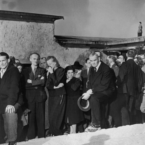
    impression that makes it mark is a series of pictures by the great Margaret
    Bourke-White (who seems to have been everywhere from the Depression to the
    Korean War and wrote and photographed what she saw brilliantly) made at the
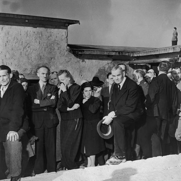
    Buchenwald Deathcamp just after liberation. 
    She did make photographs of the horrors of the place, but she also turned
    the camera around to record the faces of the locals who were forced to tour
    and view the camp in their communal midst. You can see very clearly in the
    faces of these people—for whom Blog==june 28 chaplinthe camp could not have been a mystery unless it was internalized so—how much they wanted to not see what they were looking at.

     

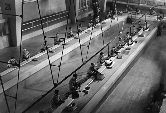
     And speaking of Hitler, Henry Ford’s contribution to the
    ethos of the American standardization and robotization of the workforce—the industrial
    production line—was well portrayed in the first cinematic appreciations of the
    idea.  (Writers had long since made
    observations on the evils of industry and society, going back at least as far
    as Charles Dickens—but its representation in the most democratic medium of the
    first half of the last century–the movies–received it first treatments in two strong
    impressions in the 1930’s.  The film that
    comes quickest to mind is Charlie Chaplin’s still-brilliant and
    still-applicable Modern Times (1936,
    though originally named The Masses)—a
    dire film (in one place dissolving sheep entering a slaughterhouse with a scene
    of workers entering a factory) that offered no solution to the factory.  Aldous Huxley wrote about the sickness of
    production in his Brave New World (1932)
    which is even scarier in its own right—though the scary image of the future
    delivered with the dark humor of Chaplin is tough to surpass—if for no other
    reason than it winds up discussing the “principle of mass production applied to
    biology”.  But earlier still is the
    little-seen film by Rene Clair (1931) A
    nous la libertie
    (Give Us Liberty/Freedom),
    which presents the mass production system as a thin metaphor for a prison labor
    system.  (Upton Sinclair said that the
    Ford assembly plants should be presented in “Museums of Unnatural History”.)
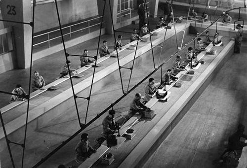
    Blog==jine 28 clair This really is an endless and mammoth subject as what I’m
    talking about is a history of perception, and all I’ve done here really is to
    draw a few things together that I have within reach.  It seems an interesting pursuit, following the
    threads of thought regarding early impressions of major (and minor) events, and
    one could easily construct a large Borgesian encyclopedia of them.  Check under “C”, for cable, for example:  the physicist Jacques Babinet thought it
    impractical and far too expensive to construct a communication line under the Atlantic ocean (as did many others, seeing the starts and
    fits of the various cable companies that were begun to try to capitalize the
    operation.  The cable business barely had
    a heartbeat, at times, in the mid-century even. 
    And speaking of heartbeats, William Harvey withstood blistering attacks
    on his correct statements on the circulation of the blood (costing him nearly
    all the patients in his practice). 
    Though at least Harvey
    lived to see a brighter day:  Michel
    Servetus, on the other hand, didn’t, and was burned at the stake for his heresies,
    one of which was the centering of the circulation of the blood in the heart
    rather than the brain.  The list goes on
    and on:  Semmelweis was killed but did
    wind up ion an asylum; Galileo didn’t wind up in an asylum but did wind up
    imprisoned; Copernicus wound up in neither place, escaping possible clerical
    criticisms by dying just as his revolutionary work was published.  Phillippe Lebon’s ideas for illumination by
    gas were seen as ridiculous, as were the revolutionary ideas of Edward Jenner
    and Luigi Galvani.  Einstein’s 1905 ideas
    weren’t happily received in France
    for a decade, and David Hilbert’s impressions of mathematics in the middle of
    the third decade of the 20th century was that it was “done”.  (Actually the young Einstein was also
    cautioned about going into physics because that field was seen as pretty much “completed”.)
      There was of course the other side of
    the impressions coin to all that I’ve mentioned above—for example, the resistance
    to Copernicus was not actually  as
    fearful as we think of it today, most thinking people were ready for it and
    were relieved with his 1543 publication.  The idea of looking at first impressions may actually have some utility in seeing how we view new things in our contemporary culture–or at least it would give us the sense of wideness and of the future, and to be at least circumspect about newness. 

    *A note on the production technology using interchangeable parts–this idea really did have its seat in  American industry. Colt’s “system of manufacturing” (c. 1851), Charles Tomlinson’s
    1853 Rudimentary Treatise on the Construction of Locks, rifle manufacturing at
    the Springfield Armory in the early 1850’s,  Eli Whitney and the cotton gin, Singer Sewing
    Machines,  (ca. 1865) phonograph machines
    produced on conveyors by Thomas Edison, and so on, till you get to Ford’s own
    Highland Park Factory around 1913.  All are indicators of this sort of conveyor belt, standardized parts, interchangeable units that marks this brand of manufacture. For an early, interesting reading see Charles Fitch’s “Report
    on the Manufacture of Interchangeable Mechanism” (1881)  as part of one of the reports of the massive
    overall report of the Tenth U.S. Census,
    and also  “The Rise of the Mechanical Ideal”
    in the Magazine of American History
    (1884)

  • What Things Are Not Department: Freeing Sex from Sin in A. Niphus, 1549

    JF Ptak Science Books LLC    Post 652   Blog Bookstore

    Blog--jun 15--love I suppose that one could write about virtually anything in
    terms of what that subject is not:  everything
    that is tangibly matter or energy could be something else, and everything not
    (like shadows and thought) are the stuff of being what they are and aren’t at
    the same time. 

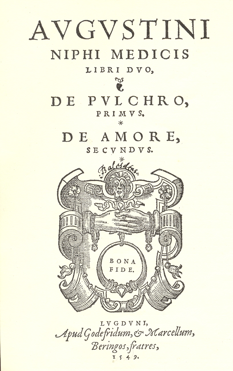
    In 1549 Augustinus Niphus wrote a beautiful, not-so-little
    work on the subjects of beauty and love. Niphus (or Agostino Nifo,
    or Niphus Suessanus, or Niphus
    and sometimes  Nyphus) was born in the Kingdom of Naples

    around 1473, and was around 55 or so when he died in
    1538-1540.  He was a philosopher and
    historian of medicine in the high-Renaissance sense, was a great Aristotlean
    and Averroist,  and proved to be an able
    antagonist to the Christian churches on the subject of the blessed
    interpretations of millennially-dead Aristotle. 
    There are some who claim that Niphus was a little incoherent on the
    subject of Aristotle because, well, he taught the corpus aristotlelicum at university—but Aristotle at this point in the
    Renaissance was incredibly deeply ingrained in the curricula of all
    universities all across Europe, and was opne of the great basics of education. There
    was no escape.

    But back to love.  Niphus’ Libri duo, de pulchero liber primus, de amore liber secundus was a
    277-page work printed at
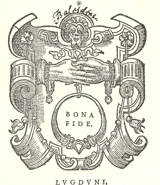
    Lyon (Latinized as “Lugduni”) by the Berigens.  The publishers also provided Niphuis with a
    beautiful title-page device showing the joing on hands under the watchful eyes
    of Christ, a love signified with an emblem announcing “bona fide”.  The book was about beauty (“pulchero”) and
    love (“amore”).  The first part of the
    two books deals with all levels of beauty and shows derivations on the subject
    from the most ancient philosophers./  The
    second part, on love, begins innocently enough on the philosophical and moral
    aspects of the emotion and institution, but then goes further, treating love in
    all of its aspects, including psychological and physical.  It is an enormously full treatment of the physiological
    side of sex, which was something that just wasn’t often encountered at this time.  

    Blog--jun 15--love det

    The main contribution of
    Niphus on love/sex was this—humans have a certain psychological and physiological
    disposition to sex, and how sex could not be considered sinful.  Not content with controlling the poor
    believing people’s thoughts with fear of eternal damnation, the church reached
    right into the very bedroom, specifying that sex was sinful, an abomination,
    dirty, laced with the potential of Satan himself, if not used for the purposes
    of procreation.  All other fruit was
    forbidden under dire threat of the
    Lake of Fire.  (And still
    is:  driving to the bagel store
    yesterday, Sunday morning, I tuned the radio to one of the preaching shows—an easy
    thing to do and sort of hard-to-miss on Sundays as I live in the Bible belt—and
    someone was railing away at “Satan’s fornicators”, which was “the basis of the
    Original Sin”, and on and on.  I don’t
    know how he got to the Original Sin part because the bagel shop is only a
    5-minute drive.) So the case made by Niphus was not popular in the minds of the
    social controllers—who knows what structurally-threatening powers might be
    unleashed in the libidinously un-hellish enjoyments of two people?

    I found this illustration in an old E.P. Goldschmidt (bookseller) catalog, and the old bookseller recognized the medical value of the work and wondered aloud why it hasn’t turned up in the major medical book collections.  I wonder about that, too. Be that as it may, Niphus should really show up as one of the great educators on the function of sex, and to physiologically and psychologically announce that sex was not the sin the church would have you believe it was.  Perhaps in a way, too, Niphus was among the earliest of those to release woman from thousands of years of blame as the proprietesse of selfish Satanic fornication–at least with Niphus, if sex were to be insisted upon as being a sin, there is the possibility of having two actors in the process, rather than having woman carry the blame for the entirety of the sin.

    ·Posted by :

    ·in:

    — —

  • A Question of Appearance: Picasso, Jung, Miss California and Hungry Joe

    JF Ptak Science Books Post 617  Blog Bookstore

    Blog--criminal 004


    I heard an interesting bit this week by Scott Simon of NPR.  He asked his audience to identify a British politician, asking us to listen to a news snippet—what he was after was for the audience’s reaction to the message.  It was an actor reading a widely circulated statement by Carrie Prejean (Miss California) in which she expresses her opinion on gay marriage and other topics.  Evidently people reacted more thoughtfully to the “educated” accent than to the same statement issued by a contestant in a beauty contest–the British pol vs. the dizzy right-wing blond.  The same message, different packages and appearances, different reactions.  

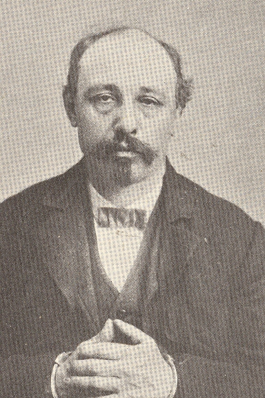
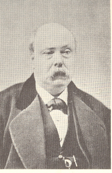
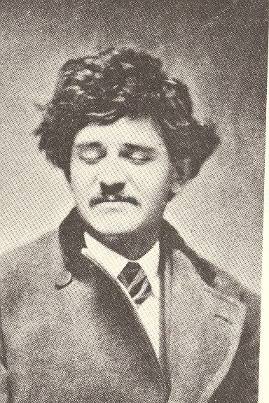
    The three 19th century photographic portraits illustrating this post could well be images of the faculty at a modest New England institution of higher learning; professors with decent taste and posture, reasonably interesting-looking, confident.  But their names really didn’t have much pull in the history of academic names:  the list of PopWhite, Hungry Joe, Grand Central Pete, Boston Charley, Pugsey Frank, Paper Collar Joe, Curly Chuck, and Deafy were criminals, and all of these pictures are from Inspector Thomas Byrnes’ 1886 Professional Criminals of America, an early “mug book”.  Their specialties weren’t in the maths and physics; rather they were listed as “sneaks”, “butcher cart sneak”, “saw dust worker”, “till tapper”, “highwayman”. “banco”, “wagon thief”, “house sneak”, “hotel sneak”, “general sneak”, “general common thief”, and so on.  The portraits don’t betray the person, by any means. Blog--criminal 001

     How this all comes to me was from reading a publication of the Analytical Psychology Club of New York City for 1940—I’ll keep the author and subject quiet for the moment.  It was an odd experience, reading this, because, well, I wanted to believe the author/analyst because he was in deep attack on his subject (an artist) whose personal life I’ve never cared for; on the other hand the attack was so myopic that I took offense with that, too.  I wanted to believe the analyst’s overall appreciation of the artist, but the means of getting their, the intellectual foundations, was just awful.  I wanted to believe the analysis, built as it was ruinous and a waste; and I wanted to believe that it was true for the subject—but if I removed the weight of their names, I’d have to come to an instant defense of the attacked party.  Pablo Picasso.

    The analyst is none other than Carl Jung—who as a collector and interpreter of images I’ve long admired.  I don’t know what to say, really, about the psychology part of it all.  Jung begins by saying that he had “nothing to say on the expression of his (Picasso’s) ‘Art’ “, and needed to “put aside the question of aesthetics”.  To me , this is sweeping Picasso’s trade under the rug, which is something that needn’t and shouldn’t be done, of course.Blog--criminal 003  

    Jung continues:  “the psychic structure of Picasso’s problem, in so far as it expresses itself in his art, is thoroughly analogous to that of my (psychiatric) patients”.  He then starts a quaky, impenetrable paragraph that stretches out over two pages:  “non-objective art comes by its contents essentially from the ”inner” side.  This “inner” side cannot correspond to the conscious, because the conscious contains images of objects as they are generally seen, and they must of necessity appear in the way that conforms to general expectations…”   Then, to my reading, Jung seems to classify Picasso in one of two categories:  schizophrenic or psychotic.

    Now as much as I’ve disliked the destructive personal path of Picasso, this is just altogether too much.  But it was the retained memory and associations of the names of these two men that so challenged (and at first conquered) my own analysis.

    _______________________________


    ·Posted by :

    ·in:


  • History of Lines: Human Queues, Fascist Italy

    JF Ptak Science Books LLC  Post 635  Blog Bookstore

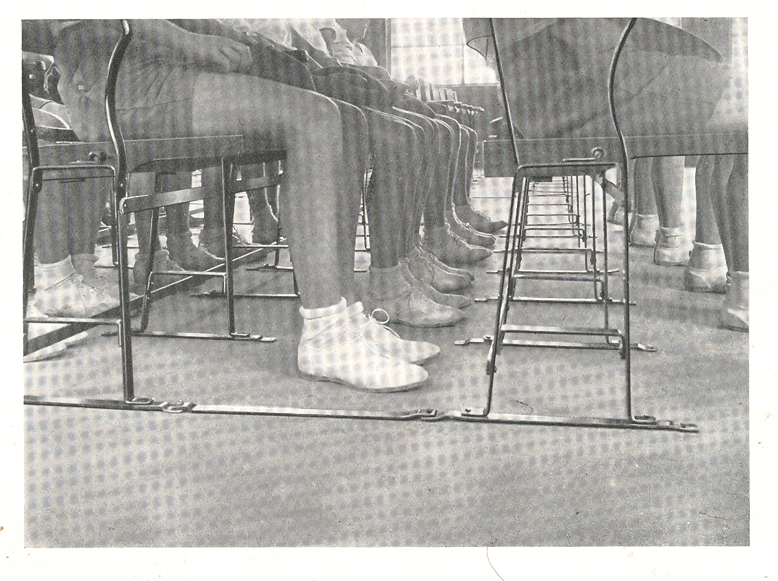
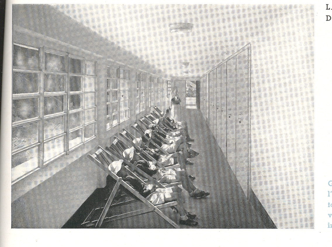
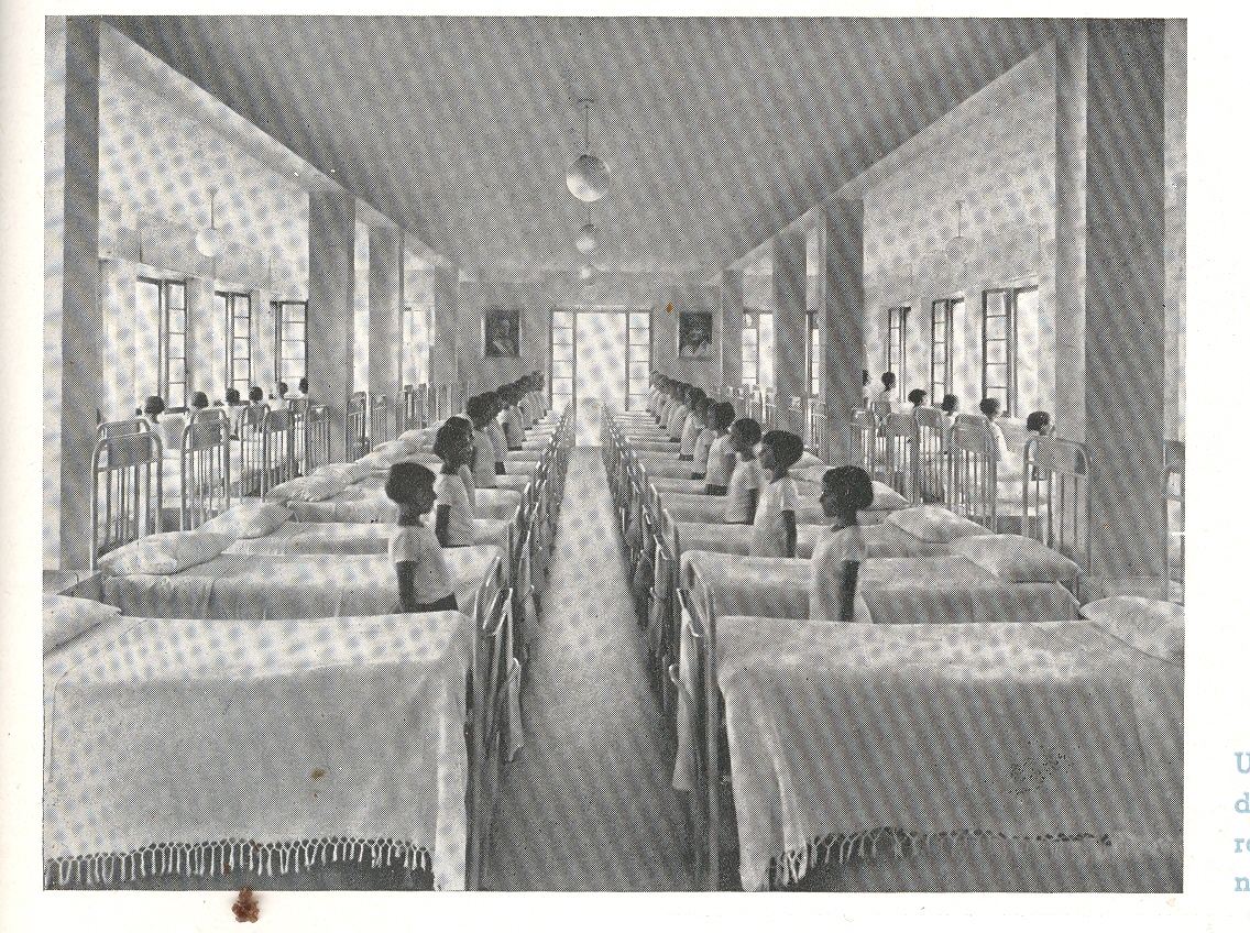
     Blog--june 1 feet In my imaginary History of Lines there is a subsection for
    humans-in-line(s).  In the history of the
    world, the fourth and fifth decades of the twentieth century—the 1930’s and ‘40’s—were
    big ones for human lines.   Big does not imply
    good, because as we all know lots of humans lined up for all manner of
    unspeakable nastiness during this time and well more than 100 million didn’t
    make it out alive (considering all of the wars, purges, revolutions and
    stupidity).

    The lines here are a little more benign, though with
    shriveled overtones of corrected respect.

     Oppressive obedience in a well-designed environment is still
    like dressing your ear-infected 14-year-old St. Bernard/Jack Russell (?!) mixed
    breed in baby booties—its just not right, and these images attest to this simpy comparison. All of these photographs
    come from a delightful manufacturer’s catalog for linoleum products (Il
    Linoleim nelle Costruzioni Scolastiche
    ), which was printed in Umbria in 1935. 

    Blog--june 1sick I’ll undoubtedly write a post on this stylistic
    beauty later on, but suffice to say for right now that it really is a lovely
    thing.  If only we could forget the
    Mussolini part.  Now I’m no fan,
    necessarily, of linoleum, but if I had
    to live on a linoleum island far removed from civilization and I had to choose
    a design for my world, I would choose the designs from this catalog, without
    hesitation. They’re spare, well-proportioned, beautifully design utilitarian designs;
    they are also very shiney and cold with a dispirited order, but so it
    goes.  The catalog seems to speak for its
    times, the inspired design bowing to the weighty needs of the flatulent state.

     Even though the people (mainly child people) are in very
    structured environments, they still look as though they really don’t believe in
    whatever it was was happening.  

    Blog--june 1sick 001

    ·Posted by :

    ·in:


  • A Note on the History of Simultaneity

    JF Ptak Science Books     

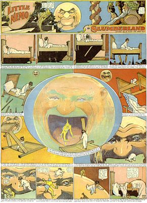
    There is a great, unifying factor drawing together Aztec glyphs, Little Nemo in Slumberland, Marcel Duchamp, the Renaissance Sienese Sassetta, Guillaume Appolinaire, William S. Porter—they all display disparate chronological sense to a single story.

    Blog--may 25--st. anthony
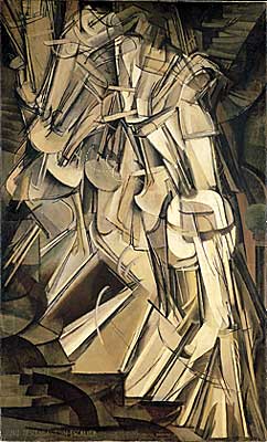
    The concept of displaying the passage of time, relating multiple events taking place at the same (or different) times, is really quite a lot older than the what is generally considered to be its recent modernist beginning.  Duchamp’s Nude Descending, which is a masterpiece of modernism displaying unfolding time and multiple perspective views across time of the same object, is the direct descendant of centuries-old artworks.  The Egyptians and the Aztecs certainly made use of this idea of multiple stories at multiple times in their stone storyboards.  Closer to the present is the genre of early Renaissance painting like Sassetta’s The Meeting of St Anthony Abbot and St Paul the Hermit (painted circa 1440), which shows several aspects of the story over time, and depicted on the same canvas. (We see the beginning of St. Anthony’s journey at top left, heading out on his journey as a younger man, winding his way through dark wood and along a curving trail; we see him a second time as an old man, and then lastly at bottom, elderly, finally meeting the other monk.)


    Blog--may 26--nemo

    The rollout of the Sassetta masterpiece (hanging happily at  the National Gallery in D.C.) reminds me a lot of the great hallmark of storytelling at the beginning of the twentieth century—no, not Barzun or Cendars, but Little Nemo (who predates all of the other greats who were to come in the next ten years or so).  Winsor McCay’s (1871-1934) Little Nemo in Slumberland (appearing in the Hearst newspapers beginning in 1902)—better yet, the comic strip in general—adopts a platform for storytelling that is nothing short of revolutionary.  By breaking out the development of the narrative in front of the reader and on one single sheet of paper gives the author fantastic maneuverability.  This is also seen in the early motion pictures of Edwin S. Porter (like The Ex Convict, 1905) and D.W. Griffith (The Lonely Villa, 1909) who both use a new concept of contrasting editing—cutaways from the main action and pace of the.

    Blog--may 26--nude descending


    film and incorporating vignettes of actions that are related and happening elsewhere, sometimes all of it happening at once.   The story is able to develop multiple themes that are occurring at the same time but in disparate locations—the artwork of futurists Balla and Boccioni and the unclassifiable Duchamp reach for the same end, and so to (again) with Apollinaire and Cendars and the rest…and all of them coming into view in 1912/1913 or so.

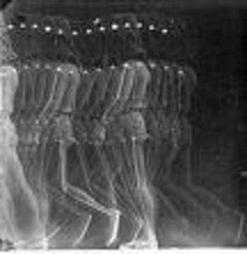
    There’s a lot to talk about on the tech end of this too, not the least of which is the work of Etienne Marey who made highly successful photographic investigations (in the 1870’s and 1880’s)
    of all manner of locomotion, some of the results of which look like the x-ray of Duchamp’s Nude.  Perhaps the greatest early enablers of technological simultaneity are the telegraph and (more impressively) the telephone, both of which allowed people to be in two different places at the same time (so to speak).

    Blog--may26--marey

    Again, this is just a note, thinking out loud, about the concept of simultaneity, and I doubt that I’ve even broken the surface…I’ve not even considered the math and physical aspects of it all, not even a whisper about Einstein and Schroedinger.  I’ve just done a search and found two works by eminent historians of science on this topic which I should think would demand reading:  Max Jammer’s Concept of Simultaneity (2005) and Peter Galison’s Einstein’s Clocks, Poincare’s Maps and the Empire of Time (2003).  I’d like to return to this post when I think I might have an idea of what I’m talking about…


  • The First Fisheye View? Vienna, 1529

    JF Ptak Science Books LLC  Post 567

    Fisheye


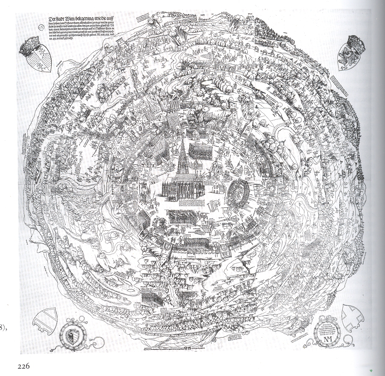
    This magnificent woodcut,
    The Siege of Vienna*, executed by Nicolaus Meldmann, was published in 1529/30 and depicts a view of the city of Vienna from an extraordinary and perhaps unprecedented perspective.  I’ve paid some attention to antique images that look straight down at things (Looking Straight-on At Things  and  Looking  Straight-Down on Things) and I can say that they are in general pretty uncommon–this is the first time though that I’ve noticed a fish-eye view looking straight down, an image conveying a 360-degree horizon-to-horizon landscape.  It is just simply phenomenal, even if a fair number of the buildings in town are missing and so on–the (unnamed) artist-on-the-spot actually climbed a high spire and made a number of sketches, extrapolating it all into this horizon-bending whole.  But the representation of the city wasn’t the paramount concern in the print–it was the placement of what was going on outside of it that was important. And what was happening concerned all of Europe–it was the invasion by the Muslim Ottoman
    Empire
    , led by Sultan Suleiman I (the magnificent)
    , and in 1529 they had made their way through Hungary and into central Europe, laying  seige to the principal city of Vienna with an army of 150,000 (or 300,00) soldiers. . It was the high point of the Ottoman expansion, as they were ultimately turned back by the Austrians in a determined and complex series of battles of mining/tunnels versus anti-mining and anti-tunnels (such battles being fought, still, deeply into World War I).  So this print was made for a wide audience of Europeans, trying to get a glimpse of the siege of Vienna and the positions of the Ottoman forces, knowing that the outcome of the siege could very well hold the fate of the rest of Europe.  

    If you check out the other posts in this blog on “Looking Straight Down” you’ll see a number of examples of early straightdownedness–none though approach the vast area that the artist of this print had taken under control and displayed. 

    *I found this reproduction in Landau and Parshall’s beautiful, attentive and intuitively incisive The Renaissance Print,1470-1550, published by Yale University Press in 1994.  It is a rich book, with very deep depth and a light touch, hard to do in an academic/historical work.  But they did it.