A Daily History of Holes, Dots, Lines, Science, History, Math, Physics, Art, the Unintentional Absurd, Architecture, Maps, Data Visualization, Blank and Missing Things, and so on. |1.6 million words, 7500 images, 4.9 million hits| Press & appearances in The Times, Le Figaro, Mensa, The Economist, The Guardian, Discovery News, Slate, Le Monde, Sci American Blogs, Le Pont, and many other places… 5000+ total posts since 2008.

Category: History of Lines

  • Notes on the History of Lines: Sight Lines

    JF Ptak Science Books   Quick Post    History of Lines 

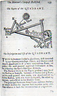
    These are particularly fine and relatively early printed images depicting a specific kind of line of sight–this one, a positioning, rather than a line of sight in fire control, or radial velocity, EM radiation or acoustics wave propagation, or targeting…this instrument was used to establish an imaginary line in perceived objects. 

    Sextant 237This is a detail from Andrew Wakley’s  The mariner’s compass rectified : containing tables, shewing the true hour of the day, the sun being upon any point of the compass ; with the true time of the rising and setting of the sun and stars, and the points of the compass upon which they rise and set … With the description and use of those instruments most in use in the art of navigation. Also a table of the latitudes and longitudes of places, published in 1763 and reprinted many times after that. (Full text is available from Google books and also from the Haithi Trust which offers a text version of the book as well.)

    The full page from which the detail is drawn:

    Sextant 236


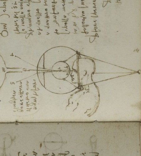
    There is a certain continuum in developing sight lines that comes to mind, as with this famous image drawn by Leonardo in 1508, perhaps the first modern interpretation of how the eye functions, kept privately in manuscript, the result of theory and experimentation:

    Leonardo eye

     Which leads us to the sigh lines of Albrecht Durer, illustrating (some 17 years later) the use of a perspective tool, the vielo, in his work The Drawing Manual published in 1525:

    http://www.oneonta.edu/faculty/farberas/arth/Images/ARTH_214images/Durer/durer_perspnude_large.jpg


  • Dots and Lines in Optical Diversion

    JF Ptak Science Books     Part of the History of Dots series  Post 2007

    Follow Me on Pinterest

    Long is the line in the history of art–far less so the dot. 

     
    Artyping216

    The line has been part of a long and deep inheritance of rendering a truth, factual, perspectival presence–in general, at least. Certain symbolic and metaphoric elements will sometimes confuse and collapse bits of the image, but the effort for centuries has been to present a balanced nature as close as practicable to its perfection.  That was the strength of the line. 

    The strength of the dot was in doing something not quite the opposite but approaching it. 

    It is interesting to think of the importance of dots in the first revolutionary changes in 500 years in the history of art.  Honestly, there wasn’t anything epochal that happened between the re-discovery of perspective (ca. 1330-1400) and the arrival of Impressionism (and just afterwards of non-representational art) in the 1872/3/4-1915 period.  

    Suerat Dots aren’t brought to bear formally in the revolutionary movement until the early 1880’s.  Impressionism for all intents and purposes is formed with the Societe Anonyme in 1872 (whose members included Monet, Pissaro, Degas, Sisley, Morisot and eleven others), and perhaps more realistically in 1874 when the Societe exhibited its first salon.  (The first show held at the Nadar Studio in Paris in April 1874; a tiny, one month long affair, compared to mammoth exhibitions like the Universal Exposition in Paris in 1867.) 

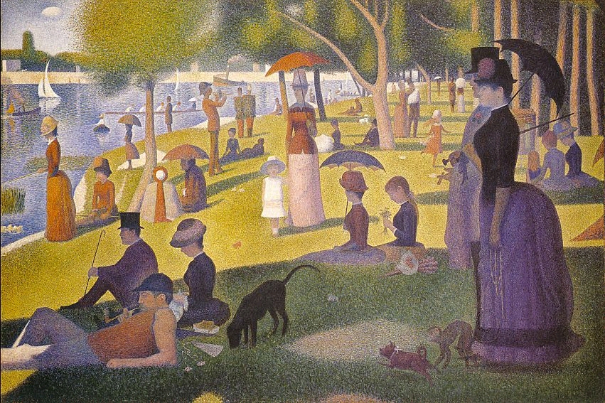
    It was Georges Seurat who brought the whole world to the dot experience with his artistic method of Pointilism, in particular with his magnificent Un dimanche après-midi à l’Île de la Grande Jatte, an enormous work given its composition—dots.  The dots replaced the brushstroke, and their placement in relation to their color was an absolutely brilliant innovation, establishing a perfect result for the viewer when examining the work as a whole.  (It may well be that the French chemist an designer Michel Chevreul made this discovery a few decades earlier, noticing the effect and changes in color depending on placement and—in his case, with fabric—color in the dyes for his material.)

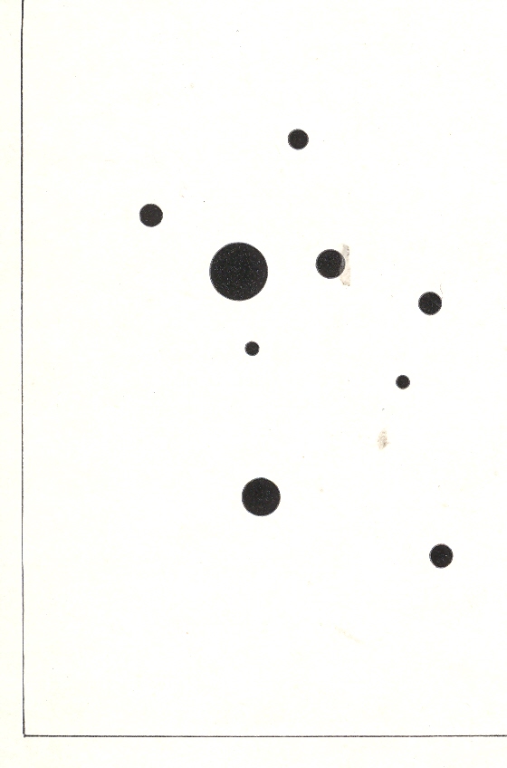
    Wassily Kandinsky (1866-1944), the discoverer of nothingness in art and the introduction of the first BLOG==july 13=kamd non-representational paintings in art history (1913) used his fair share of dots in his exploration of the previously invisible.  One good example is his 9 Points in Ascendance (1918), which is nothing but black dots, an impossible composition just two decades prior to its creation. 

    In the middle of this appeared the half-tone illustration, the great liberator of photographic illustration in popular publication.  Invented in the late 1870’s by Stephen Henry Horgan and used in the Illustrated London News for the first time in 1881, it made the publication of accurate images much feasible and economical.  No longer were readers dependent on the accuracies of artists interpreting photographs or photographed scenes—the photographs themselves were now publishable at little cost and in high quality, vastly increasing the veracity of published reports dependent upon images.  This was revolutionary in its own way, democratizing the sharing of images and icons.


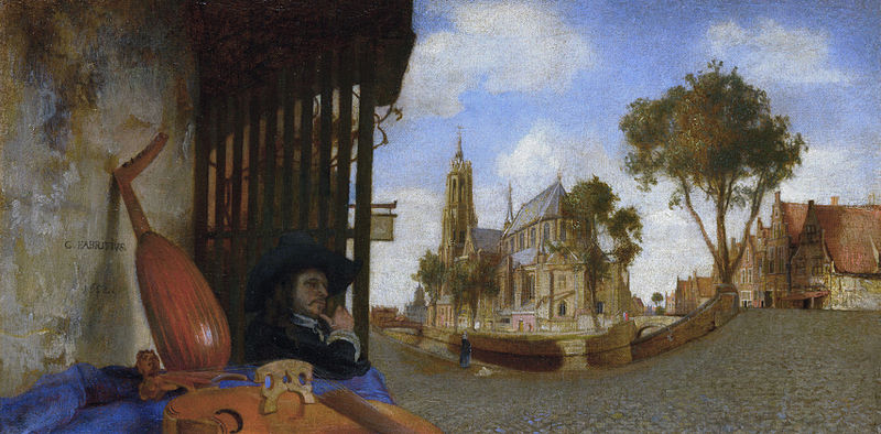
    That said about dots, the line was surely used to transport a bit of reality in art, even before the 18th century–among the earliest appearances being with Hans Holbein in his The Ambassadors of 1533, and a beautiful and very famous use was made by Andrea Pozzo in his illusionistic works at S. Ignazio in Rome in 1685 (and which I mention in an earlier post).  Certainly Carel Fabritius attempted and succeeded in this throughout his career, playing with the substance of perspective, as we can see here in his View in Delft, in 1652:

    Fabritius
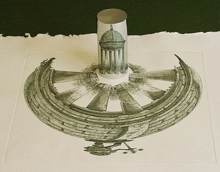
    Also the lines of the anamorphic image severely distorted the presentation of reality–if you had the mirror to distort it and if you had the mirror to reconstitute it:

    Anamorphic art
    Source:  Anamorphic Art

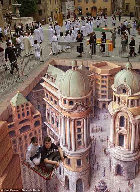
    This example is much more recognizable in widely-circulated images of the modern work of  people like Kurt Wenner, who have continued in the tradition of Leonardo’s researches in the difficulties of wide angle distortion:

    Anamorphic art b
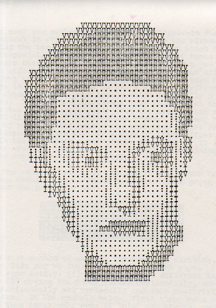
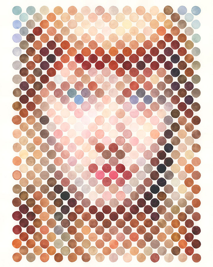
    Seeing this collection of dots in the construction of human faces I was reminded very strongly of the portraits made on the typewriter by Julius Nelson in his work, Artyping, published and sold for a dollar by the Artyping Bureau of Johnstown, Pennsylvania, in 1939 (and pictured first, above).  Nelson was an instructor in “secretarial science” in Windber High School in Pennsylvania and no doubt put together this pamphlet as something expressive of his artform and as an advertisement for his profession.  This was hardly the first time that anyone used the typewriter artistically, as I can recall some measure of artistic expression in type in Punch magazine as far back as 1869, though portraiture by typewriter does not appear to be a very wide section in the art world between those times. In any event, a portrait that he made here is rather close to those presented on the Modern Metropolis site–the “Dot Portraits”  Nathan Manire.

    Dot portraits

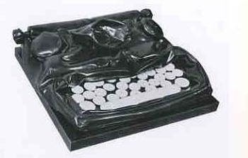
     Modern Art would have the final dispositional comment on the typewriter as an instrument of art, when Claes Oldenburg made his Soft Typewriter in 1963:

    Blogtypewriter_nwrriter_soft036_2 

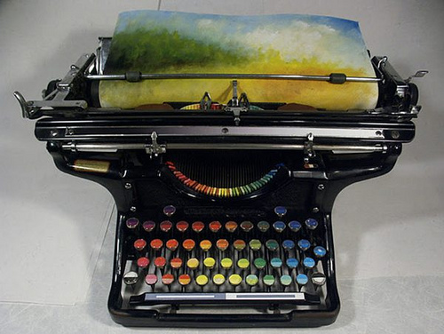
    And then, of course, the magnificent resurrection of the typewriter artform, replacing the spplication of black or red with something a little more complex:
    Typewriter chromatic
    [Source: the chromatic typewriter, by Tyree Callahan, found here  http://www.samanthahahn.com/blog/2012/01/16/chromatic-typewriter/]


  • Making Lines into Stars, Botany to Cosmology–an Episode in the History of Lines

    JF Ptak Science Books   Post 2003   Follow Me on Pinterest

    Horteus malabar
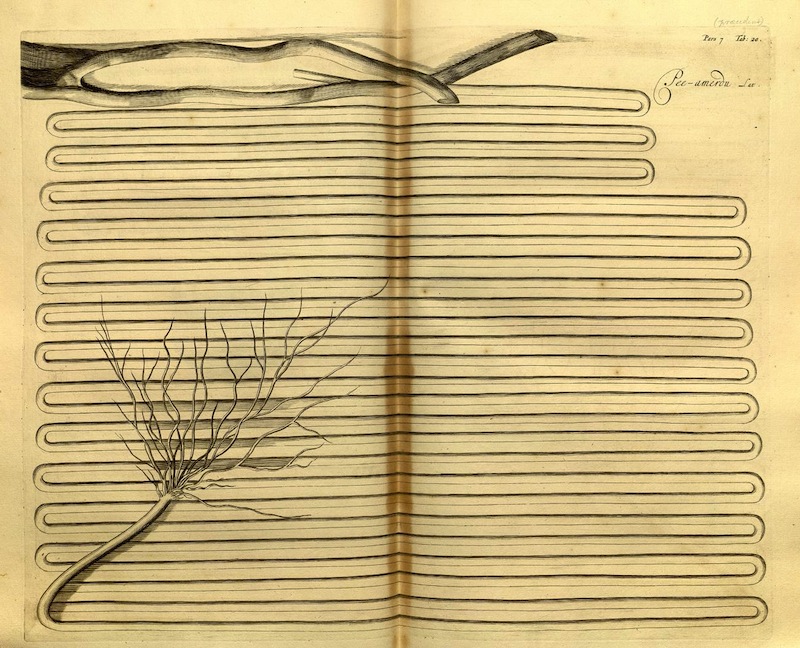
    I wanted to share this magnficient image, illustrating the Hortus Malabaricus (“Garden of Malabar:) and found at the great Public Domain Review site, here.

    There are many more images in this work, and the PDR links to many more still, but I’ve picked this one probably for all the wrong reasons, selecting it from the graphic aspect, the differentiation of space, the long line.  There is a category for The History of Lines on this blog, but it seems that there aren’t many contributions to it, mainly because just about every other thing could classify as such. But this image is certainly remarkable enough to make the category. 

    Also, it is a quick four-step process in photoshop to render these lines and their botanical aspect/origin into a star cluster via  a progression in the spatter filter.  A twist here and a simple turn there could render them the opposite way, from sky above to mud below, going from the star cluster to geology, as in the form of agates, and particualrly the more “living/anthropomorphized” agates of the great/greatly-problematic Fr. Athanasius Kircher.

    Step 1 (original detail):

    Horteus malabar b

    Step two:

    Horteus malaba psray radius a
    Step three:

    Horteus malaba psray radius cStep four:

    Horteus malaba psray radius d

    And Fr. Kircher’s agates, which appear from simply heigtening the smoothing application of the splatter in step four, rendering the star cluster so:

    Horteus malaba psray radius agates
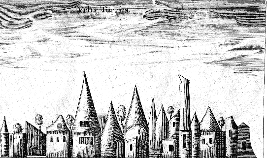
    When Kircher looked closely enough at his agates, he saw hidden objects: sometimes a Madonna, other times animals, and still others–and perhaps more famously–town skylines encased in the rock, as with this example from his Mundus Subterraneus (an undefined edition but ca. 1660):

    Kircher agate
    If you looked close enough at  the agate-ified Malabar engraving you’ll be able to find a town–and just about anything else.  


  • The Micro-Biological Beauty of the Plans of Catacombs

    JF
    Ptak Science Books     Post 1971

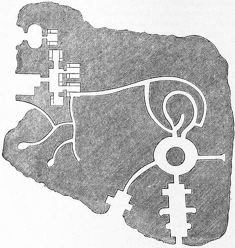
    Cemetery four[Plan of a portion of the principal storey in the Poggio Gajella]

    The plans of underground cities, of catacombs and cemeteries, share a certain biological appeal in their design with the plans of Medieval cities, or at least they seem so to me.  Removed from their context and placed in an undifferentiated environment, the plans look very much like biological structures, and art.  As maps of cities of the dead it is somewhat ironic that their geological chrysalis seem to indicate a biological structure.

    And sometimes the images aren’t so reminiscent of micro-structures as they are macro-structures, as in the case above. If you squint just a little and look at the Poggio Gajella you can visualize a cross section of the upper torso of a body, including an open mouth, with nasal cavity, throat, digestive system, and even intestines and egress routes–a picture of a person in the city of the dead.

    The images below illustrating this ragged point are by Seroux d’Agincourt, (1730-1814), and appear in his  Histoire de l’art par les monuments, depuis sa décadence au IVme siècle jusqu’ à son renouvellement au XVIme (Paris, 1825). The images illustrate the article “catacombs” from  the Encyclopedia Britannica, in the great/standard 11th edition, from Project Gutenberg:


  • Fantastic Square(s), 1840

    JF Ptak Science Books  Post 1960

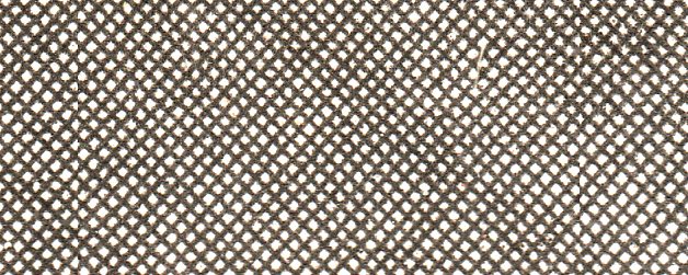
    I was shocked to investigate this seemingly magically-produced engraving under magnification–it was a small piece of inset work used to illustrate an idea within a much larger overall engraving.  The detail is about a 5% cropping of the full image:

    Square detail982

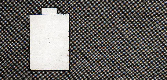
    It is a subset of this detail:

    Square detail981
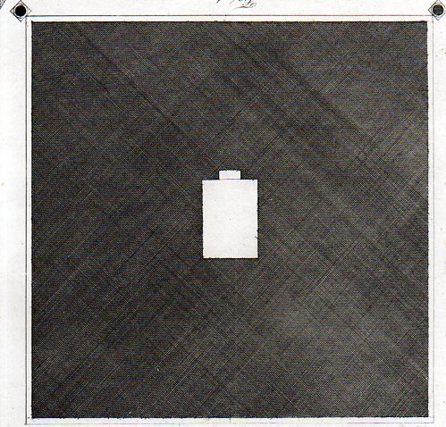
    Which in turn is a detail from this beautiful work which is itself a four-by-four inch detail in a larger engraving, the footprint of an elevation of the Sepolcro di Caio Cestio, which was printed in 1840. 

    Square 983

    The craftsman who produced this engraving incised 250 lines on one side of this 4-inch-square, then proceeded to incise another 250 lines on the other–or so. This means that there are something on the order of 62,000 (or thereabouts) squares produced by the draftsman in order to make a mostly-black background for the image. 

    The plan is for the pyramidal tomb of Caius Cestius who was a monied Roman who demanded that for the disbursement of his will to be complete had to have this tombstone built to himself in a prescribed period of time–mostly very quickly.  The result has been captured by Piranessi and others–a very sharp-pointed pyramid about 130′ at its base and 145′ tall.  When finished the builders incised their victory and documented it on the side of the pyramid so:

    Opus absolutum ex testamento diebus CCCXXX, arbitratu (L.) Ponti P. f. Cla (udia tribu), Melae heredis et Pothi l(iberti). (“The work was completed, in accordance with the will, in 330 days, by
    the decision of the heir [Lucius] Pontus Mela, son of Publius of the Claudia, and Pothus, freedman”.)

    All I really wanted to comment on here though is the craftsmanship of producing this finely-lined and remarkable detail


  • The Earth Skeleton, Primal Pansperma & the Gigantic California

    JF Ptak Science Books   Post 1933
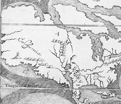
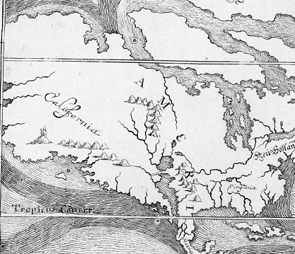
    Happel map895 detail;
    [Detail of  E.W. Happel’s map in his Relationes Curiosae (1675), plates 23 in the Peabody Library’s The World Encompassed, 1952.]]

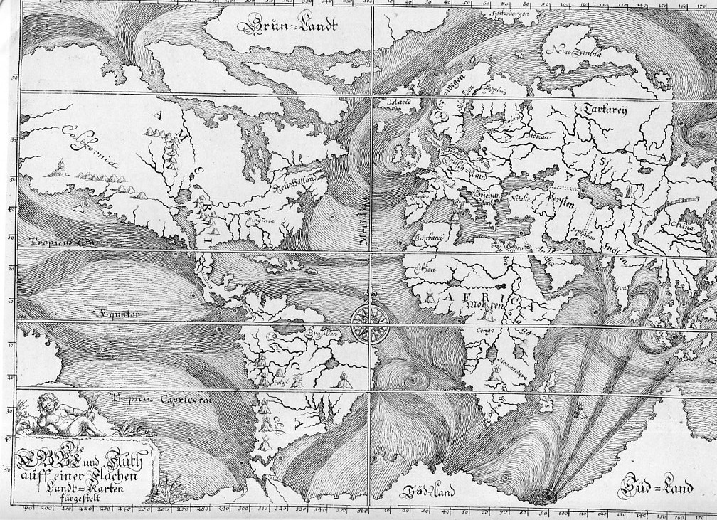
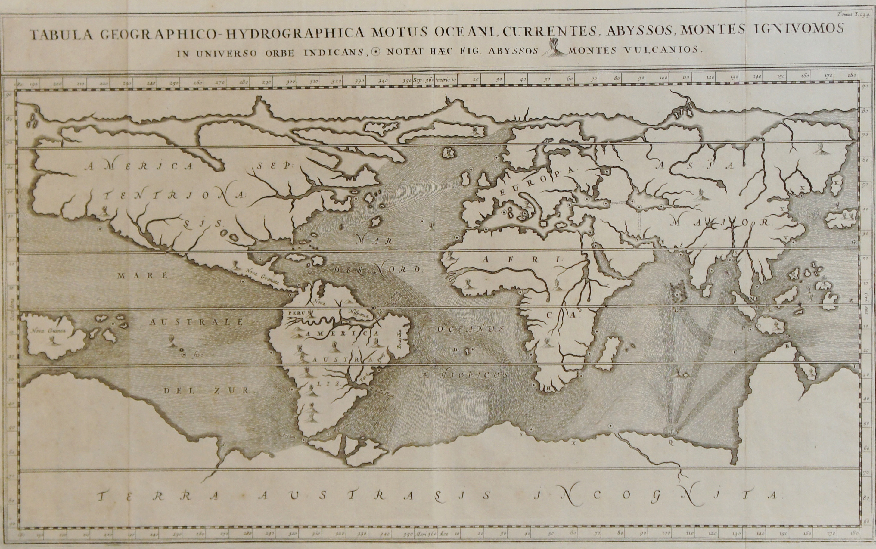
    I’m not sure how my thinking went from Athanasius Kircher’s Earth skeleton to the magnificent Eberhard Werner Happel 1675 world map of ocean currents featuring what might be the largest California ever seen in the history of cartography, but, well, the thinking wound up there, (and this leaving out Bishop Burnett’s perfect primordial world egg in the process). This was intended as a simply post following up yesterday’s bit in the Blank and Missing Things series relating to California as an island and the missing land mass connecting the non-island to the rest of North America.  Nominally California usually appears as a stubby/plump infected-appendix-sized bit either attached/not to the continent, but the California in the Happel (1647-1730, a man of math and medicine) map is larger than the rest of North America from the California gulf to the Atlantic.  Of course that also includes all of Alaska and then some imagined lands as well, but, still the mass of it is labelled “California” stands by itself larger than South America, Africa (which looks surprisingly good for the age of the rendering), China (which is very very small) and Russia (which lacks virtually all of Russia east if the Urals).  The only land mass that comes close to California’s size is the Antarctic regions, which is drawn here as a solid land mass including the scant points of data for New Zealand and Australia and whatever other island was found in southerly South Sea travels, all drawn together and fitted into an enormous continent.
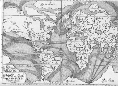
    Happel map895[The full image of the Happel map]

    Although there weren’t many explorers yet to go up the west coast of North America in 1675, other maps of the period render the coastline in a more accurate way than this.  The point of the map, really, is to display what was known of the ocean currents, some of which was correct but a lot of which is not–though it is a very good attempt given the state of the data collection.  The source of this map,the Peabody Library’s The World Encompassed (1952)  calls it the “first chart of ocean currents”, which I think is incorrect–and it is here where our favorite 17th century science-Jesuit comes into play, for it is in Athanasius Kircher’s Mundus Subterreaneus (1642) that the first map of ocean currents occurs.
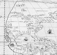
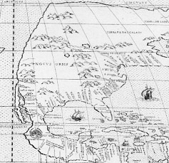
    Tramerzinus map896_edited-1 detailed

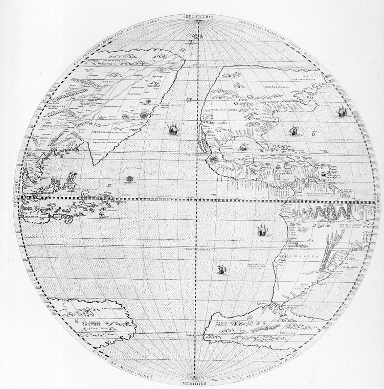
    [Michael Tramezinus’s map of the Western Hemisphere (1534) showing a mostly non-existent western coastline of North America along with a stringy California–but given the time and the available information, it is an excellent map that is not afraid to define unknown lands with a squiggly line. Source, plate 35 from The World Encompassed.]

    Kircher is a highly problematic character in the history of science.  He is at times wonderful and insightful and creative; at other times he is boring, pedantic, grueling, wrong, fanciful, and stingy with attribution.  I’m no Kircher scholar, but it seems to me after al this time that sometimes he writes stuff that he couldn’t’ve meant, that he absolutely knew better than to assert–but there it is, anyway, written as gospel truth (and the Gospels and related religious mythio-stories evidently demanded obedience to their own truths, in which Kircher complies) . This is one of the problems with the Fra Athanasius.
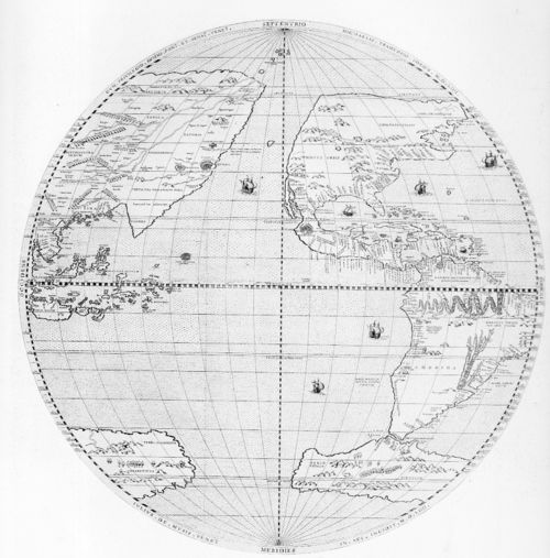
    Tramerzinus map896
    [The full detail of the Tramezinus map.]

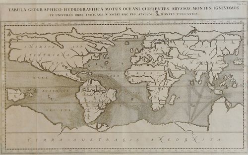
    In his Mundus Subterraneus Kircher presents the true first map of ocean currents (Tabula Geographico-Hydrographica motus Oceani, currents, abyssos, montes igniuomos in universe orbe indican), some bits being correct and others not so. He rejects the Aristotelian concept of condensation, and figures that the accumulation of snow/rain/dew is simply not enough water to feed the rivers and lakes and oceans, so he devised subterranean oceans and rivers with vast stores of water to feed the waters topside.  His hydrophyllaciae is one of four components of an underground Earth that closely coincides with the four elements and with the human condition, much in the tradition of the Medieval body/spirit approach to the understanding of the world system. 
    Kircher current maop
    [Source: image from the mapseller site of Sebastian Hidalgo Sola, Buenos Aires, here.]

    John Edward Fletcher, in his A Study of the Life and Works of Athanasius Kircher, ‘Germanus Incredibilis …” describes Kircher creating an “Earth Skeleton”which he dresses according to science and ecclesiastical needs, finding a vis spermatica, the launching of all matter from the primeval chaos of primordial Earth.  The Mundus addresses this and many other things–it is, in all of this and all of its faults (as Fletcher states), a great repository of all geological knowledge of the time.  There is the good with the bad in the Mundus, “a conglomeration of exotic facts and fiction, along with odd scraps of truth and the occasional flash of brilliance” (Fletcher, p. 172), and the ocean currents map is one of those bits.

    Kircher undertakes an enormous and probably impossible job in this book, but may actually be kept from getting to the big point by depending upon himself too much. As Fletcher points out (page 171), the Mundus‘ third edition of 1671 failed to take into account the major advances in fields touching on the book’s contents, in particular, the work of Mariotte and Varenius, which was much superior to that of Kircher on the ocean currents, neither of which are discussed or even mentioned in the new edition.

    This was a very round-about way of getting to the California-part of the Happel map, but the attribution of the World Encompassed as “the first” of its kind needed to be addressed.

    Notes:

    Here’s an interesting read on the Kircher/Happel maps:  from http://www.coastalguide.com/helmsman/gulf-stream-history-noaa2.shtml

  • Putting the “Numb” in “Numbers”–on Long Lines of People Working and Fighting

    JF Ptak Science Books   Pot 1929

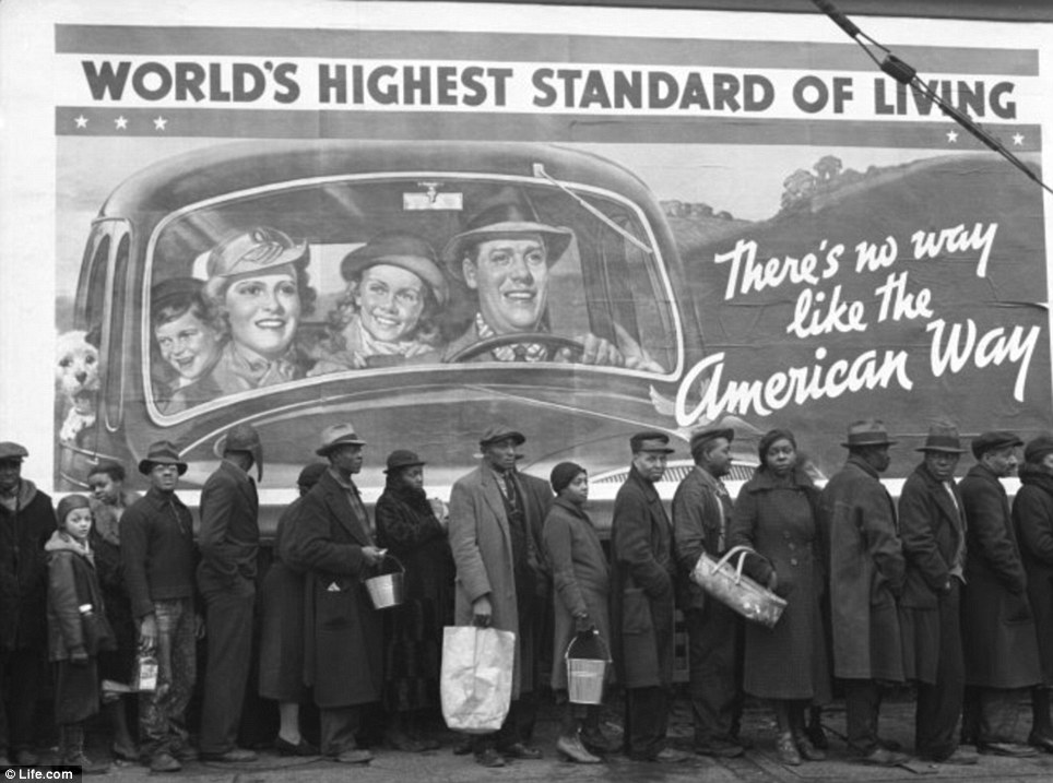
    The history of people forming lines to perform a task is an integral part of the general History of Lines. Certainly this sort of activity has been a prevalent feature of the human experience, whether it was done for commercial gain, or for construction, or betterment of the social cauldron, or in work, or whether the workers were compensated in some way or were enslaved–the idea of collective and enforced lining-up-for-a-task is about as old as humanity. 

    It would be interesting to know what the percentage of those lines were “happy” or “satisfied”.  Say  in the 10×1023 lines that have been formed over the last 10,000 years that 9% of them were constituted by people who enjoyed being there.  Offhand I’d say that this would be a very liberal estimate.

    Line food relief
    I wonder how long these lines in the modern times would stretch?  My guess is that the line formed for construction of food or agriculture or whatever else could be thought of would not be nearly so long as those lines formed for killing.  Or defence.  That said, it is easy to picture long lines of Prussian Blue set up against British Red, or the Blue stacked up against the Butternut, the long lines making their way over 3/4 mile of open field to a small stone fence at the top of Cemetery Ridge–harder to imagine those front lines being ripped apart by supersonic pieces of lead, and to have the line keep moving forward, the casualty-breaks to it plugged up by the lines of red or blue or gray moving in unison behind the first line.  It seems impossible to imagine “British Grenadiers” playing in your head while marching slowly towards another line in front of you, kneeling, and firing into you, trying to break your line, magnificent and completely insane.

    But getting back to line length question–this is tricky, but if you were to consider that during WWI that some 10-15,000 miles of trenches were constructed and that, say, a thousand miles of trenches were in use at any one time post-1916, and that those trenches were filled with soldiers, then perhaps those would be the longest human lines.  They were humans in lines in ditches, trying to not get killed and then trying to kill the other side in a simple equation of one line fighting the other.

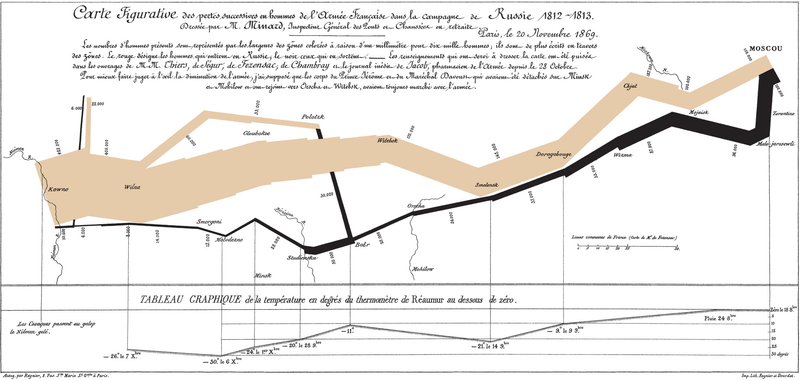
    There were also very long lines of advancing troops, armies on the move with men and countless supplies, enormous numbers of soldiers and warriors, the fighters for Zululand or the infantry of Napoleon, almost all getting smaller and smaller as time and war wore them down. (A very famous line by the statistician Charles Joseph Minard shows the devastating effect of time/weather on Napoleon’s army to and from Moscow, the thinness of the final line segment showing death and destruction.)

    Line--minard
    There is another sort of long line that appears in the 20th century that matches up with lines quite similar to it that had appeared somewhat earlier, though under different circumstances.  The story of this line–the production line–is one of a limited line segment of human beings put to work on a basically-infinite line of repetitive work.  The production line began to appear in rudimentary form in the making of the needles in the 18th century, and then more effectively in musket manufacturing in the late 1850’s and through the Civil War,  and in the McCormick reaper works in the 1860’s, and then far more famously and with greater effect in the making of the Singer sewing machine  (in the 1870’s/early 1880’s).  The process was revolutionized by Henry Ford in the 1911-1916 period, when his production lines of relatively-still automaton workers and their moving work increased the production numbers of the Model T from 53,000 (and $690/car) to 585,000 ($360/car) in just six years.

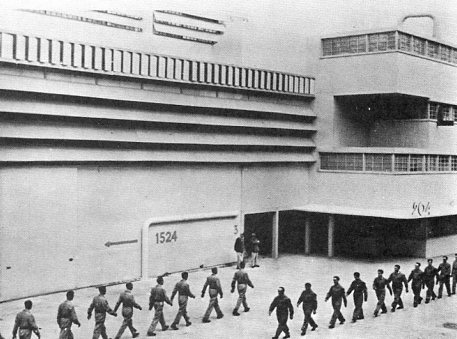
    The idea made Ford into a king of sorts, heroic and iconic, and to his detriment he believed these things of himself as well.  It took a decade and a half for the most popular culture response to make a vt appearance in regards  to Fordism and the development of mechanization and mass production to things beyond consumables like cars and rifles and bikes and sewing machines, and the picture wasn’t a very pretty one.  Brave New World by Aldous Huxley was perhaps the most chilling of these assessments, though the more popular reactions like Rene Clair (in his movie A nous la liberte, 1931) and Charlie Chaplin (Modern Times, 1936) were less abrasive in their endings, though the visual imagery of the workhouse is what stayed with people.

    A nous la liberte892
    Clair and Chaplin both presented the new work environment in light of an old one–the old one being the prison work system.  Clair especially showed the great similarities between the two–the marching to work stations, the silence, the overseer, the matching uniforms, the very controlled motions of the worker, the non-lunch period, and so on.  Chaplin did this too, making these connections through laughter that may have led to realization that the laughed-at stuff wasn’t all that laughable.  Its the imagery of these movies that made them important, I think; much more so than their endings, which produced happy/whistling/victorious workers. 

    Chaplin modern times

    You can’t spell “numbers” without “numb”.

    Notes

    ·Posted by :

    ·in:


  • The History of Lines #35: Complicated Text Design, 1474

    JF Ptak Science Books   Post 1902    Part of  the History of Lines series

    Rolevinck  canon
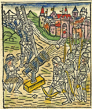
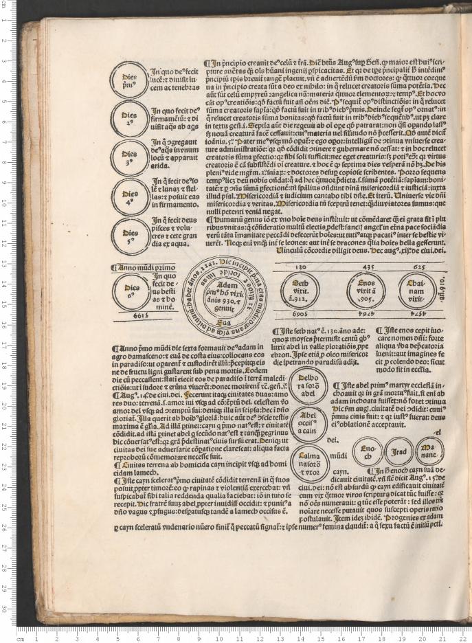
    This work was one of the early best-sellers from the time of the Incunabula, a book that went into 33 editions between 1475 and 1500, and into five different languages, and a number of different authors/annotators and publishers–a book with a very full publishing history.  The Fasiculus temporum, by Werner Rolevinck (a Monk and renowned historian at Cologne, 1425-1502), and printed originally in 1474, is an early history reaching back to the Roman times, and perhaps one of the very earliest chronological histories. It was a compendium of reaches into dim dust, histories including plagues, epidemics, diseases, monsters and other interesting bits.

    It was also illustrated; some of the woodcuts were used several times in the course of the book; many were quite interesting. For example, the image above, showing the storming and siege of a town, features the normal allotment of soldiers, plus–extraordinarily–a cannon. 

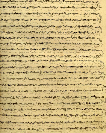
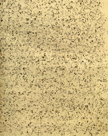
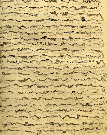
    What brings us to the History of Lines series is that the structure of the book is very impressive–and complex.  It must have been quite a chore to set into type, as the text lines vary impressively–that, and the chronological nature of the work has text running normally, and then top-to-bottom, occasionally upside down, and then quite frequently in circles.  Anyone with any experience in letterpress printing could quickly appreciate the effort it took to put this book into print. 

    Rolevinck  text

    ·Posted by :

    ·in:

    —

  • Daily Dose of Dr. Odd: Sierpinski Triangles & the Empire State Building

    JF Ptak Science Books   Daily Dose series   [Also part of the History of Lines series] 

    So, Nat’rists observe a flea

    hath smaller fleas that on him prey,

    And these have smaller fleas to bite ’em, and so on ad infinitum.

    –Jonathan Swift, 1733 

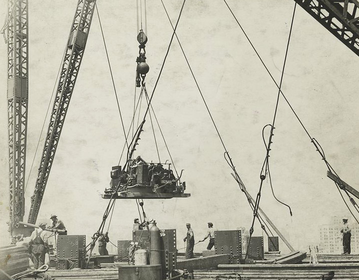
    There are a lot of triangles in this fabulous photo of the construction of the Empire State Building in 1931–a lot. At least fifty–more if you use your imagination or get your pinhole specs out. It is simply an excellent photo in which I’m seeing things of a reducible nature–not in the sense of a Sierpinski triangle/sieve/gasket, obviously–but just a simple exercise along those lines (ha!), experiencing the image by recognizing different sorts of boundaries within it.

    Lines empire state bldg

     [Source: New York Public Library Digital Collections, here.]


  • A Note on Historically Important Hyphens, Appeared and Disappeared: Space-Time and Czecho-Slovakia

    JF Ptak Science Books   Post 1833   (Part of a series on the History of Lines)

    Minkowski raum-zeitHyphens ( – ) are very old in the history of printing, going back to the lucky Johannes Gutenberg–and much further back than that in practice,  appearing as a gull wing mark to Greek grammarians, though it doesn’t appear as a word, or at least so according to the OED, until 1608. But what I’d like to talk about right now in this blog’s first and probably only hyphenic post is the joining of two words to make a bigger/better word, not an adverb-adjective bit, or a syllabification usage, or as a prefix (anti-, non-, co-, pre- and so on), and definitely not as a way to hide a letter or part of a word (as in “G-d” or “the V- word”). 

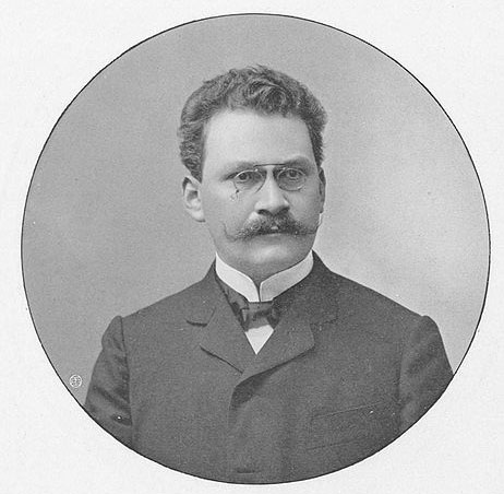
    MinkowskiIt might be argued that Hermann Minkowski (1864-1909, Ph.D. under F. von Lindemann at Konigsberg at age 21 and a brilliant thinker who died tragically young of appendicitis)  created one of the most significant/important hyphenated words in the history of hyphenated words. This came about on his paper on the work of former student Albert Einstein’s 1905 STR, a significant contribution to that field and one which helped develop the path to the theory of general relativity in 1916.  The paper (1907/8) was “Die Grundgleichungen für die elektromagnetischen Vorgänge in bewegten Körpern“, published in Nachrichten von der Gesellschaft der Wissenschaften zu Göttingen, Mathematisch-Physikalische Klasse, pp:53–111 (and translated here as”The Fundamental Equations for Electromagnetic Processes in Moving Bodies”, and translated by  Megh Nad Sah), and it was here (on page 63, section five, see above) that the two words were linked for what6 I think was the first time. (The general idea goes back quite some distance, and is very nicely reviewed by R.C. Archibald in 1914 in his article “Time as a fourth dimension” in the Bulletin of the American Mathematical Society, volume 20, page 149, who records that it goes back at least to Jean d’Alembert in 1754 and Joseph Louis Lagrange in his Theory of Analytic Functions (first edition of 1797 and a second in 1813, writing that “One may view mechanics as a geometry of four dimensions, and mechanical analysis as an extension of geometric analysis”), and to Immanuel Kant and William R. Hamilton’s quaternions, and others.)  I am not sure when the term is collapsed (“Space and time”, “Space Time”, “Space-Time”, “Spacetime”, Spacetimes”), but John Wheeler does away with the hyphen in his Spacetime Physics in 1963, though I’m sure the disappearance and conjunctions take place long before that (though Schroedinger was using it in 1950)..  J.A. Isenberg refers to a different set of hyphens for this idea in his 1980 article  “Wheeler-Einstein-Mach Spacetimes”, which appeared in Physical Review (D), 24 (2), 251-256, and which frames another aspect of the, making use of the plural which had appeared some time before.

    Now, on the other end of the spectrum comes a story from the Velvet Revolution of Czechoslovakia–it is another very quick rendition of a complicated history, like the above, but it will serve the purpose as a section in the History of Lines. The Revolution was coincident with the collapse of the Warsaw Pact governments coming with the demise of the USSR, and occurred in November and December 1989. Following the state’s first free, democratic elections, it was faced with what to call itself.  Czechoslovakia, Czecho-Slovakia, Czech-Slovakia–it was a severe issue illustrating the concerns of the Czech and Slovaks, not the least of which was the language identifying whether the sign connecting the two words was a “hyphen” or a “dash”.  There were language and cultural barriers, and what finally happened was that Czechoslovakia ceased to exist, giving way to two states on 1 July, 1993:  the Czech Republic and Slovakia.  The hyphen issue was of course just indicative of much more complex concerns, but minor mirrors like this–and, say, the different names that each side gave to the revolution, the Czechs preferring “Velvet” and the Slovaks using “Gentile”)–and so it all ended in what is referred to as the “Velvet Divorce”.

    ·Posted by :

    ·in: