A Daily History of Holes, Dots, Lines, Science, History, Math, Physics, Art, the Unintentional Absurd, Architecture, Maps, Data Visualization, Blank and Missing Things, and so on. |1.6 million words, 7500 images, 4.9 million hits| Press & appearances in The Times, Le Figaro, Mensa, The Economist, The Guardian, Discovery News, Slate, Le Monde, Sci American Blogs, Le Pont, and many other places… 5000+ total posts since 2008.

Category: History of Lines

  • The Dots that Connected the Lines, 1869

    JF Ptak Science Books    Post 1791   [Part of the History of Dots series.]

    Def. 1.1. A point is that which has no part.
    Def. 1.2. A line is a breadthless length.
    Def. 1.3. The extremities of lines are points

    —Euclid, The Elements 

    Please see the associated post on  the History of the West and the History of Lines: Telegraphs, Railraods, Treaties, and Barbed Wire.

    I really don’t mean to tangle this post up in what might be one of the most profoundly significant books ever written, mainly because the I’m talking about “dots” and not “points”, though several points do come into play in the story.

    The dots come into the story with the finishing of the great Overland Route, the Transcontinental Railroad, which was built between 18631 and 1869, and which via massive construction tied together various lines to make the fist continuous connections by rail between the American Atlantic and Pacific coasts. The construction for the vast missing connecting chunks were undertaken by the Central Pacific Railroad of California and the Union Pacific Railroad, building (respectively) their ends extending from Oakland (CA) to Council Bluffs (IA).  (A map of the railroad line can be seen below in a clickable whole and then again in the “continued reading” part of the post in more detailed sections. Interestingly this map shows both a plan and profile of the line, and when you take a closer look at the bottom part of the map it is easy then to see why the Central Pacific had so many delays getting through the Sierra Nevada.)
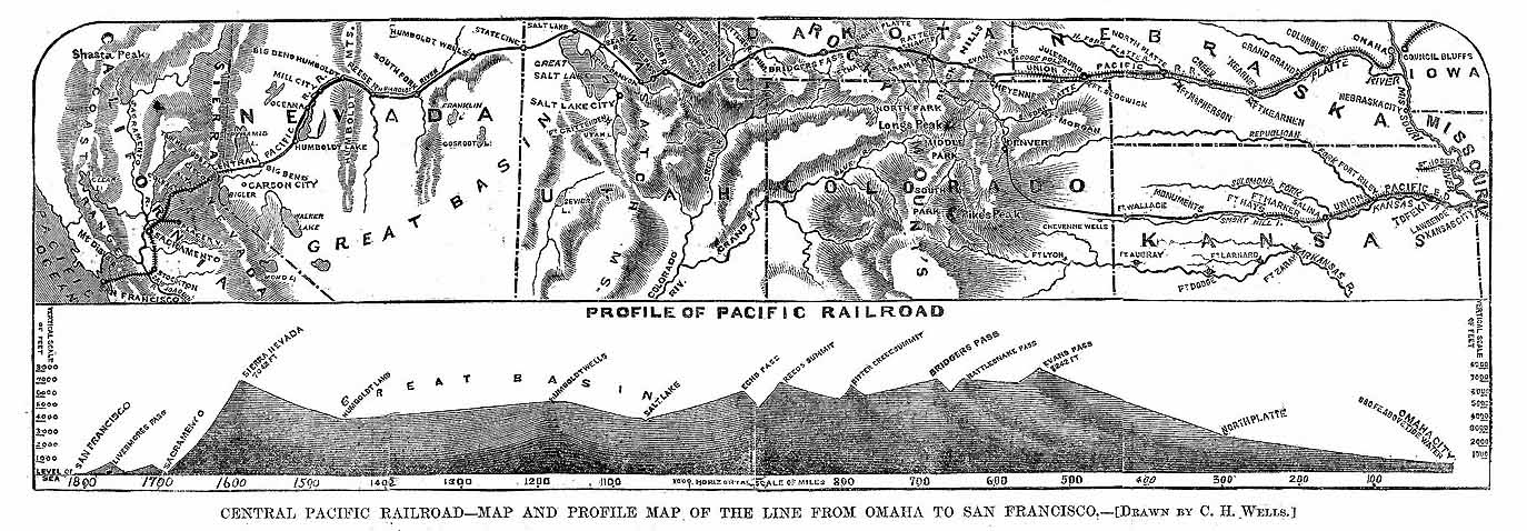
    Pacific_Railroad_Profile_1867
    The building of the railroad line was notoriously difficult, undertaken by companies desperate to build their ends fast and not using the best materials or doing the best work (with millions needing to be spent on repair of the Central Pacific effort as soon as the line was completed), or treating the largely immigrant workforce (mainly Chinese and Irish) fairly. But the job did get done and it got done relatively quickly, considering too that the first primitive locomotives didn’t appear in the U.S. until 1831–it didn’t take long at all to produce thousands of mile of line as well as the sophisticated machinery to run on them.  The great engineer Oliver Evans waged a little war on the future by allowing himself to see the following:

    “The time will come when people will travel in stages moved by steam engines from one city to another, almost as fast as birds can fly, 15 or 20 miles an hour…. A carriage will start from Washington in the morning, the passengers will breakfast at Baltimore, dine at Philadelphia, and sup in New York the same day…. Engines will drive boats 10 or 12 miles an hour, and there will be hundreds of steamers running on the Mississippi, as predicted years ago.” –Oliver Evans, 1800 [Evans built the first stationary steam engine in 1800, and then in 1804 built the first steam engine powered boat.]

     He wasn’t talking about railroads per se, as the steam locomotive hadn’t been invented yet.  But 30 years later or so there was the first appearance of these machines, and then another thirty years after that they were running across the United States, which was a remarkable turnaround in the economy of transportation. 

    The very end of this story though is told in dots.  When the Central Pacific and the Union Pacific met in the lonely Promontory Summit, Utah, there was an on-site celebration where the two lines were famously tied together using a golden spike. (Actually there were two gold, one silver one blended gold/silver, and one plain spike used int he ceremony.)  The news of the event was carried out to the rest of the country via another new and remarkable medium, the transcontinental telegraph, which had been completed in October 1861 and which allowed nearly simultaneous communication between the two American coasts, with this innovation also taking place about 25 years after the general invention of the telegraph.) 

    It is interesting to note that it was during the Lincoln administration–in the earliest part of Lincoln’s presidency–that these two great unifying elements were established.  The railroad was started in the first year of the Civil War, and the telegraph finished just months into the conflict.  It is ironic that the first communication going west-to-east by Stephen J. Field (on 24 October 1861) to President Lincoln spoke of the medium’s great power in uniting the country, if only East and West:  “will be the means of strengthening the attachment which binds both the East and the West to the Union”.  Which may or may not have been true–communications wouldn’t necessarily unite, as the country was already deeply at war with itself North and South, and there were already ample telegraphs enough existing between the two that did not manage to keep the country firmly within itself.

    Back to Promontory–the proceedings of the celebration were “broadcast” by telegraph, the event being very heavily listened-to news.  There were speeches of course and then toward the end there was a sermon followed by a long entreaty to the almighty.  That finished, the Central Pacific top man, Leland Stanford, was to drive home the final golden spike uniting the lines.  When the spike was driven and finished, the news would be related by the telegraph as so:

    “Dot. Dot. Dot.”

    Three dots would signal the end of the work, and the completion of the railroad.  Stanford reportedly missed on his first swing with his silver hammer, but the news was sent out anyway, saying the work was done.  The signifier relating the connection of thousands of miles of railway track being three simple dots.

    Hart stereoview #355, detail.  Courtesy National Park Service.
    Hart stereoview #355, detail, “The Last Rail – The Invocation. Fixing the Wire, May 10, 1869.”
    Courtesy National Park Service. [Source for image, here.]

    Notes:

    1.  Abraham Lincoln signed the Pacific Railway Act in 1862 which set the stage for the building of the Transcontinental.
  • A Note on Overcoming Hindsight: on Sending Japanese “evacuees” Home, 1945/6

    JF Ptak Science Books   Post 1779

    On Evacuees, Excludees, and “Segregees”: Closing an Ugly Chapter in U.S. History–the Japanese Internment Camps, 1942-1945

    As of April 30, 1945, the U.S. government allocated a total of $39 million to relocate 120,000 or so Japanese “evacuees” from “evacuation centers” back to their “normal homes”.  That comes to about $275.00 per person:  but that is mostly allocated to payment for personnel, because, really, all that was happening was that these people were being sent back home somewhere, or if their homes/farms had been undersold from under them, to somewhere not-their-home.  Of course the figure is slightly inflated, because of all of those Japanese interred during this time nearly 10% of them volunteered to fight in the U.S. Armed Forces, so for those who survived after serving in some of America’s most highly-decorated units of all time, Uncle Sam was paying the bill to send those young men home.  But offsetting the Americans of Japanese decent who fought in the war were about another 10,000 babies born in the “segregation centers”, so the numbers stay fairly-well the same.  (I cannot offhand find any numbers on the numbers of people who died in the camps, or for that matter what happened to their remains after the camps (and camp cemeteries) were closed.  I do not know if that was a government expense–to move the coffin and pay for reburial–or if that expense became a private affair.)

    Dillon Myer, who was the director of the War Relocation Authority,  testified in Congress on 30 April 1945 that it was time for the “relocation centers” to be closed, and for the “evacuees” to go home.  And to go home on schedule. 

    “Not later than 15 months, after revocation of the general exclusion orders, all evacuee property services to persons other than excludees (including segregees) will terminate, and all evacuee property warehouses not utilized for the property of such persons will be emptied…”

    I expect that few of the American Japanese wanted to linger. 

    ·Posted by :

    ·in:

    — —

  • History of Lines: Perspective with Lances

    JF Ptak Science Books  Quick Post  [Part of the History of Lines series]

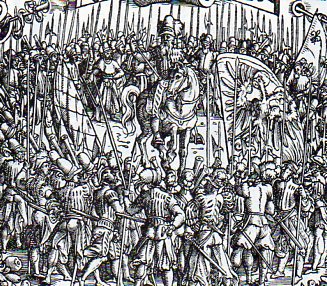
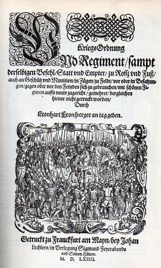
    I was quickly struck by the use of lances to establish a depth and perspective in this small woodcut on the title page of Leonhart Fronsperger’s Kriegsordung und Regiment…(1564), and how I have seen this device used many times over he years.  The artist here is the great Jobst Amman, and the book happens to be one of the most important works in military science published in the 16th century, addressing topics from troop movement to military economics to administration. (It is also one of the earliest books to address the subjects of pyrotechnics and rocketry, the later in the second chapter, “Vom Gescuetz und Feuerwerk”.) 

    Lance312
    The above is a detail from the title page:

    Lance311All that said, I’m fixed on the lances, and how they remind me somewhat of Paolo Uccello (1397-1475)–who is one of the founders of perspective–and his triptych The Battle of San Romano, with the third part of the trio in particular..  The painting was intended to be viewed together, depicting the battle (more-or-less) at morning/noon/night, the parts of which are shown below in that order.  The lances (especially in the “Counterattack”) are meant to heighten the sense of perspective–and the effect of the lances having basically no detail and being in brilliant color enhances that effect.  (In the first part of the triptych Uccello uses the alignment of dead soldiers and dropped lances to the same effect–particularly the ones beneath the hooves and in the vicinity of Niccolo de Tolentino’s spectacularly white and “solid” horse. (The business of the lack of detail in Uccello has been famously addressed in William Gaddis’ The Recognitions. I’ve written about Uccello frequently here, particularly in this note.)

    The left panel

    • Niccolò Mauruzi da Tolentino unseats Bernardino della Ciarda at the Battle of San Romano (dating uncertain, about 1435 to 1455), tempera on wood, 182 × 320 cm, Galleria degli Uffizi, Florence

    The center panel

    ·Posted by :

    ·in:

    —

  • On Antique Waves and Dropping Your Hat in Them

    JF Ptak Science Books   Post 1737  (Expanding post #850, On Dropping Your Hat in the Punic Wars)

    ++ Nov 24 dropped

    There is a particular class of illustration in which, among the secondary figures of the image, there is a small happening, an everyday trifle, that has been captured by the artist and included in the overall communication for no necessary reason. (for example, see here and below1). I’ve written about this a little before on this blog in posts about finding images-within-images: the unecessaries among the unnecessaries, the bits and pieces of everyday human existence that in and of itself is not worth commentary but which nearly everyone experiences.  Small bits, they are, of a tremendous human nature, the things that are done in private, or are so universal but inconsequential that they are shocking to see when illustrated in print.

    Titus Livius (59 BCE-17 ACE), better known to the English-speaking world as Livy, was a superior among superiors of Roman historians, writing on the history of his city and country.  His work, Romische Historie…, published in Mainz by Johann Schoeffler 1450 years later in 1514, was one of the most beautifully illustrated books ever produced in that city.  This is a considerable statement, as Mainz was the birthplace/hotbed of moveable type printing, being home to Johann Gutenberg and a number of other early presses. 

    And in looking at this fantastic work by Livy, I am a little embarrassed to find this spectacular bit of human tendency displayed in this woodcut depicting a naval engagement during the Punic Wars.  It is a beautiful thing, this scene of warfare depicted on tranquil seas and ribbony waves, determination in every face.  But what I noticed in the small boat at bottom right is a man reaching out into the water—not for a dropped oar, or to help a man overboard, or to catch his falling sword. 

    ++ Nov 24 dropped det
     He was reaching for his dropped hat. 

    I have reason to doubt that during the Punic Wars there may have been an unwritten chapter, “On the History of Dropped Hats During Warfare”.  Surely soldiers dropped their hats during the history of roman conquest, but I’d say that retrieving the headgear was more important at the Battle of the Bulge in protecting your noggin from badly splintering trees traveling at you at 180 mph and other such places than a wool cap dropped from a ship in pitched battle two hundred meters from shore. 

    I like this so because it is probably the first reaction that most of us would have—just a habit, battle raging or not—and just utterly human.  Just a little piece of back-history that doesn’t go anywhere and is lost to experience.  I’m sure that Herr Gutenberg dropped his hat at odd times, as did the unknown artist of this print.  Just an odd bit, like the first things printed on Gutenberg’s press being religious indulgences for people paying their way past Purgatory (and worse).  The fact that the indulgences preceded the great bible by several years doesn’t really matter, and neither does retrieving a dropped hat in a sea battle—but they do make interesting stories.   

    The only thing that I’d rather have the artist improve in this print were the waves–the ones on exhibit here weren’t very saucy.  Admittedly, waves were a large problem so far as depicting them goes, what with the whole vast subject of fluid dynamics so little known at the time.  THe person who would know this phenomenon best at this point–Leonardo–was thinking and working but wasn’t sharing. His “Studies of water Formations” (c. 1507-09)? and the later, magnificent “Deluge” (1513, nearly the year of publication of the above) would stay hidden for centuries, the big step forward in the West having to wait for another 120 and 140 years (respectively) for the works of Benedetto Castelli, and Evangelista Torricelli, 

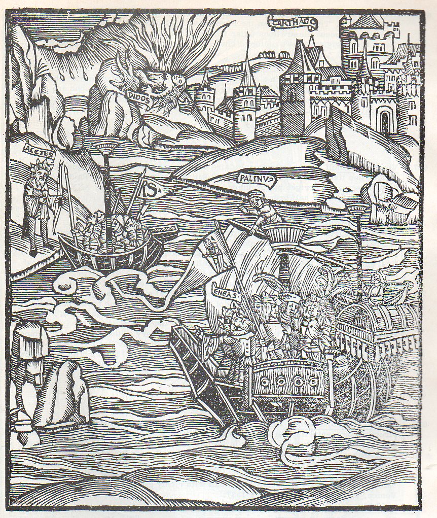
    This aside, I think that I’d rather see heavier lines in my Renaissance waves, more in line with we find in Publius Virgilius Maro Oper accuratissime castigata…, a richly illustrated (104 large woodcuts) work published in 1537, even though the artwork (evidently) appeared in an earlier edition of 1502.  No matter, “The Master of Grueninger’s Workshop” created some beautiful waves:

    Wave301
    There’s nothing “wrong” of course with the Livy waves; the Virgil though has sharper, darker, blacker and stronger contrasts in the water. Of course, the Livy has that incredibly human act of the man reaching for his fallen hat int he heat of battle, and that’s something that rarely seems to happen in prints of the Renaissance. 

    Notes:

    1.  Some other Found Images posts:

    Found Images: Penny Lane and the Inexpensive Treat, London, 1896

    Found Images of the Great Wheel, 1895

    Finding Hidden Images in Antique Prints: 18th Century Forensic Social X-Rays of Florence by Guiseppe Zocchi


  • The History of Lines series: the String of Empire, 1908

    JF Ptak Science Books     Post 1733

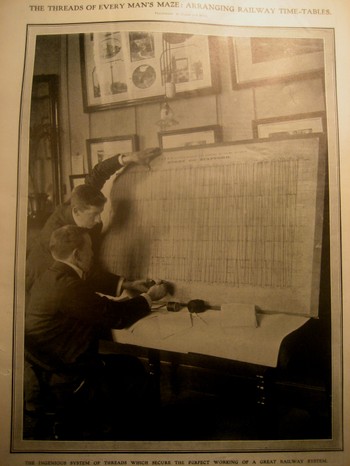
    String_big_board It is astonishing sometimes to think about how much was accomplished with so little.  This photograph, found in the 6 June 1908 issue of the Illustrated London News, entitled “The Threads of Every Man’s Maze:  Arranging Railway Time-Tables” (sub-titled “the ingenious system of threads which secure the perfect working of a great railway system”) is just such a case in point of wonder.  Each section of the board represents one hour, top to bottom; these are further subdivided by thinner lines representing 5-minute intervals; the horizontal lines representing the distances between stations.  And the guys in the foreground are keeping the whole thing up-to-minute, using string and tacks. 
    This was the British Empire at about its loftiest heights, with a spectacular internal railroading system, kept all in line and on time and correct with the help of heavy thumbs.  Can you think of a better way to display all of this complex data (with 1910 technology)  in real-time so that it is all intelligible–and to be so instantly?  I can’t.  This was just sheer, simple, brilliance.

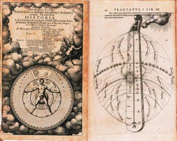
    I know, I know, this is actually “thread”, but so it goes.  If you elongated and strengthened this concept just a bit you’d come up with rope and wire, and chains–the most simple metallic form of which was used by surveyors for hundreds of years to help map our earth.  And I won’t even get close to the String Theory stuff here, or stringed instruments–but if I did, I would want to talk a little about perhaps the ultimate string/cosmology image in the history of science, which would be Robert Fludd and his fantastical thought-experiment  called “Monochordum mundi”. from his Utriusque cosmi maioris scilicet et minoris metaphysica, physica atque technica historia, printed in 1617.

    Robert_flood Fludd makes an elaborate and beautiful stab at understanding the deepest aspects of an imagined supramusical relationship between the order and rationality and mathematical aspects of music and the functioning of the universe—based on sound itself.  These ideas come up time and time again, most visually pleasing in Fludd, but most dramatically argued by Johannes (Harmonicae Mundi, “Music of the Spheres”) Kepler.  But Fludd trumps with god’s graphical intervention.
    The hand of god makes an appearance here as it adjusts the magic monochord of creation–a Pythagorean monochord of two octaves which are then divided into harmonic intervals.  But god’s hand is definitely there, doing some sort of adjustment (or perhaps even holding the slipping peg in place?), which is actually a little bit late in the history of the mechanical universe being turned by the hand of the creator, with the hand actually depicted doing the job.  In general the hand stopped making appearances by this point in the history of science, but did manage to linger on in the work of Fludd.


  • History of Lines: Barbed Wire Borders for San Francisco’s Chinese Scapegoats

    JF Ptak Science Books  Post 1698 [Part of the History of Lines series.]

    [All images below via the Library of Congress, The Chinese in California, 1850-1925]  

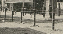
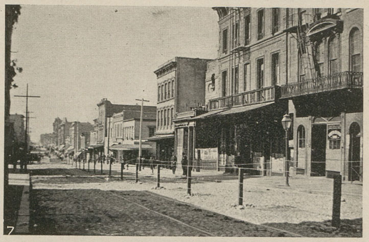
    Part of this blog’s history of line series inevitably deals with some of our planet’s most cutting lines:  barbed wire.  Talking about just the United States for the moment, it cut land into small, bite-sized chunks in the parceling-out and extinction of expansion in the American Westward movements, and has done pretty much the same in keeping apart the races in some areas of the country where the legal/social/cultural lines begged for steel more than paper. Such is the case in these remarkable photographs from San Francisco

    Chinatown barbed wire 2
    And the full image:

    Chinatown barbed wire
    [“The Barb-Wire Barricade: From The Wave: v. 21, Jan. – July 1900: no. 21, page 7: Scenes Outside the Chinatown Quarantine Lines, San Francisco”.]

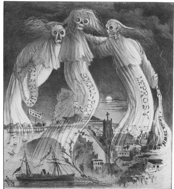
    Chinatown three gracesThe reason for this barbed wire in the streets of San Francisco was simple–it was a quarantine of Chinese people who were thought to be infested with bubonic plague. The reasons for this were simple and racist–given that the Chinese were seen from (at the very least) the 1860’s to be an “inferior” and “degraded”1 race, living in close quarters and in fair squalor at times (given the wages that they were paid and the abuses they suffered from the Chinese Exclusion Acts), and given the codified racist sentiments against them, it was seen that these people were capable of spreading the diseases via their very presence and “vapors”. (At least one of these “three graces” of “malarium”, “small-pox” and leprosy were seen as coming directly from Chinatown in San Francisco. See notes #1 for source.)

    And so up went the barbed wire, “and no Chinese American was allowed to leave the area bounded by California, Kearny, Broadway, and Stockton streets”2.  This of course restricted the access of Chinese immigrants and Chinese-American citizens, and held for some three months, prohibiting access out and in, meaning that food was in short supply, prices for goods and food went very high, and many Chinese businesses suffered loss and closure.  At the end of three months, the barbed wire quarantine was lifted, and of course not one case of plague was reported among the Chinese population. 

    There is a long history to this sort of thinking, as we find that, for example, in the 1875/6 smallpox epidemic San Francisco’s father’s determined that one cause might be the Chinese, and had all of the houses in Chinatown fumigated.  This of course had nothing to do with the epidemic; yet, at the end of it  all, “the  city health officer, J. L. Meares, offered the following explanation:  I unhesitatingly declare my belief that the cause is the presence in our midst of 30,000 (as a class) of unscrupulous, lying and treacherous Chinamen, who have disregarded our sanitary laws, concealed and are concealing their cases of smallpox.”3

    Here’s another image from the 1900 quarantine:
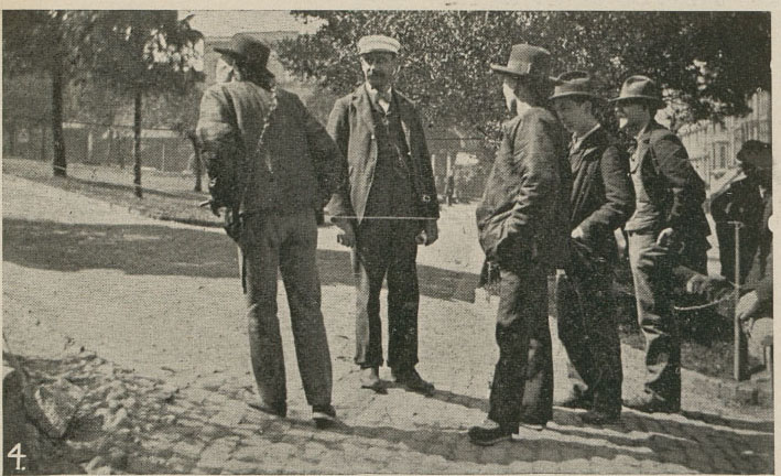
    Chinatown 2--the ropes
    [“A Conversation Across the Ropes: From The Wave: v. 21, Jan. – July 1900: no. 21, page 7: Scenes Outside the Chinatown Quarantine Lines, San Francisco“ Publisher: Wave Publishing Company.]

    And another, keeping San Francisco “clean and healthy” with barbed wire and rope.  

    Chinatown 3 barbed wire
    [“No Admittance: From The Wave: v. 21, Jan. – July 1900: no. 21, page 7: Scenes Outside the Chinatown Quarantine Lines, San Francisco.”]

    Another example of the institutionalized despoilment of the Chinese is seen here in an 1880 Board of Health pronouncement on the state of Chinatown in San Francisco was an official “nuisance”, and that the “Chinese cancer:” must be cut out:   “The Chinese cancer must be cut out of the heart of our city, root and branch, if we have any regard for its future sanitary welfare . . . with all the vacant and health territory around this city, it is a shame that the very centre be surrendered and abandoned to this health-defying and law-defying population. We, therefore, recommend that the portion of the city here described be condemned as a nuisance; and we call upon the proper authorities to take the necessary steps for its abatement without delay.”4

    And of course examples can go on and on–but there is really nothing quite like seeing a racial sentiment transferred into a three-dimensional object–like a barbed wire fence going down the middle of a street in San Francsico, in 1900–to drive home a message of learned bad thinking. 

    Notes:

    1. An excellent article by   Joan B. Trauner, “The Chinese as Medical Scapegoats in San Francisco, 1870-1905,” California History, Vol. LVII, No. 1 (Spring 1978), pp. 70-87.  Full text is available online with an academic account.

    2. Source: History of Chinese Americans in California, the 1900’s, blog  here.

    3. Trauner, ibid. Page 73

    4.  _____, pg 75.


  • Foucault’s Pendulum, 1851

    JF Ptak Science Books   [Quick Post in the History of Lines series]

    “That was when I saw the Pendulum. The sphere, hanging from a long wire set into the ceiling of the choir, swayed back and forth with isochronal majesty.. .The time it took the sphere to swing from end to end was determined by an arcane conspiracy between the most timeless of measures: the singularity of the point of suspension, the duality of the plane’s dimensions, the triadic beginning ofn, the secret quadratic nature of the root, and the unnumbered perfection of the circle itself… Were its tip to graze, as it had in the past, a layer of damp sand spread on the floor of the choir, each swing would make a light furrow…”–Umberto Eco, Foucault’s Pendulum.

    I’ve uploaded an interesting recrod to the books for sale section of this blog on the great experiment of Leon Foucault (1819-1868), who was the first to actually demonstrate the rotation of the Earth, doing so with a very simple, extraordinarily elegant experiment involving a heavy brass bob suspended from a long cable–a pendulum that was unencumbered and free to swing along any plane.  It is the curvature of the Earth that allows the tip of the bob to make its pattern, and it is the fact that the Earth is rotating under the moving pendulum that allows it to be tracing this path at all–it is also tells the difference between living on a sphere and living on a plane. 

    ·Posted by :

    ·in:

    —

  • A History of Lines: The Hands of Brooklyn

    JF Ptak Science Books    Quick Post

     This is an editor’s conception of explaining the operating principle of how the soon-to-be-built Brooklyn Bridge (finished in 1883) would support itself to the readers of the Scientific American in 1878:

    These “strands” of cable would be fixed to the superstructure with these devices:


    A simple explanation of an enormous undertaking.

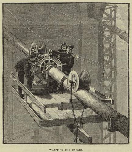
    And I just need to include this image of the wrapping of Roebling’s cables, which was an enormously dangerous job, not helped by the height of the short fence that was supposed to keep these men from falling to their death in the river:

    Brooklyn birdge cable wrapping


  • The Most Beautiful Blank Map in the World–the Bellman’s Fit from the Hunting of the Snark

    JF Ptak Science Books   Post 1644  [Part of the Series on the History of Blank, Empty and Missing Things.]

    “Other maps are such shapes, with their islands and capes!
    But we’ve got our brave Captain to thank”
    (So the crew would protest) “that he’s bought us the best-
    A perfect and absolute blank!”–
    Lewis Carroll, The Hunting of the Snark.

    Peutinger
    [This post fits perfectly in our History of Blank, Empty and Missing Things.  Ditto for the series on The History of Lines–making this a great confluence for a History of Blank and Missing Lines (in the History of Nothing series).]

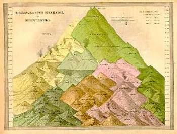
    For all of the brilliance of all of the cartographers and map makers who have drawn a line in the sand or strung a strand of quipi or drawn a celestial rendering on a cave wall or imagined the Americas in 1504 or ventured out and away from the Medieval T-maps or drew maps of other worlds or fashioned spiraling maps of Hell, I think the maps I most like are maps of imagined places.  Of course I enjoy the extremely rigorous and steadfast maps (like those of the German Stieler Company of Gotha who for a hundred years routinely drew the most detailed maps in a particular scale than any other mapmakers in creation—you know, the big maps of the U.S. that would locate minute places like Truman Capote’s “out there” town of Holcomb, Kansas) and of course maps of the solar system and galaxy and universe (as knowledge expanded and collapsed and expanded again).  And of course there are the representational maps showing the comparative heights

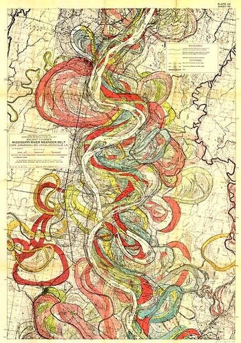
    Mountain of mountains and lengths of rivers, or the grouping of all the world’s lakes, or the divorce rate map of the United States at Centennial, or the heights at which different sorts of trees are found, or geological speculations on the thrust of the Appalachian chain, or the wanderings of the course of the Mississippi River (below), and other hosts of things.
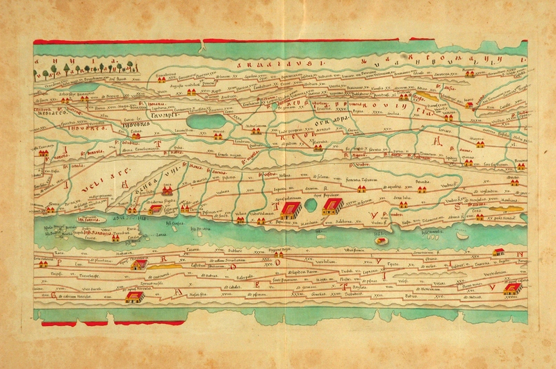
    As much as detail is attractive to me—complex, staggering information correctly displayed—there is also the opposite:  the quick, thoughtful, spare map.  The Tabula Peutingeriana is sort of like that—this is a 17th century reproduction of an ancient Roman map that was, basically, a road map of the world (or the Roman World) that was linear and included all manner of detail of the roads themselves, with little else.  It is a spectacular thing—one version I had once was 14 inches high and 16 feet long, just a skinny map of how to get around in the world from 2000 years ago.  There was of course nothing “quick” about how the map was made, coming at the expense of countless hours of careful observation, keen observation, and lots of general human tragedy.

    Mississipi

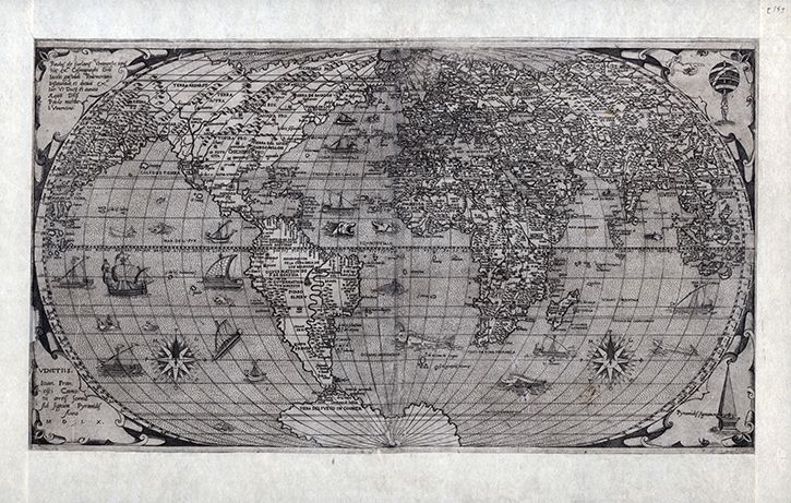
    Folrani’s world map of (ca.) 1575 (which appeared in Antoine Lafrery’s (1512–1577) Geografia tavole moderne di geographia) is a glorious thing and a fantastic accomplishment for its time (and also being the first map to use the name “Canada”).  It has a sumptuous artistry to it in addition to including (and excluding) certain of the newly known discoveries.  In this version of the map he chose to not use the newly-incorporated Straits of Ainan

    Folrani maps

     [I’m sorry to say that I’ve misplaced the original source for this map–I will try and supply. My apologies.]

    In another edition of the m-which appeared a few years later–North America is still attached to Asia, but now there is added another bit, a gigantic land mass to the south, Terra Incognita.  This was basically put together by some sightings in the southern seas that located different land masses, and Forlani took it upon himself to connect all of those pieces of information and draw them into one continuous land mass, greatly expanding his own version of Antarctica from a few years earlier.  It is a wonderful example of leaving something(big)  out and making something else (even bigger) up.

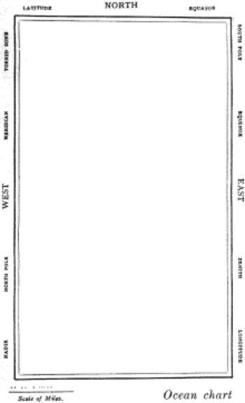
    But the map that I think I love the most illustrates Lewis Carroll’s The Hunting of the Snark, an Agony in Eight Fits, and occurs in the Bellman’s tale, starting the second fit. It begins:

    The Bellman himself they all praised to the skies-
    Such a carriage, such ease and such grace!
    Such solemnity too! One could see he was wise,
    The moment one look in his face!

    He had bought a large map representing the sea,
    Without the least vestige of land:
    And the crew were much pleased when the found it to be
    A map they could all understand.

    “What’s the good of Mercator’s North Poles and Equators,
    Tropics, Zones, and Meridian Lines?”
    So the Bellman would cry: and the crew would reply,
    “They are merely conventional signs!

    “Other maps are such shapes, with their islands and capes!
    But we’ve got our brave Captain to thank”
    (So the crew would protest) “that he’s bought us the best-
    A perfect and absolute blank!”

    Snarkmap

    Sometimes there is nothing so fine as something that beautifully illustrates the nothing that isn’t there, and this lovely map, unencumbered of all of the elements and details that define the mapness of something,  perfectly explains the origin of its need.

    For a lovely work on the complexities and simplicities and just sheer  beauty of what things like maps are check out former Ashevillean Peter Turchi’s Maps of the Imagination, the Writer as Cartographer.


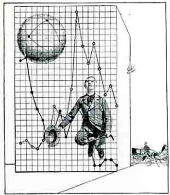
  • When Data was Dada: Max Ernst, Dada, Graphs, and the Display of Non-Existent Information

    JF Ptak Science Books   Quick Post  (Part of the series on the History of Blank, Empty and Missing Things.)

    This quasi/faux statistical/graphical modern art image by Max Ernst is found in the journal Mecano (issue no. 3 “Rouge”), which was the principal Dada publication vehicle, and issued by the artist Theo van Doesburg (in the Netherlands).  It arrived in 1922, just 10 years after the publication of Marinetti’s “Manifesto tecnico dellBlogernst030a letteratura futurista” and a year before Marcel Duchamp retired from painting, and just another two years before Andre Breton nailed down the meaning of Surrealisme (and again like a particle collision changed the direction of some of modern art). 

    The Dada Movement is generally thought to have started by WWI escapes in the neutral haven of Zurich (where the war was escapable for the duration), at the Cafe Voltaire, in 1916, the word “dada” being found as is generally believed by Tristan Tzara.)   I am trying hard to form some sort of memory for other Dadist, Futurist, Symbolist or other modern movements from the ‘teens and ‘twenties to use a graph such as this in the artwork but I cannot think of any.

    (By the way, also appearing in this issue of Mecano were Man Ray, R. Hausmann, Hans Arp, Kurt Schwitters, and others.)