A Daily History of Holes, Dots, Lines, Science, History, Math, Physics, Art, the Unintentional Absurd, Architecture, Maps, Data Visualization, Blank and Missing Things, and so on. |1.6 million words, 7500 images, 4.9 million hits| Press & appearances in The Times, Le Figaro, Mensa, The Economist, The Guardian, Discovery News, Slate, Le Monde, Sci American Blogs, Le Pont, and many other places… 5000+ total posts since 2008.

Category: History of Lines

  • A Forty-Year Precursor to Modernism–Found Cubism in 1870

    JF Ptak Science Books  Quick Post     [History of Lines #18]

    I was very surprised to come across this illustration while browsing the (3 April)  1870  volume of Punch, or the London Charivari .

    I cannot think of any particular peculiar or unusual edition of Euclid that was published at about this time to demand such an unusual illustration. (The only newish edition that comes into any possible play here is Oliver Byrne’s semi-insane First Six Books of Euclid, published by the Chiswick Press in 1849 and one of the most unusual and beautiful books of any sort printed in the 19th century–but then again that was 21 years before this volume of Punch.) And by “unusual” what I really mean to say is “highly unexpected” , as this all-angular depiction of a woman appears for all the world to be a Cubist- or Expressionist-like image, predating those movements by four decades. 

    But the Angular Woman just seems to be happenstance, a happy precursor to a revolution-in-the-making, an accident forty+ years too early.  She is extraordinary–and for some reason she is smoking a cigarette. 

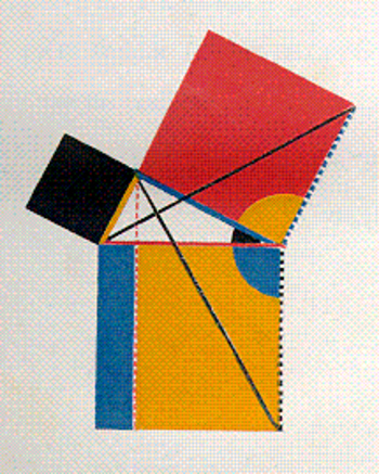
    [Below–an illustration from Oliver Byrne, illustrating the propositions of Euclid via the use of color rather than words, a beautiful but non-functioning work.]

    Blogrealbyrne


  • History of Lines, #17: the Artist Painting the Negative, Camille Corot, 1874

    JF Ptak Science Books   Post 1584   [Part of the History of Lines series]

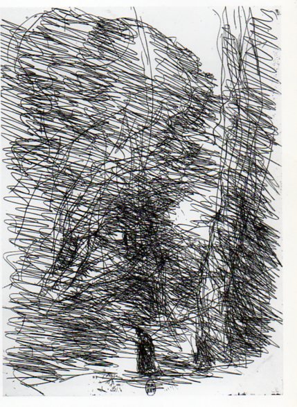
    Corot657 An interesting appearance of lines in art that seemingly crosses several disciplines and chronological development is Jean-Baptiste Camille Corot’s The Dreamer and the Large Trees (1874).  It is vivid artwork full of motion, expressing itself in an impressionistic sense that seems almost more abstract expressionist than mid-early Impressionist. (As an Impressionistic work it would be well into the second decade of the movement; if Abstract Expressionist, it is three decades early.)  It is a brusque, almost savage portrayal of a somber person in a deep wood, though the lines that is is composed of say anything but that. 

    The print was made via the cliche verre process1–Corot used a semi-photographic medium in which there was no camera, as it was the artist who drew the negative, who created the image from nature without a lens and without a camera body (thus eliminating lensless photography like pinhole), drawing directly on the medium (which in this case is glass, insinuated by the cliche) and then exposed/printed onto a photo-sensitive paper (the verre).  The artist is in a sense making a photograph directly of the image in their mind, recording it on the medium, and then printing it from there. 

    Of course there are other important lines in the history of art: Vincent Van Gogh Starry Night (1889), Giacomo Balla, Street Light (1909), Umberto Boccioni States of Mind (1911), Michael Larionov’s Rayonist Painting (1913),   Robert Delaunay Windows, (1912), Roberto Crippa (1921-1972), Jackson Pollock (1912-1956, particularly Number 1, 1948), and any numbers of works by Barnet Newman.  And of course the Cubists: Braque, Gris, Picasso, and the rest; the Constructivists like Malevich, and on and on into the sunset.  But the reason I’ve chosen Corot is because of the unexpected, wildish impressionist qualities that seem so far out of place, even with the movement. 

    Notes:

    1.  Cliche Verre was quite popular with French artists of this period, used by Theodore Rousseau, Charles Daubigny, Charles Jacques, Francois Millet and others.  The process itself appeared very early on in the history of photography, being described in Robert Hunt’s technical manual on artistic photography as early as 1841, two years after photography’s beginning.

    The images:

    ·Posted by :

    ·in:

    — — —

  • History of Lines: Looking Straight Down from Straight Up, 1786

    JF Ptak Science Books   Post 1581

    Looking down656
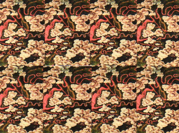
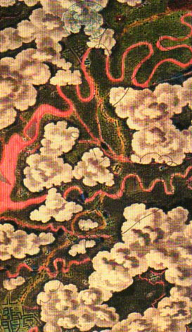
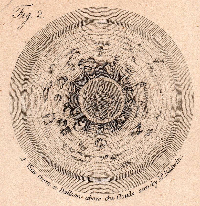
    I was struck by the mosaic possibilities of the image (below) found in Thomas Baldwin’s Airopaidia (printed in 1786) and so made it into one.  But what the engraving is,m really, is a view from a balloon, looking straight down.

    Looking down655

    We’re looking straight down, through the clouds, seeing two towns (at bottom-left and top-center)–why the rivers are red, I don’t know.

    There are other posts on this blog on looking straight down, which is an attractive subject–to me, at least. First-hand images of looking straight down fro a balloon are rare things, even through the early 19th century, and offer a prospective seldom seen in human history.

    Another view from this work attempts to show some depth:

    http://vintageprintable.com/wordpress/wp-content/uploads/2010/09/Science-Flight-View-from-Balloon-18thC.jpg

    Here’s another view of that same image from the Baldwin experience, reprinted around 1810, and left in black-and-white:”

    Looking str8t Diwn-balloom det220

     Halton Tuner makes these observations on Baldwin’s flight in his iconic Astra Castra: Experiments and adventures in the atmosphere 1(published in 1864 in London): 


  • History of Lines: the Desire Lines of William Blake

    JF Ptak Science Books   Post 1578    [Part of this blog’s History of Lines series}

     The post dedicated to Patti Digh, brilliant writer and birthday girl, who wrote a lovely, image-filled  essay on Desire Lines back in December 2005 on her award-winning blog, 37days. I think the idea of Desire Lines is one of her favorites, and so I tried to imagine my own in her honor, a small Festschrift for the birthday girl.  Happy Birthday, P.D.!
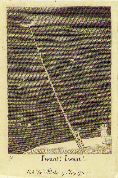
    ‘I want! I want!’ (1793) by William Blake Alastair Sooke examines Blake’s endearing engraving documenting the stages of man’s life This sweet engraving by William Blake is a vision of rudimentary space travel created centuries before Neil Armstrong was even a twinkle in his father’s eye. It isn’t hard to imagine the mystical poet and artist in his Lambeth garden, gazing at the starry sky and dreaming of a slender ladder propped up against the moon. A memorable image of aspirational zeal, I want! I want! is one of 18 tiny engravings, measuring 6cm x 5cm, that document the different stages of man’s life, published together as For Children: The Gates of Paradise in 1793. It is on show at Compton Verney in Warwickshire, part of an idiosyncratic exhibition which examines the ways in which Western artists have grappled with the cosmos since the days of Galileo. The astronomer’s Sidereus Nuncius (The Starry Messenger), published in 1610 and on loan from Corpus Christi College, Oxford, gives the exhibition its name, and can be seen alongside work by contemporary artists such as Glenn Brown, Steve McQueen and Wolfgang Tillmans.

     William Blake had a hard time of things, what with being thought of in unflattering terms of crazy vs. insane by many people rather than, say, being though of as “creative”.  He led a good and relatively long life (1757-1827), and by his artistic and poetic creations inspired generations of other creatives, though he was very little recognized during his lifetime.  He was a seeker, and was somehow able to do his art and printmaking and poetry without a substantial income, living mostly on adequate income and patrons, slowly advancing to semi-poverty as he aged , but dying without a debt to his name.

    The “line” that I site above to his unusual work, The Gates of Paradise–not the Baptistery doors by Ghiberti–, was actually a ladder and a collection of lines, but with the application of perspective becomes one combined line quicker and longer than it could ever be a ladder.   Blake’s character, as with Blake himself, wants whatever it is that he can have, conceivable or not; and som, if he wants the Moon, he just goes to get it.  This version of The Gates of Paradise, which is largely a story of pictures and a few words as legend, was intended for children, perhaps–or at least that’s what the title says.  In any event, its an interesting message to send to children whether it was actually intended for children of the chronological age, or not.  The “I Want, I Want” legend really wasn’t necessary, as the image stands on its own.

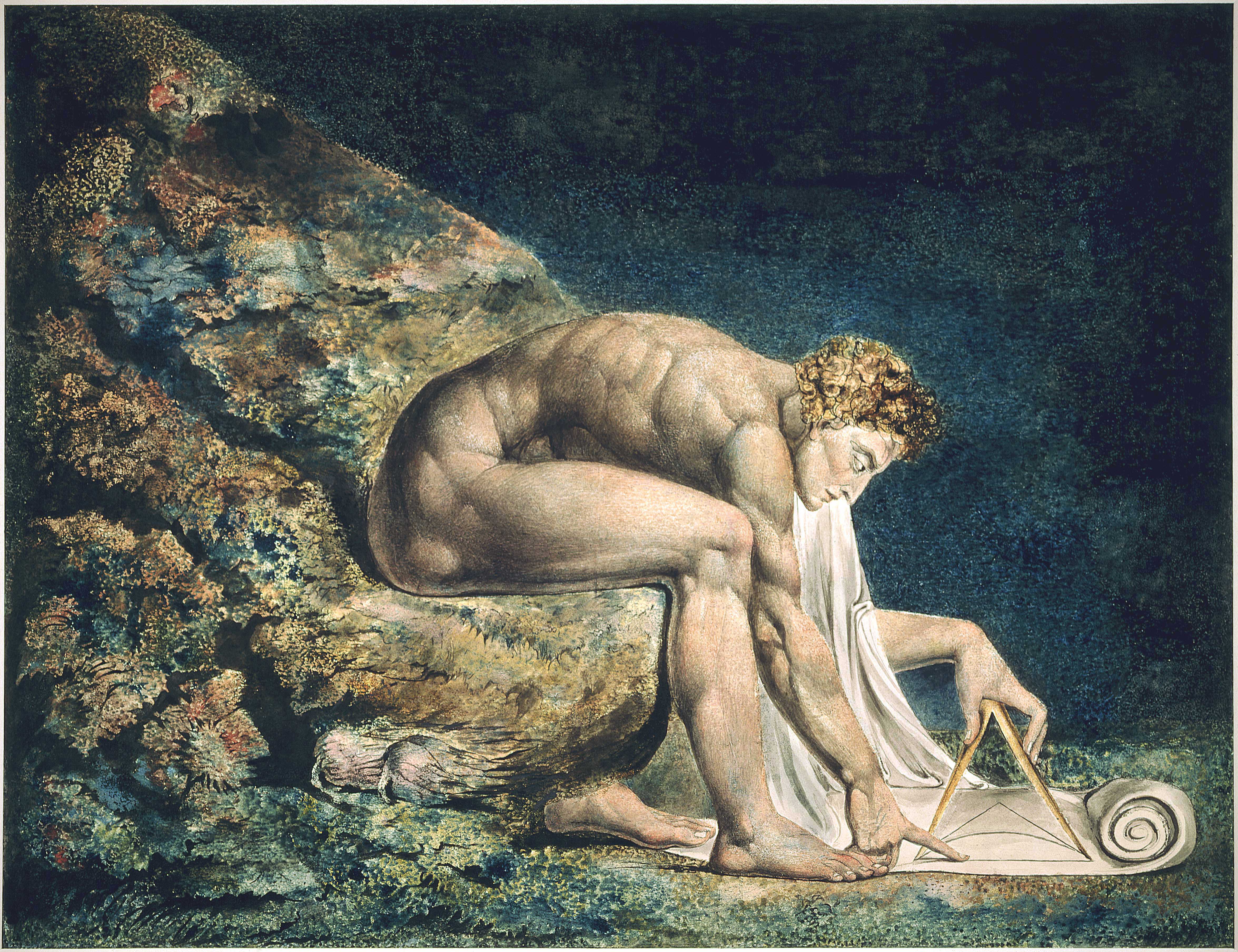
    Blake liked to tell a story with lines like this, as we see in this famous image of Newton:
    File:Newton-WilliamBlake.jpg

    Blake was an impossible anti-Newtonian–at least in my limited reading of the man–making a career of being a spectacular and beautiful anti-rationalist,  a weaver of smoke, playing with and distorting images like a theramin player of words, using language to produce dichotomies in even the most standard of sensate ideas.  Blake was the poster child for thing anti-tech, an anti-scientist out to save the world from its scientific self,  the rationalist world set to destroy imagination, the “Antichrist science” hell bent on destroying the soul of art and religion. 

    “Art is the tree of life; Science is the tree of death” wrote Blake, and so he chose the “Athesistic”  Sir Isaac to stand for the beast, depicting him in art as a naked geometer intent on subjugating the world with a compass and a keen brain, reducing glory to quantification, the work of Satan..  For most of my life I thought that this image by Blake was celebrating Newton—I knew little of the poet/artist/poet, and thought the painting a reverence.  When I understood Blake a little,  I saw that the image was intended as a mockery of Newton and the idea of science—this was an unusual sensation, because absent the unspoken intention of the artist,  you could still take the subject matter of the artwork two ways. 

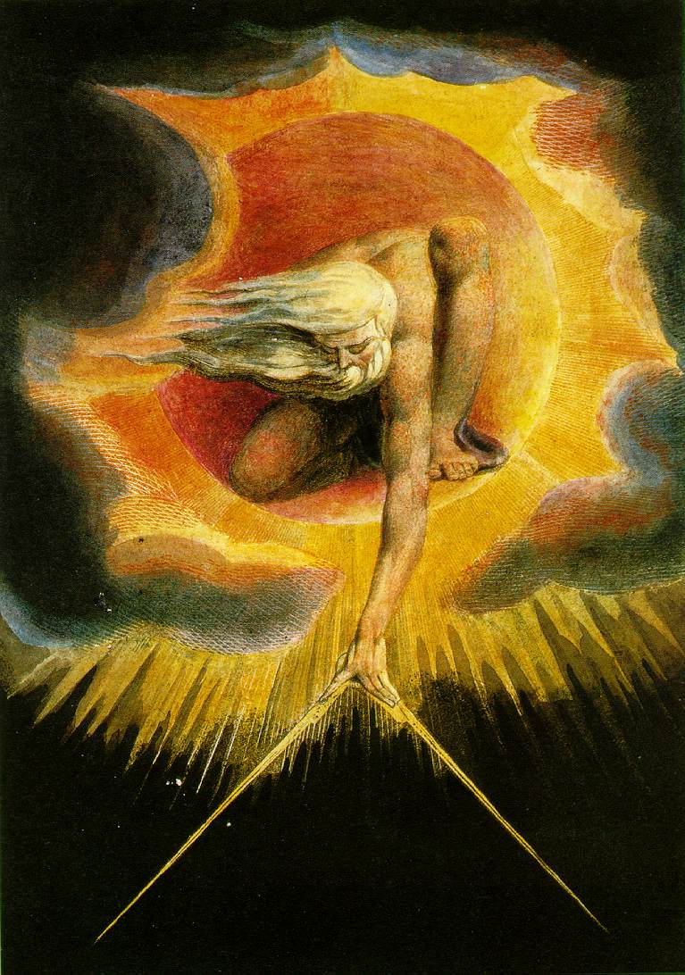
    And of course the Creator:
    http://upload.wikimedia.org/wikipedia/commons/a/ae/Blake_ancient_of_days.jpg


    God is presented as the Great Geometer, the creative power of the universe issuing forth with compass/dividers, was perhaps a kind of Greek conception of the rule of the universe and its interaction with all things on Earth. 

    But it is interesting that in the end, Blake displays the sublime reasoning powers of Heaven and Earth, in the forms of God and Newton, both with desire lines.  I think he enjoyed doing that. 

    The Series “For Children” of 1793:
    ·Posted by :

    ·in:

    — —

  • Before “Cosmos” 2012 there was “Cosmos” 1845

    JF Ptak Science Books  Post 1577    

    http://images.ha.com/lf?source=url%5Bfile%3Aimages%2Finetpub%2Fnewnames%2F300%2F5%2F2%2F6%2F7%2F5267792.jpg%5D%2Ccontinueonerror%5Btrue%5D&scale=size%5B220x350%5D%2Coptions%5Blimit%5D&source=url%5Bfile%3Aimages%2Finetpub%2Fwebuse%2Fno_image_available.gif%5D%2Cif%5B(%27global.source.error%27)%5D&sink=preservemd%5Btrue%5D

    Before the Neil deGrasse Tyson version and update of Carl Sagan’s landmark tlevision series, Cosmos, there was Alexander von Humboldt, and his enormously influential book of the same title, printed in 1845-1862.  Well, von Humboldt’s (1769-18591) book was actually Kosmos when published in German, which is where it started its life (and which von Humboldt suffered mightily for in it English translation).  Von Humboldt was enormously studied and educated and of a high scientific mind over many subjects, one of those 19th century figures who seemed as though they could know everything, a polymath of high order (along the lines of Goethe and von Helmholtz and Thomas Young and others).  He was a meteorologist and biogeographer before those sciences existed; a naturalist, geographer, archaeologist, and explorer, a natural philosopher of magnitudes.

    Kosmos reflected his lifelong interest in order, and what he did was astonishing–he attempted to unifying the complexities of nature in one book (of five volumes), binding the various branches of science together in a cohesive whole, attempting to show how the laws of the universe acted here on Earth.  It was a very influential work, very progressive, a masterwork of scientific method.  Kosmos.

    Sagan (and Tyson, soon) tried to explain what the universe was all about; 160+ years ago, so did von Humboldt, and for his time he came damned close to doing so, or as close as anyone could possibly come. 

    Notes:

    1.  von Humboldt died six months before the On the Origin of Species was born–an enormous pity. 

    Map from the atlas to accompany  Kosmos, a masterpiece of physical geography and the display of quantitative data:

    Old map by Humboldt, A. von. - Atlas zu Alexander von Humboldt's Kosmos.

    From the bibliography, Printing and the Mind of Man, which colelcted the epochal books in the history of science and medicine, we read this about Kosmos:

    ·Posted by :

    ·in:


  • History of Lines–a Note on the First Appearance of the Addition (“+”) Sign

    JF Ptak Science Books   Post 1575  [Part of the History of Lines series]

    Lines--addition sign 3 Widman det644
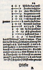
    The history of lines is full and rich with symbols, some of which have absolutely nothing to do with the extension of trust and belief and hope and fear–unless you’re a young student studying math or chemistry or physics.  One symbol in the maths that seems to have no exact age except to say that it is semi-ancient is the addition sign.  (It will be interesting in this series on the history of lines to address the origins of  other symbols like the sign for pi, division. multiplication, percent, inequality,  equality and so on.)

    Lines--addition sign Widman642
    I say “semi-ancient” because the symbol for addition is a hieratic form of the Egyptian hieroglyphic, looking like a capital “A” in a way, without the horizontal crossbar.  The earliest appearance of a symbol for addition in Europe was in the 13th century, with the letter “p“, appearing in various forms, as well as the word “plus”, “used in connection with the Rule of False Position”1.  The concept also appears as the word itself, as “et”, or “and”, which just so happens to closely resemble the symbol that the concept would become a few centuries later.  The earliest appearance of the symbol we would recognize instantly today as an addition sign came in the 1489 book by Wideman, the Behenunde und kuepsche Rechnung (seen above in detail and in full, from the 1532 edition of the work), while the first time the “+” appears in an algebraic equation for the first time 25 years later, in a work by Vander Hoecke.  

    It is interesting to think of the life of these symbols before they became themselves. 

    I am not certain of this, but it seems that the first “+” printed in the United States did not occur until the 20th edition of James Hodder’s2 Arithmetic3 was printed in Boston in 1719, and this at the press of James Franklin (1697-1735), the fourth child of ten in the Franklin family that included Benjamin (1706-1790).  So it is entirely possible that 13-year-old Ben helped his older brother print the first addition sign in the British Colonies. 

    Notes:

    1. D.E. Smith, The History of Mathematics, volume II, p. 397

    2. Hodder in 1672 wrote “note that a + (plus) sign doth signifie Addition, and two lines thus = Equality, or Equation, but a X thus, Multiplication,” no other symbols being used.”  (Smith p395)

    3.  In his introduction, Hodder says:


  • History of Lines–Measuring Things with People, 1522

    JF Ptak Science Books  Quick Post (Edited-and-added version of Post 1019)

      0 blog feb 20 line611det

     “My car gets forty rods to the hogshead, and that’s the way I likes it!”–Grandpa (Abe) Simpson, from The Simpsons  (That’s about 500 gallons to the mile.)

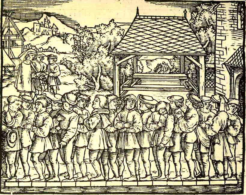
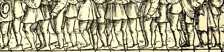
    A line, a connection of two points in space, is about as basic an imaginary thing as we have here on earth.  Humans have used these creations to build all sorts of straight things, from roads to building to ships to literature to mathematics and on and on.  What doesn’t happen very often, at least not in Western art in the last 500 years or so, is for people to be represented in art in a straight line that is not a processional (including military, religious, political venues), or that is not along a bench next to a table, or not supported by another artificial structure like a fortress wall (to give their waiting or standing a form to accommodate).   That weakens the line field considerably–after all, what else is there to line up for?  They’re not queuing up for a sale at Gimbels, and they’re not waiting patiently for a place on the bus.  There’s just not that much to form a line for, evidently. 

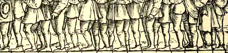
    0 blog feb 20 line611 There is, on the other hand, this (above and below), what I take to be rare representation of my odd requirements:  a delightful woodcut from Jacob Koebel’s 1522 Von Ursprung der Teilung, Mass und Messung dess Ertrichs, der Ecker, Wyngarten, Krautgarten und anderer Velder…, an early surveying handbook (probably the first ever printed in Germany) that could be used to measure and set out (as stated in its title) herb gardens, vineyards, farms and the like.

    I’m not 100% sure of this, but I think what is going oin in this image is the measruing of a rod (or “rute” in German), which is about 5.5 meters or 16 feet; and what we have in the picture is 16 men being positioned over a measuring device and beign overseen by the powers that be, at rear. On the other hand, maybe not:  the English rod was 16.5 feet, while the rod measurement for Saxony, Rhineland, Bavaria and Baden were different as well; Sweden also came in at 16 feet to the rod.  The other big question was:  how long was a “foot”? Since that measure also chnaged (varing between 23.51 cm in Wesel and 40.83 cm in Trier and  31.387 cm up north in the Rhineland)  the measurement of anything with variable units of measure seems to have been problematic, or at least in a post-facto measure.  [The whole issue of “absolute” units of measurement is another post for another time (and a much bigger and moire compelx story).] For right now I’m content to have found this pretty image, which in the end was probably the work of the author Koebel (1470-1533), who seems to have been a jack-of-all-trades; and while he was concerned with property and measurement, he also showed his flair with charm, as this group of men atest. 


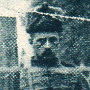
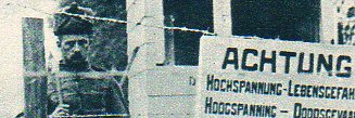
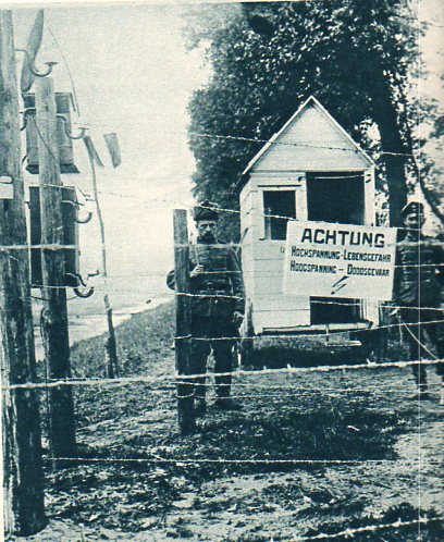
  • Barbed Wire, Trench Warfare, and the Next Lethal Step: Electric WIres

    JF Ptak Science Books  Post 1555   [Part of the History of Lines series]

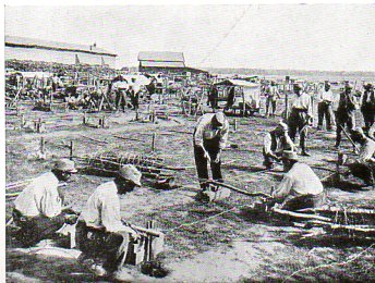
    Barbed wire was one of the most successful and horrifying defensive weapons of World War I.  In 1915 it was made more effective yet by adding high-voltage electricity to the emplacements.  In general the electrical barbed wire fence was employed as only a tiny fraction of all wire fences during the war–as the non-electrified fence was already extremely effective, very cheap to produce and very easily installed–but the possibility of finding an electrified wire somewhere along the lengthy rat’s nests of mile sand miles of this thing must’ve had some sort of weight in most soldiers’ minds. 

    The following image (and details) from The Illustrated London News for 9 October 1915:

    WWI--e---electric fenc dete extra647

    WWI--e---electric fenc dete646

    WWI--e---electric fence645

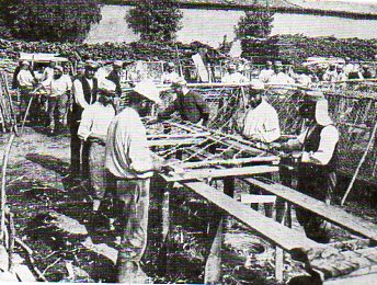
    And the places where the barbed wire was made and packaged, again from The Illustrated London News for 16 October 1915.

    WWI--e--barbed wire making648

    It looks as though the wire was stretched across 3.5 foot poles, with the barbed wire added diagonally, and then rolled up in long sections for easy transport and deployment.

    WWI--e--barbed wire making649

    ·Posted by :

    ·in:

    — — —

  • History of Lines: Complicated Simplicity and Marconi’s Lines of Communications

    JF Ptak Science Books  Post 1547   [Part of the History of Lines series.]

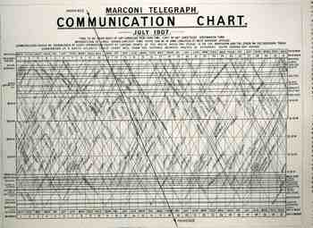
    This is an illustration of the approximate times and places that ships at sea could expect to be able to communication with each other by the relatively new invention of wireless telegraphy. (We’re talking about Marconi here and just very briefly; this is not the place for the discussion of what he did or didn’t “borrow” from his predecessors and contemporaries such as Heinrich Hertz, Oliver Lodge and Nikolai Tesla.  He at the very least however owed all of them at least an enormous helping of gratitude, and probably more.  Then there’s Marconi’s very conservative technical continuation in the field which is confusing and interesting.  And finally but not the least of all of the stuff about Marconi is his comfort and support of the Fascist regime in Italy, where Marconi became a member in 1923, escalating in his fame through the party ranks to have none other than Benito Mussolini serve as the best man in his second wedding.  But as I said that’s all for another day.) It appeared in The Illustrated London News for 7 September 1907,surrounded by an article on Obelia in the “Science Jottings” section of the magazine.  This chart isn’t
    1blog_oct_13marconi_at_sea816

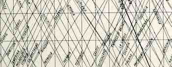
    quite as complicated as it seems, really: all you need to do is follow one line from the top to the bottom.  Simply put, each diagonal line represents a specific ship (all of which are named) and their positions as they make their ways across the North Atlantic ocean; each intersection represents the time and place that two ships can communicate via wireless with one another.  So, for example, the Empress of Britain will on its six-day voyage be able to communicate at least 26 times with other ships for news and information.

    What this seems to me to be is the supplemental efforts of the ocean-going ships

    1blog_oct_13marconi_at_sea817

    to the newly established trans-Atlantic radio-telegraphic company and installation opened by Marconi in October 1907.  Even though the first transatlantic communication is celebrated as having taken place in 1901, the performance, even in 1907, was still spotty.

    Again, I’m just after this for the image 


  • The History of Lines: Lines Come and Gone.

    JF Ptak Science Books  Post 1546    [Part of the History of Lines series.]

    Ines union pacific 573

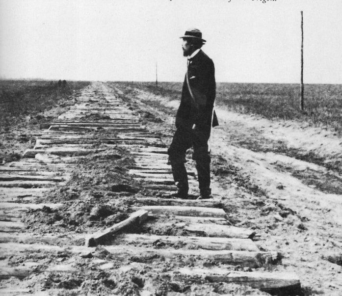
    This picture tells as much about the making lines–railroads pushing their way  towards one another, the Union Pacific and the Central Pacific, pushing on towards one another to complete a rail line that connected the American coasts–as it does in covering them up.  The photograph is of a Union Pacific supervisor named Samuel Reed, who was inspecting the rail bed–in 1868/9 it was not uncommon for one team to clear the land and lay down the ties miles ahead of the track layers.  Miles of bits of wood, waiting for their iron.

    But most roads, or at least most early roads, were in their places for a reason, and generally that reason was because it was a good way for getting from Point A to Point B.  This photograph, along the way of the Old Platte Valley route,  seems to be a mid-way point between the old and the new, or between the old and the old, lines of communication and lines of travel.  These timbers are laid down on top of the old immigration route from the east to California and Oregon, which in turn were laid on top of the trails of fur traders, which were on top of those of Indians, which were on top of those of the buffalo herds, and so on, all the way down.