A Daily History of Holes, Dots, Lines, Science, History, Math, Physics, Art, the Unintentional Absurd, Architecture, Maps, Data Visualization, Blank and Missing Things, and so on. |1.6 million words, 7500 images, 4.9 million hits| Press & appearances in The Times, Le Figaro, Mensa, The Economist, The Guardian, Discovery News, Slate, Le Monde, Sci American Blogs, Le Pont, and many other places… 5000+ total posts since 2008.

Category: Maps, Cartography, History of Mapmaking

  • Mapping Humans, 1400-1759: Bloodletting, Moles, Bumps and the Stars

    JF Ptak Science Books   Post 1123

    The history of mapping the goods and ills, the past and present and the future on the human body must be about as old as writing, or older.  Ever since you could draw geometric proofs in the sand people have been mapping out the connections (or lack of) the parts of the human body, their relations to one another, the influences of the stars on them, the control of dermatological deformities on the health of the system, the lump and pits and dings on the cranium as an indicator of intelligence and prospects for the future, connecting the lines of electroshock results on facial contortions with the inner musings of the criminal brain, and on and on.  What brings my attention to this though are the overall full-body indexes, the general NYC subway map-like overlays on the entire body, and what they look like out of context. 

    For my purposes here, it really is just the out of context element, the found art, the pre-Absurdist, pre-Dadaist images that they maps create.  Granted the real stuff behind these images are by far more interesting, but I wanted to add these pictures to the blog’s alternative art category before their Duchampian attraction left me. 

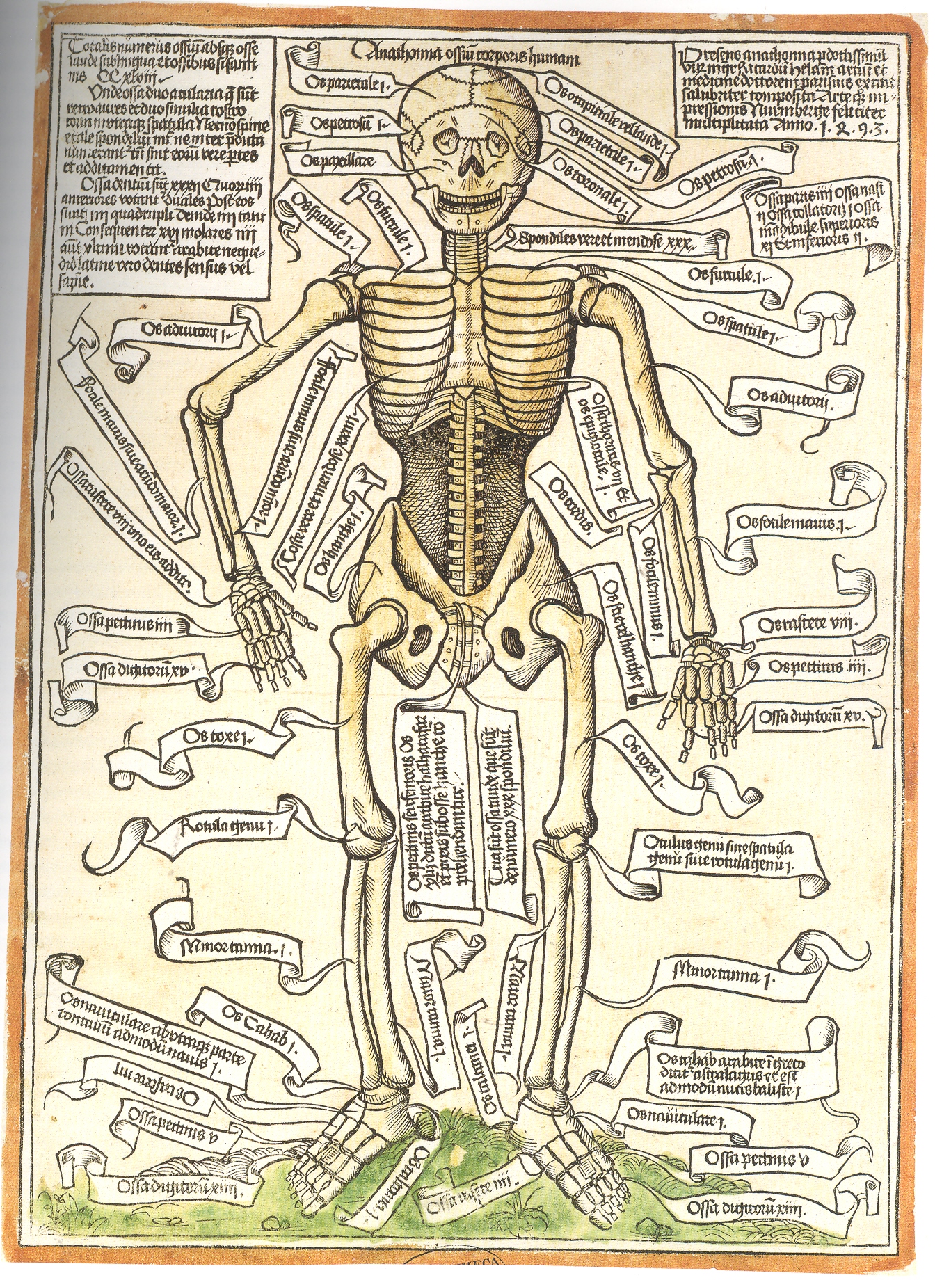
    To start with, for example, in this very breezy survey is the indexing of the very first illustration of a human skeleton. from Anathomia ossium corporis humani, printed the year after Columbus arrived in the Americas–this was the first revelation to the real world of science following a sleepytime of about 8oo years under the very heavy gaze of institutional religions. 
    Blog--may 5 skeleton

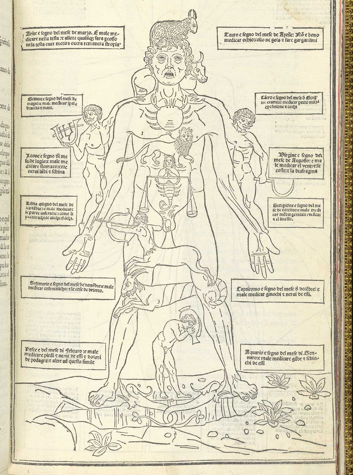
    Human map ketham_p15 In the same year that Columbus set sail for India came the anatomical publication of John de Ketham, with his overall map of astrological influences on the body, followed by a pretty-useful treatise on the treatment of war wounds, as well as the decidedly less-useful map of his locations for the best place to bleed a person of their bad humours. 

    Well, it really wasn’t like that, not how I mean by by snippy modernist viewpoint looking back on medical history with no contextual appreciation.  Bloodletting was an approach to healthfulness, as blood was seen as one of the four major elements (or “humours”) of the human body that needed to be kept in balance.  This was
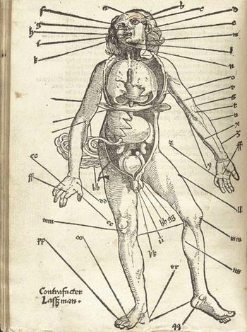
    Gersdorffx400jpg_other_2accomplished via the application of leeches or by the more common (and quicker) practice of venesection, or opening a vein to allow the blood to come out. (Let’s reference Steve Reich’s magnificent “Bruise Blood” creation of 1966 at this point—I don’t think that I’ll ever have a better chance to drop a reference to this piece of revolutionary music in regards to venesection again.)  Thus this map was map for the practiconers of bloodletting—the physicians, and more probably the barbers and other assistants who would inherit this lesser procedure from the more-busy doctors.  In the history of maps of anatomy and the general practice of mapping the human condition, this woodcut x-ray of the best places to drain human blood would not survive close to the age of modernity, disappearing almost entirely by the 18th century, and becoming much more scarce well before that.

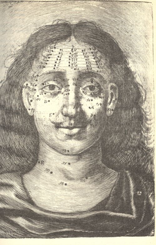
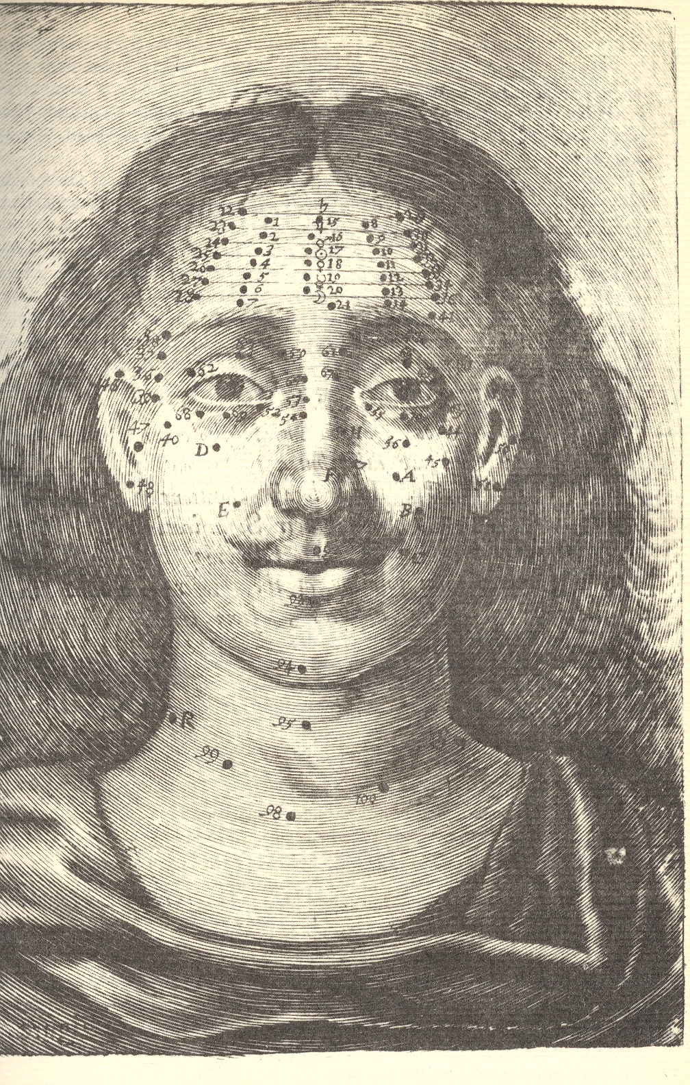
    Moving on to Richard Saunders (who I wrote about more fully here)continued a very ancient tradition into England, deep into modernity, by mapping the divine cosmos of moles and other facial extras for the purposes of health and prophecy:
    Blog--jun 11 circ mole


    Richard Saunders.  Physiognomie and Chiromancie, Metroscopie, the Symmetrical Proportions and Signal Moles of the Body, Fully and Accurately Explained; With Their Natural Predictive Significations Both to Men and Women (published in London, 1671, by Nathaniel Brook).in which he divines the psyche and the future with peoples’ moles. 

    [graphic]

    Visceral Anatomy From Reisch’s “margarita Philosophica,” Johann Schott, 1503
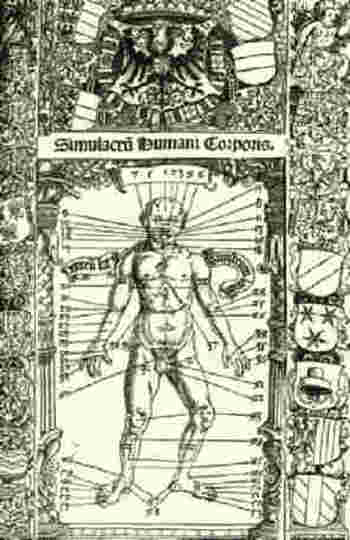
    Blogbloodletting_stoefflerI couldn’t let the above-mentioned  bloodletting image pass without reference to this excellent woodcut for Johann Stoeffler’s  Calendarium Romanum Magnum, printed in Oppenheym by the redoubtable  Jacob Koebel, (24 March) 1518.  It is a glorious display (entitled Simulcarum humani corporis) of seasonal (!) purgative and bloodletting locations on the body, meant to accompany a longish essay by Stoeffler on the practice in general.  The bulk of the book, however, had very little to do with this practice and was actually commissioned as a reform to the Julian calendar, provided with the impetus of the Lateran Council (1512-1517).  The result was a series of forty-one  propositions on the calendar and calendar-related practices, including work on eclipses, the zodiac, the occurrence of leap years, the Alexandrine and Roman calendars, the calculation of the occurrence of Easter, and so on, including the seasonal practices of bloodletting.

    I enjoyed this torso map by Salomon Alberti  in his Historia plerarumque partium humani corporis, in usum tyronum edita. Vitebergae (p1583, 8°; ibid., 1585, 8°; enlarged, ibid., 1601, 8°;(published from 1583 to 1630) for it simplicity.

    The rest of the images I’m going to have to show here as a simple Image Dump, at least for the time being:
  • New Map: Distribution of Slavery in North Carolina, 1860

    JF Ptak Science Books   Post 1099

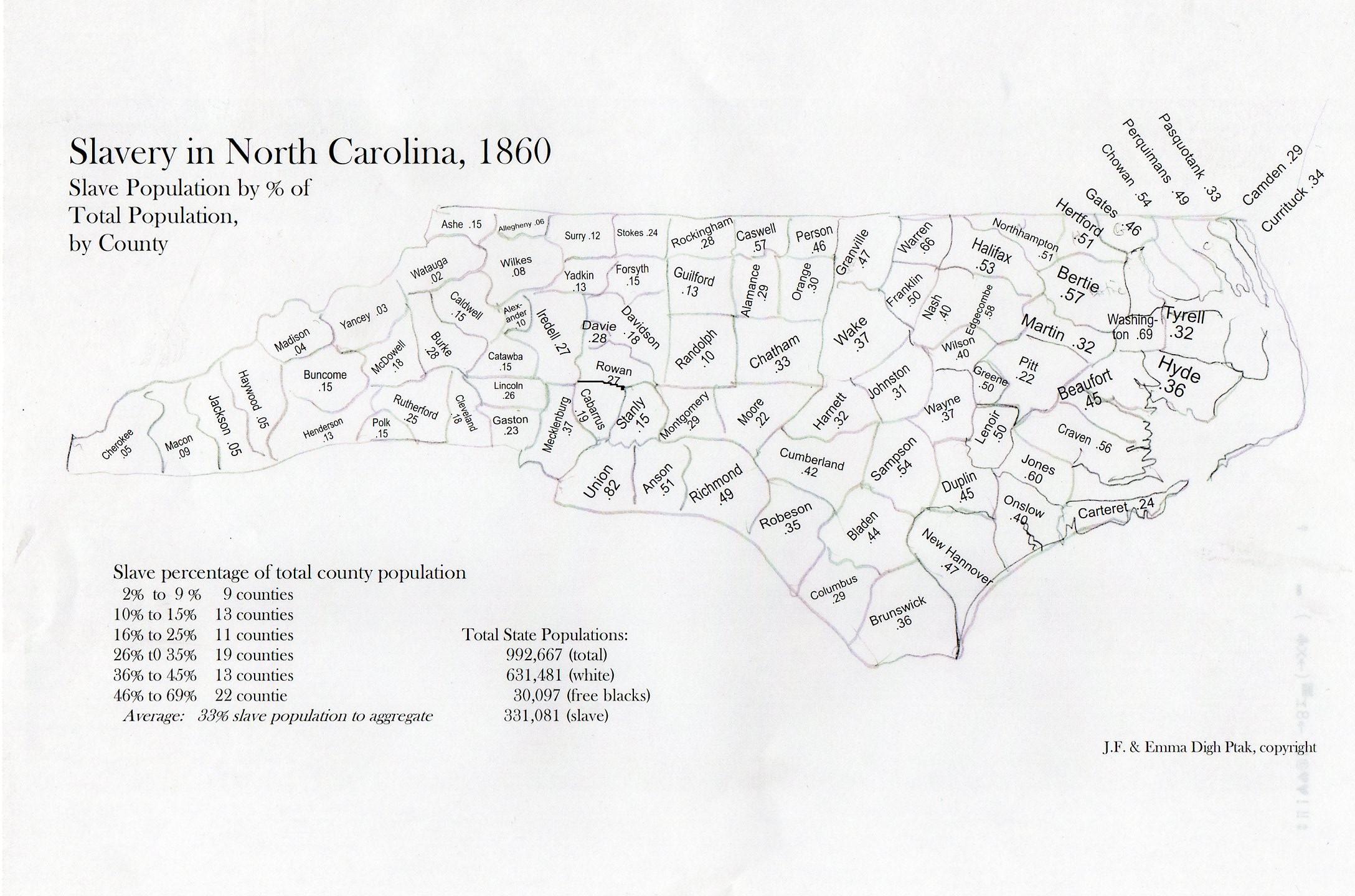
    My daughter Emma and I put this map together a few years ago for a project that just didn’t come about.  I found it this morning and thought to just post the thing and its tables.  It could certainly be dressed up some–or at all.  Color would be nice. So would a clickable interactive bit.  Caveats firmly in place, here it is–so far as I could tell there wasn’t such a descriptive tool like this available to quickly show the distribution of slave ownership (by county) in North Carolina. (Map is expandable.)

    Slavery nc237
    .  

    Data below in expanded reading section, slavery distribution arranged by heaviest concentrations to least.  

    Once you get into the mountain region of the state (the last third or so) where there are lots of hardscrabble/subsistence/poor farmers, slave ownership drops quickly. (I’m not sure how the Cherokee slave ownership factors into this.)  It would be nice to know how NC compares to the rest of the slave holding states, and I might do that yet–but for now I just wanted to share this relatively raw map before I lose it for good.


  • Dunkerque to D-Day, from the Invasion of England to the Invasion of Europe

    JF Ptak Science Books  Post 1055

    (Including a short tale of when Winston Churchill’s nephew, John Spencer Churchill, wound up passed out on the back seat of my 1979 Chrysler New Yorker.)

    Dunkerque124

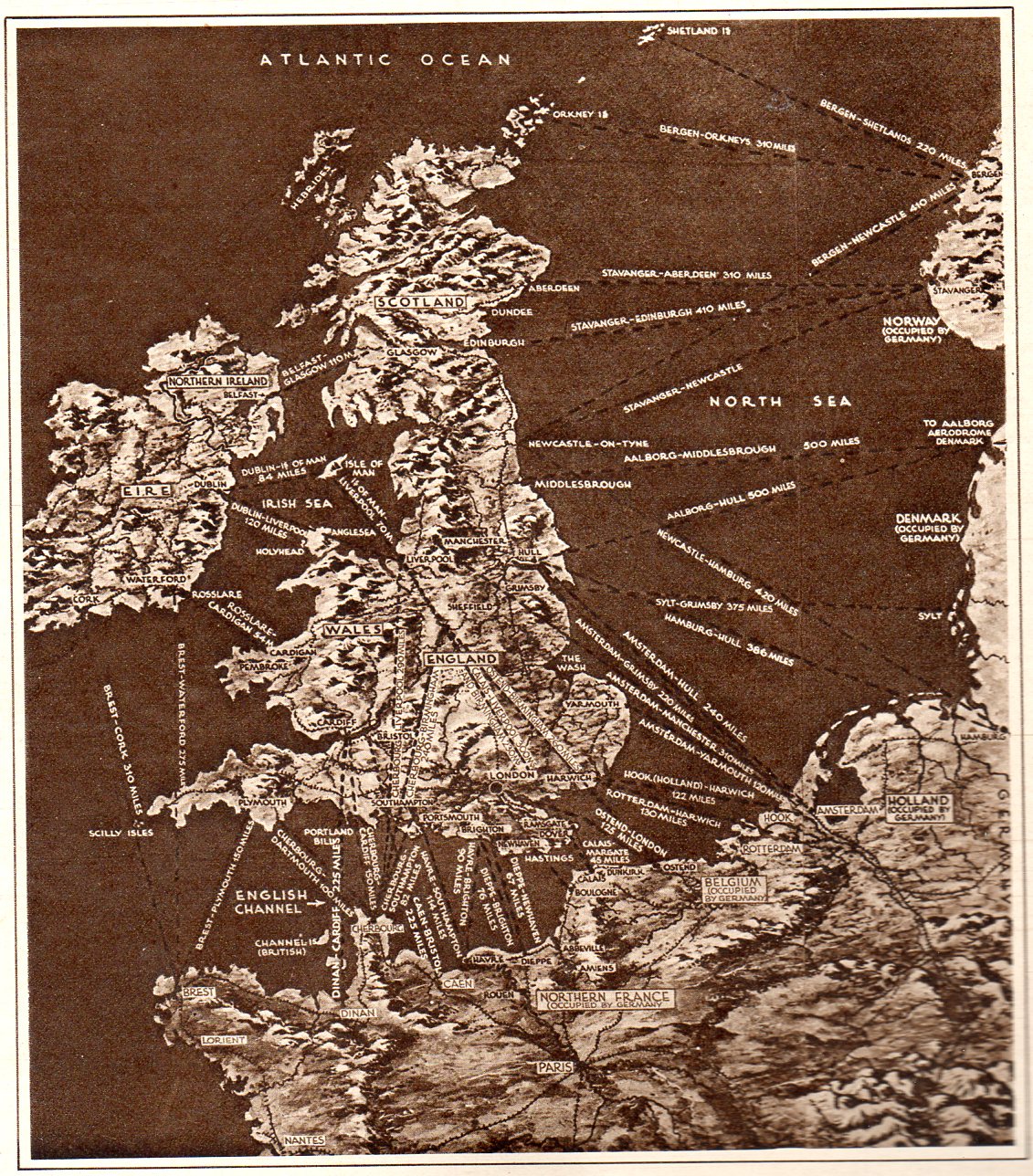
    This map pretty well tells the story of the perilous situation of Europe and England at the beginning of June, 1940.  It appeared in the Illustrated London News on the heals of Churchill’s “Blood, Soil, Sweat and Tears” speech, and was a very frank presentation of the wearing of the war.  By this point in the war Nazi Germany had successfully invaded Belgium, France, Luxembourg and the Netherlands, sweeping across Europe in a broad westward movement, backing up British and French troops all the way to the sea at Dunkerque, where a monumental rescue operation (“Operation Dynamo”) saved them.  (There was an enormous amount of materiel left there on the beach, a devastating loss for the British Expeditionary Force, nearly crippling it.) This was a bad time for the Allies, this part of the war coined by
    Winston Churchill in 18 June 1940 in the House of Commons by:  “The
    Battle of France is over. I expect the Battle of Britain is about to
    begin”. There was very little good that came of these few months for the U.K and the Allies, though four things do stand out: (1) as I just mentioned, the saving of 300,000+ troops at Dunkerque; (2) the resignation of Neville Chamberlain, (3) the coming of Winston Churchill  as Prime Minister of the U.K., and (4) the first deciphering of the Enigma at Bletchley.  Other than that, the situation was dim, and these invasion routes (published at t he very time that Germany was studying such a feat in its “Operation Sea Lion“, or “Unternehmen Seelöwe”).

    The endgame at Dunkerque took place almost four years to the day of the invasion of Europe, when the intent (though not placement) all of these arrows were turned around for the Allied operation at the Normandy beaches on 6 June 1944.. 

    It came to pass in 1985 that some friends and I had drinks with John Spencer Churchill, a man who was at Dunkerque and who reported on it to his uncle Winston.  (A slightly longer story on this meeting with Mr. Churchill appears below.)  After much else I finally asked Mr. Churchill if there was any particular sound that he remembered from being at Dunkerque.  I do not recall his phrasing, but what he said was that the beach at Dunkerque was rocky, pebbly, and that the sound made by tens of thousands of boots on that shore was “disgusting”.  He also said that the mixture of petrol, wind and grit burned the eyes and tasted bad.  It was of course fascinating to hear a first hand description, especially a memory of something so uncommon and visceral. It was unexpected to me, though now when i read about Dunkirque I can imagine its smell thanks to this encounter. 

    First Address by Winston Churchill as Prime Minister.


  • Propaganda Maps of a Different Sort–Health Advertisements & Carto-Weirdia

    JF Ptak Science Books LLC  Post 1021

    “When I’m playful I use the meridians of longitude and parallels of
    latitude for a seine, and drag the Atlantic Ocean for whales.”
    –Mark Twain (Life on the Mississippi, 1883) 

    1--may 5 world map cleaned

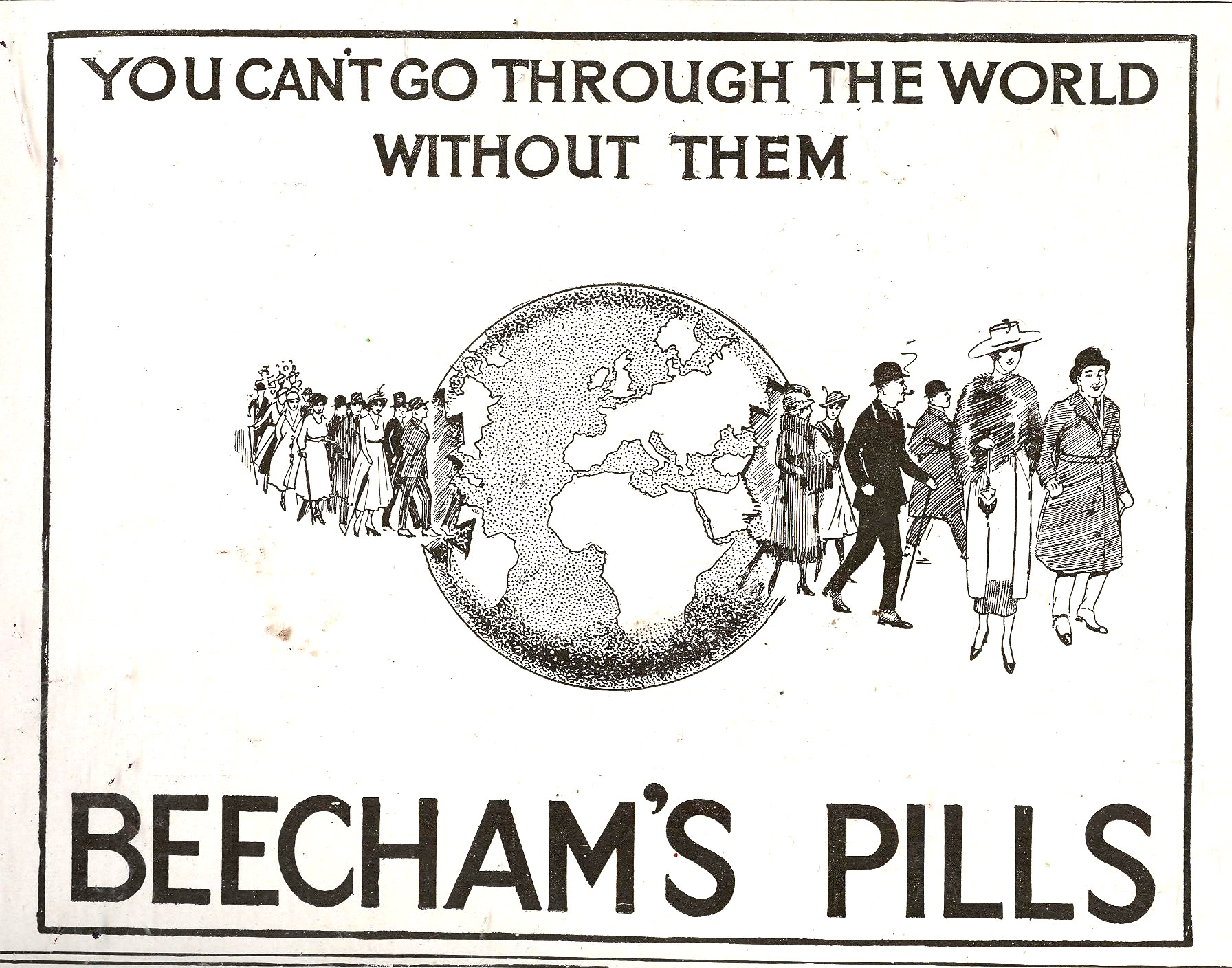
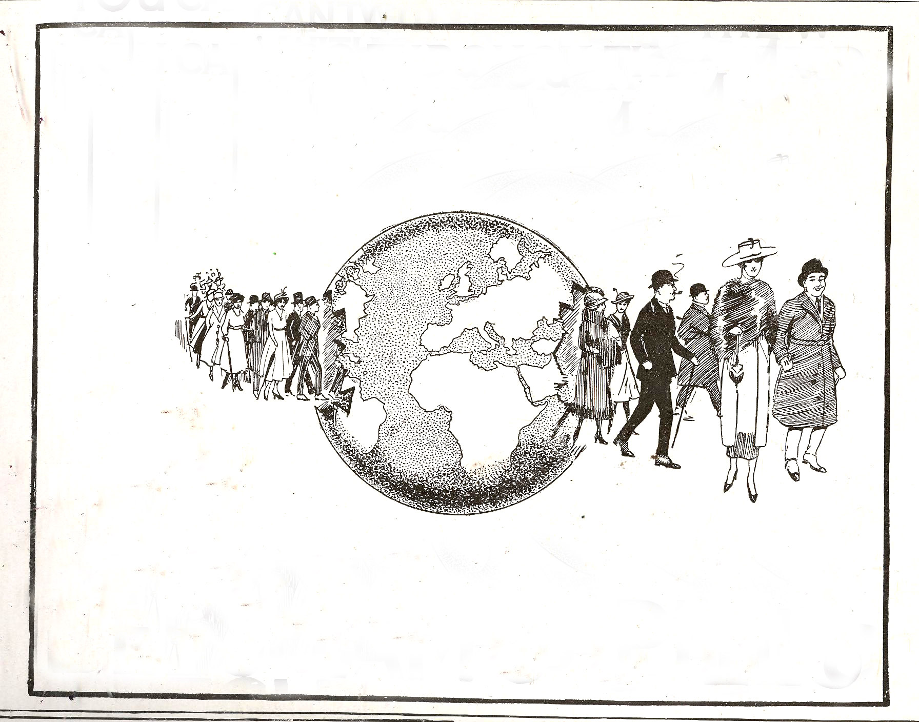
    1--may 5 world map In this blog’s continuing series on maps and propaganda come these two interesting and appealing examples, both appearing in England in the late ‘teens though their histories are older than that. They do come from a much longer tradition of finding physical landmarks of the body by which to navigate biological and mental needs–bumps and blemishes of the head, “reading” blood and urine,  general mechanical measurements of all sorts, and on and on, even so far as to include mapping the significance of the appearance and proximity of body moles and warts. (I addressed this earlier in a post on Mapping the Human Cosmos via Mole1--may 6 mole maps, here.)

     
    The first image belongs to Beecham’s Pills, long a staple of chemist/pharmacy and general goods sellers, which were basically patent medicine cure-alls composed of aloe, ginger and soap, and which found a happy market for more than 150 years (1842-1998).  Evidently Beecham’s did do something right in there somewhere, as they had some sort of positive effect on digestion.  Other than that I don’t know, though the little pills seem to not have caused any direct harm.

    The company has a long and huge advertising history, though one of the favorites that I’ve seen from this early part of the 20th century had folks marching through the globe, and happy to be doing so so long as they had their care trusted to Beecham’s.  

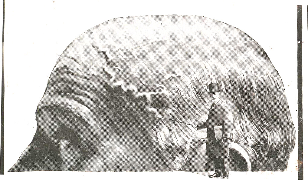
    Secondly is this odd bit that locates the center of one part of human health in the veins of head, showing that if you can indeed follow them like a map, then you’re in trouble and need to ingest the product sponsoring the scare measure, Urodonal (“dissolves uric acid”). Urodonal is of French origins and dates back to at least 1874; it was a quack medicine composed of “pleasant herbs” which would cure all sorts of aliments relating to kidney distress, plus fatigue, tired feet, aching back and of course obesity. 

    1--may 6 map weird
    The man in top hat was pointing to the Vesuvian vein with his cane, just in case you missed the thing.  But I guess in the modern age when everyone must “take” something, the nonsense concoction of Urodonal was better than most because it–like Beecham’s–didn’t actually do anything nasty to your body.  Unless of course you self-administered your medical care and relied solely on these agents for your necessary treatment for a real illness, which would mean trouble–and which is an entirely different story. 


  • Imaging Imagination: Diagrams of Humor & the Center of Levity, 1878

    JF Ptak Science Books LLC  Post 985 

    Mar 23 center of levity cvr det

    [Wood-eating woman tells a joke to distract  three men sharing the last chair in creation in alternative chairless dot universe.]

    Acerbic and punctilious, this work by an anonymous (Ambrose Bierce-like) late 19th-century
    cataloger of human-ness attempted to diagramaitcally display the
    sharing of humor among people.  The resulting images–all unexplained, not indexed, and left to a logical imagination–fit very nicely into a developing section on this blog called  Maps and Diagrams of
    Imagination and Ideas.

    Mar 23 center of levity cvr det 2

    {Woman finger-ingests chair presented to her by knee-connected chair-minions from talking-mustache close-male-pelvis universe.]

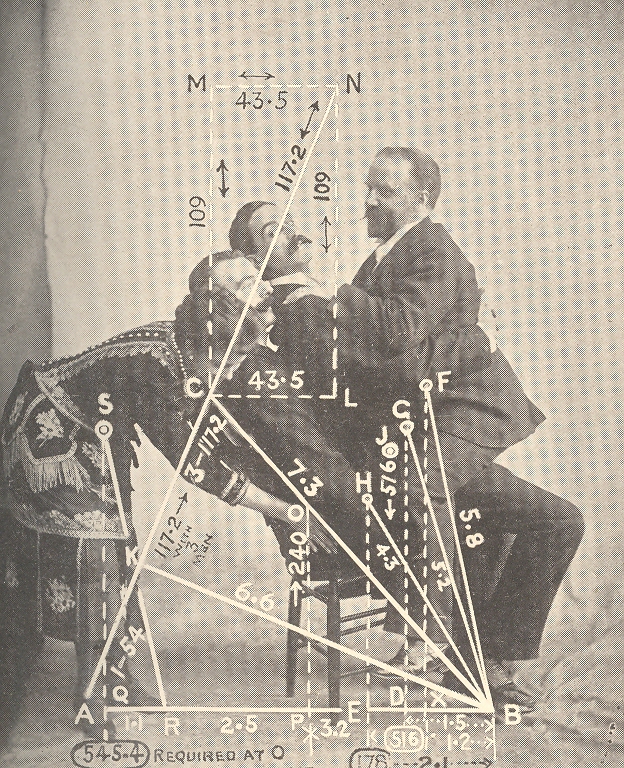
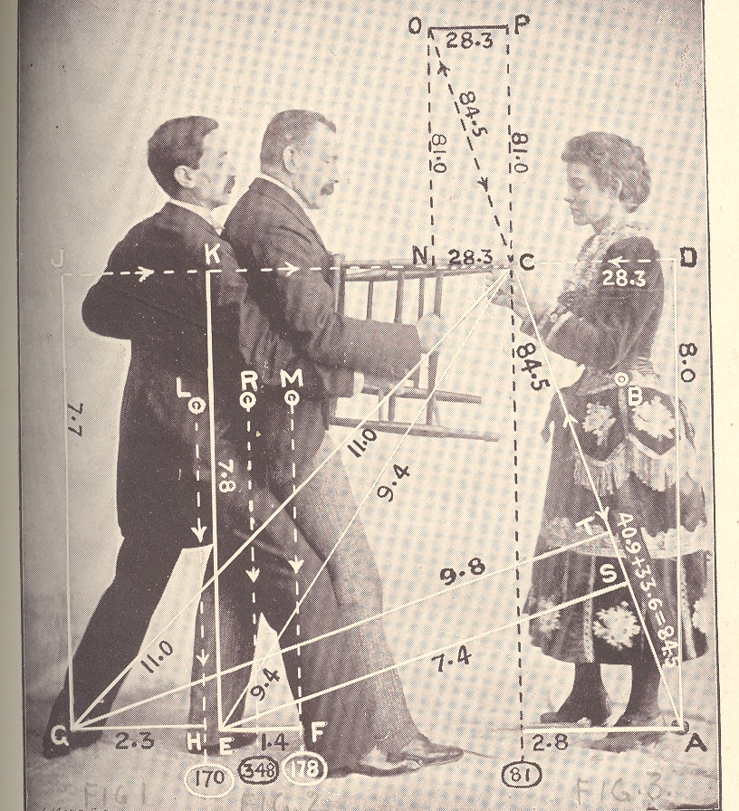
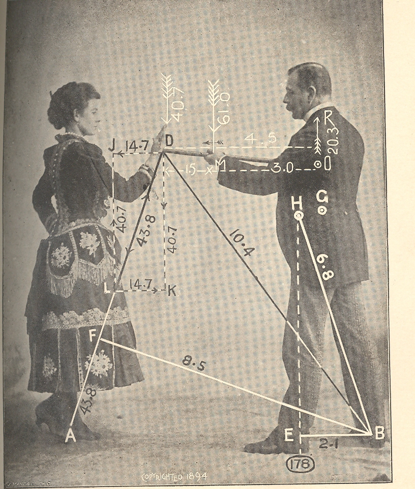
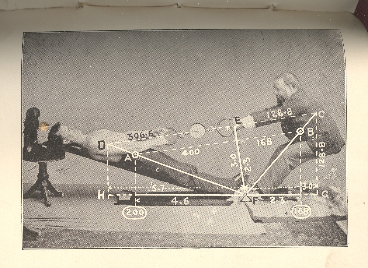
    In reality this short, small, wordless publication’s images looks like  natural philosophy textbook images displaying ideas like momentum and gravity…often they would be quite prosaic, with unnecessary natural accoutrement, little bits of added detail that had nothing really to do with the image displayed. The real intent of this document was to illustrate the center of gravity–it would’ve been more helpful if the publication had a title page or text of any kind for that matter, but since it doesn’t the mind ran free, allowing these representations to be a geometry of shared humor.  Which of course they are not–but the images do have a certain coy funniness to them…

    Mar 23 center of levity cvr det 3

    [Woman makes wooden point by stabbing Ear-lobed Mustache Man in the heart with her wooden palm finger.]

    Some of the other posts that could be included in this Imagining the Imagination category include:

    First photograph of a smell:

    Mathematical Thinking being Thought

    Map of Nothing:

    A Map of Holes in the Sky: 
    Heaven

    Map of Color-Sense Placement

    Unexpected Sense Impressions from Antique Prints: Sound

    Mar 23 center of levity cvr det 4

    {How it would be done if men gave birth.]

    Mar 23 center of levity cvr big det 

    {She is smiling. What do the other expression imply?]


  • Bombing and the End of the World: the Physics of 1932 And All That

    JF Ptak Science Books 

    1932 in my book turns out to be one of the most collectively epochal years in the history of science.  Certainly others stand out for individual achievements, like 1905 (Einstein’s four papers over two volume of the Annalen), 1687 (Principia), but there are other yeas with fabulous achievements by numerous people.

    Mar 7 airmen det


    1543 is one.  That year witnessed the published of Copernicus’ De revolutionibus and Andreas Vesalius’ De humani corporis fabrica, two giant achievements for the outer and inner worlds, one challenging the structure of the universe and the other the Galenic tradition of physiology and anatomy. (To a lesser extent is Peter Ramus’ Animadversions on Aristotle which was a very sustained and elegant attack on the ancient-precept Aristotle an physics.)

    1859 saw the publication of On the Origin of Species…JC Maxwell’s work on the kinetic theory of gases, Riemann’s hypothesis, and the spectacular invention of the spectroscope of Kirchhoff and Bunsen (that turned much of the invisible universe visible).

    Mar 7 airmen det 2


    1939 (nuclear fission, chain reaction, neutron stars, magnetic moments, penicillin (advancement), Vit K, FM) and 1948 (nuclear structure, QED, transistor, Big Bang) also come quickly to mind.

    1932, though is really quite something, seeing a sweeping array of discoveries in the large and small.  Carl Anderson identified the positron while James Chadwick discovered the neutron; also, the Joliot-Curies’ made their monumental discoveries in radiation.1 Iwanenko described the neutron as a constituent f the nucleus, while Heisenberg described the nucleus as composed of protons and neutrons.  Knoll and Ruska built the electron microscope, allowing a vision of the interior parts of the interiors of the smallest things, offering images almost as spectacularly new as Hooke’s two centuries earlier.  Looking up and out, in the same year, Lev Landau postulated the existence of neutron stars while Karl Jansky invented radio astronomy. There was also the perfection of the “Polaroid” process by Ed Land, and the isolation of ascorbic acid (Vit C, by  Charles Glen King, and the beginning of a long war between him and Szent-Gyorgyi on priority of discovery).  (In the non-sciences, there was the addition of Franklin Roosevelt and Adolf Hitler to their national agendas. It was also a banner year for literature: Death in the Afternoon, Ernest Hemingway; Light in August, William Faulkner; 1919, John Dos Passos; The Thin Man, Dashiell Hammett; Tobacco Road, Erskine Caldwell; Young Lonigan, James Farrell; Little House in the Big Woods, Laura Ingalls Wilder; and Brave New World, by Aldous Huxley…)

    Mar 7 airmen 


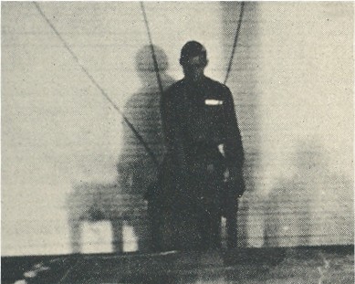
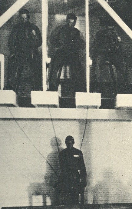
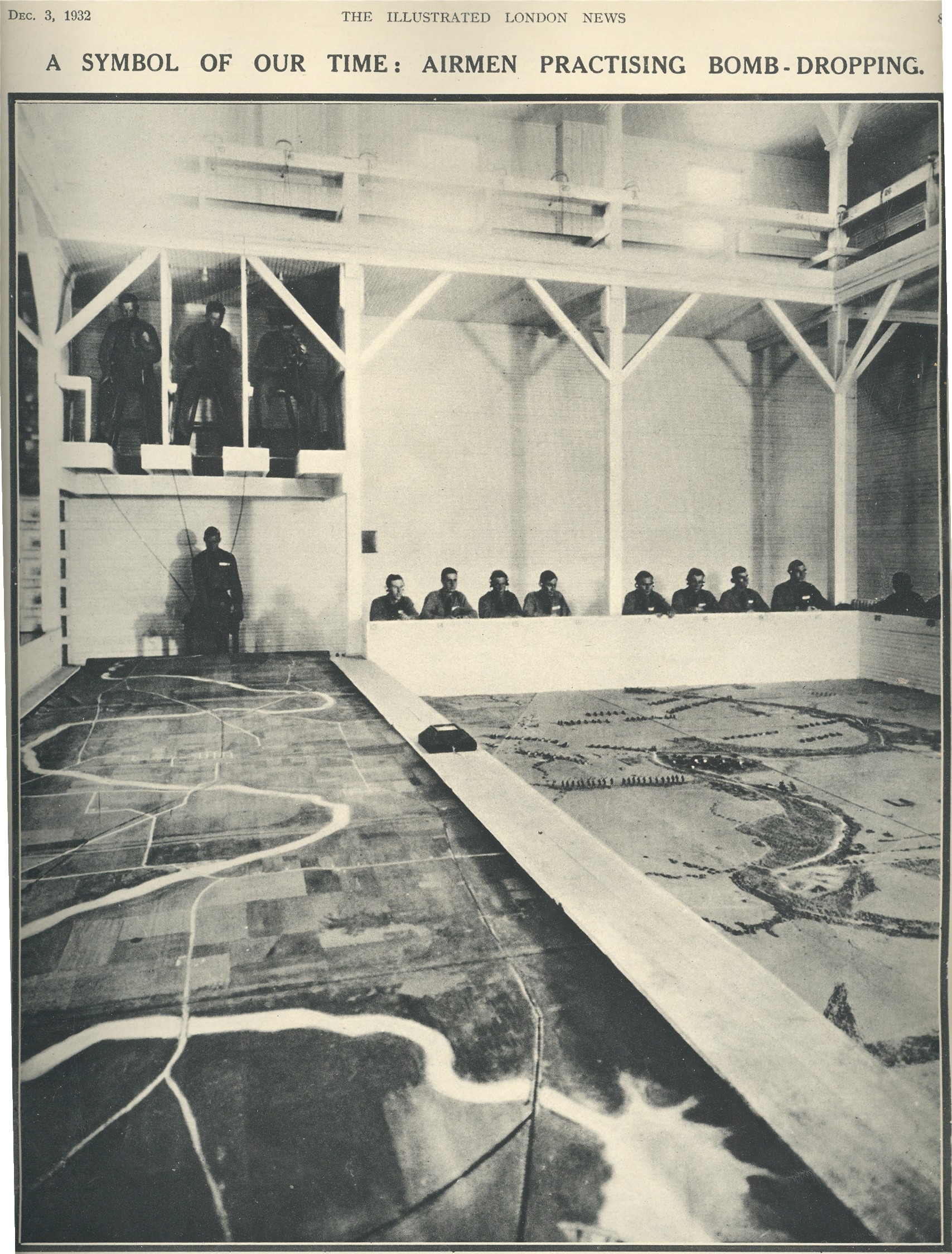
    The thread of thinking about all of this came to mind looking at this image of a bombing instruction room for aviation in England in 1932.  The image is also a great one; the aviator at far left looks like a marionette; the three men above responding to his piloting maneuvers as he concentrates on the endless panoramas of landforms that advances before him on a horizontal diorama.  It is a fabulous analog flight simulator constructed at a time of great change in aviation

    Wonder stories

    1932 is also the year of the publication of Carl W. Spohr’s classic future-vision/speculative fiction apocalyptic-atom bomb end-of-the-world two-parter (so many hyphens!) that appeared in Wonder Stories.2 The story begins with a relatively simple series of catastrophic bombings that lead to a sort of détente, a kind of mutually assured destruction, which is then upset when the combatants discover and construct the atomic bomb.   MAD breaks down, and the ensuing massive exchanges result in a  devastated world.   Pretty prescient stuff, all-in-all, even so far as the policy goes—especially so when you wrap this sci-fi story around the elements of 1932—Chadwick, Anderson, Joliot-Curie—that made all of this stuff possible just 13 years later.

    Notes

    1 The Joliot-Curie discovery was called “one of the most important discoveries of the century… the consequences of the discovery of artificial radioactivity are immense” from Segrè, From X-rays to Quarks, 198-199).  

    2.  Part one appeared in the March issue, which also carried stories like“Red April, 1965” by Frank K. Kelly; “The Eternal World” by Clark Ashton Smith; “Waves of Compulsion” by Raymond Gallun; “Mutiny on Mercury” by Clifford D. Simak; “The Time Stream” by John Taine (Eric Temple Bell), and others.  Pretty good bumper crop of sci-fi writers in itself.


  • Propaganda Maps: Potential Nazi Supporters, 1938

    JF Ptak Science Books LLC   Post 956

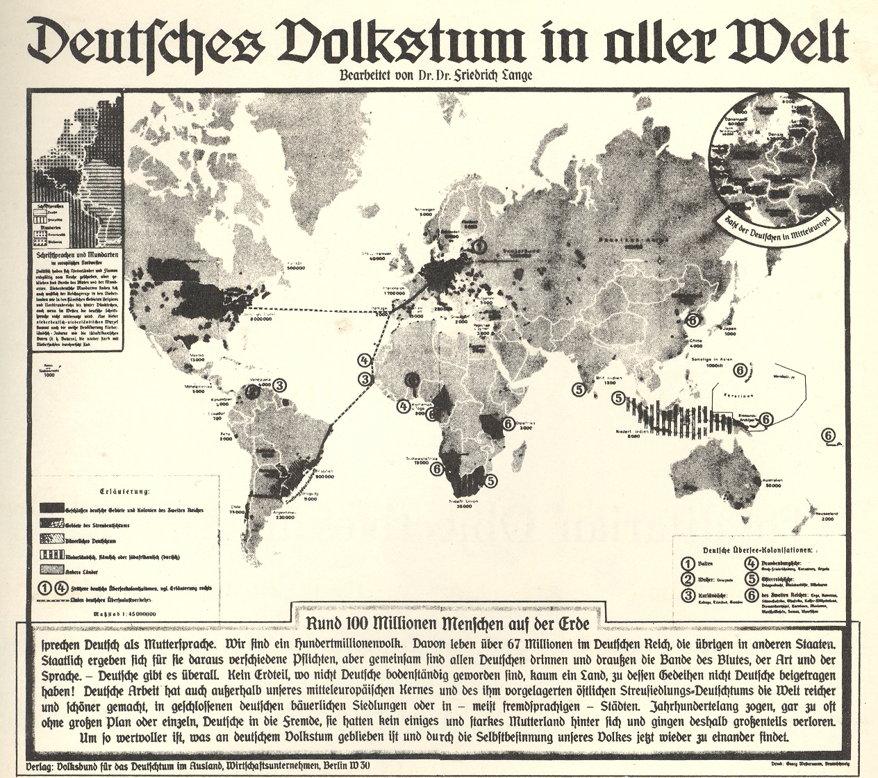
    In
    an audacious move Adolf Hitler attempted to unite German-heritage people
    throughout the world to come to the aid of the Nazi Socialists; it was a
    vicious piece of propaganda attempting to inflate the number of possible-Nazis
    into the hundreds of millions, showing a sub rosa infiltration of Nazism
    throughout the world. 

    00=nazi america

    This
    map appeared originally in Deutsches
    Volkstum in aller Welt
    (Berlin,
    1938) and purported to document far-flung German descendants—the map alone was
    perhaps statement enough to many, striking a deep fear thinking about the
    20,000,000 Americans alone whose roots could be traced back to the
    Vaterland.  As a terror and influence
    tactic that cost little money, it must have caused the anti-propaganda folks a
    good deal of worry.  The German/Vaterland
    (German American Bund, or Deutsch-Amerikanischer Volksbund) movement never
    really gained much popular ground in the U.S., though there was some
    significant compliance in business and trade going on at higher levels of
    industry and banking. 

    (I’ve
    written about the Nazi-American connections in numerous posts on this blog; all
    you need to do is do a site google under “Nazi” and you’ll find plenty. For the
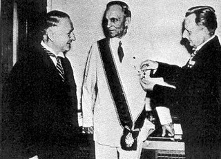
    moment I’ll just concentrate on the Henry Ford example.  The man was a monstrous moral figure without
    an ounce of historical understanding who blamed much of the world’s troubles on
    the “Jewish Dictatorship”, which Ford Henry Ford receives nazi medal somehow, in his mind, spawned WWI.  Long story short, Ford received the Grand
    Cross of the Supreme Order of the German Eagle for his friendship and services
    to the Nazi state—this friendship extended in form of money and many thousands
    of military vehicles, and so on.  His was
    a treacherous business, his Nazi interests folding very nicely in with his
    astounding anti-Semitism. Ford, by the way, received his medal months after the
    invasion of Austria,
    when he really should’ve known better. 
    I’m not sure if he gave the thing back or not after the war ended.)

    But
    among the masses, the sentiment never grew into strength, though it wasn’t for
    trying.  The movement had been present in
    the US
    since the 1920’s in the form of the National Socialist Party and the Teutonia
    Society, though the real start of the American Bund seems to have been with
    Friends of New Germany (1933). Right-Wing groups such as America First were
    strong sympathizers of Hitler, though they abandoned him once the war
    began.  (Not so true for Chase Bank, Ford
    and many others.)  The German American
    Bund never topped 100,000 members, though it did fill up Madison Square
    Garden
    for a meeting in
    1939. (One of the main speakers was Avery Brundage, International Olympic
    Committee Chair. Brundage survived in this role until Munich in ’72, when he ordered the Olympic
    games to continue, unabated, after the 11 Israeli athletes were murdered by
    elements of Yasser Arafat’s organizations.)

    Amyway,
    this map was more a propaganda tool than one of true expectation, and I’m sure
    it did its fair share of damage. 


  • Three Map Fits: a Color Map with Color and No Map, a Color Map in Black & White; AND a Black & White Map in White (only).

    JF Ptak Science Books  Post 934

    This confusing title is accurate without very much grant in license and tells a short and true story of three fitful maps, two of which are beautiful and one just so-so.  

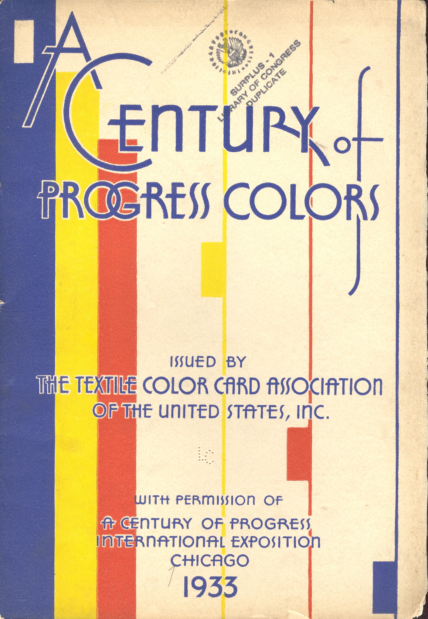
    Color--color map  

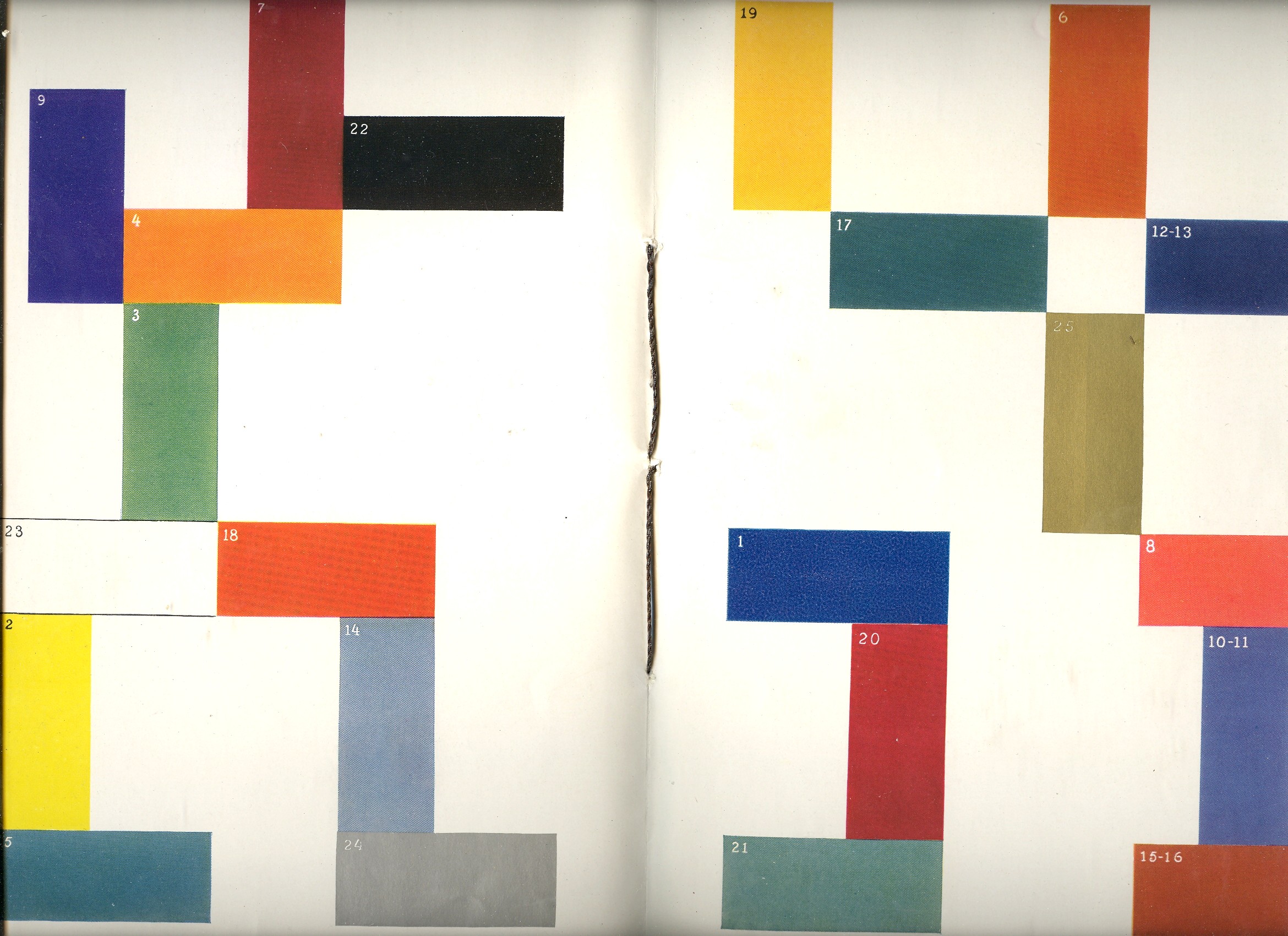
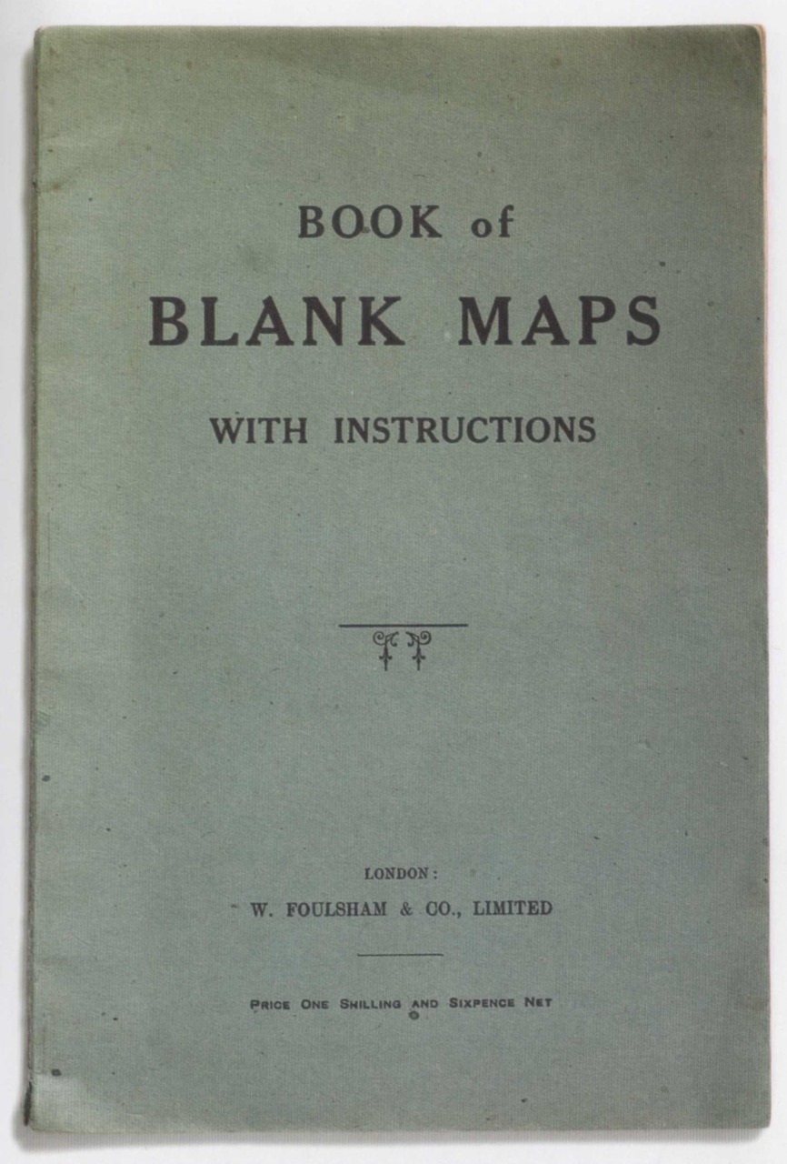
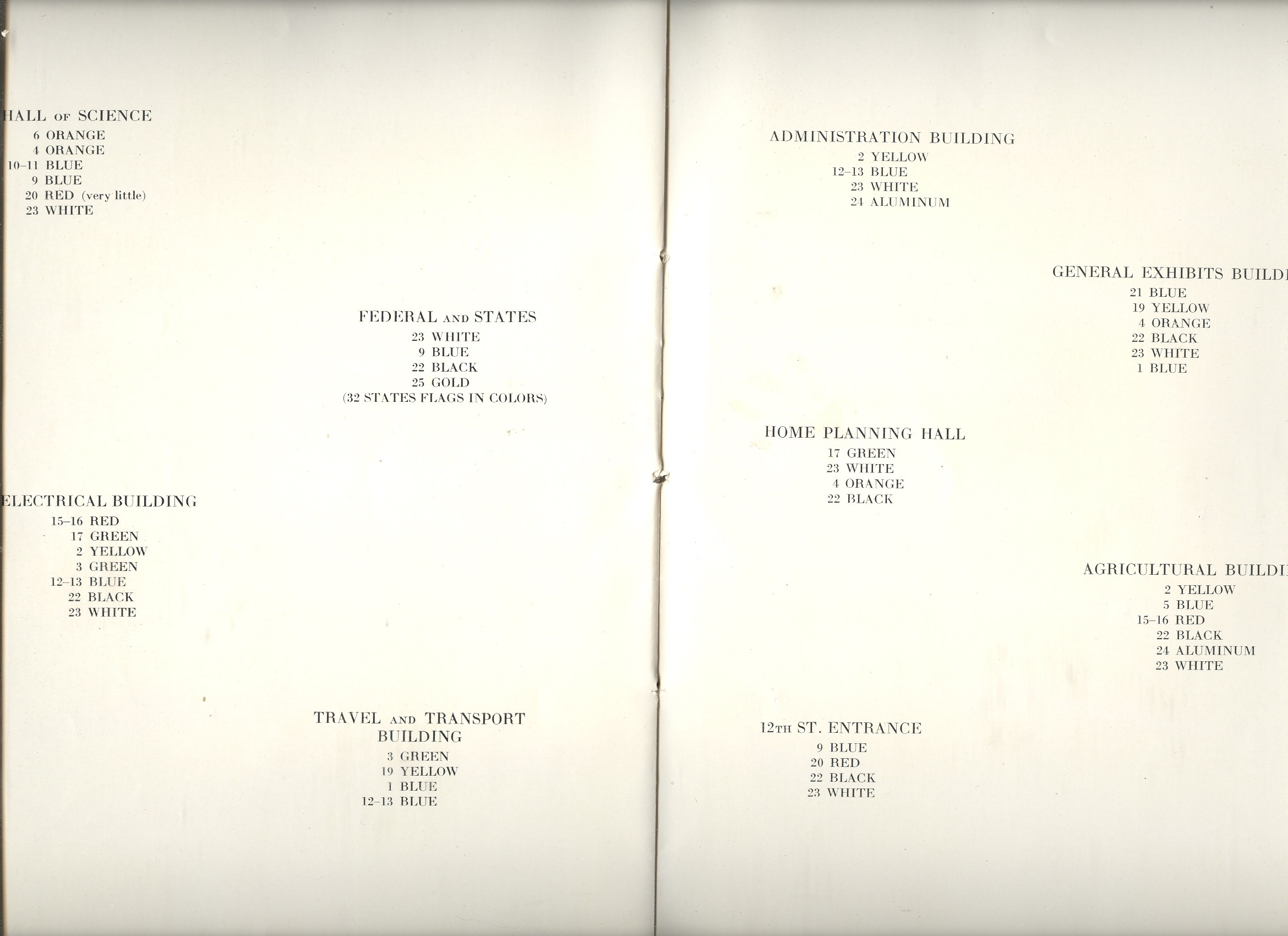
    The first map fit is featured in a beautiful pamphlet called A Century of Progress Colors and was issued by the Textile Color Card Association of the USA.(The title being a small play on the 1933 world’s fair in Chicago called “A Century of Progress”. The Textile Color Card Association was created to standardize color nomenclature and composition in industrial colors (and is still in existence.)  The map distributed the major pavilions at the fair by their dominating colors, naming those colors in the unusually-sequenced double-page key on the following pages (below1).  I can certainly appreciate the effort and the beautiful design it produced, but as a map of the fair it leaves much (if not everything) to be desired.


    Color--color map inside

     The second map fit belongs to a small pamphlet published by Albert Coble called Games of Colors, Kindergarten and Primary Exercises.  Its actually an enterprising little book about reaching into the minds of little ones and explaining how colors are put together and how they relate to one another.  It is unfortunate that the drawings used to illustrate the color map part of the pamphlet were done in black and white.  Which is a little on the self-defeating side.  


     Color--b+w 001
     

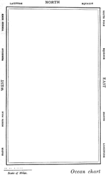
     But the finest fit of the three fits is fit number three, which is the map of the Bellman’s tale, starting the second fit of Lewis Carroll’s The Hunting of the Snark, an Agony in Eight Fits.


    Color map snark


    But the map that I think I love the most illustrates Lewis Carroll’s The Hunting of the Snark, an Agony in Eight Fits, and occurs in the Bellman’s tale, starting the second fit1. It is simply magnificent. 

    Then, of course, there is this:


    Notes:

    1. The key:


    Color--color map inside text


    2. The fit begins so:

    The Bellman himself they all praised to the skies-
    Such a carriage, such ease and such grace!
    Such solemnity too! One could see he was wise,
    The moment one look in his face!

    He had bought a large map representing the sea,
    Without the least vestige of land:
    And the crew were much pleased when the found it to be
    A map they could all understand.

    “What’s the good of Mercator’s North Poles and Equators,
    Tropics, Zones, and Meridian Lines?”
    So the Bellman would cry: and the crew would reply,
    “They are merely conventional signs!

    “Other maps are such shapes, with their islands and capes!
    But we’ve got our brave Captain to thank”
    (So the crew would protest) “that he’s bought us the best-
    A perfect and absolute blank!”


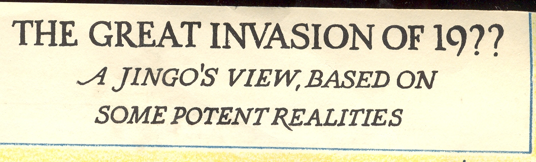
  • The Invasion of America, 19?? (1935 Scenario for Invasions via Canada, Mexico and the Caribbean)

    JF Ptak Science Books LLC  Post 898

    (This is a
    continuation of the Invasion of America
    series, started
    here.)

    Blog jan 4 us attacked ttile
    Even
    before WWII,   the American military and variously-aligned
    think-tank subsidiaries had for years hypothesized U.S. invasion scenarios.  For convenience’s sake, they were color-coded
    so as to not confuse one invadee with another: for example, there were War Plan Citron (an invasion of Brazil); War Plan Emerald (intervention in Ireland); War Plan Green (war
    with Mexico); War Plan Indigo (an
    invasion of Iceland); War Plan Lemon (an invasion of Portugal); War Plan White: (plan
    for dealing with civil disturbances cause by Communist insurgents), and many
    others. (I cannot find the color-coded plan for the 20th century
    invasion of Canada,
    but it did exist.)

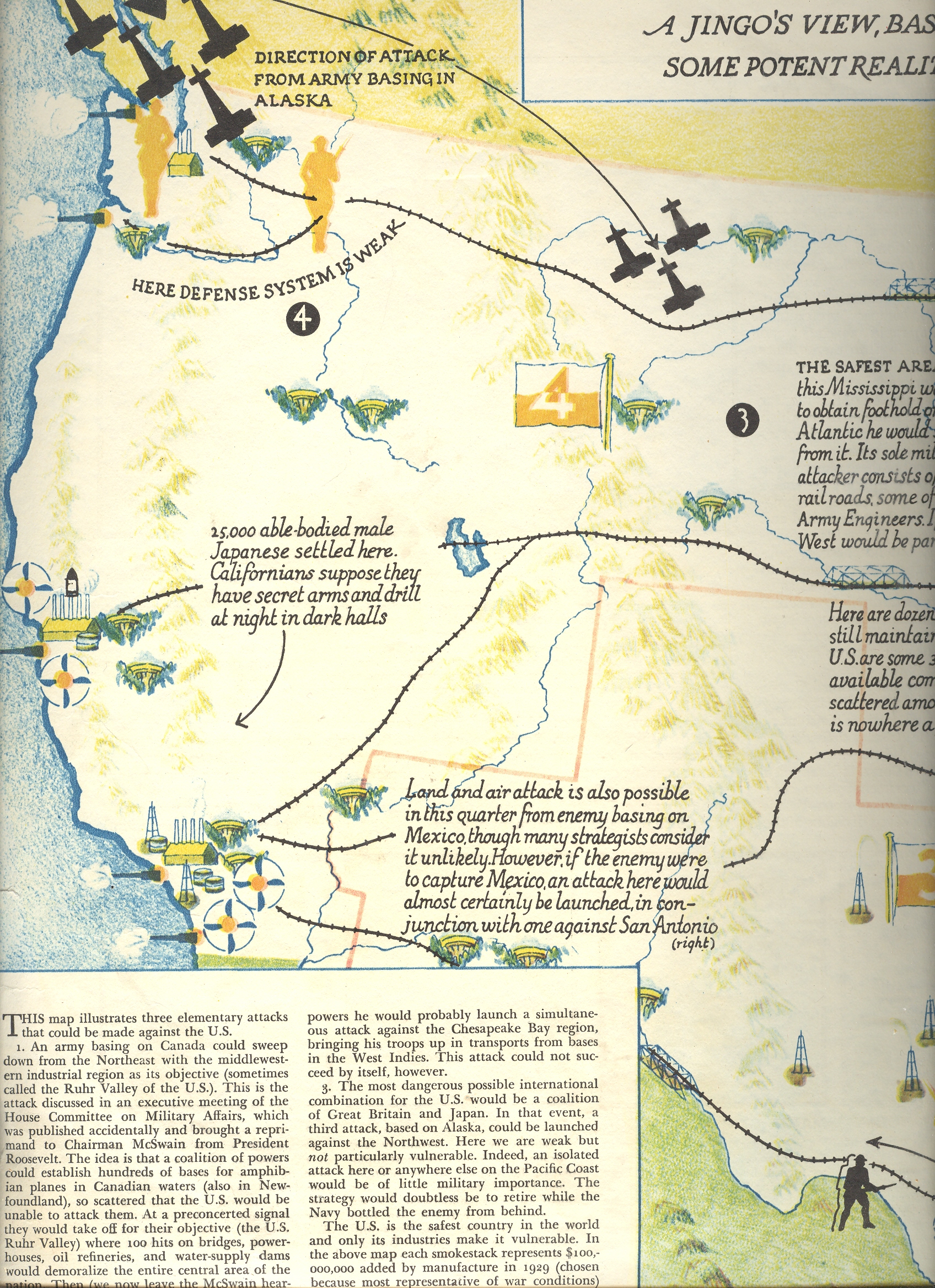
    Blog jan 4 us attacked west

    Lesser
    known are the U.S. military’s
    preparation for the invasion of America.

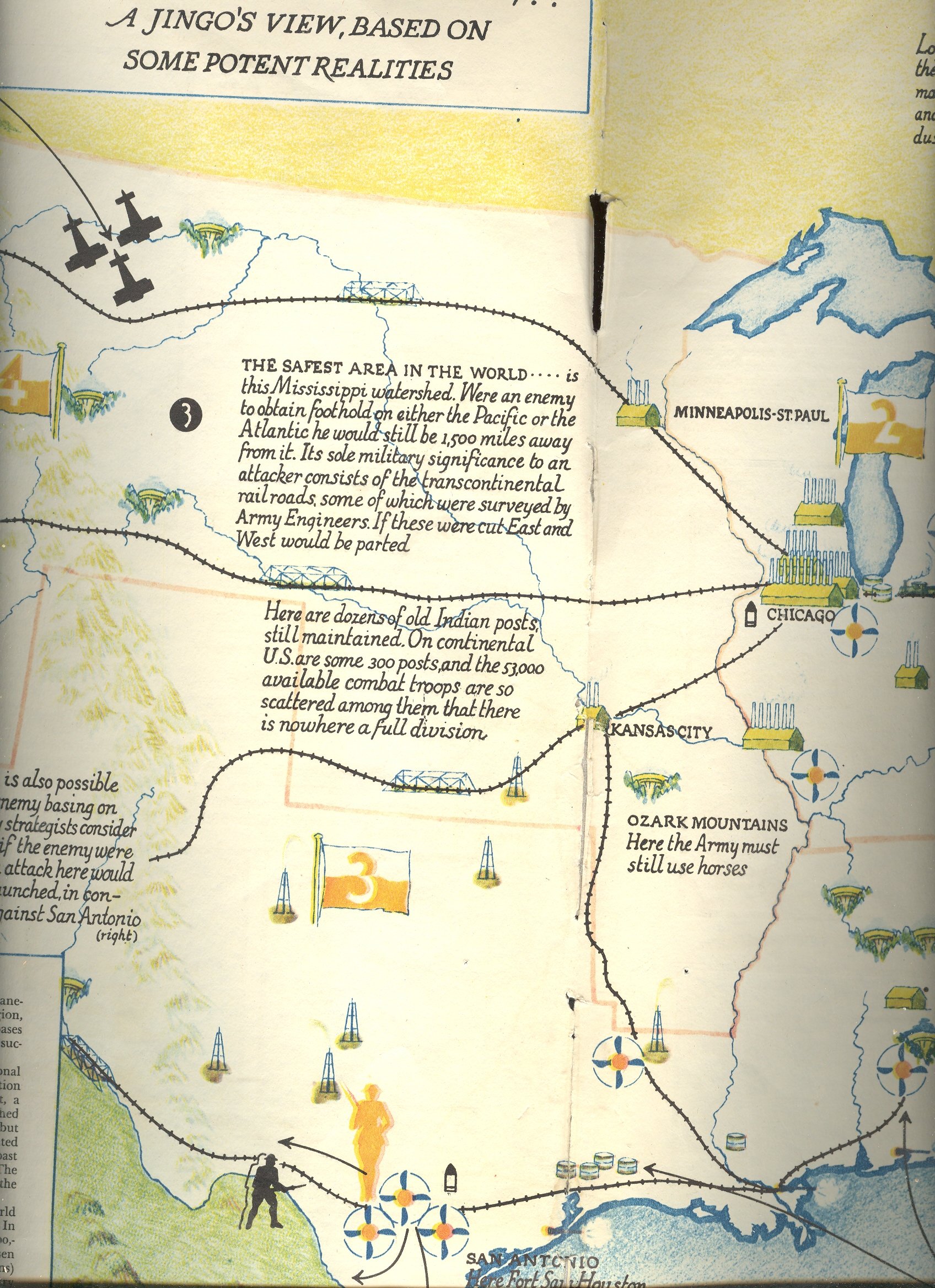
    This
    two-page spread (all that I have of a longer article) appeared in Fortune
    Magazine for September 1935.  It was undoubtedly generated
    by a number of causes, not the least of which was the rearming of Nazi Germany (referred
    to in this article as a ‘miracle”), which could theoretically cause some amount
    of concern in semi-fortress America.  It was also an opportunity for Chief of Staff
    General Douglas MacArthur to whip up a little hell in Congress for the federal
    government to give the military some more money so that there was more to the “fortress”
    part of America
    than two oceans. 

    Basically
    the plan seems to call for a standing, ready army of specialist forces that
    were agile and highly trained, a large network, of anti-aircraft batteries and detection
    areas, and of course a large buildup of the Army Air Force.  All of this of course cost money, and almost
    all o fit would’ve been directed towards MacArthur and his subordinates. (It is
    interesting and odd to note that the Fortune article notes that three of the
    top four major general assistants to MacArthur were Irish (“see the four big
    shots…with three Irish names”).)

    [Due
    to difficulties in the size of this map I have to present it in three sections,
    but I’m sure that the overall flavor will be maintained.] 

    Blog jan 4 us attacked middle

    The most prominent feature (besides the black
    invasion routes) are the terribly antiquated (even for 1936?) depictions of
    coastal defense canons.  Perhaps this was
    disingenuous to include them with such flair, what with the main point of the
    article lending itself towards air invasion, but there they are, protecting the
    American coastline from a ripping adventure from the sea. 

    But
    as we can see the successful invasion routes are coming from odd places—from Alaska,
    Canada, the Caribbean) against which the U.S. seemingly had no defense.  This was especially true in the Pacific
    Northwest (“here defense system is weak”) where America
    was entirely susceptible to attack and invasion “from army basing in Alaska”.  The rest of the west coast didn’t fair so
    well, though the only other direct threat was from “25,000 able-bodied male
    Japanese…Californians suppose they have secret arms and drill at night in dark
    halls”.

    The
    southwestern and southern California areas
    were relatively secure, except in the case of an enemy capturing Mexico; then, “an attack here would almost certainly
    be launched, in conjunction with one against San Antonio”. 
    I guess there would be long intrigue, much preparation and enormous
    effort to attack and secure Mexico,
    and I’m assuming that the thinkers behind constructing this map assumed that the
    U.S.
    would be doing nothing during this prolonged period of time. 

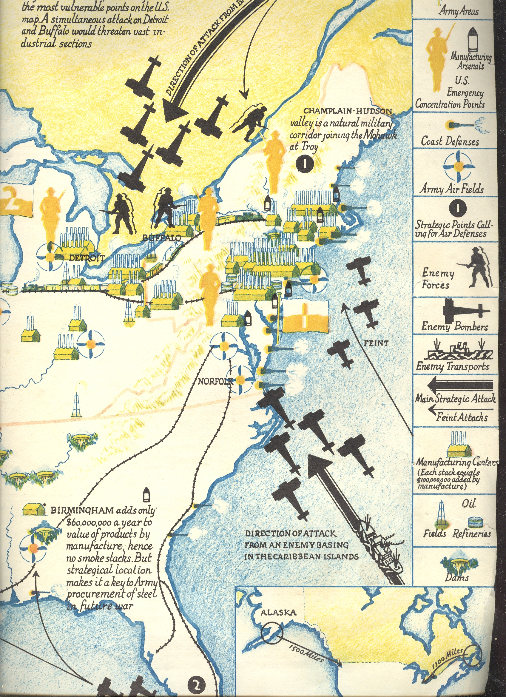
    Blog jan 4 attack east

    The
    attack on America in the
    Gulf would ostensibly come from Mexico
    and “an enemy basing in the Caribbean”, with a central interest in Birmingham and Norfolk.  But the main thrust coming to the U.S. from unnamed horribleness would be coming
    through the St. Lawrence and points east in Canada, swooping down on Lake
    Champlain, the Mohawk Valley, Troy, Buffalo and Detroit.  I know that there were bigger industrial
    concerns in these places in 1936 than there are now, but, well, my god there
    would be better places to begin an attack on the U.S.
    than from Montreal and Toronto.

    In
    all of this I see that the industrial northeast is left alone, save for a “feint”
    attack to dislodge resources and attention away from the movement against the Virginia coast. There’s
    the navy yard and industry and shipping and etc. there, but it would seem a
    terrible waste to attack here rather than a much juicer and more northerly
    series of prizes. 

    No
    attacker is named in what I own of this article, and there is a very curious
    absence of any threat coming from the already-warring Japan (save for
    the Japanese super secret nighthawks in San Fran).  The article does make a case—apart from the
    map—that national defense was at a low ebb insofar as manpower and ordnance
    were concerned.  But it scoots around the
    issue of the war of Japan
    against China
    and the vast militarization of the Nazis. 
    (Of course, this is Fortune magazine, and Krupp and Hoechst and other German firms, and Standard Oil, and the Bank for International Settlement, and Ford, and SKF, and etc. abetting
    the Nazi war machine were doing some nice business in the U.S., so perhaps it
    would’ve been best not to make Nazi money upset with some bad press.)

    Taking
    all sorts and manner of considerations into account, this is just simply a
    miserable attempt to reckon what the future might bring to America in the
    hands of unlabeled enemies—it is simply a rousing caroling of general fear of
    attack from places unknown. 


  • Nazi Propaganda: the British Threat to Germany, pre-War 1939

    JF Ptak Science Books LLC  Post 897                                                          

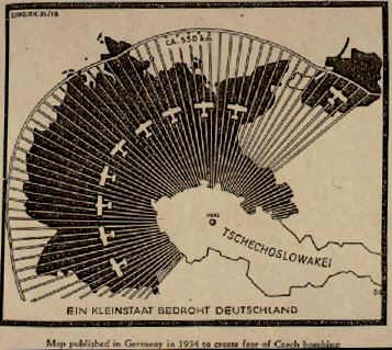
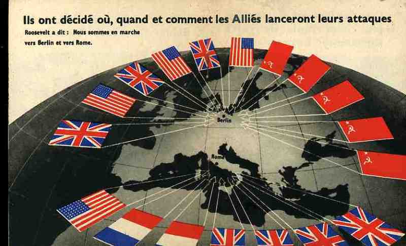
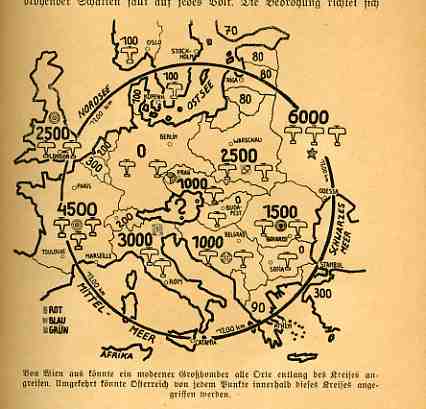
    I’ve written twenty or so posBlog jan 3 czech airts here about (mostly) graphical propaganda of World War II, and most of that coming from the Axis (and mainly Nazi) end.  A popular theme among this limited exposure seems to be the Germany-surrounded meme:  Germany under attack from all sides: massive attacks being directed by the British from air and sea,

     Blog jan 3 german surround

    airstrikes coming in from thousands of planes in Czechoslovakia, Poland moving on the ground and in the air to invade south-eastern Germany, retaliation mounting from the French, and on and on.  And somehow when all of this is presented in cartographical form to the average reader, and when it is presented over and over again, the propaganda must take its toll.  

    Blog jan 3 germany surrounded Tonight’s installments come from the Illustriete Zeitung (Leipzig), and were printed just before and just after the start of the general hostilities of WWII (meaning the invasion of Poland, and not the actions against Austria or Czechoslovakia, and not the war in the east beng waged against China by Japan).The first comes in the 27 July 1939 issue–featuring a remembrance of WWI on the cover, showing a devastated field of battle with a spanking-new heavy dagger thrust into the heart of the field–and shows John Bull pulling strings of an advancing/attacking navy in the one hand while the other controls a firing network for cannons facing Germany based in its contiguous-bordered countries.  (The image was created by the prodigious Richard Lipus and titled “Englishe Kriegspolitik”.)

    Blog jan 3 john bull

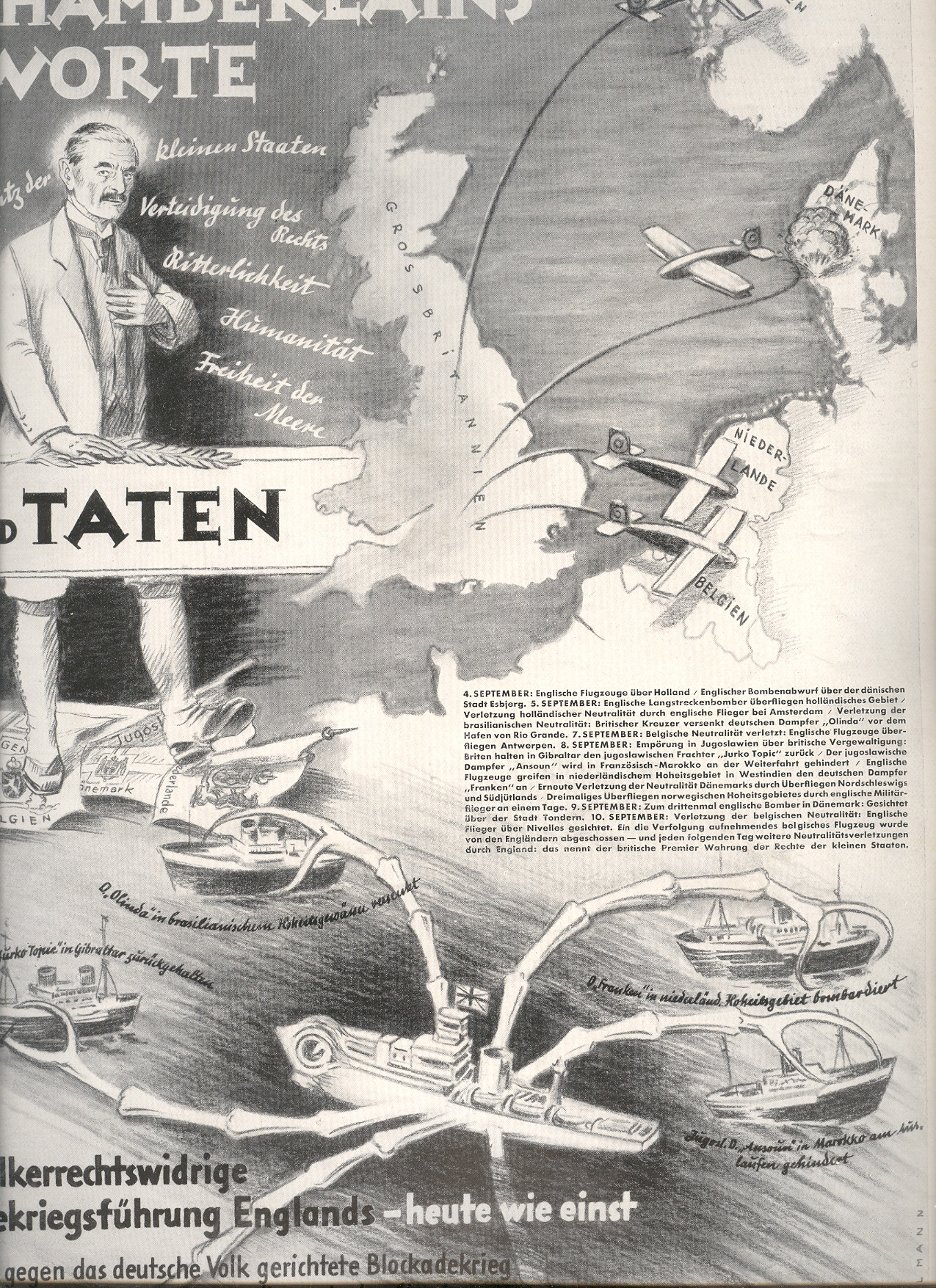
    The second piece was published just after the start of the war (21 September 1939) and attacks Neville Chamberlain (contrasting words and deeds) and his “treacherous” involvement with neutral countries.

    Not particularly virulent, these maptoons undoubtedly helped to form a Nast-ian image in the commonplace psyche of the German people about the treacherousness of the Brits and of their dire situation of being surrounded by potent and threatening enemies.

    Blog jan 3 chamberlain  

    Some of the other posts on this blog relating to WWII propaganda:

    Maps
    as Propaganda https://historyofideasblog.com/thesciencebookstore/2008/08/maps-as-propaga.html

    Maps
    of the Polish “Corridor” https://historyofideasblog.com/thesciencebookstore/2009/09/propaganda-in-maps-the-polish-corridor-1939.html

    Maps
    of Naval Disaster https://historyofideasblog.com/thesciencebookstore/2009/05/jf-ptak-science-books-llc-post-624-the-admiralty-regrets-to-announce–was-for-years-the-standard-beginning-to-an-offici.html

    Anti-Nazi
    Propaganda https://historyofideasblog.com/thesciencebookstore/2009/08/antinazi-propaganda.html

    Nazi
    Propaganda and the Threat From Czechoslovakia
    https://historyofideasblog.com/thesciencebookstore/2008/08/propaganda-maps.html

    Humanitarian
    propaganda for Allied families with family members who were POWs https://historyofideasblog.com/thesciencebookstore/2008/09/humanitarian-pr.html

    Nazi
    Germany and Scaring the Will to War (Germany surrounded, again) https://historyofideasblog.com/thesciencebookstore/2008/10/nazi-propaganda.html

    Nazi-directed
    scare tactics published in English https://historyofideasblog.com/thesciencebookstore/2008/08/nazi-propagan-1.html

    The
    Luftwaffe and RAF present their (graphical) popular cases https://historyofideasblog.com/thesciencebookstore/2008/09/graphical-and-a.html