A Daily History of Holes, Dots, Lines, Science, History, Math, Physics, Art, the Unintentional Absurd, Architecture, Maps, Data Visualization, Blank and Missing Things, and so on. |1.6 million words, 7500 images, 4.9 million hits| Press & appearances in The Times, Le Figaro, Mensa, The Economist, The Guardian, Discovery News, Slate, Le Monde, Sci American Blogs, Le Pont, and many other places… 5000+ total posts since 2008.

Category: Maps, Cartography, History of Mapmaking

  • History of Dots (Circle Subcategory): Circles in Graphical Displays of Quantitative Data

    JF Ptak Science Books  Post 889

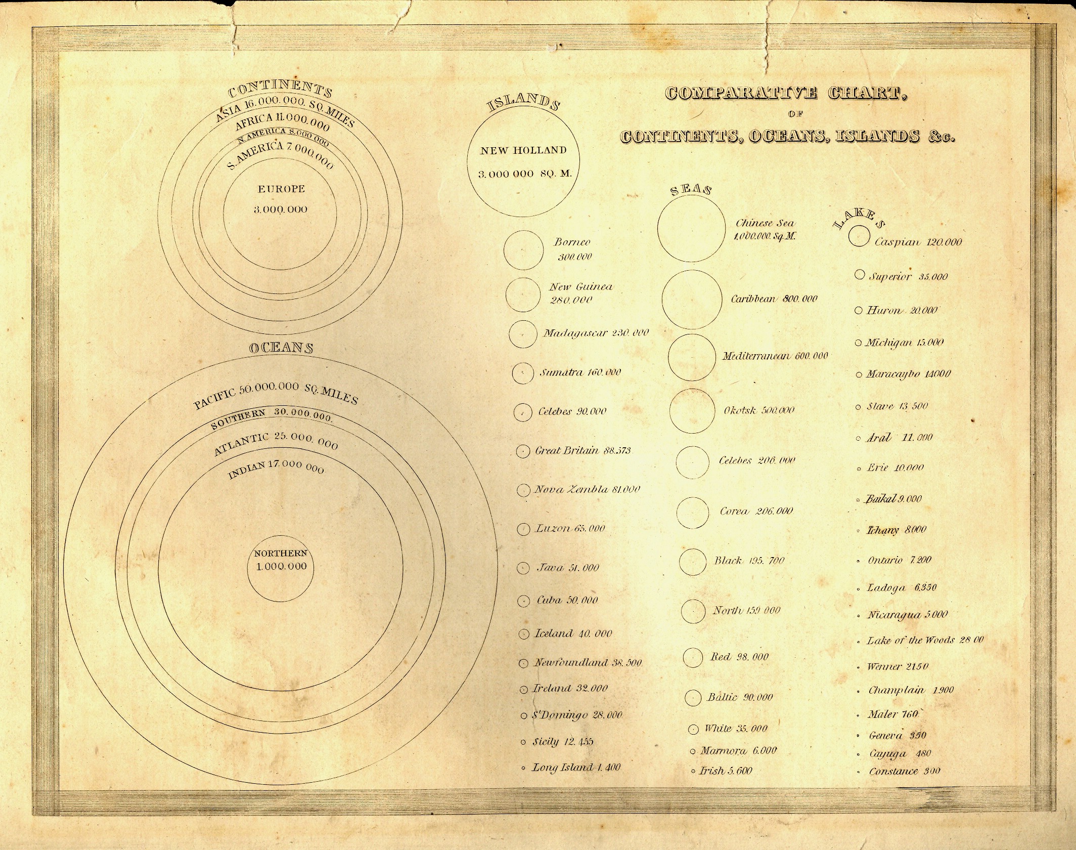
    I like bumping circles as modes of graphically conveying quantitative data—it is more unusual than most ways of portraying statistics and belongs mostly in the 19th century. 
    Blog dec 27 graphic circle

    The first example is relatively early, in the first class of this sort of information display, published in Thomas Bradford’s (1802-1887) superior Comprehensive Atlas Geographical, Historical and Commercial in Boston in 1835. Circles are the entire métier of this chart, showing the sizes of the continents and oceans, concentric circles nested inside each other, then branching out into three columns of progressively smaller circles showing the comparative sizes of islands, seas and lakes, all (interestingly) presented on
     the same scale.  It is a virtual one-stop, single-image display showing the graphical sizes of 59 geographical entities in relation to one another, making the understanding of their comparative sizes a simple, understandable, matter. 


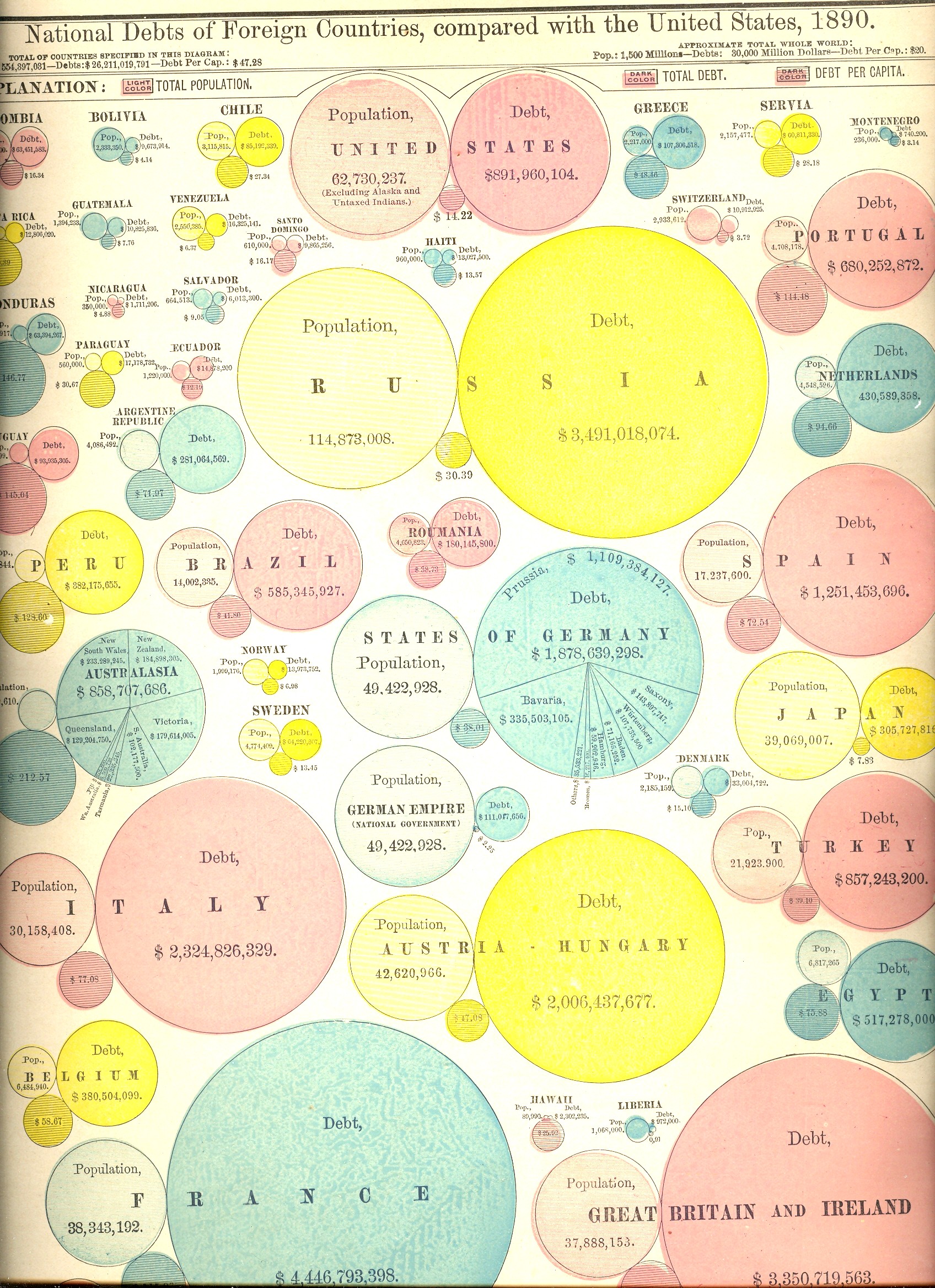
    Prettier but (initially) more difficult to use are the next two charts, the first showing the areas and populations of countries compared to that of the United States (in 1890), and the second showing the public debts of those same countries.  At first the display looks a little confusing. But once you settle in and get your eyes accustomed to the manner of presentation, the charts are actually very easy to use and very useful. 

    Moving over from circles to dots is this population map by Frère de Montizon Armand Joseph, Carte philosophique figurant la population de la France, published in 1830 (as the first of its kind).
    Blog dec 27 graphic bubble debt

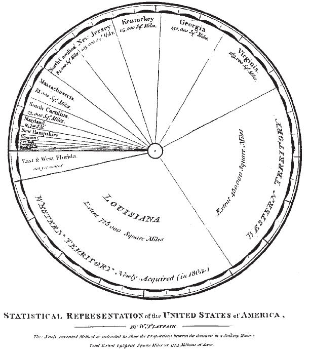
    The ubiquitous pie-chart only made its first appearance in 1801, the work of he gifted and possibly polymathic William Playfair.  He was an engineer (serving as apprentice to the inventor of the threshing machine, Andrew Meikle,  and personal assistant to James Watt) and economist, and occasional mathematician, who also invented  the line graph (1786),  bar chart (1801)and circlegraph(1801).  But for this and all of his other work, he died in poverty and not comfortable1.  


    NOTES

    1.Works by William Playfair include:

    • 1786. The Commercial and Political Atlas: Representing, by Means of Stained Copper-Plate Charts, the Progress of the Commerce, Revenues, Expenditure and Debts of England during the Whole of the Eighteenth Century.
    • 1801. Statistical Breviary; Shewing, on a Principle Entirely New, the Resources of Every State and Kingdom in Europe. London: Wallis.
    • 1805. A Statistical Account of the United States of America by D. F. Donnant. London: J. Whiting. William Playfair, Trans.
    • 1807. An Inquiry into the Permanent Causes of the Decline and Fall of Powerful and Wealthy Nations: Designed To Shew How The Prosperity Of The British Empire May Be Prolonged.


    Blog dec 27 playfair


  • Mapping the Invasion of America, 1942

    JF Ptak Science Books LLC  Post 873           Blog Bookstore

    [See also Part II of this post, here; and consider a  related post on the Nazi sub-orbital Amerika Bomber]


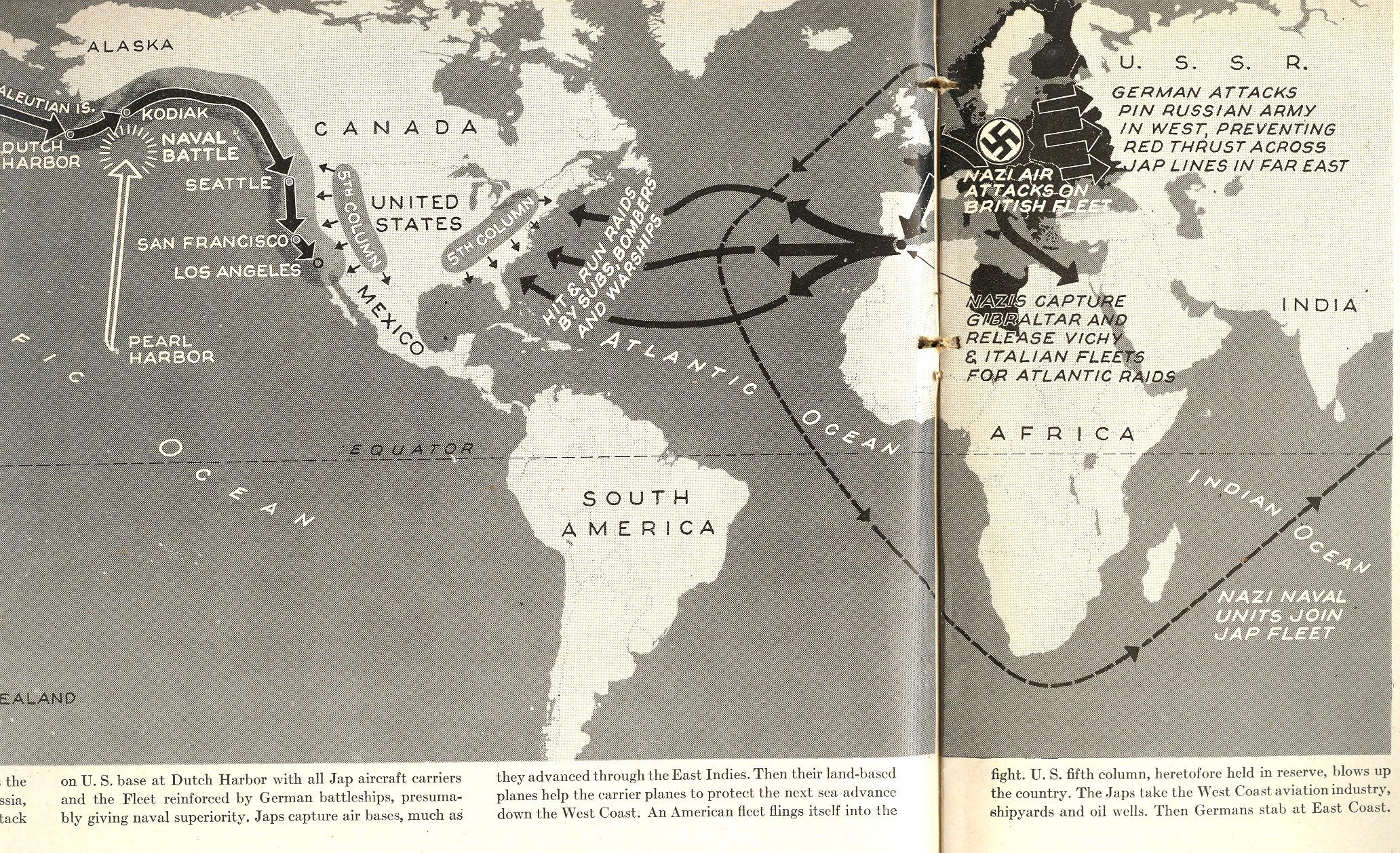
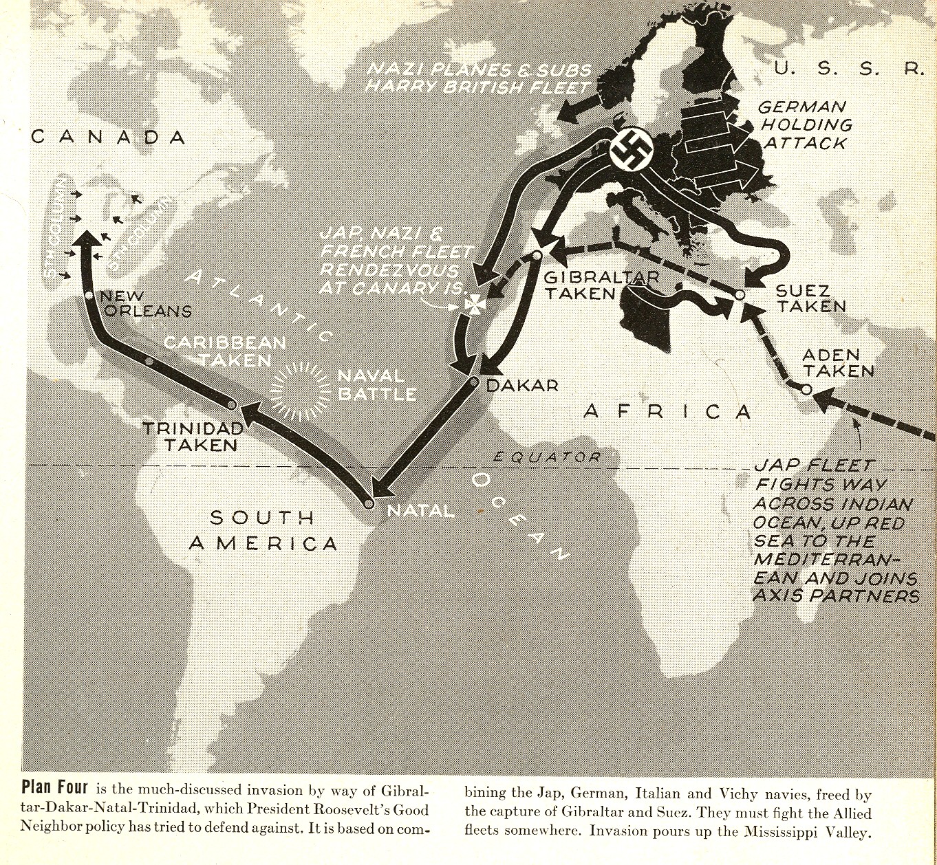
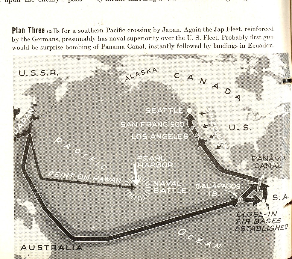
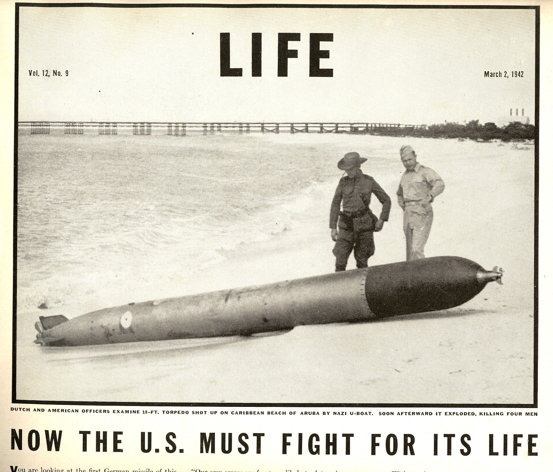
    Blog Dec 12 USA attacked map overview LIFE Magazine issued a wake-up call of sorts to its readership in their 2 March 1942 issue.  I say “of sorts” because even though this hard article (entitled “Now the U.S. Must Fight for Its Life”) must have sorely sobered some of its readers, it started on page 15, following big ads for Listerine, Matrix (women’s shoes, Bell Telephone, Modess, Clapp’s Baby Food, Dot Snap Fasteners, Goodrich Tires, White Horse Scotch, Pompeian Massage  (for shaving), Jack Benny/Carole Lombard’s “To Be or Not To Be”, Colgate, Yardley powder and  Mimeograph, and a few interspersed puff pieces—and a Ginger Rogers cover photo.  But once LIFE paid its bills1, the article got right to business, responding to a February article by sci-fi/novelist Philip Wylie2 on the possibilities of the U.S. losing the war.    

     Blog 12 10 USA map attack 1

    Losing looked like something that could actually happen in pre- war-ready America3.  The war in Europe had been on in earnest since the very end of 1939 (since 1933 in Asia), and the Axis had reached just about the fullest extent of their victories (though there would be more gains in the Pacific to come).  By March of ‘42, we had Bataan, MacArthur leaving the Philippines and the fall of rape of Manila, the siege of Leningrad, Corregidor, Java Sea, the Brits leaving Singapore, Malaya, and so much more.  The Axis powers in Europe were now in control of Austria, Czechoslovakia. Poland, Denmark, Belgium, the Netherlands, Luxembourg, France, Norway, Yugoslavia, Finland, Greece, Lithuania, Latvia, Estonia, and parts of the Soviet Union (Ukraine, Bylorussia, Crimea), and parts of North Africa;  plus the allies of Hungary, Romania, Bulgaria, and Slovakia. There was also Italy, of course, controlling Sicily, Ethiopia and Libya., and of course the Japanese controlled large swaths of China, South East Asia, Indonesia and points in-between.  The overall situation did not look very good. 

    Blog Dec 12 USA attacked map 2
     The following maps appeared in a two-page spread, detailing ways in which the Axis powers could combine their efforts, focus on America, and take over the country.  Maps such as these with arrows being drawn towards America were absolutely uncommon during this time. 

    Blog Dec 12 USA attacked map 3 001

    Notes

    1.This is almost universal SOP for war reporting for almost all media, and which continues today.  The Illustrated London News delivered reports of success and disaster sandwiched between ads for socks and trifles, as did the Illustriete Zeitung (Leipzig and Berlin), the New York Times, and so on.  I remember very clearly as a kid hearing the reading of the daily list of American soldiers killed in Vietnam  on one of the Big-Three networks, somber and intoned, followed instantly by a ad for Coke or Mister Kleen. 

    2 Wylie (1902-1971) was an interesting guy with a wide reach.  In addition to Hollywood-feeding work, interesting fiction, insightful scifi and social commentary, Wylie also provided the inspiration for the creation of Superman (“The Gladiator”, 1930) and Flash Gordon (When Worlds Collide, 1933).

    3.  Once the war machine in the U.S. got into hyper drive I think that it was impossible for this country to be defeated given its population, workforce, industrial capacity, raw materials, and of course scientific superstrucutre.  Also there was also no other country in the world with the necessary (and enormous) components needed to construct an atomic bomb.  This is a simplified statement that seems pretty homespuna dn jingoistic, but the fact of the matter is that the U.S. was the seat of overwhelming  possibilities and capacities. And yes the Nazis had been slowed down mightily with the expense of dozens of millions of Russian lives and the entire British war machine and on and on—I’m just saying that in the end, the U.S. could not have been beaten.  

    MORE maps in the extended section, below:


  • Straight Lines and Blank Space in Early Western Cartography

    JF Ptak Science Books LLC  Post 788   Blog Bookstore

    Blank and Empty Series #53

    It is sobering to look at the work of the early cartographers and see how much space in their maps they were willing to relinquish  to the blank unknown.  For example, Jacobus Ziegler, in his Quae intus continentur Syria,
    Palestina, Arabia, Aegyptus, Schondia,
    Holmiae, Regionem superiorem, singulae tabulae geographicae
    , published in 1532, was among the first to publish anything at all about Scandanavia and Greenland, wasted no effort in trying to add detail where there wasn’t any, a trait that was lost on many other cartographers and mapmakers in the centuries to follow.  His book was mostly about travel in Palestine, but at the end of the book he deals with the new and problematic geographic areas, featuring them in his eighth map, announcing the contents as follows:

    The western half of the map, featuring Sweden, Norway, Finland, Lapland and Greenland, is spectacular, and features an enormous, flat-detail, straight-edged Greenland as the bulky land mass in the west (“ulte Gron/rio/lan”, a terra incognita).  The extremely angular Greenland coastline stands in sharp contrast to the lovely wavy ocean, the mapmaker unafraid to stake his claim in what he didn’t know. 

    The eastern half of the map, Scandanavia, is more recognizable (if you focus on Denmark and Germany in the south and then work your way north):

    <

    Though the unencumbered line, far from the fractal nature of Mandelbrot’s coastline of Britain, appeared everywhere in the eight maps of Ziegler’s work, as we  can see in this intestinal-appearing Dead Sea (below).  The fact of the matter is that this was the state of the art in the first third of the 16th century, and there was in general not a great effort to embellish guesses and gloss over the areas where there was no information.  Of course there was still mythical placements of beings and locales and willing things into existence (like Prester John, sea monsters, El Dorado, no-headed men of South America, Patagonian giants, monsters, and so on), but I still find it remarkable to see how much rigor was given known geographic detail. 

    The Nile too received this unrelenting treatment of calm appraisal:

    I do admire this effort for not making things up, or covering areas for which there wasn’t good data with ephemeral and unnecessary features that would swallow up large swaths of white, empty space, as in this map of the lands eastern Syria:

    Though there were still no problems including sea serpents, even so close to the Syrian coast:

    On the whole though Ziegler’s stylized effort is quite beautiful and truthful,  and I enjoy the depiction of the sea giving way to the chunky, rectangulariness of even such decently known forms such as Cyprus.

    The bottom line here is that folks seeing this work for the first time in 1532 would have had a similar reaction to it as you had when you zoomed in on your house in Google Earth for the first time–it was an extraordinary display of information for the time. 


  • A Map of the Kingdom of Corsets, 1939

    JF Ptak Science Books  Quick Post

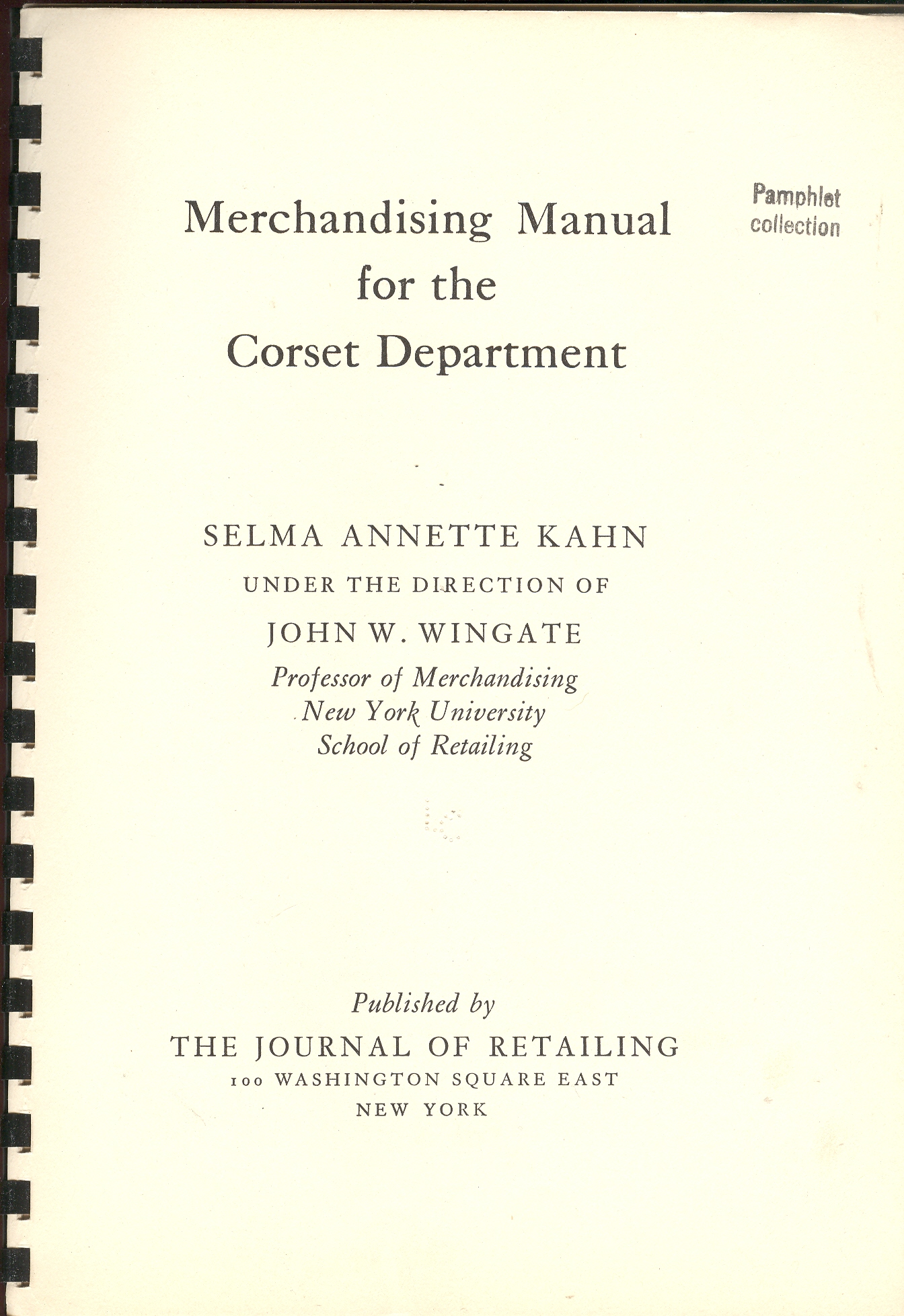
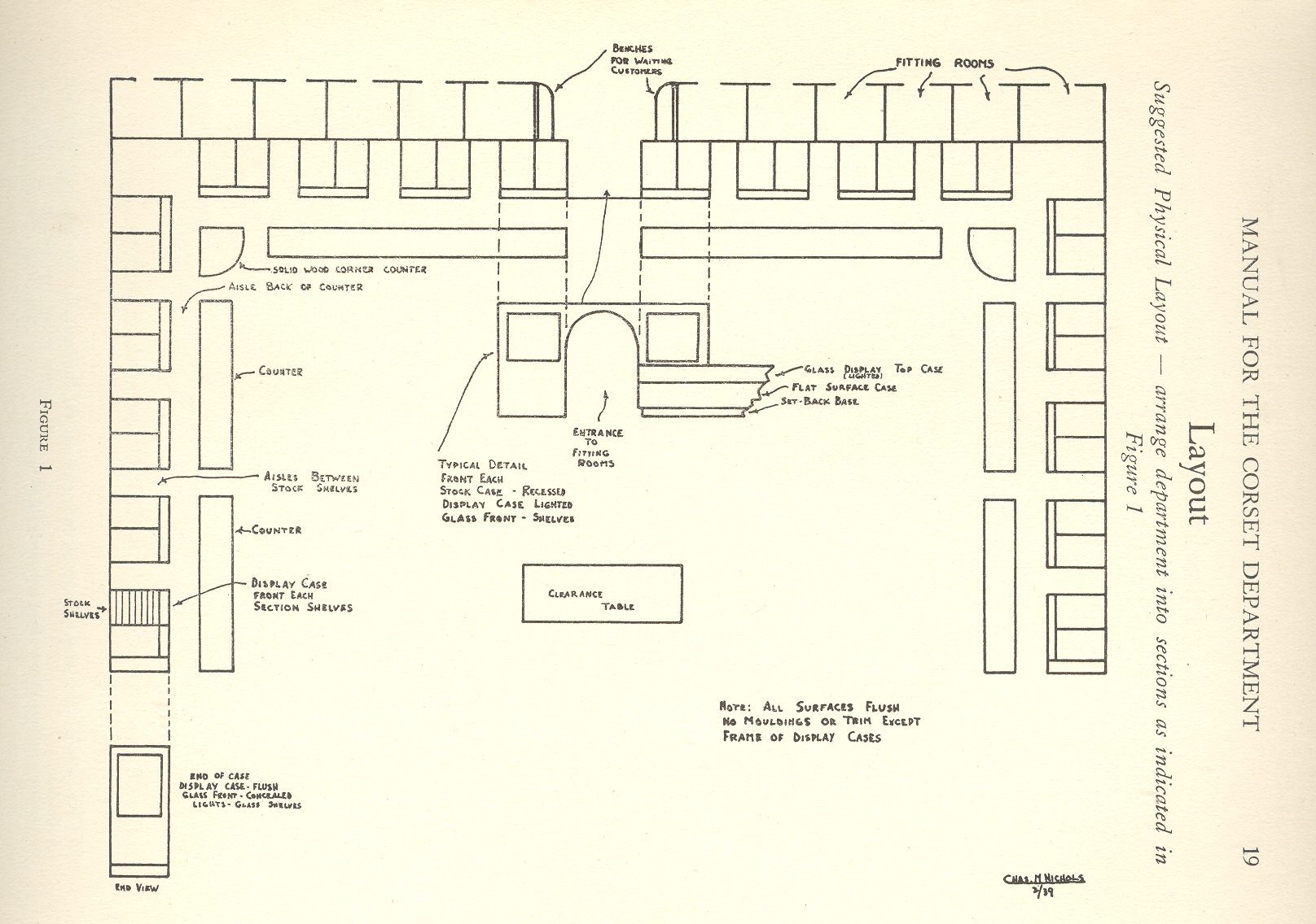
    + blog 10.26 corset tpThis finely produced, 75-page pamphlet lists all you need to know about marketing and maintaining a corset department in 1939–all except how to actually get back to 1939 to utilize this font of knowledge.  It was published with great seriousness for a serious business by the School of Retailing at New York University, a serious object for serious people.   Among the many things I’ve never thought of before thinking with this pamphlet were corset maps–and one of these happens to appear in this publication,  a map of an idealized corset department, which to me looks to be large, sanitized and medicinal, an oddly institutionalized presentation of an intimate something, something more of artistry and chance and possibility than an orthotic. 

    I should think that I would like to make a Kingdom Map for his image, some day.  It looks to me ready to accept the responsibilities of landforms or ideas or statistics or changes or comparisons in place of its plain nature of counters and countertops and display cases, empty boxes waiting for something a little more invigorating to depict.  Or maybe not, maybe the chance of display of transformations is enough to suit its peculiar, perhaps singular, needs.

    Or maybe on the Corset Map  instead of  substituting land and sea for corsets and boxes, one could substitute the noises of a quiet house at night, or the sound of heavy boots in a brittle-dry snow in the deep cold.  Or maybe a map of the discovery of children’s laughter, or inconvenient pauses in conversations through the history of human speaking…or a map of lost ways.

    Maybe the Corset Map could be used for a template for the things we will forget and the things we’ve forgotten, in which case the boxes need not be filled in, giving us a new version of the Bellman’s Map from Mr. Dodgson, a new subcategory of maps–the blank map.  Or it could be the outlines for a map of the places that you meant to say something, but didn’t.  Perhaps it could be used to outline where and how many times that people tell/told you that they’ll miss you if you step away, making hollow boxes of simple loneliness because we can’t be there all of the time.

    Or maybe the corset map is just a corset map.

    [This item is available for purchase, here.] The other surprise is how expensive these undergarments were.  For example, the Lily of France and Mme. Irene Corset Company (NYC) sold a girdle “for the heavy figure” (liberally sprinkling the word “heavy” throughout the description of the product like, well, sprinkles) for $132. The $132 corset is equal to about $2000 in today’s currency, or roughly a 15:1 increase. There were girdles and etc. in all price ranges, but the (1939) $30-$60 range seems to have been the most common; even still, the $30/low-medium quality item is about $430 in today’s dollars, and the cheapest of them all at 5 bucks goes in today’s economy at 75 dollars or so.  I’m not familiar with the value of undies today, but this sure sounds like a whole hell of a lot of money. 

    $132 for underwear in 1939 was a tremendous amount of money for the average person—even for the upper-middle class, it was a bunch, considering that you could buy a decent new car for $700.  It would also be equal to a half year’s worth of an average house rent ($28/month) and 1320 gallons of gasoline. 

    + blog 10.26 corset map
     

    It sounds like it was very expensive to keep the up with the idea of an ideal figure, which of course was partially create by this same sort of company, creating both need and demand for its product. 

    1939 Price Comparisons:

    Wages per year, average:  $1,730.00
    Minimum wage: 30 cents/hour
    Milk, by the gallon: 35 cents
    Postage stamp, 1st class: 3 cents
    Dow Jones: 131
    Gas, average price of a gallon:  10 cents
    Bread, by the loaf:  8 cents
    Hamburger Meat, by the pound: 14 cents
    Automobile, new, average:  $700.00
    House, new, average: $3,800.00
    House rent, average: $28.00/month


  • The Bumpy Earth and the Loss of Perfection, 1543

    JF Ptak Science Books LLC  Post 800 

    The idea of the Earth as a sphere is an ancient one, proved over and over
    again across the centuries, most famously proved by Aristarchus with a stick
    and a hole and a shadow. The idea of the Earth as perfect, as a perfect sphere,
    is an old belief wrapped in layers of hopeful scientific thought, God’s
    creation and the cradle of mankind necessarily being perfect (Summa aside).  This was a rigidly enforced perception and a
    religious assumption, just like the belief that the Earth was the center of this
    universe, and that a vacuum was a theological and therefore physical
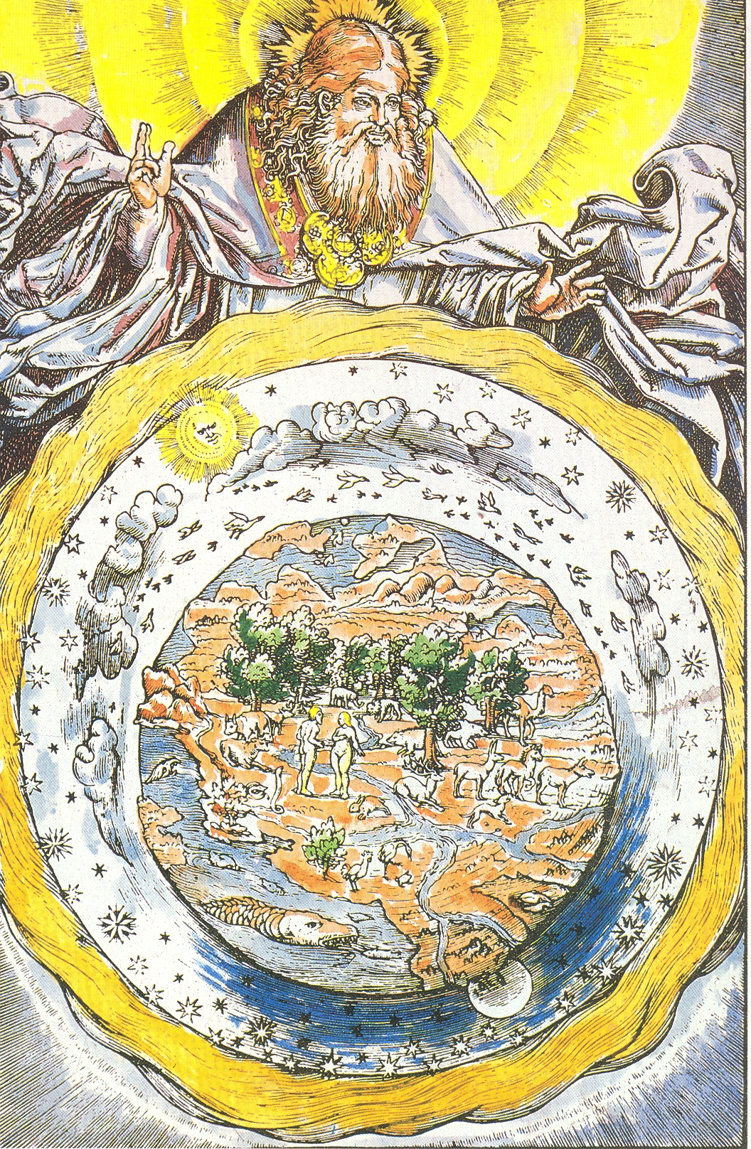
    impossibility.  (See my post On the Discovery of Nothing.)+ earth perfect

    The
    woodcut illustrated here—a depiction of a robbed and medaled God lording over
    his creation—is interesting in its depiction of what seems to be a not-perfect
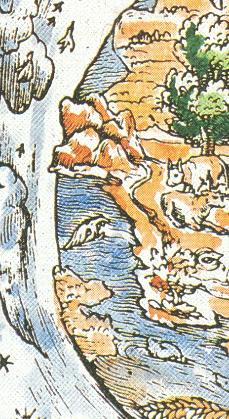
    sphere of the Earth. The planet is definitely not smooth around its perimeter,
    and the inclusion of three-dimensional mountain rendering accentuates this
    depiction, which to me seems all very novel. 
    The source for this image is given as a “Martin Luther Bible of 1543”,
    but that is wrong, unfortunately, which makes it less of a story. 
    If this woodcut was really done in 1543 it would’ve occurred in the same
    year as two monumental publications: 
    Nicolas Copernicus’
    De revolutionibus orbium coelestium and Andreas Vesalius’
    De humani corporis fabrica (On
    the Fabric of the Human Body)
    ,
    marking what is the birth of modern science.  (The print appeared in Luther’s translation of the Bible in 1534.)

    + earth perfect det

    But offhand I don’t see Luther’s “Bible” for this year, and in general 1543 is not a good year in general for Luther
    so far as I’m concerned.  He busily
    published
    Von den Juden
    und ihren Lügen
    (On the Jews and Their Lies ) and  Vom Schem Hamphoras und vom Geschlecht
    Christi
    (On the Holy Name and the Lineage of Christ), both of which
    were horrible anti-Semitic attacks, and worse. 
    For example, from the first work, he wrote that the Jews were a “base,
    whoring people, that is, no people of God, and their boast of lineage,
    circumcision, and law must be accounted as filth.”, and
    in the second wrote that it was not an immoral act for not killing Jews.  This really has nothing to do with the point
    of this post, but I just couldn’t let the reference to 1543 slide by without
    mentioning this very ugly tragedy of Luther’s  theology. 


  • A Rare Map of the Soviet Gulags, 1936.

    JF Ptak Science Books LLC  Post 797  Blog Bookstore

    Adolf Ehrt (1902-1973) was a twice-born Nazi who in 1935 let
    his 3-year membership in the party lapse so that he could do better work for
    Hitler from the “outside”.  In short, and
    to skirt some very interesting detail (over which I really don’t have much
    expertise), Ehrt felt that there was too much influence from the Church and government
    sources to fuel his unrequited need for purity in the party. 

    Ehrt wrote this anti-Communist propaganda (Der Weltbolschewismus ein internationales
    Gemeinschaftswerk über die bolschewistische Wühlarbeit und die Umsturtzversuche
    der Komitern in allen Ländern
    ) from an imaginary perch in something called
    the Anti-Kominetern, but was really nothing more than an arm of the Nazi party.  Appearing in Leipzig
    in 1936, this book savaged communism, communists and the Soviet
    Union
    to no end.  I own it
    because it is an interesting document and speaks to its period, and also has
    hundreds of unusual photos, giving it a documentary appeal.  What I noticed just recently though was a map
    on part of page 481 in the weirdly skimpy section on the Soviet Union—a reproduction
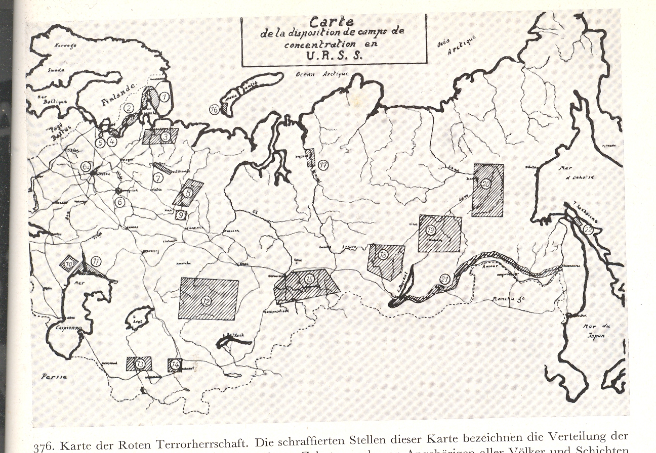
    of a French map showing the distribution of concentration camps in the USSR.  I cannot remember seeing such a map in
    English during this time period. 

    + USSR concentration 002


    + USSR concentration 001 

    (Clickable/expandable image)

    + USSR concentration b

    Ehrt was a Nazi painting with broad historical/Nazi strokes
    across a Communist canvas, and did get a lot of stuff right in his attacks; but
    considering the source his book is useless except for its pictures.   The USSR was a wicked place to be at this time; the
    bestial Joseph Stalin busy killing hundreds of thousands, imprisoning more—but
    this was in general not the story reaching folks in the United States.
    That this French map (source not given) showed two dozen or so concentration
    camps (Gulags, work camps) is remarkable; and of course it is just the tip of
    the Gulag system iceberg.  It was at
    least a start. It was also just the beginning of a particularly nasty period
    for the Russian people, who staggered under the weight of an edict called Article
    581 that sent millions of people to their doom. 
    This map was also published just before the Great Terror2, a
    spectacularly bad war of internal doom that tore millions from their homes and
    hundreds of thousands  from the
    earth. 

    The map, rare as it is in appearance and sentiment,
    seriously underestimated the extent of the barbaric Soviet existence of the
    time. 

    1. “One can find more epithets in praise of this
    article than Turgenev once
    assembled to praise the Russian language,
    or Nekrasov to
    praise Mother Russia: great, powerful, abundant, highly ramified, multiform,
    wide sweeping 58, which summed up the world not so much through the exact terms
    of its sections as in their extended diacritical interpretation.  Who among us has not experienced its
    all-encompassing embrace? In all Truth, there is no step, thought, action, or
    lack of action under the heavens which could not be punished by the heavy hand
    of Article 58” Aleksandr Solzhenitsyn,
    The Gulag Archipelago    See “Article 58″  http://en.wikipedia.org/wiki/Article_58

    2. NKVD Order no. 00447, 1937, directed against
    “ex-kulaks”
    and other “anti-Soviet elements” (such as former officials of the Tsarist regime,
    former members of political parties other than the communist party, etc.)  See http://en.wikipedia.org/wiki/Great_Purge  Generally, any unfriendly could be uprooted and shot or sent off to Siberia. .  The operative made it easy for local justice
    units to identify trouble makers and shoot them.


  • Propaganda in Maps: the Polish “Corridor”, 1939

    JF Ptak Science Books LLC  Post 739  Blog Bookstore
    +++korridor 2
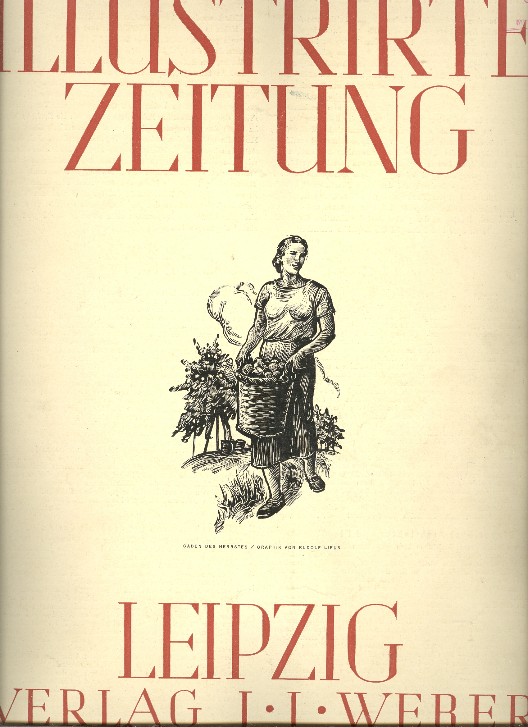
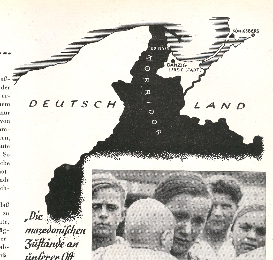
    There’s a war on?  Really?  You wouldn’t know it from the cover page of the most popular magazine in Germany, the (Leipzig) Illustrirte Zeitung, published 7 September 1939. The odd thing is that for months, years, previously there was a huge and occasionally overwhelming militaria scent to this magazine (a sort of LIFE magazine-like affair in its way), paving the way for the reading population (which I’m sure must’ve been in the millions) for the stuff to come.  I’ve looked at every issue of this magazine from 1933 to 1939, and there is simply no mistaking the under- and over-current of the war preparation.  It was just relentless.  And so to finally come to the real fighting part of the beginning of the war it is a little odd to see the cover of the mag decorated with Mother Earth in the herb garden.  The contents of the issue is not what I expected either–not much dedicated to fighting outside of happy and relieved Gdanskers saluting their warm welcome to the advancing Nazi machine, images of the “mongrels” who were living in the places that had once been occupied by Germans, and an “apology” of sorts as to why all of this was necessary.All of which was bluster and diatribe–its hard to imagine, really, how someone living in Leipzig reading this thing over breakfast could’ve nodded their head in logical consent with the magazine’s specious arguments.

    Which brings us to the small inset map depicting what was one of the major “problems” for  Germany with Poland–the northern stretch of Polish land that touched the Baltic, the so-called Polish “Corridor“.  This polemical affair shows exactly what the Germans thought of the territory, a piece of Germany now in enemy hands, a dagger struck through the heart of Prussia.  

    +++korridor Poland of course didn’t think of the land in terms of a “corridor”, and as a matter of fact the term was an offensive one.  It was simply a part of Poland, one which was returned to the Poles with the rest of the country (which had been disappeared, absorbed, with the Treaty of Vienna in 1815) in 1920.  It was essential with repatriation that this land be included, giving Poland a natural access to the Baltic, and an ability to follows it major river (the Vistula) all the way to the sea.  Without access to the Baltic, Poland’s economy would have been strangled, the country simply wouldn’t have had a good stake to survival.  It was a return of land that had been connected to the Polish Crown from 1466-1772.

    The ethnicity issues are long and deep, and something I can’t get into right here. But Germany certainly made the claim that there were huge German populations in the corridor who needed to be rescued, and who suffered under the control of the inferior Polish people. But as I said, this is a complex issue–the population in the area was probably around 45% in 1920, and this before the huge repatriation efforts to bring those German people home.  There may have been so many Germans in that area because of a massive Germanization of the area in the 19th century…and on and on.

    The Polish government did sign a Non-Aggression Pact with Germany in 1934, after which everything got on the slow boat to hell.  In the months before the Germans attacked, through the summer, there was much frenzied back-and-forth, an awful lot of negotiations that were so much meaningless talk as a mask for the inevitable.  Whatever was agreed upon and signed, Germany was going to attack, anyway, come what may.  And so they did.

    [I should point out in closing that, just a few days ago, the Airminded.org site reminded us all of H.G. Wells’ 1933 The Shape of Things to Come, and his prediction on the start (or re-start) of the next great war, right there at the Polish “corridor”, and right soon.] 


  • Unusual-Classic Design: Carto-graph of Aachen, Germany, 1932

    JF Ptak Science Books LLC    Post 687    Blog Bookstore

    ==Blog July 16==aachen

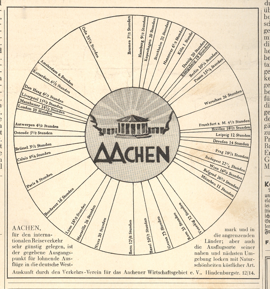
    This graphi-map isn’t so odd or unusual, and the data it presents isn’t deep or wide or complex,  but the image is still very compelling–its simplicity and design the basis for its eye-catching quality.  It takes up about a sixth of the
    next-to-the-last advertising page in the 1 April 1932 Illustrierte Zeitung (Leipzig), and it does,
    really, “pop”.  It is a very simple presentation
    establishing the centrality of Aachen,
    and that’s about it—simple.  And it
    works.  I’ve seen a number of other “all roads lead to” type of maps like this, but I’m a little stumped on locating them this moment. One of these,  a glorious world map of the port city of Wilmington, North Carolina, showing lines of transportation between it and the rest of the world, featuring the only-named-city Wilmington smack in the middle of the map Wilming-Center-of-the-World map.  (I think I can gurrantee that this is the only time WIlmington appears so on a world map.) 

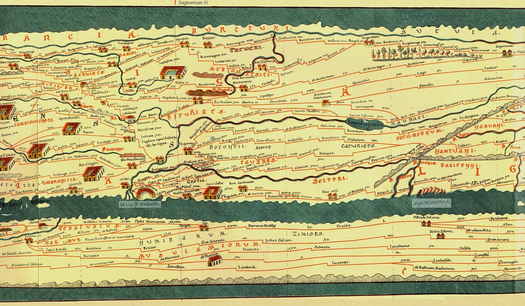
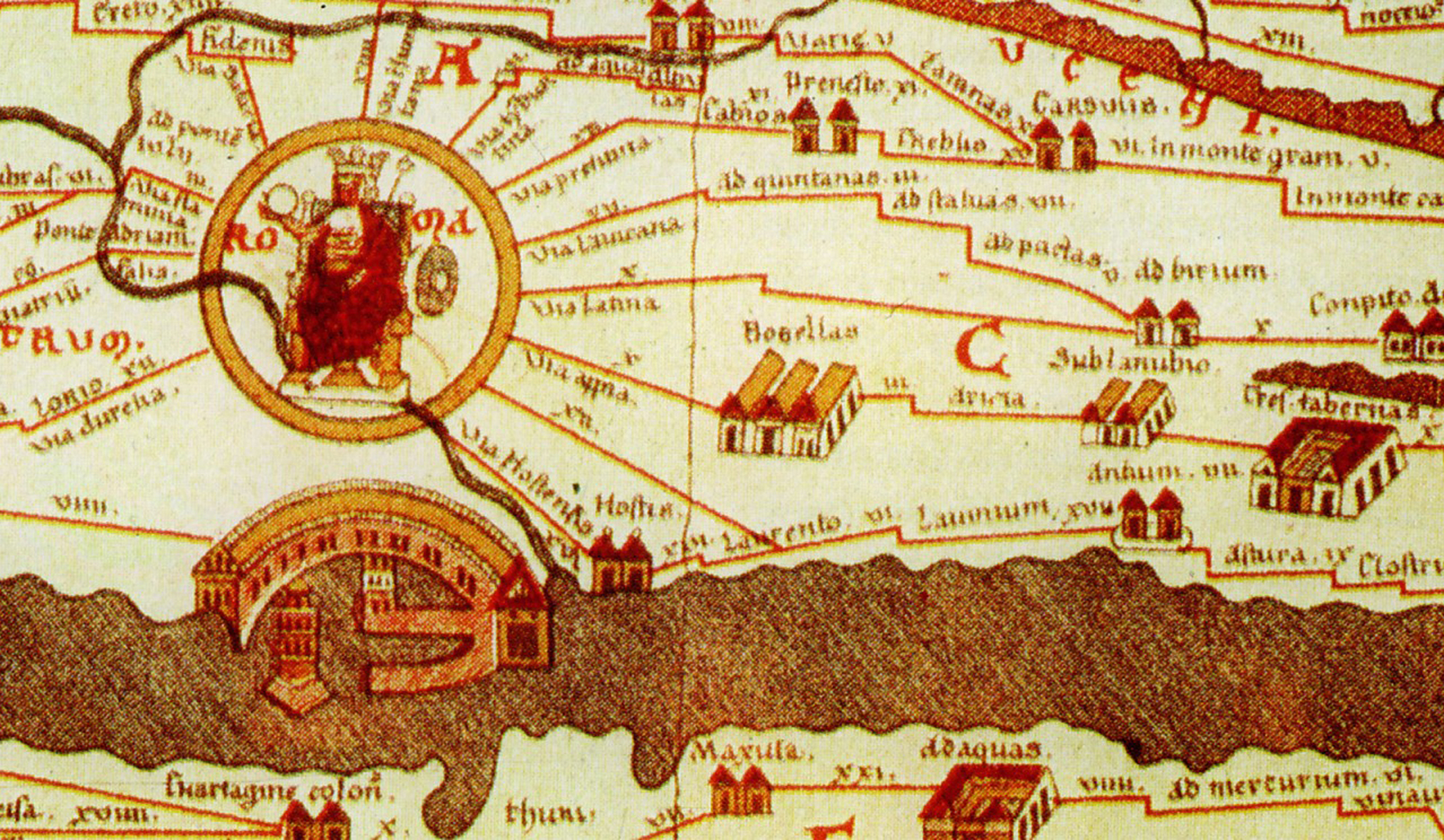
    Peutinger


    Another example–more fantastic, much older, and far more important–is the Tabula Peutingaria, a 16th century low-Renaissance copy of a third century ACE Roman map of the known world.   Now this is a map:  it was a spectacular achievement, a road map for the Roman legions to get back and forth in the shortest amount of time, an index for the Italian Autobahn.  The map covers the world from Britain and all the way east to India (which was really India, China and all the rest).  And of course, we all know where all of the roads lead to. 

    Peutinger Table Rome & Portus


  • Cutting Texas Exactly in Half: the Newspaper Frontier, 1880

    JF Ptak Science Books LLC  Post 676  Blog Bookstore

    The idea of the frontier in American history
    has been around for quite some time, made famous and mostly-invented (and
    closed) by Frederick Jackson Turner in 1893, and expanded, imagined, enticed,
    magnified, micro-analyzed, and   generally messed with ever since.  There have been all sorts of frontiers
    introduced into the study of the birth, expansion and filling-up of this
    country, from the very earliest colonial periods of Indian frontiers, “far-western”
    river frontiers of the Connecticut, Delaware, Hudson (!) and Susquehanna, to
    the Appalachian frontier of the early western reaches of the colonies, to the
    transportation frontier, the slavery frontier, the gold and mining frontier,
    the gun frontier and so on.  

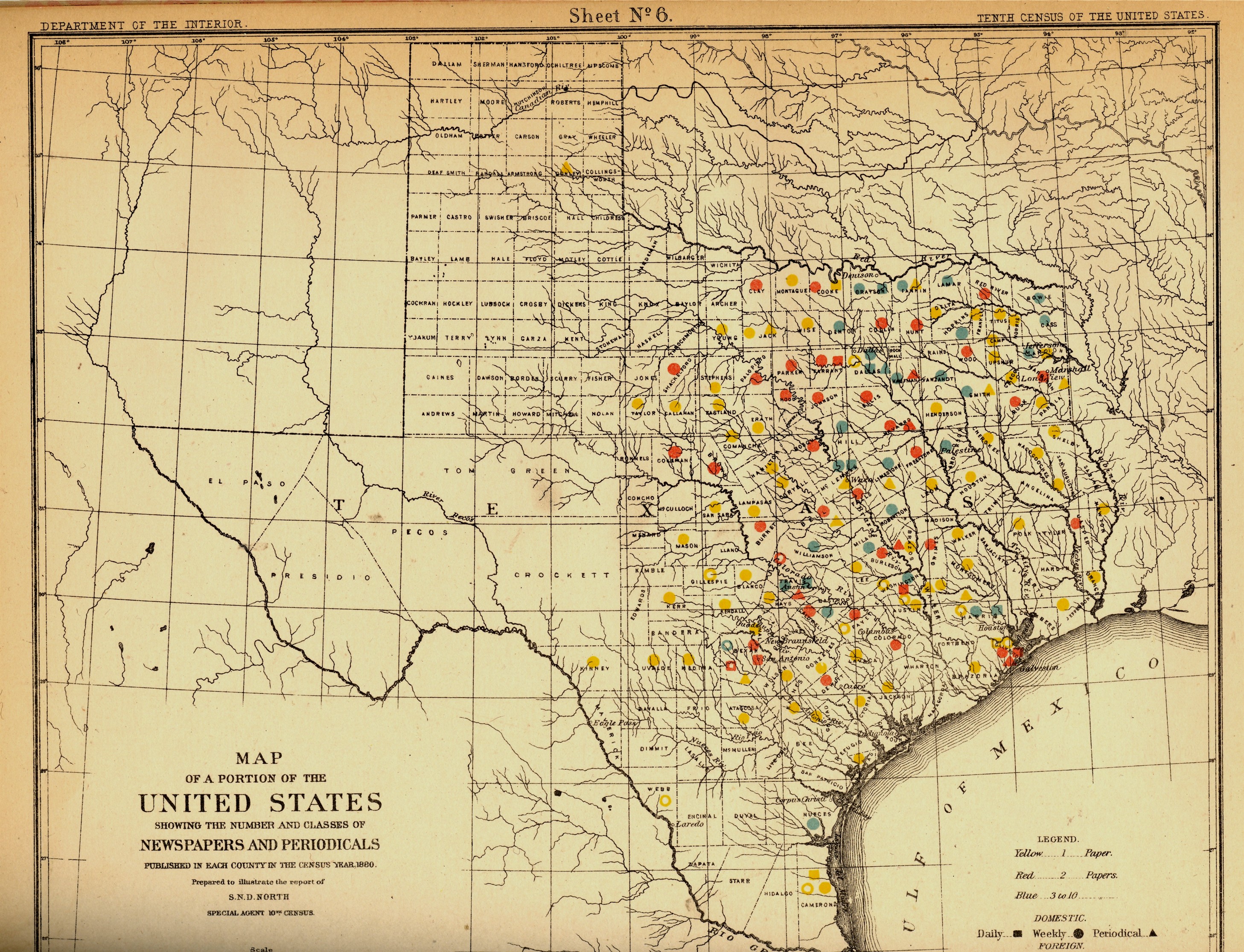
    Blog==July 6=texas

    I’ve got another bit to add:  the newspaper frontier. 

    I just happened upon a volume of the US
    Census of 1880, with a special report by S.N.D. North entitled History and Present Condition of the
    Newspaper and Periodical Press of the
    United States…and published in
    1882.  What provoked me was the map of Texas newspapers for
    1880.  It very clearly, and like no other
    map of its kind, delineates a fantastic line/frontier between the
    Texas with newspapers and the Texas without newspapers. We see very
    clearly that the frontier of the newspaper stops fairly abruptly and
    wonderfully at the 100th meridian, with only two newspapers in all of
    the rest of Texas found beyond that point (and those just barely beyond the 100th.  And it’s the 100th meridian that
    mostly marks the vertical middle of the country, running through North and South
    Dakota, Kansas, Nebraska, the Texas/Oklahoma borders, and so into Texas—if you
    folded this map vertically in half it folds virtually on the 100th meridian.  An odd bit, it is, half of the country and
    then half of
    Texas. 

    Of course the population and easier-natural-resources
    are located east of this point, I know, but it is still quite a jolt to see the
    line of newspapers get drawn in the sand so vividly.  There isn’t anything else quite like this so
    far as the newspapers go, except, a little, for Florida, where the line gets
    drawn north and south, splitting the peninsula roughly in half, the southern
    part holding only five counties at this point.. 
    But it is a much more robust image for Texas given the number of
    newspapers that were being published—280 periodicals and newspapers for Texas
    versus 45 for Florida, with 11,374 in the entire country*—so that the
    difference between the have-newspapers and haven’t-newspapers in Texas is that
    much more vivid. 

    Texas needed more papers:  there were 1.5 million people living in the
    massive state in 1880, almost twice as many as there were in 1870, and almost
    half of what there would be there in 1900. 

    Florida was another story, entirely—even in 1880, which is only 130 years ago, there
    were only 270,000 people living in the entire state, not even close to half of
    the county population of Pinelas today.

    I’m just enjoying the surprise of the
    straight-edge frontier in Texas. 


    *Just for the sake of comparison, the number
    of periodicals per state for 1880 was as follows:
    Illinois,
    1017;
    New York, 1411; Pennsylvania,
    973;
    Ohio,  774; New
    Jersey
    215. 
    Also, oddly, the average circulation of the
    Florida and Texas papers was roughly the same: 1,282
    for
    Texas and 1306 for Florida (with an average for the country at
    4137). 


  • Sacred Mountains Series: Tai Shan, China.

    JF Ptak Science Books LLC  Post 659

    The Chou dynasty Shu-ching (“the History Classic”, “the Book of History”, “the
    Book of Documents”) is one of the world’s oldest historical documents, relating
    vernacular, religious and legendary drama of China.  According to this sixth century BCE history,
    the the legendary Chinese third milenium BCE ruler, Shun (2255-2206 BCE),
    would pilgrimage* every five years to the points marking the extent of is
    realm, stopping and extolling virtue and leaving gifts at the peaks of five
    mountains at these five points.  The one mountain
    of these five that was named was Tai Shan, which remains the principal of what
    is called “the five sacred mountains**”, and which is still after thousands of
    years a point of veneration and pilgrimage. 

    Blog--june 22--tai shan 001

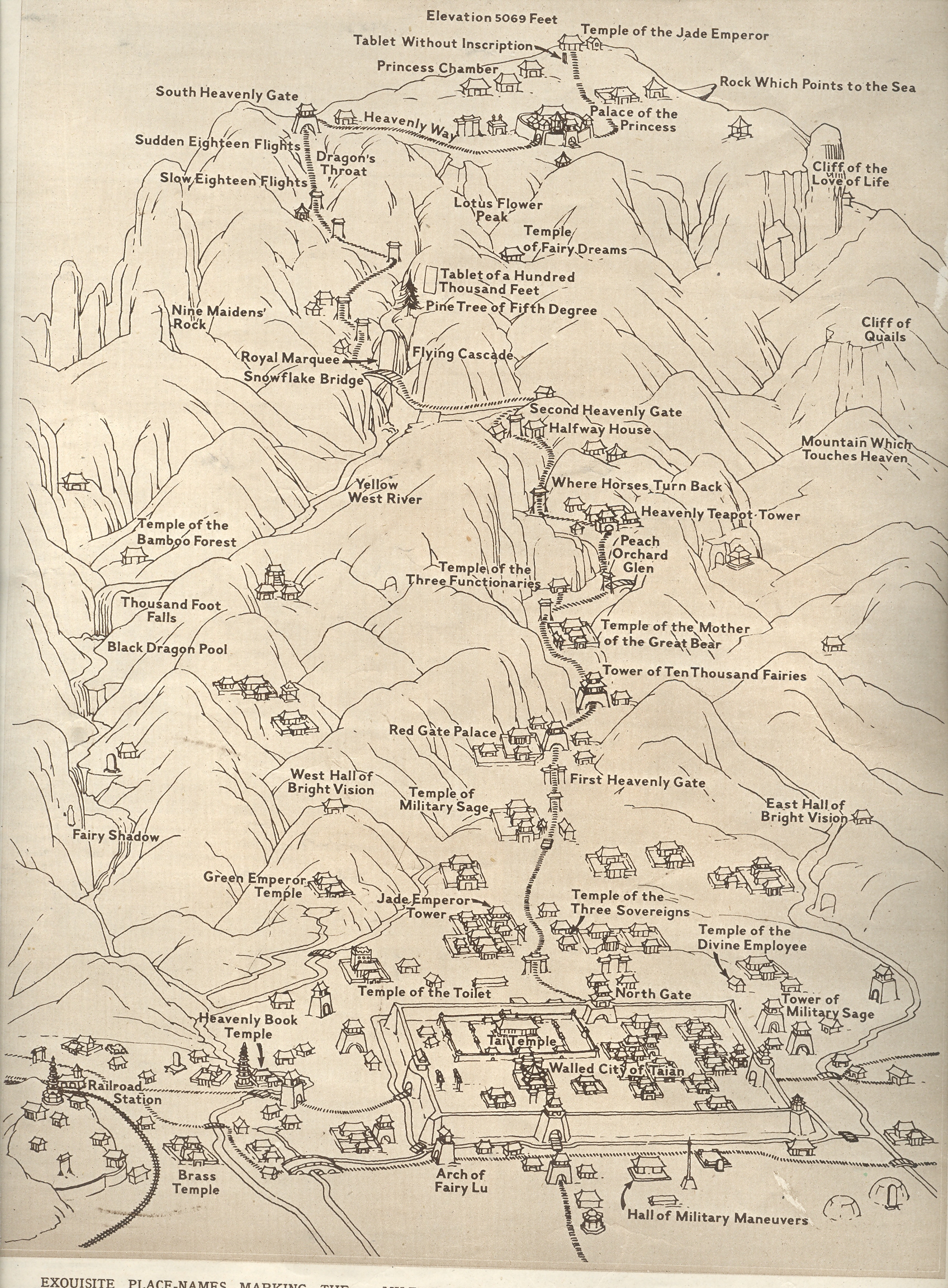
    The map of the pilgrim’s paths in this mountain was published in The
    Illustrated London News
    for 20
    October 1945.  It is a nicely
    designed skeleton map of the mountain, scaled down to reveal temples and
    principal interests, and done in such as 
    way as to look a bit naïve. 

    There’s too much not-known history here for me to make much of a comment
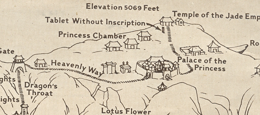
    on this map.  One item that did catch my
    interest though is found near the peak, the “tablet without Inscription”.  It is evidently a massive monolith put in
    place around 110 AC.  It has but one work
    incised in it:  the ideogram for “Lord”.

    Blog--june 22--tai shan 002

    *pilgrimage – ch’ ao-shan chin-hsiang – means ‘paying one’s respect
    to a mountain’

    **The  five sacred mountains include:

    • Tai Shan, Taoist mountain of the east, Shandong province, 1545 meters.

    • Heng Shan Bei, Taoist mountain of the north, Shanxi province, 2017 meters.

    • Hua Shan, Taoist mountain of the west, Shanxi province, 1997 meters.

    • Heng Shan Nan, Taoist mountain of the south, Hunan province, 1290 meters.

    • Song Shan, Taoist mountain of the center, Henan province, 1494 meters.

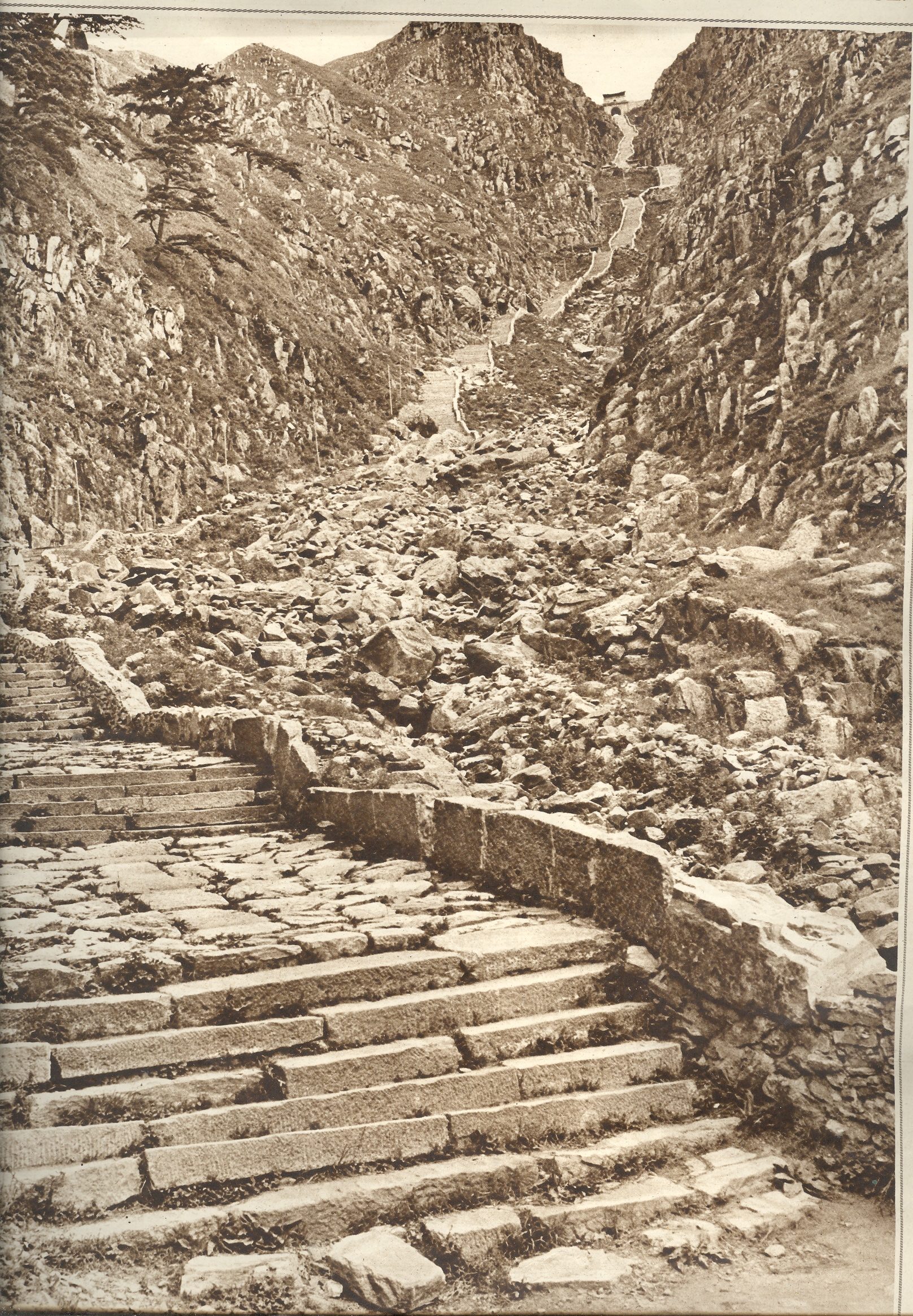
    Blog--june 22--tai shan 3
    This interesting image was made by none other than Gilbert Grosvenor (1945), the chair of the National Geographic.  These stairs–1000 of them–lead to the South Heavenly Gate near the summit.  At the time, these were still one of the world’s longest stairways.