A Daily History of Holes, Dots, Lines, Science, History, Math, Physics, Art, the Unintentional Absurd, Architecture, Maps, Data Visualization, Blank and Missing Things, and so on. |1.6 million words, 7500 images, 4.9 million hits| Press & appearances in The Times, Le Figaro, Mensa, The Economist, The Guardian, Discovery News, Slate, Le Monde, Sci American Blogs, Le Pont, and many other places… 5000+ total posts since 2008.

Category: Absurdist, Unintentional

  • History of Blank and Missing Things: Who is Albert Einstein?

    JF Ptak Science Books   Post 1137
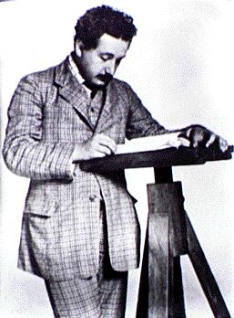
    Einstein patent [Part of the History of Blank, Empty and Missing Things series.]

    There was a time when this was a real question, even though the subject of that question was in the process of changing physics. One of the most enigmatic strings of 12 words and numerals in the history of science, “Bern, June, 1905″ appeared at the end of Albert Einstein’s special relativity paper, setting the question in motion..

    This difficult publication–one of the most revolutionary in the history of physics–was written by a mystery man.  Its author was basically unknown–when readers tried to find Einstein, they went to the universities in Bern, naturally, but of course didn’t find him there.  No one would have guessed that he was a patent office grunt, one window at work to call his own.  There were no clues in the paper about the other, not really–not even a footnote.  An invisible man was changing the face of physics. 

    1905 was, well, “busy” for Einstein.  Perhaps no one person has ever had a year like this, in any discipline. His four papers delivered during this time was nothing short of miraculous.  To start,  Einstein turned 26 on 14 March, and sent his magnificent  photoelectricity paper1 to the Annalen der Physik  three days later.  At the end of April, Einstein sent in his doctoral dissertation to the University of Zurich2 (the paper accepted and approved in July  and degree formally awarded on 15 January 1906). A few weeks later (a) his son Hans Albert celebrated his first birthday and (b)he got his big idea on the special theory.  Also in this same extraordinary month of May he sent the Annalen his Brownian Motion paper3, and then, a little more than a month later, Einstein sent his SRT 4 paper in to the same Annalen, and saw it published 26 September.

    As Einstein’s great paper awaited publication he returned from a short vacation with his family and sent in his (a)  dissertation (on 19 August, and which is published in February 1906) and (b) his mass-energy equivalence paper5 (E=mc2). I can think of no other time for any other scientist in the history of the sciences who had so much fabulous stuff up in the air at the same time. Impossible, really.  And then, after most of the papers are published and appeared in the orange-wrappered physical journal Annalen der Physik, Einstein got a part-time job tutoring a student.

    At the end of 1905 Einstein was becoming less Blank, but considering the power of his publications, I can’t think of anyone of equal power who was unequally unknown. 
       
    Notes   

    1. “On a Heuristic Point of View concerning the Production and Transformation of Light.” published June 9.
    2. “A New Determination of Molecular Dimensions.” (Published in 1906.)
    3. “On the Movement of Small Particles Suspended in Stationary Liquids Required by the Molecular-Kinetic Theory of Heat.” published July 18.
    4. “On the Electrodynamics of Moving Bodies.” Received June 30, published 26 September.
    5. “Does the Inertia of a Body Depend upon Its Energy Content?”
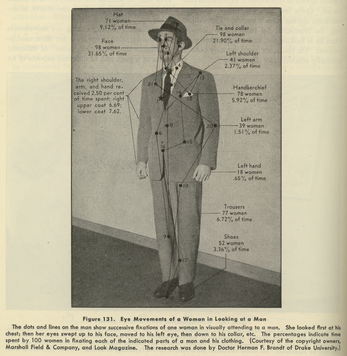

  • Center of Attention–a Map of Women’s Visual Exploration of Men (1941)

    JF Ptak Science Books Post 1136

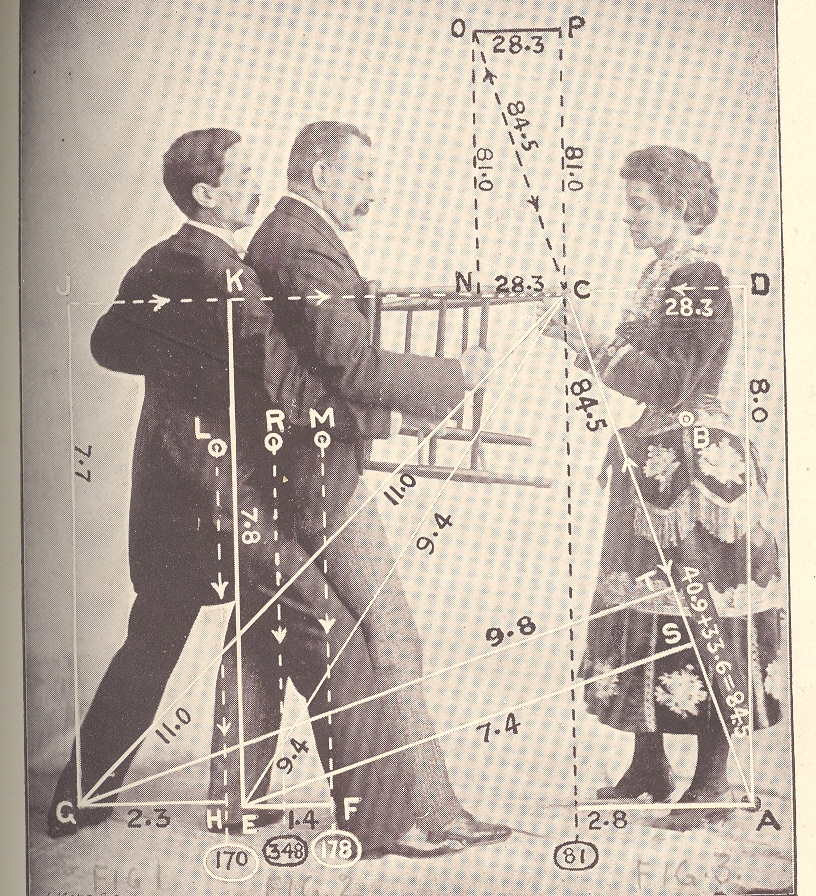
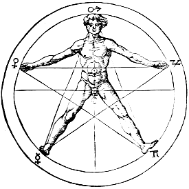
    The eye leads the brain, or the brain leads the eye, and from there, who knows where anything goes, especially when involved with a qualitative survey of a complex entity. This is more-or-less what we are dealing with here, in this image below, found on page 74 of a 1941 issue of Life magazine. (It is related in some way to an earlier post on this blog, a post called “The Center of Levity..”1 , though perhaps not really.)  It is hardly a map of the macrocosmos incised with Pythagorean precision on the body of man2, nor an astrological  or Kabalistic or Vitruvian perspective representation of humanity.  It is just a 1940’s  eye-trail map of where women looked at a man, a non-mathematical treatment of vague interest.

    Eye fixations

    It turns out that the seduction of a man’s body to a woman’s gaze–as difficult as that might seem from this photo–is fairly measurable, and was so even in the 1940’s, when the researcher Herman F. Brandt (Drake University, Iowa) produced this image.  And what it is, basically, is a map of where women looked when their eyes were tracked as they looked at this man.  Brandt had a long career investigating ocular fixation, and (I think) developed a camera that would track the reflection of beams of light on the corneas of his subjects, recording eye movement in horizontal and vertical planes, as they drank in this fine figure of manhood.  In any event his research was of interest to a wide variety of people, from neurologists to fashion designers–I’ve got no idea of how that interest was manifested, or if it turned out to be valuable information.  I do know that the Brandt work utilized by Marshall Field & Co. did produce a remarkable photograph open to all sorts of interpretation.   Visual stimulus point #19 was left uninterpreted and unmentioned, though the great majority of visual hits was above the waist, and above the neck.

    Notes:

    1. One of the images from the Center of Levity post:

    Mar 23 center of levity cvr det 2

    2. For example, this classic from Agrippa von Nettesheim, De Occulta Philosophia (1533):

    Agrippa


  • Christmas Gift Porn: Reagan, Santa, Cigarettes and (Lots) of Booze. Giving Ideas, 1954

    JF Ptak Science Books  Post 1135

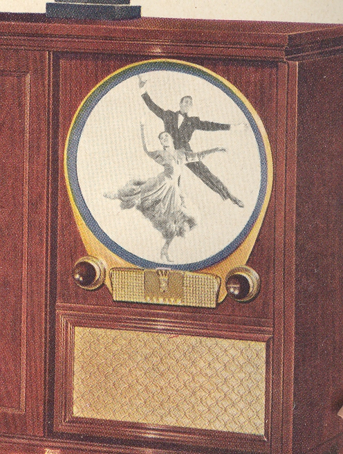
    Tv 1954 Some time ago I wrote a post here on the images displayed in tvs in television ads from the 1950’s as small windows into societal attractions and expectations.  My thinking was that the exploding television industry would try to lure buyers with the seductive promises of these pictures, that seeing them displayed would entice  people to buy the televisions so that they could see them at home.  Or perhaps not–perhaps they were only placeholders so that the screen wouldn’t be dark and blank, though I feel otherwise.  The selection of these images tells us a tiny bit of something about the working person’s dreams–I admit it’s a slippery slope and not a blunt diagnostic tool, but it is interesting.

    So too with Christmas advertising.  Looking for something else in a volume of LIFE magazine for 1954 (an article on workers using irradiated paint to apply highlights to glow-in-the-dark wristwatches) I was struck by the goods being advertised for Christmas gift-giving. Pro-phyl-Ac-Tic Brush Company was selling brushes, and Santa was pushing Playtex pillows and Hoover vacuums and irons and MEAT and waffle makers.         Christmas lited cig b370

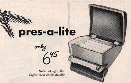
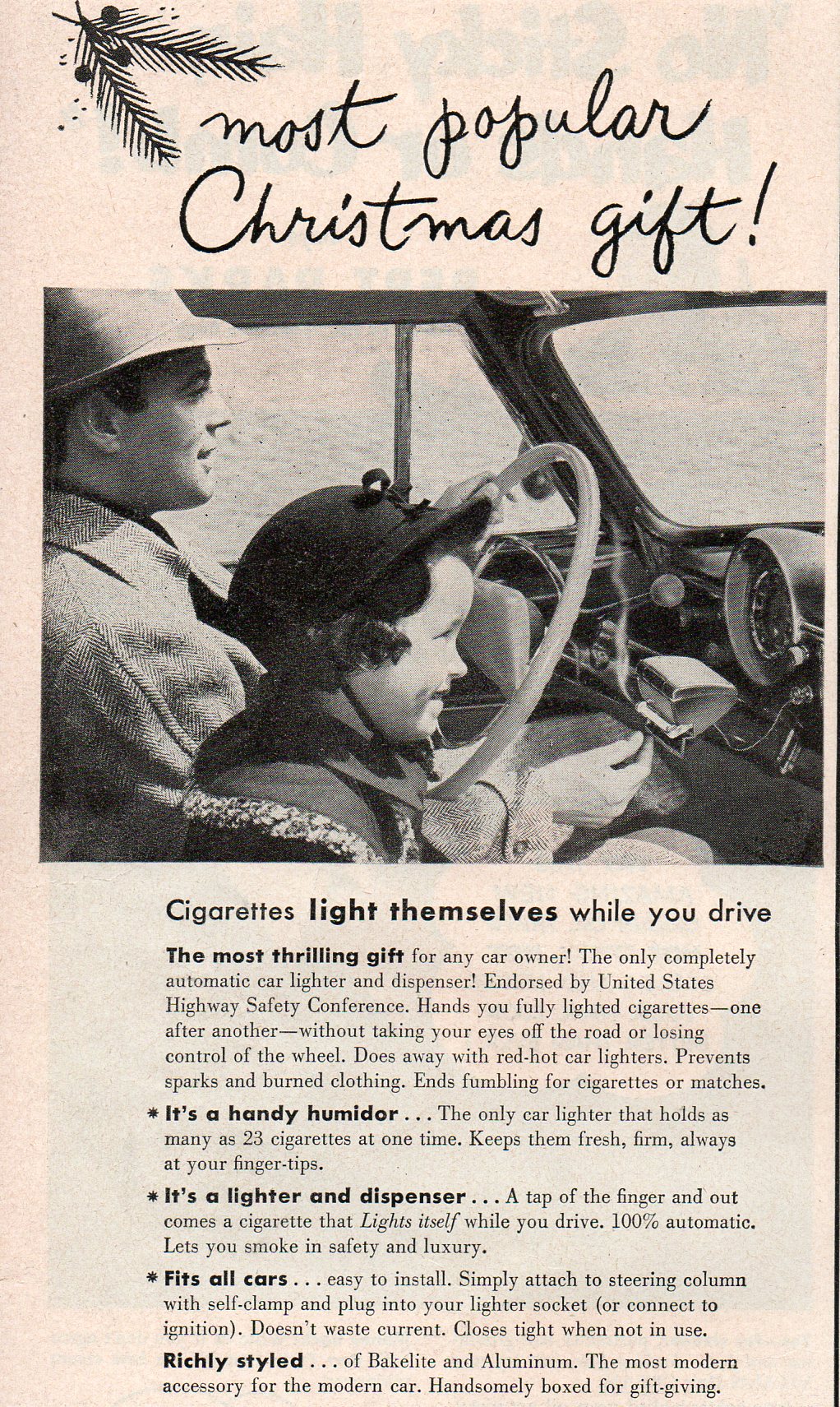
    And then there was the automatic lit-cigarette dispenser for the automobile.  Push a button–out rolls a burning ciggie.  The heated air and the rolled-up windows must’ve made for an extra-pleasurable experience for the girl sitting next to daddy.
     

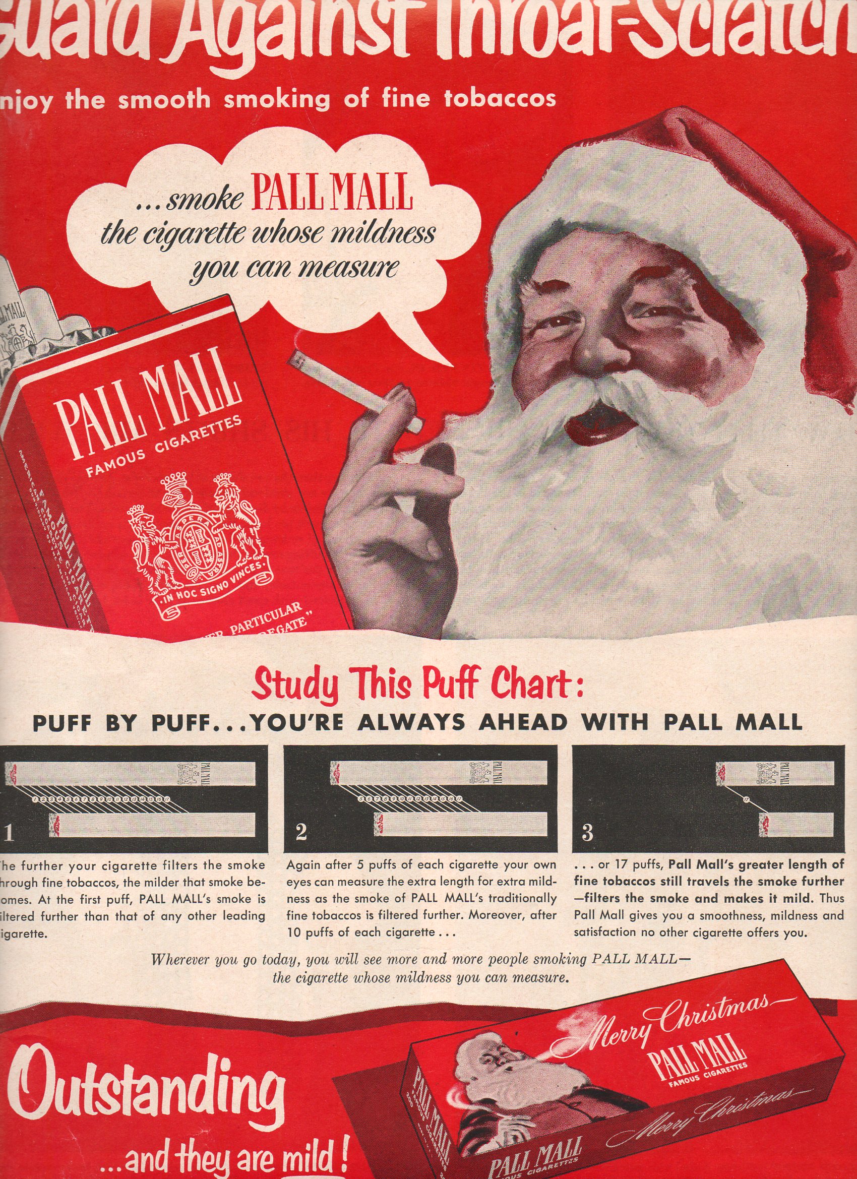
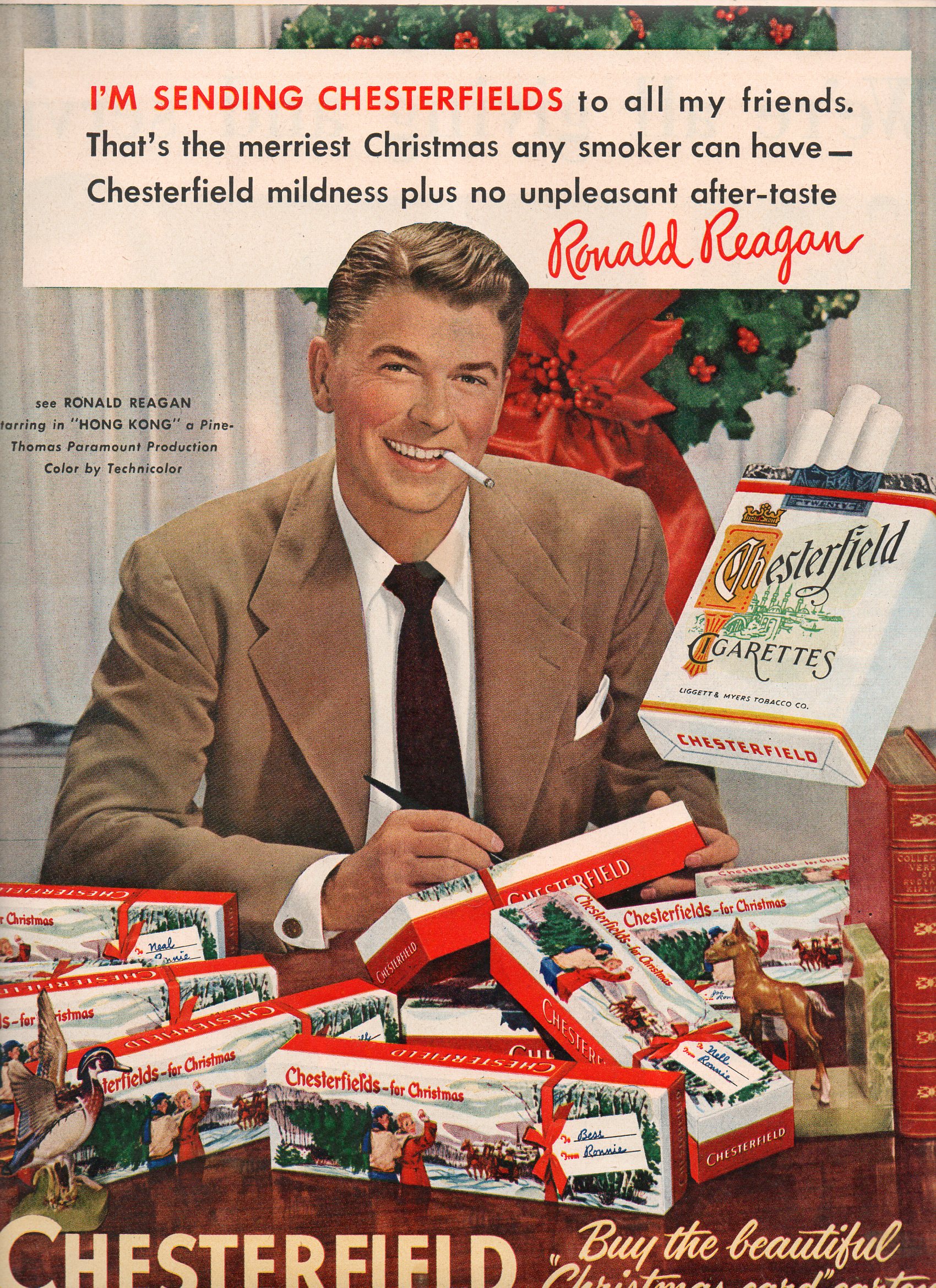
    Christmas Santa ciggies367 But it was the pictures of Santa selling cigarettes as Christmas gifts that got me–again (this story on the worst Christmas advertisements appeared earlier in this blog).  There were bunches of Santas selling smokes, including one de-bearded impostor selling Fatima cigarettes.  There were bunches of other folks, too, trading in on the smoking bit–they were excitedly opening wrapped/ribboned gifts of boxes of smokes, or hanging packs on the tree, or kissers kissing with boxes of newly-gifted smokes in their hands behind their lover’s neck.  And of course there was Ronald Reagan, who 26 years later would sell his flat forehead and broad grin to the American people as presidential lumber. (He seems to be writing on the carton in this picture.)

    Christmas RR366  

    And we’re not just talking Camels here.  In four issues of LIFE prior to Christmas 1954, the following cigarettes were advertised in full-page placements, looming suggestions for expressions of a “smokey” (which would later read “coughy/spitting/deady” for many of the buyers and receivers) love: Old Gold, Lucky Strikes, Fatima, Camel, Pall Mall and Chesterfields; also included were Robert Burns and White Owl cigars, plus Keywood pipes.  More often than not, each one of these products was featured in each of these four issues of LIFE. 
    Booze was featured very prominently as well, more so, really, than the cigs.  The ads included: Schlitz, Seagrams, Arrow Brady, Fleischman’s Gin, Haig and Haig, Old Forester, Paul Jones Whiskey, Sunny Brook Whiskey, Heublein Whisky, Seagrams Whiskey, Gilbey, Calvert, Medly, Black and White, Old Grand Dad, Pabst, Schenley, Four Roses, and Coronet.    

    LIFE was running about 175 pages per weekly issue at the time, so the full page ads for cigarettes and alcohol were actually eating up a bit of total display space per issue.

    What about the “regular” stuff?  There were surprisingly few toys, and so far as I can tell only two big ads for Schwinn bicycles. The 3/4-page/full page ads featured Whtiman Chocolates, toasters, light bulbs, cologne, televisions, Samsonite luggage, NUCOR oleomargarine, fountain pens, Zipo lighters, razors, meat, Van Heusen shirt, socks, lingerie, Green Giant peas, Coke, A & P coffee, refrigerators, pillows, Kodak cameras, cedar chests, washing machines, irons (“to show her you love her”), waffle irons, Hoover vacuums (“to show her you care”), and a couple of ads for Plymouths and Fords.

    So. Pretty utilitarian stuff, overall: buy mother chocolate, margarine, a lady razor, green peas, meat, coffee, pillows, lingerie, washing machine, and an iron; maybe a refrigerator if you had the extra cash, and an assortment of oils and perfumes for later on, when she was not working.  Dad gets cologne, a tv, fountain pens, a shirt, a tie, a high-beam spotlight for the Ford, simonize, some socks, and maybe a car for the family.  There was a two-page, double-page spread for kids’ toys, all o fit wrapped up in to display, showing 40 or so things from Santa, but in general the images for goods for children was very slim. Maybe everyone just knew to go to the toy store, or Macy’s toy department, or Gimbel’s, or Wanamaker’s. But at least for this year, in this magazine, the ads for children were very slim.

    Christmas Sunny Brook368What does all of this say?  Was there little money for working class fancies for Christmas in 1954?   I guess this all depends upon what you compare it to–slated against ads from the 1902’s, the selection looks pretty good; against the turn-of-the-century, better yet.  I’m not sure how early “Christmas advertising” gets,. But I have a feeling that it doesn’t precede Thomas Nast’s Santa by very much at all–seems to me that by 1954, real advertising for Christmas was only a couple of decades old; overall, it seems that advertising Christmas purchases is a definite 20th century invention.
    Christmas lited cig369
    That said, all of this looks like a nearly-null set compared to now, when seemingly everything and anything can be purchased at any time, especially around the Holiday season.  I wonder how this sort of consumerism can be maintained?  There’s always a fallout in super-saturated solutions, and it seems that we must be near that point.  Then again, the folks in 1954 might’ve been saying the same exact thing. 


    ·Posted by :

    ·in:

    —

  • Creating Bad-Hand Female Trouble, 1954–an Imaginary Reconstructed Filmstrip

    JF Ptak Science Books

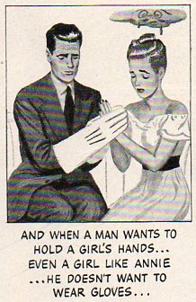
    Girl trouble 7360 Retroist excursions like this into the land of social propriety from not so long ago is a bittersweet thing–its concerns can remind of of how far away from something we seem to be, when in reality that distance in time and space just isn’t very far away at all; it is just slightly different,  renamed and repackaged.  For example, this advertisement from LIFE magazine for Trushay hand softener (1954) delivers pretty much the same message as most similar products today, except for the change in packaging and less obvious message.  The message may seem outdated but I think only in so far as the images and clumsiness of the delivery is concerned.  Products like this have increased by orders of magnitude, the target audiences age seems to have dropped considerably, and most of the time the pursuit of this 1954 end-result stays pretty much the  same. Exercises like this are peculiar, and can show us that the people who we are laughing at may very well be us. 

    The reconstructed ad is below.


  • Images from Our History of Women Series

    JF Ptak Science Books 

    I was looking for some of these images from this blog’s History of Women series and thought that I’d post them all to one page. Seeing them out of context is odd, but interesting.   Enjoy!


    File0505

    .
    000 women on a leash012
                                                   

    1 april 26 women king+queen 00--shooting strip tease042


  • Zippers, Part Two: a Big Lesson from the Humble Zipper

    JF Ptak Science Books   Post 1154

    Blogaugust_28zipper469_2

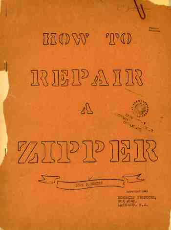
    Earlier in this blog I made a post about the Ulysses of zipper repair.  How to Repair a Zipper was one of those great, unknown classics of American technolit that stands the test of time, a great manual on how to approach n-problems with a faulty zipper–if only there were zippers worth repairing.  There are different grades of zippers, just as there are different grades of any other fastening device or automobile or wine.  Of course the zipper seems a ridiculous subject unless the lives of people–say the lives of soldiers–are dependent on their zippers working when the going got tough, 
    when soldiers’ jackets really needed to stay closed, tight, protecting them from the rain or cold.  Just ask the soldiers in 
    Zipper trouble465

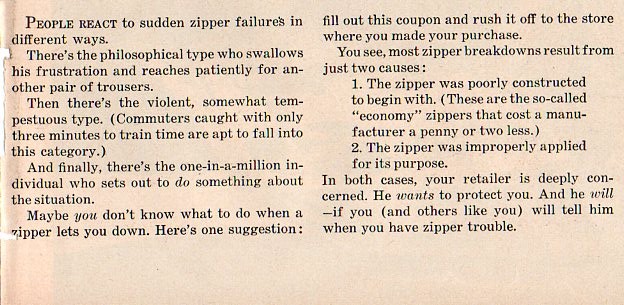
    the Napoleonic army when their coats refused to stay closed because the threads that held on their  buttons that held their jackets closed failed, leading to the death of many due to exposure and cold.  Suddenly, fasteners are a big deal.  Just try it the next time you’re out on the frigid trail–unzip your jacket and try to keep the thing closed and you warm.  Its a bad story. 

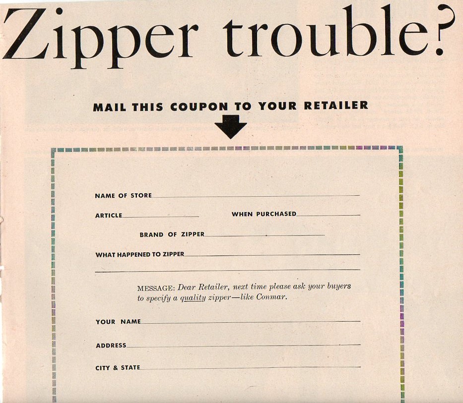
    So the initial reaction to this ad that appeared in Life magazine in 1953 is some laughter to a non-sequitor, but once you gave it a little thought, it can be appreciated just like any other piece of good craftsmanship.  In this ad, the manufacturer of Conmar Zippers (located in the once-mighty, once-leading American city of Newark, in New Jersey) plead with the reader of the full-page ad to pay attention to the zippers on their apparel.  If the zippers fail , they should use the blank form to send to their appropriate retail in complaint, and to replace the zipper with a high-quality, unconditionally guaranteed Conmar zipper, made to never fail. 

    This is attention to the small detail that would do us a world of good today. I love the idea of the Conmar Zipper.

    Zipper trouble 2466


  • Scary Color-Steampunk Photos of Food, 1933

    JF Ptak Science Books   Post 1129

    In the earliest part of the printed history of picturing scary things everything left the printer in black and white.  The colorist added the necessary tinting and fright stuff, though it seems to me that the sheets that made it through to binding in black and white were the most disturbing of them all. Most of the time and for several centuries color was left to the desire of the individual, the purchaser of the book; the green of dragons or the reds of monster men or yellows of serpents were mostly given life by the buyer.  Color printing had to wait more than three hundred years
    Medieval monster after Gutenberg’s Bible–there was some multi-color printing for grammars and the like where words and phrases were printed in multiple colors, requiring numerous passes through the press, but by and large the color printing of artwork was more a 19th century thing more than anything else.         
    My own preference is for black and white images that let the mind fill in the beasts from outside in, allowing the imagination to run with the text and the description of the beast, rather than fast-forwarding to the completed images.  It is these images, the black and whites, which have retained some element of scary or creepy over the years; the colored images don’t make it quite so well. 
                                                   
    Color does makes some unexpected contributions to scariness, and in uncommon places.  For example, this photo
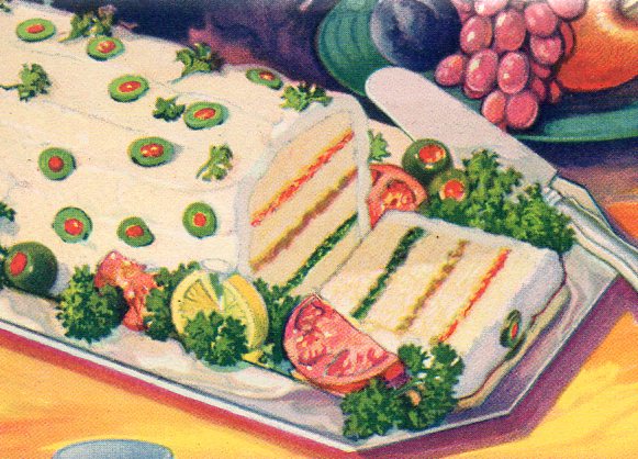
    Blog--color--mea tloaf351 from a 1933 Chicago World’s Fair pamphlet for the exhibitor Durkee Famous Foods fits the ticket perfectly.  It is an image of a sandwich loaf that is made mainly with scrapings of ham and lots of Durkee products, which were things like mayonnaise, oleomargarine, cheese squeezings, tapioca, coconut oil, salad dressings and vegetable shortening.  The color of the object only heightens the creepiness of its contents, all of which was topped by a layering of mayonnaise and cream cheese studded with olives.

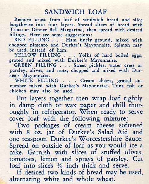
    Admittedly this color photograph comes at the earliest stages of the modern aspect of color photography, and perhaps the engineers were a little too anxious at spreading their food-color, it still just isn’t good. Here’s the recipe: 

    Blog--color--jmeatloaf rec354

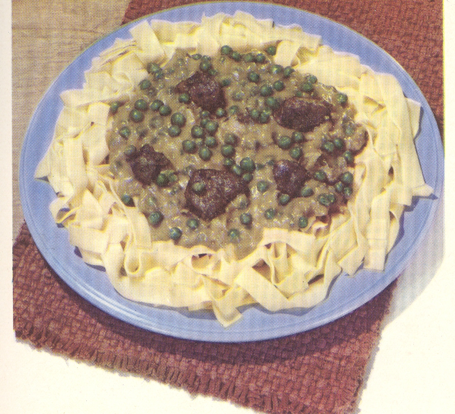
    There’s also this incredible plate (below), having some sort of internal color dialog with itself, though manifested externally–it must not be a pretty conversation.  House of La
    Rosa.  101 Ways to Prepare Macaroni seems
    about as benign and forgettable a title that one could write; that said, once
    opened, this little pamphlet poured its heart out to the Naïve Surreal in us
    all with the unforgettable (and accurate) color images of the promised linguine
    delicacies. 

    ===blog==aug 24=color--sauce green

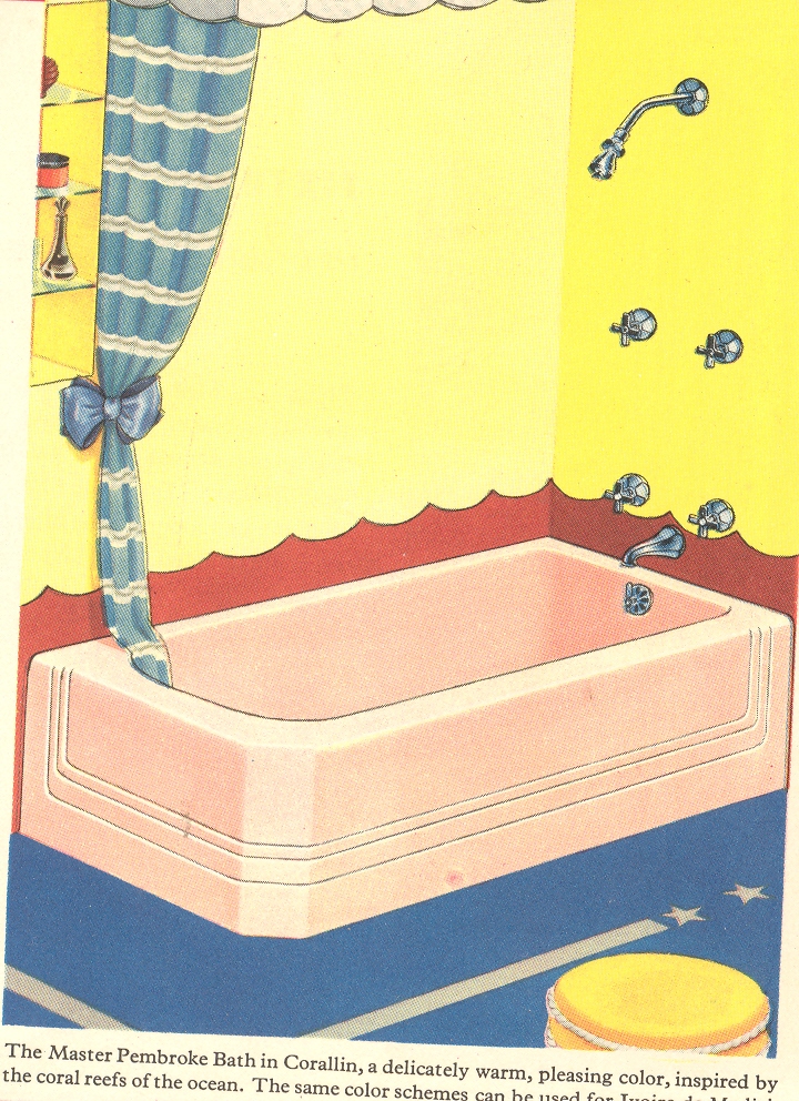
    And of course there are innumerable examples of architectural bits:

    ++00++ 9.23 bathroom3 great

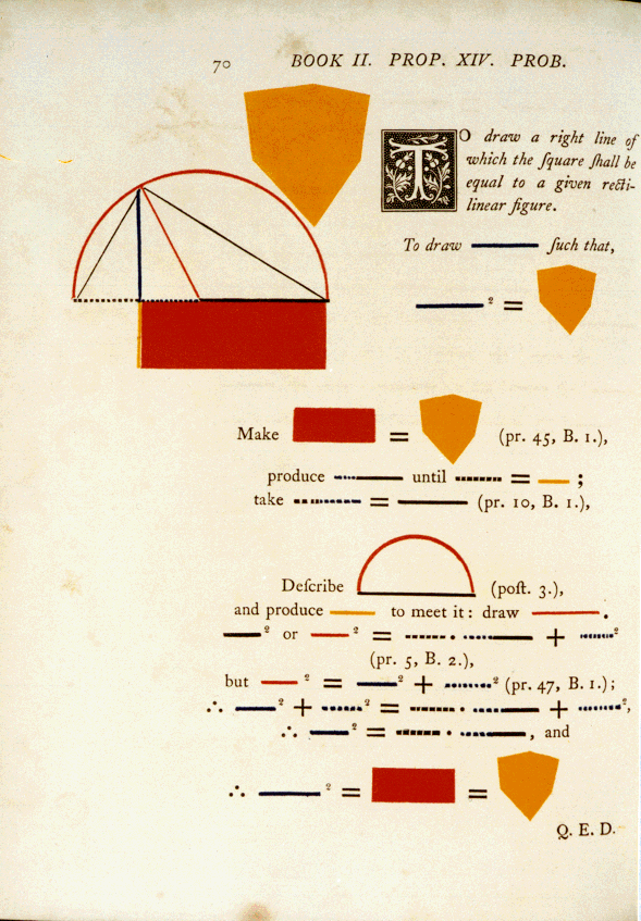
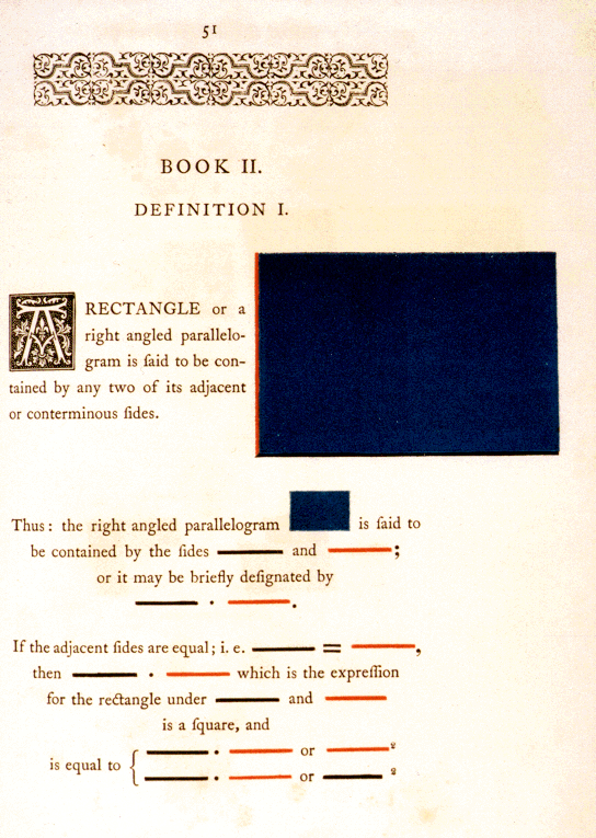
    And even when beautiful, color can be scary, as in the case of the very highly problematic Oliver Byrne, whose work restructuring the explanation of the first six books of Euclid is inversely useful to its great beauty.

    Byrnes II.14

    As unsettling as these color images may be, none come quite so close to being a truly visceral experience as does the Durkee sandwich loaf.  These other color examples are just simply wrong; but the Durkee food product, slathered in oil and leftover, is just so wrong it isn’t even wrong anymore. 


  • Extruding 3-D Shapes from 2-D Art to Create a Cubist vs. Art Deco Chess Set

    JF Ptak Science Books   Post 1129

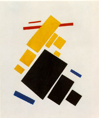
    Is there room in the history of invented art to reconstruct cubist and abstract paintings by imaging the objects that could’ve passed through the canvases to leaves their geometric footprint?  That is to say, if you took the Woolworth Building in NYC and passed it at an oblique angle through a large sheet of paper, and that paper was permeable enough and the building moving slowly enough to simply leave its “footprint” without tearing or deforming the surface of the paper, the resulting image may look a lot like figures in classic works in the history of art.

    Malevich.aeroplane-flying


    That is no revelation, really, as the Black Square or Airplanes Flying of Kasimir Malevich could’ve been made by every fourth item on your desk.  But what is interesting to me would be the reverse of this process, where you take that black square and reverse-engineer it, extruding whatever figure it was that could’ve made the black square into its three dimensional counterpart.
     
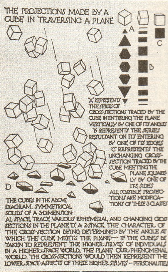
    What comes immediately to mind for me in this regard is Claude Bragdon (1866-1946),  (a New York-based architect with a long set of sleeves for writing in upper dimensional planes of Theosophy and reincarnation and other similarly squishy reaches) who wrote a few interesting books on the fourth dimension and objects and space, writing two of them at a very interesting period of t
    ime for the history of physics and art (1912 and 1913). The books are interesting enough, I guess, and seem to perhaps have had an influence on some influential artists of that time,  but what is of interest here are tow illustrations. 

    Blog--blagden 1348

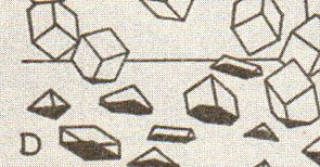
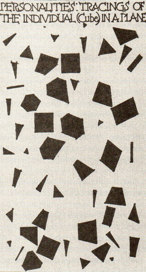
    First is “the Projections made by a Cube in traversing a Plane” from Primer1, showing the impact (at different levels) of a cube falling through a plane.  The second, “Personalities: Tracings of the Individual (Cube) in a Plane” from  Man2, shows the “shadows” of the three-dimensional figures as they lived in their two-dimensional world.  It comes close to the impact of the cubes above, but really only depicts what two-dimensional creatures would see of the three-dimensional beings inhabiting their Bragdonesque world. 

    Blog--blagden 1 det349

    I like  the tracings more as impact points than 2-D renderings of 3-D objects, and in some ways they are very similar. (I have to say that I am surprised that given Bragdon’s expanse of taste and artistic ability that he didn’t arrange these images in an artistic manner–in that sense he entirely missed the boat on adding his own bit to the newly-formed
    Cubist world. He also reminds me of Emily Vanderpoel, who in her own way completely missed the new artform that she was serendipitously creating.)    

    So when I look at something like a Malevich or Mondrian or even (but less so) at a Duchamp (Bride), I find it interesting to manufacture the base of the something that plunged itself cleanly through their canvas, pulling it out again, giving it three dimensions, and incorporating the thing as a piece in a chessboard–the chessboard being the pieces that made the shapes in the canvases resulting in the Art Deco vs. Cubist/Suprematist   Chess Set.   It would be interesting to choose two representative canvases for either style and  see if one (or a couple of ) object(s) could make all of the shapes in the two representative paintings,  populating a chessboard with sameness.

    Blog--blagden 2350

    The bottom line, then, is how different or similar would the extruded three-dimensional figures be that were responsible for this impact in a two-dimensional surface be? 

    (I am reminded too of Duchamp and John Cage sitting down to a game of chess and producing a musical composition via their moves, at  Sightssoundsystems, a festival of art and technology in Toronto, 1968. In this way too an artwork could be made with each move in a game of pieces used to make iconic shapes in the history of art.  “They did not speak. They did not sing, they remained, all of them, silent, almost determinedly silent; but from the empty air they conjured music. Everything was music…” Franz Kafka, Investigations of a Dog.)

    Notes:
       
    1..(Bragdon) A PRIMER OF HIGHER SPACE. (The Fourth Dimension). Rochester: Manas Press, 1913. 8vo, (12), 79pp, including 30 plates.Notes:

    2.. (Bragdon) MAN THE SQUARE. A Higher Space Parable. Rochester: Manas Press, 1912. 12mo, 34pp, 9 illustrations.  


  • 1947 Anatomy of Womanly Desire–Aprons, Plastics and Meat

    JF Ptak Science Books  Post 1152  {Part of the History of Women series.]

    Looking at just one week’s worth of advertising directed at women in America’s most popular magazine.

    One of the great custodians of American popular desire in the 1940’s and 1950’s was Life magazine, a picture-heavy chronicle of social history and needs and dreams.  I enjoyed the issue of Life for 12 May 1947 because it had an article on the history of skirt lengths (something I wrote about earlier in this blog here), and looking at it a second time I realized that I had entirely missed the ad content that drove the magazine.  The poetry of expectation flavored by the ads directed at women were rive ting to me here in 2010, partially because of their narrow aim, and partially for the simple and simplistic urges that were addressed.
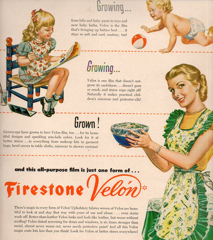
    Women--growing grown451

    The basic messages were lace, timid street crossing, plastic conveniences, bendy girdles, smart shoes, refrigerator hope chests, instant coffee, machine made clothes by Singer, DuPont combs, artificial fabrics and diamond-centered bedroom window covers by Textron, “shoes to catch his eyes”,  various flavor secrets, baby insomnia aids (“to help your husband sleep”),  dreams of meat, and some other vaguely painful things.

    The ad that first caught my attention was the life cycle of woman, seen above, picturing the grown woman in a petroleum-product apron  gleaming as she worked  her way through her Firestone-provided kitchen, emerging from babyhood to childhood to womanly-aprony-adulthood. 

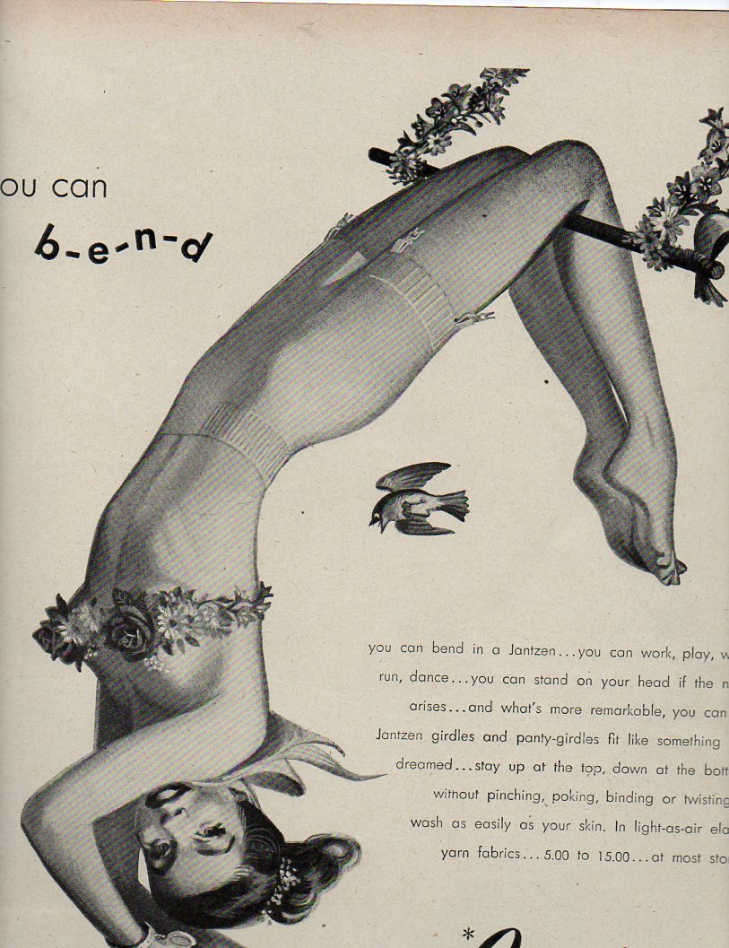
    And an impossible position for girdle wears to participate in the wearer’s girdle’s allowances, complete with fluttery Disney-esque birds:

    Women--growing bendy454
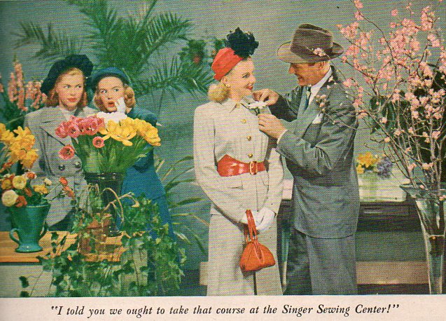
    The clustered desire over the another woman’s success in snagging a man’s interest because she could sew:
    Women--growing singer460

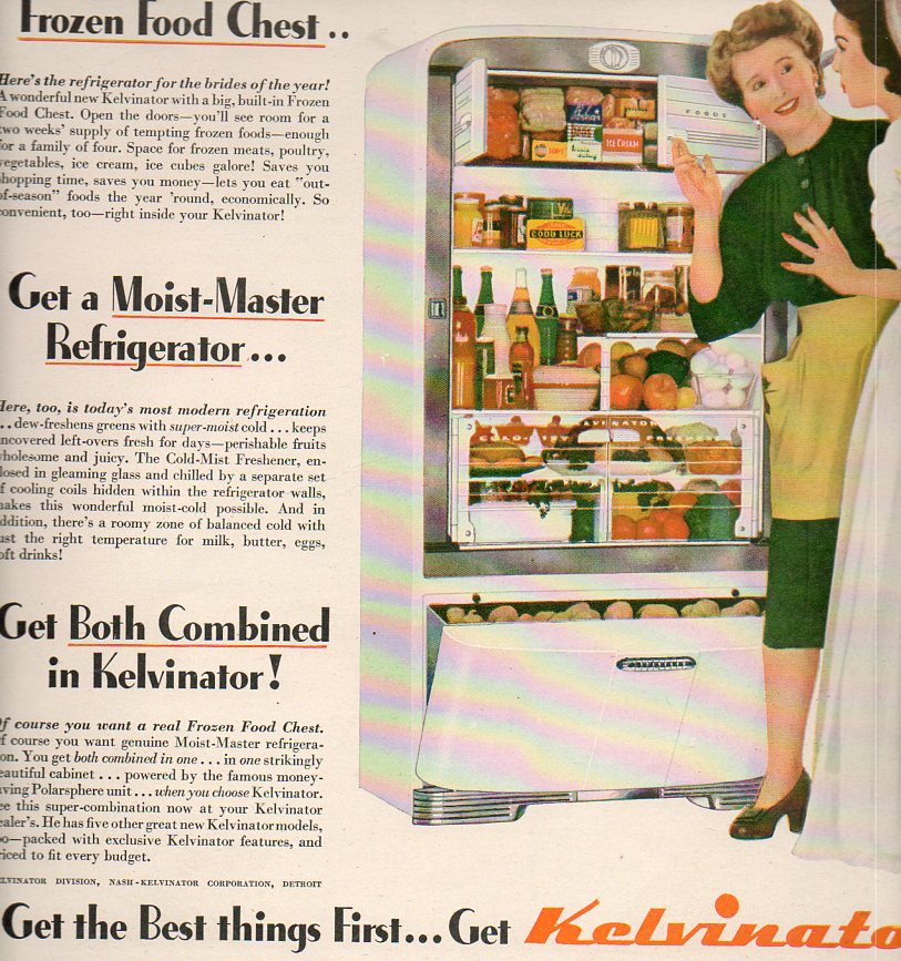
    And just one of three ads exalting various refrigerators, though this one had a newly-minted bride inspecting a model that for all the world could’ve been her hope chest, though this version was filled with food and meat (and a whole hell of a lot of potatoes) and introduced by a version of herself in the next chunky-shoed decade:
    Women--growing Kelvinator453

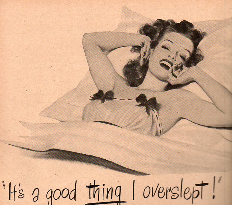
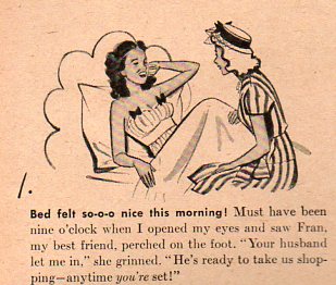
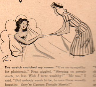
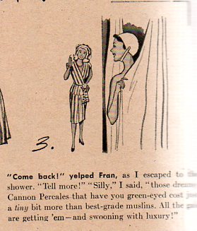
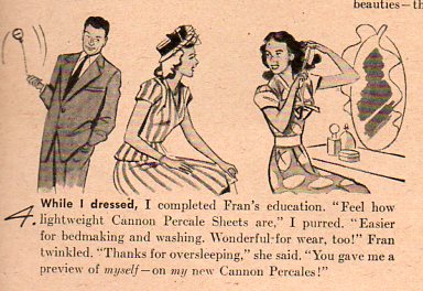
    There were ads for percale sheets, though the segment has a rather odd, vaguely proto-sensual feel to the thing (hardly I think what was intended in 1947).  It plays out a little better when the ad is rearranged in filmstrip style, reading top-to-bottom, rather than side to side:

    Women--growing overslept `455
    Women--growing overslept 2456 

    Women--growing overslept 3457
    Women--growing overslept 4459 

    Women--growing overslept 5458
    Hm.

    Not all of the womanly attention of the magazine was focused on girdles and bras and wedding meat–there was an article on Dorothy Shaver, the President of Lord & Taylor, America’s “No. 1 Career Woman”.  She made $110,000 a year  and was widely successful, but still  “carried a lace handkerchief and cross(ed) streets timidly”, and lived with her younger sister–in an earlier time Life tells us that Ms. Shaver would simply be called a “spinster”, “but now she is called a career woman”.  There was no change in the description or definition of a “spinster” or a “career woman”–they just changed the name, the result being the same, even in describing the first American woman to ever lead a multi-million-dollar international business.  (This in spite of the fact that there were plenty of working women at the time who were married and had families, no to mention the fact that we had just finished a war during which a  near-majority of women were in the workplace.  None of that seems to have come into play here in 1947, when those same war-working women were summarily replaced and sent packing, and the careerist was defined for one and all to be a spinster.)

    I am sure that I will be called to task one day i n the not-too-distant future by my daughters, asking what it  was, exactly, that people were thinking in the year 2000 in regards to women–so strange to them in their version of looking back on their equivalent of my 1947 Life magazine, a version in which I actually lived.

    In any event, these ads weren’t necessarily what women wanted, of course–they were what advertisers wanted women to want. 


  • On 19th Century Back-of-the-Head Portraits

    JF Ptak Science Books   Post 1125

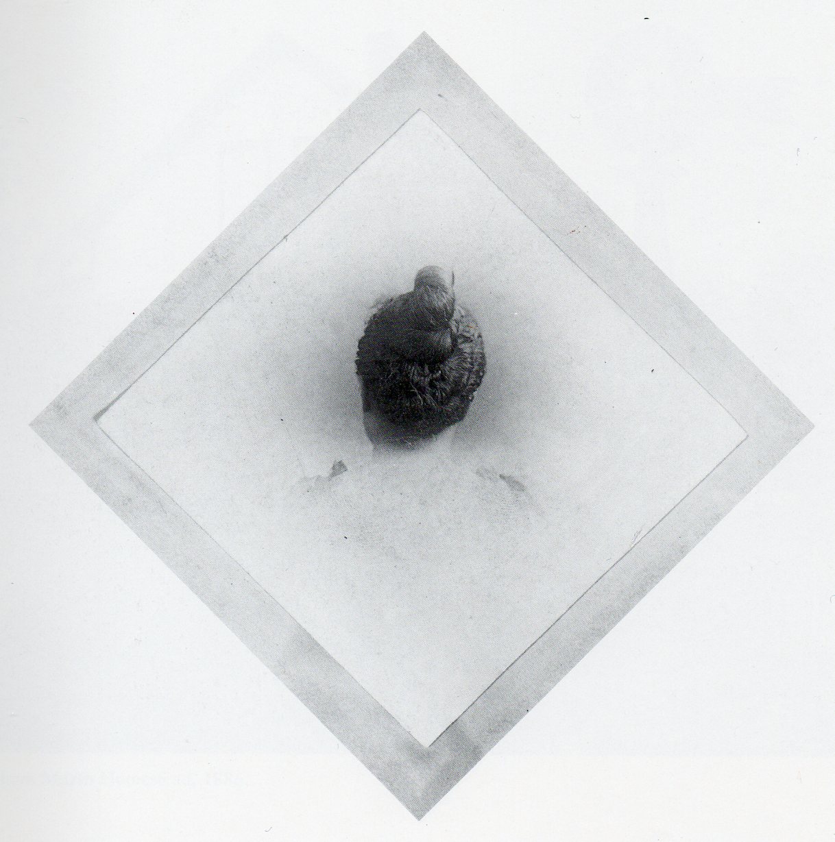
    Back of head back342

    I honestly cannot say when I first started noticing photographs in this odd category–it may have been from police images, early mugshots, that started with (the first) antropometrist  Alphonse Bertillon, showing deformities and cracks and creases and blemishes and tattoos on felons; or in the earlier and  floundered phrenological work of Franz Gall1, who looked pretty much for the same but with more  liberal doses of social philosophy But it is a restricted category, that’s for sure.  Even when you look closely at paintings and engravings it is rare to see even a secondary image of someone’s head squarely, directly form the back. 

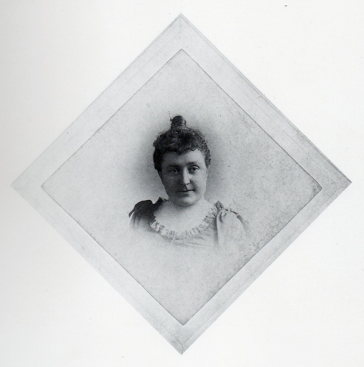
    And then came this pair of photographs presented on the endpages of Cathy Luchetti’s Women of the West (Antelope Island Press, 1982)–its a wonderful book about 19th and early20th century women as pioneers int he American West, told mostly in their own words.  It wasn’t until I closed the book that I found this picture (which is odd for me as I’m mostly back-to-front with a new book) and decided on this post.  The photos do tickle some old memories of 19th c back-of-the-head photos featuring extraordinary hair length,  Civil War wounds, spinal and neck injuries, young Hopi girl hairstyles, and that sort of thing–but in this case, I can’t see anything unusual about the back of this woman’s head.  It looks as though it is just the back of her front.  I think that most of the time that we see back-of-the-head it is for something special or unusual in some way (and I won’t even get into 20th/21st century stuff like Valdemort’s surprising hiding spot)–it seems in this case, it is not.  Its just the back.

    Back of head front343

    Notes:

    1.  Gall’s book’s title really lays it all out: The Anatomy and Physiology of the Nervous System in General, and of
    the Brain in Particular, with Observations upon the possibility of
    ascertaining the several Intellectual and Moral Dispositions of Man and
    Animal, by the configuration of their Heads,
    published 1819.