A Daily History of Holes, Dots, Lines, Science, History, Math, Physics, Art, the Unintentional Absurd, Architecture, Maps, Data Visualization, Blank and Missing Things, and so on. |1.6 million words, 7500 images, 4.9 million hits| Press & appearances in The Times, Le Figaro, Mensa, The Economist, The Guardian, Discovery News, Slate, Le Monde, Sci American Blogs, Le Pont, and many other places… 5000+ total posts since 2008.

Category: Absurdist, Unintentional

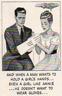
  • Creating Bad-Hand Female Trouble, 1954–an Imaginary Reconstructed Filmstrip

    JF Ptak Science Books

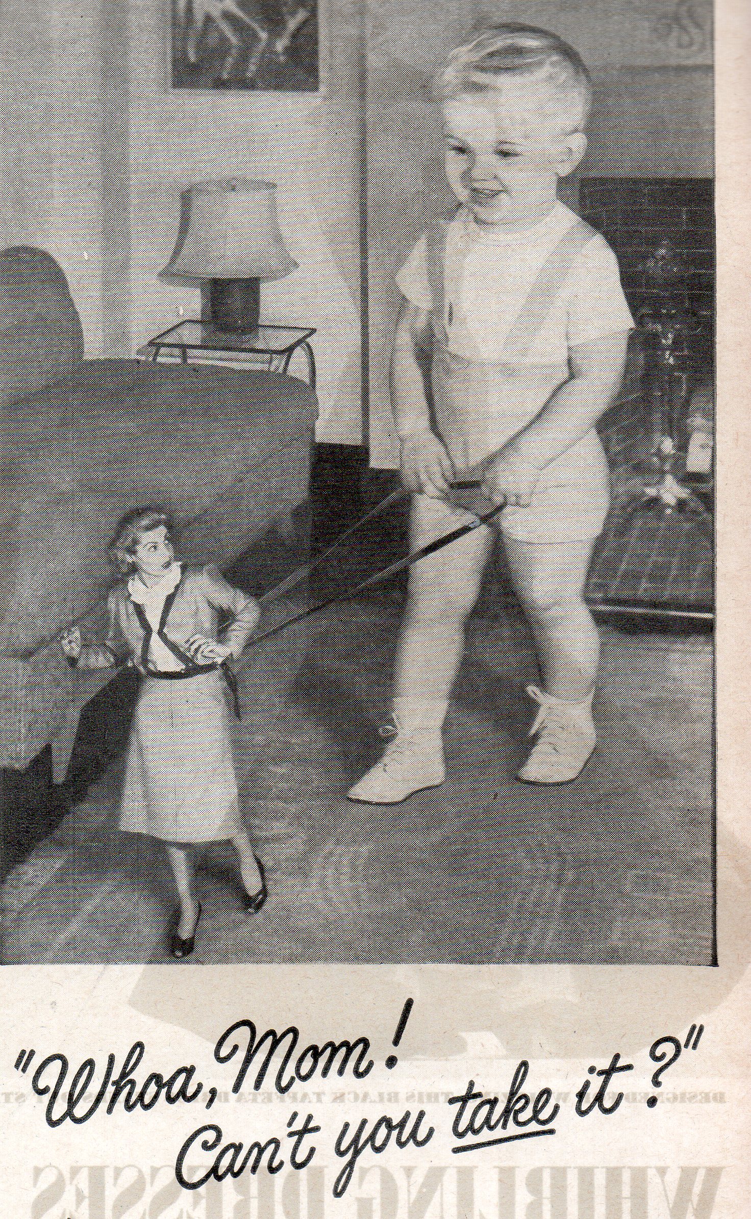
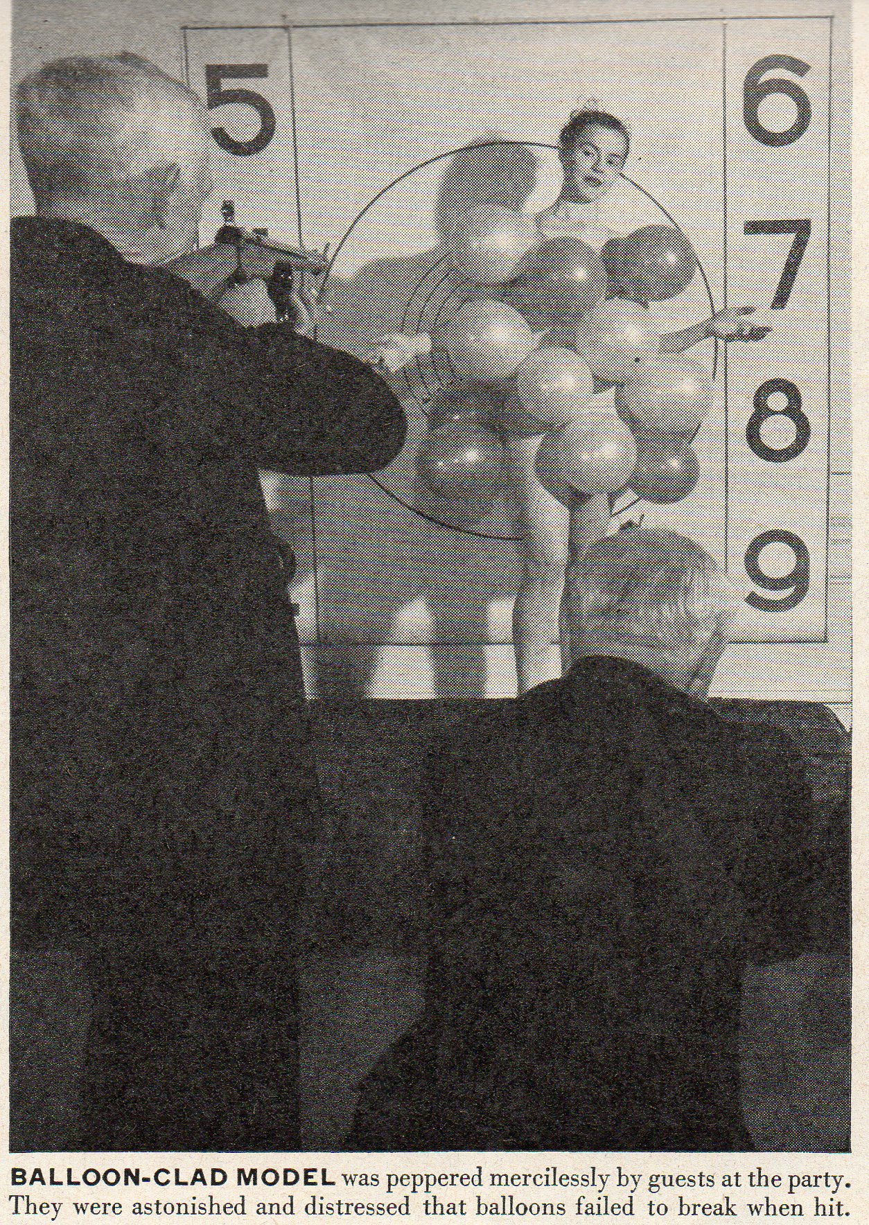
    Girl trouble 7360 Retroist excursions like this into the land of social propriety from not so long ago is a bittersweet thing–its concerns can remind of of how far away from something we seem to be, when in reality that distance in time and space just isn’t very far away at all; it is just slightly different,  renamed and repackaged.  For example, this advertisement from LIFE magazine for Trushay hand softener (1954) delivers pretty much the same message as most similar products today, except for the change in packaging and less obvious message.  The message may seem outdated but I think only in so far as the images and clumsiness of the delivery is concerned.  Products like this have increased by orders of magnitude, the target audiences age seems to have dropped considerably, and most of the time the pursuit of this 1954 end-result stays pretty much the  same. Exercises like this are peculiar, and can show us that the people who we are laughing at may very well be us. 

    The reconstructed ad is below.


  • Images from Our History of Women Series

    JF Ptak Science Books 

    I was looking for some of these images from this blog’s History of Women series and thought that I’d post them all to one page. Seeing them out of context is odd, but interesting.   Enjoy!


    File0505

    .
    000 women on a leash012
                                                   

    1 april 26 women king+queen 00--shooting strip tease042


  • Ovaries and Ovens–a Chance Encounter in the History of the Subjugation of Women

    JF Ptak Science Books   Post 1109

    A friend of mine started her facebook post writing “Ovary shipped out…”, a great piece of found story-beginnings, a great opening line, especially when ovariotomically removed from the rest of the sentence.  Alex is an artist and medical/anatomical illustrator by trade, so I knew what she meant–but forgetting that made the segment even more lovely. 
    Ovary homunuclus 1
    Aside from the fiction that the three words created and the half-word that I created/butchered, I wondered about when ovaries were first surgically removed, and then about how the ovary was seen (almost forever) as the home and birthing place of the fully-formed human delivered to it by men in the act of ya’ know.  Ovarian surgery really didn’t exist until the early 19th century, when it was practiced with great success (especially for its time1) by Ephraim McDowell (1771-1830), in 1809 in Virginia–and it was also about the first great American contribution to gynaecology as well  His first patient (“Mrs. Crawford”) sang her way through an anaesthesia-less procedure, surviving her illness and the surgery at a time when non-amputational surgery was half-fatal.2 There were other, limited reports of this procedure, but for reasons not clear to me it didn’t really start appearing as a general procedural possibility until mid-century.  Anyway, before the 19th century, women with ovarian cysts were pretty much out of luck.       

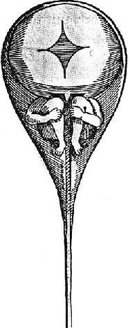
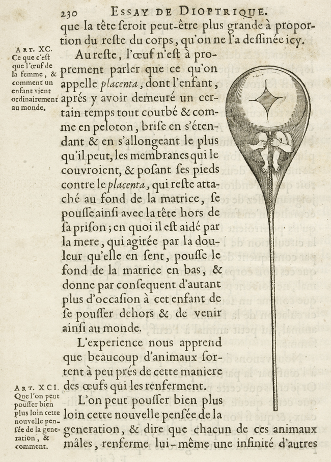
    But the issue of the ovaries as ovens–of homunuclus and palingenesis and epigenesis, the imaginary male-dominant anatomy of reproduction–was pretty much somewhat solved by the end of the 18th century.  Or at least the homunculus, the tiny but perfectly formed miniature human traveling along in sperm, was.  This character is pictured here, riding in the squinty-eyed imagination of researcher  Nicholas Hartsoeker3, who desperately wanted to see the thing, and which found itself published in his book Essai Dioptrique  in 1695. 

    The woman as a simple baker of a gift of preformed life was a medical belief that helped perpetuate the supposed inferiority of women, and that the woman’s part in the procreative process was a simple oven.  It was a difficult image/belief to resist, persisting well into the 19th century.  Anyway, this is where my thinking took me–to the anatomically-inspired subjugation of women–from Alex’s comment.
    Ovary Hartsoeker
    ____
    Notes

    1. This was still in the deep, dark time for hospitals and surgery, in general.  Remember that Joseph Lister was still a half-century in the future with his revolutionary surgical practices that were invaluable to the cause of successful surgery.  And hospitals in general were bad throughout Europe, though their story in England at this point was entirely different.  The Brits really took steps forward in the treatment of the sick, and especially in the treatment of the poor sick, thanks to being a little awash, splashing around in waves of money provided by their contributions to the industrial Revolution.  Funny how it takes major mounds of money-making to initiate good works like that, but, never mind the details–it was done, and hospitals in England during this period were comparative oases in regards to European/Continental hospitals. 

    ** McDowell’s first three cases were all successful , finally published in the Eclectic Repository for 1816.  This was the first real foray into this field by the pioneering American medical institutions; obstetrics and gynaecology before this, and particularly in the 18th century, was pretty much in the hands of the French (especially obstetrics) and the English, and to some degree the Italians (particularly with Mascagni, Santorini and Spallanzani).

    **This is probably unkind and not particularly true of Hartsoeker, who never said that he actually saw the little men of sperm, and had simply postulated them.  Maybe the squinty-eyed part was imbued in the minds of others, though it was Hartsoeker who drew the images of the homunucli to begin with.  I think that he should’ve rested in his better cups–he was a gifted mathematician and a particularly good microscopist and optical person, and probably should’ve restricted his published biological theories to his notes. 


  • Action Alphabet and a Touch of Evil, 1879

    JF Ptak Science Books  Post 1105

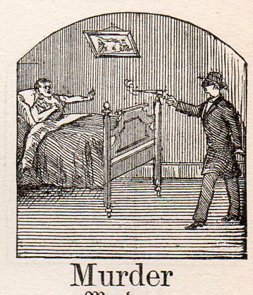
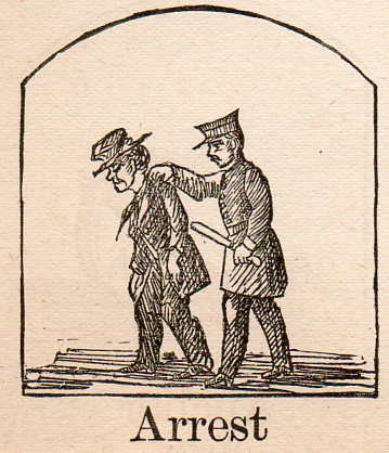
    Alphabet germ--murder298 Following yesterday’s two posts on Occupational Alphabets comes this “created” action-alphabet of late 19th century.  The source is Kantner’s Illustrated Book of Objects and Self-Educator in German and English, a self-teaching book for German vocabulary, published in Pennsylvania in 1879.  The woodcut images used to illustrate each word are fantastic, and occasionally stunning, sometimes unexpected illustrations of forgotten objects and actions.  All I’ve done is select some of the words for use as an Action Alphabet. (I failed though to provide a full alphabet, missing the letters i, u, v, x, y and z.) 

    The woodcuts appear here larger-than-life than their humble inch-square origins, and may take away a little from their mystery…or add to it.  They have an odd noir-ish, Wellesian feel to me, somehow, their tiny frames exciting a funny hankering for Kane or Macbeth or Touch of Evil, something I can’t quite understand.  Maybe it is just a happy confusion, looking too hard at too many small images, like discarded film clips on a cutting room floor, and imaging trademark deep focus bits from a famous filmmaker.  In any event, they do have their own style–perhaps tomorrow I’ll cull out the Dadaist Alphabet from their brethern.

    Alphabet germ--arrest297


  • Lost in Translation Dept: Uneasy Moments in the History of Underwear Ads

    JF Ptak Science Books  Post 1108

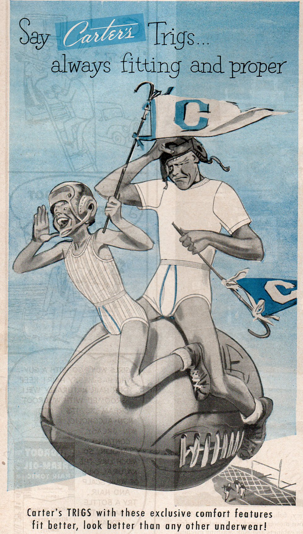
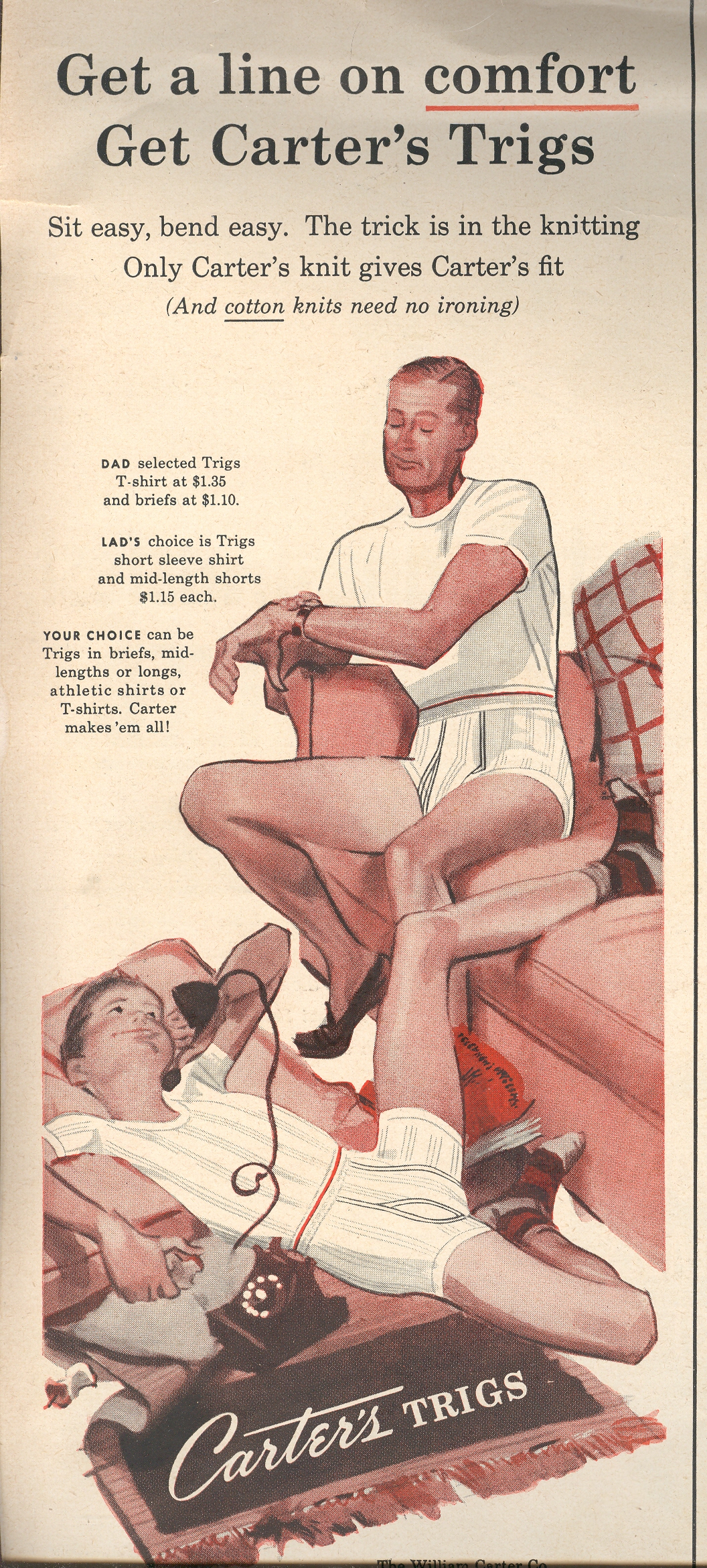
    Underwear--carter NAMBLA252 There’s really not much to say, I think, about these two ads.  The first is one I stumbled on just this morning, one in what seems now to be a long series of advertisements whose initial appeal has not only been lost to time but which now seem to wear very thin in the socially-acceptable category.  The ad is from Life magazine for July 1955, and features Carter underwear for men and boys–and for some reason, it features the happy boy/cranky man too-close combo riding a football out of a stadium.  I don’t know what any of that has to do with underwear–especially the unhappy older man.

    There are a number of these ads by Carter’s, I recall, and many of them have this deep, pit-of-your-stomach sense of wrongness about them, a high, first-order branding of their original meaning completely lost in translation, the sense of their time now completely gone. 

    + boy 


  • The Future of Women–Helicopter-Delivered Paper Clothing for Woodsy Frolics

    JF Ptak Science Books   Post 1105

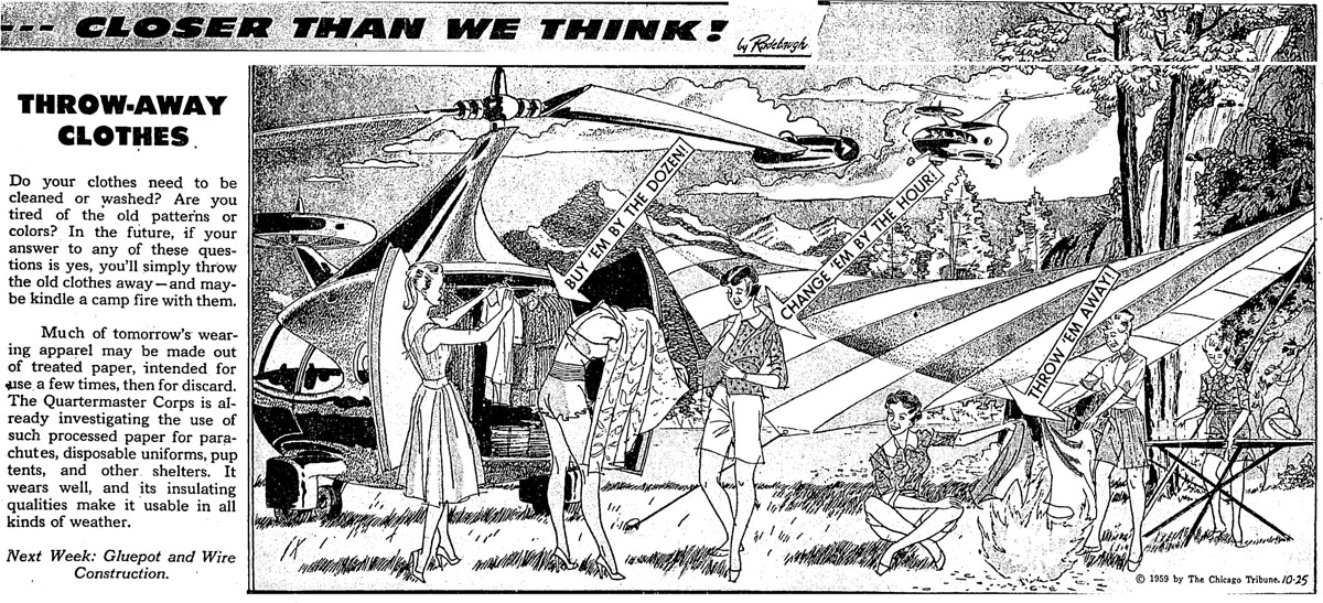
    Future--throw away clothing

    The artist of this perspective of the future offers us a little too much of his personal dreamcastle, I think.  Perhaps the future is filled with paper clothing to be thrown away at a whim, or if not paper then something else besides that, like paint.  Painted clothing might make more sense than natural disposables.  But what makes this image special to me is that none of it makes sense, but for semi-noxiously-underwear-filled reason, it did find its way into publication, even if it was only in the Chicago Tribune.  

    The artist shared a very personal vision of the future which reminded me in a way of a reverse Reclusorium.  Monks and recluses filled out their fair share–men and women alike–of Anchorages and Reclusoria, living down in tiny cells sometimes dressed in chaffing (or worse*) clothing, sometimes being permanently caged (or even walled in), spending their lives devoted to their own unworthiness and penitence and glorification of a private conversation with a god of salvation. 

    This picture offers us a group of non-recluses, living far from any sort of St. Jerome-y existence. For some reason these women are living out in the wild in high heels, enjoying The Nature, and having their disposable clothing delivered to them via helicopter(s).  They choose their paper outfits, and change into them right there, right in front of the helicopter, the artist enjoying their wreckless abandon. Find the clothing, take off old clothing, dress languidly, and then sit down and throw the old paper rags into the fire. Just in case, the lady in the background is serving refreshments.

    Seems to me that the women in this scene are developing a public demonstration of a little private fetish of the artist more so than delineating a vision of a hellfire future filled with semi-naked women frolicking  in the woods.  Or rmaybe I’m being too cranky and seeing things too hard–maybe not…


  • Darkpunk City Architecture: Psycho-Noir Cityscapes of Hugh Ferriss

    JF Ptak Science Books   Post 1104

    The work of architectural delineator Hugh Ferriss (1889-1962) gives me the same sort of feeling that I get from Martin Scorsese’s  Gangs of New York–a blistering, gritty, taut film that doesn’t really add up to anything but it really doesn’t matter; getting there being all of the fun…we know its just made up, even by Marvelous Marvin.  We know that Mr. Ferriss wasn’t going anywhere with these designs, that he wasn’t going to kill us, trapped  in his  psycho-noir cityscapes. These designs are beautiful, and a wonderful background for something, so long as no one has to live in them.  (Much more on Ferriss here.)

    Why didn’t I use Fritz Lang’s Metropolis?  The emotional (and not necessarily visual)  metaphor just didn’t work as well as The Gangs does for me; makes little sense, I know, because Ferriss knocked pretty loudly on Lang’s door.  It just didn’t work for me.

    In a way these designs could fit in my Blank and Empty Things category, lacking life, inspiration–even in their solitude these images have an advanced emptiness to me, moving well beyond simple solitude.  Edward Hopper’s 1942 Nighthawks  is a painting of solitude, but it isn’t necessarily empty.


  • A Domesday Book for Missing and Blank People

    JF Ptak Science Books   Post 1122

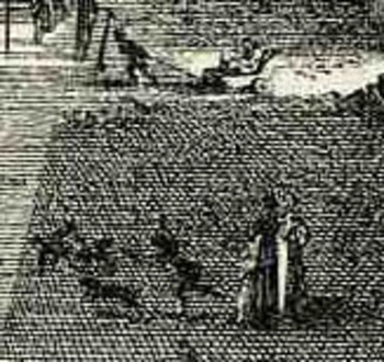
    I’ve long been interested in the added, extra stuff found in the foregrounds and empty places of artwork, the eclectic extraiana, the not-necessary pieces, the microworlds of antiquarian visual anthropology. (See here for example, an earlier post in this blog, “Hidden Children, Found Art and Social Vignettes Inside Art”.)  In towns views and architectural studies, where the primary interest is geography and, well, architecture, people are sometimes added to literally flesh out the bank spots, and to add a point of reference and perspective for the viewer.   In many circumstances these added bits turn out to be extremely interesting insights into everyday street life for the period of the artwork, also including societal exuda and discarded people, the social “rejects”, the underclass, the classless, the workers, the laborers, people.  That would be most fo the population of a place. 

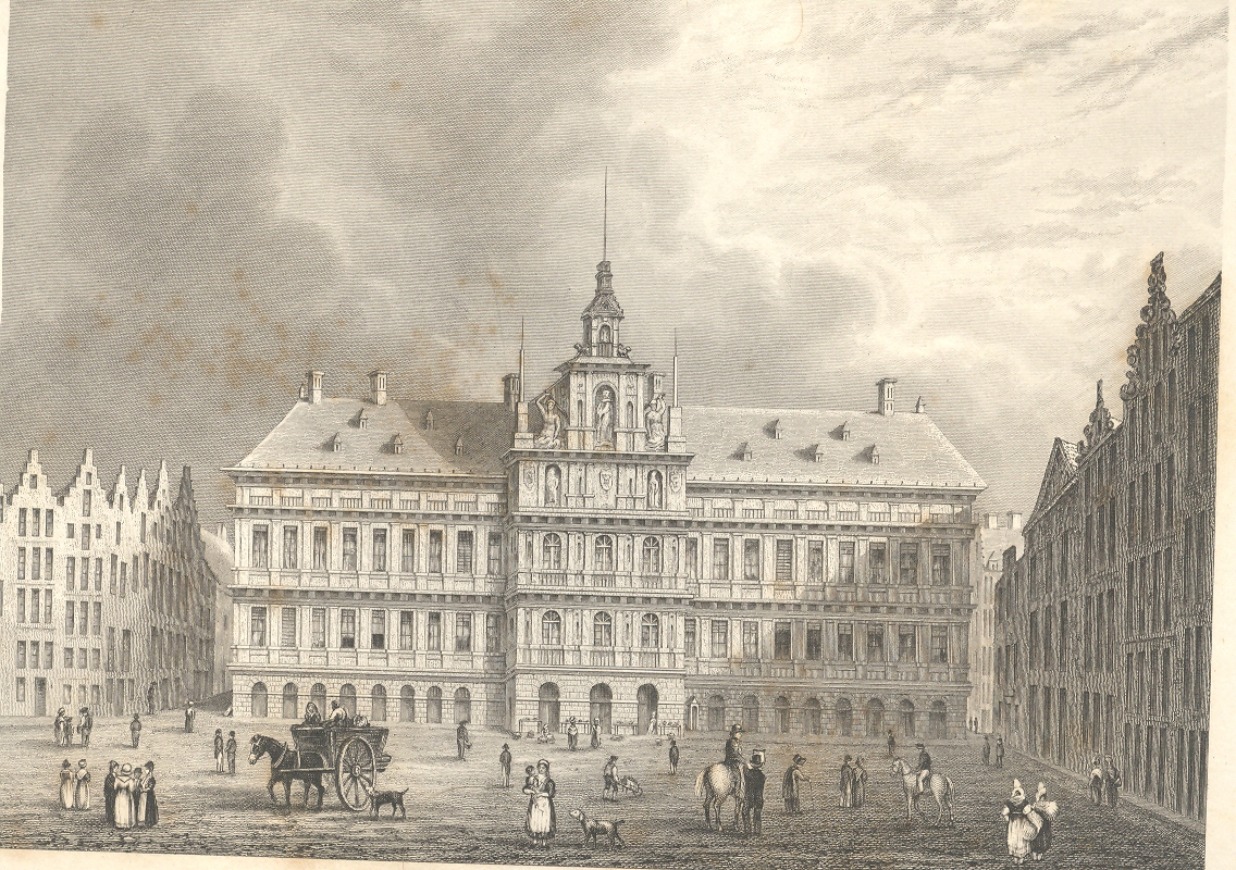
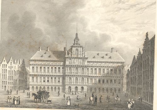
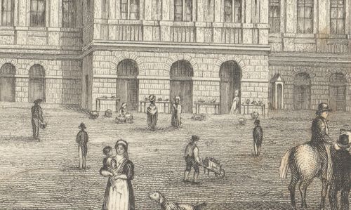
    For example in this application of the imaginary forensic arts microscope, we see this series of pictures of a standard view of the town hall of Antwerp; but what we see advancing under magnification is a very interesting set of occupations displayed in absolutely minute detail (seen in more detail in this earlier post, from which I quote below).

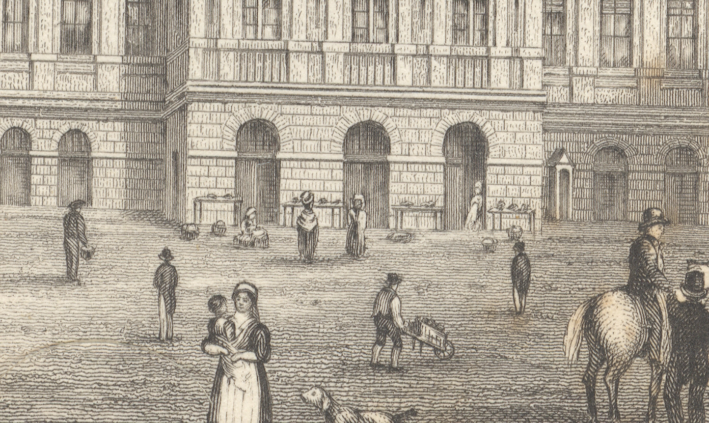
    First, the majority of the engraved image, followed by a close-up of the center of the building (the three doorways), and then by a closer view still of doorway three:
    +++looking closely

    +++looking closely detail

    The
    truly interesting bit here is barely observable in the original; but,
    under magnification, we see a very rich and minuscule “engraved
    photograph” of a slice of daily commerce and street life in Antwerp.  If
    you look at the central entrance to the town hall you can see three
    main (and large) doorways, and if you look clos+++looking closely detail2er still, you’ll see something leaning against the portal at right.
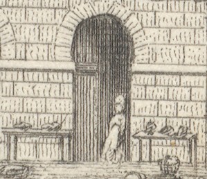
    Extraordinarily, what the artist snuck into the original is a tiny
    (2mm) figure watching over several tables of her (fruits?/vegetables?)
    ware, waiting for a customer. There doesn’t seem to be much interest in
    her stuff, currently, and she has allowed herself a little relaxation,
    leaning against the doorway.  I’ve found this sort of extremely minor
    subject matter and its ephemeral connection to the larger work at hand
    to be just fascinating.  I wonder why such detail would be added–why
    would the artist, or engraver, take such care and interest in such minor
    visions.  Perhaps this is just what was at hand on the days the artist
    fleshed out his work; perhaps it was the work of the engraver, alone,
    incising yet another semi-boring architectural image; desperate for a
    little artistic activity, adding some interesting, almost-invisible
    touches, here and there.  Perhaps no one would ever really notice them,
    but whoever was responsible for adding such incredible,
    extra-dimensional details would certainly enjoy knowing they were there,
    recognized or not.

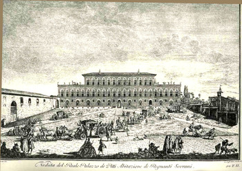
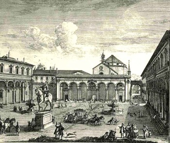
    Here’s another example (seen in an earlier post here) from Giuseppe Zocchi (1711-1767) who was commissioned by he Marchise
    Andre Gerini at mid century to record the greatest of Florentine
    landmarks.  The plaza scene offers a great view for all sorts of people, and the artist/engraver take great advantage of the possibilities:
    Bloglooking_closely_b124

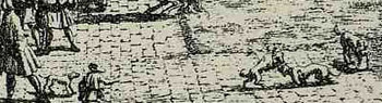
    Among the many people populating the image we find folks interested in a dogfight:
    Bloglooking_closely_b_dog_fight


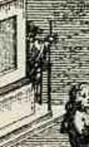
    Another image by Zocchi, Veduta della Piazza della SS Nunziata Statua Equeftre di Ferdinando Primo, Fonti, e Loggie Lateral, shows more good work with the possibilities of ephemeral populations, where among the many details we see an invalid being pulled in a small cart, and a half-obscured  man with a staff leaning against the back of the monument.  And of course there’s much more–you just need a little magnification to see the human element of the artwork. 
    Bloglooking_closely_1_96123

    Bloglooking_closely_1__carriage_2


    Bloglooking_closely_1__man_cane

    There was a class of illustrator that drew on their surroundings, or
    what they saw on their walks, or from their window–the incidental
    people in their artwork were people that they saw, who meant something
    or other to them, who formed an impression in their brains.  There were
    other artists who were perhaps not quite so fortunate in their daily
    lives to come into contact with a variety of people like this–perhaps
    they were sheltered, perhaps they were privileged and of a class that
    would not put them into contact with ordinary people. 

    Perhaps it was this class of artist who need William Pyne’s great-ish
    1845 work, Picturesque groups for the
    embellishment of landscape…1
      It was a work of clip art for its day, really, showing,
    detailing, the attitudes and occupations of working people.  It was a
    book filled with the people who might ordinarily have gone missing from
    the work of the artists needing their images displayed in their brains
    by someone else’s labor; a book filled with figures to plug-up the blank
    spaces, round out that unkind bits that called out for a human touch.

    Interestingly, it shows people at their professions but more often than
    not , it doesn’t actually show people working–its more like people
    readying themselves for work, getting materials ready, sharpening
    things, ordering.   It is impressive nonetheless for its found,
    pre-photography snapshots of working life in England in the 1830’s.  It
    shows potters, leather dressers, gravel diggers, itinerant mowers,
    hay-makers, gleaners, paviers, shepherds, fishermen, knife grinders,
    quarrymen, foresters, woodmen,  basket-makers, coopers, horse rollers,
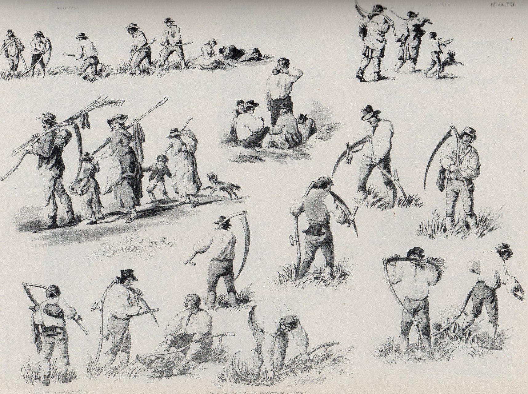
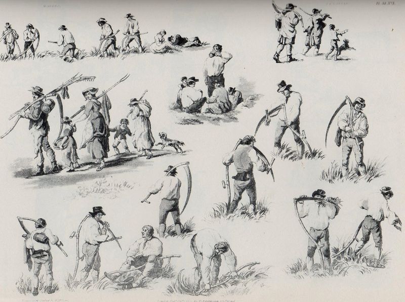
    cider-makers;  and images of boats, barrels, gypsies, games, county fairs, and on and on. For example, here’s the multi-image engraving for “itinerant mowers”:
    Mowers340
    Perhaps it was only a practice-book of images for people who wanted to
    practice–if so, it wasn’t a book for just anyone, as (so far as I can
    determine) it would’ve cost a working person week’s worth of labor to
    purchase it.    And there are certainly pictures of people doing unusual
    and rare things even for 1843–like sailors washing sails,
    maybe–actions that were not commonly seen.  And it also placed people
    in attitudes of unusual poses, so some people may have looked at the
    book with an eye for artistic anatomy.  But by and large, to me, it
    looks like a missing persons book.  

    Notes:

    1. William Henry Pane (1769-1843), Picturesque groups for the
    embellishment of landscape : in a series of above one thousand subjects :
    comprising the most interesting accessories to rural and domestic
    scenery, shipping and craft, rural sports, pastimes and occupations,
    naval, military and civil employments, implements of trade, commerce and
    agriculture, etc. , the whole forming an encyclopaedia of illustration
    of the arts, agriculture, manufactures, &c. of Great Britain 
    Publisher: London (Bedford Street, Covent Garden) : M.A. Nattali, 1845.

  • Pictographic Messages to the Year 12,010: the Medium is the Mess.

    JF Ptak Science Books  Post 1103

    Talking to the Future: a Note of Pity to Ourselves in 300 Generations
    Nuke waste--dead251

    In the history of words I’ll take a wild guess and say that fractions of 1% of everything communicated is directed at ourselves in the future–or at least it has the possibility of being directed to someone else when our deeds are long, long since forgotten. 

    And by writing to the future I don’t mean in an off-hand way, our words being read in 12,010 by chance, idea archaeologists looking at what people were talking about 10,000 years earlier; and I don’t mean via “reconstructing” our radio or tv broadcasts (in the not-right Jodie Foster Contact kinda way).  I mean intentional messages to be read a long time from today.   

    A more problematic entry would be images and symbols design to be read by future generations, in the deep future.  This is not a very deep category, though a famous (if not well designed) example being the one associated with Carl Sagan that was attached to the 1972 Pioneer 10 and 1973 Pioneer 11 spacecraft, which attempted to explain what humans were should either vehicle  in any eon come into contact with other-than-Earth life.

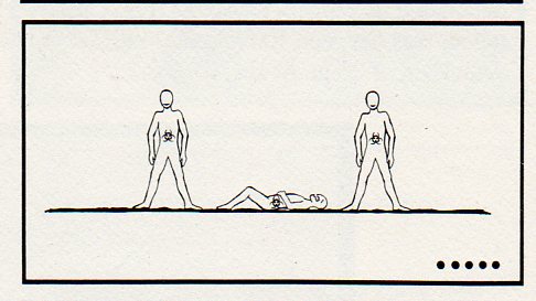
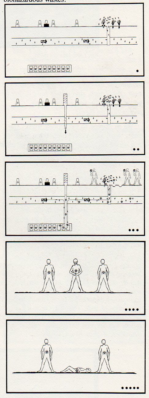
    Nuke waste--overall250 Another is the pictograph presented here, which appeared on page 117 of the ironically and extraordinarily-titled Reducing the Likelihood of Future Human Activities That Could Affect Geologic High-Level Waste Repositories1, the first half of which (bolded above) could make a nice departure for some other science fictiony type story.    But what these folks were talking about, plain and simple, was how to prevent future generations from digging into or other disturbing in any way buried masses of nuclear waste. 

    This pictograph is meant to be a non-linguisitc, universally-understood  warning to future generations that the ground they are standing on is above a nuclear waste storage site.  The plan was that nuke waste would be solidified and buried in rock hundreds of meters below the surface in an effort to keep in line with governmental policy of waste disposal2. The pictograph relates to the restricting of future human activities part of the title of the work in question–that is, folks in the future who might muck around, drilling, into the nuclear waste site.  This pictograph tells them why they shouldn’t do so, because of all of the terrifically lethal mojo underground. 

    As one might guess by the title, the report has its own communication problems–it is dense, turgid and not a particularly clear document.  It is a fine document illustrating the problems of communication, but not in the way it would have wanted to be, celebrating a reverse triumph in a Darwin Award/IgNobel type of way. And all of this in spite of/or because of a healthy slice of linguists, semioticians, logicians, artists, graphic designs, politicians,. sociologists and so on constructing the thing.

    The sign basically says that if you drill at this spot (to some unspecified depth) through aquifer or underground stream or water source or something that some point you may reach the biohazard nasty, which will then get into the water supply and into humans, which will then kill them.

    The sign was designed for 10,000 years hence, and depended upon pictures to convey the message rather than words (except for H20, and the biohazard symbol).  Of course the radioactive nastiness will be there for millions of years, which would be an entirely different story in terms of imaging.  Perhaps. 

    The one thing the design of the pictograph has in its favor is that it is read top to bottom–no language on Earth (so far as I know) is read bottom to top, though there are many differences in reading right-left/left-right.  Beyond that, the pictograph stumbles over itself–except for the last two images, which may or may not tell someone that something bad is happening. 

    There are plenty of time capsules and idea-vehicles to the future–I’m saddened that this was seen to be one of the essentials that we would pass on to our future selves.

    Notes:

    1. Reducing the Likelihood of Future Human Activities That Could Affect Geologic High-Level Waste Repositories (Technical Report prepared for Office of Nuclear Waste Isolation, Battelle Memorial Institute; BMI/ONWI-537; May 1984)

    2. “Present society’s responsibility is to dispose of radioactive wastes in a manner that is safe, is environmentally acceptable, and does not require long-term maintenance or surveillance. This ground rule is consistent with the objectives in the U.S. Department of Energy.”Reducing…, page 2.

    The pictograph, explained,  pp 115-116 from Reducing….

    The pictograph…was developed using the concepts and guidelines discussed by Givens (1981). The objective is to convey to the reader the sense that if the area below the markers is disturbed, toxic substances will enter the ground water and lead t o severe consequences. relies on several visual images acting in concert to relay the message.

    The ground surface exhibits peripheral markers and a central monument to denote relevance to the site where those markers and monument exist.

    The ground-water system is indicated by water-drop shapes and by the chemical symbol for water (the only departure from icons, used as a redundant measure).

    A repository far below the surface is depicted with the biohazardous symbol. The fact that the object portrayed below the surface is a repository may not be at all evident to a future reader from the first frame; however, the movement of the dark material from the repository through the aquifer and into the vegetables in the third frame, coupled with the movement of the biohazardous symbol, should imply the burial of biohazardous materials below the surface.

    The pictographic sequence exaggerates reality with regard to the rapidity of contaminant transport and uptake, and with regard to the severity of the consequences. However, exaggeration is necessary because both the clarity and the relevance of the message may suffer if.the pictograph attempts to indicate contaminant transport time of thousands of years. Similarly, the consequence portrayed, a painful death, over-exaggerates the cause-effect relationship and the rate of the individual’s demise (one out of three suffer death in the pictograph, whereas a
    to chance would be more representative).


  • Strange Things in the Sky Department: Tetrahedra, Horse & Steamship Balloons, Swimming Pools & Exploding Moons.

    JF Ptak Science Books  Post 1120

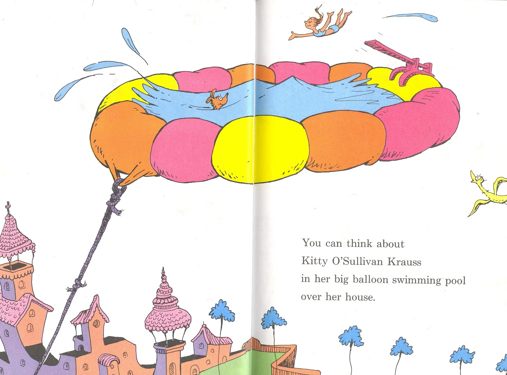
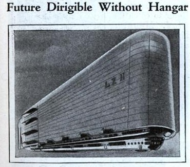
    Rounding out the image dump from yesterday are these additions to the developing category “Strange Things in the Sky”.  The odd things in today’s issue include floating tetrahedra, an exploding Moon, a hovering anti-gravity Dr. Seuss pool, a Russian rocket pioneer’s enormous apartment building-like dirigible, and a steamship balloon.

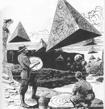
    The first, without any explanation and offered as a pure art form, is this illustration by Frank R. Paul for Wonder Stories of November 1931.


    Strange things in sky--tetra

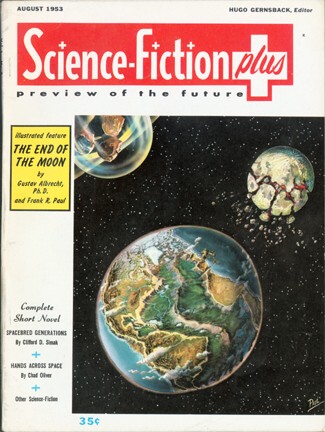
    Next, another Paul cover for Science Fiction Plus for August 1953, illustrating a story where the Moon explodes

    Moon exploded

    Other strangeness in the sky is  Dr. Seuss’ swimming balloon pool from his Oh, the Thinks you can Think. .  I’ve seen some interesting
    images of balloons and dirigibles taken as serious efforts that reminded me of
    that double-page spread by the good Doctor.

    Blog jan 2 seuss


    Blog jan 2 tsilo dirig  

    This may have been the Omega end
    of bad ideas in the career of Zilkowsky, who is better known by the other
    spelling of his name, Konstantin
    Eduardovich Tsiolkovsky (1857-1835), a Russian misanthrope and space pioneering
    genius who wrote more than 500 works on rocketry and exploration including what
    is arguably the first tech word ever done in the field (in 1903,
    The
    Exploration of Cosmic Space by Means of Reaction Devices
    ). Tsiolkovsky somehow lasted through purges
    and Stalinist tirades, while few of his colleagues did—many mysteriously
    disappeared, while others went to prison and disappeared there.  (Stalin’s crude and insatiable blood lust,
    perhaps the worst of the century, knew no bounds, not even to the scientists
    who could conceivably hand him reigns of rocket/missile-propelled power.)  Anyway, Tsiolkovsky’s dirigible was composed
    of a collapsible metal so that the aircraft could form its own hangar when “docked”.  I don’t know where to begin with this one…

    Blog jan 2 lowe

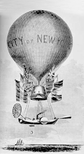
    The next entry is the ship-balloon of Thaddeus Lowe
    (1832-1913) One of Lowe’s great contributions in the
    history of ballooning was providing aerial reconnaissance via (panoramic)
    photographs to the Union army on Confederate army positions—particularly the
    Rebel positions at Richmond (1864) and Fredericksburg (1862). (He had a wide
    span of professional interests and wound up living the high life in L.A. in a half-acre
    home.)  This 130-foot diameter monster
    with a steam-ship escape pod (named The
    City of New York
    and then renamed The
    Great Western
    after the city couldn’t supply enough gas to get the thing
    inflated) was intended to be a transatlantic traveler.  Ready to try this fantastic adventure in
    1860, ready to take charge, ready to begin a very problematic trip across the
    Atlantic in a balloon, Lowe, seemingly ready, had his balloon ripped apart
    while waiting for launching by a chance and not-horrible wind.  Lucky for Lowe and the Union Army, this didn’t
    happen over the ocean somewhere out of reach, and the North’s important info-gatherer
    did not sink like a stone in the cold dark sea. 
    (I’m very cynical that the 100-foot-long, bulbously heavy steam-powered “life
    boat” would’ve landed right-side-up and softly enough to have been of any use
    save for providing some floaty bits that survivors from the balloon could’ve
    clung to for a while before being consumed by King Neptune.  

    Blogsept19_horses_in_flight607

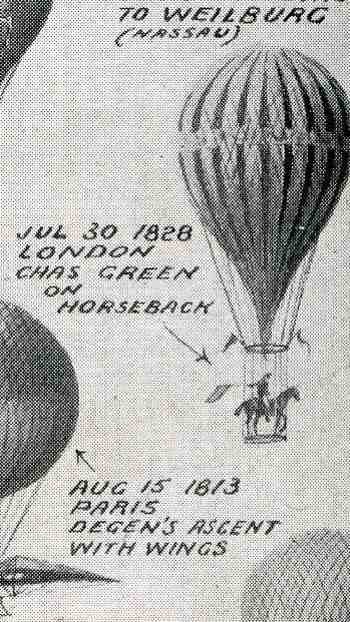
    Lastly for today is this lovely history
    of balloon and aeroplane flight published in The Illustrated London News
    for 3 July 1909, called “The Evolution of the Great War-ships of the
    Air:  Balloons, Non-Dirigible and Dirigible, and Aeroplanes, from the
    Seventeenth Century to the Twentieth Century”.  It is more fully explained here in an earlier post I made to this blog, laboring the point that 8% of the 60 air vehicles involved a horse.